
7
Stunning Aesthetics with CSS
The aesthetically focused features of CSS are so useful in responsive web design because using CSS lets us replace images in many situations. This saves you time, makes your code more maintainable, and results in less page "weight" for the end user.
In this chapter, we will cover:
- How to create text shadows
- How to create box shadows
- How to make gradient backgrounds
- How to use multiple backgrounds
- Using CSS background gradients to make patterns
- How to implement high-resolution background images with media queries
- How to use CSS filters (and their performance implications)
- Clipping with clipping paths
- Masking elements with image masks
- Mixing the colors of elements with
mix-blend-mode
Let's dig in.
Vendor prefixes
When implementing experimental CSS, just remember to add relevant vendor prefixes via a tool, rather than by hand. This ensures the broadest cross-browser compatibility and also negates you adding in prefixes that are no longer required. I'm mentioning Autoprefixer (https://github.com/postcss/autoprefixer) in most chapters as, at the time of writing, I think it's the best tool for the job.
Text shadows with CSS
Let's make a start by looking at text shadows. Text shadows are a fairly simple way to change the aesthetics of text, and therefore provide a good starting point. Support for text-shadow is also ubiquitous. Let's first consider the basic syntax:
.element {
  text-shadow: 1px 1px 1px #ccc;
}
Remember, the values in shorthand rules always go right and then down (or think of it as clockwise if you prefer). Therefore, the first value is the amount of shadow to the right, the second is the amount down, the third value is the amount of blur (the distance the shadow travels before fading to nothing), and the final value is the color. Shadows to the left and above can be achieved using negative values. For example:
.text {
  text-shadow: -4px -4px 0px #dad7d7;
}
The color value doesn't need to be defined as a hex value. It can just as easily be HSL(A) or RGB(A):
text-shadow: 4px 4px 0px hsla(140, 3%, 26%, 0.4);
You can also set the shadow values in any other valid CSS length units such as em, rem, ch, rem, and so on. Personally, I rarely use em or rem units for text-shadow values. As the length values tend to be low, using 1px or 2px generally looks good across all viewports.
Thanks to media queries, we can easily remove text shadows at different viewport sizes too. The key here is the none value:
.text {
  text-shadow: 2px 2px 0 #bfbfbf;
}
@media (min-width: 30rem) {
  .text {
    text-shadow: none;
  }
}
It's worth knowing that, in CSS, where a value starts with a zero, such as 0.14s, there is no need to write the leading zero: .14s is exactly the same.
Omit the blur value when it's not needed
If there is no blur to be added to a text shadow, the value can be omitted from the declaration. For example:
.text {
  text-shadow: -4px -4px #dad7d7;
}
That is perfectly valid. The browser assumes that the first two values are for the offsets if no third value is declared.
Multiple text shadows
It's possible to add multiple text shadows by comma separating two or more shadows. For example:
.multiple {
  text-shadow: 0px 1px #fff, 4px 4px 0px #dad7d7;
}
Also, as CSS is forgiving of whitespace, you can lay out the values like this if it helps with readability:
.text {
  font-size: calc(100vmax / 40); /* 100 of vh or vw, whichever is larger divided by 40 */
  text-shadow:
    3px 3px #bbb, /* right and bottom */
  -3px -3px #999; /* left and top */
}
You can read the W3C specification for the text-shadow property here: http://www.w3.org/TR/css3-text/#text-shadow.
So, that's how you create shadows around text. What about when you want a shadow on a containing element?
Box shadows
Box shadows allow you to create a box-shaped shadow around the outside or inside of an element. Once you understand text shadows, box shadows are a piece of cake. Principally, they follow the same syntax: horizontal offset, vertical offset, blur, spread (we will get to spread in a moment), and color. Only two of the four length values are required. In the absence of the last two length values, a value of zero is assumed. Let's look at a simple example:
.shadow {
  box-shadow: 0px 3px 5px #444;
}
The default box-shadow is set on the outside of the element. Another optional keyword, inset, allows the box shadow to be applied inside the element.
Inset shadow
The box-shadow property can also be used to create an inset shadow. The syntax is identical to a normal box shadow, except that the value starts with the keyword inset:
.inset {
  box-shadow: inset 0 0 40px #000;
}
Everything functions as before, but the inset part of the declaration instructs the browser to set the effect on the inside. If you look at example_07-01, you'll see an example of each type:

Figure 7.1: Outer shadows and inner shadows are both easily achievable
Multiple shadows
Like text shadows, you can apply multiple box shadows. Separate the box-shadow declarations with a comma. They are applied bottom to top (last to first) as they are listed. Remind yourself of the order by thinking that the declaration nearest to the top in the rule (in the code) appears nearest to the "top" of the order when displayed in the browser. As with text-shadow declarations, you may find it useful to use whitespace to visually stack the different box-shadow declarations:
box-shadow:
    inset 0 0 30px hsl(0, 0%, 0%),
    inset 0 0 70px hsla(0, 97%, 53%, 1);
Stacking longer, multiple values, one under the other in the code, has an added benefit when using version control systems; it makes it easy to spot differences when you compare, or "diff," two versions of the same file. It can be useful to stack selectors one under the other for that same reason.
Understanding spread
I'll be honest, for literally years I didn't truly understand what the spread value of a box-shadow actually did. I don't think the name "spread" is useful. Think of it more as an offset. Let me explain.
Look at the box on the left in example_07-02. This has a standard box shadow applied, with no spread. The one on the right has a negative spread value applied. It's set with the fourth value. Here is the relevant code that deals with each shadow:
.no-spread {
  box-shadow: 0 10px 10px;
}
.spread {
  box-shadow: 0 10px 10px -10px;
}
Here is the effect of each (element with a spread value on the right):
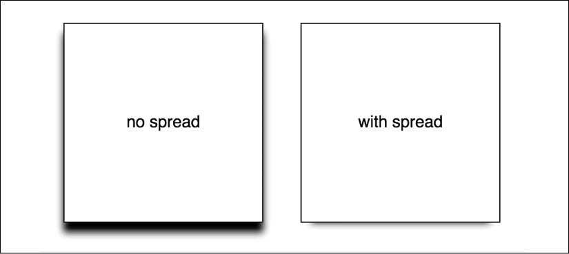
Figure 7.2: With spread, you can control how much shadow leaks out
The spread value lets you extend or contract the shadow in all directions by the amount specified. In this example, a negative value is pulling the shadow back in all directions. The result is that we can just see the shadow at the bottom of the right example, instead of seeing the blur "leak" out on all sides.
You can read the W3C specification for the box-shadow property here: http://www.w3.org/TR/css3-background/#the-box-shadow.
Right, so that's shadows. We will go on to deal with more shadows when we look at drop-shadow as part of CSS filters. For now, let's move on to gradients.
Background gradients
In days gone by, to achieve a background gradient on an element, it was necessary to tile a thin graphical slice of the gradient. As graphics resources go, it's quite an economical tradeoff. An image, only a pixel or two wide, isn't going to break the bandwidth bank and on a single site, it can be used on multiple elements.
However, if we need to tweak the gradient, it still requires round trips to the graphics editor. Plus, occasionally, content might "break out" of the gradient background, extending beyond the image's fixed size limitations. This problem is compounded with a responsive design, as sections of a page may increase at different viewports.
With a CSS background-image gradient, however, things are far more flexible. As part of the CSS Image Values and Replaced Content Module Level 3, CSS enables us to create linear and radial background gradients. Let's look at how we can define them.
The specification for CSS Image Values and Replaced Content Module Level 3 can be found at http://www.w3.org/TR/css3-images/.
Linear-gradient notation
The linear-gradient notation, in its simplest form, looks like this:
.linear-gradient {
  background: linear-gradient(red, blue);
}
This will create a linear gradient that starts at red (the gradient starts from the top by default) and fades to blue.
Specifying gradient direction
Now, if you want to specify a direction for the gradient, there are a couple of ways to do this. The gradient will always begin in the opposite direction to where you are sending it. However, when no direction is set, a gradient will always default to a top to bottom direction. For example:
.linear-gradient {
  background: linear-gradient(to top right, red, blue);
}
In this instance, the gradient heads to the top right. It starts red in the bottom left corner and fades to blue at the top right.
If you're more mathematically minded, you may believe it would be comparable to write the gradient like this:
.linear-gradient {
  background: linear-gradient(45deg, red, blue);
}
However, keep in mind that on a rectangular box, a gradient that heads "to top right" (always the top right of the element it's applied to) will end in a slightly different position than "45deg" (always 45 degrees from its starting point).
It's worth knowing you can also start gradients before they are visible within a box. For example:
.linear-gradient {
  background: linear-gradient(red -50%, blue);
}
This would render a gradient as if it had started before it was even visible inside the box.
We actually used a color stop in the previous example to define a place where a color should begin and end, so let's look at those more fully.
Color stops
Perhaps the handiest thing about background gradients is color stops. They provide the means to set which color is used at which point in a gradient. With color stops, you can specify something as complex as you are likely to need. Consider this example:
.linear-gradient {
  margin: 1rem;
  width: 400px;
  height: 200px;
  background: linear-gradient(
    #f90 0,
    #f90 2%,
    #555 2%,
    #eee 50%,
    #555 98%,
    #f90 98%,
    #f90 100%
  );
}
Here's how that linear-gradient renders:
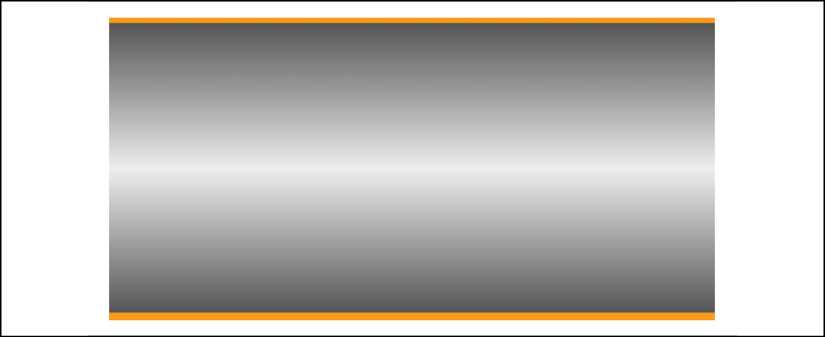
Figure 7.3: You can add as many stops as you like to a linear gradient
In this example (example_07-03), a direction has not been specified, so the default top to bottom direction applies.
Color stops inside a gradient are written comma separated and defined by giving first the color, and then the position of the stop. It's generally advisable not to mix units in one notation, but you can. You can have as many color stops as you like and colors can be written as a keyword, hex, RGBA, or HSLA value.
Note that there have been a number of different background gradient syntaxes over the years, so this is one area that is particularly difficult to write fallbacks for by hand.
At the risk of sounding like a broken record (kids, if you don't know what a "record" is, ask Mom or Dad), make your life easier with a tool like Autoprefixer. This lets you write the current W3C standard syntax (as detailed previously) and it will automatically create the prior versions for you.
You can read the W3C specification for linear background gradients at http://www.w3.org/TR/css3-images/#linear-gradients.
Having covered linear background gradients, let's now check out radial background gradients.
Radial background gradients
It's equally simple to create a radial gradient in CSS. These typically begin from a central point and spread out smoothly in an elliptical or circular shape.
Here's the syntax for a radial background gradient (you can play with it in example_07-04):
.radial-gradient {
  margin: 1rem;
  width: 400px;
  height: 200px;
  background: radial-gradient(12rem circle at bottom, yellow, orange, red);
}

Figure 7.3: We can set a gradient to start at any point. Here our "sunrise" gradient starts bottom center
Breakdown of radial gradient syntax
After specifying the property (background:), we begin the radial-gradient notation. To start with, before the first comma, we define the shape or size of the gradient and the position. We used 12rem circle for the shape and size previously, but consider some other examples:
5emwould be a circle 5em in size. It's possible to omit thecirclepart if giving just a size.circlewould be a circle the full size of the container (the size of a radial gradient defaults tofarthest-cornerif omitted—more on sizing keywords shortly).40px 30pxwould be an ellipse as if drawn inside a box 40px wide by 30px tall.ellipsewould create an ellipse shape that would fit within the element.
Next, after the size and/or shape, we define the position. The default position is center, but let's look at some other possibilities and how they can be defined:
at top rightstarts the radial gradient from the top right.at right 100px top 20pxstarts the gradient 100px from the right edge and 20px from the top edge.at center leftstarts it halfway down the left side of the element.
We end our size, shape, and position "parameters" with a comma and then define any color stops, which work in exactly the same manner as they do with linear gradients.
To simplify the notation: size, shape, and position before the first comma, then as many color stops as needed after it (with each stop separated with commas).
When it comes to sizing things such as gradients, CSS provides some keywords that are often a better choice than hardcoded values, especially with responsive designs.
Handy "extent" keywords for responsive sizing
For responsive work, you may find it advantageous to size gradients proportionally rather than using fixed pixel dimensions. That way, you know you are covered (both literally and figuratively) when the size of elements change. There are some handy sizing keywords that can be applied to gradients.
You would write them like this, in place of any size value:
background: radial-gradient(closest-side circle at center, #333, blue);
Here is what each of them does:
closest-side: The shape meets the side of the box nearest to the center (in the case of circles), or meets both the horizontal and vertical sides that are closest to the center (in the case of ellipses).closest-corner: The shape meets exactly the closest corner of the box from its center.farthest-side: The opposite ofclosest-side, in that rather than the shape meeting the nearest size, it's sized to meet the one farthest from its center (or both the furthest vertical and horizontal side in the case of an ellipse).farthest-corner: The shape expands to the farthest corner of the box from the center.cover: Identical tofarthest-corner.contain: Identical toclosest-side.
You can read the W3C specification for radial background gradients at http://www.w3.org/TR/css3-images/#radial-gradients.
The cheat's way to perfect CSS linear and radial gradients
If defining gradients by hand seems like hard work, there are some great online gradient generators. My favorite is http://www.colorzilla.com/gradient-editor/. It uses a graphics editor style GUI, allowing you to pick your colors, stops, gradient style (linear and radial gradients are supported), and even the color space (hex, RGB(A), HSL(A)) you'd like the final gradient in. There are also loads of preset gradients to use as starting points. Still not convinced? How about the ability to generate a CSS gradient based on the gradient values in an existing image? Thought that might swing it for you.
Repeating gradients
CSS also gives us the ability to create repeating background gradients. Let's take a look at how it's done:
.repeating-radial-gradient {
  background: repeating-radial-gradient(black 0px, orange 5px, red 10px);
}
Here's how that looks (don't look for long, it may cause nausea):

Figure 7.5: You can use repeating gradients to create all manner of visual effects
Firstly, prefix the linear-gradient or radial-gradient with repeating-. It then follows the same syntax as a normal gradient. Here, I've used pixel distances between the black, orange, and red colors (0px, 5px, and 10px, respectively), but you could also choose to use percentages.
You can read the W3C information on repeating gradients at http://www.w3.org/TR/css3-images/#repeating-gradients.
There's one more way of using background gradients I'd like to share with you.
Background gradient patterns
Although I've often used subtle linear gradients in designs, I've found less practical use for radial gradients and repeating gradients. However, clever folks out there have harnessed the power of gradients to create background gradient patterns. Let's look at an example from CSS Ninja, Lea Verou's collection of CSS background patterns, available at http://lea.verou.me/css3patterns/:
.carbon-fibre {
  margin: 1rem;
  width: 400px;
  height: 200px;
  background: radial-gradient(black 15%, transparent 16%) 0 0, radial-gradient(
        black 15%,
        transparent 16%
      ) 8px 8px,
    radial-gradient(rgba(255, 255, 255, 0.1) 15%, transparent 20%) 0 1px, radial-gradient(
        rgba(255, 255, 255, 0.1) 15%,
        transparent 20%
      ) 8px 9px;
  background-color: #282828;
  background-size: 16px 16px;
}
Here's what that gives us in the browser, a carbon fiber background effect:

Figure 7.6: A carbon fiber effect made with pure CSS
How about that? Just a few lines of CSS and we have an easily editable, responsive, and scalable background pattern.
You might find it useful to add background-repeat: no-repeat at the end of the rule to better understand how it works.
As ever, thanks to media queries, different declarations can be used for different responsive scenarios. For example, although a gradient pattern might work well at smaller viewports, it might be better to go with a plain background at larger ones:
@media (min-width: 45rem) {
  .carbon-fibre {
    background: #333;
  }
}
You can view this example at example_07-05.
So far, we have looked at many ways of creating background images using just CSS; however, whether that is linear gradients, radial gradients, or repeating gradients, it is still just one background image. What about when you want to deal with more than one background image at the same time?
Multiple background images
Although a little out of fashion at the moment, it used to be a fairly common design requirement to build a page with a different background image at the top of the page than at the bottom. Or perhaps to use different background images for the top and bottom of a content section within a page. Back in the day, with CSS 2.1, achieving this effect typically required additional markup (one element for the header background and another for the footer background).
With CSS, you can stack as many background images as you need on an element.
Here's the syntax:
.bg {
  background: url('../img/1.png'), url('../img/2.png'), url('../img/3.png');
}
As with the stacking order of multiple shadows, the image listed first is layered nearest to the top, or closer to the user, in the browser. You can also add a general color for the background in the same declaration if you wish, like this:
.bg {
  background: url('../img/1.png'), url('../img/2.png'),
    url('../img/3.png') left bottom, black;
}
Specify the color last and this will show up below every image specified in the preceding code snippet.
With the multiple background images, as long as your images have transparency, any partially transparent background images that sit on top of another will show through below. However, background images don't have to sit on top of one another, nor do they all have to be the same size.
Background size
To set different sizes for each image, use the background-size property. When multiple images have been used, the syntax works like this:
.bg {
  background-size: 100% 50%, 300px 400px, auto;
}
The size values (first width, then height) for each image are declared, separated by commas, in the order they are listed in the background property. As in the preceding example, you can use percentage or pixel values for each image alongside the following:
auto: This sets the element at its native size.cover: This expands the image, preserving its aspect ratio, to cover the area of the element.contain: This expands the image to fit its longest side within the element while preserving the aspect ratio.
Having considered size, let's also think about position.
Background position
If you have different background images, at different sizes, the next thing you'll want is the ability to position them differently. Thankfully, the background-position property facilitates that.
Let's put all this background image capability together, alongside some of the responsive units we looked at in previous chapters.
Let's create a simple space scene, made with a single element and three background images, set at three different sizes, and positioned in three different ways:
.bg-multi {
  height: 100vh;
  width: 100vw;
  background: url('rosetta.png'), url('moon.png'), url('stars.jpg');
  background-size: 75vmax, 50vw, cover;
  background-position: top 50px right 80px, 40px 40px, top center;
  background-repeat: no-repeat;
}
You'll see something like this in the browser:

Figure 7.7: Multiple background images on a single element
We have the stars image at the bottom, then the moon, and finally an image of the Rosetta space probe on top. View this for yourself in example_07-06. Notice that if you adjust the browser window, the responsive length units work well (vmax, vh, and vw) and retain proportion, while pixel-based ones do not.
Where no background-position is declared, the default position of top left is applied.
Background shorthand
There is a shorthand method of combining the different background properties together.
However, my experience so far has been that it produces erratic results. Therefore, I recommend the longhand method and declare the multiple images first, then the size, and then the position.
You can read the W3C documentation on multiple background elements here: http://www.w3.org/TR/css3-background/.
High resolution background images
Thanks to media queries, we have the ability to load in different background images, not just at different viewport sizes, but also different viewport resolutions.
For example, here is the official way of specifying a background image for a "normal" and a "high" DPI screen. You can find this in example_07-07:
.bg {
  background-image: url('bg.jpg');
}
@media (min-resolution: 1.5dppx) {
  .bg {
    background-image: url('bg@1_5x.jpg');
  }
}
The media query is written exactly as it is with width, height, or any of the other capability tests. In this example, we are defining the minimum resolution that bg@1_5x.jpg should use as 1.5dppx (device pixels per CSS pixel). We could also use dpi (dots per inch) or dpcm (dots per centimeter) units if preferable. However, despite the poorer support, I find dppx the easiest unit to think about; as 2dppx is twice the resolution, 3dppx would be three times the resolution. Thinking about that in dpi is trickier. "Standard" resolution would be 96dpi, twice that resolution would be 192dpi, and so on.
A brief note on performance: just remember that large images can potentially slow down the feel of your site and lead to a poor experience for users. While a background image won't block the rendering of the page (you'll still see the rest of the site drawn to the page while you wait for the background image), it will add to the total weight of the page, which is important if users are paying for data.
Earlier in this chapter, I told you we would look at more shadows when we got to dealing with CSS filters. That time has come.
CSS filters
There is a glaring problem with box-shadow. As the name implies, it is limited to the rectangular CSS box shape of the element it is applied to. Here's a screengrab of a triangle shape made with CSS with a box shadow applied:
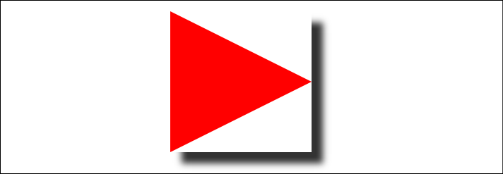
Figure 7.8: Box shadows don't always provide the effect you want
Not exactly what I was hoping for. Thankfully, we can overcome this issue with CSS filters, part of the Filter Effects Module Level 1 (http://www.w3.org/TR/filter-effects/).
Here is that same element with a CSS drop-shadow filter applied instead of a box-shadow (you can view the code in example_07-08):

Figure 7.9: A drop-shadow filter effect can apply to more than just boxes
Here is the format for CSS filters:
.filter-drop-shadow {
  filter: drop-shadow(8px 8px 6px #333);
}
After the filter property, we specify the filter we want to use, which is drop-shadow in this example, and then pass in the arguments for the filter. drop-shadow follows a similar syntax to box-shadow, so this one is easy; x and y offset, blur, then spread radius (both optional), and finally color, also optional, although I recommend specifying a color for consistency.
CSS filters are actually based upon SVG filters, which have wider support. We'll look at the SVG-based equivalent in Chapter 8, Using SVGs for Resolution Independence.
Available CSS filters
There are a few filters to choose from. We will look at each. While images of most of the filters follow, those of you reading a hard copy of this book (with monochrome images) may struggle to notice the differences. If you're in that situation, remember you can still view the various filters in the browser by opening example_07-08. I'm going to list each out now with a suitable value specified. As you might imagine, a greater value means more of the filter applied. Where images are used, the image is shown after the relevant code:
filter: url('./img/filters.svg#filterRed'): Lets you specify an SVG filter to use.filter: blur(3px): Uses a single length value (but not as a percentage):
Figure 7.10: A blur filter applied
filter: brightness(2): With brightness, a value of 1 or 100% is normal; less than that, such as "0.5" or "50%," darkens; and more, such as "200%" or "2," lightens: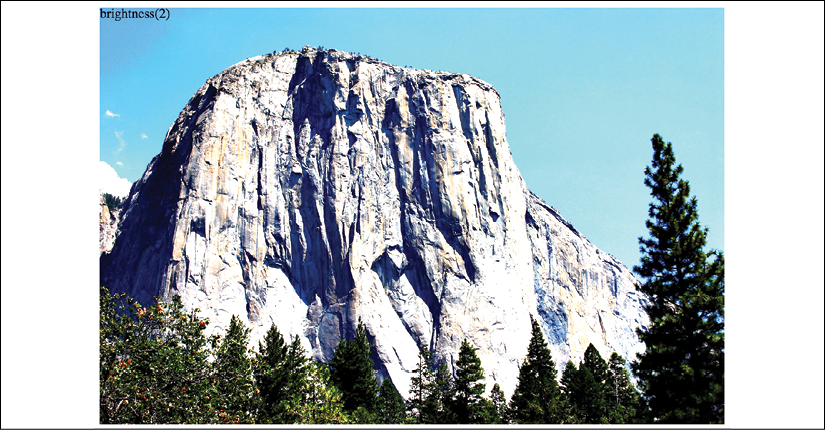
Figure 7.11: A brightness filter applied
filter: contrast(2): A value of 1 or 100% is normal; less than that, for example "0.5" or "50%," reduces contrast; and more, such as "200%" or "2," increases it:
Figure 7.12: A contrast filter applied
filter: drop-shadow(4px 4px 6px #333): We looked atdrop-shadowin detail previously.filter: grayscale(.8): Use a value from 0 to 1 or 0% to 100% to apply varying amounts of grayscale to the element. A value of 0 would be no grayscale, while a value of 1 would be fully grayscale:
Figure 7.13: A grayscale filter applied
filter: hue-rotate(25deg): Use a value between 0 and 360 degrees to adjust the hue of the colors around the color wheel. You can use a negative value to move the "wheel" backward and a number greater than 360 just spins it around more!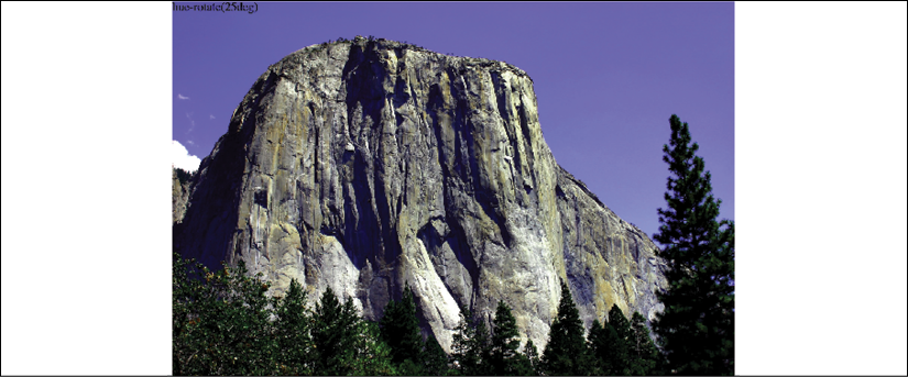
Figure 7.14: A hue-rotate filter applied
filter: invert(75%): Use a value from 0 to 1 or 0% to 100% to define the amount the element has its colors inverted:
Figure 7.15: An invert filter applied
filter: opacity(50%): Use a value from 0 to 1 or 0% to 100% to alter the opacity of the element. 1 or 100% is fully opaque, while 0 or 0% would be full transparency. This is similar to theopacityproperty you will already be familiar with. However, filters, as we shall see, can be combined, and this allows opacity to be combined with other filters in one go:
Figure 7.16: An opacity filter applied
filter: saturate(15%): Use a value from 0 to 1 or 0% to 100% to desaturate an image and anything above 1/100% to add extra saturation:
Figure 7.17: A saturate filter applied
filter: sepia(.75): Use a value from 0 to 1 or 0% to 100% to make the element appear with a more sepia color. 0/0% leaves the element as is, while anything above that applies greater amounts of sepia, up to a maximum of 1/100%:
Figure 7.18: A sepia filter applied
Combining CSS filters
You can also combine filters easily; simply space separate them. For example, here is how you would apply opacity, blur, and sepia filters at once:
.MultipleFilters {
  filter: opacity(10%) blur(2px) sepia(35%);
}
Note: Apart from hue-rotate, when using filters, negative values are not allowed.
I think you'll agree, CSS filters offer some pretty powerful effects. There are also effects we can transition and transform from situation to situation. We'll look at how to do that in Chapter 9, Transitions, Transformations, and Animations.
However, before you go crazy with these new toys, we need to have a grown-up conversation about performance.
A warning on CSS performance
When it comes to CSS performance, I would like you to remember this one thing:
Architecture is outside the braces, performance is inside.
– Ben Frain
Let me expand on my little maxim: as far as I can prove, worrying about whether a CSS selector (the part outside the curly braces) is fast or slow is pointless. I set out to prove this here: http://benfrain.com/css-performance-revisited-selectors-bloat-expensive-styles/.
However, one thing that really can grind a page to a halt, CSS-wise, is "expensive" properties (the parts inside the curly braces). When we use the term "expensive" in relation to certain styles, it simply means it costs the browser a lot of overhead. It's something the browser, or perhaps more accurately, the host hardware, finds overly taxing to do.
It's possible to make a common-sense guess about what will cause the browser extra work. It's basically anything it would have to compute before it can paint things to the screen. For example, compare a standard div with a flat solid background, against a semi-opaque image, on top of a background made up of multiple gradients, with rounded corners and a drop-shadow. The latter is more expensive; it will result in far more computational work for the browser and subsequently cause more overhead.
Therefore, when you apply effects like filters, do so judiciously and, if possible, test whether the page speed suffers on the lowest powered devices you are hoping to support. At the least, switch on development tool features such as continuous page repainting in Chrome and toggle any effects you think may cause problems. This will provide you with data (in the form of a millisecond reading of how long the current viewport is taking to paint) to make a more educated decision on which effects to apply. The lower the figure, the faster the page will perform—although be aware that browsers/platforms vary, so, as ever, test on real devices where possible.
For more on this subject, I recommend the following resource: https://developers.google.com/web/fundamentals/performance/rendering/?hl=en.

Figure 7.19: Check fancy effects aren't killing your performance.
OK, grown-up talk finished with now. Let's get back to looking at the fun and powerful stuff we can do with CSS. Next on the list is clipping things.
CSS clip-path
The clip-path property allows you to "clip" an element with a shape. Think of clipping just like drawing a shape on a piece of paper and then cutting around it. This shape can be something simple like an ellipse, something more complicated such as a polygon, or something more complex still such as a shape defined by an inline SVG path. If you want to view each of these on a page, check out example-07_09 in the download code.
clip-path with url
You can use the path of an inline SVG like this:
clip-path: url(#myPath);
If the term "inline SVG" doesn't make much sense, don't worry about that for now. Come back here once you have read the next chapter on SVG.
CSS basic shapes
You can use clip-path with any of the CSS basic shapes. These are inset, circle, ellipse, and polygon, as described here: https://www.w3.org/TR/css-shapes-1/#supported-basic-shapes.
Let's take a look at how we would write each of these.
clip-path with a circle
With clip-path: circle(), the first argument you pass is the size, and the second, which is an optional argument, is the position of that shape. So, if you wanted to clip an element down to a circle 20% of the element's height and width:
clip-path: circle(20%);
If you wanted the same circle clip-mask but positioned 60% horizontally and 40% vertically:
.clip-circle {
  clip-path: circle(35% at 60% 40%);
}

Figure 7.20: A circular clip-path applied
Notice the at keyword in there? That's needed to communicate that the lengths after relate to positioning and not size.
It's important to know that pointer events don't occur for areas of an element that have been clipped by a clip mask! To extend our cutting a shape from a piece of paper analogy, the bits outside a clip mask are like the discarded pieces of paper that have been cut away.
clip-path with ellipse
With clip-path: ellipse(), the first argument is the x axis radius (horizontal) and the second argument is the y axis radius (vertical). Just like circle(), you specify positioning lengths after the at keyword:
.clip-ellipse {
  clip-path: ellipse(100px 50px at 60% 40%);
}
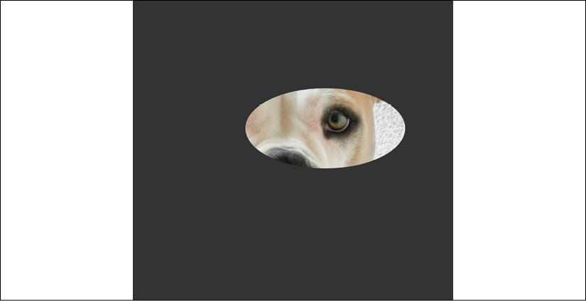
Figure 7.21: An elliptical clip-path applied
clip-path with inset
The inset() function for clip-path is a little different. You pass four lengths, and these are how much you want to inset the mask from the edges. Just like when you set margin, the values go clockwise: top, right, bottom, and left. Just like margin, you can also pass just two length values; the first will be top and bottom and the second will be left and right (the three-value syntax works the same too).
There is also an optional round keyword that can be used, followed by another length; that sets how much you would like each corner to be rounded by.
Here is an example with four inset values passed and four different radius values for the corners:
.clip-inset {
  clip-path: inset(40px 20px 40px 20px round 0 30px 15px 40px);
}
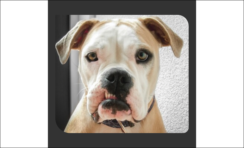
Figure 7.22: An inset clip-path applied
clip-path with polygon
The polygon() function for clip-path allows us to describe a simple shape with a series of comma separated x and y coordinates. This is what a triangle written with the polygon function looks like:
.clip-polygon {
  clip-path: polygon(50% 60px, 100% calc(100% - 40px), 0% calc(100% - 40px));
}

Figure 7.23: A clip-path applied with a polygon
Think of this as a way of describing where to start cutting (the first argument), where to go next (any subsequent arguments), and where the last point should be. The polygon then connects the final point to the first to complete the path.
Each argument is made up of an x coordinate described from the top left of the containing box (for example, 50% along), and then the y coordinate (for example, 60px from the top) in relation to the top of the containing box.
My favorite way to get started with a clip-path polygon is to use Bennett Feely's "Clippy" website: https://bennettfeely.com/clippy/.
There are a bunch of premade shapes to choose from, as well as a GUI for amending the shape. Highly recommended!
clip-path with URL (clipping source)
You can also pass the clip-path a "clipping-source" via a URL. The URL needs to be an SVG clipPath somewhere in the document.
I made a star shape as an SVG path and added an id of starSymbol to the clipPath element. With that in place, you can tell clip-path to use that path like this:
.clip-url {
  clip-path: url(#starSymbol);
}
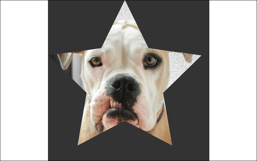
Figure 7.24: A clip-path applied with an SVG path
You can view each of these clip-path examples in example_07-09.
Animating clip-path
As if all this clipping malarkey wasn't interesting enough, you can also animate clip-paths, as long as there remains the same number of points in the shape. For example, you can animate a triangle into a different shaped triangle, but without some tricks, you can't convert that same triangle into a star. I say "without some tricks" because you can effectively do this by hiding a few points along the lines of the polygon so your triangle has enough points to animate into a star.
Here's a grab of an extra example I added, example_07-10. This is just to hopefully give you an idea of what can be done by adding a few of the things we have already learned and a few things we will learn in future chapters together:

Figure 7.25: You can even animate clip-path
This shows two elements with the same background image being masked with clip-path. You can also tint the image with an overlay like this:
background: linear-gradient(hsla(0, 0%, 0%, 0.4) 0, hsla(0, 0%, 0%, 0.4) 100%),
  url('image.jpg');
It's not possible to add a background-color above an image when using multiple background elements. However, we can create a background-image using a linear-gradient with the same HSLA color top and bottom, which creates the desired effect.
We then move the main element around the page with one set of keyframes animations (we will get to animations in Chapter 9, Transitions, Transformations, and Animations) and animate the clip-path with another set.
I think once you start playing about with these techniques, you're going to surprise yourself with just what you can create with relative ease!
There may be occasions when you don't just want to clip what's in an element, and you actually want to overlay it with a mask. We can do that with CSS too! Let me show you.
mask-image
You can also mask elements with images, from either an image source with transparency such as a PNG graphic, a linear-gradient, which we looked at earlier in this chapter, or an SVG mask element. You can read about all the possibilities afforded to us in the specification here: https://www.w3.org/TR/css-masking-1/.
In the meantime, we will just look at a fairly straightforward example so you can appreciate the kind of effect that is possible and how the syntax works to achieve it.
mask-image example
Suppose we have an image. I have one that NASA took of Mars. I'd get one I took myself but, you know, it's a bit of a jaunt.
Now, suppose we also have a PNG image that is transparent except for the word "MARS." We can use this PNG as a mask on top of our image element.
This is what we see in the browser:

Figure 7.26: A mask image applied
Here is our relevant HTML:
<img
  src="mars.jpg"
  alt="An image of Mars from space"
  class="mask-image-example"
/>
.mask-image-example {
  display: block;
  height: 1024px;
  width: 1024px;
  margin: 0 auto;
  mask-image: url('mars-text-mask.png');
}
The only relevant part of the mask is the mask-image property, which tells the browser what we want to use as a mask on this element.
Now, the cynical among you might suggest the same effect could have just been achieved in a graphics package. I'd say you were right, but then raise you this:
.mask-image-example {
  display: block;
  height: 1024px;
  width: 1024px;
  margin: 0 auto;
  mask-image: url('mars-text-mask.png');
  animation: moveMask 6s infinite alternate;
}
@keyframes moveMask {
  0% {
    object-position: 0px 0px;
  }
  100% {
    object-position: 100px 100px;
  }
}
We will look at animations in Chapter 9, Transitions, Transformations, and Animations, but what we have done here is added an animation that moves the background image behind the mask so that the word "MARS" stays in position while the planet moves behind. Try doing that in Photoshop!
If we wanted to swap things around and have the mask move and the image of the planet stay put, it is as simple as swapping object-position in the animation for mask-position.
You can have a play with this example at example_07-11. Be aware that you might need to add vendor prefixes to the mask-image property as I have in the example code, and it might also be necessary to run this example from a local server. Something like BrowserSync will do the job.
There are quite a few related properties for mask-image that can alter the way the mask works. If you find yourself tasked with something mask-related, be sure to look through the specifications and see if there is anything in there that might aid your specific requirements.
Well, I don't know about you, but I'm almost exhausted with the visual CSS "cardio" we've just been through. Before you reach for the towel and water bottle, just let me tell you about mix-blend-mode.
mix-blend-mode
One final, very visual, property I want to relate before we end this chapter is mix-blend-mode. This property lets you decide how you want one element to "blend" with the element it sits on top of.
Here are the possible blend modes: normal, multiply, screen, overlay, darken, lighten, color-dodge, color-burn, hard-light, soft-light, difference, exclusion, hue, saturation, color, and luminosity.
Static images don't really do this property justice, so I'd encourage you to open example_07-12 in a browser.
We're using that same image of Mars from the last example but setting it as a fixed background for the body element.
Then, we add some text on top that you can scroll to see mix-blend-mode in effect. In this example, we have used overlay, for no reason other than I thought it worked best. If you open the example along with your developer tools, you can cycle through the other possibilities. It's perhaps redundant to say so, but the options themselves will have different effects, depending on the foreground and background they are being applied onto.
The specification for mix-blend-mode is the Compositing and Blending Level 1 specification: https://www.w3.org/TR/compositing-1/#mix-blend-mode.
Summary
In this chapter, we've looked at a selection of the most useful CSS features for creating lightweight aesthetics in responsive web designs. CSS's background gradients curb our reliance on images for background effects.
We considered how they can be used to create infinitely repeating background patterns. We've also learned how to use text shadows to create simple text enhancements and box shadows to add shadows to the outside and inside of elements.
We've also looked at CSS filters. They allow us to achieve even more impressive visual effects with CSS alone and can be combined for truly impressive results.
In the last part of this chapter, we looked at creating masking effects with both images and clipping paths.
We've added some considerable capabilities to our toolbelts! We will come back to CSS in Chapter 9, Transitions, Transformations, and Animations. But before that...
In the next chapter, we're going to turn our attention to creating and using Scalable Vector Graphics, or SVG, as they are more simply called. While it's a very mature technology, it is only in the current climate of responsive and high-performing websites that it has really come of age.