
8
Drawing Valid Conclusions From Numbers
Invalid data and poor statistical methods can lead to bad decisions! There are many ways for an engineering project manager to make mistakes, but one of the most common and most insidious is through making logical and procedural mistakes that cause us to draw erroneous and invalid conclusions from quantifiable data, and as a result, making poor data‐based decisions. As engineers, we measure things, and then we often make decisions based on those numbers. For example, we predict when our project will be done, how much it will cost when it is done, and what the technical capabilities of our product will be (e.g. how far will our new airplane be able to fly safely without refueling). And we use those data to make decisions for our project. Whenever we use numbers, however, there is a chance for error: our measurements always involve uncertainties, a particular assumption is only true under certain circumstances, we may not have collected appropriate samples, and so forth. In this chapter, I show you the most common ways that we undermine our own credibility through poor data collection, errors in logic, procedural mistakes, weak statistics, and other errors, and how you can instead use valid methods and strong statistics so as to create credible predictions for all of our project management roles and measures.
8.1 In Engineering, We Must Make Measurements
We are engineers … and, as part of our job, we routinely measure things. Qualitative assessments are seldom adequate for our purposes; we most often instead must make use of quantitative data in our analysis and decision‐making.
Most people, when they need to make measurements, don't give the matter much thought. They just step on the scale, pull out a tape measure, or get out the air‐pressure gauge. In ordinary life, that might (or might not) be good enough. When we are making decisions about complex engineering processes, however, making measurements that can be the basis for useful decisions is much more complicated. Look at Figure 8.1, which summarizes the measurement process.
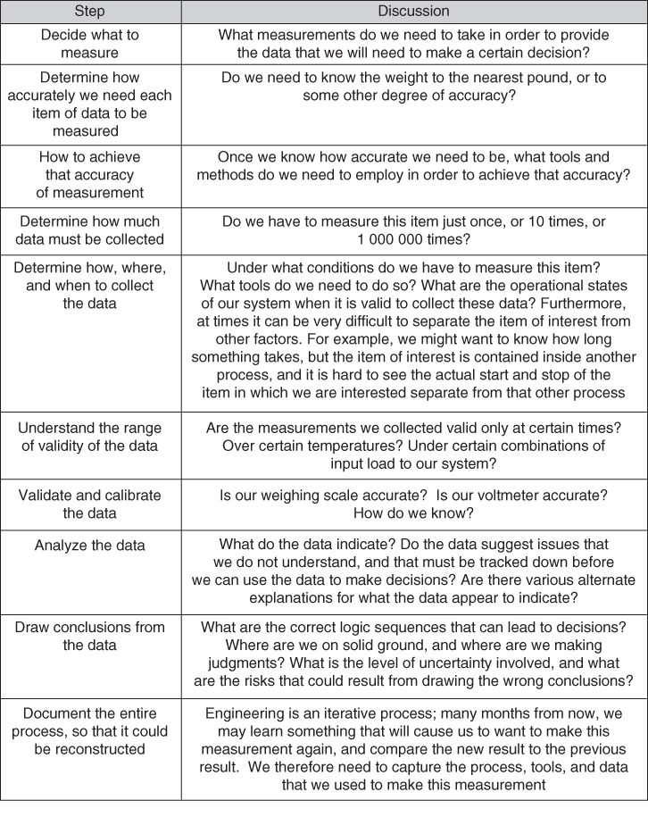
Figure 8.1 The measurement process.
8.2 The Data and/or the Conclusions are Often Wrong
People make awful mistakes in every one of these steps and, as a result, their conclusions are often completely wrong. Here's a real example that I experienced many years ago.
My wife has a PhD in Iranian linguistics. When she was still attending university, and considering faculty members to be on her doctoral committee,1 she wanted at least one of the committee members to be a woman. She received a recommendation from one of her faculty advisors that person X might be suitable. I suggested that my wife get a couple of person X's publications, and we could read them together, and see if we thought her expertise was such that she could help guide my wife's research. I am not a linguist, but many linguists – and people in many other fields of academic study – use quantitative methods in their research; my wife could understand the linguistic portion of person X's papers and I (with my training as a mathematician, the academic field of study for my first two college degrees) could understand the quantitative methods.
I was astonished to find that the quantitative methods used in person X's work were completely wrong; even if her linguistic data and conclusions were perfect (which I was not qualified to assess), her research conclusions – which depended in an essential fashion on the quantitative assessments that she made via logic and statistics – were completely unjustified by her data, because her statistical method and analysis logic were simply wrong.
These were peer‐reviewed papers, meaning that other, supposedly‐qualified academics in the same field had reviewed these papers for correctness of method and rigor. In these cases, however, the peer‐review process had completely failed; anyone trained in elementary statistics and logic could spot these errors in a few minutes. Social scientists are in fact supposed to be trained in basic logic and statistics.
This was a life‐changing event for me; I suddenly realized that published, peer‐reviewed work by experts might be completely wrong.2
Nor did this turn out to be an isolated example; I have since read hundreds of works by social scientists, physical scientists, public officials, and other experts … and discovered that most of them make similar mistakes in handling their quantitative data.
When I started working as an engineer and project manager, I also discovered that those domains are full of errors in quantitative method too.
It is not my role in this book to fix the field of linguistics; my role is to help you become effective managers for engineering projects. In engineering and engineering project management, we inevitably and routinely make decisions based in part on quantitative data. It is therefore vitally important that the methods, tools, logic, and procedures that we use to collect, process, and assess those data – which are going to influence our decisions – be logically sound and correct. That is what this chapter is all about. Once we have established this baseline of mistakes to avoid, we will in future chapters dive into the specific quantitative methods and analyses that we must perform in our role as managers of engineering projects.
The above provided an example of an error, but a second example that includes a discussion of the exact mechanisms of the error may be useful. Here, therefore, is an example of decision‐making based on quantitative data that includes a discussion of exactly what went wrong:3
- You are a physician. A patient has come to you and asked to be tested for a particular disease. This disease is fairly rare – on average, only about 1 person out of 1000 in the United States has it.
- After taking the patient's medical history, you and the patient decide to order the test.
- A week later, you get the results from the laboratory that ran the test: the results come back positive. That is, the test result says “yes, your patient has this disease.” You look up the information about the accuracy of the test, and it says that the test has a false‐positive rate of 5%. This means that 5% of the time when the test says “yes, the patient has this disease,” that answer is not correct; the patient does not have the disease.
- You call the patient to come in for her follow‐up appointment. After she arrives for this appointment, the patient asks you “What is the probability that I have the disease, given that the test came back with a positive result?” What do you tell her?
Write down your answer in the box below, before you read on.
According to the sources cited by Taleb in his book, most doctors respond “The probability that you have the disease is 95%.”
Did you give that answer?
Unfortunately, that answer is wrong.
The correct answer is just under 2%; that is, it is highly unlikely that the patient has the disease … despite the positive test result.
We need only some elementary arithmetic to figure this out:
- Imagine that you, over the course of your career, have ordered this test 1000 times on 1000 separate people. Over those 1000 tests, how many likely came back with a positive test result? Let's figure that out:
- 1 person who actually had the disease (remember, we said that the occurrence rate is 1 person per 1000 of population in the United States)
- 50 people who had a false‐positive test result (we said that the false‐positive rate is 5%, and 5% of 1000 samples is 50)
- So, there ought to be 51 positive test results in your group of 1000 tests.
- Your current patient is one of those 51. Is she/he the one who actually has the disease, or one of the 50 with the false positive? Within the framework of the question as asked herein, you have no way of knowing.4 So, the probability that this patient has the disease is 1 out of 51, or just under 2%.
Think about those two answers. Since the answer can only be between 0% and 100%, 95% and 2% are about as far apart as they can literally be. The doctor's answers could hardly have been worse.
Doctors are supposed to be trained to answer exactly this sort of question. What went wrong?
The reason for the error is easy to explain. The doctor was provided with three pieces of information: (i) that the disease was rare (only 1 person out of 1000 have it); (ii) that the test had a 5% false‐positive rate; and (iii) that the test result came back saying “yes, the patient has this disease.” To reach the correct answer, as we saw above, all three of these pieces of information had to be used.
Notice, however, that in deciding that the answer was 95%, the doctor only used the fact of the 5% false‐positive rate for the test (and the fact that the test said “yes”); he/she ignored the other piece of information – the fact that only 1 person out of 1000 has the disease.
This is a very common method by which people analyze a problem: they look at the set of all the provided information, they then select the subset of those items of information that they deem to be the most important, and make their decision based solely on those items, ignoring all of the other information that may be available (presumably, because they deem this information to be less important than the information upon which they based their decision). Unfortunately, this method is often completely invalid, and leads (as in our example) to incorrect conclusions and decisions.
If this method is so easily proven to be wrong, why is it still very common? Human beings apparently hate the complexity and ambiguity of a situation with many pieces of information, and therefore we are evolutionarily conditioned to make an informal assessment regarding which piece(s) of information seems to be the important one(s), and prefer to make our decision based solely on those piece(s) of information that we deem to be important, ignoring the remaining pieces of information.
Unfortunately, there is something in mathematics that statisticians call a conditional probability; in such a situation, multiple pieces of information interact with each other, and a reasonable answer can only be arrived at if all the pieces of information are used and combined in the correct fashion, as we did above in deriving the correct answer. This was the doctor's mistake; he/she was given three pieces of information, but elected to use only two of them in deriving the answer. Unfortunately, because of the conditional probability involved in the problem, the answer arrived at in this fashion – by using only two of the three available pieces of information – was completely wrong.
Notice that if the doctor had chosen to ignore the two pieces of data – the one about the 5% false‐positive rate and the fact that the test came back positive – and used only the piece of data about occurrence rate (1 person out of 1000 has this disease), he/she would have concluded that the chance the patient had the disease was 1 in 1000; that is, 0.1%, which is much closer to the correct answer. But you could perform this (still incorrect) analysis without even running the medical test! In this case, running the medical test and using its results while ignoring conditional probabilities gave you a worse answer than if you had not even run the medical test!
Terms like statistics and conditional probability sound complex and arcane, and people often therefore anticipate that doing the analysis in an appropriately rigorous fashion is too hard. But, as we saw when we actually worked out the answer to our doctor problem, nothing more profound than some very basic logic and some simple arithmetic was actually needed to derive the correct answer. A textbook on statistics will provide a formula for something called Bayes' Law:
For events A and B, provided that P(B) ≠ 0, then
(the notation “P(A)” is read as “the probability of A” and the notation “P(A|B)” is read as “the probability of A given B”)
Or it might be presented in another equivalent form:
(the notation P(AB) is read as “the probability that both A and B are true”)
This notation seems opaque to many people, but in fact the formulas just encapsulate the methods of the calculations that we just performed; I will leave it to you to work out exactly how. Think of P(A|B) as “the probability that the patient has the disease, given that the test said yes, she has the disease” and you should be able to lay the problem out using the first of the formulas above.
But dealing with the notation and the contents of statistics textbooks is not really necessary for us as managers of engineering projects; all we have to do is recognize a situation that may involve a conditional probability and request that the calculation be done based on that insight. As the manager of the engineering project, you are not likely to be doing the calculations yourself.
You will, however, find that conditional probabilities are everywhere! Therefore, the type of mistake made by our example doctor is very common.
But this is only one type of error that people routinely make in dealing with numbers. There are many, many others. Many of these are just inadvertent errors in data collection and/or data analysis, but some are actually willful: people often define their terms in bizarre ways, so as to improve the “look” of the answer. An easy to understand example of this is the unemployment rate, which is intended to measure the number of people out of work, as a percentage of the population of people who could work. The government naturally wants the general public to believe that their economic policies are effective, and so they define what they call the “employment rate” as something that is somewhere between one‐half and one‐quarter of what you and I, as reasonable citizens, would define as the unemployment rate.5 See Figure 8.2.

Figure 8.2 An example of fudging the numbers: the US unemployment rate.
Between the combination of the mistakes and the willful distortions, we are surrounded by numbers that are incorrect.
This leads to what I (jokingly) call Siegel's Outrageous Simplification:
Most of the numbers in public discourse are wrong.
In Figure 8.3, I list some of the common mistakes in handling quantifiable data. It is a rather long list!
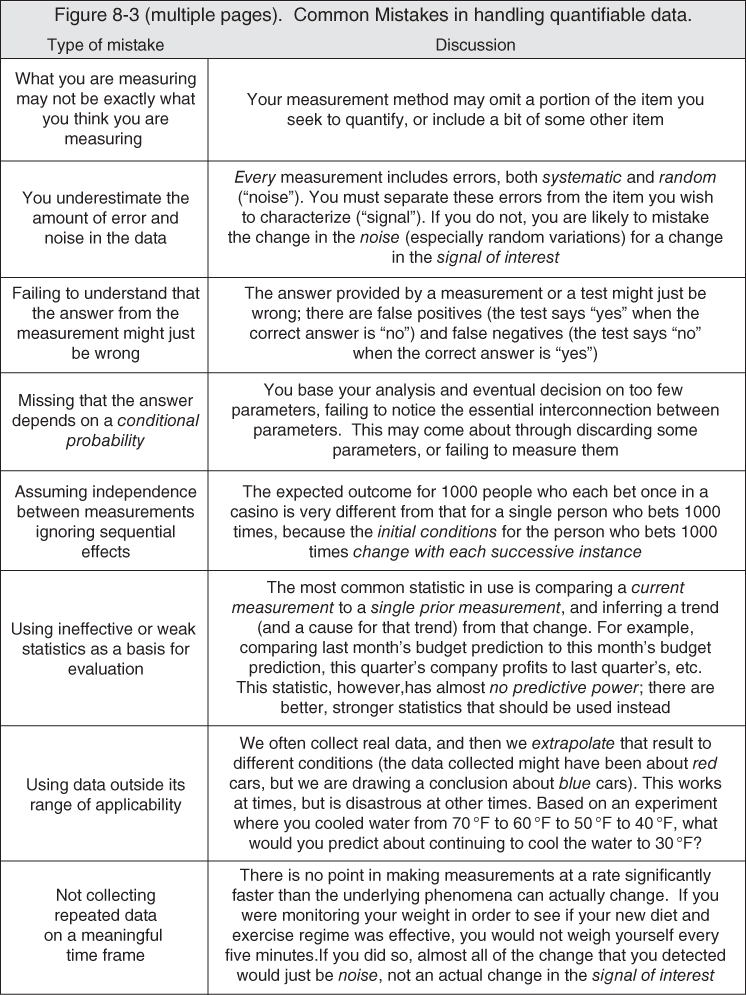
Figure 8.3 Common mistakes in handling quantifiable data.
Below, I discuss a few of these items in a bit more detail.
8.2.1 The Fallacy of the Silent Evidence
If you only hear about successes, you will be misled – the failures may exist, but if you do not hear about them, you will misinterpret the likelihood of success (and of failure); what you need is a properly representative sample of the evidence, which will include both successes and failures.
Here's an example. Take an event that has two outcomes (a stock goes up or down, a sports team wins or loses, and so forth). Now send confident predictions to 2000 different people, in advance of the event – 1000 with one answer, and 1000 with the other answer. After the event has actually occurred, 1000 individual people will notice that you got that prediction correct. But they will not know about the 1000 people who simultaneously saw that you got it wrong. Now, send another two‐outcome prediction to the 1000 people to whom you previously sent the answer that by coincidence turned out to be right; 500 with one answer, 500 with the other answer. After that second event has occurred, there are now 500 people who saw you being correct two times in a row! But that result is still just a coincidence. Now do it eight more times. There will be a person who has seen you be correct 10 times in a row! If you ask for a testimonial from that person about your predictive ability, you may well get a very flattering statement attributing you with deep insight and amazing predictive skills. But that person has that impression only because he or she knows nothing about all of the other letters. In fact, of course, you were correct no more often than would be predicted by random chance. But all of that other evidence, that negative evidence, is hidden from that one person. This is the fallacy of the silent evidence. Many investment scams and consumer frauds work on this basis.
There are many reasons why, in designing and analyzing our engineered systems, we might not see all of the negative evidence. One reason is that people do not like to report bad news. There are many others. So, in making design decisions for our engineered systems, we must take steps so as to be sure that we are in fact seeing all, or at least a properly representative sample, of the evidence, else we will fall victim to the fallacy of the silent evidence too.
We can now see that the fallacy of the silent evidence is why, in the previous chapter, I said that it is important that a company's archive of past project performance includes all projects undertaken by the company, not just the successful projects.
The fallacy of the silent evidence is, by the way, the fatal flaw in political polling (or any other sort of polling or opinion survey). In the United States, at least, participation in a poll is voluntary (nor, of course, are we required to tell the pollsters the truth about what we really think either). This voluntary participation means that the poll measures the opinions of those who are willing to participate, rather than the opinions of the voting population at large. No one can foretell in advance whether the opinions of those two different groups (e.g. those who willingly provide answers to the pollsters, and those who will actually vote) coincide. My impression is that precisely the most emotionally laden issues and elections – exactly when you would most desire your poll to be accurate – is the time when most people will decline to participate (or not tell the truth). Because of this, polling can never be accurate; this is an inherent, unrecoverable, and fatal flaw.6
8.2.2 Logical Flaws in the Organization of System Testing
The fallacy of the silent evidence (and the induction problem and round‐trip error, which are also described in Figure 8.3) affects the test programs of engineering projects in a very significant fashion. Recall the procedure that we described for a test program (Chapter 3): you create test procedures that are designed to exercise the system in a manner that allows you to see if, under those particular circumstances, the system appears to operate in accordance with each requirement contained in the system's specification. We appear to be making the assumption that, just because the system passed each requirement under some scripted and controlled circumstance, there are no flaws remaining in the system. This is obviously a case of both a round‐trip error and a “we see only white swans, so we therefore conclude that there is no such thing as a black swan” type of situation: the flaw listed in Figure 8.3 as the problem of induction.
But this, of course, is not actually the case: our system still contains flaws (all human creations do), and some combination of conditions and stimuli will cause your system to fail, and perhaps to fail in a very serious manner. It is only the case that the evidence of such failures is thus far silent, because we have not looked for it; we designed our tests deliberately so that the system would pass! That is, we deliberately looked only for positive evidence. You must therefore find out where in your system those boundaries in operating conditions are whose crossing will cause these failures, and do so before you deliver the system, and then either correct those failure mechanisms, or establish limits on the use of your system. Just because you ran some tests and the system worked, does not imply that the system will not fail; it only demonstrates that it has not failed yet. You can see now why I strongly advocated (in Chapter 3) pushing the system through your test conditions until it actually fails (as part of your verification program), and also why I advocated for unscripted operation of the system by the users (as part of your validation program). These are ways of finding some of those boundaries in operating conditions, and avoiding the fallacy of the silent evidence (and the problem of induction) in our test program.
This is so important that I am going to say it all again:
- Projects design their test programs to succeed; that is, the test is considered done when the system performs properly on all of the test procedures. That is, however, an insufficient test program! Your test program should not be content looking only for confirmation that – under a carefully scripted set of conditions – the system works. You must also find the situations where your system fails!
- This is because you cannot prove that your system is defect‐free by gathering instances of it working; that would be the logical error of induction (also called confirmation). Confusing the condition “no evidence of flaws in our system” with the condition “there is evidence that there are no flaws in our system” would be the logical round‐trip error.
- A famous example of the error of induction is the black swan: you may observe a lot of swans, but even if all of the swans that you observe are white, that does not prove that there are no black swans, and therefore that it would be invalid to conclude from your observations that all swans are white. On the contrary, it only takes a single instance of observing a black swan to prove that not all swans are white, whereas no number of observations of white swans is sufficient to prove that all swans are white.
- Your system will have defects; every human creation does. You need to discover them, and to discover the boundaries of effective and safe operation, and not leave this discovery to your customers.
- What you can do with your test program is characterize what makes your system fail. I call these boundaries.
- The point of gathering information about failures is not to confirm our design decisions, but to give us the earliest possible indication of the nature of their flaws. So, don't sweep bad news “under the rug,” or interpret it away. I find it helpful always to adopt the worst possible interpretation of the data, and the worst possible outcome/impact, and react accordingly: how can I improve the design to prevent this result?
8.2.3 The Problem of Scale
Most of our complex engineered systems today include computers and software. The most characteristic aspect of such systems is that they can process lots of data; I have built systems that process more than 1 000 000 new inputs every second, and do so 24 hours a day, 7 days a week. There are even systems in the world today that process more data than this, but even our more mundane systems process amounts of data so vast that humans have no reasonable intuitive grasp of the scale involved.
In such large sets of input samples, there will be a shocking number of outliers; that is, data or processing that deviates materially from the nominal conditions, values, and/or sequences expected. Since your system cannot avoid having to process these outliers, there are two aspects of design that become magnified in importance:
- Getting the system to do what you want under approximately normal conditions.
- Preventing the system from doing horrible things under severely off‐nominal conditions.
This is pretty much analogous – but in a slightly more general version – to what I said in Chapter 2: implement the dynamic behavior you want, but take active steps to prevent (or limit the damage caused by) the dynamic behavior you do not want.
Consider the following example. Let's say there is a set of actions that are a key portion of the mission of your system that must be performed within a time constraint. This is very common whenever computers intersect with real physical objects, whether that object be a part of the processing system (e.g. a disk drive whose data platters rotate at a given fixed rate) or an external mechanical process (e.g. some machine whose motion is being commanded by a computer). Let's say that in the nominal case, you want the computing process to complete in 100 milliseconds (1/10 second). A statistician will tell you to collect a lot of samples, and see if most of them are near (or below) 100 milliseconds in duration. They will use terms like mean, median, variance, and standard deviation to describe the distribution of the sample durations.
You clearly have a design task to ensure that, most of the time, this computing process completes in around 100 milliseconds. Every system and software designer is aware of and understands this portion of the problem; this is what I called getting the system to do what you want under approximately normal conditions.
But you must also implement the other half of my design goal too: preventing the system from doing horrible things under severely off‐nominal conditions. For example, what could happen to the physical devices that your system is controlling if a data instance takes 200 milliseconds to be processed, rather than 100 milliseconds? or 1000 milliseconds? or 10 000 milliseconds? In the amazingly large sample sizes that we deal with in today's engineered systems, these “really far off‐nominal” data are not nearly as rare as you think. A statistician considers something really rare if it is what he/she calls a “6‐sigma” event; “6‐sigma” indicates that such an event occurs no more frequently than about three times out of 1 000 000 samples. There will, however, be three such events every single second in my 1 000 000 data‐instances‐per‐second system.7 In the world of complex engineered systems, 6‐sigma does not signify a rare event.
And what if something actually physically explodes if the processing for some data instance takes 10 000 milliseconds, rather than 100 milliseconds? What if people die as a result? If you are building the automated controls for an oil refinery, a chemical plant, a power plant, or a facility making medicines or packaging food, such fatal outcomes are completely possible.
And, of course, there can be a variety of really bad outcomes that don't kill people, but will still damage your customer's mission and your company's reputation (and potentially your company's financial well‐being too, not to mention your own reputation and career prospects).
Here is the lesson to absorb: because of the vast number of data instances that today's complex engineered systems are required to process (what I call the problem of scale), there will inevitably be a significant occurrence rate where things will be very far from nominal. Normal statistical methods will neither inform you nor protect you; they assume symmetric distributions and skinny “tails” on the distribution. Both of these assumptions are wrong for our engineered systems: they have asymmetric distributions (that is, more samples with worse‐than‐average outcomes than samples with better‐than‐average outcomes; just like in our previous example of the distribution of commercial airline flights: there are many more flights that arrive late than arrive early), and also have a lot of outliers (a statistician would say that the “tails” of our system's adverse event distribution are “fat”). You must protect your system and your users from bad outcomes caused by these asymmetric distributions and these outliers; this is a vital goal for your project's design activity.
8.2.4 Signal and Noise
When we measure something, the value returned by the measurement is affected by two factors:
- The actual value of the item being measured.
- Errors in the measurement process.
For example, if we measure something on 1 March and the answer is 301, and we measure it again on 1 April and the answer is 302, then:
- All of the change might be due to a real change in the item being measured.
- All of the change might be due to errors in the measurement process.
- Or (most likely) … some combination of the two!
That part of the change in the measurement that is due to an actual change in the underlying item is called the signal. That part of the change in the measurement that is due to errors and variation in the measurement process is called noise. Every measurement contains both noise and signal; in order to get meaningful data from our measurement, and to allow us to draw valid conclusions from the measurements, we must learn to separate the signal from the noise.
There are many sources of noise; they combine to create a random variation.
Most people, unfortunately, do not separate signal from noise. This is an opportunity for you to be better than your competitors.
Example: Last month, your staff predicted that you were going to finish your project on budget. This month, your staff's prediction says that you are going to be 5% over budget. How will you react?
Most project managers will ask “What went wrong?” They assume that the data are valid.
Instead, you should be asking “How much of that change is random variation (e.g. noise), and how much is an actual change in the signal?” I will show you one way to accomplish this – one that works particularly well on engineering projects – in just a moment. But first, we have one more piece of groundwork to establish: the strength of a statistic.
Statistics is the branch of mathematics that deals with the collection, organization, analysis, and interpretation of numerical data. A statistic is a measure that can be used to make a prediction. A statistic is said to be strong if it has good predictive power; it is said to be weak if it has poor predictive power.
The most common example of a statistic is the comparison of a single current measurement to a single previous measurement. You weigh one pound more today than you did a week ago (the two measurements are subtracted). Today's stock price for Google is 2% higher than yesterday (the two measurements are divided, one by the other).
Unfortunately, it can be shown mathematically that this form of statistic – the comparison of a single current measurement to a single previous measurement (whether by subtraction or by division) is a weak statistic. That is, such a statistic has almost no predictive power – it cannot separate signal from noise. Despite this weakness, this statistic is used all the time (think of quarterly company reporting: “profits are up 2% compared to this quarter last year”). This is another opportunity for you to be better than your competitors!
If one is trying to derive signal from multiple measurements of the same item, two measurements are not enough. One usually cannot separate signal from noise in a measurement until one has more measurements; seven is a typical minimum number. You must also ensure consistency in the methods used to make all of the measurements, and you must wait long enough between the measurements to allow for the possibility that something real will actually have changed. If you weigh yourself once per minute, most of the change that you might see from measurement to measurement is simply noise.
Once you have a series, there are simple tests (described below) that can then separate signal from noise; if the data do not pass at least one of these tests, the changes in the data are likely just noise.
Let's look at Figure 8.4. This is called a control chart, or a process behavior chart.8 The chart looks a little complicated, but really isn't. First of all, the chart represents a series of measurements of the same item; in the example, it was the monthly prediction of some technical capability for an engineered system. The prediction was made during the first week of each month for 36 consecutive months. The sequence of months is shown on the X‐axis; the monthly prediction is the line with the small circles at each monthly measurement, labeled as “monthly results” in the legend. Remember, this measurement includes a mixture of the true signal and the random variation that I called noise. To use the measurement, we want to separate what changes in the measurement are due to an actual change in the signal, and what changes are due instead just to noise.
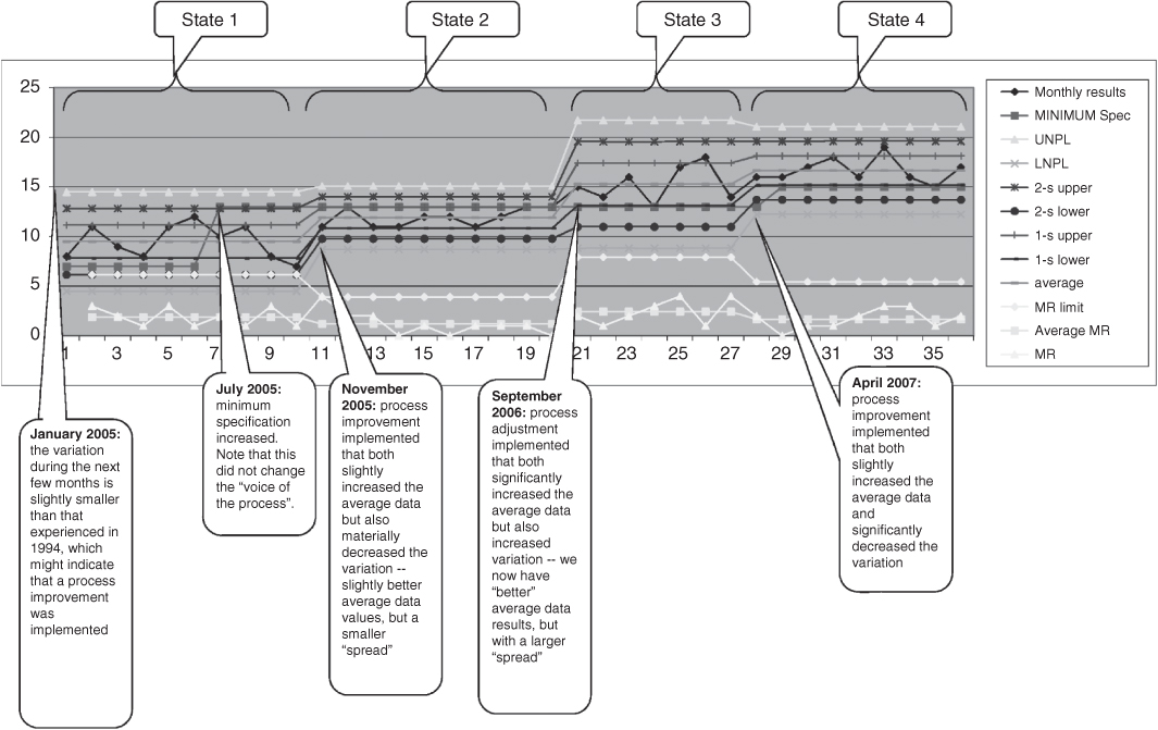
Figure 8.4 The process‐behavior chart (also called the control chart).
Every one of the other lines on the chart is calculated; only the monthly results is an actual measurement. The purpose of all the calculated lines is to help us separate signal from noise. There are calculated lines that represent what statisticians call 1‐sigma up and 1‐sigma down from the measurement. There are also calculated lines that represent 2‐sigma up and 2‐sigma down from the measurement. And there are calculated lines that represent 3‐sigma up and 3‐sigma down from the measurement, which receive the special names upper natural process limit and lower natural process limit (these names are abbreviated in the legend). There is a line that represents the average of the measurements to date, and a line that represents the desired or contractually mandated value (called in the legend the minimum spec). At the bottom of the chart are three separate lines, called moving range, average moving range, and moving range limit. To separate signal from noise, you look at the most recent set of measurements (e.g. the item labeled “monthly results”) for five different effects, which I call the Wheeler/Kazeef tests. If any of these five tests result in a positive outcome, then that data point is likely an actual signal, and not just noise. Here are the five Wheeler/Kazeef tests:
- There is one point outside the upper or lower natural process limits.
- Two out of any three consecutive points are in either of the 2‐sigma to 3‐sigma zones.
- Four out of any five consecutive points are outside the 1‐sigma zones.
- Any seven consecutive points are on one side of the average.
- Any measurement of the item called moving range is above the item called moving range limit.
That's it. If none of these tests comes back positive, the changes in the measured data are likely due only to noise; there has been no actual, meaningful change in the item being measured. That is, there is no actual change in the signal.
With a little practice, you can learn to apply these tests in seconds.
When you see the big changes in the calculated lines, that is another clue that a real change may have taken place in the state of the system, which is why I have annotated the chart with “state 1” and so forth.
As the project manager, of course, you almost never build and analyze a control chart yourself; what you actually do is establish project policy that data used for decisions must be collected and analyzed using the control‐chart methodology, ensure that appropriate training is provided to your team, and that someone is checking up that everyone is actually following through. You also set an example by rejecting any analysis or any decision that is brought to you, unless you see that all the quantitative data have been processed via the control‐chart methodology. This includes all of the information prepared by every cost‐account manager as a part of the periodic management rhythm that we will discuss in Chapters 10 and 11.
8.2.5 A Special Type of Measurement: The Test
A test is a particular type of measurement that returns only a single, binary result: pass or fail. The key insight in this section is that the result of the test may be wrong; it may say “pass” when the true state is “fail,” or it may say “fail” when the true state is “pass.” And some of the time, the test result will actually be correct.
That is to say, each time we conduct a pass/fail test, there are four possible outcomes, not two:
- The test might say “pass,” and the particular item under test might actually be good. This is a “true positive.”
- The test might say “pass,” and the particular item under test might actually be bad. This is a “false positive.”
- The test might say “fail,” and the particular item under test might actually be good. This is a “false negative.”
- The test might say “fail,” and the particular item under test might actually be bad. This is a “true negative.”
That is, what the test says, and what is true, need not be the same thing!
This situation can be represented by a 2 × 2 matrix called a Veitch diagram9 (Figure 8.5).
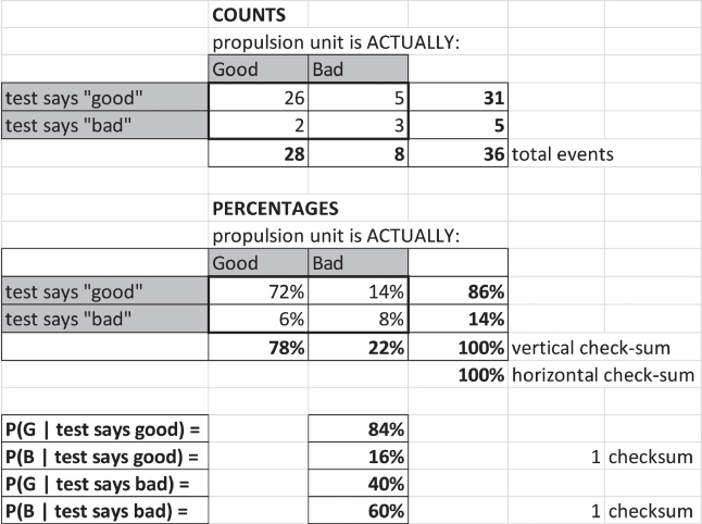
Figure 8.5 The Veitch diagram.
There are actually two Veitch diagrams in Figure 8.5, one that expresses the outcome in counts (e.g. the number of instances for each of the four possible outcomes) and another that expresses the outcome in percentages. Sometimes you might be given the counts and have to derive the percentages, or vice‐versa; sometimes even a bit of each.
At the bottom of the figure, underneath the two Veitch diagrams there are four additional lines. These are the conditional probabilities. The first line reads “the probability that the item is actually good, given that the test result says that it is good, is equal to 84%.” You read the other three lines in a similar fashion.
The point I want you to understand is this: we may run a test and get an “answer,” but that answer might be wrong! Just as we aspire to separate signal from noise, we aspire to separate true positive and true negative test results from false positives and false negatives. False positives and false negatives are, of course, themselves just a particular form of noise. When your staff analyzes outcomes, be sure that they are allowing for false test results. As we saw in the doctor example earlier in this chapter, if we do not account for these false test results properly, we are likely to draw an incorrect conclusion, and therefore make poor decisions.
8.2.6 The Decision Tree: A Method That Properly Accounts For Conditional Probabilities
A common management decision is to choose among various options for a course of action. One method of informing this decision (the decision itself should always be based on your judgment of the totality of circumstances, and not just based on the numbers – the proper role for data is to inform your decision, but not to make your decision for you) is to create a single numeric measure that can be used to compare the alternative courses of action. A typical such measure is expected cost.
There is a method called the decision tree that allows one properly to assess the expected cost of a set of alternative courses of action.10 The decision‐tree methodology deals correctly with dependencies (conditional probabilities) – something where (as we saw above in the doctor example) human intuition is often wrong!
A decision tree is a multi‐step horizontal tree, branching out of an initial condition on the left. The tree has two types of nodes, one called a decision node and another called a chance node. Using these two types of nodes, a step‐by‐step depiction of multiple complex courses of action can be created from left to right, across the page.
At the decision nodes, multiple candidate next steps in the courses of action arise from the right‐hand side of those nodes. Each line (e.g. candidate next step) that emerges from the decision node can have a cost assigned to it. For example, if one of the branches coming out of a particular decision node involves conducting a test, you can assign the estimated cost of conducting that test to that line.
At the chance nodes, you provide a probability that the step represented by the line going into the left‐hand side of the chance node will work, or not work; or if there are more than two possible outcomes (e.g. the voltage produced will be more than 100 V, the voltage produced will be between 50 and 99.9 V, the voltage produced will be between 25 and 49.9 V, the voltage produced will be less than 25 V), you assign a probability to each of those possible outcomes. The probabilities, of course, must add up to 100%.
You can nest combinations of decision nodes and chance nodes to any extent that is required by the problem. At the very right‐hand edge, you always end each branch with a chance node, and also assign a cost to each line emerging from these final chance nodes. For example, the entire decision tree might represent some alternatives for a key portion of your design, and your contract might call for a financial penalty if a certain requirement is not met (or a range of financial penalties, that vary with the magnitude of the shortcoming11). An example of a decision tree is provided in Figure 8.6.
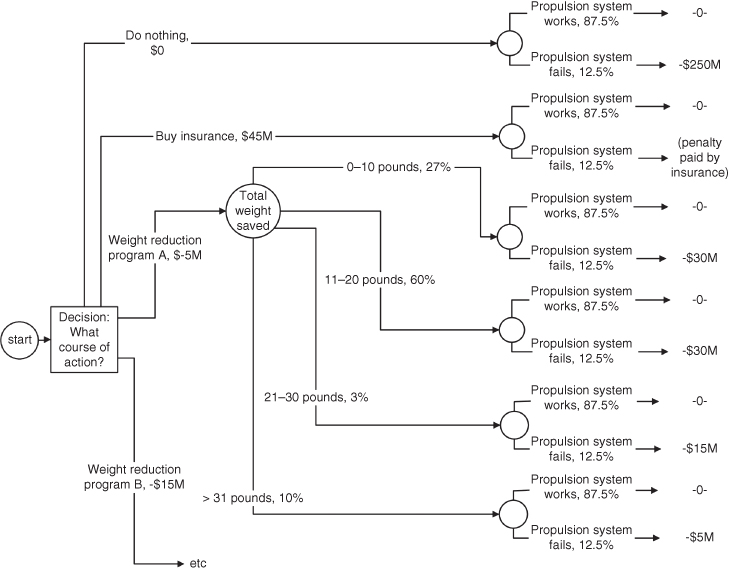
Figure 8.6 An example of a decision tree.
The decision logic unfolds from left to right, but when you are done laying out the tree, and want to make the calculations – which will create an estimate of which of the potential courses of action has the lowest expected cost – you perform those calculations starting at the extreme right‐hand portion of the tree, moving leftwards. At each stage, you multiply cost times probability to reach an expected cost and keep moving leftwards. At the chance nodes, you sum the expected costs from all the branches coming into that node from the right; at the decision nodes, you instead select the smallest number as you go left across the node.
I am not going to spend a lot of time on the details of how to do it, because like so many other things you – as the manager of an engineering project – do not actually build and evaluate the decision trees used to inform decisions; you establish a project policy requiring the use of decision trees under the appropriate circumstances, ensure that people are properly trained, and so forth. Mostly, you look at the results; just as in the doctor problem, the results may be far different from your intuition.
The detailed instructions for how to do it properly belong in a different type of course, such as a course on systems engineering methods. Just in case you have not yet taken such a course, I do provide the complete problem statement, and the “solved” version of this particular example decision tree, in the accompanying teaching materials, which are available to your instructor.
There are some phenomena (e.g. failure rates of electronic parts) where an expected‐value approach (such as the decision tree) is valid. There are other phenomena for which an expected‐value approach is not valid; these may have unusual (e.g. strongly non‐Gaussian) distributions, or the signal‐to‐noise ratio may be so small that the behavior is dominated by the noise, or have other characteristics that make an expected‐value approach not valid.
One more hint: Don't fall into the trap of trying to predict something that is inherently unpredictable, because it is dominated by noise or random variation, or for which you simply do not have enough data to build a valid predictive model. The correct management strategy in those cases is not to try to make predictions, but instead to take actions to (i) decrease your exposure to bad outcomes and (ii) increase your opportunity from good outcomes. This is part of risk management, which will be the subject of Chapter 9.
8.3 What Engineering Project Managers Need to Measure
As managers of engineering projects, we need to have our team make three types of measurements:
- Technical performance measures
- Operational performance measures
- Management measures.
We discussed the technical and operational performance measures earlier. We will discuss management measures in Chapters 10 and 11.
As pointed out above, the making of these measurements, and the interpretation of the resulting data, are often done poorly.
Note that most of the technical and operational performance measures are predictions. We measure things now, but what is important is using the data from those current measurements to predict how the system will perform when it is finally completed. For example:
- What will the processing capacity of the system be, once we are done?
- What will the weight of the satellite be, once we are done?
- For how long will the battery be able to power the system without being recharged, once we are done?
We already talked about the necessity for you to understand how your customer determines value, and to understand what is their “coordinate system” of value. We also already talked about the necessity of then relating the technical performance measures (which represent our degrees of design freedom) to the operational performance measures (which represent the goodness of the resulting system, as interpreted by the customers). We can now see that doing this – both the making of the measurements and the method of relating the two coordinate systems of value to each other – involves processes that are subject to all of the errors described in this chapter.
Our third type of measurements are the management measures. Here are some examples of management measures:
- What will it cost, when we are finally done?
- When will we likely be done?
- How many requirements have we tested to date? When will we likely be done with testing?
- How many problem reports (at each level of severity) remain open? When will we likely reach a state of zero remaining level‐1 open problems?
- How many unfilled positions exist now on the project? How many positions were we able to fill in each of the last three months? How is our staffing posture affecting our ability to complete the project on time?
We will have a lot more to say about management measures in Chapters 10 and 11.
What we just said about the technical and operational measures being subject to all of the errors described in this chapter is also, of course, true for all our management measures.
8.4 Implications for the Design and Management Processes
8.4.1 We Need Measurements in Order to Create Good Designs
I started my college education as a mathematician; I admired the formal rigor of mathematical proofs, and the theoretical insights that result. But after graduation, as I started building complex engineered systems, I learned that such systems cannot be built based exclusively on theory; there is too much uncertainty, the actual operating environment for the system is too complicated for any reasonable theory, there are too many competing interests among the stakeholders, and the conditions in the real world are never as clean as the assumptions in a mathematical proof.
As a result, we engineers must use empirical methods, and tinker; we can never create good designs based solely on theory, models, and algorithms. In order to create effective designs via tinkering, we need measurements from our models and prototypes, providing data that allows us to refine the design, and to guide the tinkering process. But those measurements – and their interpretations – must be reasonably correct! As we have seen, not only are there many ways in which errors can be introduced, but the magnitude of those errors can be stunning, and thereby drive us to completely erroneous decisions.
8.4.2 Projects Provide an Opportunity for Time Series
As we will see in Chapters 10 and 11, as part of routine project operations, we will be remeasuring all the operational performance measures, the technical performance measures, and the management measures every single month. Because of this, on an engineering project, we automatically obtain the data needed to create a time series.
I showed you that we can analyze the data in a time series using the process behavior chart (also called the control chart); this chart – and the associated five Wheeler/Kazeef tests – will help us separate signal from noise, so we can try to make decisions based only on the signal. As the project manager, you must create a project policy that requires our measurements to be gathered and analyzed as time series, using the process‐behavior chart and the five tests.
Most projects do not do this. As a result, the managers of those projects make decisions based on data that contain noise. Those tend not to be good decisions!
8.4.3 Interpreting the Data
We must not assign too much confidence to the detailed accuracy of the specific predictions though. We are looking for jumps, not little incremental changes; if your satellite must weigh less than 1000 pounds in order to be launched into the correct orbit, you will likely design it to weigh somewhat less, perhaps 950 pounds. We use the time series and the control chart of the predicted weight for each subsystem (and hence the predicted weight of the entire satellite) to tell us if something has gone drastically wrong; the difference between a prediction of 914 pounds and 917 pounds is probably below the level of fidelity of the prediction. What we are concerned about is a signal that indicates something is out of control, that big changes are either possible or looming: something that might drive the weight to 1050 pounds. Don't try to get more accuracy from the predictions than is warranted.
We are looking for the things that will break our design and cause the project to fail. Time is a powerful design corrective, so finding these things early is vital. In addition, experience shows that it gets progressively far more expensive to fix things as you move from stage to stage of your project's development cycle. It costs a lot less – about 100 times less – to fix something during the requirements or design stage, as compared to fixing it during the integration or test stage. So, there is significant value in finding problems earlier, rather than later.
8.4.4 How Projects Fail
The following is a pretty typical failure scenario for an engineering project:
- During the requirements, design, and implementation stages, all of the measurements indicate that the project is completely on time and on budget. All is well.
- Then, the project enters the integration stage.
- As multiple pieces are put together into larger and larger subassemblies, things that appeared to work well in the individual parts start showing signs of very significant problems. The system crashes every 10 minutes. The system processes data 100 times slower than it is intended to do so. And so forth.
- We laboriously track down these issues one by one. Each problem takes far longer to find and fix than we thought it would; as a result, our predicted project end date starts “slipping to the right” as fast as the calendar progresses, or even faster. Each problem turns out to be a problem of unplanned dynamic behavior: not a problem with the individual parts, but with the way that the parts interact. Things occur out of their planned sequence. Things queue up unexpectedly. Off‐nominal data (outliers) or user actions cause the system to behave badly.
- But there seems to be no end to the occurrence of such problems; fixing one does not prevent new examples of such bad behavior from occurring. No prediction about progress toward the completion of our project turns out to be justified; the predicted end date just keeps slipping. And people get discouraged: they work very hard and fix one such problem, but three days later a new, equally difficult and equally detrimental problem is found … and none of the previous corrections fix that problem. We have to start the diagnosis process entirely afresh.
- The project is soon canceled, because the customer has lost confidence in your ability to manage and deliver. Or you are fired, and someone else is given a chance to finish the project. Neither of these outcomes is good!12
How did this happen? They did not measure the right things, and therefore did not think about the right things in the course of their design. As a result, they did not actually know if their design was going to work or not.
How do you avoid this? Through (i) paying attention to the dynamic behavior in the design, especially the part that I called “preventing the dynamic behavior that you do not want” (Chapter 2); (ii) the creation of good operational and technical performance measures (Chapter 4); (iii) creating a work plan that addresses the difficult portions of the design early in the project, rather than doing just the easy parts first (Chapters 2 and 7); (iv) employing accurate measurement methods and valid analysis processes (this chapter); (v) creating a strong risk‐management process (Chapter 9); and (vi) employing good techniques for monitoring the progress of your project (Chapters 10 and 11). Most engineering projects that fail do so because they have bad designs; they had bad designs (in part) because they did not do these things well.
8.4.5 Avoid “Explaining Away” the Data
Having – through avoiding the mistakes described in this chapter – created all of these data, and having some understanding of the extent of validity, we must still be aware of our desire and ability to create retrospective and/or plausible explanations. If you observe (e.g. in a process‐behavior chart) a big change that you did not predict, there is probably a real cause that is different from any of your conventional wisdom born out of prior experience. Look for a new cause. Beware the tendency to create a compelling story that “explains away” the significance of data that tells a scary story, or after‐the‐fact explanations that assert “yes, I did in fact expect that,” when in fact the data are a surprise.
Try to obtain as much of the data that goes into your operational and technical performance measures as you can from experimentation, prototyping, and other methods of measuring actual operation. Decrease your dependence where you can on the predictions of theoretical models and algorithms. Favor tinkering over story‐telling, actual data from past experiences over glib summaries of past history, and clinical lessons learned over theory.
8.4.6 Keep a Tally of Predictions
Here is one really effective way to “keep your feet on the ground,” so to speak: take the time to keep a tally of the eventual outcomes of your predictions, and of the predictions of others, especially those considered “experts.” Such a log ought to make you humble and wary about your predictions and the predictions of so‐called experts (even the experts who work for you, on your project). I believe that such caution is both useful and well justified. Here's one of my experiences with such a tally of predictions:
- My wife and I do not have a television. So those few occasions when I find myself stuck in front of a television can be very interesting. Once, when I was on jury duty, I found myself sitting in the jury assembly room for days at a time. Of course there was a television in the room, tuned to continuous reporting from one of the Gulf wars. On an inspiration, I pulled out a piece of paper, wrote down the next 20 factual assertions by the TV reporters (no selection; no cherry‐picking things that seemed the most important or the most interesting or the most likely to be wrong), and then posted that list to my calendar page for a date one year later. I figured that by one year later, I could assess the accuracy of those assertions.
- What did I find? One year later, exactly 2 of the 20 assertions turned out to be correct. Seventeen turned out to be completely wrong. One could be deemed either right or wrong.
- That's a “wrong” rate of 85% to 90%. Why so bad? I don't know. I suspect it is at least in part that the methods of television news reporting emphasize speed over accuracy (I also suspect that this tendency has only become more pronounced in the Internet era). What is important is that television would appear to be nearly worthless as a source of information. Despite the huge news‐gathering budgets, despite the fame and reputation of those doing the reporting, these “experts” have a predictive ability far less than if they just flipped a coin. They probably make many of the mistakes that I have cited in this chapter, especially when it comes to quantitative information.
As should be apparent from the linguist and doctor stories with which I started this chapter, even highly trained and highly educated technical experts make bad predictions; the reason, as we saw, was that they (despite their training and expertise) make all of the mistakes listed in this chapter. Therefore, you as the project manager cannot assume that your own experts will know how to avoid these mistakes, or even if they know, that they will take the time and effort to do so. You must therefore create project policies that guide your people to do this work correctly, provide the necessary training and enforcement, and so forth.
Taleb13 points out that when a set of winners of the economic prize in honor of Alfred Nobel tried to apply their financial predictions in a tangible way (by forming an investment company), they lost billions of dollars. Why should your systems engineers be better at making their predictions than those prize‐winning economists were? My prescription: spend more effort protecting your project against fatal consequences (in Chapter 9, we will call this “reducing the potential impact if an adverse event comes to pass”), rather than depending on the accuracy of predictions.
8.4.7 Social Aspects of Measurement
There is an important social aspect to this too. Correct and valid methods of data collection and analysis are among the items to include in your efforts to achieve alignment among your people and customers. Good methods create credibility with your customers, and pride inside your team.
It is also the case that creating some of these measures – certainly most of the operational performance measures, and several of the management measures – requires us to understand the customer and (at times) people in general. So we, as engineers and managers of engineering projects, need to understand quite a bit about people and how they interact.
What is a good source of information about people and social structures? My conclusion from observation is that people and social systems change very slowly. We have a tendency, however, to want recent information. I believe that when dealing with the technical aspects of our project, that desire is appropriate (technical matters can change relatively rapidly), but I believe that depending solely on recent information may not be effective for understanding the people and social aspects of our project. Recent sources of information about people and social systems have not stood the test of time; they are simply of unproven worth (as we saw in my example about the validity of the information provided by television news). I believe that news is actually caused by factors that change slowly (culture, attitudes that were formed long ago because of long‐ago events, and so forth) as much as it is caused by the things that change fast (like yesterday's events, or the advent of cars, electricity, plumbing, or technology in general). I therefore believe that I can understand the people, the sociology, and the world – even current events – better by reading old history books and traditional cultural artifacts (e.g. poetry that is considered culturally significant within a group) than by viewing television.
I always recommend that managers of engineering projects, and systems engineers, do vast amounts of eclectic reading; you never know what bit of remembered reading will trigger a thought or an insight during a crisis on an engineering project. I have certainly benefited many times by making such connections from my reading in many technical fields.
Furthermore, since (as noted above, and as we will discuss further in Chapter 13) the people and social aspects of project management are very important – taking up more than half of your time as project manager, if the project is of any size or complexity – this reading ought not to be confined just to technical readings. I myself read vast amounts of history, old novels, and the classics of Greece, Rome, and Persia. I firmly believe that Rumi, Austen, Bulgakov14, and Aristotle have taught me more about how to deal effectively with people, and to identify and manage interpersonal conflict, than all of the many modern management books that I have read.
These books are old, I can hear you say; but my view is that if a book is still available hundreds of years after it was written, it is more likely to have content of value than a randomly chosen new book. It has stood the test of time. I urge you to read old books!
8.4.8 Non‐linear Effects
I recommend that you use the data that you gather to look for non‐linear effects in your design. In mathematics, we say that an effect is linear if a change in an input results in a change in the output that is, at most, a multiplicative effect (this is called linear because, if you plotted the relationship between the input and the output, the graph would be a straight line). Since multiplying a number by a very small number always results in a small number, a linear effect is also stable, in the sense that we defined that term in Chapter 2.
Such linear effects are intuitive and relatively easy to comprehend. But the behaviors of our engineered systems are seldom dominated by such linear effects. Instead, our engineered systems usual display multiple types of complex, unpredictable, non‐linear behavior, where small changes in an input may result in huge changes to an output or a behavior. These are difficult for our intuition to grasp and predict, but, in my experience, such non‐linear effects are usually at the root of the difficulties that cause big cost and schedule over‐runs, and significant shortfalls in capability from that promised in the contract. Non‐linear effects are also unstable, in the sense of Chapter 2 – small changes in conditions and inputs cause drastic changes in the behavior of our system.
Non‐linear effects can arise, however, from deceptively simple phenomena. Consider a rotating‐media computer disk drive: the platter spins at a constant rate; the data are stored in a set of concentric circles of magnetic charge (called a track), each arranged in small angular sectors. If the goal is to read all of the information on one track in one revolution of the platter, the processing and information transfer processes must keep up with the angular rate of rotation. If either the processing or information transfer processes fall behind, the disk must rotate all the way around again before it can read the next sector. I once worked on a system with 32 such angular sectors per track; when we started, it turned out that a very tiny time‐overage in the processing and information transfer processes caused the disk to have passed by the beginning of the next sector by the time the computer was ready to read that next sector, and as a result, the disk platter had to make an entire revolution before the next sector could be read. In this case, a tiny delay in timing – literally microseconds – caused the data transfer from the disk to take 32 times as long as planned, because the platter had to spin 32 times to read the entire track, rather than (as planned) just once. This is a classic example of a non‐linear effect: a tiny change in an input (in this case, the speed of the processing and information transfer processes, taking 15 microseconds instead of the planned 10 microseconds, a mere 5 microsecond increase) caused an enormous change in the behavior (e.g. 32 times slower than planned).
Our engineered systems are full of such non‐linear effects; in engineered systems, behavior can jump quickly from adequate to horrible, as some conditions change just a small amount.
These are the types of problems that kill projects. Don't be lulled by our intuition – which appears always to expect linear effects – into expecting only small deviations from planned behavior due to small variances from the plan. This warning applies to management measures, not just to operational and technical performance measures: a small increase in the duration of some task may result in a significant increase to both the predicted completion date of your project and the predicted cost at completion.
This is one of the reasons that good design practice has a large empirical component: our intuitions and our models tend to be linear, and we fail to imagine all of these non‐linear effects. But if we use empirical methods (build prototypes, measure behavior under beyond‐full‐load conditions, and so forth), we have a chance to observe the non‐linear behavior early enough to try to fix it or account for it, before it disrupts the progress of our project. It is therefore my experience that we cannot create good designs based solely on theory and algorithms; theory and algorithms can be effective for designing data transformation, but design is mostly about structure and sequence control, and not about data transformation. Structure and sequence control drive the quality of a design, and structure and sequence control are in my view exactly those aspects of a design that are most susceptible to non‐linear effects. Therefore, creating good designs for structure and sequence control is largely an empirical activity, guided by past experience (via design patterns) and measurements (prototypes and actual full‐load measurements). We must try alternatives and variants, and benchmark their differences. Such tinkering is important.
Be cautious too, in assigning causality. Causality may be far more subtle than you think, and even random chance (manifest through outliers in the data stimuli) may play a role in what you observe. There are probably many more explanations than you think for observed phenomena. Don't jump to conclusions, and never accept a single instance as “proof.” Be curious, and not overly confident in your reasoning when drawing conclusions. Allow for the existence of multiple potential explanations, and use the design to protect your project from the implications if the explanation is not the one you at present favor. Through the design, you can protect against behavior, even without always understanding all of the potential causes!
Focus on using your measurements to find (as we discussed in Chapter 2) the potential sources of unplanned adverse dynamic behavior, and prevent them, rather than relying strongly on theoretical design constructs. Observe actual behavior, rather than depending on the predictions of theory.
8.4.9 Sensitivity Analysis
How can we find such non‐linear effects? One way is by performing sensitivity analyses on critical predictions. Even though our models and predictions are based on assumptions that are not perfect, we can still investigate the sensitivity of that prediction: do small changes in the inputs and assumptions lead to small changes in the predictions? Or big changes in the predictions? These two conditions are very different.
We can create a graph of the predictions, as the inputs vary. Is the response to the varying inputs approximately linear? Or do we see the beginning of a sharp curving, a non‐linear response? Is the response symmetrical, as we increase and decrease the inputs? Or is the response asymmetrical, that is, on one side of the variation the rate of change is much higher than on the other. We need to find such non‐linear and asymmetric responses. We can find them by looking for variations of the inputs that cause the predictions to curve strongly up or down on one side as we vary the inputs.
When we find asymmetry and big variations in predictions due to fairly small variations in inputs, this should be investigated. Such non‐linear behavior could become a catastrophic problem for our system; we may need to change that portion of the design to make it less sensitive to variation in the inputs and assumptions.
For example, queuing (such as waiting your turn to gain access to communication media, waiting your turn to gain access to a computing service, and so forth) is a common situation that we encounter in the design of our engineered systems. Queuing often displays highly non‐linear behavior: below certain levels of activity, things proceed very smoothly, and the wait times to gain access to the communication media are quite predictable, but when the activity increases past some hard‐to‐predict threshold, the wait times suddenly jump by a considerable amount, and display very large variations, becoming very hard to predict.
Such discontinuities are not always predicted by our models (remember our example about cooling water). Hence my preference for actual benchmarking as a predictive method.
8.4.10 Keep it Simple
This need to prevent inadvertent adverse, unplanned dynamic behavior is why simpler is usually better in design. Everyone advocates the KISS15 principle, but what is it that you actually measure in order to achieve a simple design? The sources seldom tell you what to measure, in order to see if your design is simple or not. Here is my favorite example of a tangible design parameter that you can aspire to keep simple: the number of independently schedulable software entities within the mission software for a large, complex system. I always measure this parameter when I design or evaluate a system. One of my best systems (still in use 30+ years later – and that is an eternity in the software business!) had only seven independently schedulable software entities in the mission software. At the same time, the same customer had another company building a system for a slightly different mission, but one that shared many of the same operational conditions and constraints. That contractor was having problems, and the customer asked me to take a look at their work. It turned out that they had no count or list of the independently schedulable software entities within their system! How could they expect to control adverse dynamic behavior? At my suggestion, they made such a list; it turned out that they had more than 700 independently schedulable software entities within their system's mission software. What human being could understand the potential interactions and implications of so many independently schedulable parts in a complex system? Their system was never fielded; it was about 100× less reliable than needed (and more than 1000× less reliable than my similar system). In the end, the next system that I built for this same customer (which had nine independently schedulable software entities within the system's mission software; I was unhappy that we went from 7 to 9!) was eventually adopted to take over the mission intended for the other company's project. The other company spent nearly $1 000 000 000.00 and yet produced nothing useful. They failed to implement the KISS principle.
8.4.11 Modeling
I wish to re‐emphasize the importance of having the actual model creators be the ones who run their models, and the importance therefore of what I called in Chapter 2 the segmented model for system performance prediction. These model builders often spend years collecting data, and gathering real measurements and observations; they understand how their piece of the system really works. You therefore want those same people to run the models that form the core of your predictive process, because they will know how to keep the model from straying into predictive territory that extrapolates beyond credibility.
By the way, it is my experience that these individual models will not be full of algorithms, but instead will be full of tables of actual measurements. The model builder will know and remember the conditions under which each measurement was made too, and therefore has a chance to avoid unjustified extrapolation.
8.4.12 Ground Your Estimates and Predictions in the Past
As we discussed in Chapter 7, good companies have archives of what actually happened on past projects. Use them! Those archives provide real metrics about how much time and money it cost to do certain things, and what were the levels of technical and operational performance achieved by each of those previous designs. This is a precious resource, because it is factual.
The world of technology is full of fads about improvements. The improvements in technology can be measured, but my advice is not to be swept up in enthusiasm for tools that promise productivity breakthroughs in the efficiency of your people. I never incorporate such productivity improvements in my project estimates. By all means, use the breakthrough (if you have reason to believe that it will work, and will not introduce too many adverse side‐effects and risks), but have a “plan B” to use an older, proven method, and create your schedule and cost estimation based on proven past levels of productivity from the company archive, not the promised improved levels of productivity. Do not try to capture the schedule and cost benefits until that particular breakthrough has been used a few times (not just once!); note that by the time that productivity improvement has been used and succeeded several times, it will have automatically become a part of your company's archive of past performance – the company's baseline of productivity will have incorporated the effect of that improvement.
Consider, for example, software development productivity (e.g. how many lines of software code per month the average software programmer can produce). It has not changed in the 60 years of the entire life of the software industry! Why should it? People are still people. We do get more work from each line of software, now that we write software in programming languages (like Java) that encapsulate more work in each line than we did when we used assembly language and FORTRAN. But the number of lines of code produced by a software programmer each month has stayed essentially constant for decades. Here's the potential trap: every decade, breakthroughs are announced that promise more lines of code produced by an engineer each month. They have all failed.
8.5 Your Role in All of This
You must yourself acquire some basic knowledge of the errors of logic and analysis described in this chapter, sufficient for you to spot these errors, and avoid making them yourself (or allowing your staff to make them).
You need to establish a formal, written project policy about how quantitative decision‐making is performed on your project. I recommend that you mandate all quantitative data used for decisions be collected as a time series, and analyzed via the control‐chart methodology. You also must build up the courage to reject any analysis brought to you that fails to comply with this guidance, no matter what the time pressure may be to make a near‐term decision.
Your team will need training in how to do all of this. Your project or your company can create a training course that covers all of the materials described in this chapter (you can even use this book and this chapter as written guidance for such a course). You yourself should take the course, and do so in company with your staff. The shared experience of the course, and the implicit sign that you consider this important by spending your own personal time on the course, will be a very important team‐building experience that will pay dividends for the duration of the project. Such a training course should include both practical team exercises and individual tests that must be passed at the conclusion; these are a sign of seriousness.
8.6 Summary: Drawing Valid Conclusions From Numbers
We are engineers … so we must make measurements, and base our decisions (in part) upon these measurements. Measurements, however, inevitably entail errors. This is because measurements always contain both signal and noise.
One cannot make effective decisions from data unless one can separate the noise from the signal.
Most people and most projects do this very badly. But there are techniques – based on the use of strong statistics – that can actually accomplish this separation for us. Many of the statistics in actual use (such as comparing a current measurement to a single past measurement) are too weak to have any predictive power, and their use leads to poor decisions.
Conditional probabilities are everywhere; you must learn to recognize them, and not allow your team to fall into the trap of throwing out vital data, picking what they consider to be the “most important” item of data and ignoring the others. In fact, it is not very difficult to handle conditional probabilities properly (through the use of the Veitch diagram, the decision tree, and so forth).
Projects measure the same things (operational performance measures, technical performance measures, management measures) every month, so we have a natural opportunity to organize our measurements as time series and use the process‐behavior chart (control chart) to help us separate signal from noise.
We must recognize the customer's “coordinate system of value” in our decision processes; the operational performance parameters help us to do that. But those operational performance parameters are quantitative data, and therefore subject to all of the errors described in this chapter. So are all of the management measures that we will discuss in Chapters 10 and 11. Just because they are not technical parameters does not prevent them from being handled in an invalid way.
8.7 Next
Now that we know how to handle measurements and analysis of quantitative information correctly, we next apply these methods to the problem of characterizing what could go wrong on our project (we call these risks), and how we can go about mitigating the potentially adverse effects of these risks.
8.8 This Week's Facilitated Lab Session
There is no facilitated lab session this week. The time slot for this week's session may be used for a mid‐term examination.