
Frequency or the count of repetition is a continuing theme throughout this book. The importance of visualizing repetition for a financial manager or financial analyst cannot be stressed enough. The majority of analyses and decisions are based on how often something occurs, and what result that repetition produces. We talked about graphing repetition in Chapter 4, Using Graphs for Financial and Statistical Analysis; however, being able to visualize repetition within a worksheet without having to refer to an outside graph can be extremely valuable and allows for faster decisions.
In this recipe, you will learn how to add a repetition scale directly within the worksheet you are analyzing.
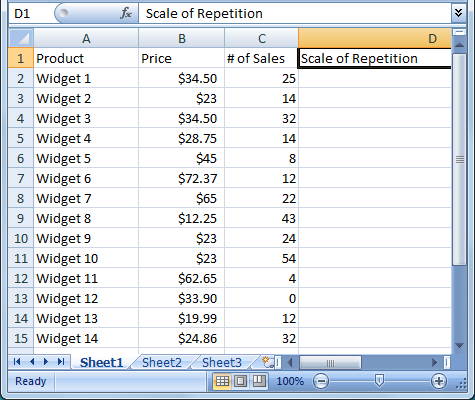
For this recipe, we will graph the number of sales based on the products within an online store:
|
Column A—Contains product names |
|
Column B—Contains product sales price |
|
Column C—Contains the number of sales in the last 3 months |
|
Column D—Contains the visual aspect |
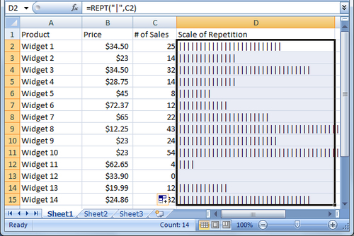
- Select cell D2 and enter the following formula:
=REPT("|",C2). The symbol used between the quotes is a pipe symbol located with the forward slash (), most often above the Enter key. - With the formula entered, copy fill the formula in cell D2 down through cell D15:
- Select cells D2 through D15, change the font size to 8, and font color to dark blue:
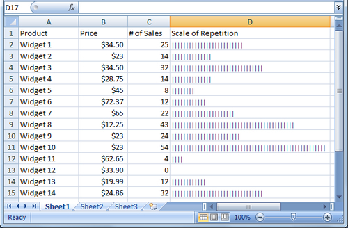
Using the information displayed above, a financial manager can quickly see that Widget 10 far outsells Widget 9, despite the fact that they are priced the same. Many aspects can affect the number of sales; however, we now have a direction as to which product prices or product lines may need to be adjusted, or whether the product has reached the end of its lifecycle as in Widgets 11 and 12.