
Similar to the repetition analysis shown earlier in this chapter, visual representation is important to making decisions. However, having the data along with a representation allows for a more complete view of the information, and allows for a more complete decision.
In this recipe, you will learn how to add mini-graph elements to your data to enhance analysis. Although this recipe will utilize a graph element from Excel, the graph is provided in-line to the text, which qualifies this as a non-standard visual element.
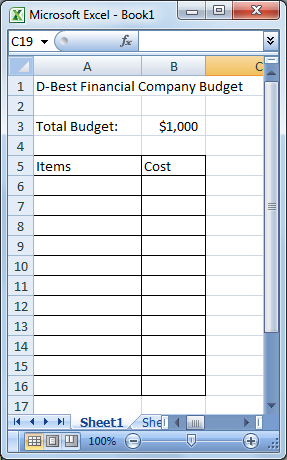
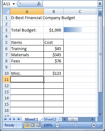
Begin with the data you wish to interpret. In this recipe, we will use a budget sheet for D-Best Financial:
- Lay out your Excel chart as shown in the following screenshot:
- Select cell C3.
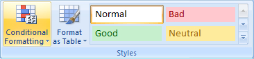
- From the Home tab on the Excel ribbon, choose Conditional Formatting | New Rule:
- From the New Formatting Rule window, choose the Format all cells based on their values rule:
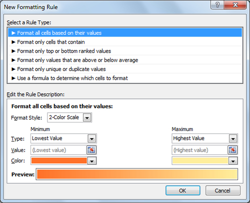
- From the Format Style dropdown, choose Data Bar, select show bar only, and enter the shortest and longest bar types as number.
The minimum bar number should be 0, and the maximum bar number will be =$B$3.
- Change the shortest bar color to blue, and the longest bar color to white.
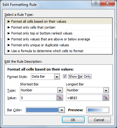
Your rule window should look like the following window:
- Click on OK.
- With cell C3 selected, enter the formula
=SUM(B6:B16)and press Enter.
As items are added to the budget list, cell C3 continues to fill with color to represent how close the current cost is to the total budget:
As a financial manager, you now have a visual indication of cost. A visual indicator of this kind elicits a greater response over strictly using numbers.
Adding the SUM formula to cell C3, we have the total cost of the budget as the cell value. Each new item that is added continues to increase the cell value.
We utilize the cell value within a conditional formatting rule. In this case, the rule is a data bar rule that allows us to select two different colors for a gradient effect. By selecting the lowest value of 0, and the highest value as the budget total, the gradient will change according to the cell value and depending on how close it is to the budget total.
The gradient colors used within the conditional formatting can be changed according to whatever visual effect you wish to create. It is important to choose a color that expresses the severity or importance of the information that you are trying to represent. If the information is more general, a blue color is appropriate, whereas red or green may provide an applicable visual indicator when working with profit and loss.