
Why presentations fail
In this chapter
- The story behind the failure of space shuttle Columbia
- One-minute checklist of presentation essentials
- Common misconceptions
- Dirty Dozen reasons for failure
Here are three startling research findings:
- Eighty per cent of business presentations fail.
- A survey of CEOs in Florida revealed that over 71 per cent of them admitted to dropping off during business presentations.
- A Practical Training for Professionals (PTP) survey revealed that 75 per cent of UK managers find business presentations boring.
In my own experience of working with business people on their presentations since 1994, at least 80 per cent of them were somewhere between poor and embarrassingly bad.
The actual percentages are not important. What matters is that the time and expense invested in preparing and delivering presentations is, most of the time, wasted. You can add the indirect cost of diminished reputation and business lost simply because the presentation failed to impress. If you could quantify that cost it would be a frightening figure.
If a business presentation’s purpose is to obtain business, it must be persuasive and possibly even impressive. If it is boring, if it is poor, if it is inferior in any way, not only will it fail to win the business, but it will create a negative impression of the presenter.
Presentations tend to fail because certain disciplines have not been followed. The necessary techniques are relatively easy to acquire. What is more important is to understand the process of persuasion. It’s the way to get more positive results from speaking in public.
Does it matter if a presentation fails?
Apart from the costs mentioned above, let me tell you about the contribution to the catastrophic failure of space shuttle Columbia made by a poor presentation slide. In a presentation about damage in a previous incident, important information about tile damage was hard to read on a cluttered slide and got missed.
Ambiguous language played its part too, and caused people to pay little attention to this phrase: ‘Test results do show that it is possible at sufficient mass and velocity.’
The word ‘it’ actually refers to ‘damage to the protective tiles’. On the same slide, the words ‘significant’ and ‘significantly’ appear five times, thus losing their power to attract attention. That’s a vital clue to the use of language in a presentation.
As a result of the damage during launch, when Columbia re-entered the Earth’s atmosphere, a briefcase-sized piece of insulation broke off the main propellant tank, striking the leading edge of the left wing and damaging the shuttle’s thermal protection system. Columbia disintegrated over Texas, and all seven crew members died.
The Columbia experience proves that it’s not enough to put in the essential information. It must be done in such a way that it will be received and understood, because people do not pay close attention at all times, and they cannot be expected to extract the vital information themselves.
As the presenter, you will always have to point out the meaning of the facts you include, not least because they might mean different things to different people.
Essential tip
- It’s not enough to include the right information. You must explain it.
Check how well you are presenting
Presentations fail because certain essentials are not carried out. Like any business activity, a presentation requires certain disciplines to be observed. Why not check now to see if your own presentations are at risk?
Here’s a checklist of 30 important considerations in preparing and delivering business presentations. In the 60 seconds or so that it will take you to answer the 30 questions, you will gain a clear understanding of your chances of success.
Just answer each question by ringing either YES or NO, then add up all your NOes at the bottom.
Essential one-minute presentation checklist
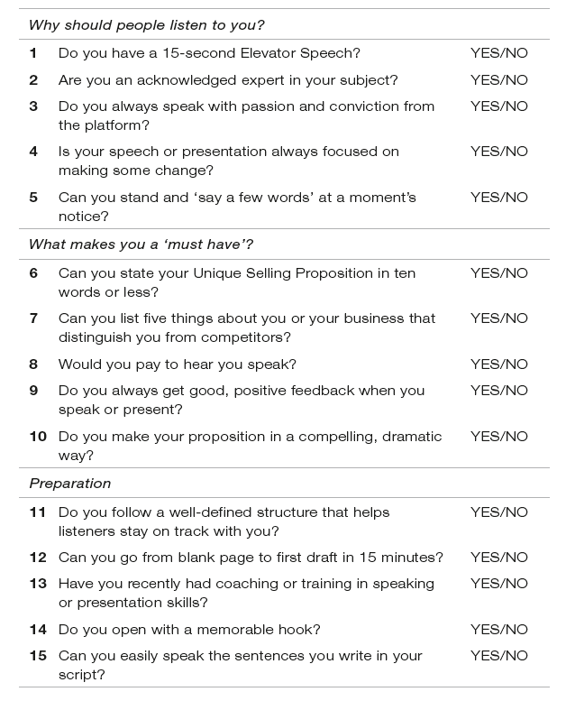
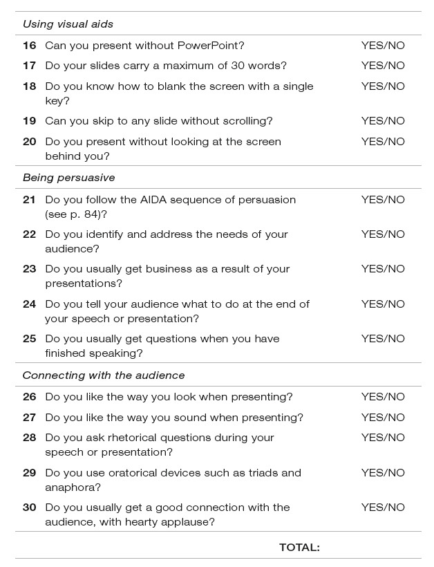
How did you score? Almost no one gets away without a few NOes, and most people say the checklist reminds them of things they know they should be doing but usually forget. The NOes you mark will tell you why your own presentations are at risk.
Two common misconceptions
In a moment I’ll deal with twelve common elements that make a presentation fall short of expectations, but first let me dispense with a couple of misconceptions that seem to have taken root.
The first is the astonishing and frankly incredible claim that speaking in public is a person’s greatest fear. It is claimed that this activity outranks the fear of death!
The American humorist Jerry Seinfeld puts this into context. He says that if this were so, then the average person delivering the eulogy at a funeral would rather be in the box! That is clearly nonsense. But it will get in the way and cause failure if you believe it.
Of course there will usually be some anxiety about presenting, but it is perfectly natural to feel nervous when the spotlight is turned on you, and this book will help you deal with that nervousness.
The second misconception is that a presentation consists of simply telling your stuff. Most business presentations fall into this trap. They consist of a linear description of the product or service being offered, following this kind of sequence:
- this is who we are;
- this is what we do;
- we did it for these people;
- we’d like to do it for you.
It’s one-way traffic. The presentation is prepared, complete with slides, and the presenter delivers it, hoping for a positive response.
An example of this approach was when Alan Johnson was appointed Britain’s Shadow Chancellor of the Exchequer in 2010. He called a press conference at the House of Commons, turned up and read out a speech that he clearly had not written himself, took no questions, and left.
Not only that, he actually gave the journalists a copy of his prepared text!
Why, then, was it necessary for him to turn up and read the text to them? Wouldn’t it have been more efficient to send it as an email? And yet, that is exactly how many business presentations are delivered. The text is prepared, with accompanying slides, and the CEO turns up to read the script and press the button to move the slides along.
What does your presentation actually cost?
Is it any wonder that people switch off and even drop off during such presentations? Try this: add up the cost of all the hours you and others spend preparing a presentation. Then add what it costs for your audience to be there – the total of their earnings per hour.
That large figure is the minimum level of value that you must deliver. If you bore or irritate them, you can add the hidden cost of lost goodwill plus the business you could have secured with a successful presentation.
A simple calculation like that will put into perspective the value in developing the skill of preparing and delivering a presentation that works. That skill has been devalued by the commonplace term, ‘presentation skills’, because there are so many unqualified people offering presentation skills training. Just as dangerous is the view that it was enough to have attended a one-day training programme on presentation skills in 1982.
Every business presentation is a ‘sales pitch’. That is not to say you have to be in sales or have a product or service to sell, but your presentation expresses your point of view, and you will want your listeners to accept, agree with and perhaps even admire what you say.
It requires the persuasive skills of a professional sales person, someone who is in tune with what turns people on these days.
The Dirty Dozen
Let me now turn to some of the common failings of business presentations. I have compiled my own Dirty Dozen, and they fall within three categories:
- Content.
- Style.
- Delivery.
A Content
1 Too much
Your purpose must be to inform and inspire your listeners to accept your proposition. They do not need to know the history of your company or the CV of its founders. To use a sporting analogy, if you were the owner of a football club, and someone wanted to interest you in ‘buying’ a new striker, what would you want to know? Would you want to know how many GCSEs he got at school, the size of his boots, how hard he kicks the ball, how many hours a week he spends on fitness training? No. You’d want to know how good he is at scoring goals.
The same applies to your audience. They want to know what directly concerns them, the benefit it can deliver for them, and they want it without the clutter of excessive supporting material.
A related caution is about the number of slides. Don’t have a slide for everything you say, or you might as well use a video. Guy Kawasaki, formerly marketing chief at Apple, uses only ten slides, one for each of his top ten points.
2 Not enough
Some presentations go to the other extreme, and leave out essential content. Your case must always be complete. It’s not safe to make assumptions about the common ground between you and your audience, any more than to assume they know nothing. A little research beforehand should give you an indication of how much they are likely to know.
It is equally important to repeat the essential elements within the presentation itself, because your listeners may have missed a link between two or more of your points.
Think about road signs. Isn’t it often the way that the crucial final turning is not marked, perhaps because it is assumed that it is known to all local drivers? Have you ever been given directions to an unfamiliar destination far from home? People almost always leave out some vital piece of information, and you have to call for the missing bit.
3 No common terms of reference
When you are telling people things that are new to them, you must make it easy for them to understand and relate to your information. It is familiar to you but may be foreign to them. So always start with what they already know, and give them a set of reference terms that will help them stay on track with you, but avoid the use of jargon and acronyms.
When I went to work at Reader’s Digest, London, I was totally bewildered during my first creative briefing. Everyone was using acronyms, to show that they were on the inside track. It gave them comfort, but it did nothing for me.
I once attended a presentation about heating. The presenter used terms like BTUs (British Thermal Units), but did not tell us how to understand the relationship between the source of heat and the cubic capacity of the room. The result was that we were expected to absorb and understand a parade of figures, and all the laypeople quickly switched off.
Terms of reference also define the context and scope of your presentation, so that your listeners know what to expect.
4 Lack of structure
One of the most common errors is the absence of structure. There is a common misconception that a linear account is a structured presentation. That could be, for example, a chronological sequence: this happened first, then that, and this came next.
Three minutes into your presentation, your listeners will be thinking, ‘Where are we going with this?’ In fact, if that question ever arises, either aloud or in the mind of a listener, you need a better structure.
A structure has two main purposes in delivery, and one in preparation. In preparation it directs your content and focus, while in delivery its purposes are: (a) to keep you on track, and (b) to help your listeners follow you.
There are some simple patterns to guide you, which are covered in Chapter 5. They will make a considerable difference to the effectiveness of your presentations.
5 All tell, no sell
I referred to this earlier in this chapter, but let me expand on it a little, because it is an error that some people cannot see if they have what Tom Peters called ‘the engineer’s mentality’. According to him, such people believe that the facts speak for themselves, and that ‘truth and virtue will automatically be their own reward’.
If that were so, it would be sufficient to write the facts on one side of a small piece of paper and send it to those you wish to do business with. If it were so there would be no need for marketing, for sales teams, for advertising.
The reality is that facts tell but feelings sell. We all buy on emotion and justify with reason. A presentation that is full of data will do no more than inform. We need to interpret the data and say what we want our listeners to understand and feel about it.
I have come across some people whose approach has been: ‘This is my product, here is the specification; you can see it is good, so you must buy it.’ If that sounds ridiculous, you’ll understand the need for more than facts alone.
Essential tip
- Make your content easy to take in and understand.
B Style
6 Over-full slides
Slides and other visual aids are meant to support but not supplant you, the presenter. Some people load their slides with all the things they want to say, not just the things they want to talk about. The slides become the script on the screen. Others limit themselves to three or four sentences per slide and don’t understand why even that is too much.
It’s very simple: we have all been conditioned to read sentences, so if you show a sentence on the screen your audience will read it. While they are reading it they are not listening to you. People who knock bullet points do not understand how slides work in support of the spoken word.
You should be able to look at a slide and take in its meaning in an instant, recognising it as a legitimate summary of what is being said. The bullet point’s function is the mechanical one of signalling the point that is being made by the presenter. In Japan, Masayoshi Takahashi created the Takahashi Method: single words or short phrases in very large letters, that you can instantly understand. Like this:

7 Cluttered slide design
It is tempting to give slides fancy backgrounds, to use multiple colours and a range of fonts, even on the same slide.
At the less well-informed end of the scale, there is type that is too small to read, type that is unsuitable for presentations, and type that is just ugly.
Here is an example of type that is too small (It’s actually 12 point!)

Too much content can create a slide that hinders rather than helps the presentation, like this one:
This is a bad example
- I want to demonstrate how difficult it is to read a slide with lots of words, and long sentences that you have to read while the presenter is still talking.
- It is a bad idea to put complete sentences on the slide as though they were actually bullet points. Bullets should be just that – a few words to summarise the point being made by the presenter.
- Research shows that 27.2% of writers have difficulty in grasping the meaning and significance of figures, and especially percentages when thrown at them during a presentation.
- The same research indicates that 43.7% of actors have similar difficulty, because their brains have a different focus from the precision of mathematics.
- As in many presentations, those statistics are totally unreliable, because I made them up.
8 Wrong language
If you write a script, remember that the language that is written to be read is not the same as the language that is written to be said. Also, Peggy Noonan (speechwriter for presidents) recommends that ‘you must be able to say the sentences you write’.
Avoid business buzzwords. Some people think it signals that the presenter is ‘in the know’, uses the right jargon, so must be in the right stream. The opposite is true. The presenter will be dismissed as pompous and unclear.
Grammatical errors will also get the presenter an uphill climb, especially phrases like ‘Comprises of’ or ‘As a valued customer we’d like to offer you ...’, or ‘your’ instead of ‘you’re’, ‘it’s’ instead of ‘its’ and ‘there’ instead of ‘their’. These howlers appear time and again on slides as well as websites and promotional literature.
Another caution is about those words that mean different things to different people. There are many examples of the differences between UK English and US English. In the US, to ‘table’ something means to put it on the back burner. In the UK it means the opposite – to present it.
Another example: an American firm was negotiating to supply to a Japanese firm. As they were going through the final checklist of agreed points, the American said ‘No problem’ to each point in turn. Unfortunately, the Japanese heard, ‘No, problem.’
Those whose first language is not English don’t always understand negative terms to signify positive intentions.
Essential tip
- Let your visual aids support but not supplant you.
C Delivery
9 Reading the slides
Just about the worst thing a presenter can do is read out the words on the slide, as though the audience had never learned to read! It is the error that will alienate an audience most quickly and guarantee the presenter some harsh criticism.
I was once asked to give a talk on presentations to the sixth formers at a major public school. They were learning to use PowerPoint and, following the (bad) examples of their teachers, believed it was the right thing to do, to read from the screen. I asked them: ‘Who was the first person to read to you?’ One of them said, ‘My mum.’ And what time of day was that? He said, ‘Bedtime.’ And for what reason? ‘To send me to sleep.’ Why, I asked, why would you want to do that to your audience?!
The presentation that is delivered in this way, with the presenter reading out the words on the screen, will usually come with a cast-iron guarantee of failure.
10 Boring voice
The content may be good, the slides well-designed and slickly executed, but if the presenter sounds boring, the presentation has little or no chance of success. Radio and television have conditioned us to prefer interesting voices. We know how the person should sound, whether they be reading the news or starring in some drama.
At the same time, the massive numbers of messages that assail us daily have trained us to switch off. We have a very low threshold of boredom. There is no excuse for sounding boring. If you can’t be excited about your proposition, why should your listeners care?
11 Self-centred
Some presentations come across as self-indulgent and focused on the presenter. This can manifest itself in the content, style or delivery. For example, it may be full of opinion without supporting fact. It may be a celebration of the presenter’s credentials or their company’s position in the marketplace. A single instance can turn off the listeners.
A common example is the opening sentence that goes, ‘We at XYZ Company ...’ That phrase signals self-congratulation, and people do not attend business presentations to hear that. It is a mistaken belief that audiences will pay attention only if they have first been impressed by the credentials of the presenter or their company. The reality is that they are only interested in what you can do for them.
Never forget that they are permanently tuned to WII FM – What’s In It For Me?
12 Going on too long
I once attended a dinner at a sports club, to which a famous athlete had been invited as the after-dinner speaker. The club steward decided to introduce him. He reminisced about his own running background and (limited) achievements. He told us how he had followed the guest of honour’s sporting career. He gave an extended history of our club, listing some of the luminaries who had represented us with distinction in the past. He went on for 40 minutes, by which time the guest speaker must have lost the will to live. The rest of us certainly had.
It is rare that people complain about a presentation being too short. But they always complain if it goes on too long. In conversation, anyone who speaks for three minutes without interruption is boring. Three minutes! We endure longer presentations because we dip in and out, but if the presenter is boring, we stay switched off and pray for the end to come swiftly.
Essential tip
- Make the effort to sound interesting or your listeners will switch off.
There are certain exceptions. Some presentations are instructional and may require complex slides with charts and other detail that needs careful explanation. In such cases, you will have to refer to the slide on the screen and even sometimes read out what’s written there. But these are exceptions which will not apply to most business presentations.
In fact, it’s probably a better idea to put such complex matters in a handout. It’s really not a good idea to try and explain complex detail in a business presentation. Far better to talk about the conclusions, or the consequences, of the research or whatever else you were going to put on the slide.
There are, of course, quite a few other errors that can impede a presentation, but the most important one to remember is not knowing your stuff. Or, to express it positively, be sure to know your stuff.
Know your subject, know what you want to tell your audience, know why they should care, know what questions they are likely to ask you, and know the answers.
Do you need PowerPoint? Not necessarily. You should be able to present with no visual aids, or with just a flip chart. We’ll address this in Chapter 5, Drafting your presentation. But first, let’s consider what goes on before you start preparing your presentation.
The next chapter will help to clarify your thinking about the purpose of a business presentation, and the role that you will play as presenter.
Summary
- Failed presentations can have drastic consequences
- Use the checklist now (and regularly) to cover the essentials and avoid the errors or omissions that cause failure
- Don’t just deliver your content. Help listeners to ‘get it’
- Visual aids should help, not hinder
- Know your stuff