
chapter 12
Technical Analysis
LEARNING OBJECTIVES
The objective of this chapter is to apprise readers of basic techniques of technical analysis of financial market variables. Technical analysis is the study of past price movements with the intent of forecasting future price movements. It is an indispensible tool in order to take buy, sell or hold decisions in financial markets. Technical analysis is a vast subject and this chapter touches upon the basics of this subject, so that the readers can have a better understanding of this subject. The contents of this chapter are organized in the following order:
1. Introduction and Importance of Technical Analysis
3. Fundamental Analysis versus Technical Analysis
4. Technical Analysis Concepts
5. Introduction to Candlestick
8. Steps in Technical Analysis
INTRODUCTION AND IMPORTANCE OF TECHNICAL ANALYSIS
Technical analysis is a study and analysis of past price movements to forecast future price movements. Traders with short-term horizon use charts to know support and resistance level, amid market volatility. Long tenor investors use charts to know trends, so that they can decide whether to buy, sell or hold securities by ignoring short-term volatilities.
Charts are formed from data relating to rise and fall in prices. Based on the study of these charts and various indicators, speculators and investors decide whether to enter or exit the particular security.
A chart enables you to see the price movement and determine whether the stock is at high, low, uptrend or downtrend and in timing the market.
KINDS OF CHARTS
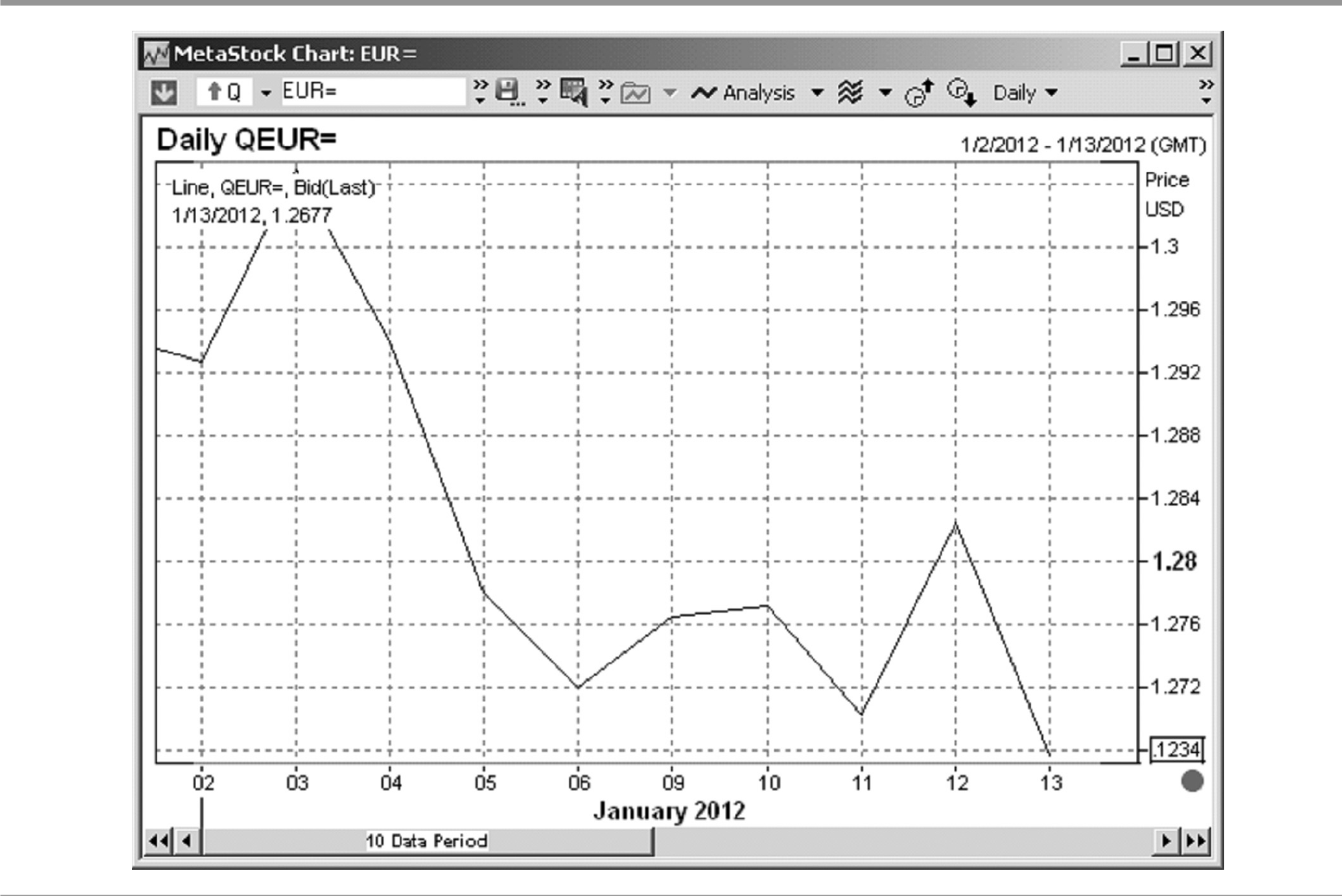
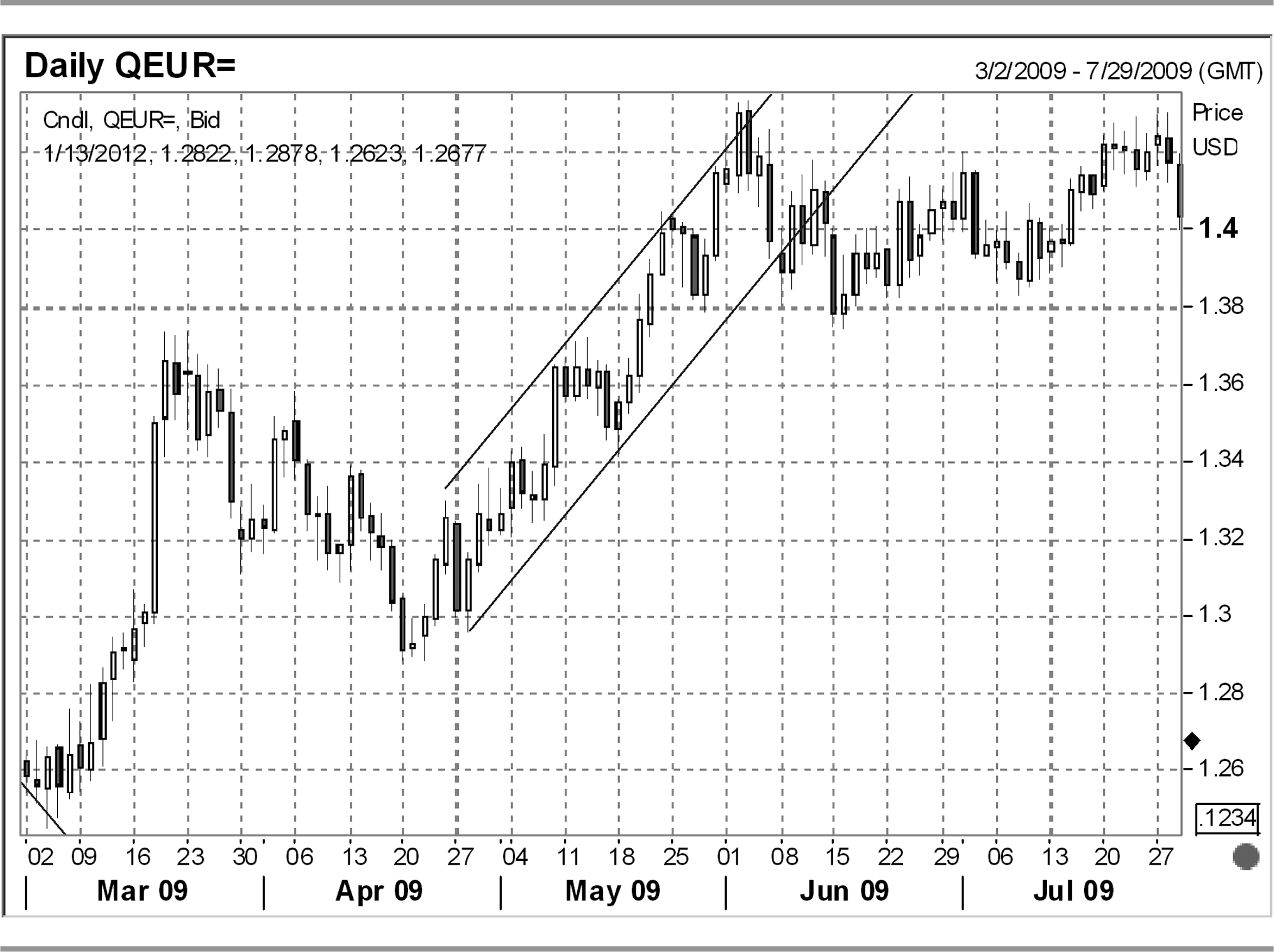
There are three kinds of charts—line, bar and candlestick.
Screenshot 12.2 Bar Chart


FUNDAMENTAL ANALYSIS VERSUS TECHNICAL ANALYSIS
Fundamental analysis is a study of factors which have led to particular price of a security.
It analyses the following:
- Why is a particular security at a particular price?
- How does it compare to other competitors and relative valuation?
- Whether one should buy, hold or sell the security based on fundamentals of sector and security.
Whereas technical analysis includes the following:
- What is the current price of a security?
- Whether one should buy, hold or sell the security based on historical price movements and implied expectation.
- Demand and supply situation.
Even if fundamentals of a particular security appear sound, charts can help you identify the unknown factors which can lead to discovery of fundamental factors hitherto unknown or unidentified.
TECHNICAL ANALYSIS CONCEPTS
Support and Resistance
Support refers to a level, where there is demand for an underlying, i.e., levels at which buyers are or would be keen to buy. Resistance refers to a level, where there is supply of an underlying, i.e., levels at which sellers are or would be keen to sell.
From support and resistance, come the concept of demand and supply. Excess of demand and over supply, lead to price rising higher and vice versa. Technical charts and various studies helps you identify the support and resistance zones. They also enable you to identify the demand and supply pressures and thereby helps in forecasting/predicting the future direction of market.
When prices repeatedly test a particular support level, but are unable to break the same, it implies a strong support area and price may bounce up sharply from that level. However, in case support is broken on account of supply side pressures, then bears rule the market and bulls stop loss on their long positions.
Similarly, when prices repeatedly test a particular resistance, but are unable to break the same, it implies a strong resistance area and prices may fall back sharply from that level. However, in case the resistance is broken on account of demand side pressures, then bulls rule the market and bears stop loss on their short position.
Screenshot 12.4 Support and Resistance

Trends
Trend refers to overall direction of market. Prices on charts are reflected in a series of peaks and valleys. The direction of these peaks and valleys make up the price trend. There are three kinds of trends, as follows:
- Upward trend: Series of successfully higher peaks and valleys.

- Downward trend: Series of successfully lower peaks and valleys

- Sideways trend: Series of successfully level peaks and valleys.
Screenshot 12.7 Sideways Trend
 Source: Thomson Reuters 3000Xtra.


Another way to classify trend can be described as follows:
- Major trend: This would last for a specific period of time, depending on one’s time frame and style of trading.
- Intermediate trend: This would have timeframe within the major trend and would be reflected as correction in the major trend.
- Near term trend: These are even shorter term trends and would lie within the intermediate trend.
INTRODUCTION TO CANDLESTICK
This is a Japanese technique. It is one of the most efficient and widely used charting techniques used globally across the trading community. This provides an amazing clarity on price formation, i.e., open, high, low and close. Traders use this technique to decide whether to buy, sell or hold based on study of single and combination of candle formations. Patterns generated from candlestick charts, give important signals for forecasting future price behaviour.
Majority of charting softwares across the world have candlestick charts. In order to understand this technique, one must understand the concept of candle formation, which can be divided into the following three parts:

- Real body
- This is the central part of the candlestick.
- If the rise or fall in price as compared to previous candle is less, its size is small.
- If the rise or fall in price as compared to previous candle is large, it is long in size.
- Normally, as a practice and standard, the colour of candle is white/blue or green in colour, when close > open and red or black in colour when close < open.
- When there is either none or negligible difference between open and close, then there is no real body and such candle is known as Doji.
- Upper shadow: This is the line formed on the upper end of the real body.
- Lower shadow: This is the line formed on the lower end of the real body.
Types of Candles
The following list is illustrative of the major types of candles normally watched by market participants.
- Doji
- Gravestone Doji
- Dragonfly Doji
- Long-legged Doji
- Morning star
- Evening star
- Shooting star
- Hammer
- Hanging man
- Piercing line
- Dark cloud cover
- Bullish engulfing
- Bearish engulfing
READING CHART PATTERNS
Study of chart patterns, helps you to identify the behaviour and force with which bulls and bears are moving the market and positioning themselves. One can use these patterns on any time interval—intraday, daily, weekly or monthly charts and make short-term, medium-term or long-term forecast. There are countless patterns in every chart and identification of the right pattern is more an art than science.
One can classify these patterns into reversal patterns and continuation patterns. They are explained in detail as follows:
Reversal Patterns
These patterns indicate change of trend and help you identify the trend change in advance, so that you can position accordingly in the market.
Head and Shoulder: This pattern mostly works in up trends. There are four components in this pattern:
- Left shoulder: In an uptrend, sellers become dominant at the high, which results in slight decline in market. This event forms the left shoulder.
- Head: bulls again take control and take price to new highs. But, bears shrug off the market and price test the neckline.
- Right shoulder: Bulls again take control, but they are not able to take market back to previous high and bears pull the price back to neckline.
- Neckline: This refers to the level at which, prices reverse in the above three components.
Once the neckline is broken post formation of right shoulder, prices typically fall by the same length which is between the neckline and the head.
Inverted Head and Shoulder: This is reverse of head and shoulders and is typically formed in an established downtrend. The same concepts of head and shoulders apply.
Rising Wedge: This pattern implies reversal of bull phase of the market. While there is upside momentum, but the trading range narrows such that there is gradual loss of upside momentum. Various other indicators have to be used in combination with this, in order to have a conclusive idea of the direction of the market.

Screenshot 12.9 Inverted Head and Shoulder


Falling Wedge: This pattern implies reversal of bear phase of the market. It is wide at the top and narrows as the time progresses, such that there is gradual loss of downside momentum. Various other indicators have to be used in combination with this, in order to have a conclusive idea of the direction of the market.
Screenshot 12.11 Falling Wedge

Double Bottom: This indicator implies strong support at a particular level due to which price could not break that support level even in two attempts. Break of this level implies that bears are in power and prices can slip down quite quickly.
Screenshot 12.12 Double Bottom

Double Top: This indicator implies strong resistance at a particular level due to which price could not break that resistance level even in two attempts. Break of this level implies that bulls are in power and prices can rise up quickly.
Continuation Pattern
These patterns indicate a temporary pause in trend and indicate that previous direction would resume after some period of time.
Triangles
- Ascending triangle: This is a bullish formation. In this pattern, price faces resistance near a certain level, and each time the prices fall, the bottom is successively higher than the previous one. This pattern is useful in predicting the level at which price would reach upon breakout on the topside.
- Descending triangle: This is bearish formation. In this pattern, price faces support near a certain level, and each time the prices rise, the top is successively lower than the previous one. This pattern is useful in predicting the level at which price would reach upon breakout on the downside.

Screenshot 12.14 Ascending Triangle


Flag Pattern: Flag is a continuation patterns. It consists of the following sequential steps:
- Sharp and steep rise or fall in price. The height of the same is known as flagpole.
- Consolidation and minor move in the opposite direction.
- Continuation of step 1, implying steep rise or fall in prices.
This pattern is useful to identify the potential level at which the price would reach in Step 3.
Screenshot 12.16 Flag Pattern

Rectangle Pattern: This is a continuation pattern and implies that the bulls and bears are equally powerful, resulting in consolidation in market. In this pattern, traders usually do range trading, whereby they buy at support and sell at resistance.
Screenshot 12.17 Rectangle Pattern

Channel: This is a continuation pattern which is either sloping upwards or downwards. It consists of two lines parallel to each other. One line is formed by joining the successive tops and other line is formed by joining the successive bottoms. Traders use this pattern to trade within channel by buying near support formed by lower trend and selling near the resistance of the upper trend line.
TECHNICAL INDICATOR
These indicators are derived from the price of underlying security and can help you identify trend, momentum and volatility of prices. There are multiple indicators prevalent and popular in the market. These indicators can be used either independently or in combination with chart patterns and various other indicators. Use of indicators varies based on market conditions, i.e., range bound or volatile or trending.
Indicators perform the following three functions:
- Alert someone to identify the change in trend or direction of the market.
- Predict the level at which prices shall reach.
- Confirm whether the movement in price is a permanent or temporary correction.
These indicators can be classified into two types—leading and logging.
Leading Indicators
This refers to indictors that lead the prices.
- They generate early signals for entry and exit in a trade.
- They generate more signals and provide more opportunity for a trader to trade.
- They help you identify at an early stage whether the market is overbought or oversold.
- The downside to the use of these indicators is that, they often generate false signals due to whipsaws in the market.
RSI: This indicator was created by J. Welles Wilder in 1978. It measures the relative strength of the stock.
- It is based on a formula which generates value between 0 and 100.
- The key levels to watch are 30, 50 and 70.
- It is primarily utilized by traders to identify overbought, oversold and momentum of market.
- If RSI is above 70, the security is considered to be overbought.
- If RSI is below 30, the security is considered to be oversold.
- If RSI is above 50, the security is considered to be in bullish trend.
- If RSI is below 50, the security is considered to be in bearish trend.
- RSI can be used in combination with other indicators to generate powerful signals.
- Divergence between price and RSI is an extremely useful indicator for identification of trend reversal.

Stochastic Oscillator: This indicator was developed by George Lane in 1950.
- This indicator works using two lines.
- The main line is called as ‘%k’ and the second lines is called as ‘%D’, which is the moving average of ‘%K’
- This indicator oscillates between 0 and 100 with 20 and 80 being key levels.
- When % K line crosses above % D line, buy signal is generated.
- When % K lines crossed below % D line, sell signal is generated.
- When % K line is below 20, security is considered to be in oversold zone.
- When % K lines above 80, security is considered to be in overbought zone.
- Divergence between price and %K is an extremely useful indicator for identification of trend reversal.
Bollinger Bands: This indicator was developed by John Bollinger in the 1980s. There are three components in the Bollinger band indicator:
- Centre line: This is typically 20 period simple moving average.
- Upper band: This is typically two standard deviation on the upside of the centre line.
- Lower band: This is typically two standard deviation on the downside of the centre line.
Key features of Bollinger bands are as follows:
- The expansion and contraction of bands are indicators of rise and fall in volatility. Bands expand when there is huge volatility and contract in case of less volatility.
- When bands contract too much, the probability of a breakout increases.
- Bollinger band is used in conjunction with other indicators like RSI to generate buy/sell signals and also to generate overbought and oversold signals.

Screenshot 12.21 Bollinger Bands

Lagging Indicators
These indictors, as the name implies, generate post price action and are mostly delayed.
- These indicators work well in trending market rather than range-bound market.
- These indicators generate lesser number of signals and are more stable resulting in fewer false signals.
Moving Averages: This is a lagging indicator and is used to identify changes in trends. It is an average of prices over a predefined period to time and interval.
Key features of moving average are as follows:
- This works well when the security is trending and not when market is range bound.
- The popular moving averages are 7, 13, 21, 39, 50, and 200.
- The tenor of moving average to be used varies based on whether trades are for short term or long term.
- Moving average crossover is considered to be a very effective technique in trading. When shorter tenor moving average crosses from below longer tenor moving average, it is considered as buy signal and vice versa in case it crosses below.
Kinds of averages:
- Simple moving average
- Exponential moving average
- Double exponential moving average
Screenshot 12.22 Moving Averages

MACD (Moving Average Convergence Divergence): This indicator is formed up using two lines:
- Fast line (signal line)
- Slow line
Key features of moving average are as follows:
- Both fast line and slow line oscillate above and below “0” line.
- When the signal line crosses from below the slow line, it is considered as buy indicator.
- When the signal line crosses from above the slow line, it is considered as sell indicator.
- The divergence between price and MACD is an important indicator.
Screenshot 12.23 MACD

STEPS IN TECHNICAL ANALYSIS
- Determination of trend: Uptrend/Downtrend/Consolidation
- Draw trend lines on monthly charts to determine the long-term trend.
- Draw trend lines on weekly charts to determine the intermediate trend.
- Draw trend lines on daily charts to determine the short-term trend.
Interpretation of trend lines:
- If all the three charts show an uptrend or downtrend, initiate a trade in that direction and expect significant move to open.
- If the monthly chart and the weekly chart show an uptrend but daily chart shows a downtrend, it is a correction move and is an opportunity to buy.
- If the monthly chart and the weekly chart show a downtrend but daily chart shows an uptrend, it is a correction move and is an opportunity to sell.
- You should always trade in the direction of long-term trend as it tends to be more reliable. However, you should be agile to identify change in trend at an early stage.
- Identify currencies or any other underlying which are at a 52 weeks high/low or all-time high/low.
- Identify patterns: reversal or continuation.
- Identify divergences: Between price and various indicators like RSI and MACD.
- Study various technical indicators—leading and lagging—and determine
- Momentum.
- Support and resistance levels.
- Study candlestick formation to understand the price behaviour.
- Initiate the trade based on the above with strict take profit and stop loss levels.
- Have primary stop loss and trailing stop loss levels.
- Have primary take profit and trailing take profit levels.
TEST YOUR UNDERSTANDING
- What is the difference between technical analysis and fundamental analysis?
- What is the difference between leading indicators and lagging indicators?
- What do you mean by support and resistance?
- Explain various components of candlestick.
- What are Bollinger bands?
- How is moving average used for trading in market?
- Describe various steps in technical analysis.