Chapter 1. The Dot, the Path, and the Pixel
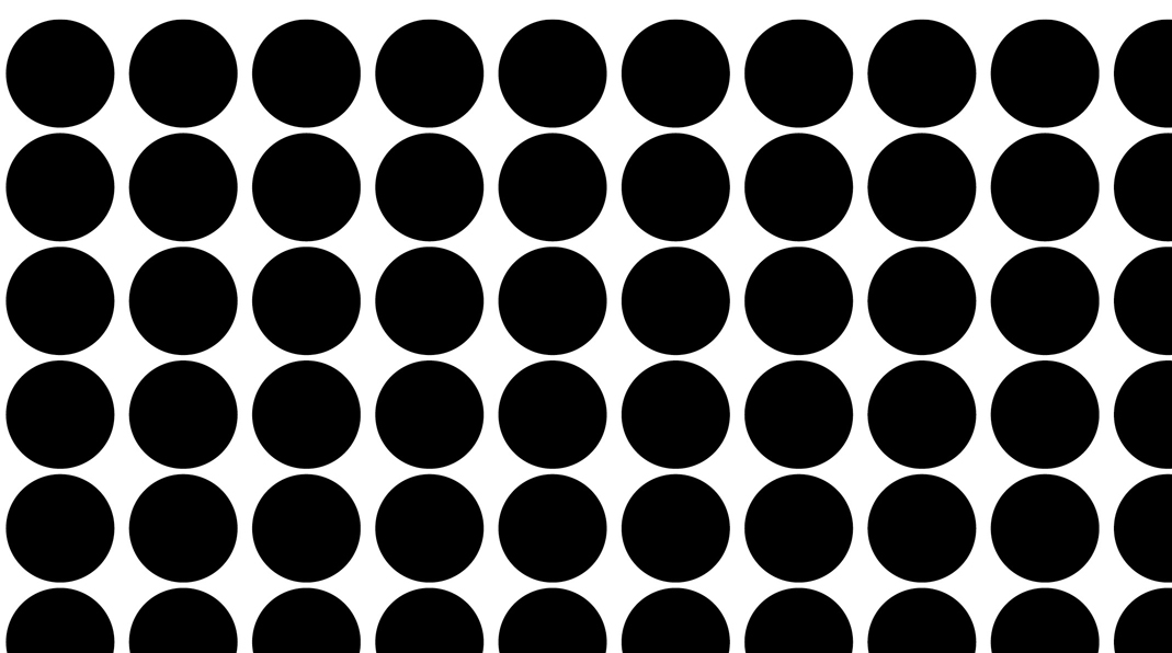
The Exercises in this chapter show you how to create and manipulate dots and make meaning with basic design elements. Remember the observation we made in the introduction: When you place a single black dot in a field of white, you can quickly judge which is the figure (or the positive space) and which is the ground (or the negative space). A group of same-shaped circles creates a repeated pattern of dots. You read this pattern as one giant shape that dominates the composition. The pattern of black dots that you create becomes the foreground, while the white space is understood as the background (FIGURE 1.1).

The division between the foreground and background, or the figure and ground, is a visual tool that can be used to manipulate a viewer’s perception. When it’s difficult to distinguish between the figure and the ground, a viewer may have trouble deciphering the message. Messages may imply unintended meanings due to an unexpected shift of the figure and ground. Gestalt psychology, which studies human perception, has provided artists and designers with a set of laws and properties that are incredibly useful for predicting how a viewer will interact with or perceive a visual work. Multistability is a Gestalt property that accounts for the shifting nature of figure and ground elements. Rubin’s vase, developed by psychologist Edgar Rubin in 1915, is a visual demonstration of this phenomenon (FIGURE 1.2), whereby viewers can possibly see two dominant images at once because they are able to mentally invert the relationship between the figure and ground.

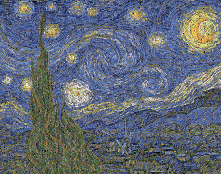
Once a pattern of dots is placed on a contrasting background, a new focal point can be made within the pattern by deleting a selection of dots. Those that are dismissed reveal the ground, which becomes dominant—if its shape is recognizable. Although the following exercises may seem abstract and elementary, you’ll begin to notice that these basic techniques are commonly in play in digital art and design. For instance, Leo Villareal’s light installations (see the introduction to this section) are visually translated as a series of repetitions of the activity: “create the dot pattern, then remove some dots.” Roe Seafood, a fish marketplace and restaurant in Long Beach, California, sports a simple logo featuring the letter “r” missing from a pattern of various sized dots (in orange, representing the hard roe you might see atop an order of sushi) set in a circular pattern (FIGURE 1.3). In Gyre II (2011), Chris Jordan re-creates Vincent van Gogh’s The Starry Night (1889) using 50,000 cigarette lighters, equal to the estimated number of pieces of floating plastic found in every square mile in the world’s oceans (FIGURE 1.4).

The exercises in this chapter will show you how to use the Ellipse tool in Adobe Illustrator to create a series of dots that form a pattern. Then you’ll experiment with removing dots to invert the figure/ground relationship. Before we begin, it’s important to understand how the software interprets your commands.
Paths and Vector Graphics
Adobe Illustrator is primarily a vector graphic application. When you draw a circle with the Ellipse tool, you’re instructing Illustrator to create an anchor point on each of the four “sides” of the circle: think of a circle as the face of a clock, with anchor points at the hours of 12, 3, 6, and 9. These anchor points hold mathematical coordinates that have a relationship to one another (FIGURE 1.5). When you scale the circle, you’re simply multiplying the coordinates by a common factor. Vector graphics are smooth, scalable, and plotted by anchor points.

Pixels and Bitmap Graphics
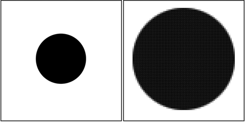
In contrast, Adobe Photoshop is primarily a bitmap application. When you draw a circle or even paint a dot with the Brush tool, you’re instructing Photoshop to create pixels. Each pixel contains one unit of color. If you zoom in close enough, you can actually see the pixels that make up a bitmap image (FIGURE 1.6). Pixels are finite. They can’t be scaled by a common factor, so file size and resolution are extremely important. (You’ll learn more about these topics in Chapter 5, Resolution and Value.)
 File Presets in Illustrator
Open Adobe Illustrator. Choose the Window menu > Workspace > Essentials Classic. You can set or reset the current workspace (that is, return it to its default arrangement) at any time by choosing Window > Workspace > Reset [whichever workspace is active]. You’ll want your workspace to look like mine so the screenshots reflect more closely what is in front of you so choose Window > Workspace > Reset Essentials Classic now.
Throughout this book, you’ll see a note regarding the workspace used at the start of the first exercise in each chapter.
Choose the File menu > New or press Command-N/Ctrl-N to create a new document.
In this book, we’ll list the macOS version of a keyboard shortcut first, followed by the equivalent shortcut in Windows.
The New Document dialog box offers a variety of document presets (or templates) in several formats grouped under tabs by category. You can change the format, depending on how you want to display the work. The categories include Mobile, Web, Print, Film & Video, and Art & Illustration. Additional preset document choices and output settings regarding file resolution, pixel area (width and height), color mode, and more will change for each of the environments suggested by those common tabs. Click the Print tab to make a file that will print sharply when you’re finished. Select the first template (Letter 612 x 792 pt) to create a letter-sized document (8.5 by 11 inches), and then click the Create button (FIGURE 1.8).

Figure 1.8 Choose a preset in the New Document dialog box. If you notice it, change the units of measurement from points to inches while you’re creating the new document. You can always change the units of measurement once you’re in the document, too.
The new document appears as a blank white page. In Illustrator, the page is called the artboard. Anything you place on the artboard—typography, graphics, or photographs—will print or be exported to a published file.
You can also keep media in the gray area to the left or right of the artboard. This comes in handy when there are design elements that you want to keep nearby but aren’t yet ready to place on the artboard.
It’s never too early to begin saving the file. Choose File > Save As and name the file chapter01.ai. Notice that “Adobe Illustrator (ai)” is the first option in the Format menu (in Windows, choose “Adobe Illustrator (*.AI)” from the Save As Type menu). For now, we’ll save in this format. Click Save, then click OK in the Illustrator Options dialog box that appears next.
 Shapes, Fills, and Strokes
The Ellipse tool is buried beneath the Rectangle tool on the Tools panel on the left side of the application window. Press and hold the mouse button on the Rectangle tool to display the tools grouped with it. Select the Ellipse tool from the group (FIGURE 1.9).

Figure 1.9 Load the Ellipse tool from the Tools panel. Notice that this tool “hides” or is grouped behind the Rectangle tool. Throughout this book, I use “mouse” to refer to the pointing device one uses to interact with a computer, but I recognize that today many people use other devices, such as trackpads or styluses.
Click from tool to tool and notice that whenever you choose a new tool, the Control panel displays options specific to that tool (FIGURE 1.10). The Ellipse tool is one of several shape tools. It is used to draw a shape. As you’ll see in the next step, shapes are made of a fill color and an outline, called a stroke. The Ellipse tool options include menus for fill and stroke colors, the weight of the stroke, and more.

Figure 1.10 Set the Stroke or other tool options in the Control panel at the top of the application window. Drag with the Ellipse tool on the artboard. As you drag away from the starting point (where you clicked), the ellipse grows. As you drag back toward where you initially clicked, the ellipse shrinks. Do this a few times to master the movement of drawing an ellipse on the artboard. After you’ve practiced making several ellipses, you’ll delete all of them. Choose the Selection tool—the first arrow in the Tools panel (FIGURE 1.11).

Figure 1.11 Five ellipses were drawn. The object remains selected when you let go of the mouse, until you take further action. Clicking anywhere outside of it on the artboard will deselect the shape. The Selection tool is used to choose objects for the purpose of copying, moving, rotating, scaling, deleting, applying effects, and so on. Click one of the ellipses to select it; then press the Delete/Backspace key on your keyboard. To select all the ellipses (so you can delete all of them at once), click anywhere outside one of the ellipses that’s outside the group (FIGURE 1.12) and drag the Selection tool over all the shapes (FIGURE 1.13). This is called marqueeing. When you’re finished, all the ellipses will be selected, made visible by a blue path around each shape and identifiable anchor points (FIGURE 1.14). If you didn’t quite pick up every shape, click anywhere on the artboard to deselect and marquee over all the shapes again. While they are selected, press the Delete/Backspace key to remove all the shapes.

Figures 1.12, 1.13, and 1.14 To marquee over a group of paths, first load the Selection tool. Drag from the empty artboard to make a box around all the items you intend to select. Release the mouse, and notice whether all elements are selected. If they’re not, click on an empty area of the artboard to deselect and try it again. Watch Out!
The default stroke and fill values are black and white, but if you’re working in a shared computer lab, you never know what those settings might include. If you made ellipses that have no assigned fill color, you’ll be able to select the shapes only by clicking directly on their contours (or outlines).
Select the Ellipse tool again. This time hold the Shift key while you draw a new shape to constrain its proportions. Instead of drawing an ellipse, draw a circle (FIGURE 1.15).
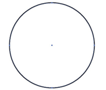
Figure 1.15 Draw a circle with the Ellipse tool by holding the Shift key while dragging the mouse. The Shift key will keep the proportions constrained—this key can be used with the Rectangle tool, for instance, to draw a square. Why use Shift? The Shift key is commonly used in Adobe applications to constrain the proportions of shapes and images, or to constrain mouse movements. You’ll often use the Shift key while using Illustrator shape tools and Photoshop marquee tools, among others. In keyboard shortcuts,
 is often used to represent the Shift key.
Click back on the Selection tool. With the circle selected, you can now change its properties. The circle is defined in Illustrator as a path. The path is governed by a set of anchor points. These anchor points define the path’s edge, which is the stroke surrounding the circumference of the circle. The area inside the shape is called the fill. The stroke and the fill each contain information such as transparency or opacity, hue, saturation and brightness, and weight (or the width of the stroke). With the circle selected, look at the bottom of the Tools panel, and you’ll see icons for the fill and stroke. In my document (FIGURE 1.16), the icon for stroke overlaps the fill icon.

Figure 1.16 The Fill and Stroke icons are near the bottom of the Tools panel. In this screen capture, the Stroke icon lies on top of the Fill icon. You can click the Fill icon directly to make it overlap the Stroke icon. You’ll find yourself toggling between various tools and the Selection tool as you work in Illustrator. This toggling is so common that you can use the Command key in macOS (or the Ctrl key in Windows) to activate the Selection tool from any of the Shape tools.
Click either the Fill or Stroke icon to move it to the front. Don’t click the curvy arrow above the two icons. (Doing this will swap the fill and stroke colors, which can be confusing when you’re learning to master this area of the Tools panel.) With the stroke in front and the circle still selected, click the button with a red slash to set the stroke to none, to turn off the outline (FIGURE 1.17).

Figure 1.17 Beneath the Fill and Stroke icons are three buttons directly related to fill and stroke. The first applies a color in a selected path’s fill or stroke (whichever is on top in the Tools panel), the second applies a gradient, and the third sets the fill or stroke value to none. This essentially renders the fill or stroke invisible. While the circle is still selected, click the Fill icon to bring it to the front. The Color panel will probably expand on the right side of the application window if it isn’t already showing. If you don’t see it, you can click the Color panel button (FIGURE 1.18) or choose Window > Color. Click the black color chip in the Color panel to fill the circle with black (FIGURE 1.19).

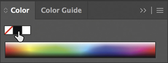
 Figure and Ground with Repeated Dots
There are various techniques for creating a pattern of black dots (or circles) on the artboard in Illustrator. For instance, you can copy, paste, and move a single dot repeatedly to create a line of dots and then copy that line and paste it repeatedly. Or, you can define a brush with the dot as a pattern and “paint” the line of dots. There are probably other methods as well. Your way of creating digital media will be different from anyone else’s, which is one of the reasons the applications are so robust and can be overwhelming to learn. In this exercise, you’ll copy, paste, and move a single dot, because it’s essential that you feel comfortable performing this action. Copy, paste, and move are three common commands; they are performed similarly in most Adobe applications and are accessed with the same key commands.
Choose the Selection tool, and click the circle to select or activate it—press the mouse button (or trackpad) and keep it pressed until instructed to let go. With the button held down, press and hold the Option/Alt key (with your non-mouse hand) while you drag the circle to another position on the artboard. Let go of the button, and then release the key. This is the swiftest way to make a copy of a path, just be sure to release the button before you release the Option/Alt key. Delete the new circle, as you’ll perform this activity again with an additional key. (See Step 4 in Exercise 2 for a refresher on selecting and deleting.)
Once again, press and hold the button down to begin the copy process for the circle. Then press and hold the Option/Alt key and press and hold the Shift key (that’s two keys with your non-mouse hand); finally, drag the circle to a new position on the artboard (FIGURE 1.20). You’ll notice that your movement is constrained to lines at 0°, 45°, or 90° relative to the page. Release the mouse before you release the keys.

Figure 1.20 Hold the Option/Alt key while dragging a path with the Selection tool to create a copy of it. If you also hold the Shift key while Option/Alt-dragging with the Selection tool, the copy will move in a limited set of directions. To make a straight line of dots, Shift-Option/Shift-Alt-drag the circle repeatedly across the top of the artboard (FIGURE 1.21). Don’t worry about the distance between the circles or at the margins. You’ll adjust the spacing in the next steps.

Figure 1.21 Multiple copies of the dot on the artboard. When you combine key commands with mouse actions, remember to release the mouse before you release the keys. For instance, when pressing the Shift key to constrict a mouse movement, you should always complete the task, release the mouse first, and then release the Shift key.
How many dots did you make? Depending on the size of your original circle, you may have any number of repeated dots (figures) on the white space (ground) of the page. Consider the page of dots as a set of rows and columns. Your goal is to create a grid of 10 columns (the number of horizontal dots) and 14 rows (the number of vertical dots). You’ll probably need to scale your dots in order to fit 10 across the top of the page. The work file documented here has six dots, if your file is like this one you’ll need to decrease the scale of the dots to fit four more on the page. Whether you need to increase or decrease the size of your dots, follow these same directions: Marquee all the circles with the Selection tool (Step 4 in Exercise 2). You’ll see a box with anchor points surrounding all the circles. Click one of the four anchors at the corner and hold down the Shift key while dragging toward the circles (to scale down) or away from the circles (to scale up) (FIGURE 1.22). You’ll have to judge visually how small the circles need to be to fit more or fewer of them on the page.
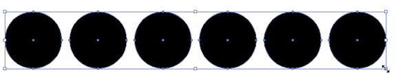
Figure 1.22 Scale all the dots at once by selecting all of them and then scaling the group using the Selection tool. Use the Selection tool to deselect the group of circles by clicking on an empty part of the artboard. Select the number of circles you need to reach a count of 10 by marqueeing that number of circles.
or
Click one circle and hold the Shift key while clicking each of the others (this is called Shift-clicking) to select multiple circles. Press the Option/Alt key and then the Shift key to begin dragging a copy (FIGURE 1.23) of the selected circles in a straight line. Move the circles to fill the space across the page in your first row (FIGURE 1.24).
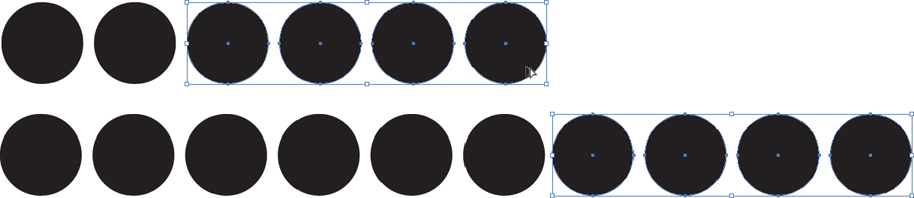
Figures 1.23 and 1.24 Copy enough dots to create a single, horizontal line across the composition.
 Grouping and Alignment
Press Command-A/Ctrl-A to select all the dots on the artboard.
Tool Tips
The Align and Distribute button icons can be difficult to read when you’re first learning Illustrator. Hover the cursor over each button to see the tool tip that displays its name. If tool tips are not enabled, check the Show Tool Tips box in General Preferences by choosing Illustrator > Preferences > General/Edit > Preferences > General (Command-K/Ctrl-K). This can be useful for any tools you don’t recognize.
The dots are probably aligned, because you used the Shift key while copying and moving them. If they’re not, click the Vertical Align Top button in the alignment area of the Control panel (FIGURE 1.25). Actually, because all the dots are the same size, you can use any of the vertical alignment buttons (Top, Center, or Bottom). If your circles are like those in Figure 1.25, no changes will take place on the artboard.

Figure 1.25 Align multiple paths (in this case, dots) by clicking the Vertical Align Top button in the Control panel. The distribution of the dots, that is, the spacing between each dot, is likely to be uneven. Choose Align To Selection from the Align To menu to align the dots as they relate to each other, rather than to the Artboard (FIGURE 1.26). While all the circles are still selected, click the Horizontal Distribute Center button in the Control panel to space them equally (FIGURE 1.27). (Use the tool tips to help you locate it.)
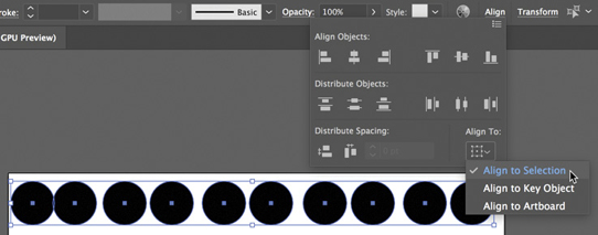
Figure 1.26 You can align elements on the artboard to the dimensions of the artboard, to a key object, or in relation to elements that have been selected. In these exercises, we will be aligning the selected dots as they relate to each other in the selection. 
Figure 1.27 Notice the differences in the negative space between the selected dots before and after clicking the Horizontal Distribute Center button. The negative space is not distributed evenly in the top image, which would be easily noticed in repeated rows. If your monitor is too narrow to display the complete Control panel, the Align and Distribute tools will not be visible. To use them, click Align on the Control panel to open the Align panel temporarily; that will give you access to the missing tools.
While the dots are selected, use the Left, Right, Up, and Down Arrow keys on your keypad to nudge the group of dots into a position on the page where the top, left, and right margins appear to be equally distant from the group of dots (FIGURE 1.28).
Select all again (Command-A/Ctrl-A), if all the dots aren’t already selected, and choose Object > Group (Command-G/Ctrl-G) to group the row of dots. Now the Selection tool will treat all the dots as one unit.

Figure 1.28 While all the dots are selected, use the arrow keys to nudge the group up, down, left, or right. Keep an eye on the margins of the page and aim to create equal negative space there. Hold Shift and Option/Alt-drag to copy the first row of dots to create a second row (FIGURE 1.29).

Figure 1.29 Use the Selection tool with the Option/Alt and Shift keys to create a copy of the first row of dots. Repeat Step 6 until you have 14 rows of dots on the artboard (FIGURE 1.30).

Figure 1.30 The artboard is full of rows of dots. Now a pattern of black dots has become the foreground of the compositional space. The background is white. You also might say that the black dots are the figure, and the white space is the ground. Do you need to adjust the alignment or distribution of your grouped rows? If the portion of the Control panel containing the alignment and distribution buttons doesn’t appear, choose Window > Align to open the Align panel. If you do need to redistribute the rows of dots, you’ll probably want to use the Vertical Distribute Center button.
Watch Out!
The Align panel will organize single paths or grouped elements. If your circles are in a group, you may see a different result upon clicking the same Align button when selected circles are not grouped. Be mindful of what exactly you’re aligning.
 A Figure and Ground or “On” and “Off” Study
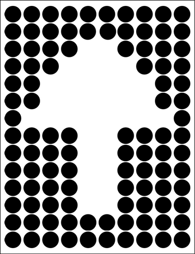
In this exercise, you’ll delete some of the dots to make a recognizable form appear in the sea of black dots. The white space (what was the ground) will become the figure as the black dots move to the background (ground). You’ll do this with the Selection tool, although in Chapter 3 you’ll learn how to use the Direct Selection tool to modify parts of paths or just some paths within groups.
Press Command-A/Ctrl-A to select all.
Choose Object > Ungroup (Shift-Command-G/Shift-Ctrl-G) to ungroup all the rows, freeing every dot on the page.
Use the Selection tool to select and delete one dot at a time as you create a white form within the pattern of black dots by “turning off” the dots. Try making a letterform, arrow, smiley face (FIGURE 1.31), or something else.

Figure 1.31 Various figure/ground studies can be created by deleting black dots from the patterned composition. When the white space begins to look like a familiar graphic icon, the figure and ground relationship reverse: The white space becomes the figure, while the black dots are newly understood as the ground.
 Lab Challenge
Express each letter in a word (using a typeface of your choice) with a repeated shape such as a circle, square, or image.