
Overview
In this chapter, you will discover how to modularize a Vue.js application using component hierarchies and nesting. This chapter introduces concepts such as props, events, prop validation, and slots. You will learn how to contrast them and identify which concept should be applied based on the situation. You will then practice implementing a component that encapsulates direct DOM manipulation using refs. You will also learn how to identify component composition scenarios where slots, named slots, and scoped slots can be used. You will then identify when to abstract functionality into filters.
By the end of this chapter, you will be able to define communication interfaces between components using props, events, and validators. You will be exposed to refs to wrap JavaScript libraries as Vue.js components and identify the pitfalls of the Vue.js context when using components.
Introduction
In the previous chapter, we learned how to initialize, build, and debug a simple Vue.js application. In this chapter, we will have a closer look at how to leverage component composition to enable code re-usability.
Reusable and extensible components are core to building products around a component library. A component library allows a team to build a project with high velocity and high consistency.
If a component library in Vue.js does not expose the right extension points, what often happens is that the component from the library is copied over into the application's code base. This leads to duplicated code and reduced cohesion from a design point of view.
In Chapter 3, Vue CLI, we learned how to create simple components in Vue. Components are Vue instances that can be instantiated and rendered multiple times. Since there can only be one root component, most components in an application are rendered by another component. For parent components to communicate with their children, we use props and prop passing.
Passing Props
Props in the context of Vue.js are fields, defined in a child component, that are accessible on that component's instance (this) and in the component's template.
The value of a prop depends on what the parent passes in its template to the child component at render time.
Defining a Simple Component That Takes Props
Let's look at a simple Hello single-file component. This can be found in a ./src/components/Hello.vue file (in a Vue CLI-generated project). Note how the who value is set in the props array and that it is interpolated as a value using {{ who }}. The props property of a Vue.js component can be an array of strings or an object literal.
When a value is defined in props, it is then accessible as an instance variable in the template section of the Vue.js component:
<template>
<div>
<h1>Hello {{ who }}</h1>
</div>
</template>
<script>
export default {
props: ['who']
}
</script>
We will now learn how to render a component using props.
Rendering a Component with Props
What follows is a demonstration of how to use the Hello component in our Vue.js application.
First, we need to import and then set it in the components property of the Vue.js component that wants to render this imported component.
Then, in the template section, we need to render <Hello> with the who attribute set to "Vue.js", as follows:
<template>
<div id="app">
<Hello who="Vue.js"/>
</div>
</template>
<script>
import Hello from './components/Hello.vue'
export default {
components: {
Hello
}
}
</script>
This will render the following on the page:
Hello Vue.js
We have now seen how to use a component and pass it with props in a Vue.js application. This is useful for code reuse and for abstracting application behavior into component-sized chunks.
Next, we will learn how to work with registered components.
Component Registration Tricks
There are a few things to note with regard to the components property.
Registered components are available both as CamelCaseName and as kebab-case-name, so if we changed the template section shown in the previous example to use <hello /> instead of <Hello />, it would work without any issues:
<template>
<div id="app">
<hello who="Vue.js"/>
</div>
</template>
The updated template renders the same in the browser, as shown in the following output:
Hello Vue.js
The components property tends to leverage ES6 shorthand property syntax. Shorthand property syntax means that instead of writing { Hello: Hello }, we can write { Hello }. We can see it in action in the following example, which registers the Hello component:
import Hello from './components/Hello.vue'
export default {
components: {
Hello
}
}
Vue's components declaration is not aware of the component name. It uses the key in the components object to register it against both the camelCase and kebab-case names:
<template>
<div id="app">
<Hey who="Vue.js"/>
</div>
</template>
<script>
import Hello from './components/Hello.vue'
export default {
components: {
Hey: Hello
}
}
</script>
The preceding code will generate the following output:
Hello Vue.js
We have now learned how to register components in Vue.js using the components property and ES6 shorthand object property syntax.
Next, we will look at a practical example of a Greeting component.
Exercise 4.01: Implementing a Greeting Component
Using our knowledge of how props can be passed from a parent component to a child component, we will create a component that lets you customize both the greeting (for example, Hello, Hey, or Hola) and who is addressed (for example, World, Vue.js, or JavaScript developers).
To access the code files for this exercise, refer to https://packt.live/35jGd7B.
Follow these steps to complete this exercise:
- Create a new file named Greeting.vue in the ./src/components directory. This will be our single-file component.
- Start by scaffolding the component with empty template and script tags:
<template>
<div>Empty</div>
</template>
<script>
export default {}
</script>
- Next, we need to tell Vue.js that our component expects props. For this, we will add a props property to our component definition (the object that's set to export default in the script section) and add a greeting and who prop to it:
export default {
props: ['greeting', 'who']
}
- Now, we want to render greeting and who. As we have seen, when values are defined in props, they are available at the top level of template:
<template>
<div>{{ greeting }} {{ who }}</div>
</template>
We can now render the Greeting component from App.vue.
- Open the src/App.vue file and import the Greeting component from ./src/components/Greeting.vue into the script section:
<script>
import Greeting from './components/Greeting.vue'
</script>
- Next, register the Greeting component in components:
<script>
export default {
components: {
Greeting
}
}
</script>
- Now that the component has been registered, we can render it in template:
<template>
<div id="app">
<Greeting greeting="Hey" who="JavaScript"/>
</div>
</template>
You will see the following in your browser (make sure you have run npm install and npm run serve in the Exercise4.01 directory):
Hey JavaScript
- Modify the greeting and who prop using the attribute values in template:
<template>
<div id="app">
<Greeting greeting="Hi" who="Everyone"/>
</div>
</template>
Upon running the preceding code, you should see an output similar to the following in your browser (make sure you have run npm install, followed by npm run serve, in the Exercise4.01 directory):
Note
Yarn includes an equivalent of npm run command under yarn. For example, instead of npm install and npm run serve, we could use yarn install and yarn serve commands respectively.
Hi Everyone
In this exercise, we have learned how props and prop passing can be used to increase reuse scenarios of a component by generalizing it. Instead of the component rendering static data, its parent passes it the data to render.
In the next section, we will learn how to set prop values dynamically.
Dynamic Props with Data Binding
The examples we have seen up to now have used hard-coded attribute values as props. But what if we want to pass parent instance data from the parent to child?
This is where binding comes in. The prop/attribute binding syntax in Vue.js is v-bind:, but you can use : for shorthand; they are equivalent.
The who prop of Greeting is bound to the appWho app component's instance property:
<template>
<div id="app">
<Hello v-bind:who="appWho"/>
</div>
</template>
<script>
import Hello from './components/Hello.vue'
export default {
components: {
Hello
},
data() {
return {
appWho: 'Vue.js'
}
}
}
</script>
In shorthand, template would look as follows:
<template>
<div id="app">
<Hello :who="appWho"/>
</div>
</template>
Both versions will output the following view to the browser:
Hello Vue.js
Note
v-bind:prop-name and :prop-name have a striking similarity since the delimiter between v-bind and prop-name is : (a semicolon). In Vue.js single-file components, since templates are compiled at build time, they are functionally equivalent.
An example to showcase that the values have been synced (propagated) from the parent component (App) to the child (Hello) is as follows, with two buttons that change the audience of the Hello message.
The buttons call a component method called setWho with JavaScript or Everyone, depending on the button. This setWho function updates the appWho instance property:
<template>
<div id="app">
<Hello :who="appWho"/>
<button @click="setWho('JavaScript')">JavaScript</button>
<button @click="setWho('Everyone')">Everyone</button>
</div>
</template>
<script>
import Hello from './components/Hello.vue'
export default {
components: {
Hello
},
data() {
return {
appWho: 'Vue.js'
}
},
methods: {
setWho(newWho) {
this.appWho = newWho
}
}
}
</script>
The initial output to the browser displays Hello Vue.js, as shown in the following screenshot:

Figure 4.1: Initial Hello Vue.js output in the browser
When clicking the JavaScript button, the appWho variable updates, as does the bound Hello component's who prop. Thus, Hello JavaScript is displayed, as follows:

Figure 4.2: Hello JavaScript after clicking the JavaScript button
When clicking the Everyone button, the appWho variable updates, as does the bound Hello component's who prop. Thus, Hello Everyone is displayed, as follows:

Figure 4.3: Hello Everyone after clicking the Everyone button
We have now seen how to bind props to values so that they are kept in sync.
The majority of Vue.js applications leverage components beyond modularizing the rendered components (as we did with the Greeting and Hello components).
As we have seen, we are able to bind props so that any update that's made to a value in the parent will cause an update in the child component.
Exercise 4.02: Passing Props That Change Over Time
To know which greeting to use, we will implement a greeter app that has multiple greetings and cycles through them.
To access the code files for this exercise, refer to https://packt.live/3kovKfo.
Follow these steps to complete this exercise:
- Create a ./src/components/Greeting.vue component and initialize it with our previously implemented Greeting component. This is how we'll display the greetings:
<template>
<div>{{ greeting }} {{ who }}</div>
</template>
<script>
export default {
props: ['greeting', 'who']
}
</script>
- In the ./src/App.vue component, import ./src/components/Greeting.vue as a Greeting and register it as a component so that you can render it:
<script>
import Greeting from './components/Greeting.vue'
export default {
components: {
Greeting
}
}
</script>
- In the script section, create a data top-level method that returns an initial greeting and who:
export default {
data() {
return {
greeting: 'Hello',
who: 'Vue.js'
}
}
}
- Render the current greeting and who using the Greeting component:
<template>
<div id="app">
<Greeting :greeting="greeting" :who="who"/>
</div>
</template>
Your browser will display a message, as follows (make sure you have run npm install and npm run serve in the Exercise4.02 directory):
Note
The following code requires that you have knowledge of computed properties, which we covered in Chapter 2, Working with Data. Please go back to that chapter now if you need a refresher.
- We will now add some greeting/who pairings as an array to the script section:
<script>
// imports
const possibleGreetings = [
{ greeting: 'Hello', who: 'Vue.js' },
{ greeting: 'Hey', who: 'Everyone' },
{ greeting: 'Hi', who: 'JavaScript' }
]
// components export
</script>
- Let's refactor the data method so that it only stores the default index and creates computed properties that look up the index to generate a greeting and who based on the current index (with an intermediary currentGreeting computed property):
<script>
// imports and greetings
export default {
// components definition
data() {
return {
currentIndex: 0
}
},
computed: {
currentGreeting() {
return possibleGreetings[this.currentIndex]
},
greeting() {
return this.currentGreeting.greeting
},
who() {
return this.currentGreeting.who
}
}
}
</script>
At this point, the application should still display the same greeting in the browser, as shown in the following output:
Hello Vue.js
Note
As computed properties clean the code up, we did not need to update our template. Instead, we have replaced the greeting and who instance properties with computed properties of the same name.
- Let's add a way to cycle through these greetings. This will involve a button that, upon being clicked, will call a newGreeting function in our template:
<template>
<div id="app">
<Greeting :greeting="greeting" :who="who"/>
<button @click="newGreeting()">New Greeting</button>
</div>
</template>
- Next, we need to implement newGreeting in script. newGreeting should move to the next greeting (by incrementing currentIndex). Alternatively, if we have already reached the end of the possibleGreetings array, it should reset currentIndex:
<script>
// imports and greetings
export default {
// other component properties
methods: {
newGreeting() {
this.currentIndex = this.currentIndex === possibleGreetings.length – 1
? 0
: this.currentIndex + 1
}
}
}
</script>
On initial load and after 3n clicks of the New Greeting button, the application displays Hello Vue.js, as shown in the following screenshot:

Figure 4.4: Hello Vue.js after 3n button clicks
After the first click and after 3n + 1 clicks of the New Greeting button, the application displays Hey Everyone, as follows:

Figure 4.5: Hey Everyone after 3n + 1 button clicks
After the second click and after 3n + 2 clicks of the New Greeting button, the application displays Hi JavaScript, as follows:

Figure 4.6: Hi JavaScript after 3n + 2 button clicks
Note
This code can be improved further; for example, possibleGreetings.length - 1 is constant since we never add or remove greetings. Instead of computing on every newGreeting call, we could compute it once, outside of the newGreeting method. Reading the length of an array and simple arithmetic (-1) is not too costly but this is a good refresher on thinking in terms of mutable versus constant values.
With that, we have seen how props and prop binding can be used to communicate about changing data from parent components to child components they render. To scale a code base or share code widely, it is helpful to give hints to the consumer of the code when they are using it incorrectly.
Next, we will learn how to add type hints to our component's props to ensure they are used correctly.
Prop Typing and Validation
Props define the interface of Vue.js components. As JavaScript is a dynamically typed language, Vue.js provides a tool we can use to validate the shape and types of props.
To validate prop types, the props component property in its object literal form should be used (as opposed to the simpler array form).
Primitive Prop Validation
Say we want a Repeat.vue component that takes a times prop, as well as a content prop. We can define the following:
<template>
<div>
<span v-for="r in repetitions" :key="r">
{{ content }}
</span>
</div>
</template>
<script>
export default {
props: ['times', 'content'],
computed: {
repetitions() {
return Array.from({ length: this.times });
}
}
}
</script>
Our Repeat component would be consumed as follows:
<template>
<div id="app">
<Repeat :times="count" content="Repeat." />
<button @click="increment()">Repeat</button>
</div>
</template>
<script>
import Repeat from './components/Repeat.vue'
export default {
components: {
Repeat
},
data() {
return { count: 1 }
},
methods: {
increment() {
this.count += 1
}
}
}
</script>
The preceding code will lead to the following output in the browser:

Figure 4.7: Output of the repeat example in action (no clicks)
After clicking the Repeat button a few times, the Repeat component will repeat an additional time for every click generating an output, as follows:

Figure 4.8: Output of the repeat example after five clicks
For this component to work properly, we need times to be a Number, and ideally content to be a String.
Note
Now is a good time to remind students of the JavaScript primitive types: String, Number, Boolean, Array, Object, Date, Function, and Symbol.
Vue.js supports all the JavaScript primitive type constructors as type hints in the props field.
In this instance, we are defining the times prop as a Number and the content props as a String:
<script>
export default {
props: {
times: {
type: Number
},
content: {
type: String
}
},
// rest of component definition
}
</script>
To consume this component, we can update the script section as follows:
<script>
import Repeat from './components/RepeatTyped.vue'
// no other changes
</script>
The component still behaves the same in the happy path case, where the props being passed for times and content are a Number and a String, respectively.
If we update App so that it wilfully passes props of the wrong type. In this case, times is a String and content is a Number.
<template>
<div id="app">
<Repeat :times="count" :content="55" />
</div>
</template>
<script>
// no changes to imports
export default {
data() {
return { count: 'no-number-here' }
},
// other properties
}
</script>
Here, the Repeat component will fail to render, and the following errors will be logged to the console:
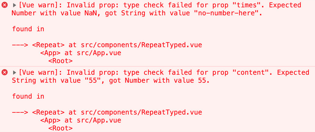
Figure 4.9: Mistyping Vue.js prop errors
The times prop check fails with a message that explains that we passed a String as a prop that was supposed to be a Number:
Invalid prop: type check failed for prop "times". Expected Number with value NaN, got String with value "no-number-here"
The content prop check fails with a message that explains that we passed a Number as a prop that was supposed to be a String:
Invalid prop: type check failed for prop "content". Expected String with value "55", got Number with value 55
Note
As per the Vue.js documentation, null and undefined values will pass any type validation, which means that the type validations are not foolproof and that it can make sense to add custom validation to a component.
Union and Custom Prop Types
In the previous example, we were just rendering the content, so it didn't matter what type it was.
Vue.js supports union types. A union type is a type that can be one of many other types. For example, String or Number is a union type.
Union types in Vue.js are represented using an array for the prop's type property, for example, to support numbers and strings as content:
<script>
export default {
props: {
// other prop definitions
content: {
type: [String, Number]
}
}
// rest of component definition
}
</script>
In this case, we can consume the RepeatTyped component as follows without errors:
<template>
<div id="app">
<Repeat :times="3" :content="55" />
</div>
</template>
This displays 55 three times. Here, 55 was passed as a Number, which our component now supports. This can be seen in the following output:
55 55 55
Any valid constructor can be used as the prop type. For example, Promise or a custom User constructor can be used. In the following example, we are defining a TodoList component prop interface:
<script>
import User from './user.js'
export default {
props: {
todoListPromise: {
type: Promise
},
currentUser: {
type: User
}
}
}
</script>
The prop interface that's exposed by this component can be used as follows:
<template>
<div>
<template v-if="todosPromise && !error">
<TodoList
:todoListPromise="todosPromise"
:currentUser="currentUser"
/>
</template>
{{ error }}
</div>
</template>
<script>
import TodoList from './components/TodoList.vue'
import User from './components/user.js'
const currentUser = new User()
export default {
components: {
TodoList
},
mounted() {
this.todosPromise = fetch('/api/todos').then(res => {
if (res.ok) {
return res.json()
}
throw new Error('Could not fetch todos')
}).catch(error => {
this.error = error
})
},
data() {
return { currentUser, error: null }
}
}
</script>
We have now seen how to use the union and custom types to validate Vue.js props.
Note
Vue.js uses instanceof internally, so make sure any custom types are instantiated using the relevant constructor.
Passing null or undefined will fail the instanceof check for Array and Object.
Passing an array will pass the instanceof check for Object since, in JavaScript, Array instances are also Object instances.
Custom Validation of Arrays, Object Shapes, and More with Validators
Vue.js allows custom validators to be used as props using the validator property. This allows us to implement deep checks regarding object and array shape as custom logic for primitive types.
To illustrate this, let's look at a CustomSelect component. On a basic level, the prop interface for a select comprises an array of options and a selected option. Each option should have a label that represents what is displayed in the select and a value that corresponds to the value passed to an API. For example, the selected option can be empty or should correspond to the value field for one of our options.
Our CustomSelect can be implemented as follows in a naive way (no validation of the inputs):
<template>
<select>
<option
:selected="selected === o.value"
v-for="o in options"
:key="o.value"
>
{{ o.label }}
</option>
</select>
</template>
<script>
export default {
props: {
selected: {
type: String
},
options: {
type: Array
}
}
}
</script>
CustomSelect can then be used to display a list of British Crisp flavors (in src/App.vue):
<template>
<div id="app">
<CustomSelect :selected="selected" :options="options" />
</div>
</template>
<script>
import CustomSelect from './components/CustomSelect.vue'
export default {
components: {
CustomSelect
},
data() {
return {
selected: 'salt-vinegar',
options: [
{
value: 'ready-salted',
label: 'Ready Salted'
},
{
value: 'cheese-onion',
label: 'Cheese & Onion'
},
{
value: 'salt-vinegar',
label: 'Salt & Vinegar'
},
]
}
}
}
</script>
The preceding application outputs a select where Salt & Vinegar is the default selected option, as shown in the following screenshot:
Figure 4.10: Collapsed CustomSelect with Salt & Vinegar selected
The following screenshot displays three flavor options, out of which one is selected:

Figure 4.11: Open CustomSelect with flavor options and Salt & Vinegar selected
To further validate our business logic around what shape options are, we can implement the following prop validator:
<script>
export default {
// other component properties
props: {
// other prop definitions
options: {
type: Array,
validator(options) {
return options.every(o => Boolean(o.value && o.label))
}
}
}
}
</script>
If we pass an option with a missing value or label, we will get the following message in the console:
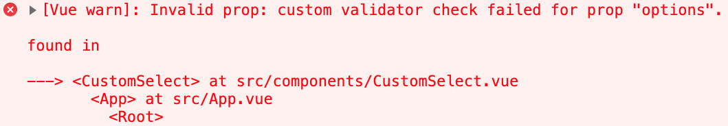
Figure 4.12: Vue.js warning when a custom validator fails
With that, we have learned how to use a custom Vue.js validator to do in-depth checks of complex props. Next, we will learn how the required prop type property works.
Required Props
To mark a Vue.js prop as required, we can use the required prop type property.
In the CustomSelect example, we can make selected a required prop.
To do this, we need to amend the prop definition so that it includes required: true, as follows:
<script>
export default {
// other component properties
props: {
selected: {
type: String,
required: true
}
// other prop definitions
}
}
</script>
Now, if we amend the consumer of CustomSelect so that it does not pass a selected prop, we will see the following error:
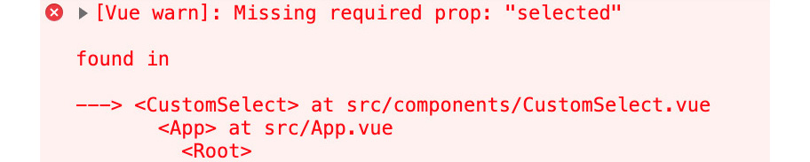
Figure 4.13: Vue.js warning when the selected required prop is missing
With that, we have learned how to mark Vue.js props as required and what happens when a required prop is not passed. Next, we will learn how defaulting a prop can be the best choice.
Defaulting Props
There are situations where defaulting a prop is the best interface for a component.
An example of this is a PaginatedList component that takes a list and displays a subset of this list based on the limit and offset parameters. In this scenario, instead of making limit and offset, it might be better to default limit to something such as 25 and offset to 0 (by default, we show the first page, which contains 25 results).
This is how we would implement such a PaginatedList component without defaults:
<template>
<ul>
<li
v-for="el in currentWindow"
:key="el.id"
>
{{ el.content }}
</li>
</ul>
</template>
<script>
export default {
props: {
items: {
type: Array
},
limit: {
type: Number
},
offset: {
type: Number
}
},
computed: {
currentWindow() {
return this.items.slice(this.offset, this.limit)
}
}
}
</script>
We can consume this using the following code:
<template>
<div id="app">
<PaginatedList :items="snacks" :offset="offset" : limit="limit"/>
<button @click="offset++">
Increment Offset (current: {{ offset }})
</button>
<button @click="limit++">
Increment Limit (current: {{ limit }})
</button>
</div>
</template>
<script>
import PaginatedList from './components/PaginatedList.vue'
export default {
components: {
PaginatedList
},
data() {
return {
offset: 0,
limit: 0,
snacks: [
{
id: 'ready-salted',
content: 'Ready Salted'
},
{
id: 'cheese-onion',
content: 'Cheese & Onion'
},
{
id: 'salt-vinegar',
content: 'Salt & Vinegar'
},
]
}
}
}
</script>
By incrementing the limit to 3, we can display the whole list, as follows:
Hello Vue.js
Then, by incrementing the offset, we can skip the first X elements in the list. The following screenshot shows PaginatedList:
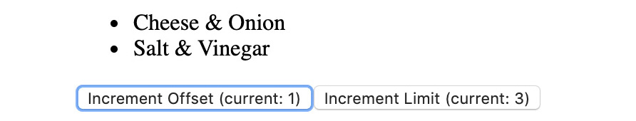
Figure 4.14: PaginatedList with limit 3 and offset 1
Now, to make our PaginatedList is resilient, we will default limit to 25 and offset to 0. To do so, we can set the default property for the relevant props:
<script>
export default {
props: {
// other props
limit: {
type: Number,
default: 25,
},
offset: {
type: Number,
default: 0,
}
},
// other component properties
}
</script>
With these defaults, we will show 25 items from the start of the list by default.
There is a gotcha with default in the case of arrays and objects (for example, if we wanted to default items), as per the Vue.js documentation; that is, "Object or array defaults must be returned from a factory function".
factory function is a function—in this case, called default—that returns the default value we want.
In the case of items, we can write the following:
<script>
export default {
props: {
items: {
type: Array,
default() {
return []
}
}
// other props
},
// other component properties
}
</script>
With that, we have learned how to default Vue.js component props. This can be helpful when we wish to provide values for optional parameters so that the Vue.js component implementation does not need to handle defaulting prop values.
Exercise 4.03: Validating an Object Property
In this exercise, we will rewrite the Repeat component so that it supports a single config prop for passing times, which is a Number, and content, which is a String.
We will have to write a custom validator to make sure times and content exist and are of the correct type.
To access the code files for this exercise, refer to https://packt.live/2Ui1hVU.
Follow these steps to complete this exercise:
- We will want our src/components/Repeat.vue component to support a config prop. This will be an Object that yields the following <script>:
<script>
export default {
props: {
config: {
type: Object
}
}
}
</script>
- Next, we want something to render when config is passed. To do this, we will create an array to v-for over a computer property. The array length will be based on the value of config.times:
<script>
export default {
// other component properties
computed: {
repetitions() {
return Array.from({ length: this.config.times })
}
}
}
</script>
- The next step is to set up <template> so that it renders config.content for each of the repetitions items:
<template>
<div>
<span v-for="r in repetitions" :key="r">
{{ config.content }}
</span>
</div>
</template>
- Currently, we are ensuring that content and times have been set and are of the correct type. To do so, we will implement typeof checks in the config prop's validator:
<script>
export default {
props: {
config: {
type: Object,
validator(value) {
return typeof value.times === 'number' &&
typeof value.content === 'string'
}
}
},
// other component properties
}
</script>
- Finally, we can consume Repeat from src/App.vue. We need to import it, register it (in script), and render it in template:
<template>
<div id="app">
<Repeat :config="{}" />
</div>
</template>
<script>
import Repeat from './components/Repeat.vue'
export default {
components: {
Repeat
}
}
</script>
This will unfortunately not render anything since config is an empty object. You will observe a warning, as follows:
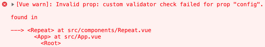
Figure 4.15: Vue.js warning due to the config prop's custom validator check failing
We will see this same error in the following cases:
a) We only add a times property; that is, <Repeat :config="{ times: 3 }" />.
b) We only add a content property; that is, <Repeat :config="{ content: 'Repeat me.' }" />.
c) times is of the wrong type; that is, <Repeat :config="{ times: '3', content: 'Repeat me.' }" />.
d) content is of the wrong type property; that is, <Repeat :config="{ times: 3, content: 42 }" />.
- For Repeat to work correctly, we can amend the line consuming it in template to the following:
<Repeat :config="{ times: 3, content: 'Repeat me.' }" />
This shows no errors in the console and renders Repeat me. three times, as follows:
Repeat me. Repeat me. Repeat me.
With that, we've shown how we might go about validating props to better define the interface of a Vue.js component.
What follows is a deep dive into slots, a mechanism we can use to compose our components by deferring template logic.
Slots, Named Slots, and Scoped Slots
Another component composition pattern that enables reusability in Vue.js is slots.
Slots are sections of a component where the template/rendering is delegated back to the consumer of the component.
Here, props can be thought of as data that is passed from a parent to a child for said child to run some logic or to render it.
Slots can be thought of as templates or markup that's passed from a parent to a child for said child to render.
Passing Markup to Be Rendered in a Child Component
The simplest type of slot is the default child slot.
We can define a Box component with a slot as follows. Note that this Box component does very little:
<template>
<div>
<slot />
</div>
</template>
The following markup is for the parent component (src/App.vue):
<template>
<div>
<Box>
<h3>This whole h3 is rendered in the slot</h3>
</Box>
</div>
</template>
<script>
import Box from './components/Box.vue'
export default {
components: {
Box
}
}
</script>
The preceding code will look as follows in the browser:
This whole h3 is rendered in the slot
The template section in the Vue Single File Component for the scope is compiled with the parent component's scope.
Consider the following example:
<template>
<div>
<Box>
<h3>This whole h3 is rendered in the slot with parent count {{ count }}</h3>
</Box>
<button @click="count++">Increment</button>
</div>
</template>
<script>
import Box from './components/Box.vue'
export default {
components: {
Box
},
data() {
return { count: 0 }
}
}
</script>
The preceding code will render count as per its value in the parent component. It does not have access to the Box instance data or props and will generate the following output:
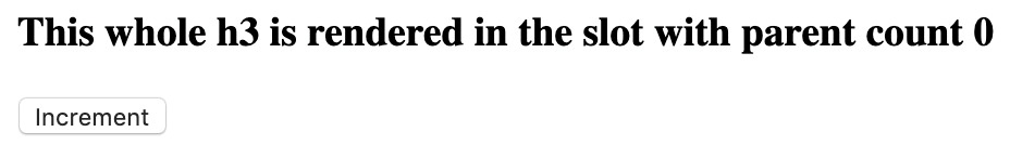
Figure 4.16: Initial h3 with a count of 0, as per the initial data in the parent component
Incrementing the count does indeed update the template, as we would expect if the variable in the template was bound to data on the parent. This will generate the following output:
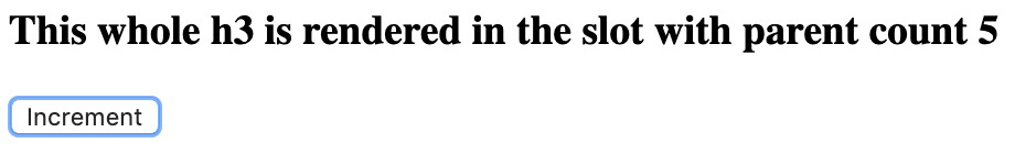
Figure 4.17: h3 with a count of 5 after five increments of the count in the parent component's scope
Slots are a way to delegate rendering a section of a child component to the parent component. Any references to instance properties, data, or methods will use the parent component instance. This type of slot does not have access to the child component's properties, props, or data.
In the next section, we will look at how to use named slots to render multiple sections.
Using Named Slots to Delegate Rendering of Multiple Sections
Named slots are used when the child component needs to be able to delegate the template of multiple sections to the parent.
For example, an Article component might delegate rendering of header and excerpt to its parent.
In this case, this would look as follows in the Article.vue file. Named slots are slot entries with name attributes that denote the slot's name:
<template>
<article>
<div>Title: <slot name="title" /></div>
<div>Excerpt: <slot name="excerpt" /></div>
</article>
</template>
By doing this, you can consume this component in another component.
For passing the slot's contents, we use the v-slot:name directive (where name should be replaced with the slot's name).
For example, for the slot named title, we will use v-slot:title, while for the excerpt slot, we will use v-slot:excerpt:
<template>
<div>
<Article>
<template v-slot:title>
<h3>My Article Title</h3>
</template>
<template v-slot:excerpt>
<p>First paragraph of content</p>
<p>Second paragraph of content</p>
</template>
</Article>
</div>
</template>
<script>
import Article from './components/Article.vue'
export default {
components: {
Article
}
}
</script>
When the preceding application is seen in the browser, it will look as follows:

Figure 4.18: Article using named slots rendering templates defined by the parent
As you can see, the named slots do indeed render the expected content.
The shorthand syntax for v-slot:slot-name is #slot-name. We could refactor our template that consumes Article as follows:
<template>
<div>
<Article>
<template #title>
<h3>My Article Title</h3>
</template>
<template #excerpt>
<p>First paragraph of content</p>
<p>Second paragraph of content</p>
</template>
</Article>
</div>
</template>
v-slot cannot be used with native elements. It can only use template and components. For example, the following <template> section attempts to set a v-slot on a h3 element:
<template>
<div>
<Article>
<h3 v-slot:title>My Article Title</h3>
</Article>
</div>
</template>
This template will fail with a compilation error of v-slot can only be used on components or <template>, as shown in the following screenshot:
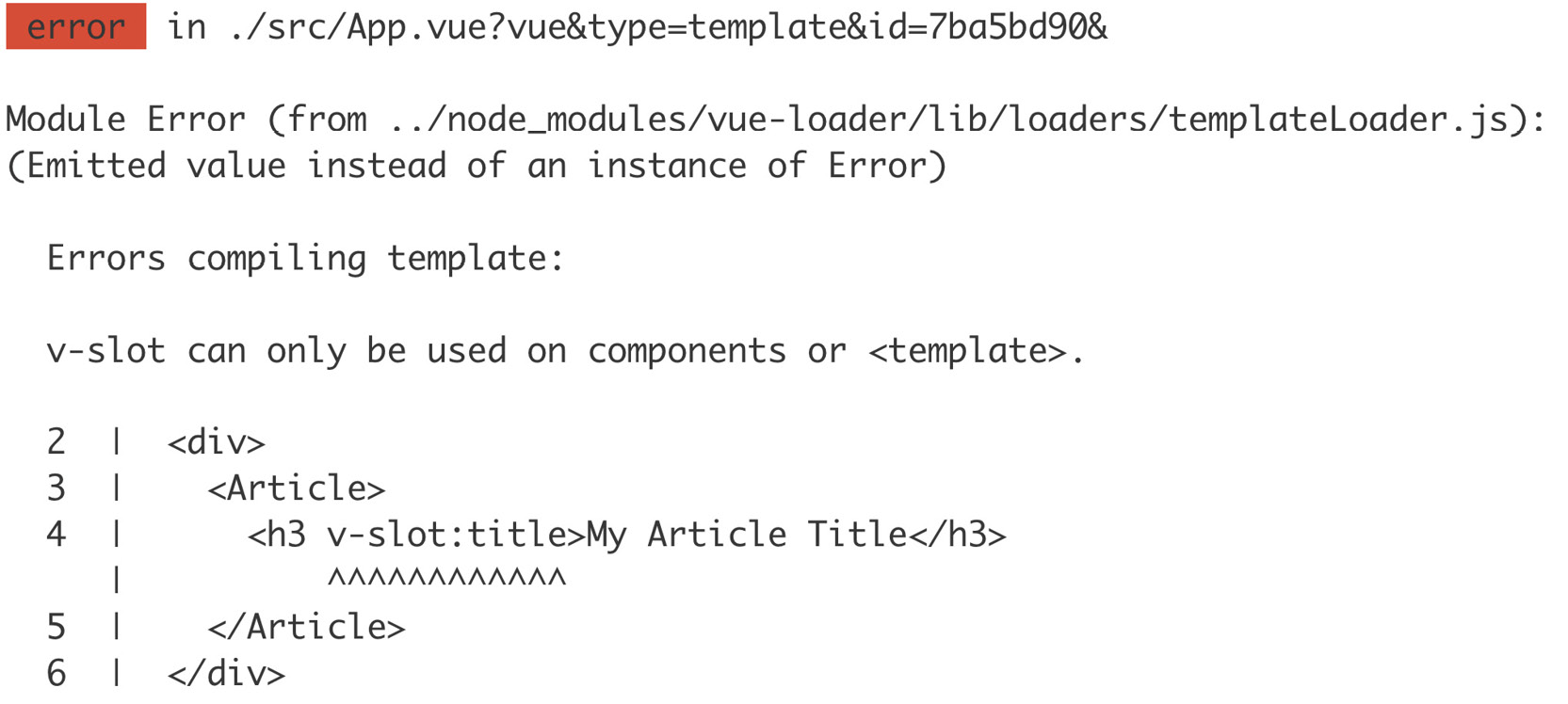
Figure 4.19: v-slot on a native element – compilation error
Earlier versions of Vue.js allowed an alternative syntax to be used for denoting named slot contents (this was deprecated in Vue 2.6.0+). Instead of the v-slot:slot-name directive style, slot="slot-name" was used. The slot syntax was allowed on native elements, as well as on templates and components.
Note
Everything that applies to the default slot applies to named slots. In fact, the default slot is a named slot called default. This means that named slots also have access to the parent instance but not the child instance.
The default slot is just a slot named default and gets special treatment by Vue.js as it is used by default in a slot with no name.
The default slot is implicitly inferred as follows:
<template>
<MyComponent>
<template>Default template</template>
</MyComponent>
</template>
The default slot can be denoted with shorthand slot notation.
<template>
<MyComponent>
<template #default>Default template</template>
</MyComponent>
</template>
The default slot can be denoted with longhand slot notation.
<template>
<MyComponent>
<template v-slot:default>Default template</template>
</MyComponent>
</template>
We have now seen how named slots allow components to delegate templating of certain sections to a consumer, as well as how these named slots can have a default template to cater for cases where a named slot is optional.
In the next section, we will learn how scoped slots are used to wrap prop passing logic.
Using Scoped Slots to Wrap Prop Passing Logic
The types of slots we have explored so far only have access to the component instance in which they are declared.
Sometimes, it is useful to let the parent component dictate the rendering while letting the child component transform the data in some way. This is what scoped slots are used for.
A scoped slot starts with the child component's slots, where the slot element has some attributes bound to it via the use of v-bind or the shorthand, :.
In this case, item is bound to el. el is an element of the items prop that has been passed to this PaginatedList component:
<template>
<ul>
<li
v-for="el in currentWindow"
:key="el.id"
>
<slot :item="el" />
</li>
</ul>
</template>
<script>
export default {
props: ['items', 'limit', 'offset'],
computed: {
currentWindow() {
return this.items.slice(this.offset, this.limit)
}
}
}
</script>
On the consumer side (the parent component), we can think of the slot template as being called with an object containing all the data bound to the slot in the child component. Hence, these slots are referred to as scoped; they are passed through a scope object, as defined by the child component.
In this case, we can consume PaginatedList as follows:
<template>
<div>
<PaginatedList :items="snacks">
<template #default="{ item }">
{{ item.content }}
</template>
</PaginatedList>
</div>
</template>
#default="{ item }" is the shorthand notation for the default scoped slot and allows us to destructure the slot's scope into item.
The longhand version of the slot's template definition is as follows:
<template v-slot="slotProps">
{{ slotProps.item.content }}
</template>
item is then used to render {{ item.content }}. The script section (with snacks to render) will be as follows:
<script>
import PaginatedList from './components/PaginatedList.vue'
export default {
components: {
PaginatedList
},
data() {
return {
snacks: [
{
id: 'ready-salted',
content: 'Ready Salted'
},
{
id: 'cheese-onion',
content: 'Cheese & Onion'
},
{
id: 'salt-vinegar',
content: 'Salt & Vinegar'
},
]
}
}
}
</script>
We get the following output in the browser:

Figure 4.20: Snacks displayed using a scoped slot, meaning the rendering logic is in the parent component
With that, we have learned how scoped slots give components increased flexibility to delegate templating logic to consumers.
Note
Scoped slots also have a deprecated (as of Vue.js 2.6.0+) slot-scope syntax. The deprecated equivalent of v-slot:name="slotProps" would be slot="name" slot-scope="slotProps". For more information, see the Vue.js documentation: https://vuejs.org/v2/guide/components-slots.html#Scoped-Slots-with-the-slot-scope-Attribute.
Now, let's learn how to implement a card component with the help of these named slots.
Exercise 4.04: Implementing a Card Component Using Named Slots
In this exercise, we will implement a card component using named slots. The card will have a title, image, and description sections. We will use slots to allow title, image, and description to be defined by a parent component.
To access the code files for this exercise, refer to https://packt.live/2UhLxlK.
Follow these steps to complete this exercise:
- We will start by creating a new src/components/Card.vue component that has a template that supports three slots – title, image, and description:
<template>
<div>
<slot name="image" />
<slot name="title" />
<slot name="description" />
</div>
</template>
- We will then import our Card.vue component into the script section of a new src/App.vue file:
<script>
import Card from './components/Card.vue'
export default {
components: {
Card
}
}
</script>
- We can now use Card in our template:
<template>
<div id="app">
<Card>
<template #image>
<img src="https://picsum.photos/id/1015/300" />
</template>
<template #title>
<h2>My Holiday picture</h2>
</template>
<template #description>
<p>Here I can describe the contents of the picture.</p>
<p>For example what we can see in the photo is a nice landscape.</p>
</template>
</Card>
</div>
</template>
Now, we can fire up the vue-cli dev server using npm run serve and see the Card component in action. The output will be as follows:
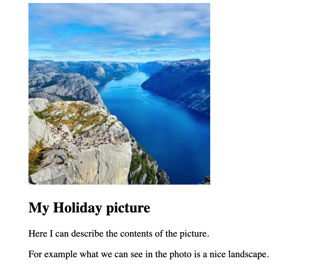
Figure 4.21: Card component with image, title, and description
With that, we have learned how different types of slots can help to create more generic components. Slots allow child components to defer the rendering of certain parts of themselves to their parent component (consumer).
To reuse functionality within a single template, we can use filters. We'll learn how to use them in the next section.
Template Logic Sharing with Filters
To share template logic, Vue.js has filters.
Filters can be used in mustache interpolations ({{ interpolatingSomething }}) or in expressions (for example, when binding a value). filter is a function that takes a value and outputs something that can be rendered (usually a String or a Number).
So, an example filter called truncate would be used in a template as follows (here, we have put some long placeholder text):
<template>
<div id="app">
{{ message | truncate }}
</div>
</template>
<script>
export default {
data() {
return {
message: 'Lorem ipsum dolor sit amet, consectetur adipiscing elit, sed do eiusmod tempor incididunt ut labore et dolore magna aliqua. Ut enim ad minim veniam, quis nostrud exercitation llamco laboris nisi ut aliquip ex ea commodo consequat. Duis aute irure dolor in reprehenderit in voluptate velit esse cillum dolore eu fugiat nulla pariatur. Excepteur sint occaecat cupidatat non proident, sunt in culpa qui officia deserunt mollit anim id est laborum.'
}
}
}
</script>
truncate could also be used in a Vue.js bind expression. For example, <MessageComponent :msg="message | truncate"> would bind the truncated output of message to msg.
To define the truncate filter, we can define it in a component's filters property in the script section.
truncate filter will truncate the text down to 120 characters:
<script>
export default {
filters: {
truncate(value) {
return value.slice(0, 120)
}
},
// other component properties
}
</script>
Without the truncation filter, we get 446 characters of lorem ipsum, as follows:
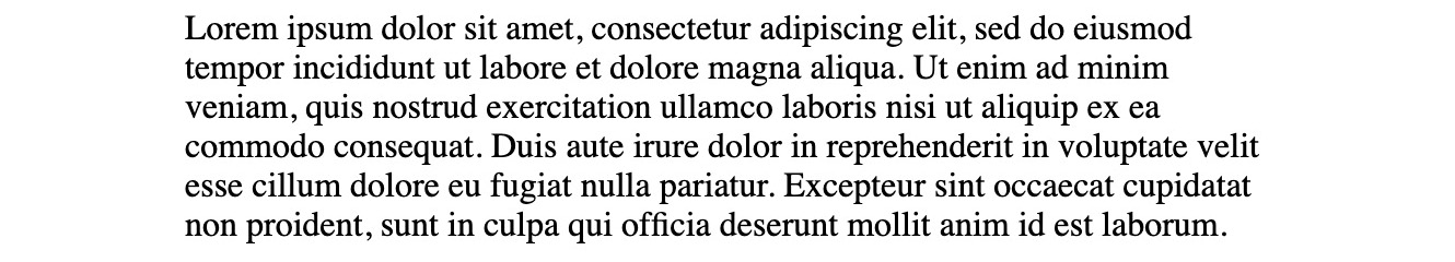
Figure 4.22: Lorem ipsum without truncation
With the truncate filter, we are down to 120 characters, as shown in the following screenshot:

Figure 4.23: Lorem ipsum with the truncate filter
The more defensive way to write this truncate filter would be to do an early return if val is false, then toString it (this will convert numbers into strings, for example) before doing the output of .slice:
<script>
export default {
filters: {
truncate(value) {
if (!value) return
const val = value.toString()
return val.slice(0, 120)
}
},
// other component properties
}
</script>
With that, we have learned how to register and implement Vue.js filters for a component. We have also learned how to use filters in the component's template with the interpolation expression's pipe syntax.
In the following exercise, we will learn how to implement an ellipsis filter.
Exercise 4.05: Implementing an Ellipsis Filter
Filters are excellent for repeated text processing tasks. In this exercise, we will implement an ellipsis filter that works as follows.
If the passed text is more than 14 characters, it should be truncated down to 11 characters and an ellipsis (…) should be added to the end of the text.
When the passed text is empty or not a String, we should be quite permissive and either return nothing or convert it into a String before doing our processing.
To access the code files for this exercise, refer to https://packt.live/2IsZyuv.
Follow these steps to complete this exercise:
- First, we need to set up the template so that it will pipe a string less than 14 characters, a string with 14 characters, and a string with more than 14 characters through ellipsis to check if it works as expected under all possible conditions (we'll do this in src/App.vue, as per the standard Vue CLI setup). We should also pipe a number and an empty value (null) through ellipsis:
<template>
<div id="app">
<p>{{ '7 char' | ellipsis }}</p>
<p>{{ '14 characters' | ellipsis }}</p>
<p>{{ 'More than 14 characters' | ellipsis }}</p>
<p>{{ null | ellipsis }}</p>
<p>{{ 55 | ellipsis }}</p>
</div>
</template>
At this stage, the application should just display the text in the console. There should be some warnings that the ellipsis filter has not defined, as shown in the following screenshot:

Figure 4.24: Application displaying unchanged text
The following screenshot shows the warning:
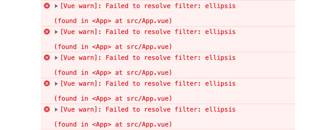
Figure 4.25: Vue.js warning that the ellipsis filter is missing
- Next, we will implement an initial version of the filter in the script section of the component. This will check the length of the passed value, truncate it to 11, and add … if it is longer than 14 characters:
<script>
export default {
filters: {
ellipsis(value) {
return value.length > 14 ? `${value.slice(0, 11)}...` : value
}
}
}
</script>
At this stage, the component fails to render and Vue.js logs an error since Cannot read property 'length' of null, as shown in the following screenshot:
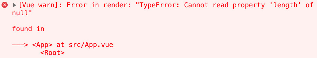
Figure 4.26: null piped into the application
- Next, we need to amend the ellipsis implementation so that it short-circuits when the passed value is false (to avoid the issue with null):
ellipsis(value) {
if (!value) return
// rest of the function
}
We now have the ellipsis filter working; it works for all the test cases we have included. The output will be as follows:

Figure 4.27: Ellipsis filter working for given inputs
Filters are useful for sharing simple text processing logic in components. A filter is a Vue.js primitive that keeps templating and formatting concerns in the template, such as truncating content and adding an ellipsis.
Vue.js provides an abstraction over the DOM Web API. However, when it becomes necessary to access the DOM directly, such as to integrate a DOM library, Vue.js provides a first-class way to do so with refs. We will learn about Vue.js references in the next section.
Vue.js refs
In Vue.js, refs are references to DOM elements or other components. This occurs programmatically.
A large use case for refs is direct DOM manipulation and integration with DOM-based libraries (that usually take a DOM node they should mount to).
Refs are defined using ref="name" on a native element or child component in the template. In the following instance, the input will be stored in a theInput ref:
<template>
<div id="app">
<input ref="theInput" />
</div>
</template>
Refs can be accessed from the Vue.js component instance through this.$refs[name]. So, in the previous example, where we had a ref defined as ref="theInput", we can access it through this.$refs.theInput.
To focus the input when a button is clicked, we could write the following:
<template>
<div id="app">
<input ref="theInput" />
<button @click="focus()">Focus Input</button>
</div>
</template>
<script>
export default {
methods: {
focus() {
this.$refs.theInput.focus()
}
}
}
</script>
When clicking the Focus Input button, the input will be focused, as shown in the following screenshot:

Figure 4.28: Input focused on a button click
With that, we have learned how to use $refs to abstract DOM manipulation logic in a Vue.js component. Where it makes sense to select a DOM node directly in Vue.js, it is recommended to use a ref instead of using the DOM selection API (querySelector/querySelectorAll).
In the following exercise, we will learn how the Countable library helps increase the interactivity in a project.
Exercise 4.06: Wrapping Countable.js with Vue.js
Countable is a library that, given an element (usually an HTML textarea or input), will add live counts of paragraphs, words, and characters. Live metrics on the text being captured can be quite useful to increase interactivity in a project where editing text is a core concern.
One of the large use cases for using refs in Vue.js is to be able to integrate with libraries that act directly on the DOM.
In this exercise, we will create a component with paragraph/word/character counting for content in a textarea by using Countable.js and Vue.js refs.
To access the code files for this exercise, refer to https://packt.live/36oOuGz.
Follow these steps to complete this exercise:
- Install countable from npm. We will run npm install --save countable here, which will add it to our dependencies
- Next, we will create a new src/components/TextEditorWithCount.vue component with a textarea that we will have a ref to:
<template>
<div>
<textarea
ref="textArea"
cols="50"
rows="7"
>
</textarea>
</div>
</template>
- Next, we will import and render the component in src/App.vue:
<template>
<div id="app">
<TextEditorWithCount />
</div>
</template>
<script>
import TextEditorWithCount from './components/ TextEditorWithCount.vue'
export default {
components: {
TextEditorWithCount
}
}
</script>
The application renders a textarea, as follows:
Figure 4.29: A bare textarea, as rendered by the application
- We now need to integrate Countable. We will import it and initialize it with this.$refs.textArea. We will also store the counts on the instance as this.count:
<script>
import * as Countable from 'countable'
export default {
mounted() {
Countable.on(this.$refs.textArea, (count) => {
this.count = count
})
},
data() {
return {
count: null
}
}
}
</script>
- With a small update to the template, we can display the counts we care about:
<template>
<div id="app">
<!-- textarea -->
<ul v-if="count">
<li>Paragraphs: {{ count.paragraphs }}</li>
<li>Sentences: {{ count.sentences }}</li>
<li>Words: {{ count.words }}</li>
</ul>
</div>
</template>
Now, we can see the counts set to 0 when textarea is empty, as follows:
Figure 4.30: Textarea with counts set to 0 when empty
If we drop some Lorem ipsum into our textarea, the counts will update accordingly, as follows:
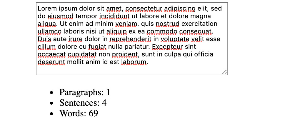
Figure 4.31: Textarea with counts updated when filled
- One last thing we need to do is remove the Countable event listener when the component is destroyed:
<script>
// imports
export default {
mounted() {
Countable.on(this.$refs.textArea, (count) => {
this.count = count
})
this.$once('hook:beforeDestroy', function () {
Countable.off(this.$refs.textArea)
})
},
// other component properties
}
</script>
Note
We have achieved this with programmatic listeners, though we could have achieved the same with the beforeDestroy life cycle method.
This integration of a JavaScript/DOM library inside of Vue.js is a key application of Vue.js refs. Refs allow us to pick from the existing ecosystem of libraries and wrap or integrate them into a component.
Vue.js refs are useful for integrating DOM libraries or for accessing DOM APIs directly.
To round off our learning of component composition, we need to know how to pass data from child components to parent components.
Vue.js Events for Child-Parent Communication
We have already seen that props are used to pass data from a parent component to a child component.
To pass data from a child component back to a parent component, Vue.js has custom events.
In a component, an event can be emitted using the $emit instance method. It can be used from within the script section using this.$emit('eventName', /* payload */), but it is also exposed within the template section as $emit.
Assuming we have got a reactive instance property, this.message, we could emit a send event with the message value in the script section using this.$emit. This could be the basis for a MessageEditor component:
<script>
export default {
data () {
return {
message: null
}
},
methods: {
send() {
this.$emit('send', this.message);
}
}
}
</script>
In the same scenario, we could trigger a send event from the template section:
<template>
<div>
<input v-model="message" />
<button @click="$emit('send', message)">Emit inline</button>
</div>
</template>
From a parent component, we can use v-on:event-name or the shorthand @event-name. event-name must match the name passed to $emit; eventName and event-name are not equivalent.
For example, a parent component would be how we listen to the send event using @send and save the event payload contained in the $event magic value. To use the event payload in a method call, we can use @eventName="methodToCall($event)":
<template>
<div id="app">
<p>Message: {{ message }}</p>
<MessageEditor @send="message = $event" />
<button @click="message = null">Reset</button>
</div>
</template>
<script>
import MessageEditor from './components/MessageEditor.vue'
export default {
components: {
MessageEditor
},
data() {
return {
message: null
}
}
}
</script>
Using the inline and method versions of $emit yields the same result. The full MessageEditor app should look as follows:

Figure 4.32: Hello World! message being emitted from child-parent
Vue.js custom events support passing any JavaScript type as the payload. The event name, however, must be a String.
Note
Binding a listener to Vue.js custom events is very similar to binding to native events such as click.
Now, let's complete an activity based on what we've learned about so far.
Activity 4.01: A Local Message View with Reusable Components
This activity aims to leverage components, props, events, and refs to render a chat interface where the user can add messages and they are displayed.
Follow these steps to complete this activity:
- Create a MessageEditor component (in src/components/MessageEditor.vue) that displays a textarea to the user.
- Add a message reactive instance variable to MessageEditor, defaulted to ''.
- Listen to change events for textarea and set the value of message to the value of the content of textarea (it is exposed as the value of the event).
- Add a Send button that, on click, emits a send event with message as the payload.
- Add a main App component to src/App.vue that renders MessageEditor.
- In App, listen to send events from MessageEditor and store each message in a messages reactive instance variable (messages is an array).
- Create a MessageFeed (in src/components/MessageFeed.vue) that has a required messages prop, which is an Array.
- In MessageFeed, render each passed message from the messages prop in a paragraph (the p element).
- Import and render MessageFeed into App, binding the messages app instance variable as the messages prop of MessageFeed.
- Improve MessageEditor so that the message is reset when it is sent. To do this, we will need to set textarea.value using a Vue.js ref and reset the message instance variable.
Note
The easier way to reset textarea would have been to use v-model="message" in the first place instead of binding @change and manually syncing textarea.value to message.
The expected output is as follows:

Figure 4.33: Message app with Hello World! and Hello JavaScript sent
Note
The solution for this activity can be found via this link.
Summary
Throughout this chapter, we have looked at Vue.js primitives that allow us to build components in such a way that they can be composed efficiently.
Props and slots are used to defer behavior within a component to whichever parent component is rendering them. Props, with their ability to be validated, are great for passing data into nested components. Slots are geared toward yielding control of rendering back to the parent component. Events enable child components to send data back to their parent, thus completing the parent-child communication cycle (props down, events up).
Global templating helpers can be encapsulated in filters to reduce boilerplate and increase code reuse. Refs unlock integration opportunities with third-party JavaScript or DOM libraries by allowing us to access DOM elements directly.
We're now able to compose and create components that clearly define their interfaces with inputs (props and slots) and outputs (rendered templates and events), while also visiting commonly faced use cases (wrapping a DOM library, abstracting templating concerns in a filter, and so on).
In the next chapter, we'll look at advanced component composition patterns and techniques that enable better code reuse.