
PERSUASION OR MANIPULATION?
THE BLURRED EDGE OF TRUTH
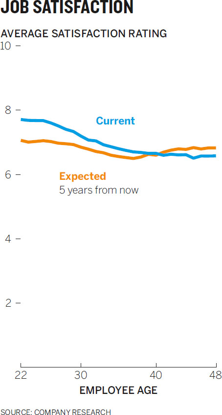
“THAT’S NOT WHAT I sent and not what I requested,” Tamar’s e-mail read. “Let’s meet to discuss.” Colette’s spirits sank. Her boss, the head of HR, was rejecting the visualization Colette had created for her. Colette knew why. Tamar had sent her a chart she’d spit out of Excel while analyzing her data, along with a note:

Colette—Data and rough visual attached. For the board presentation, want to show the big change, the U-curve for current satisfaction and the huge gap in current vs. expected for young employees, which closes and flips in midcareer. Important for presentation to show where we need to address employee satisfaction issues before we propose funding for engagement programs.—T
Colette knew that employees were asked to rate their current job satisfaction and their expected satisfaction in five years, on a 1-to-10 scale. She saw that Tamar’s chart plotted only the area where the average scores fell, from 6.4 to 7.8—it was truncated. She had reproduced her boss’s chart and then created her own version, using the full 1-to-10 scale for the y-axis:

As she looked at her revised plot, Colette thought about the keywords from Tamar’s e-mail: big change, U-curve, huge gap, flips. Those were clear in the original version of the chart, but her version looked almost changeless—a small gap separated flat lines that slowly converged in an unremarkable crossover.
Colette felt that her version more accurately depicted the data and the idea. Tamar thought it robbed her message of its persuasive power. When they met, Colette explained that the truncated axis made the separation and the changes in satisfaction look more dramatic than they actually were. Tamar shot back that it was accepted practice to “zoom in” like this. Academic journal articles and news articles did the same; she even showed Colette a few examples. All the colleagues Tamar had spoken to had said they’d do the same thing. And anyway, the change was dramatic. “In this case, that gap between current and expected satisfaction for young employees is significant,” Tamar insisted. “And that dip and rebound in current satisfaction for workers in their thirties is hugely significant. We need to stress that. We’re competing for resources here. If we show the board members your chart, they’re not going to fund our engagement programs. I’ll be saying, ‘Look at this major issue we have to address,’ and they’ll be looking at a couple of flat lines.”
THE BLURRED EDGE OF TRUTH
Who’s right? Some will side (and empathize) with Colette. You don’t have to be a “y-axis fundamentalist” to see how cutting off the top and bottom of the satisfaction scale exaggerates the shape of the curve so dramatically that it alters the idea that emerges from the data.1 Others will back Tamar, who is fighting for money and who knows that although the changes look small on a full-axis chart, they matter, so they should be made to look that way. For her, the truncated axis doesn’t alter the idea—the full axis does.
There’s no easy answer here. Would that a clear line existed between visual persuasion and visual dishonesty. Even if it were a fine line, at least we could see it and stay on the ethical side of it. But in fact, and of course, no such line exists. Instead we have to negotiate a blurred and shifting borderland between truthfulness and unfair manipulation.
On one side of this indefinite border are the persuasion techniques outlined in chapter 6: emphasis, isolation, adding or removing reference points. On the other side are the four types of deception: falsification, exaggeration, omission, and equivocation. One person’s isolation—removing distracting visual information—is another’s omission. It’s easy to see how emphasis, applied too forcefully, might slip into exaggeration.
I won’t dwell on falsification; the commandments should be obvious: Don’t lie. Don’t deliberately mislead. Don’t create a chart like this one:

It looks like a positive revenue trend, but here each bar is cumulative, accounting for all previous years’ revenue as well as new revenue. Year 1 is counted five times, although that revenue was earned only once.

This is continuous data, a trend line, hiding in a categorical form: we expect each bar to represent a distinct value. The breakdown shown here is the more honest depiction of the revenue trend.

EXPLORING THE GRAY AREA
Arrant deception of this sort is uncommon.2 More frequently, managers find themselves looking at—and creating—graphics like Tamar’s job satisfaction chart—not so much intentional efforts to mislead as extraordinary efforts to persuade, which may drift into that blurred borderland between honest and deceptive.
Persuasion is a knife, and knives can be used in any number of ways: skillfully, carelessly, recklessly, even illicitly. Unpacking the ways in which charts slip into deception is like learning to handle a knife so that you don’t accidentally cut yourself or others.
Rather than trying to create a doctrinaire list of dos and don’ts, I’ll deconstruct three of the most common techniques that put charts in this gray area, explain why you might want to use them, and lay out why they may not be okay.
The truncated y-axis: exaggerating trends. The debate over the y-axis is visualization’s version of grammarians arguing over whether or not it’s okay to end a sentence with a preposition. Even if we think it’s wrong, we do it because the proper alternative often feels awkward.
Why it may be effective. It emphasizes an idea. Cutting empty ranges out of an axis increases the physical distance between values, revealing texture and making change look more dramatic, as shown in the slices of Tamar’s and Colette’s Charts:

Tamar’s argument for truncating her y-axis was that not doing so makes it harder to see important differences, and that’s clearly true. Colette uses about 7% of the y-axis to show the 7% gap. Tamar uses almost 50% of the chart’s vertical space to represent the 7% gap. Truncation is a way of zooming in and isolating the main idea. It’s not unlike looking through a magnifying glass.
It’s also true that if a range of data is consistently far from zero, you’ll need much more space to effectively unflatten the visual while maintaining a full y-axis.3 You’ll have to manipulate the height and width of the chart. This quickly becomes an impractical exercise: it yields strangely formatted charts that, although they preserve some detail of the curves, ultimately distract the viewer, like this one.
Why it may be deceptive. Some will argue that truncation acts less like a magnifying glass than like a fun house mirror, distorting reality by exaggerating select parts of it.

The line on the Taking a Vacation chart represents a drop of 25 percentage points, from 80% to 55%. But its physical descent covers almost the entire y-axis. In other words, the line descends 100% of the y-axis to represent a 25% decline. Truncation also hides representative space. The line here divides space that represents vacationers (below) and nonvacationers (above), but neither space accurately represents the proportions at any given point. Charting the space very roughly below shows how those proportions in the truncated chart are simply inaccurate.

A note: Sometimes people equate truncating the y-axis with not starting at zero. But lopping off the top of an axis’s range also produces a distortionary effect, even if the axis starts at zero. That kind of truncation is less often noticed and produces fewer outbursts from y-axis fundamentalists, but it can hide representative space in the same way, especially with a finite range of y-axis values, like percentages.
Another good way to understand the effect of truncation is to pluck three points from the data set and turn them into stacked bars, one group with a truncated y-axis and one that spans from zero to one hundred.

Rather than persuasive or even deceptive, the truncated-axis chart looks plain wrong, and it is. Its 1995 bar, for example, at 67%, should be 2/3 dark orange and 1/3 pale orange, but it’s split about 50/50. Truncation with categorical data doesn’t work. We see it used like this mostly when deception is the goal.4 And yet the original line chart represents a similar dividing of space, except with many more data points along a continuum.
Truncation presents another problem. We know that the experiential part of the brain relies on experience, expectation, and convention to assign meaning and form narratives. It uses heuristics to rapidly grab meaning so that we don’t have to think much about something we see all the time. And research shows that we assign metaphorical value to certain visual cues. Up is positive, down is negative.5
In our minds, expectation trumps raw data. When a line approaches the bottom—the “end” or the “floor”—of a chart, we take that as a cue that it’s approaching zero, or nothing. This creates a false sense of termination. We expect the bottom to be zero, and our brains want to process it that way. When we realize it’s not zero, we have to expend more mental energy trying to understand what we’re actually looking at. Conversely, we see the top of the chart as the maximum, pinnacle, or ceiling. The truncated-axis vacation chart leads us toward the idea that everybody used to go on vacation and now no one does. But compare it to the full y-axis version below it.

Okay, the number of vacationers is indeed declining, but more people than not still take a vacation. Did that idea come through from the truncated version? Did you see it first? Was it an accessible idea? Did you get the sense that on average, over nearly four decades, a vast majority of people took vacations and a majority still do?
This is why Colette grimaced when she compared Tamar’s truncated y-axis plot to her own version. She believed it was overdramatic and accidentally deceptive. For her part, Tamar asserted that the 7% gap between current and expected happiness for young employees was huge and that the 10% fluctuation in reported satisfaction was a big change that the visual should show prominently. That’s a value judgment. It’s her context. To justify persuading through truncation, she must trust her expertise, and her audience must trust her credibility.
The double y-axis: comparing apples and oranges. Compared with truncation, double-y-axis charts provoke little agitation. An internet search for “truncated y-axis” returns top results about lying with charts, but a search for “secondary y-axis” turns up mostly sites that teach you how to add one in Excel. Still, charts with two y-axes deserve similar scrutiny.
Why it may be effective. It compels an audience to make comparisons. Instead of trying to convince people that there’s a relationship between two variables, it creates a relationship by fiat. Below is an example I created for a humorous essay on the use of the term “apples and oranges” in the media.

You can’t look at this chart and consider each plot on its own merits. The fact that they’re together forces you to think about them as something, not two things that happen to share a space. What does this chart say? More than likely you formed the narrative I wanted you to: Stock market gains lead to more people using the term “apples and oranges.”
Of course, that idea is absurd on its face—but it’s almost impossible not to make the connection. I knew that (or at least I sensed it; this was created long before I thought about the mechanics of chart making) and leveraged it to send you down a path of trying to figure out why this relationship exists and to make a funny point. Two y-axes can shape a narrative that goes in the direction you want it to.
Why it may be deceptive. The relative sameness or difference in the shapes of lines or the heights of bars being measured on two different scales is much less meaningful than it appears to be. The simplest illustration is a chart that uses two axes representing the same type of value but in different ranges.

In the top chart to the right, it appears that gold and silver are roughly the same price and their prices move together. But the range of the secondary y-axis is two orders of magnitude lower than that of the primary y-axis. (In addition, they’re truncated, so the closeness of the lines is artificial.) That means we’re seeing lines that interact in fake ways. When the blue line is higher on the chart, the price of silver isn’t actually higher than the price of gold. When the lines cross over, prices aren’t crossing over. Both axes measure US dollars, so why not use just one y-axis?

That’s what the middle gold and silver chart on the previous page shows, and it’s simply less useful. We can’t see what’s happening to silver prices. One solution to this dilemma would be to show relative change in price rather than raw price, as the bottom chart in the series shows.

The price of silver, a flat line in the previous chart, is actually more volatile than the price of gold—an idea we don’t see in the first chart. If anything, the price of gold looks more dynamic in that first chart, but the relative change from $1,300 to $1,200 is smaller than the change from $21 to $18, even though the slopes match when we use separate y-axes in the same space. Still, this new version creates new challenges. It shifts the main idea from the price of precious metals to the change in price—from value to volatility. Knowing the actual price of gold and silver at any given time is not possible in a percentage change chart.
Things get even murkier when the second y-axis uses a different value altogether. A version of this chart was published online.

Here it’s hard to miss the narrative that Tesla’s market share is going to come on strong in light vehicle sales. Its line reaches higher and higher into the bars that represent all light vehicle sales.
Unfortunately, that narrative is illusory. Although in 2025 the line reaches about 33% of the height of total light vehicle sales bar, its y-axis is measured in percentage, not raw numbers. In 2025 it would have just a 3% market share—only 1/33rd of that year’s plotted bar. The chart below is an accurate portrayal of the scenario.

When two measures bear no relationship at all, things get truly weird, as with the chart bottom left on this page.

We see events in physical space—crossovers, meeting points, divergences, convergences—that suggest a relationship that doesn’t exist. Time on page didn’t cross over or go higher than page views between the seventh and eighth weeks—and what would it even mean for seconds to be higher than page views? It’s as if soccer and football are being played on the same field and we’re trying to make sense of both as one game.
Nevertheless, when we see data charted together, our minds want to form a narrative around what we see. Charts can be concocted that combine truncation with dual-y-axes to manipulate the curves into similar shapes to encourage that narrative-seeking, such as this chart.

The two variables here are statistically correlated. The tempting if unlikely narrative is that the increase in falling down stairs is caused by the fact that more of us are staring down at smartphone screens.6 What happens when this visual parlor trick is applied to less silly examples? In an age of very big data sets and sophisticated tools for mining them, it becomes easy, as the Stanford professor of medicine John Ioannidis puts it, to “confer spurious precision status to noise.”7 Chart 1 in the series below is a good example.


The relationship we see here is unmistakable. Sales and customer service calls map closely over the course of the day. The tight link might make a manager think that customer service should be staffed according to how much money the company expects to be bringing in at that time of day. More money, more reps. But the way these lines stick together, as much as we might want to believe it means something, is artificial. First, the lines stick together in part because they use separate grids.
Chart 2 in the series exposes the grid lines to show the tight connection between lines is artificial. It’s almost as if each chart were on a semitransparent piece of paper and we slid one over the other until the curves aligned. In chart 3, when the axes are lined up to share a single grid, the picture changes.
Similarity remains, but now calls are always lower than sales (keep in mind this is all still nonsensical since the values are completely different). Even so, we get the sense that sales and calls go up and down together. This chart still might persuade us that staffing should follow the day’s sales trends.
But what if we take a view of the data that doesn’t rely on an artificial similarity in the shape of curves? Using the same data, let’s compare sales per customer service call each hour as a ratio, shown in chart 4 in the series.
If sales and customer service calls really were as closely linked as the original chart suggests, this line would be essentially flat—as sales rise, calls rise. But this view tells a different, somewhat more nuanced story: The customer service team is handling many more calls for every $100,000 earned in the early morning than at other times of day. And the ratio bounces up and down all morning. In the first chart in this series, that time period was when the lines were almost perfectly in sync, but that’s when there’s the most change in how many calls are being handled for the amount of sales coming in.
Comparisons are one of the most basic and useful things we do with charts. They form a narrative, and narrative is persuasive. But it should be obvious by now that there are no easy ways to handle different ranges and measures in a single space. Pushing down one misleading problem can cause another to pop up. More-accurate portrayals, such as percentage change, may also be less accessible, or even alter the idea being conveyed.
The simplest way to fix this is to avoid it. Placing charts side by side rather than on top of each other, and using presentation techniques that we’ll talk about in chapter 8, can help create comparisons without creating false narratives.
The map: misrepresenting Montana and Manhattan. Maps are themselves information visualizations, but they’re also popular containers for dataviz. Tools such as Tableau and Infogr.am have made it much easier to assign values from spreadsheets to geographic spaces. The rise in popularity of color-coded maps, or “chloropleths,” has spawned one of the toughest dataviz challenges in terms of toeing the line between effectiveness and deceptiveness.
Why it may be effective. Maps make data based on geography much more accessible by making it simple to find and compare reference points, because we are generally familiar with where places are. Comparing country data, for example, is easier when we embed values in maps, especially as the number of locations being measured increases. Looking at the Solar Capacity map and bar chart, see how long it takes you to complete the reasonably simple task of comparing the United States with Japan, then Spain with France, and finally Germany with Australia.


Chloropleths also help us see regional trends that other forms of charts cannot. It’s difficult, for example, to look at the bar chart and form ideas about, say, the European versus the Asian deployment of solar capacity, but in the map we can make those assessments almost without thinking.
Why it may be deceptive. The size of geographical space usually over- or under-represents the variable encoded within it. This is especially true with maps that represent populations, as we see during elections. You might call this the Montana-Manhattan problem:

More people live in Manhattan, even though Montana is almost 6,400 times its size. Another way to express this is to show how many people live in one square mile of each place. Each dot here represents seven people:

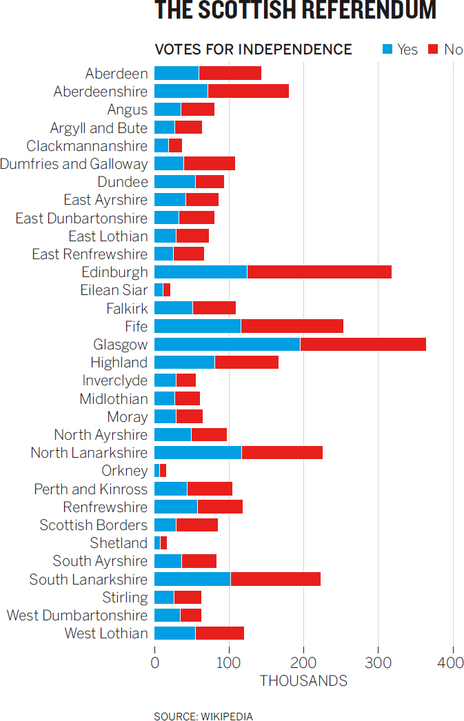
It may be hard to see, but Montana’s square mile contains one dot. So when Montana votes one way during an election, the visual representation is of a colored-in area that’s more than 6,400 times the size of the one for Manhattan, even though 60% more people live in Manhattan. This happens all over the world. Below are the election results for Scotland’s referendum on independence plotted on a map and as a simple proportional bar chart.
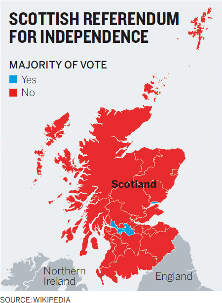
What looks geographically like an overwhelming victory isn’t actually so one-sided. It’s a solid victory for “no,” true. But less than 5% of the landmass on the map represents a “yes” vote, whereas 38% of eligible voters voted “yes.” Consider that in Highland, that massive northernmost red region on Scotland’s mainland, only about 166,000 people voted in total—fewer than the 195,000 who voted “yes” in Glasgow, one of the small blue wedges.

But moving away from maps reintroduces the problems that maps are meant to solve by using our knowledge of spaces to to make values more accessible. The proportional bar chart below makes it nearly impossible to connect places to values quickly or to make regional estimations.
More-accurate representations of data lead to less accessible geographic information. Conversely, good maps tend to misrepresent data values. This paradox has vexed designers, cartographers, and data scientists for some time. For a while, cartograms—which use algorithms to distort geography so that the area of a region matches the value it represents—found favor as a possible solution.

Above is the Scottish referendum as a cartogram.
Cartograms like this tend to look like wads of chewed bubble gum, and the more extreme the difference between geographic area and the value represented in that area, the more distorted the map, making it nearly impossible to reconcile the geography. In this cartogram, for example, that massive region in the north, Highland, is a squashed pink smear.
Grid maps provide an alternative solution. In a grid map, every region is of equal size and placed roughly where we imagine it belongs on a regular geographical map. Values are represented by color and color saturation. Multiple types of grid maps are being created and experimented with, as shown here.8


These are not perfect; it still takes more work to grab locations in these grids than it would in a regular map. Rhode Island is oddly east of Massachusetts in the hexagonal version, and Washington, DC, nearly borders Florida in the square version. When I think of a map of the United States, I think of Kansas as being roughly in the middle; so when I look for Kansas in the square version, I’m thrown off by finding Kentucky there. The four-hex version solves some of those issues; but then again, Louisiana and Texas look strangely similar and off-kilter. Grid maps also rely on color gradations to show differences in value between regions, which, if the data includes many values, may make it hard to discern differences from one level of saturation to the next.
These efforts are less misrepresentative than the ones that use area to encode other variables, but they also flout a deeply ingrained convention—the shape of the world—and make us work a little harder to find what we’re looking for. That can be frustrating and therefore less persuasive.
I described the borderland between persuasion and deception as blurred. It should be obvious why. Most of the examples deconstructed here feel not perfectly right or wrong but, rather, endlessly debatable.
I also described the borderland as shifting, and in some ways that’s the more difficult characteristic of persuasion techniques to reconcile. Tamar’s truncated y-axis chart may be fine in one setting and violative in another. Even two colleagues in the same meeting might disagree about whether it’s convincing or spurious.
Judging whether your visualization crosses that indefinite line will, like any other ethical consideration, come down to one of those difficult, honest conversations with yourself. Ask:
• Does my chart make it easier to see the idea, or is it actively changing the idea?
• If it’s changing the idea, does the new idea contradict or fight with the one in the less persuasive chart?
• Does eliminating information hide something that would rightfully challenge the idea I’m showing?
• Would I feel duped if someone else presented me with a chart like this?
If you find yourself answering yes to questions like these, you’ve probably entered deceptive territory. Another way to check yourself is to imagine someone challenging your chart as you present it. You might even recruit a colleague to practice. Do you have the supporting evidence to counter a challenge? Could you defend your chart and yourself against attacks on its and your credibility?
Tamar was trying to do that when she gave Colette reasons why her truncated-axis chart was valid. If Colette pushed back, she might compel Tamar to produce supporting information—or even new visuals—to demonstrate the significance of the change, such as a chart showing how even a half-point gain in job satisfaction positively affects the bottom line.
At the very least, Tamar should point out the truncated y-axis whenever she shows the chart and be prepared for someone to challenge her. She needs to be able to explain why what looks flat and changeless on the full scale actually means something.
Like all of us, Tamar should focus less on whether the persuasion techniques she’s using are right or wrong and more on making sure that the idea those techniques help her convey is defensible.
PERSUASION OR MANIPULATION?
Used too aggressively or recklessly, persuasion techniques—emphasis, isolation, adding or removing reference points—can become deceptive techniques: exaggeration, omission, equivocation. The line between persuasive and deceptive isn’t always clear. The best way to negotiate it is to understand the most common techniques that put charts in the gray area, understand why you’d be tempted to use them, and realize why they might not be okay. Here are three:
1. THE TRUNCATED Y-AXIS
What it is:
A chart that removes valid value ranges from the y-axis, thereby removing data from the visual field. Most often it doesn’t start the y-axis at zero.
Why it may be effective:
It emphasizes change, making curves curvier and distance from one point to another bigger. It acts as a magnifying glass, zooming in on the space where data occurs and avoiding empty space where data isn’t plotted.
Why it may be deceptive:
It can exaggerate or misrepresent change, making modest increases or declines look “steep.” It disrupts our expectation that the y-axis starts at zero, making it possible or even likely that the chart will be misread.
2. THE DOUBLE Y-AXIS
What it is:
A chart that includes two vertical scales for different data sets in the visual field—for example, one for a line that tracks revenues and one for a line that tracks share price.
Why it may be effective:
It compels the viewer to make a comparison between data sets that may not naturally go together. Plotting different values in the same space establishes a relationship between the two.
Why it may be deceptive:
Relationships between different values are artificial. Plotting those values in the same space creates crossovers, matching curves, or gaps that don’t actually mean anything.
3. THE MAP
What it is:
A map that uses geographical boundaries to encode values related to that location, such as voting results by region.
Why it may be effective:
Geography is a convention that allows us to find data quickly on the basis of location rather than searching through a list of locations to match data. It also allows us to see trends at local, regional, and global levels simultaneously.
Why it may be deceptive:
The size of a region doesn’t necessarily reflect the data encoded within it. A voting map, for example, may be 80% red but represent only 40% of the vote, because fewer people live in some larger spaces.
________________
Judging whether your visualization crosses that indefinite line between persuasion and manipulation will, like all other ethical considerations, come down to a difficult, honest conversation with yourself. Ask:
• Does my chart make it easier to see the idea, or is it actively changing the idea?
• If it’s changing the idea, does the new idea contradict or fight with the one in the less persuasive chart?
• Does eliminating information hide something that would rightfully challenge the idea I’m showing?
• Would I feel duped if someone else presented me with a chart like this?
STAKING A CAREER ON VISUALIZATION
“After six years, I wasn’t sure what I wanted to do, and I was getting worried.”
Mark Jackson was a consultant at KPMG. Analytics was part of his job; building charts and graphs wasn’t. But he did it anyway, spending lots of time bending Excel to his will to create charts that he thought might help in his work. But he was burning out. “I could become a manager or director without any deep experience in one area, but that’s not usually a good approach—plus, I had to get off the road,” he says, past exhaustions creeping into his voice.
Jackson signed on as a project manager at Piedmont Healthcare, where he continued his visual analysis in Excel for projects such as process improvements, scheduling, even where to locate offices. He also started following dataviz blogs and reading up on the topic. It still wasn’t officially part of his job, but visualization work continued to command more of his time, and it was getting him noticed.
“The light went on for me,” he says, “when we looked at a project on throughput in catheterization labs, and I built all this data out in charts in Excel. I had discovered Tufte at that point. I made these visualizations very Tufte-ish, and people found those charts so helpful.” Jackson also created a visual way to explore changes in physicians’ schedules to improve the patient experience. “We needed to show doctors that how they worked was inefficient, that if they focused on one thing at a time, they’d actually be more productive.” That was difficult but necessary. Doctors’ compensation is tied in part to their productivity, so they’re not going to change how they work unless they know it will make them more productive. “We used dataviz to show them that it would all be okay.”
Eventually, the corporate team asked Jackson to design 40 pages of charts for a report, just when he felt ready to devote himself to the visual part of data analysis. “I said to them, ‘I’m willing to stake my career on this. This is the future.’ Basically, ‘Can I make this my job?’ ”
They said yes. Jackson is now the director of business intelligence and management reporting and the go-to dataviz guy at Piedmont.
Explaining how he visualizes doesn’t come easy. “It’s like explaining how you walk,” he says. “You just know how to do it.” Jackson spends a lot of time reading about visualization, paying attention to other people’s work and mimicking it. He will try what they try and then twist it to his needs.
“A really big part of being successful with visualization is asking people why they want to do something,” he says, echoing that crucial question you’re meant to ask over and over again during the talk and listen phase outlined in chapter 4: “Why?” “If someone says to me, ‘I need a report that gives me a trend for each month of sales,’ that’s not going to work. You don’t have answers yet. There are too many assumptions there. So I’ll force us to take a step back. I ask, ‘What do you really want to know? Why do you want to know that?’ You have to dig deep with them.”
Jackson also likes to focus on use cases with his visual output. He often creates three versions of a chart that move from simplest to most complicated according to how much time he expects people have to explore it: twenty seconds for executives, two minutes for managers, and twenty minutes for analysts.
“I also pay attention to how they want to use it on their own,” he says. “We’re still a paper-driven culture here. Clinical managers want something they can print out and walk around with, show to others in person. So I’m not burying their visuals in a toolset—I’m creating something that will look good printed out. At the same time, there’s the interactive version for people who have the skill and want to explore the visualizations that way.”
Jackson now experiments with dataviz as a way to improve his skills. He’s become one of the community members he once read and mimicked. He created an interactive visualization of controversial Wikipedia articles that garnered significant attention online for its eye-catching form and, ultimately, the analysis it provides.

“Looking at it initially, it’s beautiful,” Jackson says. “But what I like better than that is that after you see how nice it looks, you realize the patterns are telling you something.”
In this chart Jackson is expressing what he sees as the value of entertainment and engagement. “Sometimes you can probably learn something quicker with a bar chart, but people want to enjoy visualizations. Admittedly, in business you have to be careful. People just want answers. But I’d argue there are still ways that you can incorporate that entertainment value, by making charts beautiful, or at least not harsh to look at. I’ve been in meetings when we bored the audience to tears getting to the answer. If they’re not interested by the time you get there, what’s the point?”