
PRESENT TO PERSUADE
GETTING A GOOD CHART TO THEIR EYES AND INTO THEIR MINDS
BY NOW YOU’RE CONCEIVING of and building smart, persuasive visualizations—good charts. So far all your energy has gone into working out ways to develop and manipulate the charts themselves. Now, you can focus on taking that well-conceived object and helping people to connect to it.
Typically, we aren’t terribly good at that. We build a smart viz and hope that the chart itself—this clear, self-sufficient, persuasive little object of visual communication—will engage an audience. But the text of a brilliant speech doesn’t compel an audience to action; the orator does. The score of a symphony doesn’t move people; its performance does.
How you get a good chart to people’s eyes and into their minds is what matters most. Effective presentation marks the difference between information visualizations that are merely adequate exposition and ones that move people.
Getting charts to eyes and into minds may sound figurative, but I mean these things literally. The twin challenges here are to help people when they first see the visual—how you present it to them—and to help them process it: how you get them to engage with it. I’ll take these in turn.
GETTING IT TO THEIR EYES: PRESENTATION
At some point most managers learn how to give a presentation. They read books about it, take a class, or hire a coach.1 The skills those tools offer are useful in presenting charts, but those learning methods may not cover more-specific techniques for presenting visualizations that can help make them easier to understand and more persuasive.
First show the chart and stop talking. Researchers estimate that about 55% of our brain activity is devoted to processing visual information. The visual system, crudely explained, includes a high road that handles spatial information and navigation and a low road that recognizes and processes objects and shapes. No matter what the visual input, both roads teem with activity. Put a chart on a screen, and the entire ventral section of the brain fires up to suss out some meaning. As George Alvarez, a visual perceptions researcher at Harvard, puts it, “Mostly, vision is what the mind does.”
So if you present a chart and immediately start talking over it, you’ll make it harder for your viewers to understand the chart. Their brains really want to look, and you’re asking them to listen, too. It distracts. Visual processing is so intense that once we see something salient such as a color or a shape, we start to tune out other visual information—never mind sounds—in order to make sense of what we see.
Instead, display the visual and don’t talk for several seconds. If it helps, count five beats in your head. Let the viewers’ brains dial in on this new thing to look at. You’ve done the hard work of making the visualization clear and persuasive. You’ve made the salient information highly accessible. You’ve used the title and subtitle as confirming cues about the idea you want to convey. Don’t undercut your own hard work. Let the chart do what it was built to do.
The urge to start talking over a visualization is noble enough: You want to make sure people get it, and silence can be unnerving. But inevitably, what happens during this initial pause is more useful than anything you might preemptively say. In education, such an extended silence is a well-established tactic called “wait time” or “think time.”2 Teachers who allow three seconds or more to pass after they ask a question tend to have classes that are more engaged, think more critically, and come up with more-sophisticated answers to problems.
That’s what will happen if you pause after showing a chart. Eventually, someone in the audience will puncture the silence with a question, or offer analysis or an opinion. You may find that the chart spurs discussion without your having said a word. If you let people arrive at their own insights, the idea in the visual will be talked about more, and more deeply, than if you immediately tell them what they should see. Paradoxically, the silence creates a deeply interactive moment.
When it’s time to talk, don’t read the picture. The easiest way to lose your audience in any presentation is to read bullet points verbatim from a slide. Explaining the structure of a chart that you’re presenting will disengage an audience just as badly.
Imagine presenting this map with the following script:

So, here’s a map of China divided into its provinces. North is at the top of the map, and each province is distinguished by a light yellow border outline and labeled with its name. Surrounding countries are labeled as gray, and the East and South China seas are shown, which are lighter gray. As you can see, distance is measured according to a key in the upper left corner.
Explaining how a map works toes the line of condescension. Yet we present dataviz with the same descriptive approach. Here’s a typical presentation of a chart and the script that might accompany it:

So, here we are showing trip comfort versus how much a plane ticket costs. Comfort is 0 to 10 on the x-axis, and the cost of the ticket is on the y-axis. As you can see, economy class tickets—the blue dots—don’t vary much in cost, but comfort does. There seems to be a little more correlation between comfort and cost for business class tickets, but only at the very high end, and even then, it’s not a very strong effect.
Everything this presenter has said we can already see; he even says “as you can see,” which is a clear tip-off that he’s wasting time declaring the obvious. If they can see it, why say it?
You don’t need to say what the axes are—they’re labeled. You don’t need to point out color coding—it’s labeled. Once it’s time to talk, discuss the idea, not the object that shows the idea. Here’s a new script for the presenter:
[After five beats] Money doesn’t seem to buy much comfort on plane trips, unless we pay the very top prices in both economy and business class. For most trips, comfort is average—in the middle—whether we pay $5,500 for a business class ticket or $2,200 for an economy ticket. This suggests that only the most expensive business class tickets are worth the cost to help our employees have comfortable trips. Since we know it’s not cost that determines comfort, we should explore what does so that we can ensure productive business trips at the best cost.
There’s no talk here of axes or color or how dots are clustered. Everything the presenter says is about the idea (money doesn’t buy comfort), analysis of the idea (most business class tickets aren’t worth the cost), prompts for discussion (if cost doesn’t affect comfort, what does?), and a reminder of the value of discussing the idea (happier employees at a reasonable cost).3 Notice how discussing ideas instead of explaining the data and structure naturally leads to more human-centered language. Rather than a price-to-comfort ratio, he’s talking about comfortable employees and successful business trips. That’s good. As the presentation guru Nancy Duarte put it to me, “Don’t project the idea that you’re showing a chart. Project that you’re showing a reflection of human activity, of things people did to make a line go up or down. It’s not ‘Here’s our Q3 financial results,’ it’s ‘Here’s where we missed our targets.’ ”
Reading a chart’s structure during a presentation is often a sign that you lack confidence in the visualization. If you aren’t sure the audience will get it, you probably haven’t highlighted the main idea well enough. If you find yourself explaining the salient information, maybe you haven’t emphasized and isolated it the way you should. Resist the urge to just read the chart, let those five beats of silence go by, and the questions and comments that come back will be a referendum on the chart’s effectiveness. If people are asking about axes and labels and what they should be looking at, the visualization needs improvement.
With unusual forms and for added context, guide the audience. Mostly you should avoid talking about the chart itself, but there are exceptions. Unusual or complicated forms may require brief explanation prior to discussing ideas. Familiarity with forms does affect the ability to understand visualizations: you can’t, for example, drop an alluvial diagram like the one below on an audience without at least some explanation of how it works.

A diagram like this may elicit oohs and aahs, but if the viewers can’t find meaning in it, they’ll quickly write it off as a pretty picture or, worse, an attempt to show off that favors eye candy over insight.
That doesn’t mean you should avoid unusual and complex forms: if they help frame ideas well, they can be powerful ways to engage people. But the time from Gee whiz! to I see! must be short. To make the transition, describe the function of the chart form before focusing on the idea:
This alluvial diagram shows how our marketing communications dollars flow throughout the year. It helps us see three things: One, how our budget is distributed by program, represented by the thickness of the bars on the left. Two, how our budget is allocated by month, represented by the thickness of the bars on the right. And three, how each program’s money flows over the course of the year, represented by how the lines move from left to right. Take a look. [Wait five beats] We seem to have two seasons for marketing communications: January to April, a shorter season of heavy, heavy spending. And May to December, a long season of spending a little bit on a lot of programs. Big direct marketing investments fall into that first time frame, which also happens to be when our events business needs heavy investment. Is this distribution okay? Do we need to rethink this?
Notice that even in this case, while the speaker rightly explained the function and mechanics of an alluvial chart, she didn’t fall into the trap of describing this particular example. She didn’t say:
The events business, in green here, represents a little more than 25% of our budget, and the spending skews slightly toward the beginning of the year, as you can see by the thicker bars flowing into January and February.
Keep explanations of forms brief, clear, and general, not specific to the data encoded in your chart.
Use reference charts. Prototypical examples can also guide the audience, providing cognitive nudges toward clearer meaning. Presenting average, ideal, and other reference points works well even with basic charts, but it can be especially effective when presenting unusual forms. If you wanted to assess Tom’s sales skills on seven different measures, you could use a dot plot like the one below. Or you could try the spider graph (also called a radar chart) next to it, which gives shape to multiple data points. It’s more difficult to assess Tom’s overall performance in the Skills Rating dot plot, because we have to evaluate seven discrete data points and then intuit what they combine to mean. But with the spider graph, we see a whole thing: one shape.4

Okay, but the shape is meaningless in itself. Presenting this chart on its own would create questions that aren’t easily answered. Is this a typical shape? Is it good? The data, Tom’s overall score, is clear. The main idea, Tom’s overall performance, isn’t nearly as accessible. Let’s add two prototypical references, average performance and desired performance, along with an accompanying script for the spider graphs:

The shape we’re looking for skews to the right side of the chart. Those skills on are more closely linked to sales success. But on average our sales team is strong on the left. Is that at the expense of developing the skills on the right? Tom’s performance skews more right than average, but notice his bowtie shape. Those pinched points at the top and bottom are even below average. Storytelling skills and company presentation skills have got to improve, but especially company presentation. We need to invest there.
Notice how the reference charts inject meaning into Tom’s chart. They help us set expectations and make sense of an otherwise arbitrary visual. Also, since we’re now evaluating a reasonably simple shape, the charts don’t require much detail and can be scaled down. The entire sales staff could be presented in multiple small charts, with little additional explanation required. A team that had grown accustomed to these visualizations might not even need labeling. (Remember, we get better at extracting meaning from charts as we gain experience using them.) Imagine a sales dashboard in which a sales manager could see the shape of team performance at a glance, such as the set shown here.

Now, without labels, and having looked at just one example previously, you can spot the best- and worst-performing salespeople.
When you have something important to say, turn off your chart. This presentation technique comes from George Alvarez, who had noticed in his Harvard lectures that as long as he kept a dataviz on the screen during class, students’ eyes would be fixed on it. Even when Alvarez had moved on to another subject, he sensed that his students weren’t fully with him as he tried to make important points.
One day in class he showed his visualization and then, when he was ready to say something that the students needed to hear, he shut off the screen entirely. The effect was stunning. Eyes that had been fixed on the picture darted to him and locked in. With nothing else to look at, the students listened intently.
This is an unusual technique that requires practice. (Since Alvarez suggested the idea, I’ve tried it. The effect is uncomfortably immediate and takes getting used to, but it has worked for me.) There’s a moment in every presentation, however, when you want the audience to focus on what you have to say. It could be when you raise an alarm about performance, or explain the reason for a strategy shift, or ask for money. At those crucial times, the best thing to do with your visualizations is to put them away. Give the audience no choice about where to focus.
Show something simple. Leave behind something detailed. A good chart depends on context—we know this. The context of a presentation requires disciplined simplicity—you have a few seconds for the audience to get it. But nothing precludes your producing more-detailed versions of the visualization to leave behind with your audience so that they can explore the visual in more detail in their own time and at their own pace.
Compare the spider graphs of sales team performance—a good choice for a presentation or a dashboard—with a leave-behind chart that combines all that data in one space:

This plot wouldn’t play well projected on a screen. It contains too many data points and offers too many places to focus. It doesn’t steer us to any particular idea. It can be used vertically (comparing, say, average with desired scores across all seven categories) or horizontally (comparing everyone within one category).
The spider graphs gave an at-a-glance sense of how individual salespeople were performing. This leave-behind visualization would allow a sales manager to spend time on his own more deeply absorbing the information. Think of it as a bit of visual discovery—a category of dataviz in which we tolerate additional complexity for the sake of finding new things. The sales manager may want to confirm or refute a hypothesis he has about what skills his team needs to improve on. He may make notes about courses of action to take on the basis of what he finds. He may notice, for example, the lack of dots near the desired score for “company presentation”; the sales team as a whole isn’t even close to where it needs to be in that skill.
Finally, it’s good practice to make data tables available as leave-behinds too. This mini-system of visualizations—the presentation version that requires a few seconds to understand, and the personal version that an individual can spend time looking at and thinking about, and a table that provides the raw material, and may allow someone to do some of their own visualizing—extends the usefulness of your presentation beyond the formal group setting.
GETTING IT INTO THEIR MINDS: STORYTELLING
The presentation techniques discussesd above are specific and tactical and, frankly, somewhat defensive. Mainly they focus on preventing you from undermining your own charts and helping to keep the audience from disengaging. If you hew to those techniques, you’ll get charts to your viewers’ eyes effectively. Now let’s focus on getting the ideas in the charts into their minds—by telling stories.
Right now nothing’s trendier in visualization than storytelling. An entire genre of journalism is building up around the notion of telling stories with data. My Twitter feed is rife with links that promise to tell you “the story of [unemployment, climate change, the Roman Empire] in [one, seven, fifty] charts.5
Data scientists, too, are latching on to narrative as a way to communicate the complexities they pluck from big data sets, and software is trying to make it easier to string visuals together into a story.
In a way, visual storytelling is just a tributary feeding into a deeper, swifter river of business activities that use narrative as a catalyst—selling, persuading, leading. Much of it is born in design thinking and bolstered by neuroscience. As much as visual perception scientists might say that vision is what the mind does, many neuroscientists would argue that stories are what the mind does. They’ve shown that our brains react differently, and more positively, to stories than to a bulleted list of items or a series of data points.6 Many more parts of our brain are active when we’re engaged with a narrative. Stories increase empathy, understanding, and recall. Storytelling is persuasive. The psychologist Robyn Dawes even argues that we can’t make sense of statistics very well without narrative—that our “cognitive capacity shuts down in the absence of a story.”7
Here are two stories about two different topics. The first is textual, the second is visual.
Throughout the 1990s and into the early 2000s, the price of copper was stable, and historically low at about 65 cents per pound. But then in 2003 a landslide at a mine sent prices over $1 per pound. After a strike at a mine in Chile in 2004, prices passed $2 per pound. Because of these events and continued high demand, production fell below consumption, which caused prices to reach nearly $4 per pound by 2006.

I chose different stories because if I had used the same narrative, reading the text first would have made it hard for you to evaluate the chart’s merits independently. Still, you can compare your experiences with each, because their storylines are nearly identical—stable prices followed by sequential events that changed conditions and sent prices skyrocketing.
Notice how much more quickly you reach understanding when7 you look at the picture. The text feels like a transfer of information—something you work to understand, through reading and thinking. In the chart, you see just the price spike and the events related to it. You don’t have to hold specific values—prices, dates—in your mind, or calculate time frames for the change. You see a long period of stability followed by a quick spike. Comprehension feels almost instantaneous.
So our brains grab on to narrative, and we need it to make sense of statistics. And narrative emerges much more quickly when it’s visual. Thus visual storytelling is an immensely powerful way to present ideas. If we define narrative broadly, as just a sequential presentation of related events, then even a simple chart can become a visual story. Intuitively, we know this. We sometimes present charts by saying, “This chart tells the story of . . .”
But more practically, you need to know how to present visuals in a way that taps into the human need for narrative and exploits visualization’s power to convey a story instantly. Here are a few techniques:
Create tension. Your boss likes to play games. He walks into a meeting and sings a familiar tune: “A-B-C-D-E-F-G. H-I-J-K . . .” He stops. And waits. Many people in the room will feel real tension. They’ll feel beholden to the unresolved melody. It’s captivating, in a literal sense. Nothing else can happen until it’s been finished. They can’t not finish it, and inevitably, someone will finally sing out, “L-M-N-O-P,” or even all the rest of the alphabet.
If you think of a chart as having a melody—the shape of a line, or how dots are scattered on a plot—you can similarly captivate an audience. Until you reveal all the visual information, that melody is unresolved.
The easiest way to do this is exactly what your boss did with the alphabet song—pause before you get to the natural stopping point. “Here’s how we scored with customers last quarter. And this quarter’s scores [pause] . . .” The short, unexpected silence generates anticipation, causes people to look up from their doodles, turn away from their screens, focus on the visual, and wait for the ending.
This technique invites interaction. Viewers are forced to think about how the melody will resolve. They’ll try to fill in the blank space. Encourage this. Show three versions of your revenue chart and ask them to guess which one reflects reality before revealing the answer. Withhold labels from a bar chart that shows which products generate what portion of overall revenue, and ask them to figure out what products the bars represent. Withhold key information, as with this slope graph and its script below.

[Wait 5 beats] There’s not a college major charted here in which women earn fewer than 40% of the degrees given out. This shows great progress. But we haven’t yet added computer science and engineering to the chart. [Pause]
The presenter signals his intention to show more. The audience wants to know where those majors fit in. Many people (including you) are already guessing. The presenter would do well to encourage speculation. “Where do you think they’ll be?” And the longer he holds the moment, the more people will need an answer—the more they will want to resolve the melody before proceeding.
There are other ways to create tension. Using time and distance can help convey a sense of vastness or large values. A simple and effective example is distancetomars.com, an animated visualization that supposes that Earth is 100 pixels wide and then “travels” through space from Earth to Mars as stars fly by. A few seconds after you leave Earth, you arrive at the moon, 3,000 pixels away. Then you take off again (moving at the equivalent of three times the speed of light). After ten seconds or so, tension rises, because it’s unclear when you’ll finally “arrive” at Mars. Ten seconds becomes 20. Then 30. The longer it goes on, the more a sense of uncertainty overtakes you as you watch. Even though you’ve already grasped the main idea—Mars is really, really, really far away—you still want to get there.
Ultimately, it takes about one minute to get to Mars. It feels like a long time, but also just short enough that you don’t become annoyed and start thinking, OK, I get the point. That elicits the first of two caveats about creating tension: make sure you resolve it soon enough after you create it.
For example, are you annoyed that you don’t yet know what percentage of computer science and engineering degrees are given to women? Did you forget about that chart? I probably ruined the effect of the tension by waiting too long to resolve it and distracting you with other things in the meantime. It won’t be as effective now, but here it is below.

That would have been a powerful reveal had I timed it well. Second caveat: use the reveal technique judiciously, when its effect will be felt because the idea being conveyed is somehow remarkable. A typical quarterly revenue chart that contains no surprises doesn’t lend itself to creating tension. Pausing with every chart, inviting speculation on all visuals, would grow tiresome quickly.
Creating tension works best when the reveal is dramatic. The reveal about women’s degrees is unexpected—even if you were sure that computer science degrees would be lower, did you think they would be that much lower? Did you expect they would have fallen by half?
It also works when the information is overwhelming. Christopher Ingraham, a journalist at the Washington Post, used this kind of tension and reveal well when he wanted his audience to understand how much water had flowed into Houston’s reservoirs during a recent series of storms. The amount is hard to comprehend, so Ingraham started by comparing two things we can relate to—one acre-foot of water (a standard measure) and a person—and then walked us through increasingly large comparisons.

“Quite a bit, isn’t it?” Ingraham asks after the first in the series. But you know it’s going to become more overwhelming than this.

After the second he says, “We’re still not at the right scale.” At each step the audience’s tension increases a little, but so does its understanding of the vast volume of water we’re talking about.8 These intermittent reference points make us wonder just how “insane” (Ingraham’s word) the amount of water was.

“Now we’re getting somewhere,” he writes after the third visual, and at this point we feel that he’s just playing with us. We need this melody resolved. How much water flowed into Houston’s reservoirs?

Finally, the reveal. It’s enough water, he explains, to serve 64 million people’s water needs for one year. The scale of the disaster is better understood because of how he brought us through the story.
Before-and-after charts are also effective at creating and resolving tension. Think of home-makeover shows. We stay tuned to see a bathroom transformed from something run-down into something astonishingly attractive. A bait and switch, or what scientists sometimes delightfully refer to as a “lure procedure,” is also suited to the reveal.9 Consider this series:
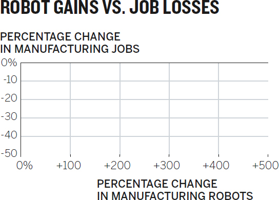
[Pause five beats] Robots are taking our jobs, right? Automated systems obviate the need for workers. We wanted to see the trend, so we decided to look at manufacturing job losses compared with the number of robots deployed over the past 15 years in 10 countries. What do we expect to see on this chart? [Pause, wait for answers] Right. As the deployment of robots increases, jobs decrease. Something like this?

[Pause five beats, wait for agreement, and nod] That looks right. Well, when we plotted the actual data, this is what we saw: [Pause three beats]

We were wrong. There’s no correlation at all. In fact, the UK and Sweden, two of the four countries that have lost the most manufacturing jobs, have deployed robots much more slowly than other countries.
In this series, the center chart with the expected results lures people to commit to an idea. The reveal is so completely different, however, that it compels the audience to think through what just happened. Why isn’t it what I thought it would be? Inconsistency creates internal anxiety that we feel compelled to fix.10 And the greater the inconsistency, the more we want to reconcile the dissonance. In the face of visual evidence like this, it’s hard to hold on to assumptions or even deeply held beliefs. It’s a powerfully persuasive presentation technique.
Deconstruct and reconstruct. I’m fond of this Football vs. Rugby chart that compares time use in televised American football games and rugby matches.

The point I want to make is that rugby is more exciting than football: it’s a longer game that features more action in less real time. That idea comes through, eventually. In truth, this is not a great chart for a presentation. I’ve given you no fewer than 15 bits of information to look at here. The main idea, which is a fairly simple one, doesn’t pop as well as it could. If I want to make it work better, I could do another simple binary comparison, first showing rugby, then football, similar to what I did with the women’s degrees chart:

[Pause 5 beats] A rugby match contains a lot of action, and because there’s very little stopping except for halftime, most of the time you’re watching, you’re watching the game itself. Compare that with American football. [Pause 3 beats before adding football chart to the screen]

This is better; my viewers can focus on one sport at a time. But I’m still asking them to think about three things in relation to one another, then to do it again, and then to compare the two sets of relationships. In contrast, the women’s degrees chart showed one thing—all other degrees—in the before state and just two new pieces of information in the reveal.
The thing about having options is that it slows us down. Here we borrow from Braess’s paradox, a principle of traffic management developed by the mathematician Dietrich Braess, which states that adding route options (new roads, new lanes) to congested roadways can decrease traffic performance.11 That’s because when many people can switch routes (and switch again) for more-favorable personal outcomes, they slow the system down. Braess’s paradox has been demonstrated in the real world many times when traffic improved after roads were removed. It has been applied to phenomena other than traffic, including power transmission (performance declined after systems were decentralized), protection of endangered species (the prospects for many species improve when one species goes extinct), and crowd control (multiple paths from a concourse to a seat in an arena make it take longer to get to seats).
What we experience with a complex chart isn’t technically Braess’s paradox, but it’s similar. Think of all the places to focus on the Football vs. Rugby chart as the route options. Should you start with the orange bar or the green? Should you compare the bars overall or the pieces? Do the specific values matter enough to focus on them? Which route will get you to understanding fastest? Options require choices, and choices take time. In a presentation, different people may choose to focus on different things.
By deconstructing a chart, you can remove all possible routes except one so that your presentation provides the fastest path to understanding. Here’s the Football vs. Rugby chart deconstructed for a presentation. Each chart would be shown one by one, starting with the top one.

The top chart is unambiguous. We’ve eliminated all but one route here: how long a game lasts. Viewers will grasp this immediately because it’s a simple comparison and it’s the only one available. The subtitle further prods them, asking the question the chart answers, in case there was any doubt.
In the second chart, we’ve added some new information now but, crucially, we’ve also removed some of the previous labeling and the first subtitle. We feel confident removing them because they were so clear and immediately understood. The bars of lighter color remain, serving to put the new information in context. Because viewers aren’t figuring out where to look, they can quickly assess that a rugby match has proportionally much more action.
One more time—add new information, remove old. Only one route. This time the reveal feels much more powerful. Viewers haven’t once had to think about where to focus or decide what’s important. Instead of spending mental energy figuring out the chart, viewers are free to think about and discuss the idea. It’s also more unlikely that they’ll disagree about the meaning of this story, because it has been presented in such a way that they can’t start from different places or focus on different things. Everyone can agree on what’s shown here.
Some vanguard neuroscience suggests that might be important. The neuroscientist and marketing professor Moran Cerf, with Sam Barnett, recently published a paper suggesting that what makes a story memorable or engaging or vivid is how many brains respond similarly to it.12 Put another way, what the authors call “cross-brain correlation,” or CBC, predicts whether people will remember a story as well as or better than other measures, such as how they rate the story or how long they spend with it. To the extent that we can make our visual stories concise and unambiguous, they’re likely to be far more engaging and memorable.
Animate. Deconstruction and reconstruction lends itself to animation. Used skillfully—that means sparingly and functionally, not decoratively—animation can deepen understanding and engagement.
To show the massive scale of death in World War II in a way that conveys the tragic loss of human life rather than reporting statistics, for example, is difficult even with data visualization. Neil Halloran did it, though, in his interactive documentary Fallen.io. Halloran deftly uses movement (along with narration and sparse background music) to traverse a field of data points, zooming in and out to help viewers understand the vast scale of the war’s carnage. In one powerful section he tallies deaths in the Soviet Union. The animation adds units of people killed—each icon added represents 1,000 deaths—for 45 harrowing seconds (using time to create tension), until it finally reaches 8.7 million. A fast zoom out shows the total in comparison with other countries’ columns of units before redistributing all the deaths over time as a stacked area chart. One person who commented on the dataviz illuminated the effectiveness of the narrative techniques we’ve discussed here in communicating statistics that are too absurd, too abstract, to grasp in other forms:
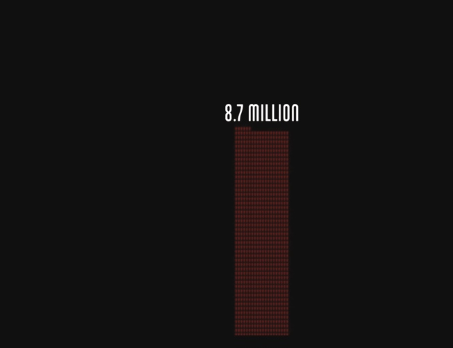


Fallen.io masterfully visualizes the harrowing death toll of World War II, using animation and multiple presentation techniques outlined in this chapter. Deaths stack up in unit charts in which each unit represents 1,000 deaths before those units are redistributed into a stacked area chart that shows how the deaths occurred over time.
One million, six million, seventy million. Spoken or written, these numbers become a buzz. Incomprehensible. Presented graphically, they hit closer to the heart. As the Soviet losses climbed, I thought my browser had frozen. Surely the top of the column must have been reached by now, I thought.13
Tell stories. When you want to deeply impress an audience with dataviz, your impulse may be to show them uncommon and unusually beautiful forms. “Eye candy” is the perfect moniker for charts like that, because they tend to give a quick buzz that doesn’t last.
Storytelling is the best, most powerful tool for making the kind of lasting impression that can create new understanding, change minds, or even effect policy change. Halloran’s animation is visual storytelling at its most captivating. It moves us in a way that the text and static charts I’ve used to describe it can’t capture. In a world in which it’s said that people can’t sit still for more than a minute or two, this 18-minute dataviz went viral.
It essentially consists of three basic chart types—unit charts, bar charts, and stacked area charts—deconstructed and reconstructed over and over again. Powerful presentations that grab an audience don’t have to rely on clever chart types. They can rely on your ability to craft your idea as a little drama.
Any story can be told in multiple ways, but a good way to start is to break the idea into three basic dramatic parts: setup, conflict, and resolution:
Conflict: Here is new information that complicates or changes reality.
Resolution: Here is the new reality.
In general, when we tell stories, the setup and resolution get about half of our attention. The other half is devoted to the conflict. That’s where the action is. That’s what makes narrative. No change, no story.
This formula is deeply entrenched in how humans experience stories; most successful narratives follow it. We can crudely map just about any story, or story archetype, onto it:

This is deeply reductive, but intentionally so. Obviously, crafting a great novel or eight feature-length movies involves much, much more than a few sentence fragments outlining the structure. But it’s a useful way to practice deconstructing narratives (try it with your favorite stories) that will help make your dataviz presentations more engaging.
Setup, conflict, resolution. Beginning, middle, end. You don’t have to follow chronology, though usually you will; you only need to have your story proceed such that the setup makes sense on its own, the conflict affects the setup, and the resolution follows the conflict. Focus primarily on the conflict: that’s what creates uncertainty, or introduces obstacles, or simply changes the status quo. It doesn’t have to be negative. It could be the hiring of a star performer that changes your department’s fortunes. Or it could be a new exercise regimen that positively affects your productivity.
To find this rough story structure in your visualization, break down and refine the idea statement that you came up with in the process of talking and sketching. (It should be clear by now just how important arriving at some statement of your idea is to successful visualization.) The story will be easiest to find in time-series data, which is inherently sequential. Take the idea described in the peanut butter chart earlier in this chapter. Consecutive bad harvests due to drought have sent once-stable peanut butter prices to historical highs. That is:
Setup: Prices are stable for years.
Conflict: Droughts create consecutive bad harvests.
Resolution: Prices spike and then stay high.
These breakdowns demonstrate how you might turn one good chart into a series of simpler charts, as we did with the football/rugby comparison, to create little dramas. Each step becomes its own chart or adds new information to the main chart. Here is the peanut butter narrative, with presenter’s script, using narrative to engage the audience.

[Pause 5 beats] For nearly a decade, prices of peanut butter were smooth. Modest increases during the recession mapped to rises in most food prices.

But then there was a drought and a bad peanut harvest. What happened? Where did prices go from here? [Pause, invite speculation].
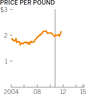
For most of the following year, prices were actually flat, until the next harvest approached, when prices started to rise as growers feared another drought.

And that’s what happened: another bad harvest. Prices spiked almost 50%. And since then . . . [Pause]

Prices have remained high. One bad harvest was tolerable, but two sent prices to nearly $3 per pound, where they’ve remained for nearly half a decade.
SOURCE: CPI
Reserve dramas for your most complex ideas—explaining how multiple economic factors are affecting your business, for example—and your most important ideas, those for which you need to be especially convincing and persuasive.
PUTTING IT ALL TOGETHER
It can be useful to apply narrative principles to a chart, but it’s far more powerful when, with multiple charts, you turn a presentation, or part of one, into a story.
Let’s say you’re a start-up pitching potential investors on a new type of coffee pod for single-serve coffee machines. The market for coffee pods is saturated, but yours is different. It’s recyclable. You could just go in and say, “We have a recyclable pod that fixes a problem in the market.” But will they understand the problem? Do they care? You want them to feel the problem so that when it comes time to show them your solution, they’ll have no doubt that there’s a need for it. Turn the beginning of your presentation into a short narrative.
First sketch out the three main parts of the drama, in words and literal sketches:
Setup: Single-serve coffee machines are taking over the consumer coffee market.
Conflict: The pods these machines use are nonrecyclable and have produced a staggering and growing amount of waste.
Resolution: Recyclable pods will help solve this problem.

You’ve mapped out a story. It’s a good sign that most of the time and space has gone into the conflict section, where drama has the greatest effect. Another good sign: you’re already thinking about the presentation of the idea, making notes about using tension, time, and reveals to increase the persuasive effect of what you’re showing.
Now you have to build those charts. Each chart will still go through the talk-sketch-prototype process; some may go through it together. But each needs to be well conceived and convey its idea effectively so that the audience can focus on the story rather than on making sense of the visuals. For brevity’s sake, I’ll skip to final charts and presenter’s notes. Notice how they pull together everything discussed in this chapter, from not reading the picture, to using silence, to creating tension and reveals, to telling a story.

Setup:
[Show first chart, pause five beats] We all know that single-serve coffee is a growing phenomenon, but just how intense its surge is can’t be understated. Its share has quadrupled in the past four years. In 2007, single serve’s market share was virtually zero. Last year almost one in three people said their last cup came from a single-serve machine.
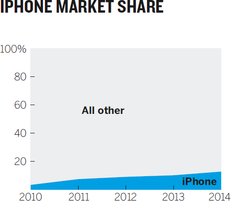
For perspective, here’s the growth of the iPhone’s share of the mobile market over the same period. [Display next chart next to first]

[Pause 3 beats] Every single-serve cup brewed requires a pod. Sales numbers on pods are notoriously difficult to pin down, but we know that the leading vendor alone is approaching 10 billion pods sold in one year—six times as many as five years ago. [Pause three seconds] During my pause right there almost 1,000 pods were sold.

Conflict:
And most of them aren’t recyclable, which has created a significant waste problem. The dominant vendor sold 18 billion pods in the past two years. But it’s hard to fathom how much waste that really is, so let’s try to break it down. If we lined up the pods, 36 would fill a square foot.
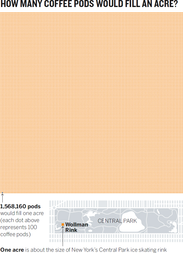
[Pause 3 beats] Think of an acre: like the skating rink in Central Park. Covering that with pods would account for eight one thousandths of one percent of the pods sold by that one vendor in the past two years.

We have to go far bigger to see how much space 18 billion pods would take up. Would covering Central Park in pods use up all those sold in the past two years? Would it at least take half the pods to cover Central Park? [Pause] No. It would take only about 7%.
We’re going to have to start stacking them to account for the rest. If we did that in Central Park, the entire park would be just over two feet deep in the coffee pods sold by the leading vendor in the past two years. We’d be thigh-high in unrecyclable used coffee pods.
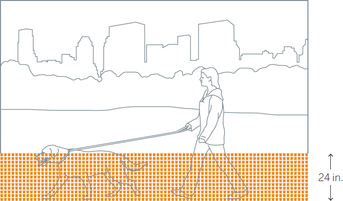
But to be fair, we should subtract the pods that are already recyclable. If we did that, how much lower would the pile be in Central Park? [Pause, remove recyclables on same image, change label from 24 in. to 22.8 in.]

About 1.2 inches lower. Not even a single pod’s height.
Resolution:
The reason there are so few recyclable pods is that it’s been a technically difficult design to achieve. We have a design that we believe solves that problem. And if our design can gain even 15% of the market in two years, we can reduce this pile of trash in Central Park by almost half a foot. [Again tweak image to remove pods and change label to 16.8 in.]

That’s a big start.
This story doesn’t guarantee success, but it’s a hell of a lot more engaging and impressive than projecting standard spreadsheet charts and reading the data in them—or, worse, reading bullet points verbatim. Notice how little you’ve said about the data itself; instead you focus incessantly on helping the audience understand the idea, which is not simply that 18 billion coffee pods were thrown away. The idea is that the popularity of single-serve coffee creates a major waste problem that current recycling efforts can’t begin to address—but we can. The number 18 billion is big enough and abstract enough that simply stating it can’t possibly convey its meaning in terms of objects. Imagery, relatable points of reference, and a narrative arc conspire to make that abstract number tangible.
You’re sparking viewers’ brains so that they’ll understand the idea better, engage with it more, and remember it in a way they otherwise wouldn’t. Even when charts are perfectly executed, to truly engage an audience, the play’s the thing.
RECAP
PRESENT TO PERSUADE
Beyond manipulating charts themselves, you can make visualizations more effective by improving your presentation skills. The twin challenges here are to help viewers when they first see the visual (how you present it to them) and to help them process it (how you get them to engage with it).
PRESENTATION TIPS
• Show the chart and stop talking.
A good chart will speak for itself. Let the viewers’ active visual systems work without distractions.
• Don’t read the picture.
Talk about the ideas in the chart, not its structure.
• For unusual visual forms, guide the audience.
Don’t read the picture, but do provide some brief explanation of how the form works.
• Use reference charts.
Companion visuals that show “ideal” or “average” cases can add context and make your chart easier to understand.
• When you have something important to say, turn off your chart.
As long as a visual is displayed, viewers will look more than listen. If you want them to hear you, turn off the screen for a moment to refocus them.
• Show something simple. Leave behind something more detailed. Use the simplest forms possible in presentations, but create versions with more information that audience members can spend time with on their own.
ENGAGEMENT TIPS
• Create tension.
Before revealing a full visual, show parts of it and ask the audience to speculate on what it will ultimately show.
• Use time.
To make an audience grasp large values, reveal them gradually.
• Zoom in or out.
To give viewers a sense of scale, start with a relatable value and then increase or decrease the scale step by step to show the value you want them to understand.
• Bait and switch.
Lure viewers in with a visual they may expect to see and then show them the actual version, which contradicts expectations.
• Deconstruct and reconstruct.
Break down a visualization into multiple, simpler charts and then put it back together for the audience.
• Tell stories.
Use the dramatic structure of setup, conflict, and resolution to make a chart or several charts tell a short story.
INDIA SWEARINGEN
IN SEARCH OF AHA! MOMENTS
“I was not hired to do this.”
India Swearingen, of San Francisco’s United Way of the Bay Area, sounds almost defiant about her budding expertise in data visualization. “I was hired to evaluate the effectiveness of our programs,” she says. “I have a statistics background. I know how to do data analysis.”
Swearingen seems worried that her deftness with visualization may lead people to forget that she’s a skilled data scientist. “I spent years in college learning hard, high-level statistics,” she says. “I thought that’s what would be most meaningful to the organization.” But when she presented her statistical analyses, some of it visualized, she was met with confusion and blank stares. People weren’t really getting it, and she was spending more time than she had anticipated trying to make her visualizations more effective. “What I found was that people really just needed to know what was happening. They were hungry for the basic story.”
She taught herself how to use visualization software and kept improving her visuals. Swearingen recognized that as her visualizations became simpler, her audience responded better. “People were so desperate to understand the big picture, and I was providing it,” she says. “I’m helping them make decisions. I’m creating those Aha! moments.”
Before long, she was hooked.
Swearingen’s visualization process echoes the talk-sketch-prototype framework laid out in chapter 4. She starts by defining her audience and then asks herself, What is the story? “The form comes out of that. When I’m building my story, I’m thinking about the key insights I want them to see. I’m writing, erasing. Putting stories on top of stories. I end up with a storyline.”
Then she sketches—“a lot.” On whiteboards. Walls. Paper. Any form she can think of that might help her create the Aha! moment. She calls this part the visualizing, because it’s when the idea, the story, starts to take on a visual form. Creating the actual charts is less a matter of visualizing than of building what she’s already visualized during the sketching process.
With sketches in hand, she solicits reactions from colleagues. “Since I don’t have a data team, or training in visualization, really, I don’t have the opportunity to have deep critique sessions,” she says. “So I run things by people.” She brings in “strong thinkers” from various teams—marketing, leadership, program development—to get their gut reactions to her charts. “I listen for their questions, see where their minds go. I don’t think they truly know exactly what I’m doing, and how they’re helping, but it works. It really helps me create those charts that people respond to, because what we see and think about when we create a chart may not be what others see when they look at it. We have to test their reactions.”
After a few rounds, when her recruits start asking fewer questions, she knows it’s time to start building the visualization.
As for the Aha! moments: “I’ve had a lot of them now. But my favorite happened recently.” The United Way relies on engagement with its donors and volunteers; Swearingen saw a need to understand that engagement better statistically. “How do people view the organization’s role compared with our perception of who we are? Where are we strong and weak? If we see people donating less, how do we know what’s really happening?” She proposed that the organization launch a major survey to acquire some deep data on engagement. This was no small investment, and she needed approval from “basically everyone” to do it, so she knew the output from the investment had to be good. Her reputation, her perceived value to the organization, in some ways depended on it.
When she presented to the all-staff meeting, there were no doubts about her value. “It was this really neat, really awesome moment,” Swearingen recalls, “really the first truly interactive session since I got here. I could see people’s engagement with the visuals. They were asking good questions. They were drawing conclusions based on what they saw and discussing it. Hunches were being confirmed and denied. The questions just kept coming out of the audience.”
Engagement strategies and programs were adjusted. Swearingen also benefited: Initial skepticism about investing in data analysis eroded. “Now they see the value of gathering, submitting, and tracking data,” she says. “It was a good presentation, but it could have been so much better with more data.” That’s Swearingen the data scientist.
Swearingen is thriving. “Right now, I’m special, because so many people are intimidated by dataviz. But that’s changing. Tools are making it easier. More people are trying it. I’m doing it really well and working on getting to the next level.”
That next level includes more exploratory visualization and interactivity. Swearingen has already seen how tools help to bring interactive visuals to lay users. She has even seen these techniques seep into formal presentations—a development she views as exciting and possibly transformational. “To be able to have a good visualization on the screen and have someone say, “Let’s see that data filtered to show only results for younger people and women,” and then to be able to instantly show a good visual representation of that filtered data—that will change how presentations work, I think. It allows the audience to take more ownership. It’s a shared approach.”
Even though she wasn’t hired to do visualization, Swearingen is happy with the turn her career has taken: “I just kind of evolved into the dataviz person here, and it has absolutely helped me in my career. Without this, I’d be behind the scenes, answering questions about data. With it, my image in the organization and beyond has really increased.”