Chapter 7
Special Situations
Special situations can provide trading opportunities or signs of things to come. Some situations are worth looking for, and some are just informational. I discuss them in this chapter, sorted alphabetically.
Bull and Bear Markets
One of the keys to making money trading chart patterns is to trade with the trend. If you've been in the markets for long, you will have heard the phrase, trade with the trend. But what does that mean?
Buy when the market is rising, such as in a bull market, and sell or sell short when the market is falling, such as in a bear market.
It also applies to the industry. Research on my trades found that the industry movement was more important than the market movement.
For example, when both the industry and market were rising, I made 15% on my trades. When both the industry and market were trending lower, my trades lost 10%. If the industry was down but the market was up, I still lost money. In the reverse situation (industry up, market down), I made money.
In other words, the industry trend was more important to the performance of the stock than the market, and the trend of each (industry and market) affected performance.
- Trade with the market and industry trends.
selling a security you don't own on the expectation that you can buy it later at a lower price.
Once you become familiar with chart patterns, you can look at the S&P 500 index and tell which way price is likely to go in the coming weeks. You won't be right all of the time, but you will be able to make predictions that help your trading.
If you expect the index to climb, then go long. If you expect the index to drop, then stay out of the market or buy defensive stocks (utilities, for example, which pay dividends and are usually not as volatile as other stocks).
![]() trade with the trend
trade with the trend
go long in a rising market, and stay in cash or go short in a falling market. Your results may improve if your trades agree with the industry and market trends.
Here's a quick anecdote about how the market can influence stocks. In January 2005, I was stopped out of Vertex Pharmaceuticals for a 9% loss. Ouch! But that was only the start. The next day, another four stocks hit their stops, some for a profit, and some for a loss. By mid-month, the market had stopped me out of every stock. I made money on the trades overall, but I was hoping for more—much more.
My instinct was to go shopping for new stocks, but the market kept telling me the same thing: it was going down. And down it went. I found some footing in Exxon Mobil and Lyondell Chemical when they showed ascending triangle chart patterns. Their bull run lasted about a month, and I netted profits on the pair.
Let's get back to bull and bear markets. Chart patterns perform differently depending on how the market is doing. Since I mentioned ascending triangles, let's talk about them. I studied 1,643 ascending triangles and measured their performance after the breakout. Table 7.1 shows the results.
In a bull market, triangles with upward breakouts showed price rising an average of 34% after the breakout. Don't think that you will make 34% trading triangles because (1) commissions aren't included; (2) you can be a lousy trader; and (3) the number represents 925 perfect trades, exiting at the very top without any fees deducted.
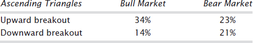
Notice that the decline in a bear market (21%) is not as large as is the rise in a bull market (34%). You can make more money in a bull market than in a bear market.
![]() countertrend pattern
countertrend pattern
a pattern with an upward breakout in a bear market or a downward breakout in a bull market. The breakout direction is against the prevailing market trend.
Trade with the trend. Trade chart patterns with upward breakouts in a rising bull market and downward breakouts in a falling bear market for the best performance. Avoid countertrend pattern moves such as buying an upward breakout in a falling market or shorting a downward breakout in a rising market. That's like swimming against the current. You will make it to the other side of the river, but if you don't hurry, the hot shots on the jet skis might run you over. Make as much money as you can in as little time as you can in the market.
- Avoid countertrend trades, those that go against the industry or market trend.
Trade with the trend means not only the market trend but the industry trend as well. If the stock market is red hot but the machine tool industry is suffering, then stay away from machine tool makers.
I follow five or more stocks in the 51 industries that I track on a daily basis. When I see a buying opportunity, I check other stocks in the same industry. If they are showing signs of reversing or are trending down, then I stay away.
- Look at other stocks in the same industry and determine if they are trending higher or lower.
My home-built computer program does the analysis for me. It counts the industry stocks using 1-, 2-, and 6-month price changes (today's price compared to 1, 2, and 6 months ago). It also computes the trends on the stock I'm interested in buying and the S&P 500 index using the same period and method.
Bull and Bear Traps
Just when you see a promising situation and jump on it, the market turns, filling your portfolio with blood. Figure 7.1 shows an example.
This is an ascending triangle, sporting a flat top and upsloping trendline along the bottom. Price crosses from side to side numerous times, filling the pattern not with white space but with trading action. Price touches each trendline at least twice, and the pattern completes when price closes outside the trendline boundary (point A). An upward breakout occurs 64% of the time in an ascending triangle.
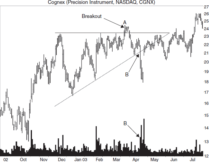
FIGURE 7.1 A bull trap snares bullish traders at the upward breakout (A) then drags them underwater until they gush blood to the right of B.
In this example, price falters at A then tumbles and bounces off the bottom trendline before plunging downward through it at B, a one-day dip of almost $3 on high volume. Traders that bought at A probably sold for a loss. Those at B sell short, expecting price to continue moving down. They are right, for a time, as price continues lower then turns and gaps upward on exceedingly high volume. Price works its way higher after that.
Point A is a classic bull trap. Price rises after an upward breakout then collapses. Point B is a bear trap. Those investors expecting the stock to decline were disappointed when it gapped upward and climbed.
I haven't found a way to predict when a breakout will reverse like that shown at A or B. The volume pattern doesn't vary from the actual breakout nor does the distance to the apex. Overhead resistance, underlying support, a market or industry reversal—all can trap a trader. When you trade chart patterns, these situations occur and you need to take prompt action to save your trade. For traders, that is why placing stops after buying is so important.
- Bull and bear traps need quick action to save a trade.
The Dead-Cat Bounce
When Merck pulled their drug Vioxx (an arthritis painkiller) off the shelves, the stock plunged from a close of 45.07 to 32 and change.
Figure 7.2 shows what happened to the stock. The event decline took the stock lower 28%, then price bounced. That lasted just two days before the stock resumed tumbling again. Eventually, the stock bottomed at 25.60, for a total decline of 43%.
If you invest in stocks long enough, a dead-cat bounce (DCB) will likely snare one of your stocks.
A typical dead-cat bounce pattern takes the shape of the inset in Figure 7.2. The smart money knows something is wrong, and they start dumping the stock at point A. In the Merck example, the stock peaked in June, and the event occurred in September. The smart money got out early.
When the event decline begins, it takes price down from B to C, a massive drop. Then the brokerage firms start touting the stock. “If you loved it at 50, it's a steal at 25.” “It's a fire sale! You can pick up a share of stock for 30 cents on the dollar. Buy aggressively.” The hype pushes the stock up, and it bounces to D. That's when the smart money begins shorting the stock.
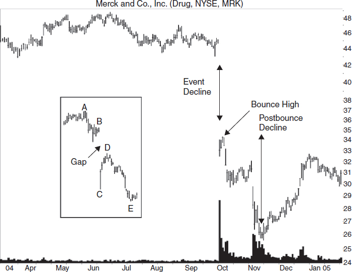
FIGURE 7.2 The stock dropped 28% in one day when the company pulled Vioxx from distribution. After a bounce of just a few days, the downtrend resumed.
If the company announces a stock buyback or insiders say that the price represents value and that they are buying like crazy, the stock may continue recovering, but that's rare. Most likely, the stock eases over and continues down to E, below the event low at C. If the event is earnings related, chances are that another dead-cat bounce will occur in three months’ time.
- A dead-cat bounce sees the stock plunge during the event decline; it bounces and then trends lower.
- Another dead-cat bounce can occur within 3 to 6 months.
Dead-Cat Bounce by the Numbers
I've studied the dead-cat bounce extensively—almost 700 events—so let me tell you what I found. The event begins in the middle third of the yearly price range 44% of the time. Just 25% of the time does the event begin within a third of the yearly high. Clearly, the smart money is selling the stock, forcing it lower, ahead of the event.
The event decline averages 31%, but it can range from 15% to over 75%. By event decline, I mean the price decline as measured from the close the day before the event announcement (B in Figure 7.2) to the trend low (C) posted before price begins to bounce. The median decline lasts two days. Forty-six percent make a lower low the day after the massive decline, 17% make another low the next day, then 9% and then 3%. A price gap occurs 74% of the time.
Once price hits bottom after the event, it begins to bounce (C to D). This phase sees price rise an average of 28%, and it takes 23 days. Twenty-two percent of the time, the bounce will be high enough to close the gap made during the event.
Then the fun resumes. Price eases lower, declining an average of 30% from the high at the bounce (D) to the new postbounce low (E). On average, it takes 49 days before price hits bottom. When everything is completed, in 67% of the dead-cat bounces I looked at the stock will bottom 18% below the event low (C).
Another massive decline (at least 15%) follows the first one 26% of the time within three months and 38% suffer a decline of at least 15% within six months. For those stocks recovering, 38% close the event day gap in three months, and 58% close it in six months.
- Sixty-seven percent of the time price will bottom 18% below the event low.
- A second dead-cat bounce will occur 38% of the time within six months.
Trading and Trading Tips
If you are caught in a dead-cat bounce, the easiest thing to do is to sell immediately. If you are a seasoned trader, you can wait for the bounce and sell then.
An upsloping trendline sometimes works to time the exit. Draw it beneath the valleys as price rises. When price closes below the trendline, then sell. The odds suggest that the price will continue to go down, plus another dead-cat bounce could happen in three or six months.
For aggressive traders, short the stock once it crests during the bounce phase (point D in Figure 7.2). On the way to E, the stock may stall at the event low price (C), so watch for that.
If you see a stock with a wonderful chart pattern in which you would like to invest but a dead-cat bounce happened within the past six months, avoid the stock. Higher failure rates from chart patterns come from stocks with dead-cat bounces.
- Avoid trading stocks with a dead-cat bounce for at least six months.
Case Study
For this case study, look at the chart of Airgas, shown in Figure 7.3. I bought at 15.94 after the breakout from a head-and-shoulders bottom.
I thought it would climb to resistance at 18, and it might even climb to meet the June high at 21. With luck, the old high at 27 would fall by the wayside, too.
The dead-cat bounce at A changed all of that. The company announced earnings, and the stock tumbled 15% (A to B). I waited for the stock to bounce, and when it did, I sold. It turns out, I sold too soon as the stock really bounced, almost closing the gap (C).
I made $220 on the trade, but it could have been worse. The chart doesn't show it, but the stock made a near straight-line run down to 7.88, recovered to 14 then sank to 4.63 in June 2000.
- Trying to determine when the stock has bounced is difficult.
The Inverted Dead-Cat Bounce
What happens to price when a company announces unexpectedly good news? Sometimes, the stock shoots up by 5% to 20% or more in one day. Then price tumbles.
Figure 7.4 shows two examples. The first, at point A, happened when the company got news that banks extended a liquidity facility related to a receivables program. I have no idea what that means, but the market liked it. The stock shot up 26%, peaking at B. For a few days, the stock moved horizontally then began a swift decline to C. The drop measured 39%.
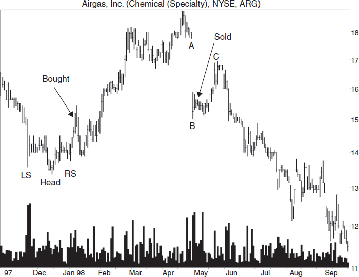
FIGURE 7.3 I bought after the head-and-shoulders bottom broke out upward and sold when it looked as though the bounce phase of a dead-cat bounce was over.
At F, the company said that quarterly sales slightly exceeded its earlier outlook. Up the stock went to D, peaking 47% above the close the day before the news. Then another decline set in, this time taking the stock down 59%.
![]() event pattern
event pattern
significant movement in a stock caused by a newsworthy event.
I term this behavior—a rapid one- or two-day rise followed by a decline—an inverted dead-cat bounce. Like the dead-cat bounce, the inverted variety is an event pattern, one of about a dozen that I've studied.
- An inverted dead-cat bounce sees a stock rise by 5% to 20% (sometimes more) in one session.
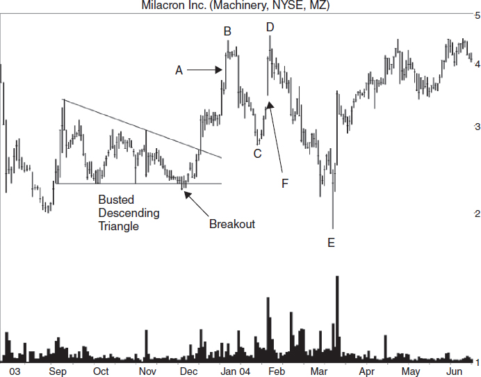
FIGURE 7.4 The announcement of good news sent the stock higher at A and F, but only for a short time.
Trading and Trading Tips
For swing traders, the choice to trade or not is easy. Consider selling after a large price jump (5% or more) when it occurs in one day. That means selling the day after the announcement sends price higher. According to my statistical review of nearly 31,000 samples where this occurred, selling was the smart move because price peaked the day after the announcement then retraced some or all of the gains.
- Swing traders should sell the day after an inverted dead-cat bounce.
For position traders and investors, the choice is not so clear. Why? Because price continues upward sometimes. Perhaps the general market or industry influences which way price will go, so be sure to check those when deciding to hold on or sell immediately. If the rise is vertical but takes longer than a day or two, then consider holding onto the stock. Chances are the stock will form a flag or pennant, signaling additional gains.
If a flag or pennant develops, trade in the direction of the breakout. If the breakout is upward, hold onto the stock. A downward breakout is the sell signal. One last thought: You never go broke taking a profit.
- For position traders and investors, consider holding if the announcement that sends price higher is earnings related. The stock may continue to climb.
- You never go broke taking a profit.
Case Study 1
Figure 7.5 shows how I made use of the inverted dead-cat bounce information. I bought an upward breakout from a head-and-shoulders chart pattern then sold two days later for a 25% gain. Here are the details.
With the stock trading near the yearly high, I expected the stock to rise back to 16 or 17, forming a double top. With luck, the stock would continue higher. When I saw the head-and-shoulders bottom forming, I decided to trade it. A buy signaled when price closed above the downsloping neckline, and I received a fill at an average price of 14.68. I placed a stop at 12.94, just below the 13 round number and slightly below the right shoulder low (RS).
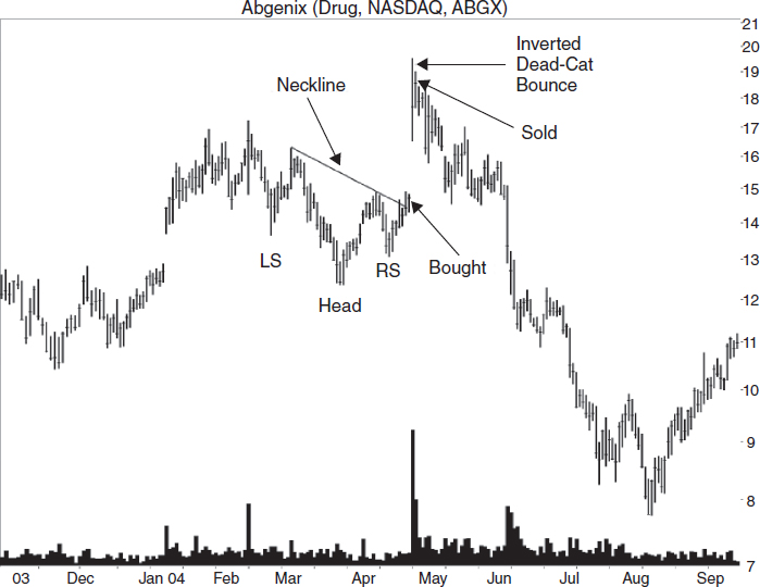
In my book, Trading Classic Chart Patterns, I describe how I scored the head-and-shoulders pattern for a +3 score. I usually won't trade a chart pattern having a minus score. A positive score meant that the stock had a good chance of rising to the 18.59 target predicted by the scoring system. That value comes from the median rise of 29.03% applied to the breakout price.
The day after I bought the stock, it zipped up 20%. With such a tasty gain in just two days, I didn't want to take a chance and give it all back. So, I reviewed the situation and decided to sell. I sold my shares and received a fill at 18.308, for a three-day gain of 25%. That day the company announced earnings.
What happened next amazes me even to this day. Look at Figure 7.5. The price tumbled, reaching a low of 7.76, or 60% below the peak the day before I sold. Wow!
Case Study 2
Figure 7.6 shows another case study. The bottom of the large symmetrical triangle has a downward breakout in August. The rest of the triangle is off the screen, and the lower trendline skirts the bottom of other valleys so even though the trendline looks drawn wrong, it is correct.
![]() flat base
flat base
a consolidation region in which price touches or nears the same price multiple times over several weeks or months, and identification is usually easiest on the weekly scale. The bottom of this region appears flat and sometimes forms the base of an impending up move, hence the name, flat base. Some chart patterns (such as double and triple bottoms, or head and shoulders) form after a flat base, the bottom of the chart pattern will usually reside slightly below the flat base level.
The symmetrical triangle had a score of +1 and a price target of 18.46 (using my scoring system). Earnings were due in two weeks, so it was a gamble, but one I felt worth taking. I thought the stock would do well since others in the industry were going up gangbusters and the market was moving higher, too. I bought at an average price of 14.60.
- I avoid taking a position in a stock three weeks or closer to an earnings announcement.
I placed a stop at 13.60, point A in Figure 7.6. If the trade were stopped out, I would lose about 7%. I thought the 18.46 target was aggressive and believed that the stock would stop at the January 2004 high at 16.70 (not shown).
Since the triangle broke out downward but turned around and shot out the top, it suggested additional gains.
When the company announced earnings, the stock took off, reaching an intraday high of 16.54, or up 15% from the prior close. That was close to the January high, so I felt the stock had topped out. Five minutes before the close, I sold. The trade filled at 16.18. In two weeks, I made nearly 10%.
Look what I could have made if I had hung on. The stock peaked at 20.26. At that price, I would have made 39%.
Flat Base
A flat base is one of the setups that you want to look for periodically. I use a weekly linear scale because it makes flat bases easy to spot. Figure 7.7 shows an example.
- Use a weekly chart, linear scale, to find the flat base pattern.
I define a flat base as a long, essentially horizontal price movement. This one begins in March and ends at the upward breakout in October 2003. A week later, an ascending, right-angled broadening formation builds. Often, when a chart pattern forms immediately after a flat base, it means that the upward breakout is going to be a powerful one. Jump in and buy the stock; just be sure to use a stop because anything can happen.
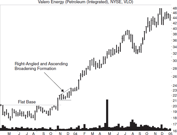
- A chart pattern forming at the end of a flat base can predict a strong up move.
Another tip that I've read about, but not verified, is that the longer a flat base is, the better the performance when price takes off. Some even measure the length and project it upward, but that smells fishy to me. You are taking a time measure (the flat-base length) and pretending it's a price move (projecting the length upward) … Go figure.
Gaps
The type of gaps I discuss here are those that appear using end-of-day data, on the daily charts. Price jumps, either up or down, leaving a gap on the chart.
when today's high is below yesterday's low, or today's low is above yesterday's high, a gap appears on the price chart. A gap closes when price later retraces and covers the gap.
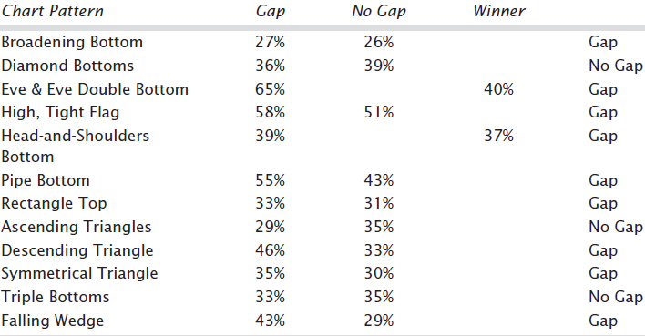
Traders can put too much emphasis on gaps, but their influence varies from chart pattern to pattern. For example, I found 157 ascending triangles with breakout day gaps and 768 without gaps in a bull market with upward breakouts. Those with gaps showed postbreakout rises averaging 29%. Those without gaps climbed higher: 35%. The difference could be because of the low sample count.
Table 7.2 lists the price performance after a breakout-day gap for some common chart patterns. The results measure from the breakout to the ultimate high and represent perfect trades.
Figure 7.8 shows an example of an ascending triangle with a bullish gap on the breakout day. The gap is called an “area or common gap” because price curls around and closes the gap a few days later. Other types of gaps have moves that are more extensive.
- Price closes the gap quickly in area or common gaps.
- A breakout day gap occurs when price breaks out of a chart pattern (on the breakout day) by gapping higher or lower.
The inset shows a bullish and bearish gap. A bullish gap occurs when the intraday low price is above the prior day's high. A bearish gap happens when the intraday high is below the prior day's low. Both leave a gap of white space on the price chart.
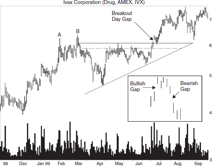
The dashed line in the figure is an internal trendline outlining the top of the ascending triangle pattern. The trendline above the dashed one does not touch price enough to outline a valid triangle, so I drew in the dashed one.
Lower Highs and Higher Lows
![]() bullish and bearish gaps
bullish and bearish gaps
bullish gaps occur in an uptrend, and bearish ones occur in a downtrend.
Want to know when the trend changes? Pay attention to peaks and valleys. A rising price trend shows higher peaks and higher valleys. A falling price trend has lower peaks and lower valleys.
- A rising price trend has higher peaks and higher valleys. A falling price trend has lower valleys and lower peaks.
Consider peaks A and B in Figure 7.9. The top of B is slightly below the top of A. Traders buying the stock lost their enthusiasm and let selling pressure halt the advance at B. With momentum swinging from up to down, additional selling pressure gathered like a snowball rolling downhill. The failure of B to rise above A and continue higher suggested a trend change.
B need not stop rising below A to signal a bearish turn. This is not an exact science, so sometimes B rises slightly above A before running into resistance. Figure 7.8 shows an example of this situation at peaks A and B. Notice that B is just above A before the trend reverses.
- If price stalls near the price level of a prior peak, expect a reversal. However, the reversal may only be temporary before the upward move resumes.
Figure 7.9 shows another example of a declining top to the right of peak E. The peaks seem to slide lower over time, suggesting a bearish trend developing.
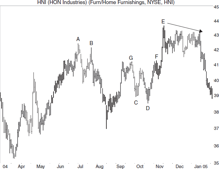
FIGURE 7.9 When a lower peak occurs (A, B), it warns of a bearish trend change. Valleys that fail to continue moving lower (C, D), also warn of a bullish trend change.
The bad news with trying to call turns like A and B is that it works only 35% of the time. That's how often a twin-peak pattern confirms as a double top. A confirmed double top means that price closes below the valley between the two peaks. Sixty-four percent of the time in a bull market, price doesn't decline far before going on to make a new high.
Do valleys also signal trend changes? Yes—see points C and D in Figure 7.9 for an example. Valley D is below C before the decline tires and price rebounds. Price rises and stalls at F, matching the old September peak at G. Price then declines less than a point but meets support at the round number 40 before continuing up.
This scenario is an example of two peaks, F and G, not signaling a trend change. Valleys C and D, however, do show momentum changing from down to up. Like their peak counterparts, price can fall just short of or decline just beyond a prior valley low before recovering. A second valley correctly predicts a trend change 36% of the time. That's how often a twin valley pattern confirms as a valid double bottom in a bull market.
When your trade begins an uphill run like the straight-line rise from 37 in May to point A, your skin will begin to tingle as price rises.
Each day professionals will ask if the trend is about to change, while amateurs will count their paper profits. When a second peak occurs and stalls near the first one, you'll break out in a sweat and feel that the time has come to sell. Have patience—and if price closes below the valley between the two peaks, then sell. Remember, two out of three times price will resume its uphill run in a bull market, so don't be too quick to sell.
Partial Rises and Declines
A partial rise or decline occurs in broadening chart patterns and rectangles. Partial rises and declines are brief price moves that signal a breakout, usually an immediate one. They are early trading signals.
Let's take the partial rise first, an example of which appears in Figure 7.10. Look for a valid chart pattern. By that, I mean a pattern that has price touching each trendline at least twice and meets any other identification guidelines appropriate for the chart pattern. Then, look for price to touch the bottom trendline, rise up, curl around, and head back down before coming close to or touching the top trendline. An immediate downward breakout usually follows.
Figure 7.10 shows an example of a partial rise in a broadening bottom chart pattern. The partial rise begins at A when price touches the lower trendline, and then price moves up, retraces the rise, and breaks out downward. A partial rise correctly predicts a downward breakout from a broadening bottom 58% of the time, so it's not a sure thing.
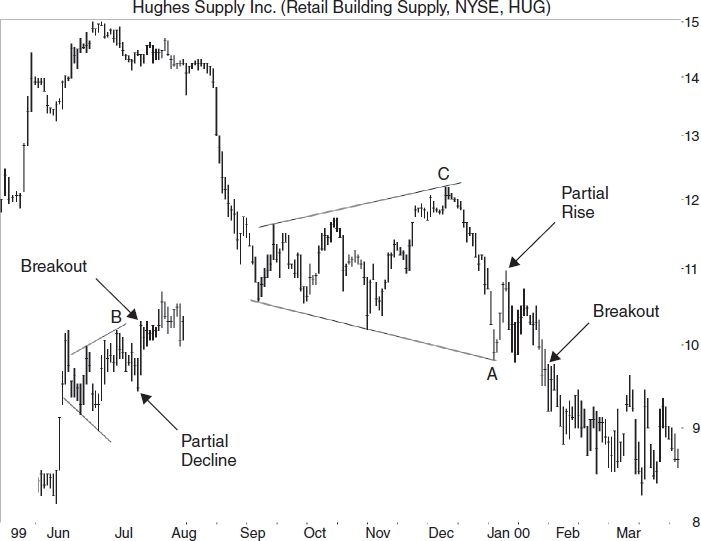
FIGURE 7.10 A partial rise correctly predicts a downward breakout, and a partial decline predicts an upward breakout.
Statistical analysis of 649 chart patterns with partial rises shows that the height of the partial rise as a percentage of the formation height averages 60% with peaks at 36% and 62%, close or equal to the Fibonacci numbers of 38% and 62%. That means the average partial rise climbs 60% of the way up the chart pattern before curling down. If price climbs above a 62% retrace, then chances are price will continue moving higher.
- Partial rise: In an established chart pattern (meaning the pattern has met all of the identification guidelines including trendline touches), price will rise off the bottom trendline, but not touch or come that close to the top trendline before heading down and staging an immediate downward breakout.
A partial decline is nearly the same as a partial rise except it applies to upward breakouts. Price touches the top trendline, drops down but does not come close to or touch the bottom trendline before curling upward and staging an upward breakout. A partial decline applies to established patterns, and it occurs before the breakout.
- Partial decline: In an established chart pattern, price will drop below the top trendline, but not touch or come that close to the bottom trendline before moving up and staging an immediate upward breakout.
Figure 7.10 shows an example. Price touches the top trendline at B, drops and then reverses before staging an upward breakout. A partial decline works 77% of the time in a broadening top. Analysis of 543 partial declines shows that price retraces an average of 59% with peaks at 36% and 75%.
The bad news is that partial rises and declines are difficult to trade. As price crosses from side to side, it often pauses midway across before continuing in the original direction. It looks as if price is going to reverse, but it doesn't.
One way to combat this is to use a 62% Fibonacci retrace of the prior move. For example, in Figure 7.10 if price retraces 62% of the drop from C to A and then appears to reverse, short the stock or sell any long holdings. This also works for 38% and 50% retrace values, so you can experiment.
- Use a 62% Fibonacci retracement to help differentiate a partial rise or decline from a normal pause as price moves across a chart pattern.
Case Study
Figure 7.11 shows a trade in Varco (now National Oilwell Varco). I bought shares at 9.38 in late May as a three-year play to give oil a chance to stabilize, and for the company to get a good return on their oilrig investments. I predicted a target of 13 with a downside of 8.75, the low just a few days before I bought. Resistance was at about 11, the site of the symmetrical triangle apex. A portion of the triangle appears in April, and it may look strange because price pokes out the top of the upper trendline. Additional trendline touches are off the chart.
With summer approaching and OPEC holding firm on quotas, I expected the price of oil would hold, but I also expected the stock to underperform. I figured I would pick up more shares if the price dropped 10%.
In late July, I bought more shares at 10.38. Bollinger bands showed low volatility over the past two months, meaning that the bands were narrow, and prior low volatility lasted three months before price shot from 8 to 13. I expected the same thing to happen this time. Downside was 8.63, the site of the May low, and upside was 13 with a move expected in the next 1.5 months.
- Bollinger bands: Periods of low volatility follow periods of high volatility (and the reverse). That means narrow Bollinger bands widen and wide ones narrow.
Instead, the up move came a week later. Price shot to 14.25, forming a broadening top.
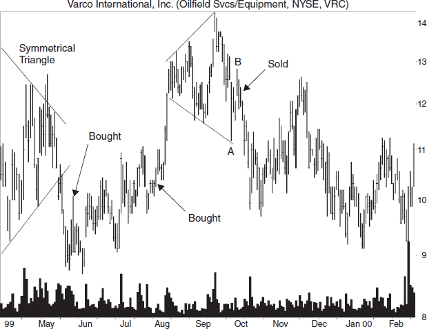
On October 1, I sold my shares at 12 as the stock started moving back to the lower trendline in a classic partial rise. The stock left the bottom trendline at A and climbed to B before it headed back down. On the two trades, I netted 21%.
You can see what happened to the stock after that. Sometimes you have to sell a long-term holding. The stock hit 9.19 before recovering, a decline of 23% from where I sold.
Quick Rises and Declines
Figure 7.12 shows what happens after a quick price rise from A to B. The stock rolled over and dropped, ending at C, 64% below the May high. Is this typical or unusual? The answer doesn't matter if you happen to be holding the stock. If you want to make money in the stock market, before a stock declines, sell it. That's easier said than done.
I will say that I find diamond tops an interesting play on the quick-rise, quick-decline scenario. The inset in Figure 7.12 shows an example taken from the stock charts. Price zips up from D to the diamond top and then retraces almost all of its gains (E) after the breakout. However, a quick rise, quick decline is not typical behavior.
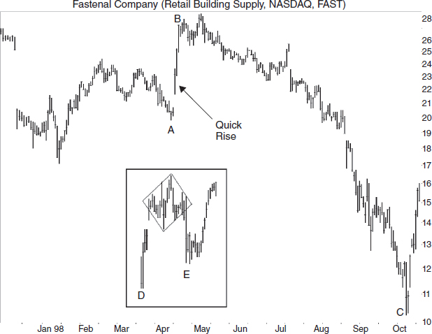
- Sometimes a quick decline follows a quick rise. Diamond tops can show this behavior with the stock returning to just above the launch price.
Does a quick rise follow a quick decline? Yes, but it happens less often than the reverse. You see this after the breakout from a diamond bottom. Imagine the inset in Figure 7.12 flipped upside down. That's what it looks like.
Let me issue this warning too: Just because you see a quick rise is no reason to expect a decline. With flags and pennants, a quick rise is what you are looking for. After the chart pattern the rise resumes, nearly equaling the rise before the chart pattern. The difference is that price breaks out upward after the chart pattern instead of downward. If you own the stock and it breaks out downward, then traders should sell immediately. Otherwise, you might hold onto a stock that looks like the disaster in Figure 7.12.
- Flags and pennants show a quick rise following a quick rise when the breakout is upward. Know your chart pattern, especially half-staff patterns.
Spikes and Tails
Some call them spikes, and some call them tails. I prefer tails, but it does not matter what they're called, just so you don't panic when your stock is whipped by one. Figure 7.13 shows several examples of tails on the daily chart. Tails are long price spikes that occur in a stock and usually mark short-term turning points after a sharp price run-up or violent decline.
- Tails (or spikes) are unusually long price spikes that can signal a reversal.
The inset shows a close-up of a bullish tail. The opening and closing price need not be at the same price as I show here (the left half of the horizontal bar is the opening price, and the right half is the closing price).
A bullish tail appears after a strong downdraft, and the closing price is near the intraday high. A bearish tail is a slim antenna sticking up on a hilltop. The price rise leading to the hilltop is a sharp, robust advance, and price closes near the intraday low. All of the tails shown here obey those guidelines except for the one in late September at about 41. There, the close is near the intraday high, not the low.
- A bullish tail pokes downward with a close near the day's high. A bearish tail spikes upward with a close near the day's low. In both cases, remember that price needs something to reverse, so look for them at the end of a strong trend.
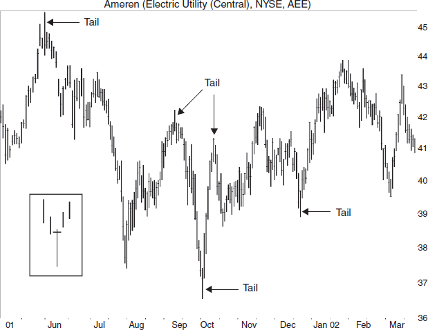
I remember holding a position in a declining stock that showed a downward spike. I became upset because of the paper loss. Then I smiled because I suspected that the stock was forming a bullish tail. Sure enough, the stock rebounded the next day and soon posted new highs. The tail turned into a major turning point.
![]() stop running or gunning the stops
stop running or gunning the stops
occurs when one or more stops trigger causing price to move and trigger additional stops.
Tails are panic buying or selling that sends price spiking upward or downward, respectively. They may even trigger stop running, where the execution of one stop triggers the next, forcing price to move rapidly intraday.
After the run exhausts, price collapses, retracing the move as buying demand hands off to selling pressure. The close is near the low for the day, leaving a tall spike on the chart. The next day, the sellers still have the upper hand because those wanting to buy did so yesterday. The price drops and continues declining in the coming days, leaving the tail reversal as a tree standing alone on the hilltop.
One important lesson I learned about tail chasing is not to act too quickly. Let a day lapse after you think a tail appears. Why? Because the next day may also have a large trading range, covering the tail in a parallel spike, and eliminating the trading signal. In many cases, price congests at the base of the tail for several days before resuming the move, so you have time to consider the situation before acting.
- Often price will pause at the base of a tail, so you can take time to evaluate before acting on a tail.
Chasing Tails
Figure 7.14 shows a tail trade I made in Cypress Semiconductor. I saw the Eve & Eve double bottom forming, but failed to place a buy order at the breakout price. Doing so would have gotten me into the stock at a much better price—about 11.85. Semiconductor stocks were weak and trading near their yearly low, but Cypress showed promise.
My market order to buy filled at a price of 12.69 as shown in the figure. I placed a stop at 11.05, just below the pennant in February. The pennant should support the stock in case price turned down. I expected a climb to 15.71, according to the scoring system in my book Trading Classic Chart Patterns.
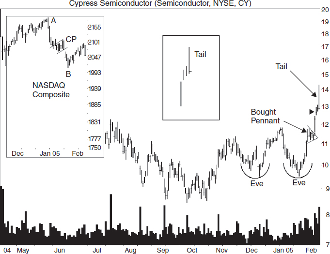
FIGURE 7.14 A tail appears on the right edge of the chart. Do you sell the stock or hang on for additional gains?
A knot of resistance in June 2004, at 14, would be a problem to additional gains, as would the entire 13 to 16 range (not shown).
The commodity channel index said buy, and the stock was riding the top Bollinger band upward. The commodity channel index (CCI) is a short-term trading indicator, which I used to check for divergence (I no longer use the indicator). Divergence occurs when the indicator trends one way but price moves the opposite.
I expected the general market to fall, as shown by the NASDAQ Composite. It trended down from the first of the year but climbed the last two or three weeks going into the trade. See the large inset in Figure 7.14.
If the NASDAQ continued upward, I would be set, but that probably wouldn't happen. Why? Overhead resistance. It completed a measured move down and was retracing to the corrective phase. I expected it to resume the downward move.
I show the measured move down chart pattern as the drop from A to B with the corrective phase (CP) in the middle of the larger inset in the figure.
When I pulled up the chart and saw the tail, I decided that the risk of a drop was much higher than the chance for addition gains. I placed a market order to sell the stock at the open the next day.
the commodity channel index, a price momentum oscillator that compares the current mean price with the average of its mean price. I use a 20-day lookback with a five-day DCCI signal line.
I got lucky, and the stock moved up on the open, filling my sell order at 13.28 for a profit of nearly 4.5% in three days.
The stock didn't turn tail and run. In fact, price peaked near 15 as the tail evaporated into just another bar on the chart. I should have waited a day to be sure the pattern was a tail.
Stops
A stop order is an order to buy above or sell below the current price. For example, I use a buy stop to enter a trade in ascending triangles (see Figures 7.1, 7.8, and 7.15 for examples of ascending triangles). I place the stop a penny above the horizontal trendline and automatically get filled at a good price during the breakout. I use a sell stop (stop-loss order) to protect my position. The stock sells when price drops far enough to hit the stop. Here are two other types of stops that I use.
- Stops come in a variety of configurations: trailing stop, volatility stop, minor high stop, minor low stop, and so on.
![]() DCCI
DCCI
dual CCI, a five- day exponentially smoothed moving average of the commodity channel index.
Volatility Stops
Price fluctuates like the illumination on a partly cloudy day. If you place a stop-loss order too close to the current price, the chances increase that price will stop you out. A volatility stop helps prevent that because it's based on daily price fluctuations. (I learned about a volatility stop from Perry Kaufman's A Short Course in Technical Trading (John Wiley & Sons, 2003). Refer to that book for detailed information.)
To compute a volatility stop, I dump the price data into a spreadsheet and take the difference between the high and low price for each day. Then, I average the differences over the last month. Multiply the average times 1.5 and subtract the result from the current low price to get the stop price.
- A volatility stop helps prevent being stopped out by normal price movement.
For example, Figure 7.15 shows an ascending triangle. Say I place a stop order to buy a penny above the breakout price (point E). How far down should I place my stop loss?
I found that the average daily high-low range a month before the breakout was 21 cents. Since the breakout was at 7.25, I should place the stop no closer than 32 cents ($0.32 = $0.21 × 1.5) below the breakout—6.94. Stocks below $20 tend to be especially volatile. Instead of multiplying by 1.5, try 2.
Trailing Stops
A trailing or progressive stop is nothing more than a stop-loss order that rises along with price. For example, Figure 7.15 shows an ascending triangle. A volatility stop placed at 6.94 will protect the trade even as price throws back to B. The low at B is 7.07.
- A trailing stop trails price upward.
a method of stop placement such that normal price volatility will not result in the triggering of a stop-loss order. I use the average of the high-low price difference of 30 calendar days (about 22 trading days) multiplied by 1.5. A stop should not be placed closer than the result subtracted from the current low price.
If the stop appears to be too close, use a 62% Fibonacci retrace of the move from F to E (E is used because that's all that was available on the breakout day). That would put the stop at 6.52, just above the 6.50 round number. However, a lower stop means a larger potential loss, 10% in this case, so keep that in mind.
As price climbs, raise the stop. For example, when price makes a new high at A, raise the stop to just below the prior valley, B. When price makes a new high at C, raise the stop to D, just below the flat support zone.
The diagonal lines show where price makes a new high, and the horizontal lines show were the stop should go. When price peaks at 24.25 in mid-March, there is no close plateau at which to place a stop. The one at 17 is 29% below the high—too far away. Where should you place the stop?
The answer is to use a volatility stop. Volatility is now 87 cents so 1.5 times this is $1.31. Place the stop no closer than 21.94, or 1.31 below the intraday low (23.25) the day price peaks. A stop there would close out the trade the next day. The stock continued lower until finding major support at 8.50.
I have found that using stops in this manner has cut my losses dramatically and allowed me to capture tasty gains instead of riding the stock back down. The method works.
Throwbacks and Pullbacks
Throwbacks and pullbacks are names for similar price movements. Figure 7.16 shows both after breakouts from head-and-shoulders chart patterns. A pullback occurs after a downward breakout, and a throwback happens after an upward one. By definition, throwbacks and pullbacks occur within 30 days of the breakout, and both must have white space as price curls back to the breakout price. The white space helps differentiate a valid throwback or pullback from price sliding along the chart pattern's trendlines.
- A throwback occurs when price curls back down within a month after an upward breakout from a chart pattern. A pullback is similar; only the breakout is downward. The stock climbs back to the breakout before resuming the downward trend.
FIGURE 7.16 Price pulls back after the head-and-shoulders top breakout and throws back after an upward breakout from a head-and-shoulders bottom.
Let's consider throwbacks first. I looked at 26,542 chart patterns (collected over several years) and found that price throws back to the breakout or trendline break an average of 55% of the time.
![]() swing trading
swing trading
short-term trading that takes advantage of price swings from retrace low to crest high or the reverse.
Price peaks an average of six days after the breakout, but it takes an average of 10 days total to make the return trip to the breakout. That's important for swing trading. Swing traders want to buy the breakout and sell a few days later as price rounds over for the return trip. The average distance from the breakout to the top of the throwback is 8%—a quick and tasty return if you can time it right.
A high-volume breakout throws back 70% of the time. By high volume, I mean the breakout day's volume is above the 30-day average. So, if you have a high-volume breakout, expect price to throw back. It may not, but it pays to play the percentages.
Once a throwback completes, price continues moving higher 65% of the time.
Pullbacks occur 57% of the time in the chart patterns I looked at. Price declined an average of six days but took an average of 11 days (total) to return to the breakout. The average distance from the pullback valley to the breakout price is 9%.
A pullback follows a high-volume breakout 66% of the time—every two out of three times. When price returns to the breakout, they resume dropping 47% of the time.
When a pullback or throwback happens, performance usually suffers. Let me give you an example. I looked at 3,266 head-and-shoulders bottoms and found that when a throwback occurs, the stock climbed an average of 33% before the trend changed. Without a throwback, the rise measured 41%. Both numbers are from a bull market, and both use an average of perfect trades, so don't think that your trade will work as well.
- Performance suffers after a throwback or pullback.
Pullbacks show a similar trend, but the numbers are closer. I looked at 2,927 head-and-shoulders tops with downward breakouts in a bull market. When a pullback occurred, price declined an average of 16%. Patterns without pullbacks declined an average of 21%.
Before trading a chart pattern, look for overhead resistance or underlying support. Those two are responsible for causing most throwbacks or pullbacks.
- Look for nearby overhead resistance or underlying support to help determine if a throwback or pullback will happen.
Since throwbacks and pullbacks are so important to trading chart patterns, let's try a quiz. Figure 7.17 shows a downward breakout from a valid head-and-shoulders top. Will price pull back?
When I consider trading a stock, I always assume a throwback or pullback will occur. The exception to this is if a stock is making a new high where there is little or no overhead resistance (a prior trendline projected upward or round number might cause overhead resistance and a throwback).
As I look at Figure 7.17, I see a low-volume breakout. Pullbacks accompany most high-volume breakouts as I've said, so a low-volume breakout would tend to indicate no pullback would happen. However, I don't put much faith in volume. Instead, I look at the general market, industry, and especially prior support zones.
I use the S&P 500 as the proxy for the general market, and on the day of the breakout, the S&P was trending downward. A pullback happening would be like the stock swimming against the current.
Using the Dow Utility index as the proxy for the utility industry, the index was also trending downward. A spot check of the 11 central U.S. electric utility stocks I follow showed them all heading downward. That also made it unlikely a pullback would occur.
Finally, I check for underlying support. Do you see any in Figure 7.17? I do, starting in February and running through March. If I were shorting this stock—betting on a continued decline—that horizontal consolidation region at 38 to 39+ would cause me to change my underwear. I would expect price to enter that area and be repulsed.
With the industry and market also trending down, I would not expect an immediate pullback on the approach to the area, and because strong breakouts often push through nearby support zones. Thus, I would expect it to bounce off the bottom of the range, hitting, say, 38.50 or so.
What happened? Figure 6.4 of this book gives the answer. With the market and industry tide pushing the stock lower, the price shot through the horizontal consolidation region (an ascending triangle) and bounced off a second support zone shown in January 2002 at 36 to 37. Prices bounced there and pulled back to the chart pattern, as expected.
What We Learned
Here is a list of the major lessons discussed in this chapter.
Bull and Bear Markets and Traps
- Trade with the market and industry trends.
- Avoid countertrend trades, those that go against the industry or market trend.
- Look at other stocks in the same industry and determine if they are trending higher or lower.
- Bull and bear traps need quick action to save a trade.
The Dead-Cat Bounce
- A dead-cat bounce sees the stock plunge during the event decline, bounces and then trends lower.
- Another dead-cat bounce can occur within three to six months.
- Sixty-seven percent of the time price will bottom 18% below the event low. See “Dead-Cat Bounce by the Numbers.”
- A second dead-cat bounce will occur 38% of the time within six months. See “Dead-Cat Bounce by the Numbers.”
- Avoid trading stocks with a dead-cat bounce for at least six months. See “Trading and Trading Tips.”
- Trying to determine when the stock has bounced is difficult. See “Case Study.”
The Inverted Dead-Cat Bounce
- An inverted dead-cat bounce sees a stock rise by 5% to 20% (sometimes more) in one session.
- Swing traders should sell the day after an inverted dead-cat bounce. See “Trading and Trading Tips.”
- For position traders and investors, consider holding if the announcement that sends price higher is earnings related. The stock may continue to climb. See “Trading and Trading Tips.”
- You never go broke taking a profit. See “Trading and Trading Tips.”
- I avoid taking a position in a stock three weeks or closer to an earnings announcement. See “Case Study 2.”
Flat Base
- Use a weekly chart, linear scale, to find the flat base pattern.
- A chart pattern forming at the end of a flat base can predict a strong up move.
Gaps
- Price closes the gap quickly in area or common gaps.
- A breakout day gap occurs when price breaks out of a chart pattern (on the breakout day) by gapping higher or lower.
- Bullish gaps occur in an uptrend and bearish ones occur in a downtrend.
Lower Highs and Higher Lows
- A rising price trend has higher peaks and higher valleys. A falling price trend has lower valleys and lower peaks.
- If price stalls near the price level of a prior peak, expect a reversal. However, the reversal may be only temporary before the upward move resumes.
Partial Rises and Declines
- Partial rise: In an established chart pattern (meaning the pattern has met all of the identification guidelines include trendline touches), price will rise off the bottom trendline, but not touch or come that close to the top trendline before heading down and staging an immediate downward breakout.
- Partial decline: In an established chart pattern, price will drop below the top trendline, but not touch or come that close to the bottom trendline before moving up and staging an immediate upward breakout.
- Use a 62% Fibonacci retracement to help differentiate a partial rise or decline from a normal pause as price moves across a chart pattern.
- Bollinger bands: Periods of low volatility follow periods of high volatility (and the reverse). That means narrow Bollinger bands widen and wide ones narrow. See “Case Study.”
Quick Rises and Declines
- Sometimes a quick decline follows a quick rise. Diamond tops can show this behavior with the stock returning to just above the launch price.
- Flags and pennants show a quick rise following a quick rise when the breakout is upward. Know your chart pattern, especially half-staff patterns.
Spikes and Tails
- Tails (or spikes) are unusually long price spikes that can signal a reversal.
- A bullish tail pokes downward with a close near the day's high. A bearish tail spikes upward with a close near the day's low. In both cases, remember that price needs something to reverse, so look for them at the end of a strong trend.
- Often price will pause at the base of a tail, so you can take time to evaluate before acting on a tail.
Stops
- Stops come in a variety of configurations: trailing stop, volatility stop, minor high and minor low stop, and so on.
- A volatility stop helps prevent being stopped out by normal price movement. See “Volatility Stops.”
- A trailing stop trails price upward. See “Trailing Stops.”
Throwbacks and Pullbacks
- A throwback occurs when price curls back down within a month after an upward breakout from a chart pattern. A pullback is similar; only the breakout is downward. The stock climbs back to the breakout before resuming the downward trend.
- A breakout on high volume is more likely to throw back or pull back than one on low volume.
- Performance suffers after a throwback or pullback.
- Look for nearby overhead resistance or underlying support to help determine if a throwback or pullback will happen.