Chapter 5
Ten Buy Signals
Over 30 years ago, I researched stocks and opened a brokerage account. Then I bought my first stock, 100 shares of Essex Chemical for $2,250, and held on. I sold it less than three years later for a profit of almost $2,000, a gain of 88% including dividends.
![]() average rise or decline (ARD)
average rise or decline (ARD)
I measure the rise from the breakout price to the ultimate high, or the decline from the breakout price to the ultimate low, for each stock, and then compute the average.
Two months after I bought Essex, I grabbed Nuclear Pharmacy with its way-cool name. I found it in the prospectus of my mutual fund and researched the fundamentals. Everything looked good, so I bought 200 shares for $1,800. Two weeks after I bought, the stock did a dead-cat bounce (dropped substantially, bounced up, dropped more). On paper, I lost a bundle. Another company swooped in and swallowed the stock on the cheap. I held it for less than three years before giving up and selling for a 25% loss.
Lesson 1: If your mutual fund owns the stock, there is no need for you to buy it—you already own it. Lesson 2: Don't fall in love with a stock just because it has a way-cool name.
Since those trades, I have learned much about stocks and stock market behavior. In this chapter, I share some of that knowledge by discussing ten buy signals—chart patterns. These are arranged according to how well they perform based on the results posted in my book Encyclopedia of Chart Patterns, second edition.
- If your mutual fund owns the stock, there is no need for you to buy it—you already own it.
- Don't fall in love with a stock just because it has a way-cool name.
High and Tight Flag
I received an e-mail from a woman asking me about a symmetrical triangle after I told her about a high, tight flag I saw forming on her chart. She bought at 80 and sold at 135 for a 69% gain. Her e-mail almost shouted, “Somebody stop me before I make too much money!”
The brokerage firm she deals with protects customer accounts up to $25 million. Can you imagine her telling them, “It's not enough. Can you cover me for $50 million?” Trading the high and tight flag just might get you there one buck at a time. However, the route is dangerous.
High and tight flags are the best performing chart pattern; they have the highest average rise (51%, based on perfect trading with no commissions), and the lowest breakeven failure rate (1%). Just three of the 412 high and tight flags I looked at failed to rise at least 5%. However, you have to know how to hunt this animal and how to ride it, or it could be as risky as running with the bulls in Pamplona.
- High and tight flags are the best performing chart pattern.
Identification
Here's what to look for:
- Price should climb at least 90% in two months or less.
- After the rise, find a place where price pauses (often sideways to down)—a congestion or consolidation area.
- Volume should trend downward in the flag.
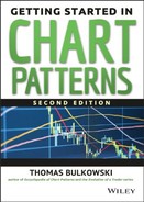
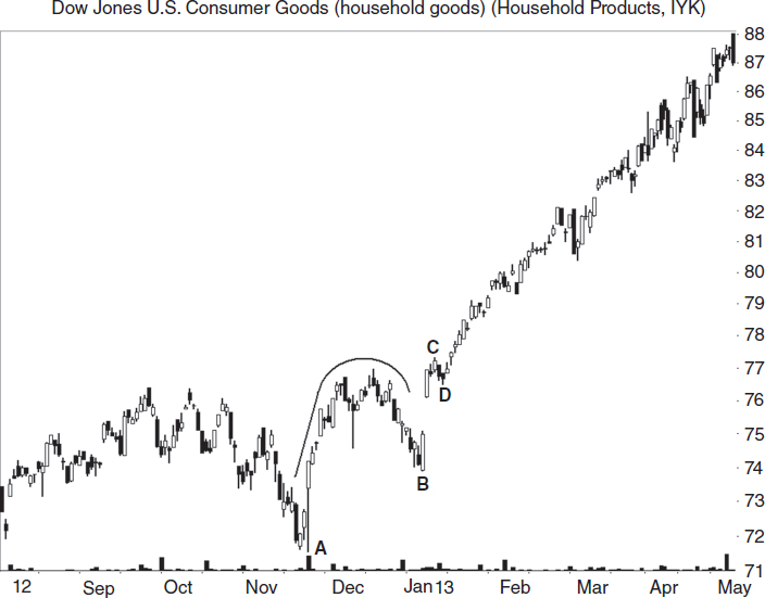
Figure 5.1 shows three examples that appear as pennants. The first one occurs in mid-August 1999 and is a tight pennant, meaning price touches the trendline boundaries in small, compact crossings. Prices climb 66% until reaching the September peak and dropping at least 20%, signaling a trend change.
The middle high and tight flag occurs in December and the post-breakout run tops out at High 2, the top of the loose pennant, for a rise of 74%. The December pennant is also a tight pattern with price crossing from trendline to trendline in a narrow cluster of action.
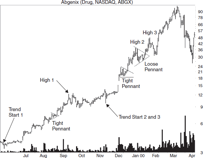
FIGURE 5.1 High, tight flags appear as flags, pennants, or random shapes after price doubles in less than two months.
The final high and tight flag happens less than a month later, and price soars 54% after the breakout (to High 3). Notice how the logarithmic scale makes the large price move appear small. On the arithmetic scale, the August high and tight flag is a speed bump in the foothills of the Himalayas.
To find these three high and tight flags, I looked for a rising price trend that doubled in two months or less. The August pattern, for example, reaches its highest peak at the start of the pennant on August 16, at 7.63. On June 16, two months before the high and tight flag, price reached a low of 3.78. That represents a rise of 102% in two months.
Price pauses and forms a pennant shape, moving sideways and resting, gathering strength for the climb to higher ground. Volume in this example trends upward; that is unusual because it happens just 13% of the time, and performance often suffers when it does occur.
The upward breakout confirms the pattern as a valid one. I found the other two high and tight flags using the same method—price doubling in less than two months attended by price moving sideways.
The high and tight flag need not appear as pretty as the ones shown in Figure 5.1. Sometimes the congestion area (pennants in this case) is irregular, looking like the loose pennant in late December. With some high and tight flags, you can't draw a trendline along the tops because it is as ragged as discarded clothing. Still, if high and tight flags break out upward and obey the identification guidelines, then they are valid patterns. For irregularly shaped high and tight flags, use a close above the highest peak in the pattern as the breakout price instead of a close above the trendline.
Figure 5.2 shows an example of a high and tight flag setup to avoid. I saw a number of high and tight flags that failed during the decline of the 2007 to 2009 bear market (and the start of the following bull market).
The high and tight flag is from A to B with the flag ending at C. After C, price moves up the way it's supposed to, but then what happens? Price dies. The stock drops back down near the price of A.
If you see a high and tight flag forming after an extended downturn, don't trade it. It could be part of a bounce that a year later will look like a tall double bottom. You will likely see this situation happen just as or just after a bear market ends.

Trading and Trading Tips
Once you have correctly identified a high and tight flag, how do you trade it? Here are the rules for buying:
- Wait for price to close above the pattern high.
- Buy the stock.
- Place a stop below the prior valley, below the pattern itself, or use a volatility stop (see Chapter 7).
With this pattern, the most important rule is to wait for an upward breakout (a close above the top of the flagpole or highest peak in the pattern). In a test of 78 high and tight flags, I found 13 patterns that broke out downward. That might not sound like much until a failure happens to you. Save your bucks and wait for the upward breakout.
The hardest thing to do when trading high and tight flags is to buy the stock. Chances are the stock is near the yearly high after doubling in price. How much higher can it possibly go? Buy in and find out!
Remember, high and tight flags have the lowest failure rate and highest average gain of any chart pattern. Your selection may prove the exception and fail, so place a stop-loss order below the valley nearest the breakout. This may be below the high and tight flag itself. Check to make sure the stop is not too close. You don't want volatility to stop you out. Later in the book, I review two high and tight flag trades, one where I stole two grand from someone and another in which they stole it back … with interest.
When identifying or trading high and tight flags, what should you look for or avoid? Here is a list:
- Look for overhead resistance that occurred in the past. If a horizontal congestion region appears at a price level above where the stock is trading, then that could act as a ceiling.
- Avoid loose-looking flags. A tight flag has price that overlaps from bar to bar. A loose flag meanders; there is marginal overlap, and price seems to climb for a day or two and then drops back for a few days only to repeat the sequence. Figure 5.1 shows one loose high and tight flag and two tight ones. High and tight flags with loose flags show gains averaging 40%, but those with tight flags gain 53%.
- The most powerful high and tight flags have flags that retrace 10% to 25% below the top of the high and tight flag, according to a study I conducted.
- Flags 5 to 19 days long tended to see price outperform. Generally, the longer the flag, the worse the performance.
- A receding volume trend in the flag portion of the high and tight flag sees better postbreakout performance when price climbs an average of 50% versus 35% for those with rising volume.
- High and tight flags with light breakout day volume tend to outperform, but not dramatically: 52% versus 46%. I define the breakout as the day price closes above the highest peak in the high and tight flag.
- High and tight flags that do not throw back climb further after the breakout than those that do: 53% to 42%.
You may decide to trade a stock with a high and tight flag that has all of the elements suggesting underperformance. Good! Just be sure to watch the stock closely and raise your stop as price makes a new high.
Measuring Success
How far will price rise? Find the lowest valley in the high and tight flag (the two months leading to the top of the flagpole) and measure the rise during that time to the top of the high and tight flag.
![]() trend start
trend start
before the chart pattern, find the highest high or lowest low before which price falls or rises by at least 20 percent, respectively.
For the stock shown in Figure 5.1, let's use the January high and tight flag, the highest one on the chart. The lowest valley within the last two months begins at the trend start in November at 9.88. The top of the pattern is at 37.25. Take the difference and divide by two, leaving 13.69. Add this to the lowest valley in the flag portion of the high and tight flag (26.19 in this example), projecting upward for a target of 39.88. The stock shown in Figure 5.1 hits the target just a few days after the breakout. This measure rule works 87% of the time.
- For high and tight flags, use half the pattern's height added to the top of the pattern to get a target.
Case Study
Figure 5.3 shows a situation that seems to happen frequently with high and tight flags. I bought at the market open two days before Christmas. The order filled at 11.69. After placing the trade, I put a stop at 10.33, which is slightly below the top of the November congestion region.
“I was expecting price to rise to 15,” I wrote in my trading notebook, “matching the left side of a failed Big W pattern in January 2004. Oil prices were dropping, and that was good for airline stocks. The industry was working with me as the other airlines started moving up in October or earlier, just as this one did.”

FIGURE 5.3 This high, tight flag ended in failure when price moved marginally higher before plummeting.
Unfortunately, the S&P 500 changed trend in six trading sessions. The airline stock crashed a day later, and I was stopped out at 10.334. I lost almost 12%.
After analyzing the trade, I determined that the stop was too far away. Volatility was 56 cents so that would call for a stop at 10.54 (that is, 1.5 times $0.56 subtracted from the intraday low at 11.38 on the buy date). Other than that, it was a good trade.
- A tighter stop could have limited the loss.
Pipe Bottoms
Pipe bottoms have a breakeven failure rate of 7%, meaning that 7% of the 7,740 pipes I looked at climbed less than 5% after the breakout. The average rise is a mouthwatering 43% (for perfect trades, remember).
Pipes are the new kids on the block, a chart pattern I discovered and explored. That's why I have so many samples: I wanted to get it right.
Identification
What should you look for when searching for pipes? Here are the guidelines:
- Use the weekly chart to select pipes. Pipes on the daily chart do not perform as well.
- Find two downward, adjacent price spikes that look like parallel lines.
- The spikes should be longer than other spikes during the past year.
- The bottom of the spikes usually has a small price variation (the average is 40 cents).
- The two spikes should have a large price overlap (67% is the average).
- Volume is high (above the 30-day average) 71% of the time on one or both spikes.
- The pipe should be obvious on the chart.
Most of these guidelines are self-explanatory. Pipes appear like weeds growing in a vacant lot: Some children collect and press their colorful petals between pages in a book, but the city mows down the others when they grow too high and violate ordinances. Distinguishing the collectables from the weeds is one reason for the many guidelines.
Figure 5.4 shows examples of several pipes. Look at the pipe on the right, during July 1996. The twin downward price spikes appear as parallel lines on the weekly chart, and in this case the low prices in the twin bottoms are the same. That happens infrequently, as the chart shows, and performance usually suffers when it does occur.
Switch to the arithmetic price scale and look for spikes that are longer than are those over the past year. They perform better (53% average rise versus 37%). The inset in Figure 5.4 shows what I mean by long spikes. The spike length is the difference between the two horizontal lines, which is the difference between the higher of the two pipe bottoms and the lower of the two weeks adjacent to the pipes.
After the breakout—meaning that price closes above the higher of the two spikes, confirming the pattern as a valid one—price climbs to point 1 and pauses there.
This is a common feature with pipes—price climbs to the prior high and stalls or reverses. Point 2 shows another resistance location where price reversed at the ultimate high.
![]() ultimate high
ultimate high
following an upward breakout from a chart pattern, it's the highest high after which price drops by at least 20 percent.
Figure 5.5 shows a pipe bottom in an exchange-traded fund (ETF) using the weekly scale.
Notice that the price trends down into the pipe from A. After price confirms the pattern by closing above the top of it, the exchange-traded fund moves sideways for months until after B. Then it begins a straight-line run higher.
The consolidation region between the pipe and B takes the shape of an ascending triangle, as the figure shows.
Trading and Trading Tips
Pipe bottoms are common so you can be selective. You will usually find pipes at the bottom of a price trend, many times as part of a V-shaped bottom. For swing traders, pipes represent an excellent profit opportunity. After the right price spike, switch to the daily scale and buy when price closes above the highest peak in the two-week pattern. That will get you in sooner than trading on the weekly scale.

![]() position trading
position trading
trading that holds a security overnight, sometimes maintaining a position for weeks, months, or longer, but not buy-and-hold forever.
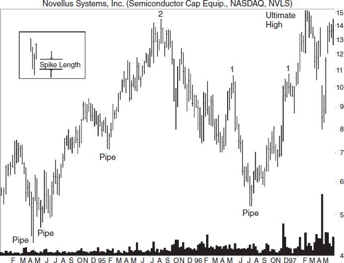
For position traders and longer-term holders, use the weekly scale for the buy signal. Wait for price to close above the higher of the two spikes before buying. In downtrends, many times pipe bottoms will not confirm (price does not close above the highest pipe spike), and price will continue lower. Figure 5.6 shows an example of an unconfirmed pipe in late September 1999. Price never closes above the pattern's high before resuming the downtrend.
Here are some additional trading tips:
- Pipes with short-term (zero to three months) downtrends leading to the pipe perform substantially better than intermediate- or long-term downtrends (46% average rise after a short-term downtrend versus 39% for intermediate-term and 35% for long-term).
FIGURE 5.6 The peak before a pipe bottom often becomes a resistance level, halting or delaying the price advance, as the numbers show.
- Avoid overhead resistance on both the daily and weekly scales.
- Pattern height: Tall patterns perform better than short ones (53% average rise versus 37%). Measure the height from the highest peak to the lowest valley in the pipe and then divide by the breakout price (the price of the highest peak). If the result is above 12.5%, then you have a tall pipe.
- Select pipes with a large price difference between the spike lows (average rise 48% versus 40% for price differences smaller than the 1.24% median).
- Volume heavier on the left spike compared to the right suggests better performance (48% average rise versus as low as 41% for the other three combinations).
- Pipes with a lower left spike tend to perform better than do those with a lower right spike (45% average rise versus 42%, and 37% rise for pipes with even bottoms).
I measure the formation height by taking the difference between the highest peak and the lowest valley in the chart pattern, and then dividing the difference by the breakout price to get a percentage of height to price. I use the median value as the difference between short (values below the median) or tall (values above the median).
- If price closes below the lower of the pipe bottoms, then exit your position. If things go right and price advances, raise your stop to just below the prior valley (a trailing stop).
Measuring Success
Notice in Figure 5.6 that price stalls or reverses near the peak before the pipe (numbered, in all cases shown). Thus, the prior peak represents the price target. Price may continue higher as it did after the June 2000 pipe (pausing briefly at point 3), but do not stake your life on it. Consider selling if price stalls near the level of the old peak. Notice that price sometimes does not make it up that far, as the right peak opposite points 2, 3, and 4 show.
- For swing traders, consider selling if price stalls near a prior peak.
Case Study
Figure 5.6 shows an example trade for the March 2000 pipe. Our trader waited for price to close above the highest peak in the pattern before buying. That took a month (point A).
Price moved up as it does in most trades that work. “But when it approached the old peak,” he said, “I got nervous.” I show that as point 2. Price was making new highs, but the rate of change oscillator was showing lower peaks. “Bearish divergence—a sell signal.”
He sold when price closed below the prior week (B). “If I had to do it again, I'd put a sell order just below the old high. Even if it was a buck below, that would have saved me money.”
Inverted and Ascending Scallops
Few people have heard of ascending scallops, and even fewer have heard of the inverted variety. Inverted and ascending scallops are patterns that I found when considering what ascending and descending scallops looked like when inverted. I went fishing and found hundreds of them swimming in the price ocean. They have an average rise of 38% and breakeven failure rate of 7%.
Identification
What does an inverted and ascending scallop look like? Figure 5.7 shows three scallops swimming upstream. Inverted and ascending scallops are the upside-down and backward J shapes on the chart.
Notice how the scallops narrow the farther up the price trend they appear. That is not always the case, but if you see that behavior, it warns that the end of the price trend may be near. This is especially true when the start and end of the scallops have nearly the same price (so it looks like an upside down U). Here are the selection guidelines:
- On the daily chart, find an upward price trend.
- Look for an inverted and backward J-pattern. Price should start by moving up in nearly a straight line (sometimes leaning to the right), round over smoothly at the top, and then decline.
- Price at the end of the pattern retraces an average of 54% of the prior up move. Avoid any pattern that retraces more than 100% (drops below the start).

FIGURE 5.7 These three inverted and ascending scallops narrow as they appear in a price uptrend. Point 2 should retrace about half the distance from points 3 to 1.
- The pattern becomes valid when price closes above the highest peak in the pattern.
- Volume trends downward 72% of the time from the start of the pattern to the end.
You can see what the inverted and backward J-pattern looks like from Figure 5.7. For larger patterns (points 1, 3, and 2 in the figure), the rounding turn at the top of the pattern is usually not smooth. For narrower scallops, the turn may appear squished in a vice, more of an inverted V-shape than a J. I prefer to see a gentle, rounded turn. In all cases, the start of the pattern (point 1) must be below the end (2).
Figure 5.8 shows what an inverted and ascending scallop looks like in an exchange-traded fund. The pattern forms between valleys A and B, and confirms as valid when it closes above the top of the pattern at C. Price throws back to the breakout price at D.
Figure 5.9 shows two inverted and ascending scallops in a mutual fund using a line chart. Scallop AB has a less than perfect rounding top, but BC is smoother. Also notice that each pattern ends above its start (that is, point B is above A, and C is above B).
- A series of inverted and ascending scallops that get narrower or shorter may signal the end of an uptrend.
Trading and Trading Tips
Here are tips to make trading scallops easier and more profitable:
- For swing traders, buy when price makes a higher valley after completing the inverted and backward J with a price target of the scallop high. I'll explain this in a moment.
- For other traders, buy when price closes above the highest peak in the pattern.
- If the pattern end points follow an existing upsloping trendline, buy when price rises above the trendline after the second inverted and ascending scallop touch (that corresponds to “Low” in Figure 5.10). The inset shows this scenario.
![]() confirmation point, price, level, or line
confirmation point, price, level, or line
also known as the breakout point, price, or level—a price or location that validates a chart pattern.
- If price drops below the start of the scallop, then avoid trading the pattern. That means point 2 drops below point 1 in Figure 5.7
- Place a stop just below the right valley of the inverted and ascending scallop. Figure 5.10 shows this as a stop below B.
- Patterns with a rising volume trend do better postbreakout, gaining 42% versus 36% for patterns with receding volume.
- Breakout volume above the 30-day average means a larger average gain, 42% versus 29% for light volume breakouts, respectively.
Figure 5.10 shows how to use the first tip; that is, for swing traders, buy when price makes a higher valley after completing the scallop. This works well if it looks as though the pattern has completed, meaning that price has retraced about half of the prior up move on the left side of the scallop and is now heading back up. The sell target is the top of the pattern unless price is advancing in a straight-line run. Under that condition, hold on until your other indicators say sell.

FIGURE 5.10 A close above the confirmation line represents the traditional buy signal. The inset shows a buy signal when the pattern follows a trendline.
The usual confirmation price is a close above the top of the pattern (see the confirmation line in Figure 5.10). Buy when price closes above the line. This works well if price is trending up at nearly the same angle as during the left side of the scallop, especially if it is in a straight-line run.
The inset in Figure 5.10 shows an example. This also shows another buying technique. When price follows a trendline, buy after the scallop touches the trendline on the right side of the scallop and bounces off, moving up.
If price drops below the valley on the right side of the scallop (point B in Figure 5.10), then the pattern is a failure and you should exit the trade. Never take a position in a scallop in which the valley on the right is at or below the valley on the left (B is below A). A lower valley signals a trend change.
- Place a stop below the right side of the scallop.
- Avoid ascending and inverted scallops if the end is at or below the start.
Measuring Success
Price prediction uses the height of the scallop projected upward from the top of the scallop. Using Figure 5.7 as an example, height is point 1 (13.10) subtracted from point 3 (22.75), or 9.65. Add the height to the highest peak in the pattern to get a target of 32.40 (22.75 + 9.65). This method works just 59% of the time, so be conservative in your targets (try using half the height to get a closer target) and look for nearby resistance zones where price might reverse.
- Use the height of the scallop to predict a target price.
Three Rising Valleys
When I first tested the three rising valleys pattern, I was surprised at how well it performed. In a bull market, they have an average rise of 41% after the breakout (if traded perfectly), and 5% fail to rise at least 5%.
Identification
I show the three rising valleys pattern as bottoms 1, 2, and 3 in Figure 5.11. The pattern can act as a reversal of the downward price trend, and reversals also give the best performance.
FIGURE 5.11 The three rising valleys pattern, shown here as 1–2–3, suggests a reversal of the downward price trend.
As the pattern's name implies, look for three valleys, each one higher than the last, so that the pattern begins or continues an upward price trend. Each valley should appear similar, but they need not follow a trendline. You wouldn't, for example, pair bottoms 1 and 2 with 4, the little nubbin poking downward.
![]() reversal
reversal
a price reversal occurs when price enters and exits the chart pattern on the same side (enters the top and exits the top, for example).
If you select wide bottoms, stick with wide bottoms on all three valleys. If you start with one-day spikes, then choose narrow valleys—those just a few days wide.
The pattern confirms as a valid three rising valleys when price closes above the confirmation line—the highest peak in the pattern. When the peak between valleys 1 and 2 is higher than the one between peaks 2 and 3, draw a downsloping trendline connecting those peaks. When price closes above the trendline, that signals a buy, and it might get you in earlier than waiting for the standard breakout (a close above the confirmation line).
Try looking for three rising valleys on the weekly chart, since they look like icicles and are almost as plentiful.
What selections should you avoid? Look at valleys A, B, and C in Figure 5.11. The valleys do not represent a valid three rising valleys pattern because valley C is not above valley B. Instead, the pattern is a right-angled and ascending broadening formation. (Draw a horizontal line from A to C to complete the pattern.)
Here are the steps to identifying a three rising valleys pattern:
- Look for three valleys; each valley must be higher than the last with no ties allowed. The weekly chart might help with selection.
- Find similar-shaped valleys. Pair wide ones with wide ones, narrow ones with slim valleys in both width and height.
- A buy signal occurs when price closes above the highest peak in the pattern or pierces a downsloping trendline drawn joining the peaks between the three valleys.
- Volume trends downward in two out of three cases.
Figures 5.12 and 5.13 show the three rising valleys chart pattern in an exchange-traded fund and a mutual fund, respectively.
Look at Figure 5.12 first. Valleys 1, 2, 3 form the pattern. The valleys look similar in shape and are distinct turning points. You can go up the scale and find other three rising valleys, such as bottoms 2, 3, and 4, and 3, 4, and 5. Point 6 can join bottoms 3 and 4 to form a three rising valleys pattern as well.
Figure 5.13 is a mutual fund covering nearly the same period as the prior figure. The line chart makes it easier to spot the three rising valleys pattern, and the pattern follows the same sequence of bottoms: 1–2–3, 3–4–5, and so on.
- When the peak between the first two valleys is higher than the peak between the last two valleys, draw a downsloping trendline connecting those peaks for an early buy signal.
Trading and Trading Tips
The three rising valleys pattern is plentiful, so you can be selective. Before trading any three rising valleys, switch to a longer time scale and see what the price landscape looks like. Many times, you will see overhead resistance that you will want to avoid. That usually causes me to toss a pattern and look for another one.

Figure 5.14 shows one such example, although it is on the daily scale. The three rising valleys appear as narrow price spikes, but each valley is above the prior one, as expected. When price closes above the confirmation line, a buy signals, or does it?
If you draw a downsloping trendline joining the peaks on the chart, notice how price rises to the trendline and then reverses. This is common behavior for three rising valleys. Check to be sure the rising valleys pattern passes the 1–2–3 trend change method discussed in Chapter 3 (“1–2–3 Trend Change Method”). Look for (1) price to close above a downsloping trendline; (2) price to test the valley (attempt to reach a low but make a higher valley); and (3) wait for price to close above the peak between the lowest valley and the test.
The three rising valleys pattern in Figure 5.14 fails the first test in the 1–2–3 method, because price does not close above the trendline. Thus, a trend change is not indicated, so you would avoid trading this pattern.
FIGURE 5.14 This three rising valleys pattern fails to pierce trendline resistance, and price reverses. To avoid similar situations, use the 1–2–3 trend change method. Notice the receding volume trend.
Here are some additional trading tips for this pattern. Performance numbers are averages and represent perfect trades, so your results will vary.
- Patterns with below average breakout volume tend to perform better than do those with above average volume, with rises averaging 53% versus 38%, but 76% break out on high (above the 30-day average) volume.
- When volume trends upward throughout the pattern, postbreakout performance improves: rises average 45% versus 38%, but 67% have downward-sloping volume trends.
- Sixty-seven percent act as reversals, and reversals perform better than continuations, with rises of 46% versus 33%.
- Two out of three patterns break out within a third of the yearly high, and they perform best.
- Tall patterns perform better than short ones, by 45% to 37%. Use the median height of 23.8% (the height divided by the breakout price) as the divider between short and tall.
![]() continuation
continuation
a synonym for consolidation. For a continuation, price must break out in the same direction as it entered the pattern.
- Narrow patterns perform better than wide ones, 44% versus 39%. A narrow pattern is one narrower than the median 43 days, measured from the first valley to the last.
- Patterns both tall and narrow show postbreakout gains of 53%.
- Throwbacks occur 60% of the time, and when they occur, performance suffers (50% average rise without throwbacks versus 36% with them).
- The farther up the price trend a three rising valleys pattern appears, the smaller the potential gain.
- Avoid overhead resistance when selecting any chart pattern. Use a longer time scale to check.
Measuring Success
The measure rule for three rising valleys is the same as for most other chart patterns. Subtract the price of the lowest valley from the highest peak in the pattern to get the height. Add the height to the highest peak, and the result is the target price. This method works just 58% of the time, so you might consider cutting the height in half before applying it to the highest peak. That boosts the success rate to 79% in a bull market.
Consider the three rising valleys shown in Figure 5.14 as an example. Subtract the lowest valley (valley 1 at 22.06) from the highest peak in the pattern (30, at the confirmation line) to get a height of 7.94. Add the difference to the highest peak to get a target of 37.94. If you cut the height in half, 3.97, you get a closer target of 33.97.
Take the height (3.97) and divide it by the breakout price (30) to get 13%. If you traded this stock perfectly, 13% is how much you could expect to make—assuming price climbs to the target (if not higher). Of course, you won't trade it perfectly, and you need to factor in commissions, so your results might be lower. Before trading, balance the possible gain with the size of the potential loss. Is the reward substantially higher (by 2 or 3 times) than the loss?
- Use the full height of the three rising valleys pattern applied to the highest peak to get a price target. For a closer target, use half the height in the computation.
Rounding Bottoms
I prefer to think of rounding bottoms as rounding turns because they need not be bottoms at all. Rather, many of them have prices that enter the rounding pattern from below, so they act as consolidations (pauses) of the upward price trend.
Rounding bottoms have an average rise of 43%, if you were to trade perfectly the bull market patterns I looked at. The breakeven failure rate is 5%, meaning that 5% of the patterns failed to rise at least 5% after the breakout.
I don't trade rounding bottoms as often as I should despite their profit potential. I like it when price bumps up near midway through the turn. I'll wait for price to return to just above the launch price before buying.
Identification
Figure 5.15 shows a rounding turn on the daily scale. In this example, price climbs into the pattern, curves downward, and soars out the right side without pausing. A rising approach happens 62% of the time, and when it does, it predicts better performance after the breakout—an average rise of 57% versus 36% for rounding bottoms with downtrends leading to the chart pattern. Thus, select patterns in a rising price trend.
I show the same rounding bottom on the weekly scale in the inset on the far left. You still have to use your imagination; the turn doesn't appear as smooth as it could, but few chart patterns are perfect. That's part of the identification challenge.
Insets B and C have price trending down into the pattern. Inset B is on the weekly scale, and the rounding turn looks smooth. The exit does not pause at the price level of the left cup rim. Inset C is on the daily scale, and I picked this rounding bottom to show you what a handle looks like. The handle is on the right (H).
Here are the identification tips for rounding bottoms:
- Use the weekly scale. Rounding bottoms are large enough to see there, and they make more graceful turns.
- Price enters the pattern trending upward 62% of the time (best) or downward (38%).
- Look for a peak that occurs before the rounding turn. This forms the left cup lip.
- Price should round downward in a bowl shape, usually smooth, but allow variations.
- Midway through the turn, price may shoot up and then ease down to just above where it started.
- Volume trends upward 51% of the time.
Figure 5.16 shows a rounding bottom on the daily chart in an exchange-traded fund. This is an example of a rounding bottom that I call a failure. If you had purchased this pattern midway through the turn, you would have made a profit if you sold on or before it peaked in October (B). The swift drop after that caught many by surprise.
The pattern also takes on the shape of a descending scallop. Think soup ladle with the handle on the left at the July peak (A).
Figure 5.17 may not look like a rounding bottom, but I struggled to find a recent mutual fund with a nice-looking turn. This is what I found. Yes, the turn is irregular. It shows how jumpy the market was during that time.
I think the rounding top looks better than the rounding bottom. The turns seem smoother. The top is also a head-and-shoulders top. The left (LS) and right (RS) shoulders are clear, as is the head. This is how a head-and-shoulders top appears on the line chart in a mutual fund.
- Rounding bottoms in a rising price trend tend to outperform.

Trading and Trading Tips
Unless I am making a trade, I rarely look at the weekly scale, but I make the effort monthly. Each month, price adds four or five additional bars to the chart, and sometimes that's enough.
I found a rounding turn about halfway through its development in Lam Research and decided to trade it. Because I knew (hoped, really) that price would rise to the height of the left cup lip, I decided that the trade would be a long-term one. Nevertheless, I used a trailing stop that I raised as price climbed. The general market downturn at the start of the new year cashed me out, but not before I made some money. (I detail the trade in Chapter 9.)
The point of mentioning it now is to convince you to look at the weekly scale (or a longer period than the one you usually use) to find this pattern. If you can spot a gentle turn as price develops, then buy the stock and ride it upward. However, be aware of the midway bump that sometimes happens. Figure 5.18 shows an example.
Price starts the rounding turn at B and slides downward to the September low in an almost straight-line decline. Then price retraces a good portion of the decline. When the retrace completes, price drops to point A, slightly above where it started the rise. Then, the rise resumes, ending at C before forming a handle and moving higher.
If you buy a rounding turn and price shoots up midway through the bottom, you can exit at the top of the retrace if you are a swing trader. Those traders with a longer-term perspective might do well holding onto the stock. You can add to your position or buy back in once price returns to just above the launch point. Don't expect it to meet the launch point low because it usually makes a higher valley like that shown in Figure 5.18 (point A).
FIGURE 5.18 This rounding turn has price rising midway through the turn. When the rise completes, price returns to near where it began.
Most times a handle forms when price reaches the high of the left cup lip (resistance at a prior peak). I measured the time from the right cup lip to the breakout and found that 90% of the patterns took longer than seven days to climb to the breakout. That gives plenty of time for a handle to form.
Here are some additional trading tips:
- Use the weekly scale to find a rounding turn that is at the midway part of its development. Buy if you expect the industry and general market to trend upward.
- Swing traders can sell if price bumps up after the midway point—retracing a portion of the downward move that forms the left side of the cup. For all others, don't get too disappointed when price returns to just above the launch point. After price bottoms again and then resumes the uptrend, consider adding to your position.
- Count on price pausing near the level of the left cup lip. If the general market or industry is weak, then sell. You can always buy back in when price bounces off the handle low.
- If the rounding bottom has a handle, try drawing a downsloping trendline connecting the two cup lips and extending the line down beyond the handle. When price closes above the trendline in the handle, buy the stock or add to your position. The inset in Figure 5.18 shows this scenario.
- The standard buy location is when price closes above the right cup lip—if it has a right lip. If not, buy when price closes above the price of the left cup lip.
- If price is predominantly flat leading to the rounding bottom—a flat base of several months' duration—that often leads to a powerful rise after the breakout.
- Throwbacks only occur 40% of the time, and when they do occur, performance suffers (33% average rise versus 50% without a throwback). Avoid nearby overhead resistance to avoid a throwback. Figure 5.18 shows a throwback to the handle on the far right.
- Patterns taller than the median 31.58% (height divided by the breakout price) perform better than short ones, 52% versus 38% average rise.
- Wide patterns—wider than the 196-day median—perform better, 48% average rise versus 38% for narrow patterns.
- Patterns with breakouts near the yearly high perform best.
- The median time from the right cup lip to the breakout is 33 days.
Measuring Success
The measure rule for rounding bottoms uses the height of the cup from the bottom to the right cup lip if it has one (otherwise use the left cup lip). Add the height to the breakout price—usually the right cup lip or trendline break if a handle is used (otherwise use the left cup lip)—to get the target. Unfortunately, this works only 57% of the time.
For a more conservative measure, use half the cup height and add it to the breakout price. Using this method boosts the success rate to 78%.
For example, the height of the rounding bottom pictured in Figure 5.18 is C (at 12.80) minus D (the lowest valley in the pattern at 5.51) or 7.29. The target price is the height added to the breakout price, or 20.09 (12.80 + 7.29). A more conservative target uses half the height, or 3.65, for a target of 16.45.
- Use half the height of a rounding bottom to get a target price.
Descending Triangles
The descending triangles I studied show a 35% average rise. The number assumes perfectly traded patterns, so your results will vary. The breakeven failure rate is 12%, meaning that 12% of the patterns have prices that fail to rise at least 5% after the breakout. I consider that high (I like single-digit failure rates).
When I first started trading, I fell in love with ascending triangles, the sister to the descending variety. But I was scorned by that pattern when it failed too often.
Descending triangles are great when the breakout is downward and price moves up to close above the top of the chart pattern. That's a busted pattern that I'll discuss later in this book, but it's one worth looking for.
Identification
Figure 5.19 shows an example of a descending triangle. Price along the bottom of the pattern touches a horizontal or near horizontal trendline. Along the top, the trend slopes downward, ending when the two trendlines touch at the triangle apex. This one shows a throwback that occurs just 51% of the time, so you should not depend on it happening to enter a position.
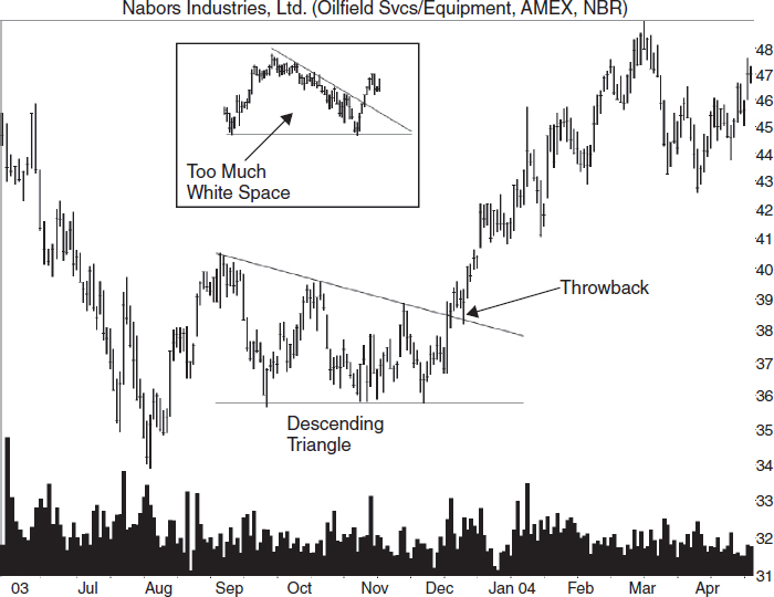
FIGURE 5.19 A descending triangle is flat along the bottom, and the top slopes downward. Price throws back to the top trendline in this example. The inset is not a descending triangle because price does not cross the pattern enough times to fill the white space.
What should you look for when trying to find descending triangles in the wild? Fortunately, triangles are easy to spot, but here are a few guidelines to make the job simpler:
- Look for two price trends: valleys that align horizontally or nearly so, and peaks that slope downward. Both trends should follow trendlines connecting them.
- Price must touch each trendline at least twice, but I strongly suggest three touches. Too many identification errors occur after using two touches.
- Price must cross the pattern from side to side, filling the pattern with price movement, not white space. Do not cut off a rounding turn and call it a descending triangle. The inset to Figure 5.19 shows this situation. It's not a descending triangle because of too much white space.
- We want to stay on the bullish side with this pattern, so trade only upward breakouts. A breakout occurs when price closes above the downsloping trendline.
- Volume slopes downward 79% of the time and can become quite low days before the breakout.
Figure 5.20 shows another example of a busted descending triangle, except that this one occurs in an exchange-traded fund. The breakout occurs at A. Price doesn't drop far before reversing and shooting out the other side of the triangle. When it closes above the top trendline at B, a buy signals. After that, price rises for almost two months before returning to the triangle's apex, finding support, and then lifting off again.
Figure 5.21 shows what a descending triangle looks like in a mutual fund. This is another example of a descending triangle with a downward breakout. In this case, though, look at the spectacular upward move after the downward breakout reverses.
Trading and Trading Tips
Always wait for an upward breakout from a descending triangle. If you are lucky, price will break out downward, spin around, and then soar out the top. I show that scenario in Figure 5.22.
The busted triangle, where price breaks out downward and drops less than 10% before rebounding, can lead to large gains. Trading busted chart patterns is a different way to make money, so I devote an entire chapter to them later in this book. For now, if you see a situation like that shown in Figure 5.22, consider buying it. Also, watch for a throwback to occur because you don't want to be stopped out prematurely.
FIGURE 5.20 A busted descending triangle breaks out at A, reverses, and becomes a buying opportunity at B.
Figure 5.22 shows what I used to call a premature breakout. That's when price breaks out in one direction and returns to the triangle within a day or two before staging the real breakout later.
Preemies are rare, however. Just 6% break out upward, and 20% break out downward. As I mentioned, the downward preemies are a blessing as they sometimes lead to a busted pattern. Busted descending triangles occur about 30% of the time.
The median distance to the breakout is 62% of the way to the triangle apex. However, my research says that the most powerful breakouts happen 70% to 90% of the way.
Descending triangles that appear far up a rising price trend tend to flame out quicker, meaning that the rise after the breakout is less than one might hope. My study showed that those near the beginning of a trend show a postbreakout rise averaging 42%. Those closer to the trend's end rise 31%. The median rise to the triangle is 83 days.

FIGURE 5.21 This mutual fund shows a busted descending triangle that turns and makes a substantial uphill run.
Here are some interesting tidbits I found on descending triangles. They may help you select better-performing triangles to trade.
- Nimble swing traders can buy near the horizontal trendline and sell when price turns at the top trendline.
- Extend the two trendlines into the future for support and resistance zones.
- The triangle apex acts as a future region of support and resistance.
- A buy signals when price closes outside the top trendline (an upward breakout).
- Patterns with breakout day gaps do well, with price rising an average of 46% after the breakout versus 33% for those without gaps.
- Above average breakout day volume tends to push price higher: 39% versus 28% for those patterns with breakout volume below the 30-day average.
- Sixty-four percent acted as continuations of the prior price trend, 39% were reversals.

FIGURE 5.22 This descending triangle breaks out downward then shoots out the top. Busted patterns, such as this one, suggest a powerful upward move.
Measuring Success
The measure rule for descending triangles is simply the height added to the breakout price. The height is the difference between the price of the horizontal trendline (the lowest valley) and highest peak in the pattern. Add this difference to the breakout price—the point where price crosses the trendline. This method works 75% of the time. It's fallible, but it does provide a price target you can work with. After you compute the target, look for overhead resistance. Price may stop there.
As an example of how to apply the measure rule, Figure 5.22 shows the highest peak in the pattern at point A and the lowest valley at B (ignore the downward breakout). The price difference is 35.34 − 33.17, or 2.17. The breakout price is 34.31—the value where price pierces the downsloping trendline (since we are looking for an upward breakout target). Thus, the target is the breakout price plus the height, 34.31 + 2.17, or 36.48. I show the price target on the figure.
- Use the height of a descending triangle to help gauge how far price may rise.
Ascending Broadening Wedges
Ascending broadening wedges show an average rise of 37% if traded perfectly. The breakeven failure rate is 4%, meaning that 4% of the patterns failed to rise at least 5% after the breakout. That performance places the chart pattern in second place.
Before I get too far, I studied 506 ascending broadening wedges, but only 170 broke out upward in a bull market. Those are the ones I discuss in this chapter.
I avoid trading most broadening patterns. That's because it can be difficult to determine the entry price (when price breaks out).
Identification
Figure 5.23 shows what an ascending broadening wedge looks like. Two trendlines follow the price action. Both slope upward, but the top one is steeper than the bottom one, so the trendlines diverge. The pattern reminds me of a cheerleader's megaphone tilted upward.
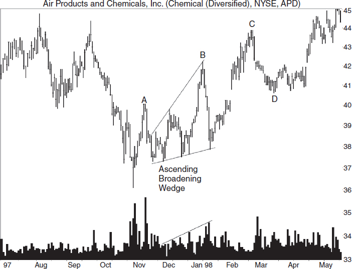
FIGURE 5.23 An ascending broadening wedge appears as shown, but a larger one connects ABC on the top. D marks the bottom of a large partial decline correctly predicting an upward breakout from the ABC pattern.
To make sure you identify an ascending broadening wedge correctly, look for three touches of each trendline. That helps select patterns that have the broadening characteristic.
Here are the guidelines for selecting ascending broadening wedges:
- Three peaks and three valleys should near or touch upsloping trendlines.
- Neither trendline should be horizontal.
- The top trendline should slope upward more steeply than the bottom one.
- The pattern should look like a megaphone tilted upward.
- Volume trends upward 64% of the time.
If you draw a trendline across peaks A, B, and C in Figure 5.23, it would make a larger ascending broadening wedge.
For the larger ascending broadening wedge (points A, B, and C), a breakout occurs when price closes above point C in Figure 5.23. For the smaller ascending broadening wedge (between points A and B), the breakout occurs when price closes above B, the highest peak in the pattern.
Figures 5.24 (an exchange-traded fund) and 5.25 (a mutual fund) show additional examples of ascending broadening wedges. They both have partial rises at A and B. The ones at A don't break out downward immediately as they are supposed to, but the ones at B work as expected. I will discuss partial rises and declines in the next section.
In both examples of ascending broadening wedges, price touches each trendline at least three times (or comes close to the trendline). Both trendlines slope upward and diverge, taking on a megaphone shape.
Trading and Trading Tips
Figure 5.23 shows a partial decline at D for the ABC wedge. A partial decline accurately predicts an upward breakout 68% of the time. That's based on just 50 patterns, so you shouldn't put much faith in it.
A partial decline occurs when price leaves the top trendline and heads down, but swings upward before coming close to or touching the bottom trendline. An immediate upward breakout follows if the partial decline works as expected.
When searching for a partial decline, work with an established chart pattern, meaning the peaks and valleys touch each trendline at least three times. Only then should you look for a partial decline, and it must begin before the breakout.
For experienced traders, 63% of ascending broadening wedges break out downward, and a partial rise can get you in before the breakout. In Figure 5.26, a partial rise is at point A, and it predicts a downward breakout. That does not happen in this example, so no technique is perfect.
How do you identify a partial rise? Once the chart pattern is established (meaning price touches each trendline at least three times), look for price to rise off the bottom trendline but not come close to or touch the top trendline. When price returns to the lower trendline, an immediate downward breakout occurs 76% of the time.
Trading a partial rise is not easy because it can look like the pause that often occurs midway through a rise heading to the top trendline. Short the stock once it's clear price is heading back to the lower trendline. If price bounces upward off the trendline, cover your short immediately. Price may still break out downward, but the odds shift against that happening.
If you don't have a partial rise or decline to trade, here are additional trading tricks.
- For swing traders, buy when price touches the lower trendline and sell as it approaches the top trendline, and then reverse the trade.
- Place an order to buy just above the third peak to capture a potential upward breakout. If price rises and makes a fourth trendline touch and then begins heading down, sell immediately to avoid a return to the bottom trendline.
- For aggressive traders, place a buy order when price touches the bottom trendline for the third time and begins moving up. Watch for a partial rise to occur, and if one does, sell your position when price closes below the bottom trendline (or earlier to capture more profit), because price is likely to continue falling like a rock down a steep hill after a downward breakout. If price bounces off the top trendline instead of pushing through it, sell immediately.
- Tall patterns do better than short ones, with postbreakout price climbing 40% versus 36%, respectively. Tall or short means the pattern height divided by the breakout price compared to the 16.9% median.
- Seventy-seven percent acted as continuations of the prior price trend. Reversals made up the remainder.
The traditional breakout price is a close above the confirmation line, the highest peak in the pattern, as shown in Figure 5.26. Unfortunately, it can be difficult to tell when the stock has quit following the top trendline and is breaking out. Many times, a close above the third peak will correctly signal an upward breakout, so use that.

FIGURE 5.26 The partial rise shown at point A usually predicts a downward breakout from the pattern. Here, the breakout is upward.
For example, Figure 5.27 shows another ascending broadening wedge with price touching each trendline three times. The two trendline touches at 2 are close enough together to be considered one touch. The same goes for point A. The traditional buy point is a close above C, which I show as the horizontal line, Buy 1. If you place a buy order at or above the third top trendline touch, you will be on the correct side of the trade the majority of the time. Price may retrace once it encounters the top of the pattern (as it does by dropping to B), so factor that into your stop price.
If you spot the ascending broadening wedge soon enough, you can trade it as price swings from side to side. Again, place a buy order when price begins rising after the third trendline touch (Buy 2). You can ride the stock upward to the price level of C, or the stock may curl back into a partial rise and break out downward. Be sure to sell if it closes below the lower trendline because the downward breakout means price will tumble.
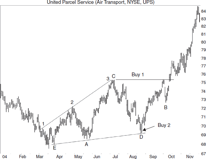
FIGURE 5.27 Place a buy order at C for the traditional breakout, or at D, the third bottom touch, once price begins heading back up.
If price rises to the top trendline and bounces downward, swing traders should take their profits. For others, sell if price drops below a 62% retrace of the prior up move. By that, I mean measure the price difference between where the stock stops moving upward and the prior valley. Take 62% of that and subtract it from where the stock stopped moving up. In this example, the decline to B is less than 62% of the D to Buy 1 move, so a sale is not needed. Hold onto the stock and hope price recovers as in this example.
Measuring Success
The measure rule for ascending broadening wedges helps predict a target price. Compute the wedge height and add it to the breakout price to get the target. For example, the pattern in Figure 5.27 has a height of C – E, or 7.35. Add the height to C (the breakout price) to get a target of 82.64. If overhead resistance is nearby, then expect price to stall there and adjust your target accordingly.
The measure rule for upward breakouts works 66% of the time. That is well short of the 80% I like to see, so you might want to use half the height in the computation. For the example shown in Figure 5.27, the height becomes 3.68. When added to the price of C, the new target becomes 78.97. Prices hit the nearer target 86% of the time.
- Use the height (or half the height) of the wedge added to the breakout price to get an upward target.
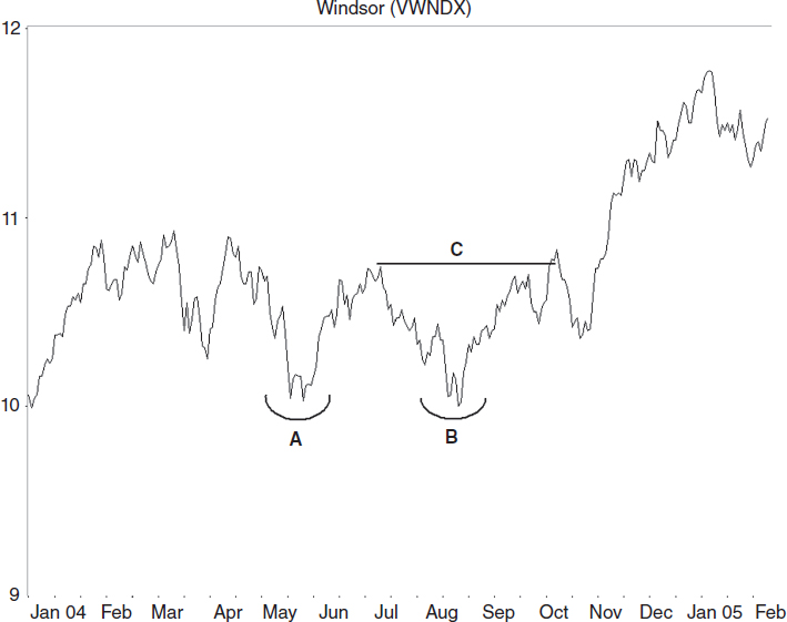
Eve & Eve Double Bottoms
The Eve & Eve double bottom is what most chartists call the classic double bottom. The average rise from perfectly traded stocks is 45% with a breakeven failure rate of 6%.
Eve & Eve double bottoms are reliable tools for a trader's toolbox. They appear near market bottoms or when a stock bottoms. To determine when the trend changes, I prefer an ugly double bottom. That's a double bottom, which has the right bottom at least 5% above the left. When the pattern confirms, it signals that the trend has changed from down to up.
Identification
The Adam and Eve combinations of double bottoms are a somewhat recent addition to the chart pattern landscape. The names describe the appearance of each bottom in the twin valley formation. Adam bottoms are narrow, usually one-day downward price spikes while Eve is more rounded looking and considerably wider than Adam.
Figure 5.28 shows what an Eve & Eve double bottom looks like. The two valleys are wide, rounded appearing turns, spaced several weeks apart. The rise between the bottoms is rather extensive. The double bottom confirms as a valid Eve & Eve double bottom when price closes above the peak between the two valleys (shown as the confirmation line).
What should you look for when trying to spot Eve & Eve double bottoms? Here are the guidelines, but consider them flexible.
- Price should trend downward before the left valley, but should not drop below the valley. In other words, you don't want to see a lower valley adjacent to the first valley.
- Each valley should appear similar: wide, rounding turns.
- The rise between the two valleys should be at least 10% (I don't pay attention to the 10% number).
- The two bottoms should appear near the same price—less than 6% apart.
- Several weeks (two to six for the best performance) should separate the two valleys (I don't pay attention to how close the valleys are).

FIGURE 5.28 An Eve & Eve double bottom has two wide rounding valleys, not narrow price spikes as does its Adam counterpart.
- Volume is usually higher on the left bottom (volume trends downward 64% of the time).
- Price must close above the confirmation line (the highest peak in the pattern) before the twin bottom becomes a true Eve & Eve double bottom.
- If a double bottom forms a third bottom before the double bottom confirms, treat it as a triple bottom.
For example, the Eve & Eve double bottom shown in Figure 5.28 has a downward price trend that leads to the first valley without dropping below it on the way down. Both valleys are wide, rounding turns (compare with the Adam & Adam double bottom in March). The rise between the two valleys measures 20% from the lowest valley (the left one) to the peak. The two valleys are less than 2% apart in price (22 cents) and are 11 weeks apart, as measured from the lowest valley in each bottom. That's a little wide, yet close enough for government work, as they say.
Volume is higher surrounding the left valley, as expected. Price closes above the confirmation line in early September, confirming the pattern as a valid Eve & Eve double bottom.
Figure 5.29 shows what the various combinations of Adam and Eve bottoms look like. Eve is wide and rounded-appearing. Adam is often a single spike or just a few days wide, long, and needle sharp. Eve sometimes has spikes, but they are shorter and more clustered, like shallow roots of a tree.
Figure 5.30 shows a potential Eve & Eve double bottom in an exchange-traded fund. If price closed above the peak (A) between the two bottoms before it dropped below the pattern at B, it would have confirmed the double bottom as valid. Instead, people buying this pattern may have lost money if they sold on the way down to B.
Wait for confirmation, that is, wait for price to close above the top of the chart pattern (or use a buy stop a penny or two above the top of the chart pattern to enter the trade). Doing so would remove these types of losing trades.
Figure 5.31 illustrates what a double bottom looks like in a mutual fund. I had to go back a few years to find one. The A and B bottoms look irregular but wide enough to qualify when you consider the entire turn (shown as the arc). The pattern qualifies as valid when the fund closes above the line at C.
FIGURE 5.29 Shown are the different combinations of Adam and Eve bottoms. Pattern AA is an Adam & Adam double bottom.
Trading and Trading Tips
I have noticed that Eve & Eve double bottoms, and all double bottoms for that matter, are riskier than many other chart patterns. Why? Because you find them at the bottom of a price trend. The problem occurs after price confirms the pattern. That's when traders come along and swat price back down. The stock drops below the lowest valley, stopping out the trade and emptying your wallet or purse.
How can you prevent investing in busted patterns? Before taking a position in any stock showing a chart pattern, look at the general market. I use the Standard & Poor's 500 index as the proxy.
I look for any bearish chart patterns in the S&P, Dow Jones Industrials, and NASDAQ composite. Then I guess the coming price trend, often assuming that the existing trend will continue.
I'll check the industry in which the stock belongs. Because I follow five or more stocks in the same industry, it's easy to pull up each stock and look at the chart. Is price trending upward? Are there any chart patterns that signal a trend reversal (bearish patterns)? Are they trading near the yearly high?
Sometimes the general market or the industry will be weak enough to keep me on the sidelines. However, when the clay pigeons line up, I grab my rifle and start shooting. Here are additional tips for trading Eve & Eve double bottoms:
- Look for a shelf on the right bottom, a flat top that can act as a support zone. I show it on the November Eve bottom in Figure 5.29. For swing traders, buy when price closes above this threshold and sell at confirmation if price stalls there. Be aware that the double bottom may become a triple bottom.
- For position traders and investors, buy when price closes above the confirmation price—the highest peak between the two bottoms. Trading before confirmation means a loss 64% of the time. Based on a study I conducted in 1999, the 64% rate is how often price never makes it up to confirmation.
- Sometimes, price will confirm the Eve & Eve double bottom and then waffle up and down, forming a handle. When price breaks out of this congestion region, it often (but not always) moves up in a strong trend. Figure 5.28 shows the Eve & Eve double bottom with handle scenario.
- When the double bottom forms after a long, flat price trend (a flat base), the double bottom usually sports a large gain after the breakout. Switch to the weekly scale and look for a flat base. Think of the double bottom as a pothole in a flat road before a hill. If price bounces out of the hole, it can drive uphill for an extended move.
- If a pipe bottom (or any other bullish chart pattern) forms as part of the right Eve bottom, then buy the stock when the pipe confirms.
- Eve & Eve double bottoms both short and narrow tend to outperform (52% average rise) the other combinations of height and width. Short means less than the 15.4% median height divided by the breakout price. Narrow means less than the median 43 days wide.
- Eve & Eve double bottoms without throwbacks perform significantly better than do those with throwbacks. Price rises 55% versus 37% after the breakout, respectively. Look for trades without nearby overhead resistance.
- Look for a big W pattern—an Eve & Eve double bottom with an unusually tall left side. The decline leading to the Eve & Eve double bottom should be a straight-line run of several points. Expect (hope, really) the breakout will return price to where it started the decline. Figure 5.29 shows a big W between points D and E.
Measuring Success
The measure rule for double bottoms is the height added to the breakout price. The height is the difference between the highest peak and the lowest valley in the pattern. Add the difference to the breakout price—the highest peak in the pattern—to get a target price.
Price meets the target 69% of the time after a breakout from an Eve & Eve double bottom. That percentage is a little low, so be conservative with your targets—as in archery, the closer the target, the better the accuracy.
The measure rule applied to the Eve & Eve double bottom shown in Figure 5.29 is the difference between B and C added to B. B is at 21.39, and C is at 18.49. The difference between the two, 2.90, is the height. Add the height to the breakout (B) to get a target of 24.29. In this example price reaches the target in mid-December.
- Use the height of the double bottom added to the breakout price to get a target.
Case Study
Refer to Figure 5.32 for this case study. A trader told me why he bought Guess by reading from his notes. “I bought the Eve & Eve double bottom. The apparel market seems to be doing well. In the last few days, the stocks [in the industry] have moved higher, strongly. Many are like this one: They've reached a yearly high then backtracked and are struggling to recover. The bad news is that Guess has a PE [price to earnings ratio] of 50. Ouch. I have my doubts about this one working, but if the market continues to climb, this might do well, too.”
He bought 1,000 shares at 16.13 the day after the pattern confirmed (when price closed above the peak at point A, 16). He placed a stop at 14.57, three cents below the valley at B, for a potential loss of about 10%.
“I expected price to stall near the April high at 18.50,” he said. Then he read from his notes again about how he felt the trade would unfold: “I don't expect this to work out well. I think the market is about to tumble.”
On July 16, he was stopped out at 14.55, two cents below his stop price and just a day before the stock made a bullish tail at C. The market continued down into early August before staging a nice up move leading into October.
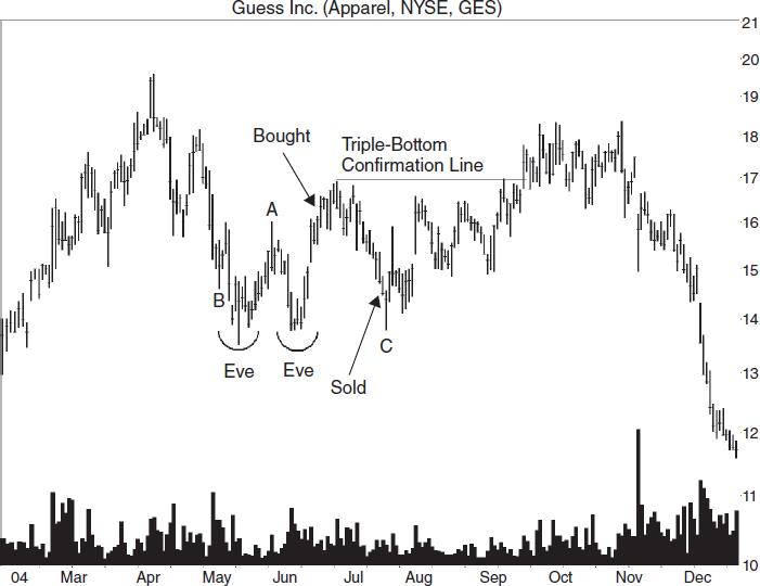
FIGURE 5.32 An Eve & Eve double bottom confirmed, but price backtracked and changed into a triple bottom. Price didn't rise very far before tumbling.
“I lost $1,600 on the trade,” he said.
Triple Bottoms
If you know what a double bottom looks like, you can imagine what a triple bottom looks like. The average rise measures 35%, and the breakeven failure rate is 11%, meaning that 11% of the triple bottoms failed to rise at least 5%.
I don't trade triple bottoms much. Why? Because they are too rare to worry about. I can pick up a double bottom and use that as a buy signal. Sometimes my double bottom will grow a third bottom, scaring the dickens out of me (because when it's forming, I think price is going down).
Identification
Identification of triple bottoms shares many of the guidelines of double bottoms. Look for three valleys, all bottoming at about the same price, widely spaced so that they are not part of the same valley, and with two distinct peaks between them. I set no minimum price rise between the valleys as I did with double bottoms because these patterns are rare enough without such qualifiers. Here are the guidelines:
- Price should trend downward to the first valley, but should not drop below it. In other words, you don't want to see a sinkhole before the first valley.
- The three bottoms should appear near the same price, but allow variations.
- Several weeks usually separate each valley.
- Volume trends downward 67% of the time from the first bottom to the last, but may be high beneath the individual valleys.
- The stock must close above the confirmation price (above the highest peak in the pattern) before the pattern becomes a valid triple bottom.
- If a double bottom forms a third bottom before the double bottom confirms, treat it as a triple bottom.
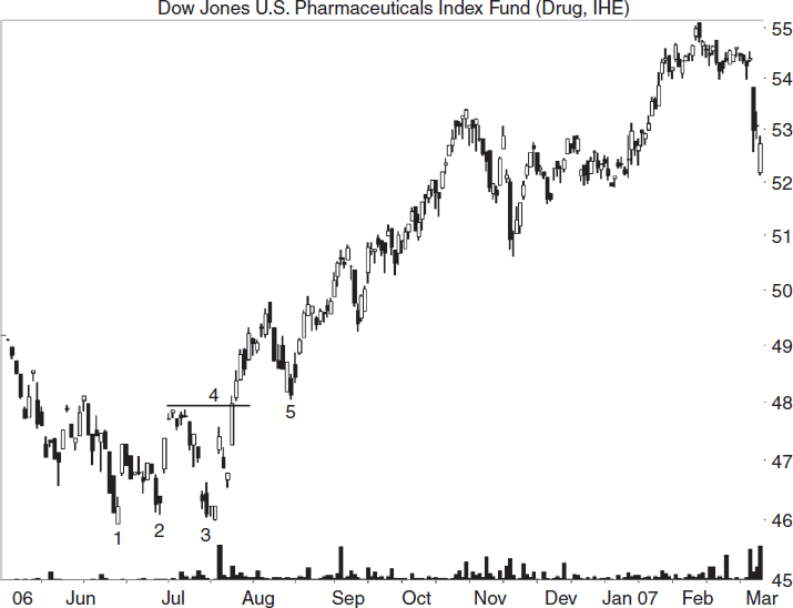
Figure 5.33 shows an example of a triple bottom. Price trends downward to the bottom. The three bottoms, 1, 2, and 3, are near the same price level. Each bottom is a valley in its own right with a rise between them. Volume trends downward but is high beneath the base of each valley in this example. When the stock closes above the price of point A, it confirms the chart pattern as a true triple bottom and signals a buy.
FIGURE 5.33 A triple bottom (valleys 1, 2, and 3) appears at the end of an extensive decline. A breakout occurs when price closes above the price of point A or above the downsloping buy trendline.
Figure 5.34 shows a triple bottom (1, 2, 3) in an exchange-traded fund. The three valleys bottom near the same price. They are distinct valleys separated by two peaks. When price closes above the horizontal line at 4, it confirms the triple bottom as a valid chart pattern.
Price throws back to the triple bottom at point 5. I found that a throwback happens 60% of the time.
Figure 5.35 shows another example of a potential triple bottom except that this one occurs in a mutual fund.
The three bottoms are at 1, 2, and 3. Instead of confirming the chart pattern by closing above the tallest peak between the three bottoms (line 4 shows this), the fund drops to 5. When the net asset value drops below the lowest of the three valleys, it invalidates the triple bottom. This is not a triple bottom at all, but just squiggles on the price chart.
Trading and Trading Tips
If the rise between bottoms 1 and 2 is higher than is the rise between bottoms 2 and 3, draw a downsloping trendline connecting the tops. When price closes above this trendline, that's a buy signal. Figure 5.33 shows an example of this scenario.
![]() half-staff pattern
half-staff pattern
a chart pattern that appears midway in a price trend. Flags and pennants often act as half-staff patterns.
Figure 5.36 shows another example of a triple bottom. In this example, bottom 3 is above the price level of bottom 2. When that situation happens, price after the breakout tends to move further than when bottom 3 is at or below bottom 2. Every situation is different, but keep this one in mind.
The dashed line extending downward from point A shows an early buy trendline. The horizontal trendline from point A is the traditional buy signal. In this case, the stock throws back to the breakout price before resuming its uphill run.
I also highlight a small flag. Flags often appear in strong, straight-line runs like the one shown in Figure 5.36, and they sometimes mark the midpoint of the rise. Thus, they have the nickname half-staff patterns. The rise from the bottom of the flag to the trend end at B is nearly as long as the rise from point 3 to the top of the flag.
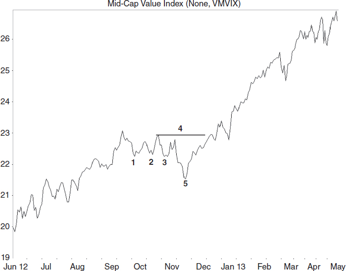
FIGURE 5.35 This is not a triple bottom because price dropped below the bottom of the pattern, invalidating it.
Here are additional trading tips.
- Triple bottoms that appear after a flat base tend to outperform. Look for a long (months) horizontal (or nearly so) price trend leading to the triple bottom. Use the weekly scale because the trend becomes clearer there. The pattern does well because price pushes its way through overhead resistance to find clear skies above, and ample room to rise. The flat base–triple bottom combination is the best setup for triple bottoms. The inset of Figure 5.33 shows this combination.
- Triple bottoms often appear as the corrective phase of a measured move up (picture a flat step in a rising staircase). The rise after the breakout may not be as high as you expect. Avoid trading triple bottoms that occur after an extensive (months) price uptrend. The trend may be ending.
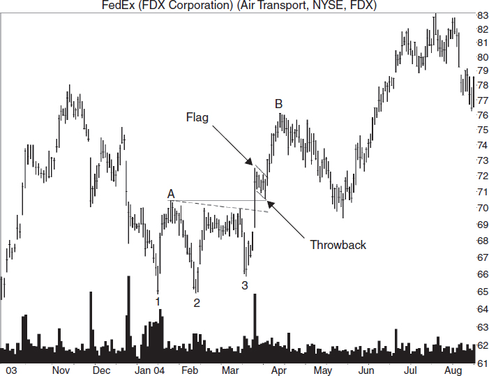
FIGURE 5.36 A triple bottom (1, 2, and 3) has a third bottom above the other two. This suggests a better-performing triple bottom.
- When a triple bottom appears after a decline, draw a downsloping trendline along the peaks before the triple bottom. Expect price to stall once it climbs to the trendline. It may push through the overhead resistance, but play it safe. The left inset in Figure 5.33 shows this situation on the weekly scale. Price reaches the trendline then collapses.
- Triple bottoms with short-term declines leading to the pattern have postbreakout rises averaging 33%. Intermediate-term declines yield rises of 37% and long-term declines, 18%. Trade triple bottoms with short- to intermediate-term declines (declines up to six months).
- Here's another variation on the small decline scenario: Triple bottoms with a price decline less than the 18% median decline leading to the chart pattern have postbreakout rises averaging 37% versus 32% for those with a larger decline. A triple bottom that forms after an extensive decline suggests serious problems that will take time to fix. The rise after the breakout is often just a retrace in a downtrend, not a trend change.
- If a triple bottom appears after a decline from a peak, assume that prices will stall when they return to the price of the peak. The triple bottom becomes the valley between two mountains. This is a variation of a big W chart pattern (with ends at D and E in Figure 5.29. Read the accompanying text).
- If the third bottom has a flat area, then swing traders should buy when price closes above the flat threshold and sell at the confirmation price if price stalls there. Place a stop just below the bottom. This is similar to the shelf shown in Figure 5.29.
- For position traders and investors, buy when price closes above the confirmation price—the highest peak between the three bottoms (or above a downsloping trendline connecting the peaks between the bottoms. See the earlier discussion.).
- Throwbacks happen 60% of the time, and when they do occur, performance suffers: 40% rise postbreakout without throwbacks versus 31% with throwbacks.
- If the last valley bottom is above the price of the second valley bottom, then expect better performance: 38% average rise versus 31%.
Measuring Success
The measure rule for triple bottoms is the pattern's height added to the breakout price. This works 67% of the time, so be conservative when picking a price target (that means select a closer target, perhaps by using half the height). If the target is near overhead resistance, then expect price to stall there.
For example, point A in Figure 5.36 shows the highest peak in the pattern and the lowest valley is at point 1. The height is the difference between those two, 70.40 – 64.84, or 5.56. Add the height to the highest peak to get a target of 75.96. The stock reached the target at B.
- Use the height of the triple bottom applied to the breakout price to get an estimate of how high price might climb.
Case Study
![]() limit order
limit order
an order to buy for no more or to sell for no less than a specified price.
Figure 5.37 shows the setup for the case study. The trader put a limit order to buy 400 shares at 28 on the triple bottom confirmation of 27.88. The limit order should have been a stop order to buy. He picked up the 400 at 27.64 instead of 28.
He predicted overhead resistance would kick in at 30 and then again at 32, corresponding to knots of price action at those levels in June. Yet he was hoping for 36, near the old high for the stock.

FIGURE 5.37 Resistance highlighted by a downsloping trendline warned of this failed triple bottom trade.
On the downside, he was looking at a 14% loss to 24.50, the price at valley 2. “This trade might have worked except for one thing,” he said. “I bought two days before 9/11, when the terrorists struck.”
Trading resumed on 9/17, and the price touched the downsloping trendline on that day and then drilled down.
“I used a mental stop at 24.50, but price shot through that and I sold at 23.64, a day before price bottomed. I expected the price to continue moving down.”
This is an example of market risk. Something comes along and just pulls the rug out from under a trade. As a trader, that's why you want to be out of the market as much as possible.
By comparison with this trader, I sold Alaska Air three trading days before 9/11 for a loss of less than $250. Had I waited until 9/27, I would have lost over $4,000. The stock was down 44% from where I sold.
Head-and-Shoulders Bottoms
The head-and-shoulders formation is arguably the most famous of the chart patterns. The average rise is 37% in a bull market for perfectly traded patterns. The breakeven failure rate is quite low, 5%.
Perfect-looking head-and-shoulders bottoms make me nervous. I swear they fail more often than the ugly ones (uneven shoulders, necks too long or too short, that sort of thing).
My research says I'm dreaming. Maybe it's because the biggest loss I ever took started with a perfect-looking head-and-shoulders bottom. For a while, everything worked just as it should. But then the stock started going down. And down.
Identification
Figure 5.38 shows a near perfect example of a head-and-shoulders bottom. The head protrudes well below the bottoms of the adjacent shoulders. The two shoulders look similar—needles in this case—and are nearly an equal distance from the head. They look symmetrical, which I consider important.
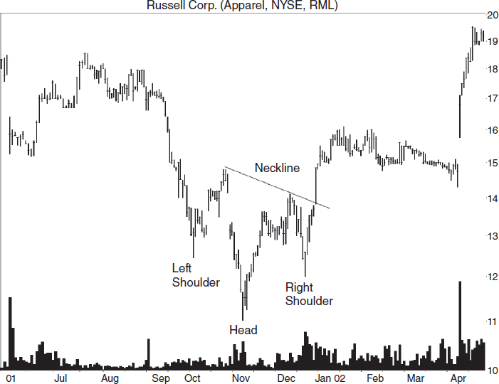
FIGURE 5.38 Shown is a head-and-shoulders bottom with pronounced shoulder symmetry and a downsloping neckline. Only the volume pattern is backward in this otherwise perfect example.
The volume pattern, however, is backward. Most often, you'll find volume heaviest beneath the left shoulder or head, and diminished below the right shoulder. A neckline joins the armpits and slopes downward in this case and in most head-and-shoulders bottoms. When price closes above the neckline, that's the buy signal and it confirms the pattern as a valid head-and-shoulders bottom. Without confirmation, you don't have a head-and-shoulders bottom.
To identify head-and-shoulders bottoms, look for the following:
- Find three valleys with the center valley below the other two.
- The shoulders should appear similar in shape.
- The shoulders should be almost equidistant from the head.
- The shoulders should have valleys that stop near the same price.
- Volume is highest on the head 43% of the time, the left shoulder 39% of the time, and the right shoulder 18% of the time.
- Volume trends downward 65% of the time (between the left and right shoulder valleys).
Figure 5.39 shows what a head-and-shoulders bottom looks like in an exchange-traded fund. The neckline, B, slopes upward, so I use a close above a horizontal line starting from the right armpit (the peak between the head and right shoulder) as the buy signal. I show that as line A. I'll discuss this more in the next section.
Figure 5.40 is a head-and-shoulders bottom in a mutual fund. This head-and-shoulders appears as the fund transitions from bear market to bull. The neckline, A, which joins the two armpits, slopes downward.
Trading and Trading Tips
Figure 5.41 shows another example of a head-and-shoulders bottom. In this example, the bottom of the right shoulder is above the price of the left, but they are close enough. The shoulders look similar and are almost the same distance from the head. Volume is highest on the head.
A neckline joins the armpits and signals a buy when price closes above it. This works well when the neckline slopes downward as in Figure 5.38, but you can see what a disaster it is in Figure 5.41. You give up profit by waiting (price closes above the neckline at point A). In fact, sometimes the neckline slopes so steeply that price never closes above it. That's like walking to school uphill, both ways.
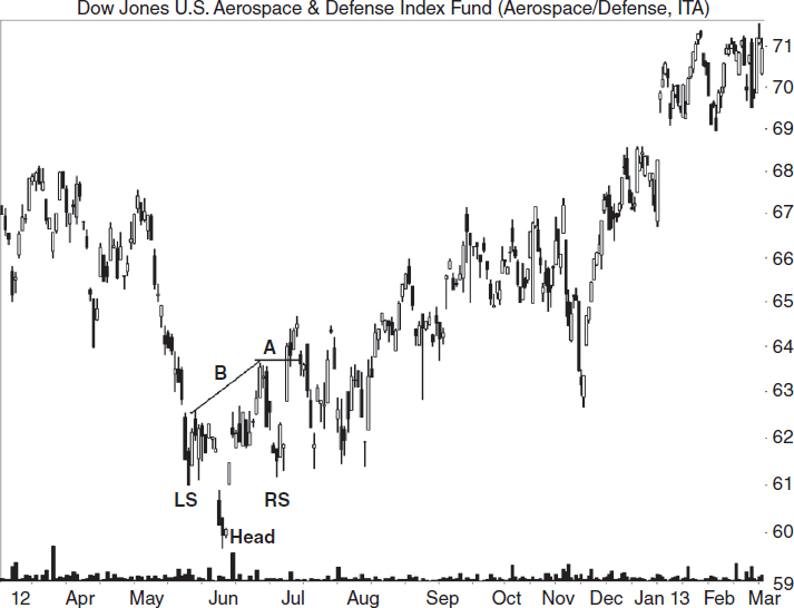
FIGURE 5.39 A head-and-shoulders bottom appears in an exchange-traded fund. Use a close above the right armpit as a buy signal.
A solution to the steep neckline problem is to use the highest peak in the pattern as the buy signal. When price closes above the value of the highest peak, buy. I show this scenario in Figure 5.41 as the dashed line.
Here are additional trading tips.
- For downsloping necklines, a close above the trendline signals a buy.
- For upsloping necklines, use a close above the highest peak in the head-and-shoulders bottom as the buy signal.
- Head-and-shoulders bottoms that appear after a flat base tend to outperform. Look for an extended horizontal price move of several months duration before the head-and-shoulders bottom forms.
- When price declines in a straight-line run leading to the head-and-shoulders bottom, expect price to recover to the top of the pattern. This is a variation of a big W chart pattern (with ends at D and E in Figure 5.29. Read the accompanying text). Imagine that the head-and-shoulders bottom replaces the double bottom. Expect price to stall or reverse at E.
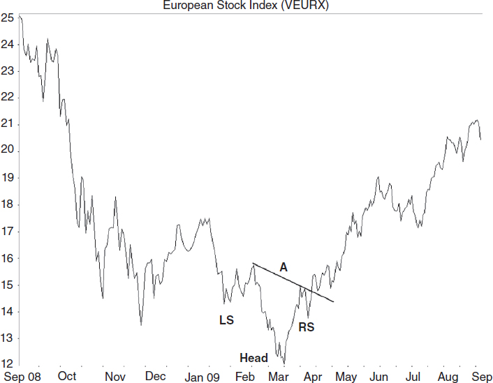
- Head-and-shoulders bottoms with short-term declines (less than three months) leading to the pattern have postbreakout rises averaging 38%. Intermediate-term and long-term declines yield rises of 35%.
- Throwbacks happen 52% of the time, and when they occur, performance suffers: 41% rise postbreakout without throwbacks versus 33% with throwbacks. Avoid selecting patterns with overhead resistance that may cause a throwback.
- When volume is higher on the right shoulder, the head-and-shoulders bottom tends to outperform: 40% average rise versus 34% for volume highest on the left shoulder and 38% for high volume surrounding the head.
- Postbreakout performance improves for those head-and-shoulders bottoms with downsloping necklines: 40% average rise versus 32% rise for those with upsloping necklines.
- Patterns taller than the 14.7% median height divided by the breakout price rise an average of 46% postbreakout versus 31% for short head-and-shoulders bottoms.

FIGURE 5.41 A head-and-shoulders bottom appears with an upsloping neckline. Buying using the traditional method of price closing above the neckline can lead to reduced profits. Instead, when the neckline slopes upward, draw a horizontal line from the highest peak in the pattern and buy when price closes above it.
- Eighty-eight percent acted as reversals of the prior price trend.
- From the right shoulder valley, it takes an average of 12 days for the stock to climb to the breakout price.
Measuring Success
The measure rule for head-and-shoulders bottoms is slightly different from what it is for other chart patterns. First, compute the pattern height from the head vertically to the neckline. In Figure 5.41, the black dot at B shows the neckline intersection at about 23.25. Directly below, the head low is at 17.75 for a height of 5.50. Add the height to the breakout price to get a target. Using the highest peak in the pattern as the breakout point (23.83) would mean a target of 29.33. Using a trendline pierce as the breakout (25.59) would give a target of 31.09.
Price meets the measure rule 76% of the time using this method.
What We Learned
Here is a list of the major lessons discussed in this chapter, sorted by the chart pattern.
Introduction
- If your mutual fund owns the stock, there is no need for you to buy it—you already own it. See the introduction.
- Don't fall in love with a stock just because it has a way-cool name. See the introduction.
High and Tight Flag
- High and tight flags are the best-performing chart pattern.
- See high and tight flag “Identification” for tips on finding these patterns.
- Look for overhead resistance that occurred in the past. If a horizontal congestion region appears at a price level above where the stock is trading, then that could act as a ceiling. See “Trading and Trading Tips.”
- Avoid loose-looking flags. See “Trading and Trading Tips.”
- For the best performance, flags should retrace between 10% and 25% of the height of the flagpole. See “Trading and Trading Tips.”
- Generally, the longer the flag, the worse the performance. See “Trading and Trading Tips.”
- A receding volume trend in the flag portion of the high and tight flag sees better post breakout performance. See “Trading and Trading Tips.”
- High and tight flags with light breakout day volume tend to outperform. See “Trading and Trading Tips.”
- High and tight flags that do not throw back climb further after the breakout than those that do. See “Trading and Trading Tips.”
- For high and tight flags, use half the pattern's height added to the top of the pattern to get a target. See “Measuring Success.”
- A tighter stop could have limited the loss. See “Case Study.”
Pipe Bottoms
- See “Identification” for details on finding the pattern.
- Wait for price to close above the highest price spike before trading a pipe bottom. See “Trading and Trading Tips.”
- Pipes with short-term (0 to 3 months) downtrends leading to the pipe perform substantially better than intermediate- or long-term downtrends. See “Trading and Trading Tips.”
- Avoid overhead resistance on both the daily and weekly scales. See “Trading and Trading Tips.”
- Tall pipes perform better than short ones. See “Trading and Trading Tips.”
- Select pipes with a large price difference between the spike lows. See “Trading and Trading Tips.”
- Volume heavier on the left spike compared to the right suggests better performance. See “Trading and Trading Tips.”
- Pipes with a lower left spike tend to perform better than do those with a lower right spike. See “Trading and Trading Tips.”
- If price closes below the lower of the pipe bottoms, exit your position. See “Trading and Trading Tips.”
- For swing traders, consider selling if price stalls near a prior peak. See “Measuring Success.”
Inverted and Ascending Scallops
- For scallop identification, see “Identification.”
- A series of inverted and ascending scallops that get narrower or shorter may signal the end of an uptrend. See “Identification.”
- For swing traders, buy when price makes a higher valley after completing the inverted and backward J with a price target of the scallop high. See “Trading and Trading Tips.”
- For other traders, buy when price closes above the highest peak in the pattern. See “Trading and Trading Tips.”
- If the pattern end points follow an existing upsloping trendline, buy when price rises above the trendline after the second inverted and ascending scallop touch. See “Trading and Trading Tips.”
- If price drops below the start of the pattern, avoid trading the pattern. That means point 2 drops below point 1 in Figure 5.7. See “Trading and Trading Tips.”
- Place a stop just below the right valley of the inverted and ascending scallop. See “Trading and Trading Tips.”
- Patterns with a rising volume trend do better postbreakout. See “Trading and Trading Tips.”
- Breakout volume above the 30-day average means a larger average gain. See “Trading and Trading Tips.”
- Place a stop below the right side of the scallop. See “Trading and Trading Tips.”
- Avoid ascending and inverted scallops if the end is at or below the start. See “Trading and Trading Tips.”
- Use the height of the scallop to predict a target price. See Inverted and Ascending Scallops, “Measuring Success.”
Three Rising Valleys
- See “Identification,” for tips on how to find these patterns.
- When the peak between the first two valleys is higher than the peak between the last two valleys, draw a downsloping trendline connecting those peaks for an early buy signal. See “Identification.”
- Patterns with below-average breakout volume tend to perform better. See “Trading and Trading Tips.”
- When volume trends upward throughout the pattern, postbreakout performance improves. See “Trading and Trading Tips.”
- Sixty-seven percent act as reversals, and reversals perform better than continuations. See “Trading and Trading Tips.”
- Two out of three patterns break out within a third of the yearly high, and they perform best. See “Trading and Trading Tips.”
- Tall patterns perform better than short ones. See “Trading and Trading Tips.”
- Narrow patterns perform better than wide ones. See “Trading and Trading Tips.”
- Patterns both tall and narrow show postbreakout gains of 53%. See “Trading and Trading Tips.”
- Throwbacks occur 60% of the time, and when they occur, performance suffers. See “Trading and Trading Tips.”
- The farther up the price trend a three rising valleys pattern appears, the smaller the potential gain. See “Trading and Trading Tips.”
- Use the full height of the three rising valleys pattern applied to the highest peak to get a price target. For a closer target, use half the height in the computation. See “Measuring Success.”
Rounding Bottoms
- See “Identification” for a list of guidelines when searching for the pattern.
- Rounding bottoms in a rising price trend tend to outperform. See “Identification”
- Use the weekly scale to find a rounding turn that is at the midway part of its development. Buy if you expect the industry and general market to trend upward. See “Trading and Trading Tips.”
- Swing traders can sell if price bumps up after the midway point—retracing a portion of the downward move that forms the left side of the cup. For all others, don't get too disappointed when price returns to just above the launch point. After price bottoms again and then resumes the uptrend, consider adding to your position. See “Trading and Trading Tips.”
- Count on price pausing near the level of the left cup lip. If the general market or industry is weak, then sell. See “Trading and Trading Tips.”
- If the rounding bottom has a handle, try drawing a downsloping trendline connecting the two cup lips and extending the line down beyond the handle. When price closes above the trendline in the handle, buy the stock or add to your position. See “Trading and Trading Tips.”
- The standard buy location is when price closes above the right cup lip—if it has a right lip. If not, buy when price closes above the price of the left cup lip. See “Trading and Trading Tips.”
- If price is predominantly flat leading to the rounding bottom—a flat base of several months duration—that often leads to a powerful rise after the breakout. See “Trading and Trading Tips.”
- Throwbacks occur only 40% of the time, but when they do occur, performance suffers. See “Trading and Trading Tips.”
- Patterns taller than the median height perform better than short ones. See “Trading and Trading Tips.”
- Wide patterns perform better. See “Trading and Trading Tips.”
- Patterns with breakouts near the yearly high perform best. See “Trading and Trading Tips.”
- The median time from the right cup lip to the breakout is 33 days. See “Trading and Trading Tips.”
- Use half the height of a rounding bottom to get a target price. See “Measuring Success.”
Descending Triangles
- See “Identification” for details on how to find them.
- Always wait for an upward breakout from a descending triangle. If the triangle breaks out downward, then wait to see if the downward breakout busts (and price closes above the top trendline). See “Trading and Trading Tips.”
- The most powerful breakouts from descending triangles happen near the triangle's apex. See “Trading and Trading Tips.”
- Avoid triangles too far along (up) the price trend. See “Trading and Trading Tips.”
- Nimble swing traders can buy near the horizontal trendline and sell when price turns at the top trendline. See “Trading and Trading Tips.”
- Extend the two trendlines into the future for support and resistance zones. See “Trading and Trading Tips.”
- The triangle apex acts as a future region of support and resistance. See “Trading and Trading Tips.”
- A buy signals when price closes outside the top trendline (an upward breakout). See “Trading and Trading Tips.”
- Patterns with breakout day gaps do well. See “Trading and Trading Tips.”
- Above-average breakout day volume tends to push price higher. See “Trading and Trading Tips.”
- Sixty-four percent of descending triangles act as continuations of the prior price trend. See “Trading and Trading Tips.”
- Use the height of a descending triangle to help gauge how far price may rise. See “Measuring Success.”
Ascending Broadening Wedges
- See “Identification” for tips on how to find them.
- A partial rise or decline from an ascending broadening wedge can get you into a trade sooner than waiting for a breakout. See “Trading and Trading Tips.”
- For swing traders, buy when price touches the lower trendline and sell as it approaches the top trendline, and then reverse the trade. See “Trading and Trading Tips.”
- Place an order to buy just above the third peak to capture a potential upward breakout. If price rises and makes a fourth trendline touch and then begins heading down, sell immediately to avoid a return to the bottom trendline. See “Trading and Trading Tips.”
- For aggressive traders, place a buy order when price touches the bottom trendline for the third time and begins moving up. Watch for a partial rise to occur, and if one does, sell your position when price closes below the bottom trendline (or earlier to capture more profit), because price is likely to continue falling after a downward breakout. If price bounces off the top trendline instead of pushing through it, sell immediately. See “Trading and Trading Tips.”
- Tall patterns do better than short ones. See “Trading and Trading Tips.”
- Seventy-seven percent acted as continuations of the prior price trend. See “Trading and Trading Tips.”
- Use the height (or half the height) of the wedge added to the breakout price to get an upward target. See “Measuring Success.”
Eve & Eve Double Bottoms
- See “Identification” for guidelines on how to find double bottoms.
- Look for a shelf on the right bottom, a flat top that can act as a support zone. For swing traders, buy when price closes above this threshold and sell at confirmation if price stalls there. Be aware that the double bottom may become a triple bottom. See “Trading and Trading Tips.”
- For position traders and investors, buy when price closes above the confirmation price—the highest peak between the two bottoms. See “Trading and Trading Tips.”
- Sometimes, price will confirm the Eve & Eve double bottom and then waffle up and down, forming a handle. When price breaks out of this congestion region, it often (but not always) moves up in a strong trend. See “Trading and Trading Tips.”
- When the double bottom forms after a long, flat price trend (a flat base), the double bottom usually sports a large gain after the breakout. See “Trading and Trading Tips.”
- If a pipe bottom (or any other bullish chart pattern) forms as part of the right Eve bottom, then buy the stock when the pipe confirms. See “Trading and Trading Tips.”
- Eve & Eve double bottoms both short and narrow tend to outperform. See “Trading and Trading Tips.”
- Eve & Eve double bottoms without throwbacks perform significantly better than do those with throwbacks. See “Trading and Trading Tips.”
- Look for a big W pattern—an Eve & Eve double bottom with an unusually tall left side. The decline leading to the Eve & Eve double bottom should be a straight-line run of several points. Expect (hope, really) the breakout will return price to where it started the decline. See “Trading and Trading Tips.”
- Use the height of the double bottom added to the breakout price to get a target. See “Measuring Success.”
Triple Bottoms
- See “Identification” for tips on how to recognize triple bottoms.
- Triple bottoms that appear after a flat base tend to outperform. See “Trading and Trading Tips.”
- Triple bottoms often appear as the corrective phase of a measured move up. See “Trading and Trading Tips.”
- When a triple bottom appears after a decline, draw a downsloping trendline along the peaks before the triple bottom. Expect price to stall once it climbs to the trendline. See “Trading and Trading Tips.”
- Trade triple bottoms with short- to intermediate-term declines (declines up to six months). See “Trading and Trading Tips.”
- Triple bottoms with a price decline less than the 18% median decline leading to the chart pattern outperform. See “Trading and Trading Tips.”
- If a triple bottom appears after a decline from a peak, assume that prices will stall when they return to the price of the peak. See “Trading and Trading Tips.”
- If the third bottom has a flat area, then swing traders should buy when price closes above the flat threshold and sell at the confirmation price if price stalls there. See “Trading and Trading Tips.”
- For position traders and investors, buy when price closes above the confirmation price. See “Trading and Trading Tips.”
- Throwbacks hurt performance. See “Trading and Trading Tips.”
- If the last valley bottom is above the price of the second valley bottom, then expect better performance. See “Trading and Trading Tips.”
- Use the height of the triple bottom applied to the breakout price to get an estimate of how high price might climb. See “Measuring Success.”
Head-and-Shoulders Bottoms
- See “Identification” for guidelines on how to spot these chart patterns.
- For downsloping necklines, a close above the trendline signals a buy. See “Trading and Trading Tips.”
- For upsloping necklines, use a close above the highest peak in the head-and-shoulders bottom as the buy signal. See “Trading and Trading Tips.”
- Head-and-shoulders bottoms that appear after a flat base tend to outperform. See “Trading and Trading Tips.”
- When price declines in a straight line run leading to the head-and-shoulders bottom, expect price to recover to the top of the pattern. See “Trading and Trading Tips.”
- Head-and-shoulders bottoms with short-term declines (less than three months) leading to the pattern have postbreakout rises averaging 38%.. See “Trading and Trading Tips.”
- Throwbacks happen 52% of the time, and when they do occur, performance suffers. See “Trading and Trading Tips.”
- When volume is higher on the right shoulder, the head-and-shoulders bottom tends to outperform. See “Trading and Trading Tips.”
- Postbreakout performance improves for those head-and-shoulders bottoms with downsloping necklines. See “Trading and Trading Tips.”
- Tall patterns outperform, on average. See “Trading and Trading Tips.”
- Eighty-eight percent acted as reversals of the prior price trend. See “Trading and Trading Tips.”
- From the right shoulder valley, it takes an average of 12 days for the stock to climb to the breakout price. See “Trading and Trading Tips.”
- See “Measuring Success” for how to calculate a price target for the head-and-shoulders bottom.