Chapter 3
The Truth about Trendlines
Trading stocks using chart patterns is a lot like fishing—patiently waiting for a chart pattern to appear and excitement when the chase begins. If you're lucky, the sweetness of success will overcome the bitter taste of failure. You will have both, but trendlines can help.
Trendlines are overlooked chart patterns, but serve as wonderful tools to help gauge where price is going. They are the logical choice to begin our exploration of chart patterns.
What Are Trendlines?
If you look at almost any price chart, your eyes will find prices that zigzag but still follow an imaginary path. That path is called a trend. If you draw a line connecting the peaks or valleys along that trend, you get a trendline. A trendline can outline a chart pattern as we will see in Figure 3.1 (the falling wedge), or it can highlight a price trend (trendline C). Trendlines indicate buying or selling opportunities when price crosses them.
- When price trends, a line connecting them is called a trendline.
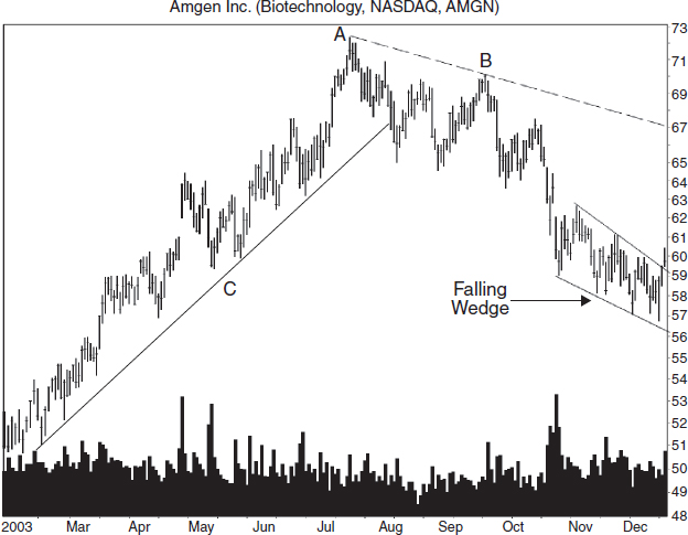
FIGURE 3.1 A falling wedge with an upward breakout marked a buying opportunity until a trendline, drawn along the tops connecting points A and B and extended down, warned that price might stall when it reached the trendline.
A Trendline Example
Figure 3.1 shows examples of several trendlines. Trendline C is a good example of a trendline. Price touches the line multiple times along its length and seems to find support at the line. Notice that price does not plunge through the line until it approaches the valley between AB.
Consider the trading setup shown by the falling wedge. The two trendlines surrounding the wedge slope downward, joining at the wedge apex sometime in the future. Volume also slopes downward as it does in many chart patterns. Breakout day volume—the day price closes above the top pattern line—is high, but not worth writing home about. The upward breakout confirmed the falling wedge as a valid chart pattern and signaled a buy. Should you take the trade?
Based on a study of 481 falling wedges in a bull market, 66% of them saw price rise to at least the top of the wedge. If the rise stops there, the trade would be worth only two points. More likely, though, is that price will push higher until it hits a trendline connecting peaks A and B. With a declining price trend, the chances are good that price will rise to meet the trendline and then plummet faster than a hot air balloon out of propane. If traded perfectly, you'd make 10%.
In early February 2004, the stock reached a high of 66.88, one point above the downsloping trendline before the stock reversed and sank to a low of 52 and change.
- Beware buying a stock when a trendline marks nearby overhead resistance.
Trendlines: External, Internal, and Curved
![]() trendline types
trendline types
trendlines come in three varieties: external, internal, and curved. External trendlines do not cut through price along its length. Internal trendlines slice through price frequently. Curved trendlines describe the shape of the trendline, but they can be external or internal.
Trendline types come in three flavors: external, internal, and curved. External trendlines are straight lines drawn so that the line rests on the peaks or grips the bottom of valleys. We saw an example of that in Figure 3.1, trendline C.
Internal trendlines cut through price by trying to better position the line so that it follows the majority of price movement.
Curved trendlines can be external or internal, depending on whether the line skirts price or cuts through it.
Let's take a closer look at the three varieties.
External Trendlines
Figure 3.2 shows an external trendline starting in September 2001 and running until mid-2002. Upsloping trendlines connect the valleys of a rising price trend. That way, when price crosses the trendline, it is an indication of a possible trend change from up to down. In the stock market, knowing when the trend will change is worth big bucks. Notice that price zigzags as it moves higher, but it still follows the straight trendline.
- Upsloping trendlines connect the valleys of a rising price trend.
The downsloping trendline beginning in mid-2003 is also an external trendline, but it rests on the price peaks. Draw downsloping trendlines along the price peaks to indicate a possible trend change from down to up. Notice that both external trendlines in Figure 3.2 do not cut through price but rest along the tops or bottoms of the peaks or valleys. Cutting through price is what differentiates an internal trendline from an external one.
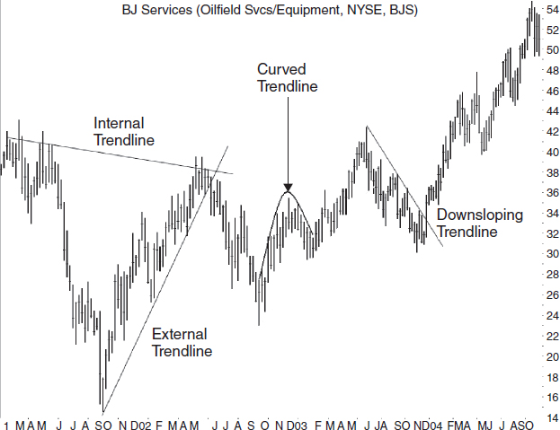
FIGURE 3.2 Shown on the weekly scale are the three types of trendlines: external, internal, and curved. The curved trendline highlights an ascending and inverted scallop chart pattern.
- Draw downsloping trendlines along the price peaks to indicate a possible trend change from down to up.
Internal Trendlines
Internal trendlines are lines of trend drawn so that they rest on the flat portion of peaks or valleys—and frequently cut through price. If the price peak were a hill, an internal trendline would rest on the ground. An external trendline, by contrast, would only connect the tops of the tallest trees. Figure 3.2 shows one example of an internal trendline. Notice how the line cuts through price instead of resting on it.
One technical analyst argues that internal trendlines better represent the trading behavior of the masses, whereas external trendlines show the behavior of just a few traders, the ones that traded at the price extremes.
Most chartists use external trendlines, especially when drawing chart patterns, and that is my personal preference. Sometimes I'll use an internal trendline to highlight a trend better, especially an unusually long trend, or a chart pattern with a few price outliers.
- Draw trendlines so that they highlight price movement best.
Curved Trendlines
Occasionally, the price trend is not straight, but curved as Figure 3.2 shows. Draw a curved trendline along the peaks or valleys to highlight the price pattern. Often curved trendlines will slice through price, but there's no need to dial 911. Price can't feel the pain. What's important is that the trendline highlights the curve, allowing your eyes to better fashion a chart pattern. For example, the curved line in the figure shows a chart pattern called an “ascending and inverted scallop.”
Sometimes traders get excited about a stock and push price up (or down) at faster and faster rates. The price trend moves up at a good clip (30 to 45 degrees) and then starts curving upward in a parabolic arc. These vertical climbs can be both thrilling and scary because price moves higher than you expect, but you know that the rise is going to stop eventually. Then, everyone races for the exits, forcing price to plummet. When price closes below a rising but curved trendline (the parabolic arc), that is the sell signal, and it can help you be one of the first out the door. A sharp reversal often follows the breakout from a parabolic or steep trendline.
For all three varieties of trendlines—external, internal, and curved—traders simply refer to them as trendlines. Whether you use an internal or external trendline is a matter of personal preference.
- Curved trendlines frequently cut though price. What's important is that the curve outlines price movement the best.
Touch Spacing
When I wrote Trading Classic Chart Patterns (John Wiley & Sons, 2002), I conducted research on trendlines and proved what others had merely speculated. I looked at about 200 trendlines with narrow and wide touch spacing and found that larger price moves occurred after a breakout from a trendline with widely spaced touches.
Figure 3.3 shows that line AC has four trendline touches and the line is five months long. On average, the touches are widely spaced. Trendline AB has five trendline touches; four of the touches are just a day apart. That trendline has narrowly spaced touches.
I found that when the average spacing between touches was less than the median 29 days in a downsloping trendline, the resulting price rise after an upward breakout averaged 36%. Trendlines with touches that were spaced wider than 29 days showed prices climbing 41%.
The same applies to upward-sloping trendlines. There, the median was 28 days between touches, and narrow trendline touches gave declines averaging 14%, but widely spaced touches showed declines averaging 19%. The results from these tests are for perfect trades without any fees, so don't expect to replicate them in actual trading.
- Trendlines with touches spaced widely apart (about a month apart) perform better than do those with narrowly spaced touches.
If you are considering trading a trendline with four touches in a month compared to a longer trendline with four touches each one month apart, trade the one with wider spacing. It will be more reliable, meaning that price is less likely to pierce the trendline and reverse (a false breakout).
Trendline Touches
median value is the middle one in a sorted list of values such that half the values are below the median and half above. If no middle value exists, the average of the two closest values is used. For example, in the list 10, 15, 30, 41, and 52, the median is 30 because there are two values on either side of it.
I also looked at the number of times price touched a trendline. Experienced traders say that the more times price touches a trendline, the more significant becomes a breakout from the trendline. I proved that true.
I looked at 85 downsloping trendlines with price touching the trendlines three times. After an upward breakout, price climbed an average of 33%. Then I compared it to 40 trendlines with five touches and found that the postbreakout rise averaged 57%.
To check this result, I split the trendlines into those with four touches or fewer. They showed gains averaging 35%. Those trendlines with more than four touches climbed an average of 48%. Again, those trendlines with more touches led to better performance after the breakout.
I conducted the same research using upsloping trendlines and found similar results, but with a closer performance difference.
- The more times price touches a trendline, the more significant becomes a breakout from that trendline.
Trendline Length
![]() short term
short term
lasts up to three months.
Of all trendline features, length is one of the important ones. Do long trendlines perform better than short ones after a breakout? Yes. I found that the median length for downward-sloping trendlines that I used was 139 days. Trendlines shorter than the median saw price climb an average of 33% after the breakout, but long trendlines saw price soar 43%.
![]() intermediate term
intermediate term
between three and six months.
As a check, I used another method and sorted the trendline length into three categories: short term (0–3 months), intermediate term (3–6 months), and long term (more than 6 months). Short-term trendlines had postbreakout rises averaging 34%. Intermediate-term and long-term trendlines had gains averaging 35% and 46%, respectively. I found similar results for upsloping trendlines.
Trendlines are like diving boards: You get a better bounce from a longer diving board than a shorter one.
- Long trendlines outperform short ones.
Trendline Angles
Another important consideration is the angle that the trendline makes with the horizontal. The steeper the trendline, the worse the performance. That's the conclusion I reached when I researched trendline angles. I measured the angle from the horizontal and sorted the trendlines by the angle they made. For both up- and downsloping trendlines, the distance that price moved (after the breakout) decreased the steeper the trendline became. (For upsloping trendlines, a trendline breakout means a close below the trendline; for downsloping trendlines, it's a close above the trendline.)
![]() trendline breakout
trendline breakout
for upsloping trendlines, a trendline breakout means a close below the trendline; for downsloping trendlines, it's a close above the trendline.
Look for trendlines that slope 30 to 45 degrees. Trendlines with those angles can last a long time. However, if the trendline slopes upward at, say, 60 degrees or more, then you'd better tighten your stop. That means adjusting your stop-loss order often, moving it closer to the current price as the stock rises. The price may continue soaring, but when the turn comes, the resulting decline will likely be rapid. A tight stop limits the dollars you give back.
- The steeper the trendline, the worse the performance.
One caution comes to mind. Be aware of the aspect ratio. That's the ratio of the width to the height of a chart. If you draw a trendline at 45 degrees and move either axis, the trendline angle will change. That's why a movie shown in a theater will fill the screen but the same flick at home will show a black band at the top and bottom of the screen.
My computer screen may show a trendline at a 45-degree angle but when I print out the chart, it might look like 30 degrees. The angles of trendlines shown in this book will likely differ from the same chart shown on your computer screen.
- The aspect ratio describes the relationship of the width to the height of a chart.
Trendline and Breakout Volume
Does breakout volume influence how far price will move after a trendline break? Yes. Let's take trendline volume first. I did a study of volume and trendlines and found that upsloping trendlines that had volume trending upward over their length resulted in a decline averaging 19% after a downward breakout. When volume receded over the length of the trendline, the decline averaged just 14%.
For downsloping trendlines, when volume climbed over the course of the trend, price climbed 30% after the upward breakout. A receding volume trend had prices climb by 45%. In short, here's what I found:
![]() ultimate high
ultimate high
the ultimate high price is the highest high before price drops at least 20%.
- Expect a larger price decline after a breakout from an upsloping trendline if volume is trending up.
- Expect a larger price rise after a breakout from a downsloping trendline if volume is trending down.
What about breakout day volume? I compared volume on the day price staged a breakout to the three-month average and found the following to be true:
![]() ultimate low
ultimate low
the ultimate low price is the lowest low before price rises at least 20%.
- Upsloping trendlines with heavy (above average) breakout volume mean a larger decline—19% versus 16%.
- Downsloping trendlines with light (average or below-average) breakout volume mean a larger rise—39% versus 36%.
Because the performance difference is not massive, don't bet that a large price change will occur, and don't think that price will rise by 39%. As I mentioned, the statistics in this chapter are for comparison purposes only because they result from 200 perfect trades. They represent the price rise or decline after a breakout to the ultimate high or ultimate low, respectively.
Measure Rule for Trendlines
When price closes below an upsloping trendline, how far will it fall? One answer to that question comes from the measure rule.
varies from pattern to pattern but is usually the pattern height added to (upward breakouts) or subtracted from (downward breakouts) the breakout price. The result is the predicted price target. Price often falls short of the target, so use half the height in the measure rule computation.
Figure 3.4 shows an upsloping trendline. The measure rule is a tool used to help predict how far price will decline after a breakout.
To use the rule, find the breakout where price closes below the trendline (point D). Then look for the widest distance between price and the trendline until the last time price touched the trendline. The last touch happened at point C, so the largest vertical distance is between points A and B. The price difference between those two is 20.75 points in this example. Subtract the difference from the breakout price (point D, the point where price intersects the trendline) to get the target price, which turns out to be 12.25. Price reaches the target (not shown) in September 2001.
If the prediction is a negative number then discard it.
The measure rule works 63% of the time for upsloping trendlines and 80% for downsloping ones, according to my tests.
You can apply this technique to downsloping trendlines in the same manner. Find the largest distance between price and the trendline from the breakout to the prior trendline touch and project the difference upward from the breakout price.
When predicting a target, be conservative and assume that the stock will fail to reach the target. Consider taking the height and converting it to a percentage of the stock's price (100 × height ÷ breakout price). If the percentage is unrealistic, then don't depend on the measure rule.
- The measure rule is a tool used to help predict how far price will move (up or down) after a breakout from a chart pattern.
- Convert the measure rule height for a trendline into a percentage price change to see if the target represents a realistic move.
Drawing Trendlines
Now that we've explored trendline features, what's left? Answer: figuring out how to draw them. Some analysts argue that it's harder than just connecting several peaks or valleys. It's not, unless you are searching for a trend change. I'll discuss that in a moment.
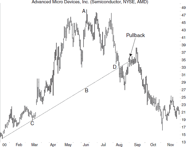
FIGURE 3.4 Use the distance from the trendline to the price high (A-B), measured vertically then projected downward from the breakout (D) to get a postbreakout price target. This is the measure rule for trendlines, but it only works between 63% (upsloping trendlines) and 80% (downsloping trendlines) of the time.
If you see several peaks that line up, draw a line across them. The same goes for valleys. Sometimes you'll want to draw both and form a channel—two parallel trendlines with price bouncing between them. Think of the channel as a price conduit. When price reaches the bottom of the channel, buy the stock, and sell when it shows signs of turning at the top of the channel. If price fails to reach the top (bottom) of the channel, that may signal a weakening (strengthening) trend and time to sell (buy). The odds increase—but not guarantee—that when price reaches the bottom (top) of the channel, price will stage a downward (upward) breakout and punch through the trendline.
- Use trendlines to highlight price (and volume) trends.
- Sometimes, price forms channels, bouncing from side to side. Buy at the low end of the channel and sell at the high end for a swing trade.
1–2–3 Trend Change Method
By definition, when price closes below an upsloping trendline, price is no longer trending up. For downsloping trendlines, a close above the trendline means price is not trending down.
Price usually moves in a zigzag fashion, like climbing stairs, so price may pierce the trendline heading down, rebound, and continue rising. The 1–2–3 trend change method takes the guesswork out of determining a trend change. Here are the three rules for upsloping trendlines:
- Draw an external trendline from the lowest valley before the highest peak and leading to the highest peak on the chart such that the trendline does not overwrite any price between them. Look at Figure 3.5. I show dashed line AB connecting the lowest valley to the highest peak. Notice how the line overwrites price. Swivel the line from point B to the right until the line touches but does not overwrite price. I show the trendline as line AC1. Point 1 is the breakout.
- Price should attempt to climb back to the price level of the highest peak but not exceed it by much, if any. I show this attempt at point 2.
- Finally, price must close below the lowest valley between points 1 (the breakout price) and 2 (the test of the high). I mark this valley with a horizontal line ending at point 3.
When all three conditions become true, then the trend has changed from up to down.
How well does this method work for upsloping trendlines? By my definition, a trend change is a 20% decline in price after the breakout. I tested the 1–2–3 trend change method on 67 trendlines that obeyed the above conditions.
I found that the average decline was 21% after the breakout, which is higher than the 17% decline for all trendlines that ignored the 1–2–3 approach. Unfortunately, only 43% of the 67 trendlines accurately predicted a decline of at least 20% (a trend change).
Before drawing conclusions about this method, note that the sample size is small and there are ways to improve the sell signal that I ignored during testing (called the 2B method). For more information, see Victor Sperandeo, Trader Vic: Methods of a Wall Street Master (John Wiley & Sons, 1991).

FIGURE 3.5 Shown is the 1–2–3 method of detecting a trend change. Point 1 is the breakout from an upsloping trendline. Point 2 is a test of the high, and point 3 is near a close below a recent low.
You can use the 1–2–3 trend change method for downsloping trendlines to denote a trend change. Here are the steps:
- Draw an external downsloping trendline from the highest peak to the lowest valley such that it doesn't intersect price until after the lowest valley.
- Price should test the low after the trendline break.
- Price must rise above the highest peak between the breakout and the test.
In Figure 3.5, assume that point 1A is the highest peak on the chart. Step 1 says draw the trendline downward to the lowest valley such that it doesn't intersect price until after the lowest valley. I show the line as 1A2A, with the lowest valley being point D. Along the way, the trendline touches but doesn't cross price between points 1A and 2A until after point D.
Step 2 says price should test the low. That happens at 2A when it approaches but does not exceed the valley low at D. Finally, step 3 says look for a rise above the peak between the breakout (a close above the trendline, shown directly below 3) and the retest (2A). I show that as the horizontal line 3A. When price closes above that line, it signals a trend change.
How often does the 1–2–3 trend change method work for downsloping trendlines? Again, I classify a trend change as a rise of 20% after the breakout, and 73% of the 101 trendlines I tested that matched the three steps in the 1–2–3 method showed an average rise of 35%. While the 73% rate is good, the 35% result falls short of the 38% average rise posted by all trendlines excluding those used in the 1–2–3 test. Nevertheless, for both up- and downsloping trendlines, I consider the 1–2–3 trend change method to add value.
- Use the 1–2–3 trend change method to determine a significant change in trend.
Sample Trade Using Trendlines
Figure 3.6 shows a trade made with two trendlines giving the buy and sell signals. On the weekly price chart, using a logarithmic scale, buy the week after price breaks out upward from the ascending broadening wedge.

this occurs after a downward breakout when price returns to, or comes very close to, the breakout price or trendline within 30 days. There must be white space between the breakout point and the pullback low. The white space rule prevents the pullback term being applied to prices clustering near the breakout price. Contrast with throwback.
The ascending wedge is a chart pattern with two trendlines that widen over time, but both tilt upward. A close above top trendline A occurred the week before purchase, and it is the buy signal.
Price followed trendline B higher until late July. That's when price closed below the trendline for the first time. A sale completed the trade at the open the next week. A person making this trade would have doubled their money.
A few notes:
- The weekly scale gives reliable sell signals. If the stock punches through a trendline on the weeklies, then the chances improve that price will continue moving down.
- The logarithmic scale signals a trendline pierce earlier than the arithmetic scale. I prefer the log scale (semi-log since only price is on the log scale).
Advanced Trendline Tactics
Here are some interesting trendline trivia that you may not know but may prove useful:
- When price moves away from a trendline, momentum is increasing. When price moves toward the trendline, momentum is decreasing. When price rides along the trendline, the rate of change is constant.
- Trendline mirrors: Sometimes, a price bump on one side of the trendline reflects across the other side of the line as a dip, and vice versa. The measure rule is based on this.
- When price pierces a steep trendline, it often moves up at a slower rate, following a new trendline.
- When price pierces a downsloping trendline and makes a higher peak (note: this is the second peak that is higher than the first), connect the two peaks with an upsloping trendline. Then, draw a new line parallel to the original trendline starting at the low between the two peaks. The lower trendline will show where price is likely to reverse.
this occurs after an upward breakout when price declines to, or comes very close to, the breakout price or the chart pattern trendline within 30 days. There must be white space between the hooking price action of the throwback and the breakout price. Contrast with pullback.
- Expect a pullback (downward breakout) or throwback (upward breakout) after price pierces a trendline. Figure 3.4 shows an example of a pullback, when price returns to the trendline before continuing down. In Figure 3.5, point 2 is a pullback to trendline AC1 (extended into the future) and point 2A represents a throwback to line 1A2A.
- During strong uptrends, price may pierce a trendline and head down for about a month before resuming the uptrend at nearly the same angle. This stair-step rise is a chart pattern called a measured move up. The reverse also applies and forms a measured move down.
- When price pierces a trendline, look at the prior day's close. For upsloping trendlines, if the prior close was at or near the intraday high, the chances increase that the downward breakout is false (because profit taking got carried away, forcing price down). If the close was near the intraday low, then chances increase that the breakout is valid.
![]() intraday
intraday
within a single trading day.
I found that last gem in Barbara Rockefeller's book, Technical Analysis For Dummies (John Wiley & Sons, 2004), so I decided to test it. I used 202 upsloping trendlines and split the trading range the day before the trendline breakout into thirds and then placed the closing price that day within one of the thirds. Those with prices within a third of the intraday high performed worst after the breakout, just as the theory predicted. I also found the same behavior for downsloping trendlines. A close near the intraday high the day before the breakout suggested a less powerful move.
What We Learned
Here is a list of the major lessons discussed in this chapter.
- When price trends, a line connecting them is called a trendline. See “What Are Trendlines?”
- Beware buying a stock when a trendline marks nearby overhead resistance. See “A Trendline Example.”
- Trendlines come in three varieties: external, internal, and curved. External trendlines do not cut through price along its length. Internal trendlines slice through price frequently. Curved trendlines describe the shape of the trendline, but they can be external or internal. See “Trendlines: External, Internal, and Curved.”
- Upsloping trendlines connect the valleys of a rising price trend. See “External Trendlines.”
- Draw downsloping trendlines along the price peaks to indicate a possible trend change from down to up. See “External Trendlines.”
- Draw trendlines so that they highlight price movement best. See “Internal Trendlines.”
- Curved trendlines frequently cut though price. What's important is that the curve outlines price movement the best. See “Curved Trendlines.”
- Trendlines with touches spaced widely apart (about a month apart) perform better than do those with narrowly spaced touches. See “Touch Spacing.”
- The more times price touches a trendline, the more significant becomes a breakout from that trendline. See “Trendline Touches.”
- Long trendlines outperform short ones. See “Trendline Length.”
- The steeper the trendline, the worse the performance. See “Trendline Angles.”
- The aspect ratio describes the relationship of the width to the height of a chart. See “Trendline Angles.”
- Expect a larger price decline after a breakout from an upsloping trendline if volume is trending up. See “Trendline and Breakout Volume.”
- Expect a larger price rise after a breakout from a downsloping trendline if volume is trending down. See “Trendline and Breakout Volume.”
- Upsloping trendlines with heavy (above average) breakout volume mean a larger decline. See “Trendline and Breakout Volume.”
- Downsloping trendlines with light (average or below average) breakout volume mean a larger rise. See “Trendline and Breakout Volume.”
- The measure rule is a tool used to help predict how far price will move (up or down) after a breakout from a chart pattern. See “Measure Rule for Trendlines.”
- Convert the measure rule height for a trendline into a percentage price change to see if the target represents a realistic move. See “Measure Rule for Trendlines.”
- Use trendlines to highlight price (and volume) trends. See “Drawing Trendlines.”
- Sometimes, price forms channels, bouncing from side to side. Buy at the low end of the channel and sell at the high end for a swing trade. See “Drawing Trendlines.”
- Use the 1–2–3 trend change method to determine a significant change in trend. See “1–2–3 Trend Change Method.”
- The weekly scale gives reliable sell signals. If the stock punches through a trendline on the weeklies, then the chances improve that price will continue moving down. See “Sample Trade Using Trendlines.”
- The logarithmic scale signals a trendline pierce earlier than the arithmetic scale. See “Sample Trade Using Trendlines.”
- When price moves away from a trendline, momentum is increasing. When price moves toward the trendline, momentum is decreasing. When price rides along the trendline, the rate of change is constant. See “Advanced Trendline Tactics.”
- Trendline mirrors: Sometimes, a price bump on one side of the trendline reflects across the other side of the line as a dip, and vice versa. The measure rule is based on this. See “Advanced Trendline Tactics.”
- When price pierces a steep trendline, it often moves up at a slower rate, following a new trendline. See “Advanced Trendline Tactics.”
- When price pierces a downsloping trendline and makes a higher peak, connect the two peaks with an upsloping trendline. Then, draw a new line parallel to the original trendline starting at the low between the two peaks. The lower trendline will show where price is likely to reverse. See “Advanced Trendline Tactics.”
- Expect a pullback (downward breakout) or throwback (upward breakout) after price pierces a trendline. See “Advanced Trendline Tactics.”
- During strong uptrends, price may pierce a trendline and head down for about a month before resuming the uptrend at nearly the same angle. This stair-step rise is a chart pattern called a measured move up. The reverse also applies and forms a measured move down. See “Advanced Trendline Tactics.”
- When price pierces a trendline, look at the prior day's close. For upsloping trendlines, if the prior close was at or near the intraday high, the chances increase that the downward breakout is false. If the close was near the intraday low, then chances increase that the breakout is valid. See “Advanced Trendline Tactics.”