6
THE VIRTUES OF SIMPLICITY: OR, WHY IT'S HARD TO POUND IN A NAIL SIDEWAYS.
IF YOU TAKE AWAY ONE THING from this book, let it be the advice in this section: simpler is always better.
Maurice Saatchi, of London's M&C Saatchi, on simplicity: “Simplicity is all. Simple logic, simple arguments, simple visual images. If you can't reduce your argument to a few crisp words and phrases, there's something wrong with your argument.”
To create a simple advertising idea in any medium, we must limit ourselves to saying one thing. Any advertising concept that tries to make more than one point won't work. This is basically why they put the point on the end of the nail.

MAKE SURE THE FUSE ON YOUR IDEA ISN'T TOO LONG OR TOO SHORT.
Here's the thing: the customer must get your ad instantly, or close to instantly. I sometimes refer to this as the Speed of the Get. (As in, “I get it.”) For my money, a quick-get is the first and the most important thing an idea needs to have. A quick get matters more than even the creativity of the piece. Heresy, I know, but it's the truth.
However, you don't want your idea to be too quick of a get. If your idea doesn't have enough substance to it, it may well be an instant read but will likely have little effect on the viewer. Sort of like a STOP sign; obviously an instant read but not likely something I'm gonna post about. Few students err on the too fast end of the continuum. Most of the ideas I see are too slow.
To create an intriguing idea that requires a little bit of readers—which is a good thing—students sometimes overcomplicate things and end up “encoding” the idea, resulting in a get that takes three or four beats longer than it should.
I liken the Speed of the Get to the length of a fuse on a firecracker. If the fuse on an idea is too short, the idea goes off too fast. Before the reader is even really paying attention, its quick, clueless bang makes it clear there's nothing there to be interested in. I've found most students tend to set their fuses too long; equally ineffective because nobody has time to wait around for your idea to go off.
You can improve the speed of the get on your concepts by taking everything out of the idea except the idea. An old story (possibly apocryphal) has it that an admirer of Michelangelo had asked him how he had managed to create such a magnificent statue of an elephant from a cold block of marble. Allegedly, he answered, “I just chipped away everything that wasn't elephant.” I suggest you do the same with your concepts.
To determine whether you need a certain image, phrase, or word to make your idea work, try taking it out. If the idea doesn't work without it, that part was what I call a load-bearing beam. But if the idea still holds up without it, well, it didn't need it and you should probably take it out.
Which reminds me. There's an old parable about problem-solving called Occam's razor. It states when you have two correct answers that both solve the problem, the more correct answer is the simplest one because it solves the problem with fewer moving parts. It solves the problem more elegantly.
Simple has stopping power.
What is it about the two ads in Figures 6.2 and 6.3?
For my money, it's their stopping power. The ads stop me because, other than the logo, there's only one place I can look. And then, once I'm looking, I realize the image, it's … off … it's weird somehow, so I lean in thinkin' what the hell … >bang< … and the idea goes off. The fuse is exactly the right length on both of these ideas.
Simple doesn't figure it all out for you. Sometimes it asks the reader to finish it. The less you put in the ad, the better. As the writer Saki said, “When baiting a trap with cheese, always leave room for the mouse.”
Simple is bigger.
On May 7, 1915, a German U-boat sank a passenger ship, the Lusitania, killing nearly 1,200 civilians, many of them women and children. America was finally too angry to stay out of the Great War, and enlistment posters began to appear in shop windows, one of which is reprinted here (Figure 6.4).
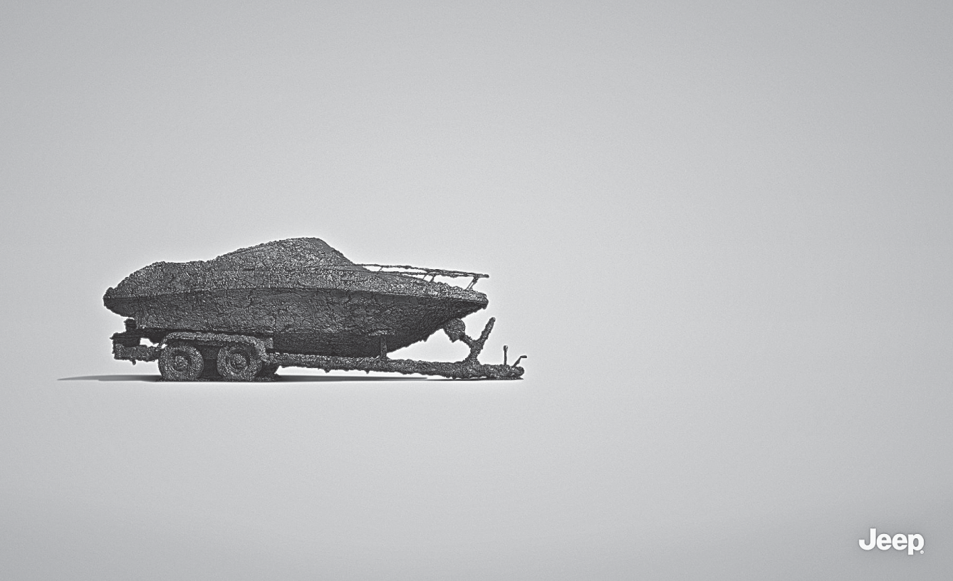
Figure 6.2 No headline. No product. Just a mud-caked boat on a trailer. For Jeep.
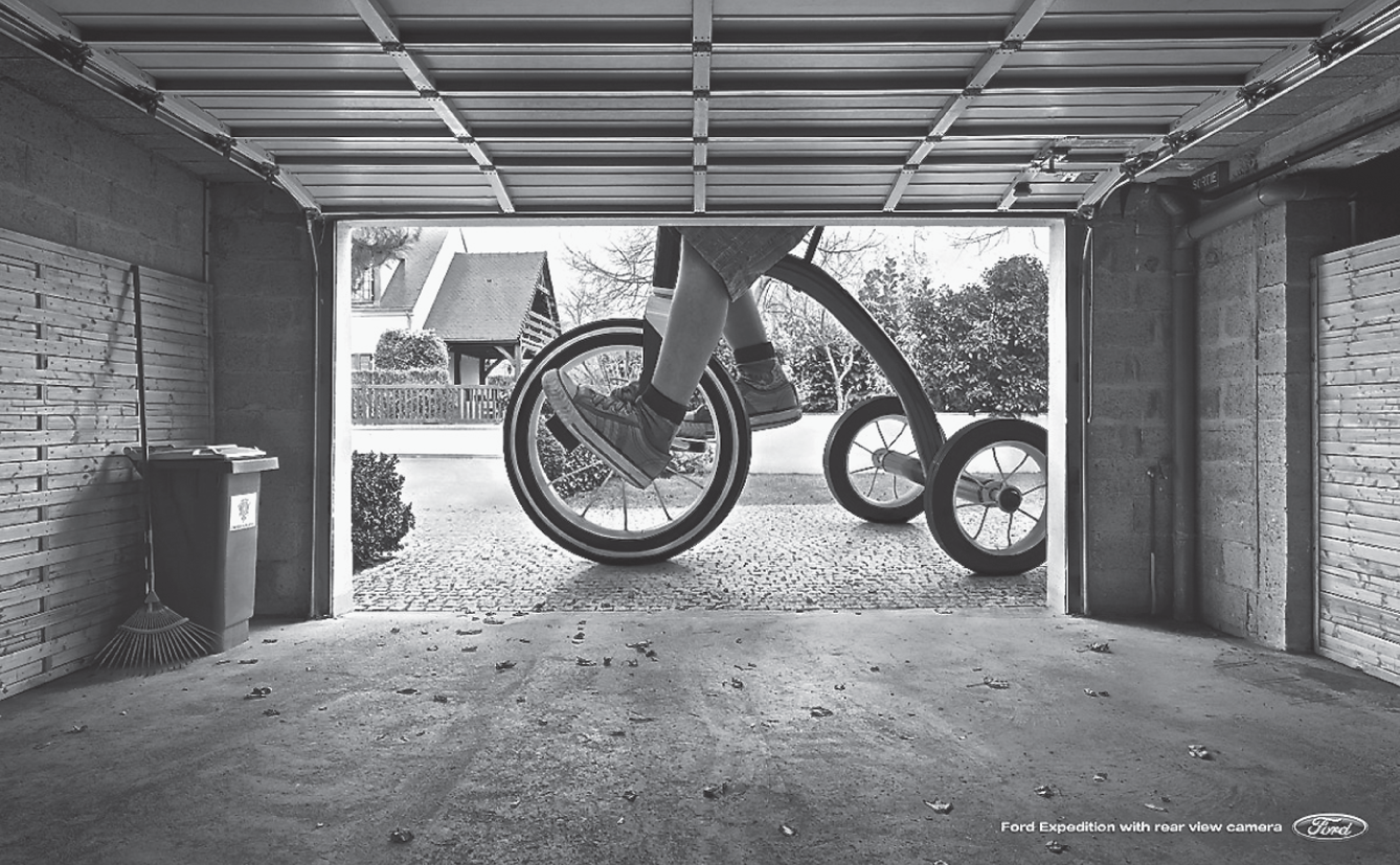
Figure 6.3 Headline reads “Ford Expedition with rear view camera.”
Most other World War I posters were not as visual and instead used headlines like “Irishmen, Avenge the Lusitania!” and “Take Up the Sword of Justice.” Seems to me, all these decades later, they're not nearly as powerful as this one simple image, this one word.
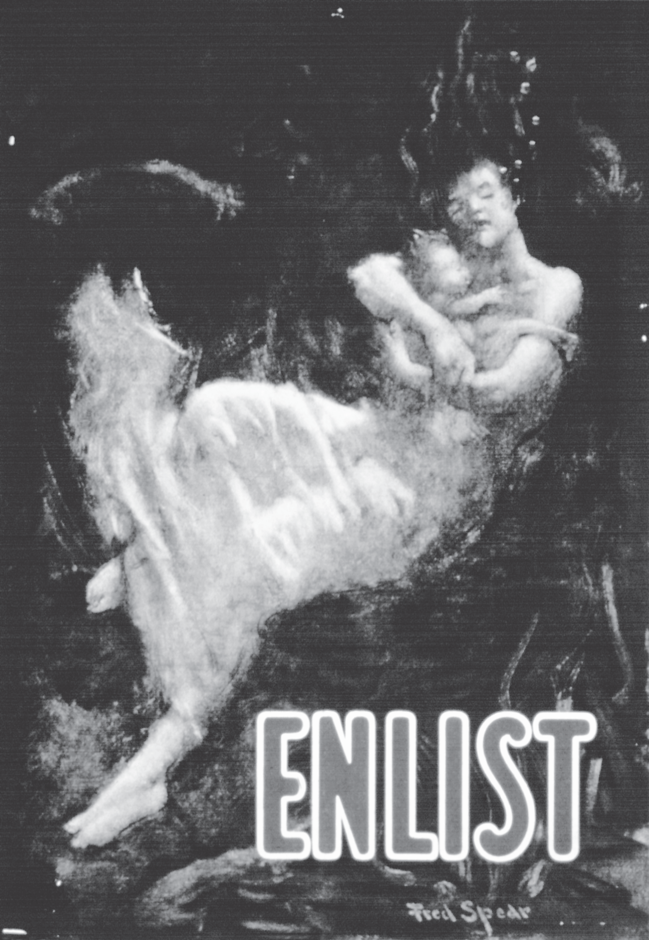
Figure 6.4 Simple graphic images are powerful. One hundred years later, this World War I recruitment poster still works.
Remember, in any cluttered media environment, less is truly more. So, why not have your radio spot be one person saying 40 words? Maybe have a print ad be all one color. Lock the camera down and do your whole TV spot on a tabletop. Show a scorpion walking up a baby's arm, I don't know, but do something simple. Simple is huge.
The artist Cezanne said, “With an apple, I will astonish Paris.”
Simple breaks through clutter.
The kryptonite of clutter is simplicity. How can anything else but simplicity break out of clutter? Should we do clutter that's cleverer? Or perhaps clutter that has a better design? Clutter that's more strategically correct? No. The only effective antidote to clutter is simplicity.
Even the Super Bowl, with its annual collection of eye-popping TV commercials, has its own brand of clutter. Call it “good” clutter if you will. But it's still clutter and you have to find a way to improve what a scientist might call the “signal-to-noise ratio” of your idea. You must break out. And you can do that with an idea of draconian simplicity.
Keep paring away until you have the essence of your idea.
Let's start with three observations from three different men: one dead, one British, and one crazy.
Robert Louis Stevenson said, “The only art is to omit.”
Tony Cox, a fabulous British writer said, “Inside every fat ad there's a thinner and better one trying to get out.”
And then there's Neil French, a great writer from Singapore. I was lucky enough to meet him one day, and he walked me through a wonderful exercise in the art of omitting, of reductionism.
He started by drawing a thumbnail sketch of a typical ad (idea 1 in Figure 6.5). You have your headline, your visual, some body copy, a tagline, and a logo.
Okay, he asked, can we make this ad work without the body copy? Maybe we could, by making the headline work a little harder. We can? Good, let's take out the body copy. That leaves the slightly cleaner layout of idea 2.
What about the tagline? Is it bringing any new information to the ad? No? Then let's broom it. Look, the third layout's already better, faster, cleaner.
Now, about that headline. What if we came up with a visual that, all by itself, delivered the key message? And that logo—isn't there some way we can incorporate it into the visual?
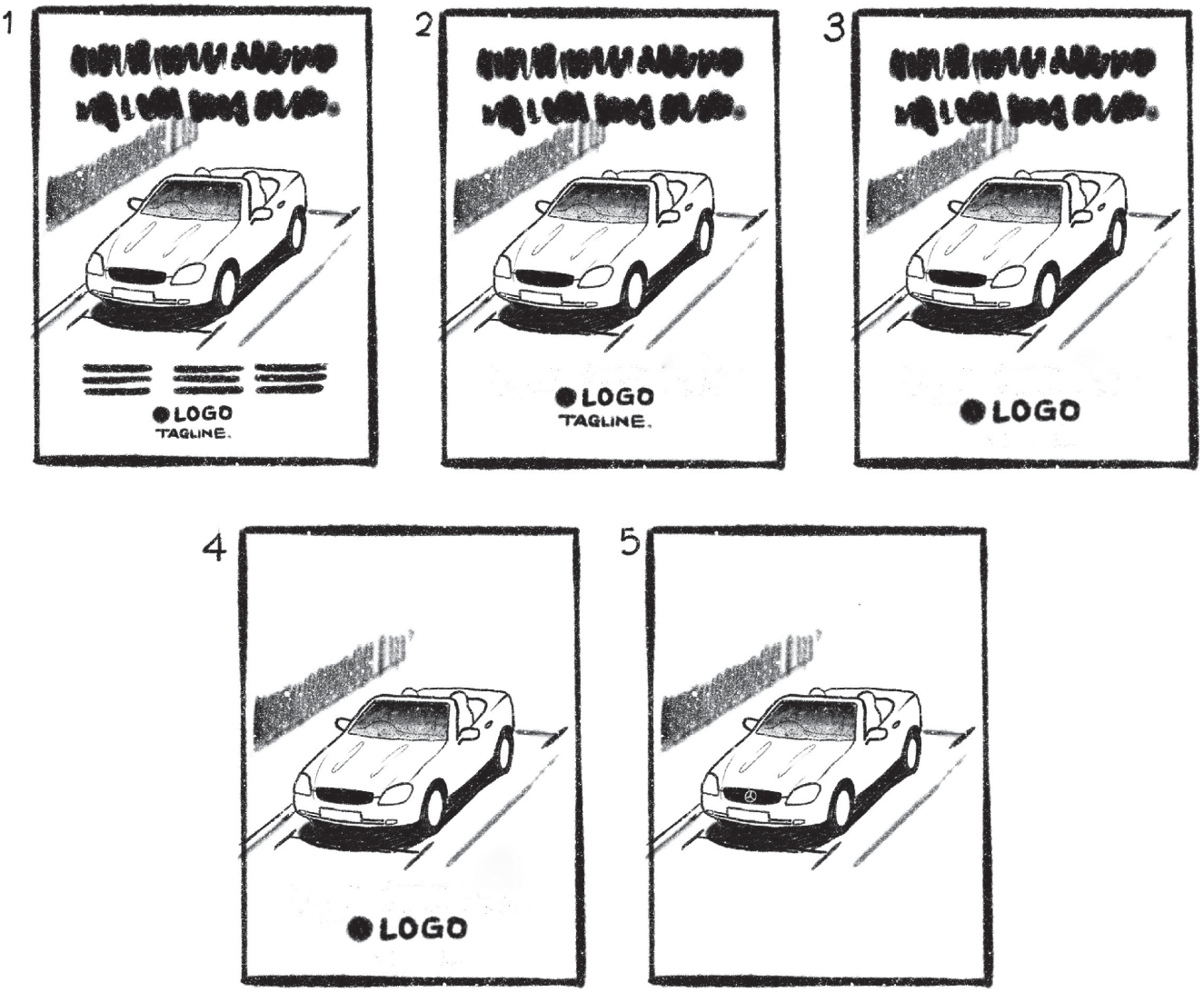
Figure 6.5 Neil's napkin demonstration of reductionism. Idea 5 is almost always going to be better than idea 1.
Ultimately, Neil reduced his ad to one thing. He suggested I try to do the same whenever I can. Get it down to one thing. Sometimes it's just a headline. Sometimes a picture. Either way, he said, the math always works out the same. Every element you add to an idea reduces the importance of all the other elements. And conversely, every item you subtract raises the visibility and importance of what's left.
Several years after my conversation with Neil, an ad from Leo Burnett London won gold at Cannes with the excellent concept you see in Figure 6.6.
Admittedly, this kind of draconian reductionism is hard to pull off, especially when you have a client who wants to put more in an ad, not less. In my career, I've managed only once to reduce a print concept down to a single image. But to this day, it remains my favorite. It was a business-to-business (B2B) ad that ran in fashion magazines like Women's Wear Daily to remind store buyers to stock Lee jeans during their wholesale discounts (Figure 6.7). Note the absence of even a logo.
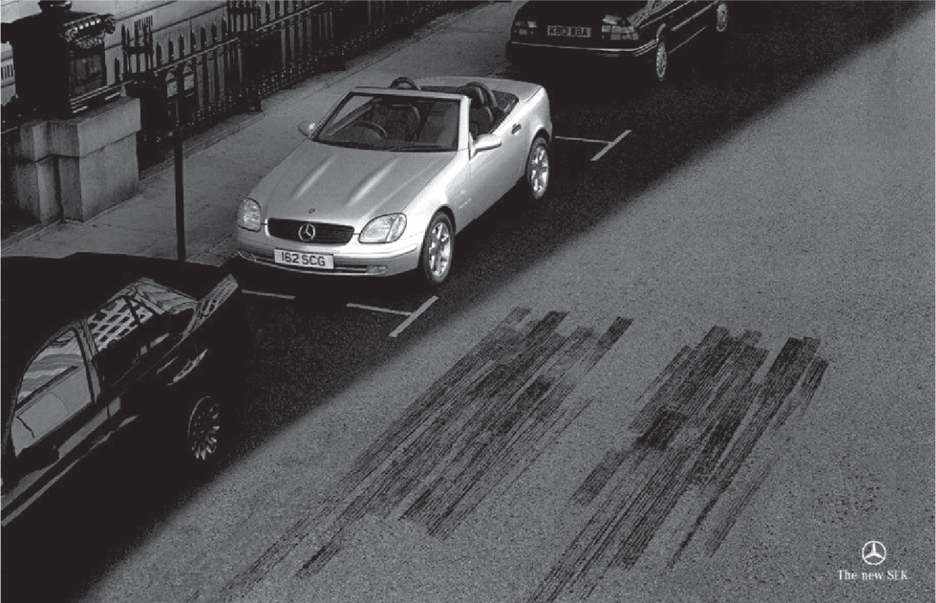
Figure 6.6 Brilliantly simple ideas also have stopping power.
One last thing I noticed about simple. It doesn't age. Maybe it's just me, but this ad for Lee jeans, along with most of the ads in this chapter, they all seem timeless; the clients could publish them tomorrow, just as they are.
A FEW WORDS ABOUT OUTDOOR. (FEW BEING THE KEY WORD.)
Billboards and posters force you to be simple.
Billboards and out-of-home advertising (or OOH as most agency people refer to it) may be the best medium to practice the art of simplicity, because there's no room to do much else other than get right to your idea. No time for any drumroll here, folks. Just cut to the cymbal crash.
It's been said an outdoor board should have no more than seven words. Any more and people won't have time to read them. Obviously, we have to include the client's logo which may add two or three words. So, now we're up to 10 words, which is pushing it. However, with the right execution (having no visual helps), even 11 words can work, as Figure 6.8 shows.
Out-of-home advertising is an unforgiving medium to work in. But when you think about it, is there any medium where people are just poking along waiting to see our ideas? Given the speed of passing audiences, I suggest draconian measures. Tagline? Broom it. Website address? Fuhgeddaboudit. Cut, cut, and cut again. Simpler is always better.
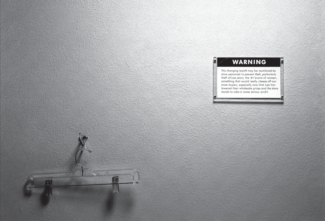
Figure 6.7 It's hard to read reprinted here, but the little warning sign says: “This changing booth is monitored by store personnel to prevent theft, particularly theft of Lee jeans, the #1 brand of women, something that would really cheese off our store buyers, especially now that Lee has lowered their wholesale prices and the store stands to rake in some serious profit.”
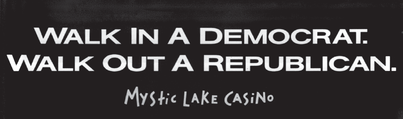
Figure 6.8 Hunt-Adkins of Minneapolis did another great board for Mystic Lake Casino which read, “Call In Rich Tomorrow.”
Here's a good way to test whether your outdoor ideas work quickly. Show it to a friend, for just two seconds, and then put it out of sight. One Mississippi, Two Mississippi. And then ask ’em, what did it say?
Or, as a test for legibility, try looking at the layout on your computer from 10 feet away. Speed matters. Check out how fast this next one is (Figure 6.9).
To see for yourself why these tests matter, next time you're driving a highway, count the number of billboards you're able to read from your car. In my experience, it's less than 10 percent of ’em. I'm beginning to think highway outdoor is probably best used just for giving directions on which exit to take to get to the brand's location.
However, for subway postings and bus stops, concepts can risk a slightly longer fuse. Another interesting media buy is known as “station domination.” Creepy name, I know, but buying out every board in a single subway stop can be very attention-getting and is often perfect for big events.
One last thing? A personal favor? If someone asks you to do yet another one of those personal injury lawyer billboards, you know, with the big-ass phone numbers like 777-777 or 888-8888? Please, just walk away.
Outdoor's super-power: Size.
Out-of-home offers something no other medium can—scale. It's the perfect medium to pull off ideas where size matters. In Figure 6.10 you can see Nationwide Insurance's dramatic oversized paint spill. But even traditional billboards can incorporate large 3D elements, as Chik-Fil-A did during its long-running outdoor campaign (Figure 6.11).
Big as they are on the cityscape, outdoor boards aren't just a big ads; they can be events. Which is why you should never settle for some idea that's just “okay.” If you do and it's actually posted, its huge size will magnify your so-so idea into a towering tribute to your mediocrity and you'll wanna take a different route into work just to avoid having it scream this down at you:
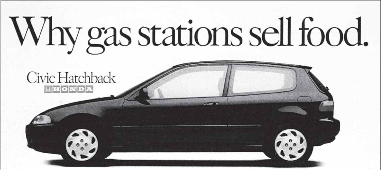
Figure 6.9 A simple billboard about Honda's fuel efficiency.
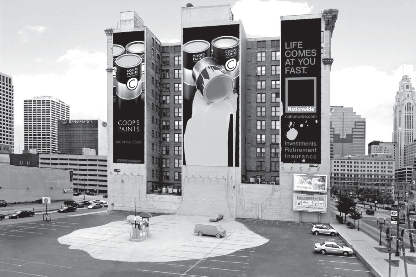
Figure 6.10 Nationwide Insurance and regional paint brand Coop's collude to create this traffic stopper in Nationwide's home town, Columbus, SC.
Digital technology is also changing outdoor.
Perhaps the most famous, most-talked-about billboard in advertising history is still Ogilvy London's digital masterpiece for British Airways. On a board high above Piccadilly Circus (Figure 6.12), a little boy pointed to any BA plane flying overhead, naming both its flight number and destination in real time. To pull it off, Ogilvy's digital developers fed the installation with live data from, among other sources, flight patterns and weather. (The case study on YouTube is required viewing.)
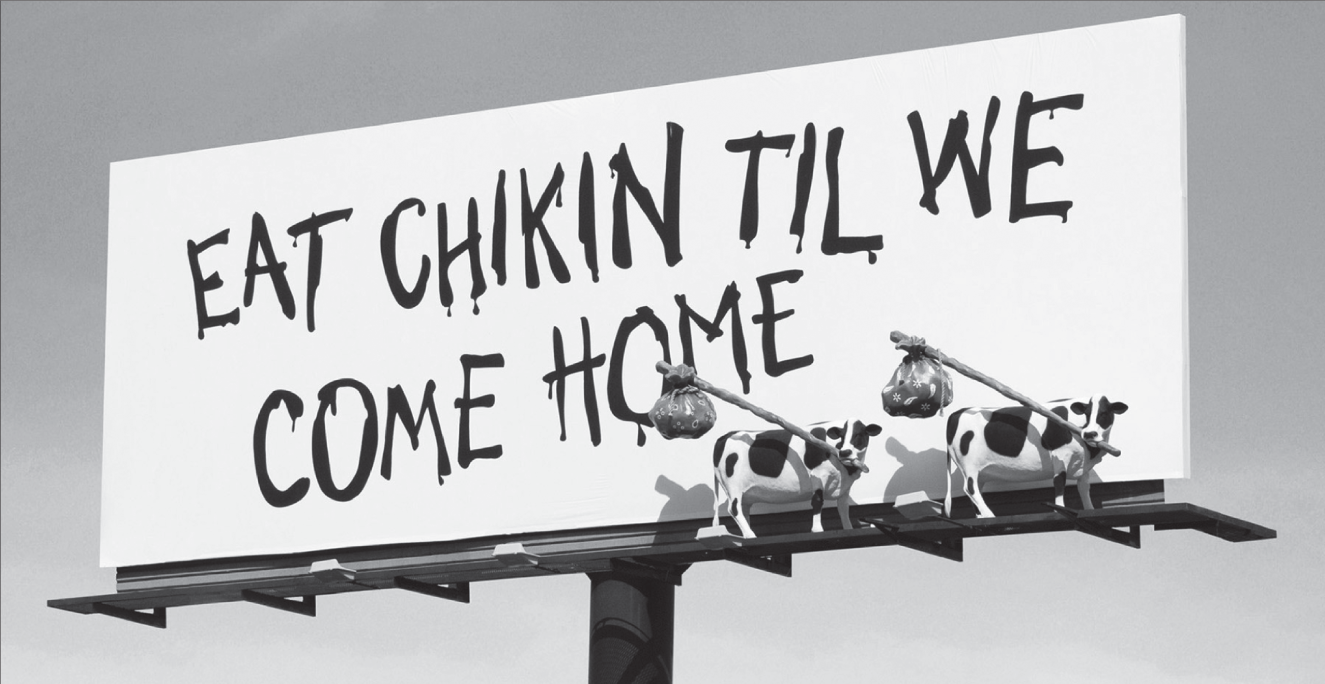
Figure 6.11 For years, Chik-Fil-A spent most of its advertising budget on this well-loved, long-running outdoor campaign.
With streaming data, many OOH installations now use digital technology in simpler but effective ways. Weather data allowed a Carnival Cruise digital board to show freezing Boston citizens an always-accurate reminder, “Current temperature in the Caribbean: 83˚.”
Technical add-ons to outdoor boards can also enhance the idea. Light sensors can change the board's mood according to the time of day. In another example, if someone smoked near a digital poster for a nicotine gum, a smoke detector triggered the person in the image to begin coughing.
Today, most of the industry interest is in pairing brands' mobile and OOH campaigns, sometimes with Bluetooth technology or geofencing and geotargeting tools. Outdoor executions can also be folded into a brand's social strategy. Spotify recently launched an outdoor campaign promoting its “New Music Fridays” designing the layouts to look like a featured artist's playlist on the site. The artists then posted photos of themselves (posing in front of their boards) to the millions of fans following them on social media. Every post, of course, featured the Spotify logo right in the picture.
As long as we're talking about OOH, WTF is “new media”?
Although the term “new media” is not in wide use, I use it here synonymously with terms such as “ambient” and “alternative media,” which refer to the use of any surface or object to carry a brand message. These can be everything from overhead hand straps on buses to those irritating gas pump TV screens.
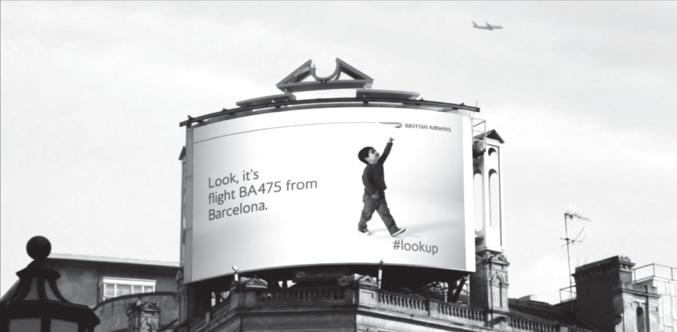
Figure 6.12 This one billboard idea was talked about on television news programs around the world.
One of Wikipedia's contributors nicely summed up the draw of creatively chosen new media: “Within the advertising business there is a blurring of the distinction between creative (content) and the media (the delivery of this content). New media itself is considered to be creative and the medium has indeed become the message.”
Then there's guerilla marketing. Taking its name from a kind of warfare that uses the element of surprise, brands sometimes use guerilla as part of an PR strategy employing surprise or unconventional interactions, usually in urban settings. However, in Advertising by Design, author Robin Landa suggests the judicious use of such tactics. “‘Guerilla' advertising is effective when it is entertaining. It is offensive when it accosts or seriously intrudes. As advertising creeps more and more into our environment, we must be judicious about its placement and its effect on popular culture and on people. Respecting people is critical.”1
In this medium, your ideas must delight people.
Except for the handful of great ideas in the award shows each year, most of the outdoor I see is either okay or pretty bad. The thing is, when a digital idea is bad, people can just >click< and it goes away. But if you live across the street from a stupid outdoor board, all you can do is close the curtains and drink yourself to sleep.
Copywriter Howard Luck Gossage didn't believe outdoor boards were a true advertising medium:
An advertising medium is a medium that incidentally carries advertising but whose primary function is to provide something else: entertainment, news, etc… . Your exposure to television commercials is conditional on their being accompanied by entertainment that is not otherwise available. No such parity or tit-for-tat or fair exchange exists in outdoor advertising… . I’m afraid the poor old billboard doesn't qualify as a medium at all; its medium, if any, is the scenery around it and that is not its to give away.2
In 2006, the city of Sao Paulo, Brazil, outlawed billboards, and here in America other states are considering joining Maine, Vermont, Alaska, and Hawaii with similar bans. Is it heresy to suggest outdoor advertising should be restricted to city limits? Well, until the day billboards are banned altogether (for the crime of “corporate littering” or perhaps “retinal trespassing”), you owe the citizens of the town where your outdoor appears your very best work. Let your work delight people.