Chapter 9
Paragraph Indents and Spacing
Typography, like all communications media, relies on established conventions that are understood, often unconsciously, by its audience. One such convention is the chunking of our text into separate paragraphs, each of which represents a unit of thought. Although there are several ways to indicate a new paragraph, two methods are most prevalent: indenting the first line and adding spacing between paragraphs. In this chapter, I’m primarily concerned with the hows and whys of these two time-honored conventions, but I also look at the use of other types of indents for differentiating specific types of paragraphs.
First-Line Indents
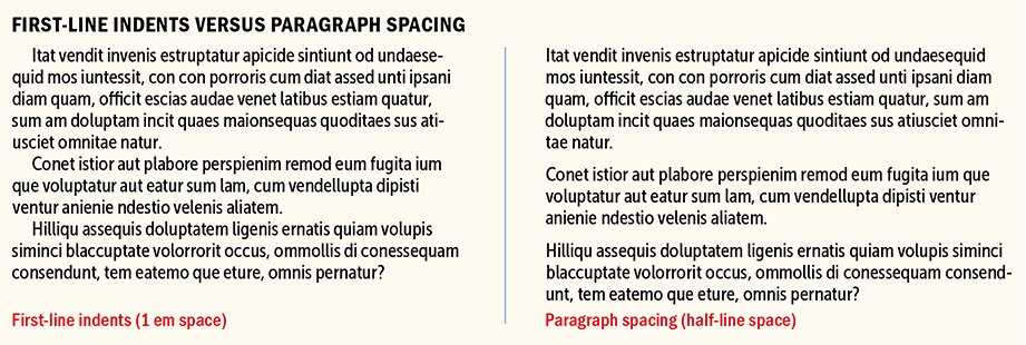
The humble first-line indent plays a crucial role in the readability of documents, alerting the reader that one paragraph has ended and a new one is about to begin. First-line indents also provide a visual pause and necessary white space to what might otherwise look like a forbidding block of type.
How Big Should They Be?
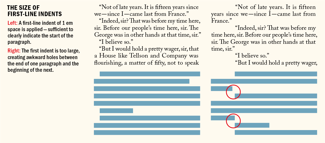
There is no hard-and-fast rule regarding the size of first-line indents, but 1 em (or a bit bigger if the typeface has a large x-height) is a good starting point. If you’re using 10-point type, for example, a 10-point first-line indent is suitable; anything less and the indent may be missed.
“Typesetting without indentation makes it difficult for the reader to comprehend what has been printed. And that is its most important disadvantage. While blunt beginnings seem to create a uniform and consistent impression when compared to normal typesetting, this impression is paid for with a serious loss of comprehension.”
— Jan Tschichold, The Form of the Book: Essays on the Morality of Good Design
Alternatively, you can use your leading increment: If your text is 10/12, then a 12-point first-line indent is suitable. Some people prefer a slightly larger indent, especially when working with wide columns. Just make sure your first-line indent is smaller than the shortest last line of your paragraphs, to avoid creating ugly areas of trapped space between paragraphs.
Contradicting the advice above, you can use bigger indents to good effect. An extreme indent can be as wide as mid-column and be applied to one or more lines. This technique provides an unmissable paragraph signal and produces an interesting text shape, which can add graphic interest.
How (and How Not) to Add First-Line Indents
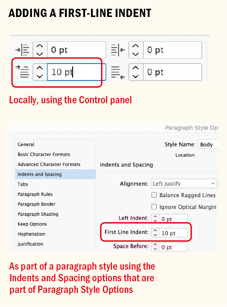
First-line indents can be applied through the Control panel or the Paragraph panel, or (preferably) can be incorporated into a paragraph style definition. Never create your first-line indents with tabs or, worse, by pressing the spacebar multiple times.
While first-line indents are generally well suited to reading matter, be it newspaper articles or literature, block-style paragraphs with paragraph spacing may be more appropriate for reference material, instructional manuals, or text intended to be read onscreen. To some degree, it’s a matter of preference, but here are some things to consider:
Don’t use first-line indents and paragraph spacing to differentiate body text. It’s an either/or proposition.
Don’t use first-line indents on centered or right-aligned type.
Don’t indent the first paragraph of an article. This is unnecessary because the indent serves to separate a paragraph from the one that precedes it.
If a paragraph follows a heading or subhead, the first-line indent is unnecessary.
Dropping the first-line indent and adding a line of spacing before a paragraph is a simple way to indicate a separation without implying a hierarchical difference between two paragraphs. For more emphasis, a graphic element between continuous paragraphs can serve as an elegant separator.
First-line indents are more economical than paragraph spacing in terms of space usage.
Using first-line indents rather than paragraph spacing results in a more even type color because you don’t have horizontal stripes of white space between paragraphs.
It’s easier to align type to a baseline grid when using first-line indents rather than paragraph spacing. Adding a whole line space is too much between paragraphs. If you add less than a whole line of paragraph space, however, the baselines of your type will not align across columns.
When you have wide text columns, you can make a statement with a wide indent.
Alternatives to the First-Line Indent
In some newspapers, where space is tight, paragraphs are set flush left. This is problematic if the last lines of the paragraphs run the full column measure, making it difficult for the reader to discern one paragraph from the next.
An alternative to using first-line indents is to run the paragraphs together and use a decorative mark between them. This maintains the flush look of the text without compromising its meaning. In medieval manuscripts, a pilcrow was used to differentiate paragraphs; in certain contexts, this can still be an effective solution.
Hanging Indents
There are two types of hanging indents: left-hanging (also known as outdents) and right-hanging (or last-line indents). Left-hanging indents are used in dictionaries, bibliographies, and sometimes on résumés or CVs. They look sharp and give prominence to the item or entry on the left side of the text frame. Right-hanging indents are used in price lists, on restaurant menus, or in a table of contents with long, multiline entries. The purpose of right-hanging indents is to create vertical white space around the prices or numbers so that they are more easily read.
Left-Hanging Indents
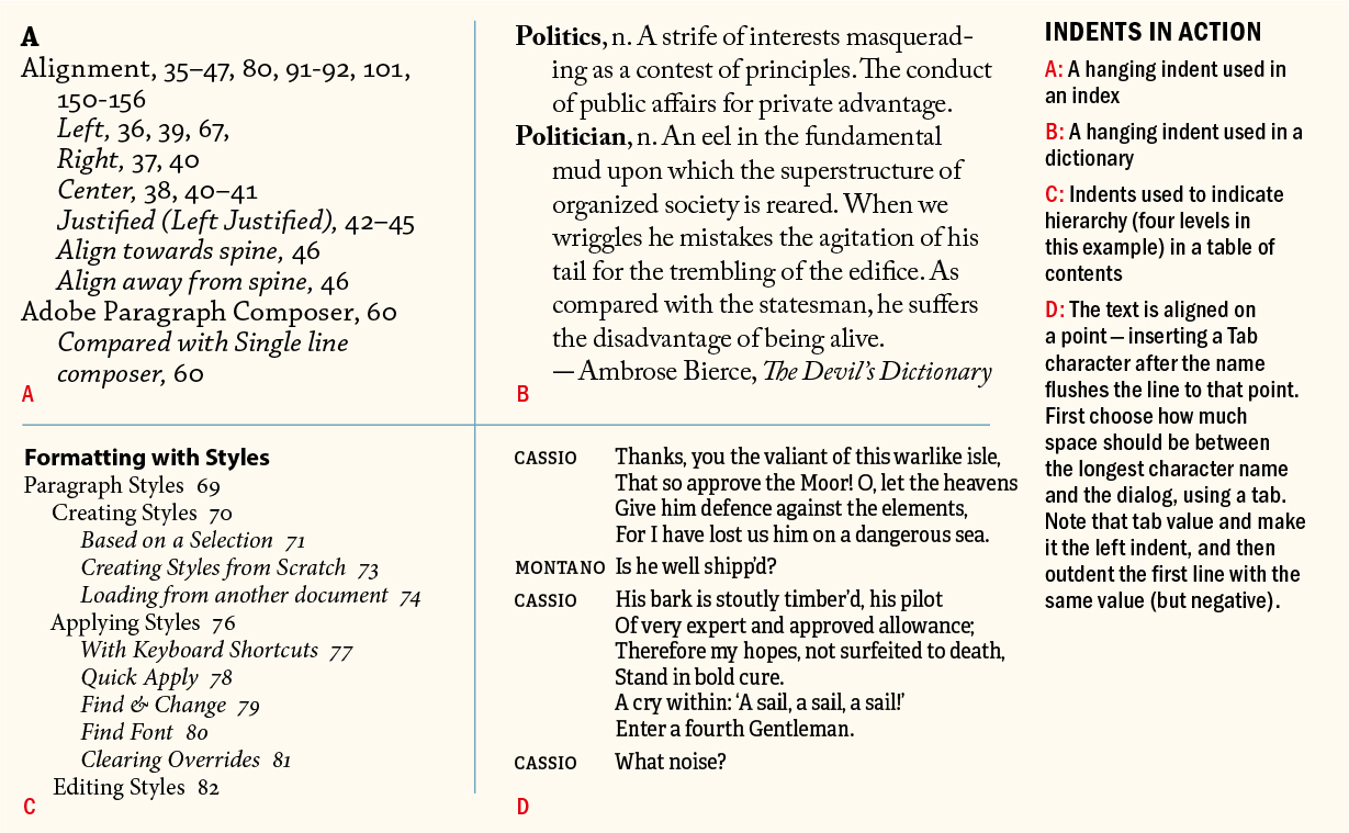
With left-hanging indents, all the lines of the paragraph are indented except for the first line, which sticks out beyond the left margin edge. Hanging indents can be distinct — the bigger the outdent, the more dramatic the effect. They are achieved by first applying a left indent to the text, then applying a first-line indent with a negative value, typically the same amount as you entered for the left indent. For example, if you specify a left indent of 12 points, your first-line left indent will be −12 points.
Right-Hanging Indents
Right-hanging, or last-line, indents extend the last line of a paragraph beyond the edge of the text to accentuate its content. They are achieved by applying a right indent to the text, then applying a negative last-line indent. Typically, the last-line indent is the same amount as entered for the right indent. For example, if you specify a right indent of 12 points, your last-line right indent will be −12 points.
Left and Right Indents
Certain types of paragraphs benefit from indentation on both edges. Indenting an entire block of text on the left, the right, or both is appropriate in the following situations:
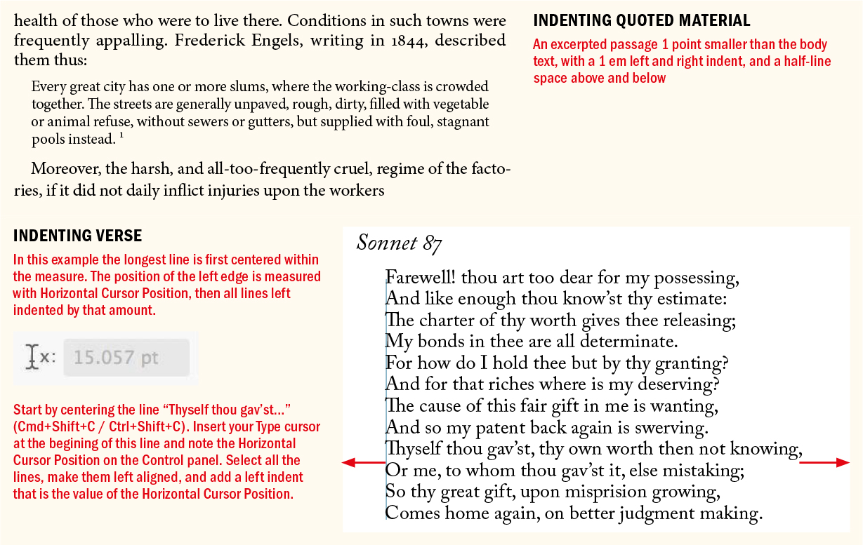
To indicate a quoted passage of text or extract. Make the type 1 point smaller than the body text, indented both left and right, and add an even amount of paragraph space — usually a half-line space — before and after the passage. As with first-line indents, the left and right indents should be large enough to be noticed, but not so large that the line length is too short. There’s no need for quotation marks at the start and end of the indented passage.
In tables of contents or technical documents, the indentation signifies a lower level of the hierarchy.
When working with verse, center the longest line in the verse, then insert your cursor at the beginning of this line and note the Horizontal Cursor Position on the Control panel. Next, select all the lines, make them left aligned, and add a left indent that is the value of the Horizontal Cursor Position.

Text Insets
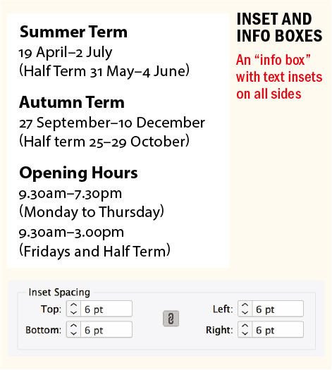
Text insets are margins, or padding, within your text frame. Choose Object > Text Frame Options or press Cmd+B (Ctrl+B) — or just Option/Alt+double-click the text frame with the Selection tool. Inset spacing and paragraph indents are cumulative; for example, add a 1-pica left inset to a frame containing text with a 1-pica left indent and your text is indented by 2 picas. In terms of indenting your text left and right, it’s an either/or proposition. In general, it’s easier to apply indents through the left/right indent values and leave the inset spacing at zero. However, using an inset is more convenient if your text is clearly “boxed” — for example, informational text in a colored or tinted rectangle. A shortcoming of text insets is that as soon as you make your frame anything other than a simple rectangle, you have just a single inset value, losing the ability to set the indent of all four sides independently.
Space Before and Space After
Time for another sweeping pronouncement: Never under any circumstances have more than one consecutive paragraph mark in your document. To put it another way, never create line spaces by pressing Return (Enter). There are no exceptions — at least none I can think of. If text that you place in InDesign has extra returns (very likely), then zap ‘em with Find/Change: Cmd+F (Ctrl+F). An easy way to do this is to choose the predefined Multiple Return to Single Return GREP query in the Find/Change window.
Now you might be thinking, what’s the big deal? Why not type a harmless extra return or two between paragraphs? And it’s true: The sun will still rise if you insist on maintaining this bad habit. But there are good reasons to avoid extra returns:
Using returns for paragraph spacing is another example of “typewriter” thinking. It allows no flexibility in the size of the space between paragraphs. Every time you create a new paragraph by pressing Return, the blank paragraph has the same formats (including the leading) as the paragraph before it.
If your text flows to multiple columns or pages, a return at the top of the column or page creates unwanted vertical space.
If you’re creating EPUBs and you use blank returns to create space between paragraphs, the EPUB export ignores them.
If you use Keep Options to keep a heading with the paragraph that follows, these will not work, because the heading will stay with the next blank paragraph instead of the actual text.
Instead of pressing Return twice or — heaven forbid — more than twice, use Space Before or Space After from the Control panel or, preferably, in the Paragraph Style Options. While occasionally it’s necessary to use both Space Before and Space After, usually you only need one or the other. If you do use both, keep in mind that InDesign adds the values of Space Before and Space After together rather than applying the larger of the two.
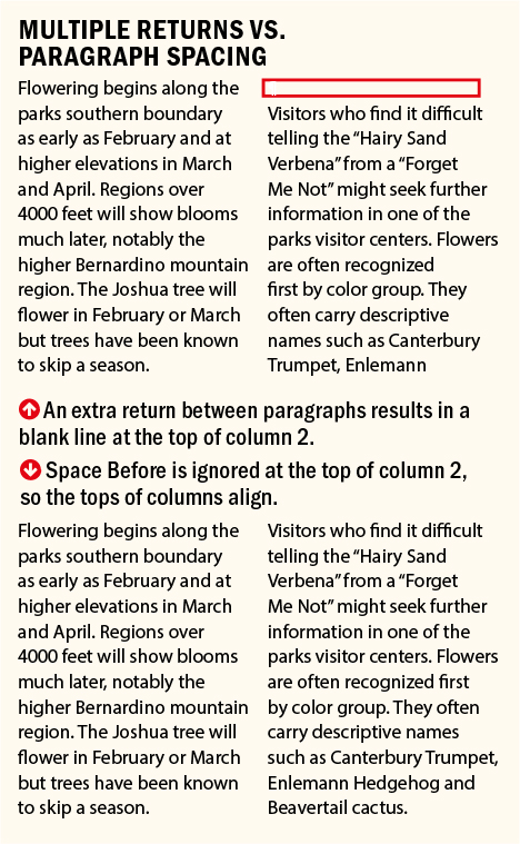
Most of the time, I use Space Before because that’s what I’ve always used. Pick one and stick with it. As well as giving you complete flexibility in the size of the space between paragraphs, paragraph spacing is polite enough to disappear when not needed (such as at the top or bottom of a column or page).
For those occasions when you need space before a paragraph at the top of a frame, you can use the First Baseline offset. Choose Object > Text Frame Options, click Baseline Options, then choose Fixed from the drop-down menu and enter the height of the space you want above the text in the Min: field.
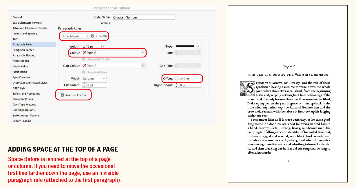
In a book scenario, if you need space before a chapter-opening paragraph to provide a visual pause between chapters, a useful trick is to use an invisible paragraph rule (see page 164). This is more flexible than the First Baseline offset solution because it can be incorporated into a paragraph style and will move with the text flow. Set the Paragraph Rule to On, and the color of the rule to None. Next, increase the offset of the rule to introduce the required amount of space between the text and the top of the frame. So long as Keep in Frame is selected, the invisible rule remains fixed at the top of the frame and the text moves down to the required position on the page.

This approach has the added benefit that you don’t need to make a separate master page for the chapter openers, which, if the text reflows, can end up being applied to the wrong page. For a similar technique that allows you to start a lead paragraph in the same position regardless of the number of lines in the chapter title that precedes it, see Chapter 15.
Proximity
Information that belongs together should have a visual connection. Make sure any paragraph spacing accentuates rather than detracts from the connection between related pieces of text. Organizing your material into clusters of information — subheads and body text, for example — establishes the rhythm of your type. Readers will interpret the space between such clusters as a pause, the next cluster as being a new idea.
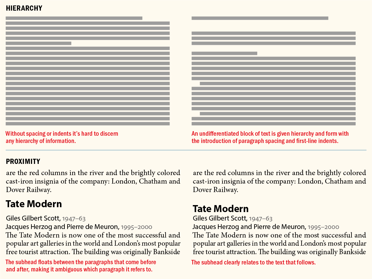
To reinforce this relationship, subheads should be closer to the text that follows them than to the text that precedes them. This may seem obvious, but it’s a rule that’s frequently broken.
To ensure that this connection isn’t broken — by a column or page break, for example — set your Keep Options for your subheads to Keep With Next 2 Lines.
▄
Indents and spacing provide essential spatial cues. The white space that they create enhances the message of the text and serves as visual pause for the reader, making our documents more digestible and more approachable. The majority of the time it’s best to follow time-honored conventions in their usage, but it’s also possible to sometimes break the rules.
