
Chapter 7. Navigation Systems
Just wait, Gretel, until the moon rises, and then we shall see the crumbs of bread which I have strewn about; they will show us our way home again.
| What we’ll cover: |
| Balancing context and flexibility in web navigation |
| Integrating global, local, and contextual navigation |
| Supplemental navigation tools such as sitemaps, indexes, guides, wizards, and configurators |
| Personalization, visualization, tag clouds, collaborative filtering, and social navigation |
As our fairy tales suggest, getting lost is a bad thing. It is associated with confusion, frustration, anger, and fear. In response to this danger, humans have developed navigation tools to prevent us from getting lost and to help us find our way home. From bread crumbs to compass and astrolabe, to maps, street signs, and global positioning systems, people have demonstrated great ingenuity in the design and use of navigation tools and wayfinding strategies.
We use these tools to chart our course, to determine our position, and to find our way back. They provide a sense of context and comfort as we explore new places. Anyone who has driven through an unfamiliar city as darkness falls understands the importance these tools and strategies play in our lives.
On the Web, navigation is rarely a life or death issue. However, getting lost in a large web site can be confusing and frustrating. While a well-designed taxonomy may reduce the chances that users will become lost, complementary navigation tools are often needed to provide context and to allow for greater flexibility. Structure and organization are about building rooms. Navigation design is about adding doors and windows.
In this book, we have split navigation and searching into individual chapters. This chapter focuses on navigation systems that support browsing; the next chapter digs deep into searching systems that are clearly components of navigation. In fact, structure, organization, labeling, browsing, and searching systems all contribute toward effective navigation.
Types of Navigation Systems
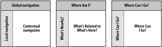
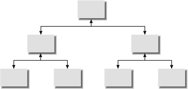
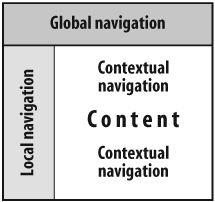
Navigation systems are composed of several basic elements, or subsystems. First, we have the global, local, and contextual navigation systems that are integrated within the web pages themselves. These embedded navigation systems are typically wrapped around and infused within the content of the site. They provide both context and flexibility, helping users understand where they are and where they can go. These three major systems, shown in Figure 7-1, are generally necessary but not sufficient in themselves.
Second, we have supplemental navigation systems such as sitemaps, indexes, and guides that exist outside the content-bearing pages. These are shown in Figure 7-2.
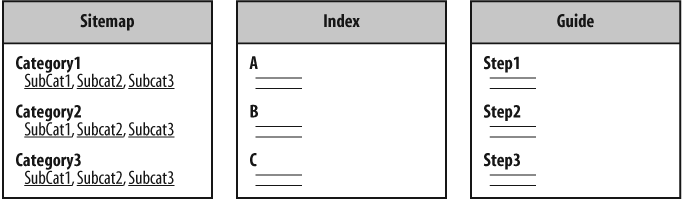
Similar to search, these supplemental navigation systems provide different ways of accessing the same information. Sitemaps provide a bird’s-eye view of the site. A to Z indexes allow direct access to content. And guides often feature linear navigation customized to a specific audience, task, or topic.
As we’ll explain, each type of supplemental navigation system serves a unique purpose and is designed to fit within the broader framework of integrated searching and browsing systems.
Gray Matters
The design of navigation systems takes us deep into the gray area between information architecture, interaction design, information design, visual design, and usability engineering, all of which we might classify under the umbrella of user experience design.
As soon as we start talking about global, local, and contextual navigation, we find ourselves on the slippery slope that connects strategy, structure, design, and implementation. Does the local navigation bar work best at the top of the page, or is it better running down the left side? Should we use pull-downs, pop-ups, or cascading menus to reduce the required number of clicks? Will users ever notice gray links? Isn’t it better to use the blue/red link color convention?
For better or for worse, information architects are often drawn into these debates, and we are sometimes responsible for making these decisions. We could try to draw a clear line in the sand, and argue that effective navigation is simply the manifestation of a well-organized system. Or we could abdicate responsibility and leave the interface to designers.
But we won’t. In the real world, the boundaries are fuzzy and the lines get crossed every day. Information architects do design and designers do information architecture. And the best solutions often result from the biggest debates. While not always possible, interdisciplinary collaboration is the ideal, and collaboration works best when each of the experts understands something about the other areas of expertise.
So in this chapter, we roll up our sleeves, cross lines, step on toes, and get a little messy in the process. We tackle navigation design from the information architect’s perspective. But before we drag you deep into this swampy gray matter, let us throw you a lifeline. In the Appendix, we have included references to a few truly excellent books that cover these topics from a variety of perspectives. We encourage you to read them all!
Browser Navigation Features
When designing a navigation system, it is important to consider the environment in which the system will exist. On the Web, people use web browsers such as Mozilla Firefox and Microsoft Internet Explorer to move around and view web sites. These browsers sport many built-in navigation features.
Open URL allows direct access to any page on a web site. Back and Forward provide a bidirectional backtracking capability. The History menu allows random access to pages visited during the current session, and Bookmark or Favorites enables users to save the location of specific pages for future reference. Web browsers also go beyond the Back button to support a “bread crumbs” feature by color-coding hypertext links. By default, unvisited hypertext links are one color and visited hypertext links are another. This feature helps users see where they have and haven’t been and can help them to retrace their steps through a web site.
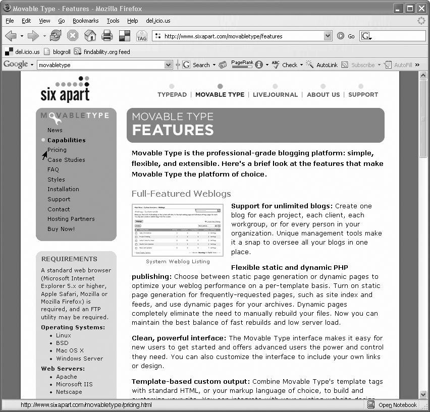
Finally, web browsers allow for a prospective view that can influence how users navigate. As the user passes the cursor over a hypertext link, the destination URL appears at the bottom of the browser window, hinting at the nature of that content. A good example is shown in Figure 7-3, where the cursor is positioned over “Pricing.” The prospective view window at the bottom shows the URL of that page. If files and directories have been carefully labeled, prospective view gives the user context within the content hierarchy. If the hypertext link leads to a web site on another server, prospective view provides the user with basic information about this offsite destination.
Much research, analysis, and testing has been invested in the design of these browser-based navigation features. However, it is remarkable how frequently site designers unwittingly override or corrupt these navigation features. The most common design crimes are:
Cluelessly modifying the visited/unvisited link colors
Killing the Back button
Crippling the Bookmark feature
Should you plan to commit any of these grave transgressions, make sure you’ve got a really good reason or an even better lawyer.
Building Context
With all navigation systems, before we can plot our course, we must locate our position. Whether we’re visiting Yellowstone National Park or the Mall of America, the You Are Here mark on fixed-location maps is a familiar and valuable tool. Without that landmark, we must struggle to triangulate our current position using less dependable features such as street signs or nearby stores. The You Are Here indicator can be the difference between knowing where you stand and feeling completely lost.
When designing complex web sites, it is particularly important to provide context within the greater whole. Many contextual clues in the physical world do not exist on the Web. There are no natural landmarks, no north and south. Unlike physical travel, hypertextual navigation allows users to be transported right into the middle of an unfamiliar web site. Links from remote web pages and search engine results allow users to completely bypass the front door or main page of the web site. To further complicate matters, people often print web pages to read later or to pass along to a colleague, resulting in even more loss of context. For all these reasons, in the design of navigation systems, context is king!
You should always follow a few rules of thumb to ensure that your sites provide contextual clues. For example, users should always know which site they’re in, even if they bypass the front door and enter through a search engine or a link to a subsidiary page. Extending the organization’s name, logo, and graphic identity through all pages of the site is a fairly obvious way to accomplish this goal.
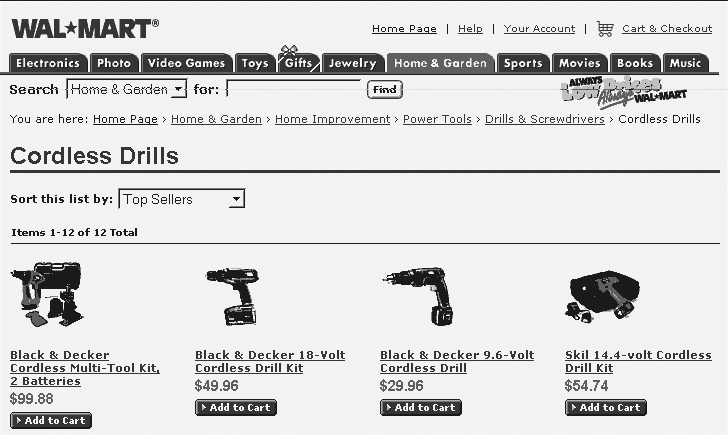
The navigation system should also present the structure of the information hierarchy in a clear and consistent manner, and indicate the user’s current location, as shown in Figure 7-4. Wal-Mart’s navigation system shows the user’s location within the hierarchy with a variation of the You Are Here sign near the top of the page. This helps the user to build a mental model of the organization scheme, which facilitates navigation and helps her feel comfortable.
If you have an existing site, we suggest running a few users through a Navigation Stress Test.[1] Here are the basic steps as outlined by Keith Instone:
Ignore the home page and jump directly into the middle of the site.
For each random page, can you figure out where you are in relation to the rest of the site? What major section are you in? What is the parent page?
Can you tell where the page will lead you next? Are the links descriptive enough to give you a clue what each is about? Are the links different enough to help you choose one over another, depending on what you want to do?
By parachuting deep into the middle of the site, you will be able to push the limits of the navigation system and identify any opportunities for improvement.
Improving Flexibility
As we explained in Chapter 5, hierarchy is a familiar and powerful way of organizing information. In many cases, it makes sense for a hierarchy to form the foundation for organizing content in a web site. However, hierarchies can be limiting from a navigation perspective. If you have ever used the ancient information-browsing technology and precursor to the World Wide Web known as Gopher, you will understand the limitations of hierarchical navigation.[2] In Gopherspace, you were forced to move up and down the tree structures of content hierarchies (see Figure 7-5). It was impractical to encourage or even allow jumps across branches (lateral navigation) or between multiple levels (vertical navigation) of a hierarchy.
The Web’s hypertextual capabilities removed these limitations, allowing tremendous freedom of navigation. Hypertext supports both lateral and vertical navigation. From any branch of the hierarchy, it is possible and often desirable to allow users to move laterally into other branches, to move vertically from one level to a higher level in that same branch, or to move all the way back to the main page of the web site. If the system is so enabled, users can get to anywhere from anywhere. However, as you can see in Figure 7-6, things can get confusing pretty quickly. It begins to look like an architecture designed by M.C. Escher.

The trick to designing navigation systems is to balance the advantages of flexibility with the dangers of clutter. In a large, complex web site, a complete lack of lateral and vertical navigation aids can be very limiting. On the other hand, too many navigation aids can bury the hierarchy and overwhelm the user. Navigation systems should be designed with care to complement and reinforce the hierarchy by providing added context and flexibility.
Embedded Navigation Systems
Most large web sites include all three of the major embedded navigation systems we saw back in Figure 7-1. Global, local, and contextual navigation are extremely common on the Web. Each system solves specific problems and presents unique challenges. To design a successful site, it is essential to understand the nature of these systems and how they work together to provide context and flexibility.
Global (Site-Wide) Navigation Systems
By definition, a global navigation system is intended to be present on every page throughout a site. It is often implemented in the form of a navigation bar at the top of each page. These site-wide navigation systems allow direct access to key areas and functions, no matter where the user travels in the site’s hierarchy.
Because global navigation bars are often the single consistent navigation element in the site, they have a huge impact on usability. Consequently, they should be subjected to intensive, iterative user-centered design and testing.
Global navigation bars come in all shapes and sizes. Consider the examples shown in Figure 7-7.
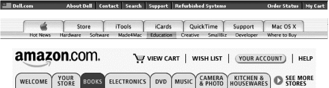
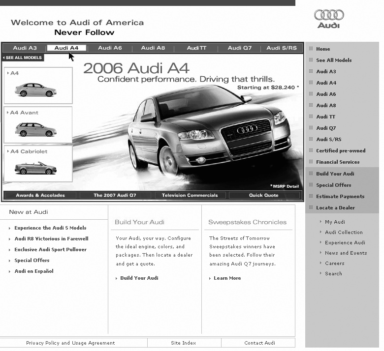
Most global navigation bars provide a link to the home page. Many provide a link to the search function. Some, like Apple’s and Amazon’s, reinforce the site’s structure and provide contextual clues to identify the user’s current location within the site. Others, like Dell’s, have a simpler implementation and don’t do either. This pushes the burden of providing context down to the local level and opens the door for inconsistency and disorientation. Global navigation system design forces difficult decisions that must be informed by user needs and by the organization’s goals, content, technology, and culture. One size does not fit all.
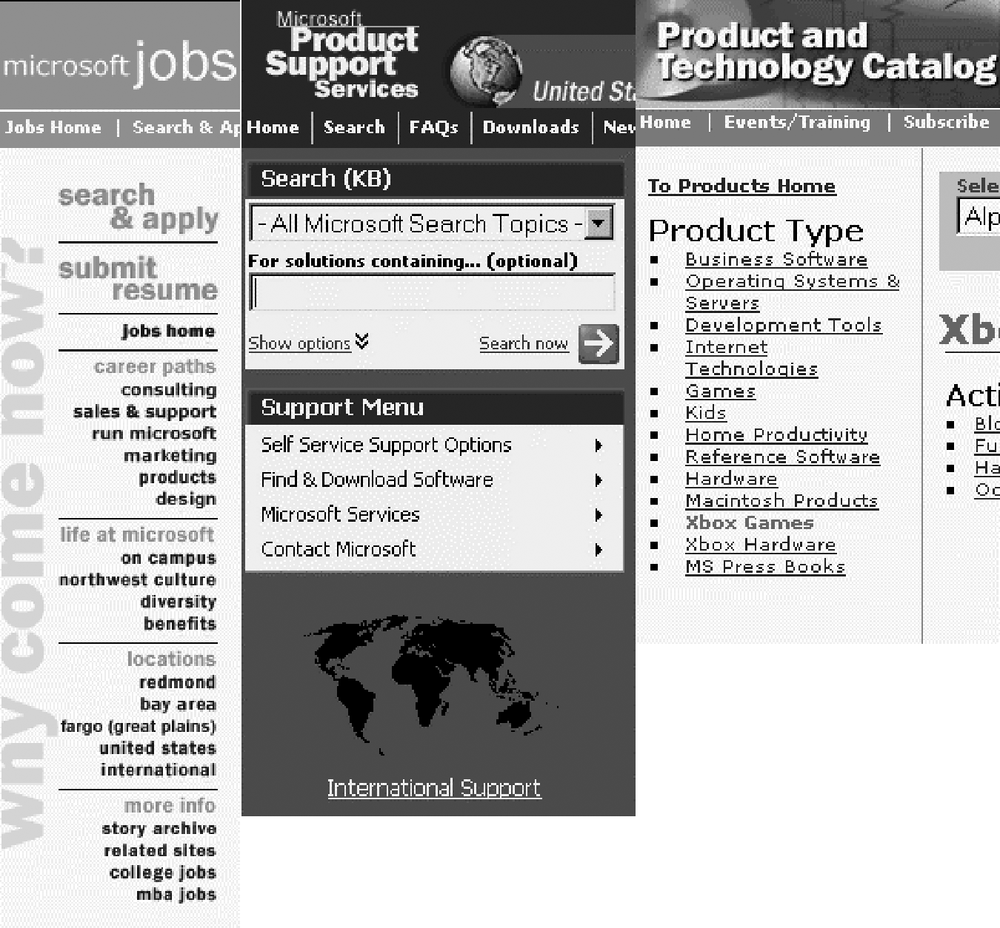
It’s often not possible to identify the global navigation system from the main page of a web site. The main page is sometimes the sole exception to the omnipresence of the global navigation bar. In some cases, designers choose to show an expanded view of the global navigation system on the main page. In other cases, the main page presents a variety of navigation options, and it’s impossible to tell which ones have been carried throughout the site without exploring further.
This is the case with Microsoft’s main page, as shown in Figure 7-8. There are three distinct navigation bars, and it’s unclear whether any or all of them constitute a global navigation system. However, check out a few subsidiary pages, and it becomes obvious that only one is truly global. The other two are simply the designer’s way of exposing important dimensions of the site’s structure on the main page.
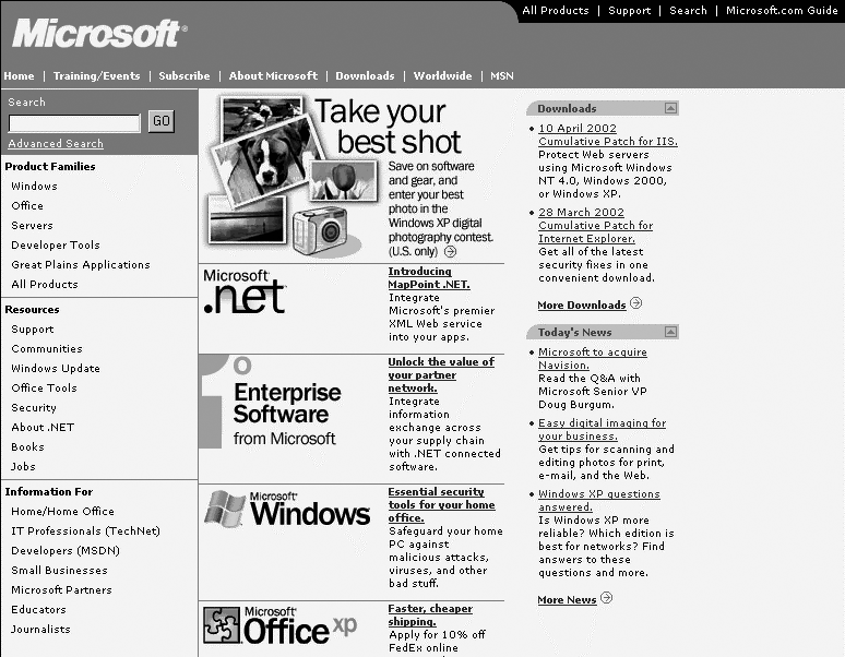
As Figure 7-9 shows, Microsoft’s global navigation bar is very compact, and for good reason. This global navigation bar represents a massive investment in screen real estate, occupying a prominent position on several hundred thousand pages. These pages exist within dozens of subsites that are “owned” by powerful business units and functions within Microsoft.
Despite convincing user-centered design arguments, it is still not easy to drive consistency throughout the subsites of modern, decentralized organizations. Most large enterprises are lucky if they can get the company logo and a simple global navigation bar implemented on 80 percent of their pages.
Local Navigation Systems
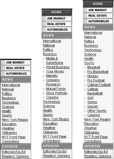
In many web sites, the global navigation system is complemented by one or more local navigation systems that enable users to explore the immediate area. Some tightly controlled sites integrate global and local navigation into a consistent, unified system. For example, the New York Times web site presents a global navigation bar that expands to provide local navigation options for each category of news. A reader who selects “Business” sees different local navigation options than a reader who selects “Sports,” but both sets of options are presented within the same navigational framework (see Figure 7-10).
In contrast, large sites like Microsoft.com (Figure 7-11) often provide multiple local navigation systems that may have little in common with one another or with the global navigation system.
These local navigation systems and the content to which they provide access are often so different that these local areas are referred to as subsites,[3] or sites within sites. Subsites exist for two primary reasons. First, certain areas of content and functionality really do merit a unique navigation approach. Second, due to the decentralized nature of large organizations, different groups of people are often responsible for different content areas, and each group may decide to handle navigation differently.
In Microsoft’s case, it makes sense to provide different ways to navigate the Jobs Area, the Support Database, and the Product Catalog. These local navigation systems are aligned with user needs and the local content. Unfortunately, there are many bad examples on the Web where the variation between local navigation systems is simply a result of multiple design groups choosing to run in different directions. Many organizations are still struggling with the question of how much central control to exercise over the look and feel of their local navigation systems. Grappling with these local navigation issues can make global navigation systems look easy.
Contextual Navigation
Some relationships don’t fit neatly into the structured categories of global and local navigation. This demands the creation of contextual navigation links specific to a particular page, document, or object. On an e-commerce site, these “See Also” links can point users to related products and services. On an educational site, they might point to similar articles or related topics.
In this way, contextual navigation supports associative learning. Users learn by exploring the relationships you define between items. They might learn about useful products they didn’t know about, or become interested in a subject they’d never considered before. Contextual navigation allows you to create a web of connective tissue that benefits users and the organization.
The actual definition of these links is often more editorial than architectural. Typically an author, editor, or subject matter expert will determine appropriate links once the content is placed into the architectural framework of the web site. In practice, this usually involves representing words or phrases within sentences or paragraphs (i.e., prose) as embedded or “inline” hypertext links. A page from Stanford University’s site, shown in Figure 7-12, provides an example of carefully chosen inline contextual navigation links.

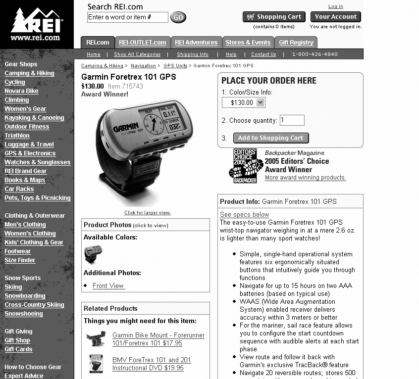
This approach can be problematic if these contextual links are critical to the content, since usability testing shows that users often tend to scan pages so quickly they miss or ignore these less conspicuous links. For this reason, you may want to design a system that provides a specific area of the page or a visual convention for contextual links. As you can see in Figure 7-13, REI designs contextual navigation links to related products into the layout of each page. Moderation is the primary rule of thumb for guiding the creation of these links. Used sparingly (as in this example), contextual links can complement the existing navigation systems by adding one more degree of flexibility. Used in excess, they can add clutter and confusion. Content authors have the option to replace or complement the embedded links with external links that are easier for the user to see.
The approach used on each page should be determined by the nature and importance of the contextual links. For noncritical links provided as a point of interest, inline links can be a useful but unobtrusive solution.
When designing a contextual navigation system, imagine that every page on the site is a main page or portal in its own right. Once a user has identified a particular product or document, the rest of the site fades into the background. This page is now his interface. Where might he want to go from here? Consider the REI example. What additional information will the customer want before making a buying decision? What other products might he want to buy? Contextual navigation provides a real opportunity to cross-sell, up-sell, build brand, and provide customer value. Because these associative relationships are so important, we’ll revisit this topic in Chapter 9.
Implementing Embedded Navigation
The constant challenge in navigation system design is to balance the flexibility of movement with the danger of overwhelming the user with too many options. One key to success is simply recognizing that global, local, and contextual navigation elements exist together on most pages (consider the representation of a web page shown in Figure 7-14). When integrated effectively, they can complement one another.
But when designed independently, the three systems can combine to monopolize a great deal of screen real estate. Alone, they may each be manageable, but together on one page, the variety of options may overwhelm the user and drown out the content. In some cases, you may need to revisit the number of options within each navigation bar. In others, the problem may be minimized through careful design and layout.
In its simplest form, a navigation bar is a distinct collection of hypertext links that connect a series of pages, enabling movement among them. They can support global, local, and contextual navigation. You can implement navigation in all sorts of ways, using text or graphics, pull-downs, pop-ups, rollovers, cascading menus, and so on. Many of these implementation decisions fall primarily within the realms of interaction design and technical performance rather than information architecture, but let’s trespass briefly and hit a few highlights.
For example, is it better to create textual or graphical navigation bars? Well, graphic navigation bars tend to look nicer, but can slow down the page-loading speed and are more expensive to design and maintain. If you use graphic navigation bars, you need to be sensitive to the needs of users with low bandwidth connections and text-only browsers. People who are blind and people using wireless mobile devices are two important audiences to consider. Appropriate use of the <ALT> attribute to define replacement text for the image will ensure that your site supports navigation for these users.
And where do the navigation bars belong on the page? It has become convention to place the global navigation bar along the top of the page and the local navigation bar along the lefthand side. However, all sorts of permutations can be successful. Just make sure you do lots of user testing, particularly if you deviate from convention.
What about textual labels versus icons? Textual labels are the easiest to create and most clearly indicate the contents of each option. Icons, on the other hand, are relatively difficult to create and are often ambiguous. It’s difficult to represent abstract concepts through images. A picture may say a thousand words, but often they’re the wrong words—particularly when you’re communicating to a global audience.
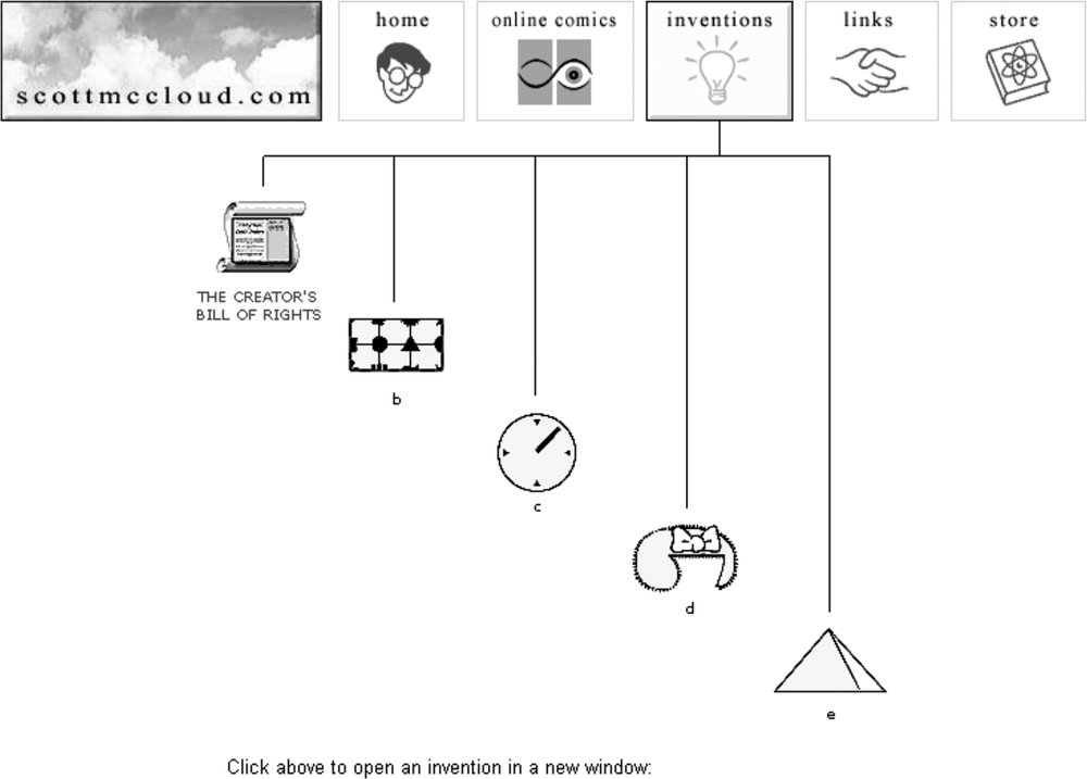
Icons can successfully be used to complement the textual labels, however. Since repeat users may become so familiar with the icons that they no longer need to read the textual labels, icons can be useful in facilitating rapid menu selection. In Figure 7-15, Scott McCloud combines text and images to create a global navigation system that balances form and function. But can you guess what lies behind icons b through e? On this comic creator’s web site, the mystery icons provoke curiosity and create a playful experience. On a business web site, they would simply be frustrating.
How about the increasingly common use of DHTML and JavaScript rollovers to show the navigation options behind a category or menu option (as shown in Figure 7-16)? Well, it depends. On one hand, this prospective view on steroids can make valuable use of limited screen real estate, enhancing the scent of information and often reducing the number of pages and clicks, while simultaneously adding a dynamic, interactive feel to the web site. On the other hand, rollover navigation can be difficult to do well. Usability and accessibility often suffer due to poor design and implementation. Also, the use of rollover navigation is no substitute for the careful selection of the omnipresent major categories and labels, which lend themselves to rapid visual scanning. You can’t expect the user to “mine sweep” her mouse cursor over every option.
And finally, what about frames? In the 1990s, designers went a little crazy with frames, implementing navigation bars and banner advertisements alike inside non-scrollable panes. We don’t see too many frames these days, and that’s a very good thing. Even beyond the technical design and performance problems, frames tend to cripple usability. After all, the Web is built upon a model of pages, each of which has a unique address or URL. Users are familiar with the concept of pages. Frames confuse this issue by slicing up pages into independent panes of content. By disrupting the page model, the use of frames frequently disables important browser navigation features such as bookmarking, visited and unvisited link discrimination, and history lists. Frames can also confuse users who are trying to perform simple tasks such as using the Back button, reloading a page, and printing a page. While web browsers have improved in their ability to handle frames, they can’t remove the confusion caused by violating the page paradigm.
Supplemental Navigation Systems
Supplemental navigation systems (shown back in Figure 7-2) include sitemaps, indexes, and guides. These are external to the basic hierarchy of a web site and provide complementary ways of finding content and completing tasks. Search also belongs to the supplemental navigation family but is so important that we’ve dedicated all of Chapter 8 to it.
Supplemental navigation systems can be critical factors for ensuring usability and findability within large web sites. However, they’re often not given the care and feeding they deserve. Many site owners still labor under the misconception that if they could only get the taxonomy right, all users and all user needs would be addressed. Usability pundits feed this fantasy by preaching the gospel of simplicity: users don’t want to make choices, and they resort to sitemaps, indexes, guides, and search only when the taxonomy fails them.
Both statements are theoretically true but miss the point that the taxonomy and the embedded navigation systems will always fail for a significant percentage of users and tasks. You can count on this like death and taxes. Supplemental navigation systems give users an emergency backup. Do you really want to drive without a seatbelt?
Sitemaps
In a book or magazine, the table of contents presents the top few levels of the information hierarchy. It shows the organization structure for the printed work and supports random as well as linear access to the content through the use of chapter and page numbers. In contrast, a print map helps us navigate through physical space, whether we’re driving through a network of streets and highways or trying to find our terminal in a busy airport.
In the early days of the Web, the terms “sitemap” and “table of contents” were used interchangeably. Of course, we librarians thought the TOC was a better metaphor, but sitemap sounds sexier and less hierarchical, so it has become the de facto standard.
A typical sitemap (Figure 7-17) presents the top few levels of the information hierarchy. It provides a broad view of the content in the web site and facilitates random access to segmented portions of that content. A sitemap can employ graphical or text-based links to provide the user with direct access to pages of the site.
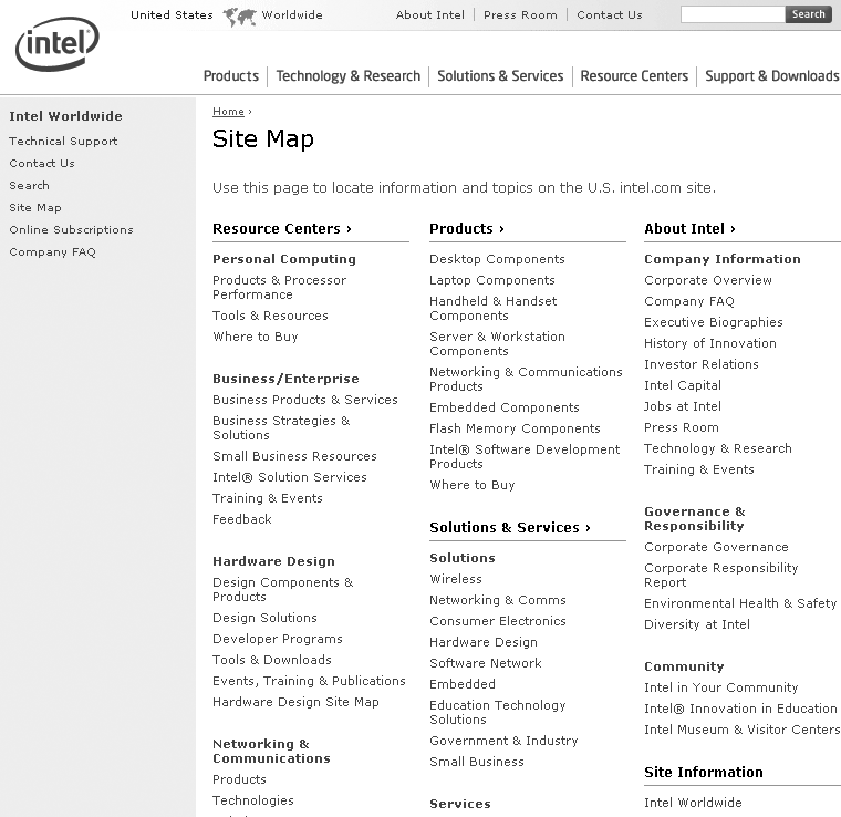
A sitemap is most natural for web sites that lend themselves to hierarchical organization. If the architecture is not strongly hierarchical, an index or alternate visual representation may be better. You should also consider the web site’s size when deciding whether to employ a sitemap. For a small site with only two or three hierarchical levels, a sitemap may be unnecessary.
The design of a sitemap significantly affects its usability. When working with a graphic designer, make sure he understands the following rules of thumb:
Reinforce the information hierarchy so the user becomes increasingly familiar with how the content is organized.
Facilitate fast, direct access to the contents of the site for those users who know what they want.
Avoid overwhelming the user with too much information. The goal is to help, not scare, the user.
Finally, it’s worth noting that sitemaps are also useful from a search engine optimization perspective, since they point search engine spiders directly to important pages throughout the web site.
Site Indexes
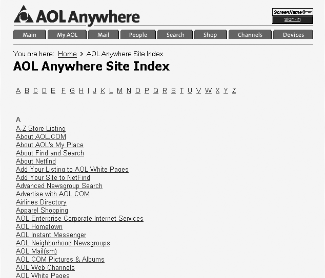
Similar to the back-of-book index found in many print materials, a web-based index presents keywords or phrases alphabetically, without representing the hierarchy. Unlike a table of contents, indexes are relatively flat, presenting only one or two levels of depth. Therefore, indexes work well for users who already know the name of the item they are looking for. A quick scan of the alphabetical listing will get them where they want to go; there’s no need for them to understand where you’ve placed that item within your hierarchy. In Figure 7-18, AOL presents a simple but useful alphabetical site index. Handcrafted links within the index lead directly to destination pages.
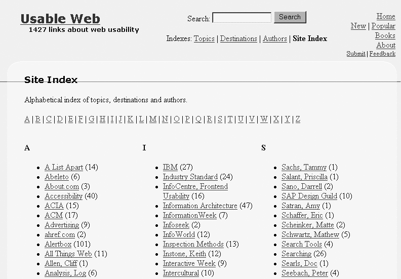
Large, complex web sites often require both a sitemap and a site index (and a search capability, for that matter). The sitemap reinforces the hierarchy and encourages exploration, while the site index bypasses the hierarchy and facilitates known-item finding. For small web sites, a site index alone may be sufficient. On Usable Web (see Figure 7-19), Keith Instone has made his site index even more useful by indicating the number of items behind each link.
A major challenge in indexing a web site involves the level of granularity. Do you index web pages? Do you index individual paragraphs or concepts that are presented on web pages? Or do you index collections of web pages? In many cases, the answer may be all of the above. Perhaps a more valuable question is: what terms are users going to look for? The answers should guide the index design. To find those answers, you need to know your audience and understand their needs. You can learn more about the terms people will look for by analyzing search logs and conducting user research.
There are two very different ways to create a site index. For small web sites, you can simply create the index manually, using your knowledge of the full collection of content to inform decisions about which links to include. This centralized, manual approach results in a one-step index such as the one in Figure 7-18. Another example is shown in Figure 7-20, where Vanguard’s dynamically generated two-step site index features term rotation and see/see-also references.
In contrast, on a large site with distributed content management, it may make sense to use controlled vocabulary indexing at the document level to drive automatic generation of the site index. Since many controlled vocabulary terms will be applied to more than one document, this type of index must allow for a two-step process. First the user selects the term from the index, and then selects from a list of documents indexed with that term.
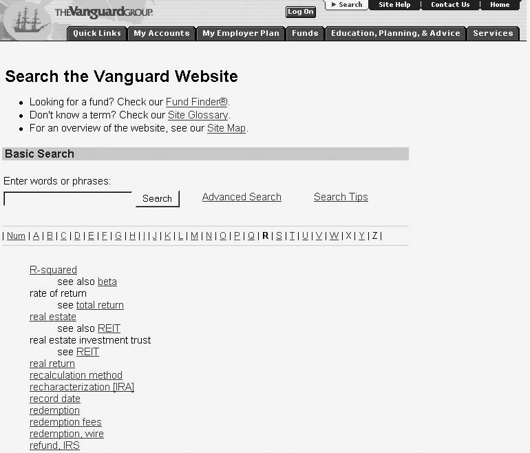
A useful trick in designing an index involves term rotation, also known as permutation. A permuted index rotates the words in a phrase so that users can find the phrase in two places in the alphabetical sequence. For example, in the Vanguard index, users will find listings for both “refund, IRS” and “IRS refund.” This supports the varied ways in which people look for information. Term rotation should be applied selectively. You need to balance the probability of users seeking a particular term with the annoyance of cluttering the index with too many permutations. For example, it would probably not make sense in an event calendar to present Sunday (Schedule) as well as Schedule (Sunday). If you have the time and budget to conduct focus groups or user testing, that’s great. If not, you’ll have to fall back on common sense.
Guides
Guides can take several forms, including guided tours, tutorials, and micro-portals focused around a specific audience, topic, or task. In each case, guides supplement the existing means of navigating and understanding site content.
Guides often serve as useful tools for introducing new users to the content and functionality of a web site. They can also be valuable marketing tools for restricted-access web sites (such as online publications that charge subscription fees), enabling you to show potential customers what they will get for their money. And, they can be valuable internally, providing an opportunity to showcase key features of a redesigned site to colleagues, managers, and venture capitalists.
Guides typically feature linear navigation (new users want to be guided, not thrown in), but hypertextual navigation should also be available to provide additional flexibility. Screenshots of major pages should be combined with narrative text that explains what can be found in each area of the web site.
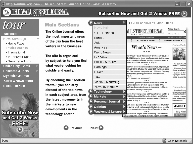
The Wall Street Journal, shown in Figure 7-21, uses a guided tour to showcase navigation and editorial features of the web site that, for the most part, are accessible only to subscribers.
Rules of thumb for designing guides include:
The guide should be short.
At any point, the user should be able to exit the guide.
Navigation (Previous, Home, Next) should be located in the same spot on every page so that users can easily step back and forth through the guide.
The guide should be designed to answer questions.
Screenshots should be crisp, clear, and optimized, with enlarged details of key features.
If the guide includes more than a few pages, it may need its own table of contents.
Remember that a guide is intended as an introduction for new users and as a marketing opportunity for the web site. Many people may never use it, and few people will use it more than once. You should balance the inevitable big ideas about how to create an exciting, dynamic, interactive guide with the fact that it will not play a central role in the day-to-day use of the web site.
Wizards and Configurators
Though they could be considered a special class of guide, wizards that help users to configure products or navigate complex decision trees deserve separate highlighting. Sophisticated configurators, like the Mini Cooper example shown in Figure 7-22, blur the lines between software application and web site.
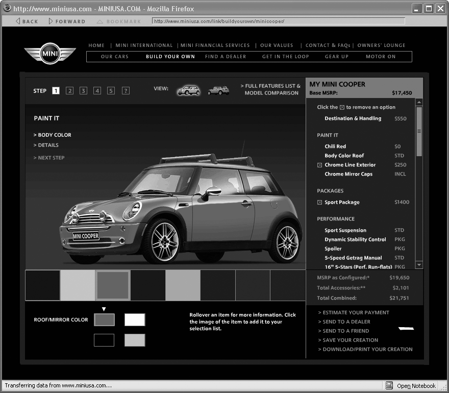
Mini successfully combines a rich suite of navigation options without causing confusion. The user can move through a linear process or jump back and forth between steps, and the site’s global navigation is always present, providing context and possible next steps.
Search
As we noted earlier, the searching system is a central part of supplemental navigation. Search is a favorite tool of users because it puts them in the driver’s seat, allowing them to use their own keyword terms to look for information. Search also enables a tremendous level of specificity. Users can search the content for a particular phrase (e.g., “socially translucent systems failure”) that is unlikely to be represented in a sitemap or site index.
However, the ambiguity of language causes huge problems with most search experiences. Users, authors, and information architects all use different words for the same things. Because the design of effective search systems is so important and so complex, we’ve devoted all of the following chapter to the topic.
Advanced Navigation Approaches
So far, we’ve focused attention on the bread-and-butter components of navigation systems, the elements that form the foundation of useful, usable web sites. Good navigation design is really important and really hard. Only after you’ve mastered the integration of these fundamental building blocks should you dare wander into the minefield of advanced navigation.
Personalization and Customization
Personalization involves serving up tailored pages to the user based upon a model of the behavior, needs, or preferences of that individual.In contrast, customization involves giving the user direct control over some combination of presentation, navigation, and content options. In short, with personalization, we guess what the user wants, and with customization, the user tells us what he wants.
Both personalization and customization can be used to refine or supplement existing navigation systems. Unfortunately, however, both have been hyped by consultants and software vendors as the solution to all navigation problems. The reality is that personalization and customization:
Typically play important but limited roles
Require a solid foundation of structure and organization
Are really difficult to do well
Personalization has preoccupied marketing folks in recent years, partly due to the influential book by Don Peppers and Martha Rogers, The One to One Future (Doubleday). On a web site, you might use demographic data (e.g., age, sex, income level, zip code) and previous purchasing behavior to make educated guesses about which products to feature in the contextual navigation system during a customer’s next visit. On an intranet, you might use role and job function as a basis for filtering views of news and e-service applications; for example, personalization is essential for controlling access to human-resource applications involving compensation and benefits.
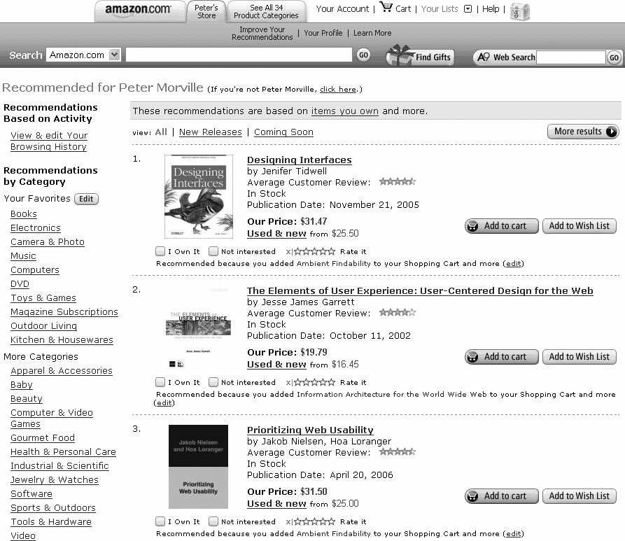
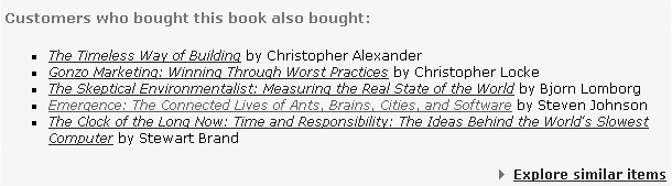
Amazon is the most cited example of successful personalization, and some of the things it’s done are truly valuable. It’s nice that Amazon remembers our names, and it’s great that it remembers our address and credit card information. It’s when Amazon starts trying to recommend books based on past purchases that the system breaks down (see Figure 7-23). In this example, Peter already owns two of the top three recommended books, but the system doesn’t know this because he didn’t purchase them from Amazon. And this ignorance is not the exception but the rule. Because we don’t have time to teach our systems, or because we prefer to maintain our privacy, we often don’t share enough information to drive effective personalization. In addition, in many cases, it’s really hard to guess what people will want to do or learn or buy tomorrow. As they say in the financial world, past performance is no guarantee of future results. In short, personalization works really well in limited contexts, but fails when you try to expand it to drive the entire user experience.
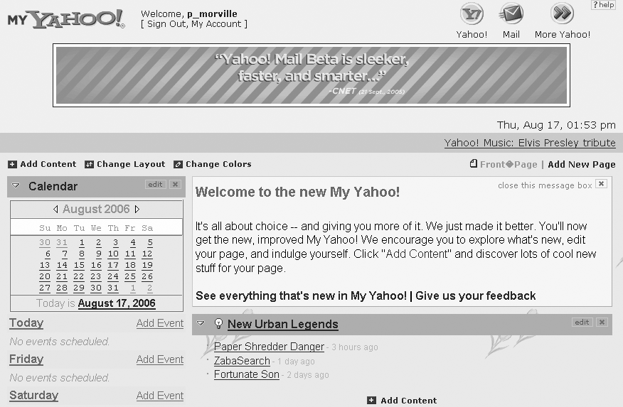
Customization introduces a similar set of promises and perils. The idea of giving users control and thereby alleviating some of the pressures on design is obviously very compelling. And customization can sometimes deliver great value. My Yahoo! (Figure 7-24) and more recently, MySpace, are flagship examples and provide all sorts of customization capabilities, which many users take full advantage of—for better or for worse.
The problem with customization is that most people don’t want to spend much (if any) time customizing, and will do this work only on a small handful of sites that are most important to them. Since corporate intranets have a captive audience of repeat visitors, customization has a much better chance of being used there than it does on most public web sites.
However, there’s another problem. Even users themselves don’t always know what they will want to know or do tomorrow. Customization works great for tracking the sports scores of your favorite baseball team or monitoring the value of stocks you own, but not so well when it comes to broader news and research needs. One day you want to know the results of the French elections; the next day you want to know when dogs were first domesticated. Do you really know what you might need next month?
Visualization
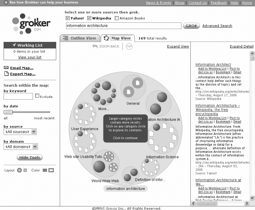
Since the advent of the Web, people have struggled to create useful tools that enable users to navigate in a more visual way. First came the metaphor-driven attempts to display online museums, libraries, shopping malls, and other web sites as physical places. Then came the dynamic, fly-through “sitemaps” that tried to show relationships between pages on a web site. Both looked very cool and stretched our imaginations. But neither proved to be very useful. Even today, high-profile companies such as Groxis continue to explore the potential of visualization for navigation. Grokker, its enterprise search product, allows you to create visual navigation experiences for users (see Figure 7-25). It’s worth keeping an eye on these experiments, but we remain skeptical that these approaches will prove useful for mainstream search and navigation.
Social Navigation
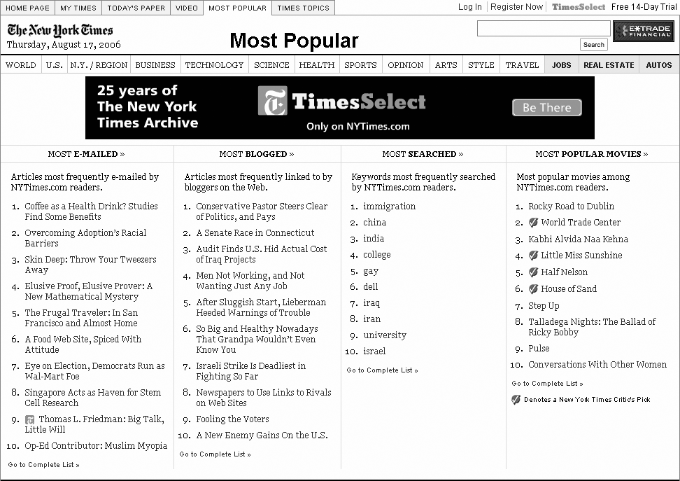
On a more positive note, social navigation, built on the premise that value for the individual user can be derived from observing the actions of other users, continues to hold great promise and is already on the fast track to mainstream adoption. Simple examples include lists of most popular resources, such as the New York Times’ Most Popular (see Figure 7-26).
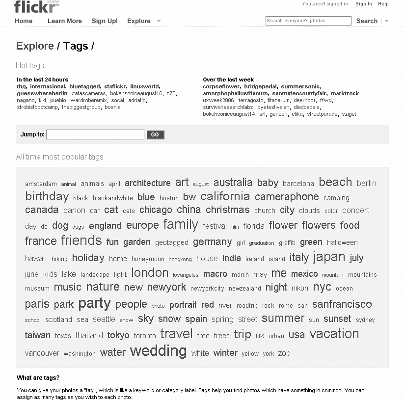
More sophisticated examples include Amazon’s collaborative filtering (see Figure 7-27), Epinions’ recommendation engine (see http://www.epinions.com), and Flickr’s beloved tag clouds, shown in Figure 7-28, which use font size to show tag popularity. Perhaps there is a future for visualization after all.
While most companies aren’t yet employing social navigation approaches on their web sites and intranets, we expect the practice to become increasingly common in the coming years. At a minimum, companies will find ways to unlock the value currently trapped in their search logs, usage statistics, and customer databases to drive more effective contextual navigation. We also hope to see more ambitious solutions that tap this feedback loop between design and behavior, creating adaptive navigation systems that significantly advance the usability of our web sites and intranets.
In the past several years, the design of navigation systems has improved in a rapid and highly visible manner. If you need convincing, just check out a few sites from the mid-90s using the Internet Archive’s Wayback Machine (http://www.archive.org/). Let’s hope we can keep up the pace, because there’s still a long way to go.
[1] Keith Instone popularized the notion of a Navigation Stress Test in his 1997 article, “Stress Test Your Site.” See http://user-experience.org/uefiles/navstress.
[2] If you’re too young to remember Gopher, consider the category/subcategory navigation on an iPod instead.
[3] The term subsite was coined by Jakob Nielsen in his 1996 article “The Rise of the Subsite” to describe a collection of web pages within a larger site that invite a common style and shared navigation mechanism unique to those pages. See www.useit.com/alertbox/9609.html.