Chapter 11. Strategy
| What we’ll cover: |
| The elements of an information architecture strategy |
| Guidelines for moving from research to strategy |
| Using metaphors, scenarios, and conceptual diagrams to bring your strategy to life |
| Project plans, presentations, and the strategy report (including a detailed example from Weather.com) |
Research can be addictive: the more you learn, the more questions you have. This is why doctoral students sometimes take more than a decade to complete their dissertations. Information architects rarely have that luxury. We typically need to move from research to design according to schedules measured in weeks or months rather than years.
The bridge between research and design is an information architecture strategy. It’s critical that you start thinking about how you’re going to build that bridge before research begins, and keep thinking about it throughout the research process. Similarly, as you’re building the bridge, you need to continue your research efforts—continually testing and refining your assumptions.
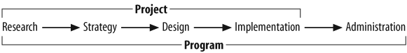
In short, the line between research and strategy is blurred. It’s not as simple as turning the page from Chapter 10 to Chapter 11. Though the process of moving from research to administration is linear at a high level, as shown in Figure 11-1 (also featured in the previous chapter), when you get down into the details this is a highly iterative, interactive process.
The information architect must repeatedly switch back and forth, wearing both the researcher’s hat and the strategist’s hat against the backdrop of a budget and schedule. Oh, did we mention there’s some stress involved? There’s no question that this is hard work, but it can be fun and rewarding, too.
What Is an Information Architecture Strategy?
An information architecture strategy is a high-level conceptual framework for structuring and organizing a web site or intranet. It provides the firm sense of direction and scope necessary to proceed with confidence into the design and implementation phases. It also facilitates discussion and helps get people on the same page before moving into the more expensive design phase. Just as the operating plans of each department should be driven by a unifying business strategy, the design of a detailed information architecture should be driven by a holistic information architecture strategy.
To succeed, we need a solution that will work within the unique information ecology at hand. Based upon the results of our research into context, users, and content, we’re striving to design a strategy that balances the needs and realities of each.
The information architecture strategy provides high-level recommendations regarding:
- Information architecture administration
It’s critical to look ahead to the end game and create a realistic strategy for developing and maintaining the information architecture. This covers the inevitable centralization versus decentralization questions that are closely tied to politics, the departmental structure, and content ownership. Are you looking at a command-and-control model or a federated approach? Will your architecture deliver users to subsites or all the way through to content and applications? Can we trust content authors to apply metadata? Who will manage the controlled vocabularies?
- Technology integration
The strategy must address opportunities to leverage existing tools and identify needs for additional technologies to develop or manage the information architecture. Key technology categories include search engines, content management, auto-classification, collaborative filtering, and personalization.
- Top-down or bottom-up emphasis
Many factors influence where to focus your energies, including the current status of the site, the political environment, and the IA management model. For example, if there’s already a solid top-down information architecture or a strong interaction design team that “owns” the primary hierarchy, bottom-up is probably the way to go.
- Organization and labeling systems (top-down)
This involves defining the major organization schemes for the site (e.g., users must be able to navigate by product, by task, and by customer category) and then identifying the dominant organization scheme to serve as the primary hierarchy.
- Document type identification (bottom-up)
This involves identifying a suite of document and object types (e.g., article, report, white paper, financial calculator, online course module) and requires close collaboration with the content authoring and management teams.
- Metadata field definition
This entails the definition of administrative, structural, and descriptive metadata fields. Some fields may be global (i.e., applied to every document), others may be local (i.e., applied only to documents within a particular subsite), and others may be associated only with a particular document type (e.g., for every news article, we need to identify the headline).
- Navigation system design
The strategy must explain how the integrated and supplemental navigation systems will leverage the top-down and bottom-up strategies. For example, search zones may allow users to leverage the top-down product hierarchy, while fielded searching may allow users to search for a particular white paper. This may also cover implications for customization and personalization capabilities.
While this may seem like a lot to cover, it’s certainly not an exhaustive list. Each information ecology will place unique demands on the architect regarding what to include in the strategy and where to place emphasis. As always, you’ll have to be creative and use good judgment.
The strategy is typically detailed in an information architecture strategy report, communicated in a high-level strategy presentation, and made actionable through a project plan for information architecture design. However, it’s important to avoid placing too much focus on creating the perfect deliverables. Ultimately, an information architecture strategy must find understanding and acceptance within the minds of the designers, developers, authors, stakeholders, and anyone else involved in designing, building, and maintaining the site. Getting people to buy into your vision is critical to success.
Strategies Under Attack
While we’re on the topic of buy-in, it’s worth discussing some critical issues that crop up again and again when developing information architecture strategies. It’s not unusual for a hostile stakeholder within a client’s organization to ask the following questions during an interview:
How can you develop an information architecture when we don’t have a business strategy?
How can you develop an information architecture before we have the content in place?
These questions can stop the inexperienced information architect in his tracks, especially when they’re asked by a Chief Information Officer or a Vice President for Business Strategy within a Fortune 500 corporation. It’s at times like that when you wish you’d read one of those books on how to deal with difficult people or how to disappear into thin air.
Fortunately, the lack of a written business plan or a complete content repository does not mean you need to fold up your blueprints and go home. In all our years of consulting for Fortune 500 clients, we’ve never seen a business plan that was complete or up to date, and we’ve never seen a content collection that wouldn’t undergo significant change within a twelve-month period.
The reality is that you’re dealing with a classic chicken-and-egg problem. There are no clean answers to the questions:
What comes first, the business strategy or the information architecture?
What comes first, the content or the information architecture?
Business strategies, content collections, and information architectures don’t exist in a vacuum, and they don’t hatch from the egg fully formed. They co-evolve in a highly interactive manner.
Developing an information architecture strategy is a wonderful way to expose gaps in business strategies and content collections. The process forces people to make difficult choices that they’ve thus far managed to avoid. Seemingly simple questions about organization and labeling issues can often set off a ripple effect that impacts business strategy or content policy. For example:
- Innocent question posed by information architect:
“In trying to design the hierarchy for this Consumers Energy web site, I’m having a really hard time creating a structure that accommodates the content of Consumers Energy and its parent company, CMS Energy. Are you sure we shouldn’t provide two different hierarchies and separate the content?”
- Long-term implication of asking this question:
This simple question started a discussion that led to a business decision to build two separate web sites, providing a unique online identity and unique content collections for the two organizations:
http://www.consumersenergy.com/ http://www.cmsenergy.com/ This decision has held up for more than 10 years. Go ahead and check the URLs.
There’s a similar bidirectional relationship between business strategy and content policy. For example, a colleague of ours was involved in the information architecture design of the Australian Yellow Pages. The business strategy was focused on increasing revenues by introducing banner advertising. It soon became obvious that the content policy was a key factor in executing this strategy, and the strategy ultimately led to real success.
Ideally, the information architect should work directly with the business strategy and content policy teams, exploring and defining the relationships between these three critical areas. Just as the business strategists and content managers should be open to the possibility that the development of an information architecture strategy may expose gaps or introduce new opportunities in their areas, the information architect needs to remember (and remind others) that the information architecture strategy is not set in stone either. As interaction designers and programmers become involved in later phases of the project, their work may expose gaps and introduce opportunities for improving the information architecture as well.
From Research to Strategy
A good information architect starts considering possible strategies for structuring and organizing the site before the research even begins. During the research phase, throughout the user interviews and content analysis and benchmarking studies, you should be constantly testing and refining the hypotheses already in your head against the steady stream of data you’re compiling. If you’re really committed (or ready to be committed, depending on how you look at it), you’ll be wrestling with organization structures and labeling schemes in the shower. By the way, that’s a great place for a whiteboard!
In any case, you should never wait until the strategy phase to start thinking and talking within your team about strategy. That’s a given. The more difficult timing issue involves deciding when to begin articulating, communicating, and testing your ideas about possible strategies. When do you create your first conceptual blueprints and wireframes? When do you share them with clients? When do you test your assumptions in user interviews?
As usual, there’s no easy answer. The research phase exists to challenge your (and everyone else’s) preconceived notions regarding content, context, and users. You need a structured methodology in place to create the necessary space for learning. However, you’ll reach a point in the research process when you begin to experience the law of diminishing returns. You’re no longer learning anything new by asking the same questions in open-ended user interviews, and you’re anxious to flesh out one or two hierarchies and start introducing your structures and labels to users, clients, and colleagues.
Whether or not the timing corresponds with the formal project plan, this is the point when you move from research to strategy. The emphasis shifts from open-ended learning to designing and testing. While you can continue to use research methodologies as you move through this phase, your focus should shift to articulating your ideas through visuals (conceptual blueprints and wireframes), sharing those visuals with clients and colleagues in strategy meetings, and testing your organization structures and labeling schemes with users.
Developing the Strategy
The transition from research to strategy involves a shift from a primary focus on process to a balance between process and product. Methodology is still important, but the work products and deliverables you create by applying that methodology move toward the center of attention.
Moving from a mode of absorption to one of creation is often a difficult transition for the information architect. No matter how much qualitative or quantitative research you’ve done, the development of an information architecture strategy is inherently a creative process, with all the associated messiness, frustration, pain, and fun.
Figure 11-2 presents an outline of the strategy development process and the resulting deliverables. Note the preponderance of arrows. This is a highly iterative and interactive process. Let’s take a look at the four steps along the path: think, articulate, communicate, and test (TACT).
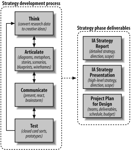
Think
The human mind is the ultimate black box. Nobody really understands the process by which input (e.g., research data) is converted into output (e.g., creative ideas). Our advice is to use whatever works best for you. Some people think best by themselves, while taking a long walk or doodling on a pad of paper. Others think best in a group setting. The key is to recognize that you need to create some time and space to digest all that you’ve learned during research and become ready to be productive.
Articulate
As your ideas begin to form, it’s important to begin articulating them. It’s best to start informally, scribbling diagrams and notes on paper or whiteboard. Stay away from visual design software at this point; otherwise, you’ll waste energy on layout and formatting when you should be focused on developing your ideas.
Once again, some people work best alone whereas others need a sounding board. We’ve seen teams of two or three information architects work well together to flesh out ideas, collaborating around design of high-level visuals on a whiteboard. We’ve also seen environments where teams of eight or more people from a variety of backgrounds lock themselves in a room for day-long “collaborative design workshops.” In our experience, these have been highly inefficient, unproductive exercises that lead to groupthink and exhaustion. Large group meetings may be good for brainstorming and sharing reactions, but not for designing complex systems.
Communicate
Eventually, you’ll make the shift from creating ideas to communicating them. You’ll need to identify the most effective ways to communicate these particular ideas to your target audience. Your architect’s toolbox may include metaphors, stories, use case scenarios, conceptual diagrams, blueprints, wireframes, reports, and presentations. Let form follow function, selecting the right communication tools for your purpose.
It’s often best to begin with informal communications with “safe” colleagues who will help you refine your ideas and build your confidence. You can then share your draft work products with “unsafe” colleagues, those people you can count on to ask hard questions and poke holes. This process should help you to develop your ideas and confidence so you’re ready to present them to a broader group of clients or colleagues.
We’ve learned through much experience that it’s good to communicate your ideas early and often. Many of us have a natural aversion to sharing partially formed ideas—our egos don’t like the risk. One way to reduce your own sense of exposure is to suggest that this is a “strawman” work product, intended to provoke reactions and jump-start discussion. This explicit disclaimer will help everyone feel comfortable presenting and discussing alternate viewpoints and hopefully moving toward consensus. By proactively taking this collaborative approach, you’ll end up with a better information architecture strategy and more buy-in from your clients and colleagues.
Test
Whether you’re operating on a shoestring budget or have a multimillion-dollar project, there’s no excuse for not testing your ideas before you lock into an information architecture strategy. Even running an informal usability test on your mom is better than nothing.
Many of the methodologies covered during the research phase can be applied with minor modification to the testing of possible strategies. For example, you might present your draft work products to a few opinion leaders and stakeholders to make sure you’re on the right track in terms of business context. Similarly, you might test your model against documents and applications not included in the content analysis sample to make sure your strategy will accommodate the full breadth and depth of content. However, we’ve found the most valuable methods for testing at this stage of the game to be variations of card sorting and task performance analysis.
Closed card sorting provides a great way to observe user reactions to your high-level organization and labeling schemes. Create “category cards” for each of your high-level categories, using your recommended category labels. Then select a few items that belong in each of those categories. You may want to run this exercise a few times with items at differing levels of granularity (e.g., second-level category labels, destination documents and applications). Jumble up the cards and ask users to sort them into the appropriate categories. As users perform this exercise and think out loud, you’ll get a sense of whether your categories and labels are working for them.
Task performance analysis is also a useful approach. Rather than testing users’ abilities to navigate the existing web site as you did during research, you can now create paper or HTML prototypes for users to navigate. Designing these prototype tests can be tricky; you need to think carefully about what you want to test and how you can construct the test to yield trustworthy results.
At one end of the spectrum, you may want to isolate the high-level information architecture (e.g., categories, labels) from the interface components (e.g., graphic design, layout). You can get close to this ideal of testing the pure information architecture by presenting users with hierarchical menus and asking them to find some content or perform a task. For example, you could ask the user to find the current stock price of Cisco by navigating the following series of hierarchies:
| Arts & Humanities |
| Business & Economy |
| Computers & Internet |
Of course, it’s impossible to completely escape interface design implications. Simply deciding how to order these categories (e.g., alphabetical, by importance, or by popularity) will impact the results. More significantly, when presenting hierarchies, you need to make an interface decision regarding the presentation of sample second-level categories. Research shows that the presentation of second-level categories can substantially increase users’ abilities to understand the contents of a major category. By adding second-level categories, you can increase the “scent” of information:[1]
- Arts & Humanities
Literature, Photography, etc.
- Business & Economy
B2B, Finance, Shopping, Jobs, etc.
- Computers & Internet
Internet, WWW, Software, Games, etc.
Advantages of these stripped-down information architecture prototype tests include:
Very little work is necessary to build the prototypes.
The tests ensure that users focus primarily on information architecture and navigation rather than interface.
Disadvantages include:
The danger of thinking you’ve isolated information architecture from interface when you really haven’t.
You miss the opportunity to see how the interface might alter the users’ experience of the information architecture.
At the other end of the spectrum is the fully designed, web-based prototype. In most situations, this testing occurs later in the process. Developing these prototypes requires a great deal of work, some of it involving interface designers and software developers. Additionally, the tests themselves introduce so many variables that you often lose the ability to learn about user reactions to the information architecture.
We often run a combination of tests, some aimed at isolating pure hierarchy and some that use simple wireframes. Wireframes are not fully designed prototypes, but they do allow us to see how users interact with the information architecture when it’s embedded within the broader context of a web page, as illustrated in Figure 11-3.
Ideally, these tests will validate the information architecture strategy that you’ve developed. Realistically, they will help you to identity problems with your strategy and provide some insight into refining that strategy.
Remember that strategy development should be an iterative process. Within the parameters of budget and schedule, the more you can move from “think” to “articulate” to “communicate” to “test” and back again, the more confident you’ll be that your information architecture strategy is on the right track.
Work Products and Deliverables
Throughout this chapter, we’ve referred to a variety of work products and deliverables (e.g., sample architectures, organizational schemas, and labeling systems) that may prove useful in communicating an information architecture strategy. Let’s explore the advantages, disadvantages, and proper uses of a few.
Metaphor Exploration
Metaphor is a powerful tool for communicating complex ideas and generating enthusiasm. By suggesting creative relationships or mapping the familiar onto the new, metaphor can be used to explain, excite, and persuade.[2] In 1992, vice-presidential candidate Al Gore popularized the term “information superhighway.”[3] This term mapped the familiar metaphor of the physical highway infrastructure of the United States onto the new and unfamiliar concept of a national information infrastructure. Gore used this metaphor to excite the voters about his vision for the future. Although the term is oversimplified and has since been horribly overused, it did inspire people to learn about and discuss the importance and direction of the global Internet.
Many types of metaphors can be applied in the design of web sites. Let’s look at three of the most important ones.
- Organizational metaphors
These leverage familiarity with one system’s organization to convey quick understanding of a new system’s organization. For example, when you visit an automobile dealership, you must choose to enter new car sales, used car sales, repairs and services, or parts and supplies. People have a mental model of how dealerships are organized. If you’re creating a web site for an automobile dealership, it may make sense to employ an organizational metaphor that draws from this model.
- Functional metaphors
These make a connection between the tasks you can perform in a traditional environment and those you can perform in the new environment. For example, when you enter a traditional library, you can browse the shelves, search the catalog, or ask a librarian for help. Many library web sites present these tasks as options for users, thereby employing a functional metaphor.
- Visual metaphors
These leverage familiar graphic elements such as images, icons, and colors to create a connection to the new elements. For example, an online directory of business addresses and phone numbers might use a yellow background and telephone icons to invoke a connection with the more familiar print-based yellow pages.
The process of metaphor exploration can really get the creative juices flowing. Working with your clients or colleagues, begin to brainstorm ideas for metaphors that might apply to your project. Think about how those metaphors might apply in organizational, functional, and visual ways. How would you organize a virtual bookstore, library, or museum? Is your site more like one of these things? What are the differences? What tasks should users be able to perform? What should the site look like? You and your colleagues should really cut loose and have fun with this exercise. You’ll be surprised by the brilliant ideas you come up with.
After this brainstorming session, you’ll want to subject everyone’s ideas to a more critical review. Start populating the rough metaphor-based architecture with random items from the expected content to see if they fit. Try one or two user scenarios to see if the metaphor holds up. While metaphor exploration is a useful process, you should not feel obligated to carry all or any of the ideas forward into the information architecture. The reality is that metaphors are great for getting ideas flowing during the conceptual design process, but can be problematic when carried forward to the site itself.
For example, the metaphor of a virtual community is one that has been taken too far in many cases. Some of these online communities have post offices, town halls, shopping centers, libraries, schools, and police stations. It becomes a real challenge for the user to figure out what types of activities take place in which “buildings.” In such cases, the metaphor gets in the way of usability. As an architect, you should try to ensure that any use of metaphor is empowering, not limiting.
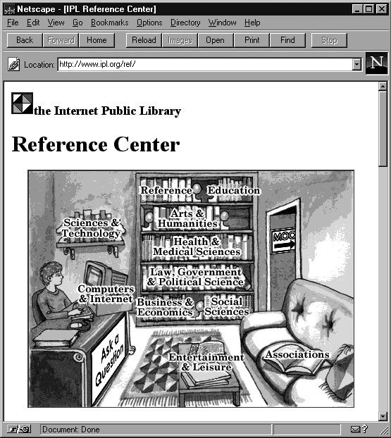
When first launched, the Internet Public Library (Figure 11-4) used visual and organizational metaphors to provide access to the reference area. Users could browse the shelves or ask a question. However, the traditional library metaphor did not support integration of such things as a multiuser object-oriented environment (“MOO”), and eventually the entire site was redesigned. Applied in such a strong way, metaphors can quickly become limiting factors in site architecture and design.
Also realize that people tend to fall in love with their own metaphors. Make sure everyone knows that this is just an exercise, and that it will rarely make sense to carry the metaphor into the information architecture design. For a lively discussion of the dangers of metaphor, see the section entitled “The Myth of Metaphor” in Alan Cooper’s book, About Face: The Essentials of User Interface Design (Wiley).
Scenarios
While architecture blueprints are excellent tools for capturing an approach to information organization in a detailed and structured way, they do not tend to excite people. As an architect who wants to convince your colleagues of the wisdom of your approach, you need to help them “envision” the site as you see it in your mind’s eye. Scenarios are great tools for helping people to understand how the user will navigate and experience the site you design,[4] and may also help you generate new ideas for the architecture and navigation system.
To provide a multidimensional experience that shows the true potential for the site, it is best to write a few scenarios that show how people with different needs and behaviors might navigate your site. Your user research is obviously an invaluable source of input for this process. Make sure you really take the time to wallow in the data before beginning to ask and answer these questions.
Who are the people using your site? Why and how will they want to use it? Will they be in a rush or will they want to explore? Try to select three or four major user “types” who will use the site in very different ways. Create a character who represents each type, giving him a name, a profession, and a reason for visiting your site. Then begin to flesh out a sample session in which that person uses your site, highlighting the best features of the site through your scenario. If you’ve designed for a new customization feature, show how someone would use it.
This is a great opportunity to be creative. You’ll probably find these scenarios to be easy and fun to write. And hopefully, they’ll help convince your colleagues to invest in your ideas.
Sample scenario
Let’s now look at a brief sample scenario. Rosalind, a 10th grader in San Francisco, regularly visits the LiveFun web site because she enjoys the interactive learning experience. She uses the site in both “investigative mode” and “serendipity mode.”
For example, when her anatomy class was studying skeletal structure, she used the investigative mode to search for resources about the skeleton. She found the “interactive human skeleton” that let her test her knowledge of the correct names and functions of each bone. She bookmarked this page so she could return for a refresher the night before final exams.
When she’s done with homework, Rosalind sometimes “surfs” through the site in serendipity mode. Her interest in poisonous snakes leads her to articles about how certain types of venom affect the human nervous system. One of these articles leads her into an interactive game that teaches her about other chemicals (such as alcohol) that are able to cross the blood-brain barrier. This game piques her interest in chemistry, and she switches into investigative mode to learn more.
Tip
This simple scenario shows why and how users may employ both searching and browsing within the web site. More complex scenarios can be used to flesh out the possible needs of users from multiple audiences.
Case Studies and Stories
It’s not easy to take a complex, abstract subject like information architecture and make it accessible to a diverse audience. When you’re communicating with other information architects, you can cut right to the chase, using a technical vocabulary that assumes familiarity and understanding. But when you’re talking with a broader audience of clients and colleagues, you may need to be more creative in your communication approach in order to engage their interest and facilitate their understanding.
Case studies and stories (such as the ones featured in Chapters 20 and 21) can be a wonderful way to bring the concepts of information architecture to life. When trying to explain a recommended information architecture strategy, we find it very helpful to compare and contrast this case with past experiences, discussing what did and didn’t work on past projects.
Conceptual Diagrams
Pictures are another way to bring abstract concepts to life. As an information architect, you often have to explain high-level concepts and systems that go beyond organization and labeling schemes.
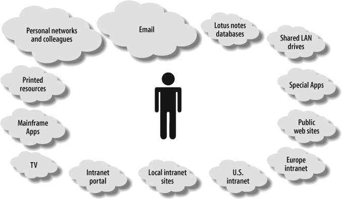
For example, we often find ourselves needing to paint a picture of the broader information ecology within a business. When we work with an intranet team, it’s not uncommon to find that they’ve succumbed over time to tunnel vision, seeing the intranet as the sole source of information for employees. You can tell them that this isn’t true, but this really is a case where a picture is worth a thousand words.
The conceptual diagram in Figure 11-5 places the employee, rather than the intranet, at the center of the universe. The sizes of the “information clouds” roughly correspond to the importance of each resource as explained by employees during a series of user interviews. This diagram shows that people view personal networks and colleagues as the most important information resources, and see the current intranet as having relatively little value in their work lives. The diagram also presents a fragmented information environment, in which artificial boundaries of technology (media and format) or geography exist between pools of information. While it’s possible to explain all of this verbally, we’ve found this type of visual to have a significant and lasting impact. It really gets the point across.
Blueprints and Wireframes
The collaborative brainstorming process is exciting, chaotic, and fun. However, sooner or later, you must hole up away from the crowd and begin to transform this chaos into order. Blueprints (which show the relationships between pages and other content components) and wireframes (quick-and-dirty visuals that show the content and links of major pages on the web site) are the architect’s tools of choice for performing this transformation. We discuss blueprints and wireframes in much greater detail in Chapter 12.
The Strategy Report
In our experience, this deliverable serves as the catalyst for the most detailed, comprehensive articulation of the information architecture strategy. The process of integrating the previous results, analysis, and ideas into a single written document forces tough decisions, intellectual honesty, and clear communication. Great ideas that don’t fit within the broader framework must be discarded in the name of consistency and cohesiveness. Big, vague ideas must be broken down into components and explained so that all involved can understand their intention and implications.
For the information architecture team, the strategy report is often the largest, hardest, and most important deliverable. It forces the team members to come together around a unified vision for the information architecture, and requires them to find ways to explain or illustrate that vision so that clients and colleagues (i.e., people who are not information architects) will understand what the heck they’re talking about.
One of the hardest things about writing the report is organizing it. Here you face yet another chicken-and-egg problem. An information architecture strategy is not linear, but a report forces a linear presentation. “How will they understand this section if they haven’t read that later section?” is a common question. There’s rarely a perfect solution, but the problem can be dealt with in a couple of ways. First of all, by including high-level visuals in the report, you can paint a nonlinear big picture and follow up with linear textual explanations. Second, remember that a strategy report cannot and should not stand completely alone. You should always have an opportunity to verbally explain your ideas and answer questions. Ideally, you’ll have a face-to-face information architecture strategy presentation; at a minimum, you should have a conference call to discuss reactions and answer questions.
The only thing harder and more abstract than writing an information architecture strategy report is trying to write about how to write one. To bring this subject to life, let’s examine a real strategy report that Argus created for the Weather Channel (http://www.weather.com/) in 1999.
A Sample Strategy Report
The Weather.com web site is a component of the broader Weather Channel family of services (including cable television, data and phone, radio and newspaper, and the Internet) that has provided timely weather information to the world since 1982. The Weather Channel web site is one of the most popular sites in the world, and features current conditions and forecasts for over 1,700 cities worldwide along with local and regional radars.
In 1999, the Weather Channel contracted Argus Associates to conduct research and recommend a strategy for improving the information architecture of Weather.com. Let’s take a look at the table of contents of the final strategy report for this engagement (Figure 11-6).
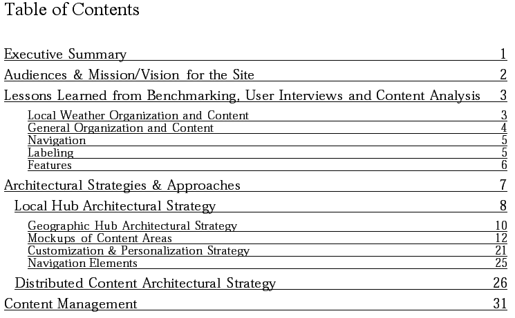
This table of contents should provide a rough sense of the size and scope of the strategy report. While some of our reports (including blueprints and wireframes) have been more than 100 pages, we encourage our teams to strive for fewer than 50. If it gets much longer than that, you run the risk that nobody will have the time or inclination to read it. The major sections of this report are fairly typical. Let’s take a look at each one in turn.
Executive summary
The executive summary (Figure 11-7) should provide a high-level outline of the goals and methodology, and present a 50,000-foot view of the major problems and major recommendations. The executive summary sets a tone for the entire document and should be written very carefully. It’s helpful to think of this as the one page of the whole report that will be read by the big boss. You need to consider the political message you’re sending, and generate enough interest to get people to continue reading.
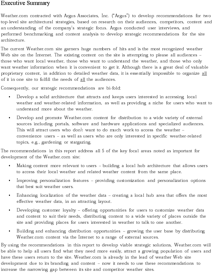
The executive summary in Figure 11-7 does a nice job of accomplishing its objectives within one page. We were able to take such an upbeat tone because the Weather.com team was already well organized and had a fairly solid information architecture in place. This executive summary places an emphasis on recommendations for improving the information architecture to achieve greater competitive advantage.
Audiences, mission, and vision for the site
It’s important to define the audiences and goals of the site to make sure that the report (and the reader) is grounded by the broader context. This is a good place to restate the mission statement for the web site.
The following is the mission statement from the Weather.com strategy report:
Weather.com will be the best weather web site on the Internet. As the dominant brand leader of weather information on the Internet, Weather.com will provide relevant, up-to-the-minute information about the weather to any user. The primary focus of the site is to provide localized weather data and value-added proprietary and exclusive weather and weather-related content, supported by significantly related non-proprietary content. Weather.com will employ technology that effectively leverages personalization and customization of content, and that allows us to meet user demands during extraordinary weather conditions.
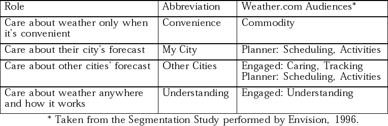
This is also a good place to define a vocabulary for discussing the roles of users and the audience segments. Figure 11-8 shows how this was accomplished for the Weather.com report.
Lessons learned
This section forms the bridge between your research and analysis and your recommendations. By showing that your recommendations are grounded in the results of competitive research (benchmarking), user interviews, and content analysis, you will build confidence and credibility.
In the Weather.com report, we organized this section into five subcategories. The following table shows a sample observation from each:
| Observation | Conclusion | Implications for site architecture |
| Local Organization and Content | ||
| Users said they wanted to see their city’s weather first. (User Interviews) | Local, local, local. | Access to local weather should be through a prominent search box and browsing via a map or links. |
| General Organization and Content | ||
| On weather sites, seasonal content is often scattered among several content areas. (Benchmarking) | Ephemeral content does not live in distinct areas that have a place within the site architecture. | Topically related content should live in a discrete, devoted area, even if it is seasonal. This will assist in providing effective content management of all content areas. |
| Navigation | ||
| Users couldn’t decipher where local and global navigation took them within portal sites that contained weather as well as other content. (User Interviews & Benchmarking) | Weather is only a portion of the content, and consequently what would be global navigation on a devoted weather site becomes local, which confuses users. | Weather- and non-weather-related content navigation shouldn’t be co-located within the navigation frame. |
| Labeling | ||
| Many labels didn’t accurately describe the content area underneath. (Benchmarking) | Labels need to describe exactly what is under them. | Use description or scope notes to help clarify a label. Avoid colloquialism and jargon. |
| Features | ||
| No weather sites are providing effective personalization; in fact, some are doing a very poor job at it. (Benchmarking) | Personalizing using anonymous tracking and content affinity is most effective. | Use Amazon as a benchmark for this. Provide options such as “the top 10 weather stories” or “the top 5 purchases made by users from Michigan.” Link these from the local weather pages. |
Architectural strategies and approaches
Now we get to the meat of the report—the explanation of the recommended architectural strategies and approaches. This is a fairly extensive section, so we can’t include it in its entirety, but we can present and briefly explain a few of the visuals used to illustrate the recommendations.
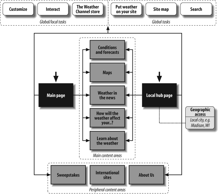
This report presents two strategies, local hub and distributed content, which are intended to be used in tandem. The local hub strategy centers on the fact that users are mainly focused on learning about their local weather. The conceptual blueprint in Figure 11-9 presents an information architecture built around this local hub strategy.
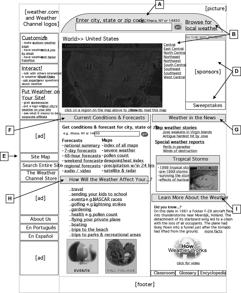
This blueprint is fairly difficult to understand without the accompanying text and context, some of which is shown in Figure 11-10. At a high level, it provides for geography-specific access (the local hub), and specifies major content areas and tasks that will ultimately be translated into navigation options on the local hub web page. These conceptual blueprints are followed by a series of wireframes that further illustrate the key points.
For each of the lettered call-outs in the wireframe, we included a textual explanation. The following table shows two examples.
| Code | Elements | Description | Implications (from Lessons Learned) |
| A | City, state, or zip code search box. | Searching for local weather needs to be at the very top of the page. It should be prominent and obvious, or users will ignore it. | Access to local weather should be through a prominent search box and browsing via a map or links. |
| B | Find local weather (search, map, “breadcrumbs”) | Users can click on the “Browse for local weather” link next to the search box, click on the map or the links to the right to access a region, or click on “World” to go up a geographic level. This allows users to navigate to weather at all levels. The map, if provided, cannot detract attention from the search box, which is the main method of access. | [Ditto.] |
On the other hand, the distributed content architectural strategy is centered on the fact that there are a wide variety of portals other than Weather.com through which users access weather information. For example, Yahoo! serves as a general portal for many users. Weather information is one component of a wide range of information needs for Yahoo! users.
The Weather Channel has partnerships with some of these portals, providing customized access to Weather.com content. The distributed content architectural strategy shown in Figure 11-11 presents a model for how to structure the information architecture for these partnerships.
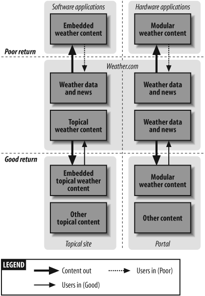
One of the major goals of this architectural strategy is to get users to return to the place that contains all the content: the Weather.com web site. When distributing content, it’s not possible to offer users everything they need, so it’s important to provide “teasers” to attract users to the site.
This architectural diagram places emphasis on the rate of return to the Weather.com site. It makes the point that it’s more likely that users will come to Weather.com from topical web sites and general portals than from embedded software applications (e.g., a Java-based Miami heat index) or wireless hardware platforms (e.g., a Palm Pilot or cell phone).
Content management
The final section of this report provides a reality check by discussing how these information architecture recommendations will impact the content management infrastructure. Any discussion of content management is very context-sensitive, depending upon the people, technology, and content in question. In this particular report, we took a high-level pass at explaining the relationship between information architecture and content management. It begins with a brief description of the three components of effective content management, as follows:
- Rules
These are the processes whereby the content is managed. Usually these are workflows followed by staff to create, publish, and maintain content on the site. The workflow can be a part of, or external to, any content management software that is purchased or developed. Peripheral process documents include style guidelines and standards.
- Roles
These are the staff that perform the content management processes. These people follow the processes and guidelines, as well as help create and maintain them. There may be highly specified roles for people who create metadata, review content, write content, act as a liaison with external content providers, or fix software when it breaks. There may be several people who have the same role, e.g., indexers.
- Resources
These include the content itself in its various forms of creation, modification, or deletion, as well as the repository for holding static content and dynamic data. It also includes the management software that makes it easier for the Rules and Roles to be carried out.
We then go on to provide specific recommendations to Weather.com that might lead to more efficient content management. Here are just a few of the recommendations:
- Templates
Much of the content that already exists on the site is dynamic data pulled from external sources (e.g., dew point, pollen count, flight arrival times). Data is very well suited for templates—it’s simple to build common structured pages that are used over and over for the same type of data. Textual content isn’t as easily placed in templates because it is more variable by nature, although it’s necessary for some document types (e.g., a news story template). Both static and dynamic content need structured navigation templates, a consistent frame where users can easily see the types of navigation: global, local, and contextual.
- Metadata
Descriptive metadata needs to be created to more easily populate the site architecture with relevant content. For instance, for each news story blurb on the “Weather in the News” main page, the following descriptive data should be noted:
| Metadata element | Example |
| author | Terrell Johnson |
| publisher | Jody Fennell |
| title | Antigua hardest hit by Jose |
| date | Thu Oct 21 1999 |
| expiration date | 1031999 12:01:23 |
| links | /news/102199/story.htm |
| document type | news story, glossary term |
| subject area | tropical storm |
| keywords | Jose, Antigua, damage, intensity |
| related to | breaking weather, news stories, severe weather maps |
| geographic access levels | local city, local regional, national |
| geographic areas | Antigua, North Carolina, South Carolina |
- Thesaurus
Building a thesaurus for your metadata helps users find information more easily. For instance, if a user is unsure whether to use the term “tropical storm” or “hurricane,” accessing a thesaurus can identify the preferred term. It will be useful to create thesauri for weather terms and geographic areas, as well as one that allows for normalization of the “keyword” metadata field for indexing purposes. Generally, thesauri are built for behind-the-scenes use by staff who are creating the metadata for content chunks (e.g., looking up which term to assign to a chunk), but it is also useful at the searching and browsing stage on the site.
The Project Plan
We often find it useful to go beyond the content management discussion and actually create a project plan for information architecture design as part of the strategy phase deliverables.
This project plan can accomplish two major objectives. First, when developed in parallel with the strategy report, it forces the team to constantly ask questions such as:
How will we accomplish that?
How long will it take?
Who will do it?
What kinds of deliverables will be required?
What are the dependencies?
This ensures that information architecture strategy is grounded in reality. The second objective of the project plan is to form the bridge between strategy and design. It can be integrated with plans from other teams (e.g., interaction design, content authoring, or application development) toward the development of a structured schedule for overall site design.
Given the common need to show some immediate progress, we usually provide short-term and long-term plans. In the short-term plan, we focus on low-hanging fruit, defining a process for design changes that can and should be made immediately to improve the information architecture. In the long-term plan, we present a methodology for fleshing out the information architecture, noting interdependencies with other teams where appropriate.
Presentations
You’ve done rigorous research and brilliant brainstorming. You’ve created a detailed, high-quality strategy report and a solid project plan. You’ve worked hard. You’ve successfully completed the strategy phase, right? Wrong!
We’ve learned through painful experience that information architecture deliverables can die a quiet death if they’re left to fend for themselves. People are busy, have short attention spans, and generally don’t enjoy reading 50-page information architecture strategy reports. Without some form of presentation and discussion, many of your best recommendations may never see the light of day.
It’s often a good idea to make one or more presentations to the people who need to understand your recommendations. In some situations, this might take the form of a single presentation to the web site or intranet strategy team. In other situations, you make dozens of presentations to various departments to achieve organization-wide understanding and buy-in. You need to think about these presentations from a sales perspective. Success is defined by the extent to which you can communicate and sell your ideas in a clear and compelling manner.
First, make sure you’ve got the basics down. Select some highlights of your recommendations that will really get the attention of the particular group you’re talking to. Then, organize your thoughts into a logical order to create a smooth presentation.
After you’ve figured all that out, you can consider ways to bring the presentation to life. Visuals such as charts, graphs, and conceptual diagrams can make a big difference, as can the use of metaphor. Remember, you’re selling ideas. Metaphor can be a powerful tool for transforming garden-variety ideas into contagious, self-replicating memes.
Consider this example. We were designing an information architecture strategy for the primary web site of a Global 100 corporation. We had developed three possible strategies with the following working titles:
- Umbrella Shell for Separate Hubs
Develop a broad but shallow umbrella web site that directs users to independently maintained subsites or “hubs.” Distributed control. Low cost, low usability.
- Integrated Content Repository
Create a unified, structured database for all content, providing powerful, flexible, consistent searching and browsing. Centralized control. High cost, high usability.
- Active Inter-Hub Management
Create standards for global metadata attributes, but allow for local subsite (“hub”) attributes as well. Knit together with inter- and intra-hub guides. Federated model. Medium cost, medium usability.
The titles were very descriptive, but they didn’t exactly roll off the tongue or stimulate interest. For our presentation, we came up with a musical metaphor that made this complex topic more fun and engaging:
| Model | Working title | Description | Comments |
| Competing boom boxes | Umbrella Shell for Separate Hubs | Whoever has the loudest music wins | The “Status Quo.” Works for neither company nor customers. |
| Symphony | Integrated Content Repository | Many instruments acting as one; a big investment | A “Bet the Farm” approach that carries many risks. |
| Jazz Band | Active Inter-Hub Management | A common key and beat; good teamwork; combination of tight rhythms and improvisation | Our favorite option. It provides rich functionality with less risk than the Symphony approach. |
Not only can this use of metaphor make for a better immediate discussion, but people are more likely to talk about it with colleagues after the presentation itself, spreading your ideas like a virus.
Now, finally, you can congratulate the visionary within you, take a brief rest, and prepare for the detail-orientation of the design and documentation phase.
[1] The notion of information scent comes from an information-foraging theory developed at Xerox PARC.
[2] For more about the use of metaphor, read the book Metaphors We Live By by George Lakoff and Mark Johnson (University of Chicago Press).
[3] “The information superhighway metaphor goes back to at least 1988, when Robert Kahn proposed building a high-speed national computer network he often likened to the interstate highway system.” Internet Dreams, Mark Stefik (MIT Press).
[4] For a more formal methodology, you may want to learn about use cases and use case scenarios (http://www.usecases.org/).