
Chapter 12. Design and Documentation
| What we’ll cover: |
| The role of diagrams in the design phase |
| Why, when, and how to develop blueprints and wireframes, the two most common types of IA diagrams |
| How to map and inventory your site’s content |
| Content models and controlled vocabularies for connecting and managing granular content within your site |
| Ways to enhance your collaboration with other members of the design team |
| Style guides for capturing your past decisions and guiding your future ones |
When you cross the bridge from research and strategy into design, the landscape shifts quite dramatically. The emphasis moves from process to deliverables, as your clients and colleagues expect you to move from thinking and talking to actually producing a clear, well-defined information architecture.
This can be an uneasy transition. You must relinquish the white lab coat of the researcher, leave behind the ivory tower of the strategist, and forge into the exposed territory of creativity and design. As you commit your ideas to paper, it can be scary to realize there’s no going back. You are now actively shaping what will become the user experience. Your fears and discomforts will be diminished if you’ve had the time and resources to do the research and develop a strategy; if you’re pushed straight into design (as is too often the case), you’ll be entering the uneasy realm of intuition and gut instinct.
It’s difficult to write about design because the work in this phase is so strongly defined by context and influenced by tacit knowledge. You may be working closely with a graphic designer to create a small web site from the ground up. Or you may be building a controlled vocabulary and site index as part of an enterprise-level redesign that involves more than a hundred people. The design decisions you make and the deliverables you produce will be informed by the total sum of your experience.
In short, we’re talking about the creative process. The information architect paints on a vast, complex, and ever-changing canvas. Often, the best way to teach art is through the time-tested practice of show-and-tell. So, in this chapter, we’ll use work products and deliverables to tell the story about what the information architect does during the design phase.
Before we dive in, here’s a caveat. Although this chapter focuses on deliverables, process is as important during design as it is during research and strategy. This means that the techniques covered previously should be applied to these later phases, albeit with more concrete and detailed artifacts—ranging from vocabularies to wireframes to working prototypes—being tested.
And another caveat: for reasons beyond your control, you’ll occasionally—even frequently—find yourself in the uncomfortable situation of bypassing research and strategy altogether, skipping headlong into the abyss of design. Deliverables are especially critical in this context; they’re anchors that, by forcing the team to pause, capture, and review its work, regulate and moderate an out-of-control project. You can also use deliverables to unmask design problems and force the project to backtrack to research and design tasks that should have been handled much earlier.
Guidelines for Diagramming an Information Architecture
Information architects are under extreme pressure to clearly represent the product of their work. Whether it’s to help sell the value of information architecture to a potential client or to explain a design to a colleague, information architects rely upon visual representations to communicate what it is they actually do.
And yet information architectures, as we’ve mentioned many times, are abstract, conceptual things. Sites themselves are not finite; often you can’t tell where one ends and the other begins. Subsites and the “invisible web” of databases further muddy the picture of what should and shouldn’t be included in a specific architecture. Digital information itself can be organized and repurposed in an almost infinite number of ways, meaning that an architecture is typically multidimensional—and therefore exceedingly difficult to represent in a two-dimensional space such as a whiteboard or a sheet of paper.
So we’re left with a nasty paradox. We are forced to demonstrate the value and essence of our work in a visual medium, though our work itself isn’t especially visual.
There really is no ideal solution. The field of information architecture is too young for its practitioners to have figured out how best to visually represent information architectures, much less agree upon a standard set of diagrams that work for all audiences in all situations.[1] And it’s unlikely that the messages we wish to communicate will ever lend themselves easily to 8.5×11 sheets of paper.
Still, there are a couple of good guidelines to follow as you document your architecture:
Provide multiple “views” of an information architecture. Digital information systems are too complex to show all at once; a diagram that tries to be all things to all people is destined to fail. Instead, consider using a variety of techniques to display different aspects of the architecture. Like the blind men and the elephant in John Godfrey Saxe’s fable (see the section “Many Good Ways” in Chapter 18), no single view takes in the whole picture, but the combination of multiple diagrams might come close.
Develop those views for specific audiences and needs. You might find that a visually stunning diagram is compelling to client prospects, therefore justifying its expense. However, it probably requires too many resources to use in a production environment where diagrams may change multiple times per day. Whenever possible, determine what others need from your diagrams before creating them. For example, Keith Instone, an information architect at IBM, finds himself developing very different diagrams for communicating “upstream” with stakeholders and executives than for “downstream” communication with designers and developers.
Whenever possible, present information architecture diagrams in person, especially when the audience is unfamiliar with them. (If you can’t be there in person, at least be there via telephone.) Again and again, we’ve witnessed (and suffered from) huge disconnects between what the diagram was intended to communicate and what it was understood to mean. This shouldn’t be surprising, because there is no standard visual language to describe information architectures yet. So be there to translate, explain, and, if necessary, defend your work.
Better yet, work with whomever you’re presenting your diagrams to—clients, managers, designers, programmers—to understand in advance what they will need from it. You may find that your assumptions of how they would use your diagrams were quite wrong. We’ve seen a large, respected firm fired from a huge project because it took too many weeks to produce bound, color-printed, sexy diagrams. The client preferred (and requested) simple, even hand-drawn, sketches because it needed them as soon as possible.
As we’ve seen in previous chapters, the most frequently used diagrams are blueprints and wireframes. These focus more on the structure of a site’s content than its semantic content. Blueprints and wireframes are effective at depicting structure, movement, flow, and relationships between content, but not at conveying the semantic nature of content or labels. We’ll discuss both types of diagrams in detail in the following sections, but first it would be helpful to understand the “language” that these diagrams use.
Communicating Visually
Diagrams are useful for communicating the two basic aspects of an information system’s structural elements (semantic aspects, like controlled vocabularies, don’t easily lend themselves to visual representation). Diagrams define:
- Content components
What constitutes a unit of content, and how those components should be grouped and sequenced
- Connections between content components
How components are linked to enable navigating between them
That’s really pretty simple, and no matter how complex your diagrams may ultimately become, their main goal will always be to communicate what your site’s content components are and how they’re connected.
To help information architects and other designers create diagrams, a variety of visual vocabularies have emerged to provide a clear set of terms and syntax to visually communicate components and their links. The best-known and most influential visual vocabulary is Jesse James Garrett’s,[2] which has been translated into eight languages. Jesse’s vocabulary anticipates and accommodates many uses, but perhaps the greatest reason for its success is its simplicity; just about anyone can use it to create diagrams, even by hand.
Visual vocabularies are at the heart of the many templates used to develop blueprints and wireframes. Thanks to their developers’ generosity, there are many free templates you can use to create your own deliverables; we’ve provided a table of useful examples below. Each requires one of the common charting programs, like Microsoft’s Visio (for PC compatibles) or Omni Group’s OmniGraffle (for Macintosh computers).
What if you’re a nonvisual person who cringes at the idea of learning Visio? Or the people you’re communicating your ideas to aren’t visually oriented? Does your work have to be visual?
Absolutely not. As ugly as it can be, you can render your blueprints as outlines in a word processor, or use a spreadsheet’s cells in a similar fashion. You can write page descriptions that cover the same bases as your wireframes. Just about anything can be rendered in text, and ultimately, these deliverables are first and foremost communication tools. You need to play to your own communication strengths and, more importantly, take advantage of whatever style works best for your audience.
But remember, there’s a reason they say “a picture is worth a thousand words.” The lines between information archicture and the more visual aspects of design are blurry, and at some point, you’ll have to connect your IA concepts, however textual, to the work that is the responsibility of graphic designers and interaction designers. Hence we spend most of our time in this chapter on visual means for communicating information architectures.
Blueprints
Blueprints show the relationships between pages and other content components, and can be used to portray organization, navigation, and labeling systems. They are often referred to as “site maps,” and do in fact have much in common with the other definition of “site map,” a type of supplementary navigation system that we describe in Chapter 7. Both the diagram and the navigation system display the “shape” of the information space in overview, functioning as a condensed map for site developers and users respectively.
High-Level Architecture Blueprints
High-level blueprints are often created by information architects as part of a top-down information architecture process (and, it’s worth noting, they may also be produced during a project’s strategy phase) Starting with the main page, the information architect might use the process of developing a blueprint to iteratively flesh out more and more of the architecture, adding subsidiary pages, increasing levels of detail, and working out the navigation from the top down. (Blueprints can also support bottom-up design, such as displaying a content model’s content chunks and relationships; we discuss these uses later in the chapter.)
The very act of shaping ideas into the more formal structure of a blueprint forces you to become realistic and practical. If brainstorming takes you to the top of the mountain, blueprinting can bring you back down to the valley of reality. Ideas that seemed brilliant on the whiteboard may not pan out when you attempt to organize them in a practical manner. It’s easy to throw around concepts such as “personalization” and “adaptive information architectures.” It’s not so easy to define on paper exactly how these concepts will be applied to a specific web site.
During the design phase, high-level blueprints are most useful for exploring primary organization schemes and approaches. High-level blueprints map out the organization and labeling of major areas, usually beginning with a bird’s-eye view from the main page of the web site. This exploration may involve several iterations as you further define the information architecture.
High-level blueprints are great for stimulating discussions focused on the organization and management of content as well as on the desired access pathways for users. These blueprints can be drawn by hand, but we prefer to use diagramming software such as Visio or OmniGraffle. These tools not only help you to quickly layout your architecture blueprints, but can also help with site implementation and administration. They also lend your work a more professional look, which, sadly, will be more important at times than the quality your actual design.
Figure 12-1 shows a high-level blueprint that includes components within pages, groups of pages, and relationships between pages. The grouping of pages can inform page layout. For example, this blueprint dictates that the three guides should be presented together, whereas Search & Browse, Feedback, and News should be presented separately.
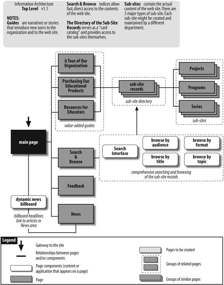
Let’s walk through the blueprint in Figure 12-1 as if we were presenting it to clients or colleagues. The building block of this architecture is the subsite. Within this company, the ownership and management of content is distributed among many individuals in different departments. There are already dozens of small and large web sites, each with its own graphic identity and information architecture. Rather than try to enforce one standard across this collection of sites, this blueprint suggests an “umbrella architecture” approach that allows for the existence of lots of heterogeneous subsites.
Moving up from the subsites, we see a directory of subsite records. This directory serves as a “card catalog” that provides easy access to the subsites. There is a record for each subsite; each record consists of fields such as title, description, keywords, audience, format, and topic, which describe the contents of that subsite.
By creating a standardized record for each subsite, we are actually creating a database of subsite records. This database approach enables both powerful known-item searching and exploratory browsing. As you can see from the Search & Browse page, users can search and browse by title, audience, format, and topic.
The blueprint also shows three guides. These guides take the form of simple narratives or “stories” that introduce new users to the site’s sponsor and selected areas with the web site.
Finally, we see a dynamic news billboard (perhaps implemented through Java or JavaScript) that rotates the display of featured news headlines and announcements. In addition to bringing some action to the main page, this billboard provides yet another way to access important content that might otherwise be buried within a subsite.
At this point in the discussion of the high-level blueprint, you are sure to face some questions. As you can see, the blueprints don’t completely speak for themselves, and that’s exactly what you want. High-level blueprints are an excellent tool for explaining your architectural approaches and making sure that they’re challenged by your client or manager. Questions such as “Do those guides really make sense, considering the company’s new plans to target customers by region?” will surface, and present an excellent opportunity to gain buy-in from the client and to fire-proof your design from similar questions much later in the process, when it’ll be more expensive to make changes.
Presenting blueprints in person allows you to immediately answer questions and address concerns, as well as to explore new ideas while they’re still fresh. You might also consider augmenting your blueprints with a brief text document to explain your thinking and answer the most likely questions right on the spot. At the very least, consider providing a “Notes” area (as we do in this example) to briefly explain basic concepts.
Digging Deeper into Blueprints
As you create blueprints, it’s important to avoid getting locked into a particular type of layout. Instead, let form follow function. Notice the difference between Figures 12-2 and 12-3.
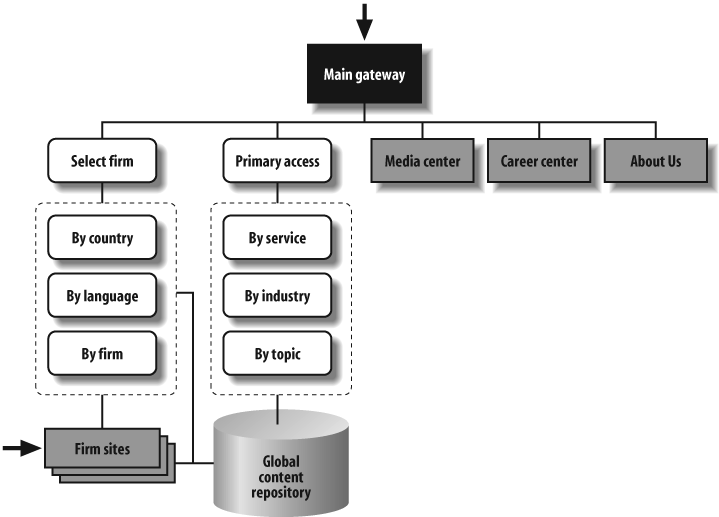
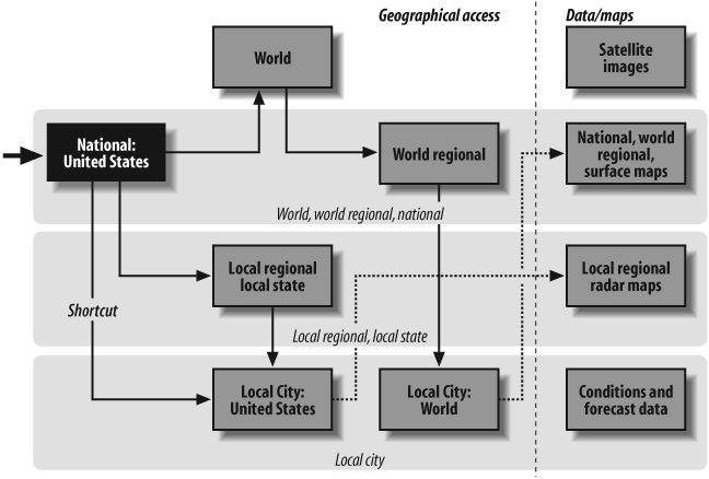
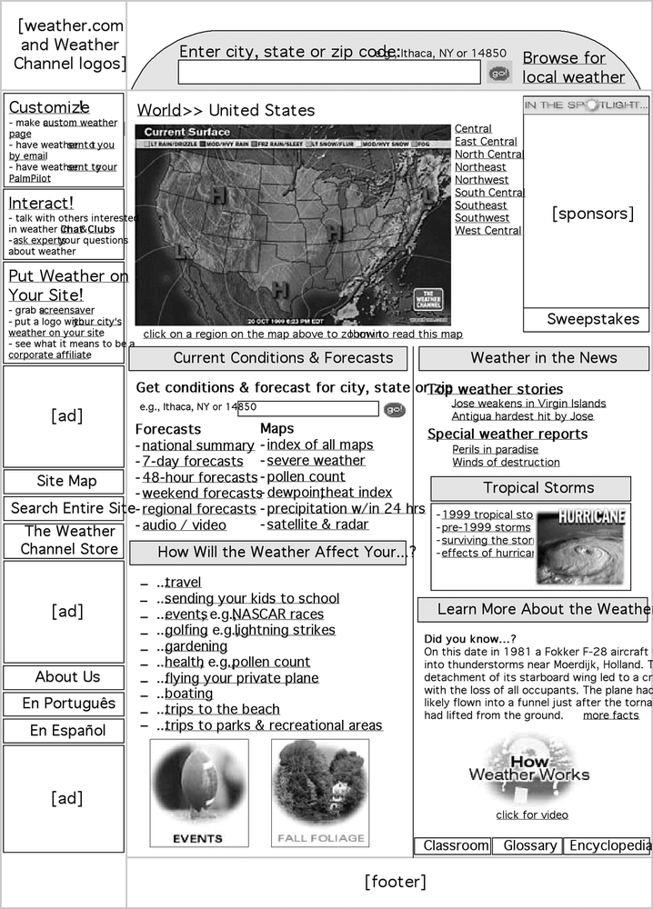
Figure 12-2 provides a holistic view of the information architecture for a global consulting firm. It’s part of an initiative to build support for the overall vision of unified access to member firms’ content and services. In contrast, Figure 12-3 focuses on a single aspect of navigation for the Weather Channel web site, aiming to show how users will be able to move between local and national weather reports and news. Both blueprints are high level and conceptual in nature, yet each takes on a unique form to suit its purpose.
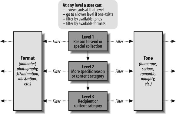
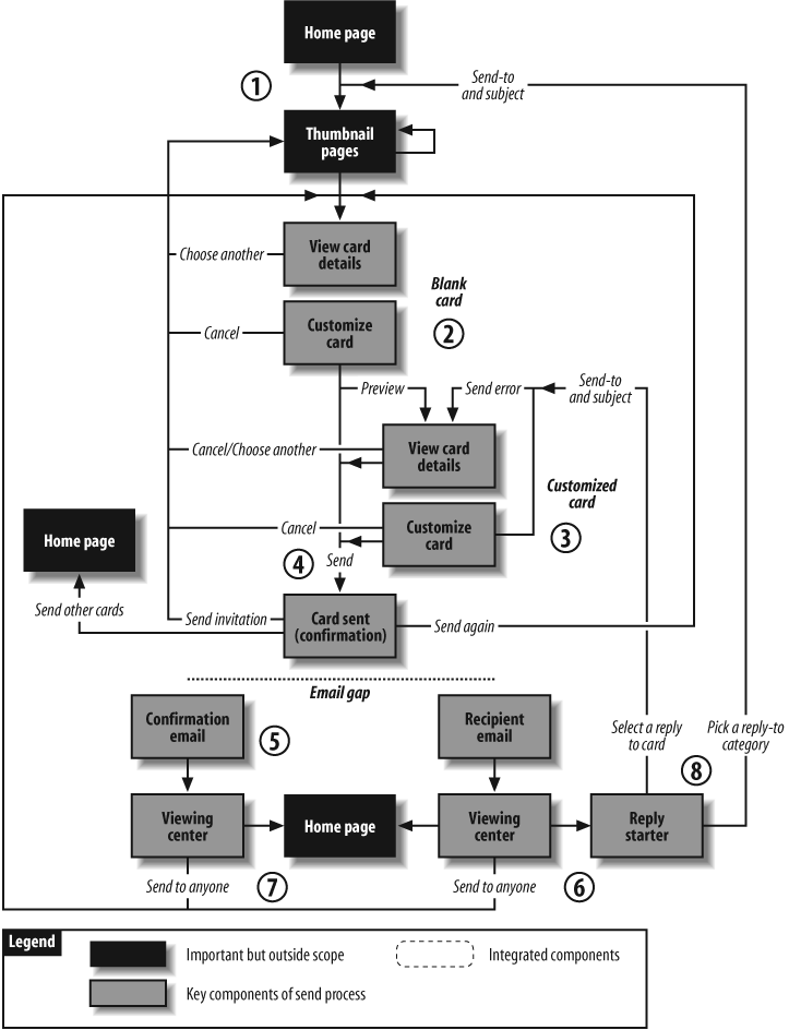
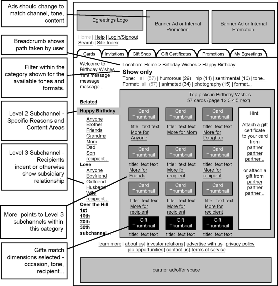
In Figure 12-4, we see a high-level blueprint for the online greeting card web site Egreetings.com. This blueprint focuses on the user’s ability to filter cards based on format or tone at any level while navigating the primary taxonomy.
It’s important for information architects (particularly those of us with library science backgrounds) to remind ourselves that web sites aren’t just about content; we can also contribute to the design of online applications and e-services. This work requires task-oriented blueprints, which are similar to the process flow diagrams often created by interaction designers.
For example, Figure 12-5 presents a user-centered view of the card-sending process at Egreetings.com prior to a redesign project. It allows the project team to walk through each step along the web- and email-enabled process, looking for opportunities to improve the user experience.
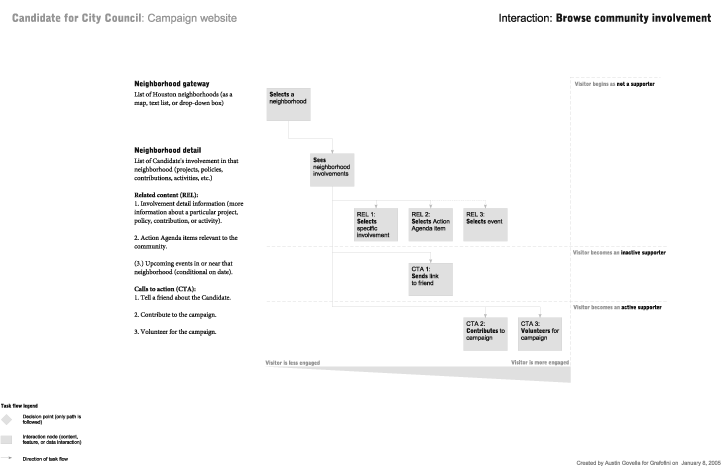
In Figure 12-6, information architect Austin Govella’s blueprint demonstrates how casual browsers may become engaged in a political campaign over time by interacting with the site’s content. This blueprint is as much about changes in the user’s mind as it is descriptive of the site’s content and navigation.
You’ll notice that as we dug deeper, we moved from high-level blueprints toward diagrams that isolated specific aspects of the architecture, rather than communicating the overall direction of the site. Blueprints are incredibly flexible; while boxes and connectors can’t communicate everything about a design, they are simple enough that just about anyone can both develop and understand them.
You should also note that all of these blueprints leave out quite a bit of information. They focus on the major areas and structures of the site, ignoring many navigation elements and page-level details. These omissions are by design, not by accident. For blueprints, as with the web sites you design, remember the rule of thumb that less is more.
Keeping Blueprints Simple
As a project moves from strategy to design to implementation, blueprints become more utilitarian—enabling the information architect to communicate to others involved in design and development—and less geared toward strategy and product definition. “Lower-level” blueprints need to be produced and modified quickly and iteratively, and often draw input from an increasing number of perspectives, ranging from visual designers to editors to programmers. Those team members need to be able to understand the architecture, so it’s important to develop a simple, condensed vocabulary of objects that can be explained in a brief legend. See Figure 12-7 for an example.

In this figure, the legend describes three levels of content granularity. The coarsest are content groups (made up of pages); these are followed by the pages themselves. Content components are the finest-grained content that makes sense to represent in a blueprint. The arrow describes a link between content objects; these can be one-way or bidirectional links.
This is a minimal set of objects; we’ve found that retaining a limited vocabulary helps the information architect avoid the temptation of overloading the diagram with too much information. After all, other diagrams can be used to convey other views of the architecture more effectively.
Detailed Blueprints
As you move deeper into the implementation stage, your focus naturally shifts from external to internal. Rather than communicating high-level architectural concepts to the client, your job is now to communicate detailed organization, labeling, and navigation decisions to your colleagues on the site development team. In the world of “physical” architecture, this shift can be likened to architecture versus construction. The architect may work closely with the client to make big-picture decisions about the layout of rooms and the location of windows; however, decisions regarding the size of nails or the routing of the plumbing typically do not involve the client. And in fact, such minutiae often need not involve the architect either.
Detailed architecture blueprints serve a very practical purpose. They map out the entire site so that the production team can implement your plans to the letter without requiring your involvement during production. The blueprints must present the complete information hierarchy from the main page to the destination pages. They must also detail the labeling and navigation systems to be implemented in each area of the site.
The blueprints will vary from project to project, depending upon the scope. On smaller projects, the primary audience for your blueprints may be one or two graphic designers responsible for integrating the architecture, design, and content. On larger projects, the primary audience may be a technical team responsible for integrating the architecture, design, and content through a database-driven process. Let’s consider a few examples to see what blueprints communicate and how they might vary.
Figure 12-8 shows a blueprint from the SIGGRAPH 96 Conference that introduces several concepts (yes, we know it’s an old example, but it remains useful and valid).By assigning a unique identification number (e.g., 2.2.5.1) to each component (e.g., pages and content chunks), the architect lays the groundwork for an organized production process, ideally involving a database system that populates the web site structure with content.
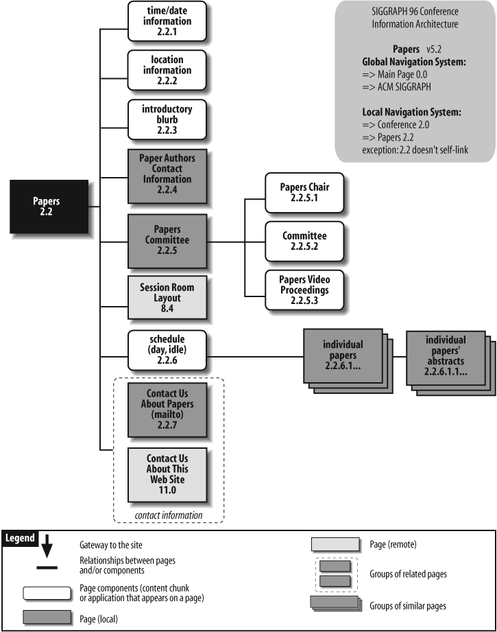
There is a distinction between a local and a remote page in Figure 12-8. A local page is a child of the main page on that blueprint, and inherits characteristics such as graphic identity and navigation elements from its parent. In this example, the Papers Committee page inherits its color scheme and navigation system from the Papers main page. On the other hand, a remote page belongs to another branch of the information hierarchy. The Session Room Layout page has a graphic identity and navigation system that are unique to the Maps area of the web site.
Another important concept is that of content components or chunks. To meet the needs of the production process, it is often necessary to separate the content (i.e., chunks) from the container (i.e., pages). Content chunks such as “Contact Us About Papers” and “Contact Us About This Web Site” are sections of content composed of one or more paragraphs that can stand alone as independent packages of information. (We’ll discuss content chunking in more detail later in this chapter.) The rectangle that surrounds these content chunks indicates that they are closely related. By taking this approach, the architect provides the designer with flexibility in defining the layout. Depending upon the space each content chunk requires, the designer may choose to present all of these chunks on one page, or create a closely knit collection of pages.
You may also decide to communicate the navigation system using these detailed blueprints. In some cases, arrows can be used to show navigation, but these can be confusing and are easily missed by the production staff. A sidebar is often the best way of communicating both global and local navigation systems, as shown in Figure 12-8. The sidebar in the upper right of this blueprint explains how the global and local navigation systems apply to this area of the web site.
Organizing Your Blueprints
As the architecture is developed, it needs to accommodate more than just the site’s top-level pages. The same simple notation can be used, but how can you squeeze all of these documents onto one sheet of paper? Many applications will allow you to print on multiple sheets, but you’ll find yourself spending more time taping sheets together than designing. And if a diagram is too large to print on a single sheet, it’s probably also too large to reasonably view and edit on a standard monitor.
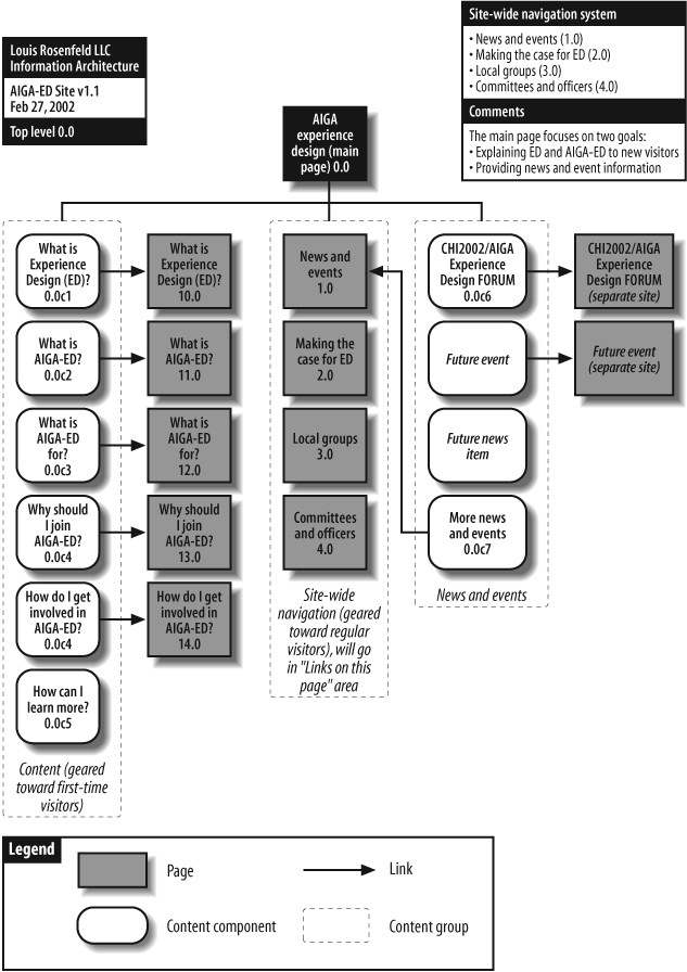
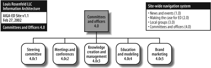
In this case, we suggest modularizing the blueprint. The top-level blueprint links to subsidiary blueprints, and so on, and so on. These diagrams are tied together through a scheme of unique IDs. For example, in the top-level diagram in Figure 12-9, major pages, such as the one representing “Committees and officers,” are numbered 4.0. That page becomes the “lead page” on a new diagram (Figure 12-10), where it is also numbered 4.0. Its subsidiary pages and content components use codes starting with 4.0 in order to link them with their parent.
Using a unique identification scheme to tie together multiple diagrams helps us to somewhat mitigate the tyranny of the 8.5×11 sheet of paper. (Although you may still find that your architecture requires dozens of individual sheets of paper.) This scheme can also be helpful for bridging a content inventory to the architectural process—content components can share the same IDs in both content inventory and blueprint. This means that in the production phase, adding content to the site is not much different from painting by numbers.
If you’d like to learn more about blueprints, we suggest visiting the IAwiki site for some excellent discussion on the topic (http://iawiki.net/SiteMaps).
Wireframes
Blueprints can help an information architect determine where content should go and how it should be navigated within the context of a site, subsite, or collection of content. Wireframes serve a different role: they depict how an individual page or template should look from an architectural perspective. Wireframes stand at the intersection of the site’s information architecture and its visual and information design.
For example, the wireframe forces the architect to consider such issues as where the navigation systems might be located on a page. And now that we see it on an early version of a page, does it seem that there are actually too many ways to navigate? Trying out ideas in the context of a wireframe might force you back to the blueprint’s drawing board, but it’s better to make such changes on paper rather than reengineering the entire site at some point in the future.
Wireframes describe the content and information architecture to be included on the relatively confined two-dimensional spaces known as pages; therefore, wireframes themselves must be constrained in size. These constraints force the information architect to make choices about what components of the architecture should be visible and accessible to users; after all, if the architectural components absorb too much screen real estate, no room will be left for actual content!
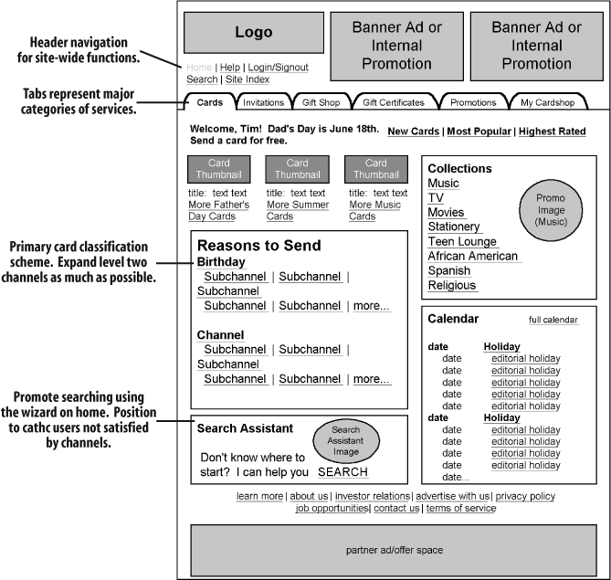
Developing wireframes also helps the information architect decide how to group content components, how to order them, and which groups of components have priority. In Figure 12-11, the information architect has determined that “Reasons to Send” is of a higher priority than the “Search Assistant.” This priority is made clear by the content’s prominent positioning and the use of a larger typeface for its heading.
Wireframes are typically created for the site’s most important pages—such as main pages, major category pages, and the interfaces to search—and other important applications. They are also used to describe templates that are consistently applied to many pages, such as a site’s content pages. And they can be used for any page that is sufficiently vexing or confusing to merit further visualization during the design process. The goal is not to create wireframes for every page in your site, but only for the ones that are complicated, unique, or set a pattern for other pages (i.e., templates).
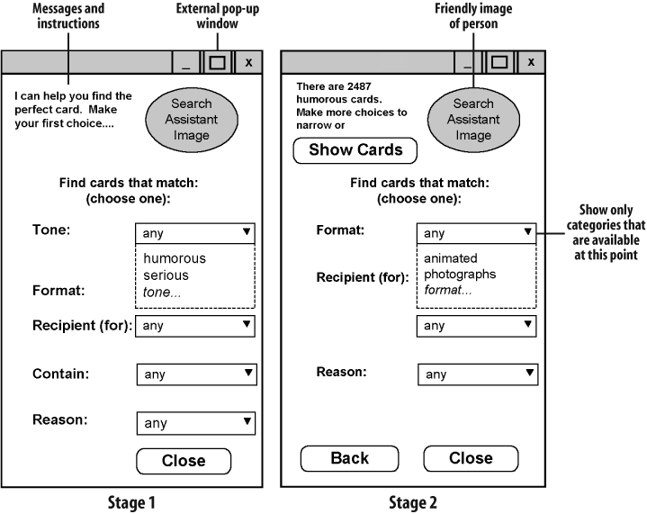
Note that wireframes are not limited to describing pages. Figure 12-12 shows two stages of a user’s interaction with a pop-up window.
Wireframes represent a degree of look and feel, and straddle the realms of visual design and interaction design. Wireframes (and page design in general) represent a frontier area where many web design-related disciplines come together and frequently clash. The fact that wireframes are produced by an information architect (i.e., a non-designer) and that they make statements about visual design (despite being quite ugly) often makes graphic designers and other visually oriented people very uncomfortable. For this reason, we suggest that wireframes come with a prominent disclaimer that they are not replacements for “real visual design.” The fonts, colors (or lack thereof), use of whitespace, and other visual characteristics of your wireframes are there only to illustrate how the site’s information architecture will impact and interact with a particular page. Make it clear that you expect to collaborate with a graphic designer to improve the aesthetic nature of the overall site, or with an interaction designer to improve the functionality of the page’s widgets.
We also suggest making this point verbally, while also conveying how your wireframe will eliminate some work that visual designers and interaction designers might consider unpleasant or not within their expertise. For example, just as you’d prefer that a designer select colors or placement for a navigation bar, you’ve relieved the designer of the task of determining the labels that will populate that navigation bar.
Finally, because wireframes do involve visual design, their development presents a perfect opportunity for collaboration with visual designers, who will have much to add at this point. Avoid treating wireframes as something to be handed off to designers and developers, and instead use them as triggers for generating a healthy bout of interdisciplinary collaboration. Although collaboration slows down the project’s schedule, the end product will be better for it (and besides, it may save you time during the project’s development).
Types of Wireframes
Just like blueprints, wireframes come in many shapes and sizes, and the level of fidelity can be varied to suit your purposes. At the low end, you may sketch quick-and-dirty wireframes on paper or a whiteboard. At the high end, wireframes may be created in HTML or with a publishing tool like Adobe Illustrator. Most wireframes fall somewhere in the middle. Let’s review a few samples.
Figure 12-13 is a relatively low-fidelity wireframe; there are no graphic elements and no real content. This enables the visual designer to focus attention on the global, local, and contextual navigation elements of the page.
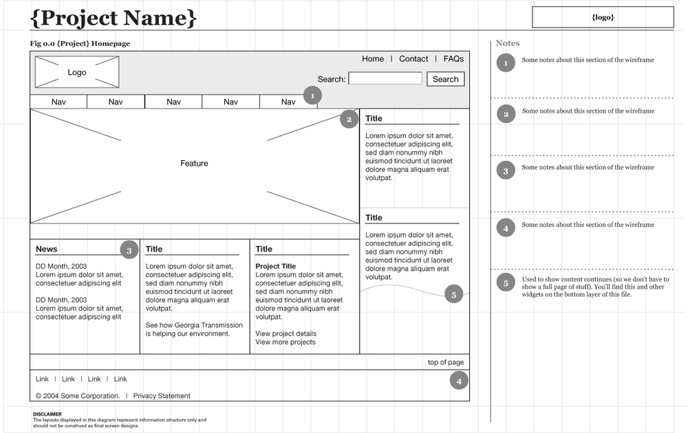
Figure 12-14, from a redesign project for Egreetings.com, is a medium-fidelity wireframe with a high degree of detail. This wireframe was intended to introduce several aspects of content, layout, and navigation into the discussion, and was one of many wireframes used to communicate the information architecture to managers, graphic designers, and programmers.
Finally, Figure 12-15 is a relatively high-fidelity wireframe that presents a close approximation of what the page will actually look like. This is about as far as most information architects can go without bringing a graphic designer into the picture.
Such a high-fidelity wireframe has the following advantages:
The content and color bring the page to life, helping to capture the attention of your clients or colleagues.
By simulating actual page width and font size, the wireframe forces you to recognize the constraints of an HTML page.
The fidelity is sufficient to support paper prototype-testing with users.
On the other hand, some disadvantages are:
Higher fidelity requires greater effort. It takes a lot of time to design such a detailed wireframe. This can slow down the process and increase costs.
As you integrate visual elements and content into a structured layout, the focus may shift prematurely from information architecture to interface and visual design.
Provided that you recognize the strengths and weaknesses of these varying levels of fidelity, wireframes can be an extremely powerful tools for communication and collaboration during the information architecture design process.
Wireframe Guidelines
Chris Farnum, a former colleague at Argus Associates and a wireframe expert, suggests the following best practices to consider when creating wireframes:
Consistency is key, especially when presenting multiple wireframes. It ensures that clients will be impressed by the professionalism of your wireframes. More importantly, colleagues take wireframes quite literally, so consistency makes their design and production work go more smoothly.
Visio and other standard charting tools support background layers, allowing you to reuse navigation bars and page layouts for multiple pages throughout the site. Similarly, Visio’s stencil feature allows you to maintain a standard library of drawing objects that can be used to describe page elements.
Callouts are an effective way to provide notes about the functionality of page elements. Be sure to leave room for them at the sides and top of your wireframes.
Like any other deliverable, wireframes should be usable and professionally developed. So tie your collection of wireframes together with page numbers, page titles, project titles, and last revision date.
When more than one information architect is creating a project’s wireframes, be sure to establish procedures for developing, sharing, and maintaining common templates and stencils (and consider establishing a wireframe “steward”). Schedule time in your project plan for synchronizing the team’s wireframes to ensure consistent appearance, and for confirming that these discrete documents do indeed fit together functionally.
For an excellent discussion of information architecture deliverables and wireframes and additional information, see the IAwiki (http://iawiki.net/WireFrames).
Content Mapping and Inventory
During research and strategy, you are focused on the top-down approach of defining an information structure that will accommodate the mission, vision, audiences, and content of the site. As you move into design and production, you complete the bottom-up process of collecting and analyzing the content. Content mapping is where top-down information architecture meets bottom-up.
The process of detailed content mapping involves breaking down or combining existing content into content chunks that are useful for inclusion in your site. A content chunk isn’t necessarily a sentence or a paragraph or a page. Rather, it is the most finely grained portion of content that merits or requires individual treatment.
The content, often drawn from a variety of sources and in a multitude of formats, must be mapped onto the information architecture so that it will be clear what goes where during the production process. Because of differences between formats, you cannot count on a one-to-one mapping of source page to destination page; one page from a print brochure does not necessarily map onto one page on the Web. For this reason, it is important to separate content from container at both the source and the destination. In addition, when combined with XML or a database-driven approach to content management, the separation of content and container facilitates the reuse of content chunks across multiple pages. For example, contact information for the customer-service department might be presented in context within a variety of pages throughout the web site. If the contact information changes, the modification need only be made to the database record for that content chunk, and it can then be propagated throughout the web site at the push of a button.
Even when you are creating new content for your site, content mapping is still necessary. It often makes sense to create content in a word processing application rather than an HTML editor, since tools like Microsoft Word tend to have more powerful editing, layout, and spell-checking capabilities. In such cases, you’ll need to map the Word documents to HTML pages. The need for careful content mapping is even greater when new content is created by multiple authors throughout your organization; the mapping process then becomes an important managerial tool for tracking content from these disparate sources.
The subjective process of defining chunks should be determined by asking the following questions:
Should this content be divided into smaller chunks that users might want to access separately?
What is the smallest section of content that needs to be individually indexed?
Will this content need to be repurposed across multiple documents or as part of multiple processes?
Once the content chunks have been defined, they can be mapped to their destinations, which can be web pages, PDAs, or some other medium. You will need a systematic means of documenting the source and destination of all content so that the production team can carry out your instructions. As discussed earlier, one approach involves the assignment of a unique identification code to each content chunk.
For example, the creation of the SIGGRAPH 96 Conference web site required the translation of print-based content to the online environment. In such cases, content mapping involves the specification of how chunks of content in the print materials map to pages on the web site. For SIGGRAPH 96, we had to map the contents of elaborately designed brochures, announcements, and programs onto web pages. Because it wouldn’t have made sense to attempt a one-to-one mapping of printed pages to web pages, we instead went through a process of content chunking and mapping with the content editor. First, we broke each page of the brochure into logical chunks of content, inventoried the results, and then devised a simple scheme tied to page numbers for labeling each chunk (Figure 12-16).
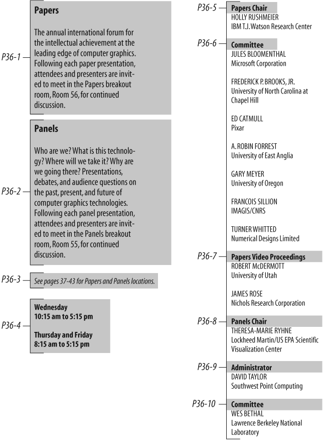
As you saw in Figure 12-9, we had already created a detailed information architecture blueprint with its own content chunk identification scheme. We then had to create a content mapping table that explained how each content chunk from the print brochure should be presented in the web site (Figure 12-17).
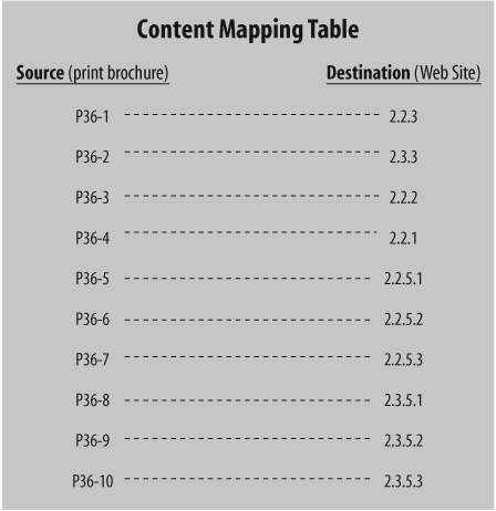
In this example, P36-1 is a unique ID code that refers to the first content chunk on page 36 of the original print brochure. This source content chunk maps onto the destination content chunk labeled 2.2.3, which belongs in the Papers (2.2) area of the web site.
Armed with the original print documents, architecture blueprints, and the content mapping table, the production staff created and populated the SIGGRAPH 96 Conference web site. As you can see in Figure 12-18, the contents of this web page (2.2) include three content chunks from P36.

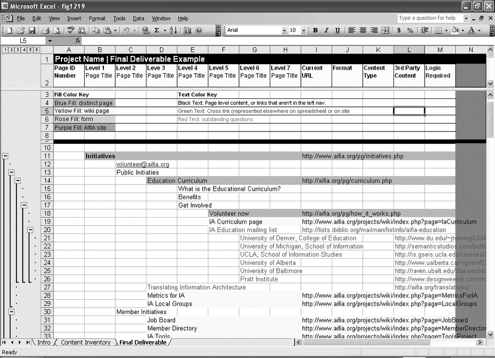
A byproduct of the content mapping process is a content inventory describing available content and where it can be found (e.g., the current site or the annual report), as well as content gaps that need to be filled. Depending upon the size and complexity of the web site and the process and technology in place for production, there are many ways to present this inventory. For larger sites, you might require a document or content management solution that leverages database technology to manage large collections of content. Many of these applications also provide a workflow that defines a team approach to page-level design and editing. For simpler sites, you might rely on a spreadsheet (see Figure 12-19). Sarah Rice of Seneb Consulting has created an excellent spreadsheet that you can download and use (at http://www.seneb.com/example_content_inventory.xls); in this example, she’s applied it to the site of the Information Architecture Institute (formerly AIfIA).
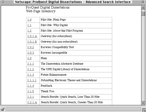
Or, if you’re feeling a bit more ambitious, you can create a web-based inventory that presents the titles and unique identification numbers of each page for the site, such as that shown in Figure 12-20. Selecting the hypertext numbers pops up another browser window that shows the appropriate web page.
You can create a content inventory[3] as soon as you have completed the content mapping process. At different points in time, it can serve as an inventory of pages that need to be created, an inventory of architectural page mockups that need to be designed, and an inventory of designed pages that need to be reviewed before integration into the web site.
Content Models
Content models are “micro” information architectures made up of small chunks of interconnected content. Content models support the critical missing piece in so many sites: contextual navigation that works deep within the site. Why a missing piece? Because it’s easy—maybe too easy—for an organization to accumulate blobs of content, but extremely difficult to link those blobs together in a useful way.
Why Do They Matter?
We encounter content models all the time on the Web and in more traditional media. A recipe is a great example. Its objects are a list of ingredients, directions, a title, and so on. If you “greek up” a recipe, it’ll still be recognizable. But change the logic—by putting the steps before the ingredients or leaving out an important object—and the model collapses. Content models rely on consistent sets of objects and logical connections between them to work.
Supporting contextual navigation
Imagine that, by hook or by crook, you found your way deep into a clothing retailer’s web site in your quest for a snazzy new blue oxford shirt. As a user, you’ve just clearly stated an incredibly specific information need. Such a need is far more precise than that of a user who has reached a site’s main page. Wouldn’t it be silly for the retailer not to apply this knowledge to your benefit (not to mention to its advantage)?
That’s why most online retailers will, at this point, introduce you to some matching pants or other accessories. “You might also be interested in....” This is far more reasonable than the retailers hoping and expecting you to 1) guess that they sell these related items, and 2) actually find those items using the site’s top-down organization and navigation systems. Horizontal hopping across the hierarchy is a form of contextual navigation, where your movement is based more on your needs as a user, rather than the site’s structure. And content models exist primarily to support such navigation, whether for cross-selling retail products, connecting baseball fans to the story behind the boxscore, or introducing potential customers to a product’s specs.
Coping with large amounts of content
Content models also help us deal with scale. When inventorying content, it’s not uncommon to stumble upon large bodies of homogenous information buried in our content management systems and databases. For example, after a content inventory, a company that provides information on cellular phone products might find that it owns dozens of content chunks for each model’s basic product information, thousands of reader reviews, and many more for information on related accessories. The phone product pages look, work, and behave the same. So do the review pages and the accessory pages.
If each type of content chunk works the same, why not take advantage of this predictability by linking them? Allow those users to move naturally from a specific cell phone’s page to its product reviews and accessories. Better yet, do this in an automated fashion so the links can be generated instantly, rather than having an army of HTML coders deciding what should be linked to what. Automating the creation of links between content chunks means your users benefit from more and better ways to navigate contextually, and your organization derives greater value from its investment in the content.
So content models can be especially helpful when we’ve got a lot of high-value homogeneous content chunks that aren’t well linked and some technology on hand to automate those links. You can certainly create content models for smaller numbers of content chunks—for example, information associated with the dozen or so people that serve on your company’s board—but it’s pretty easy to manually connect these objects. You could also create content models for all of your content, but the process is a bit involved, so we recommend doing so for only your most valuable content (with value defined as a judicious combination of both user and organizational needs, of course).
An Example
Let’s say you work for a media organization that has invested lots of resources in assembling information on popular music. Certain content chunks—such as artist descriptions and album pages—number in the thousands, and they all look and work in the same way. You might sense that there is potential here for a content model that serves fans of popular music. Instead of having those fans rely on the site’s hierarchy to find content relevant to a particular artist or album, why not create a content model?
Based on content inventory and analysis, there are a few music-related content objects that may emerge as good candidates for a content model, shown in Figure 12-21.

How should these objects be linked? We can certainly decide that an album page ought to link to its corresponding review, artist bios and descriptions should link to each other, and so on. But it won’t always be so easy to come up with the most obvious links; even if it is fairly obvious, you may need to produce some user research to validate your work.
In such cases, consider a variation of the card sort exercise. Print out a sample of each content object and cut out the navigation options (to prevent biasing users with the current information architecture). Then ask subjects to look at each content object and consider where they’d want to go next. Then have them cluster the objects and draw lines between them that indicate navigation (they can do this with string, or they can tape the content object samples to a whiteboard and use dry-erase markers to draw their lines). Arrows indicate whether users wish to navigate in both directions or prefer a one-way link.
To perform a simple gap analysis, ask subjects which missing content objects would be nice to include in the mix. By doing so, you’ll get a sense of what should be added to your content model. If you’re fortunate, the missing objects might already exist somewhere else in your site. Otherwise, you’ll at least have some guidance in deciding which content to create or license.
At the end of the process—whether based on user research or your own hunch—you’ll have an idea of how your content model ought to work. The result might look like Figure 12-22.
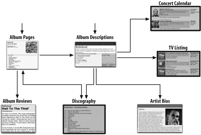
So you’ve identified new content objects, like a discography, that you might need to create. And you’ve linked to other content, like TV listings for televised concerts and events in a concert calendar, that is a logical extension of the content model (and possibly, a connection to candidates for future content models). You’ve also identified logical “tops” or common points of entry to this content. And ultimately, you have a sense of how users might want to navigate an area deep in the guts of your site.
Unfortunately, you’re not quite done. How do these links between content objects get made?
If you’re Amazon, you’ve got reams of usage data to draw from. Amazon employs customer-behavior data to make connections between related products in its content model; familiar examples are the products listed under “Customers who bought this item also bought” and “What do customers ultimately buy after viewing this item?” But not every organization has the traffic volume from which to cull this kind of useful data.
So the rest of us typically rely on metadata as the basis of the logic that connects our content chunks. Shared metadata does the work of linking a pair of content chunks. For example, if we want to link an album page and an album review, the logic might look like this:
IF ALBUM PAGE'S ALBUM NAME = ALBUM REVIEW'S ALBUM NAME
THEN LINK ALBUM PAGE AND ALBUM REVIEW
Now, this rule might suffice for albums with unique titles, like “Sergeant Pepper’s Lonely Hearts Club Band.” But what if the title is the ubiquitous “Greatest Hits”? If you’re lucky, the object has a unique identifier, like an ISBN, that can be used as connecting metadata (many classical albums do have unique IDs; unfortunately, pop albums don’t):
IF ALBUM PAGE'S UNIQUE ID = ALBUM REVIEW'S UNIQUE ID
THEN LINK ALBUM PAGE AND ALBUM REVIEW
But as that’s often not the case, your linking logic will need to get a little more complicated, and additional metadata attributes will be necessary:
IF ALBUM PAGE'S ALBUM NAME = ALBUM REVIEW'S ALBUM NAME
AND ALBUM PAGE'S ARTIST NAME = ALBUM REVIEW'S ARTIST NAME
THEN LINK ALBUM PAGE AND ALBUM REVIEW
As you can see, these rules rely on metadata. Do the required metadata attributes exist? The bad news is that you’ll probably need to invest in creating new metadata from scratch or acquiring it.
Of course, metadata availability is a consideration with just about any information architecture project of any size. And the good news is that the content modeling process will help you decide which metadata attributes to invest in by helping you select the most useful from the wide range of possibilities.
Consider our arrows in Figure 12-22. Which metadata will be necessary to drive the logic behind each link? Make a simple table listing each content object, which other objects it should link to, and the metadata attributes required to make those connections. It might look something like this:
| Content objects... | ...link to other content objects... | ...by leveraging common metadata attributes |
| album page | album review, discography, artist | Album Name, Artist Name, Label, Release Date |
| album review | album page | Album Name, Artist Name, Review Author, Source, Pub Date |
| discography | album review, artist description | Artist Name, Album Name, Release Date |
| artist description | artist bio, discography, concert calendar, TV listing | Artist Name, Desc Author, Desc Date |
| artist bio | artist description | Artist Name, Individual Artist Name |
| concert calendar | artist description | Artist Name, Tour, Venue, Date, Time |
| TV listing | artist description | Artist Name, Channel, Date, Time |
Notice a pattern here? Certain metadata attributes show up more frequently than others. These are the attributes that are most necessary for the content model to succeed. If you’re operating with limited resources (and who isn’t?), now you’ll have an excellent way to prioritize your investment in metadata attributes.
A Valuable Process
As you can see, content models are as much an exercise as a deliverable. While the primary output is a useful IA deliverable that informs the design of contextual navigation deep within a site, the process also generates two invaluable, if secondary, benefits.
First, content modeling forces us to determine which content is most important content to model. As you can see, it’s work—not necessarily terribly difficult, but not trivial. Most likely you can’t create content models for all of your content. So you’ll have to ask yourself: which content fulfills the requirements of homogeneous, high volume, and, most of all, high value? You might find a set of priorities falls out of this exercise; for example, perhaps this year you’ll develop a product-area content model, next year a support-area content model, and later you’ll link those two models together for even greater benefit.
Second, content modeling also forces you to choose which of the many metadata attributes are the ones that will make your content model operational. The combination of focusing on and narrowing down to critical content and critical metadata means a huge simplification and clarification of a large and complex problem space. And that’s what the Pareto Principle, the information architect’s best friend (and commonly referred to as the 80–20 rule), would recommend.
Controlled Vocabularies
There are two primary types of work products associated with the development of controlled vocabularies. First, you’ll need metadata matrixes that facilitate discussion about the prioritization of vocabularies (see Table 12-1 for an example). Second, you’ll need an application that enables you to manage the vocabulary terms and relationships.
| Vocabulary | Description | Examples | Maintenance |
| Subject | Terms that describe networking | Home networking; servers | Difficult |
| Product type | Types of products that 3Com sells | Hubs; modems | Moderate |
| Product name | Names of products that 3Com sells | PC Digital WebCam | Difficult |
| Product brand | Brands of products that 3Com sells | HomeConnect; SuperStack | Easy |
| Technology | Types of technologies associated with products | ISDN; Broadband; Frame relay | Moderate |
| Protocols | Types of standards and protocols associated with products | TCP/IP; Ethernet | Moderate |
| Hardware | Types of devices that products are used in | PDA; Wireless phone; Internet appliances; PC | Moderate |
| Geographic location: region | Name of geographic region | Europe; APR | Easy |
| Geographic location: country | Name of country | Germany; Czech Republic | Easy |
| Language | Name of language | German; Czech | Easy |
| Technology applications | Names of applications for technologies | Call center; e-business | Moderate |
| Industries | Types of industries that 3Com works with | Healthcare; government | Easy |
| Audiences | Kinds of audiences the 3Com site attracts | Consumers; First-time visitors; media | Easy |
| Customer group: workplace | Type of workplace that customers work in | Home; office | Moderate |
| Customer group: business | Size or scale of business that customers work in | Small business; large enterprise; service provider | Moderate |
| Roles | Type of role that people have in their business | IT manager; consultant | Moderate |
| Document type | Purpose of content object | Form; instructions; guide | Easy |
As you can see from Table 12-1, there’s no shortage of possible vocabularies. The information architect’s job is to help define which vocabularies should be developed, considering priorities and time and budget constraints. A metadata matrix can help you to walk clients and colleagues through the difficult decision-making process, weighing the value of each vocabulary to the user experience against the costs of development and administration.
As you shift gears from selecting vocabularies to building them, you’ll need to choose a database solution to manage the terms and term relationships. If you’re creating a sophisticated thesaurus with equivalence, hierarchical, and associative relationships, you should seriously consider investing in thesaurus management software (see Chapter 16 for further discussion). However, if you’re creating a simple vocabulary with only preferred and variant terms, you should be able to manage with just a word processor, spreadsheet program, or basic database package.
When we created a controlled vocabulary to be used by thousands of representatives at AT&T’s inbound call centers, we managed the accepted and variant terms in Microsoft Word (see Table 12-2).
| Unique ID | Accepted term | Product code | Variant terms |
| PS0135 | Access Dialing | PCA358 | 10-288; 10-322; dial around |
| PS0006 | Air Miles | PCS932 | AirMiles |
| PS0151 | XYZ Direct | DCW004 | USADirect; XYZ USA Direct; XYZDirect card |
For this project, we were dealing with 7 distinct vocabularies and around 600 accepted terms.
Products & Services (151 accepted terms)
Partners & Competitors (122 accepted terms)
Plans & Promotions (173 accepted terms)
Geographic Codes (51 accepted terms)
Adjustment Codes (36 accepted terms)
Corporate Terminology (70 accepted terms)
Time Codes (12 accepted terms)
Even given the relatively small size and simplicity of these vocabularies, we found Microsoft Word was barely sufficient for the task. We created one very long document with tables for each vocabulary. This document was “owned” by a single controlled vocabulary manager and shared via our local area network. Our team of indexing specialists was able to search against accepted and variant terms in the “database” using MS Word’s Find capability. And we were able to output tab-delimited files to assist the programmers who were building the site at AT&T.
Design Collaboration
Once you’ve developed blueprints, wireframes, content models, and vocabularies, you’ll find yourself collaborating more with other people involved in developing the site—visual designers, developers, content authors, or managers. You’ll move from capturing and communicating your own design concepts to integrating them with the visions of other members of your team. Naturally, this is as challenging as design gets—everyone wants his own ideas to play a role in the final product, and because the group’s members often come from interdisciplinary backgrounds, there are often competing vocabularies and breakdowns in communication. But if each person goes in with an open mind and good tools for collaborating, this difficult phase is also the most gratifying one, ending with a shared vision that’s far better than anyone was likely to arrive at individually. Design sketches and web prototypes are just two tools for merging differing ideas.
Design Sketches
In the research phase, the design team developed a sense of the desired graphic identity or look and feel. The technical team assessed the information technology infrastructure of the organization and the platform limitations of the intended audiences, and they understood what was possible with respect to features such as dynamic content management and interactivity. And, of course, the architect designed the high-level information structure for the site. Design sketches are a great way to pool the collective knowledge of these three teams in a first attempt at interface design for the top-level pages of the site. This is a wonderful opportunity for interdisciplinary user interface design.
Using the wireframes as a guide, the designer now begins sketching pages of the site on sheets of paper. As the designer sketches each page, questions arise that must be discussed. Here is a sample sketching-session dialog:
Developer: “I like what you’re doing with the layout of the main page, but I’d like to do something more interesting with the navigation system.”
Designer: “Can we implement the navigation system using pull-down menus? Does that make sense architecturally?”
Information Architect: “That might work, but it would be difficult to show context in the hierarchy. How about a tear-away table-of-contents feature? We’ve had pretty good reactions to that type of approach from users in the past.”
Developer: “We can certainly go with that approach from a purely technical perspective. How would a tear-away table of contents look? Can you sketch it for us? I’d like to do a quick-and-dirty prototype.”
As you can see, the design of these sketches requires the involvement of members from each team. It is much cheaper and easier for the group to work with the designer on these rough sketches than to begin with actual HTML pages and finished graphics. These sketches allow rapid iteration and intense collaboration. The final product of a sketching session might look something like Figure 12-23.
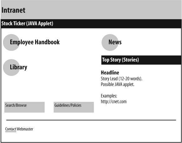
In this example, Employee Handbook, Library, and News are grouped together as the major areas of the web site. Search/Browse and Guidelines/Policies make up the page navigation bar. The News area defines space for a dynamic Java-based news panel. This sketch may not look much different from a wireframe. In fact, the team may have begun with an information architect’s wireframe, then iterated on the design until arriving at this sketch, which in turn may be the basis for a revised and final wireframe.
Starting with a sketch—whether a formal wireframe or something more “back-of-the-napkin”—is critical to the success of interdisciplinary meetings. The sketch provides a common focus for each participant, minimizing the attention paid to the individual personalities around the table. It also makes it more likely that participants will be using the same terminology to discuss the design; shared terms for design concepts often emerge directly from the sketch itself.
Finally, note that design sketches aren’t necessarily “owned” by the information architect. For example, sketches that describe functional requirements may be under the purview of the designer or developer. Be wary of getting caught up in ownership issues; contributing to the design, regardless of who is driving Visio, OmniGraffle, or Illustrator, is far more important to the project’s outcome.
Web-Based Prototypes
For the information architect, a high point of the design process is the creation of web-based prototypes. More than sketches or scenarios, these digital renditions show how the site will look and function. They are concrete and often aesthetically compelling; you can actually see how your work will really come together, and maybe even kick the tires yourself.
While the balance of attention now shifts toward aesthetic considerations such as page layout and graphic identity, the prototypes frequently identify previously unseen problems or opportunities related to the information architecture. Once your architecture and navigation system are embodied in actual web pages, it becomes much easier for you and your colleagues to see whether they are working.
The designer may begin with two concepts based on a single information architecture. After getting feedback from the client, the designer and architect may work together to adapt and extend the preferred concept. At this point, conceptual design officially ends, and production actually begins. The most exciting challenges for the architect have been met, and you now begin the days of detail.
Point-of-Production Information Architecture
Ideally, the production process would proceed smoothly in a paint-by-numbers manner, and the architect could sit back and relax. In reality, you must be actively involved to make sure the architecture is implemented according to plan and to address any problems that arise. After all, no architect can anticipate everything.
Many decisions must be made during production. Are these content chunks small enough that we can group them together on one page, or should they remain on separate pages? Should we add local navigation to this section of the site? Can we shorten the label of this page? Be aware that at this stage, the answers to these questions may impact the burden on the production team as well as the usability of the web site. You need to balance the requests of your client against the sanity of the production team, the budget and timeline, and your vision for the information architecture of the web site.
You shouldn’t need to make major decisions about the architecture during production because hopefully these have already been made. Discovering a major flaw in the architecture at this point is an information architect’s nightmare. Fortunately, if you’ve followed the process of research, strategy, and design, this is unlikely. You have worked hard to define the mission, vision, audiences, and content for the web site. You have documented the decisions made along the way. You have resolved the top-down and bottom-up approaches through content mapping and detailed blueprints. Through careful planning, you’ve created a solid information architecture that should stand the test of time.
Still, it’s worth reminding yourself that an information architecture can never be perfect. Factors of content, users, and context are constantly changing, and the architecture will, too. It’s more important to invest your energy in educating your colleagues that information architecture design is an ongoing process, rather than fighting with them to get it “right.”
Putting It All Together: Information Architecture Style Guides
A web site is always growing and changing. As an information architect, you must help guide its development—even after the site launches—or risk architectural drift. It’s frustrating to see your carefully and flexibly designed organization, navigation, labeling, and indexing systems get mangled as site maintainers add content without heeding the architectural implications. While it may be impossible to completely prevent the effects of entropy, an information architecture style guide can steer content maintainers in the right direction.
An architecture style guide [4] is a document that explains how the site is organized, why it is organized that way, who it’s for, and how the architecture should be extended as the site grows. The guide should begin with documentation of the mission and vision for the site, as it’s important to understand the original goals. Continue with information about the intended audiences. Who was the site designed for? What are their goals? What assumptions were made about their information needs? Then, follow up with a description of the content development policy. What types of content will and won’t be included and why? How often will it be updated? When will it be removed? And who will be responsible for it?
The “Why” Stuff
Documenting the lessons learned and the decisions made during the research, strategy, and design phases is critical. These underlying philosophies not only drive the design and maintenance of the information architecture, they also guide your site through the zigs and zags of major changes that your organization will surely encounter in the future.
For example, your organization may merge with another or spin off a unit. It may offer new products, or try to reach new markets and go global in the process. Major changes like these often coincide with major organizational changes such as new senior managers, many of whom wish to leave their mark in all areas, including the site’s design. But do new requirements and major changes to the organization require major changes to the site’s information architecture? Ideally, not; a clearly documented rationale serves to explain an information architecture and demonstrate its flexibility, thereby mitigating against the extremes that plague so many redesigns.
Perhaps the biggest “why” you’ll encounter is the one that comes so often from senior vice presidents, marketing managers, and product managers, which, in effect, boils down to: “why can’t my favorite feature/my department’s content be made more prominent/become your highest priority?” An information architecture style guide provides you with concrete documentation to help you prioritize the many such requests you’ll likely encounter. It’ll even provide you with cover when you absolutely have to say no.
The “How” Stuff
Your style guide should include some basic nuts-and-bolts components to help various people maintain the site. Consider including such sections as:
- Standards
There are usually at least a few rules that must be followed while maintaining and changing the site. For example, newly-created documents must be indexed with terms from the appropriate controlled vocabulary before they are published to the site. Or there may be specific procedures that must be followed to ensure that new content is immediately spidered and indexed by the site’s search system. Here’s the place to note the rules...
- Guidelines
...and distinguish the rules from the guidelines, which suggest—but don’t mandate—how the information architecture should be maintained. These may be drawn from information architecture best practices,[5] and often require interpretation for each situation in which you’ll find yourself; examples include advice on how to avoid overly long lists of links and page-titling recommendations.
- Maintenance procedures
Regular tasks that are required for the site’s survival should be fully documented, such as when and how to add new terms to a controlled vocabulary.
- Pattern library
Consider creating a pattern library[6] that documents and provides access to reusable aspects of your site’s design—such as a navigation widget that helps users scroll through pages of results—to cut down on reinventing the wheel.
Your style guide should also present both the blueprints, wireframes, controlled vocabulary information, and other documentation that came from the design process and will be reused throughout the site’s lifetime. Since you won’t always be there to explain these deliverables, it may be necessary to provide written explanations to accompany the blueprints. You also need to create guidelines for adding content to ensure the continued integrity of the organization, labeling, navigation, and indexing systems. This can be a challenge. When should a new level in the hierarchy be added? Under what conditions can new indexing terms be introduced? How should local navigation systems be extended as the web site grows? By thinking ahead and documenting decisions, you can provide much-needed guidance—a user’s manual, really—to the site maintainers.
Keep in mind the different audiences that might use the style guide. For example, in a large organization, content authors working from far-flung parts of the globe may not need to know the site’s overall strategy so much as the maximum number of characters they should use for a document title. Interaction designers may need to understand the rules that guide construction of the ALT tags that a navigation system’s mouse-overs rely upon. Consider an information architecture style guide as a sort of “how and why” document that should be designed for use, just like any other information system. And remember that your organization may already have a style guide for its branding, its content, and other aspects of its online presence; when possible, integrate information architecture guidelines into existing style guides.
[1] It’s worth noting that, while standards for deliverables haven’t emerged, the diagrams themselves are maturing. The fall of 2006 saw the publication of Communicating Design: Developing Web Site Documentation for Design and Planning (New Riders), a book focused solely on deliverables, by Dan Brown, an information architect whose work is highly respected by many practitioners.
[3] We suggest reading Jeff Veen’s short and excellent take on content inventories, “Doing a Content Inventory (Or, A Mind-Numbingly Detailed Odyssey Through Your Web Site)” (http://www.adaptivepath.com/publications/essays/archives/000040.php).
[4] For an excellent example of a general style guide that includes information architecture and other areas, see the “Best Practices for PBS Member Stations” design guidelines, developed with assistance from Adaptive Path: http://www.pbs.org/remotecontrol/bestpractices.
[5] For a few examples of IA heuristics, visit the following links: Lou Rosenfeld’s “IA heuristics” at http://www.louisrosenfeld.com/home/bloug_archive/000286.html, Lou Rosenfeld’s “IA heuristics for search systems” at http://louisrosenfeld.com/home/bloug_archive/000290.html, and James Robertson/StepTwo’s “Intranet Review Toolkit” at http://www.intranetreviewtoolkit.org.
[6] To learn how Yahoo! developed its excellent library, read “Implementing a Pattern Library in the Real World: A Yahoo! Case Study,” by Erin Malone, Matt Leacock, and Chanel Wheeler (Boxes & Arrows, April 29, 2005): http://www.boxesandarrows.com/view/implementing_a_pattern_library_in_the_real_world_a_yahoo_case_study.