When thinking about usability and graphic design on any device, it’s worth considering the needs and wants of the users, the speed of on-screen responses, the advantages of simplicity and the nature of the medium.
Viewers tend to interact with their television in well-established ways. The set is viewed from a distance and controlled with a remote. Different programmes are watched with varying levels of involvement. Most activity is focused on entertainment and information.
Television screens display graphics and text differently from computer monitors. Material needs to be designed specifically for the television screen in order to look good.
It’sachallengetogetpeopletotakepartinnewandunusualbehaviours–like using the remote control to buy pizza, or taking part in a programme rather than sitting back couch-potato style. To succeed, just like normal television programmes, interactive television applications need to offer viewers something they want or need in a way that keeps their attention. This chapter focuses on two key factors that help shape viewers’ experience of interactive television services: the usability and the graphic design.
Usability is about whether it’s easy to use a device or interface for the intended purpose. An application with great usability works well, is understandable and leaves a sense of satisfaction. This requires an appreciation of the different types of viewers that are likely to use the service, what they want, how they live their lives and what will be easy for them to understand on-screen.
Graphic and interface design, for the purpose of this chapter, is about creating meanings beyond the basic functionality by manipulating the style of the graphics. A great graphic design helps make a service emotionally engaging and aesthetically pleasing, helps signal how an application should be used, and helps boosts viewers’ enjoyment. Think about the different reactions viewers would have to the same application designed in the style of a Japanese comic book, compared to the style of one of the early bank cash machines or the style of a kindergarten classroom. Each graphic design style would result in a completely different experience.
Usability and graphic design are symbiotic. An interactive television service designed purely for usability may allow viewers to perform tasks, but risks leaving them feeling disconnected, uninvolved and without a sense of allegiance. A service built only with graphic design in mind may look fantastic but be difficult and frustrating to use. The two must work together, not against each other.
How do you get the right mix? You wheedle your way inside viewers’ heads – and stare right back out at the television set. This involves the application of common sense, experience, observation, technical knowledge and research. This chapter cherry-picks a little bit from each of these: first by looking at fundamental usability and design considerations for all devices, then by examining the experience of watching and using a television, and finally by suggesting a practical checklist for producing graphics that will work well on television screens.
Fundamentals of Usability and Design
There are some fundamental principles of usability and graphic design that apply to all devices, whether television, mobile phone or personal computer – any medium where human beings interact with a machine. These are well worth considering during interactive television production.
Users
Most successful user-interface designs have a common thread: they are built, as much as possible, with reference to users’ needs and wants. For example, to help get the Palm Pilot personal organiser right, the inventor walked around for weeks with a small block of wood and a chopstick, pretending to enter information. Although the Palm Pilot wasn’t the first hand-held computer, it was one of the first really successful ones. It succeeded where others had failed because the inventor’s research helped focus the specification and design towards the activities people actually wanted to perform – like looking up addresses and noting down phone messages.
There are tools and techniques that can be used to help observe and learn from users or to put yourself in their shoes. Some are informal and subjective; some are more formal and scientific – some are expensive to employ, others simply involve grabbing someone who happens to walk past your desk. Some common usability testing tools and techniques are described in Table 5.1 and in the case studies at the end of this chapter from Serco Usability Services and BBC Research and Development.
Table 5.1 :Some overlapping examples of usability research tools and techniques
Tool |
Explanation |
Card sorting |
Can be used to help understand how viewers structure a topic or issue in their minds. Users categorise words or concepts written on cards. Results can be fed into the navigation design of a service and the requirements. |
Paper prototyping |
Quick and easy sketches of aspects of an application, aimed at helping clarify requirements and at highlighting issues. |
Heuristic evaluation |
Evaluating a service based on a specific set of principles (a technique known as expert evaluation is similar but more open-ended). |
Walkthroughs |
Predicting and testing the usability of a service by working through the experience of using it (asking what actions users would expect to take at various points, for example). It’s very useful to watch videos of users doing walkthroughs. |
Think aloud techniques |
Users say what comes to mind during testing. |
Journal studies |
Asking users to keep journals of their daily experiences and use of a particular service. |
Button hit records |
Recording the number of button presses users take to perform particular tasks. |
User surveys and checklists |
Questions or items on particular issues or aspects of the design and navigation. |
Contextual research and ethnographic research |
Observing user behaviour in real-world contexts. |
Eye tracking studies |
Actually following how people’s eyes move across the screen. |
Scenario analysis |
Examining how users perform different tasks in specific contexts and circumstances. |
A production approach called user-centred design actively engages the target users in the production and design process. It involves asking questions, observing, testing and developing iteratively, building a product based on people’s feedback, as well as producers’ insights. The user-centred design methodology recognises that even the most visionary and brilliant producer of interactive systems will benefit from understanding that little bit more about the users he or she is trying to target.
Speed of Response
There’s a classic piece of user research from the late 1960s, which is still relevant today. Robert Miller looked at the effects on users of different response times with computer systems (response time being the time it takes for the desired result to happen after the user has pressed a button or key). He found that, on average, there needs to be:
Less than about a 0.1-second response time, for users to feel that the system is reacting instantaneously and to feel that they are directly manipulating events.
Less than about a one-second response time, for users’ thought processes to remain uninterrupted. That is, the delay will be noticed but will not interfere with the feeling of working directly on the system.
Less than about a ten-second response time, for the users to keep their attention on what is taking place. Anything longer and users are likely to do something else while they wait.
Response times are particularly relevant to interactive television, because screens often have to be downloaded or processed by the set-top box, and viewers have to wait for them to appear on-screen. Ideally, these response times should be kept to less than one second. Interactive television producers are in a position to reduce the response time of applications they are building by finding ways of reducing, among other things, the complexity of graphics and the amount of information that needs to be processed. Alternatively, content (an egg-timer graphic, for example) can be put on-screen to maintain or divert viewers’ interest during the wait (see the remote control section later in this chapter) or the service can include a picture-in-picture television channel, so people can watch this.
Response times over ten seconds are particularly dangerous in a television environment, because there are so many other attractions that could draw the viewer away – such as the pleasures of switching channel. Only the most compelling and valuable information will survive a response time greater than ten seconds.
Simplicity
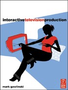
Whatever the device, the simpler it is to use, the more people are likely to use it – as long as it still fulfils the core user needs. You don’t have to look far for evidence of this. Video Plus sold millions, because video recorders were far too complicated to understand. The early success of the Apple Macintosh was partly due to the graphical user-interface, which was much easier to understand than command-based interfaces. The internet search engine Google has become a multi-million pound operation, by offering a fast-download front page, simple interface and effective responses to user requests. With all these examples of simplicity, users can get what they want, quickly, easily and without having to make cognitive leaps to decipher the interface.
5.1 Keeping it simple. © Fish4Homes; © Open TV; Courtesy of the BBC: images supplied by kind permission BBC/BBC Worldwide, Tweenies © BBC 1998 © BBC Worldwide 2003. Tweenies is a Tell Production for BBC Television. Bill and Ben logo and characters are trademarks of the British Broadcasting Corporation/Ben Productions LLC and are used under licence by BBC Worldwide Ltd. Bill and Ben logo and characters © BBC Worldwide Ltd/Ben Productions LLC 2000.
The need for simplicity is doubly the case with interactive television. The control of television is an eminently straightforward experience already – and viewers seem to like it that way. Most people use just a few buttons on the remote – channel up and down, volume up and down, and the number keys. These always work as expected and aren’t difficult to become familiar with. Similarly, television programmes tend to use on-screen graphics that are big, bold and to the point. And when voice-overs or on-screen presenters are used, they tend to speak clearly and keep the messages simple.
The challenge for interactive television is to work within this environment, where simplicity is the norm and where new ways of doing things may even be feared. A study from the United Kingdom Independent Television Commission in 2001 found that people see interactive television as more complex than computers and video recorders – even if, in reality, this is far from the case.
One good way to keep an interactive television application simple is to avoid extra features that the majority of people don’t necessarily want or need. Consider what the core functionality is and make sure it is consistently presented and available throughout the application. Also, spend time thinking about how to help make that functionality as easy as possible to use. If advanced functionality for a minority of users needs to be included, it’s worth finding ways of presenting it so that it doesn’t get in the way of the core purpose of the application.
The Medium is the Message
The information in this book is presented in a certain way, to make the best use of a paper-based medium. It is broken down into chapters, there are long blocks of text that readers can digest at their own pace and there are lots of nice colour pictures. By building on the strengths of the delivery medium like this, it’s possible to create an experience that is as engaging and as useful as possible.
To work well on a computer, Interactive Television Production would be delivered in a completely different way. The text would need to be broken into smaller chunks, to make it easier to read on a computer monitor. The illustrations would be a lower resolution, to make file transfer faster. And there could be on-demand interactivity, such as quizzes. To work well on a mobile phone, most of the content would probably need to be dropped. Reading lots of information on a small mobile-phone screen is tedious in the extreme. Interactive Television Production on a mobile phone might work best by concentrating on quick-access but useful interactive television production tips, perhaps sent to the phone each time the user arrives at the office in the morning.
Similarly, a service that has been designed for one medium then transferred directly to another is unlikely to be very successful. As discussed in Chapter 1, web sites that get plonked, unchanged, onto television screens are usually unmitigated disasters. They are strange and difficult to use on a television set. Most interactive television applications should be designed with the television experience in mind, not just moved across, unchanged, from other media.
Usability and Design Across Media and Platforms
Some producers work across a number of media and try to design services that make the most of the different features of each one. For example, Channel 4’s Big Brother 2001 and 2002 used television for its video highlights programme; a channel switching enhanced television application, so viewers could monitor the goings on for most of the day and get information on demand; the web for in-depth news and games; and mobile phones for quick updates. Viewers could switch between the media, depending on what they wanted. For more on the use of multiple media channels with interactive television, see Chapter 3. There’s also a case study on the production process for Big Brother at the end of Chapter 4.
The Television Experience
The television experience is very different from reading a book, sending a message on a mobile phone, or using a personal computer. Television itself necessarily affects the way interactive television services are designed. Unfortunately (or perhaps fortunately), there has not yet been a great deal of research carried out to determine the best way to design for interactive television. Current practices are often a mixture of opinion plus trial and error. The following are factors that are worth bearing in mind during design – not hard and fast rules.
Lean Forward Versus Lean Back
One distinction that is often referred to in relation to interactive television is between lean forward and lean back. Personal computers are thought to be lean-forward devices, because users sit near the screen and lean forward to actively engage in what they are doing. Television is thought to be lean back, because viewers sit back on the sofa to watch programmes – and expect everything to be delivered to them.
The premise is that people are in very different modes when leaning forward and leaning back, and that it is very difficult to persuade television viewers to sit up and lean forward to actively ‘use’ television. If any interactivity works at all, it will be interactivity that fits in with a very passive lean-back style.
It is the case that television is often less cognitively and physically demanding than using a personal computer or reading a newspaper. Televisions are frequently left on in the background, as just one of the many activities people are engaged in (vacuuming, reading, vigorous love-making and so on), and television is often used while viewers are in a very relaxed mode. Consequently, interactive television producers do need to recognise that it may well be more difficult to persuade television viewers to interact than it would be to persuade personal computer users. Nevertheless, the lean-forward, lean-back concept is, perhaps, an oversimplification. People already lean back and forward when watching regular television. Sports events and quiz shows, for example, are often far from lean-back experiences – with viewers shouting out comments or arguing with the rest of the family. And console games on television are played actively rather than merely watched. Furthermore, United Kingdom and European viewers are familiar with switching instantly into a lean-forward information-retrieval mode when they use analogue teletext.
5.2 Television viewing is often a group activity. Courtesy of Telewest Broadband.
What this means for producers of interactive television applications is that the level of cognitive and physical activity that can be expected from viewers is likely to be dependent on the type of content on offer and the mode the viewer is in. ‘Generalisation of mood experience when describing television consumption can be misleading’, says Andrew Lowe, managing director of interactive television strategy company EnhanceTV. ‘It is better to describe the lean-back and lean-forward postures around types of programming or activities, as opposed to a way that describes our posture for a particular content delivery mechanism.’ For example, a viewer absorbed in a romantic movie is only likely to be prepared to engage in enhanced television interactivity that has a very low level of cognitive and physical effort, at least until the end of the show, and the reward on offer for interacting would probably need to be very high. Conversely, a viewer watching a quiz show may well be prepared to pick up the remote and get stuck in to the enhanced television, without needing too much persuasion at all.
Within interactive applications themselves, different types of content are also likely to be used in different ways. Viewers can reasonably be expected to proactively engage with a game, for example, but may only have a fleeting interest in a shopping or information application. Time should be spent working out how the usability and graphic design will tie in with the content and objectives of a given application.
Distance from Screen
The distance between television viewers’ faces and the television screen is typically 2–3.5 metres (children tend to sit the closest). This means that television screens generally take up much less area on the retina than personal computer monitors, which are viewed from less than a metre away. Activities in the rest of the room will easily distract television viewers and content on-screen will have to work harder to get attention, compared to content on a personal computer monitor. There are several tricks that can be used to sustain viewers’ attention. These include:
Using colour, sound, high-impact images and movement to attract and keep the viewers’ attention – without getting in the way of the key functionality. Sound, in particular, can add tremendous impact to the interactive television experience.
Making sure the screen is not cluttered. There should be one area of focus and/or a clear order for the viewers’ eyes to follow. The number of elements on-screen should be kept to a minimum. Some producers try to have less than seven different elements on-screen at any time.
Fonts and graphics should be clear and large. See the design checklist, later in this chapter.
Written material should be broken up into small and easily digestible chunks, with plenty of spacing between lines of text.
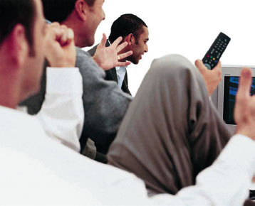
5.3 Text is easier to read from a distance if it is broken up into small chunks. © ITN.
Remote Control
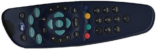
Remotes control television; hence, interactive television applications need to be designed with the remote control in mind, not a mouse or joystick.
Navigation
Many television viewers will not have any understanding of the remote control beyond what the channel up and down and the number buttons generally do. It is illuminating (and to be recommended) to watch the subjects of user tests struggling with even the simplest interactive applications – unable, for example, to make the connection between arrow keys on the remote control and the movement of a selector box on-screen.
5.4

5.5
To work well, interactive television navigation should pass the ‘intra-ocular trauma test’ – that is, it needs to be so obvious that it hits viewers right between the eyes. There are a number of ways of ensuring this happens:
If there is an on-screen selector that viewers need to move around, it should be very prominent – perhaps it changes the colour and size of the selected element compared with the rest of the screen.
Short text instructions can be put on the screen, explaining what the viewers need to do. (Don’t expect viewers to navigate to a help section to find out this kind of information. They may not know how to select help unless that too is explained on-screen. And most people never make the effort to read help sections anyway – even if they need to.)
Important parts of the on-screen navigation design should be logically positioned (in terms of the likely movement of the viewers’ eyes across the page). For example, many applications use on-screen arrows to help viewers understand that they need to press an arrow key on the remote to get more information on-screen. If the arrows are not positioned near the part of the screen the viewer will be looking at, just before they need to press the arrow key, they are less likely to make the cognitive link between the on-screen arrow and the fact that it will help them get more information.
5.6 A purple on-screen selector. Courtesy of Carlton Active.
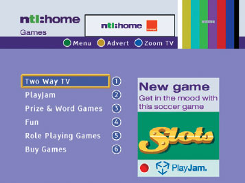
5.7 A yellow box selector. © NTL.
Abstract icons should be avoided. For example, viewers may not be able to interpret that a hand with a pointing finger means they should press an arrow on the remote for more information. It will help viewers make the connection between the screen and the remote control if on-screen icons mimic the designs and buttons used on the remote.
Navigation using number keys can work well. Viewers press a number to go to a particular option. The model is familiar to people from television channel changing and analogue teletext. Ideally, the numbers on-screen should look very similar to the number buttons on the remote control, so that viewers can immediately make the connection between the two.
Minimise the number of key presses required. Using a remote control for selection can be a reasonably strenuous activity (relative to using a mouse for pointing and clicking). ‘Instead of being a single action, pointing turns into a sequence of actions that have to be planned and monitored with a much larger degree of cognitive load than when using a mouse,’ said Jakob Nielsen in one of the first studies of WebTV usability (in 1997).
Anticipate the viewer’s next selection when they are navigating between pages and pre-set the selector box or highlighter in that position for them.
The range of finger movement required between different keys on the remote control should be limited, as should the number of keys in use. The more remote control keys that viewers are required to use, the more they will have to look away from the screen to check the remote and the more effort it will take. ‘We try to minimise the number of different keys used in navigation and stick to arrows and the select button,’ says Matthew Stratfold, manager of enhanced television at digital cable operator NTL. ‘In an ideal world, I’d even like to stop using the coloured keys as well, as the viewers have to keep looking back at the remote to use these, which can be time-consuming and annoying.’
Remote controls can make it difficult for viewers to operate scrolling pages. Some viewers may also find this computer-based concept confusing. Pages that appear in series, one after the other, are likely to be more familiar to viewers, as this is the style of graphic presentation used in television programmes.
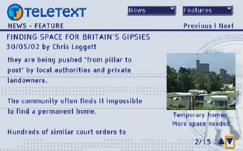
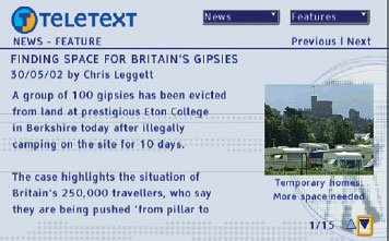
5.9 The second paragraph of the news story on the second screen. The whole page is updated for each section and there is no scrolling. © Teletext Ltd.
Avoid personal computer or internet navigation devices, like drop-down menus, which viewers may not have encountered before and therefore will take more time to understand.
Avoid having too many planes of navigation (for example, just up/down navigation options are likely to be easier to understand than on-screen options that require movement of the selector up/down, left/right and the pressing of various coloured fast-text keys on the remote).
Text Input
Inputting text is tedious with a remote control. Although some platforms provide keyboards, these usually get to just a small percentage of customers – and, even if every viewer has one, there’s no reason to assume they will want to use them. Would you enjoy juggling with a full size keyboard and your TV dinner?
Text input using a remote control, rather than a keyboard, is possible using letters etched onto the remote next to the number keys, in the style of a mobile phone, or using mini-keyboards that appear on-screen, in the style of arcade machines. Both are time-consuming and annoying. An interactive television application that requires lots of text input (a full name and address, for example) may find that the only people to use it are teenagers, who, from constant phone texting, seem to have the muscular thumbs suitable for marathon text sessions. If you absolutely have to get someone’s address, it’s best to ask only for the postcode, then look up the full address on a database. Then, even better, get the system to remember the full address for the next time the viewer uses the service.
Remote controls are used at some distance from the television. Therefore, it’s helpful if there is some confirmation that instructions from the viewer are being received and understood. Ideally, there should be some kind of on-screen or other feedback (such as a click sound) within 0.1 seconds of buttons being pressed on the remote control, even if the main response to the key press is going to take a little longer. For example, if the viewer presses OK to select something on-screen and the next screen is going to take a second or two to appear, it’s worth considering making the selector box flash once in response to the OK press. This should help the viewer understand that the selection has been registered – rather than risk them pressing the button again during the delay.
If there is likely to be a significant delay in the response following a viewer action (anything much more than one second), this should certainly be signalled back to the viewer, for example, by putting a message on-screen that says, ‘Retrieving information now … please wait.’ If there is absolutely no way of getting the delay below ten seconds, then it’s worth considering putting something on-screen that will both distract and give an indication of the time left – perhaps an animated clock, a percentage figure counting up or designing the service so a television channel’s video and audio are constantly available to provide some level of entertainment during waiting periods.
5.10 Viewers can press the red button if they get lost on the service. © NTL.
It is sometimes tempting to implement a repeat function on remote control keys. With this, an action will be performed many times if a key is held down. This can help viewers perform some tasks faster. However, repeat keys can be risky with interactive television, since some viewers will not be familiar with the idea that holding keys down means the function will be repeated. If it is used, the repeat should take a little while to kick in and should repeat slowly. A fast repeat function combined with lack of on-screen signals for delayed responses can be a deadly combination – since viewers will hold keys down if it doesn’t look as if they are working. If key presses are still being registered while screens are updating, this could cause all sorts of mayhem.
Finally, when creating a navigation design, it’s worth considering providing an escape route if viewers get lost, bored or press the wrong button. This should be a button or option that will quickly take them back to somewhere they know – such as the main menu. A back button on the remote control can work well for this – but it needs to be implemented consistently across the platform, so that viewers learn that they can always press it repeatedly to back-track through what they’ve been doing.
Navigational Consistency Across Applications
In an ideal world, all interactive applications would use the same navigation model. Viewers would then not have to go through a learning process every time they use a new interactive television service. Part of the success of analogue teletext is due to the fact that services all work in the same way – using a page number look-up system and hierarchical menus.
Unfortunately, in the United Kingdom, although several industry bodies have tried, there’s very little agreement on what a consistent navigation model for interactive television should be. Each producer seems to think that his or her model is best. And interactive television applications are so varied, it’s difficult to come up with workable generic rules.
One practical tip: design your interactive television applications to mimic the navigation system used by the platform operator on the electronic programme guide. Viewers are likely to be familiar with this.
Viewer Expectations
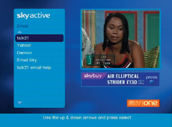
Television viewers have certain expectations about what a television is used for and how things should work on it. The Henley Centre, Planning for Consumer Change study (2000), looked at how consumers view different devices. The research showed that television is viewed primarily as a source of entertainment and information, while the internet is viewed more as a tool for communication. This is perhaps partly due to television’s history of being used in the living room, for relaxation and family activities, and the internet’s history of being used at the office and for email. It’s probably easier then for interactive television services to be designed to build on these existing expectations than fight against them. And there’s some evidence of this being the case: games are one of the most popular applications on United Kingdom interactive television platforms, while email hasn’t taken off. Similarly, some standalone interactive shopping services are struggling – perhaps because the weekly shopping task is not associated with television at all.
Furthermore, as discussed in Chapter 3, new interactive services may be easier for viewers to understand and use, and therefore be more popular, if there is a frame of reference from the viewers’ previous experience with television. Digital text services in the United Kingdom and Europe have the advantage of building upon existing viewer expectations of analogue teletext. Video-on-demand and personal video recorders have the advantage of building on video cassette expectations. Interactive shopping services linked to television channels, like QVC (as opposed to standalone shopping services that are not linked to television channels), have the advantage of tying in with an existing activity – that of watching a channel for information then buying products that look interesting.

5.11 Share of mind for different media. Source: Planning for Consumer Change, The Henley Centre (2000).
This is not to say that out and out revolution isn’t possible with television, but when thinking about the usability and graphic design of an application, it is worth considering whether evolution is the easier route to take – by thinking about what viewers already know, then building on that.
5.12 This application builds on the existing television experience. © NTL.
Viewer Demographics
Television is used by a huge percentage of the population – many more people than use computers or mobile phones. This means the potential market for interactive television includes a wide variety of different people. To avoid excluding potential viewers, the design of most interactive television applications should take into account the variety of needs and abilities of an audience that could include senior citizens, children, the visually impaired, and so on.
One way of doing this is to offer viewers a choice at the beginning – for example, ‘If you want the easy-access service, press 1, if you want advanced functions, press 2.’ It also helps to choose interface styles that most people can relate to and use writing styles that everyone can understand. There’s not much point putting a message on-screen that says ‘Error #4309303 HTTP’, if you want to appeal to a broad market.
Even so, it is always worth bearing in mind that however useful interactive television becomes, some viewer groups may never be persuaded to use it at all. Also, applications aimed at particular niche audiences may not need to care too much about using language, designs or navigation models that exclude those outside their target group. They can be designed with that audience in mind. A pop music service, for example, is likely to want to use design styles that appeal to teenagers and will not worry too much about alienating those over the age of 40.
There’s one view on the different ways interactive television viewers can be categorised in the case study from Netpoll at the end of this chapter.
The Social Context
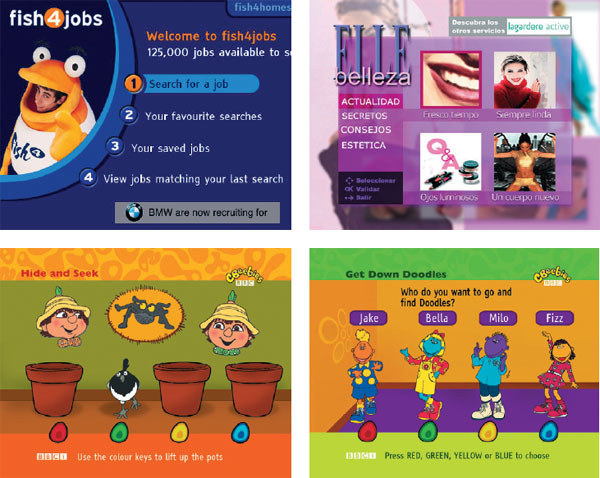
According to Statistical Research Inc (2000), 60 per cent of living room television viewing happens in a group. And it’s the living room where most televisions with digital interactive services are located (the older analogue sets, without interactivity, tend to get relegated to bedrooms and studies). Therefore, interactive television applications intended for use during group-viewing times should take this into account.
One way of building interactive applications that work in a social context is to make sure viewers can get what they need quickly and easily – during advertising breaks, between programmes and during boring bits. The Henley Centre (in 2001) found that 25 per cent of the users of Sky’s interactive service went there during television advertising. Enabling quick access means that the interactivity is less likely to annoy the rest of the people watching.
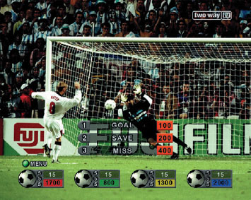
5.13 Semi-transparent graphics overlaid onto video pictures are less likely to get in the way of the programme itself. Courtesy Two Way TV.
Another route is to make the interactivity work in such a way that it doesn’t interfere with the video programming. This is the main thrust of enhanced television. The less the interactivity gets in the way of the enjoyment of others in the room the better. This can be done by:
Overlaying information on the video channel using semi-transparent graphics, rather than solid graphics.
Using inserts, rather than taking up the whole screen. For example, if an enhanced television application has a function to allow viewers to select a camera that follows a particular sportsperson, this may be better done as a video insert into the main picture rather than taking up the whole screen, so other viewers don’t risk missing the main action.
Always keeping a television channel on-screen, even when the viewer is using unrelated interactive content (this is usually achieved by running the TV channel in a picture-in-picture window).
Providing multiple remote controls and designing the application so lots of people can use it at once. Two Way TV and Sky Digital sell multiple remote controls, so the whole family can play along with enhanced television games.
5.14 This service can be used while watching television in a picture-in-picture window. © BSkyB.
In this same vein, there are some interesting possibilities around providing interactive functionality to accompany the radio stations and audio streams that are available on digital television platforms (these are designed to be played via the television or using a stereo connected to the set-top box). Viewers tend to use these as background noise while they do something else, and the television interactivity can be designed to complement this fact. Music Choice in the UK already provides an interactive application that allows easy switching between its audio streams. Several UK radio stations are also looking at how interactive content can be used to support their output on digital television.
Time of Day
Television tends to be watched by more people in the evening. Therefore, unless specifically pitched at the kind of people that use television during the day, interactive applications will tend to get more usage in the evenings too. This means that it’s worth thinking about providing the best standard of interactive television service (for example, more updates and the biggest customer service team) during the evenings, at peak television viewing times – not during office hours.
Furthermore, in the morning and afternoon, television is more likely to be on while viewers are doing other things. To get round this, television programme makers will often try to structure programmes in such a way that dipping in and out is easy and enjoyable. Niche television channels use the same tricks – they are happy if they get a few minutes of people’s viewing time per week. Next time you see a specialist news channel, watch how often graphics come up explaining who is speaking – even if the person had been identified two minutes before. This is done because it’s difficult to know when viewers have switched on or started paying attention. You may also notice that morning magazine-style programmes often have much snappier items than the evening magazine-style programmes, and morning and daytime soaps have stories that are easy to pick up without viewers having to have watched the rest of the programme or series.
Interactive television applications can benefit from the same approach. To get viewers to use the service in the mornings and daytime, it can be worth thinking about the kind of interactive content that will provide satisfaction quickly. For example, an interactive television games service could consider running shorter games or ones that can be dipped in and out of during the day. An interactive television news service could promote quick updates and weather in the mornings – and promote more in-depth material at night. It may even be worth changing designs to reflect the different states of mind of people in the morning and the evening – in the same way that late-morning television chat shows are often very different in design to evening ones.

5.15 ITN News Channel iTV service usage figures across the day.
As well as considering the television experience, the graphics themselves for interactive television services need to be adjusted to work on the television set – otherwise they can look really bad.
Set-top boxes and middleware systems make some adjustments to graphics and text. Unfortunately, these automatic processes can’t deal with every kind of problem, so it’s better to get screens looking right before they are sent to the set-top box for processing (doing this will help the application run faster too). Also, some viewers connect their televisions to the set-top box using poor-quality RF connections, rather than the better-quality connections like SCART and S-Video. This can exacerbate problems with interactive television graphics.
The following is a checklist for producing graphics that will work well on television screens.
Design for the Television Screen, not the Computer Monitor
Canvas
So, you’re sitting down in front of Photoshop ready to design your interactive television application. What size should your design be? It depends. A regular television screen has a 4:3 aspect ratio. The picture is built up with horizontal lines scanning across the screen – 625 lines with the United Kingdom and European PAL television system and 525 lines with the American NTSC-M system. Some lines are used for carrying signal synchronisation and other information, rather than picture information – see Chapter 2. Interactive television services are left with an available screen size of around 720 × 576 pixels for PAL and 640 × 480 pixels for NTSC-M televisions.
This is approximate, because different set-top boxes sometimes use different screen sizes.
Safe Area
Unfortunately, every television model is built slightly differently and some show more of the available picture area than others. Therefore, any important information needs to be shown away from the edges of the screen, to avoid disappearing completely on some televisions – in part of the picture known as the safe area. A background image can take up the whole screen, but any text or important graphics should be within the safe area. There’s some debate about what this safe area is, but most broadcasters advise keeping important information within an area around 20 per cent smaller than the full screen – that’s 10 per cent off each edge – although it might be possible to get away with a bit less if you don’t mind cutting off the edges of your graphics and text on some televisions.
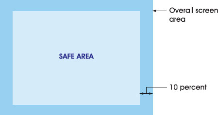
5.16 The television safe area, 20 per cent smaller than the active picture area.
Some middleware systems and platforms will set a specific screen size and force information into this area. Designs that are too big will be squeezed into this. They do this to make sure information is inside their view of what the safe area should be. Some platform operators also include their own navigation or other elements within the screen area, which will restrict the available space still further. Check with the platform operator for the exact available screen dimensions and the recommended safe area.
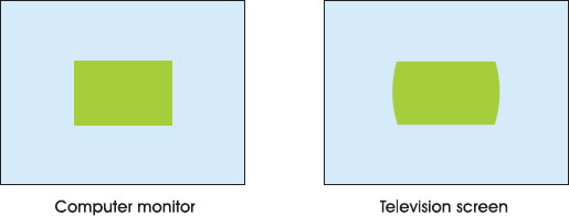
Pixel Shape
If the interactive television design is being carried out on a personal computer monitor, bear in mind that personal computer monitors have square pixels, while televisions have pixels that are slightly rectangular. This means that shapes designed on a personal computer monitor will look a little wider when finally displayed on television – a circle will become an oval. To get round this, graphic work in progress should be viewed on a television screen not a personal computer monitor. Or, failing that, the graphics should be squeezed a little on the horizontal axis before being sent to a set-top box (UK cable operator NTL recommends, for their platform, re-sizing to 94 per cent of the original width, after designs are finished on a personal computer monitor).
Additionally, it’s worth taking into account the fact that interactive television applications designed for 4:3 may be stretched further if they are viewed on widescreen (16:9) televisions – making the fonts and graphics appear fatter than they would on a 4:3 television. To get round this, some interactive television producers design their graphics and fonts in such a way that they look okay both on 4:3 and 16:9 – a compromise position.
Avoid Detail
The available television screen size in pixels doesn’t give a wholly accurate portrayal of the screen resolution. This is because television pictures are built using two interlaced fields (see Chapter 2). The effect this has is that images on television appear softer than they would on a personal computer monitor, because only half of the image is being updated with each pass of the electron beam. There’s no point using images with fine details then, as these will blur and television viewers won’t be able to see them properly.
Interlacing also means that any very thin horizontal lines are likely to flicker, as they will only be updated with every other pass. Middleware systems and televisions will often have some kind of filter to minimise this effect, although it’s still worth avoiding anyway.
Finally, some detailed designs can cause unwanted movement and shifts on-screen known as moiré patterns (one version of this is the effect seen on-screen when someone is wearing a checked shirt). To avoid this, don’t use patterns made up of lots of thin lines of light and dark next to each other.
Avoid Highly Saturated and Very Bright Colours
Saturation
Colours that are highly saturated (very rich and intense) don’t work well next to each other on television. The television set can’t always keep up with the transition between the two, and blurring or crawling occurs at the edges. There isn’t usually a problem in the middle of areas of colour, just at the edges.

5.17 Very highly saturated colours can bleed into each other.
The saturation level of graphics and text should ideally be dropped to less than 80 per cent. Red and yellow tend to be the worst offenders. Pastel colours work well on television, as do blues.
Brightness
Very bright (high in luminance) colours don’t look great on television – particularly if used as backgrounds. Pure white is the worst offender. This is because pure white is made by turning up the red, green and blue cathode rays to full blast. The intensity of electrons upsets the electrical balance of the screen and makes the beams go wide of the intended targets – creating wavy effects or curving, known as bloom, around the sides of the screen or around the edges of bright text or graphics. To deal with this cut down brightness levels below 90 per cent.
Television Colour Terminology
Colour on television is a complicated area, touching on biology, psychology, technology and aesthetics. Here’s a ten-second summary of the terminology:
Hue: the colour itself, expressed as the proportion of red, green and blue.
Saturation: the intensity and richness of the colour. The more a colour is diluted with white, the less saturated it becomes (pink is a de-saturated red).
Luminance: the brightness of the image; the brighter the image, the more intense the electron beams will be.
Chrominance: a combination of hue and saturation.
5.18 Very bright colours can cause bloom.
There can also be problems when there are different colours next to each other with very similar brightness levels. As with the bleeding caused by transitions between highly saturated colours, televisions have trouble keeping up with rapid changes between different colours with similar brightness levels. The end result is blurring between the two. The best way around this is to make sure colours next to each other have different brightness levels.
Note that the NTSC-M system displays colours brighter than PAL, as well as having a different screen size. Interactive graphics will need to be designed especially for each system.
Colour-Check Tools
Most middleware companies supply PC-based tools for checking combinations of colours for problems with saturation or brightness. These can be really useful, although they should ideally be used in combination with checking the work on a television set (preferably a mid-range television that is reasonably representative of what the viewing public have at home). Checking work on lots of different television sets is an even better idea.
Choose Fonts for Television
Most broadcasters use font sizes on graphics that are no less than one fifteenth of the screen size. The relative sizes of fonts depend on the middleware and font processing in the set-top box, but as a rule of thumb it’s rarely worth using font sizes less than 22 points – and bigger is better. Get a small portable television and see if you can comfortably read the text from three metres away. If you can’t – make the font bigger. Moreover:
Sanserif fonts tend to look better on television than serif fonts. Serif and delicate fonts can break up around the edges.
Anti-alias fonts as much as possible. Anti-aliasing adds transitional colours between high-contrast colours (like text and its background). This has the effect of smoothing out the edges of fonts, reducing boundary blur and making the font easier to read. Regular television caption generators traditionally have an incredible number of levels of anti-aliasing.
Drop shadow (a slightly offset shadow of each character just underneath it) helps pull the text away from the background, reducing blur at the edges and making text easier to read.
Upper and lower case words are better than all upper case, as the shapes of the letters and words are easier to identify.
One of the easiest to read colour combinations for text on television is white on blue – as opposed to the black on white or grey that works well on personal computer monitors.
Unfortunately, there may not always be much flexibility with font choices. Some settop boxes support just one or two different fonts and these are available in a limited range of sizes. Furthermore, most set-top boxes don’t have the processing power to do much anti-aliasing on fonts, so they can look a little ragged compared to graphics used in television programmes.
A common font used by United Kingdom middleware systems and set-top boxes is Tiresias. The Royal National Institute for the Blind designed the font to be as easy as possible to read by partially sighted people – and perhaps because of that, it works very well for people with normal vision too.
Next: the future.
Case Study: The Usability of Electronic Programme Guides
Owen Daly-Jones, manager, Serco Usability Services. Serco Usability Services is the largest independent usability consultancy in the UK.
This case study is based on extensive research that Serco Usability Services has conducted into interactive television services. As advocates of user-centred design, we have learnt many fascinating lessons about how people use interactive television applications such as electronic programme guides (EPGs). In fact, EPGs are particularly worthy of scrutiny from the usability point of view, as their quality may contribute to the overall success of interactive television platforms. Yet little is known about the best way to design these services and there are no established guidelines.
During our research, we have explored user reactions to a range of EPGs to identify the main usability issues and offer relevant insights. We have looked at EPGs available on satellite, cable and terrestrial platforms. Some of our studies have been comparative in nature – users have been asked to carry out the same tasks using rival services. Participants in our research have also been drawn from a wide range of backgrounds. Ages have ranged from 18 to 66, and we take care to talk to users with a spread of technical experience.
The research itself has been conducted in both labs and actual homes. The usability labs recreate a living room environment to support our research. In all cases we have been interested in understanding the users’ natural strategies, as well as seeing how they get on when asked to carry out simple tasks using an EPG. Our approach to conducting this kind of research draws on ethnographic techniques and we also encourage participants to think aloud while using services.
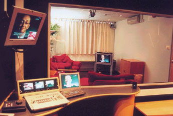
5.19 One of the Serco Usability Services user-testing labs. © Serco Usability Services.
Keeping Things Simple
The EPGs available in the United Kingdom market make use of quite different design approaches. Here’s what we found worked well with users:
Navigation by numbers and coloured fast-text buttons works particularly well, probably because existing experience with television remote controls revolves around this kind of control and input.
Tabbed pages. The key advantage is that the user is not overloaded with too much information on-screen.
Transparent windows. These support social viewing and allow programmes to be monitored in the background.
Fairly minimal ‘now and next’ information. By addressing the needs of most users, most of the time, this represents a classic case of less providing more.
Offering Clear Signposts
During our research, with new and experienced users, we have often seen people navigate to where they didn’t want to go. In part, this is attributable to poor remote control design – people press the wrong buttons. However, another cause is the click-through feature, which allows a user to be taken to a television programme from an EPG listing. One of the biggest problems was that users clicked directly through when they expected to see programme details first. Clear instructions to help users get back into a service will also be essential. In the absence of such cues, some users were unable to return to their original EPG. In fact, they often navigated to the EPG of a rival. This is frustrating and bad news if a commercial service provider wants to keep people to view promotions.
Another issue is that users do not tend to associate EPG services with specific channels because of their experience with analogue television. In the analogue context, they switch between text and television modes. Where possible, service providers should offer a prominent means of accessing and leaving an EPG via a dedicated Text or Guide button.
Helping People Find what they Want
EPGs present programme listings in different ways. The Sky approach, for example, is comprehensive and organises programmes into genres, such as movies, news and comedy, which users react positively to. But care needs to be taken not to overwhelm by displaying too much on-screen. For example, participants in our studies have found Sky’s ‘all channels’ listing confusing. This is mainly due to poor alignment and layout of the information, truncated titles, and confusing channel ordering. Determining what is on should not be a complex visual search task. Present a subset of channels clearly, rather than have all channels displayed in a complicated way.
Users’ information requirements depend on the programme type. For example, users want more information on movies, or the guests for a chat show. Programmes with changing content need explanation, whereas a news broadcast or a regularly scheduled series does not. Some users also want added value content, such as reviews, alongside the facts.
In some cases, users were unable to find programme details, due to inconsistent selection metaphors. If Select is used across most of a service, then users may not expect to press a separate Info button on the remote. If they must do this, then on-screen cues should draw their attention to the fact. Also note that some users did not like seeing the term ‘loading’ when accessing information, and suggested alternatives like ‘please wait’. Interactive television users cannot be assumed to have an internet vocabulary.
Allowing users to consult television listings while watching a programme in the background is a good idea. Pop-up transparent windows support this and are particularly useful for listings that show current and subsequent programmes.
Linking the Remote to the on-Screen Design
One of the key things about interactive television is that it is a three-way interaction, between the user, the remote and the on-screen interface. Far from being a peripheral, the remote mediates the interaction and plays a crucial part in the quality of the whole experience. Yet many remotes exhibit poor ergonomic qualities, and as a result of the poor design users make frequent selection mistakes. In the worst cases we see people operating the remote with two hands, when a television remote control should be a one-handed input device. After all, if both hands are occupied you can’t hold on to a drink while sitting in front of the television!
Users are also fixated on the screen; they often only look at the remote when there are no on-screen prompts and they are having difficulties. Despite this, some functions might not be visible on-screen, they are accessed from the remote. Yet users in our studies, some of them experienced with the platform, have problems moving back up through the information, as they are unaware of or keep forgetting about the backup button on the remote. The logical implication of this is that all important options and functions should have some representation on-screen. Remember it is television, a powerful medium that draws in the user’s attention. It is not surprising that users look to the television rather than the remote for cues on how to interact with an EPG.
When users do consider the remote, they often expect a direct correspondence with on-screen elements. They look for buttons that have the same symbols, colours and terms as those on-screen. So in the absence of any clear on-screen cues, they may press the yellow fast-text button (with sometimes unpredictable results) to ‘get at’ an item in yellow. Symbols, colours and labels should therefore be used carefully on the screen, and match elements of the remote only where a direct correspondence is intended.
Conclusion
For EPGs to be positioned as a primary interactive service, they need to be easy to get into, use and return to. Our own research shows that users have difficulties navigating early United Kingdom services. In some cases the interaction model is significantly more complex than listings magazines or other paper-based alternatives.
The presentation of programme information, in terms of the design and layout, may also handicap users’ ability to find programmes. Further research into people’s natural planning strategies is needed to inform successful designs. How do people currently plan their viewing? How far in advance do they plan? How much information do they need? How do they compare options? What would people really like to do most of the time?
We would suggest that one of the best places to start would be to take a long hard look at how people use paper-based television listings. This would help increase the chances of getting it right based on what most people currently do. Ultimately, creating EPGs that add real value and are easy to navigate requires direct end-user involvement during their design and evaluation.
Case Study: User Research for Interactive Television
Dr Guy Winter, senior behavioural scientist, BBC Research and Development. BBC R&D is the BBC’s centre for media production and broadcasting technology innovation.
User-centred design (UCD) is important to work at BBC Research and Development (R&D). Fundamentally, BBC R&D is trying to identify and anticipate future audience needs, goals or outcomes, and develop the technology to achieve this. This case study outlines some of our approach.
Our work covers a wide range of projects. For example, European Community Collaborative projects such as STORit, myTV and Share It! were focused on developing standards and services for hard-disk video recorders and have contributed to the TV Anytime Forum. New interactive television programme formats have also been explored, particularly the means of finding and accessing these through electronic programme guides, intelligent agents and other technologies (like mobile phones and personal organisers).
The UCD, or human factors, input aids the defining of the requirements, the description of the users and their goals, the iterative development and testing, and the design of the user-interface itself.
Gathering user Requirements
The first effort of the user-centred designer is to gather and shape the user requirements. Within R&D (and engineering more generally), this defines the scope of the development and thus the system requirements. Adopting a UCD perspective leads to quite a radical shift in focus. The emphasis is upon what the user wants and how they wish to behave, and using this to define what a system must achieve. For example, if the users want immediate access to high-quality news clips on their personal computer, then the engineers will strive to develop the technology to enable high-bandwidth, real-time video over a suitable network.
The user requirements usually consist of a number of key components. The first is to define the context of use, that is, the environment into which your technology will be placed and used, and the place within which it will have an effect. In development for domestic technologies such as set-top boxes, personal video recorders, interactive television and so on, a variety of sources of information are used to understand this. Of interest are facts such as the number of people using a technology in a household, to determine whether it is shared or private/ individual; what technologies are already in the home; where these technologies are located and so on. It is also important to retain the more usual measures of demographics, such as social and geographical distinctions.
Perhaps most important is an understanding of your potential users’ attitudes and behaviours. Models of psychology emphasise the weak relationship between attitude, intention and finally behaviour; thus, it is important to realise that a user may look like an ideal user, they may even sound like an ideal user in interviews, but they still may not use the technology. Research into how media is consumed and how this fits into typical and ordinary lifestyles is vital. From this, it is possible to develop a realistic understanding of how a user in a given context of use might actually use your technology or service. This research relies heavily upon existing knowledge. In addition to this, the results from numerous detailed user tests are extremely important. User testing usually finds faults specific to a particular service, but this broader aim should always be kept in mind.
Early Prototyping and Testing with Users
Once user requirements have been developed, every attempt is made to start early prototyping, and encourage as much user involvement and input as can be achieved. Traditionally, users are involved once the bulk of a system is in place, and experience shows that this is often too late. Users can shape the user requirements more effectively if brought into the process early. This is achieved in a number of ways.
Indirect techniques begin with the development of realistic and important scenarios. A scenario describes a detailed situation and the sequence of events that a user will experience. They can also be used for highlighting alternative ways of achieving the same thing, and this is a useful tool for testing. Two alternative scenarios can be given to users for comment and evaluation to great effect at little cost. Users can also influence the approach to a project through the development of personas. A persona is a stereotypical description of a realistic member of the target user group. The user-centred designer should organise the development of personas and promote their use in all discussions of system design. With time, the persona becomes a means of designing with the intended users in mind at all times, and it is an effective and simple technique.
Early input to refine user requirements can be very enlightening. Techniques such as card sorting are very useful for gathering an understanding of naturally occurring classifications, and the relative importance and sequencing of information. The process is used in many ways, but the principle is simple. Users can either label cards then group them into meaningful clusters, or pre-labelled cards can be grouped. Furthermore, if the cards are labelled with tasks, it can be useful for sequencing user tasks. When done appropriately, this can help design the interaction and information architecture of a system. Web pages, user-interface screens and interactive television menus benefit from determining what items might appear on a screen together (or not), how they are labelled (the terminology), and what tasks should appear where and when.
Scenarios can be tested very quickly and cheaply; and in a similar manner, paper mock-ups of screen designs, structures of information flow, icons, terminology, metaphors and so on can all be exposed to the intended users to generate feedback. The common reliance on full working, interactive prototypes can be mitigated to a large extent by the use of paper prototypes. This is desirable, as working prototypes require considerable coding effort. In practice then, paper prototypes are heavily used to try and ensure that the development of a working prototype will be as successful as possible.
Direct methods of user involvement complement and inform the indirect methods. Primarily, user research that can inform the user requirements should be carried out. Ethnographic, questionnaire, interview and observational techniques are all useful. They are also often expensive, so reuse of research should always be a factor in designing or commissioning this work. A useful means of determining how people might use your system is to user test systems they commonly use, or services that are similar or have close properties to your intended product.
User Testing
User testing is important and should be done often in order to create an iterative development process. Methods for testing prototypes vary according to the quality of the testing material, information needs, resources and, of course, deadlines. For initial prototypes, the testing is usually informal and could be described as ‘quick and dirty’. At the BBC, potential users are identified from within our organ-isation (for workflow systems), or may be accessible through a user pool of willing participants, or via an agency. These users are asked to comment informally on what they are shown. Often, a semi-structured interview technique is used to ensure that the resulting feedback is not tainted by variations in approach and questioning, and to minimise the effects of response bias, experimenter and other effects.
In more formal user tests, where the system complexity has increased, user testing is moved to a user-testing laboratory, where greater experimental control can be exercised. The emphasis is upon detailed understanding of what people do with a system, and where errors due to low-level features such as usability can be identified. This is usually exploratory or task-led in outline, the former concentrating on finding out what users do with a system, the latter focusing on tasks we know to be crucial or problematic. Most commonly, a concurrent ‘think aloud’ protocol is used, where users are encouraged to verbalise their decisions, actions, impressions, attitudes and so on, as they use the system. Task-led tests are often combined with a form of semi-structured interview in order to focus the user on specific aspects of usability, terminology, design and system structure. Finally, a variety of questionnaires and follow-up interviews are used to gather more data and allow the user the opportunity to comment on things we may have missed or failed to attend to. Ultimately, the goal of user testing is to refine the design, and not add a stamp of approval onto a nearly finished project. It is all too easy for user testing to be used for the latter, and the user-centred designer must reinforce this message.
The Role of UCD at the BBC
Within an engineering-dominated environment such as BBC R&D, the user-centred designer, or human factors expert, has an important and wide role to play. They must offer expert advice, yet maintain an open mind on what the user would really want. They must be skilled in drawing information from users, with whatever prototypes they can, and they must be able to rationalise and communicate the findings to the rest of the team. Fundamentally, they must adopt the role of evangelist, acting to discover, involve and act as the proxy for users to allow them to have a say in what is developed.
Within the BBC, this role has grown beyond R&D, and the key skills are now being applied more widely. The knowledge and skills gained at R&D have contributed to the early development of more high-profile services, such as Ceefax, BBCi, What’s On, i-Bar and other specific projects and interactive television applications. UCD has grown from its modest origins to become an important design driver, helping to develop standards as well as services through the establishment of specific skilled teams. UCD is fast becoming an established modus operandi for the BBC.
© British Broadcasting Corporation 2002
Case study: Hands on TV – Interactive Television Consumer Research
Andy Mayer, former senior strategist, Netpoll. Netpoll is a leading specialist in user attitudes to digital communication platforms. Near the end of 2002 Andy Mayer became business analyst at the NOP Research Group.
Interactive television consumers are television consumers first and interactive second. It is important to get the interactive portion of any interactive television project right; we know, for example, that interactivity increases consumer engagement with the broadcast stream and in consequence has implications for retention and positioning strategy. But it is not yet an end goal in itself. Examples of standalone interactive services that are both compelling and profitable are rare and rely heavily on good television-based marketing support – Domino’s Pizza, for example.
But what’s the right mix of interactivity and television? Netpoll is one of Europe’s leading specialists in user attitudes to interactive media. Our survey work, which resulted in a report called Hands on TV, has enabled us to identify a few of the different types of people who use interactive television and how to create an offering for each. This case study outlines some of our findings.
Who are the Interactive Television Consumers?
The life cycle of new technology goes through several phases:
Early Adopters.
Early Majority.
Late Majority.
Mass Market.
Within the phases, consumer segments tend to have distinct characteristics that help us understand not simply their demographic positioning, but also their attitudes, behaviours and likely responses to new products and services. The United Kingdom interactive television market moved into what could be described as the end of the early majority by mid-2002. Hands on TV concentrated around real responses from the first two phases. For this piece, we’ve also included some insight into returns from some of our broadband research, as an implication to the characteristics of the late majority adopters who will make up the next phase.
Early Adopters
Generation ‘i’ – socially active teenagers.
Armchair Athletes – tribal sports fans.
Gadget Guy – earliest of the early adopters.
Generation ‘i’
‘I just use it for watching MTV, E4 and Sky One – things like Big Brother.’
female, family, Sky, Nottingham
Generation ‘i’ is teenaged, socially active and very switched on to all things ‘cool’. Technically confident, they derive the maximum benefit from all of the social and communication platforms available to them. They know what they want to watch and when. Frequently, they are the most confident user of interactive television in the household. As a result, they frequently become the household interactive champion; their behaviour patterns are likely to influence others.
One of the more interesting interactive functions driven by this group is cross-channel SMS voting, particularly true of the music channels (MTV Battle of the Bands) and in conjunction with reality shows (Big Brother). SMS is already a successful model for taking invisible micro-payments on premium content or services. As a social communications medium, it fits particularly well with the preferred communications behaviour of the teen market and allows them to engage more deeply with social programming (programming that becomes the social currency of our conversations, media and lifestyles). Interactive television voting and quizzes also work well with this group; however, it is questionably a weaker method of raising revenue than SMS. Like micro-payments on the internet, users are reluctant to pay for impulse services if they can feel it happening. SMS works well as a payment mechanism because you don’t experience the pain until the monthly bill arrives or you have to recharge the repayment card. Interactive television companies are consequently experimenting with payment schemes that mimic this important psychological factor.
Armchair Athletes
‘I got Sky for the football, simple as that. I use the interactive for the sports, the girls use it more as a normal television really.’
male, family, Sky Digital, Preston
Sport has been a significant driver in the adoption of interactive television services. Almost exclusively male, the Armchair Athlete is an out-and-out sports fan. Passionate about his favourite sports and teams, the range of channels used is relatively limited and interactive services are used only if he can see a direct benefit or enhancement to the entertainment experience around the broadcast stream. Gadgets like Playercam can be perceived as a marketing ploy to entice Armchair Athletes. Armchair Athletes like to be in control and ready access to choice and statistics provides the impression of greater ownership than the best non-interactive alternative. In isolation, these features run the risk of doing little other than make a good viewing experience average. Football viewers generally expect that trained camera operators will know where the action is and Playercam is generally used just a few times and then forgotten. In tennis, on the other hand, court selection is a genuinely value added feature at the early stages of tournaments.
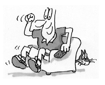
5.20 Armchair Athlete.
Gadget Guys
‘I don’t have any trouble when it comes to most electronic things.’
male, 45, Telewest, Preston
The traditional early adopter market can be loosely characterised as 60–80 per cent male, mostly aged 25–34, AB dominant and with a mountaineer’s approach to adoption – ‘I bought it because it was there’. Very at ease with technology, owning the latest gadgets and being able to use them is an important part of who they are. Partly based on innate curiosity and partly on a need to be among the first to explore the new, they respond to interactive television with relish at first when trailing services, but are easily bored when these fail to live up to the expectations generated by their extensive range of alternate devices. Gadget Guys are often over researched and tend to be poor barometers for how services will be used by others.
Early Majority
Early Clickers – young children with pester power.
Daytime Dabblers – usually female, at home during the day.
i-Potato – recumbent channel-hopper.
Silver Sofas – 50+ with time on their hands.
‘I played trivia with mum the other day.’
female, family, digital terrestrial, Preston
Early Clickers are children between the ages of three and ten. Some are familiar with interactivity through either school or the home personal computer, and their parents have actively encouraged them to use interactive television and the web, so that they will be more proficient with computers in later life. Young children of technically averse parents tend not to be Early Clickers. In some instances their parents claimed to have subscribed to interactive television at least partly because of the presumed education benefits to their young children.
Games, particularly, for example, those provided by channels such as the Cartoon Network, are a route to interactive access for this group. Their play and on-screen learning with various interactive services provides a path for their parents to improve their own understanding.
With the emergence of successful i-advertising, an emergent danger for parents is that traditional pester power is evolving from ‘why can’t we buy it?’ to ‘why can’t we buy it now!’ – whether that be using shopping cart-enabled toy advertisements or premium content gaming.
Daytime Dabblers
‘I like to relax and play a few games when my daughter has gone to school.’
female, family, digital terrestrial, London
Complementary to the Early Clickers are the Daytime Dabblers. This group is almost entirely female and generally not actively uninvolved in the decision to subscribe. Often the spouse of a Gadget Guy or Armchair Athlete, they were very much a secondary user of interactive television when it was first acquired. Now, however, Dabblers are likely to be establishing their own pattern of use, evolving largely during time alone in the house or with children.
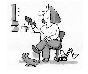
5.21 Daytime Dabbler.
Dabblers account for an early rise in on-screen gaming on interactive television by women who account for between 45 and 55 per cent of all interactive television game plays, not a trend matched in the personal computer and console market. The technical inferiority of many interactive television platforms has, to some extent, removed a barrier for those previously outside the gaming market. Games are simple, usable, and often throwbacks to tried and tested concepts such as Space Invaders and Tetris.
What has been disappointing for the market is that this group has yet to take to the walled garden as a preferred method for shopping. A group traditionally familiar with conventional television shopping (specialised channels and exclusive-to-television products) has not translated that familiarity into browsing and buying behaviour. Most (but not all) television commerce (t-commerce), as offered by retailers and banks in 2002, remains a flawed experience for this target consumer.
i-Potato
‘There’s always something good on one of the channels.’
male, 46, Telewest, Preston
The i-Potato we cruelly characterise as generally a male, who can now not only spend his days channel surfing, but also order pizza direct from the sofa, only having to disengage from UK Gold to answer the door. Aged 30–55, the i-Potato is a heavy television viewer, turning into a wide range of programming. Television forms a central part of the i-Potato’s life and interactive television represents yet more choice and greater convenience. Viewing is generally passive and the instinct to channel hop rather than switch off when nothing interesting can be found is strong. This group is unlikely to generate revenues for providers before the emergence of one-click video-on-demand. Wider interactivity is just not as interesting to the i-Potato unless it involves no more effort than flicking channels. In that respect, the quality of the EPG and channel choice influence this group (if the household buying decision maker) more than other services.
Silver Sofas
‘Well I’ve got eight grandchildren and my sister now lives in Egypt so I tend to send quite a few emails.’
female, 53, Telewest, Preston
The final group are the Silver Sofas. Generally 50+ with time on their hands – either due to retirement or the fact that the children have left home. They are drawn to the range of channels relevant to their interest and are open to exploring the potential of the interactive services. In terms of the technical proficiency, they have either gained experience in the workplace or feel sufficiently comfortable with the television to try the different functions that appeal. Although some already use the internet, not all Silver Sofas would be as comfortable with a personal computer.
For Silver Sofas, the principal barrier with any interactive technology is lack of confidence and relevance. Silver Sofas are not hostile to interactive television, there is some pride associated with being able to ‘keep up with the grandchildren’ and maybe even ‘beat the kids to it’. To this extent, the simplicity and usability of interactive television services is very important. Leadership displayed by the BBC and government in delivering enhancements to established programming and local services content is helpful to the Silver Sofas.
A key weakness of interactive television for this group, however, is communication services. Less than 20 per cent of interactive television users have keyboards in 2002 and even those that have access find the traditional layout of a television lounge less than adequate for using the keyboard-based services in a meaningful way. We won’t know for certain whether keyboard activity on interactive television has failed entirely until adoption by the Late Majority and those consumers who do not have access to email via other means (15–30 per cent of the market is dependent on the success of 3G and home personal computer penetration). What we do know is that those who do have alternate access, particularly work PC access, don’t use email on interactive television unless for very specialised private activities such as managing reactions to recruitment consultants.
What impact will broadband have on the Late Majority?
In mid-2002, there were three Early Adopter groups within the United Kingdom broadband market:
Gadget Guys (again).
Hotwired Homeworkers (those using broadband to work from home).
Fast Families (entertainment and learning orientated adopters).
The first two groups are largely PC-internet fans. However, it is within Fast Families that we believe the greatest overlap will occur with the traditional interactive television groups. Based on analysis of which broadband functions appear to be accelerating in use most rapidly, there are four emergent micro-groups:
Game Guys (using the personal computer/television for network gaming).
Movie Enthusiasts (video-on-demand consumers).
Music Junkies (music-on-demand consumers).
Push-button Punters (sports betting fans).
Examples of this behaviour are most evident in the nascent broadband interactive television services, HomeChoice and Kingston Interactive. Kingston has led the move away from promoting broadband as an ISP+ fast access service, to using entertainment and choice as a key driver.
Summary of Consumer Benefits
When we first ran the Hands On TV research, we identified seven drivers for the consumer benefit of interactive television services. These in turn were mapped against the seven early user groups.
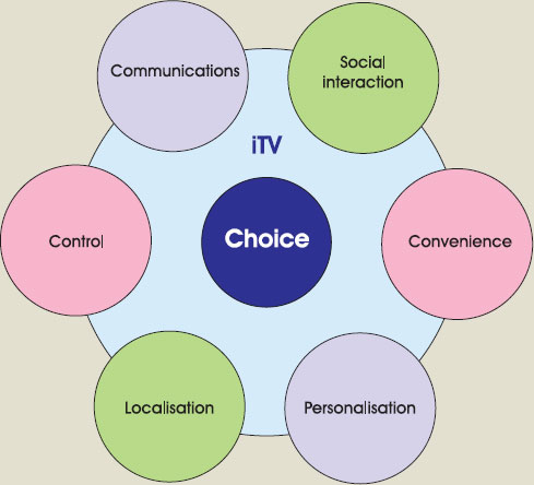
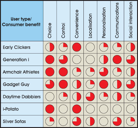
5.23 Consumer benefits of interactivity by distinct consumer segment. Source: Netpoll.
But all of this must be put into context against the primary motivation for using television – lean-back entertainment. In the same way that the predominant driver of uptake for 2.5 and 3G telecommunications is peer-to-peer voice communication, the predominant driver of adoption and usage of interactive television is good-quality compelling entertainment well suited to the target audience. In the consumer mind, putting a red button on the remote control doesn’t alter the fact that the dominant interactive experience is between your eyes and ears and the screen and speakers. In that sense, the enhanced element of enhanced television can’t yet compete for consumer attention with the television element.
Conclusion
When attempting to predict the likely success of a new interactive television service, there is no real substitute for audience research, concept testing, usability and usage profiling. However, interactive producers can take heart in some simple guidelines for avoiding inappropriate services:
Don’t assume connectivity means interactivity – if you build it they won’t necessarily come.
Devise content that is right for the medium – social programming and special interest broadcasts will complement interactivity in a way narrative will not.
Understand the user journey – just like the internet, you won’t be thanked for getting it right and you will be punished for designing services that don’t take into account consumer touch points at every stage of their engagement with both your service and the context it sits in.
Keep it simple – creative innovation is fine but no substitute for solid usable design consistent with the standards on the relevant platform.
Avoid ambiguity – you have even less space than the internet to explain the meaning of prompts and service suggestions. Stick to recognisable icons and intuitive labelling.
Use consistent brand communications – particularly on ‘i’-advertising micro-sites where the television stream sets the standard for what the consumer expects from your brand and is only a button click away.
Work within the limitations – this means understanding the limitations of your target consumers, not just the technical failings of the platforms. If people don’t feel comfortable entering personal information on the screen in the family living room using a remote control from ten feet away, they won’t do it, no matter how compelling the content or design.
Above all – ask the customer!
Sign up to the www.usableitv.com discussion group. Subscribe to the UsableiTV magazine at www.itv-network.org.
Check out any design guidelines for interactive television you can find. Design guideline web links are listed on www.InteractiveTelevisionProduction.com.
Read Don’t Make Me Think by Steve Krug and Designing Web Usability by Jakob Nielsen. These two classic books on web site usability are also relevant to interactive television design, usability research and testing. See also the list of links regarding usability testing tools and techniques at www.InteractiveTelevisionProduction.
Sign up to the WebTV developers’ site and take the course in interactive television design. Although this is focused on WebTV, it has some useful insights across the board.
Take the usability and design quiz at www.InteractiveTelevisionProduction.com.