
Chapter 10
Give It Some Swing
• Understanding swing
• Adding swing to a JavaFX script
• Using SwingComboBoxItem
Swing is a common package used in Java development. However, swing is also available to users of JavaFX. In this chapter you will learn how to use swing and swing components in your JavaFX applications.
What Is Swing?
The javafx.ext.swing package contains a host of GUI (graphical user interface) tools. These tools can be used to build a useful interface for your JavaFX application. If you are looking to build a more business-like application using JavaFX, you will want to look at the available swing components.
If you are already an experienced Java developer, swing should be familiar to you. Swing has been available to Java developers since the early days of Java development. Java developers can use their knowledge of swing to jump right into JavaFX swing development. However, if you are an experienced Java developer who has worked with swing before, you will notice some differences between the full swing package that is provided to Java and that which is provided to JavaFX.
The version of the swing package provided with JavaFX does not include all the controls in the full Java package. The JavaFX version of swing only contains a subset of controls, including the following:
• SwingButton
• SwingCheckBox
• SwingComboBox
• SwingComboBoxItem
• SwingLabel
• SwingList
• SwingListItem
• SwingRadioButton
• SwingScrollPane
• SwingSlider
• SwingTextField
• SwingToggleButton
• SwingToggleGroup
All the components listed here for the swing package either directly or indirectly inherit from Node. This means you can use a swing component wherever you would use any other JavaFX node. In the following sections you learn about where and how you can use JavaFX swing components to add style and interactivity to your applications.
NOTE
Because the JavaFX swing components inherit from Node, all the onMouse* and onKey* events you learned about in Chapter 9 are available.
Let’s take a look at the different swing components available to you within JavaFX.
Swing Components
This section describes how to use the swing components available to you through the javafx.ext.swing package. These components add usability and interactivity to your applications. Everyone is familiar with the look and function of buttons, check boxes, and lists in an application. Using swing will let you add these familiar items to your JavaFX applications.
If you are creating business applications, such as surveys, look-up tools, or input forms, the swing components discussed in this section will help you.
To begin, create a new, empty JavaFX script and name it Chapter10.fx. The contents of this script should look as follows:
If you have just followed the examples in the previous chapter, your version of NetBeans may still be set up to execute code in the mobile emulator. Change your Run profile back to the default before running the scripts in this chapter.
/*
 * Chapter10.fx
 *
 * v1.0 - J. F. DiMarzio
 *
 * 6/20/2010 – created
 *
 * Give it some Swing
 *
 */

package com.jfdimarzio.javafxforbeginners;

/**
 * @author JFDiMarzio
 */

// place your code here
In the following subsections you add four different swing components to this script. These four different components—SwingButton, SwingCheckBox, SwingComboBox, and SwingComboBoxItem—best represent the overall structure of the swing components. Learning and mastering these four components will help you understand all of them.
Let’s start with the SwingButton component.
SwingButton
SwingButton is a graphic button you can add to your script. This button allows users to interact with your applications by making selections and choosing actions. Everyone who uses a computer, cell phone, or most any other electronic device is familiar with the use of an onscreen button. Therefore, adding buttons to your site will give it a sense of familiarity and ease of use.
For this example you will be creating a button that increments a value every time it is clicked. That value will then be written to a Text node.
Set up an Integer variable named clickValue and a Text node that binds to it, as follows:
/*
 * Chapter10.fx
 *
 * v1.0 - J. F. DiMarzio
 *
 * 6/20/2010 – created
 *
 * Give it some Swing
 *
 */

package com.jfdimarzio.javafxforbeginners;

import javafx.stage.Stage;
import javafx.scene.Scene;
import javafx.scene.text.Text;
import javafx.scene.text.Font;

/**
 * @author JFDiMarzio
 */

var clickValue : Integer = 0;

Stage {
      title : "UsingSwing"
      onClose: function () {  }
      scene: Scene {
            width: 200
            height: 200
            content: [Text {
                            font : Font {
                                 size: 24
                                }
                            x: 10, y: 50
                            content: bind "Value = {clickValue}"
                            }
                        ]
                }
}
If you compile and run this script now, it should like Figure 10-1.
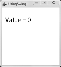
Figure 10-1 App before swing is added
TIP
String interpolation is great way to build functionality directly into your string values. The JavaFX string interpolation operators are the curly braces ({}). You can put variable and other functional script within these operators to change the contents of your string. In this example, you are interpolating the clickValue variable within your string. The bind keyword ensures that when clickValue changes, the string is updated accordingly.
Before you add a SwingButton to your script, you must import the swing package:
javafx.ext.swing.SwingButton
After adding the SwingButton to your Scene’s content, you need to set up two properties: text and action. The text property defines the text that is displayed in your button. The name you provide for your button should be descriptive enough so that an uninformed observer can determine the function of the button. This can be something simple, such as “Submit” or “Calculate,” or it can describe something more complex, such as “Retrieve related records” or “Process schedule changes.”
SwingButton {
              text: "Increment Value"
}
The action property contains all the information the button needs to perform a function when the user clicks it. Like the onMouse* and onKey* events that are inherited from Node, the action property can take an anonymous function to encapsulate the code needed to execute an action. You can also create a function elsewhere in your script and call it from the action property. Either method is acceptable and will ultimately yield the same result.
For this example, use an anonymous function to increment the value of clickValue every time the button is clicked:
 SwingButton {
              text: "Increment Value"
              action:function ():Void {
                      clickValue ++ ;
                     }
              }
TIP
The double plus sign operator, ++, will increment a variable by 1. It is equivalent to clickValue = clickValue + 1.
Your finished script should look like this:
/*
 * Chapter10.fx
 *
 * v1.0 - J. F. DiMarzio
 *
 * 6/20/2010 – created
 *
 * Give it some Swing
 *
 */

package com.jfdimarzio.javafxforbeginners;

import javafx.stage.Stage;
import javafx.scene.Scene;
import javafx.ext.swing.SwingButton;
import javafx.scene.text.Text;
import javafx.scene.text.Font;

/**
 * @author JFDiMarzio
 */

var clickValue : Integer = 0;

Stage {
      title : "UsingSwing"
      onClose: function () {  }
      scene: Scene {
            width: 200
            height: 200
            content: [SwingButton {
                            text: "Increment Value"
                            action:function ():Void {
                                     clickValue ++ ;
                                    }
                                }
                        Text {
                            font : Font {
                                 size: 24
                                }
                            x: 10, y: 50
                            content: bind "Value = {clickValue}"
                            }

                        ]
                }
}
Compile and run this script. After clicking the button you will see the value increment, as shown in Figure 10-2.
NOTE
This example may produce warnings from the compiler. These warnings will not prevent you from running the example and can be ignored here.
This example was a little basic. It explains in a concise way how to establish a basic rectangular button that performs an action. However, what if you want to do something a little out of the ordinary? The clip property is very useful for adding something extra to the look of your SwingButton.
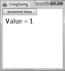
Figure 10-2 Using a SwingButton to increment a value
The clip property is also inherited from Node, so anything that inherits from Node can utilize clip.
The purpose of the clip property is to allow you to define a clip area for your button to change the shape of the button. The clip property takes in a node and uses that node to reshape the button. Therefore, you can assign a circle to the clip property of a SwingButton and the result will be a round button.
Take a look at the following script. The text of the SwingButton has been changed, and the clip property has been defined as a circle:
/*
 * Chapter10.fx
 *
 * v1.0 - J. F. DiMarzio
 *
 * 6/20/2010 – created
 *
 * Give it some Swing
 *
 */

package com.jfdimarzio.javafxforbeginners;

import javafx.stage.Stage;
import javafx.scene.Scene;
import javafx.ext.swing.SwingButton;
import javafx.ext.swing.SwingSlider;
import javafx.scene.text.Text;
import javafx.scene.text.Font;
import javafx.scene.shape.Circle;

/**
 * @author JFDiMarzio
 */
var clickValue : Integer = 0;

Stage {
      title : "UsingSwing"
      onClose: function () {  }
      scene: Scene {
            width: 200
            height: 200
            content: [SwingButton {
                            text: "+"
                            action:function ():Void {
                                     clickValue ++ ;
                                    }
                                   clip: Circle {
                                    centerX: 18, centerY: 12
                                    radius: 8
                                 }
                                 }
                        Text {
                            font : Font {
                                  size: 24
                                }
                            x: 10, y: 50
                            content: bind "Value = {clickValue}"
                            }
                        ]
                }
}
Compile and run this script. You will now see a round button with a plus sign in it that increments the value from the last example. The result is shown in Figure 10-3.
The clip property provides a very useful way to modify the look of your control. Take note that the bounds of the button have also been modified, not just the look of the button. The rectangular portion of the button that lies outside the clip region is no longer active or actionable.
Next, you learn about the SwingCheckBox component.
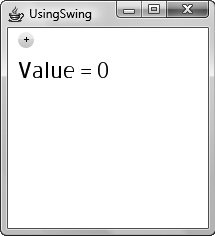
Figure 10-3 A round button using clip
SwingCheckBox
In this section you set up a SwingCheckBox. However, the process you use to set it up is slightly different from what you have used so far in this book. In an effort to introduce you to different ways of setting up and utilizing nodes, we are going to take a different approach in setting up the SwingCheckBox.
You should start out with a basic script containing a Stage, Scene, and Text node. The Text node is used to display the selected value of the SwingCheckBox. Your script should appear as follows:
/*
 * Chapter10.fx
 *
 * v1.0 - J. F. DiMarzio
 *
 * 6/20/2010 – created
 *
 * Give it some Swing
 *
 */

package com.jfdimarzio.javafxforbeginners;

import javafx.stage.Stage;
import javafx.scene.Scene;
import javafx.scene.text.Text;
import javafx.scene.text.Font;

/**
 * @author JFDiMarzio
 */

Stage {
      title : "UsingSwing"
      onClose: function () {  }
      scene: Scene {
            width: 200
            height: 200
            content: [
                        Text {
                            font : Font {
                                 size: 24
                                }
                            x: 10, y: 50
                            content: bind "Value = {}"
                            }

                        ]
                }
}
The next step is to create a variable that is typed as a SwingCheckBox:
import javafx.ext.swing.SwingCheckBox;

def sampleCheckBox : SwingCheckBox = SwingCheckBox{
    };
Set the text property of the SwingCheckBox to “Check Me”:
def sampleCheckBox : SwingCheckBox = SwingCheckBox{
    text:″Check Me″
    };
Finally, bind the string interpolator in the Text content to the selected property of the SwingCheckBox:
 Text {
      font : Font {
      size: 24
              }
      x: 10, y: 50
      content: bind "Value = {sampleCheckBox.selected}"
      }
The script you have written will create a check box. The selected property of the check box is a Boolean that indicates whether the check box has been checked. Because you have bound the value of the selected property to the Text content, you will see the text True or False when you check and uncheck the SwingCheckBox. The finished script shows where to add the sampleCheckBox to have it display to the screen.
The finished script should appear as follows:
/*
 * Chapter10.fx
 *
 * v1.0 - J. F. DiMarzio
 *
 * 6/20/2010 – created
 *
 * Give it some Swing
 *
 */

package com.jfdimarzio.javafxforbeginners;

import javafx.stage.Stage;
import javafx.scene.Scene;
import javafx.scene.text.Text;
import javafx.scene.text.Font;
import javafx.ext.swing.SwingCheckBox;

/**
 * @author JFDiMarzio
 */
def sampleCheckBox : SwingCheckBox = SwingCheckBox{
    text:″Check Me″
    };

Stage {
      title : ″UsingSwing̸
      onClose: function () {  }
      scene: Scene {
            width: 200
            height: 200
            content: [sampleCheckBox,
                        Text {
                            font : Font {
                                  size: 24
                                }
                            x: 10, y: 50
                            content: bind "Value = {sampleCheckBox.selected}"
                            }
                        ]
                }
}
Compile and run your script. Figures 10-4 and 10-5 illustrate the unchecked and checked states, respectively, of your script.
Next, you learn about SwingComboBox and SwingComboBoxItem.
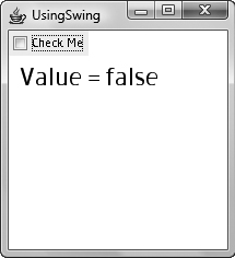
Figure 10-4 Unchecked SwingCheckBox with text
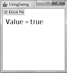
Figure 10-5 Checked SwingCheckBox with text
SwingComboBox and SwingComboBoxItem
SwingComboBox allows you to offer choices to your users and react on those choices. Most people are very familiar with the look, feel, and function of a combo box–style control. When a user is presented with a choice of different items, that choice is normally done through a combo box.
When using swing, you use two controls to create a functional combo box–style control. You need to use a SwingComboBox and one or many SwingComboBoxItem(s). Using these two swing controls together will give you a functional combo box.
Let’s create a functional SwingComboBox that populates a Text node with the text of whatever item you select.
Create an empty script that contains just a Text node, as follows:
/*
 * Chapter10.fx
 *
 * v1.0 - J. F. DiMarzio
 *
 * 6/20/2010 – created
 *
 * Give it some Swing
 *
 */

package com.jfdimarzio.javafxforbeginners;

import javafx.stage.Stage;
import javafx.scene.Scene;
import javafx.scene.text.Text;
import javafx.scene.text.Font;

/**
 * @author JFDiMarzio
 */

Stage {
      title : "UsingSwing"
      onClose: function () {  }
      scene: Scene {
            width: 200
            height: 200
            content: [
                        Text {
                            font : Font {
                                  size: 24
                                }
                            x: 10, y: 50
                            content: bind "Value = { }"
                            }
                        ]
                }
}
Again, you should notice that the content of the Text node is set to an interpolator. This is where you bind the text of the selected item from the combo box.
In this script you are going to create a combo box that has three choices: One is blank (the default), one reads “Item A,” and the last reads “Item B.” The first step is to create a var of a SwingComboBox, as follows:
import javafx.ext.swing.SwingComboBox;

var sampleSwingComboBox : SwingComboBox = SwingComboBox {
}
The var, sampleSwingComboBox, right now is just a shell of a combo box; it will not do anything without some SwingComboBoxItems. The items property within the SwingComboBox will hold all your SwingComboBoxItems.
Create a SwingComboBoxItem as follows:
NOTE
Keep in mind that the import statements are shown with the code for your convenience. However, in your script, all the import statements should appear together. The full script files illustrate this correctly.
import javafx.ext.swing.SwingComboBoxItem;

SwingComboBoxItem {
        text: "Item A"
}
Pretty easy, right? Now create three SwingComboBoxItems and assign them to the items property of the SwingComboBox:
var sampleSwingComboBox : SwingComboBox = SwingComboBox {
                         items: [
                            SwingComboBoxItem {
                                text: ""
                                selected: true
                             }
                             SwingComboBoxItem {
                                 text: "Item A"
                             }
                             SwingComboBoxItem {
                                 text: "Item B"
                             }
                          ]
                        }
NOTE
One of the items in this code sample contains a selected property that is set to true. This property tells JavaFX that this item is the default item to be shown as selected in the combo box.
Finally, you need to find a way to set the contents of the Text node to the text of the selected combo box item. Luckily for you, there is a property of the SwingComboBox called selectedItem. This property contains the selected SwingComboBoxItem. Therefore, set the interpolator to selectedItem.text. The finished script should appear as follows and shows you where to add the ComboBox to the content of the Scene:
/*
 * Chapter10.fx
 *
 * v1.0 - J. F. DiMarzio
 *
 * 6/20/2010 – created
 *
 * Give it some Swing
 *
 */

package com.jfdimarzio.javafxforbeginners;

import javafx.stage.Stage;
import javafx.scene.Scene;
import javafx.scene.text.Text;
import javafx.scene.text.Font;
import javafx.ext.swing.SwingComboBox;
import javafx.ext.swing.SwingComboBoxItem;

/**
 * @author JFDiMarzio
 */

var sampleSwingComboBox : SwingComboBox = SwingComboBox {
                          items: [
                             SwingComboBoxItem {
                                 text: ""
                                 selected: true
                             }
                             SwingComboBoxItem {
                                 text: "Item A"
                             }
                             SwingComboBoxItem {
                                 text: "Item B"
                             }
                           ]
                         }

Stage {
      title : "UsingSwing"
      onClose: function () {  }
      scene: Scene {
            width: 200
            height: 200
            content: [sampleSwingComboBox,
                        Text {
                            font : Font {
                                 size: 24
                                }
                            x: 10, y: 50
                            content: bind "Value =
{sampleSwingComboBox.selectedItem.text}"
                            }
                        ]
                }
}
Figures 10-6 and 10-7 show the SwingComboBox opened and closed, respectively.
Take some time to further explore the different properties of these swing components. Swing components can add a level of flexibility and usefulness to your JavaFX applications.
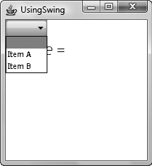
Figure 10-6 SwingComboBox opened
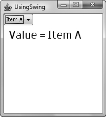
Figure 10-7 SwingComboBox closed
Try This Create an Application with Swing
Swing is a very common Java element type. Even if you move on from JavaFX to other Java-based development platforms, chances are you will run into swing. The more you know about swing and the more comfortable you are with using it, the better your applications will be.
Create a new project and build a new Scene. Create your own application using only swing nodes. Add a TextBox and a Button to the Scene. Place the nodes around the Scene in the most logical position. For an added challenge, write some code behind the Button so that when it is clicked, the TextBox is populated with the words “You clicked my button.”
 Chapter 10 Self Test
1. What package contains the swing components for JavaFX?
2. True or false? The swing JavaFX package contains all the components available in Java.
3. Are the onMouse* and onKey* events available to swing components?
4. What are the JavaFX string interpolator operators?
5. What property of the SwingButton can hold an anonymous function that will execute when the button is clicked?
6. What property of the SwingButton can be used to change the shape of the button?
7. True or false? The isChecked property of the SwingCheckBox will tell you if the box is checked.
8. What swing component is used to populate SwingComboBox?
9. How do you set a SwingComboBoxItem to the default choice?
10. What property of SwingComboBox will tell you what SwingComboBoxItem has been selected?