
Wouldn’t it be nice if you could change the appearance of your application without altering its functionality? Many companies spend lots of money and time designing user interfaces (UIs).
Often companies will mock up several designs before deciding how their UI should look and behave. Depending on the scope, many companies also build UIs that support different screen dimensions. Typically, tablets, smartphones, TVs, and desktops are among the main challenges UI designers face.
In this chapter, you learn about theming and how to customize applications by applying various themes (look and feels). Next, you learn about the fundamentals of JavaFX CSS styling, which will enable you to change attributes of any Scene graph node, such as colors, backgrounds, margins, and so on. After learning about CSS styling, you learn about creating custom controls. Here, you learn how to build UI controls that aren’t part of the JavaFX 8 built-in controls. Some custom controls that might come to mind are LEDs, number pads, gauges, clocks, and futuristic context menus.
In this chapter, you learn about the following APIs and concepts:
Theming
JavaFX CSS styling
Custom controls
Theming
You have probably heard the terms skinning and look and feel in the context of designing user interfaces. These terms are often used interchangeably, and they both reflect the basic concept of theming or styling a UI. Theming is the idea of transforming an entire application’s appearance without changing its underlying functionality. An example of theming is when you change an application’s UI layout and controls from a stylized business theme to a sports-like theme. Usually, companies try to skin an application to resemble their logo. They also use beautiful typefaces (typography) selected to personify their corporate culture or target audience.
In JavaFX you have the ability to create, modify, or use existing themes to skin your applications. Later, I discuss how to create themes, but for now I show you how to apply existing themes (skins) in JavaFX applications. To demonstrate applying themes to an application’s UI, I created a JavaFX application depicted in Figure 15-1, which allows users to apply various UI look-and-feel themes.
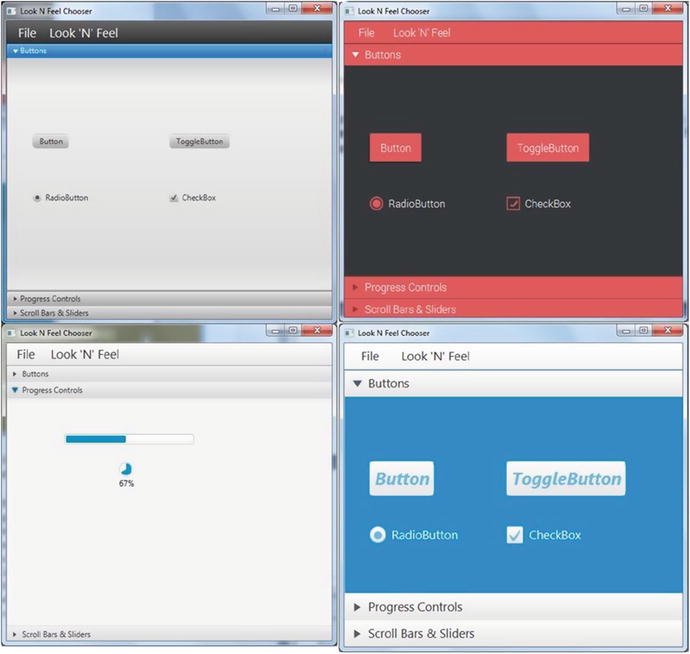
Figure 15-1. Setting an application’s look and feel using JavaFX CSS styling. Moving counterclockwise from the upper-left are the Caspian, Modena, Sky, and Flat Red themes.
As you can see, there are four UI skins applied to the same application. At the upper left is the familiar Caspian theme from Java FX 2.X. Caspian has served well over the years and still has quite the professional look. At the lower left you see an accordion UI control expanded to show progress controls using JavaFX 8’s new default theme, Modena. The Modena theme seems brighter, cleaner, and more modern.
At the lower right, the next theme, called the Sky look and feel, was created by yours truly (Carl Dea). My intent was to create a theme for touch displays so that the controls would be slightly enlarged for adult-sized fingers. I wanted a friendly feel and so the cool blue sky came to mind.
Last, but not least, in the upper right is the Flat Red look and feel, created by Gerrit Grunwald.
The Flat Red uses a custom font (Roboto) to give text on controls a crisp and clean look. Another nice feature of the Flat Red theme is that it uses CSS effects based on pseudo-class state changes of UI controls, such as a mouse press on a slider control. Don’t worry if you don’t know yet what pseudo-classes are, because later in this chapter, you will learn about pseudo-class selectors in detail. Mr. Grunwald’s look and feel is also an excellent candidate for touch displays.
Native Look and Feels
Before jumping into example code, I want to give a shout-out to individuals (pioneers) in the JavaFX community who have crafted beautiful skins and themes that you will find most inspiring. For those interested in the OS X (Mac desktop) native look and feel, Claudine Zillmann (@etteClaudette) created AquaFX (with Elements). You can download AquaFX at http://aquafx-project.com . AquaFX, shown in Figure 15-2, is a library that allows developers to style applications easily with the native OS X look, but also to theme the UI with colors other than the usual aqua blue.
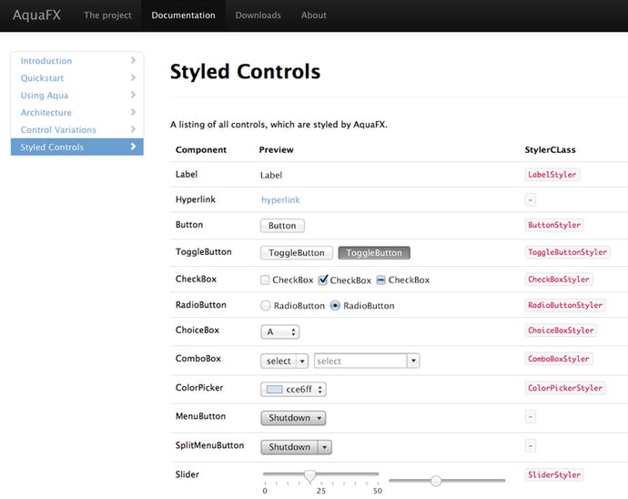
Figure 15-2. AquaFX is a JavaFX library that styles controls resembling the OS X native look and feel
For those interested in Window’s Metro look and feel, Pedro Duque Vieira (@P_Duke) created a project called JMetro. JMetro has a light theme, shown in Figure 15-3, and a dark theme shown in Figure 15-4.
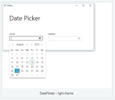
Figure 15-3. The date picker control stylized using JMetro’s light theme
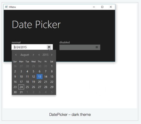
Figure 15-4. The date picker control stylized using JMetro’s dark theme
To download the JMetro theme, go to JFXtras’ Style section at https://github.com/JFXtras/jfxtras-styles/tree/master/src .
What about a look and feel that has a Roku-like or Apple TV-like interface; it’s called Flatter, by Java Champion and book author Hendrik Ebbers (@hendrikEbbers). Flatter was designed for a proof of concept project BoxFX. BoxFX is another project Mr. Ebbers created by using a Raspberry Pi device running JavaFX 8 with the Flatter look and feel, as shown in Figure 15-5.
Figure 15-5. The Flatter style applied to a JavaFX application
The following are links to the UI styles mentioned in this section:
AquaFX (with Elements): http://aquafx-project.com/project.html
Jmetro
BoxFX: http://www.guigarage.com/2013/08/boxfx-javaone-preview-1
Now that you’ve seen native looking styles and media device styles, let’s look at web and mobile UI styles.
Web and Mobile Look and Feels
Depending on the application, the users might prefer a more web or mobile look and feel. Often the screen dimensions of a device can force a designer’s decision to have a non-native UIs look. Non-native UIs make up the majority of popular web sites and mobile apps. So what are the popular non-native UIs that I’m referring to?
As a web developer, the most popular UI styles (look and feels) today are Google’s Material Design and Twitter’s Bootstrap. For example, Figure 15-6 shows a JavaFX clock and TreeTableView controls skinned with the Material Design style.
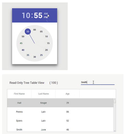
Figure 15-6. The Material Design style applied to a JavaFX application
Figure 15-7 shows buttons styled with the Twitter’s Bootstrap look and feel.
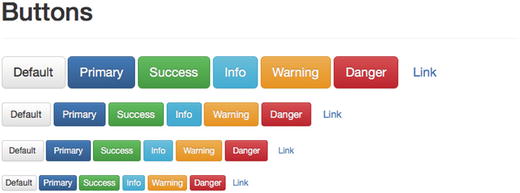
Figure 15-7. Twitter’s Bootstrap style applied to a button controls
As the JavaFX community continues to grow and adapt to these new UI styles, there are a growing number of developers who have ported these popular UI styles as libraries to help you transform your JavaFX application to these popular UI styles.
New to the list of folks who have created popular web and mobile device themes are the following:
(Google) Material Design
GluonHQ
JFoenix
Site: http://www.jfoenix.com
Author(s): http://www.jfoenix.com/team.html
MaterialFX
(Twitter) Bootstrap
JBootx
BootstrapFX
Author: Andres Almiray
Applying the JavaFX CSS Theme
Now that you have seen a glimpse of some great-looking skins and UI styles, let’s see how to apply JavaFX CSS-based styles. JavaFX has the capability to apply cascading style sheets to the Scene graph and its nodes in very much the way web developers use CSS style sheets with HTML5 elements. These CSS style sheets are external files containing attributes and values to style JavaFX nodes. An example JavaFX CSS file looks something like Listing 15-1.
Listing 15-1. A JavaFX CSS File Containing Styling Attributes
/* sample.css */.button {-fx-text-fill: brighter-sky-blue;-fx-border-color: rgba(255, 255, 255, .80);-fx-border-radius: 8;-fx-padding: 6 6 6 6;-fx-font: bold italic 20pt "LucidaBrightDemiBold";}/* ...more styling */
This code contains a CSS class style definition for JavaFX button controls. Button UI controls by default have a class style button, which maps to -fx- prefixed properties. You will learn about JavaFX CSS styling later in this chapter, but for now let’s discuss how to swap between the CSS style sheets that will dynamically skin an application.
In this section, you learn the two ways to apply CSS style sheets as look-and-feel themes onto JavaFX applications. The following are the two ways to apply JavaFX CSS files to Scene graph nodes.
javafx.application.Application: setUserAgentStylesheet()
javafx.scene.Scene: getStylesheets().add()
Using the setUserAgentStylesheet(String URL) Method
The first way to apply CSS style sheets is by invoking the static setUserAgentStylesheet() method on the JavaFX Application (javafx.application.Application) class. This static method styles every scene and all child nodes in a JavaFX application as shown here.
Application.setUserAgentStylesheet(url);The setUserAgentStylesheet(String URL) method accepts a valid URL string representing the JavaFX CSS file. Typically, CSS files are bundled inside a JAR application; however they can reside on the local filesystem or a remote web server. When the CSS file is in the classpath, the call to the following method will find the CSS file and produce an URL string for accessing the file:
getClass().getResource("path/some_file.css").toExternalForm()This assumes the resource is copied and collocated where the compiled classes are.
The following code snippet loads the sample.css file as the current look and feel for the JavaFX Application. The sample.css file in the code snippet is co-located where the current class is located. In other words, your Java class and your CSS file are in the same directory, so there is no need for a path in front of the filename.
Application.setUserAgentStylesheet(getClass().getResource("sample.css").toExternalForm());
The setUserAgentStylesheet() method applies styling globally to all scenes owned by an application, such as context menus and child popup windows. JavaFX 8 currently contains two style sheets—Caspian and Modena—which serve as default cross-platform look and feel skins. Because the two style sheets are predefined, you can easily switch between them using the setUserAgentStylesheet() method. The following code shows how to switch between the Caspian and Modena look and feel style sheets.
// Switch to JavaFX 2.x's CASPIAN Look and Feel.Application.setUserAgentStylesheet(STYLESHEET_CASPIAN);// Switch to JavaFX 8's Modena Look and Feel.Application.setUserAgentStylesheet(STYLESHEET_MODENA);
A great way to learn how the pros do it (creating skins) is to look at good examples. You can extract the CSS files (caspian.css and modena.css) from the jfxrt.jar file or view the JavaFX source code, located at http://openjdk.java.net . To obtain jfxrt.jar, you must be on the JDK prior to Java 9.
Since Java 9 no longer makes the jfxrt.jar available on the runtime or JDKs, you need to look for the jmods directory under JAVA_HOME. Part of project Jigsaw was also restructuring the runtime as modules. In the jmods directory you should find the module called javafx.controls.jmod. In order to get into the module file, you have to copy the module to some other temporary directory. Next, you should rename the copied module and end it with a .jar extension to be extracted. Lastly, you invoke jar xvf on the renamed module. Use your file explorer or Finder to locate the following file:
classes/com/sun/javafx/scene/control/skin/modena/modena.cssThe modena.css file contains all the JavaFX CSS styling for the default look and feel. This file is where you can learn from the experts as to how they style every control on the JavaFX platform.
Note
When you invoke the setUserAgentStylesheet(null) method by passing in a null value, the default style sheet (Modena) will be automatically loaded and set as the current look and feel. However, if you are using JavaFX 2.x, the default style sheet will be Caspian.
Using Scene’s getStylesheets().add(String URL) Method
The second way of applying a look and feel is by invoking a Scene object’s getStylesheets().add() method. Unlike the first method of applying a look and feel, the getStylesheets().add() method is used to style a single scene and its child nodes.
By calling the getStylesheets().add() method, you can style a single scene and its child nodes as shown:
Scene scene = ...scene.getStylesheets().add(getClass().getResource("sample.css").toExternalForm());
As in the previous call to setUserAgentStylesheet(), you pass in an URL string that represents a JavaFX CSS file. Later, you will see an example application that switches between different styles by using either the setUserAgentStylesheet() or the getStylesheets().add() method. If you decide to create an entire CSS to style an entire app, you maybe hesitant to start from scratch.
Creating an entire look and feel requires hundreds if not thousands of lines of code in order to style every UI control in JavaFX. So, it’s a good idea to start off with the default look and feel and then override styles using the getStylesheets().add() method.
I basically created very small look-and-feel style sheet files to demonstrate the ability to swap themes. The simple example CSS files have just a handful of CSS styles for a small amount of UI controls that would be styled. In other words, the example’s small CSS files are loaded via the getStylesheets().add() method, which styles only some of the nodes and not every node in the application.
Because the default style sheet (Modena.css) is loaded from the prior call via the setUserAgentStylesheet(null) method, the smaller custom CSS styling file can then “piggyback” onto the default style sheet. What’s nice is that you don’t have to start from scratch to create a new look and feel. The following snippet of code initially invokes the setUserAgentStylesheet() method with a null value, which loads Modena as the default look and feel. It then sets the scene’s additional styling by invoking the getStylesheets().add() method.
Application.setUserAgentStylesheet(null); // defaults to Modena// apply custom look and feel to the scene.scene.getStylesheets().add(getClass().getResource("my_cool_skin.css").toExternalForm());
An Example of Switching Themes
To show you how to switch between various CSS style sheets (aka skins or themes), I’ve created an example application called the Look N Feel Chooser, which allows you to choose between different predefined themes. Figure 15-8 shows the Look and Feel Chooser example application initially displaying an accordion UI control pane with common UI controls, beginning with the Modena look and feel.
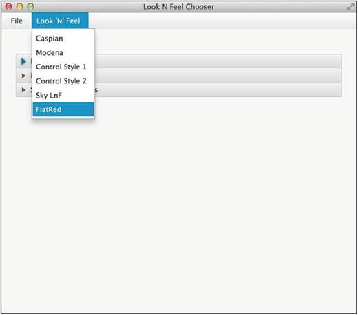
Figure 15-8. Predefined look and feel themes to choose from the Look N Feel menu
In Figure 15-8, you’ll notice the menu options to select a look and feel (skin). Once a look and feel has been selected, the application’s appearance will change dynamically. Figure 15-9 shows the application switched to the Flat Red look and feel.
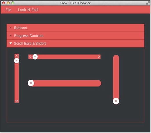
Figure 15-9. The Look N Feel Chooser application using the Flat Red look and feel
In Figure 15-9, notice that the accordion UI control’s title bar says Scroll Bars & Sliders. It’s expanded with UI controls sporting the selected look and feel. This is a great way to show off different look and feel themes to your customers or users while their application continues to function as usual.
The next section explains the main source code of the Look N Feel Chooser application in Listing 15-2. For the sake of space, you see the start() method and not the entire source code. To see the entire source code listing of the Look N Feel Chooser application, visit the book’s web site to download the project under Chapter 15’s LookAndFeelChooser.
The Look N Feel Chooser Example Application Code
By loading the Look N Feel Chooser project into the NetBeans IDE, you can see that the source code consists of six files: LookNFeelChooser.java, lnf_demo.fxml, controlStyle1.css, controlStyle2.css, flatred.css, and sky.css. The .ttf files are TrueType fonts that are used in the Flat Red look and feel. Figure 15-10 shows the project structure in the NetBeans IDE.
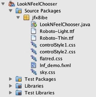
Figure 15-10. The Look N Feel Chooser project structure in the NetBeans IDE
Looking at the project structure, you’ll notice the LookNFeelChooser.java file as the main driver application class. The lnf_demo.fxml file is an FXML-formatted file representing the center content, which contains the accordion UI control with other UI control elements. The FXML file was created by the Scene Builder tool. The rest of the files are JavaFX CSS style sheets that represent different look-and-feel themes: controlStyle1.css, controlStyle2.css, flatred.css, and sky.css.
Listing 15-2 shows the init() and start() methods of the LookNFeelChooser.java Application class. Remember that all JavaFX applications are first initialized via the init() method and then begin with the start() method. After you have examined Listing 15-2, you can read about how it all works.
Listing 15-2. The Look N Feel Chooser Project Source Code to Switch Between Look and Feel (JavaFX CSS) Style Sheets. (LookNFeelChooser.java)
@Override public void init() {Font.loadFont(LookNFeelChooser.class.getResourceAsStream("Roboto-Thin.ttf"), 10).getName();Font.loadFont(LookNFeelChooser.class.getResourceAsStream("Roboto-Light.ttf"), 10).getName();}@Override public void start(Stage primaryStage) throws IOException {BorderPane root = new BorderPane();Parent content = FXMLLoader.load(getClass().getResource("lnf_demo.fxml"));Scene scene = new Scene(root, 650, 550, Color.WHITE);root.setCenter(content);// Menu barMenuBar menuBar = new MenuBar();// File menuMenu fileMenu = new Menu("_File");MenuItem exitItem = new MenuItem("Exit");exitItem.setAccelerator(new KeyCodeCombination(KeyCode.X, KeyCombination.SHORTCUT_DOWN));exitItem.setOnAction(ae -> Platform.exit());fileMenu.getItems().add(exitItem);menuBar.getMenus().add(fileMenu);// Look and feel menuMenu lookNFeelMenu = new Menu("_Look 'N' Feel");lookNFeelMenu.setMnemonicParsing(true);menuBar.getMenus().add(lookNFeelMenu);root.setTop(menuBar);// Look and feel selectionMenuItem caspianMenuItem = new MenuItem("Caspian");caspianMenuItem.setOnAction(ae -> {scene.getStylesheets().clear();setUserAgentStylesheet(null);setUserAgentStylesheet(STYLESHEET_CASPIAN);});MenuItem modenaMenuItem = new MenuItem("Modena");modenaMenuItem.setOnAction(ae -> {scene.getStylesheets().clear();setUserAgentStylesheet(null);setUserAgentStylesheet(STYLESHEET_MODENA);});MenuItem style1MenuItem = new MenuItem("Control Style 1");style1MenuItem.setOnAction(ae -> {scene.getStylesheets().clear();setUserAgentStylesheet(null);scene.getStylesheets().add(getClass().getResource("controlStyle1.css").toExternalForm());});MenuItem style2MenuItem = new MenuItem("Control Style 2");style2MenuItem.setOnAction(ae -> {scene.getStylesheets().clear();setUserAgentStylesheet(null);scene.getStylesheets().add(getClass().getResource("controlStyle2.css").toExternalForm());});MenuItem skyMenuItem = new MenuItem("Sky LnF");skyMenuItem.setOnAction(ae -> {scene.getStylesheets().clear();setUserAgentStylesheet(null);scene.getStylesheets().add(getClass().getResource("sky.css").toExternalForm());});MenuItem flatRedMenuItem = new MenuItem("FlatRed");flatRedMenuItem.setOnAction(ae -> {scene.getStylesheets().clear();setUserAgentStylesheet(null);scene.getStylesheets().add(getClass().getResource("flatred.css").toExternalForm());});lookNFeelMenu.getItems().addAll(caspianMenuItem,modenaMenuItem,style1MenuItem,style2MenuItem,skyMenuItem,flatRedMenuItem);primaryStage.setTitle("Look N Feel Chooser");primaryStage.setScene(scene);primaryStage.show();}
Note
To run this example, make sure the CSS and TTF (true type font) files are in the compiled class’s area. Resource files can be loaded easily when placed in the same directory (package) as the compiled class file that is loading them. The CSS files are initially co-located with this source code example file. In NetBeans, you can select Clean and Build Project or you can copy your files to your class’s build area.
How It Works
The Look N Feel Chooser application is first initialized with the overloaded method init(), which loads the required fonts used for the Flat Red look-and-feel theme. After the init() method is executed, the JavaFX application lifecycle will invoke the start() method.
In the start() method, the code begins by creating a border pane layout, which then loads an FXML file to be placed as the center content region. FXML is an XML-based language to express JavaFX UIs. This provides a way to separate the presentation layer from the application logic layer. Typically, FXML is generated by a GUI builder tool, which allows a designer to drag and drop controls and create UIs graphically. The following line uses the FXMLLoader.load() method to unmarshall (deserialize) the center content. The center content pane is an AnchorPane layout containing an Accordion control holding other UI controls.
Parent content = FXMLLoader.load(getClass().getResource("lnf_demo.fxml"));To learn more about the Scene Builder tool, see Chapter 5.
Continuing with the example code, you will notice the usual creation of a scene with a root node. Next, the code builds a menu bar with menu items. The first menu is the File menu, which allows users to exit the application. Notice that for a quick exit using a keyboard shortcut, the KeyCodeCombination instance allows the users to press the Ctrl+X key combo. To learn about menus and keyboard shortcuts, refer to Chapter 4.
The second menu option on the Look N Feel allows the users to select predefined look and feel CSS style sheet files. The menu items are set to invoke handler code (lambda expressions) that is triggered based on an onAction event. The following code snippet is a menu item that is responsible for switching the application’s look and feel with the Caspian CSS style:
MenuItem caspianMenuItem = new MenuItem("Caspian");caspianMenuItem.setOnAction(ae -> {scene.getStylesheets().clear();setUserAgentStylesheet(STYLESHEET_CASPIAN);});
Above the JavaFX API, the STYLESHEET_ CASPIAN and STYLESHEET_MODENA values are strings that represent the CSS files based on their location on the classpath.
Because the rest of the code is pretty similar, I’m going to fast-forward to the last look and feel menu option, which switches to the Flat Red look and feel. The other menu items are essentially identical and invoke the same methods to clear previously loaded CSS style sheet files. However, for the Flat Red look and feel, I used the getStylesheets().add() method to style only the current scene-level nodes.
The Flat Red look and feel styles a subset of UI controls that includes sliders, scroll bars, buttons, and progress controls. The code snippet shown next sets up a menu item to be selected that will skin the application with the Flat Red look and feel. The onAction code clears the scene’s style sheets and then sets the UserAgentStylesheet to null. Lastly, the flatred.css file is loaded to style the given scene.
MenuItem flatRedMenuItem = new MenuItem("FlatRed");
flatRedMenuItem.setOnAction(ae -> {
    scene.getStylesheets().clear();
    setUserAgentStylesheet(null);
    scene.getStylesheets()
         .add(getClass().getResource("flatred.css")
                        .toExternalForm());
});
JavaFX CSS Styling
Now that you know how to load CSS style sheet files, let’s discuss JavaFX CSS selectors and styling properties (rules). Similar to the way HTML5 uses CSS style sheets, there are selectors or style classes associated with Node objects on the Scene graph. All JavaFX Scene graph nodes have a setId(), a getStyleClass().add(), and a setStyle() method to apply styling properties that could potentially change the node’s background color, border, stroke, and so on.
Before you learn about selectors, I want to refer you to the JavaFX CSS Reference Guide at the following location:
http://docs.oracle.com/javase/8/javafx/api/javafx/scene/doc-files/cssref.html
This invaluable reference guide will be very handy throughout this book and beyond.
What Are Selectors?
Similar to the W3C CSS (World Wide Web Consortium) standards for styling HTML elements, JavaFX CSS has the concept of selectors. Selectors are basically tags to help locate JavaFX nodes on the Scene graph to be styled using CSS style definitions. The two kinds of selector types are id and class. An id selector is a unique string name that is set on a scene node.
A class selector is also a string name that can be added as a tag to any JavaFX node. I should also point out that a class selector has no relation to the concepts of C++ or Java classes. Class selectors allow any number of nodes to contain the same class string name for the ability to style nodes with one CSS style definition. In the next sections, you learn more about how to define CSS selector types, and I follow up with an example.
CSS id Type Selectors
The id type selector is a unique string name assigned to a node. This means that no other node’s ID can be the same. When using id type selectors, you invoke the setId(String ID) method on a JavaFX node object. For example, to target a Button instance whose ID is my-button, you invoke the setId("my-button") method. To style the button with an ID of my-button, you create a CSS style definition block declared with an ID selector #my-button, as shown:
#my-button {-fx-text-fill: rgba(17, 145, 213, .90);-fx-border-color: rgba(255, 255, 255, .80);-fx-border-radius: 8;-fx-padding: 6 6 6 6;-fx-font: bold italic 20pt "LucidaBrightDemiBold";}
This CSS styling block will be applied to a button with the unique ID of my-button. Thus no other node will be allowed to contain an ID of my-button. You will also notice that when you use ID selectors in styling blocks, the CSS selector name is prefixed with the # symbol, and when setting the id in Java code, the # symbol is not used.
CSS class Type Selectors
When using class type selectors, you will be invoking the getStyleClass().add(String styleClass) method to add a selector to a node. The method allows you to have multiple style classes for styling a node. Since the getStyleClass() method returns an ObservableList, you can add and remove style classes in an ad hoc fashion to update their appearance dynamically. For example, let’s target two buttons whose style classes (ObservableList) contain a class called num-button via the getStyleClass().add("num-button") method. The following is a CSS style definition block declared with a class selector .num-button:
.num-button {-fx-background-color: white, rgb(189,218,230), white;-fx-background-radius: 50%;-fx-background-insets: 0, 1, 2;-fx-font-family: "Helvetica";-fx-text-fill: black;-fx-font-size: 20px;}
This CSS styling block will be applied to buttons with a style class num-button. You will notice that when using class selectors, the CSS selector name is prefixed with a dot (.), and when adding the selector in Java code, the (.) symbol is not present.
Selector Patterns
Up until now, you’ve seen only simple selectors; however, selectors can have patterns that traverse the Scene graph’s hierarchy of nodes from the root node to the child nodes. A full discussion of selector patterns is beyond the scope of this book, but I briefly mention common selector patterns and introduce pseudo-classes.
Common Selector Patterns
Often you will want to style many nodes based on common selector patterns. A typical selector pattern you might want to perform is to style child nodes whose parent is of a certain type. For example, you might want to style all buttons whose parent is an HBox.
Another pattern would be to style two different kinds of nodes with a common property. The following example shows selector patterns for both of these use cases:
/* style all buttons who's parent is an HBox */.hbox > .button {-fx-text-fill: black;}/* style all labels and text nodes */.label, .text {-fx-font-size: 20px;}
As you can see, the selector pattern (.hbox > .button) styles Button nodes that are descendants of an HBox. This is pretty straightforward. The greater-than symbol between the two selectors lets the system know which nodes to style.
Also, as described in the JavaFX CSS Reference Guide, the selectors for UI controls have a naming convention. They are all lowercase letters, and if a control has more than one word, they are separated by hyphens. For instance, a GridPane’s class selector would be .grid-pane. Keep in mind that not all nodes have named class selectors by default, so refer to the JavaFX CSS Reference Guide.
The second use case with the selector pattern (.label, .text) has to do with setting a common property that is shared by different types of nodes. This example is a selector pattern that styles all Label nodes and Text nodes to have the same text font size. The comma denotes a list of selectors to style. In other words, in this scenario the font size will be styled to be 20 points.
Pseudo-Class Selectors
Pseudo-class selectors are used to style nodes that have different states. An example is a Button node’s hover state. A button control has the following states: armed, disabled, focused, hover, pressed, and show-mnemonic. To specify selectors with pseudo-classes you must append a colon and the state (type) to the main selector name. The following code snippet shows two selector patterns for a button that has a class selector num-button:
.num-button {-fx-background-color: white, bluish-gray, white;-fx-background-radius: 50%;-fx-background-insets: 0, 1, 2;-fx-font-family: "Helvetica";-fx-text-fill: black;}.num-button:hover {-fx-background-color: black, white, black;-fx-text-fill: white;}
In this CSS code, the first (.num-button) selector merely styles a button in its normal state. However, the second selector with the appended colon and state (hover) will change a subset of properties, altering them slightly. In this scenario, when a mouse cursor moves over (hovers) a button with the style class num-button:hover, the color of the button and the text’s fill color will be reversed. Figure 15-11 shows the pseudo-selector in action when the mouse is hovering over the number pad on button 3.
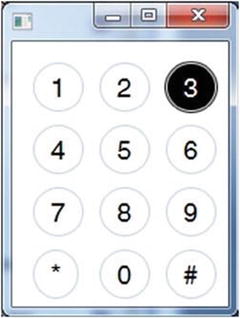
Figure 15-11. A selector with a pseudo-class of hover is used when the mouse cursor is on top of any number pad button
A Selector Styling Example
To demonstrate selectors using id and class type selectors, I created an application resembling a smartphone’s number pad, as shown in Figure 15-12.
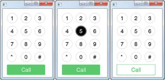
Figure 15-12. An application to mimic a number pad from a smartphone.
In Figure 15-12, notice the 4 × 3 grid of round buttons for a number pad and a green rectangular button beneath it to make a phone call. Listing 15-3 is the main start() method containing the source code. Listing 15-4 then shows the contents of the CSS file mobile_buttons.css.
Listing 15-3. The JavaFX Source Code for the Number Pad Application
@Overridepublic void start(Stage primaryStage) {BorderPane root = new BorderPane();Scene scene = new Scene(root, 180, 250);scene.getStylesheets().add(getClass().getResource("mobile_buttons.css").toExternalForm());String[] keys = {"1", "2", "3","4", "5", "6","7", "8", "9","*", "0", "#"};GridPane numPad = new GridPane();numPad.getStyleClass().add("num-pad");for (int i=0; i < 12; i++) {Button button = new Button(keys[i]);button.getStyleClass().add("num-button");numPad.add(button, i % 3, (int) Math.ceil(i/3) );}// Call buttonButton call = new Button("Call");call.setId("call-button");call.setMaxSize(Double.MAX_VALUE, Double.MAX_VALUE);numPad.add(call, 0, 4);GridPane.setColumnSpan(call, 3);GridPane.setHgrow(call, Priority.ALWAYS);root.setCenter(numPad);primaryStage.setScene(scene);primaryStage.show();}
The code in Listing 15-3 will load the mobile_button.css file that gets applied to the Scene graph. The CSS file’s contents are shown in Listing 15-4.
Listing 15-4. The Contents of the mobile_buttons.css CSS File
.root {-fx-background-color: white;-fx-font-size: 20px;bright-green: rgb(59,223, 86);bluish-gray: rgb(189,218,230);}.num-pad {-fx-padding: 15px, 15px, 15px, 15px;-fx-hgap: 10px;-fx-vgap: 8px;}.num-button {-fx-background-color: white, bluish-gray, white;-fx-background-radius: 50%;-fx-background-insets: 0, 1, 2;-fx-font-family: "Helvetica";-fx-text-fill: black;}.num-button:hover {-fx-background-color: black, white, black;-fx-text-fill: white;}#call-button {-fx-background-color: white, bright-green;-fx-background-radius: 2;-fx-background-insets: 0, 1;-fx-font-family: "Helvetica";-fx-text-fill: white;}#call-button:hover {-fx-background-color: bright-green, white;-fx-background-radius: 2;-fx-background-insets: 0, 1;-fx-font-family: "Helvetica";-fx-text-fill: bright-green;}
How It Works
The code starts by creating a scene that has a BorderPane as a root node. After the scene is created, the code loads the CSS style sheet file mobile_buttons.css to style the current scene’s nodes. Next, the code simply creates a grid using the GridPane class and generates 12 buttons to be placed in each cell. Notice in the for loop that each button is set with the style class named num-button via the getStyleClass().add() method.
Last, the green call button will be added to the last row of the grid pane. Because the call button is unique, its id selector is set with call-button, and it is styled using the id selector, which means the selector named inside the CSS file will be prefixed with the # symbol. To see some amazing button styling, head over to the FXExperience.com’s blog entry on styling buttons at the following link:
http://fxexperience.com/2011/12/styling-fx-buttons-with-css
At FXExperience, the blog entry on styling FX buttons is by Jasper Potts (developer experience architect on client java at Oracle).
How to Define -fx- Based Styling Properties (Rules)
I’m sure by now you have noticed the many name-value pairs (properties) inside styling definition blocks having the prefix -fx-. These properties, often called rules, can be defined to have values that can set a region’s border width, background fill colors, and so on. In this section, you learn how to style a JavaFX node using selector styling blocks and the ability to override properties by using inline styling.
Styling a Node with a Selector Style Definition Block
A selector style definition block always begins with a selector name prefixed with a . or # symbol. The symbol determines the selector type as mentioned earlier. A selector will start a block with an open curly brace, followed by property or rule definitions. Each JavaFX theme property or rule will be prefixed with -fx- and its appropriate property name. A property name and value are separated by a : symbol, and the pair ends with a semicolon. To finish the styling block, you simply end the block with a closing curly brace. The syntax for a selector style definition block looks like this:
. or #<selector-name> <pattern>{-fx-<some-property> : <some-value>;}
One last thing to mention is the ability to add comments to CSS styling definitions. To add comments, you use an opening slash asterisk /* and a closing asterisk slash */ (the same as adding comments in C/C++ and Java). Shown next is an example of using comments in a selector style block definition:
.num-button {-fx-background-color: white, rgb(189,218,230), white;/* This is a comment.-fx-background-radius: 50%;*/-fx-background-insets: 0, 1, 2;-fx-font-family: "Helvetica";-fx-text-fill: black;-fx-font-size: 20px;}
Styling a Node by Inlining JavaFX CSS Styling Properties
While CSS selector blocks are the recommended way to style your JavaFX nodes, there might be situations where you will want to override styling properties. For example, you may want to enlarge a button and change its text color temporarily as a mouse cursor hovers (OnMouseEntered) over the specified button. When the mouse cursor is not hovering (OnMouseExited) the button’s inline style is removed, which then reverts the styling to the parent class or id selector styling blocks. To override a node’s styling property set from its ancestor (parent) id or class selector, you can invoke the node’s method setStyle().
To implement the prior example just mentioned, the following code snippet implements a button with handler code that responds to OnMouseEntered and OnMouseExited events and toggles the button’s text size and color.
Button button = new Button("Press Me");button.getStyleClass().add("my-default-style");button.setOnMouseEntered(actionEvent ->button.setStyle("-fx-font-size: 30px; -fx-text-fill: green;"));button.setOnMouseExited(actionEvent -> button.setStyle(""));
Styling Properties (Rules) Limitations
Because all graph nodes extend from the Node class, derived classes will be able to inherit styling properties from their ancestors. Knowing the inheritance hierarchy of node types is very important because the type of node will help determine the types of styling properties you can control. For instance, a Rectangle class extends from Shape, which extends from Node. Having said this, you will later see that some properties that you assumed would be on a node don’t exist. So how do you know what properties exist? The solution is to refer to the JavaFX CSS Reference Guide. Again, based on the type of node, there are limitations to the styles you are able to set.
Obeying the JavaFX CSS Rules
Did you know that styling properties (rules) can be overridden? To override properties, you must learn about the order of precedence when rules are defined. Figure 15-13 depicts a typical Scene graph with a root (parent) node and child nodes. A root node such as a BorderPane layout node will contain a class selector of root, which is meant for top-level properties.
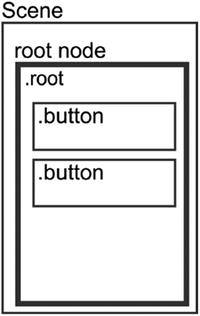
Figure 15-13. A scene with a root node that has buttons as child nodes
These are basically properties common to many nodes, such as font size for text or background color. This is a great feature for theming, because many nodes that share a property will inherit that change. As mentioned earlier, some nodes will contain default selectors; for example, JavaFX Button instances have a .button class selector.
In Figure 15-13, the class selector root could have a property that is common across many nodes related to text:
.root {-fx-font-size: 12px;}.button {-fx-font-size: 20px;}
When you want to style a button’s text font size, you can override the root’s styling definition. In order to override the -fx-font-size property, the button style class definition block will override the 12 point font from the parent with a 20 point font.
Believe it or not, there is another way to override the style definition block of the class selector .button in addition to the method just shown. Similar to HTML5 CSS, each element has a style attribute. JavaFX’s graph nodes also have a style attribute (property). Following is an example of how to set the style property programmatically in Java code:
Button button = new Button("press it!");button.setStyle("-fx-font-size: 30px;");
This code will override any root-, id-, or class-level selector style definition block. Basically, the invocation to the setStyle() method allows you to add any number of property-value pairs as long they are separated by semicolons.
Custom Controls
“Use the force, Luke.”
—Obi-Wan Kenobi
With all of your newfound abilities, there is yet another powerful API you will want to harness. Imagine a customer whose requirements call for specialized UI controls such as LEDs, gauges, knobs, and light indicators. Surely you could attempt to use the existing UI controls to be styled, but it is rather difficult, if not impossible. So, what is a young Padawan to do? (Now, say the quote). Welcome to the world of JavaFX custom controls (the Controls API)!
As an example of creating a custom control, in this section you learn how to create a light-emitting diode (LED) control. The section begins with a description of the LED control. Then you see how the code is structured as you look at the classes involved in the creation of custom controls. After that, you get a chance to look at the code before you walk through the code details.
The LED Custom Control
The light-emitting diode (LED) is something that you will find in many electronic devices to indicate status (such as on or off). So why not use an LED as a custom control in your code as a visual indicator? Typically, an LED contains two wires and a body made from clear plastic, as shown in Figure 15-14.

Figure 15-14. A typical light-emitting diode (LED)
Often the LED is mounted to a socket. To create a custom JavaFX control to emulate a physical object, you first have to decide which materials and components you will portray.
In the case of the LED custom JavaFX control, we can approximate this appearance:
Metal socket
Plastic body
Light effect on top of the plastic body due to the curved surface
One thing that Java developers often don’t like, but which is really helpful for designing a custom control, is using a drawing program. To be precise, a vector drawing program. When the appearance of your control is important, it makes sense to use a tool that is good for visualizing things—a drawing program, such as the one used to create Figure 15-15. So the first thing you should do is create a vector drawing of the control you plan to create.

Figure 15-15. A vector drawing of the LED control
You can see the metal socket around the red plastic body and the white highlight. The red body contains an inner- and outer-shadow to create a more realistic look. If you look at the parts of the vector drawing, you will find three circles filled with gradients, as shown in Figure 15-16.
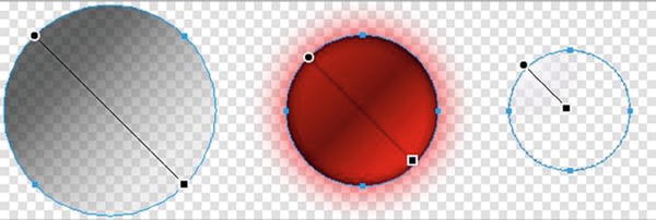
Figure 15-16. The three parts of the vector LED
You start coding in the drawing program because here you define the size, colors, gradients, and positions of your control. The big advantage of using a drawing program is the direct visual feedback that you get by changing parameters like color, size, and position.
In JavaFX there’s not only one way of creating a custom control, but many. Here is a list of valid approaches:
Customize the CSS of an existing control
Extend an existing control
Extend the Region node
Create a control, a skin, and a CSS file
Use the Canvas node
This chapter focuses on the approach that extends a Region node and uses CSS. To get an idea of how to create the same LED control by using the Canvas node or by using a separate Control class, Skin class, and a CSS file, look at the GitHub repository at http://github.com/HanSolo/JFX8CustomControls . For this book, you can get the source code from the book’s web site or from the following:
https://github.com/carldea/jfx9be/blob/master/chap15/JFX9CustomControls/src/jfx9controls/ledregion
Structure of the LED Custom Control Example Code
Usually I structure the code in my controls in the following way:
Constructor
Initialization:
An init() method defines the initial size.
An initGraphics() method sets up the Scene graph of the control.
A registerListeners() method hooks up listeners to properties.
A Methods block contains the get, set, and property methods.
A Resizing block contains methods to resize and redraw the control (if needed).
The Properties of the LED Control
The LED control will contain the logic of the control (its properties) and the visualization code. Because the LED is a very simple control, you do not need many properties. This example uses five properties:
On (Boolean property for current state)
Blinking (Boolean property to switch on/off blinking)
Interval (long property to define the blink interval)
FrameVisible (Boolean property to switch on/off the metal socket)
LedColor (object property of type Color to define the color of the LED)
Listing 15-5 shows the get, set, and property methods for these properties.
Listing 15-5. Property Manipulation Code (Led.java)
public class Led extends Region {private static final double PREFERRED_SIZE = 16;private static final double MINIMUM_SIZE = 8;private static final double MAXIMUM_SIZE = 1024;private static final PseudoClass ON_PSEUDO_CLASS = PseudoClass.getPseudoClass("on");private static final long SHORTEST_INTERVAL = 50_000_000l;private static final long LONGEST_INTERVAL = 5_000_000_000l;// Model/Controller relatedprivate ObjectProperty<Color> ledColor;private BooleanProperty on;private boolean _blinking = false;private BooleanProperty blinking;private boolean _frameVisible = true;private BooleanProperty frameVisible;private long lastTimerCall;private long _interval = 500_000_000l;private LongProperty interval;private AnimationTimer timer;// View relatedprivate double size;private Region frame;private Region led;private Region highlight;private InnerShadow innerShadow;private DropShadow glow;public final boolean isOn() {return null == on ? false : on.get();}public final void setOn(final boolean ON) {onProperty().set(ON);}public final BooleanProperty onProperty() {if (null == on) {on = new BooleanPropertyBase(false) {@Override protected void invalidated() { pseudoClassStateChanged(ON_PSEUDO_CLASS, get()); }@Override public Object getBean() { return this; }@Override public String getName() { return "on"; }};}return on;}public final boolean isBlinking() {return null == blinking ? _blinking : blinking.get();}public final void setBlinking(final boolean BLINKING) {if (null == blinking) {_blinking = BLINKING;if (BLINKING) {timer.start();} else {timer.stop();setOn(false);}} else {blinking.set(BLINKING);}}public final BooleanProperty blinkingProperty() {if (null == blinking) {blinking = new BooleanPropertyBase() {@Override public void set(final boolean BLINKING) {super.set(BLINKING);if (BLINKING) {timer.start();} else {timer.stop();setOn(false);}}@Override public Object getBean() {return Led.this;}@Override public String getName() {return "blinking";}};}return blinking;}public final long getInterval() {return null == interval ? _interval : interval.get();}public final void setInterval(final long INTERVAL) {if (null == interval) {_interval = clamp(SHORTEST_INTERVAL, LONGEST_INTERVAL, INTERVAL);} else {interval.set(INTERVAL);}}public final LongProperty intervalProperty() {if (null == interval) {interval = new LongPropertyBase() {@Override public void set(final long INTERVAL) {super.set(clamp(SHORTEST_INTERVAL, LONGEST_INTERVAL, INTERVAL));}@Override public Object getBean() {return Led.this;}@Override public String getName() {return "interval";}};}return interval;}public final boolean isFrameVisible() {return null == frameVisible ? _frameVisible : frameVisible.get();}public final void setFrameVisible(final boolean FRAME_VISIBLE) {if (null == frameVisible) {_frameVisible = FRAME_VISIBLE;} else {frameVisible.set(FRAME_VISIBLE);}}public final BooleanProperty frameVisibleProperty() {if (null == frameVisible) {frameVisible = new SimpleBooleanProperty(this, "frameVisible", _frameVisible);}return frameVisible;}public final Color getLedColor() {return null == ledColor ? Color.RED : ledColor.get();}public final void setLedColor(final Color LED_COLOR) {ledColorProperty().set(LED_COLOR);}public final ObjectProperty<Color> ledColorProperty() {if (null == ledColor) {ledColor = new SimpleObjectProperty<>(this, "ledColor", Color.RED);}return ledColor;}// ******************** Utility Methods ***********************************public static long clamp(final long MIN, final long MAX, final long VALUE) {if (VALUE < MIN) return MIN;if (VALUE > MAX) return MAX;return VALUE;}
The Initialization Code of the LED Control
The first thing you have to do in the constructor of the LED control is load the corresponding CSS file and add the main style class as follows:
public Led() {getStylesheets().add(getClass().getResource("led.css").toExternalForm());getStyleClass().add("led");Then we simply initialize the AnimationTimer that we will use to make the LED control blink:lastTimerCall = System.nanoTime();timer = new AnimationTimer() {@Override public void handle(final long NOW) {if (NOW > lastTimerCall + getInterval()) {setOn(!isOn());lastTimerCall = NOW;}} };
The last thing you have to do in the constructor is call these methods to initialize the size of the control, initialize the Scene graph, and register some listeners:
init();initGraphics();registerListeners();
To make sure that the LED control will be correctly sized during initialization, you must set the minimum, preferred, and maximum sizes in the init() method, which looks as follows:
private void init() {if (Double.compare(getWidth(), 0) <= 0 || Double.compare(getHeight(), 0) <= 0 ||Double.compare(getPrefWidth(), 0) <= 0 || Double.compare(getPrefHeight(), 0) <= 0) {setPrefSize(PREFERRED_SIZE, PREFERRED_SIZE);}if (Double.compare(getMinWidth(), 0) <= 0 || Double.compare(getMinHeight(), 0) <= 0) {setMinSize(MINIMUM_SIZE, MINIMUM_SIZE);}if (Double.compare(getMaxWidth(), 0) <= 0 || Double.compare(getMaxHeight(), 0) <= 0) {setMaxSize(MAXIMUM_SIZE, MAXIMUM_SIZE);}}
Visualization Code
The javafx.scene.layout.Region node is a lightweight JavaFX container that can contain other nodes and be styled by CSS. By extending the Region node, the custom control will contain the logic of the control and also the visualization code. In the initGraphics() method shown in Listing 15-6, the code sets up the Scene graph for the control by creating the nodes that are needed and applying the appropriate CSS styles to them.
Listing 15-6. Setting Up the LED Control Scene Graph
private void initGraphics() {// Create the node for the metal socketframe = new Region();frame.getStyleClass().setAll("frame");frame.setOpacity(isFrameVisible() ? 1 : 0);// Create the node for the main LED plastic bodyled = new Region();led.getStyleClass().setAll("main");led.setStyle("-led-color: " + (getLedColor()).toString().replace("0x", "#") + ";");// Create the inner shadow effect for the main LED bodyinnerShadow = new InnerShadow(BlurType.TWO_PASS_BOX,Color.rgb(0, 0, 0, 0.65),8, 0d, 0d, 0d);// Create the drop shadow effect for the main LED body (the glow effect)glow = new DropShadow(BlurType.TWO_PASS_BOX,getLedColor(),20, 0d, 0d, 0d);glow.setInput(innerShadow);// Create the node for the highlight effect on the main LED bodyhighlight = new Region();highlight.getStyleClass().setAll("highlight");// Add all nodes to the Scene graph of this controlgetChildren().addAll(frame, led, highlight);}
So far, the example has created each node that you need for the LED control and applied the appropriate style from the CSS file.
The LED Control CSS File
Each node that is created in the initGraphics() method gets its own CSS style class, which can be found in the led.css file. It looks like this:
/* The main led style class where the -led-color variable is defined */.led {-led-color : red;-frame-color: linear-gradient(from 14% 14% to 84% 84%,rgba(20, 20, 20, 0.64706) 0%,rgba(20, 20, 20, 0.64706) 15%,rgba(41, 41, 41, 0.64706) 26%,rgba(200, 200, 200, 0.40631) 85%,rgba(200, 200, 200, 0.3451) 100%);}/* The .frame sub-class, which defines the fill for the metal socket */.led .frame {-fx-background-color : -frame-color;-fx-background-radius: 1024;}/* The .main sub-class, which defines the fill for the LED plastic body when it's off */.led .main {-fx-background-color : linear-gradient(from 15% 15% to 83% 83%,derive(-led-color, -80%) 0%,derive(-led-color, -87%) 49%,derive(-led-color, -80) 100%);-fx-background-radius: 1024;}/* The .main sub class with pseudo-class :on that defines the fill for the LED plasticbody when it's on*/.led:on .main {-fx-background-color: linear-gradient(from 15% 15% to 83% 83%,derive(-led-color, -23%) 0%,derive(-led-color, -50%) 49%,-led-color 100%);}/* The .highlight sub-class that defines the fill of the highlight effect */.led .highlight {-fx-background-color : radial-gradient(center 15% 15%, radius 50%,white 0%,-fx-background-radius: 1024;}
Because in CSS, you can use percentage to define positions in gradients, you don’t have worry about the real size of the control to calculate the start and stop positions of the gradients. That is a huge advantage compared to Java Swing, where you had to calculate all these values every time the size of the control changed. So all these calculations will be done automatically by JavaFX. That reduces the resizing code a lot, as you will see.
Resizing the LED Control
In JavaFX, the size of the layout container determines the size of its children, so you have to ensure that your control is resized by its layout container. That means if you put your LED control in a StackPane (which resizes its children relative to its own size), the LED will be sized the same as the StackPane. Therefore, you must hook up listeners to the widthProperty() and heightProperty() of the control in the registerListeners() method.
private void registerListeners() {widthProperty().addListener(observable -> resize());heightProperty().addListener(observable -> resize());frameVisibleProperty().addListener(observable ->frame.setOpacity(isFrameVisible() ? 1 : 0));onProperty().addListener(observable -> led.setEffect(isOn() ? glow : innerShadow));ledColorProperty().addListener(observable -> {led.setStyle("-led-color: " + (getLedColor()).toString().replace("0x", "#") + ";");resize();});}
This method hooks up listeners to all properties that might have an effect on either visualization or size of the LED control. When the listeners for the width and height are triggered, they will call the resize() method, and that will take care of sizing all nodes in the control.
private void resize() {size = getWidth() < getHeight() ? getWidth() : getHeight();if (size > 0) {if (getWidth() > getHeight()) {setTranslateX(0.5 * (getWidth() - size));} else if (getHeight() > getWidth()) {setTranslateY(0.5 * (getHeight() - size));}innerShadow.setRadius(0.07 * size);glow.setRadius(0.36 * size);glow.setColor(getLedColor());frame.setPrefSize(size, size);led.setPrefSize(0.72 * size, 0.72 * size);led.relocate(0.14 * size, 0.14 * size);led.setEffect(isOn() ? glow : innerShadow);highlight.setPrefSize(0.58 * size, 0.58 * size);highlight.relocate(0.21 * size, 0.21 * size);}}}
As you can see, in the resize() method, the only thing you have to do for each node is calculate its size and relocate the node. So first you calculate the minimum dimension of the LED (because it’s square, you take the width if it’s less than the height or vice versa). In addition, you must make sure that the resizing will be done only if the current size is larger than 0.
How It Works
Now that you have all things in place, you can simply use the control like any other control, as shown here:
@Override public void start(Stage stage) {Led control = new Led();StackPane pane = new StackPane();pane.getChildren().add(control);Scene scene = new Scene(pane);stage.setTitle("JavaFX Led Control");stage.setScene(scene);stage.show();control.setBlinking(true);}
Figure 15-17 shows the result.
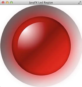
Figure 15-17. The region-based custom LED control
Other Ways to Create a Custom Control
As mentioned earlier, there are different ways to create a custom control in JavaFX. The “extend Region” approach that was shown here is the most common one. The drawback that comes with this approach is that you mixed up the model/controller with the view, which is acceptable for small controls like this LED, but might be a bad solution for a bigger control that relies on a data model or controls that are part of a controls library.
For those more complex controls, you should use a custom Control.class class in combination with a custom Skin.class and your CSS file. The main difference here is that the properties with their get, set, and property methods will be placed in the Control.class and the visualization code will be placed in the Skin.class. This approach provides proper separation between the controller logic and the view logic.
The last approach to creating a custom control that I want to mention is using the Canvas node. The Canvas node represents a single node that in principle behaves like an image that you can draw on. The API that is used to draw on the Canvas node is taken from the HTML5 Canvas, which means you won’t have JavaFX nodes but you will simply draw on the Canvas node. (That is, you’ll be working in immediate mode rather than retained mode.) You have to take care of clearing and redrawing the Canvas node surface. This approach might be useful for controls that contain very complex drawings to calculate and draw, as you would only need to do so once.
Summary
In this chapter, you learned how to style your application with custom CSS files by using the following methods:
Application.setUserAgentStylesheet(String URL)
Scene: getStylesheets().add(String URL)
Then you saw how CSS is used in JavaFX by using the default CSS selectors or creating your own. You learned about the id type selectors, class type selectors, and CSS pseudo-classes. In addition, you learned how to use the selectors in different selector patterns. By using selector patterns, you could apply styling to a group of nodes and their siblings.
Finally, you learned how to create an LED custom control in JavaFX. In this section, you got a chance to employ different strategies in creating custom controls. You learned how to use the Control and Skin classes to adhere to the standard way to create custom controls. You also learned about other interesting strategies, such as extending from Region or using the Canvas class to render primitives in immediate mode.