
In the previous section, we introduced a number of functions to import data, the first step in most data analysis. It is usually a good practice to look at the data before pouring it into a model, so that is what we will do in the next step. The reason is simple—different models have different strengths, and no model is universally the best choice for all cases since they have a different set of assumptions. Arbitrarily applying a model without checking the data against its assumptions usually results in misleading conclusions.
An initial way to choose a model and perform such checks is to just visually examine the data by looking at its boundaries and patterns. In other words, we need to visualize the data first. In this section, you will learn the basic graphic functions to produce simple charts to visualize a given dataset.
We will use the datasets in the nycflights13 and babynames packages. If you don't have them installed, run the following code:
install.package(c("nycflights13", "babynames"))In R, the basic function to visualize data is plot(). If we simply provide a numeric or integer vector to plot(), it will produce a scatter plot of value by index. For example, the following code creates a scatter plot of 10 points in the increasing order:
plot(1:10)
The plot generated is as follows:

We can create a more realistic scatter plot by generating two linearly correlated random numeric vectors:
x <- rnorm(100)
y <- 2 * x + rnorm(100)
plot(x, y)
The plot generated is as follows:

In a plot, there are numerous chart elements that can be customized. The most common elements to be specified are the title (main or title()), the label of the x axis (xlab), the label of the y axis (ylab), the range of the x axis (xlim), and the range of the y axis (ylim):
plot(x, y,
  main = "Linearly correlated random numbers",
  xlab = "x", ylab = "2x + noise",
  xlim = c(-4, 4), ylim = c(-4, 4))
The plot generated is as follows:

The chart title can be specified by either the main argument or a separate title() function call. Therefore, the preceding code is equivalent to the following code:
plot(x, y,
   xlim = c(-4, 4), ylim = c(-4, 4),
   xlab = "x", ylab = "2x + noise")
title("Linearly correlated random numbers")The default point style of a scatter plot is a circle. By specifying the pch argument (plotting character), we can change the point style. There are 26 point styles available:
plot(0:25, 0:25, pch = 0:25,
   xlim = c(-1, 26), ylim = c(-1, 26),
   main = "Point styles (pch)")
text(0:25+1, 0:25, 0:25)

The preceding code produces a scatter plot of all point styles available with the corresponding pch numbers printed beside. First, plot() creates a simple scatter plot, and then text() prints the pch numbers on the right side of each point.
Like many other built-in functions, plot() is vectorized with respect to pch and several other arguments. It makes it possible to customize the style of each point in the scatter plot. For example, the simplest case is that we use only one non-default point style for all points by setting pch = 16:
x <- rnorm(100)
y <- 2 * x + rnorm(100)
plot(x, y, pch = 16,
  main = "Scatter plot with customized point style")
The plot generated is as follows:

Sometimes, we need to distinguish two groups of points by a logical condition. Knowing that pch is vectorized, we can use ifelse() to specify the point style of each observation by examining whether a point satisfies the condition. In the following example, we want to apply pch = 16 to the points satisfying x * y > 1 otherwise, pch = 1:
plot(x, y,
   pch = ifelse(x * y > 1, 16, 1),
   main = "Scatter plot with conditional point styles")
The plot generated is as follows:

We can also draw the points in two separate datasets that share the same x axis using plot() and points(). In the previous example, we generated a normally distributed random vector x and a linearly correlated random vector y. Now, we generate another random vector z that has a non-linear relationship with x and plot both y and z against x but with different point styles:
z <- sqrt(1 + x ^ 2) + rnorm(100)
plot(x, y, pch = 1,
   xlim = range(x), ylim = range(y, z),
   xlab = "x", ylab = "value")
points(x, z, pch = 17)
title("Scatter plot with two series")
The plot generated is as follows:
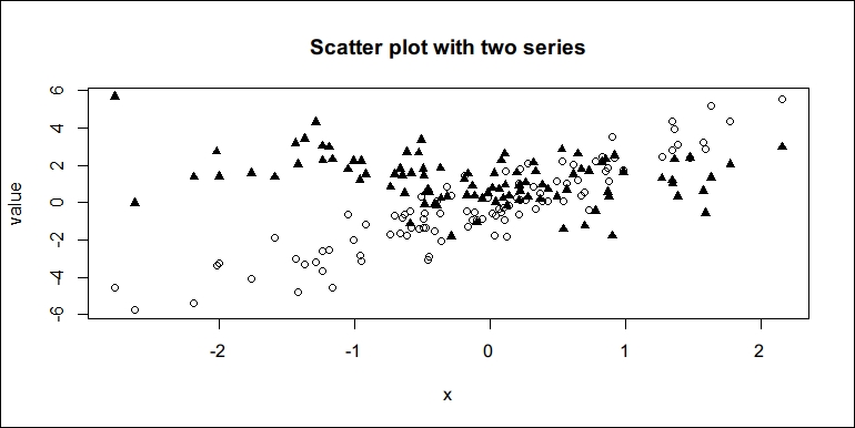
After we generate z, we create a plot of x and y first, and then add another group of points z with a different pch. Note that if we don't specify ylim = range(y, z), the plot builder will only consider the range of y, and the y axis may have a range narrower than the range of z. Unfortunately, points() does not automatically lengthen the axes created by plot(), therefore any point beyond the axes' range will disappear. The preceding code sets an appropriate range of y axis so that all points in y and z can be shown in the plot area.
If the graphics are not limited to gray-scale printing, we may also use different point colors by setting the column of plot():
plot(x, y, pch = 16, col = "blue",
   main = "Scatter plot with blue points")
The plot generated is as follows:

Like pch, col is also a vectorized argument. With the same method, we can apply different colors to separate points into two different categories depending on whether they satisfy a certain condition:
plot(x, y, pch = 16,
  col = ifelse(y >= mean(y), "red", "green"),
  main = "Scatter plot with conditional colors")
The plot generated is as follows:

Note that if the scatter plot is printed grayscale, the colors can only be viewed as different intensities of grayness.
Also, we can use plot() and points() again, but with different col to distinguish different groups of points:
plot(x, y, col = "blue", pch = 0,
  xlim = range(x), ylim = range(y, z),
  xlab = "x", ylab = "value")
points(x, z, col = "red", pch = 1)
title("Scatter plot with two series")
The plot generated is as follows:

R supports commonly used color names and many others (657 in total). Call colors() to get a full list of colors supported by R.
For time series data, line plots are more useful to demonstrate the trend and variation across time. To create line plots, we only need to set type = "l" when calling plot():
t <- 1:50
y <- 3 * sin(t * pi / 60) + rnorm(t)
plot(t, y, type = "l",
   main = "Simple line plot")
The plot generated is as follows:

Just like pch for scatter plot, lty is used to specify the line type of a line plot. The following shows a preview of six line types supported by R:
lty_values <- 1:6
plot(lty_values, type = "n", axes = FALSE, ann = FALSE)
abline(h =lty_values, lty = lty_values, lwd = 2
mtext(lty_values, side = 2, at = lty_values)
title("Line types (lty)")
The plot generated is as follows:

The preceding code creates an empty canvas with type = "n" with proper axes ranges and turns off axes, and another label elements.abline() is used to draw the horizontal lines with different line types but of equal line width (lwd = 2). The mtext() function is used to draw the text on the margin. Note that abline() and mtext() are vectorized with respect to their arguments so that we don't need a for loop to draw each line and margin text in turn.
The following example demonstrates how abline() can be useful to draw auxiliary lines in a plot. First, we create a line plot of y with time, t, which we defined before we created the first line plot a moment ago. Suppose we also want the plot to show the mean value and the range of y along with the time at which the maximal and minimal values appear. With abline(), we can easily draw these auxiliary lines with different line types and colors to avoid ambiguity:
plot(t, y, type = "l", lwd = 2)
abline(h = mean(y), lty = 2, col = "blue")
abline(h = range(y), lty = 3, col = "red")
abline(v = t[c(which.min(y), which.max(y))], lty = 3, col = "darkgray")
title("Line plot with auxiliary lines")
The plot generated is as follows:

Another kind of line plot in which different line types are mixed is a multi-period line plot. A typical form is that the first period is historic data and the second period is predictions. Suppose the first period of y includes the first 40 observations and the remaining points are predictions based on the historic data. We want to use solid lines to represent the historic data and dashed lines for the predictions. Here, we plot the data in the first period and add dashed lines() for the data in the second period of the plot. Note that lines() is to a line plot as points() is to a scatter plot:
p <- 40
plot(t[t <= p], y[t <= p], type = "l",
   xlim = range(t), xlab = "t")
lines(t[t >= p], y[t >= p], lty = 2)
title("Simple line plot with two periods")
The plot generated is as follows:

Sometimes, it is useful to plot both lines and points in the same chart to emphasize that the observations are discrete or simply make the chart clearer. The method is simple, just plot a line chart and add points() of the same data to the plot again:
plot(y, type = "l")
points(y, pch = 16)
title("Lines with points")
The plot generated is shown as follows:

An equivalent way to do this is to plot a scatter chart first using the plot() function and then add lines using the lines() function of the same data to the plot again. Therefore, the following code should produce exactly the same graphics as the previous example:
plot(y, pch = 16)
lines(y)
title("Lines with points")The full version of a multi-series chart should include multiple series represented by lines and points, and a legend to illustrate the series in the chart.
The following code randomly generates two series, y and z, with time, x, and creates a chart with these put together:
x <- 1:30
y <- 2 * x + 6 * rnorm(30)
z <- 3 * sqrt(x) + 8 * rnorm(30)
plot(x, y, type = "l",
   ylim = range(y, z), col = "black")
points(y, pch = 15)
lines(z, lty = 2, col = "blue")
points(z, pch = 16, col = "blue")
title ("Plot of two series")
legend("topleft",
  legend = c("y", "z"),
  col = c("black", "blue"),
  lty = c(1, 2), pch = c(15, 16),
  cex = 0.8, x.intersp = 0.5, y.intersp = 0.8)
The plot generated is as follows:

The preceding code uses plot() to create the line-point chart of y and adds the lines() and points() of z. In the end, we add a legend() on the top left to demonstrate the line and point styles of y and z, respectively. Note that cex is used to scale the font sizes of the legend and x.intersp and y.intersp are used for minor adjustments to the legend.
Another useful type of line plot is step-lines. We use type = "s" in plot() and lines() to create a step-line plot:
plot(x, y, type = "s",
  main = "A simple step plot")
The plot generated is as follows:

In the previous sections, you learned how to create scatter plots and line plots. There are several other types of charts that are useful and worth mentioning. Bar charts are among the most commonly used ones. The height of bars in a bar chart can make a constrast quantitatively between different categories.
The simplest bar chart we can create is the following one. Here, we use barplot() instead of plot():
barplot(1:10, names.arg = LETTERS[1:10])
The plot generated is as follows:

If the numeric vector has names, the names will automatically be the names on the x axis. Therefore, the following code will produce exactly the same bar chart as the previous one:
ints <- 1:10
names(ints) <- LETTERS[1:10]
barplot(ints)
The making of a bar chart looks so easy. Now that we have the flights dataset in nycflights13, we can create a bar plot of the top eight carriers with the most flights in the record:
data("flights", package = "nycflights13")
carriers <- table(flights$carrier)
carriers
##
##    9E    AA    AS    B6    DL    EV    F9    FL    HA    MQ
## 18460 32729   714 54635 48110 54173   685  3260   342 26397
##    OO    UA    US    VX    WN    YV
##    32 58665 20536  5162 12275   601
In the preceding code, table() is used to count the number of flights in the record for each carrier:
sorted_carriers <- sort(carriers, decreasing = TRUE)
sorted_carriers
##
##    UA    B6    EV    DL    AA    MQ    US    9E    WN    VX
## 58665 54635 54173 48110 32729 26397 20536 18460 12275  5162
##    FL    AS    F9    YV    HA    OO
##  3260   714   685   601   342    32
As shown in the preceding code, the carriers are sorted in descending order. We can take the first 8 elements out of the table and make a bar plot:
barplot(head(sorted_carriers, 8),
   ylim = c(0, max(sorted_carriers) * 1.1),
   xlab = "Carrier", ylab = "Flights",
   main ="Top 8 carriers with the most flights in record")
The plot generated is as follows:

Another useful chart is the pie chart. The function to create a pie chart, pie(), works in a way similar to barplot(). It works with a numeric vector with labels specified; it also works directly with a named numeric vector. The following code is a simple example:
grades <- c(A = 2, B = 10, C = 12, D = 8)
pie(grades, main = "Grades", radius = 1)
The plot generated is as follows:

Previously, you learned how to create several different types of charts. Scatter plots and line plots are direct illustrations of the observations in a dataset. Bar charts and pie charts are usually used to show a rough summary of data points in different categories.
They are two limitations to plots: scatter plots and line plots convey too much information and are difficult to draw insights from, while bar charts and pie charts drop too much information, so with these too it can be difficult to make a conclusive judgement with confidence.
A histogram shows the distribution of a numeric vector, and it summarizes the information in the data without dropping too much and thus can be easier to make use of. The following example demonstrates how to use hist() to produce a histogram of a normally distributed random numeric vector and the density function of normal distribution:
random_normal <- norm(10000)
hist(random_normal)
The plot generated is as follows:

By default, the y axis of a histogram is the frequency of the value in the data. We can verify that the histogram is quite close to the standard normal distribution from which random_normal was generated. To overlay the curve of a probability density function of the standard normal distribution, dnorm(), we need to ensure that the y axis of the histogram is a probability and the curve is to be added to the histogram:
hist(random_normal, probability = TRUE, col = "lightgray")
curve(dnorm, add = TRUE, lwd = 2, col ="blue")
The plot generated is as follows:

Now, let's make a histogram of the speed of an aircraft in flight. Basically, the average speed of an aircraft in a trip is the distance of the trip (distance) divided by the air time (air_time):
flight_speed <- flights$distance / flights$air_time
hist(flight_speed, main = "Histogram of flight speed")
The plot generated is as follows:

The histogram seems a bit different from a normal distribution. In this case, we use density() to estimate an empirical distribution of the speed, plot a pretty smooth probability distribution curve out of it, and add a vertical line to indicate the global average of all observations:
plot(density(flight_speed, from = 2, na.rm = TRUE),
   main ="Empirical distribution of flight speed")
abline(v = mean(flight_speed, na.rm = TRUE),
   col = "blue", lty = 2)
The plot generated is as follows:

Just like the first histogram and curve example, we can combine the two graphics together to get a better view of the data:
hist(flight_speed,
  probability = TRUE, ylim = c(0, 0.5),
  main ="Histogram and empirical distribution of flight speed",
  border ="gray", col = "lightgray")
lines(density(flight_speed, from = 2, na.rm = TRUE),
  col ="darkgray", lwd = 2)
abline(v = mean(flight_speed, na.rm = TRUE),
   col ="blue", lty =2)
The plot generated is as follows:

Histograms and density plots are two ways to demonstrate the distribution of data. Usually, we only need several critical quantiles to get an impression of the whole distribution. The box plot (or box-and-whisker plot) is a simple way to do this. For a randomly generated numeric vector, we can call boxplot() to draw a box plot:
x <- rnorm(1000)
boxplot(x)
The plot generated is as follows:
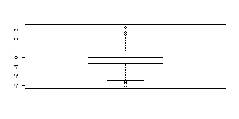
A box plot contains several components to show critical quartile levels of data as well as outliers. The following image clearly explains what a box plot means:

The following code draws a box plot of the flight speed for each carrier. There will be 16 boxes in one chart, making it easier to roughly compare the distribution of different carriers. To proceed, we use the formula distance /air_time ~carrier to indicate that the y axis denotes the flight speed computed from distance / air_time, and the x axis denotes the carrier. With this representation, we have the following box plot:
boxplot(distance / air_time ~ carrier, data =flights,
  main = "Box plot of flight speed by carrier")
The plot generated is as follows:

Note that we use the formula interface of creating graphics in boxplot(). Here, distance / air_time ~ carrier basically means the y axis should represent the values of distance / air_time, that is, flight speed, and the x axis should represent different carriers. data = flights tells boxplot() where to find the symbols in the formula we specify. As a result, the box plot of flight speed is created and grouped by carrier.
The formula interface of visualizing and analyzing data is very expressive and powerful. In the next section, we will introduce some basic tools and models to analyze data. Behind the functions that implement these tools and models are not only algorithms but also a user-friendly interface (formula) to make it easier to specify relationships for the model to fit.
There are also other packages that are specially tailored for data visualization. One great example is ggplot2, which implements a very powerful grammar of graphics to create, compose, and customize different types of charts. However, it is beyond the scope of this book. To know more, I recommend that you read ggplot2: Elegant Graphics for Data Analysis by Hadley Wickham.