
Chapter 2. How Vue works - The basics
In the previous chapter, you learned the essential tools for building a Vue application and also created your first Vue application, preparing you for the next step: learning how Vue works by writing Vue code.
This chapter introduces you to the concepts of Virtual Document Object Model (Virtual DOM) and the fundamentals of writing a Vue component with Vue Option APIs. It also explores further Vue directives and Vue reactivity mechanism. By the end of the chapter, you will understand how Vue works and be able to write and register a Vue component for use in your application.
Virtual DOM under the Hood
Vue doesn’t work directly with the DOM (Document Object Model). Instead, it implements its Virtual DOM to optimize the application’s performance on runtime.
To have a solid understanding of how Virtual DOM works, we start with the concept of the DOM.
The DOM represents the HTML1 document content on the web, in the form of an in-memory tree-like data structure (as shown in Figure 2-1). It acts as a programming interface that connects the web page and the actual programming code (such as JavaScript). Tags, such as <div> or <section>, in the HTML document are represented as programmatic nodes and objects.

Figure 2-1. Example of a DOM tree
After the browser parses the HTML document, the DOM will be available for interaction immediately. Upon any layout changes, the browser then paints and repaints the DOM constantly in the background. We call the process parsing and painting the DOM screen rasterization or the pixel-to-screen pipeline. Figure 2-2 demonstrates how rasterization works:

Figure 2-2. The rasterization process of the browser.
The layout update problem
Each paint is costly to the browser’s performance. Since the DOM may consist of many nodes, querying and updating single or multiple nodes can be extremely expensive.
Let’s look at a simple example of a list of li elements in the DOM as follows:
<ulclass="list"id="todo-list"><liclass="list-item">To do item 1</li><liclass="list-item">To do item 2</li><!--so on…--></ul>
Adding/removing a li element or modifying its content requires to query the DOM for that item using document.getElementById (or document.getElementsByClassName). Then you need to perform the desired updates using the appropriate DOM APIs.
For instance, if you want to add a new item to the above example, you need to do the following steps:
-
Query the containing list element by its
idattribute’s value - “todo-list” -
Add the new
lielement usingdocument.createElement() -
Set the
textContentand the relevant attributes to match other elements’ standard usingsetAttribute(). -
Append that element to the list element found in step 1 as its child using
appendChild().
constlist=document.getElementById('todo-list');constnewItem=document.createElement('li');newItem.setAttribute('class','list-item');newItem.textContent='To do item 3';list.appendChild(newItem);
Similarly, suppose you want to change the text content of the 2nd li item to “buy groceries”. In that case, you perform step 1 to get the containing list element, then query the target element using getElementsByClassName(), and finally change its textContent to the new content:
constsecondItem=list.getElementsByClassName('list-item')[1];secondItem.textContent='Buy groceries'
Usually, such actions as querying and updating the DOM on a small scale do not enormously impact performance. However, these actions can slow down the page if performed more repetitively (within a few seconds) and on a more complex web page. The performance impact is significant when there are consecutive minor updates. Many frameworks, such as Angular 1.x, failed to acknowledge and address this performance issue as the codebase grows. The Virtual DOM, as a new and modern approach, comes to solve the layout update problem.
What is Virtual DOM?
Virtual DOM is the in-memory virtual copy version of the actual DOM in the browser, but is lighter-weight and has extra functionalities. It mimics the real DOM structure, with a different data structure (usually Object)(see Figure 2-3).

Figure 2-3. The browser DOM vs. the virtual DOM.
Behind the scenes, the virtual DOM still uses the DOM API to construct and render updated elements in the browser. Thus it still causes the browser’s repainting process but at a more innovative and efficient level.
In short, Virtual DOM is an abstract pattern aiming to free the DOM from all the actions that can lead to performance inefficiencies, such as manipulating attributes, handling events, and manually updating DOM elements.
How Virtual DOM works in Vue
The Virtual DOM sits between the real DOM and the Vue application code. Below is an example of what a node in the Virtual DOM looks like:
constnode={tag:'div',attributes:[{id:'list-container',class:'list-container'}],children:[/* an array of nodes */]}
Let’s call this node VNode. VNode is a virtual node which resides within the Virtual DOM and represents the actual DOM element in the real DOM.
Through UI interactions, the user tells Vue what state they wish the element to be in; Vue then triggers the Virtual DOM to update that element’s represented object (node) to the desired shape while keeping track of those changes. Finally, it communicates with the actual DOM and performs accurate updates on the changed nodes accordingly.
Since the Virtual DOM is a tree of custom JavaScript objects, updating a component equals updating a custom JavaScript object. This process doesn’t take long. Because we don’t call any DOM API, this update action doesn’t cause a DOM repainting.
Once the Virtual DOM finishes updating itself, it syncs in batch with the original DOM, leading the changes to reflect on the browser.
In Figure 2-4, we can see how updates from the virtual DOM to the actual DOM work when adding a new list item and changing the list item’s text.

Figure 2-4. How update from Virtual DOM to actual DOM works when adding a new element and updating the text of an existing element in the list.
Since the Virtual DOM is a tree of objects, we can easily track the specific updates that need to be synced with the original DOM when modifying the Virtual DOM. Instead of querying and updating directly on the actual DOM, we can now schedule and call the updated APIs with a single render function in one update cycle to maintain performance efficiency.
Now we understand how virtual DOM works, we will move on to explore the Vue instance and the Vue Options API.
The Vue app instance and Options API
Every Vue application starts with only one single Vue component instance as the application root. Any other Vue component created in the same application needs to be nested inside this root component.
Note
You can find the initialization code example in main.ts of our Vue project. Vite automatically generates the code as part of its scaffolding process.
We also write our example code of this chapter within this file.
In Vue 2, Vue exposes a Vue class2 for you to create a Vue component instance based on a set of configuration options, using the following syntax:
constApp={}constapp=newVue(App)
Vue receives a component, or the component’s configuration to be more precise. A component’s configuration is an Object containing all the component’s initial configuration options. We call the structure of this argument Options API, which is another of Vue’s core APIs.
Starting from Vue 3, you can no longer call new Vue() directly. Instead, you create the application instance using createApp() method from the vue package. This change in functionality enhances the isolation of each Vue instance created both on dependencies and shared components (if any) and the code readability:
1import{createApp}from'vue'2 3constApp={}4 5constapp=createApp(App)
createApp() also accepts an Object of component’s configurations. Based on these configurations, Vue creates a Vue component instance as its application root app. Then you need to mount the root component app to the desired HTML element using the app.mount() method, as follows:
app.mount('#app')
#app is the unique id selector for the application’s root element. Vue engine queries for the element using this id, mounts the app instance to it, then renders the application in the browser.
The next step is to provide the configurations for Vue to build a component instance according to Options API.
Note
We write code according to Vue 3 API standards from this point onwards.
Exploring the Options API
Options API is Vue’s core API for initializing a Vue component. It contains the component’s configurations structured in an Object format.
We divide its essential properties into four main categories:
-
State handling: including
data()which returns the local data state for the component,computed,methods,watchfor enabling observation on specific local data, andpropsfor the incoming data. -
Rendering:
templatefor the HTML view template andrender()as the rendering logic for the component. -
Life cycle hooks such as
beforeCreate(),created(),mounted(), etc., for handling different stages of a component’s life cycle. -
Others such as
provide(),inject()for handling different customization and communication between components. Andcomponents, an collection of nested component templates to use within the component.
Below is an example structure of our root App component based on Options API:
1import{createApp}from'vue'2 3constApp={4template:"This is the app's entrance",5data(){6return{}7}8}9 10constapp=createApp(App)11app.mount('#app')
In the above code, we provide an HTML template that displays a regular text. We also define an empty local data state using data() function, which we will discuss further in “Creating local state with data properties”.
You can also rewrite the above code to use the render() function as below:
1import{createApp}from'vue'2 3constApp={4render(){5return"This is the app's entrance"6},7data(){8return{}9}10}11 12constapp=createApp(App)13app.mount('#app')
Both codes will generate the same result (Figure 2-5).

Figure 2-5. Sample output of writing a root component using Options API
If you open the Element tab in the browser’s Developer Tools, you will see the actual DOM now contains a div with id="app" and a text content This is the app’s entrance (Figure 2-6).
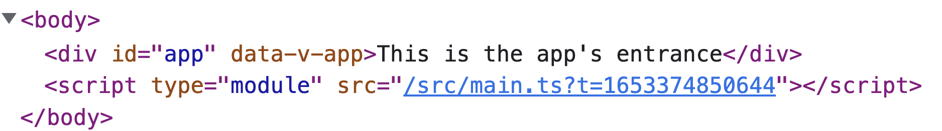
Figure 2-6. Sample output of writing a root component using Options API
You can also create a new component - Description which renders a static text and pass it to components of the App. Then you can use it as a nested component in the template, like in Example 2-1:
Example 2-1. Declare an internal component template to use in the App.
1import{createApp}from'vue'2 3constDescription={4template:"This is the app's entrance"5};6 7constApp={8components:{Description},9template:'<Description />'10}11 12constapp=createApp(App)13app.mount('#app')
The output stays the same as in Figure 2-6.
Note here you must declare either template or render() function (see “The render function and JSX”) for the component. However, you don’t need these properties in case you are writing the component in Single File Component (SFC) standard. We will discuss this component standard in Chapter 3.
Next, let’s look at the template property syntax.
The template syntax
In Options API, template accepts a single string that contains valid HTML-based code and represents the component’s UI layout. The Vue engine parses this value and compiles it into optimized JavaScript code, then accordingly renders the relevant DOM elements.
The code below demonstrates our root component App whose layout is a single div displaying a text This is the app’s entrance:
1import{createApp}from'vue'2 3constApp={4template:"<div>This is the app's entrance</div>",5}6 7constapp=createApp(App)8app.mount('#app')
For multi-level HTML template code, we can use backtick characters3, denoted by ` symbol, and maintain the readability. We can rewrite App’s template in the previous example to include another h1 and h2 elements, as in the following:
1import{createApp}from'vue'2 3constApp={4template:`5<h1>This is the app's entrance</h1>6<h2>We are exploring template syntax</h2>7`,8}9 10constapp=createApp(App)11app.mount('#app')
The Vue engine will render to the DOM with two headings, with the content accordingly (Figure 2-7)

Figure 2-7. The output of a multi-level template for a component
The template property syntax is essential to create the binding between a specific DOM element and the component’s local data using directives and a dedicated syntax. We will explore how to define the data we want to display in the UI next.
Creating local state with data properties
Most components keep their local state (or local data) or receive data from external. In Vue, we store the component’s local state using the Options API’s data() function property.
data() is an anonymous function that returns an object representing the local data state of a component. We call that returned object the data object. When initializing the component instance, the Vue engine will add each property of this data object to its reactivity system for tracking its changes and triggering the re-rendering of the UI template accordingly.
In short, the data object is the reactive state of a component.
To inject the data property in the template, we use the mustache syntax, denoted by double curly braces {{}}. Within the HTML template, we wrap the data property with the curly braces where we need to inject its value, as seen in Example 2-2:
Example 2-2. Inject title to display in the HTML template
1import{createApp}from'vue'2 3constApp={4template:`5<div>{{ title }}</div>6`,7data(){8return{9title:'My first Vue component'10}11}12}13 14constapp=createApp(App)15app.mount('#app')
In the above code, we declare the local data property title and inject its value in the template of App by using the {{ title }} expression. The output in the DOM equals the following code:
<div>My first Vue component</div>
You can also combine an inline static text with double curly braces within the same element tag, as shown below:
constApp={template:`<div>Title: {{ title }}</div>`,/**... */}
Vue automatically preserves the static text and replaces only the expression with the correct value. The result equals the following:
<div>Title: My first Vue component</div>
All data object properties are available for access directly and internally through the component instance this. And this is accessible in any component’s local methods, computed properties, and life cycle hooks. For example, we can print out title to the console after creating a component with the hook created() as below:
import{createApp}from'vue'constApp={/**... */created(){console.log(this.title)}}constapp=createApp(App)app.mount('#app')
You can debug the reactivity of a data property by using the Vue Devtools. While on the main page of our application, let’s open the browser’s Developer Tools, head towards the Vue tab, and select the Root component displayed in the Inspector panel. Once selected, a right-side panel will appear, showing the component data object’s properties. When you hover on the title property, there will be a pen icon allowing you to edit the property value (Figure 2-8)

Figure 2-8. How to debug and edit a data property using Vue DevTools
After clicking on that edit icon button, modifying the title value, and hitting Enter, the application UI instantly reflects the new value.
So you learned how to use data() and double curly braces {{}} to inject the local data to the UI template. This is a type of one-way data binding.
Before we explore the two-way binding and other directives in Vue, let’s look at the reactive system in Vue.
How reactivity in Vue works
To understand how reactivity works, let’s take a quick look at how the Virtual DOM processes all the received information, creates and keeps track of created VNodes before yielding to the actual DOM (Figure 2-9).
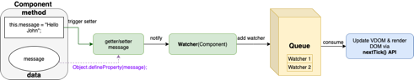
Figure 2-9. The flow of Virtual DOM’s rendering process.
We can describe the process diagram above as follows:
-
Once you define the local data, in Vue.js 2.0, the internal Vue engine uses JavaScript built-in
Object.defineProperty()to establish the getters and setters for each related data and enables relevant data reactivity. In Vue.js 3.0, however, the Vue engine uses ES5 Proxy-based mechanism4 for performance enhancement, boosting runtime performance by double and reducing the memory taken by half. We will discuss about this reactivity mechanism in Chapter 3. -
After setting the reactivity mechanism up, the Vue engine uses Watcher objects to keep track of any data update triggered by the setters. Watcher helps the Vue engine detect changes and update the Virtual DOM and the actual DOM through a Queue system.
-
Vue uses the Queue system to avoid inefficient multiple updates of the DOM within a short time. A Watcher adds itself to the Queue upon a related component’s data change. The Vue engine sorts it by a specific order for consumption. Until the Vue engine finishes consuming and flushing that Watcher from the Queue, only one Watcher of the same component exists within the Queue, regardless of the number of data changes. This consumption process is done by
nextTick()API, which is a Vue function. -
Finally, after the Vue engine consumes and flushes all the watchers, it triggers the
run()function of each Watcher to update the component’s real DOM and virtual DOM automatically. And hence the application renders.
Let’s perform another example. This time we use data() and the help of created() to demonstrate reactivity in the application. created() is the lifecycle hook that the Vue engine triggers after creating the component instance and before mounting it to the DOM element. At this point, we won’t discuss this hook further but use this hook to perform a timer update on a data property counter with setInterval:
1import{createApp}from'vue'2 3constApp={4template:`5<div>Counter: {{ counter }}</div>6`,7data(){8return{9counter:010}11},12created(){13constinterval=setInterval(()=>{14this.counter++15},1000);16 17setTimeout(()=>{18clearInterval(interval)19},5000)20}21}22 23constapp=createApp(App)24app.mount('#app')
In the code above we increment the counter every one sec5. We also use setTimeout() to clear the interval after 5 seconds. On the browser, you can see the displayed value changing from 0 to 5 every second. The final output will equal the string below:
Counter: 5
After understanding the concept of reactivity and rendering in Vue, we are ready to explore how to perform the two-way data binding.
Two-way binding with v-model
Two-way binding refers to how we sync data between component’s logic and its view template. When a component’s data field changes programmatically, the new value reflects on its UI view. And vice versa, when a user makes changes to the data field on the UI view, the component automatically gets and saves the updated value, keeping both the internal logic and the UI synchronized. A good example for two-way binding is the form input field.
The two-way data binding is always a complex yet beneficial use case for application development. One common scenario for two-way binding is the form input synchronization. Proper implementation saves developing time and reduces complexity to maintain the data consistency between the actual DOM and component data. But implementing two-way binding is a challenge.
Fortunately, Vue makes two-binding much simpler with the v-model directive. Binding v-model directive to a component’s data model will automatically trigger updating the template when the data model changes, and vice versa.
The syntax is straightforward, with the value passing to v-model is the name alias declared in the data return object.
Assume we have an NameInput component that receives text input from the user, with the following template code:
constNameInput={template:`<label for="name"><input placeholder="Enter your name" id="name"></label>`}
We want to sync the the input value received with a local data model, naming name. To do so, we add v-model="name" to the input element, and declare the data model in data() accordingly, as below:
1constNameInput={2template:`3<label for="name">4Write your name:5<input6v-model="name"7placeholder="Enter your name"8id="name"9>10</label>`,11data(){12return{13name:'',14}15}16}
The value of name will change whenever the user changes the input field on run time.
To have this component render in the browser, we add NameInput as one of the components for the application, as follows:
import{createApp}from'vue'constNameInput={/**... */}constapp=createApp({components:{NameInput},template:`<NameInput />`,})app.mount('#app')
You can track this data change by opening the Vue tab in the browser’s Developer Tools. Within the Inspector tab, find and select the NameInput element under the Root element, and you will see the component’s data displayed on the right panel of the Vue tab (Figure 2-10)

Figure 2-10. Debug the input component using the Vue tab in Developer Tools
When you change the input field, the name property under data displayed on the right side of the Vue tab will get the updated value also (Figure 2-11).

Figure 2-11. Input value changes also sync with the relevant component’s data model.
You can also use the same approach for building a checklist with multiple options. In this scenario, you need to declare the data model as an Array and add the v-model binding on each checkbox input field. Example 2-3 demonstrates how it looks for a CourseChecklist:
Example 2-3. Create a chapter checklist using v-model and checkbox input
1import{createApp}from'vue'2 3constCourseChecklist={4template:`5<div>The course checklist: {{list.join(', ')}}</div>6<div>7<label for="chapter1">8<input9v-model="list"10type="checkbox"11value="chapter01"12id="chapter1"13>14Chapter 115</label>16<label for="chapter2">17<input18v-model="list"19type="checkbox"20value="chapter02"21id="chapter2"22>23Chapter 224</label>25<label for="chapter3">26<input27v-model="list"28type="checkbox"29value="chapter03"30id="chapter3"31>32Chapter 333</label>34</div>35`,36data(){37return{38list:[],39}40}41}42 43constapp=createApp({44components:{CourseChecklist},45template:`<CourseChecklist />`,46})47 48app.mount('#app')
Vue automatically adds or removes an input value to the list array according to the user’s interaction (Figure 2-12)

Figure 2-12. A screenshot displaying the value of the list after the user makes a selection.
Using v-model.lazy modifier
Sometimes, updating a data’s value on every user’s keystroke can be too much, especially when displaying that input value in other places. Remember Vue re-renders the template UI according to the data changes. By enabling two-way syncing on every input key received, you expose your application to potential unnecessary re-rendering. To reduce this overhead, you can use v-model.lazy modifier instead of the regular v-model to bind with the data model.
1constNameInput={2template:`3<label for="name">4Write your name:5<input6v-model.lazy="name"7placeholder="Enter your name"8id="name"9>10</label>`,11data(){12return{13name:'',14}15}16}
This modifier ensures the v-model will only track changes triggered by the onChange event of that input element solely.
Using v-model.number and v-model.trim modifier
If the data model you are binding to v-model should be a number type, you can use the modifier v-model.number to convert the input value into a number.
Similarly, if you want to ensure the string data model free from trailing whitespaces, you can use v-model.trim instead.
That’s all for two-way binding. Let’s examine the more common directive v-bind for one-way binding, shall we?
Binding reactive data and passing props data with v-bind
Previously we learned to use v-model for two-way binding and double curly braces {{}} for one-way data injection. But to perform one-way binding data to another element as attributes’ values or other Vue components as props, we use v-bind.
v-bind, denoted by :, is the most used Vue directive in any application. We can bind an element’s attribute (or component’s props) or more to JavaScript expressions, following the syntax:
v-bind:<attribute>="<expression>"
Or, in short, with : syntax:
:<attribute>="<expression>"
For example, we have a imageSrc data, an image URL. To display the image using <img> tag, we perform the following binding to its src attribute:
Example 2-4. Binding source to an image
1import{createVue}from'vue'2 3constApp={4template:`5<img :src="imageSrc" />6`,7data(){8return{9imageSrc:"https://res.cloudinary.com/mayashavin/image/upload/TheCute%20Cat"10}11}12}13 14constapp=createApp(App)15 16app.mount('#app')
Vue takes the value of imageSrc and binds it to the src attribute, resulting in the following code on the DOM:
<imgsrc="https://res.cloudinary.com/mayashavin/image/upload/TheCute%20Cat">
Vue updates the src whenever imageSrc’s value changes.
Also, you can add v-bind on an element as a standalone attribute. v-bind accepts an object containing all the attributes to bind as properties and the expressions as their values. We rewrite the above Example 2-4 to demonstrate this use case:
Example 2-5. Binding source and alt text to an image using an object
1import{createVue}from'vue'2 3constApp={4template:`5<img v-bind="image" />6`,7data(){8return{9image:{10src:"https://res.cloudinary.com/mayashavin/image/upload/TheCute%20Cat",11alt:"A random cute cate image"12}13}14}15}16 17constapp=createApp(App)18 19app.mount('#app')
In the Example 2-5, we bind an object image with two properties src for the image URL and alt for its alt text to the element <img>. The Vue engine will automatically parse image into relevant attributes by its properties’ names, and then generate the following HTML code in the DOM:
<imgsrc="https://res.cloudinary.com/mayashavin/image/upload/TheCute%20Cat"alt="A random cute cate image">
Binding to class and style attributes
When binding to class or style attributes, you can pass expression in Array or Object type. Vue engine knows how to parse and unite them into the proper styling or class name string.
For example, let’s add some classes to our img in Example 2-5 as follows:
1import{createVue}from'vue'2 3constApp={4template:`5<img v-bind="image" />6`,7data(){8return{9image:{10src:"https://res.cloudinary.com/mayashavin/image/upload/TheCute%20Cat",11alt:"A random cute cate image",12class:["cat","image"]13}14}15}16}17 18constapp=createApp(App)19 20app.mount('#app')
The above code generates <img> element with the class as a single string " cat image ", as in the following:
<imgsrc="https://res.cloudinary.com/mayashavin/image/upload/TheCute%20Cat"alt="A random cute cate image"class="cat image">
You can also perform dynamical class names by binding the class attribute to an object whose properties’ values are according to the boolean isVisibile data value as below:
1import{createVue}from'vue'2 3constApp={4template:`5<img v-bind="image" />6`,7data(){8return{9image:{10src:"https://res.cloudinary.com/mayashavin/image/upload/TheCute%20Cat",11alt:"A random cute cate image",12class:{13cat:isVisible,14image:!isVisible15}16}17}18}19}20 21constapp=createApp(App)22 23app.mount('#app')
Here we define the img element to have cat class when isVisibile is true, and image otherwise. The generated DOM element for when isVisible is true now becomes:
<imgsrc="https://res.cloudinary.com/mayashavin/image/upload/TheCute%20Cat"alt="A random cute cate image"class="cat">
Similar output for when isVisible is false, with image instead of cat for the class name.
You can perform the same approach with the style attribute or pass an object containing CSS rules in the camelCase format. For example, let’s add some margins to our image in Example 2-5
1import{createVue}from'vue'2 3constApp={4template:`5<img v-bind="image" />6`,7data(){8return{9image:{10src:"https://res.cloudinary.com/mayashavin/image/upload/TheCute%20Cat",11alt:"A random cute cate image",12style:{13marginBlock:'10px',14marginInline:'15px'15}16}17}18}19}20 21constapp=createApp(App)22 23app.mount('#app')
The above code generates inline stylings for the img element with margin-block: 10px and margin-inline: 15px applied.
You can also combine several style objects into a single style array. Vue knows how to unite them into a single style rule string, as follows:
1import{createVue}from'vue'2 3constApp={4template:`5<img v-bind="image" />6`,7data(){8return{9image:{10src:"https://res.cloudinary.com/mayashavin/image/upload/TheCute%20Cat",11alt:"A random cute cate image",12style:[{13marginBlock:10px,14marginInline:15px15},{16padding:10px17}]18}19}20}21}22 23constapp=createApp(App)24 25app.mount('#app')
The output DOM element will be:
<imgsrc="https://res.cloudinary.com/mayashavin/image/upload/TheCute%20Cat"alt="A random cute cate image"style="margin-block: 10px; margin-inline: 15px; padding: 10px">
Using v-bind for style
In general, inline style is not a good practice. Hence I don’t recommend using v-bind for organizing component stylings. We will discuss the proper way of working with styling in Vue in Chapter 3.
Next, let’s iterate over a data collection in a Vue component.
Iterating over data collection using v-for
Dynamic list rendering is essential to help to reduce repetitive code, increase code reusability, and maintain the format consistency between a group of similar element types. Some examples are a list of articles, active users, and Tiktok accounts you follow. The data is dynamic in these examples, while the type of content and the UI layout remain similar.
Vue provides a v-for directive to accomplish the goal of iterating through an iterative data collection, such as an array or object. We use this directive directly on an element, following the below syntax:
v-for = "elem in list"
elem is just an alias for each element in the data source list.
For example, if we want to iterate through an array of numbers [1, 2, 3, 4, 5] and print out the element value, we use the following code:
1import{createApp}from'vue'2 3constList={4template:`5<ul>6<li v-for="number in numbers" :key="number">{{number}}</div>7</ul>8`,9data(){10return{11numbers:[1,2,3,4,5]12};13}14};15 16constapp=createApp({17components:{List},18template:`<List />`19})20 21app.mount('#app')
The above code equals writing the following native HTML code:
<ul><li>1</li><li>2</li><li>3</li><li>4</li><li>5</li></ul>
One significant advantage of using v-for is to keep the template consistent and map the data content dynamically to the relevant element, regardless of how the data source may change over time.
Each block generated by the v-for iteration has access to other components’ data and the specific list item. Take Example 2-6, for instance:
Example 2-6. Writing a task list component using v-for
1import{createApp}from'vue'2 3constList={4template:`5<ul>6<li v-for="task in tasks" :key="task.id">7{{title}}: {{task.description}}8</li>9</ul>10`,11data(){12return{13tasks:[{14id:'task01',15description:'Buy groceries',16},{17id:'task02',18description:'Do laundry',19},{20id:'task03',21description:'Watch Moonknight',22}],23title:'Task'24}25}26}27 28constapp=createApp({29components:{List},30template:`<List />`31})32 33app.mount('#app')
The Figure 2-13 below displays the output of the above code:

Figure 2-13. Output of tasks list with the default title for each row
Keeping the uniqueness with the key attribute
Here we must define a unique key attribute for each iterated element. Vue uses this attribute to keep track of each element rendered for a later update. See “Make the element binding unique with key attribute” for a further discussion on its importance.
In addition, v-for supports an optional second argument, index, the current element’s appearance index in the iterating collection. We can rewrite Example 2-6 as follows:
1import{createApp}from'vue'2 3constList={4template:`5<ul>6<li v-for="(task, index) in tasks" :key="task.id">7{{title}} {{index}}: {{task.description}}8</li>9</ul>10`,11data(){12return{13tasks:[{14id:'task01',15description:'Buy groceries',16},{17id:'task02',18description:'Do laundry',19},{20id:'task03',21description:'Watch Moonknight',22}],23title:'Task'24}25}26}27 28constapp=createApp({29components:{List},30template:`<List />`31})32 33app.mount('#app')
This code block generates the following output (Figure 2-14):

Figure 2-14. The output of the task list with each task’s index.
So far, we have covered iteration with array collection. Let’s look at how we iterate through the properties of an Object.
Iterating through Object’s properties
In JavaScript, Object is a type of key-value map table, with each object’s property being the unique key of the table. To iterate through the properties of an object, we use similar syntax with array iteration:
v-for = "(value, name) in collection"
Here value stands for the value of a property and name for that property’s key.
Below is an example of how we iterate through properties of an Object collection and print out each property’s name and value according to the format <name>: <value>:
1import{createApp}from'vue'2 3constCollection={4template:`5<ul>6<li v-for="(value, name) in collection" :key="name">7{{name}}: {{value}}8</li>9</ul>10`,11data(){12return{13collection:{14title:'Watch Moonknight',15description:'Log in to Disney+ and watch all the chapters',16priority:'5'17}18}19}20}21 22constapp=createApp({23components:{Collection},24template:`<Collection />`25})26 27app.mount('#app')
The output will be:

Figure 2-15. The output of collection object with default title
And indeed, we still have access to the index appearance of the present pair as the third argument, as in the following syntax:
v-for = “(value, name, index) in collection”
As mentioned earlier, we always have to define a key attribute value for each iterating element. This attribute is significant in making the element update binding unique. We will explore the key attribute next.
Make the element binding unique with key attribute
The Vue engine keeps track and updates the elements rendered with v-for by a simple in-place patch strategy. However, in various scenarios, we need to take complete control over list reordering or prevent unwanted behavior when the list element relies on its child component’s state.
Vue provides an additional attribute – key, as a unique identity for each node element binds to a specific iterated list item. Vue engine uses it as a hint to track, reuse, and reorder the rendered nodes and their nested elements instead of in-place patching.
The syntax usage of a key attribute is straightforward. We use v-bind:key (:key in short) and bind a unique value to that list element, as shown in the below example:
<divv-for="(value, name, index) in collection":key="index">
Keeping the key’s uniqueness
The key should be the item’s distinct identifier (id) or its appearance index in the list.
As a good practice, you must always provide the key attribute when using v-for.
Nevertheless, Vue will throw a warning on the browser console if there is no key presented. Also, if you enable ESLint in your application, it throws an error and instantly warns you about the missing key attribute, as shown in Figure 2-16 below.
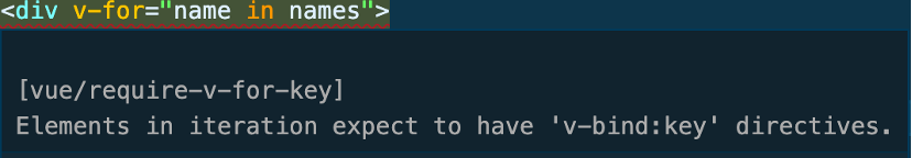
Figure 2-16. Eslint warning when there is no the key presented
Valid values for the key attribute
A key should be a string or numeric value. Object or array is not a valid key to use.
key attribute is helpful, even beyond the scope of v-for. Without a key attribute, applying the built-in list transition and animation effect is impossible. We’ll come back for more details on the benefits of key in Chapter 7.
Adding event listener to elements with v-on
To bind a DOM event to a listener, Vue exposes the built-in directive v-on ( in short @) for element tags. v-on directive accepts the following value types:
-
Some inline JavaScript statements in the form of a string or
-
A name of the component method declared in the component options under
methodsproperty.
We use v-on with the following format:
v-on:<event>= “<inline JavaScript code / name of method>”
Or with the shorter version using @:
@<event>=”<inline JavaScript code / name of method>”
Note
From now on we use @ to denote v-on.
Then add this directive directly on any element as an attribute, as seen below:
<button@click="printMsg='Button is clicked!'">Click me</button>
For code readability, especially in a complex codebase, I recommend keeping the JavaScript expression inside a component’s method and exposing the use through its name on the directive, as in Example 2-7:
Example 2-7. Change printMsg’s value on button click using v-on directive
1import{createApp}from'vue'2 3constApp={4template:`5<button @click="printMessage">Click me</button>6<div>{{ printMsg }}</div>7`,8methods:{9printMessage(){10this.printMsg="Button is clicked!"11}12},13data(){14return{15printMsg:"Nothing to print yet!",16}17}18}19 20constapp=createApp(App)21 22app.mount("#app");
When the user hasn’t clicked on the button, the display message below the button will be “Nothing to print yet” (Figure 2-17).

Figure 2-17. A message “Nothing to print yet!” appears as default
Otherwise, the message will change to “Button is clicked!” (Figure 2-18)

Figure 2-18. A message “Button is clicked!” appears after the user clicks on the button
Handling events better with v-on event modifiers
Before the browser dispatches an event on a target element, it constructs that event’s propagation path list using the current DOM tree structure. The last node in this path is the target itself, and the other preceding nodes are its ancestors, respectively, in order. Once dispatched, the event travels through one or all three main event phases (Figure 2-19):
-
Capturing (or Capture phase): The event travels (or propagates) from the top ancestor down to the target element.
-
Target: The event is at the target element.
-
Bubbling: The event travels (or bubbles) from the target element up to its ancestor.

Figure 2-19. Flow of propagation for a click event
We usually interfere with this event propagation flow programmatically within the listener logic. With v-on’s modifiers, we can interfere directly on the directive level.
We use v-on modifiers following the below format:
v-on:<event>.<modifier>
One great advantage of modifiers is that it keeps the listener as generic and reusable as possible. We do not need to worry internally about event-specific details, such as preventDefault or stopPropagation.
Take the Example 2-8, for instance:
Example 2-8. Manually stop the propagation using stopPropagation()
1constApp={2template:`3<button @click="printMessage">Click me</button>4`,5methods:{6printMessage(e:Event){7if(e){8e.stopPropagation()9}10 11console.log("Button is clicked!")12}13},14}
Here we have to stop the propagation ourselves with e.stopPropagation, adding another validation layer to make sure e exists. We can rewrite the above Example 2-8 using @click.stop modifier as follows:
Example 2-9. Stop propagation using @click.stop modifier
1constApp={2template:`3<button @click.stop="printMessage">Click me</button>4`,5methods:{6printMessage(){7console.log("Button is clicked!")8}9},10}
Table 2-1 shows the complete list of event modifiers available, briefly explaining the equivalent event functionalities or behavior.
| Modifier | Description |
|---|---|
| Instead of calling |
| Instead of calling |
| Trigger the event listener only if the event’s target is the element where we attach the listener to. |
| Trigger the event listener at most once |
| Instead of passing |
| Mainly to opt-in for better scroll performance and prevent triggering |
Chaining modifiers
The event modifiers support chaining, meaning you can write expressions like @click.stop.prevent=" printMessage"> on the element tag. This expression equals calling both event.stopPropagation() and event.preventDefault() inside event handler, in the appeared order.
Detecting keyboard events with key code modifiers
While event modifiers are for interfering with the event propagation flow, key modifiers help detect special keys of keyboard events such as keyup, keydown, and keypress.
Usually, to detect a specific key, we need to perform two following steps:
-
Identify the key code,
keyor thecoderepresented that key. For instance, thekeyCodeforEnteris 13, itskeyis “Enter”, and itscodeis “Enter”. -
When firing the event handler, within the handler, we need to check manually if
event.keyCode(orevent.codeorevent.key) matches the target key code.
This approach is inefficient in maintaining reusable and clean code in a large codebase. v-on comes with built-in key modifiers as a better alternative. If we want to detect if the user types the Enter key, we add the modifier .enter to the related keydown event, following the same syntax when using event modifiers.
Assume we have an input element, and we log to the console a message whenever a user presses Enter, as seen in Example 2-10:
Example 2-10. Manual checking if a keyCode is 13 which stands for Enter key.
1constApp={2template:`<input @keydown="onEnter" >`,3methods:{4onEnter(e:KeyboardEvent){5if(e.keyCode==='13'){6console.log('User pressed Enter!')7}8 9/*...*/10}11}12}
We now can rewrite it using @keydown.enter:
Example 2-11. Checking for Enter key pressed by @keydown.enter modifier
1constApp={2template:`<input @keydown.enter="onEnter" >`,3methods:{4onEnter(e:KeyboardEvent){5console.log('User pressed Enter!')6/*...*/7}8}9}
The app behaves the same in both cases.
A few other common used key modifiers are .tab, .delete, .esc, .space, etc.
Another popular use case is to capture a special keys combination, such as Ctrl & Enter (CMD & Enter for MacOS) or Shift + S. In these scenarios, we chain the system key modifiers (.shift, .ctrl, .alt and .meta for CMD key in MacOS) with key code modifiers, as in the following example:
<!-- Ctrl + Enter --><input@keyup.ctrl.13=”onCtrlEnter”>
Or chaining the Shift modifier and the key code modifier for S key (keyCode is 83), as below:
<!-- Shift + S --><input@keyup.shift.83=”onSave”>
Chaining system modifiers and key code modifiers
You have to use key code modifiers instead of standard key modifiers, meaning .13 in place of .enter for this type of chaining.
Also, to capture the exact key combinations for triggering an event, we use the .exact modifier as follows:
<button@click.shift.exact=”onShiftEnter”/>
Combining .shift and .exact makes sure the click event fires when the user presses the only Shift key while clicking the button.
Conditional rendering elements with v-if, v-else, and v-else-if
Depending on a particular condition, we may decide to generate or remove an element from the DOM. We call this scenario conditional rendering.
Assuming we have a boolean data property isVisible which decides if Vue should render a text element into the DOM and make it visible to user. Binding directive v-if to isVisible by placing v-if="isVisible" on the text element enables reactively rendering the element only when isVisible is true.
Example 2-12. Example usage for v-if
1import{createVue}from'vue'2 3constApp={4template:`5<div>6<div v-if="isVisible">I'm the text in toggle</div>7<div>Visibility: {{isVisible}}</div>8</div>9`,10data(){11return{12isVisible:false13}14}15}16 17constapp=createApp(App)18 19app.mount('#app')
When setting isVisible to false, the generated DOM elements will look like the following:
<div><!--v-if--><div>Visibility: false</div></div>
Otherwise, the text element will be visible in the DOM as follow:
<div><div>I'm the text in toggle</div><div>Visibility: true</div></div>
If we want to render a different component for the opposite condition (isVisible is false), v-else is the right choice. Unlike v-if, you use v-else without binding to any data property. It takes the correct condition value based on the immediate preceding v-if usage in the same context level.
Using v-else
v-else only works when v-if exists, and it has to always present last in a chaining conditional rendering.
For example, we can create a component with the following code block with both v-if and v-else:
Example 2-13. Conditional display different texts using v-if and v-else
1import{createVue}from'vue'2 3constApp={4template:`5<div>6<div v-if="isVisible">I'm the visible text</div>7<div v-else>I'm the replacement text</div>8</div>9`,10data(){11return{12isVisible:false13}14}15}16 17constapp=createApp(App)18 19app.mount('#app')
In short, you can translate the above conditions into similar logical expressions as
<!--if isVisibile is true, then render --><div>I'm the visible text</div><!-- else render --><div>I'm the replacement text</div>
Same as in any if…else logic expression, we can always extend the condition check with else if condition block. This condition block equals to v-else-if directive. and also requires a JavaScript condition statement. For example, we want to display a text I’m the subtitle text when isVisible is false and showSubtitble is true:
Example 2-14. Condition chaining with v-if, v-else-if and v-else
1import{createVue}from'vue'2 3constApp={4template:`5<div v-if="isVisible">I'm the visible text</div>6<div v-else-if="showSubtitle">I'm the subtitle text</div>7<div v-else>I'm the replacement text</div>8`,9data(){10return{11isVisible:false,12showSubtitle:false,13}14}15}16 17constapp=createApp(App)18 19app.mount('#app')
Warning
If we use v-else-if, we must present it on elements appearing after the element with assigned v-if attribute
While using v-if means to render an element conditionally, there are situations where it won’t be efficient to mount/unmount an element from the DOM so frequently.
In such cases, it’s better to use v-show.
Conditional displaying elements with v-show
Unlike v-if, v-show only toggles the visibility of the target element. Vue still renders the target element regardless of the status of the condition check. Once rendered, Vue controls the visibility using CSS display rule to hide/show the element conditionally.
Let’s take Example 2-12 and change the directive from v-if to v-show, for instance.
Example 2-15. Hide/Show the element using v-show
1import{createVue}from'vue'2 3constApp={4template:`5<div>6<div v-show="isVisible">I'm the text in toggle</div>7<div>Visibility: {{isVisible}}</div>8</div>9`,10data(){11return{12isVisible:false13}14}15}16 17constapp=createApp(App)18 19app.mount('#app')
The UI output is as same as when we use v-if. However, in the browser DOM (you can debug in the Element tab of the Developer Tools), the text element exists in the DOM but is not visible to the user:
<div><divstyle="display: none;">I'm the text in toggle</div><div>Visibility: false</div></div>
The target element has an inline style with display:none applied. When toogling isVisible to true, Vue will remove this inline style.
Note
v-show is more efficient if the toggling frequency is high at runtime, while v-if is an ultimate choice if the condition is not likely to change.
Dynamically displaying HTML code with v-html
We use v-html to inject plain HTML code into the DOM dynamically, in a form of a string, as in the following Example 2-16:
Example 2-16. Using v-html to render inner HTML content
1import{createVue}from'vue'2 3constApp={4template:`5<div v-html="innerContent" />6`,7data(){8return{9innerContent:`10<div>Hello</div>11`12}13}14}15 16constapp=createApp(App)17 18app.mount('#app')
The Vue engine will parse the directive value as static HTML code and place it into the innerHTML property of the div element. The result should look like:
<div><div>Hello</div></div>
Security concern with v-html
You should only use v-html to render trusted content or perform server side rendering.
Also, a valid HTML string can contain a script tag and the browser will trigger the code within this script tag, leading to a potential security thread. Hence I don’t recommend using this directive on clide-side rendering at all.
Displaying text content with v-text
v-text is an alternative way of injecting data as the element’s content besides the double curly braces {{}}. However, unlike {{}}, Vue won’t update the text rendered if there are any changes.
This directive is beneficial when you need to predefine a placeholder text, then override the text only once after a component finishes loading, as seen in the code below:
1import{createVue}from'vue'2 3constApp={4template:`5<div v-text="text">Placeholder text</div>6`,7data(){8return{9text:`Hello World`10}11}12}13 14constapp=createApp(App)15 16app.mount('#app')
Here Vue will render the application displaying “Placeholder text”, and will eventually replace it with “Hello World” received from text.
Optimizing renders with v-once and v-memo
v-once helps render static content and preserves performance from the re-rendering static element. Vue renders elements with this directive presented only once and would not update it regardless of any re-rendering.
To use v-once, you place the directive as is on the element tag, as below:
1import{createVue}from'vue'2 3constApp={4template:`5<div>6<input v-model="name" placeholder="Enter your name" >7</div>8<div v-once>{{name}}</div>9`,10data(){11return{12name:'Maya'13}14}15}16 17constapp=createApp(App)18 19app.mount('#app')
In the above example, Vue renders name once for the div tag, and regardless what value name receives from user through input field and by v-model, the content of this div won’t be updated (Figure 2-20).
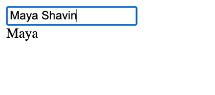
Figure 2-20. Text remains the same though the input value has changed.
While v-once is excellent for defining a block of elements as static content, we use v-memo to memorize a block of parts (or components) within a template conditionally.
v-memo accepts an array of JavaScript expressions as its value. We place it on the top element where we want to control its and its children’s re-rendering. Vue then validates these JavaScript conditional expressions and only triggers the re-rendering on the target block of elements when fulfilling those condition(s).
Take rendering a gallery of image cards, for instance. Assume we have an array of images. Each image is an object with a title, url, and id. Users can select an image card by clicking on the card, and the selected card will have a blue border style around it.
First, let define the images data array and selected image card id in the component data object:
1constApp={2data(){3return{4selected:null,5images:[{6id:1,7title:'Cute cat',8url:9'https://res.cloudinary.com/mayashavin/image/upload/w_100,h_100,c_thumb/TheCute%20Cat',10},{11id:2,12title:'Cute cat no 2',13url:14'https://res.cloudinary.com/mayashavin/image/upload/w_100,h_100,c_thumb/cute_cat',15},{16id:3,17title:'Cute cat no 3',18url:19'https://res.cloudinary.com/mayashavin/image/upload/w_100,h_100,c_thumb/cat_me',20},{21id:4,22title:'Just a cat',23url:24'https://res.cloudinary.com/mayashavin/image/upload/w_100,h_100,c_thumb/cat_1',25}]26}27}28}
Then we define the layout for the list rendering to the template, adding a conditional memorization v-memo for the list item to re-render only if the image item is no longer selected or vice versa.
1constApp={2template:`3 <ul> 4 <li 5 v-for="image in images" 6 :key="image.id" 7 :style=" selected === image.id ? { border: '1px solid blue' } : {}" 8 @click="selected = image.id" 9 v-memo="[selected === image.id]"10 > 11 <img :src="image.url"> 12 <div>{{image.title}}</h2> 13 </li> 14 </ul> 15`,16data(){17/*..*/18}19}

We set the re-rendering to only if the condition check
selected === image.idresults differently from previous check.
The output will look like in Figure 2-21 below:

Figure 2-21. Images gallery output
Every time you make an image selection by clicking on the image card, Vue will only re-render two items - the previously selected item and the currently selected one. For optimizing large list rendering, this directive can be very powerful.
v-memo availability
v-memo is only available in Vue 3.2 and above.
We have now learnt how to write a component using the template syntax and some common Vue directives, except v-slot. We will resume discussing about the power of v-slot in Chapter 3.
Next, let’s explore how we can write a component using the render() function property instead.
The render function and JSX
With Vue compiler API, Vue processes and compiles all the HTML templates used for a Vue component into the Virtual DOM upon rendering. When data of a Vue component is updated, Vue triggers the internal render function to send the Virtual DOM the latest value.
Using template is the most common approach to creating a component. However, we need to bypass the HTML template parser process in specific scenarios, such as optimizing performance, working on a server-side rendering application, or working on a dynamic component library. By returning the rendered virtual node from the Virtual DOM directly and skipping the template compiling process, render() is the solution for such cases.
Using render function
In Vue 2, render() function property receives a createElement callback parameter. It returns a valid VNode6 by triggering createElement with the appropriate arguments. We usually denote createElement as h function7.
Below is an example of creating a component in Vue 2 syntax:
Example 2-17. Use render function in Vue 2
constApp={render(h){returnh('div',{id:'test-id'},'This is a render function test with Vue 2')}}
The above code equals writing the following template code:
constApp={template:`<div id='test-id'>This is a render function test with Vue 2</div>`}
In Vue 3, the syntax of render changes significantly. It no longer accepts h function as parameter. Instead, vue package exposes a global function h for creating VNodes. Hence we can rewrite the code in Example 2-17 to the the following:
Example 2-18. Use render function in Vue 3
import{createApp,h}from'vue'constApp={render(){returnh('div',{id:'test-id'},'This is a render function test with Vue 2')}}
The output stays the same.
Supporting multi-root nodes with the render function
Since Vue 3 supports multiple root nodes for a component template, render() now can return an array of VNodes, each will be injected into the DOM at the same level as the others.
Using h function to create VNode
Vue designs the h function to be very flexible with three input parameters in different types, as shown in Table 2-2 below.
| Parameter | Is required? | Acceptable data type | Description |
|---|---|---|---|
component | Yes | String, Object or Function | It accepts a string as a text or HTML tag element, a component function, or a component options object. |
props | No | Object | This object contains all components’ |
nested children | No | String, Array or Object | This parameter includes a list of VNodes, or a string for a text-only component, or an object with different |
The syntax of the h function is as follows:
h(component, { /*props*/ }, children)For example, we want to create a component that uses a div tag as a root element and has an id, an inline border style, and one input child element. We can call h like in the below code:
1constinputElem=h(2'input',3{4placeholder:'Enter some text',5type:'text',6id:'text-input'7})8 9constcomp=h(10'div',11{12id:'my-test-comp',13style:{border:'1px solid blue'}14},15inputElem16)
And in the actual DOM, the output of the component will be:
<divid="my-test-comp"style="border: 1px solid blue;">Text input<inputplaceholder="Enter some text"type="text"id="text-input"></div>
You can play with the complete working code below and experiment with different configurations for the h function:
1import{createApp,h}from'vue'2 3constinputElem=h(4'input',5{6placeholder:'Enter some text',7type:'text',8id:'text-input'9})10 11constcomp=h(12'div',13{14id:'my-test-comp',15style:{border:'1px solid blue'}16},17inputElem18)19 20constApp={21render(){22returncomp23}24}25 26constapp=createApp(App)27 28app.mount("#app")
Writing JSX in render function
JSX (JavaScript XML) is a JavaScript extension introduced by the React framework to allow developers to write HTML code within JavaScript. Below is an example of what HTML and JavaScript code in a JSX format looks like:
constJSXComp=<div>ThisisaJSXcomponent</div>
The above code outputs a component that renders a div tag with the text “This is a JSX component”. All left to do is to return this component in the render function directly:
import{createApp,h}from'vue'constJSXComp=<div>ThisisaJSXcomponent</div>constApp={render(){returnJSXComp}}constapp=createApp(App)app.mount("#app")
Vue 3.0 supports writing with JSX out of the box. The syntax for JSX is a bit different from the Vue template. To bind a dynamic data, we use single curly braces {}, like in the following Example 2-19:
Example 2-19. Writing a simple Vue component using JSX
1import{createApp,h}from'vue'2 3constname='JSX'4constJSXComp=<div>Thisisa{name}component</div>5 6constApp={7render(){8returnJSXComp9}10}11 12constapp=createApp(App)13 14app.mount("#app")
We bind dynamic data with the same approach. There is no need to wrap the expression with ''. Below example shows how we attach a value to the id attribute of the div:
/**... */constid='jsx-comp'constJSXComp=<divid={id}>Thisisa{name}component</div>/**... */
However, unlike JSX in React, with Vue, we don’t transform the attributes such as class to className. Instead, we keep these attributes’ original syntax. And same goes to elements’ event listeners (onclick instead of onClick in React, etc).
You can also register a JSX component as part of components like other Vue components written in Options API. It can be handy in combining with the render function in writing dynamic components and offers better readability in many cases.
Next, we will discuss how we can write a functional component.
Functional component
A functional component is a stateless component and bypasses the typical component lifecycle. Unlike a standard component, which works with options API, a functional component is a function, denoting the render function for that component.
Since it is a stateless component, there is no access to the this instance. Instead, Vue exposes component’s external props and context as function arguments. Functional component needs to return a virtual node instance created by using the global function h() from the vue package. Hence the syntax will be:
import{h}from'vue'exportfunctionMyFunctionComp(props,context){returnh(/* render function argument */)}
context exposes the component’s context properties, including emits for the component’s event emitters, attrs for passed attributes to the component from the parent, and slots containing the component’s nested elements.
For example, we have a functional component myHeading which displays any text passed to it within a heading element. We give the heading’s level as level props. If we want to display the text “Hello World” as heading level 2 (<h2>), we will use myHeading as follows:
<my-headinglevel="2">Hello World</my-heading>
And the output should be:
<h2>Hello World</h2>
To do so, we use the render function h from the vue package and perform the following code:
Example 2-20. Using h function to create a custom heading component
import{h}from'vue';exportfunctionMyHeading(props,context){constheading=`h${props.level}`returnh(heading,context.$attrs,context.$slots);}
Vue will skip the template render process for the functional component and add the virtual node declaration directly to its renderer pipeline. This mechanism results in no nested slots or attributes available for functional components.
Defining props and emits for functional component
You can explicitly define functional component’s acceptable props and emits by following the syntax:
MyFunctionComp.props=['prop-one','prop-two']MyFunctionComp.emits=['event-one','event-two']
Without defining, context.props will have the same value as context.attrs, containing all the attributes passed to the component.
A functional component is powerful when you want to control how to render your component programmatically, especially for component library authors who need to provide low-level flexibility for their components toward users’ requirements.
Note
Vue 3 offers an additional way of writing component by using <script setup>. This is only relevant if you write component in SFC format. we will explore this further in “setup”
Registering a component globally
Using the components property of Option API to register a component only enables its availability explicitly within the current component. Any of the present component’s nested elements won’t have access to use the registered one.
Vue exposes the instance method Vue.component(), which receives two input parameters as arguments:
-
A string stands for the component’s registered name (alias).
-
Component instance, either an SFC imported as a module or an Object containing the component’s configurations followed Options API.
To register a component globally, we trigger component() on the created app instance, as seen in Example 2-21:
Example 2-21. Register MyComponent as global component and use it in App template
1/* main.ts */2import{createApp}from'vue'3 4//1. Create the app instance5constapp=createApp({6template:'<MyComponent />'7});8 9//2. Define the component10constMyComponent={11template:'This is my global component'12}13 14//3. Register a component as global15app.component('MyComponent',MyComponent)16 17app.mount('#app')
If you have a MyComponent as an SFC file8, you can rewrite Example 2-21 to the following:
1/* main.ts */2import{createApp}from'vue'3importAppfrom'./App.vue'4importMyComponentfrom'./components/MyComponent.vue'5 6//1. Create the app instance7constapp=createApp(App);8 9//2. Register a component as global10app.component('MyComponent',MyComponent);
And MyComponent will always be available for reuse in any component nested within the app instance.
Importing the same component over again in every component file can be repetitive and inconvenient. In reality, sometimes, you need to reuse a component multiple times across an application. In this scenario, registering components as global components is an excellent practice.
Next, we will explore how to add external functionality to a Vue application using plugins.
Adding custom functionality globally with Vue plugins
We use plugins to add third-party libraries or extra custom functionality for global usage in our Vue application. A Vue plugin is an object that exposes a single method install(), containing the logic code, and is responsible for installing the plugin itself. Below is an example of a sample plugin:
/* plugins/samplePlugin.ts */exportdefault{install(app:Vue,options:Object){// Installation logic}}
In the above code, we define our sample plugin code within the samplePlugin file, located in the plugins directory. install() receives two argument: an app instance, and some options as the plugin’s configurations.
For example, let’s compose a trucate plugin that will add a new global function property $truncate. $truncate will return a truncated string if its length is over options.limit characters.
Example 2-22. Compose a truncate plugin
/* plugins/truncate.ts */exportdefault{install(app:Vue,options:{limit:number}){app.config.globalProperties.$truncate=(str:string)=>{if(str.length>limit){return`${str.slice(0,limit)}...`;}returnstr;}}}
To use this plugin in our application, we call the app.use() method on the created app instance in the main.ts
/* main.ts */import{createApp}from'vue'importtruncatefrom'./plugins/truncate'constApp={}//1. Create the app instanceconstapp=createApp(App);//2. Register the pluginapp.use(truncate,{limit:10})app.mount('#app')
The Vue engine will install the truncate plugin and initialize it with the limit of 10 characters. The plugin will be available in every Vue component within the app instance. You can call this plugin using this.$truncate in the script section, or just $truncate in the template section, as seen below:
1import{createApp}from'vue'2importtruncatefrom'./plugins/truncate'3 4constApp={5template:`6<h1>{{ $truncate('My truncated long text') }}</h1>7<h2>{{ truncatedText }}</h2>8`,9data(){10return{11truncatedText:this.$truncate('My 2nd truncated text')12}13}14}15 16constapp=createApp(App);17app.use(truncate,{limit:10})18app.mount('#app')
The output should look like this in Figure 2-22:

Figure 2-22. The component output texts as truncated.
Plugins are very helpful in organizing global methods and making them available for reuse in other applications. It is also beneficial in writing your logic during an installation of an external library, such as axios for fetching external data, i18n for localization, etc.
Registering Pinia and Vue Router in our application
During the scaffolding of our application, Vite adds the Pinia and Vue Router as application plugins using the same approach reflected in the original generated code in main.ts.
In the next section, we will look at rendering the dynamic component in runtime using the Vue <component> tag.
Dynamic rendering with <component> tag
The <component> tag acts as the placeholder for rendering a Vue component, according to the component reference name passed to its is props, following the syntax below:
<componentis="targetComponentName"/>
Suppose your target component is accessible from the Vue instance (registered as a component of the app or the parent component when <component> nested); the Vue engine will know how to look up the target component based on the name string, and replace the tag with the target component. The target component will also inherit all the extra props passed to <component>.
Let’s say we have a HelloWorld component that renders a text “Hello World”, as below:
constHelloWorld={template:`<div>Hello World</div>`}
We register this component to the App, then render it dynamically using the <component> tag, as follows:
constApp={components:{HelloWorld},template:`<component is="HelloWorld" />`,}
You can also bind the component as a reference to the is props using the v-bind directive (denoted by : short syntax). We can shorten the two code blocks above into a single App component by rewriting the code as follows:
1constApp={2template:`3<component :is="myComp" />4`,5data(){6return{7myComp:{8template:'<div>Hello World</div>'9}10}11}12}
Note here the component reference myComp follows Options API syntax. You can also pass an imported SFC component instead. The output of both cases should be the same.
<component> tag proves to be very powerful in many cases. For example, if you have a gallery component, you can choose to render each gallery item as a Card component or a Row component. Using <component> to switch parts conditionally can be very beneficial.
However, switching components means Vue unmounts the current element completely and erases all the component’s current data states. Switching back to that component equals creating a new instance with a new data state. To prevent that behavior and maintain the states of a passive element for a future switch, we use the <keep-alive> component.
Keeping component instance alive with <keep-alive>
<keep-alive> is a built-in Vue component for wrapping around a dynamic element and preserves the component’s states when it is in inactive mode.
Assume we have two components, StepOne and StepTwo. In the StepOne component, there is a string input field that has two way binding to a local data property name using v-model:
constStepOne={template:`<div><label for="name">Step one's input</label><input v-model="name" id="name" /></div>`,data(){return{name:"",}},}
while the StepTwo component renders a static string, as shown below:
constStepTwo={template:`<h2>{{ name }}</h2>`,data(){return{name:"Step 2",}},}
In the main App template, we will use component tag to render a local data property - activeComp as component reference. The initial value of activeComp is StepOne, and we have a button to move between StepOne to StepTwo, and vice versa, as shown below:
1constApp={2template:`3<div>4<keep-alive>5<component :is="activeComp" />6</keep-alive>7<div>8<button @click="activeComp = 'one'" v-if="activeComp === 'two'">9Go to Step Two10</button>11<button @click="activeComp = 'two'" v-else>Back to Step One</button>12</div>13</div>14`,15components:{StepTwo,StepOne},16data(){17return{18activeComp:"one",19};20},21}
Whenever you switch between StepOne and StepTwo, Vue preserves any value of the name property received from the input field. When switching back to StepOne, you can continue with the previous value rather than starting from the initial value.
You can also define the maximum instances for keep-alive to the cache using its max props.
<keep-alivemax="2"><component:is="activeComp"/></keep-alive>
In the above code, we define the maximum number of instances keep-alive should hold as two by setting max="2". Once the number of cached instances exceeds the limit, Vue removes the least recent used (LRU) instance from the cached list, allowing for caching new instances.
Summary
This chapter explored Virtual DOM and how Vue uses it to achieve its performance goal. We learned how to control the component rendering with JSX and functional components, handle built-in Vue directives, and use them to process the component’s local data for displaying on the UI template reactively. You also learn about the reactivity fundamentals and how to create and register the Vue component using Option API with the template syntax. These are the basics for going further into the Vue component mechanism in the next chapter.