Chapter 4. Interacting between components
In Chapter 3, we deep-dived into composing a component with lifecycle hooks, computed properties, watchers, methods, and other features. We also learned about the power of slots and how to receive external data from other components using props.
Based on that foundation, this chapter guides you on how to build the interactions between components using custom events and provide/inject patterns. It also introduces Teleport API, which allows you to move elements around the DOM tree while keeping their order of appearance inside a Vue component.
Nested component and data flow in Vue
Vue components can nest other Vue components inside them. This feature is handy in allowing users to organize their code into smaller, manageable, and reusable pieces in a complex UI project. We call nested elements child components and the component containing them as their parent component.
Data flow in a Vue application is unidirectional by default, which means that the parent component can pass data to its child component but not the other way around. The parent can pass data to the child component using props, and the child component can emit events back to the parent component using custom events emits. Figure 4-1 demonstrates the data flow between components.

Figure 4-1. One-way data flow in Vue components
Passing function as props
Unlike other frameworks, Vue does not allow you to pass a function as a prop to the child component. Instead, you can bind the function as a custom event emitter (“Communication between components with custom events”).
Using props to pass data to child components
In the form of an object or array, the props field of a Vue component contains all the available data properties that the component can receive from its parent. Each property of props is a prop of the target component. To start receiving data from the parent, you need to define the props field in the component’s options object, as shown in the following example:
Example 4-1. Defining props in a component
exportdefault{name:'ChildComponent',props:{name:String}}
In Example 4-1, the ChildComponent component defines a name prop of type String. The parent component then can pass data to the child component using this name prop, as shown in the following example (Example 4-2):
Example 4-2. Passing static data as props to a child component
<template><ChildComponentname="Red Sweater"/></template><scriptlang="ts">importChildComponentfrom'./ChildComponent.vue'exportdefault{name:'ParentComponent',components:{ChildComponent},}</script>
The ChildComponent receives a static “Red Sweater” as a name value in the above example. If you want to pass and bind a dynamic data variable to name, such as the first element in the children list, you can use the v-bind attribute, denoted by :, as follows:
Example 4-3. Passing dynamic variables as props to a child component
<template><ChildComponent:name="children[0]"/></template><scriptlang="ts">importChildComponentfrom'./ChildComponent.vue'exportdefault{name:'ParentComponent',components:{ChildComponent},data(){return{children:['Red Sweater','Blue T-Shirt','Green Hat']}}}</script>
The output for the above code is the same as passing a static string Red Sweater to the name prop.
Note
If the name prop is not of type String, you still need to use the v-bind attribute (or :) to pass static data to the child component, such as :name="true" for Boolean, or :name="[hello, world]" for Array type.
In Example 4-3, whenever the value of children[0] changes, Vue will also update the name prop in the ChildComponent, and the child component will re-render its content if needed.
If you have more than one prop in the child component, you can follow the same approach and pass each data to the relevant prop. For instance, to pass name and price of a product to the ProductComp component, you can perform the following (Example 4-4):
Example 4-4. Passing multiple props to a child component
/** components/ProductList.vue */<template><ProductComp:name="product.name":price="product.price"/></template><scriptlang="ts">importProductCompfrom'./ProductComp.vue'exportdefault{name:'ProductList',components:{ProductComp},data(){return{product:{name:'Red Sweater',price:19.99}}}}</script>
And we can define the ProductComp component as in the following (Example 4-5):
Example 4-5. Defining multiple props in ProductComp
<template><div><p>Product: {{ name }}</p><p>Price: {{ price }}</p></div></template><scriptlang="ts">exportdefault{name:'ProductComp',props:{name:String,price:Number}}</script>
The output will be as follows:
Product: Red Sweater
Price: 19.99
Alternatively, you can use v-bind (not :) to pass the entire object user and have its properties bound to the relevant child component’s props, as below:
<template><ProductCompv-bind="product"/></template>
Note that only the child component will only receive the relevant declared props. Hence if you have another field product.description in the parent component, it will not be available for access in the child component.
Note
Another approach to declare your component’s props is to use an array of strings, each representing the name of the prop it accepts, such as props: ["name", "price"]. This approach is practical when you want to prototype a component quickly. However, I strongly recommend you use the object form of props and declare all your props with types, as a good practice for code readability and bug prevention.
We have learned how to declare props with types, but how do we validate the data passed to the child’s props when needed? How can we set a fallback value for a prop when no value passed? Let’s find out next.
Declaring prop types with validation and default values
Back in Example 4-1, we declare name prop as String type. Vue will warn if the parent component passes a non-string value to the name prop during run-time. However, to be able to enjoy the benefit of Vue’s type validation, we should use the full declaration syntax, as shown below:
{type:String|Number|Boolean|Array|Object|Date|Function|Symbol,default?:any,required?:boolean,validator?:(value:any)=>boolean}
In which:
-
typeis the type of prop. It can be a constructor function (or custom Class) or one of the built-in types, as shown above. -
defaultis the prop’s default value if no value is passed. For typesObject,Function, andArray, the default value must be a function that returns the initial value. -
requiredis a boolean value indicating whether the prop is mandatory. Ifrequiredistrue, the parent component must pass a value to the prop. By default, all props are optional. -
validatoris a function that validates the value passed to the prop, mainly for development debugging.
We can declare the name prop to be more specific, including a default value, as shown in the Example 4-6:
Example 4-6. Defining prop as a string with a default value
exportdefault{name:'ChildComponent',props:{name:{type:String,default:'Child component'}}}
If the parent component does not pass a value, the child component will fall back to the default value “Child component” for the name prop.
We can also set name as a mandatory prop for the child component and add a validator for its received data, as follows (Example 4-7):
Example 4-7. Defining name as required with a prop validator
exportdefault{name:'ChildComponent',props:{name:{type:String,required:true,validator:value=>value!=="Child component"}}}
In this scenario, if the parent component does not pass a value to the name prop, or the given value matches Child component, Vue will throw a warning in development mode.

Figure 4-2. Console warning in development for failed prop validation
Note
For the default field, the Function type is a function that returns the initial value of the prop. You can’t use it to pass data back to the parent component or to trigger some data changes on the parent level.
In addition to the built-in types and validation provided by Vue above, you can combine JavaScript Class or a function constructor and TypeScript to create your custom prop type. Let’s discover them in the next section.
Declaring props with custom type checking
Using primitive types like Array, String, or Object suits the essential use case. However, as your application grows, primitive types can be too generic to keep your component’s type safe. Take a PizzaComponent with the following template code, for instance.
<template><header>Title: {{ pizza.title }}</header><divclass="pizza--details-wrapper"><img:src="pizza.image":alt="pizza.title"width="300"/><p>Description: {{ pizza.description }}</p><divclass="pizza--inventory"><divclass="pizza--inventory-stock">Quantity: {{pizza.quantity}}</div><divclass="pizza--inventory-price">Price: {{pizza.price}}</div></div></div></template>
And this component accepts a mandatory pizza prop, which is an Object containing some details about the pizza:
exportdefault{name:'PizzaComponent',props:{pizza:{type:Object,required:true}}}
Straightforward enough. However, by declaring pizza as an Object type, we assume the parent will always pass the suitable object with the appropriate fields (title, image, description, quantity, and price) required for a pizza to render.
This assumption can lead to a problem. Since pizza accepts data of type Object, any component who uses PizzaComponent can pass any object data to the prop pizza without the actual fields needed for a pizza, like in the below example (Example 4-8):
Example 4-8. Using Pizza component with wrong data
<template><div><h2>Bad usage of Pizza component</h2><pizza-component:pizza="{ name: 'Pinia', description: 'Hawaiian pizza' }"/></div></template>
The above code results in a broken UI rendered of PizzaComponent, where only description is available, and the rest of the fields are empty (with a broken image), as seen in Figure 4-3

Figure 4-3. Broken UI with no image link and missing fields for a pizza
TypeScript won’t be able to detect the data type mismatch here either, as it performs the type checking according to the declared type of pizza - the generic Object. Another potential problem is that passing pizza in the wrong nest properties format can cause the app to crash. Therefore, to avoid such accidents, we use custom-type declarations.
We can define the Pizza class and declare the prop pizza of type Pizza as follows (Example 4-9):
Example 4-9. Declaring a Pizza custom type
classPizza{title:string;description:string;image:string;quantity:number;price:number;constructor(title:string,description:string,image:string,quantity:number,price:number){this.title=titlethis.description=descriptionthis.image=imagethis.quantity=quantitythis.price=price}}exportdefault{name:'PizzaComponent',props:{pizza:{type:Pizza,required:true}}}
Alternatively, you can use TypeScript’s interface or type to define your custom type instead of Class. However, in such scenarios, you must use type PropType from the vue package, with the following syntax, to map the declared type to the target prop.
type:ObjectasPropType<Your-Custom-Type>
Let’s rewrite the Pizza class as an interface instead (Example 4-10):
Example 4-10. Declaring a Pizza custom type using the TypeScript Interface API
importtype{PropType}from'vue'interfacePizza{title:string;description:string;image:string;quantity:number;price:number;}exportdefault{name:'PizzaComponent',props:{pizza:{type:ObjectasPropType<Pizza>,required:true}}}
When you use PizzaComponent with the wrong data format, TypeScript will detect and highlight the error appropriately.
Note
Vue performs type validation during run-time, while TypeScript performs type checking during compile-time. Hence, it is a good practice to use both Vue’s type-checking and TypeScript’s type-checking to ensure your code is bug-free.
Declaring props using defineProps() and withDefaults()
As we learned in “setup”, starting from Vue 3.x, Vue offers <script setup> syntax for declaring a functional component without the classic options API. Within this <script setup> block, you can use defineProps() to declare props, as shown below:
Example 4-11. Props declaration with defineProps() and <script setup>
<scriptsetup>import{defineProps}from'vue'constprops=defineProps({name:{type:String,default:'Hello from the child component.'}})</script>
Thanks to TypeScript, we can also declare the accepted type for defineProps() per component with type validation on compile-time, as shown below:
Example 4-12. Props declaration with defineProps() and TypeScript type
<scriptsetup>import{defineProps}from'vue'typeChildProps={name?:string}constprops=defineProps<ChildProps>()</script>
In this case, to declare the default value of the message prop, we need to wrap the defineProps() call with withDefaults(), as in the below code:
Example 4-13. Props declaration with defineProps() and withDefaults()
import{defineProps,withDefaults}from'vue'typeChildProps={name?:string}constprops=withDefaults(defineProps<ChildProps>(),{name:'Hello from the child component.'})
Using defineProps() with TypeScript type checking
We can’t combine run-time and compile-time type checking when using defineProps(). I recommend using defineProps() in the approach mentioned in Example 4-11, for better readability and a combination of both Vue and TypeScript type checking.
We have learned how to declare props for passing raw data in a Vue component, with type checking and validation. Next, we will explore how to pass the function as custom event emitters to a child component.
Communication between components with custom events
Vue treats data passed to a child component via props as read-only and raw data. One-way data flow ensures that the parent component is the only one that can update the data prop. We often want to update a specific data prop and have it synced with the parent component. To do so, we use the emits field in the component’s options to declare custom events.
Take a to-do list - or ToDoList component, for instance. This ToDoList will use ToDoItem as its child component to render a list of tasks with the following code (Example 4-14):
Example 4-14. ToDoList component
<template><ulstyle="list-style: none;"><liv-for="task in tasks":key="task.id"><ToDoItem:task="task"/></li></ul></template><scriptlang="ts">import{defineComponent}from'vue'importToDoItemfrom'./ToDoItem.vue'importtype{Task}from'./ToDoItem'exportdefaultdefineComponent({name:'ToDoList',components:{ToDoItem},data(){return{tasks:[{id:1,title:'Learn Vue',completed:false},{id:2,title:'Learn TypeScript',completed:false},{id:3,title:'Learn Vite',completed:false},]asTask[]}}})</script>
And ToDoItem is a component that receives a task prop and renders a input as a checkbox for the user to mark the task as completed or not. This input element receives task.completed as its initial value for the checked attribute. Let’s look at the code below (Example 4-15):
Example 4-15. ToDoItem component
<template><div><inputtype="checkbox":checked="task.completed"/><span>{{ task.title }}</span></div></template><scriptlang="ts">import{defineComponent,typePropType}from'vue'exportinterfaceTask{id:number;title:string;completed:boolean;}exportdefaultdefineComponent({name:'ToDoItem',props:{task:{type:ObjectasPropType<Task>,required:true,}},})</script>
When a user toggles this input checkbox, we want to emit an event called task-completed-toggle to inform about the task.completed value of the specific Task to the parent component. We can do so by first declaring the event in the emits field of the component’s options, as follows:
Example 4-16. ToDoItem component with emits
/** ToDoItem.vue */exportdefaultdefineComponent({//...emits:['task-completed-toggle']})
Then, we create a new method onTaskCompleted to emit the task-completed-toggle event with the new value of task.completed from the checkbox and the task.id as the event’s payload, as follows:
Example 4-17. ToDoItem component with a method to emit task-completed-toggle event
/** ToDoItem.vue */exportdefaultdefineComponent({//...methods:{onTaskCompleted(event:Event){this.$emit("task-completed-toggle",{...this.task,completed:(event.targetasHTMLInputElement)?.checked,});},}})
Note
We use defineComponent to wrap around the component’s options and create a TypeScript-friendly component. Using defineComponent is not required for simple components, but you need to use it to access other data properties of this inside components’ methods, hooks, or computed properties. Otherwise, TypeScript will throw an error.
And then we bind the onTaskCompleted method to the input element’s change event, as in the following code:
Example 4-18. ToDoItem component’s updated template
<div><inputtype="checkbox":checked="task.completed"@change="onTaskCompleted"/><span>{{ task.title }}</span></div>
Now in the parent component <ToDoList> of ToDoItem, we can bind the task-completed-toggle event to a method using @ notation, with the following template:
Example 4-19. ToDoList component’s updated template
<template><ulstyle="list-style: none;"><liv-for="task in tasks":key="task.id"><ToDoItem:task="task"@task-completed-toggle="onTaskCompleted"/></li></ul></template>
The onTaskCompleted method in the parent component <ToDoList> will receive the payload of the task-completed-toggle event, and update the task.completed value of the specific Task in the tasks array, as follows:
Example 4-20. ToDoList component’s script with a method to handle task-completed-toggle event
//...exportdefault{//...methods:{onTaskCompleted(payload:{id:number;completed:boolean}){constindex=this.tasks.findIndex(t=>t.id===payload.id)if(index<0)returnthis.tasks[index].completed=payload.completed}}}
The above code blocks will render the following page:

Figure 4-4. ToDoList component with three items
Vue will update the related data in ToDoList and accordingly render the relevant ToDoItem component instance. You can toggle the checkbox to mark a to-do item as completed. The below screenshot (Figure 4-5) shows we can detect the component’s event using the Vue Devtools:
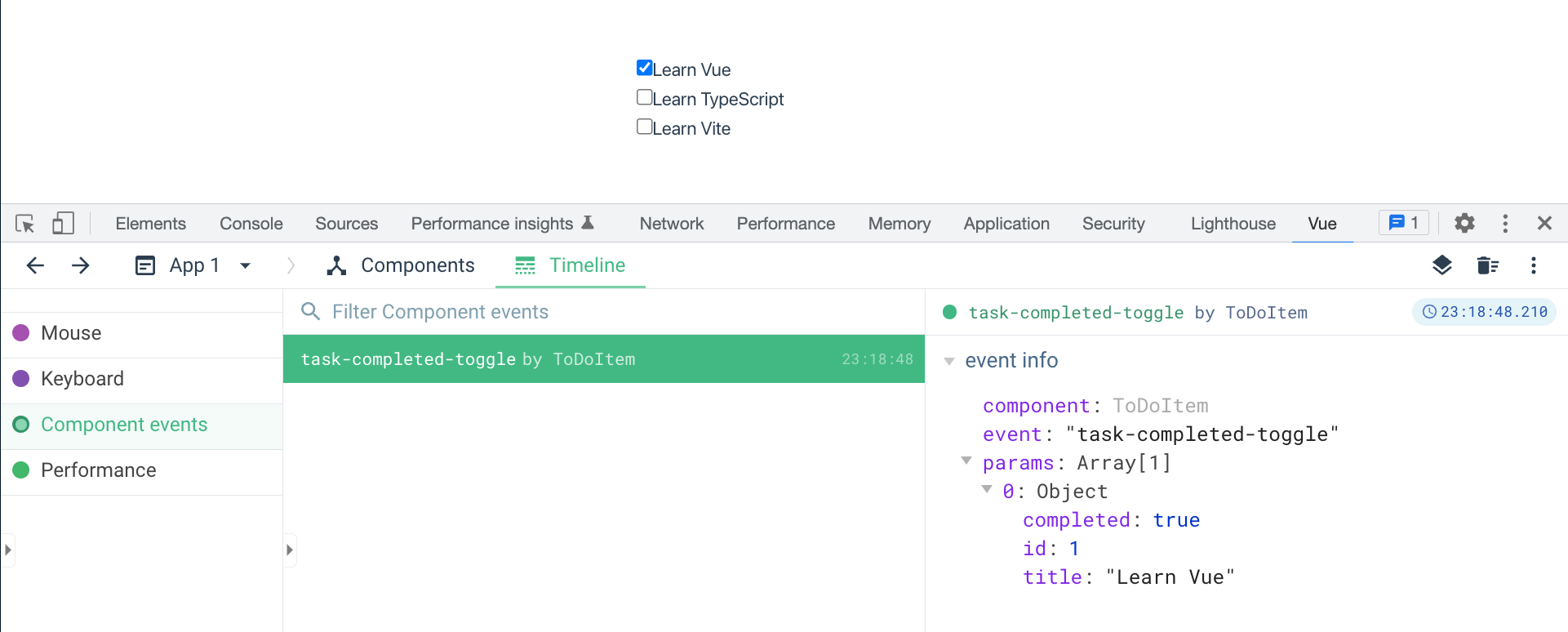
Figure 4-5. Mark a to-do item as completed and debug the event emitted using Vue Devtools
Defining custom events using defineEmits()
Similar to “Declaring props using defineProps() and withDefaults()”, within a <script setup> code block, you can use defineEmits() to define custom events. The defineEmits() function accepts the same input parameter type as emits accepts.
constemits=defineEmits(['component-event'])
It then returns a function instance that we can use to invoke a specific event from the component, as shown below:
emits('component-event',[...arguments])
Thus we can write the script section of ToDoItem as in the following code (Example 4-21):
Example 4-21. ToDoItem component with the custom event using defineEmits()
<scriptlang="ts"setup>importtype{PropType}from"vue";exportinterfaceTask{id:number;title:string;completed:boolean;}constemits=defineEmits(['task-completed-toggle'])constprops=defineProps({task:{type:ObjectasPropType<Task>,required:true,}})constonTaskCompleted=(event:Event)=>{emits("task-completed-toggle",{id:props.task.id,completed:(event.targetasHTMLInputElement)?.checked,});}</script>
Note here we don’t need to use defineComponent since there is no this instance available within the <script setup> code block.
For better type checking, you can use type-only declaration for the task-completed-toggle event instead of a single string. Let’s improve the emits declaration in Example 4-21 to use type EmitEvents as shown below (Example 4-22):
Example 4-22. Custom event using defineEmits() and type-only declaration
// Declare the emit typetypeEmitEvents={(e:'task-completed-toggle',task:Task)=>void;}constemits=defineEmits<EmitEvents>()
The above approach is helpful to ensure you bind the correct method to the declared event. As seen for the task-complete-toggle event, any event declaration should follow the same pattern below:
(e:'component-event',[...arguments])=>void
In the above syntax, e is the event’s name, and arguments are all the inputs passed to the event emitter. In the case of the task-completed-toggle event, its emitter’s argument is task of type Task.
emits is a powerful feature that allows you to enable two-way communication between a parent and a child component without breaking the data flow mechanism of Vue. However, props and emits are only beneficial when you want direct data communication.
You must use a different approach to pass data from a component to its grandchild or descendant. In the next section, we will see how to use the provide and inject APIs to pass data from a parent component to its child or grandchild component.
Communicate between components with provide/inject pattern
To establish data communication between an ancestor component and its descendants, provide/inject API is a reasonable consideration. provide field passes data from the ancestor, while inject ensures that Vue injects the provided data into any target descendant.
Using provide to pass data
The component’s option field provide accepts two formats: a data object or a function.
provide can be an object containing data to inject, with each property representing a (key, value) data type. In the below example, ProductList provides a data value selectedIds with the value [1] to all its descendants (Example 4-23):
Example 4-23. Passing selectedIds using provide in ProductList Component
exportdefault{name:'ProductList',//...provide:{selectedIds:[1]},}
Another format type for provide is a function that returns an object containing the data available to inject for descendants. A benefit of this format type is we can access this instance and map dynamic data or a component method to the relevant fields of the return object. From Example 4-23, we can rewrite the provide field as a function as shown below (Example 4-24):
Example 4-24. Passing selectedIds using provide in ProductList Component as a function
exportdefault{//...provide(){return{selectedIds:[1]}},//...}</script>
Note
Unlike props, you can pass a function and have the target descendant trigger it using the provide field. Doing so enables sending data back up to the parent component. However, Vue considers this approach an anti-pattern, and you should use it cautiously.
At this point, our ProductList passes some data values to its descendant using provide. Next, we must inject the provided values to operate within a descendant.
Using inject to receive data
Like props, the inject field can accept an array of strings, each representing the provided data key (inject: [selectedId]) or an object.
When using inject as an object field, each of its properties is an object, with the key presenting the local data key used within the component and the following properties:
{
  from?: string;
  default: any
}
Here from is optional if the property key is the same as the provided key from the ancestor. Take the Example 4-23 with the selectedIds as the data provided by ProductList to its descendants, for instance. We can compute a ProductComp that receives the provided data selectedIds from ProductList and rename it to currentSelectedIds to use locally, as shown in the following code:
Example 4-25. Injecting provided data in ProductComp
<scriptlang='ts'>exportdefault{//...inject:{currentSelectedIds:{from:'selectedIds',default:[]},},}</script>
In the above code, Vue will take the value of injected selectedIds and assign it to a local data field currentSelectedIds or use its default value [] if there is no injected value.
Within the Component section of the Vue tab in the Browser Developer Tools, when selecting the ProductComp from the component tree (the left-side panel), you can debug the indication of the renaming for the injected data (the right-side panel), as shown in Figure 4-6 below:
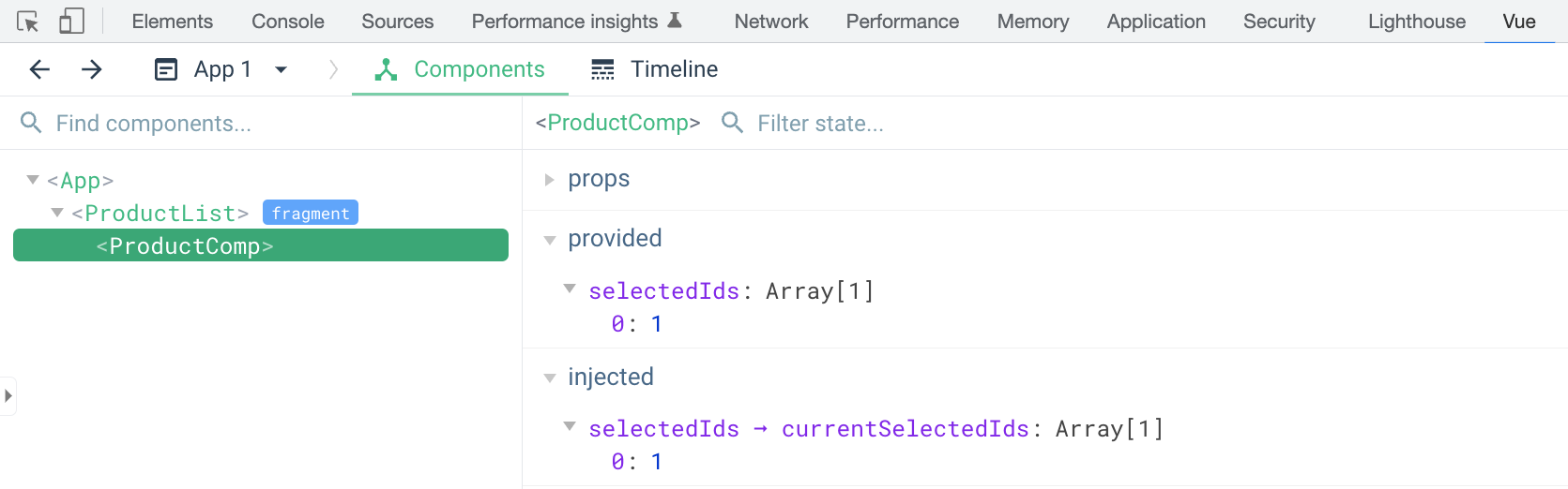
Figure 4-6. Debug the provided and injected data using Vue Devtools
Note
The equivalent hooks in Composition API for provide/inject are provide() and inject(), respectively. We will discuss their use cases in Chapter 6 further.
Now we understand how to use provide and inject to pass data between components efficiently without props drilling. Let’s explore how we can render a specific content section of an element to another location in the DOM with the <Teleport> component.
Teleport API
Due to some styling constraints, we often need to implement a component that contains some elements that Vue should render in a different location in the actual DOM for full visual effect. In such cases, we usually need to “teleport” those elements to the desired place by developing a complex solution, resulting in lousy performance impact, time consumption, etc. To solve this “teleport” challenge, Vue offers <Teleport> component.
The <Teleport> component accepts a prop to which indicates the target container, whether an element’s query selector or the desired HTML element. Let’s have a House component that will have a section of Sky and clouds that needs the Vue engine to teleport it to a designated #sky DOM element, as in the below code:
Example 4-26.
<template><div>This is a house</div><Teleportto="#sky"><div>Sky and clouds</div></Teleport></template>
And in our App.vue, we add a section element with the target id sky above the House component, as follows:
Example 4-27.
<template><sectionid="sky"/><sectionclass="wrapper"><House/></section></template>
The above code outputs the following:

Figure 4-7. The actual display order when using the Teleport component
When you inspect the DOM tree using the Element tab of the Browser Developer Tools, “Sky and clouds” appears as nested within <section id="sky"> instead (Figure 4-8).

Figure 4-8. The actual DOM tree when using the Teleport component
You can also temporarily disable moving the content inside a <Teleport> component instance with its Boolean prop disabled. This component is handy when you want to keep the DOM tree structure, and Vue should move only the desired content to the target location when needed. An everyday use case for Teleport is modal, which we will implement next.
Wrapping both section under a parent
The destination component for teleporting must exist in the DOM before mounting <Teleport>. In the above Example 4-27, if you wrap both section under a main element, the <Teleport> component will not work as expected. See “Rendering problem using Teleport” for more details.
Implementing a modal with Teleport and <dialog> element
A modal is a dialog window that appears on top of a screen and blocks the user’s interaction with the main page. The user must interact with the modal to dismiss it and returns to the main page.
A modal is very handy in displaying essential notifications that require full attention from the user and should only appear once at a time.
Let’s design how a basic modal should be. Similar to a dialog, a modal should contain the following elements (Figure 4-9):
-
A backdrop that covers the entire screen where the modal appears on top and blocks the user’s interactions with the current page.
-
A modal window that contains the modal’s content, including a
headerwith a title and a close button, amaincontent section, and afootersection with a default close button. These three sections should be customizable using slots.

Figure 4-9. The design of a basic modal
Base on the above design, we implement a Modal component template using the <dialog> HTML element, as follows:
Example 4-28.
<template><dialog:open="open"><header><slotname="m-header"><h2>{{ title }}</h2><button>X</button></slot></header><main><slotname="m-main"/></main><footer><slotname="m-footer"><button>Close</button></slot></footer></dialog></template>
In the above code, we use three slot sections to allow the user to customize the follows:

the modal’s header (
m-header)
the main content (
m-main)
the modal’s footer (
m-footer)
We also bind the <dialog> element’s open attribute to a local data prop open for controlling the modal’s visibility (visible/hidden). In addition, we render the title prop as the modal’s default title.
Now, let’s implement the Modal component’s options which receives two props - open and title as follows:
Example 4-29.
<scriptlang="ts">import{defineComponent}from'vue'exportdefaultdefineComponent({name:'Modal',props:{open:{type:Boolean,default:false,},title:{type:String,default:'Dialog',},},})</script>
When a user clicks on the modal’s close button or the “X” button on the header, it should close itself. Since we control the visibility of the modal using the open prop, we need to emit a closeDialog event with the new value of open from the Modal component to the parent. Let’s declare emits and a close method that emits the target event as below:
Example 4-30.
<scriptlang="ts">/** Modal.vue */import{defineComponent}from'vue'exportdefaultdefineComponent({name:'Modal',//...emits:["closeDialog"],methods:{close(){this.$emit("closeDialog",false);},},})</script>
emitswith one eventcloseDialogclosemethod that emits thecloseDialogevent with the new value ofopenasfalse
And then we bind it to the relevant action elements in the <dialog> element using @ notation, as follows:
Example 4-31.
<template><dialog:open="open"><header><slotname="m-header"><h2>{{ title }}</h2><button@click="close">X</button></slot></header><main><slotname="m-main"/></main><footer><slotname="m-footer"><button@click="close">Close</button></slot></footer></dialog></template>
@clickevent handler for the “X” button on the header@clickevent handler for the default close button on the footer
Next, we need to wrap the dialog element with a <Teleport> component to move it outside the parent component’s DOM tree. We also pass the to prop to the <Teleport> component to specify the target location - a HTML element with an id modal. Lastly, we bind the disabled prop to the component’s open value to ensure Vue only moves the modal component content to the desired location when visible.
Example 4-32.
<template><teleportto="#modal":disabled="!open"><dialogref="dialog":open="open"><header><slotname="m-header"><h2>{{ title }}</h2><button@click="close">X</button></slot></header><main><slotname="m-main"/></main><footer><slotname="m-footer"><button@click="close">Close</button></slot></footer></dialog></teleport></template>
<Teleport>componenttoprop with the target location with id selectormodaldisabledprop with the condition when component’sopenvalue is falsy
Now, let’s try out our Modal component in a WithModalComponent by adding the following code to the WithModalComponent:
Example 4-33. Using modal component in WithModalComponent
<template><h2>With Modal component</h2><button@click="openModal = true">Open modal</button><Modal:open="openModal"title="Hello World"@closeDialog="toggleModal"/></template><scriptlang="ts">import{defineComponent}from"vue";importModalfrom"./Modal.vue";exportdefaultdefineComponent({name:"WithModalComponent",components:{Modal,},data(){return{openModal:false,};},methods:{toggleModal(newValue:boolean){this.openModal=newValue;},},});</script>
Finally, add a <div> element with an id modal to body element in the index.html file <11> , as follows:
<body><divid="app"></div><divid="modal"></div><scripttype="module"src="/src/main.ts"></script></body>
divelement with idmodal
By doing so, Vue renders the Modal component’s content to this div with id modal whenever the open prop is set to true (Figure 4-10).

Figure 4-10. Modal component rendered to the div with id modal when visible
With the following screenshot as how it looks on screen:
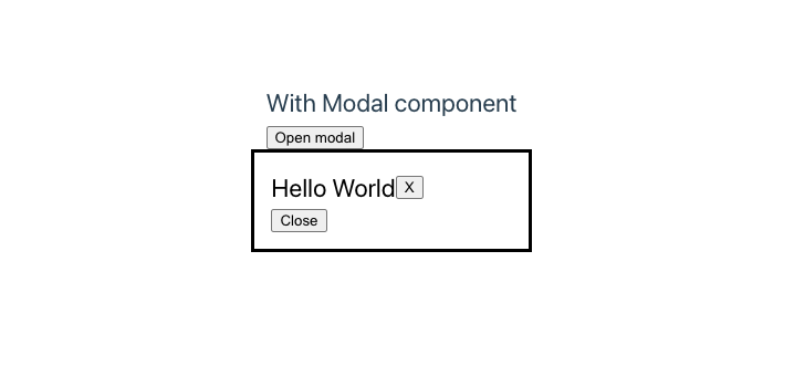
Figure 4-11. Output of the WithModalComponent when modal is visible
And when the open prop is false, the div with id modal is empty (Figure 4-12), and the modal is invisible on screen(Figure 4-13).

Figure 4-12. Modal component not rendered to the div with id modal when hidden
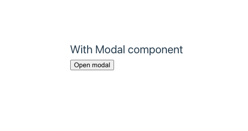
Figure 4-13. Modal component not visible when hidden
At this point, you have a working Modal component. However, the visual appearance of the modal isn’t exactly as good as we wanted; where there should be a dark overlay over the main page content when the modal is visible. Let’s fix this issue using CSS stylings for ::backdrop selector in the <style> section of the Modal element.
<stylescoped>dialog::backdrop{background-color:rgba(0,0,0,0.5);}</style>
However, this won’t change the appearance of the modal’s backdrop. This behavior is because the browser applies the ::backdrop CSS selector rules to the dialog only when we open the dialog using dialog.showModal() method, and not by changing open attribute. To fix this issue, we need to perform the following modifications in our Modal component:
-
Add a direct reference to the
<dialog>element by assigning “dialog” value to therefattribute.
<dialog:open="open"ref="dialog"><!--...--></dialog>
-
Trigger
$refs.dialog.showModal()or$refs.dialog.close()on thedialogelement whenever theopenprop changes respectively withwatch.
watch:{open(newValue){if(newValue){(this.$refs.dialogasHTMLDialogElement).showModal();}else{(this.$refs.dialogasHTMLDialogElement).close();}},},
-
Remove the original binding for the
openattribute of the<dialog>element.
<dialogref="dialog"><!--...--></dialog>
-
Remove the use of
disabledattribute in<teleport>component.
<teleportto="#modal"><!--...--></teleport>
When opening the modal using the built-in showModal() method, the browser will add a ::backdrop pseudo-element to the actual <dialog> element in the DOM and dynamically moving the element content to the target location will disable this functionality, leaving the modal without the desired backdrop.
We also re-position the Modal to the center of the page and on top of other elements by adding the following CSS rules to the dialog selector:
dialog{position:fixed;z-index:999;inset-block-start:30%;inset-inline-start:50%;width:300px;margin-inline-start:-150px;}
And the output will be as shown in Figure 4-14 when the modal is visible.

Figure 4-14. Modal component with backdrop and stylings
We have learned how to implement a reusable Modal component using Teleport and explored different use cases with each of the built-in <dialog> element features. We also learned how to use the ::backdrop CSS selector to style the modal’s backdrop.
As you notice, we set the target location div for the modal to be a direct child of body, outside of the Vue app entry element <div id="app">. What happens if we want to move the modal’s target div to within the entry component App.vue of the Vue application? Let’s find out in the next section.
Rendering problem using Teleport
To understand the problem with using Teleport to render the modal inside a child component of the App.vue component, let’s first move the <div id="modal"></div> from index.html to App.vue, after WithModalComponent instance, as shown below:
<template><sectionclass="wrapper"><WithModalComponent/></section><divid="modal"></div></template>
After running your application, you can see that the browser doesn’t render the modal despite how often you click on the Open modal button. And the console shows the following error:
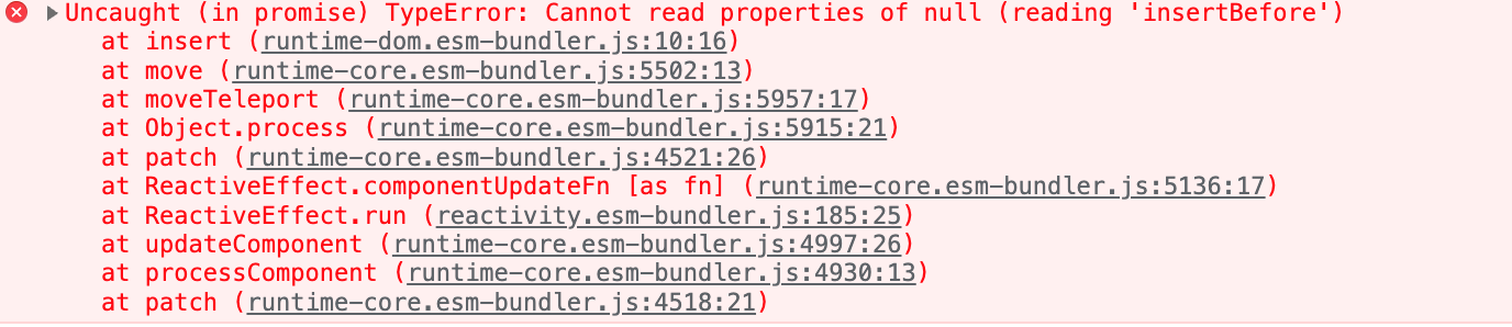
Figure 4-15. Console error message when rendering modal inside App.vue
Due to the Vue rendering order mechanism, the parent waits for the children to render before rendering itself. The children render in the order of appearance in the parent’s template section. In this scenario, the WithModalComponent renders first. Thus Vue renders the <dialog> element and starts moving the component’s content to the target location before rendering the ParentComponent. However, since the ParentComponent is still waiting for WithModalComponent to finish its rendering, the <div id="modal"> element doesn’t exist on the DOM yet. As a result, Vue can’t locate the target location and perform the right move, and can’t render the <dialog> element inside the <div id="modal"> element, hence the error.
A workaround to bypass this limitation is to put the target element <div id="modal"> to appear before WithModalComponent, as shown below:
<template><divid="modal"></div><sectionclass="wrapper"><WithModalComponent/></section></template>
This solution ensures the target div is available before Vue renders the Modal element and moves the content. Another approach is to use the disabled attribute to postpone the content moving process for Modal during rendering until the user clicks on the Open modal button. Both directions have pros and cons, and you should choose the one that best suits your needs.
The most common solution is to insert the target element as a direct child of the body element and isolate it from the Vue rendering context.
A significant benefit of using <Teleport> is to achieve the maximum visual display effect (such as fullscreen mode, modal, sidebar, etc.) while maintaining the code hierarchy structure, component isolation, and readability.
Summary
This chapter explored the concept of different approaches in components’ communication using the built-in Vue features such as props, emits, provide/inject. We learned how to use these features to pass data and events between components while keeping Vue’s data flow mechanism intact. We also learned how to use Teleport API to render an element outside the parent component’s DOM tree while keeping its appearance order in the parent component’s <template>. <Teleport> is beneficial for building components that require displaying with alignment to the main page element, such as popups, dialogs, modals, etc.
You are ready to move to the next chapter, where we will learn how to incorporate external data from an API or database resource into your Vue application.