Chapter 6
Reporting with Power BI
Chapter 1, “Core Data Concepts,” introduces different data processing techniques and several popular data visualizations such as tables, matrices, pie charts, column charts, line charts, scatter plots, and maps. Chapter 5, “Modern Data Warehouses in Azure,” describes different data processing services and analytical data stores. This chapter builds on these lessons by exploring how Power BI can be used to ingest data from different data stores and analyze data with visualizations, reports, and dashboards.
Power BI at a Glance
Power BI is often thought of as a powerful reporting tool that can be used to analyze data with a rich suite of data visualizations. While this is true, Power BI offers so much more. Analysts and business intelligence (BI) practitioners with varying technical expertise can use Power BI to ingest, cleanse, model, analyze, and visualize data from over 130 different data sources. Citizen data scientists can also use built-in AI-related features such as the Key Influencers visualization and AI Insights to gain insights beyond what can be gained from traditional descriptive and diagnostic analysis.
The range of scenarios that Power BI can be used for is nearly limitless. Self-service BI developers can ingest data from a large data warehouse like an Azure Synapse Analytics dedicated SQL pool into a Power BI model using the Power BI desktop tool and mold the data into an easy-to-use OLAP model. Analysts can also use the service to ingest operational and analytical data stores into the same Power BI model to discover additional features that can be added to a modern data warehouse. Reports that are ready for wide-scale consumption can be published to a central workspace online or on-premises where they can be shared with any user who needs access to the reports.
While Power BI consists of several core components, the three most basic elements are as follows:
- Power BI Desktop—A free Windows desktop application that is used to ingest data, build data models, and author interactive reports. This tool can also be used to publish datasets and reports to the Power BI service or a Power BI Report Server where they can be shared or collaborated on with other users. You can download a free copy of the Power BI Desktop by clicking the Download Free button at
https://powerbi.microsoft.com/en-us/desktop. - Power BI service—An online Software as a Service (SaaS) platform that can be used to host Power BI resources such as datasets, reports, and dashboards. These resources can be shared with other users so that they can view and interact with them. Analysts and BI practitioners can create workspaces within the Power BI service (also referred to as Power BI online) where they can invite other users to collaborate on reports and dashboards. You can sign up for a free trial of the Power BI service by clicking the Try Power BI for Free button at
https://powerbi.microsoft.com/en-us/getting-started-with-power-bi. - Power BI mobile app—These are mobile applications where users can view and interact with reports via a mobile device. The mobile app is supported by Windows, iOS, and Android operating systems.
Power BI also consists of two elements that are used to build traditional reporting solutions:
- Power BI Report Builder—A free Windows desktop application that is used to create traditional paginated reports. These can be uploaded to either the Power BI service or a Power BI Report Server. You can download a free copy of the Power BI Report Builder by clicking the Download button at
www.microsoft.com/en-us/download/details.aspx?id=58158. - Power BI Report Server—An on-premises report server where report creators can publish their Power BI reports after creating them in Power BI Desktop or Power BI Report Builder.
Because Power BI is briefly covered on the DP-900 exam, the following sections will only cover the core Power BI components at a high level. However, understanding how and when to use these components will provide the fundamental knowledge necessary to start working with Power BI.
Working with Power BI
Before we explore the use cases for different report types and dashboards, let's examine the common steps that most Power BI workflows follow:
- Ingest data from one or more data sources.
- Transform data to fit the specific needs of the reports being built.
- Build a data model.
- Define calculations that answer business-specific questions.
- Author reports.
- Publish the reports.
- Create dashboards with visualizations from one or more reports to summarize different business views.
- Share the reports and dashboards with business users who will consume and make decisions based off of the information presented.
Although they follow similar workflows, interactive and paginated reports require very different approaches when being built, which will be discussed in the sections “Interactive Reports” and “Paginated Reports” later in this chapter. The tools and methods used to ingest, transform, and visualize data are very different for interactive and paginated reports.
Interactive reports are far and away the most sophisticated and feature-rich of the two Power BI report types. In fact, when first released in 2015, interactive reports were the only type of reports that users could build with Power BI. The ability to author, publish, and share paginated reports with Power BI was not supported until several years later in 2019. For this reason, the steps used by most Power BI workflows are intended for interactive reports.
The following sections will examine the full life cycle of an interactive report, before describing the roles of dashboards and paginated reports in Power BI.
Interactive Reports
Interactive reports are collections of data visualizations and filters that reveal insights from a dataset. As the name implies, they are designed to be “interactive,” meaning that users can filter and slice the data by interacting with any of the visuals or filters on the report. A single report can have several pages, each filled with content that focuses on different aspects of the dataset being analyzed. The next two sections explore how to create an interactive report through Power BI Desktop and publish the report to the Power BI service for sharing and collaboration.
Creating Interactive Reports with Power BI Desktop
While it is possible to develop interactive reports through the Power BI service, the preferred tool for authoring interactive reports is Power BI Desktop. This is a completely free tool that can be downloaded from the following link: https://powerbi.microsoft.com/en-us/desktop.
Once you have downloaded, installed, and opened Power BI Desktop, it will ask you to sign into a Power BI account. Feel free to skip this step if you are not going to publish reports to the Power BI service.
The Power BI Desktop UI has a similar look and feel to Microsoft Office products such as Microsoft Excel. The ribbon at the top of the canvas allows you to connect to different data sources, create custom measures and columns, and perform different tasks that are specific to the different Power BI Desktop views. There are three views available in Power BI Desktop, all of which can be accessed on the left side of the canvas. The following is a list of the views in the order that they appear:
- Report—In this view report creators can build and modify interactive reports. This view includes several tool panes on the right side of the UI that report creators can use to build new data visualizations and choose what pieces of data are displayed on the page. At the bottom of this view, there is a tab labeled “Page 1” next to a + sign. Interactive reports can have several pages as a means of organizing content for different topics.
- Data—This view displays all tables, measures, data fields that are used in the data model. This view also allows users to transform data for best use by the report's data model.
- Model—This view allows users to see and edit the relationships among the tables in the data model.
Figure 6.1 illustrates a blank report on the Report view and highlights where you can access the other views.

FIGURE 6.1 A blank report in the Power BI Desktop Report view. You can switch views by clicking one of the options on the left side of the canvas.
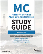
The first step in building an interactive report is to connect to one or more data sources. To do this, click the Get Data button in the Home ribbon at the top of the canvas. This will open the Get Data page (see Figure 6.2), displaying the many data sources that Power BI can connect to. Power BI Desktop groups its data in the following categories:
- File—This category includes common file sources, such as Excel, CSV, JSON, and PDF files.
- Database—This category includes several popular database services, including SQL Server, Access, Oracle, MySQL, PostgreSQL, SAP HANA, Amazon Redshift, Teradata, and MariaDB.
- Power Platform—This category provides connectivity to the Microsoft Power Platform ecosystem, including Power BI datasets and dataflows as well as Dataverse.
- Azure—This category contains connectors to the most popular Azure data services, including Azure SQL Database, Azure Synapse Analytics SQL pools (both dedicated and serverless), Azure Blob Storage, ADLS, Azure Databricks, and Azure Cosmos DB.
- Online Services—This category contains connectors to popular SaaS platforms like SharePoint Online lists, Microsoft Exchange Online, Dynamics 365, Salesforce, and Google Analytics.
- Other—This category contains connectors for services that do not fall in any specific category, such as Active Directory, SharePoint lists, Solver, and Apache Spark. It also includes generic interfaces such as ODBC, OLE DB, OData, and REST APIs to expand Power BI's connectivity options to any service that is accessible via those interfaces. Finally, users can leverage existing R or Python scripts to access data sources through the R script or Python script connector.
After you select a connector type, Power BI will open a prompt that requests access information specific to that connector. Most connector types will also ask whether to import a copy of the data into Power BI's in-memory data store or leave the data in its source system where it is queried dynamically every time the report is interacted with. Power BI supports the following data connectivity types:
- Import—This data connectivity type will load all of the data objects selected into the Power BI cache. This is the most performant data connectivity option as any visual that is built off of imported data will query the cache every time it is interacted with. The imported data is packaged with the data model, and reports that are published to the Power BI service or Power BI Report Server will also publish the imported data as a dataset. Changes that are made to the source data store are not automatically reflected, making it necessary to manually refresh a dataset or scheduling it to be refreshed during predefined time periods.
- DirectQuery—This data connectivity type does not load data from the source data store into Power BI. Instead, Power BI creates a reference to the data objects selected and queries the data source every time a data visualization is interacted with. While there are no storage limitations with this option, there are performance implications as every interaction with a data visualization results in a query being issued against the source data store. DirectQuery is usually used instead of importing data when data is changing frequently and near-real-time reporting is needed, and when the volume of data being reported on is very large, making it cumbersome to import all of it.
- Live connections—This data connectivity type is similar to DirectQuery but is specific to connectors that use the same storage engine as Power BI, such as Azure Analysis Services and SQL Server Analysis Services.
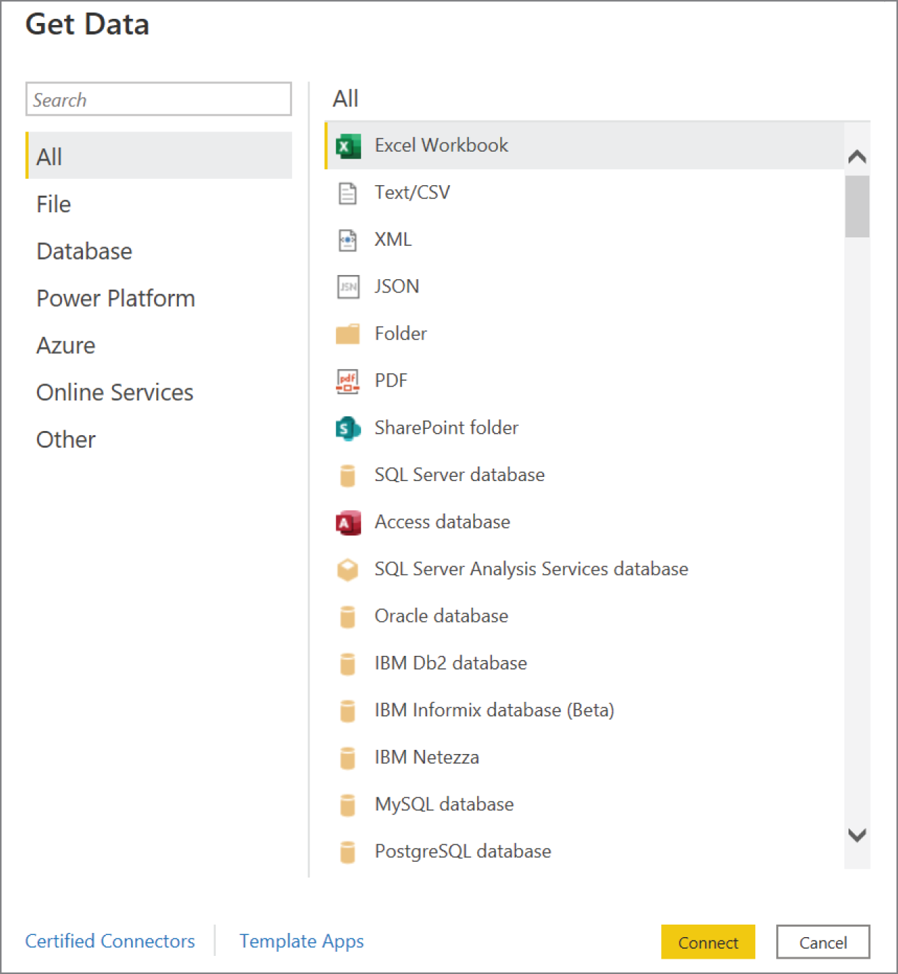
FIGURE 6.2 Get Data page
Power BI allows users to mix different connectivity types, resulting in composite data models. Composite models consist of two or more data connections from different data sources. For example, a report creator can use DirectQuery to connect to an Azure Synapse Analytics dedicated SQL pool to minimize the size of the Power BI dataset and import reference data from a CSV file to optimize report performance. While this is useful, not all data sources can be used in a composite model. More information about composite model limitations can be found at https://docs.microsoft.com/en-us/power-bi/transform-model/desktop-composite-models#considerations-and-limitations.
By selecting the Azure SQL Database connector, you can connect to the dp900sql001 logical server and the dp900sql001 database that were created in Chapter 2, “Relational Databases in Azure.” As you can see in Figure 6.3, by expanding the Advanced Options setting on the SQL Server database pop-up window, you can use a T-SQL query to retrieve the data you want added to the data model. After clicking OK, you will be asked to authenticate to the Azure SQL Database instance.

FIGURE 6.3 SQL Server database connection page
If you do not use a query to retrieve data from the database, Power BI will open a new prompt that will allow you to select one or more tables or views to import or reference (see Figure 6.4). This example will import the SalesLT.Product, SalesLT.ProductCategory, and SalesLT.SalesOrderDetail tables from the database into the dataset. Click Transform Data after selecting the tables to use Power BI's Power Query Editor to modify data before it is loaded into Power BI.

FIGURE 6.4 Select the tables or views that will be imported into the Power BI data model.
The Power Query Editor enables report creators to preprocess data to meet report requirements. Users can apply several transformations to the data, such as changing column data types, removing rows based on specific criteria, splitting columns, pivoting rows into columns and vice versa, applying mathematical functions to columns, and parameterizing the dataset to make it more dynamic. The Power Query Editor can also apply machine learning transformations by connecting to an Azure Machine Learning model, by invoking an Azure Cognitive Services API, or by running an R or a Python script against the data.
As you can see in Figure 6.5, the Power Query Editor is divided into the following four main components:
- In the ribbon at the top of the page, there are several buttons available to apply transformation steps to the data.
- In the left pane, each table/view selected is presented as a query. Users can switch back and forth between queries to apply different transformations to each one. Keep in mind that if you use a T-SQL query to establish the connection to the data source, then the data source will be presented as a single query in the Power Query Editor.
- In the center pane, data from the selected query is displayed and is available for shaping.
- The Query Settings pane on the right of the page displays all of the transformation steps applied to the query. This pane also allows users to rename the query to a more user-friendly name.

FIGURE 6.5 Power Query Editor
Transformations that are applied through the Power Query Editor are translated to M code. M is the formula language used by the Power Query engines in Analysis Services (both Azure and SQL Server Analysis Services), Excel, and Power BI to apply data transformations to connected data sources. The Power Query Editor allows users to view the M code by clicking the Advanced Editor button in the ribbon at the top of the page. It also lets users edit the code and add transformation steps or parameters that are not exposed through the Power Query Editor UI. Figure 6.6 is an example of the Advanced Editor and the M code that is generated to connect to the SalesLT.SalesOrderDetail table. The code also applies a single transformation that changes the LineTotal column data type.
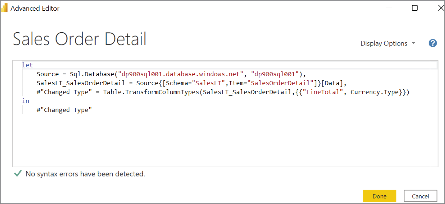
FIGURE 6.6 M Code can be viewed and edited through the Power Query Advanced Editor.
Click Close & Apply in the ribbon at the top of the page to load the data after you are satisfied with the data model. You can revisit the Power Query Editor to add or modify data transformation steps at any time by clicking the Transform Data button in the Home ribbon.
If you go to the Model view in Power BI Desktop, you will see that Power BI has inferred a one-to-many relationship between the Product and Sales Order Detail tables and a one-to-many relationship between the Product Category and Product tables (see Figure 6.7). These relationships are proposed based on common field names and can be altered through the Manage Relationships button in the Home ribbon. At the bottom of the view, users can create additional tabs that focus on different subsets of tables. The All Tables tab is created automatically to display the relationships between all tables in the model.
FIGURE 6.7 Power BI Desktop Model view
Before moving to the Data view, it is important to note how Power BI manages imported data. Power BI use an in-memory storage engine that stores data as tabular models, just like Azure Analysis Services and the SQL Server Analysis Services tabular mode. Tabular models use relational constructs like rows and columns to manage data. The VertiPaq engine used to power tabular models leverages modern compression algorithms to ensure fast performance for data retrieval and custom calculations. Tabular models support Data Analysis Expression (DAX) formulas to create custom calculations such as measures or calculated columns.
Navigate to the Data view to see the imported data in tabular format; it can be broken down into the following components (see Figure 6.8):
- The data grid in the center of the view displays the selected table and all columns and rows in it. You can highlight specific columns in the data grid to apply filters and quick transformations to the data.
- The Fields pane on the right side of the view allows you to choose which table is displayed in the data grid. You can also use the Fields pane to add new calculated measures or columns, rename data objects, and hide objects from the report view.
- The formula bar just above the data grid allows you to enter DAX formulas to create new measures and calculated columns. This is grayed out by default, but if you click New Measure or New Column, the formula bar will become available for you to enter DAX code. Let's take this time to create a new measure that calculates the most popular item sold by order quantity by clicking New Measure and adding the following DAX code to the formula bar:
Most Popular Item Sold = TOPN(1, VALUES('Product'[Name]),CALCULATE(SUM('Sales Order Detail'[OrderQty]))) - At the top of the view there are two contextual ribbons, Table Tools and Column Tools, that contain common transformation activities like changing a column's data type and format.
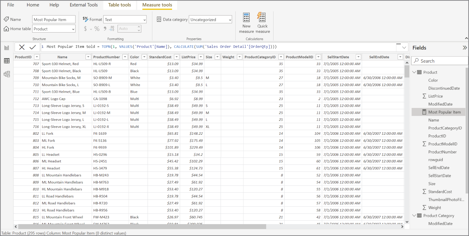
FIGURE 6.8 Power BI Desktop Data view
Once the data is modeled and cleansed to meet report specifications, navigate to the Report view to build an interactive report. This view allows report creators to do what they do best: build reports. The following steps can be used to create a report that displays the total order sales and total order quantity for every subcategory of road bikes that were sold.
- Create a slicer for product names. There are two ways to start authoring visualizations with Power BI Desktop. Either you can drag a field from the Fields pane onto the canvas and choose the appropriate visual, or you can drag a visual from the Visualizations pane onto the canvas and drag data fields into the appropriate setting. For this filter, we are going to drag the Names field from the Product Category table onto the canvas and choose the Slicer visual. Select Road Bikes in the slicer to filter every visual on the page to only show data for road bikes.
- Create a clustered column chart to display total order quantity for each product category sold. Select the Clustered Column Chart visual to create a blank clustered column chart. Drag the Name field from the Product table to the Axis setting. Next, drag the OrderQty field from the Sales Order Detail table to the Values setting. This will create a clustered column chart that displays the number of items sold for each product. Because the slicer is actively filtering the report by the road bike category, the column chart will display the order quantity data for each road bike subcategory. You can modify the visual's format at any time by clicking the Format icon in the Visualizations pane and changing settings such as the bar colors, text font, title, and data labels.
- Create three card visuals that display the total sales amount, total order quantity, and most popular item sold. Select the Card visual three times to create three blank cards on the canvas. Add the following to each card:
- For the first card, drag the OrderQty field from the Sales Order Detail table to the Fields setting. Power BI will automatically aggregate the OrderQty field to display its sum based on any applied filters.
- For the second card, drag the LineTotal field from the Sales Order Detail table to the Fields setting. Power BI will automatically aggregate the LineTotal field to display its sum based on any applied filters.
- For the third card, drag the previously defined Most Popular Item measure from the Product table to the Fields setting. Power BI will use this measure to display the item with the highest OrderQty value based on any applied filters.
As an interactive report, the filtering capabilities extend further than just the slicer visual. By clicking any of the columns in the column chart, the page will filter so that the other visuals will focus on the specific product name that is associated with the clicked column. Also, if you hover your mouse over any of the columns you will see a tooltip that displays the product name and order quantity for that specific product. Figure 6.9 illustrates the finished report with the tooltip for the first column in the column chart.
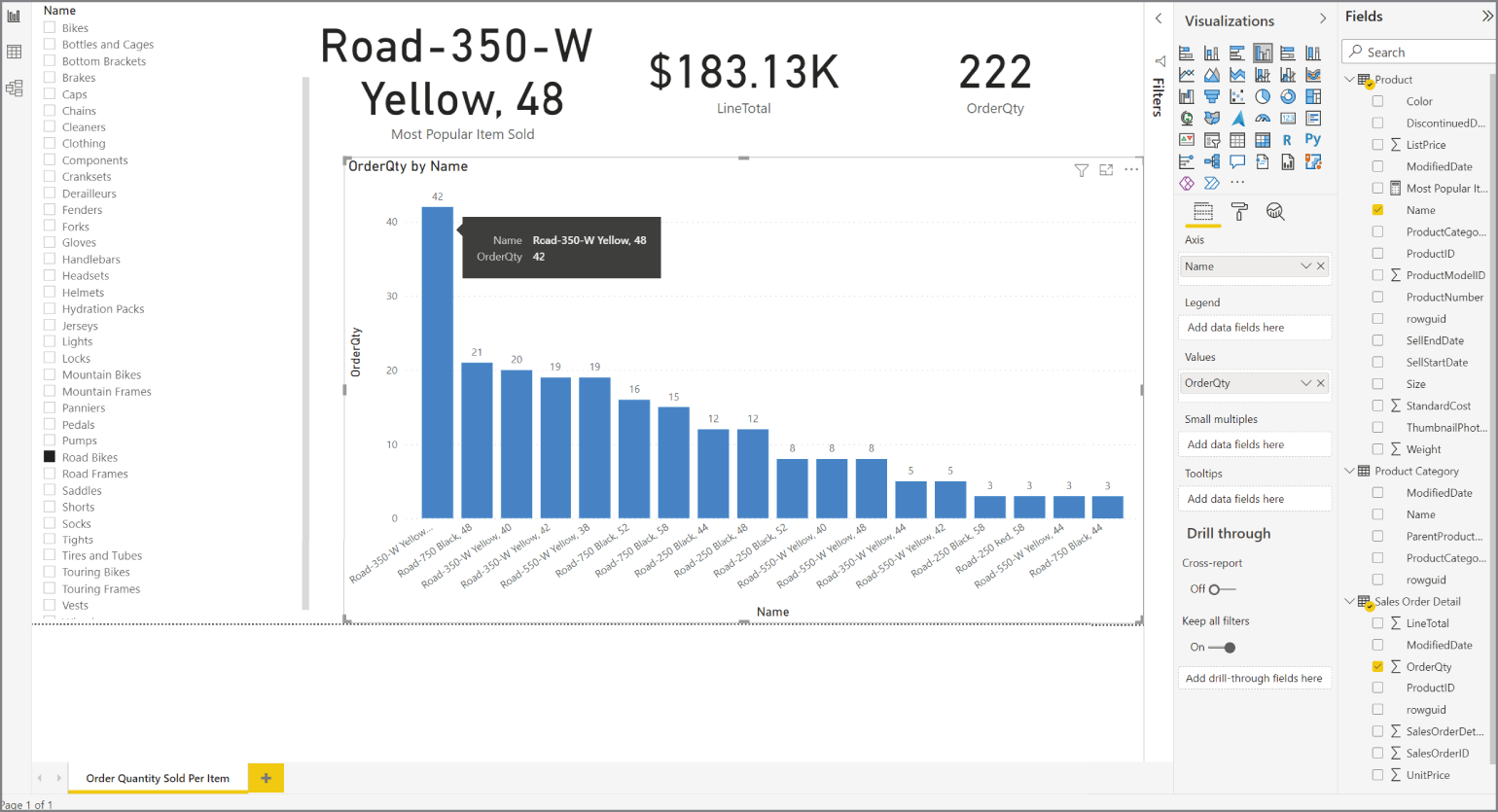
FIGURE 6.9 Power BI Desktop Report view on the Order Quantity Sold Per Item page
After you have finished building the report, you can save the file locally as a PBIX file. PBIX files (saved with the .pbix filename extension) can be opened at any time by Power BI Desktop so that report creators can modify the visuals, data model, and query definitions used to power the report. In addition to saving reports as PBIX files, you can save the report as a Power BI report template (PBIT) that other report creators can use as a starting point for a new report's layout, data model, and query definitions. Unlike a PBIX file, PBIT files (saved with the .pbit filename extension) do not include the data used to power the report. More information about Power BI report templates can be found at https://docs.microsoft.com/en-us/power-bi/create-reports/desktop-templates.
Publishing and Sharing Interactive Reports with the Power BI Service
Now that the data model and report are ready to be shared with other users, let's publish the report to the Power BI service. You can do this by clicking the Publish button in the Home ribbon and choosing a destination workspace for the report and data model. Remember that you will need to log into the service first before you can publish the report.
Workspaces serve as containers in the Power BI service where users can logically organize content and collaborate with colleagues. A single workspace can host several datasets, reports, and dashboards that serve the reporting needs of specific business units or for specific solutions. Content creators with a Power BI Pro or Power BI Premium Per User license can share workspace content to different users and control their level of access by assigning them one of the following roles:
- Viewer—Users assigned this role will only be able to view and interact with reports and dashboards contained in the workspace.
- Contributor—Users assigned this role will be granted Viewer permissions and the ability to create, edit, and delete content. This includes publishing reports to the workspace, downloading a report, and scheduling data refreshes.
- Member—Users assigned this role will be granted Viewer and Contributor permissions as well as the ability to add other users to the workspace with Viewer or Contributor permissions.
- Admin—Users assigned this role will have full control of the workspace, including the ability to update and delete the workspace.
More information about Power BI workspace roles can be found at https://docs.microsoft.com/en-US/power-bi/collaborate-share/service-roles-new-workspaces#workspace-roles.
The workspace features that are available to a user, such as the number of times they can schedule a data refresh or the maximum data model size that a workspace can manage, depends on the type of license the user has and the Power BI plan applied to the workspace. While licensing is not covered by the DP-900 exam, it is important to know that users can use a Power BI Pro or Power BI Premium Per User license to manage content and that workspaces can use shared capacity or premium (dedicated) capacity. The feature and price differences between license and plan types can be found at https://powerbi.microsoft.com/en-us/pricing.
Workspace content is organized into different sections for dashboards, reports, and datasets as well as two other objects not discussed so far: workbooks and data flows. Power BI workbooks are Excel workbooks that are imported into a Power BI workspace. Once imported into a Power BI workspace, the workbook is converted to a dataset that can be used to serve new reports. Power BI dataflows offer similar data connection, ingestion, and transformation functionality as the Power BI Desktop Power Query Editor but are instead managed by the Power BI service.
You can navigate to the Power BI service by going to https://powerbi.com. Once you are signed in, you will be able to traverse the service by using the buttons in the left-side menu. This menu is divided into two sections, with the top one including buttons that will take the user to commonly browsed pages such as the Power BI service home page, recently viewed objects, Power BI apps, and deployment pipelines. The bottom section of the left-side menu allows users to navigate to the different workspaces that they have access to.
All of the content associated with a workspace is displayed in the center of the page when you select a workspace. The workspace home page also includes options that allow users to manage several administrative activities such as setting a dataset refresh schedule and granting user access. Figure 6.10 shows the home page of the “DP900-PBI-Workspace” workspace that contains the DP900PBI report and dataset.
If you click on the report name, Power BI will open it in the center of the page. This view, known as the “reading view,” allows users to interact with visuals and derive insights from the report. Users with the appropriate access can click the Edit button in the top bar to make modifications to the report directly in the Power BI service. Figure 6.11 shows the DP900PBI report in the DP900-PBI-Workspace.
As you can see in Figure 6.11, the top bar includes additional settings that allow you to monitor the usage of your report and share the report to internal and external business users. There are also options that allow users to export the report to a PDF or PowerPoint to serve business users who prefer to consume their reports through those mediums.
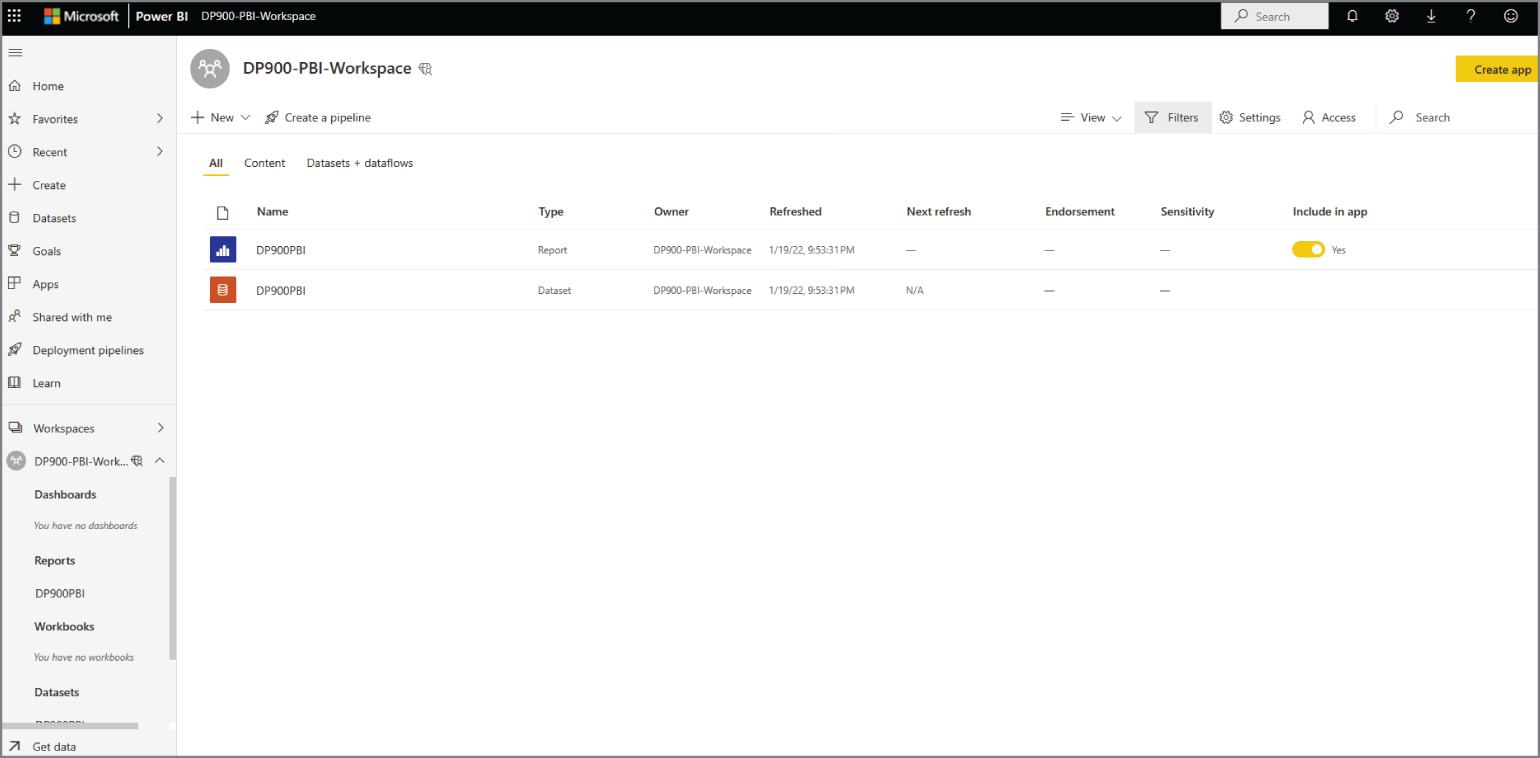
FIGURE 6.10 Power BI Service Workspace home page

FIGURE 6.11 Power BI Service Report view
Reports, both interactive and paginated, are often too granular for business decision makers who need to monitor the performance of their business in real time. Many times, these decision makers are looking for a clear, summarized view that allows them to monitor their business and see the most important metrics without having to dig through a mountain of reports. Content creators can provide this functionality in Power BI by building dashboards that highlight the most relevant visuals from one or more Power BI reports. The next section, “Dashboards,” examines Power BI dashboards in further detail.
Dashboards
Power BI dashboards are single page views that contain a collection of pinned visuals that are taken from reports and other data storytelling objects. It is important to remember that while reports tell a detailed story, dashboards only provide the highlights of that story.
You can think of a pinned visual, known as a tile, as a “headline” for the report it comes from. Tiles should summarize the information that a user needs to monitor their business while still being thought-provoking. If a user wants to examine a tile and its underlying information in more detail, or “read the full story,” they can click the tile and Power BI will navigate them to the report that the tile comes from.
Report visuals can be added to a dashboard by pinning them. To pin a visual, hover your mouse over a report visual and click the pin icon (see Figure 6.12). You will then be able to pin the visual to an existing or new dashboard.
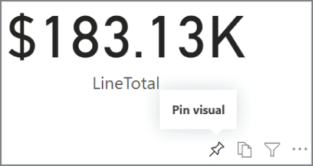
FIGURE 6.12 The pin icon on a report visual
While report visuals are commonly used to compose dashboards, there are other object types that can be pinned to a dashboard. Here is a full list of objects that that can be pinned:
- Report visuals—Pinned report visuals maintain the filters that were applied in the underlying report at the time the visual was pinned to the dashboard. Keep in mind that report visuals cannot be filtered once they are pinned to a dashboard, unless you open the tile in focus mode. Even then, the filter will be removed once you exit focus mode.
- Entire reports—In addition to being able to pin individual report elements to a dashboard, Power BI allows you to pin an entire report page. When you pin an entire report page, the tile maintains the report's interactivity capabilities. This means that you can interact with the tile as you would the report.
- Tiles from another dashboard—You can pin a tile from one dashboard to another. When clicked, the shared tile will still take you to the report that the tile comes from.
- Excel workbooks—You can pin a range of cells, an entire table, or a PivotTable from an Excel workbook to a dashboard. The workbook must be located in a OneDrive for Business account, and the account must be linked to a Power BI workspace. You can do this by clicking Get Data in the Power BI workspace, selecting Files, and then selecting OneDrive - Business. From here you will select the workbook file and choose Connect. More information about how to connect to and pin content from an Excel workbook can be found at
https://docs.microsoft.com/en-us/power-bi/create-reports/service-dashboard-pin-tile-from-excel#connect-your-excel-workbook-from-onedrive-for-business-to-power-bi. - Power BI Q&A—Q&A is a Power BI tool for exploring data with natural language, like “Top 10 product categories by order qty.” You can find this tool at the top of any dashboard, with a prompt that states, “Ask a question about your data.” As of this writing, Power BI Q&A only supports questions asked in English, with support for Spanish in public preview. If Power BI can translate your question to the features and measures defined in your dataset, Q&A will render a visual that is tailored to answer your question. The generated visual can be pinned to the dashboard.
- Quick Insights—The Quick Insights feature in Power BI uses a set of advanced analytical algorithms developed by Microsoft Research to generate visualizations that highlight specific features of a dataset. You can also run the Quick Insights feature on a dashboard tile to discover insightful information from a tile. Once the Quick Insights feature has finished running, you can choose to pin any of the generated visuals to a dashboard.
- Paginated reports—Power BI allows you to pin a paginated report that is hosted in the Power BI service, an on-premises Power BI Report Server, or SQL Server Reporting Services (SSRS).
Along with pinned tiles, dashboard designers can incorporate the following five stand-alone tile types into their dashboards:
- Web content—With this tile type, you can embed HTML code in a dashboard. This is useful if you would like to add content from social media sites or
embed.lyto a dashboard. - Image—This tile type adds an online image to a dashboard. Simply provide the image URL and the image will be displayed. Images stored on a site that requires security credentials, such as OneDrive or SharePoint, are not supported. Also, images that are stored in SVG format are not supported.
- Text box—This tile type allows you to add text to a dashboard.
- Video—This tile type allows you to add a YouTube or Vimeo video to a dashboard.
- Streaming data—This tile type allows you to add a real-time data stream, such as social media feeds or sensor data, to a dashboard. Power BI supports data streams that come from an API, Azure Stream Analytics, or PubNub.
You can add any of these stand-alone tile types by clicking the Edit button at the top of a dashboard and selecting + Add A Tile.
Figure 6.13 illustrates an example of a dashboard with tiles taken from the DP900PBI report. The top three tiles focus on the most popular item sold, the sales total, and the total number of items sold. Below those tiles is the column chart that breaks down the quantity sold for each product subcategory. As you can see, the dashboard tiles reflect the “Road Bikes” filter that was applied in the underlying report.

FIGURE 6.13 Power BI dashboard
Above the dashboard tiles is the Power BI Q&A text box. If you enter a question like “top 10 product categories by order qty” into the text box, Q&A will generate a clustered bar chart with the Product Category Name field on the y-axis and the Sales Order Detail OrderQty field on the x-axis (see Figure 6.14). If you would like, you can click Pin Visual in the upper-right corner of the Q&A page to pin the visual to the dashboard. You can also change the question to get a new result. Click Exit Q&A to return to the dashboard.
Power BI dashboards can be created and managed only by the Power BI service. Dashboard designers can define two distinct layouts for a dashboard: the web layout that is used by computers and tablets and the mobile layout that optimizes the dashboard layout for mobile devices. The mobile layout is used when a user is viewing a dashboard through the Power BI mobile app.
Paginated Reports
Paginated reports differ from interactive reports in that they are designed to display every row of data for a given data source and a set of parameters versus aggregating data. They are called paginated because they are formatted to fit cleanly on one or more pages, making them easy to print. Just like an interactive report, paginated reports can be shared with business users through the Power BI service, as long as it has Premium capacity, or through an on-premises Power BI Report Server.

FIGURE 6.14 Power BI Q&A output
Paginated reports have been a staple of BI solutions for several years now. Prior to paginated reports being available in Power BI, organizations could host their paginated reports in SSRS. While organizations can still host their paginated reports in an SSRS instance, Power BI enables them to consolidate all of their reports in a single ecosystem.
Report creators can use Visual Studio or Power BI Report Builder to create paginated reports. Power BI Report Builder is a free desktop application that is dedicated for building Power BI paginated reports. As mentioned previously in this chapter, you can download a free copy of Power BI Report Builder at www.microsoft.com/en-us/download/details.aspx?id=58158.
When you open Power BI Report Builder on your desktop, you will be presented with a pop-up window that provides several options for getting started (see Figure 6.15). Along with being able to open a blank or an existing report, the Getting Started pop-up window allows you to create a new report with one of the following wizards:
- The Table or Matrix Wizard will guide you through establishing a data source connection and designing the layout for a table or matrix report.
- The Chart Wizard will guide you through creating a column, line, pie, bar, or area chart.
- The Map Wizard will guide you through building a report that has a geographical background.
If you click the Blank Report option in the Getting Started pop-up window, you will be taken to a new report page where you can begin building your report. At the top of the page, there are several ribbons that allow you to establish a new data connection and build report visuals. On the left side of the page there are folders for items that can be incorporated into a report, including built-in fields, parameters, images, data sources, and datasets.
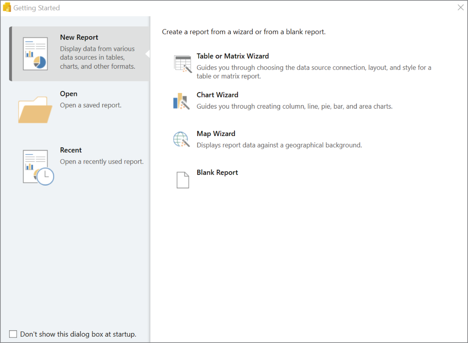
FIGURE 6.15 Power BI Report Builder Getting Started window
In the center of the page is the report canvas, with two prepopulated fields for the report title and the execution time (these can be removed if you do not need them). You can add a new data visualization to the report by navigating to the Insert ribbon at the top of the canvas, selecting a visual, and placing it anywhere on the canvas. Figure 6.16 illustrates a new report in Power BI Report Builder with a focus on the Insert ribbon:
You can establish a connection to a data source by selecting one of the options in the Data ribbon at the top of the canvas. As of this writing, paginated reports support the following data sources:
- Azure SQL Database
- Azure Synapse Analytics
- Azure Analysis Services
- Dataverse
- SQL Server
- SQL Server Analysis Services
- Power BI datasets
- Oracle
- Teradata
- ODBC connections

FIGURE 6.16 A blank report in Power BI Report Builder
After you have finished building the report, you can save the file locally as a Report Definition Language (RDL) file. RDL files (saved with the .rdl file extension) can be opened at any time by Power BI Report Builder so that report creators can modify the report. You can publish the report to a Power BI workspace that is in a Power BI Premium capacity by clicking the Publish button in the Home ribbon and choosing a destination workspace for the report.
Summary
Power BI is an ecosystem of services that turn data into coherent and visually stimulating insights. BI practitioners and data analysts can build interactive reports from a combination of several data sources with Power BI Desktop and upload those reports to the Power BI service where the reports can be shared with business users. Once a report is published to the Power BI service, users can create a mobile friendly version of the report that business users can view through the Power BI mobile app. Report creators can also create traditional, paginated reports through Power BI Report Builder and host their content in their on-premises environment with the Power BI Report Server.
Regardless of the type of report a user is creating, most Power BI solutions follow the same conceptual workflow: ingest data, transform data to meet specific report requirements, build a data model, define business-oriented calculations, author reports, publish the reports, create dashboards, and share Power BI content to business users.
Of the two report types, interactive reports are far and away the most sophisticated and feature-rich. These reports are a collection of interactive data visualizations and filters that reveal insights from a dataset. Interactive reports are usually built with Power BI Desktop, where users can either import data from one or more data sources into a Power BI data model for fast performance or establish a direct connection to the data source with DirectQuery or a live connection to minimize the data model footprint. Users can apply data transformation activities to the data as it is being ingested with the Power Query Editor and create custom calculations with DAX formulas after the data model is defined.
Once the report is ready to be shared, users can publish the report to a workspace in the Power BI service. Content creators can share their reports and other workspace content to business users who need to view the reports and with additional content creators who will be adding content to the workspace. Along with reports and datasets, Power BI workspaces manage other data analysis objects such as workbooks, dataflows, and dashboards.
Content creators can highlight the most important aspects of their reports by pinning visuals as tiles to a Power BI dashboard. If a user wants to examine a tile and the report it comes from in more detail, then they can click on the tile and Power BI will navigate them to the report. Tiles can be created from several data storytelling objects, including report visuals, entire reports (interactive or paginated), Excel workbooks, visuals generated from Power BI Q&A or Power BI Quick Insights, or other dashboard tiles. Dashboards can also contain several stand-alone tile types that display web content, text, images, videos, or streaming data. Dashboard designers can use the Power BI service to define two distinct layouts for a dashboard: a web layout that is optimal for computers and tablets and a mobile layout that can be used by the Power BI mobile app.
Paginated reports are designed to display tabular data and are formatted to fit cleanly on one or more pages. Just like an interactive report, paginated reports can be shared to business users through the Power BI service, as long as it has Premium capacity, or an on-premises Power BI Report Server. Report creators can build paginated reports with Power BI Report Builder, a desktop tool that provides users with a dedicated environment for building Power BI paginated reports.
Exam Essentials
- Describe the Power BI workflow. Power BI solutions typically follow the same conceptual workflow: ingest data, transform data to meet specific report requirements, build a data model, define business-oriented calculations, author reports, publish the reports, create dashboards, and share Power BI content to business users. Remember that while the workflow is the same, building interactive and paginated reports requires different tools and uses different design approaches.
- Describe interactive reports. Interactive reports, which are commonly created with Power BI Desktop, consist of interactive visuals and filters that can be used to reveal valuable business insights. Report creators can choose to import data from one or more data sources into a single Power BI data model for fast performance or establish a direct connection to the data source to minimize the data model footprint. Remember that you can apply data transformation steps as data is being ingested with the Power Query Editor and that you can create custom calculations with DAX formulas after the data model is defined. Once a report is created and is ready to be shared, you can publish the report and the underlying data model to the Power BI service. From here, you can grant business users access to view the report or grant content creators access to add and modify content.
- Describe Power BI dashboards. Power BI dashboards are single page views that contain a collection of pinned visuals that are taken from reports and other data storytelling objects. They highlight the most important features of a group of reports, giving users a high-level overview of the state of their business. Dashboards can consist of report visuals, entire interactive or paginated reports, Excel workbook objects, Power BI Q&A visuals, Power BI Quick Insights visuals, or tiles from another dashboard. Dashboards can also include stand-alone tiles that display web content, text, images, videos, or streaming data. A dashboard tile cannot be filtered unless the tile is opened in focus mode or is a pinned report. Remember that Power BI dashboards can only be created through the Power BI service and that you can create a web layout and a mobile layout for a dashboard.
- Describe paginated reports. Paginated reports are formatted to fit cleanly on one or more pages, making them easy to print. Paginated reports can be published and shared through the Power BI Service only if it has Premium capacity. Otherwise, users can publish and share their paginated reports through an on-premises Power BI Report Server instance. Report creators can build paginated reports in Visual Studio or Power BI Report Builder. Power BI Report Builder is a desktop application that provides users a dedicated environment for building paginated reports and publishing paginated reports to a Power BI workspace that is in a Power BI Premium capacity or a Power BI Report Server instance.
Review Questions
- Is the italicized portion of the following statement true, or does it need to be replaced with one of the other fragments that appear below? The Power BI service is a free Windows desktop application that is used to ingest data, build data models, and author interactive reports.
- Power BI Report Builder
- Power BI Desktop
- Power BI Report Server
- No change needed
- Which of the following services cannot be used to create a Power BI interactive report?
- Power BI service
- Power BI Desktop
- Power BI Report Builder
- All of the above
- You are building reports with Power BI Desktop that will use data from a large data warehouse hosted on an Azure Synapse Analytics dedicated SQL pool. You do not want to import all of the fact table data as the volume of data will be too large to upload to the Power BI service. On the other hand, the dimension tables you would like to connect to are small and static in nature. Which of the following options will provide the best performance for this dataset?
- Use DirectQuery to create a live connection to the fact tables and import the smaller dimension tables.
- Use the live connection connectivity type to connect to the fact tables and import the smaller dimension tables.
- Use DirectQuery to create a live connection to the fact and dimension tables.
- Use the live connection connectivity type to connect to the fact and dimension tables.
- What is the minimum role required to allow a user to view existing reports and publish new ones to a Power BI workspace?
- Viewer
- Member
- Contributor
- Admin
- Which of the following scenarios allows you to filter or slice an entire dashboard?
- If an entire report page is pinned to a dashboard.
- When a filter and a visual from the same report is pinned as separate tiles on a dashboard.
- When a dashboard tile is opened in focus mode you can filter the tile. The filter will be saved and applied to the other dashboard tiles when you exit focus mode.
- All of the above.
- Which of the following can be added as a stand-alone tile to a Power BI dashboard?
- Text boxes
- Streaming data
- Web content
- All of the above
- Paginated reports can be published to a Power BI workspace if the workspace is in which of the following Power BI capacity types?
- Shared
- Premium
- Pro
- All of the above