Chapter 12. Metrics and Classification Evaluation
We’ll cover the following metrics and evaluation tools in this chapter: confusion matrices, various metrics, a classification report, and some visualizations.
This will be evaluated as a decision tree model that predicts Titanic survival.
Confusion Matrix
A confusion matrix can aid in understanding how a classifier performs.
A binary classifier can have four classification results: true positives (TP), true negatives (TN), false positives (FP), and false negatives (FN). The first two are correct classifications.
Here is a common example for remembering the other results. Assuming positive means pregnant and negative is not pregnant, a false positive is like claiming a man is pregnant. A false negative is claiming that a pregnant woman is not (when she is clearly showing) (see Figure 12-1). These last two types of errors are referred to as type 1 and type 2 errors, respectively (see Table 12-1).
Another way to remember these is that P (for false positive) has one straight line in it (type 1 error), and N (for false negative) has two vertical lines in it.
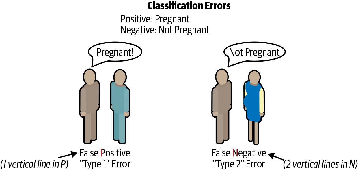
Figure 12-1. Classification errors.
| Actual | Predicted negative | Predicted positive |
|---|---|---|
Actual negative |
True negative |
False positive (type 1) |
Actual positive |
False negative (type 2) |
True positive |
Here is the pandas code to calculate the classification results. The comments show the results. We will use these variables to calculate other metrics:
>>>y_predict=dt.predict(X_test)>>>tp=(...(y_test==1)&(y_test==y_predict)...).sum()# 123>>>tn=(...(y_test==0)&(y_test==y_predict)...).sum()# 199>>>fp=(...(y_test==0)&(y_test!=y_predict)...).sum()# 25>>>fn=(...(y_test==1)&(y_test!=y_predict)...).sum()# 46
Well-behaving classifiers ideally have high counts in the true diagonal.
We can create a DataFrame using the sklearn confusion_matrix function:
>>>fromsklearn.metricsimportconfusion_matrix>>>y_predict=dt.predict(X_test)>>>pd.DataFrame(...confusion_matrix(y_test,y_predict),...columns=[..."Predict died",..."Predict Survive",...],...index=["True Death","True Survive"],...)Predict died Predict SurviveTrue Death 199 25True Survive 46 123
Yellowbrick has a plot for the confusion matrix (see Figure 12-2):
>>>importmatplotlib.pyplotasplt>>>fromyellowbrick.classifierimport(...ConfusionMatrix,...)>>>mapping={0:"died",1:"survived"}>>>fig,ax=plt.subplots(figsize=(6,6))>>>cm_viz=ConfusionMatrix(...dt,...classes=["died","survived"],...label_encoder=mapping,...)>>>cm_viz.score(X_test,y_test)>>>cm_viz.poof()>>>fig.savefig("images/mlpr_1202.png",dpi=300)
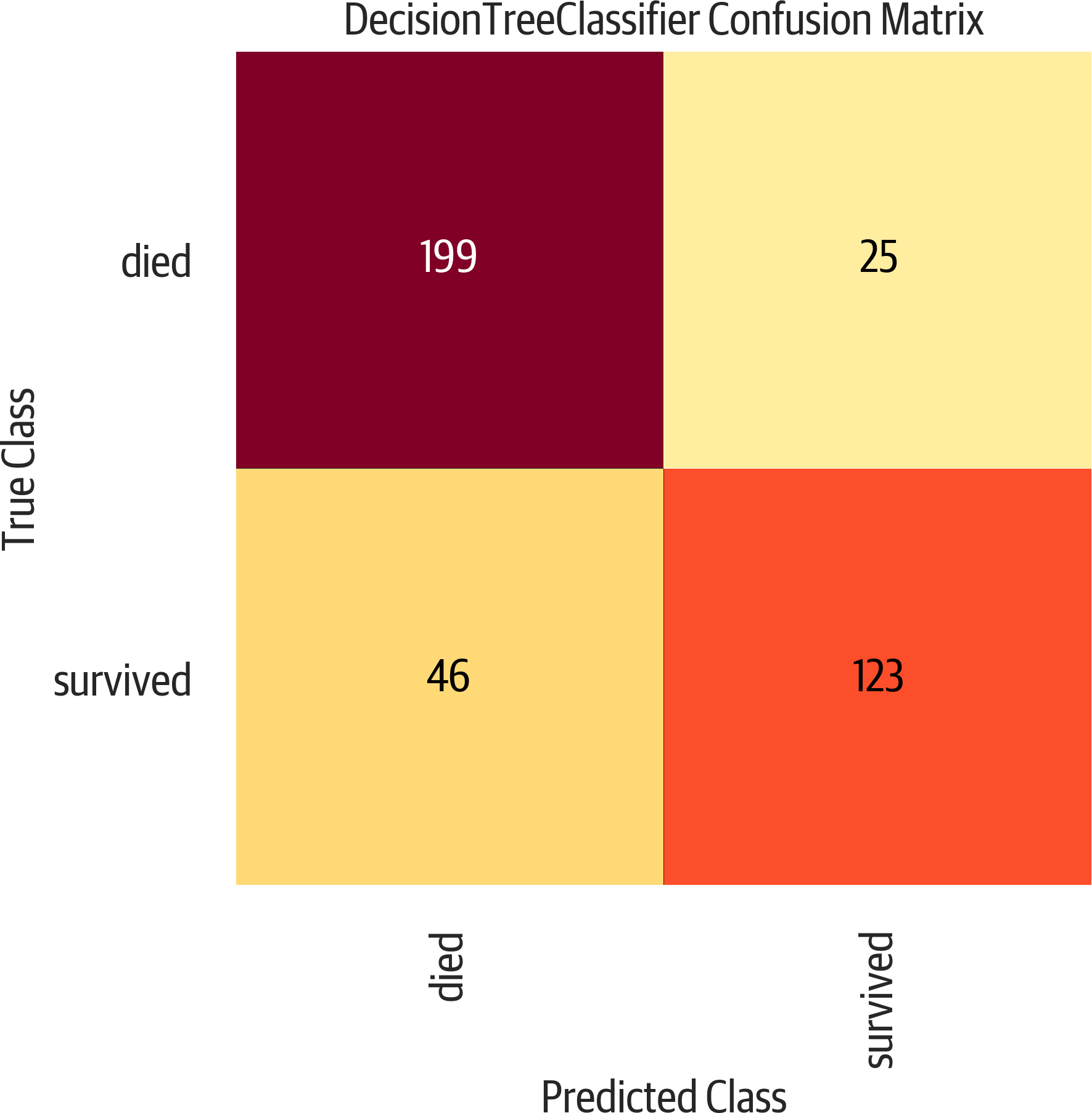
Figure 12-2. Confusion matrix. The upper left and lower right are correct classifications. The lower left is false negative. The upper right is false positive.
Metrics
The sklearn.metrics module implements many common classification
metrics, including:
'accuracy'-
Percent of correct predictions
'average_precision'-
Precision recall curve summary
'f1'-
Harmonic mean of precision and recall
'neg_log_loss'-
Logistic or cross-entropy loss (model must support
predict_proba) 'precision'-
Ability to find only relevant samples (not label a negative as a positive)
'recall'-
Ability to find all positive samples
'roc_auc'-
Area under the receiver operator characteristic curve
These strings can be used as the scoring parameter when doing grid search,
or you can use functions from the sklearn.metrics module that have the same
names as the strings but end in _score. See the following note for examples.
Note
'f1', 'precision', and 'recall' all support the following suffixes for
multiclass classifers:
'_micro'-
Global weighted average of metric
'_macro'-
Unweighted average of metric
'_weighted'-
Multiclass weighted average of metric
'_samples'-
Per sample metric
Accuracy
Accuracy is the percentage of correct classifications:
>>>(tp+tn)/(tp+tn+fp+fn)0.8142493638676844
What is good accuracy? It depends. If I’m predicting fraud (which usually is a rare event, say 1 in 10,000), I can get very high accuracy by always predicting not fraud. But this model is not very useful. Looking at other metrics and the cost of predicting a false positive and a false negative can help us determine if a model is decent.
We can use sklearn to calculate it for us:
>>>fromsklearn.metricsimportaccuracy_score>>>y_predict=dt.predict(X_test)>>>accuracy_score(y_test,y_predict)0.8142493638676844
Recall
Recall (also called sensitivity) is the percentage of positive values correctly classified. (How many relevant results are returned?)
>>>tp/(tp+fn)0.7159763313609467>>>fromsklearn.metricsimportrecall_score>>>y_predict=dt.predict(X_test)>>>recall_score(y_test,y_predict)0.7159763313609467
Precision
Precision is the percent of positive predictions that were correct (TP divided by (TP + FP)). (How relevant are the results?)
>>>tp/(tp+fp)0.8287671232876712>>>fromsklearn.metricsimportprecision_score>>>y_predict=dt.predict(X_test)>>>precision_score(y_test,y_predict)0.8287671232876712
Classification Report
Yellowbrick has a classification report showing precision, recall, and f1 scores for both positive and negative values (see Figure 12-3). This is colored, and the redder the cell (closer to one), the better the score:
>>>importmatplotlib.pyplotasplt>>>fromyellowbrick.classifierimport(...ClassificationReport,...)>>>fig,ax=plt.subplots(figsize=(6,3))>>>cm_viz=ClassificationReport(...dt,...classes=["died","survived"],...label_encoder=mapping,...)>>>cm_viz.score(X_test,y_test)>>>cm_viz.poof()>>>fig.savefig("images/mlpr_1203.png",dpi=300)
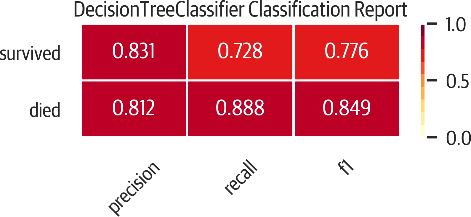
Figure 12-3. Classification report.
ROC
A ROC curve illustrates how the classifier performs by tracking the true positive rate (recall/sensitivity) as the false positive rate (inverted specificity) changes (see Figure 12-4).
A rule of thumb is that the plot should bulge out toward the top-left corner. A plot that is to the left and above another plot indicates better performance. The diagonal in this plot indicates the behavior of a random guessing classifier. By taking the AUC, you get a metric for evaluating the performance:
>>>fromsklearn.metricsimportroc_auc_score>>>y_predict=dt.predict(X_test)>>>roc_auc_score(y_test,y_predict)0.8706304346418559
Yellowbrick can plot this for us:
>>>fromyellowbrick.classifierimportROCAUC>>>fig,ax=plt.subplots(figsize=(6,6))>>>roc_viz=ROCAUC(dt)>>>roc_viz.score(X_test,y_test)0.8706304346418559>>>roc_viz.poof()>>>fig.savefig("images/mlpr_1204.png",dpi=300)
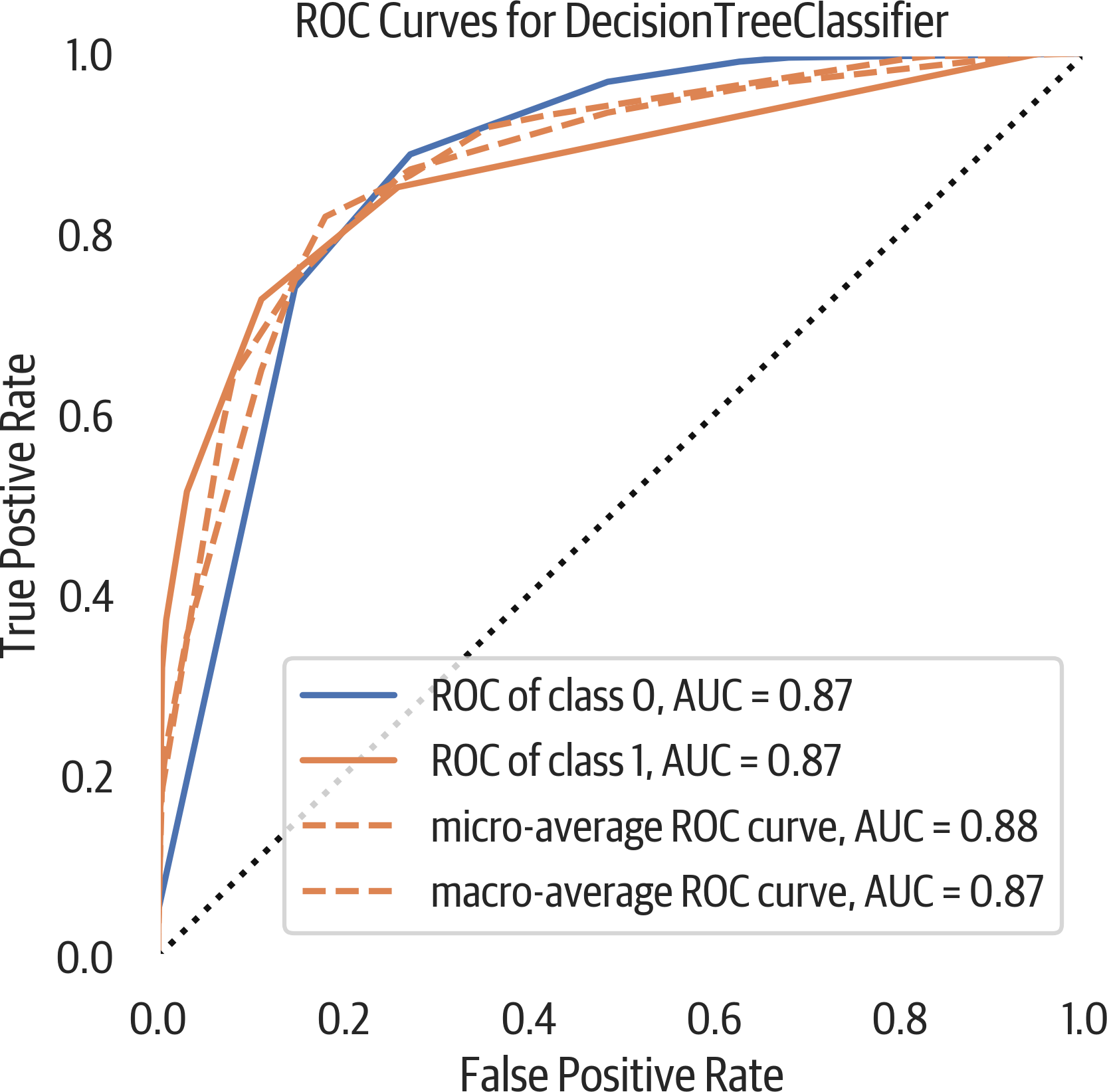
Figure 12-4. ROC curve.
Precision-Recall Curve
The ROC curve may be overly optimistic for imbalanced classes. Another option for evaluating classifiers is using a precision-recall curve (see Figure 12-5). Classification is a balancing act of finding everything you need (recall) while limiting the junk results (precision). This is typically a trade-off. As recall goes up, precision usually goes down and vice versa.
>>>fromsklearn.metricsimport(...average_precision_score,...)>>>y_predict=dt.predict(X_test)>>>average_precision_score(y_test,y_predict)0.7155150490642249
Here is a Yellowbrick precision-recall curve:
>>>fromyellowbrick.classifierimport(...PrecisionRecallCurve,...)>>>fig,ax=plt.subplots(figsize=(6,4))>>>viz=PrecisionRecallCurve(...DecisionTreeClassifier(max_depth=3)...)>>>viz.fit(X_train,y_train)>>>(viz.score(X_test,y_test))>>>viz.poof()>>>fig.savefig("images/mlpr_1205.png",dpi=300)
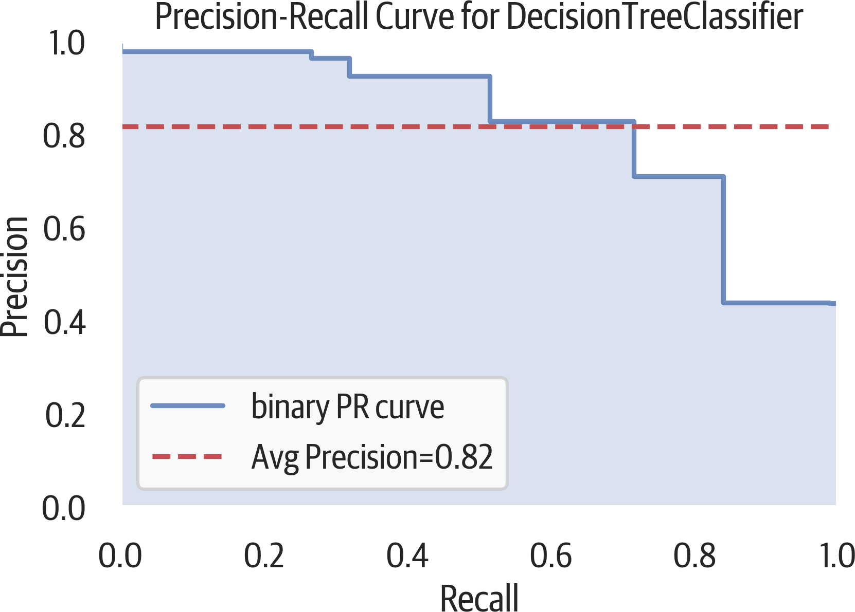
Figure 12-5. Precision-recall curve.
Cumulative Gains Plot
A cumulative gains plot can be used to evaluate a binary classifier. It models the true positive rate (sensitivity) against the support rate (fraction of positive predictions). The intuition behind this plot is to sort all classifications by predicted probability. Ideally there would be a clean cut that divides positive from negative samples. If the first 10% of the predictions has 30% of the positive samples, you would plot a point from (0,0) to (.1, .3). You continue this process through all of the samples (see Figure 12-6).
A common use for this is determining customer response. The cumulative gains curve plots the support or predicted positive rate along the x-axis. Our chart labels this as “Percentage of sample”. It plots the sensitivity or true positive rate along the y-axis. This is labeled as “Gain” in our plot.
If you wanted to contact 90% of the customers that would respond (sensitivity), you can trace from .9 on the y-axis to the right until you hit that curve. The x-axis at that point will indicate how many total customers you need to contact (support) to get to 90%.
In this case we aren’t contacting customers that would respond to a survey but predicting survival on the Titanic. If we ordered all passengers on the Titanic according to our model by how likely they are to survive, if you took the first 65% of them, you would have 90% of the survivors. If you have an associated cost per contact and revenue per response, you can calculate what the best number is.
In general, a model that is to the left and above another model is a better model. The best models are lines that go up to the top (if 10% of the samples are positive, it would hit at (.1, 1)) and then directly to the right. If the plot is below the baseline, we would do better to randomly assign labels that use our model.
The scikit-plot library can create a cumulative gains plot:
>>>fig,ax=plt.subplots(figsize=(6,6))>>>y_probas=dt.predict_proba(X_test)>>>scikitplot.metrics.plot_cumulative_gain(...y_test,y_probas,ax=ax...)>>>fig.savefig(..."images/mlpr_1206.png",...dpi=300,...bbox_inches="tight",...)
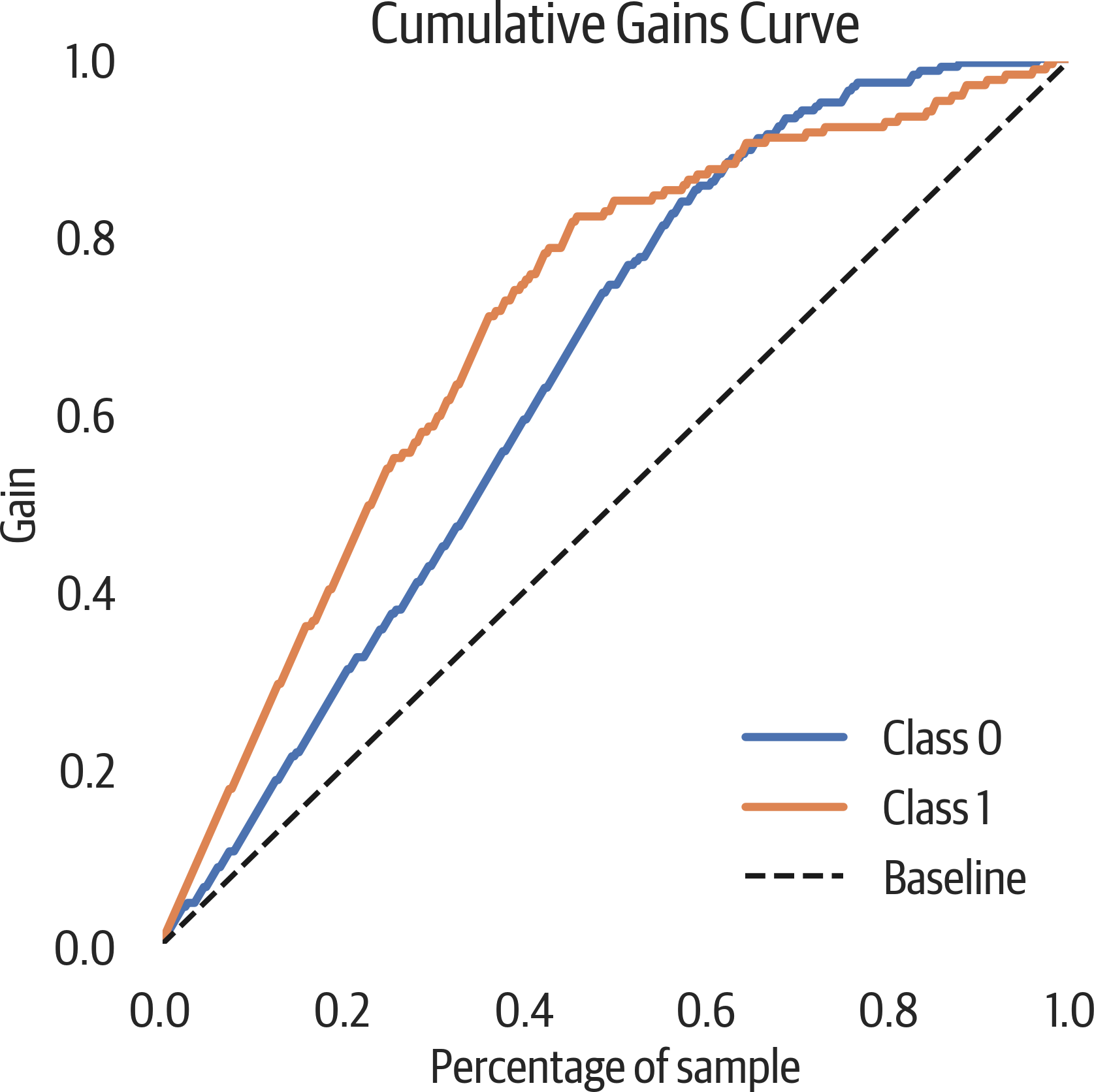
Figure 12-6. Cumulative gains plot. If we ordered people on the Titanic according to our model, looking at 20% of them we would get 40% of the survivors.
Lift Curve
A lift curve is another way of looking at the information in a cumulative gains plot. The lift is how much better we are doing than the baseline model. In our plot below, we can see that if we sorted our Titanic passengers by the survival probability and took the first 20% of them, our lift would be about 2.2 times (the gain divided by sample percent) better than randomly choosing survivors (see Figure 12-7). (We would get 2.2 times as many survivors.)
The scikit-plot library can create a lift curve:
>>>fig,ax=plt.subplots(figsize=(6,6))>>>y_probas=dt.predict_proba(X_test)>>>scikitplot.metrics.plot_lift_curve(...y_test,y_probas,ax=ax...)>>>fig.savefig(..."images/mlpr_1207.png",...dpi=300,...bbox_inches="tight",...)
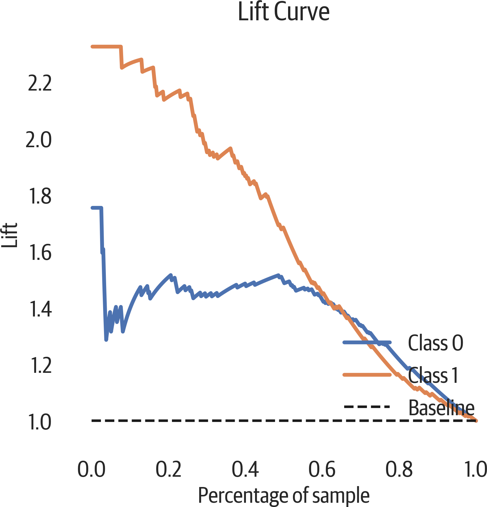
Figure 12-7. Lift curve.
Class Balance
Yellowbrick has a simple bar plot to view the class sizes. When the
relative class sizes are different, accuracy is not a good evaluation
metric (see Figure 12-8). When splitting up the data into training and test sets, use stratified sampling so the sets keep a relative proportion of the classes. (The test_train_split function does this when you set the stratify parameter to the labels.)
>>>fromyellowbrick.classifierimportClassBalance>>>fig,ax=plt.subplots(figsize=(6,6))>>>cb_viz=ClassBalance(...labels=["Died","Survived"]...)>>>cb_viz.fit(y_test)>>>cb_viz.poof()>>>fig.savefig("images/mlpr_1208.png",dpi=300)
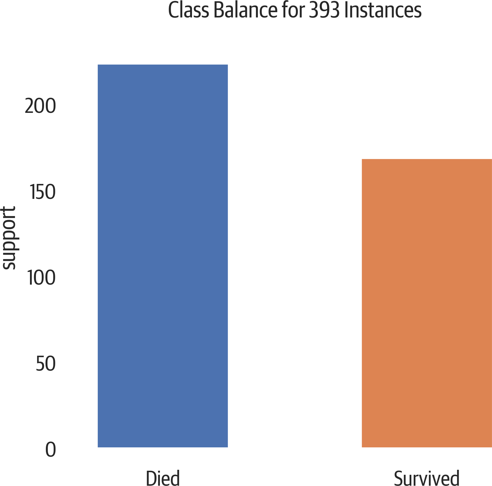
Figure 12-8. A slight class imbalance.
Class Prediction Error
The class prediction error plot from Yellowbrick is a bar chart that visualizes a confusion matrix (see Figure 12-9):
>>>fromyellowbrick.classifierimport(...ClassPredictionError,...)>>>fig,ax=plt.subplots(figsize=(6,3))>>>cpe_viz=ClassPredictionError(...dt,classes=["died","survived"]...)>>>cpe_viz.score(X_test,y_test)>>>cpe_viz.poof()>>>fig.savefig("images/mlpr_1209.png",dpi=300)
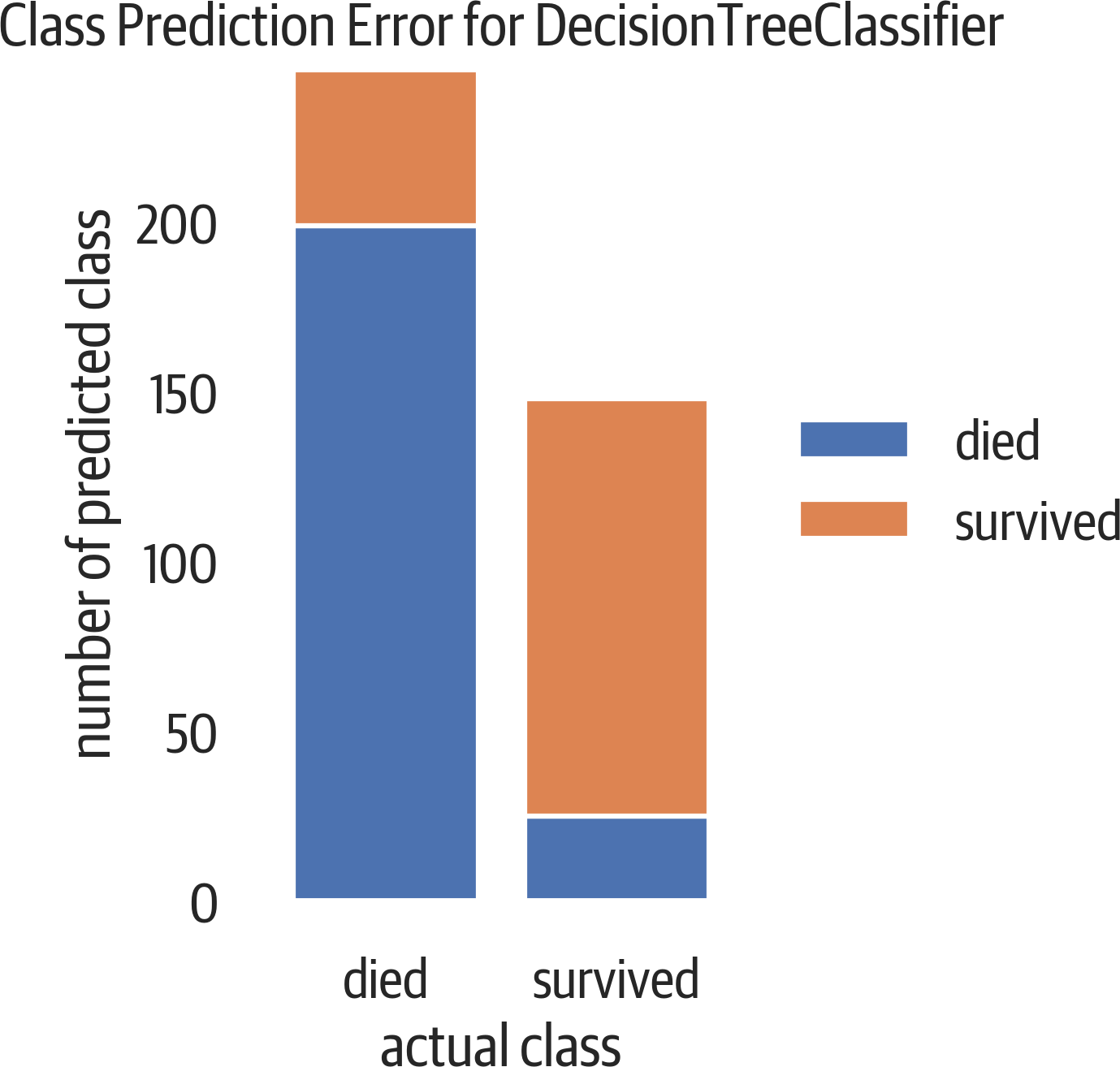
Figure 12-9. Class prediction error. At the top of the left bar are people who died, but we predicted that they survived (false positive). At the bottom of the right bar are people who survived, but the model predicted death (false negative).
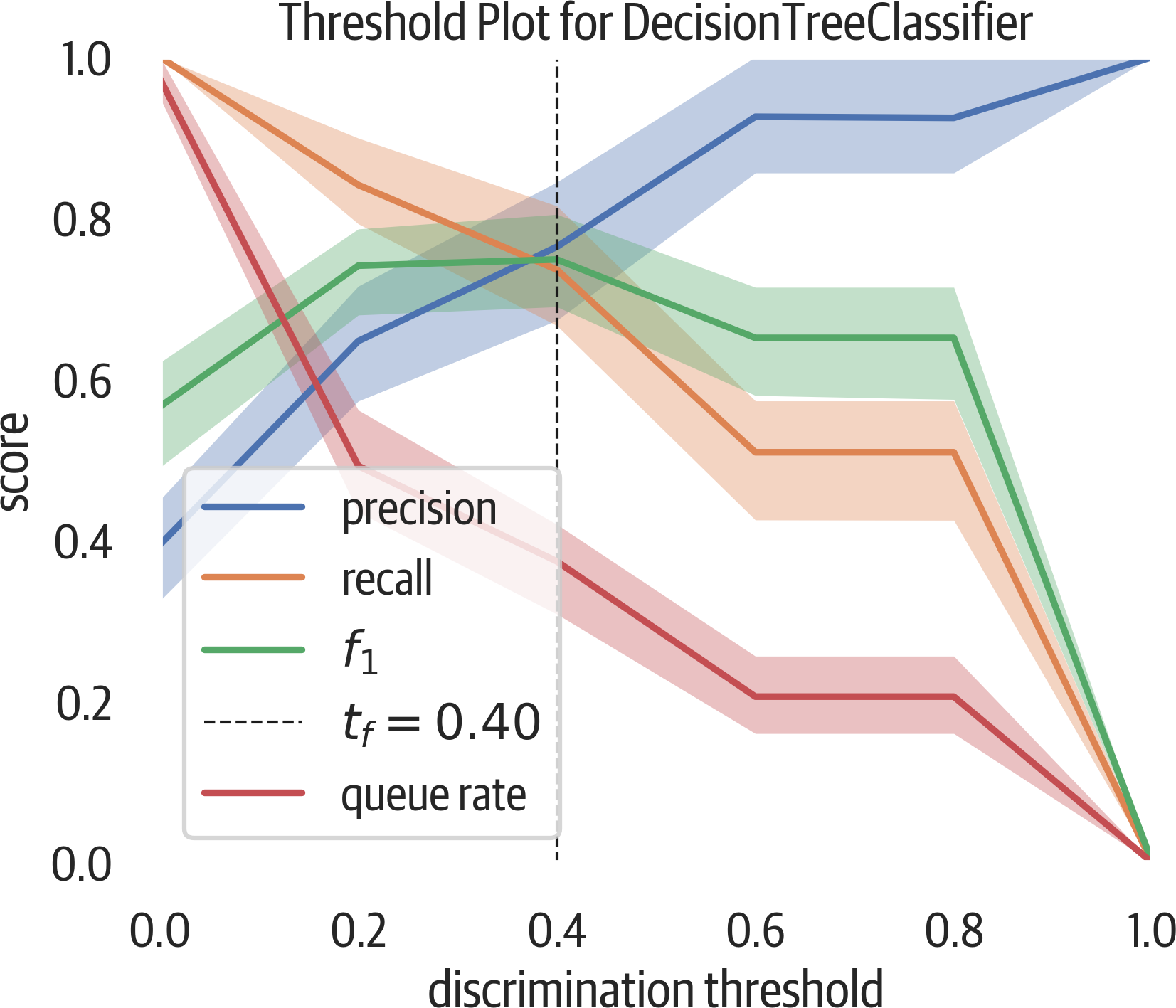
Discrimination Threshold
Most binary classifiers that predict probability have a discrimination threshold of 50%. If the predicted probability is above 50%, the classifier assigns a positive label. Figure 12-10 moves that threshold value between 0 and 100 and shows the impact to precision, recall, f1, and queue rate.
This plot can be useful to view the trade-off between precision and recall. Assume we are looking for fraud (and considering fraud to be the positive classification). To get high recall (catch all of the fraud), we can just classify everything as fraud. But in a bank situation, this would not be profitable and would require an army of workers. To get high precision (only catch fraud if it is fraud), we could have a model that only triggers on cases of extreme fraud. But this would miss much of the fraud that might not be as obvious. There is a trade-off here.
The queue rate is the percent of predictions above the threshold. You can consider this to be the percent of cases to review if you are dealing with fraud.
If you have the cost for positive, negative, and erroneous calculations, you can determine what threshold you are comfortable with.
The following plot is useful to see what discrimination threshold will maximize the f1 score or adjust precision or recall to an acceptable number when coupled with the queue rate.
Yellowbrick provides this visualizer. This visualizer shuffles the data and runs 50 trials by default, splitting out 10% for validation:
>>>fromyellowbrick.classifierimport(...DiscriminationThreshold,...)>>>fig,ax=plt.subplots(figsize=(6,5))>>>dt_viz=DiscriminationThreshold(dt)>>>dt_viz.fit(X,y)>>>dt_viz.poof()>>>fig.savefig("images/mlpr_1210.png",dpi=300)