Chapter 13. Explaining Models
Predictive models have different properties. Some are designed to handle linear data. Others can mold to more complex input. Some models can be interpreted very easily, others are like black boxes and don’t offer much insight into how the prediction is made.
In this chapter we will look at interpreting different models. We will look at some examples using the Titanic data.
>>>dt=DecisionTreeClassifier(...random_state=42,max_depth=3...)>>>dt.fit(X_train,y_train)
LIME
LIME works to help explain black-box models. It performs a local interpretation rather than an overall interpretation. It will help explain a single sample.
For a given data point or sample, LIME indicates which features were important in determining the result. It does this by perturbing the sample in question and fitting a linear model to it. The linear model approximates the model close to the sample (see Figure 13-1).
Here is an example explaining the last sample (which our decision tree predicts will survive) from the training data:
>>>fromlimeimportlime_tabular>>>explainer=lime_tabular.LimeTabularExplainer(...X_train.values,...feature_names=X.columns,...class_names=["died","survived"],...)>>>exp=explainer.explain_instance(...X_train.iloc[-1].values,dt.predict_proba...)
LIME doesn’t like using DataFrames as input. Note that we converted the data
to numpy arrays using .values.
Tip
If you are doing this in Jupyter, follow up with this code:
exp.show_in_notebook()
This will render an HTML version of the explanation.
We can create a matplotlib figure if we want to export the explanation (or aren’t using Jupyter):
>>>fig=exp.as_pyplot_figure()>>>fig.tight_layout()>>>fig.savefig("images/mlpr_1301.png")
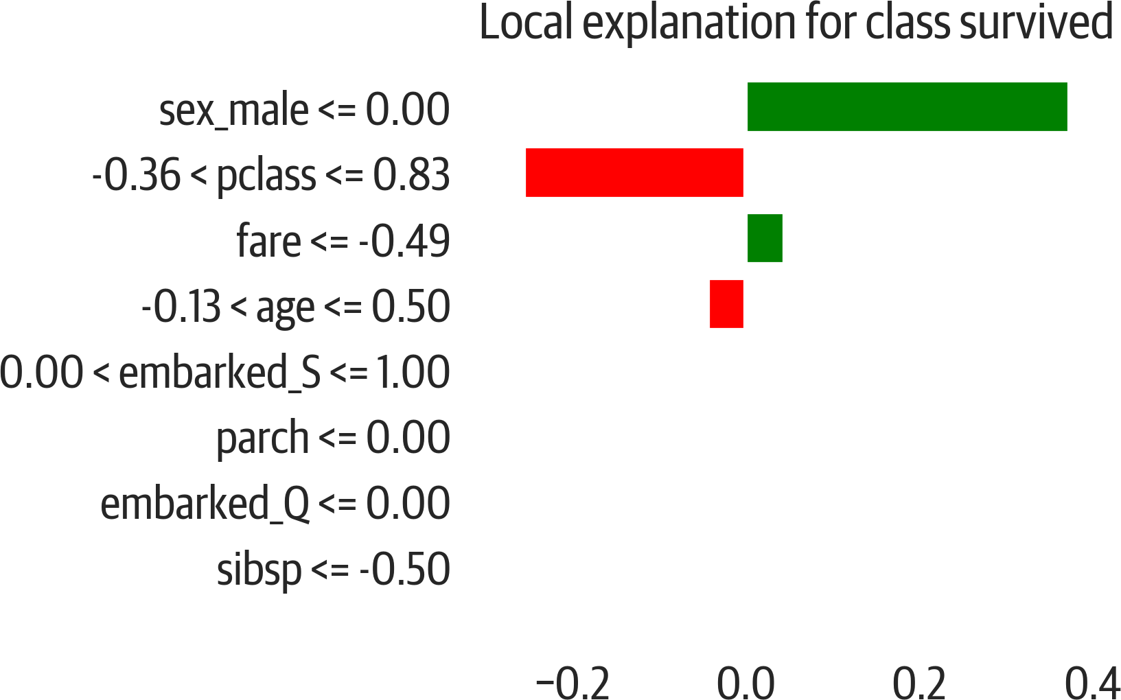
Figure 13-1. LIME explanation for the Titanic dataset. Features for the sample push the prediction toward the right (survival) or left (deceased).
Play around with this and notice that if you switch genders, the results are affected. Below we take the second to last row in the training data. The prediction for that row is 48% deceased and 52% survived. If we switch the gender, we find that the prediction shifts toward 88% deceased:
>>>data=X_train.iloc[-2].values.copy()>>>dt.predict_proba(...[data]...)# predicting that a woman lives[[0.48062016 0.51937984]]>>>data[5]=1# change to male>>>dt.predict_proba([data])array([[0.87954545, 0.12045455]])
Tree Interpretation
For sklearn tree-based models (decision tree, random forest, and extra tree models) you can use the treeinterpreter package. This will calculate the bias and the contribution from each feature. The bias is the mean of the training set.
Each contribution lists how it contributes to each of the labels. (The bias plus the contributions should sum to the prediction.) Since this is a binary classification, there are only two. We see that sex_male is the most important, followed by age and fare:
>>>fromtreeinterpreterimport(...treeinterpreterasti,...)>>>instances=X.iloc[:2]>>>prediction,bias,contribs=ti.predict(...rf5,instances...)>>>i=0>>>("Instance",i)>>>("Prediction",prediction[i])>>>("Bias (trainset mean)",bias[i])>>>("Feature contributions:")>>>forc,featureinzip(...contribs[i],instances.columns...):...(" {} {}".format(feature,c))Instance 0Prediction [0.98571429 0.01428571]Bias (trainset mean) [0.63984716 0.36015284]Feature contributions:pclass [ 0.03588478 -0.03588478]age [ 0.08569306 -0.08569306]sibsp [ 0.01024538 -0.01024538]parch [ 0.0100742 -0.0100742]fare [ 0.06850243 -0.06850243]sex_male [ 0.12000073 -0.12000073]embarked_Q [ 0.0026364 -0.0026364]embarked_S [ 0.01283015 -0.01283015]
Note
This example is for classification, but there is support for regression as well.
Partial Dependence Plots
With feature importance in trees we know that a feature is impacting the outcome, but we don’t know how the impact varies as the feature’s value changes. Partial dependence plots allow us to visualize the relation between changes in just one feature and the outcome. We will use pdpbox to visualize how age affects survival (see Figure 13-2).
This example uses a random forest model:
>>>rf5=ensemble.RandomForestClassifier(...**{..."max_features":"auto",..."min_samples_leaf":0.1,..."n_estimators":200,..."random_state":42,...}...)>>>rf5.fit(X_train,y_train)
>>>frompdpboximportpdp>>>feat_name="age">>>p=pdp.pdp_isolate(...rf5,X,X.columns,feat_name...)>>>fig,_=pdp.pdp_plot(...p,feat_name,plot_lines=True...)>>>fig.savefig("images/mlpr_1302.png",dpi=300)
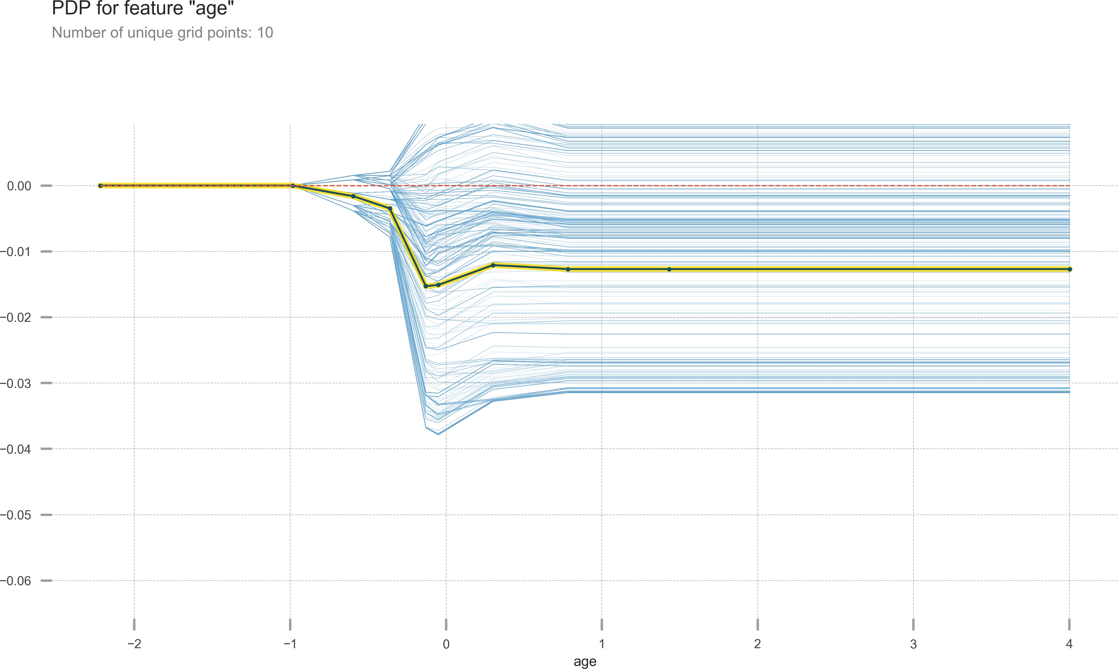
Figure 13-2. Partial dependence plot showing what happens to the target as age changes.
We can also visualize the interactions between two features (see Figure 13-3):
>>>features=["fare","sex_male"]>>>p=pdp.pdp_interact(...rf5,X,X.columns,features...)>>>fig,_=pdp.pdp_interact_plot(p,features)>>>fig.savefig("images/mlpr_1303.png",dpi=300)
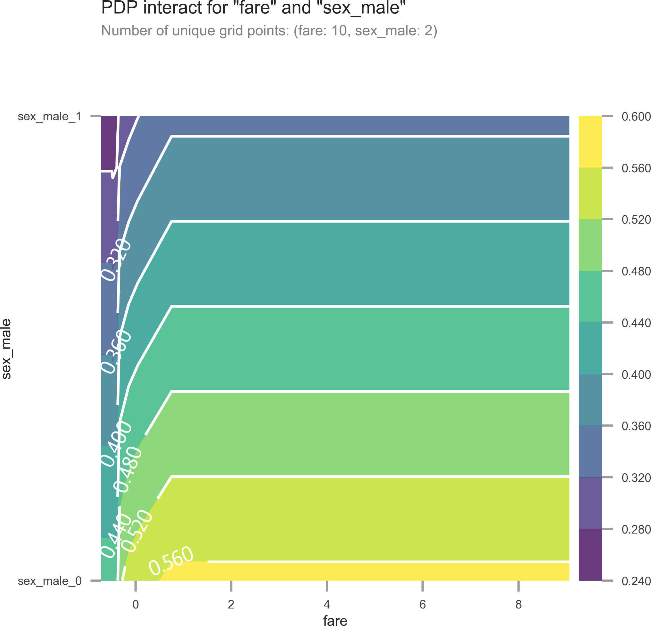
Figure 13-3. Partial dependence plot with two features. As fare goes up and sex goes from male to female, survival goes up.
Note
The partial dependence plot pins down a feature value across the samples and then averages the result. (Be careful about outliers and means.) Also, this plot assumes features are independent. (Not always the case; for example, holding width of a sepal steady would probably have an effect on the height.) The pdpbox library also prints out the individual conditional expectations to better visualize these relationships.
Surrogate Models
If you have a model that is not interpretable (SVM or neural network), you can fit an interpretable model (decision tree) to that model. Using the surrogate you can examine the feature importances.
Here we create a Support Vector Classifier (SVC), but train a decision tree (without a depth limit to overfit and capture what is happening in this model) to explain it:
>>>fromsklearnimportsvm>>>sv=svm.SVC()>>>sv.fit(X_train,y_train)>>>sur_dt=tree.DecisionTreeClassifier()>>>sur_dt.fit(X_test,sv.predict(X_test))>>>forcol,valinsorted(...zip(...X_test.columns,...sur_dt.feature_importances_,...),...key=lambdax:x[1],...reverse=True,...)[:7]:...(f"{col:10}{val:10.3f}")sex_male 0.723pclass 0.076sibsp 0.061age 0.056embarked_S 0.050fare 0.028parch 0.005
Shapley
The SHapley Additive exPlanations, (SHAP) package can visualize feature contributions of any model. This is a really nice package because not only does it work with most models, it also can explain individual predictions and the global feature contributions.
SHAP works for both classification and regression. It generates “SHAP” values. For classification models, the SHAP value sums to log odds for binary classification. For regression, the SHAP values sum to the target prediction.
This library requires Jupyter (JavaScript) for interactivity on some of its plots. (Some can render static images with matplotlib.) Here is an example for sample 20, predicted to die:
>>>rf5.predict_proba(X_test.iloc[[20]])array([[0.59223553, 0.40776447]])
In the force plot for sample 20, you can see the “base value.” This is a female who is predicted to die (see Figure 13-4). We will use the survival index (1) because we want the right-hand side of the plot to be survival. The features push this to the right or left. The larger the feature, the more impact it has. In this case, the low fare and third class push toward death (the output value is below .5):
>>>importshap>>>s=shap.TreeExplainer(rf5)>>>shap_vals=s.shap_values(X_test)>>>target_idx=1>>>shap.force_plot(...s.expected_value[target_idx],...shap_vals[target_idx][20,:],...feature_names=X_test.columns,...)
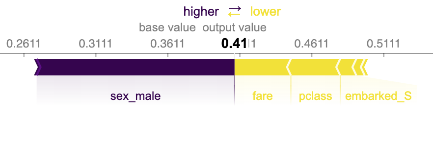
Figure 13-4. Shapley feature contributions for sample 20. This plot shows the base value and the features that push toward death.
You can also visualize the explanations for the entire dataset (rotating them by 90 and plotting them along the x axis) (see Figure 13-5):
>>>shap.force_plot(...s.expected_value[1],...shap_vals[1],...feature_names=X_test.columns,...)
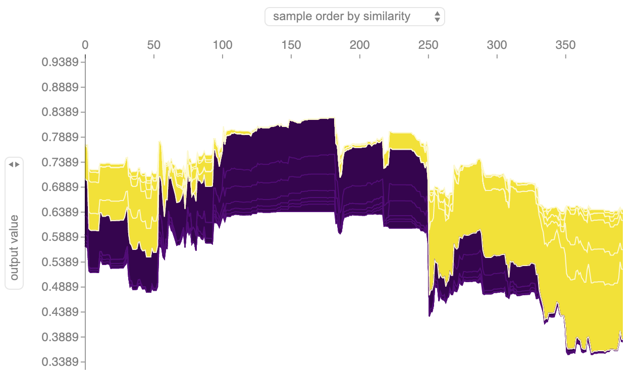
Figure 13-5. Shapley feature contributions for dataset.
The SHAP library can also generate dependence plots. The following plot (see Figure 13-6)
visualizes the relationship between age and SHAP value (it is colored by
pclass, which SHAP chooses automatically; specify a column name as an interaction_index parameter to choose your own):
>>>fig,ax=plt.subplots(figsize=(6,4))>>>res=shap.dependence_plot(..."age",...shap_vals[target_idx],...X_test,...feature_names=X_test.columns,...alpha=0.7,...)>>>fig.savefig(..."images/mlpr_1306.png",...bbox_inches="tight",...dpi=300,...)
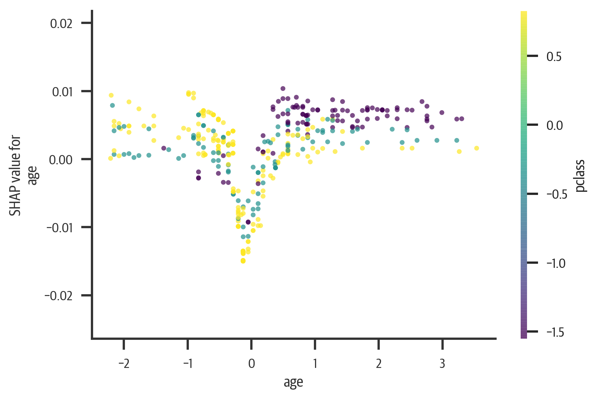
Figure 13-6. Shapley dependency plot for age. Young and old have a higher rate of survival. As age goes up, a lower pclass has more chance of survival.
Tip
You might get a dependence plot that has vertical lines. Setting the x_jitter parameter to 1 is useful if you are viewing ordinal categorical features.
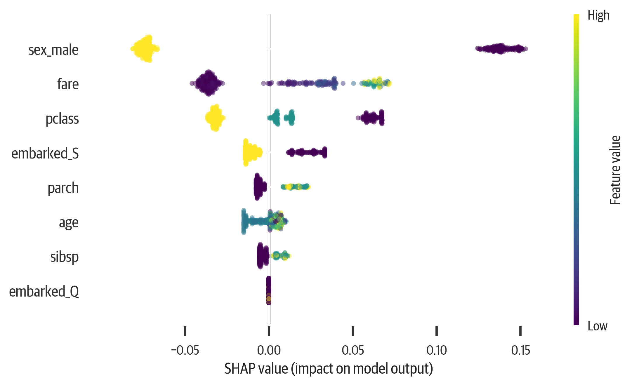
In addition, we can summarize all of the features. This is a very powerful chart to understand. It shows global impact, but also individual impacts. The features are ranked by importance. The most important features are at the top.
Also the features are colored according to their value. We can see that a low sex_male score (female) has a strong push toward survival, while a high score has a less strong push toward death. The age feature is a little harder to interpret. That is because young and old values push toward survival, while middle values push toward death.
When you combine the summary plot with the dependence plot, you can get good insight into model behavior (see Figure 13-7):
>>>fig,ax=plt.subplots(figsize=(6,4))>>>shap.summary_plot(shap_vals[0],X_test)>>>fig.savefig("images/mlpr_1307.png",dpi=300)