Chapter 17. Dimensionality Reduction
There are many techniques to decompose features into a smaller subset. This can be useful for exploratory data analysis, visualization, making predictive models, or clustering.
In this chapter we will explore the Titanic dataset using various techniques. We will look at PCA, UMAP, t-SNE, and PHATE.
Here is the data:
>>>ti_df=tweak_titanic(orig_df)>>>std_cols="pclass,age,sibsp,fare".split(",")>>>X_train,X_test,y_train,y_test=get_train_test_X_y(...ti_df,"survived",std_cols=std_cols...)>>>X=pd.concat([X_train,X_test])>>>y=pd.concat([y_train,y_test])
PCA
Principal Component Analysis (PCA) takes a matrix (X) of rows (samples) and columns (features). PCA returns a new matrix that has columns that are linear combinations of the original columns. These linear combinations maximize the variance.
Each column is orthogonal (a right angle) to the other columns. The columns are sorted in order of decreasing variance.
Scikit-learn has an implementation of this model. It is best to standardize the data prior to running the algorithm. After calling the .fit method, you will have access to an .explained_variance_ratio_ attribute that lists the percentage of variance in each column.
PCA is useful to visualize data in two (or three) dimensions. It is also used as a preprocessing step to filter out random noise in data. It is good for finding global structures, but not local ones, and works well with linear data.
In this example, we are going to run PCA on the Titanic features. The PCA class is a transformer in scikit-learn; you call the .fit method to teach it how to get the principal components, then you call .transform to convert a matrix into a matrix of principal components:
>>>fromsklearn.decompositionimportPCA>>>fromsklearn.preprocessingimport(...StandardScaler,...)>>>pca=PCA(random_state=42)>>>X_pca=pca.fit_transform(...StandardScaler().fit_transform(X)...)>>>pca.explained_variance_ratio_array([0.23917891, 0.21623078, 0.19265028,0.10460882, 0.08170342, 0.07229959,0.05133752, 0.04199068])>>>pca.components_[0]arrayarray([-0.63368693, 0.39682566,0.00614498, 0.11488415, 0.58075352,-0.19046812, -0.21190808, -0.09631388])
Instance parameters:
n_components=None-
Number of components to generate. If
None, return same number as number of columns. Can be a float (0, 1), then will create as many components as needed to get that ratio of variance. copy=True-
Will mutate data on
.fitifTrue. whiten=False-
Whiten data after transform to ensure uncorrelated components.
svd_solver='auto'-
'auto'runs'randomized'SVD ifn_componentsis less than 80% of the smallest dimension (faster, but an approximation). Otherwise runs'full'. tol=0.0-
Tolerance for singular values.
iterated_power='auto'-
Number of iterations for
'randomized'svd_solver. random_state=None-
Random state for
'randomized'svd_solver.
Attributes:
components_-
Principal components (columns of linear combination weights for original features).
explained_variance_-
Amount of variance for each component.
explained_variance_ratio_-
Amount of variance for each component normalized (sums to 1).
singular_values_-
Singular values for each component.
mean_-
Mean of each feature.
n_components_-
When
n_componentsis a float, this is the size of the components. noise_variance_-
Estimated noise covariance.
Plotting the cumulative sum of the explained variance ratio is called a scree plot (see Figure 17-1). It will show how much information is stored in the components. You can use the elbow method to see if it bends to determine how many components to use:
>>>fig,ax=plt.subplots(figsize=(6,4))>>>ax.plot(pca.explained_variance_ratio_)>>>ax.set(...xlabel="Component",...ylabel="Percent of Explained variance",...title="Scree Plot",...ylim=(0,1),...)>>>fig.savefig(..."images/mlpr_1701.png",...dpi=300,...bbox_inches="tight",...)
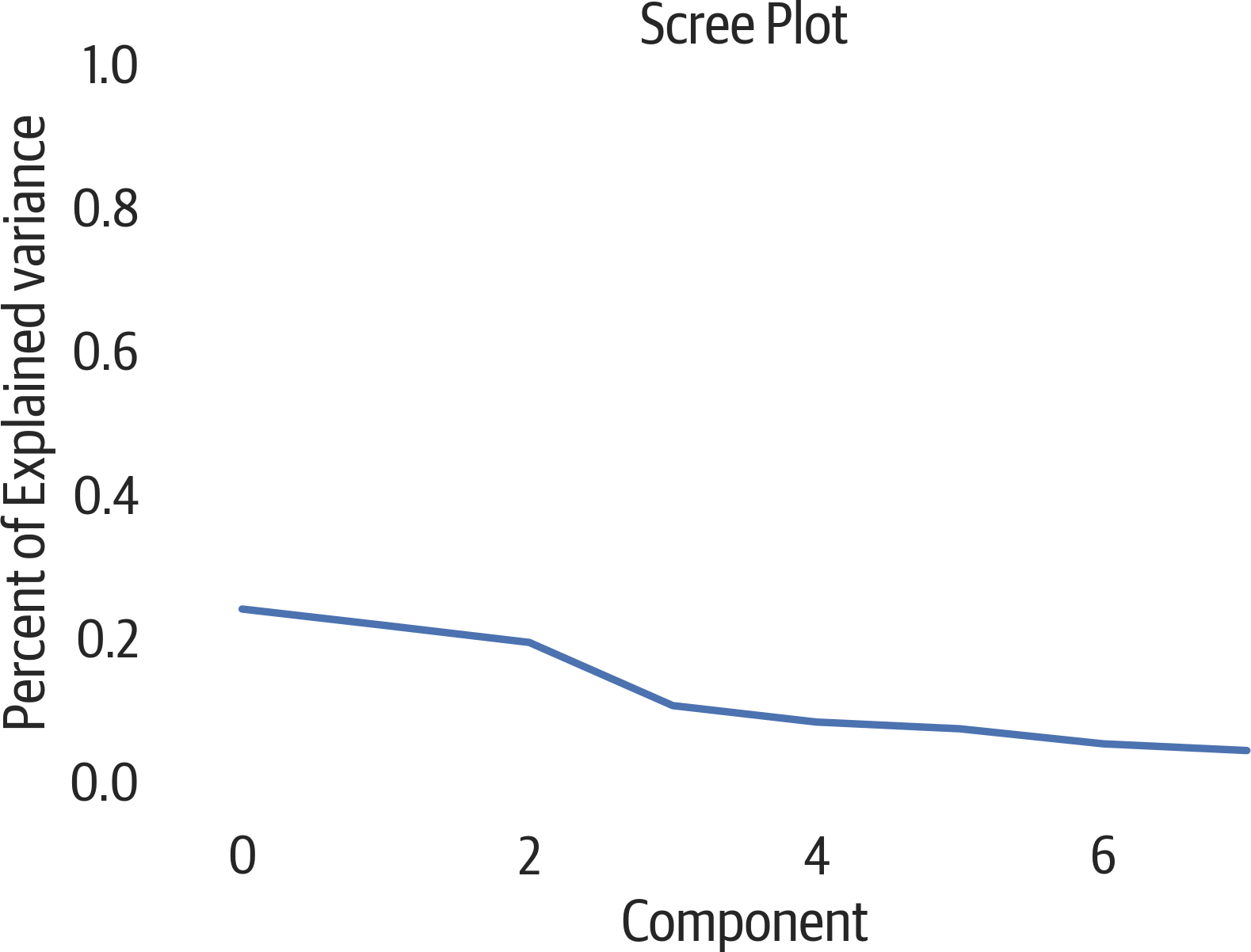
Figure 17-1. PCA scree plot.
Another way to view this data is using a cumulative plot (see Figure 17-2). Our original data had 8 columns, but from the plot it appears that we keep around 90% of the variance if we use just 4 of the PCA components:
>>>fig,ax=plt.subplots(figsize=(6,4))>>>ax.plot(...np.cumsum(pca.explained_variance_ratio_)...)>>>ax.set(...xlabel="Component",...ylabel="Percent of Explained variance",...title="Cumulative Variance",...ylim=(0,1),...)>>>fig.savefig("images/mlpr_1702.png",dpi=300)
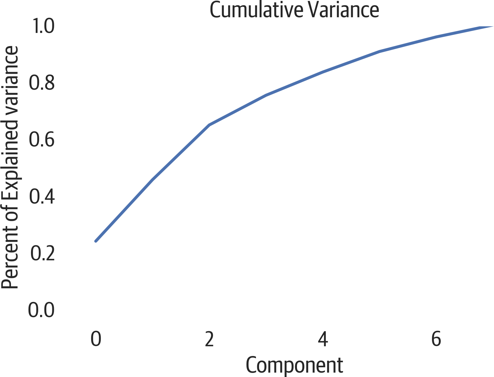
Figure 17-2. PCA cumulative explained variance.
How much do features impact components? Use the matplotlib imshow function to plot the components along the x axis and the original features along the y axis (see Figure 17-3). The darker the color, the more the original column contributes to the component.
It looks like the first component is heavily influenced by the pclass, age, and fare columns. (Using the spectral colormap (cmap) emphasizes nonzero values, and providing vmin and vmax adds limits to the colorbar legend.)
>>>fig,ax=plt.subplots(figsize=(6,4))>>>plt.imshow(...pca.components_.T,...cmap="Spectral",...vmin=-1,...vmax=1,...)>>>plt.yticks(range(len(X.columns)),X.columns)>>>plt.xticks(range(8),range(1,9))>>>plt.xlabel("Principal Component")>>>plt.ylabel("Contribution")>>>plt.title(..."Contribution of Features to Components"...)>>>plt.colorbar()>>>fig.savefig("images/mlpr_1703.png",dpi=300)
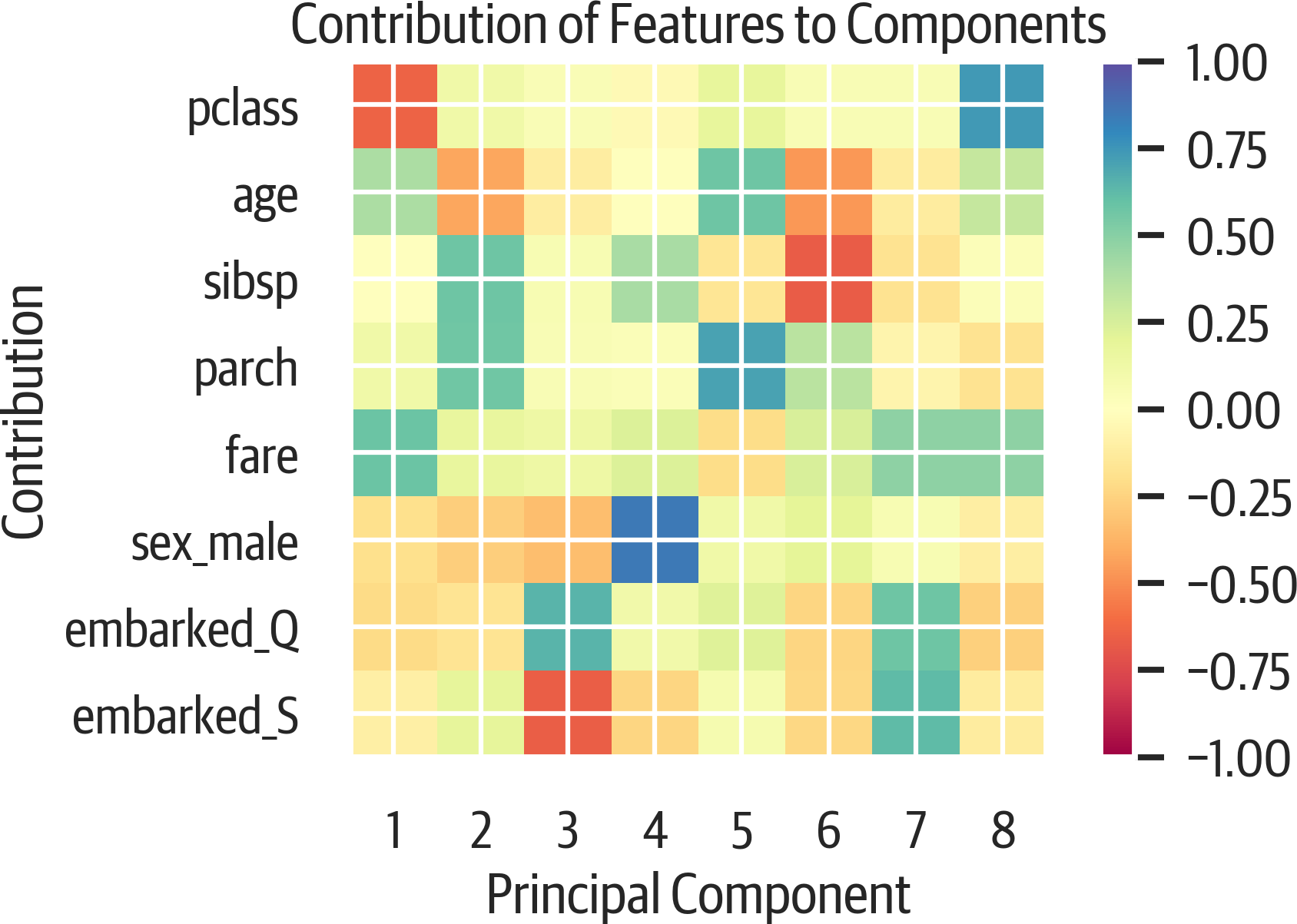
Figure 17-3. PCA features in components.
An alternative view is to look at a bar plot (see Figure 17-4). Each component is shown with the contributions from the original data:
>>>fig,ax=plt.subplots(figsize=(8,4))>>>pd.DataFrame(...pca.components_,columns=X.columns...).plot(kind="bar",ax=ax).legend(...bbox_to_anchor=(1,1)...)>>>fig.savefig("images/mlpr_1704.png",dpi=300)
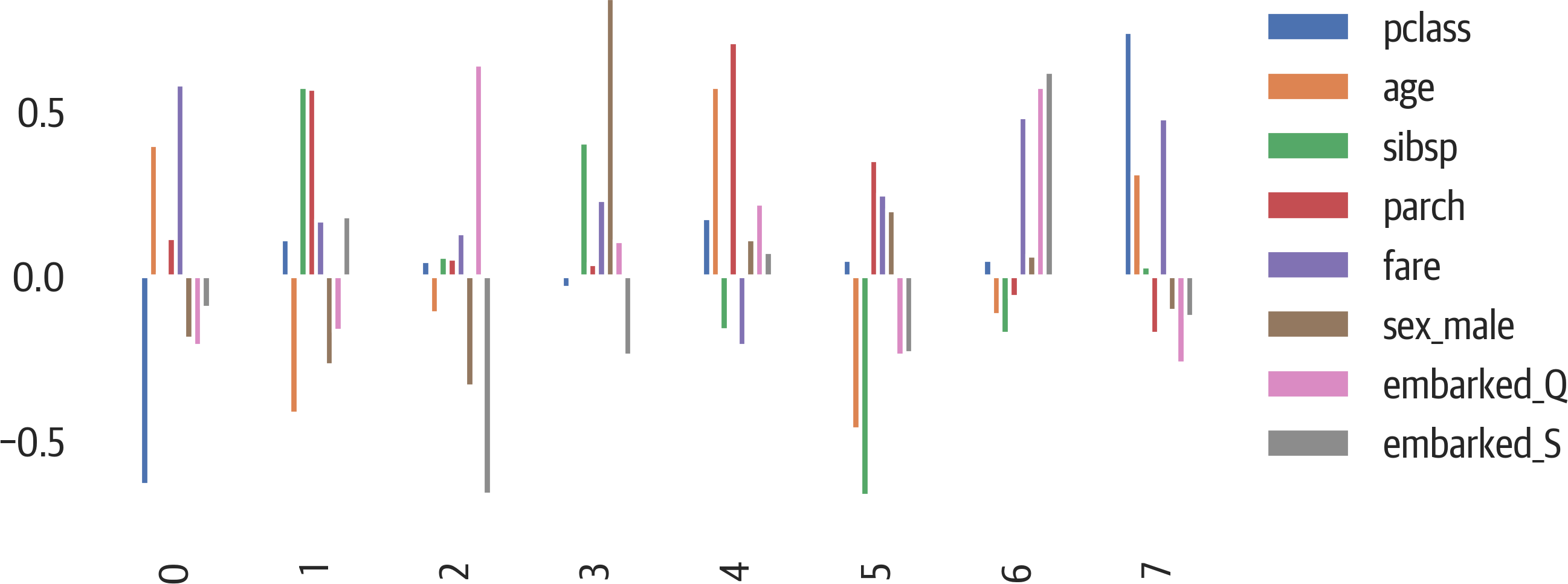
Figure 17-4. PCA features in components.
If we have many features, we may want to limit the plots above by showing only features that meet a minimum weight. Here is code to find all the features in the first two components that have absolute values of at least .5:
>>>comps=pd.DataFrame(...pca.components_,columns=X.columns...)>>>min_val=0.5>>>num_components=2>>>pca_cols=set()>>>foriinrange(num_components):...parts=comps.iloc[i][...comps.iloc[i].abs()>min_val...]...pca_cols.update(set(parts.index))>>>pca_cols{'fare', 'parch', 'pclass', 'sibsp'}
PCA is commonly used to visualize high dimension datasets in two components. Here we visualize the Titanic features in 2D. They are colored by survival status. Sometimes clusters may appear in the visualization. In this case, there doesn’t appear to be clustering of survivors (see Figure 17-5).
We generate this visualization using Yellowbrick:
>>>fromyellowbrick.features.pcaimport(...PCADecomposition,...)>>>fig,ax=plt.subplots(figsize=(6,4))>>>colors=["rg"[j]forjiny]>>>pca_viz=PCADecomposition(color=colors)>>>pca_viz.fit_transform(X,y)>>>pca_viz.poof()>>>fig.savefig("images/mlpr_1705.png",dpi=300)
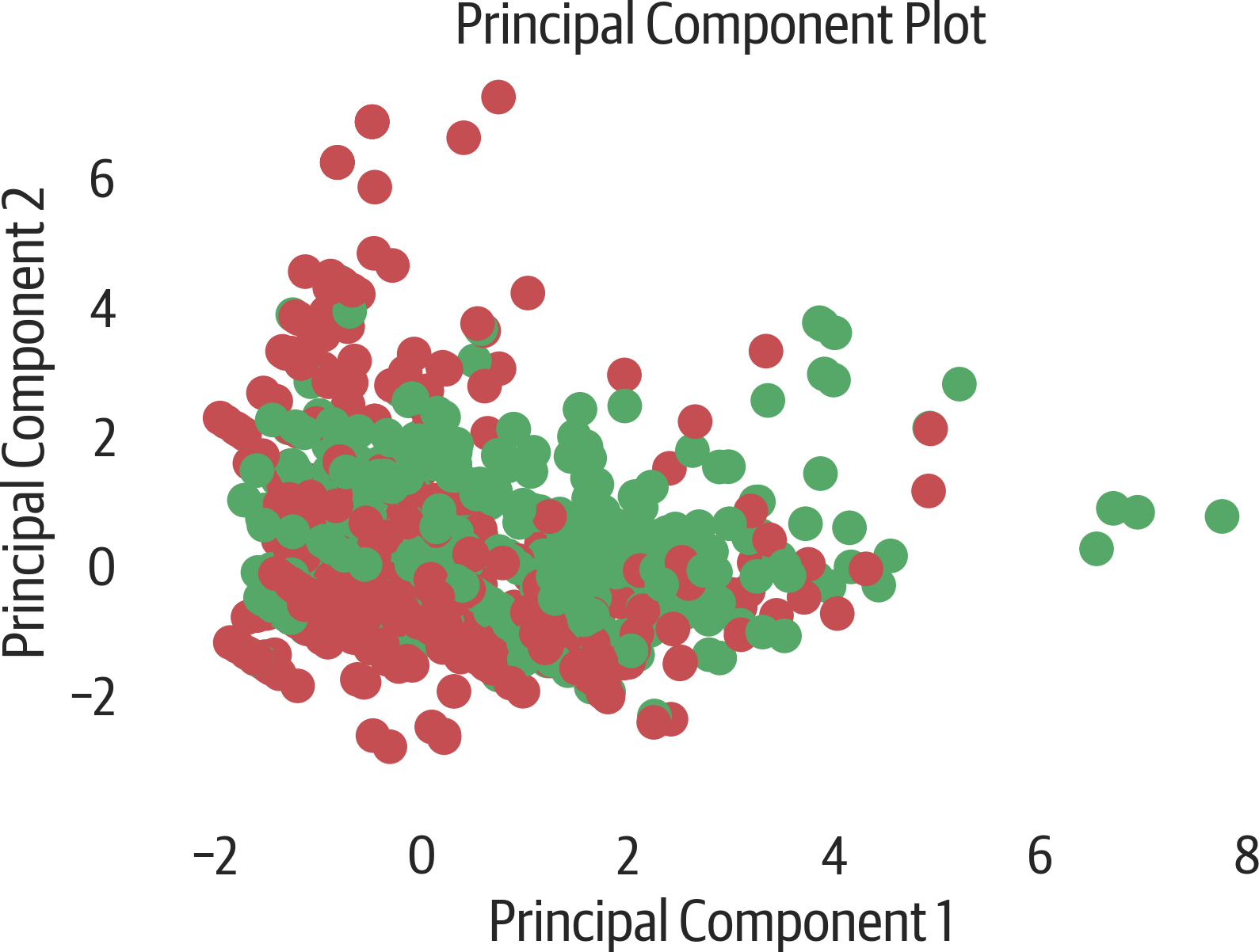
Figure 17-5. Yellowbrick PCA plot.
If you want to color the scatter plot by a column and add a legend (not a colorbar), you need to loop over each color and plot that group individually in pandas or matplotlib (or use seaborn). Below we also set the aspect ratio to the ratio of the explained variances for the components we are looking at (see Figure 17-6). Because the second component only has 90% of the first component, it is a little shorter.
>>>fig,ax=plt.subplots(figsize=(6,4))>>>pca_df=pd.DataFrame(...X_pca,...columns=[...f"PC{i+1}"...foriinrange(X_pca.shape[1])...],...)>>>pca_df["status"]=[...("deceased","survived")[i]foriiny...]>>>evr=pca.explained_variance_ratio_>>>ax.set_aspect(evr[1]/evr[0])>>>sns.scatterplot(...x="PC1",...y="PC2",...hue="status",...data=pca_df,...alpha=0.5,...ax=ax,...)>>>fig.savefig(..."images/mlpr_1706.png",...dpi=300,...bbox_inches="tight",...)
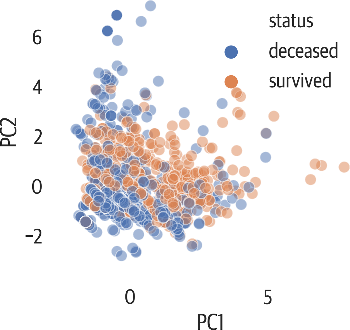
Figure 17-6. Seaborn PCA with legend and relative aspect.
Below, we augment the scatter plot by showing a loading plot on top of it. This plot is called a biplot because it has the scatter plot and the loadings (see Figure 17-7). The loadings indicate how strong features are and how they correlate. If their angles are close, they likely correlate. If the angles are at 90 degrees, they likely don’t correlate. Finally, if the angle between them is close to 180 degrees, they have a negative correlation:
>>>fig,ax=plt.subplots(figsize=(6,4))>>>pca_df=pd.DataFrame(...X_pca,...columns=[...f"PC{i+1}"...foriinrange(X_pca.shape[1])...],...)>>>pca_df["status"]=[...("deceased","survived")[i]foriiny...]>>>evr=pca.explained_variance_ratio_>>>x_idx=0# x_pc>>>y_idx=1# y_pc>>>ax.set_aspect(evr[y_idx]/evr[x_idx])>>>x_col=pca_df.columns[x_idx]>>>y_col=pca_df.columns[y_idx]>>>sns.scatterplot(...x=x_col,...y=y_col,...hue="status",...data=pca_df,...alpha=0.5,...ax=ax,...)>>>scale=8>>>comps=pd.DataFrame(...pca.components_,columns=X.columns...)>>>foridx,sincomps.T.iterrows():...plt.arrow(...0,...0,...s[x_idx]*scale,...s[y_idx]*scale,...color="k",...)...plt.text(...s[x_idx]*scale,...s[y_idx]*scale,...idx,...weight="bold",...)>>>fig.savefig(..."images/mlpr_1707.png",...dpi=300,...bbox_inches="tight",...)
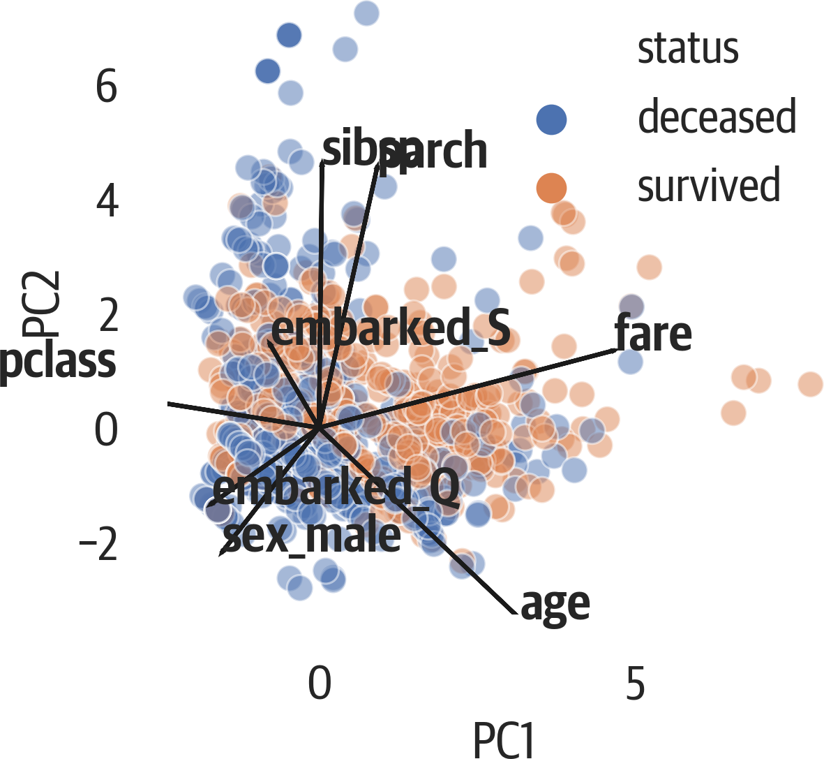
Figure 17-7. Seaborn biplot with scatter plot and loading plot.
From previous tree models, we know that age, fare, and sex are important for determining whether a passenger survived. The first principal component is influenced by pclass, age, and fare, while the fourth is influenced by sex. Let’s plot those components against each other.
Again, this plot is scaling the aspect ratio of the plot based on the ratios of variance of the components (see Figure 17-8).
This plot appears to more accurately separate the survivors:
>>>fig,ax=plt.subplots(figsize=(6,4))>>>pca_df=pd.DataFrame(...X_pca,...columns=[...f"PC{i+1}"...foriinrange(X_pca.shape[1])...],...)>>>pca_df["status"]=[...("deceased","survived")[i]foriiny...]>>>evr=pca.explained_variance_ratio_>>>ax.set_aspect(evr[3]/evr[0])>>>sns.scatterplot(...x="PC1",...y="PC4",...hue="status",...data=pca_df,...alpha=0.5,...ax=ax,...)>>>fig.savefig(..."images/mlpr_1708.png",...dpi=300,...bbox_inches="tight",...)
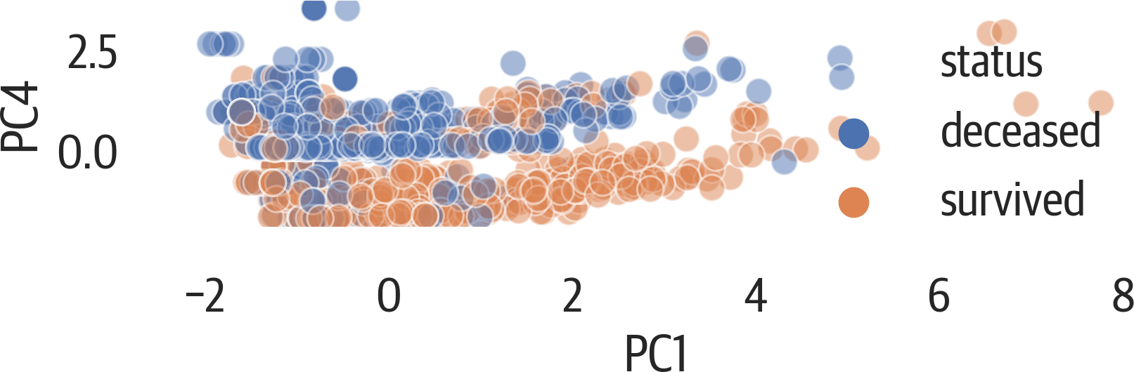
Figure 17-8. PCA plot showing components 1 against 4.
Matplotlib can create pretty plots, but it is less useful for interactive plots. When performing PCA, it is often useful to view the data for scatter plots. I have included a function that uses the Bokeh library for interacting with scatter plots (see Figure 17-9). It works well in Jupyter:
>>>frombokeh.ioimportoutput_notebook>>>frombokehimportmodels,palettes,transform>>>frombokeh.plottingimportfigure,show>>>>>>defbokeh_scatter(...x,...y,...data,...hue=None,...label_cols=None,...size=None,...legend=None,...alpha=0.5,...):..."""...x - x column name to plot...y - y column name to plot...data - pandas DataFrame...hue - column name to color by (numeric)...legend - column name to label by...label_cols - columns to use in tooltip...(None all in DataFrame)...size - size of points in screen space unigs...alpha - transparency..."""...output_notebook()...circle_kwargs={}...iflegend:...circle_kwargs["legend"]=legend...ifsize:...circle_kwargs["size"]=size...ifhue:...color_seq=data[hue]...mapper=models.LinearColorMapper(...palette=palettes.viridis(256),...low=min(color_seq),...high=max(color_seq),...)...circle_kwargs[..."fill_color"...]=transform.transform(hue,mapper)...ds=models.ColumnDataSource(data)...iflabel_colsisNone:...label_cols=data.columns...tool_tips=sorted(...[...(x,"@{}".format(x))...forxinlabel_cols...],...key=lambdatup:tup[0],...)...hover=models.HoverTool(...tooltips=tool_tips...)...fig=figure(...tools=[...hover,..."pan",..."zoom_in",..."zoom_out",..."reset",...],...toolbar_location="below",...)......fig.circle(...x,...y,...source=ds,...alpha=alpha,...**circle_kwargs...)...show(fig)...returnfig>>>res=bokeh_scatter(..."PC1",..."PC2",...data=pca_df.assign(...surv=y.reset_index(drop=True)...),...hue="surv",...size=10,...legend="surv",...)
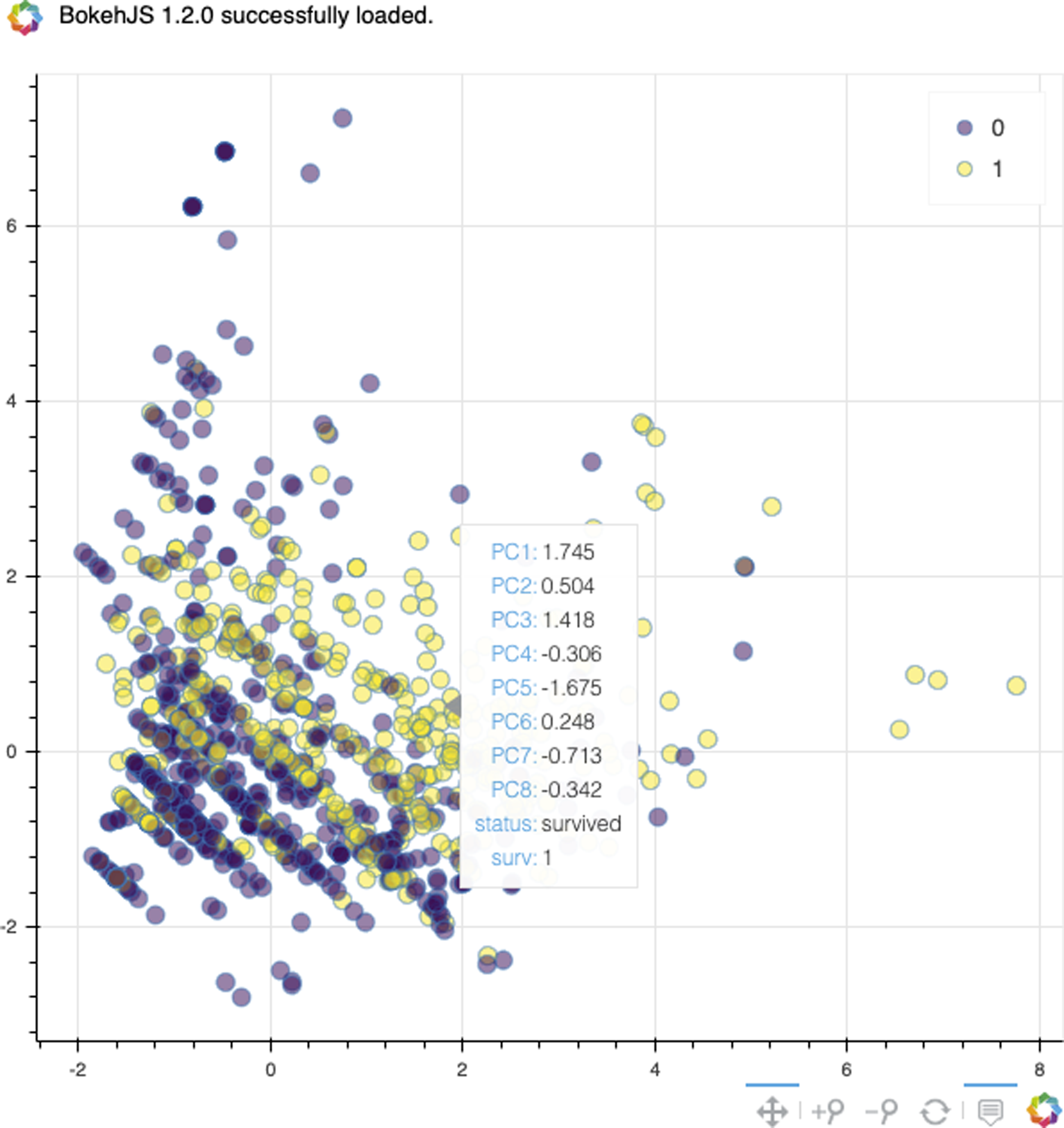
Figure 17-9. Bokeh scatter plot with tooltips.
Yellowbrick can also plot in three dimensions (see Figure 17-10):
>>>fromyellowbrick.features.pcaimport(...PCADecomposition,...)>>>colors=["rg"[j]forjiny]>>>pca3_viz=PCADecomposition(...proj_dim=3,color=colors...)>>>pca3_viz.fit_transform(X,y)>>>pca3_viz.finalize()>>>fig=plt.gcf()>>>plt.tight_layout()>>>fig.savefig(..."images/mlpr_1710.png",...dpi=300,...bbox_inches="tight",...)
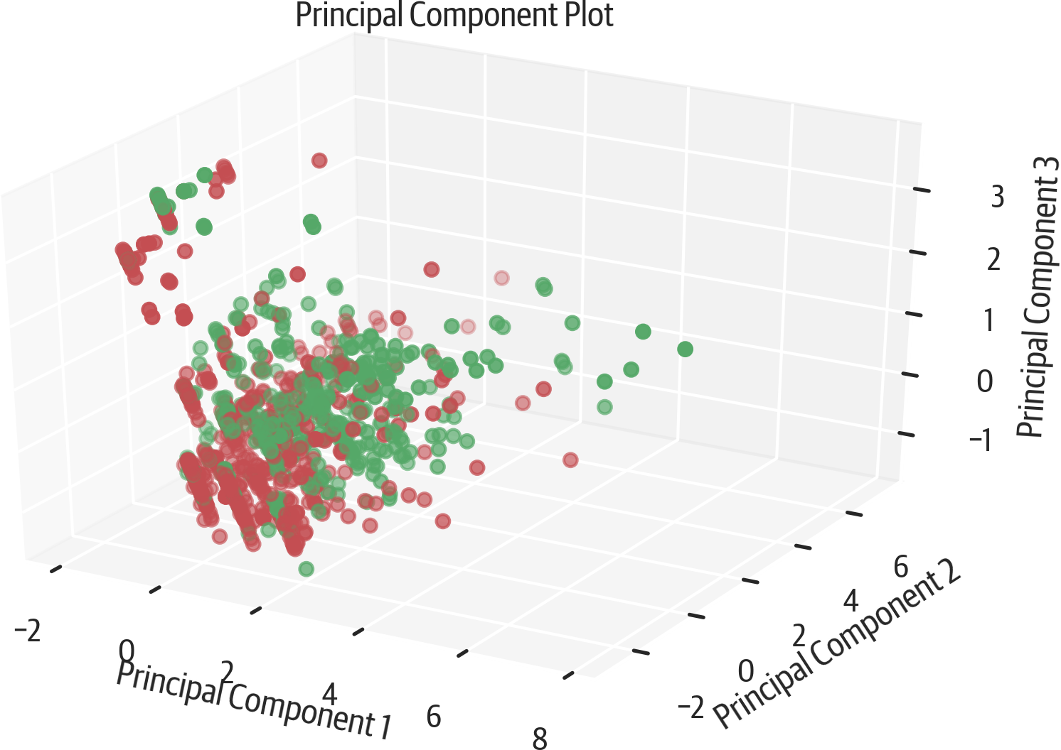
Figure 17-10. Yellowbrick 3D PCA.
The scprep library (which is a dependency for the PHATE library, which we discuss shortly) has a useful plotting function. The rotate_scatter3d function can generate a plot that will animate in Jupyter (see Figure 17-11). This makes it easier to understand 3D plots.
You can use this library to visualize any 3D data, not just PHATE:
>>>importscprep>>>scprep.plot.rotate_scatter3d(...X_pca[:,:3],...c=y,...cmap="Spectral",...figsize=(8,6),...label_prefix="Principal Component",...)

Figure 17-11. scprep 3D PCA animation.
If you change the matplotlib cell magic mode in Jupyter to notebook, you can get an interactive 3D plot from matplotlib (see Figure 17-12).
>>>frommpl_toolkits.mplot3dimportAxes3D>>>fig=plt.figure(figsize=(6,4))>>>ax=fig.add_subplot(111,projection="3d")>>>ax.scatter(...xs=X_pca[:,0],...ys=X_pca[:,1],...zs=X_pca[:,2],...c=y,...cmap="viridis",...)>>>ax.set_xlabel("PC 1")>>>ax.set_ylabel("PC 2")>>>ax.set_zlabel("PC 3")
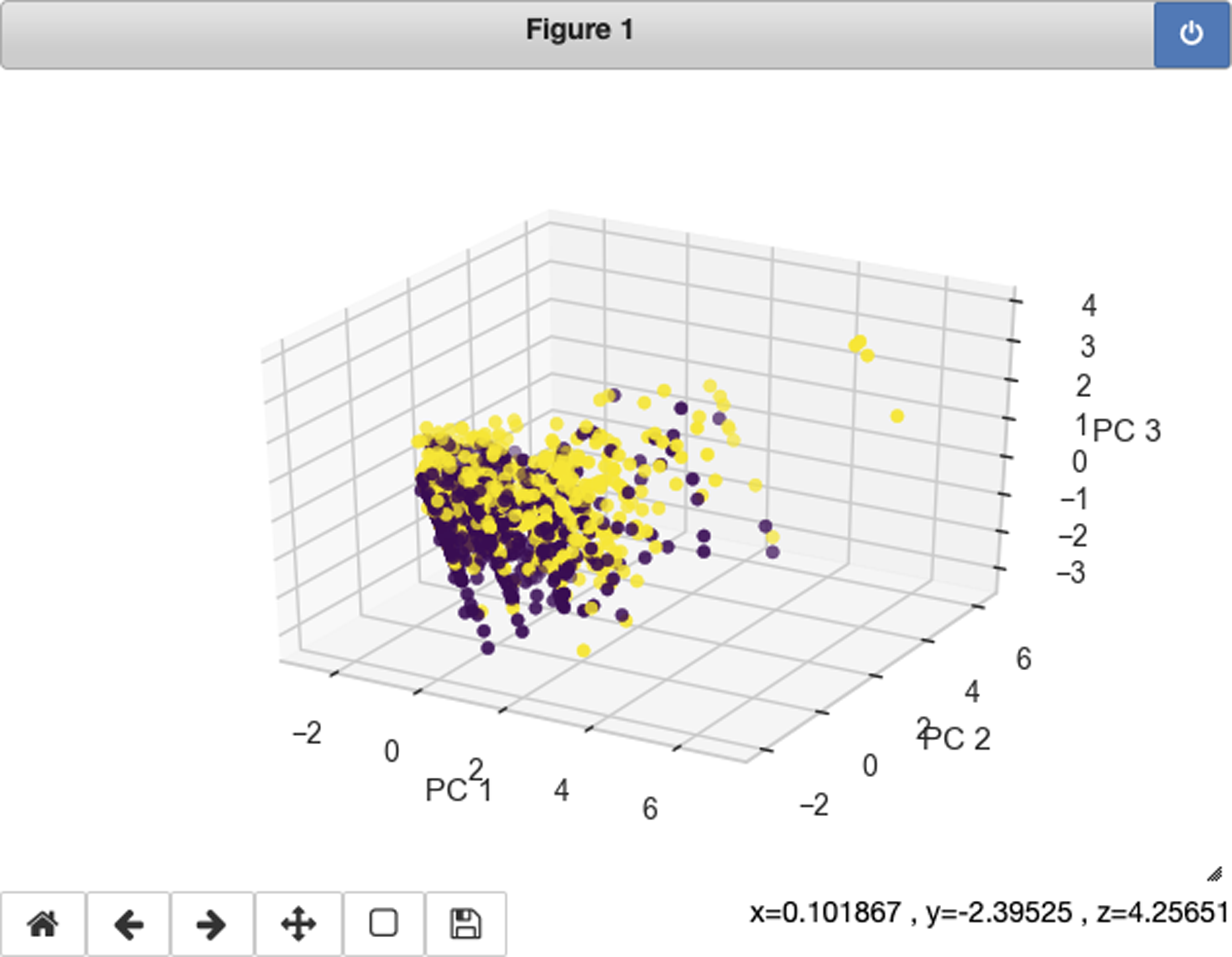
Figure 17-12. Matplotlib interactive 3D PCA with notebook mode.
UMAP
Uniform Manifold Approximation and Projection (UMAP) is a dimensionality reduction technique that uses manifold learning. As such it tends to keeps similar items together topologically. It tries to preserve both the global and the local structure, as opposed to t-SNE (explained in “t-SNE”), which favors local structure.
The Python implementation doesn’t have multicore support.
Normalization of features is a good idea to get values on the same scale.
UMAP is very sensitive to hyperparameters (n_neighbors, min_dist, n_components, or
metric). Here are some examples:
>>>importumap>>>u=umap.UMAP(random_state=42)>>>X_umap=u.fit_transform(...StandardScaler().fit_transform(X)...)>>>X_umap.shape(1309, 2)
Instance parameters:
n_neighbors=15-
Local neighborhood size. Larger means use a global view, smaller means more local.
n_components=2-
Number of dimensions for embedding.
metric='euclidean'-
Metric to use for distance. Can be a function that accepts two 1D arrays and returns a float.
n_epochs=None-
Number of training epochs. Default will be 200 or 500 (depending on size of data).
learning_rate=1.0-
Learning rate for embedding optimization.
init='spectral'-
Initialization type. Spectral embedding is the default. Can be
'random'or a numpy array of locations. min_dist=0.1-
Between 0 and 1. Minimum distance between embedded points. Smaller means more clumps, larger means spread out.
spread=1.0-
Determines distance of embedded points.
set_op_mix_ratio=1.0-
Between 0 and 1: fuzzy union (1) or fuzzy intersection (0).
local_connectivity=1.0-
Number of neighbors for local connectivity. As this goes up, more local connections are created.
repulsion_strength=1.0-
Repulsion strength. Higher values give more weight to negative samples.
negative_sample_rate=5-
Negative samples per positive sample. Higher value has more repulsion, more optimization costs, and better accuracy.
transform_queue_size=4.0-
Aggressiveness for nearest neighbors search. Higher value is lower performance but better accuracy.
a=None-
Parameter to control embedding. If equal to
None, UMAP determines these frommin_distandspread. b=None-
Parameter to control embedding. If equal to
None, UMAP determines these frommin_distandspread. random_state=None-
Random seed.
metric_kwds=None-
Metrics dictionary for additional parameters if function is used for
metric. Alsominkowsi(and other metrics) can be parameterized with this. angular_rp_forest=False-
Use angular random projection.
target_n_neighbors=-1-
Number of neighbors for simplicity set.
target_metric='categorical'-
For using supervised reduction. Can also be
'L1'or'L2'. Also supports a function that takes two arrays fromXas input and returns the distance value between them. target_metric_kwds=None-
Metrics dictionary to use if function is used for
target_metric. target_weight=0.5-
Weighting factor. Between 0.0 and 1.0, where 0 means base on data only, and 1 means base on target only.
transform_seed=42-
Random seed for transform operations.
verbose=False-
Verbosity.
Attributes:
embedding_-
The embedding results
Let’s visualize the default results of UMAP on the Titanic dataset (see Figure 17-13):
>>>fig,ax=plt.subplots(figsize=(8,4))>>>pd.DataFrame(X_umap).plot(...kind="scatter",...x=0,...y=1,...ax=ax,...c=y,...alpha=0.2,...cmap="Spectral",...)>>>fig.savefig("images/mlpr_1713.png",dpi=300)
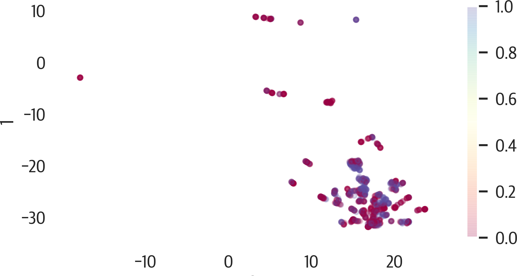
Figure 17-13. UMAP results.
To adjust the results of UMAP, focus on the n_neighbors and min_dist hyperparameters first. Here are illustrations of changing those values (see Figures 17-14 and 17-15):
>>>X_std=StandardScaler().fit_transform(X)>>>fig,axes=plt.subplots(2,2,figsize=(6,4))>>>axes=axes.reshape(4)>>>fori,ninenumerate([2,5,10,50]):...ax=axes[i]...u=umap.UMAP(...random_state=42,n_neighbors=n...)...X_umap=u.fit_transform(X_std)......pd.DataFrame(X_umap).plot(...kind="scatter",...x=0,...y=1,...ax=ax,...c=y,...cmap="Spectral",...alpha=0.5,...)...ax.set_title(f"nn={n}")>>>plt.tight_layout()>>>fig.savefig("images/mlpr_1714.png",dpi=300)
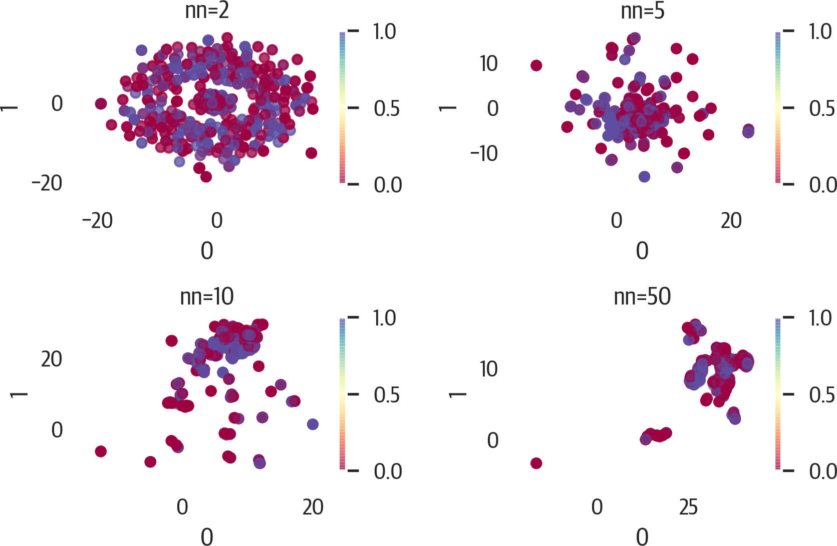
Figure 17-14. UMAP results adjusting n_neighbors.
>>>fig,axes=plt.subplots(2,2,figsize=(6,4))>>>axes=axes.reshape(4)>>>fori,ninenumerate([0,0.33,0.66,0.99]):...ax=axes[i]...u=umap.UMAP(random_state=42,min_dist=n)...X_umap=u.fit_transform(X_std)...pd.DataFrame(X_umap).plot(...kind="scatter",...x=0,...y=1,...ax=ax,...c=y,...cmap="Spectral",...alpha=0.5,...)...ax.set_title(f"min_dist={n}")>>>plt.tight_layout()>>>fig.savefig("images/mlpr_1715.png",dpi=300)
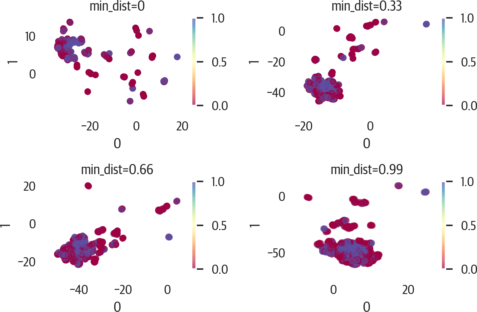
Figure 17-15. UMAP results adjusting min_dist.
Sometimes PCA is performed before UMAP to reduce the dimensions and speed up the computations.
t-SNE
The t-Distributed Stochastic Neighboring Embedding (t-SNE) technique is a visualization and dimensionality reduction technique. It uses distributions of the input and low dimension embedding, and minimizes the joint probabilities between them. Because this is computationally intensive, you might not be able to use this technique with a large dataset.
One characteristic of t-SNE is that it is quite sensitive to hyperparameters. Also, while it preserves local clusters quite well, global information is not preserved. As such, the distance between clusters is meaningless. Finally, this is not a deterministic algorithm and may not converge.
It is a good idea to standardize the data before using this technique:
>>>fromsklearn.manifoldimportTSNE>>>X_std=StandardScaler().fit_transform(X)>>>ts=TSNE()>>>X_tsne=ts.fit_transform(X_std)
Instance parameters:
n_components=2-
Number of dimensions for embedding.
perplexity=30.0-
Suggested values are between 5 and 50. Smaller numbers tend to make tighter clumps.
early_exaggeration=12.0-
Controls cluster tightness and spacing between them. Larger values mean larger spacing.
learning_rate=200.0-
Usually between 10 and 1000. If data looks like a ball, lower it. If data looks compressed, raise it.
n_iter=1000-
Number of iterations.
n_iter_without_progress=300-
Abort if no progress after this number of iterations.
min_grad_norm=1e-07-
Optimization stops if the gradient norm is below this value.
metric='euclidean'-
Distance metric from
scipy.spatial.distance.pdist,pairwise.PAIRWISE_DISTANCE_METRIC, or a function. init='random'-
Embedding initialization.
verbose=0-
Verbosity.
random_state=None-
Random seed.
method='barnes_hut'-
Gradient calculation algorithm.
angle=0.5-
For gradient calculation. Less than .2 increases runtime. Greater than .8 increases error.
Attributes:
embedding_-
Embedding vectors
kl_divergence_-
Kullback-Leibler divergence
n_iter_-
Number of iterations
Here’s a visualization of the results of t-SNE using matplotlib (see Figure 17-16):
>>>fig,ax=plt.subplots(figsize=(6,4))>>>colors=["rg"[j]forjiny]>>>scat=ax.scatter(...X_tsne[:,0],...X_tsne[:,1],...c=colors,...alpha=0.5,...)>>>ax.set_xlabel("Embedding 1")>>>ax.set_ylabel("Embedding 2")>>>fig.savefig("images/mlpr_1716.png",dpi=300)
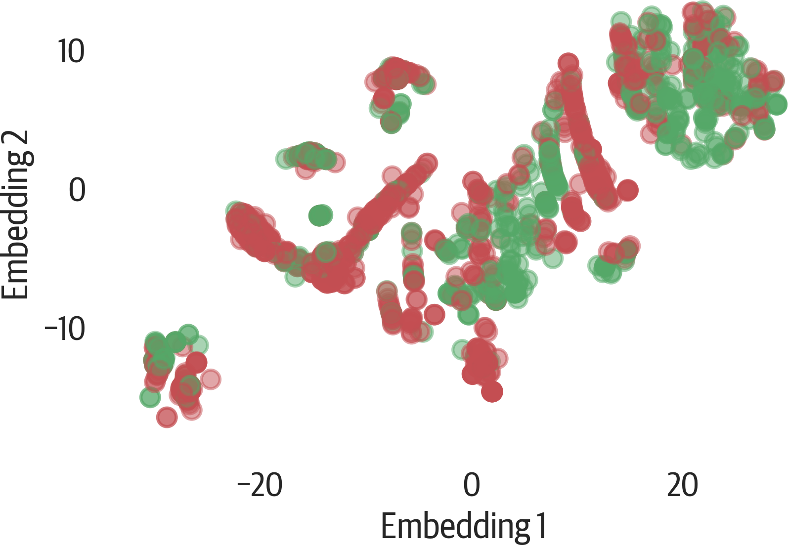
Figure 17-16. t-SNE result with matplotlib.
Changing the value of perplexity can have big effects on the plot (see Figure 17-17). Here are a few different values:
>>>fig,axes=plt.subplots(2,2,figsize=(6,4))>>>axes=axes.reshape(4)>>>fori,ninenumerate((2,30,50,100)):...ax=axes[i]...t=TSNE(random_state=42,perplexity=n)...X_tsne=t.fit_transform(X)...pd.DataFrame(X_tsne).plot(...kind="scatter",...x=0,...y=1,...ax=ax,...c=y,...cmap="Spectral",...alpha=0.5,...)...ax.set_title(f"perplexity={n}")...plt.tight_layout()...fig.savefig("images/mlpr_1717.png",dpi=300)
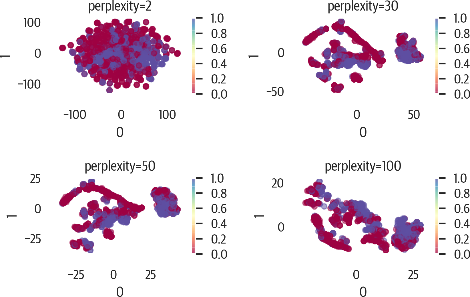
Figure 17-17. Changing perplexity for t-SNE.
PHATE
Potential of Heat-diffusion for Affinity-based Trajectory Embedding (PHATE) is a tool for visualization of high dimensional data. It tends to keep both global structure (like PCA) and local structure (like t-SNE).
PHATE first encodes local information (points close to each other should remain close). It uses “diffusion” to discover global data, then reduce dimensionality:
>>>importphate>>>p=phate.PHATE(random_state=42)>>>X_phate=p.fit_transform(X)>>>X_phate.shape
Instance parameters:
n_components=2-
Number of dimensions.
knn=5-
Number of neighbors for the kernel. Increase if the embedding is disconnected or dataset is larger than 100,000 samples.
decay=40-
Decay rate of kernel. Lowering this value increases graph connectivity.
n_landmark=2000-
Landmarks to use.
t='auto'-
Diffusion power. Smoothing is performed on the data. Increase if embedding lacks structure. Decrease if structure is tight and compact.
gamma=1-
Log potential (between -1 and 1). If embeddings are concentrated around a single point, try setting this to 0.
n_pca=100-
Number of principle components for neighborhood calculation.
knn_dist='euclidean'-
KNN metric.
mds_dist='euclidean'-
Multidimensional scaling (MDS) metric.
mds='metric'-
MDS algorithm for dimension reduction.
n_jobs=1-
Number of CPUs to use.
random_state=None-
Random seed.
verbose=1-
Verbosity.
Attributes (note that these aren’t followed by _):
X-
Input data
embedding-
Embedding space
diff_op-
Diffusion operator
graph-
KNN graph built from input
Here is an example of using PHATE (see Figure 17-18):
>>>fig,ax=plt.subplots(figsize=(6,4))>>>phate.plot.scatter2d(p,c=y,ax=ax,alpha=0.5)>>>fig.savefig("images/mlpr_1718.png",dpi=300)
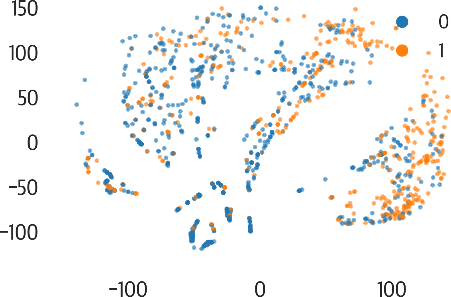
Figure 17-18. PHATE results.
As noted in the instance parameters above, there are a few parameters that
we can adjust to change the behavior of the model.
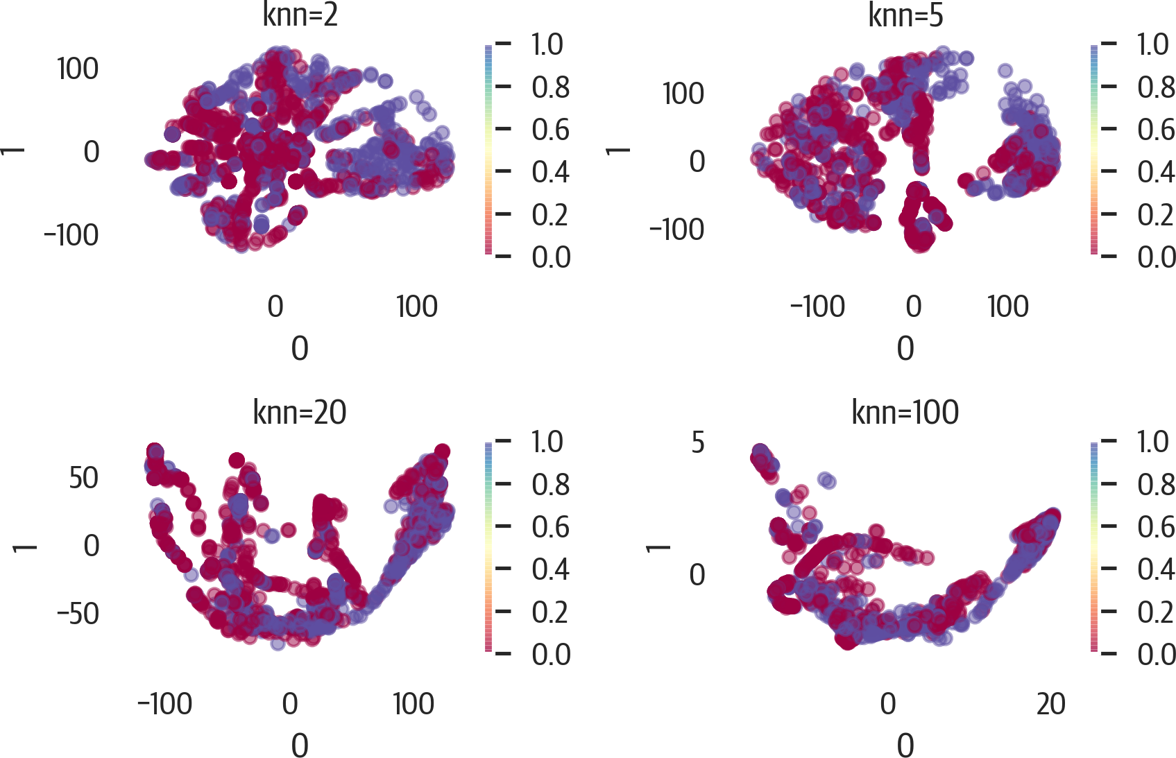
Below is an example of adjusting the knn parameter (see Figure 17-19). Note that if we use
the .set_params method, it will speed up the calculation as it uses the
precomputed graph and diffusion operator:
>>>fig,axes=plt.subplots(2,2,figsize=(6,4))>>>axes=axes.reshape(4)>>>p=phate.PHATE(random_state=42,n_jobs=-1)>>>fori,ninenumerate((2,5,20,100)):...ax=axes[i]...p.set_params(knn=n)...X_phate=p.fit_transform(X)...pd.DataFrame(X_phate).plot(...kind="scatter",...x=0,...y=1,...ax=ax,...c=y,...cmap="Spectral",...alpha=0.5,...)...ax.set_title(f"knn={n}")...plt.tight_layout()...fig.savefig("images/mlpr_1719.png",dpi=300)