9. Regression
9.1 Introduction
Model fitting is the process of estimating a model’s parameters. In other chapters, we described linear regression as a specific example. Now, you’ll develop that example with a little more detail. You’ll find this same basic pattern throughout the book. It works well for linear regression, and you’ll see the same structure for more advanced models like deep neural networks.
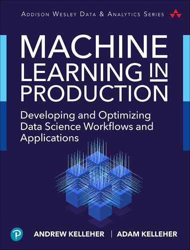
Generally, the first step is to start plotting the data with scatter plots and histograms to see how it is distributed. When you’re plotting, you might see something like Figure 9.1. The constant slope to the data, even when there is a lot of noise around the trend, suggests that y is related linearly to x.
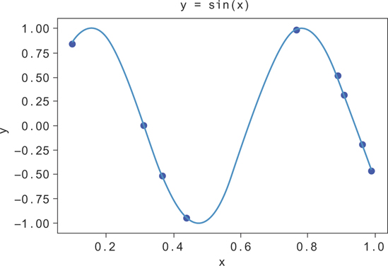
Figure 9.1 Random data from y = sin(10x), along with the line for y = sin(10x)
In Figure 9.1, you can see that there’s still a lot of spread to the y values at fixed values of x. While y increases with x on average, the predicted value of y will generally be a poor estimate of the true y value. This is okay. You need to take more predictors of y into account to explain the rest of the variation of y.
9.1.1 Choosing the Model
Once you’ve explored the data distributions, you can write down your model for y as a function of x and some parameters. Our model will be as follows:
Here, y is the output, β is a parameter of the model, and ∊ captures the noise in the y value from what you would expect just from the value of x. This noise can take on many different distributions. In the case of linear regression, you can assume that it’s Gaussian with constant variance. As part of the model checking process, you should plot the difference between your model’s output and the true value, or the residual to see the distribution of ∊. If it’s much different from what you expected, you should consider using a different model (e.g., a general linear model).
You could write this model for each y value explicitly, yi (where i ranges from 1 to N when you have N data points), by writing it as follows:
You could instead write these as column vectors, where
and it will have the same meaning.
Often, you’ll have many different x variables, so you’ll want to write the following:
Or you can write this more succinctly as the following:
9.1.2 Choosing the Objective Function
Once you’ve chosen the model, you need a way of saying that one choice of parameter values is better or worse than another choice. The parameters determine the model’s output for a given input. The objective function is usually decided based on the model’s output by comparing it to known values.
A common objective function is the mean squared error. The error is just the difference between what the model thinks the y value should be, which you’ll call ŷ, and the actual output, y. You could look at the average error but there’s a problem. ŷ could be arbitrarily far from y as long as for every positive error there is a negative error that cancels it out. This is true because when you take the average error (ME), you have to sum all the errors together, like so:
Instead, you’d like only positive values to go into the average, so you don’t get cancellation. An easy way to do this is to just square the errors before taking the average, giving you the mean squared error (MSE).
Now, the smaller the mean squared error, the smaller the distance (on average) between the true y values and the model’s estimates of the y values. If you have two sets of parameters, you can use one set to calculate the ŷ and compute the MSE. You can do the same with the other set. The parameters that give you the smaller MSE are the better parameters!
You can automate the search for good parameters with an algorithm that iterates over choice of parameters and stops when it finds the ones that give the minimum MSE. This process is called fitting the model.
This isn’t the only choice of objective function you could make. You could have taken absolute values, for example, instead of squaring the errors. What is the difference?
It turns out that when you use MSE and you have data whose mean follows a linear trend, the model that you fit will return the average value of y at x. If you use the absolute value instead (calculating the mean absolute deviation, or MAD), the model reports the median value of y at x. Either might be useful, depending on the application. MSE is the more common choice.
9.1.3 Fitting
When we say fitting, we generally mean systematically varying the model parameters to find the values that give the smallest value of the objective function. Generally, some objective functions should be maximized (likelihood is one example, which you’ll see later), but here you’re interested in minimizing functions. If an algorithm is designed to minimize an objective function, then you can maximize one by running that algorithm on the negative of the objective function.
We’ll give a more thorough treatment later in the book, but a simple algorithm for minimizing a function is Newton’s method, or gradient descent. The basic idea is that at a maximum or minimum, the derivative of a function is zero. At a minimum, the derivative (slope) will be negative to the left of the minimum and positive to the right.
Consider the one-dimensional case. We start at a random value of β and try to figure out if you should use a larger or smaller beta. If the slope of the objective function points downward at the value of you’ve chosen, then you should follow it, since it points you toward the minimum. You should then adjust to larger values. If it’s a positive slope, then the objective function decreases toward the left, and you should use a smaller value of . You can derive this very rigorously using more calculus, but the basic result is a rule for updating your value of to find a better value. If you write your objective function as f (β), then you can write the update rule as follows:
You can see that if the derivative is positive, you decrease the value of beta. If it is negative, you increase the value of beta. Here, is a parameter to control how big the algorithm’s steps are. You want it to be small enough that you don’t jump from one side of a minimum clear across to the other. The best size will depend on the context.
Now, given a model and objective function, you have a procedure for choosing the best model parameters. You just write the objective function as a function of the model parameters and minimize it using this gradient descent method.
There are many ways you could do this minimization work. Instead of this iterative algorithm, you can write the objective function as a function of the parameters explicitly and use calculus to minimize it. There are also many variants of iterative algorithms like this one. Which is best for your job depends on the application.
9.1.4 Validation
After fitting your model, you need to test how well it works! You’ll typically do this by giving it some data points and comparing its output with the actual output. You can calculate a score, often the same loss function you used to fit the model, and summarize the model performance. The problem with this procedure is when you validate the model on the same data you used to train it. Let’s imagine an extreme case as an example.
Suppose your model had as much freedom as it liked to fit your data. Suppose also that you had only a few data points, like in Figure 9.1. If you try to fit a model to this data, you run the risk that the model overfits the data. To give you a parameter to adjust, you’ll try to make a polynomial regression fit to this data. You can do this by making columns of data with higher and higher powers of x.
You’ll plot a few different lines fit to the data with different powers of x, where you’ll label the power by k, in Figure 9.2. In this figure, you can see the fit improving as k gets higher, until around k = 5. After k = 5, there’s too much freedom in the model, and the function fine-tunes itself to the data set. Since this data is drawn from y = sin(10x), you can see that you’ll generalize much better to new data points with the k = 5 model, even though the k = 8 model fits the training data better. You say the k = 8 model is “overfit” to the data.
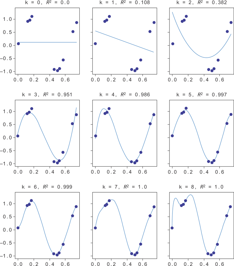
Figure 9.2 Random data from y = sin(10x), along with the line for y = sin(10x)
How, then, can you see when you’re overfitting a model? The typical way to check is to reserve some of the data at training time and use it later to see how well a model generalizes.
You can do this, for example, using the train_test_split function from the sklearn package. Let’s generate some new data and now compute the R2 not only on the training data but also on a reserved set of test data.
First, we generate N = 20 data points.
1 import numpy as np
2
3 N = 20
4 x = np.random.uniform(size=N)
5 y = np.sin(x*10) + 0.05 * np.random.normal(size=N)
Next, let’s split this into a train and test split. You’ll train on the training data but hold the test data until the end to compute the validation scores. Typically you want your model to perform well, so you use as much training data as you can afford to train the model and validate with enough data to be sure the precision of your validation metric is reasonable. Here, since you’re generating only 20 data points, you’ll make a split into halves.
1 from sklearn.model_selection import train_test_split
2
3 x_train, x_test, y_train, y_test = train_test_split(x, y,
4 train_size=10)
Now, you’ll build up lots of columns of higher and higher powers of the x variable to run the polynomial regression. You’ll use sklearn’s linear regression to do the actual regression fit.
 1 k = 10
 2
 3 X = pd.DataFrame({'x^{}' . format(i): x_train**i for i in range(k)})
 4 X['y'] = y_train
 5
 6 X_test = pd.DataFrame({'x^{}'.format(i): x_test**i for i in range(k)})
 7 X_test['y'] = y_test
 8
 9 x_pred = np.arange(xmin, xmax, 0.001)
10 X_pred = pd.DataFrame({'x^{}'. format(i): x_pred**i for i in range(k)})
Now that you have train and test data preprocessed, let’s actually run the regressions and plot the results.
 1 f, axes = pp.subplots(1, k-1, sharey=True, figsize=(30,3))
 2
 3 for i in range(k-1):
 4     model = LinearRegression()
 5     model = model.fit(X[['x^{}'. format(l) for l in range(i+1)]],
 6                       X['y'])
 7     model_y_pred = model.predict(
 8                             X_pred[['x^{}'. format(l) for l in range(i+1)]])
 9     score = model.score(X[['x^{}'. format(l) for l in range(i+1)]],
10                         X['y'])
11     test_score = model.score(
12                             X_test[['x^{}'. format (l) for l in range(i+1)]],
13                             X_test['y'])
14     axes[i].plot(x_pred, model_y_pred)
15     axes[i].plot(x, y, 'bo')
16     axes[i].set_title('k = {}, $R^2={}$, $R^2_t={}$'
17                 .format(i, round(score,3), round(test_score, 3)))
18 pp.ylim(-1.5,1.5)
This produces the data in Figure 9.3. You can see the R2 gets better and better as k increases, but the validation R2 doesn’t necessarily keep increasing. Past k = 4 it seems to get noisy and sometimes increase while sometimes decreasing. Here, the validation and the training data are plotted on the same graph. When the trendline fails to match the validation data, the R2 gets worse, even though the model does a good job of fitting the training data.
Figure 9.3 Random data from y = sin(10x), along with the line for y = sin(10x)
These same basic principles can be applied in different ways. Another validation approach involves splitting the data into several slices and holding out one slice while training on the rest. This is called k-fold cross-validation. You can also train on all of the data but leave out a single data point at a time for validation. You can repeat this for each data point. This is called leave-one-out cross-validation.
Choosing a good model is a careful balance between giving your model enough freedom to describe the data but not so much that it overfits. You’ll see these themes come up throughout the book, but especially when you look at neural networks in Chapter 14.
9.2 Linear Least Squares
Least squares refers to minimizing the square of the difference between the value at a point according to our data set and the value at that point according to the objective function. These values are known as residuals.
Least squares estimations can model equations with multiple independent variables, but for simplicity it’s easier to consider simple linear equations.
In general you want to build a model of m linear equations with k coefficients weighting them.
To get the behavior of the model as close as possible to the function you’re fitting, you minimize the function ||y− Xβ ||2.
Here, Xij is the jth feature of the ith data point. We show some data generated from such a model in Figure 9.4 (blue data points), along with the model that fits it (green line). Here, the coefficients have been fit to make sure the model has the correct slope () and y-intercept (2).
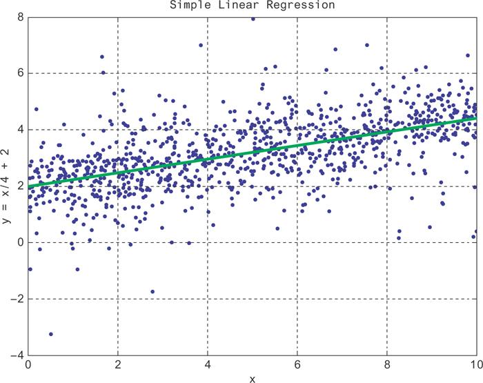
Figure 9.4 A curve fit to a randomly generated data set about the line id="equ2" with linear regression
|
Linear Regression Summary |
The Algorithm |
Linear regression is for predicting outcomes based on linear combinations of features. It’s great when you want interpretable feature weights, want possible causal interpretations, and don’t think there are interaction effects. |
Time Complexity |
O(C2n), with C features and N data points. It’s dominated by a matrix multiplication. |
Memory |
The feature matrix can get large when you have sparse features! Use sparse encodings when possible. |
9.2.1 Assumptions
Ordinary least squares assumes errors have zero mean and equal variance. This will be true if the errors are Gaussian around the average y value at each x. If they are not Gaussian but the data is linear, consider using a general linear model.
9.2.2 Complexity
This complexity will be based on the algebraic approach to linear least squares model fitting.
You have to do the matrix multiplications given in the following formula:
If N is the number of sample points and k is the number of features you’re fitting, then the complexity is (with N > k), k2N.
9.2.3 Memory Considerations
Large matrix multiplications are usually run in a divide-and-conquer algorithm. When it comes to matrix multiplications in particular, it’s often the case that it takes as much processing to send the matrix data across the network as it takes to do the multiplication locally. This is why “communication avoiding algorithms” like Cannon’s algorithm exists. They minimize the amount of communication required to parallelize the task. Cannon’s algorithm is among the most common and popular.
Part of Cannon’s algorithm requires matrices to be broken into blocks, Since you choose the size of the blocks, you can choose the amount of memory required for this algorithm.
Another common approach is to just sample down the data matrix. Many common packages will report standard errors on regression coefficients. Use these metrics to help guide your choice of sample size.
Most often, you’ll train a large-scale linear regression with SGD. There’s a nice implementation in pyspark in the mllib package for doing this.
9.2.4 Tools
scipy.optimize.leastsq is a nice implementation in Python. This is also the method working under the hood for many of the other optimizations in scipy. scipy’s implementation is actually a loose set of bindings on top of MINPACK’s lmdif and lmdir algorithms (which are written in Fortran). MINPACK is also available in C++, though. If you want to minimize the dependencies for your application, numpy also has an implementation that can be found at numpy.linalg.lstsq. You can find implementations for least-squares regression in scikit-learn, in sklearn.linear_model.LinearRegression, or in the statsmodels package in statsmodels.regression.linear_model.OLS.
9.2.5 A Distributed Approach
To improve communication across the network, one of the keys is minimizing bandwidth. Each node at the beginning of a mesh of nodes pulls what data it needs from a database or archival source. It shifts the rows and columns appropriately for the next node and passes that information along. Each node operates on its own data to compute some portion of the resulting multiplication. Figure 9.5 illustrates this architecture.
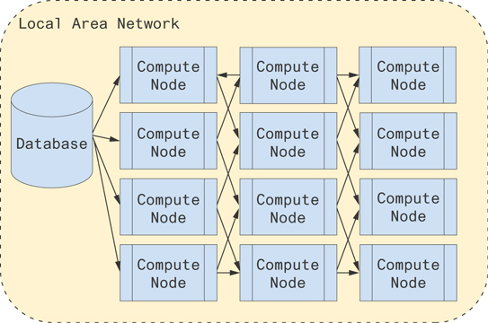
Figure 9.5 A possible architecture for computing distributed matrix multiplications
Alternatively, you can use the pyspark implementation!
9.2.6 A Worked Example
Now, let’s actually run a linear regression. We’ll use numpy and pandas to work with the data and statsmodels for the regression. First, let’s generate some data.
 1 from statsmodels.api import OLS
 2 import numpy as np
 3 import pandas as pd
 4
 5 N = 1000
 6
 7 x1 = np.random.uniform(90,100, size=N)
 8 x2 = np.random.choice([1,2,3,4,5], p=[.5, .25, .1, .1, .05] size=N)
 9 x3 = np.random.gamma(x2, 100)
10 x4 = np.random.uniform(-10,10, size=N)
11
12 beta1 = 10.
13 beta2 = 2.
14 beta3 = 1.
15
16 y = beta1 * x1 + beta3 * x3
17
18 X = pd.DataFrame({'$y$': y, '$x_1$': x1, '$x_2$': x2, '$x_3$': x3})
The independent variables are x1, x2, and x3. The dependent variable, y, will be determined by these independent variables. Just for concreteness, let’s use a specific example. Say the y variable is the monthly cost of living for a household and the x1 variable is the temperature outside for the month, which you expect is a big factor and will significantly increase their housing costs. It will be summer, so the hotter it is, the more expensive the cooling bill. The x2 variable will be the number of people living in the house, which directly leads to higher food costs, x3. Finally, x4 will be the amount spent on everything else. Families don’t tend to keep track of this very well, and you’re not able to measure it.
To get a feel for the data, you should make some plots and tables. You’ll start by looking directly at a random sample of the data, shown in Figure 9.6.
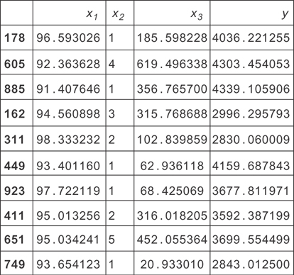
Figure 9.6 A sample of data simulated for this housing data example. Here x1 is the temperature outside. x2 is the number of people living in the house. x!3 is the cost of food for the month.
This gives you some ideas for visualization. You can see the x2 variable is small and discrete and that the y variable (total monthly expenses) tends to be a few thousand dollars.
To get a better picture of what variables are related to one another, you can make a correlation matrix (see Figure 9.7). The matrix is symmetric because the Pearson correlation between two variables doesn’t care which variable is which: the formula gives the same result if they trade their places. You’re curious which variables predict y, so you want to see which ones correlate well with it. From the matrix, you can just read the y column (or row) and see that x1, x2, and x3 are all correlated with y. Notice that since household size (x2) directly determines food cost (x3), these two variables are correlated with each other.
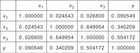
Figure 9.7 The correlation matrix for the housing data simulated earlier. You can see most variables are somewhat strongly correlated with each other, except for x1.
Now that you’ve confirmed that all of these variables might be useful for predicting y, you should check their distributions and scatter plots. This will let you check what model you should use. Pandas’ scatter matrix is great for this.
1 from pandas.tools.plotting import scatter_matrix
2 scatter_matrix(X, figsize=(10,10))
It produced the plots in Figure 9.8.
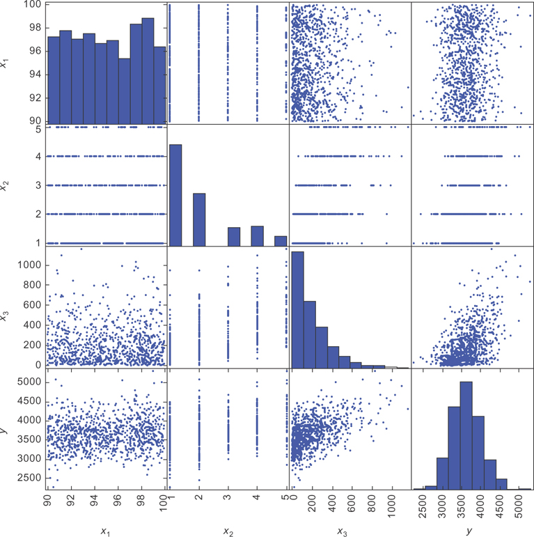
Figure 9.8 The scatter matrix for our simulated living expense data. The bottom row will be most important.
When you’re examining scatter plots, the standard convention is to place the dependent variable on the vertical axis and the independent variable on the horizontal axis. The bottom row of the scatter matrix has y on the vertical axis and the different x variables on the horizontal.
You can see there’s a lot of noise in the data, but this is okay. The important thing is that the average y value at each x value follows the model. In this case, you want the average y value at each x value to be increasing linearly with x.
Looking at the bottom left plot in the matrix, you see the points don’t seem to be getting higher or lower (on average) as you go from left to right in the graph. There seems to be a weak relationship between x1 and y. Next, you see the data for x2 is in bands at integer values of x2. This is because x2 is a discrete variable. Since there are many other factors that determine the value of y, there is some spread to the data at each value of x2. If x2 were the only factor, then the y values would take on only one specific value at each x2 value. Instead, they follow at different distributions at each x2 value.
Next, you can see the plot of x3 and y. You can see again the data points seem to be increasing linearly (on average), but again there is a lot of noise around the trend. You can see the scatter plot is denser at smaller values of x3. If you compare the scatter plot with the histogram for x3, you can see that this is because most of the data points have smaller values of x3.
Often, when people first see data like the plot of y versus x3, they think a linear model can’t possibly work. After all, if you tried to make a prediction with the linear model, you’d do a very bad job. It would just guess the average y value at each x value. Since there is so much variation around the average y value at each x value, your predictions would tend to be far from the true values.
There are two reasons why these models are still very useful. The first is that you can include many more factors than these two-dimensional plots can show. While there is still a lot of variation around the average y value at each x in these scatter plots, there will tend to be less variation if we plot the data in higher dimensions (using more of the x variables). As we include more and more independent variables, our predictions will tend to get better.
Second, predictive power isn’t the only use for a model. Far more often, you’re interested in learning the model parameters rather than predicting a precise y value. If I learn, for example, that the coefficient on temperature is 10, then I know that for each degree of monthly average temperature increase, there is a ten dollar increase in monthly average living expenses. If I’m working at an energy company, that information might be useful for predicting revenue based on weather forecasts!
How can we see this interpretation of this parameter? Let’s look at our model again.
What happens if you increase the month’s average temperature by one unit while keeping x3 fixed? You’ll see that y increases by 1 units! If you can measure 1 using a regression, then you can see how much temperature changes tend to increase living expenses.
Finally, you’ll examine the graph for y. It looks like the distribution takes on a bell curve, but it’s slightly skewed. Linear regression requires that the distribution of the errors is Gaussian, and this will probably violate that assumption. You can use a general linear model with a gamma distribution to try to do a better job, but for now let’s see what you can do with the ordinary least squares model. Often, if the residuals are close enough to Gaussian, the error in the results is small. This will be the case here.
Let’s actually perform the regression now. It will be clear in a minute why we’ve omitted x2 from Equation (9.2). We’ll use statsmodels here. Statsmodels doesn’t include a y intercept, so you’ll add one automatically. A y intercept is just a constant value added on to each data point. You can introduce one by adding a column of all ones as a new variable. Then, when it finds the coefficient for that variable, it’s simply added to each row! For a fun exercise, try omitting this yourself, and see what happens.
1 X['intercept'] = 1.
2 model = OLS(X['$y$'], X[[u'$x_1$', u'$x_2$', u'$x_3$', 'intercept']],
3             data=X)
4 result = model.fit()
5 result.summary()
Figure 9.9 shows the results. There are a lot of numbers in this table, so we’ll walk through the most important ones. You can confirm that you used the right variables by seeing the dependent variable (top of the table) is y, and the list of coefficients are for the independent variables you’re regressing on.
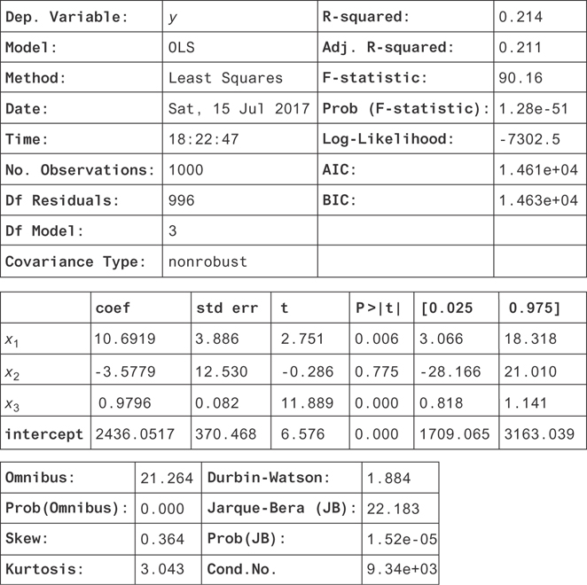
Figure 9.9 The results for the regression on all the measured dependent variables (including a y-intercept)
Next, you have the R squared or R2. This is a measure of how well the independent variables account for variation in the dependent variable. If they fully explain the variation in y, then the R2 will be 1.
If they explain none of it, it will be zero (or close to zero, due to measurement error). It’s important to include a y intercept for the R2 to have a positive value and a clear interpretation. The R2 is actually just the proportion of the variance in y that is explained by the independent variables. If you define the “residuals” of the model as the left-over part of y that isn’t explained by the model,
then the residuals are all 0 if the model fits perfectly. The further off the prediction is, the more the residuals tend to vary around the average y value. So, the better y is explained by the data, the smaller the variance of the residuals. This leads to our intuition for the definition of R2,
where is the sum of squared differences from the y values and the average y value, , and is the sum of squared residuals. You can make this more intuitive by dividing all the sums of squares by N to get the (biased) estimate of the population variance, , so the R2 is just the remaining variance!
You can do better than this by just dividing by the correct number of degrees of freedom to get unbiased estimates for the variances. If k is the number of independent variables (excluding the y intercept), then the variance for y has N− 1 degrees of freedom, and the variance for the residuals has n− k− 1 degrees of freedom. The unbiased variance estimates are and id="equ1" id="equ1" id="equ1" id="equ1" id="equ1" . Plugging these into the formula, you get the definition for the adjusted R2.
This is better to use in practice since the estimators for the variance are unbiased.
Next, you can see in the table of coefficients (in the middle of the figure) that the coefficients (coef column) for x1 and x3 are very close to the values you entered for the beta variables when you created our data! They don’t match exactly because of all the noise from x4 that you’re not able to model (since you didn’t measure it).
Instead of trying to get an estimate for the value of the coefficient, it’s nicer to measure a confidence interval for the parameters! If you look to the right of the coefficients, you’ll see the columns 0.025 and 0.975. These are the 2.5 and 97.5 percentiles for the coefficients. These are the lower and upper bounds of the 95 percent confidence intervals! You can see that both of these contain the true values and that x3 is much more precisely measured than x1. Remember that x1 had a much weaker correlation with y than x3, and you could hardly see the linear trend from the scatter plot. It makes sense that you’ve measured it less precisely.
There’s another interesting problem here. In this example, x2 causes x3 but has no direct effect on y. Its only effect on y was by changing x2. This may seem like a contrived example, but a less extreme version of this will happen in real data sets. In general, there might be both direct and indirect effects of x2 on y. Notice that the measurement for the coefficient of x2 has a very wide confidence interval! This is the problem on collinearity in independent variables: generally, if independent variables are related to each other, their standard errors (and so their confidence intervals) will be large.
In this example, there’s actually a nuance that’s not clear because the collinearity is so large. If the confidence interval were narrower on the x2 coefficient, you’d see it’s actually narrowed in around β2 = 0. This is because x3 contains all the information about x2 that is relevant for determining y. If you drop x3 from the regression (try it!), you’ll measure a coefficient for x2 where 80 < 2 < 118 at the 95 percent confidence level. You should proceed by dropping x2 from the regression entirely. You’ll get the final result in Figure 9.10. Notice that the confidence interval for x3 has narrowed, but the R2 hasn’t changed significantly!
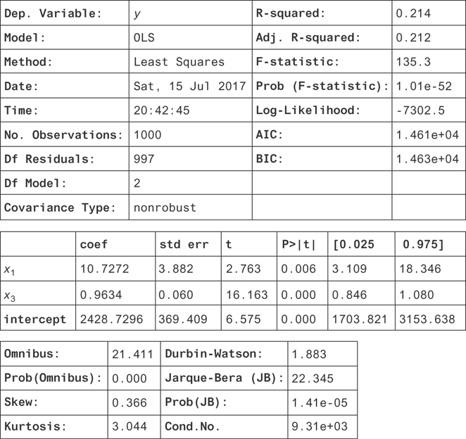
Figure 9.10 The results for the regression on the measured dependent variables excluding x2
You’ll use these concepts throughout the book. In particular, R2 is a good metric for evaluating any model that has a real-valued output. Now, you’ll examine your modeling assumptions. Working strictly with linear models can be too restrictive. You can do better, without having to go beyond ordinary least-squares regression.
9.3 Nonlinear Regression with Linear Regression
The model used for ordinary least squares regression might sound overly restrictive, but it can include nonlinear functions as well. If you’d like to fit y = x2 to your data, then instead of passing in x as your dependent variable, you can simply square it and regress on x2. You can even use this approach to fit complicated functions like cos(x), or nonlinear functions in several variables, like x1sin(x2). The problem, of course, is that you have to come up with the function you’d like to regress and compute it in order to do the regression.
Let’s do an example with some toy data. As usual, we’ll use numpy and pandas to work with the data, and we’ll use statsmodels for the regression. The first step is to generate the data.
1 N = 1000
2
3 x1 = np.random.uniform(-2.*np.pi,2*np.pi,size=N)
4 y = np.cos(x1)
5
6 X = pd.DataFrame({'y': y, 'x1': x1})
Now, you’ll plot it to see what it looks like. The cos function will make this very nonlinear. It’s easy to see with a scatter plot.
1 X.plot(y='y', x='x1', style='bo', alpha=0.3, xlim=(-10,10),
2        ylim=(-1.1, 1.1), title='The plot of $y = cos(x_1)$')
This generates Figure 9.11.
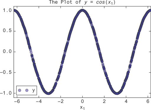
Figure 9.11 The graph of y = cos(x1). A linear regression will fit this poorly, passing a line through the mean of the data at y = 0.
Without using the trick, a linear regression should try to fit this graph of y = 1x1 by just fitting to the mean as well as it could. It would succeed by just finding β1 = 0. We can confirm this by trying it.
1 model = OLS(X['y'], X['x1'], data=X)
2 result = model.fit()
3 result.summary()
You get the result in Figure 9.12.
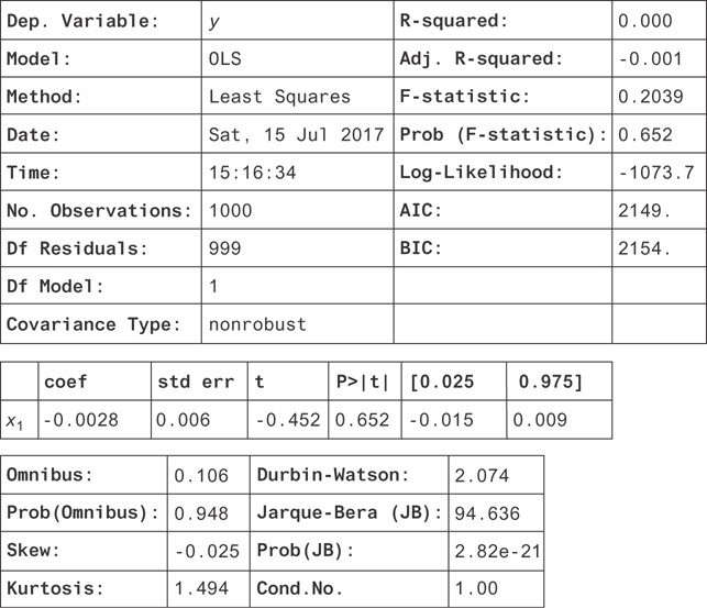
Figure 9.12 The result of a linear regression on y = cos(x). Notice that the coefficient is consistent with zero. If you allowed a y-intercept in this regression, you would have found that it was zero too.
You can see it’s just a flat line with slope zero since the coefficient on x1 is zero. Now, you can try the nonlinear version. First, you need to make a new column in the data.
1 X['cos(x1)'] = np.cos(X['x1'])
Now, you can regress on this new column to see how well it works.
1 model = OLS(X['y'], X[['cos(x1)']], data=X)
2 result = model.fit()
3 result.summary()
You find the result in Figure 9.13 on page 108.
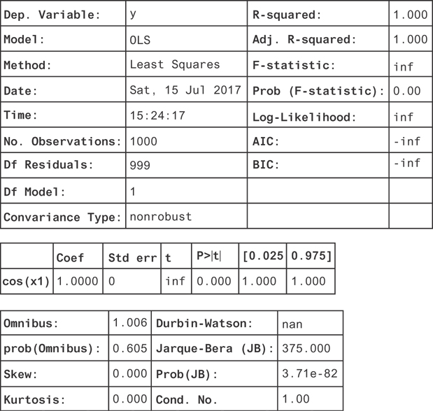
Figure 9.13 The result of a linear regression on the transformed column cos(x). Now, we find the coefficient is consistent with 1, suggesting that the function is y = 1. cos(x).
Many of the metrics diverge! The R2 is one, and the confidence interval on the coefficient is just a single point. This is because there’s no noise in the function. All the residuals are zero since you’ve fully explained the variation in y.
9.3.1 Uncertainty
One great thing about linear regression is that we understand noise in the parameter estimates very well. If you assume the noise term, ∊, is drawn from a Gaussian distribution (or that sample sizes are large, so the central limit theorem applies), then you can get good estimates for the coefficient confidence intervals. These will be reported by statsmodels under the 0.025 and 0.975 columns for a 95 percent confidence interval.
What happens if these assumptions are violated? If that happens, you can’t necessarily trust the confidence intervals reported by statsmodels. The most common violations are either that the residuals are not Gaussian or that the variance of the residuals is not constant with the independent variable.
You can tell if the residuals are Gaussian using some of the summary statistics reported with your regression results. In particular, the skew, kurtosis, and Jarque-Bera statistic are all good tests of Gaussian distribution; the skew is 0, and the kurtosis is 3. Significant deviations from these indicate the distribution isn’t Gaussian.
The skew and kurtosis are combined to give the Jarque-Bera statistic. The Jarque-Bera test tests the null hypothesis that the data was drawn from a Gaussian distribution against the alternative that it was not. If Prob(JB) is large in your results, then it was likely that your distributions were drawn from a Gaussian distribution.
Another handy test is to plot a histogram of your residuals. These are stored on the resid attribute of your regression results. You can even plot them against your independent variable to check for heteroskedasticity.
If you have non-Gaussian residuals, you can use a general linear model instead of a linear model. You should plot the residuals or conditional distributions of the data to find a more appropriate distribution to describe the residuals.
A solution when you have heteroskedasticity is to use robust standard errors. In some fields (e.g., economics), this is the default choice. The result of using robust standard errors is larger confidence intervals. In the presence of homoskedasticity, this results in overly conservative estimates of standard errors. To use robust confidence intervals in statsmodels, you can set the cov_type argument of the fit method of the OLS regression object.
9.4 Random Forest
Random forests [11], as the name suggests, consists of a combination of “decision trees.” In this section, you’ll learn about decision trees. You’ll see how they can combine to form random forests, which are a great first algorithm to try for machine-learning problems.
9.4.1 Decision Trees
You can try to fit functions using simple flow charts, or decision trees, as follows. Take a look at the function given by the blue curve in Figure 9.14.
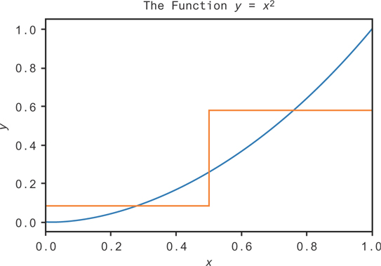
Figure 9.14 An approximation to the function y = x2 on the interval [0,1] using a single decision
You could try to make some simple rules to approximate the function. A rough estimate might be “If x is greater than 0.5, y should be 0.58. If x is less than 0.5, y should be 0.08.” That would give the orange curve in Figure 9.14. While it’s not a very good estimate, we can see that it’s better than just guessing a uniform constant value! We’re just using the average value of the function over each range.
This is the beginning of the logic for building a decision tree. We can draw a diagram for this decision tree in Figure 9.15.
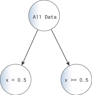
Figure 9.15 A diagram for a decision tree. You can imagine each data point falls down the tree, going along the branches indicated by the logic on each node.
Here, you start with all of the data at the top of the decision tree. Then, at the branch, you map all points with x < 0.5 to the left and all points with x 0.5 to the right. The left points get one output value, 0.08, and the right points get the other 0.58.
You can make the problem more complex by adding more branches. With each branch, you can say “...and this other decision also holds.” For example, making one more decision for each of these branches, you get the tree in Figure 9.16.
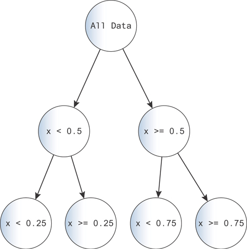
Figure 9.16 You can fit data increasingly precisely by adding more decisions. As the complexity grows, you risk overfitting. Imagine the case where each data point maps to a single node!
This tree produces a better fit to the function, because you can subdivide the space more. You can see this in Figure 9.16.
One great strength of decision trees is their interpretability. You have a set of logical rules that lead to each outcome. You can even draw the tree diagram to walk a layperson through how the decision is made!
In this example, we chose our splitting points as half the domain. In general, decision tree algorithms make a choice to minimize a loss (usually the mean-squared error) with each split. For that reason, you’d likely have finer splits when the curve is steeper and coarser splits when the curve is flatter.
Decision trees also have to decide how many split points to use. They’ll keep splitting until there are very few data points left at each node and then stop. The nodes at the ends of the tree are the terminal nodes or the leaf nodes. After building the tree stops, the algorithm will decide which terminal nodes to cut out by trying to balance loss against the number of terminal nodes. See [12] for more details.
You can use the implementation of decision trees in the sklearn package like this:
1 from sklearn.tree import DecisionTreeRegressor
2
3 model = DecisionTreeRegressor()
4 model = model.fit(x, y)
5 y_decision_tree = model.predict([[xi] for xi in np.arange(0, 1,0.1)])
Figure 9.17 shows the result. The line is in blue, and the decision tree fit is in red. If we plot the decision tree fit as a line against this one, the overlap is too close to tell the lines apart!
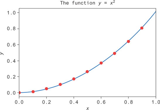
Figure 9.17 A decision tree (blue line) fit using sklearn to data (red dots) from the function y = x2 on [0, 1]
This same process can be used for classification. If you have classes i ∊ {1, . . . , K}, then you can talk about the proportion of data points at node k as pik. Then, the simple rule for classification at the leaf nodes would just be to output the class k at node i for which pik is the largest!
One issue with decision trees is that the split points can change substantially when you add or remove data points from your data set. The reason for that is all of the decisions that happen below a node depend on the split points above them! You can get rid of some of that instability by averaging the results of lots of trees together, which you’ll see in more detail in the next section. You lose interpretability by doing this since now you’re dealing with a collection of decision trees!
Another issue is that decision trees don’t handle class imbalance well. If they’re just looking to minimize a measure of prediction accuracy, then poor performance on a small subset of the data won’t hurt the model too much. A remedy for this is to balance the classes before fitting a decision tree. You can do that by sampling out the larger class while leaving the smaller class untouched or by drawing random samples from the smaller class (with replacement) to create a large sample that repeats data points.
Finally, because decision trees make decisions at lines of constant values of variables (e.g., the decision “x > 0.5”), decision boundaries tend to be rectangles or combinations of rectangles that form together as a patchwork. They also tend to be oriented along the coordinate axes.
Now, let’s look at the performance increases we can get by averaging lots of decision trees together.
9.4.2 Random Forests
Random forests exploit a technique called bootstrap aggregating, or bagging. The idea is that you draw a random sample (a “bootstrap” sample) of your data with replacement and use that sample to train a decision tree. You repeat the process to train another tree, and another, and so on.
To predict the output for a single data point, you calculate the output for each decision tree. You average the results together (“aggregate” them), and that becomes the output of your model.
The hope is that you get a good sampling of the different possible trees that you can form due to the sensitivity of the decision trees to the sample, and you can average that variability by averaging over these trees.
You know that when you average random variables together, the error in the mean decreases as the number of samples increases like , where id="equ2" id="equ2" id="equ2" id="equ2" id="equ2" is the variance of the mean, and σ2 is the variance of the output variable. That’s true for independent samples, but with dependent samples, the story is a little different.
When you bootstrap, you can regard each sample of data as a random sample that leads to a random output from a decision tree (after training on that sample). If you want to understand how the variance of the random forest output decreases with the number of trees, you can similarly look at this variance formula. Unfortunately, these tree outputs are not independent: every bootstrap sample is drawn from the same data set. You can show [12] that if the tree outputs are correlated with correlation ρ, then the variance in the output is like this:
That means that as you increase the number of trees, N, the variance doesn’t keep decreasing as it does with independent samples. The lowest it can get is ρσ2.
You can do best, then, by making sure the tree outputs are as uncorrelated as possible. One common trick is sample a subset of the input data’s columns when training each tree. That way, each tree will tend to use a slightly different subset of variables!
Another trick is to try to force trees to be independent with an iterative procedure: after training each tree, have the next one predict the residuals left over from training the last. Repeat the procedure until termination. This way, the next tree will learn the weaknesses of the tree before it! This procedure is called boosting and can let you turn even very marginal learning algorithms into strong ones. This technique is not used in random forests but is used in many algorithms and can outperform random forests in some contexts, when enough weak learners are added.
Now, let’s see how to implement random forest regression. Let’s take the same data as before but add some noise to it. We’ll try a decision tree and a random forest and see which has the better performance on a test set.
First, let’s generate new data, adding some random noise ∊ drawn from a Gaussian distribution. This data is plotted in Figure 9.18.
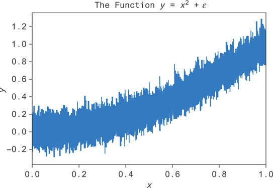
Figure 9.18 Noise added to the function y = x2. The goal is to fit the average value at each x, or E[y|x].
Now, you can train the random forest and the decision tree on this data. You’ll create test and train sets by randomly dividing your data into a training set and a test set and by training a decision tree and a random forest on the training set. You can start with just one decision tree in the random forest.
 1 from sklearn.model_selection import train_test_split
 2 from sklearn.ensemble import RandomForestRegressor
 3 from sklearn.tree import DecisionTreeRegressor
 4
 5 x_train, x_test, y_train, y_test = train_test_split(x, y)
 6
 7 decision_tree = DecisionTreeRegressor()
 8 decision_tree = decision_tree.fit(x_train.reshape(-1, 1), y_train)
 9
10 random_forest = RandomForestRegressor(n_estimators=1)
11 random_forest = random_forest.fit(x_train.reshape(-1, 1), y_train)
Then, you can check the model performance on the test set by comparing the R2 of each model. You can compute the R2 of the decision tree like this:
1 decision_tree.score(x_test.reshape(-1, 1), y_test)
and of the random forest like this:
1 random_forest.score(x_test.reshape(-1, 1), y_test)
The decision tree has an R2 = 0.80, and the random forest with one tree gives R2 = 0.80. They perform almost the same (smaller decimals are different). Of course, the random forest can have many more than just one tree. Let’s see how it improves as you add trees. You’ll want to measure the error bars on these estimates since the random forests train by bootstrapping.
 1 scores = []
 2 score_std = []
 3 for num_tree in range(10):
 4     sample = []
 5     for i in range(10):
 6         decision_tree = DecisionTreeRegressor()
 7         decision_tree = decision_tree.fit(x_train.reshape(-1, 1),
 8                                           y_train)
 9
10         random_forest = RandomForestRegressor(n_estimators=num_tree
11                                                            + 1)
12         random_forest = random_forest.fit(x_train.reshape(-1, 1),
13                                           y_train)
14         sample.append(random_forest.score(x_test.reshape(-1, 1),
15                                           y_test))
16     scores.append(np.mean(sample))
17     score_std.append(np.std(sample) / np.sqrt(len(sample)))
You can use this data to get the plot in Figure 9.19. The performance increases sharply as you go from one to two trees but doesn’t increase very much after that. Performance plateaus around five or six trees in this example.
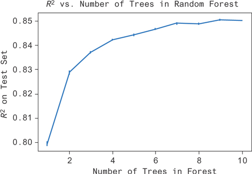
Figure 9.19 You can see here that as the complexity of the random forest (number of trees) increases, you do an increasingly good job of fitting the data (R2 increases). There’s a point of vanishing returns, and forests with more than seven trees don’t seem to do much better than forests with seven trees.
You might have expected this kind of result. There’s unexplainable noise in the data set because of the noise we added. You shouldn’t be able to perform better than R2 = 0.89. Even then, you’re limited by other factors like the heuristics involved in fitting the model and the dependence between trees in the forest.
9.5 Conclusion
In this chapter, you saw the basic tools used to do regression analysis. You learned how to choose a model based on the data and how to fit it. You saw some basic examples for context and how to interpret the model parameters. At this point, you should feel relatively comfortable building basic models yourself!