
In this chapter we discuss how to configure and manage graphic standards through the development and use of a project template. Such templates can be rich with information that goes beyond the out-of-the-box content provided by Autodesk. We will present proven methods for establishing template settings and content as well as explain how the reuse of work will increase productivity with each successive project.
In this chapter, you will learn to:
Define settings for graphic quality and consistency
Organize views for maximum efficiency
Create custom annotation families
Start a project with a custom template
Develop a template management strategy
Like many other programs, Revit allows you to start with a basic template and then evolve your own custom templates to suit specific needs. As your knowledge of the software progresses, you'll begin to create new and reusable content such as wall types, roof types, ceilings, stairs, tags, and other families in order to meet your design and documentation needs. This is also the case with regard to the graphical language that you or your firm has established and needs to implement within Revit. How you graphically present elements such as text, dimensions, annotations, keynotes, and hatch patterns defines your graphic style of design documentation. In reality, the architectural profession tends to develop stylized graphics to convey design intent, and Revit respects this by enabling the customization of almost all aspects of the project template.
With Revit, project templates are configured by one or more of the following tasks:
Defining all project settings to meet graphic requirements
Preloading model and annotation families
Defining standard system families
We'll explain these tasks in greater detail throughout this chapter. For now, know that you can save the completed settings as a new project template (.rte) and use them whenever you start a new project. You can create templates either by using a completely blank project, by saving an existing project as a template, or by using one of the default templates provided with the Revit installation. To start from scratch, click the Application button and choose New
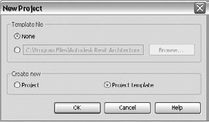
Starting a new project template without a base template requires you to develop all common content such as levels, grids, sections, callouts, tags, and model elements. If you have completely custom graphics and system families, this approach would be appropriate; however, if much of your graphic style is similar to the defaults, we suggest you start with one of Revit's default templates and edit it as necessary. You can find these templates by clicking Browse in the Template File area of the New Project dialog box. The files are usually installed in the root folder of the templates directory such as C:Documents and SettingsAll UsersApplication DataAutodeskRAC 2011Imperial Templates.
In the older versions of Revit, when the program was launched, a new project was created using the specified default template. This behavior was similar to AutoCAD opening Drawing1.dwg when launched or Microsoft Word with Document1. If a heavier custom template was the default, Revit would take much longer to open. This forced users to think about providing lighter templates or to use an empty template as the default and train fellow users to create new projects by manually specifying the appropriate template. In recent years, Revit has eliminated the use of a new project at startup in lieu of a Recent Files page. This allows greater flexibility when developing a strategy for managing custom project templates.
One of the most common complaints from teams implementing Revit on their first projects is poor graphic quality of printed documents. When you first install the software, only some default settings are defined to approximate a standard graphic appearance of architectural drawings. For example, walls cut in sections are thicker than those shown in projected views and callout boundaries are dashed; however, all annotation categories are set to a line weight of 1. Fortunately, you can easily overcome these problems with some basic configuration.
The primary means of controlling graphic consistency throughout a project is through object styles. To access these settings, switch to the Manage tab and choose Object Styles. As shown in Figure 4.2, the dialog box is divided into three tabs: Model Objects, Annotation Objects, and Imported Objects. Settings for line weight, line color, line pattern, and material are established for each category.
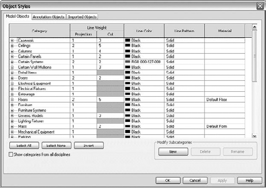
Figure 4.2. The Object Styles dialog box gives you graphic control of all Revit categories and their subcategories.
- Model Objects
The Category column on the Model Objects tab lists all available categories and subcategories of model elements. It is important to note that the subcategories for model and annotation objects are created in families, which are loaded into the project or template. This will be discussed in greater detail in Chapter 15, "Family Editor."
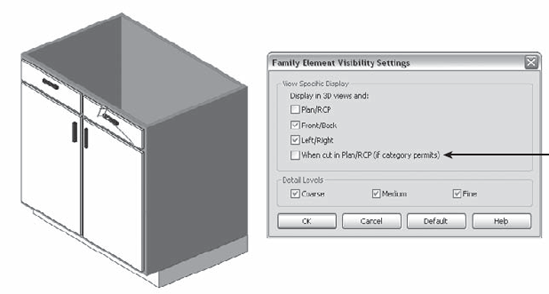
The next two columns, under Line Weight, define the line weight used when the elements are displayed in projection or cut modes. In some categories, the Cut setting is unavailable; these element categories will never be cut in plan or section views, regardless of the location of the view's cut plane. For other categories that enable Cut display, element geometry in the Family Editor can be set to follow that rule or not, as shown in Figure 4.3.
Line Color and Line Pattern allow customization of the display properties of each category and subcategory, but remember that printing a Revit view is WYSWYG (what you see is what you get)—colors will print as colors unless you override them to print as grayscale or black in Print Setup. The last column, Material, allows the definition of a default material to be associated with the category or subcategory in case family components in that category don't have materials explicitly defined. If a family has materials set to By Category, it references the material set in Object Styles.
- Annotation Objects
The Annotation Objects tab is similar to the Model Objects tab except there are no material definitions. There is also only one column for line weight (Projection) because lines do not have three-dimensional properties like model objects and cannot be "cut."
- Imported Objects
You can control the graphic appearance of layers (DWG) and levels (DGN) within linked or imported CAD files throughout the project on the Imported Objects tab of the Object Styles dialog box; however, we will cover this in greater detail in Chapter 8, "Interoperability: Working Multiplatform."
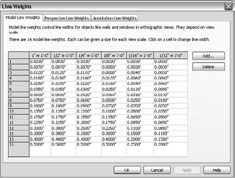
You can use lines in a variety of ways in Revit. Some lines relate to obvious tools such as Detail Lines and Model Lines, while you can place others with Filled Regions and the Linework tool. Lines also relate to the graphic representation of model and annotation elements as previously discussed. Achieving the desired graphic quality requires a review of Revit's line weights, patterns, and styles.
The dialog box shown in Figure 4.4 manages the printed line weights relative to a numbered assignment from 1 to 16. For model objects, heavier line weights vary between view scales. If you require more granular control between scales, click the Add button to insert another scale value column and edit the line weights as required.
We recommend that you first customize the graphic appearance of model and annotation elements with object styles. You should only attempt to refine the line weight settings with a rigorous investigation of printed views in multiple scales.
Repetitive series of line segments, spaces, and points comprise line patterns in Revit. To edit or create line patterns, switch to the Manage tab and choose Additional Settings
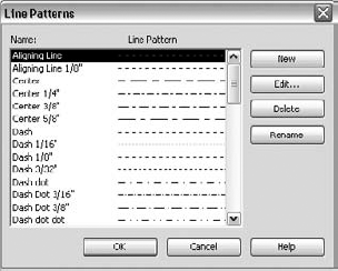
To edit an existing pattern, click the Edit button, or click New to create your own. You create patterns by specifying dash and space lengths, which will form a repeating sequence as shown in Figure 4.6. For dots, a length value isn't required.
Frequently, a line pattern is required to include a symbol or text for elements such as fence lines, piping, or underground utilities. In AutoCAD, shape definitions could be used within linetype definitions to achieve the desired results. In Revit, these special lines can be created as line-based detail components. A sample of this type of custom line can be found by downloading the file c04-Lines.rvt from this book's companion website at www.sybex.com/go/masteringrevit2011.
Follow these steps to create a new simple line pattern:
Switch to the Manage tab and choose Additional Settings
In the Line Pattern dialog box, click New.
Give the new line pattern a name.
Define the sequence, as follows:
Name: Dash - Dot - Double Dash - Dot
Dash: 7/16 " (10 mm)
Space: 3/16 " (5 mm)
Dot
Space: 1/16 " (2 mm)
Dash: 1/8 " (3 mm)
Space: 1/16 " (2 mm)
Dash: 1/8 " (3 mm)
Space: 1/16 " (2 mm)
Dot
Space: 3/16 " (5 mm)
Confirm by clicking OK.
The resulting line pattern looks like this:
Now that we have discussed the basic components of lines—color, weight, and pattern—the three are combined to create line styles for use in Detail Lines, Model Lines, Filled Regions, and Masking Regions. They are also available when the Linework tool is used to override a part of a model element. Access the Line Styles dialog box on the Manage tab under Additional Settings (Figure 4.7).
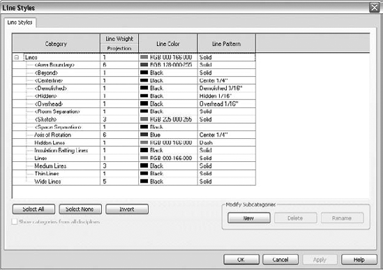
In the Line Styles dialog box, notice that some of the style names are bracketed—for example, <Hidden>. These are internal, "system" types of lines that cannot be renamed or deleted; however, their weight, color, and pattern can be modified.
Establishing the best styles for your templates will be completely up to you, but we will offer some proven examples for inspiration. First, realize that Revit already uses common line styles such as Thin Lines, Medium Lines, and Wide Lines. If you are creating a complete array of customized line styles for your colleagues to use, rename the common styles to fit into your standard.
One common approach is to create line styles organized by their weight number along with any variable to its appearance, such as (3) Gray Dashed. Note the parentheses keep your custom line styles sorted to the top of the list in the Line Styles dialog box as well as the Type Selector when using a line-based tool. This approach has proven to be effective and efficient when creating details in drafting views or generating fill or masking regions.
Another approach reserves certain line styles for special circumstances where lines represent aspects of a building in a plan, elevation or section and must be assigned to a specific layer when views are exported in CAD format. For example, the crossing lines typically used to indicate an area in plan that is "open to below" may need to be assigned to a CAD layer "A-FLOR-BELW." This is difficult if you used a line style based solely on weight and pattern alone such as (2) Dashed. You cannot separately assign that line style to "A-FLOR-BELW" for the floor plan export and "A-DETL-THIN" for all other exports. Here are some examples of line styles you could create:
Open to Below
ADA Circles
Curbs
Fire Rating
In summary, take care to understand the different settings when you are beginning to customize graphic settings for lines in the Revit template. To change the displayed weight of an element in a project, changes should not be made in Line Weights, but rather through the Object Styles dialog box. For example, if you wanted to increase the cut line weight of a wall already set to (5), do not increase the value of (5) in the Line Weights dialog box. You would change this value by selecting (6) or (7) as the cut weight of a wall in the Object Styles dialog box.
Note
Defining materials in your project template is another important task that can help maintain graphic consistency in many other areas of Revit. Materials drive the graphic representation of elements—not just in a rendered view—but in hidden line views, 2D or 3D. They are also responsible for cleanups because materials can merge with one another when elements of the same material are joined. A material also defines how an element's surface looks in shaded views, when cut in plan or section, and when seen in 3D views. In Figure 4.8, the surface patterns are all derived from the material used in the element.
To access the Materials Editor (Figure 4.9), switch to the Manage tab and choose Materials on the Settings panel. At the lower left of the dialog box (a) are icons for basic editing commands—duplicate, rename, and delete. At the upper left (b) is a search bar for quickly locating specific materials in the project and all material properties are found at the right side (c) of the dialog box.
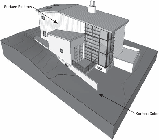
Figure 4.8. Materials define the surface and cut patterns, color, and render material of the elements.
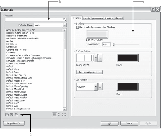
The material properties are divided into four tabs: Graphics, Render Appearance, Physical, and Identity.
- Graphics
Defines shading color, surface patterns, and cut patterns.
- Shading
Defines the color and transparency of a material when the view is set to Shaded, Shaded with Edges, or Consistent Colors display mode. Note that the color can be dependent on the material's render appearance. If the Shading option is selected, the color and transparency are adopted from the Render Appearance settings and the shading controls will be disabled.
- Surface Pattern
Allows the selection of a model pattern to be displayed on the faces of elements in elevation, plan, and 3D views. Note that a material's surface pattern does not appear in rendered views; a pattern can be defined in the Render Appearance tab.
- Cut Pattern
Allows the selection of a drafting pattern to be displayed when an element is cut in a model view. Some elements can't be cut as discussed earlier in this chapter; in these cases, this setting has no effect on the graphic display and the pattern will not be displayed.
- Render Appearance
Defines rendering attributes. Click the Render Appearance tab to view render properties. These properties will only become visible when you render a view and will not affect construction documentation graphics.
- Physical
Defines structural properties of a material for analysis.
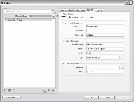
- Identity
Defines schedule values and keynotes for materials. Specifying correct identity data for your standard or typical materials will increase efficiency when using annotation such as material tags as well as facilitate quality management by aligning model data such as manufacturer, model, and mark with your project specifications. In Figure 4.10, some sample identity data has been entered. Notice how the Material Class field can be customized to group project materials. Keywords can be entered for use with the Search bar and cost data has been entered for use in a Material Takeoff schedule. The use of material identity data in project annotation and detailing is discussed in greater detail in Chapter 19, "Annotating Your Design."
It may seem impossible to imagine all the materials you'll need in a project, making building a template seem daunting. Think of the basic materials you're likely to use—wood, brick, concrete, glass, and so on—and build from those. Remember, a template is just a starting point, and you can always expand it. If you end up making a lot of nice materials over the course of a project, use the Transfer Project Standards function to move materials back into your templates.
When you start to organize materials in Revit by name, there are many prevailing theories too numerous to list here, but here are a few suggestions:
- By Type
Each material is prefixed with a descriptor such as Metal, Paint, Carpet, Wood, and so on.
- By Use
Each material is prefixed with a description of its application such as Cladding, Interior, Exterior, Site, and so on.
- Alphabetical
Materials have no prefixes.
- By CSI Division
Each material is prefixed with a MasterFormat numerical descriptor corresponding to its specification section.
- By Mark
Each material is prefixed with the designation of its Mark annotation parameter (for example, WD01-Wood-Cherry).
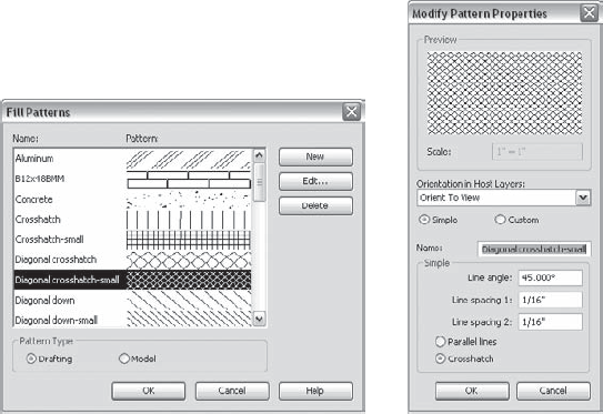
Materials are often represented with simple hatch patterns. For any material used in Revit, you can define a surface pattern and a cut pattern. For simple parallel hatches and crosshatches, you can use the patterns already supplied in Revit or you can make your own patterns.
For more complex patterns, you need to import an external pattern file (.pat). Such pattern definitions can be imported from pattern files used by AutoCAD—a process we explain later in this chapter. To create, modify, or view an available fill pattern, switch to the Manage tab and choose Additional Settings
Model patterns are used to convey real-world dimensional patterns to represent a material, whereas drafting patterns are intended for symbolic representations. For example, a model pattern is used to show a brick pattern in 3D and elevation views, whereas a brick drafting pattern is used to represent the material in plan and section. Figure 4.12 shows how concrete masonry units (CMUs) are represented with a running bond pattern (model) as well as a crosshatch (drafting).
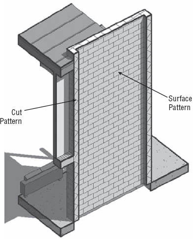
Model and drafting patterns have specific behaviors. In this example, you have a CMU wall with blocks that measure 16" x 8" (40mm x 20mm), regardless of the view scale. With a drafting pattern, the opposite is true: the pattern adjusts with the view scale, so the pattern looks identical in all scales.
To create a new pattern, first choose either Model or Drafting, and then click the New button. A generic pattern appears in the New Pattern dialog box. You can then design your pattern and assign some behaviors.
The option Orient In Host Layers is particularly useful when you're making drafting patterns. This allows you to specify how a pattern orients itself relative to host elements such as walls, floors, roofs, and ceilings when they're represented as cut. Note that the option isn't available for model pattern types. As shown in Figure 4.13, the orientation options are Orient To View, Keep Readable, and Align With Element.

- Orient To View
When this orientation is applied, the patterns used in the project all have the same orientation and the same origin. They're always perfectly aligned with the origin of the view.
- Keep Readable
This orientation will maintain alignment with the view (i.e., horizontal lines will remain horizontal), but will be adjusted relative to angled host elements.
- Align With Element
This orientation ensures that the pattern orientation depends on the orientation of the host element. Patterns essentially run parallel with the element.
You can choose to make either simple or custom patterns with this dialog box, using the radio button options. Figure 4.14 illustrates some examples of each option:
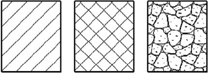
Figure 4.14. From left to right: simple fill pattern, simple fill pattern with the crosshatch option selected, and a custom fill pattern
- Simple
These patterns are generated with parallel or crosshatch lines that can have different angles and spacing. With both the crosshatch and parallel options, you can specify only one angle for the entire pattern. Using crosshatch, you can set two spacing values.
- Custom
To create a more complex custom pattern, you have to import a pattern (
.pat) file from an external source. This is often necessary because of Revit's current limitation in creating natively complex patterns. Your office may have a set of established patterns they've been using for years, and the Custom option allows you to import and reuse them without having to make them again from scratch. Custom patterns let you import a PAT file from anywhere on your hard drive or on a network and use it as a base pattern for a new fill pattern in Revit. The next section shows some best practices for importing a PAT file.
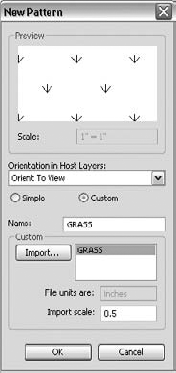
Custom patterns require an external file that contains the definition of the pattern. The file extension of that pattern should be .pat, which is what you'll make in this section by editing an existing AutoCAD PAT file. An advantage of specifying patterns in the template file is that the PAT file won't need to be installed on each computer where Revit is installed; Revit stores each pattern internally in each template or project.
Before modifying PAT files, always make a copy of the original PAT file you intend to use as a base; you don't want to risk messing up other files that might already be using that original PAT file. PAT files can be edited with Notepad, but any text-editing application will also do. For this exercise, you'll choose the AutoCAD pattern called Grass, which you can find in acadiso.PAT (in metric units) or acad.pat (Imperial units) located on this book's companion web page: www.sybex.com/go/masteringrevit2011.
Follow these steps to make a custom fill pattern by importing an existing pattern definition:
Using Notepad, open the file
acadiso.PAToracad.PAT.Highlight the lines that define the pattern, and select them:
45, 6.35, 0, 4.49013, 4.49013, 1.5875, −5.80526, 1.5875, −8.98026
*GRASS, turfed surface90, 0, 0, 17.9605, 17.9605, 4.7625, −31.158545, 0, 0, 0, 25.4, 4.7625, −20.6375135, 0, 0, 0, 25.4, 4.7625, −20.6375*GRATE, grid 0, 0, 0, 0, 0.79375Choose Edit
Open a new text file, and paste the selection. (You can also open the PAT file located in
C:Program FilesAutodeskRevit Architecture 2011Data, in which all Revit patterns are already saved. In that case, you can paste the selected text in that file.)This is the important part: in the new text file where you pasted the selected text, add the two lines shown highlighted here:
;%UNITS=MM*GRASS, turfed surface;%TYPE=DRAFTING90, 0, 0, 17.9605, 17.9605, 4.7625, −31.1585 45, 0, 0, 0, 25.4, 4.7625, −20.6375 135, 0, 0, 0, 25.4, 4.7625, −20.6375The first line that you write before the pattern text,
;%UNITS=MM, can appear only once in the text file. It defines the value for the units used in the pattern. In the example, the units are millimeters (MM); if you wanted to work in imperial units, it would be;%UNITS=INCH. (If you use the option in step 4 to collect all patterns the master PAT file, then this line already exists and you don't need to add it.)The second statement,
;%TYPE=DRAFTING, helps define whether you're creating a drafting or model pattern. In this example, the pattern is the Drafting type.Save your text file with a
.patfile extension.In Revit, on the Manage tab, choose Additional Settings
In the Fill Patterns dialog box, verify that the Drafting option is selected, and click New.
In the New Pattern dialog box, select the Custom option. The lower part of the dialog box offers new options.
Click Import.
Importing PAT Files
It's important to know that when you import a new pattern, the type of pattern needs to be the same as the new type of pattern you're making. In other words, if you're making a new model pattern, you can't import a drafting pattern. If you try to do so, you'll see a warning message like the one shown here:
Navigate to the place on your hard drive or network where you saved the PAT file, and click Open.
In the list that appears to the right of this button, you can see the name of the pattern you created: GRASS, as shown in Figure 4.15. (If you have a PAT file with many patterns defined, you see all the other drafting patterns available in that list.) The name of the pattern automatically becomes the name of your fill pattern, but you can change that if you like.
If necessary, you can adjust the scales of the imported pattern. The Preview window displays the graphic of the pattern, always in 1:1 scale. This informs you if you need to scale the pattern up or down. You'll know that you need to scale the pattern if the preview appears as a solid black box—that means the pattern is too dense.
If you're happy with the result, confirm by clicking OK.
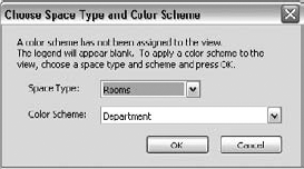
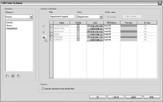
The use of color schemes in project documentation will be covered in greater detail in Chapter 20, "Presenting Your Design"; however, for now, just know that you can preconfigure them in project templates for a variety of scenarios. As an example, an architect may perform many projects for a single client who utilizes the same department names in all of their program design requirements. The architect would like to ensure that the colored plans in all projects for this client use the identical color scheme. In the following steps, you will create a new color fill legend with some predefined department values and associated colors to be saved in a custom project template.
On the Home tab, go to the Room & Area panel and select the Legend tool.
Place a legend in any available floor plan view, and you will see the Choose Space Type And Color Scheme dialog box, as shown in Figure 4.16. Choose Space Types: Rooms And Color Scheme: Department. (These choices can be modified later.)

As shown in Figure 4.17, click the Add Value icon to populate the list of departments in the Scheme Definition area. Choose colors and fill patterns according to your graphic requirements.
Click OK to close the dialog box.
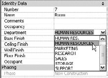
When rooms are placed, you can either type values for departments that match the predefined values in the color scheme or select the values in the Element Properties of the room, as shown in Figure 4.18.
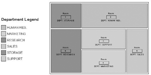
As shown in Figure 4.19, the department values utilized in every project started with your project template will have the same colors and fill patterns according to those specified in the original color scheme. You also have a predefined list of your client's department names.
Once you've customized the settings for graphic quality, you can use several other tools and techniques to increase efficiency and ensure your visual standards are applied consistently throughout your projects. The properties of all views within Revit can be used to your advantage in creating a browser organization that meets the needs of your teams. You can apply filters to views for generating graphic overrides based on model element parameters. You can manage and deploy these settings and more in view templates that can be applied to many views simultaneously.
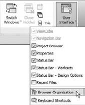
Maintaining a clear and consistent organization of views within a Revit project can generate measurable increases in project productivity. Especially in larger projects, a Revit file can have more than 1,000 views, which can easily cause confusion and wasted time if the right view cannot be found in the Project Browser when needed. The default project template contains a few simple browser organization types that can be copied and/or customized—except for the type named All. To access these settings, switch to the View ribbon, find the Windows panel, click the User Interface drop-down button, and select Browser Organization, as shown in Figure 4.20.
Select any one of the listed types in the Browser Organization dialog box and click the Edit button. Remember, you can't edit or delete the type named All.
In the Browser Organization Properties dialog box (Figure 4.21), there are two tabs called Folders and Filter. Folders allow you to group views together based on selected view parameters, whereas the Filter tab will give you the opportunity to display only views that pass selected criteria.
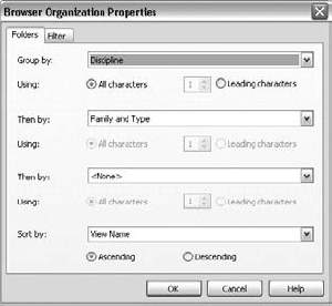
Choose the Folders tab to specify up to three levels of "folders" to be shown in the Project Browser. Some examples are:
Family and Type, Discipline, Scale
Phase, Discipline, Family and Type
Detail Level, Family and Type
To further organize the views in your project, you can create additional parameters and assign them to views and sheets. The following is one example of adding custom text parameters to views for more refined organization:
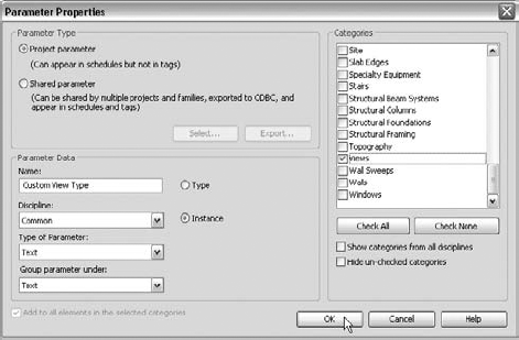
On the Manage tab, find the Settings panel and click Project Parameters.
In the Project Parameters dialog box, click Add.
In the Parameter Properties dialog box, create a parameter named
Custom View Type; for Type Of Parameter, specify Text. Select the Instance option; then find and check the Views category, as shown in Figure 4.22.Repeat steps 2 and 3 and create another text parameter named
Custom View Sub-Typeassigned to the Views category. Remember to set the Type Of Parameter option to Text.Click OK to close the window.
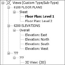
Return to the Browser Organization dialog box and click New. Name the new type Custom Type/Sub-Type, and click OK.
Set the following values on the Folders tab:
Group By: Custom View Type
Then By: Custom View Sub-Type
Click OK to close the open dialog box. The Project Browser is now ready to support the use of the custom view parameters you created earlier.
It is now up to you to assign values to the custom view parameters created in the previous exercise. These values can be assigned directly to the view properties in the Properties Palette or by adding them to View Templates. Views that do not have values for these parameters will be found under the folders listed as "???" (three question marks). Figure 4.23 illustrates this scenario in which plans and elevations have been assigned to the Custom View Type and Custom View Sub-Type parameters but the 3D view was not.
Filters are another view configuration and customization tool that can be developed and deployed in Revit project templates. They are similar to the filters available in schedules in that they can either display or hide elements matching user-specified criteria. But view filters can also override the graphic appearance of such elements affected by them. The possible combination and application of view filters is virtually limitless, so let's take a look at a few real-world examples.
First, we'll review the steps to create and assign a view filter. The fundamental steps are as follows:
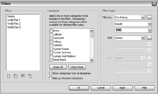
In the following example, you will create view filters to identify fire-rated walls with different colors. You can download the sample file c04-JenkinsMusicBldg.rvt from this book's companion web page at www.sybex.com/go/masteringrevit2011.
Open the file
c04-JenkinsMusicBldg.rvt. Switch to the View tab, find the Graphics panel, and click Filters.Add a new named filter by clicking the New icon at the bottom of the Filters zone at the left side of the dialog box. Name the first new filter Walls-Fire-1 and click OK.
Find Walls in the center zone and check the category.
In the Filter Rules zone at the right side, define the following criterion:
Filter by: Fire Rating equals 1 HR
Click Apply. With the Walls-Fire 1 filter still selected, click the Duplicate icon twice and Walls-Fire 2 and Walls-Fire 3 should be created.
Select Walls-Fire 2 and change the value in Filter Rules to 2 HR.
Select Walls-Fire 3 and change the value in Filter Rules to 3 HR, as shown in Figure 4.24.
Click OK to close the window.
Activate the Level 2 floor plan, open the Visibility/Graphics settings, and select the Filters tab.
Click the Add button, select all three Walls-Fire filters, and click OK.
Click the Override button in each filter row under Cut-Lines and change the line color as follows:
Walls-Fire 1 = Green
Walls-Fire 2 = Yellow
Walls-Fire 3 = Red
Click OK to close the Visibility/Graphic Overrides dialog box.
With the filters now applied to the floor plan, walls that have been assigned a fire rating value will appear with the color overrides you had assigned to the respective filters. You can create more filters to define graphic styles for specific model elements such as furniture by owner, interior walls, secure doors, or equipment not in contract.
After you have defined your desired settings in as many view types as possible, you can use view templates to manage these settings and apply them to other views of the same type. They will be described in greater detail in Chapter 18, "Documenting Your Design," but we will discuss their importance to the project template in this section. Let's begin by opening the View Templates tool:
On the View tab, find the Graphics panel and select View Templates
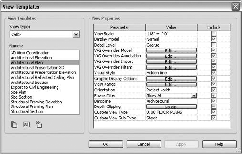
In the View Templates dialog box (Figure 4.25), you will find icons to duplicate, rename, or delete view templates below the list on the left. On the right are the View Properties that can be applied when the view template is applied to a view.
Notice the column named Include. This allows you to include or exclude various View Properties when applying the View Template. In Figure 4.25, notice that View Scale and Detail Level are not included. This would allow you to apply this template to plans of multiple scales and detail levels, while applying settings such as visibility of object styles, phase filter, and view range.
Also notice in Figure 4.25 the two custom view parameters: Custom View Type and Custom View Sub-Type, which we described earlier in this chapter. These values can be applied with the View Template, which will have the effect of cataloging the views in your standardized folders within the Project Browser.
Click OK to close the window.
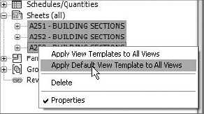
Changes to view templates are not automatically reflected in the views to which they have been applied; however, Revit has a method for making these updates easy to maintain. When a View Template is applied to a view for the first time, it becomes the default View Template for that view. Subsequent View Template applications will not change a view's default View Template; rather it can only be changed in the View Properties.
When you apply a template as the Default View Template, it is easy to update all views prior to publishing sheets. Simply select the sheets you are about to print or publish from the Project Browser, right-click, and select Apply Default View Template To All Views, as shown in Figure 4.26.
Including view templates in your project template will give your teams the ability to quickly apply your standard view settings. It will also support continued consistency as each building project grows in scope and size. Remember that view templates are easily shared between projects using the Transfer Project Standards tool, which we will discuss later in this chapter in the section "Strategies for Managing Templates."
The authors of this book are avid supporters of global graphic standards for architecture and engineering such as the US National CAD Standard (www.nationalcadstandard.org), but each architect or designer will likely have their own set of standards that will need to be implemented in their Revit projects. Placing customized annotation families in your project template will save time when starting new projects and ensure maximum compliance with your firm's standards. You can load tag families into the template using several methods:
Switch to the Insert tab, and in the Load Library panel, select Load Family.
Using Windows Explorer, select
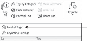
.rfatag families and drag them into the Revit project environment with the template open. If you try to drag more than one family at once, Revit prompts you to either open each of those files in an independent window (so you can modify them) or load them all in the current project. Choose the second option.Use the Loaded Tags tool available in the Annotate tab when you expand the Tag panel (Figure 4.27). This allows you to preview all loaded and preset tags that will be used for respective element categories.
In this section, we'll walk you through creating some common element tags and customizing system annotation.
Before you begin to customize annotation families or create your own, it is important to review the fundamental difference between text and labels.
- Text
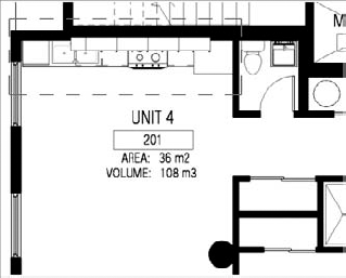
In the Family Editor, placing text in an annotation or title block means you're defining text that will always be the same and is unchangeable when that annotation is placed in the project environment. Figure 4.28 shows the words AREA and VOLUME as text. Regardless of where this room tag is placed, the text will always say AREA and VOLUME. Section tags work the same way: if you add static text, that text appears exactly the same for all section marks. This isn't typically used for sections, because each section is a reference to a unique view, and you want that information to be dynamic and parametric. That's where label functionality comes into play.
- Labels
Like static text, a label offers textual information; however, it's a live reference to a parameter value of an element in the project. For example, if you add an Area label, it will pull the value of the area of the room; if you add a Sheet Number label in a Section Head family in the Family Editor environment and then use that section head in a project, the label will automatically display the actual sheet number on which the section is placed in the project. If you move the section from one sheet to another, the label will automatically report the new sheet number.
In Figure 4.28, Unit 4 is a label of the room name; the number 201 is a label of the room number. The label behaves as dynamic text and is always fully coordinated with the value of the parameter it represents.
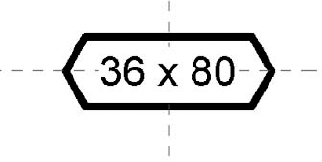
As an example of creating custom tags for a basic model element, use the following steps to create the custom door tag shown in Figure 4.29.
Click the Application button, and select New
In the Select Template File dialog box, select the family template called
Door Tag.rftorM_Door Tag.rftand click Open.The Family Editor opens in a view with two crossing reference planes, the intersection of which represents the origin of the tag. To avoid problems later, don't move these planes.
On the Home tab, find the Text panel and select Label. Click the intersection of the two planes to position the label.
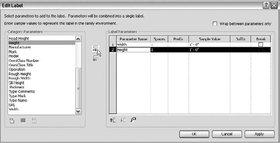
In the Edit Label dialog box that opens, select Width and click the Add Parameter To Label icon between the Category Parameters and Label Parameters fields. Then do the same for Height, as shown in Figure 4.30.
The Width and Height parameters will be concatenated in a single label, which will display the actual size of the door in the tag. In the subsequent steps, you will customize the display of the label.
Add a space and the letter x in the Suffix column of the Width parameter and change the Sample Value to 36 [in] or 1000 [mm]. Change the Sample Value of the Height parameter to 80 [in] or 2000 [mm].

Units: Decimal Inches or Millimeters.
Rounding: 0 decimal places
Unit symbol: None
Repeat the previous step for the Height parameter.
Click OK in all open dialog boxes.
On the Home tab, activate the Masking Region tool and sketch a six-sided polygon, as shown in Figure 4.29.
Remember to finish the sketch by clicking the green check in the Mode panel.
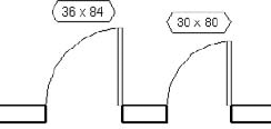
Save your tag and load it into your project template. Make sure that it is specified as the default tag for doors in the Tags dialog box and use the Tag By Category or Tag All Not Tagged tools or place new doors with the Tag On Placement option. Using concatenated parameters in tag labels allows a great deal of flexibility while utilizing actual parametric values. In this example (Figure 4.31), the actual width and height parameters driving the door size become the text displayed in the tag.
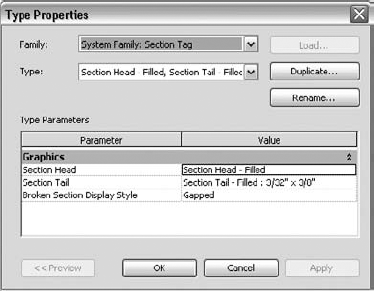
Section, callout, and elevation tags are graphic indicators that reference (link to) other views in your project. The graphics for these elements can be customized to meet most scenarios. To create a custom section tag, for example, you have to first create a custom section tag family and load it into a template or project. You must then associate it with a section tag system family type, which is then assigned to a section type. Switch to the Manage tab, and choose Additional Settings
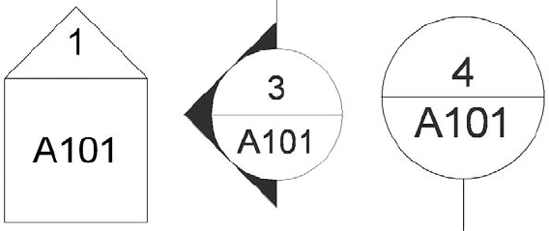
In simple terms, view tags in Revit are organized in the following hierarchy:
System Family: Section
System Family: Section Tag
Annotation Family: Section Tag/Tail
By default, there is a predefined view tag for each view type. The graphics can vary depending on the language version of Revit you have installed on your machine. The tags shown in Figure 4.33 are displayed and available by default in the US English version.
In the next exercise, you will create a section tag that looks like the one shown in Figure 4.34. You'll first need to create a section tag family using the Family Editor before loading it into the template.
To begin, follow these steps:
Click the Application button, and select New
In the Open dialog box, select the family template called
Section Head.rftorM_Section Head.rft, and click Open.The Family Editor environment automatically opens, and the drawing area shows a view in which three green reference planes (two vertical and one horizontal) have already been drawn. Do not change the position of either the horizontal reference plane or the vertical reference on the right. In some templates, this is indicated with help text in red (which you can later remove).
The intersection of horizontal and right reference planes defines the connection location with the section line. This means your annotation will be located in between the two intersections points.
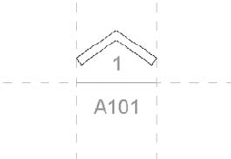
A proposed geometric shape is drawn for the annotation: a circle (two arcs) and a horizontal line. You're free to delete this default geometry and create your own tag shape. The default shape is there to help you visually understand where to begin drawing your new tag geometry.
Select the arcs that create the circle (use the Ctrl key for faster selection), and delete them.

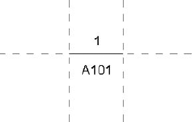
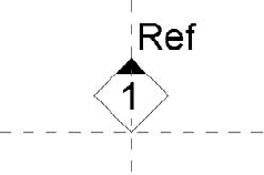
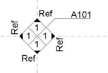
In the Edit Label dialog box, select Sheet Number. Click the Add Parameter(s) To Label button. In the Sample Value column, you can enter a value; the default is A101.
The label is placed and displays blue grips when selected. These let you change the length of the label text field. The length is important, because any value that is added (in a project) that is longer than the length of this box will begin to wrap and could cause undesirable results.
Following the same principle, place the label Detail Number above the horizontal reference but still between the vertical references, as shown in Figure 4.35.
You can reposition a label by selecting it and using the Move button to move it around. For more precise positioning, use the arrow keys on your keyboard to nudge elements in small increments. You can also help yourself by zooming in for a better view. (Note that zooming in refines the increment for the nudge tools.)
On the Detail panel of the Home tab, click the Filled Region button. You'll be put into Sketch mode. Using the Line tool, draw the shape shown in Figure 4.36. In the Region Properties, check that Color is set to Black and Cut Fill Pattern to Solid Fill. Make sure the lines form a closed loop (no gaps or overlapping lines).
Click Finish on the Mode panel of the Modify | Create Filled Region Boundary tab.
Save the tag you just created as
Custom Arrow.rfasomewhere on your hard drive or network, and you're ready to use it in the template or a project. To load it into your project, click the Load Into Projects button located in the Family Editor panel. Choose the project you want to use the symbol in, and click OK.
Next, you'll assign this tag to a section mark system family type in the context of a project or template.
To create a section type that utilizes the section head family you created previously, you need to load the created section head in the template file (if you've already loaded the custom arrow family in the previous exercise, skip to step 3):
If the family isn't already loaded, switch to the Insert tab, and on the Load From Library panel, choose Load Family.
In the Load Family dialog box, find the
Custom Arrow.rfasection head you created previously, select it, and click Open.Switch to the Manage tab and select Additional Settings
In the Type Properties dialog box, click Duplicate.
In the Name dialog box, name the new type Custom Filled Arrow and click OK.
In the section head's Type Properties dialog box, click the drop-down menu for Section Head and select Custom Arrow. For Section Tail, click <none>. This means the other end of the section line will not use a symbol. Click OK.
The final step is to create a customized section type, which will utilize the new section tag type created in the previous step.
Switch to the View tab, and on the Create panel, select Section.

In the Type Properties dialog box, select Duplicate.
Name the new type Custom Arrow - No Tail, and click OK.
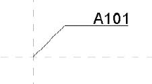
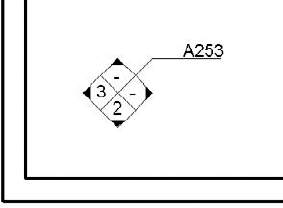
You can now place a section in your drawing area and see the results shown in Figure 4.37.
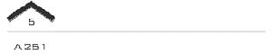
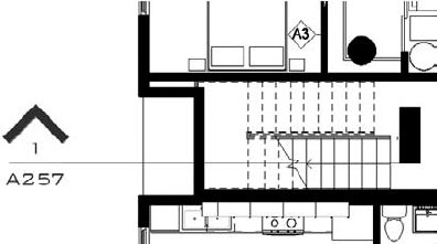
The custom section tag exercise can also be applied to the creation of custom callouts, as shown in Figure 4.38.
We can't help but get excited over this long-awaited new feature for Revit Architecture 2011—the ability to create custom elevation tags! You are no longer limited to either a circle or square tag. Here's how it works:
Click the Application button, and select New
In the Open dialog box, select the family template called
Elevation Mark Body.rftorM_Elevation Mark Body.rft, and click Open.Using similar steps from the section tag exercise, place the Sheet Number label and draw lines as shown in Figure 4.39.
Make sure the label has the properties Keep Readable and Fixed Rotation checked.
Save the family as
Custom Elev Head.rfa.Click the Application button, and select New
In the Open dialog box, select the family template called
Elevation Mark Pointer.rftorM_Elevation Mark Pointer.rft, and click Open.Using similar methods in previous steps, place labels for the Detail Number and Reference Label parameters. Draw a diamond with lines and a small triangular filled region, as shown in Figure 4.40.
Again remember to make sure the labels have the properties Keep Readable and Fixed Rotation checked.
Save the family as
Custom Elev Pointer.rfaand load it into theCustom Elev Head.rfafamily.Place four instances of the Custom Elev Pointer family around the intersection of the visible reference planes, as shown in Figure 4.41.
When this custom elevation tag family is loaded into a project and associated with an elevation type, it will function much like standard elevation symbols.
After the views are placed on a sheet, you get a preview of the completed elevation symbol, as shown in Figure 4.42.
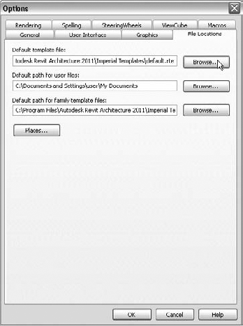
Now that we have covered many areas of customization within project templates, you can configure Revit to use your new template. To do so, follow these steps:
Click the Application button, and at the bottom of the menu click Options.
In the Options dialog box, select the File Locations tab. The first option in the dialog box lists the default template location.
Click the Browse button to choose a new path to your default template file (see Figure 4.43).
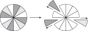
During the implementation of Revit, you can take one of two approaches when managing project templates: additive or subtractive. An additive approach, as shown in Figure 4.44, assumes that more than one project template will be developed to manage standards and content for a single project. Typically, a "base" template is used to start a project with a minimum amount of settings, whereas content and settings from "supplemental" templates are appended based on region, project type, or project style. In this scenario, each template file is lighter, but managing the templates becomes more difficult because changes in common settings or families must be applied to all templates.
In contrast, the subtractive approach, shown in Figure 4.45, uses a single master template that contains all standard settings and content and relies on the project teams to remove and purge unused content. Although these templates tend to be heavier, graphic settings are easier to manage within a single file.

Based on a survey conducted by Robert Manna for an Autodesk University class, the majority of responders indicated they develop two to five project templates primarily to differentiate between project types and/or market sectors. For example, if you're an architectural firm that is usually contracted to perform work on large transportation sector projects, you might need to create a Revit file just to manage the site data for every project.
In that case, you would use a specific template as a "site" project template. Within such a template, you could use the following settings to reduce the amount of redundant work every time different teams attempt to establish a site model into which other building models are linked:
Levels named Sea Level and First Floor Reference
Setting default view scales to larger sizes
Changing default project units to reflect civil engineering
Adding a Cut/Fill schedule
Creating dimension types useful for large drawings
Pad types including "gravel"
More information on template management, including results of the survey, can be found on Robert Manna's website at http://revit.krarchdesign.net. His Autodesk University content can be found at au.autodesk.com.
Whether you are managing the settings between templates or developing a project with multiple templates in an additive approach, Revit has some useful tools to help share data between projects, such as Transfer Project Standards, Insert Views From File, and Insert 2D Elements From File.
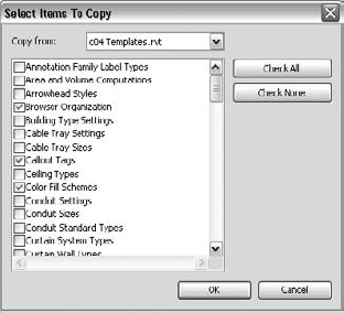
You can easily share Revit families between project files by loading their RFA files; however, most other types of content can be transferred with the Transfer Project Standards command. Some types of elements commonly transferred with this command include, but are not limited to, the following:
Materials
System family types (Walls, Floors, Roofs, and so on)
Text and dimension styles
Grid and level types
Line styles and patterns
Object style settings
Viewport types
To use this command, you must first have both the source and target Revit files open; then make the target file the active project. Switch to the Manage tab, and select Transfer Project Standards on the Settings panel. In the Select Items To Copy dialog box (Figure 4.46), choose as many item categories as you'd like to transfer, and then click OK.
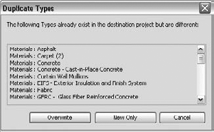
If you choose an element category containing some of the same types that already exist in your current project, you will be prompted with the option to overwrite the existing types or import the new types only (New Only), as shown in Figure 4.47.
The Insert Views From File command is useful for sharing Drafting Views of standard or typical details with other Revit project files. It can also insert entire sheets with all attached Drafting Views and associated properties. You can use the Insert Views From File command with the following view types:
Drafting views
Sheets
Schedules
Switch to the Insert tab, and choose Insert From File
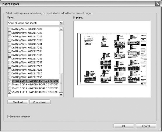
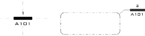
Figure 4.48. Insert Views can be used to transfer an entire sheet of drafting views into your project.
If one or more sheets are selected in the Insert Views dialog box, all eligible drafting views placed on those sheets will be inserted into the current project as well. Note that repeating this process will not update the drafting views in the project, but instead will create new renamed drafting views and sheets. Also note that any custom view parameters are maintained during the transfer and can fit right into your customized Project Browser organizations, as we discussed earlier in this chapter.
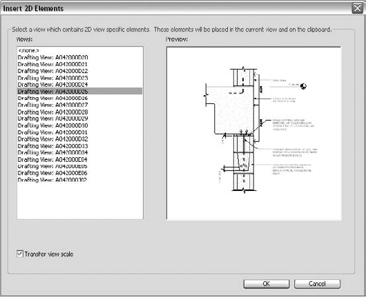
Similar to Insert Views From File, the Insert 2D Elements From File command imports the 2D elements of the selected view as a detail group into the active view in the current project instead of the entire view. For best results, make sure you have a drafting view active before using this command. On the Insert tab, find the Import panel, choose Insert From File
For consistency, be sure to select the Transfer View Scale option to convert the scale of the active drafting view to that of the view you are inserting. You can move the elements into position using the Move command and, after placing the 2D elements, be sure to click Finish in the Edit Pasted panel or double-click anywhere outside the elements to complete the command.
Duplicate Types When Inserting
When using Insert Views From File or Insert 2D Elements From File, be sure to watch for warnings about duplicate types being renamed, as shown here. You may be able to use the Purge Unused tool to remove any renamed styles; however, some types may need to be manually modified.
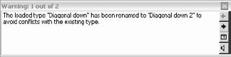
If duplicated types cannot be removed with Purge Unused, you will need to swap the duplicated types with the originals. Find the duplicated family types in the Project Browser, right-click on it, and choose Select All Instances. This selects all instances of that type throughout the entire project. Open the Properties Palette and select a different type. You will then be able to remove the duplicated type with Purge Unused or by right-clicking on it in the Project Browser and choosing Delete. Note that the Select All Instances method does not work on line styles.
- Define settings for graphic quality and consistency.
The fundamental building blocks for any template are the customized settings to object styles, line styles, fill patterns, materials, and more.
- Master It
How can a complex custom fill pattern be imported into Revit?
- Organize views for maximum efficiency.
The project template can be used to capture a framework supporting your visual and organizational standards.
- Master It
How can you customize the Project Browser to support your business needs?
- Create custom annotation families.
Developing a graphic style to match your standards will usually require some annotation families to be edited or created from scratch.
- Master It
Can a single label display more than one parameter? How are custom view tags loaded into a project?
- Start a project with a custom template.
Making your custom template available for new projects ensures all future projects will maintain the same level of graphic quality and efficiency you expect.
- Master It
How do you set your own custom project template to be the default for new projects?
- Develop a template management strategy.
Organizing your standards, content, and settings while using Revit's tools to transfer content will make your effort more efficient.
- Master It
How do you insert your standard details from one Revit project to another? How do you transfer settings such as materials?