
Chapter 8
Data visualization
A great way to make sense of large volumes of data is to create graphic visualizations that make it easier for users or consumers of the data to understand what the data is telling them. Graphics can make spotting trends easier to identify, help clarify relationships between data elements, and improve the decision-making cycle.
Some of the most common data visualizations include time-series analysis (line charts), ranking (bar charts), ratio analysis (pie charts), frequency distribution, geospatial (maps), correlation (scatterplots), and cluster analysis. In this chapter, you will learn more about Microsoft Sentinel Workbooks, how to leverage the built-in Workbooks, and how to create your own Workbook.
Microsoft Sentinel Workbooks
Sentinel Workbooks provide interactive reports that can be used to visualize your security and compliance data. Workbooks combine text, queries, and parameters to make it easy for developers to create mature visualizations, and they provide advanced filtering, drill-down capabilities, advanced dashboard navigations, and more.
Also, Workbooks allow users of the dashboards to edit and customize the visualizations to meet their needs using simple dropdown menus. While you can create your own Workbook, it is important to review the library of templates to see if what you need is already there. To view the available Workbook templates, follow the steps below:
Open the Azure portal and sign in as a user who has either contributor or reader permissions on the resource group to which the Microsoft Sentinel workspace belongs.
In the search pane, type Sentinel and click the Microsoft Sentinel icon when it appears.
Select the workspace on which Microsoft Sentinel has been enabled.
In the left navigation pane, click Workbooks. By default, the Templates tab will appear, as shown in Figure 8-1.
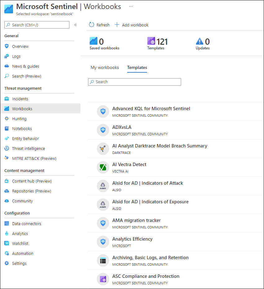
FIGURE 8-1 Sentinel Workbooks Templates tab
The Templates tab has a collection of Workbooks that were created based on customers’ demands, and they were tailored for specific scenarios. It is very important to emphasize that if there is no data ingestion to feed the Workbook, there will be no data to show. For example, if you don’t have the Office 365 Connector already working, nothing will appear when you load the Office 365 Workbook.
For this example, open the Azure Activity Log Workbook by typing Activity in the Search box and clicking the Azure Activity option. The Azure Activity blade appears, as shown in Figure 8-2.
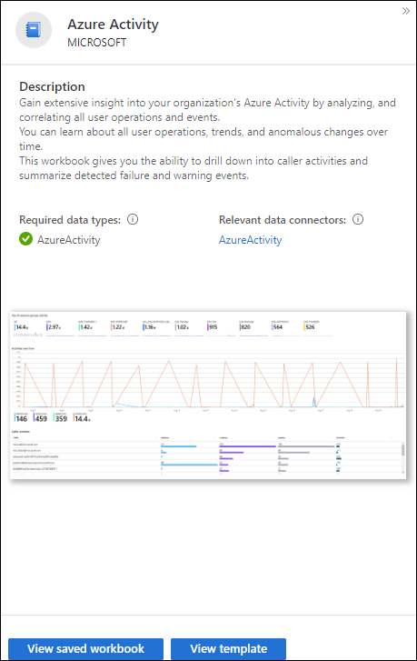
FIGURE 8-2 The Azure Activity blade
Click the View Template button to see what the Workbook looks like without the data. The structure of the Workbook appears as shown in Figure 8-3.
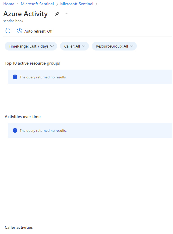
FIGURE 8-3 Workbook template without data
If your Workbook appears fully empty, as shown in Figure 8-3, it is because you don’t have a data connector that is ingesting the data needed to feed this Workbook. When the connector is working properly, the Workbook template will look like the one shown in Figure 8-4.
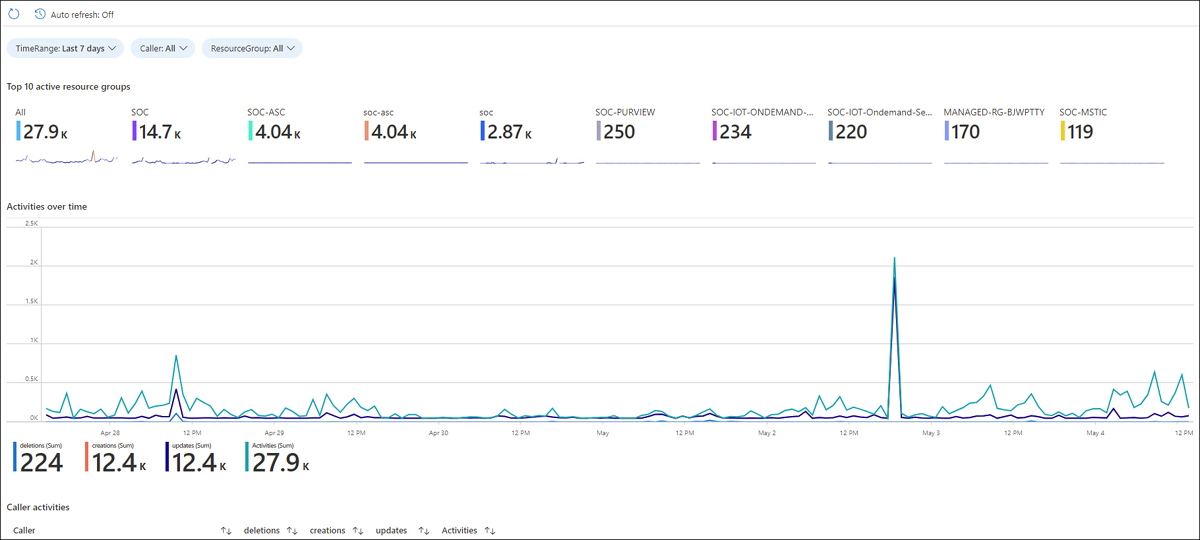
FIGURE 8-4 Workbook template with data
In the example shown in Figure 8-4, you have the Workbook fully populated with the data, which may not look exactly like the one you built since the data is different. After reviewing, you can click on the close icon (X) in the top-right corner of the Workbook.
To leverage a specific Workbook template, you must have at least Workbook reader or Workbook contributor permissions on the resource group of the Microsoft Sentinel workspace. The Workbooks that you can see in Microsoft Sentinel are saved within the Sentinel’s workspace resource group and are tagged by the workspace in which they were created. Follow the steps below to view and make changes to the Data Collection Health Monitoring Workbook:
Open the Azure portal and sign in as a user who has either contributor or reader permissions on the resource group to which the Microsoft Sentinel workspace belongs.
In the search pane, type Sentinel and click the Microsoft Sentinel icon when it appears.
Select the workspace on which Microsoft Sentinel has been enabled.
In the left navigation pane, click Workbooks.
In the Search box, type Data collection and click the Data Collection Health Monitoring Workbook.
The Data Collection Health Monitoring blade appears on the right side. Click the View Template button, and the Data Collection Health Monitoring page appears, as shown in Figure 8-5.
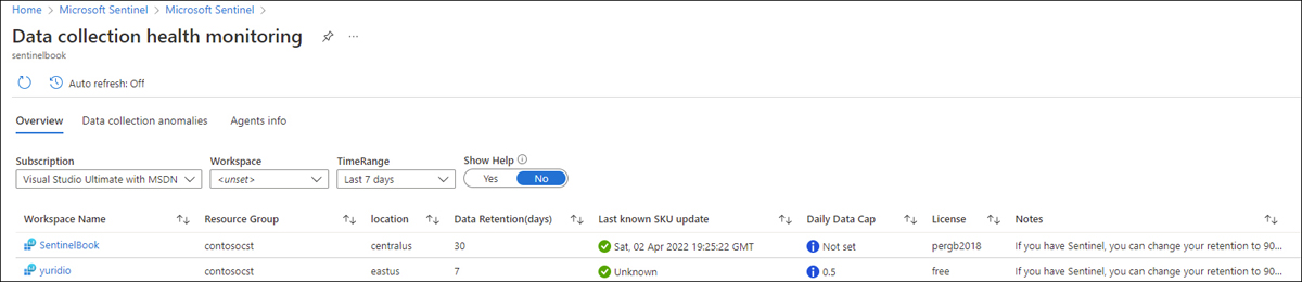
FIGURE 8-5 Insights from the Data Collection Health Monitoring Workbook
If your environment has multiple workspaces, this Workbook will retrieve information about the following workspace items:
Resource group
Geolocation
Data retention
Last update
Daily data cap
License
You can also use the TimeRange option to visualize more or less than 7 days (default selection), customize which Subscription you want to focus on, and select the individual workspace.
You can also use the Data Collection Anomalies tab to detect potential anomalies in the data collection process by table and data source. An example of the results in this tab is shown in Figure 8-6.
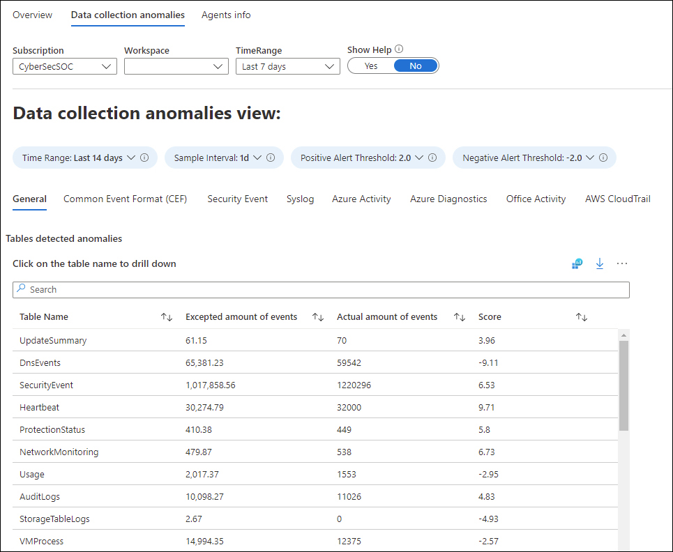
FIGURE 8-6 Data collection anomalies view
Each tab presents anomalies for a particular table (the General tab includes a collection of tables). The anomalies are calculated using the
series_decompose_anomalies()function that returns an anomaly score.Note
For more information about the
series_decompose_anomalies()function, see http://aka.ms/SWBAnomalies.
Creating custom Workbooks
You can also create your own custom Workbooks if the pre-built templates are insufficient for your needs. You can combine text, analytic queries, Azure metrics, and parameters into highly interactive reports. Follow the steps below to create your own Workbook:
In the Microsoft Sentinel dashboard, select Workbooks and then select Add Workbook to create a new Workbook from scratch. You will be taken to the New Workbook screen, as shown in Figure 8-7.
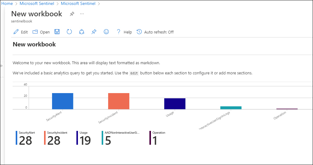
FIGURE 8-7 New Workbook
To edit the Workbook, select Edit. In the top-right corner, select the Edit button to make changes to the text that was included with the New Workbook template. As shown in Figure 8-8, add the following text: Workbook to Visualize changes in the volume and severity of Security Alerts. Click the Done Editing button to finish.
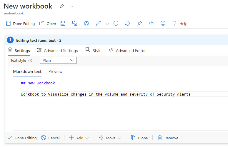
FIGURE 8-8 A view of the Markdown Text To Display screen
Now add a pie chart displaying the
Security Eventsthat have occurred over the last six months, sorted by severity. To do this, select Edit at the top of the Workbook. Now, scroll to the right of the screen and select the second Edit button. In the Log Analytics Workspace Logs Query section, add the following query:SecurityAlert | where TimeGenerated >= ago(180d) | summarize Count=count() by AlertSeverity | render piechart
You can now test by clicking the Run Query button. Although the final numbers in the pie chart might vary, the example shown in Figure 8-9 has the expected output.
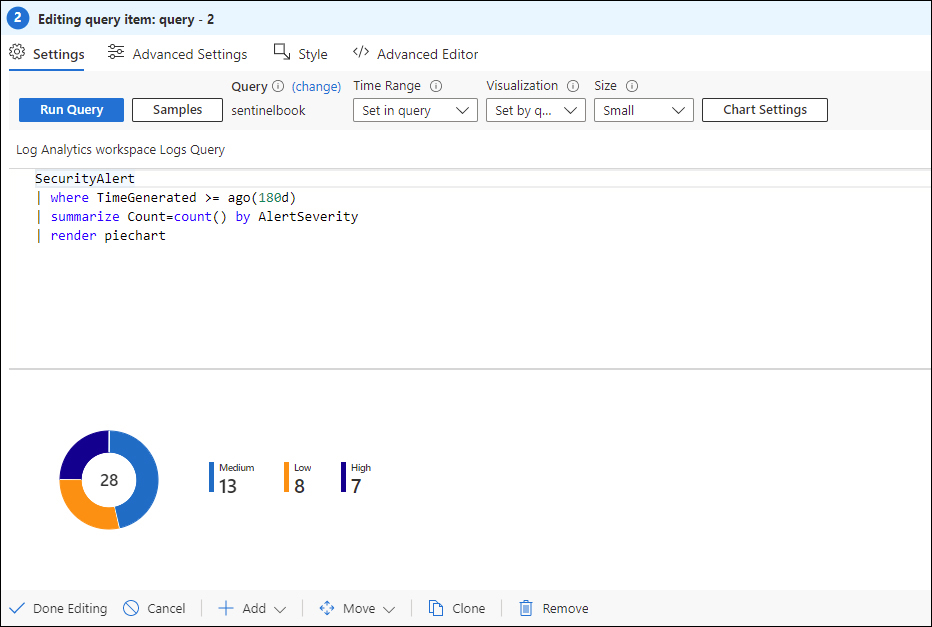
FIGURE 8-9 Changing the graphical representation of the query
Click the Done Editing button to finish.
Now create a new time chart displaying changes in the number of security alerts by severity over the last year. Click the Edit button, and then click the Add button, followed by the Add Query option.
In the Edit Query window, type the following query:
SecurityAlert
| where TimeGenerated >= ago(365d)
| summarize Count=count() by bin(TimeGenerated, 1d), AlertSeverity
From the Visualization dropdown menu, select Time Chart and click the Run Query button. Figure 8-10 shows an example of how this query will be represented in this graph format.
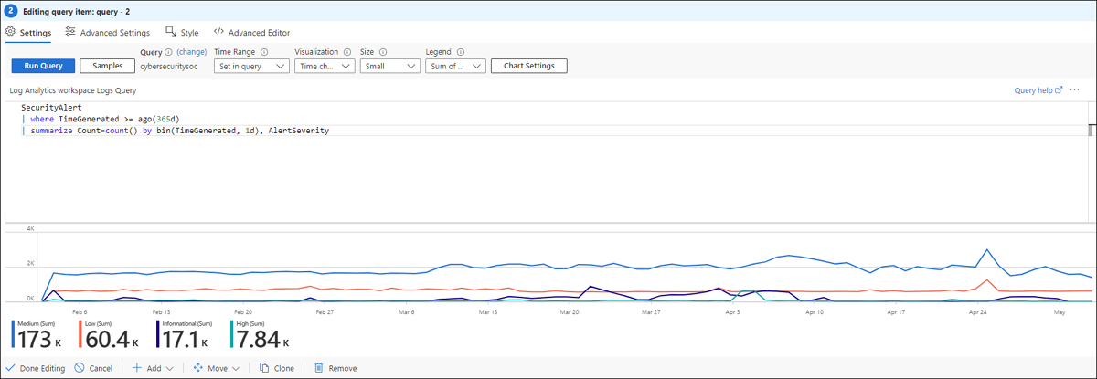
FIGURE 8-10 Changing the visualization for time chart
After visualizing, you can click the Done Editing button.
Now that you have created your new Workbook, save the Workbook by selecting the Save button at the top of the screen. You will then be presented with a set of text boxes and dropdown menus, including Title, Save To, Subscription, Resource Group, and Location. Ensure that you save the new Workbook under your Microsoft Sentinel workspace's subscription and resource group. If you want to let others in your organization use the Workbook, select Shared Reports from the Save To menu. If you want this Workbook to be available only to you, select My Reports, add a meaningful title for your Workbook, and then select Save.
Creating visualizations in Power BI and Excel
SOC leaders are often asked to provide metrics and report on their operations to executives and key business partners. Most likely, executives and business partners will not have access to Microsoft Sentinel; therefore, another method must be leveraged to provide them with the information they need.
Creating visualizations in Power BI
Log Analytics provides a native integration with Power BI. You can take any query used in Log Analytics and export it in Power Query language to create a Power BI Dataset. The architecture for exporting Microsoft Sentinel data in Power BI is shown in Figure 8-11.
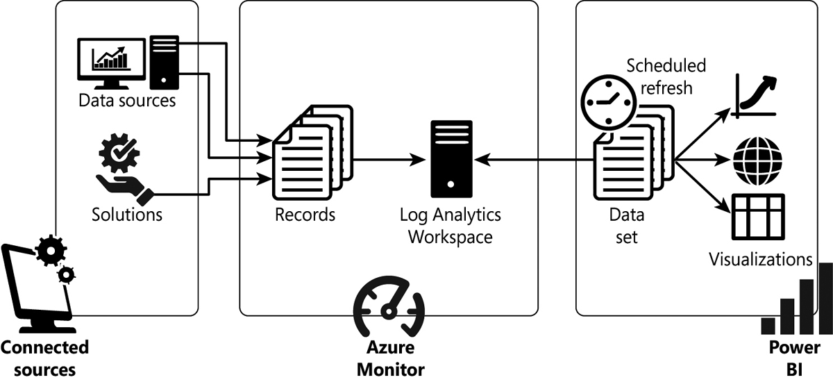
FIGURE 8-11 Architecture for exporting Microsoft Sentinel data to Power BI
To create visualizations in Power BI with Microsoft Sentinel data, you need to perform the following steps:
Ensure that you have Power BI Desktop installed on your computer.
Next, create a log query within Microsoft Sentinel that returns the data that you want to populate a Power BI dataset. To do this, open the Azure portal and sign in as a user who has either contributor or reader permissions on the resource group to which the Microsoft Sentinel workspace belongs.
In the search pane, type Sentinel and click the Microsoft Sentinel icon when it appears.
Select the workspace on which Microsoft Sentinel has been enabled.
Click Logs in the left navigation pane and enter the query to retrieve the data you want to share. For example, enter the following query to retrieve all Azure Active Directory audit logs for the last six months:
AuditLogs
| where TimeGenerated >= ago(120d)
Click Export at the top of the Query window and then select Export To Power BI (M Query), as shown in Figure 8-12.
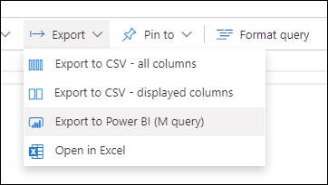
FIGURE 8-12 PowerBI Export menu
You will be prompted to open or save the Power BI M query. For demonstration purposes, click Open. A Notepad file will open with the M query.
Open Power BI Desktop, click Get Data > Blank Query, and then select Advanced Editor, as shown in Figure 8-13. Paste the contents from the exported file into the query window and click Done.
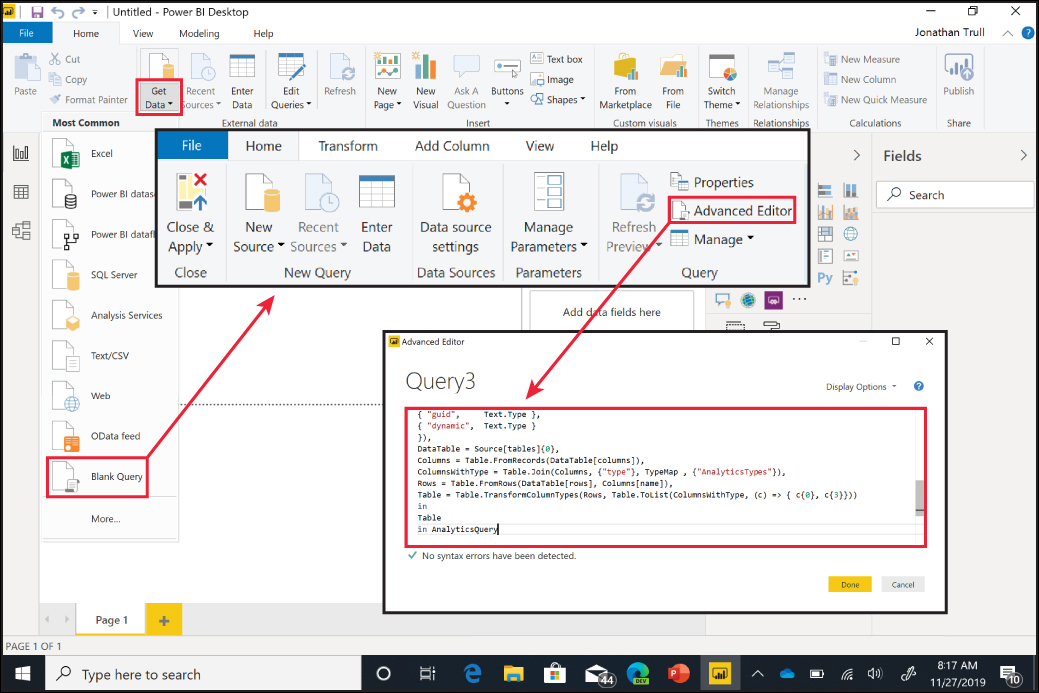
FIGURE 8-13 Power BI Desktop app navigation to the Advanced Editor
Click Close & Apply.
Microsoft Sentinel data is now available within Power BI, and you can create custom reports and share those reports with others within your organization.
Exporting data to Microsoft Excel
You can also easily export your Microsoft Sentinel data to Microsoft Excel to create visualizations and share information. You can use this approach if you need to create custom, one-time reports for individuals. Follow these steps:
Open the Azure portal and sign in as a user who has either contributor or reader permissions on the resource group to which the Microsoft Sentinel workspace belongs.
In the search pane, type Sentinel and click the Microsoft Sentinel icon when it appears.
Select the workspace in which Microsoft Sentinel has been enabled.
Select Logs and enter the query to retrieve the data you want to share. For example, enter the following query to retrieve all Security Events that have occurred over the last six months and display the alert name, severity level, and whether it was identified as an incident:
SecurityAlert
| where TimeGenerated >= ago(120d)
| project AlertName, AlertSeverity, IsIncident
Select Run.
Select Export at the top of the window, and select Export To CSV – All Columns.
Now you can open, save, or share the CSV file and work with the data as needed to create additional reports and visualizations.