With the server side of MailBag ready to go, it’s time now to move on to the client side of things! Here, we’ll get back to playing with our good friend React, along with some supporting libraries, and we’ll hook it all up to the server that was built in the previous chapter. In the end, we’ll have ourselves a fully functional webmail application that you could use for real if you wanted to!
What Are We Building?

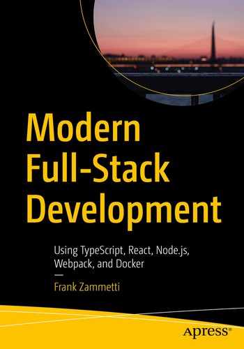
Our first look at MailBag’s client
A few messages in my inbox (I get A LOT of spam – this was a good day!)
In this screenshot, I’ve also gone ahead and clicked one of the messages, which shows its details at the bottom. As you can see, I can reply to the message, or I can delete it (and none of the fields above the buttons are editable). When you click the NEW MESSAGE button in the toolbar, you see the same basic screen except that the ID and the date are hidden, the From field becomes a To field, and there is just a single Send button (and everything is editable, naturally).
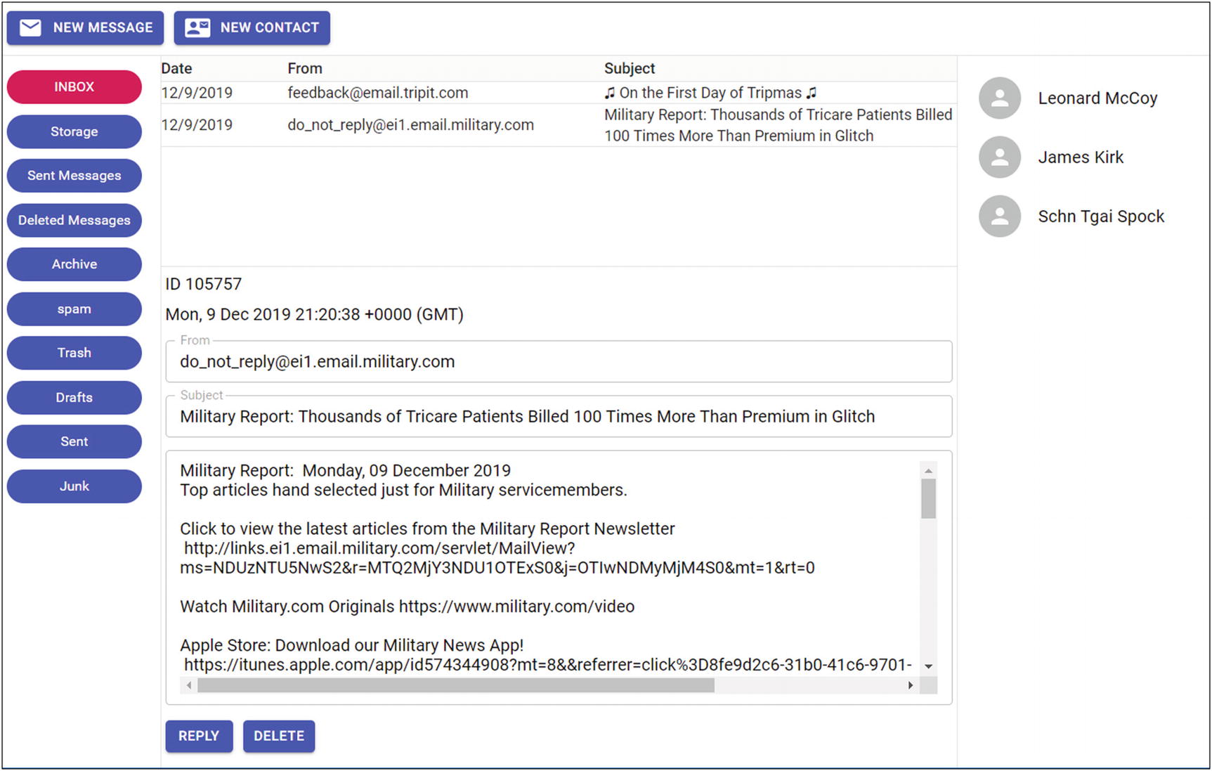
Adding a contact
Similar to the view of a message, clicking an existing contact shows a screen that is essentially the same except that in that case, the SAVE button becomes a DELETE button (and the fields are read-only).
Although this section is just meant as a walkthrough, you of course can (and maybe even should) fire up MailBag now and talk a look at it in action. Assuming you’ve already gone through Chapter 8 and downloaded the source code bundle and installed dependencies, you can fire up the MailBag server, and the client is then available at http://localhost automatically.
Basic Requirements
The server must be consulted for a list of mailboxes under a single configured IMAP account once at startup.
The user can select a mailbox from the list, which will double as a refresh action. The messages will be displayed in a tabular form and will show the date received, subject, and sender.
Clicking a message shows it below the list, including subject, sender, ID on the server, date received, and, of course, the message itself, as plain text.
The user must be able to delete the message being viewed.
The user can begin a new message in reply to the message being viewed. The subject will automatically have “Re:” prepended to it, and the original message will be shown below a bit of marker text.
A list of contacts will be stored on the server. The user can select a contact from a list and can delete the contact or begin a message to them. They can also, of course, add a new contact.
Like mailboxes, the server will be consulted once at startup for the list of contacts.

The overall layout of the client in block form
As you can see, in block form, it mimics the arrangement shown in the screenshots. However, how we achieve that layout is the critical piece of the puzzle, and that’s something we’re going to talk about a bit later on, after a necessary detour. But, before we get to that, we have to set up the project, so let’s do that now!
Setting Up the Project
Setting up the client project is very similar to setting up the client. Create a client directory under the project root directory alongside the server directory. Then, create a src directory in it.
If you download the source archive for this book, that’s what you’ll find, and you can just do an npm install at this point to get everything installed. Otherwise, just overwrite this file with this content (and this is true of the remaining configuration files we’re about to discuss).
As you can see, TypeScript is installed, and then too is Webpack. Also, several Webpack loaders and plugins are installed (and some of those results in some additional dependencies being automatically added by NPM).
I also added a script that can be used to execute a build, so now npm run build is all we need to do to kick off the build. Also note that Axios didn’t have type bindings at the time of this writing and normalize.css isn’t a library of code, it’s a stylesheet, so typing doesn’t factor into it.
React – Of course!
normalize.css – A CSS reset to ensure we start with a consistent client-side environment across browsers as far as styles go
Axios – A library for server communications (more on this later)
Material-UI – A library providing UI widgets to build our UI with based on Google’s Material guidelines (more on this later too)
You can see the rules defined for handling HTML, CSS, and TSX files, using the loaders installed before.
The HtmlWebPackPlugin has a particular purpose. We tell Webpack what HTML file in our source code to start with via the entry attribute, and it then modifies it as needed (including adding a proper module loader) so that our app can be launched after Webpack has transformed it. This plug is responsible for that.
The performance attribute is necessary because, by default, Webpack will produce a warning or error, depending on various factors, if the final bundle is over 250Kb. Setting performance : { hints : false } disables this behavior.
Setting watch:true serves much the same purpose as the scripts entries in the server did: Webpack will watch our source files and automatically rebuild the client if any files change. That gives us that nice, fast turnaround for changes we so liked when working with the server code, but we get it “for free” with Webpack just by adding this attribute!
Finally, devtool set to "source-map" ensures that a source map is created for the final bundle, allowing us to do some debugging when necessary.
Source File Rundown
src/index.html – The main entry point of the application.
src/css/main.css – A regular old CSS file with some shared styles.
src/code/main.ts – The main code entry point. This is where React will begin to build our UI from.
src/code/Contacts.ts – Like the server, this is the file that contains a Worker class for dealing with contacts (this is what talks to the server side of MailBag for contacts).
src/code/IMAP.ts – Like Contacts.ts, this contains a Worker for performing all the IMAP functions, in conjunction with the server.
src/code/SMTP.ts – Just like IMAP.ts, but for the SMTP (send) functionality.
src/code/config.ts – A simple configuration file that will contain information about the server component and your email address.
src/code/state.ts – This is where most of the action of the app actually is, but we’ll get to that in due time!
src/code/components/BaseLayout.tsx – A React component that houses all others.
src/code/components/Toolbar.tsx – A React component that is the toolbar.
src/code/components/MaliboxList.tsx – A React component that is the list of mailboxes on the left.
src/code/components/ContactList.tsx – A React component that is the list of contacts on the right.
src/code/components/MessageList.tsx – A React component that is a list of messages in a selected mailbox.
src/code/components/WelcomeView.tsx – A React component that serves as just a simple splash screen when the app starts up or when certain operations occur.
src/code/components/ContactView.tsx – A React component that is the presentation of the contact view when a contact is selected or a new one is being created.
src/code/components/MessageView.tsx – A React component that is the presentation of a message or when a message is being composed.
As always, we’ll be examining each of these in turn, but I think that gives you a good rundown of what code we’ll be looking at. It seems like a lot of files, but really, most of them are very small.
The Starting Point: index.html
Well, that’s kind of anticlimactic, isn’t it? Remember earlier when I said that Webpack will transform this file as appropriate to make the app work. Because of that, there’s not much for us to do here, so it’s a nice, simple HTML document with no real content. It’s a little weird that we don’t even import any JavaScript because obviously, that must happen at some point, or else MailBag isn’t going to do much! But that’s what Webpack takes care of for us, so we don’t even have to think about that much.
The Starting Point, Redux: main.tsx
Okay, now it’s time to get to some real code! The first file to look at is main.tsx, which is the main entry point code-wise. This is where React will start to execute our application from. Given the .tsx extension, we know that this is a JSX file that is written in TypeScript. And it begins simply enough:
For the remainder of this chapter, to save some trees, I’ve removed all imports except where they are something unique, as is the case here.
It may seem a bit odd to see CSS files imported into a code file like this, but it’s okay because JSX and the TypeScript compiler (and Webpack) know how to deal with that on our behalf. That’s also why index.html doesn’t have them imported, as you’d normally do.
Now, as far as what those files are, normalize.css is a CSS reset, meaning that it normalizes initial style conditions on a page across browsers. It takes care of ensuring every browser has the same padding around a given HTML element, for example, or that the margins on the document itself are consistent across browsers. All of that stuff can be different from browser to browser, so using a reset helps ensure that the styles our app uses, which are in the main.css file, are applied on a stable, consistent foundation. You don’t use any styles in normalize.css yourself directly; they’re strictly something that gets applied automatically before your app’s styles do (which is why normalize.css must be imported first, by the way).
That kicks off the React portion of the proceedings, rendering the BaseLayout component , which we’ll be looking at soon, into the body of the document. With that, we have an app on the screen!
Before we get there, though, there’s a fair number of other stops this train must make, starting with application state.
A Quick Detour: State’ing the Obvious
Every React application – well, any nontrivial application anyway – is going to need some sort of state, as was discussed in Chapters 3 and 4. Exactly how you maintain this state is a topic of much debate in the React community. I mentioned Redux in Chapter 3. Redux is a way to have a centralized state object that all the components in the application share. It’s a popular approach, but it’s just one of many. And you don’t need to look outside of React itself if you don’t want to because React offers the notion of state by default, and that’s what I did with MailBag. The trick, though, is that to have components sharing that state, you have to push it up the component tree as far as needed.
In other words, recall that React always constructs a component tree. Any tree has a single element at the top with children beneath it, and those children can have children, and so on. So, where you place your state object becomes a question, and you answer it by determining which components in the tree need access to it. You simply find the highest component in the tree that is a parent to all that need it, and that’s where you put your state.
In MailBag, you’re going to find that we have a single component, BaseLayout , that is a parent to all the rest. This is the most logical place to place state then.
However, what is state in MailBag, exactly? Well, state in React is nothing but a JavaScript object. You could define it directly within the BaseLayout.tsx code file, but I wanted to have it be separate, just to organize the code a little cleaner. That’s what the state.ts file is all about. It defines an object that BaseLayout will include, and it’s where all state for the application will live, along with the methods needed to mutate state.
Our state consists of a series of properties in the object, starting with pleaseWaitVisible. This is a flag that will tell our code whether a “please wait” popup, which we’ll show every time we call the server, is visible or not. More on this later!
It starts out with the "welcome" view and then changes to one of "welcome", "message" (when viewing a message), "compose" (when creating a message), "contact" (when viewing a contact), and "contactAdd" (when adding a contact). How this changes the view is something you’ll see later.
I’d imagine those are all obvious. Note that messageID would only ever be populated when viewing an existing message, and it’s the ID of the message on the server.
The state object also contains a collection of methods that the remainder of the application code calls on to mutate state in various ways. These are termed “state mutator methods,” and I’m going to introduce each of those methods as they are first encountered.
So, to wrap this up in a bow, what will happen is that this createState() function will be called at some point inside BaseLayout, and the state object will be returned. That object will then be a member of BaseLayout, and we’re good to go.
Well, mostly… but we’ll get to a small problem next!
Back to the Code!
You must remember that with React, you don’t directly tell components to do things. Instead, you mutate state in some way, using the setState() method on the component that holds the state, which causes React to repaint the pertinent parts of the UI as needed. In this case, to show the please wait popup, all we need to do is update the pleaseWaitVisible state attribute, setting it to true. React will then redraw the UI, and what will happen, something you’ll see later, is that the popup element will now be set to visible. This will make sense when we look at the MainLayout.tsx file, but just keep in mind for now that pleaseWaitVisible is set to true when we want the please wait popup to be shown and false when we want it hidden and that React will see that change in state and redraw the screen as needed. That’s the key thing right now.
The little problem I alluded to earlier is that since we are limited to calling the setState() method on the component that contains the state object, any code that tries to call it must execute within the context of that component. When we define a separate object for state as I did in order to break it out into its own source file, the this reference in the methods inside state won’t be what we need. In other words, any method inside the state object won’t have access to setState() because its execution context, at least in some instances, won’t be the BaseLayout component.
That’s where the bind() statements come in, and you’ll see these on every function in the state object. When the state object is constructed via the call to createState(), a reference to the BaseLayout instance was passed in. That’s what we bind all the mutator functions to. That way, they will always have access to setState() as we need. Note that if any of them needs to touch the state object itself, which they obviously would need to in at least some cases, they can do so by accessing this.state, since components always expose their state via that property.
We know that getting a list of mailboxes is an IMAP operation from our look at the server code, and since the IMAP Worker class on the client seeks to mimic that API that is exposed by the server to the IMAP Worker class there, it makes sense that we’d be calling IMAP.Worker.listMailboxes() here too. And the code looks almost identical to the endpoint handler function code on the server as a result. We’ll look at the client-side IMAP close a bit later, but I think you’ll find it rather trivial. The bottom line, though, is that we get back an array of mailboxes, and we then iterate them and call the addMailboxToList() method on the state object (which we can do because we have a reference to the BaseLayout component via the baseComponent variable). That will update the mailboxes array in state, causing React to render the screen to show the mailboxes on the left.
First, you have always to remember that when you call setState(), you should never pass references to objects in state. That may sound weird, but it’s easy to understand when dealing with arrays, as we are here. Your first inclination would be to directly push inMailbox into state.mailboxes and then try to call this.setState({this.state.mailboxes}). Everyone tries that at first because it seems reasonable! However, it won’t work because what you pass into setState() replaces what’s in state at the time, and trying to do that with what’s already there… well, let’s just say React won’t like you very much!
Instead, we make a copy of the array via slice(0), then push the new mailbox into that copy, and finally pass that copy to setState(). Now, everything works as expected. Note that you only have to do this sort of copying/updating/setting when dealing with objects and collections.
We don’t want to get the list of contacts until the list of mailboxes is done so that we know that all server calls are done before the please wait popup is hidden, so we use the then() syntax to chain them. Inside the then() callback, another function is defined, getContacts() this time, for the same reason: async/await usage. Once defined, we can call getContacts() and again use the then() syntax so that we can call showHidePleaseWait(), passing false this time, to cause React to hide the please wait popup.
In this case, I’ve constructed the object push()’ed into the contacts array explicitly, not for any particular reason other than to show that you can. If you wanted the client contact objects to have different fields than the server-supplied objects for some reason, this is how you can do that translation.
A Bit of Configuration: config.ts
It’s quite simple: it’s just a literal object with a serverAddress property that gives the address of the MailBag server. During development, this is likely to be localhost. Also, note that it must contain the protocol prefix. This object also contains the userEmail that provides your eMail address. I’m gonna guess that’s not your email address, so go ahead and update it as appropriate! This file will be imported into the Worker classes as needed.
Hey, speaking of Worker classes, that’s exactly what’s up next!
A Worker for All Seasons
Just like the server side of MailBag, we have three “Worker” classes on the client side: Contacts.ts, IMAP.ts, and SMTP.ts. These are the interface between the client application itself and the MailBag server, and they break down functionally in the same way as their server counterparts. Before we look at the React code itself that defines out UI and makes it functional, let’s take a look at these Worker classes so that when you see them being used, you’ll know what they’re doing.
But how, exactly, does the code in these workers talk to the server? For that, we must take a quick detour!
A Quick Detour: AJAX
AJAX is a technique that came to life, so to speak, at the hands of one Jesse James Garrett in an essay he wrote in February 2005. There, he coined the term AJAX, which stands for Asynchronous JavaScript and XML. The interesting thing about AJAX, though, is that it doesn’t have to be asynchronous (but virtually always is), doesn’t have to involve JavaScript (but virtually always does), and doesn’t need to use XML at all (but probably doesn’t 99+% of the time).
AJAX is, at its core, an exceedingly simple and, by no stretch of the imagination, original concept: it is not necessary to refresh the entire contents of a web page for each user interaction, or each “event,” if you will. When the user clicks a button, it is no longer necessary to ask the server to render an entirely new page, as is the case with the “classic” Web. Instead, you can define regions on the page to be updated and have much more fine-grained control over user event handling as a result. No longer are you limited to simply submitting a form to a server for processing or navigating to an entirely new page when a link is clicked.
The interesting thing about AJAX is that it is in no way, shape, or form new, and it actually wasn’t even when Mr. Garrett coined the term. A decade ago, when AJAX was still somewhat new, I liked to say that you could always tell who has done AJAX before and who hadn’t because those who had are mad that it was a big deal and they didn’t get credit for “inventing” it themselves!
Nowadays, the term AJAX isn’t used as much as before. People tend to talk about “out-of-band requests” or simply “asynchronous requests” or, indeed, simply “server requests” because it’s pretty much the de facto way of communicating with a server on the Web when you aren’t refreshing the entire page.
Even if this is your first time seeing such code, I bet you can understand it without much trouble. In short, you create an XMLHttpRequest object (branching based on whether the object exists or not, because for a while, not all browsers exposed the object in the same way). You then hook a callback function up to it that will be called whenever the state of the object changes (e.g., when it connects to the server or when the response comes back – the object has an entire lifecycle you can hook into). You give it the URL to connect to, optionally tell it about any data you’re sending (in this case, there is none), and finally, send the request. The callback function will be called, multiple times, in fact, based on the lifecycle events provided. We only care about the readyState 4, which is what occurs when a response comes back. Then, assuming we got an HTTP 200 back, we take the responseText, which is what the server sent, and insert it into a DOM node, presumably a <div>, or do whatever else we want with it. That’s it, that’s all there is to it.
Yep, that’s much better, isn’t it?
However, aside from the browser having to support this API, it also must support async/await, as you can see. If you want to reach the widest audience possible, but you don’t want to write all the XMLHttpRequest code as in the preceding text, you’ll probably want to use a capable library that abstracts all of this away from you (and, most likely, provides many other benefits). For MailBag, that’s exactly what we’re going to do!
Getting Some Help: Axios
Rather than doing “naked” AJAX, we’ll instead use a popular library for it instead: Axios (https://github.com/axios/axios). In simplest terms, Axios is a Promise-based HTTP client that works in both browsers and Node. It uses XMLHttpRequest under the covers in a browser and uses the Node http library when used in a Node-based app. Being Promise-based means that you can use async/await with it (or the more “classical” Promise approach), which makes for a very nice API.
Axios offers some more advanced capabilities, including the ability to hook into the request and response cycle to make modifications broadly (think cross-cutting concerns in Aspect-Oriented Programming, or AOP, for things like logging and security). Or, it offers the ability to transform request and response data in various ways automatically and the ability to cancel requests, if necessary.
Using Axios also means security because it includes protection against client-side XSRF, or Cross-Site Request Forgery. This is a trick nefarious sorts can use to transmit requests to the server, masquerading as you, a legitimate user. That’s bad news, obviously, and Axios can keep your application safe from it without doing anything special on your part.
Axios will automatically serialize that object into JSON for transmission to the server (naturally, you can pass an object reference there, it doesn’t need to be an object literal like that). It will also automatically deserialize a JSON response so that you have a nice JavaScript object to play with.
You can use any other HTTP method there too: DELETE, HEAD, OPTIONS, PUT, PATCH, whatever you need, it’s all there for you.
transformRequest – You provide a function here, and this will allow you to modify the response before it’s passed to the response handler function (or returned to the variable specified in an await call). You can do the same for the request with the transformResponse property.
params – You can provide a list of URL parameters to append to the URL with this.
timeout – By default, Axios waits forever for a response (well, at least until the browser itself times out). With this option, you can specify how long to wait.
proxy – Does your network require you to go through a proxy? If so, you can specify that information with this property.
onDownloadProgress – This is a function to be called periodically while a response is downloading, allowing you the ability to show a progress bar or spinner or similar UI element (you can do this with onUploadProgress in the opposite direction too).
Axios is a very robust but extremely simple-to-use library that, for me, is the obvious choice for our server communication needs in MailBag.
Mirroring the Server Part 1: Contacts.ts
If you look back at the Contacts.ts file on the server side, you’ll find this same interface. That should make sense to you: after all, we’re passing objects back and forth that need to have the same structure on both sides of the conversation!
Nothing special there, and again identical to the server. Within the Worker, we find a series of methods, beginning with listContacts().
Listing Contacts
Here, you can see Axios used, as we discussed in the previous section. The serverAddress from the config object is used to construct the appropriate path, and this is of course a get request, so that’s the Axios method executed. Then, the response is returned, and we’re done. Very simple, right? But it serves the important purpose architecturally of abstracting away the MailBag client application from the server. Think of it this way: if you wanted to change the server to use an XML-based message exchange, and you didn’t want to use Axios, you’d only need to change the code in this class (and the server, obviously), but the rest of the MailBag client app would be none the wiser. That’s good architectural flexibility.
I’m going to go through the rest of these methods, as well as those in the IMAP and SMTP Worker classes, pretty quickly, because they follow the same pattern, which is to mimic the server. No need to linger, I think! But you should still take the time to examine the code and make sure you do understand what’s happening, simple though it generally is, for each method presented.
Adding a Contact
Once more, it’s a simple Axios call, this time a post(), passing inContact as the second argument. Axios takes care of serializing that to JSON and sending it in the request body for us. We get back the same object but now with the _id field added, so that is returned so the caller can add it to the list of contacts for display (we’ll get into all of that later).
Deleting a Contact
Well, that’s pretty simple, isn’t it? Here, you can see the contact’s ID added to the URL, as per our REST interface server design.
Mirroring the Server Part 2: IMAP.ts
After that, the Worker class begins, and we have some methods to look at.
Listing Mailboxes
Yep, just a slightly different URL to call and different interfaces, but otherwise, the same as listing contacts.
Listing Messages
Here, we just need the path of the mailbox to get messages for, which we get from the inMailbox argument. Then, it’s just an Axios get() call again.
Getting the Body of a Message
We need the ID of the message and the path to the mailbox it’s in, but other than that, it’s not substantially different from getting a list of mailboxes.
Deleting a Message
By this point, I’m betting you’re pretty comfortable with these Worker methods and how they interact with the server. There’s nothing that says I had to mimic the basic layout of the server code on the client. I could have had a drastically different structure to these methods here. So long as they eventually call the server as expected, that’s all that matters. But hopefully, you’ll agree that mirroring them like this helps keep it all straight in your mind.
Mirroring the Server Part 3: SMTP.ts
I’m going to go out on a limb here and say you probably don’t even need this explained at this point! So, with that assumption, let’s now move on to the true React code that makes use of the Workers we just looked at.
A Cavalcade of Components
To build a web app usually requires a user interface, and a user interface usually requires widgets, or components. Sometimes you use the basic ones that HTML itself provides, and it’s enough. Sometimes, you build your own using those primitives as building blocks. And, sometimes, you find a good library that suits your needs.
For MailBag, we’ll be doing the latter, and the choice I landed on to provide out components is Material-UI.
A Quick Detour: Material-UI
Around 2014, Google realized that most of the web app products were going in different directions in terms of look, feel, and function. Android, too, was a completely different beast visually, and in fact, Android is where the eventual solution began. They determined that this wasn’t a sustainable direction to go and they needed to come up with something to unify their products.
As a result, the Material design language was created (https://material.io). Although it’s not terribly important for our work here, I think a very brief description of Material design itself is in order.
Material design is a set of design principles that are informed by how people interact with real objects in the physical world. Primarily influenced by print media, Material design begins with concepts like sheets of paper and their digital equivalents. When you read a book, you turn pages, and that motion is encapsulated in Material design, just as the underlying pattern of the sheet of paper itself is.
Material design is concerned with how layers of content can slide over each other, for example, and those slides, those animations, are key elements. Everything is intended to be reactive to touch (remember that this all started with Android, at least in its initial implementation, so touch was automatically a key part of Material design).
As I said, knowing this doesn’t make a huge difference in our work here, but a little context never hurt anybody!
Now, I’m glossing over something important here, but we’re going to get to it soon (in the section on functional components), but focus on what matters here: React was imported naturally, and too was the Button component from Material-UI. Then, it’s simply a matter of dropping a <Button> tag into the code, and we have ourselves a Material-UI button.
The Material-UI library offers a wealth of components with which to build a user interface. It has all the usual suspects like buttons, checkboxes, radio buttons, drop-down lists, grids, lists, progress bars, alert dialogs, menus, and a lot more. The web site referenced in the preceding text does a great job of presenting it all. You’ll find a list of components with numerous simple examples for each and then links for the API of each that details the properties and options available.
It really is an easy-to-use library that also makes your apps look and function great with minimal effort on your part. You’ll only see a small portion of what it has to offer in MailBag, so I highly encourage you to spend some time on the Material-UI web site exploring all it has to offer. I think you’ll be very impressed, and it will, I bet, quickly become your favorite collection of widgets for building UIs with React.
Another Quick Detour: CSS Grid
One of the first questions you must answer when developing a web app is how you’re going to lay out your components. There are lots of methods, each with their own pluses and minuses. But, given that we’re trying to use relatively modern techniques in this book, we’re going to go with the newest darling on the street: CSS Grid.
Virtually any web page layout can be described in terms of a grid (in fact, I’m not sure there’s any that can’t be). It’s all just columns and rows in the end, whether there’s only one of each (read: just a single block of content) or whether there are nested grids inside nested grids. All of it just rows and columns.
CSS Grid example markup
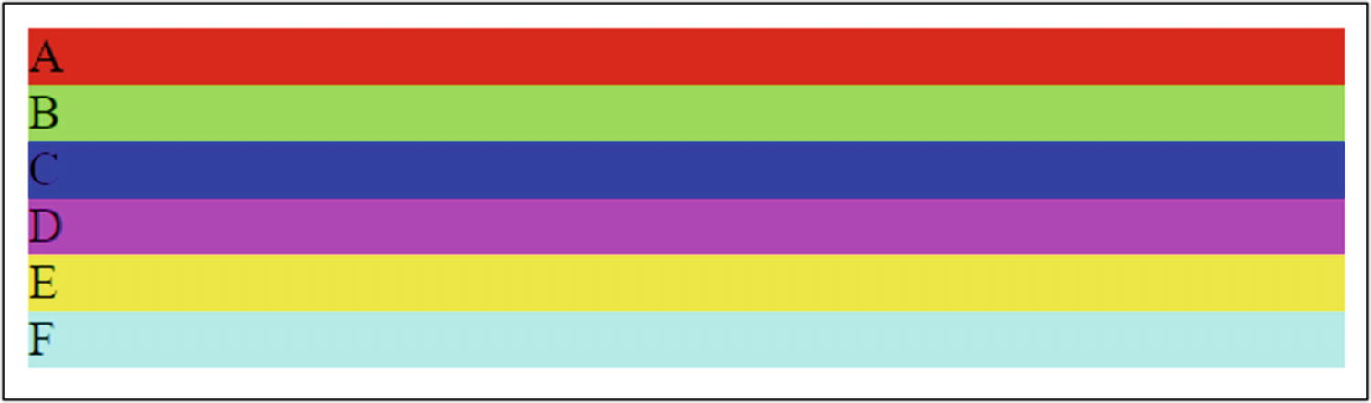
You can’t see the colors on the printed page, but trust me, they’re there!

Our beautiful, beautiful grid!
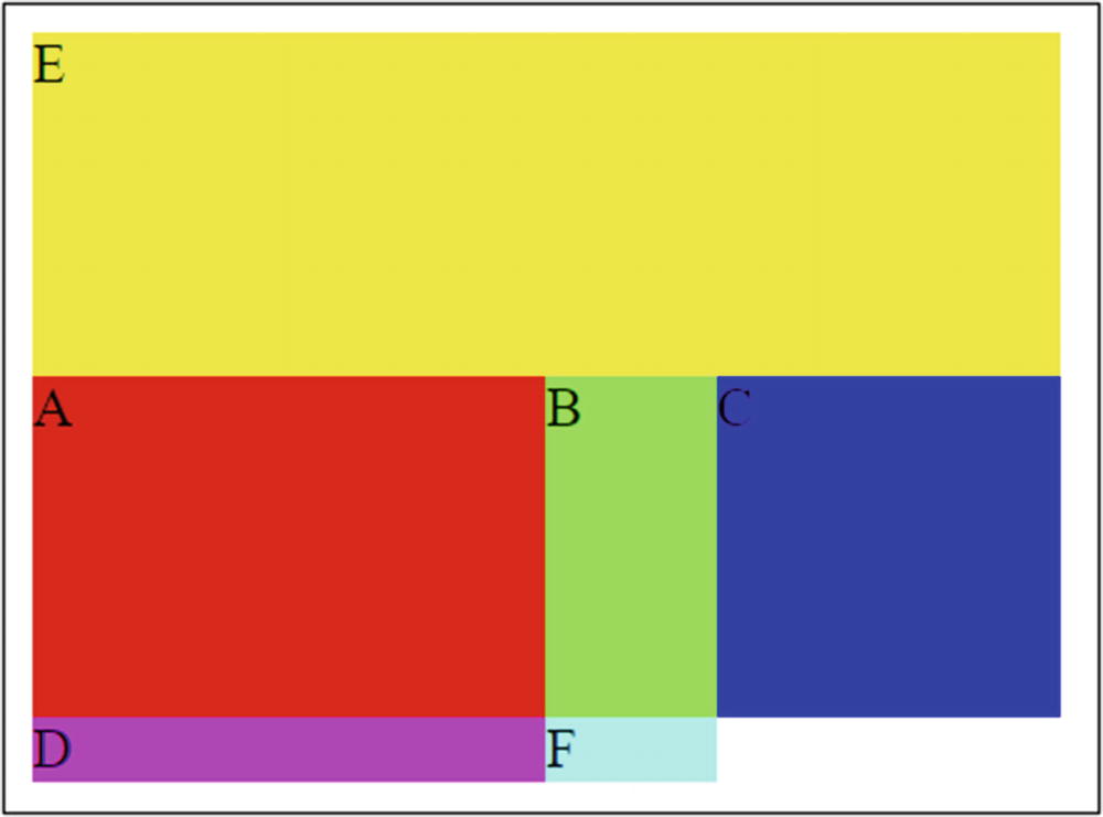
A more interesting grid (well, I think so at least!)
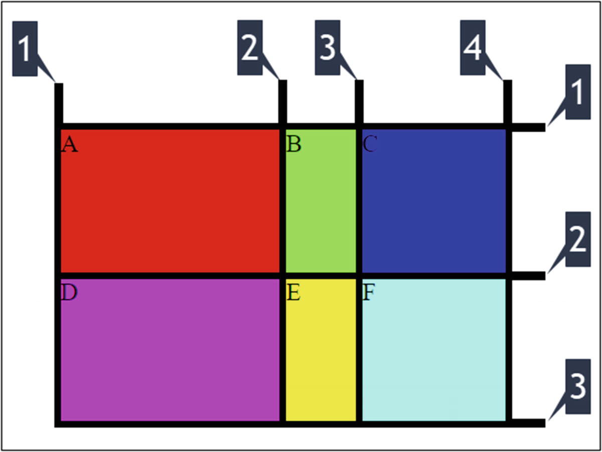
The numbers across the top are the column lines; the ones down the side are the row lines
Also, because <div> E now takes up the entire first row, <div>’s A, B, and C use the second row, which pushes D and F down. Sometimes, it takes a little tweaking to get your grid to work precisely the way you want it to, but when you do, you’ll find that laying out pages is a piece of cake with CSS Grid.
It’s also important to realize that you can nest grid. So say we want to have some grid layout within <div> B, we can absolutely do that, and you do it in exactly the same way: apply the display:grid style to a container <div> (along with the grid-template-columns and grid-template-rows as appropriate) inside <div> B and then define the grid in exactly the same way, but now that grid will be constrained to <div> B. And it’s exactly this nesting that will allow us to lay out the MailBag UI as shown earlier, as you’ll see in action shortly.
Yet Another Quick Detour: main.css
In the source code for this app, you’ll find the main.css file in the src/css directory. This is an ordinary CSS stylesheet, absolutely nothing special about it. Usually, I would go through it here, but I think it will make much more sense to look at the relatively small handful of CSS rules it contains in context as we go through the various components.
So, that’s precisely what I’m going to do! And, given that, we can move on to the code of BaseLayout.tsx.
BaseLayout.tsx
Hopefully, you’re having a “Eureka!” moment right about now. This is where createState() is called, and a reference to the BaseLayout instance itself is passed in so that all the state mutator methods can be bound to it.
That’s just like the example from earlier as far as defining the grid goes, but now you see width and height set using vw and vh units, respectively. The v in those units stands for viewport. So what we’re really saying is “make this container element 100% of the width and height of the viewport.” In other words, our grid fills the screen, which, of course, is what we want for MailBag (in contrast to the earlier CSS Grid examples where that wasn’t the case, the grid used only as much space as was specified in its style definition).
It may seem odd that something like a popup dialog, something that is transient, actually exists at all times and is just hidden and shown, but that’s a common thing with React. Here, the open prop gets its value from the pleaseWaitVisible property in state, which you’ll recall from earlier I said to keep in mind. When the hideShowPleaseWait() state mutator method is called, that property gets changed, and React notices that. So it will re-render the page, now either hiding or showing this dialog based on the changed prop value.
We don’t want this dialog to be dismissible by the user, which it would be by default. So, the disableBackdropClick prop is set to true, which stops the user from clicking outside of the dialog to dismiss. Additionally, disableEscapeKeyDown is also set to true to prevent them from pressing the ESC key to dismiss it. I also set transitionDuration to 0 so that the animation that it normally does by default doesn’t occur, since the call to the server, in some cases, could actually be faster than the transition itself! Indeed, it’s expected that, in most cases, this dialog will appear and disappear so fast that the user will just see a flash. But, for times when the network is a bit slower, it’s nice to have it there.
The actual Dialog has as a child a DialogTitle component, and here I set style so that its text is centered (which I just thought looked better) and a DialogContent child, which itself has a DialogContentText child. This is simply the text displayed in the Dialog itself. As an aside, the Material-UI Dialog component is much more robust and can have buttons you define, or even input elements, virtually anything you can imagine can wind up in a Dialog. It doesn’t need to be simple static text as here, but since that’s all we need, that’s all it is in this case.
Notice the pattern here, which you’ll see throughout this component: state is passed down to the Toolbar component (the definition of which we’ll see in the next section). Every component that is a child to BaseLayout, save for one (WelcomeView), needs state, and they all get it the same way. That’s the other half of what I was talking about earlier in terms of choosing the right component to contain state: just putting the state in a component higher up the component tree doesn’t do much unless you pass that state to child components as needed.
As you can see, we want the toolbar to stretch across the three columns of the grid, just like in the earlier example. I also add some padding to keep the buttons from touching the edges of the screen on the left and top (again, it just looks better to my eyes that way). I also added a border on the bottom to give some separation from the rest of the UI contents (this, too, is a pattern repeated throughout).
That’s not much different from the toolbar style rule either, with the exception of overflow set to auto to ensure that the list can scroll if there are more mailboxes than the vertical space allows for.
Pretty simple, right? Once again, we need this area to scroll, since a message list can be arbitrarily long, so overflow is again set to auto.
Remember that { } denotes an expression in JSX syntax. Also remember that in JavaScript, && is a short-circuit boolean and operation. That means that whatever is on the right of it will only be evaluated if what’s on the left is true. Therefore, here, if the boolean outcome on the left is false, then the component won’t be rendered because it won’t even be evaluated.
So, for the <WelcomeView> component to render, for example, the currentView property in state must equal "welcome". If it doesn’t, then React won’t render that component. For the MessageView component to render, currentView must be "message" or "compose" (the view does double duty for both of those, as you’ll see later). Finally, for ContactView to render, currentView must be "contact" or "contactAdd". In the end, we’ll only ever get one of these components rendered as a result, so only one view will ever be shown, and changing currentView in state will allow us to flip between these views. Pretty nifty, right?
That places this content in the second row of the sub-grid and provides some padding about it to avoid any of its content bunching up on the edges.
And with that, our BaseLayout component is done! Now, let’s look at the individual components that we just saw used – well, right after one last quick detour, that is!
Each of the remaining components has a single export at the end, just like BaseLayout, but I’m going to skip showing you that over and over again.
A Quick Detour: Functional Components
Using functional syntax like this works because JSX is aware of it and can process it. It’s clearly not valid JavaScript because if you tried to have HTML embedded in a function like that, it simply wouldn’t work. But JSX allows you to do just that. A valid component will be created, and the HTML you see there, the component tree it represents to be more precise, will be returned from an automatically created render() method.
Why would you choose the class-based approach over the functional approach? There are two primary reasons, beyond whether you prefer the brevity of the functional code or not: lifecycle event needs and state needs. If you need access to lifecycle events, then you can’t use the functional approach – at least, not without introducing the topics of Hooks, which is something that was added a little later in React, and something I’m not covering in this book because it’s a bit of a more advanced topic and not a necessary component of React coding. The same is true of state: if you need your component to have its own state, then you’ll need to use the class-based approach (but again, Hooks provides a solution here too).
However, note that with state, it’s possible to hoist the state up to a component higher in the component tree and then pass it into the component. So, in a sense, the state limitation is no limitation at all, even before you get into Hooks. You’ll be seeing exactly this approach in MailBag because the state object discussed earlier is used in exactly this fashion.
Toolbar.tsx
At a high level, it’s a simple component: it just has two Button components in it, courtesy of the Material-UI library. The Button component has several options to change how it looks and functions, and here I’ve used its variant=“contained” to make it look like a more traditional button rather than the text-only buttons that are common on Android (it has elevation and fill in this form, to be more precise). I also set the color to primary, which, by default, will give it a blue appearance. The size=“small” prop makes the buttons smaller than usual, to gain a bit more space in the UI. For the NEW MESSAGE button, I also added a margin on the right so that there would be separation between it and the NEW CONTACT button.
Within each Button is an icon, also provided by Material-UI. The library contains numerous icons, and most have their own components, as NewMessageIcon and NewContactIcon do. For each, I also again add margin on the right so that the icon has space between it and the text. And, speaking of text, that’s the second child of each Button, just literally static text.
A button without some sort of click handler code wouldn’t be of much use, so both buttons have such a handler hook up to it through the onClick prop . In the case of the NEW MESSAGE button, there is an anonymous function defined, and from it, state.showComposeMessage() is called. This is necessary because the "new" value needs to be passed to it in order to indicate that the MessageView component, which we’ll look at later, should display in the new message composition mode. When the user clicks a message in the message list, by contrast, the same view is shown, but there will be different fields and buttons, and what is passed to showComposeMessage() determines all that.
As you can see, there are three possibilities. The first, for a value of "new", is when the user wants to compose a brand-new message. In all three cases, the goal is to set currentView in state so that the appropriate view is shown ("compose" in all cases) and to set up any state properties as necessary. For the "new" case, that means clearing out the messageTo, messageSubject, messageBody, and messageFrom fields. The first three will be populated by the user when they enter the values on the compose view (something you’ll see a bit later), and messageFrom is set from what’s in the config object.
Second, when the user clicks the REPLY button when viewing a message, it’s still ultimately the "compose" view we want to go to, but now we pre-fill the messageTo, messageSubject, and messageBody variables in state.
Third, the "contact" case is when the user clicks the Send Email button when viewing a contact. It’s just like the "reply" state except that the messageTo property comes from the contact itself while messageSubject and messageBody are blanked out.
Once again, it’s just a case of setting currentView appropriately and clearing out any state properties that are involved in user input. In this case, the contact won’t have an ID until we save it to the server, so contactID is null, while contactName and contactEmail start off as empty strings, which will be reflected initially in the text fields that the user will enter the values in.
For the remainder of these components, I’m just going to show the content of the function, since that’s all that’s different in them, aside from the obvious of the component’s name and export.
MailboxList.tsx
It all begins with a Material-UI List component. Material-UI has several components for displaying collections of data in various ways, and List is one of them, and perhaps the most used. Within it, you have one or more child components, one per item in your list.
The list of mailboxes is, of course, in the mailboxes array property of the state object, so we use the map() function on that array to process each item. For each element, a Chip component is returned, which is again a component from Material-UI. A Chip is a lot like a Button, and in fact, for how it’s used here, a Button could have been just as good. Typically, Chips are used to represent things like contacts, but there are no real rules for their use. They look a bit different than buttons, which is why I went with it (that, and just to show you a different component!) But, at the end of the day, each Chip has some label text, which is the name of the mailbox, some styling to set its size and ensure spacing between them, and color. The color prop is interesting because we want the currently selected mailbox to be a different color. The state.currentMailbox stores the path of the currently selected mailbox, so we can do some logic to set the color. If the path of the element of the array being processed is the same as currentMailbox , then the secondary color will be used, which is red. Otherwise, the primary color (blue) will be used. As long as currentMailbox changes when a mailbox Chip is clicked, then we’ll get the highlighting of the current mailbox as we want.
And speaking of clicking a Chip, the onClick handler is defined pointing to state.setCurrentMailbox() for that purpose. Again, because we need to pass the path of the clicked mailbox to that method, we need to use an anonymous function to call state.setCurrentMailbox(), the code for which is
If you tried to set onClick={ state.setCurrentMailbox } to avoid the anonymous function, then what would be passed to it would be an Event object. While it might be possible to drill down into that object to get at the path of the mailbox, using the anonymous function approach decouples the code a little bit from React or even the browser event model in general and, in my mind, makes what’s happening clearer.
Sure enough, we can see that currentMailbox is indeed set, which highlights it once React sees that state change and re-renders the appropriate part of the component tree. The currentView is also changed to "welcome" because until the user selects a message, there’s nothing to show in the view area, and any time that situation arises, I defaulted it to the welcome view.
As you’ve seen before, the list of mailboxes is copied first, then a new item pushed into it, an object constructed from the object passed in. Once again, just adding inMessage to the array would be okay, but doing it this way provides more flexibility it we want to alter the object at all. Finally, the updated array is passed to setState(), and React does its thing to update the list of messages.
ContactList.tsx
As with the mailbox list, we have a List component. But, unlike the mailbox list, which just had a series of Chip components as children, here, we’re going to use some components that are more typically used within a List. Here, you have one or more child components of type ListItem. In this case, the items come from the array of contacts in state, so like with mailboxes, map() is used to iterate them. For each, a ListItem is created. Every ListItem must have a unique key, though what the value is isn’t something List defines – it’s up to us. So, in this case, I simply make it the next contact object from the contacts array itself. Then, for each, an onClick handler prop is attached that calls state.showContact(), passing it the unique ID of the contact along with the name and email properties.
As you can see, currentView is set to "contact" and the three values passed in are set in the corresponding state properties. That way, when the contact view is shown, which we’ll be looking at next, the contact’s name and email address are showing.
Backing up a bit, the List component and its child ListItem components don’t define what the look of an individual item in the list is. You are free to do whatever you like. So, I use another Material-UI component, ListItemAvatar, which is used to display an avatar, usually a small image of some sort, for each contact. ListItemAvatar demands an Avatar child that is the image to display. If we had real avatar images for each contact, we could insert it here (hint: that’d make a good suggested exercise!). But, here, I make each contact have the same image, using the Person icon that Material-UI supplies. Finally, I want to put the name of the contact next to the image, so for that, we add a ListItemText component. The primary prop is the text to show (there is also a secondary prop you could use to, perhaps, show the email address below the name).
ContactView.tsx
Strictly speaking, the form isn’t necessary. But remember that render() must always return a single element (and that doesn’t change when using the functional component approach – the code here still winds up in a render() method ), whether it has children or not. While a <div> would work just as well here, I thought <form>, given its children, made sense.
As the name implies, the TextField allows users to enter text. Here, we’re looking for the contact’s name. The margin prop set to dense reduces the space around the field, purely a visual choice in this instance. Similarly, setting variant to outlined results in the field having the border around it, which I felt looked better, rather than being just a single line, which is the default look. The label prop is, of course, the text that tells you what field this is (and which moves above the field from inside it as soon as you start typing, which is a nice Material-ish thing to do). The value comes from state, just like you’d expect, whether it’s an empty string in the case of creating a new contact or the contact’s name when selecting one from the list. The InputProps prop is used to style the underlying HTML <input> element, which is what provides the base functionality that Material-UI then builds upon. The problem here is that when a TextField is disabled, which is done by setting the disabled prop (which here is true when state.currentView is "contact" because that’s what it will be when the user clicked a contact in the list and so is viewing the contact in a non-editable mode), the text is a gray color. That makes it hard to read. So, by explicitly setting the color to black (#000000), that problem is solved, and it remains readable. I also set an explicit width for the field, one large enough to support the maximum characters allowed.
This handler is used on all the editable fields in MailBag, in fact, and you can see where the id prop matters here. If you recall from earlier when discussing the mailbox list, I mentioned that if you don’t use an anonymous function in the event handler and instead reference the state mutator method directly, then you’ll wind up getting an event object passed in. For that situation, that was problematic, but here it’s perfect because the target attribute of the event object is the component triggering the event. That includes the id prop value. So, we can start by checking if this is the contactName field based on the id. If it is, and if the length of the value passed in is greater than 16, which is our maximum name length, then we return immediately. That effectively limits the maximum length of the field. If there’s still room, or this isn’t the contactName field, then the id again comes into play because we use it to set the appropriate state property. If you look back at the state object, you’ll find that the fields associated with editing a contact match the id’s used on the TextFields in this code. This is similarly true for the MessageView later. The result is that we have a generic event handler that can be used for all these TextFields, and that will mutate the correct property on the state object.
We begin, as you’ve seen a few times before, copying the contacts array. Next, the please wait dialog is shown, and then a call to Contacts.Worker.addContact() is made, passing it an object formed from the contactName and contactEmail fields in state, whose values will have been set when the user typed them in the two TextFields from before. When that call comes back, please wait is hidden, the returned contact (which now includes the _id field) is pushed into the contacts array, and finally setState() is called to update the array. I also clear out the properties associated with editing a contact so that the field is clear, in case the user wants to add another contact right away.
These two are only shown when a contact has been clicked from the list, and they provide the user the opportunity to delete the contact or send a new eMail to them. Note that for both, I added some margin on the top to separate them from the eMail field, and for the DELETE button, I also have some on the right so the buttons themselves don’t bunch up. For the DELETE button, the onClick handler can point directly at the deleteContact() method in the state object because that method will already have access to everything it needs to do the delete (namely, the contactID property in state), but for sending an eMail, we need to know the source of the action, as you saw earlier, hence why we need to use the anonymous function approach here.
It’s much the same as what you’ve seen before: show please wait, call server via Contacts.Worker.deleteContact() method , and then remove it from the list. To remove it, we must find it first. The filter() method of the contacts array in state allows us to do that. For each element in the array, the function we provide to filter() is executed and is passed the next element. If the _id property of the element isn’t state.contactID, then true is returned, which filter() takes to mean we want the element included in the new array that it’s constructing. Simply put, all elements in state.contacts will be copied into the new array cl except for the contact being deleted. What that new array built, we can pass it to setState(), which results in React re-rendering the list, sans that contact. As with adding a contact, the contact editing-related properties in state are cleared, and we’re done.
MessageList.tsx
The Table component is another Material-UI component for displaying data like List that you saw earlier, but this one essentially mimics an HTML table. That’s ideal for the message list because it should look like a typical table, or grid as it’s sometimes called. We have a header row, which we want to ensure stays “stuck” at the top even if you user scrolls to see the list, and that’s what the stickyHeader prop set to true does for us. Then we have three columns, one each for Date, From, and Subject. So, inside the Table component goes firstly a TableHead component, which demarks the header. Inside that is a TableRow, since the header row is, in fact, a row like any other despite it being the header. Finally, inside that TableRow goes three TableCell components, one for each column in the table. The first two have specific widths assigned, which will cause the third, the Subject column, so take up the remaining horizontal space.
After the TableHead comes a TableBody , again, just like a plain old HTML table. Inside the TableBody goes a TableRow for each message. We iterate the list of messages found in state.messages with map() like you’ve seen for mailboxes and contacts. For each of the three data elements to display, we drop a TableCell into the TableRow and render the appropriate properties from the message object into it. That’s about all there is to it!
Once the please wait popup is shown, the IMAP.Worker.getMessageBody() method is called, passing it the ID of the message and the path of the current mailbox. The server is called, the body returned, and please wait hidden. Finally, the setState() call is made to change the view and populate all the message details, including the body. The result is that the message is displayed, all pertinent details visible to the user in the view area below the message list.
MessageView.tsx
As with ContactView, we need a single container for fields here, and a <form> again makes sense, though it doesn’t need to be a <form> element.
That serves much the same purpose as the styling on the TextFields you saw earlier to make the text readable when the field is disabled. Note that appending !important was required here to get the color to override the default gray color, not an uncommon thing to have to do with CSS.
Of course, conditional rendering is used to only show these fields with currentView is "message", that is, when viewing an existing message, as opposed to when this view is shown for composing a message.
The From field is again only shown when viewing an existing message, and like the previous two InputBase fields , this one stretches across the entire container thanks to fullWidth being set to true. Of course, this field is never editable, hence disabled set to true with no logic.
The To field is obviously needed, and like From, we stretch it across the entire container to allow the user as much room to enter long addresses as possible. You can see our friendly neighborhood state.fieldChangeHandler() method again being used, which means that the id here must match the state property that should get the value of whatever the user enters here, which it does.
Ah, here we have a few new props! When multiline is set to true, Material-UI will render an HTML <textarea> under the covers. That implies that we can set rows and cols value, and we can, though only rows is used here because fullWidth is set to true. So, what we wind up with is a <textarea> that fills the entire available horizontal space and allows for 12 rows of text to be input (it will, of course, scroll to accommodate more as necessary, as a <textarea> does by default). Other than that, though, this is the same as the other fields.
Again, this code is very much like other methods you’ve seen. We show the please wait dialog; call the appropriate Worker method, passing it the properties from state that will have been populated as the user typed values into the fields, thanks to that fieldChangeHandler() method ; hide please wait; and finally change the view to the welcome view, since it doesn’t make much sense to go somewhere else or even to stay on the compose view at that point.
For all intents and purposes, it’s the same as the NEW MESSAGE button in the toolbar, but the one difference is that showComposeMessage() must be called and passed a different value, so it’s anonymous function time again! And, of course, this button is only shown when state.currentView is "message", not when it’s "compose".
This is very much the same as the deleteContact() method , except that it calls IMAP.Worker.deleteMessage() of course, passing it the message’s ID and the path to the current mailbox, and then filtering the state.messages array to remove it from the list.
We have just one more component left to examine, and here it comes!
WelcomeView.tsx
Yep, that’s literally it! The styling here serves to center the text (well, it’s actually a hair closer to the top than the bottom, which I think looks a little better) and then just a big, red <h1> element.
And that, my friend, is MailBag, all done and ready to serve your email needs!
Suggested Exercises
Did you notice that all emails are treated as plain text, whether they are or not? Wouldn’t it be nice to see HTML messages displayed as they’re intended to? I think so! See if you can pull that off. As a hint, the server will need to be altered to return HTML instead of plain text (should be a one- or two-line change), and then the client will need to display it (you might try just inserting the content into a <div>, or perhaps an <iframe>, but either will require you to make additional changes to MessageView.tsx).
Allow the user to upload pictures for their contacts. There are several approaches, but you might consider using a plain old HTML form with a <file> element, but then you’ll need to consider how to alter the server to accept it. Then, store the image in a temporary location and make the client fetch it to display it. Then figure out how to store it in NeDB when they save it (hint: Base64-encoded is probably a good answer there). Note that this most likely would not be part of the RESTful API of the server, so you’ll need to figure out how to make this coexist with the existing service endpoints.
Summary
In this chapter, we completed the MailBag app, building the client side of it. In the process, you learned about things like conditional rendering with React, the Material-UI component library, a bit about AJAX and the Axios library for doing it, and CSS Grid. The result is a complete application, MailBag, that, while pretty basic, does the job as a webmail client pretty well.
One project down, just one to go! And the next one is going to be something quite a bit different: a game!