
Appendix A: General Composition Tips
Similar to painting, drawing, or just about any visual art medium, photography has general rules of composition. These rules are more aptly called guidelines, but they have been developed throughout history and applied because, quite simply, they work. These aren’t hard and fast rules that must be strictly adhered to — honestly every subject calls for a different approach and common subjects can usually benefit from a unique approach. These simple techniques will transform your pictures from snapshots into photographs. Know the rules of composition, because when you know them you will also know when you should deviate from them.
Keep It Simple
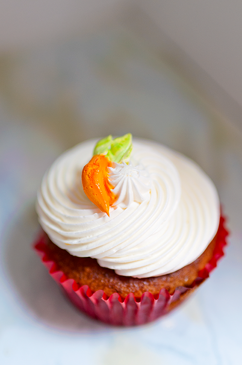
Keeping it simple is just about the easiest way to create an interesting composition. Creating an image using an easily identifiable subject with an uncluttered background makes it easier to command and hold the viewer’s attention. If you have a number of competing elements your composition will be distracting. Viewers who can’t readily see a subject will more often than not move on to another more engaging image.
One technique for achieving simplicity in a photograph is to use a wide aperture to create shallow depth of field isolating the subject from a busy background. With the background out of focus, the subject stands out better.
You can also isolate your subject is by changing perspective. For example, instead of shooting down on a subject and including the ground in the composition, try shooting upward to use a plain blue sky as the background.
Simplicity in an image can speak volumes. Try to concentrate on removing unnecessary elements to achieve photos with greater visual impact.

AA.1 A simple, uncluttered image makes for a strong composition. The subject also fills the frame. Exposure: ISO 100, f/1.4, 1/500 second, using a Sigma 85mm f/1.4.
The Rule of Thirds
Beginning photographers are often inclined to place the subject in the middle of the composition. Although this approach seems to make sense, placing the subject off-center usually makes your images much more interesting — this is where the Rule of Thirds comes in.
The Rule of Thirds is one of the best compositional guides in art, and artists throughout history have used it. It involves dividing the image into nine equal parts using two equally spaced horizontal and vertical lines, kind of like a tic-tac-toe pattern. You want to place the main subject of the image at or near the intersection of one of these lines. The D7100 has an option that you can enable that displays a grid in the viewfinder. Although this grid isn’t quite an exact setup for the Rule of Thirds, it’s close. If you place the subject just inside the gridlines in the four corners of the viewfinder you will be close to the Rule of Thirds. You can activate guidelines in the Custom Setting Menu ( ![]() ) d2.
) d2.
When using the Rule of Thirds with a moving subject, you want to keep most of the frame in front of the subject to create the illusion that the subject has somewhere to go within the frame.
AA.2 Placing a simple subject in with the frame using the Rule of Thirds as a guide makes for a visually more interesting composition. Exposure: ISO 320, f/1.8, 1/320 second, using a Nikon 35mm f/1.8G.
Leading Lines and S-Curves
Using lines that occur naturally in a scene is a great way to lead the eye through the image. Sometimes these lines are very distinct, such as the lines of railroad tracks leading to a vanishing point (the point where parallel lines seem to converge), or the lines can be more subtle, like the gentle S-curve of a meandering country stream. The key is to look for leading lines and incorporate them in your images, either as the main subject or to draw attention and bring the eye to focus on the main subject.
The Odd Rule
One of the more obscure compositional rules is the odd rule. This doesn’t mean the subject should be odd in appearance (although that can add interest to a photograph as well) but the name is derived from the number of elements that are included in the subject, the point being that an odd number of major elements appears more aesthetically pleasing to the eye than an even number of elements (although even numbers can also be used for symmetrical compositions).
The human eye is naturally drawn to the center of a composition when one central subject is surrounded by an even number of supporting elements (leaving you with an odd number). Compositions with an even number of elements tend to cause the brain to divide the composition causing the viewer to see the image in separate pieces instead of as a whole.
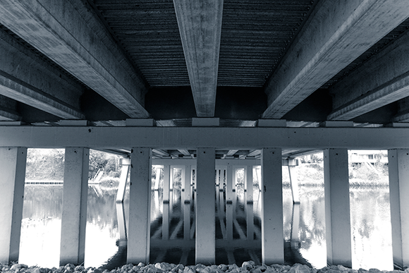
AA.3 Here, I used the strong lines in the underside of this bridge crossing Cane River Lake in Natchitoches, LA to create heavily patterned composition. Exposure: ISO 1000, f/2.8, 1/50 second, using a Nikon 17-55mm f/2.8 at 17mm.
The odd rule works best with three elements in the composition. This provides a pleasing triangular shape or allows two objects to support a third element allowing for a stable appearance. Using more than five elements in the composition generally leads to the photograph appearing cluttered.
Using Color
Complementary colors are colors that are opposite each other on the color wheel. Using these colors in your composition creates a dynamic tension in the image and can help the subject pop from the background. Complementary colors make the other appear brighter and more highly saturated when placed next to each other.
The opposite of using complementary colors is to use analogous colors. These are colors that are similar in hue to each other; this creates a more harmonious aspect to the composition and also helps to create a specific tone, such as warm or cool, which is more difficult to do when using bold complementary colors.

AA.4 This composition follows the odd rule by using a trio of sushi. Exposure: ISO 500, f/5.6, 1/500 second, using a Nikon 17-55mm f/2.8G at 24mm.
Using bright colors makes the image more vibrant and alive while using more muted tones can give the photograph a more somber and subdued feel.
Helpful Hints
There are many compositional tips and guidelines that can help you make your photography more interesting than a standard snapshot. The following list covers a few of the basics:
• Frame the subject. Use elements in the foreground to frame the subject; this keeps the viewer’s eye on the subject.
• Avoid shots in which the subject looks directly out of the side of the frame to which he is closest. If your subject looks out of the photograph, it can distract the viewer. For example, if your subject is on the left side of the composition, positioning him so that he is facing right is better, and vice versa.
• Avoid mergers. A merger occurs when an element from the background appears to be a part of the subject, like the snapshot of granny at the park that looks like she has a tree growing out of the top of her head.
• Try not to cut through the joint of a limb. When composing or cropping your picture, it’s best not to cut at a joint, such as an elbow or knee. Also, if hands are included in a photo, you should keep all fingers in the frame.
• Avoid bright spots or unnecessary details near the edge of the frame. Anything bright or detailed near the edge of the frame draws the viewer’s eye away from the subject and out of the image.
• Fill the frame. Try to make the subject the dominant part of the image. Avoid a lot of empty space around the subject unless it’s essential to make the photograph work.

AA.5 I used the analogous colors of the sky and the ’57 Chevy to make this cool-toned image. Exposure: ISO 100, f/3.5, 1/1000 second, using a Nikon 24mm f/2.8D.