
STEP EIGHT
PROFESSIONAL MATERIALS
RESUME/CV
Your resume (or CV-curriculum vitae) is a crucial part of your ability to market yourself. It should be approached with as much energy and effort as you would any other aspect of your comprehensive portfolio. A resume presents you with a fundamental and critical information design problem, and will require your best typographic and layout skills. It will be judged as a prime example of your design sensibilities and needs to communicate your educational and work experiences as clearly and concisely as possible. It should also, in a limited fashion, relate back to the look and feel established by your portfolio design. Keep in mind, however, that your resume is a unique visual problem. Don't force it to look exactly like your portfolio book or website, but instead reference your brand identity through color and typographic choices. You will need both a print and digital version of your resume.
Unless you have many years of experience in the industry, best practice is to keep your resume to one page (this is especially true for students and recent graduates). The following is a list, in order, of the standard categories of information that should be included in a resume. Some of the categories listed are optional.
- Name and contact information
• Your name should be noticeable on the page and grouped with your contact information. List the best way to contact you first.
- Objective (other terms: mission statement, personal statement). This is optional. Some resumes include a brief statement or bullet points addressing the following:
• The type of position one is seeking.
• One's strategic skills and/or how one could benefit a potential employer.
• A personal statement relevant to the industry or one's career.
• Overall (and typically more generic) career goals or objectives.
It's not necessary to include an objectives category on your resume, and in fact, if it is too generalized, it may not serve you well. Think about whether this type of content could be included in a cover letter and relate more directly to the specific company and job you are applying for.
Nobody is hired because they have kick-ass solutions alone.
PEOPLE WANT TO WORK WITHPEOPLE THEY LIKE.
You are the most important factor.
SEAN ADAMS
Partner, ADAMSMORIOKA
- Education. Include:
• Name of degree received and date of graduation.
• Educational institution and its location.
• You can additionally include any honors that you may have graduated with. For those of you who have not yet graduated, include your expected date of graduation. Note that it is the “expected date.” If you have more than one degree, it is standard practice to list them in reverse chronological order.
- Experience. List your experience in reverse chronological order (start with the most recent). Include:
• Company or client name
• Job location (sometimes listed), with city and state
• Position
• Brief description of duties
• Dates of employment
It's common practice to limit the jobs listed on your resume to those applicable to the industry and position that you are applying for. However, an exception could be made for a student with little to no industry experience who has worked a part-time or summer job over a number of years. In which case, try to include work experiences that demonstrate leadership skills and a positive work ethic. Additionally, it's completely acceptable for students and recent graduates to include internship and nonprofit work experiences, especially those related to the industry.
- Awards (other terms: accolades, acknowledgments). This is optional. If you have been recognized by the industry make sure to mention it. This includes:
• Group or solo shows
• Features about you or your work in a print or online publication
- Software skills and capabilities. This is optional. It's typically a good idea, especially for students and recent graduates, to list software and technical capabilities—print, web development, etc. Most entry-level positions require a significant amount of production work. Most employers will want to know that recent graduates can work with the software and processes the company uses right from the get go.
- Organizations. This is optional. Most potential employers or clients will like to see that you are involved in art, design, or photographic industry organizations. It shows you are engaged, informed, and passionate about your industry. However, don't just list clubs, sports teams, or other organizations that are not relevant to your profession.
- References. It's not necessary to list references on your resume, but it may be a good idea (again, especially for recent graduates). Include name, title, company, and contact information (email and phone number) for each person (usually three minimum). If you don't include references on your resume, you should at least include the line: References available upon request. Make sure your references know they are your references before they get a call from someone! Ask them ahead of time and give them a heads up if you have recently applied for a position. Additionally, they should be someone who can speak to your character and abilities related to the position you are applying for.
TYPE
The type treatment for your resume should be clean, clear, and functional—without decorative flair or embellishment. Be careful that you don't overdesign the page. Don't get hung up on logos, decorative typefaces, or decorative shapes and symbols. It's best to avoid a mix and match of too many different typefaces. One practical strategy is to utilize a typographic family with a variety of weights and proportions. This will allow you to maintain visual consistency while still offering variability. Another common practice is to use a sans-serif typeface for titles and a serif typeface for the rest of the copy (serif typefaces are usually easier to read for text blocks). If applicable, use the same or similar typographic system as you used in your interior book design.
A well-designed resume utilizes a strong typographic hierarchy. To do so, you will need to create multiple groupings and levels of information. Not only does a resume include different categories of information (such as education, experience, awards, etc.), but there are also different types of information that belong in each category. The experience category alone includes several subcategories—company name and location, employment dates, job title, and job description—all belonging together, but each also representing a discrete kind of information. Some of this information belongs together on the same line, some on a different line, and some should be more visually prioritized over others. In addition, usually name and contact information stand apart from the other categories of information, either because an aspect of the grouping is more visually prominent (e.g., the name is larger than the rest of the text) and/or because of its placement on the page.
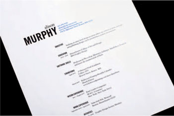
ALISON MURPHY, STUDENT PROFESSIONAL MATERIALS, Massachusetts College of Art.
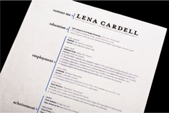
LENA CARDELL, STUDENT PROFESSIONAL MATERIALS, Tyler School of Art.
You can emphasize and prioritize text through multiple techniques:
1. The amount of white or negative space surrounding the type—elements that are isolated on a page typically call more attention to themselves.
2. The simple order in which you compose the information—that is, the reading direction.
3. The use of typographic styles—there are a number of commonly used typographic styles that can be used to emphasize text (bold, italic, accent color, all caps, underline, and size). If you previously developed a color palette as part of your brand identity, the accent color can and should be used effectively to prioritize main categories of information.
4. Visual differentiation—a different typeface or shift in line orientation.
Use these techniques sparingly and strategically to structure information in the document—don't overdue it. Keep in mind that a simple typographic system usually proves to be the most effective. One or two typographic styles and/or compositional techniques should be applied as needed, and consistently in order to prioritize, group, and categorize information.
It's also possible to add variety to the organization and layout of your resume by utilizing vertical type for information like titles, subtitles, or dates. Since this makes the text a bit more difficult to read, use this technique sparingly and limit it to short lines of type. In addition, make sure the reading direction of vertical type starts in the lower left corner and faces up and out.
Keep the type size legible, but not too big (or too small); 9–12 point is usually a pretty safe bet. Make sure that you make adjustments to kerning, leading, and the typographic rag.
Bars, Rules, and Simple Graphical Elements
Bars, rules, or even simple graphical elements like brackets can be used to further emphasize the grouping and separating of information. Basic shapes, such as lines, circles, arrows, or rectangles, can be used at the starting point of a category or line of text in order to call attention to it. These elements can also be used as simple bullet points, however, make sure they are small enough so that they do not become distracting. Flow lines (lines that adhere to the grid itself, indicating its underlying structure) can also be quite helpful in activating or emphasizing subdivisions of space and separating content.
The standard orientation for a resume is vertical, however, horizontal layouts are becoming more popular (especially among designers). In general, it's recommended that you keep your paper to the standard size—8½ × 11 inches in the United States and 210 × 297mm in Europe.
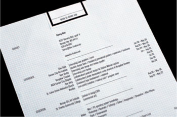
KENNY KIM, STUDENT PROFESSIONAL MATERIALS,
Kansas City Art Institute.
Paper Stock
Material and paper selections are important parts of the print design and photographic process. Make sure you consider their importance when it comes to your resume. Your paper selection will communicate your attention to detail and concern for the total design. Don't just use a standard inkjet paper from an office supply store. Instead, check out a number of paper mills and compare paper selection, quality, and price. Almost all paper companies have samples that they are happy to share. You should avoid “fancy” papers with special linen or parchment finishes and tinted colors. Most will appear unsophisticated and look like they came from a craft store. If you're unsure of a direction, you can always play it safe with a paper that has a whitish or light cream hue, a plain smooth finish, and a slightly heavier weight.
See the following web links for more information:
http://www.howdesign.com/papermillindex/
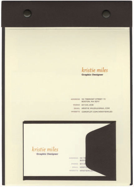
KRISTIE MILES, STUDENT PORTFOLIO, Massachusetts College of Art.
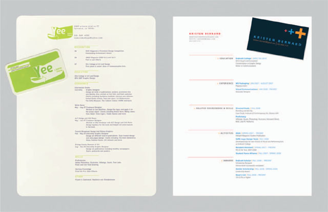
(LEFT) JEANIE CHONG, STUDENT PROFESSIONAL MATERIALS, Otis College of Art and Design.
(RIGHT) KRISTEN BERNARD, STUDENT PROFESSIONAL MATERIALS, Endicott College.
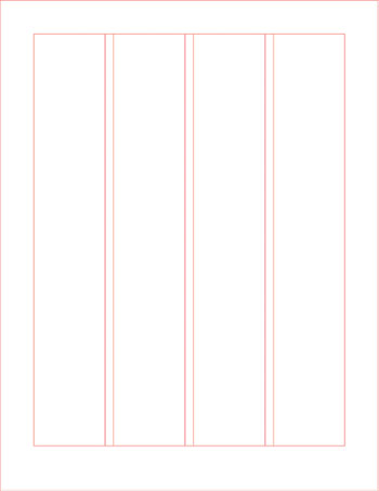
When designing your resume you should construct a clean, clear, well-organized layout. Utilize a simple grid system to help you do the following:
- Subdivide the page into equal or proportional columns (and rows if need be). Equal or proportionate units of positive and negative space create a visual rhythm throughout a composition. This pattern can help establish visual balance, harmony, and unity among groups of content and the negative space between and around them.
- Include a healthy margin of white space along the outside of the page.
- Organize and group information by utilizing:
• Alignment—especially along the vertical axes of the grid. Zoom in to make sure that lines of type really are aligned to the same axis. You can utilize both left and right alignment. For multiple lines of text, be sure to pay attention to the typographic rag.
• Proximity—the closer things are to each other the more they are perceived to connect and relate. When separating individual lines of text and groups of content, be sure to use an equal or proportionate increment of space to measure.
COVERLETTERS
It goes without saying that the cover letter should be coordinated with your resume and even the leave-behinds. The paper, typeface, and design aesthetic should all tie together.
A cover letter should be direct and to the point, providing some context or rationale for your contact with the intended audience (e.g., your experience and interest in the available position). State:
- The reason for your writing.
- Who you are and where you are coming from—student, graduate, current employment.
- Your interest in the position/opportunity.
- Your (briefly) qualifications for this particular position.
- What you have attached/enclosed as support materials.
- Your desire to set up an interview/meeting.
- In some cases, how you will follow up (e.g., a phone call, more materials) and whatever might be relevant to the particular process.
Do not:
- Reprise every aspect of your resume.
- Provide a lengthy rationale of why you are the perfect person for the position. This will happen when they interview you.
- Make it any longer than one page—two to three paragraphs should suffice to get your point across.
- Forget to have someone else read it before you send it out.
Think about coordinating the visual look of:
- Business cards
- Envelope
- Thank-you notes
Love this.
Once, we salty and cynical ad people wanted nothing more than to do this for a living. You remind us of ourselves. If we see you love making this stuff, being creative, and never quitting on the pursuit of good ideas, we're more likely to go to the mat for you.
CHRIS WOOSTER
Group Creative Director, T3
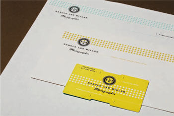
HAROLD LEE MILLER, PROFESSIONAL MATERIALS, Indianapolis, IN. Designer: Funnel: The Fine Commercial Art Practice of Eric Kass.
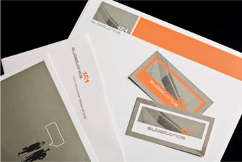
SUBSTANCE 151, PROFESSIONAL MATERIALS, Baltimore, MD.
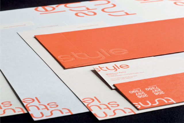
TURNSTYLE STUDIO, PROFESSIONAL MATERIALS, Seattle, WA.
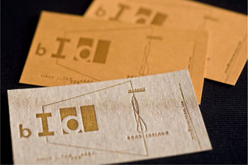
BRAD IRELAND, Washington, DC.
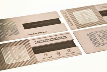
CAPSULE, Minneapolis, MN.
Some tips for business cards:
- Use the standard U.S. business card size (fits in holder) of 3½ × 2 inches.
- Design it in the same brand style as the rest of your comprehensive portfolio package.
- Make it easy to read—consider type size and contrast. Provide a margin around information.
- Make your name the top level of information on your card.
- Additionally, include email, phone number, and the URL to your portfolio website. Make sure your email address is a professional one.
- Keep the design simple (much like your resume). Use typeface and color effectively so the design is clean, clear, and stands out!
- Think about the ink, finish, card stock, and/or material of the card.
- For fast, inexpensive business cards, check out online companies like Moo Cards or http://www.psprint.com.
- A business card must be functional first and foremost—keep that in mind if you are pushing the envelope in terms of form, size, or materials.
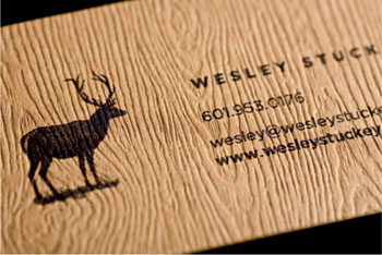
WESLEY STUCKEY, Mississippi State University.
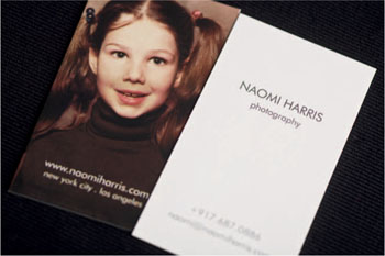
NAOMI HARRIS, New York, NY.
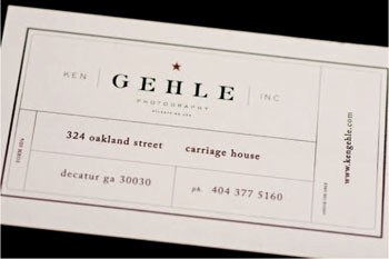
KEN GEHLE, Decator, GA.
THEORETICAL UNIVERSE, Boston, MA.
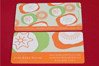
JUDY REED-SILVER, Calabasas, CA.
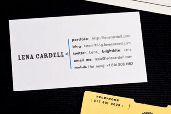
LENA CARDELL, Tyler School of Art.
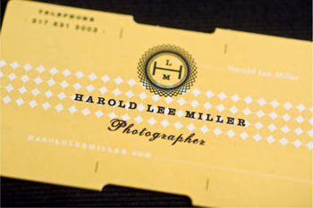
HAROLD LEE MILLER, Indianapolis, IN.
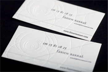
FABIEN BARRAL, Auvergne, France.
Interviewing
A portfolio is a requirement even to be considered for a position. After that, it's really all about the interview.
– JEREMIE DUNNING, Senior Web Designer, Burton Creative Services, Burlington, VT
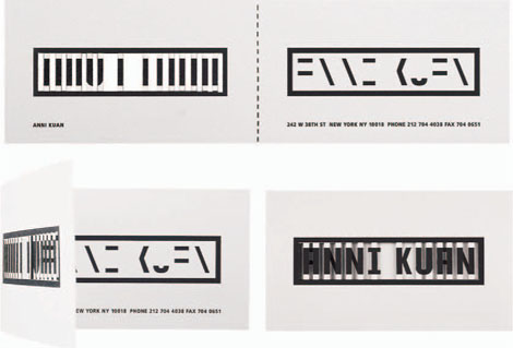
ANNI KUAN, BUSINESS CARD, Concept: Stefan Sagmeister; Designer: Stefan Sagmeister and Hjalti Karlsson.
Hopefully, after you've done all this work on your portfolio, you'll land that big interview. Sitting down with someone in person is a golden opportunity to engage someone in a discussion about who you are and what you can do, to essentially prove you are the right fit for the job both professionally and personally. The importance of making a great impression during your interview cannot be underestimated.
Consider that someone has already seen your work and liked it well enough to want to know more. So, bring your book to the interview, but be prepared to discuss more than just the work you've previously done. An interview is just as much about who you are and what you have to offer in the future as it is about what you've done in the past. During the interview, you'll be evaluated on what someone thinks it would be like to work with you—your personality, your enthusiasm for the industry, your passion for your work, your interest in the company your interviewing with, your knowledge about industry practice, your work ethic and attitude, and much more.
If you are a student, don't be afraid to present yourself as just that. An entry-level position or internship is a learning opportunity; you aren't supposed to know everything. Be confident and show them the energy, drive, and problem-solving skills you have, but don't try to show them something that you aren't. You are better off showing how hard you are willing to work and how capable you are of learning and developing as a creative.
Don't talk about work that you don't have available to show the interviewers. The last thing you want to do is get your interviewers interested in something that they can't see.
Do bring additional work to show. However, don't necessarily show it, as you can overwhelm the interview with too much work. Be prepared to show it if the interviewers ask about something in particular, want to see more work, or if you have a specific point you want to make and need an example.
Be prepared to talk about a work experience or project that you have worked on. Sometimes the best example is a job that didn't work out. What did you take away from that experience? What did you learn? This demonstrates self-awareness and humility.
Some interviewing tips are:
- Take some time to find out about the company or client you are interviewing with. Their website is a good place to start. You need to be able to answer the question “Well, tell me, why do you want to work here?” with specific knowledge about what makes this company or client unique and appealing to you. Find out what they are proud about and get excited about it too. Ask a couple of informed, intelligent questions about the position or company.
- Consider every interview as an opportunity to practice your interviewing skills. Don't be arrogant or pushy during the interview, but try not to lack confidence either. Remember that looking someone in the eyes and smiling can actually go a long way.
- Be prepared to discuss your work—the objective, your process, your solution. Be brief.
- If possible tailor your portfolio to the company or client you're interviewing with. Know what they are looking for and provide it.
- Take a moment to think before you respond to a question. If you don't understand the question, ask for clarification.
- Be polite and professional.
- Dress appropriately. Depending on the place, that may not mean wearing a suit. However, when in doubt, err on the side of dressing more formally than casually.
- It goes without saying: Be on time!
- Bring a few printed copies of your resume.
- Refrain from asking about salary or compensation on the first interview. That's something best reserved for a second interview. When you get to that point, know how much you're worth:
Photography: Contracts and Pricing
Photographers work as independent contractors 95 percent of the time, and as such your contact with potential clients will ultimately result in a bid or proposal for a specific job. The nature of pricing, bidding, and contracts is such that we could devote a whole book to this subject.
Image use and licensing constitute a big part of the bidding and fee structure for a photographer. The compensation for photographing and licensing of images has changed dramatically in the web era. This is in part to the proliferation of inexpensive stock photography, royalty-free compilations, and expanded uses for images. Businesses in turn are aware that the more uses they can get out of an image without incurring additional fees, the better. You should familiarize yourself with the fees for the particular market you are working in. If you are new to the industry, there are numerous resources for establishing rates and license terms. You can also talk with other professionals to get advice on bidding and fees.
Note: Work for hire. Work for hire is essentially handing over what you have produced to the client with no licensing and use terms. Even if you retain the copyright to the photographs, you have essentially given over everything to the client. This is never in your best interest and shouldn't be accepted.
When you talk to a potential client, you do not have to provide an estimate on the spot, and this is generally not the best practice. It is better to do your research than speak prematurely. Further, there is a judgment to be made on how you bid your job. If you are new and trying to break into the industry you might feel you need to underbid to get the work and build some client relationships and even portfolio material. This is generally not the best practice. Underselling yourself is a fast way to getting paid less further down the road. Your best gauge is the client. You may be making a photograph in the same manner, with the same use as an editorial publication. Your client may be a small business or nonprofit, with a smaller audience and ultimately much less budget. This may impact the scale of your license and fee, and again you have to make judgments about how to go about this.
Note: All work should be licensed.
With the exception of family portraits and other kinds of work for private individuals, all of your photographs made on commission should have licensing terms. Even pro bono work should reinforce the understanding to the client that you own the photographs and that the work has terms for its uses. You should define those terms in your contract and invoices.
Pro Bono Work
Should you work for free? You may find that you are approached by a nonprofit agency or a small business that can't afford to pay for the services of a designer or photographer. This is an opportunity to build your portfolio and extend yourself into the world with your work. While your goal is paying jobs, or a salaried position, occasionally doing a job for free can be very beneficial to you as well as the client. There are many professionals who do pro bono work as a regular part of their professional practice because they believe in offering services to support certain nonprofits. They often find that it has been work that they enjoyed and benefited from as well.
Pro bono work can offer you more creative freedom than you might have in a typical project, and for this reason alone it is worth taking on, particularly if you are starting out in the industry. It may lead to a paying job since the work you produce extends your visibility. It can be a portfolio builder and can help you gain some experience. There are no guarantees, but these are worth pursuing. The clients generally cover material costs.
Pricing, Licensing, and Salary Resources
Design
AIGA: http://www.aiga.org/content.cfm/salary-survey
How Magazine: http://www.howdesign.com/article/08SalaryReport/
Graphic Artists Guild Handbook: Pricing and Ethical Guidelines
Photography
The ASMP and resources like PDN can be invaluable in providing a basis for contracts and fees. Many individual photographers have also posted pricing guidelines in an effort to support industry standards:
Seth Resnick and D-65: http://www.d-65.com/photographers.html
Editorial Photographers: http://www.editorialphoto.com/resources/ (extremely helpful regarding contracts and license)
Software: Fotobiz and Fotoquote are quote-generation software
ASMP Licensing Guide: http://www.asmp.org/tutorials/licensing-guide.html
Salary surveys are also a great way to find out what (and where) positions are in demand in the marketplace.
Q&A: Interview with Chris Wooster, Group Creative Director, T3, Austin, TX (continued)
Do you have any advice for students or recent grads?
Junior people rarely have many questions in interviews, which is a mistake. I know you're anxious and a bit nervous, but consider as one of your questions: “Is there anything you recommend I take out of my portfolio?” Be prepared for some jerk to say “everything,” but you'll mostly get some constructive advice from a real creative director, which early in your career is a rare opportunity.
Have a one-sentence pitch for every piece of work, summarizing the target audience, the ad's creative direction (what problem are you trying to solve with this ad), and why you thought it belongs in your book. If you don't have any of this, make it up. But have it. Without it, you've obviously just created something because you thought it was cool, and that's not how the industry works. We make cool stuff, but with a purpose and a mission behind it. Tell me that. If you don't, I'll probably just reconstruct the brief in my head backward from the work, and I may come to the conclusion you didn't solve the brief. You don't want that.
Credit your co-creators. This is a small industry, and word gets around if you're claiming full credit for work a group did. I always applaud people who clearly list their role in the creation of work. You don't need to name names; you can simply list your roles this like: Roles: concept, support copywriting; or Roles: execution, production support (if you weren't in on the concept).
Consider having different flavors of your portfolio. Especially for art directors, sometimes you're going for more “design-intensive” jobs, sometimes more “traditional/tactical” jobs, and sometimes more “conceptual” jobs. Having different collections of work ready helps you better answer the needs, and avoid showing irrelevant work. This is one way to help “cull” the number of pieces, especially with online portfolios.
Perfect your thank-you email/card. Thank me for a piece of relevant advice. Mention how you'll be thinking about something I said that resonated with you. Don't tell me how perfect a fit you think you'd be—you're biased and I already have my own opinion. But do take the time to make it personal without getting chummy.
Be human. If you're not ferociously curious about the world (and not just advertising), you're not a very interesting human being. Don't interview like a robot. Have questions, observations, opinions. Read things, stay up on current events and culture. More than anything, don't be dull. I promise to give you a chance to make an impression. Make the most of it by being interesting or engaging. Unless you're just batshit crazy, in which case you need to back it down a bit. Heh.
Love this. Once, we salty and cynical ad people wanted nothing more than to do this for a living. You remind us of ourselves. If we see you love making this stuff, being creative, and never quitting on the pursuit of good ideas, we're more likely to go to the mat for you. If you don't really, really love the process of making ads, or improving your book, you're probably chasing the wrong line of work. Even all these years later, I'm still that 13-year-old kid who loved TV ads and wanted to make them for a living. You're next; show me you've got the same nerdy love for this.
Q & A: Interview with Sean Adams, Partner, AdamsMorioka, Beverly Hills, CA
Sean Adams has been recognized by every major competition and publication, including Step, Communication Arts, Graphis AIGA, Type Directors Club, British Art Director's Club, and New York Art Director's Club. A solo exhibition on AdamsMorioka (Beverly Hills, CA) was held at The San Francisco Museum of Modern Art. Adams has been cited as one of the 40 most important people shaping design internationally in the ID40. Sean is the national president of AIGA, past AIGA national board member, and past president of AIGA Los Angeles. He is a Fellow of the Aspen Design Conference, and AIGA Fellow. He teaches at Art Center College of Design.
How important do you feel an online and print portfolio is in securing a creative position in your industry?
The portfolio is the point of entry. It is like wheels on a car; I expect them to work and be great quality, but I don't buy a car because of them. The baseline of a portfolio must present excellence in craft and concept. After that is proven, 80 percent of the decision to hire a designer is based on personality and presentation.
Do you have any advice for a student currently working on his or her portfolio and/or other promotional materials?
The portfolio is only a prop. It must be flawless, well made, and cared for. Time is short and precious. The interviewer does not care about every typeface choice, or how your first dog inspired a project. Give one simple explanation for each piece—what the assignment was, and what the best part of the solution is. Keep the explanations to a couple of sentences. If the interviewer wants more information, they'll ask. Nobody needs to go through every piece in detail. I can look at the work in a couple of minutes and understand if someone knows typography, or doesn't.
Most importantly, there are thousands of designers out there with beautiful, well-made work and wonderful portfolios. Nobody is hired because they have kick-ass solutions alone. People want to work with people they like. You are the most important factor. Learn about the company you're visiting. Compliment a recent piece or mention an article on the firm. Flattery always works. I once interviewed a young designer with incredible work, who started the interview with, “You know, you're work's not that bad. I thought you were just ripping off the old guys.” Not good.
Job Listings and Professional Resources
http://www.creativehotlist.com/
http://www.aiga.org/content.cfm/careers
http://www.howdesign.com/career/
http://www.behance.net/Job_List
Check out local chapters of professional organizations and clubs.
Contact local job placement agencies.