
STEP SIX
DIGITAL &
ONLINE
PORTFOLIOS
INTRODUCTION
Note: This chapter discusses the issues surrounding the strategy, branding, and design of an online portfolio. It does not go into depth about how to build and develop one. While web development issues will be touched on, it is a thing unto itself, and there are a number of excellent books and online resources devoted to this subject. Many of these are referenced through the online companion to this book, available at www.noplasticsleeves.com. Much of the content written in this chapter is targeted toward someone who has at least some experience designing and developing a website. However, for someone with little experience, this chapter can be a great place to start.
Tip: It's a great idea to include the URL to your online portfolio on your printed promotional materials – this allows someone a fast and easy way to find out more if they are interested.
Your digital and/or online portfolio is a very important part of your comprehensive portfolio package. Some may argue that it is even more critical than a portfolio book, as chances are a lot more people will see it. The fact is that for most artists, designers, and photographers, both a print and digital portfolio are essential. Both serve an important function as part of a comprehensive portfolio package. Along with your resume, your digital portfolio will probably be your best means of getting your foot in the door with a potential employer or client. When you show up for your interview, think how impressive it will be when you arrive with your own portfolio book. And one that looks and feels the same as your website—identifying you and reinforcing your message. It's guaranteed to be impressive if all the components of your portfolio are designed with the same conceptual and visual brand in mind. In the design and advertising industries, messages are consistently and cohesively conveyed through both print and digital contexts—tailoring the message for each medium's strengths.
The creation of one's online portfolio is an important task that affects pretty much anyone in the creative industries. It is also a process that relies heavily on a unique balance and integration of both visual form and technology. The web itself has a number of unique inherent characteristics—all of which need to be carefully considered in order to design a portfolio that works effectively for the online experience. Whether an artist, illustrator, designer or photographer there are a number of core approaches and strategies that should be understood when approaching an online portfolio. There are also a number of current trends and web 2.0 standards that should be considered.
Digital portfolios have their benefits:
1. You can make unlimited copies at virtually no cost.
2. They are easily accessible through email or the Internet.
3. They are easily updatable.
4. They show that you are capable of working with web and interactive media.
A digital portfolio, in the most basic sense, can take the form of a digital document, such as a portable document format (PDF). To move beyond the basics (which is recommended), you should consider an online portfolio website.
You've probably noticed that almost everyone has a website these days. With so many online portfolios out there, it's tough to get noticed. Your online portfolio has an important job to do:
1. To establish or extend a memorable brand voice and concept through an online presence.
2. To function effortlessly and present project work in a clear and effective manner.
3. To provide access to important information, such as portfolio work, contact, and resume.
4. To utilize interactive and multimedia elements that don't detract from, but instead support and enhance the online experience.
Skill Level
As you consider your digital portfolio, an important first step is to assess the level of your web technical and design abilities. Not everyone is capable of designing and developing a website, and doing so requires a certain amount of skill and knowledge. In fact, it will not serve you well to just throw together a website that doesn't look or function well—sometimes you have to know and appreciate your limitations. However, anyone at any level can develop a successful digital version of their portfolio and create at least some type of effective presence online. On the flip side, if you are currently or intent in the future to work in the interactive industry (which is required of more and more designers and photographers these days), it's important that you spend the time and energy necessary on your online presence to ensure that it represents you just as well as your book.
TIPS FOR THE INEXPERIENCED
For those with little to no experience creating web and interactive content, the idea can seem quite daunting. The good news is that there are a number of really great options out there that can get you online in no time. You should at the very least create a digital version of your portfolio book—one that you can post online or email. A PDF version is recommended. If you composed the layout for your book in InDesign, just export the document as a web-ready PDF.
Here are some options for the novice:
Premade web templates available for purchase:
- Populate with your own content.
- Limited ability to customize, but can still include imagery related to your visual identity (perhaps as opening image).
- Pros: Able to customize many features of the “look and feel”; functions as a real website with navigation and subsections.
- Cons: Costs money; need to have some limited understanding of the web, as a “canned” solution may limit your ability to express your own unique concept and vision.
- Resources: Check out the resources page at www.noplasticsleeves.com for current recommendations.
Create a blog:
- Pros: Fairly easy to setup, populate with content and update. Provides an “out-of-the-box” solution with a content management system. There are a number of “themes” available for free and purchase that focus more on typography, grids and a magazine style look.
- Cons: Design layout, formatting and interactivity is limited unless you have some coding knowledge – especially with CSS. Format is best suited for textual and image based content that is updated on a regular basis. (May not be an appropriate venue for your work.)
- Resources: http://wordpress.org/.
PDF:
- Digital version of portfolio book made web ready as a multipage electronic document.
- Pros: Everyone should make one of these. It's very easy to export a PDF from InDesign, or composite Illustrator/Photoshop files or images together in Adobe Acrobat. Easy to email or post online and even has some interactive navigational options if you want to take it to that level in Adobe Acrobat. Be careful of file size; reduce file size in order to send through email.
- Cons: Can't include multimedia or more sophisticated levels of interactivity; still functions more like a book than a website.
Image/video sequence:
- Pros: Good option for photographers and video/film projects. No need to build a website or deal with navigation and multiple pages.
- Cons: Will need to know how to use a program like iMovie, Final Cut, Premiere, Flash, etc. Be careful of file size; work with codecs to compress files.
Flickr account:
- Pros: Free—allows you to post your portfolio images online so anyone can view them. Very easy to use.
- Cons: Little control over the look or functionality—not customizable. Should be a last resort, as not considered professional.
Online portfolio directory (additional information at end of this chapter):
- Pros: Nominal fee if you become a member. Can easily post and share work. Clients and employers will search the website and may happen upon your work; searchable by geographic location and expertise.
- Cons: No control over formatting or functionality; not an individual URL—grouped along with others in your industry.
Software export:
- Use Adobe Photoshop, Adobe Bridge, Adobe Lightroom, or another piece of software to create a web portfolio (typically an SWF file). Additional software like SiteGrinder lets you design web pages in Illustrator or Photoshop, then it generates web pages for you, code and all.
- Keep it simple. Use software like Adobe Dreamweaver or Adobe Flash to create a few basic templates that can be used multiple times. Use simple interactive features that support and enhance showcasing your work.
- Keep the focus on your portfolio work. On portfolio pages limit the physical size of navigation, other graphical elements, and text.
- Do some research and look at lots of portfolio websites in order to figure out what the possibilities are.
- If you need help get it. Work with someone who can help you develop your website and/or check out the resources available to you. Online resources like http://www.computerarts.co.uk/ and http://www.lynda.com are highly recommended.
Tips for the Experienced
- Make this your quintessential piece, especially if you don't have a lot of impressive interactive work in your portfolio already.
- Show off your abilities, both technically and conceptually, as they make sense to enhance the purpose of the website. Consider how you can enhance the online experience, not detract from it with gratuitous bells and whistles.
- Use the most current technologies, applications, coding languages, etc. Make sure you build to web standards, test, and debug!
Defining Your Goals
In the professional world, project goals are usually defined in something akin to a creative brief. A creative brief literally “briefs” someone as to what a project is all about. It generally outlines the goals and objectives of a project. Typically, it starts by defining what the problem is, including a brief overview of who, what, where, when, and why. Briefs (especially client ones) will also include project scope, deliverables, timeline, and budget. It's probably a good idea for you to define all of these aspects too, even though your portfolio is for you and not someone else. Start with bullet points of key objectives and goals. This should help you focus in on the crux of the design problem in a clear and concise manner.
Your design should provide accessibility to your portfolio work, while at the same time supporting and enhancing your brand statement and portfolio concept. Make sure to create visual continuity with your portfolio book—all aspects of your portfolio should function together as one. You will need to be strategic and plan accordingly. The design of your website—the look and feel from the color palette to the visual look of the navigation—should all serve your communication goals.
It should be noted that most online projects also include a technical brief, which outlines the technical scope and requirements for a web project. While you don't need something as robust as a technical document, you will need to eventually define the kinds of technologies that you intend to design and develop online content for.
Target Audience
Consider the following:
- Who are you trying to reach with your message?
- What do you want them to know about you?
Clarity of message is important. Consider the top three things you want someone to think about you upon viewing your website for the first time. Consider your homepage: What images, navigation, and copy would you include in introducing yourself? How will you stand out and remain memorable? Keep in mind that a potential employer or client will sum you up very quickly. Such people are adept at looking at portfolios—give them a reason to spend the time to get to know what you have to offer. Remember why someone is at your website—to view your portfolio of work. Make sure doing so effectively is your first priority. Second, you should consider your brand statement and continue to establish a consistent visual link to your other portfolio materials, projecting a clear and concise visual statement about yourself. Also, don't forget to provide information about how to contact you and learn more!
Some great online portfolio collections are available at:
http://www.websitedesignawards.com/
Some great resources are:
http://www.computerarts.co.uk/
http://www.tutorialmagazine.com/
Usability
Consider how your portfolio website will be used. What kinds of functionality (means for someone to navigate and experience the website) will be included? Focus on your goals and the website's “ease of use.” Navigation should allow someone quick, easy access to what you have to offer—clearly labeled and consistently applied throughout the website. Any interactivity, audio, or motion should be used to enhance and support the experience, not detract from your main goals. Don't overdesign the experience and make it difficult for someone to find what he or she is looking for. There is a tendency with interactive work to do something just because you can—to use technology for technology's sake. Communicate only what is key—don't detract from that purpose.
The study of usability is also concerned with user testing. It's recommended that you ask several people to try out your website before you launch it. Watch carefully as they try to navigate around. Are they having difficulty knowing where to go and/or how to get there? Test your website out on different operating systems and the most likely levels of connectivity. Is the website downloading quickly? Is the playback smooth? With online content, you need to weigh the quality, quantity, and types of content you include with download and playback speed, both of which are very important. If someone has to wait or if the experience isn't smooth, a potential employer or client may very well get frustrated and move on.
For more information on interactivity, interface design, and navigation continue to read through this chapter.
Research
You can't design in a vacuum. Take the time to research online portfolio examples. There are many websites out there that include directories of the latest and greatest. You should know what the possibilities are.
You may also need to research how to create certain types of content that you may want to include in your online portfolio. Hopefully you've taken at least a rudimentary web course or taught yourself the basics. There are a number of great resources out there that can help you learn how to develop online content. Just because you might not currently know how to do something doesn't mean you can't learn.
Design Considerations: Taking Your Brand from Print to Web
The web is an entirely different medium than print. So, your print design can't just directly translate into your online portfolio. There are some huge differences. Obviously, the web is interactive, it can include multimedia (motion, animation, video, and sound), it's not tactile (at least not like a book is), and you view it on a computer screen from inside a browser (or on your PDA, phone, etc). These differences can make for some interesting challenges and solutions as you approach your online portfolio design.
Keep in mind that the overarching ideas and concepts that you have already established for your portfolio book should remain consistent with your online portfolio. However, think about new ways in which the online portfolio concept can be expanded, varied, or taken in a slightly new direction—one that is more appropriately suited for the web.
CONCEPT AND BRAND
Q&A: Interview with Mark Barcinski, Partner, and Adrien Jeanjean, Partner, Barcinski & Jeanjean Interactive Studio, http://www.barcinski-jeanjean.com/
How did you arrive at the idea or concept for your website? What do you think it communicates about you or your company?
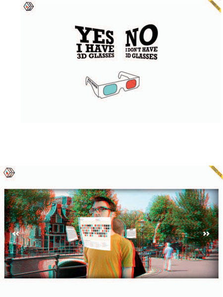
The idea for our website was actually born in the concept phase of another project in which we started to experiment with 3D in Flash and experimental photography techniques. We soon realized that when combining those two we could create something really unusual and immersive. Then we had another epiphany. We realized that by shooting the photo footage in stereo, using two identical cameras, and by modifying the 3D rendering engine, we could generate interactive 3D scenes to be viewed with 3D glasses. That got us really excited.
The subject for the website, a panorama of us standing on a picturesque bridge in the heart of Amsterdam with our portfolio cases as paper flyers suspended in the air around us, came quite naturally and wasn't thought out at all. But somehow it perfectly suits what we want to tell about ourselves and our work. Barcinski & Jeanjean is us two, so you immediately see who you will be dealing with.
Do you have any promotional and/or collateral materials that drive traffic to your website?
The launch of the website was accompanied by a mailing of customized Barcinski & Jeanjean 3D glasses. We now also use the glasses as our business cards, which gets people instantly excited and wanting to get to a connected computer as fast as possible to have a look. However, the traffic generated by award sites such as FWA and Webby dwarfed the number of visitors driven to the site by the glasses. But it really went bananas once the website was picked up on StumbleUpon. The traffic literally brought the server to its knees. After these initial waves, the blogs that featured the site are still keeping the traffic on an average of 1000 visitors a day.
What do you think the main strengths of your website are (concept, ease of use, navigation, aspects of multimedia, brand identity, etc.)?
All in all it's a very tech-heavy website, but it doesn't feel like that to the average visitor. It's all about the experience and not the cutting-edge technology behind it. But at the same time it clearly shows our skills and qualities to those who care. We actually haven't considered any of the branding, identities, or other marketing buzzwords. We simply created the website we wanted to experience ourselves, and by doing that we created a website that's truly ours.
What was the most challenging part about creating this website? Did you develop the website yourself? If so, what programs and/or other development tools did you use?
The website is the result of a three-month process of experimenting, optimizing, and reworking. For this project we wanted to do everything by ourselves, from design to development to photography. We really learned a lot from that.
Along the way we've been confronted with numerous challenges, ranging from finding a five-minute window of no car traffic on a narrow bridge in a busy part of the city to shoot the footage to managing the fairly long preloading time.
By creating the panorama as a stop motion video rather than from multiple stills stitched together, the movement of people, boats, and bikes in the scene is also captured. This creates a rich background filled with little things to observe and discover. But it also makes the site a lot heavier. To keep the visitors entertained while the website loads we revamped the traditional pong waiting game into a solitary 3D version that's actually easier to play with 3D glasses.
What has been the response?
The response has been tremendously positive. Our visitor numbers went from a few hundred a month to over 100,000 in the first month after the launch. We've been featured in many prestigious magazines and countless blogs. Many of our all-time web heroes sent us congratulations mail for the awesomeness. The response couldn't have been any better than this!
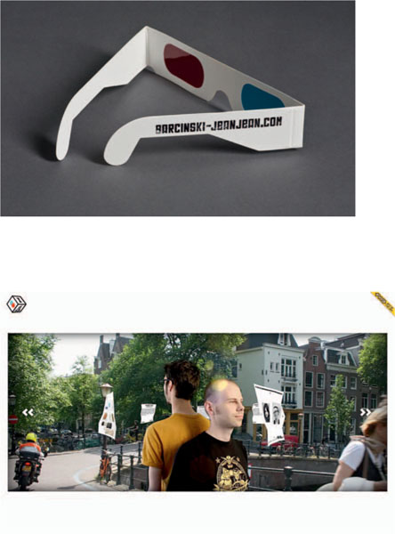
HTTP://WWW.BARCINKSI-JEANJEAN.COM, Amsterdam, The Netherlands.
Keeping the Brand Voice Consistent
There are many visual properties that can and should remain consistent with the visual identity that you have already established. It's important to present a cohesive and visually unified portfolio package—one that looks and feels the same all around.
A consistently defined visual message will:
1. Make sure you stand out with a clear, recognizable brand message across multiple mediums.
2. Make sure your message is a memorable one because it will be consistently repeated.
3. Reflect on your ability to extend a concept and/or visual brand across multiple forms and mediums.
4. Demonstrate confidence in yourself and your message.
In advertising, a marketing campaign is often integrated across multiple mediums and formats. This “360-degree” advertising strategy means that from radio to billboards, magazine ads to television commercials, print to web, the concept, message, and visual approach all remain consistent.
Color, image stylization, and typographic treatment should remain consistent with your book design. While there is some color shifting from print to digital, the essential color palette can and should remain consistent. Keep in mind that colors tend to be darker in print than on the screen. Stylization of imagery should remain the same too. However, you can certainly create new imagery for your website—just make sure it matches the same style as the imagery in your book design. You should also consider how you can take advantage of the web's interactive and motion features to enhance the imagery and overall online experience. For example, it's quite easy to animate through a series of images—something that's not possible in the static medium of print.
Note:
Obviously the web isn't tactile like a book, so while it's possible to simulate texture and material references they certainly won't “feel” the same. Any HTML-type text included in your website needs to reference the standard typeface package installed on most computers. This is because the browser needs to reference these in order to format the type correctly. This limits the number of typefaces you can use and control on your website (especially with non-Flash-based websites). Special typographic treatments, such as for titles, navigation, or other typographic design elements, will need to be turned into a graphic in order to be included (non-Flash).
BEVERLY HAYMAN, STUDENT PORTFOLIO, Mississippi State University.
BEVERLY HAYMAN, STUDENT PORTFOLIO, Mississippi State University, http://www.beverlyhayman.com/
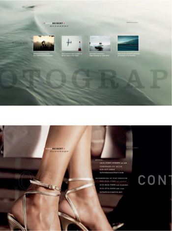
DANA NEIBERT, CORONADO, CA, http://www.dananeibert.com/
I think it is very important that the print and online pieces look and feel connected. With so many photographers out there it is very easy for someone to forget your name. But if you keep all your communication design consistent, it helps develop you as a brand and hopefully gets your name to eventually stick
– DANA NEIBERT
WEB DESIGN
Through interaction, the website on this page playfully moves around to various sections. The composition also “stretches” to the size of the browser.
The Uniqueness of a Web Composition
Consider how to modify your composition and layout design in order to better utilize the web's environment. The compositional space of a web page has some unique characteristics. While it's possible to keep the proportion and orientation of your website closely aligned to that of your book design, it may make more sense to go in a different direction. For although your web design will be seen through the fixed aspect ratio of a computer screen, there is actually a lot of flexibility regarding the overall composition's length, proportion, and orientation.
Through the use of a simple scrollbar a website can be variably long, extending the composition vertically almost indefinitely. The composition can move and extend horizontally too.
Consider the z-axis of the page (depth), incorporating interactivity that moves one forward and backward through space. Simple interactivity can also extend the composition past the confines of the browser, making a canvas that seems to “move” in any direction. The composition can even stretch with the browser's expanding or constricting size, creating a “liquid layout.”
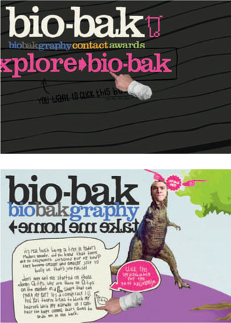
HTTP://WWW.BIO-BAK.NL/, Utrecht, The Netherlands.
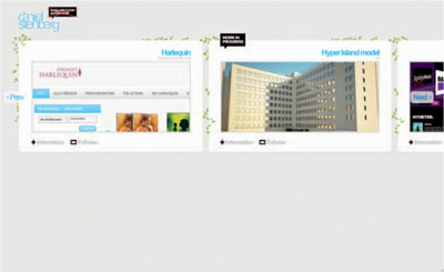
HTTP://WWW.DANTESTYLE.SE/, STUDENT PORTFOLIO, Stockholm, Sweden.
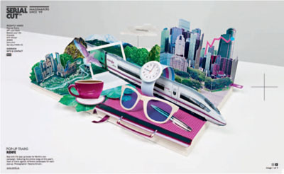
HTTP://WWW.SERIALCUT.COM/, Madrid, Spain.
Keep in mind the size and proportion of the work you are showcasing in your online portfolio, as this may influence overall compositional decisions. Too often images of project work are small and crammed into a certain area of a website. Obviously this makes it difficult to get a good look at them, defeating the whole purpose of a portfolio website. Utilize the space you have in order to best showcase your work.
HTTP://WWW.JAMES-MEAKIN.COM/, London, UK.
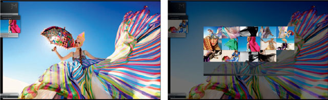
This photography website, and the one on the opposite page, utilize a collection of smaller images to navigate to larger, almost full-screen views. This larger view allows the image to truly be seen – as it becomes the primary focus of the composition. Menu items and functionality can then be “layered” on top and placed to the side.
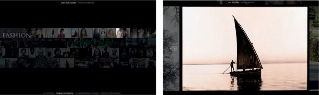
HTTP://WWW.DAG-KNUDSEN.COM/, Norway.
This website instantly highlights Kenjiro Harigai's range and depth at a glance, by featuring a background of slowly moving images. Upon rollover the image brightens, distinguishing it. Navigation at the top allows one to sort the works by category. A list which pops up from the bottom of the screen provides an additional means of navigating and viewing the portfolio.
HTTP://WWW.KENJIROHARIGAI.COM, Japan.
Taking Advantage of the Web
There are unique aspects to the web experience. Consider how your design approach can take advantage of both multimedia and interactivity.
Multimedia includes a combination of different content forms, such as moving image sequences, video, animation, and sound. These different media types can be integrated together and/or linked to each other.
Interactivity is defined as the ability of the user to control the action and reaction of a media experience.
Both of these aspects can bring a new dimension to your design ideas. Moving from a static design to one that is interactive, moves, and animates can bring your online portfolio to life. The challenge is to use these aspects to enhance the user's overall experience—to make your interface seamless, engaging and easy to use.
Even if interactive design is not your forte, try not to be apprehensive about how you approach and utilize these qualities. If you decide to add elements of motion (video, animation) and/or sound, you should consider how they relate to your brand message. Keep in mind the conceptual framework you have already developed and explore ideas that relate. Integrating multimedia and interactive components should enhance the online experience in a meaningful way, without distracting from the original goals of your online portfolio.
Aspects to consider:
- Audio—background music, navigational cues, sound effects. Keep in mind that audio can get annoying—use sparingly and always include an on/off button.
- Animation/motion graphics.
- Video (and web codecs).
- Image sequences/slideshow.
- Transitions between sections and imagery.
- Movement through depth and space.
- Interconnectedness to content and media.
- Social networking.
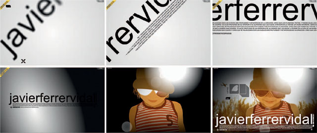
Javier's portfolio website does a great job of integrating motion, sound, and interactivity, creating an engaging and memorable experience.
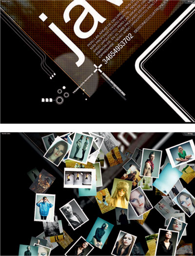
HTTP://WWW.JAVIERFERRERVIDAL.COM/, Spain.
HTTP://WWW.JONATHANYUEN.COM/, Singapore.
Traditional Website Design
Traditionally, when designing a website one considers several different page layout designs; that of a homepage, and at least one or two secondary pages (depending on the variety of content to be presented). For more complex websites, additional page layout designs are also often necessary. A homepage has traditionally served a somewhat different purpose than that of the rest of the website. Much like a book cover or film title, its main purpose has been to attract, entice, and establish a particular mood, tone, or brand identity. This is often achieved through heavier graphics and/or animation, motion, and sound in order to “introduce” the website itself. On the other hand, secondary and lower-level pages have been traditionally designed more functionally to allow one to navigate to and view content, whether imagery, text, video, or animation.
Fluid Spaces
Many website designs nowadays don't differentiate as clearly between the look and functionality of a homepage versus the secondary pages. These websites layer visual elements and transition between content, navigation, and information more fluidly. Such a website doesn't jump from page to page so much as it moves, transitions, rearranges itself, and hides and reveals content, navigation, and other visual elements in response to the audience's interaction. In such cases, hierarchy becomes much more fluid; as shifts in the content change, so too do the relationships between the elements and the space around them. So while these elements exist in the same compositional space, they are simply layered onto multiple “levels”—shifting visual emphasis and focus as the priority of each section changes. A common technique used with these types of portfolio websites is to present project work in a “lightbox” of sorts, layered above a darkened or blurred-out background of content.
Simple and elegant animations bring life to Jonathan Yuen's captivating portfolio website.
Layering and Separation
Many contemporary website designs take advantage of a design principle called layering and separation. If used strategically it can help one integrate and organize multiple levels of visual and functional information into the same space without clutter or confusion. To do so requires a careful balance of elements and hierarchy.
Integrated Media
One of the great things about the web is that it can bring together different types of media and content. It's important to consider how each separate element can work together as part of the larger whole. Each element should be considered and designed in order to achieve a cohesive overall composition, regardless of media type. The integration of content, navigation, imagery, video, and/or animation should be seamless.
Confusion and clutter are the failure of design, not the attributes of information.
– EDWARD TUFTE, Information Designer
HTTP://ALLABOUTJAMES.CO.UK/, London, UK.
Video
To integrate video into your website you will need to compress the video and limit its file size. This can be done with a number of video codecs (compression schemes). Of course, you will trade video quality for file size. In addition, Adobe Flash has its own video format, which is quite popular—the FLV format.
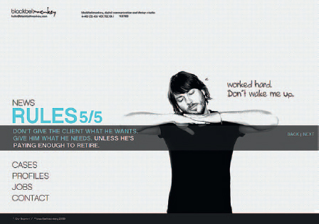
HTTP://WWW.BLACKBELTMONKEYCOM, Hamburg, Germany.
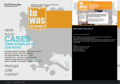
In Black Belt Monkey's website, video acts as an integral part of the composition, instead of being isolated and separated in its own little box.
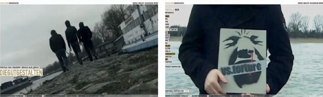
HTTP://WWW.DIEGUTGESTALTEN.DE, Düsseldorf, Germany.
The creative studio Diegutgestalten utilizes full-screen video as part of a unique and captivating concept to present their works in public spaces or onscreen. They also use video to create a short introductory narrative about getting ready for work in the morning.
Movements and Transitions
It's important to consider the timing and manner in which visual elements move or appear on and off the screen, as well as transition between each other. Such movements in the interactive environment should be unobtrusive and smooth. Quick, simple motion effects and animations, such as fades, wipes, and dissolves, can work well to introduce individual elements and create smooth transitions between elements in an image sequence.

HTTP://WWW.GLENNBOWMAN.COM/, Orlando, FL.
In Glen Bowman's Travel Japan website, a simple crossfade between images helps make the sequence appear less abrupt and flow more naturally. Transitions such as these should happen quickly (often in less than a second) and be limited in type applied consistently and only when needed.

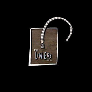
HTTP://WWW.PORLINIERS.COM/, Argentina.
Other types of motion effects can occur more broadly when transitioning from one section to another or adding and rearranging multiple elements onto the screen at one time. Often images, navigation, or text will slide into the viewable area of the screen in response to the user's interaction.
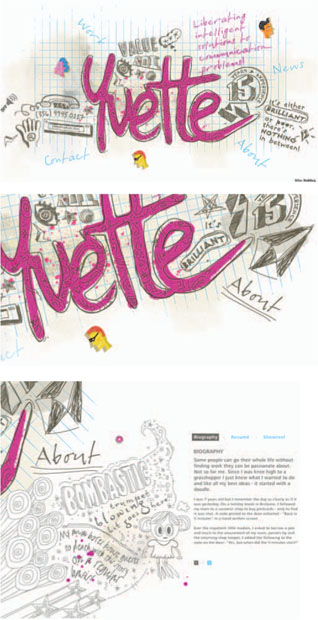
HTTP://WWW.YVETTEMAHON.COM, Sydney, Australia.
Another popular method for transitioning between website sections involves moving in and out of the compositional canvas. The main composition moves, zooms, and rotates around from one area to the next, each displaying a different section of content. Don't forget to apply an ease in/out to your motion effects so that they feel more natural.
Animation imitates the world that we live in, so it's important that movements within your animations feel as if they are based on real world movements, even if they are exaggerated. In our world, it is very rare that something will move at a constant rate.1
Time-Based Media
A basic familiarity with time-based media can be helpful when designing for fluid interactive spaces. If you don't have much experience in this area, you can learn a lot through trial and error. As you work, take the time to export your animation frequently. Watch it carefully. How's the timing? Is the motion fluid or jerky? Do transitions take too long? Does it feel rhythmic? Keep making adjustments until the playback feels right—then shorten it!
A Note about Blogs
With the increased popularity of blogs, one current trend for portfolio websites is to model themselves after its structure. In this way, the homepage acts less like a cohesive design and more like a portal or listing of text, images, video, etc., taking you directly to content and relational links. Traditionally, blogs are by nature more about social networking, linking content, and journaling than presenting a portfolio. This does not mean, however, that such a website can't still work for your purposes. But it will rely on the work speaking for itself, whereby the website structure functions more like a container. You'll have to decide if this approach works for you.
A blog structure is easy to use and gets you to content fast. It's also fairly easy to maintain and keep up to date. However, for a creative professional it may be important to design something that is more unique and can express an overarching vision and design concept. It may be a better idea to have a blog for more personal use and a separate portfolio website for professional use.
The Grid System (Again)
The use of a grid system can be useful in the design of a website. It can be helpful in planning the consistent placement of content and navigation from page to page, making for a well-organized sequence that is easy for website visitors to use. Remember that negative space is a good thing. You can use a grid to help group and separate content while not filling up the page. Traditionally, website designs have been organized and constructed based on a grid system, establishing some fairly predictable page layouts. Early on, the use of HTML tables supported this direction. Nowadays, website designs can take on a variety of forms—some still reference a grid, but others do not. Whether you use the grid, deconstruct the grid, or decide not to use it at all, make sure you at least consider your options.
Layout and Content Tips
- Don't let consistent areas of content shift placement or “jump around” from page to page.
- Include navigational cues, titles, and subtitles.
- Include brief explanations about project work.
- Think about the kinds of content that will be included “above the fold” — what can be seen in the browser without having to scroll.
Introductions
For those of you working with a heavier (k size) website design, you should consider the design and implementation of a preloader. A typical preloader includes a simple animation and/or progress bar, along with a dynamically updating percentage that indicates how much of the website is currently loaded. This will take a little coding, but it's really important to inform your audience how long they have to wait for your website to download. Of course, the longer someone waits, the greater his or her expectation will be!
HTTP://ALLABOUTJAMES.CO.UK/, London, UK.
HTTP://WWW.YVETTEMAHON.COM, Sydney, Australia.
HTTP://WWW.PORLINIERS.COM/, Argentina.
LISA CROWLEY, STUDENT PORTFOLIO, Endicott College.
HTTP://WWW.JAVIERFERRERVIDAL.COM/, Spain.
Some websites also include an animated sequence, which acts as an introduction to the website. These can be fun, demonstrate your motion abilities, and set the tone of the portfolio experience. They are often designed with the website's concept in mind. Typically these animated sequences are created in Adobe Flash and can include animation, motion graphics, animated type, sound, and/or video. Often they include opening transitions that “build” up the website design, bringing visual and navigational elements onto the screen in a choreographed manner. It's important that such an introduction be quick. If it's more than a couple seconds long it's recommended that you provide a means to skip it. Keep in mind that someone may be going to your website more than once. If they are trying to get your contact information to offer you a job, you don't want them to be frustrated because they have to wait.
SITE ARCHITECTURE
One of the big reasons you can't just directly transform a print design into a web design is because of the inherent importance of navigation. The inclusion and integration of navigation into your interactive design is of course crucial and requires some thought. Navigational links and/or graphical “buttons” take you to additional content, such as web pages, images, video, or even other websites. Through navigation users are able to take control of the direction, sequence, and rate at which they move through, view, and sometimes even interact with content. Great navigation should be a perfect melding of both form and function.
When determining the navigation and functionality of your website you need to start by considering your website's overall architecture, which describes three things:
1. The kind of content you are including in the website and how much of it there will be.
2. How your content is organized and prioritized—subdivided and grouped into particular sections or web pages.
3. How these sections are linked together—that is, if you're in one area of the website, how do you get to another? Describe the path a user has to take in order to get around.
Grouping Content
It's important, especially for a portfolio website, to be clear about what content is included and how someone can get to it. To do this you should organize and prioritize content into main sections— “chunking” similar information into overarching logical groups. You should have already done something similar when organizing your portfolio book.
Think about not only the various similarities and differences between the information itself, but also the various kinds of content you have: There's a difference between a section that includes mainly text describing your talents and experiences in an “About Me” section versus a section that includes mainly images showing your talents and experiences in a “Portfolio” section. Keep in mind that the very act of organizing content affects the way the end user will interpret and understand the separate pieces of information in your portfolio. It creates context and also a way to find information.
Target Audience
Remember to always keep your target audience in mind: What is the purpose for the target audience's visit to your website? What do you think is most important for someone to look at first, second, third?
The manner in which you organize content will have a huge impact on the structure of your navigation. A good rule of thumb is to limit the number of main buckets of content to seven; this is the number a person can generally remember using short-term memory.
LATCH and Other Organizational Schemes
Richard Saul Wurman (famous information architect and designer) discusses information design principles at length in several of his books. He uses the acronym LATCH to identify five key ways to organize information:
Location: Great for geographic relationships such as with maps.
Alphabet: Like a dictionary or names in a phone book.
Time: Works well for things like train schedules.
Category: This organizational scheme is used quite frequently since it allows things to be grouped by some quality that they have in common. Defining that quality is crucial, as it will communicate a certain prejudice and understanding of the information more openly than any other organizational scheme.
Hierarchy: Organizes by magnitude such as small to large or least expensive to most expensive
One can also add:
Continuums: Qualitative comparisons such as ratings systems.
Numbers: Creating underlying mathematical relationships such as the Dewey Decimal system.
Randomness: Arbitrary organizations—the absence of a defined organizational system can be valuable at times.
Defining Categories and Labels
Determining how to name sections of your website and subsequent navigation will tell your target audience a lot about you right upfront. It will define the context with which someone will understand the depth and breadth of your talents and experience in one glance. However, it's not necessarily easy to capture the content of a website with only a handful of keywords.
For example, some people create a generalized grouping of their work under a “portfolio” section. In this case, a secondary level of navigation can be used to link to more specific kinds of work. Other people, however, are more specific in identifying the main section headers of their website. They use section names that distinguish among the various kinds of work in their portfolio, such as an “illustration” section or “logo design” section. Some people decide to merge both. They provide a main navigational link to a “portfolio” section, but break down each category as a more direct link from the homepage. Still, others find more offbeat and creative ways to describe each section of their website. Figuring out what's best for you means figuring out what works best with your overall concept and how you frame the context of your work.
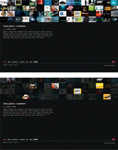
HTTP://WWW.TROLLBACK.COM/, New York, NY.
On Trollback + Co's homepage, a user can filter a collection of thumbnails by different categories, some more conventional like “branding” and “titles,” and some more fun like “shiny” and “yellow.”
Make sure to include secondary navigation for major areas of your website, especially in the portfolio section. A user should be able to get to all the main areas of your website at anytime, no matter where they are. Within one main section, a user should be able to easily get to all the secondary subsections as well. So, if you break up your portfolio by category and someone clicks to go to the print section, he or she should be able to click and get to a photography section or video section from that same page. Don't make someone have to click back to the homepage in order to see more work. Your website should be easy to use and provide quick, efficient access to all your work.
Site Maps
It's best to draw out a site map so that you are clear about how you are going to organize your website and what navigational links or buttons you're going to need in order to allow someone to get to your content. There are two types of website architecture that are most widely used, separately and in combination.
The first is a hierarchical structure—starting with a homepage that links to a number of secondary pages, all of which typically identify main sections of the website. Additional pages are usually accessible from these secondary pages. In this way you prioritize the information and define not only the main sections, but secondary and tertiary levels too. (site example opposite page: top).
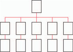
Another type is a sequential structure. This simply means that you set up your website map linearly, moving forwards or backwards in a sequence. Quite often this is used as a means to view a series of images, usually including “next” and “previous” buttons as well as links to individually numbered pieces. (site example opposite page: bottom).
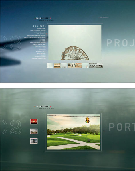
HTTP://WWW.DANANEIBERT.COM/, Coronado, CA.
Regardless of the type of structure you choose, when it comes to your own website, try to keep it simple in terms of architecture and subsequent navigation.
A user interface is the layer of interaction by which we are able to communicate with a computer, website, application, or other type of technology. The design of a user interface focuses on the expectation of a user's experience—attempting to facilitate interaction that is clearly understood and efficient in allowing the user to accomplish his or her goals. We often hear reference to a graphical user interface (GUI), which utilizes icons and other visual references in order to help one interact with and navigate a computer system, application, or website. The “desktop” metaphor used by almost all personal computers is a great example of a GUI—it allows people to more easily interact with the computer through familiar objects such as folders and task-specific icons. Obviously, the design and application of navigation within your website design is important; it will be the primary “interface” by which someone will use your website.
You can think of interface design as encompassing information design, interaction design, and some forms of sensorial design (mostly visual and auditory design, since most computers can only display sights and sounds). Typically interface designers have addressed the layout of screens, the design of screen elements like icons, and the flow among them.2
– NATHAN SHEDROFF, Author, Experience Design
Navigation
Well–thought out navigation is key to any good website design. In many cases it's even the focus of the design itself. Navigation can range from fun and playful to practical and efficient. The best navigational solutions reference the design concept and are intuitive to use.
It's important that navigation be visually distinguished from other elements on the page in terms of style and placement in the composition. It should be clear from the start how users can get to content that they are looking for. Rollovers and hover effects can also be quite useful, not only to indicate that something is “active,” but also as a means to provide additional navigational information.
Navigation can take many forms: graphical buttons, hypertext links, CSS buttons, Flash animations, dropdown menus, icons, and so on. Whatever the style, navigation provides users with a sense of orientation within the website—where they are and where they can go. So it's important that at least the global navigation (main sections) of a website remain consistent. Make sure to design multiple “states” for your links and buttons. Once a user clicks on a link or button and goes to a new web page, that link or button should look different. This helps provide a visual cue to the user that he or she is now at a corresponding page within the website.
Keep in mind that you don't have to make your navigation too big—big, huge “buttons” on a web page look clumsy and unattractive. In addition, think about issues of growth and scalability. If you intend for your work to expand into other directions at some point, you may need to plan your design accordingly so that additional navigation can be added without much hassle.
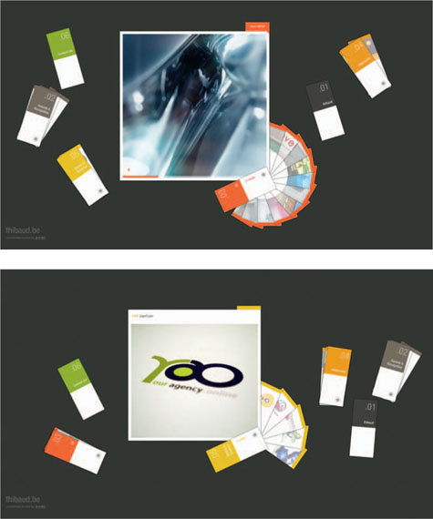
HTTP://WWW.THIBAUD.BE/, Belgium.
Thibaud's portfolio website focuses on a unique navigational system — “swatches” are draggable and fan out to reveal integrated content, such as imagery and video.
Hiding/Revealing
Another trend in website design is to collapse and reveal navigation, keeping menu items “hidden” or out of the way when not needed. In these cases, at least one word or icon typically remains visible in order to indicate where the menu is located. Upon rollover or click, the menu bar expands revealing navigation to the user. This is a great way to keep the compositional space clean and uncluttered, especially when presenting portfolio work. Collapsing menus, dropdown menus, hide and reveal layering, hovers, and pop-up menus all work for this purpose.
In this example, the navigational area of the portfolio section is “hidden” until it is rolled over. This creates a clean, clear presentation space for individual project images to be viewed. Upon rolling over that area, the focus of the composition changes—the project image is pulled out of focus and individual project links are listed. In addition, upon rolling over a “profile/contact” button, the compositional space opens up from the top to reveal profile and contact information. This collapses again upon rolling over a “close” button.
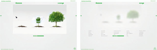
HTTP://WWW.RODRIGOMANFREDI.COM/08/, São Paulo, Brazil.
HTTP://WWW.SELFTITLED.CA/, Santa Monica, CA.
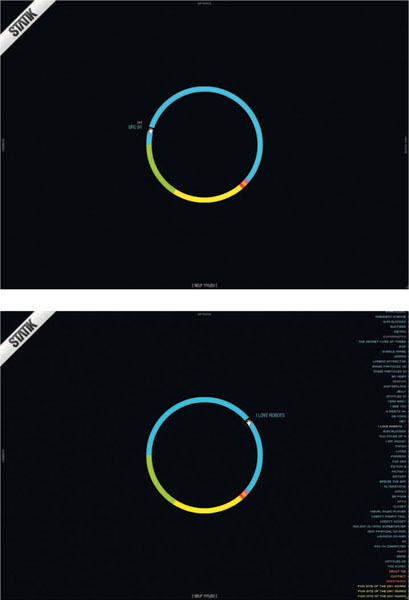
In this example, the color coding within the circle divides the content into sections. It also acts as the main navigational device. Additional menus reveal and collapse upon interaction.
Additional Tips: Don't Forget!
1. Include your contact information—make sure it's clear to the user how to get in touch with you.
2. Include a link to a resume or CV that will look good when it's printed out, like a downloadable PDF.
3. Keep your portfolio up to date. This is one of the inherent benefits to an online portfolio—keep it fresh!
Q&A: Interview with Chris Wooster, Group Creative Director, T3
Chris Wooster is the group creative director for T3 in Austin, TX. Chris’ previous positions include vice president/associate creative director of interactive media at Mullen, senior copywriter at Baldwin & Stone, and copywriter at Zentropy Partners. He is a graduate of Boston University and his website is http://chriswooster.net/
How important do you feel an online and/or print portfolio is in securing a creative position in your industry?
Put simply, you don't have a chance without a digital book. I'm hiring for expertise in digital spaces, and if you have trouble getting a site up it suggests to me a wide array of things that concern me.
First, it suggests you don't have friends who work in this space and can help you out. If you don't have friends in this space, you likely haven't worked in it very long. And that's a huge, flapping-in-the-wind red flag. How about a school colleague? Kid neighbor? Somebody?
Second, putting digital work in print is kind of like putting a print portfolio on a 33 RPM record album. It simply disintegrates the ideas to take them out of the form they were meant to live. Plus, me asking for your printed portfolio raises your expectations that I'm really interested in you. I'd prefer to browse your site and then contact you, in that order.
Third, if you can't figure out how to market yourself, how can I trust you with the brands we work on?
What do you look for in a portfolio? What contributes to an overall portfolio design or construction that stands out and grabs your attention?
Simplicity of idea and execution. There are no points off for a site that is a bit spare in its technical construction, but huge points off if you both overthink and underexecute the presentation. I'd much rather see a simple, straightforward slideshow of work than a highly conceptual monstrosity with some kind of clever-seeming navigation that's a mystery to navigate. We return to the idea: If you didn't see why your own site was a user-experience challenge, how can I expect you to do anything worthwhile for our clients?
Concept:
Do: Think twice before developing a gimmicky concept for the whole site.
Do: Remember all the sites you hate that let concept get in the way of content.
Don't: Have four pages of intro click-through before you get to real work.
Don't: Overreach. You're going for a job, not a Cannes award.
Flash or no Flash:
Remember, unless you really know what you're doing, 100 percent Flash sites are poorly optimized for search, don't show up on mobile devices well, and are a huge pain to update unless you're a Flash wizard. This means, consecutively, that recruiters can't find you, on the-go-iPhone-enabled creative directors have to be at their desks to browse you, and you'll never, ever have an up-to-date site with your best work. You can have some Flash if necessary, but you can do wonders with simple Javascript these days. Really. In fact, I'm more impressed with that since it shows awareness and workaround problem solving. Good on you for that.
Sweat the details. Don't have any links that error out. Double check them all from time to time, especially links to live sites that clients can modify or take offline unexpectedly.
Note: See more Q&A with Chris Wooster in Step 8: Professional Materials.
Most people design their websites in a program like Adobe Photoshop or Adobe Illustrator. It's a good idea to create multiple designs and iterations in search of the best solution. Make sure to sketch and draw out storyboards so that you understand not only how your website will look, but also how it will function. A storyboard should illustrate the homepage design, key transitions, and functionality, as well as the major sections of the website (such as the portfolio section). Such design mock-ups typically try to describe all the functional and visual elements of a website that are important in communicating the concept. This includes the various states of navigation and functionality, such as rollovers.
Include textual notes and visual information that describe transitions, interactivity, media, motion, sound, and animation as they correspond to the individual storyboard frames. While designing, utilize layers in Photoshop or Illustrator in order to indicate the various states of navigation and functionality (like a “default,” “rollover,” or “clicked” button). These layers can then be turned on and off in order to illustrate how functionality will work across a storyboard.
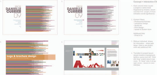
DANIELLE CURRIER, STORYBOARD
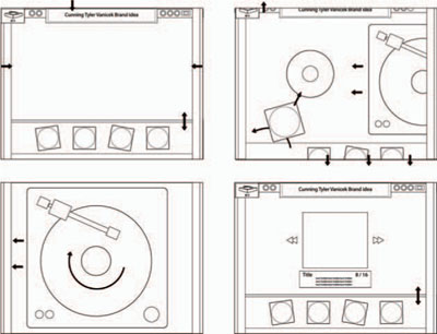
TYLER VANICEK, STUDENT STORY BOARD, Endicott College.
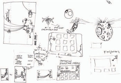
JESSICA HARTIGAN, STUDENT SKET CHES, Endicott College.
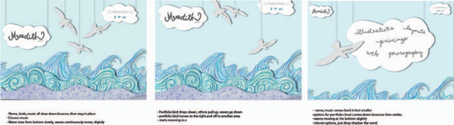
MEREDITH LINDSEY, STUDENT STORY BOARD, Endicott College.
For more information and resources about web development, check out Appendix A or visit us online at http://www.noplasticsleeves.com.
Note: Screen size. Recommended screen resolution: 1024 pixels × 768 pixels or 1280 pixels × 800 pixels.
Define the viewable area. Screen resolution − the browser = viewable area “above the fold.”
Development Tools
For those with little to moderate experience, developing online content can be quite daunting. As the standard for website design and functionality has increased, so too has the level of knowledge one needs to know in order to develop a “successful” site. Thankfully, there are a broad range of tools and technologies that are available to help. Depending on your project goals, a variety of solutions may do the job. These range from out of the box solutions to software applications that do a lot of the heavy coding for you. The challenge is to make sure that you don't allow the technology to undermine your concept or vision, but understand how to take advantage of, work with (and sometimes even around) the technology in order to develop a successful portfolio solution. An understanding of current trends, schools of thought, and available technologies is a key part of figuring out how to do just that. Most of you will probably end up building your website through the use of web development software such as Adobe Flash or Adobe Dreamweaver. You might also decide to integrate video using such formats as Flash Video or Quicktime. As you develop your ideas for your website it should become clearer which applications to use. Your decisions may also be based on what you feel most comfortable using.
Adobe Flash is the industry standard for developing rich media web content. That means it's great for integrating 2D animation, video, sound, and interactivity. It's also used to develop more sophisticated online RIAs (rich Internet applications). Flash contains it own scripting language called Actionscript.
Adobe Dreamweaver is the industry standard for developing non-Flash-based websites. It enables users to build fully functional websites in two distinct ways: to write and edit code directly through the “code” view; or, allow users to visually see and edit the layout of the page through the “design” view.
Sites designed in either Photoshop or Illustrator are typically broken down and then reconstructed for the web. For websites built in Dreamweaver, a healthy knowledge of XHTML, CSS, and Javascript behaviors is a plus. Flash users will need to understand how to work within the Flash environment and how to code some basic Actionscript. Photoshop's built-in web tools can also be helpful for the less experienced – try slicing, animated gifs, and creating rollovers.
Developing a website demands a certain amount of skill. If you are unsure if your abilities will enable you to accomplish what you want, you may need to invest some time and money into getting up to speed. You may, for example, need to take a course or work through a set of tutorials in order to learn how to develop your website. You could also find someone who has the skill set you desire to work with. You may even be able to barter your professional services in exchange for theirs.
There are certain standards that have been developed within the web industry. These include standards regarding naming conventions and the setup of directory structures. If you are building your own website, you will need to be aware of these.
Optimization for the Web
When creating images of your portfolio work for a website, you will need to take screen resolution and file size into account—making sure that your images are 72 dpi and will physically fit within a standard web size format. The most common web file formats are JPEG, PNG, and SWF. When optimizing video for the web, use codecs that have been especially designed to balance file size, quality, and streaming.
The best way to approximate [overall screen dimensions] is to set a monitor at the appropriate screen size, expand the browser, and take a screen grab. You can then get an idea of how much space is actually available for displaying information. 3
– JOSHUA DAVID MCCLURG-GENEVESE, Designer
How to Get Your Website Live
It's pretty inexpensive to purchase your own domain name and hosting space. Keeping your URL the same as your name or book title is also a great way to reinforce continuity and keep things professional. That goes for your email address too!
1. Purchase a domain name.
2. Purchase server space (site hosting).
3. Use FTP software to upload your website and push it “live.”
It's recommended that you purchase your domain name through the same provider that will be hosting your website—it makes the set up a lot less painful. While the whole process can seem difficult, don't let that stop you—it's really advantageous to have your own website. If your grandmother can do it, so can you.
Online Portfolio Directories
There are a whole host of online directories that serve as a means for people to post and share their work. Many of these are searchable by geographic location and expertise. They provide a key way for potential employers and clients to search for someone who they'd like to hire, whether full time or for a specific job. Some of these websites require a fee in order to be listed and some don't. Examples: Photo Serv, Site Welder, Communication Arts, AIGA, ASMP.
Q&A: Interview with Andrew King, Partner, and Mike Wislocki, Partner, SquareWave Interactive
Founded in 1998, SquareWave Interactive, in Watertown, MA, has built a solid reputation for delivering exciting, engaging media solutions. Their services span the range of media made possible by their combination of technology and award-winning experience. Leveraging a specialty in Flash, they create websites, product demos, games, rich media ads, videos, and identities that turn heads—and get results. Each production involves the carefully orchestrated efforts of programmers, motion designers, 3D modelers, compositors, music composers, and audio engineers. Their skills are complimented by their state-of-the-art tools and software, and amplified by their dedication, vision, and expertise.
How important do you feel an online and print portfolio is in securing a creative position in the interactive industry?
Between a potential candidate's resume and portfolio, we feel that the portfolio is by far the most important criteria—hands down. To us, a resume shows your ability to type, spell (hopefully), and regurgitate a handful of technologies and buzzwords common to 95 percent of the applicants who come down the pipeline. We want to see what you can accomplish in practice; not in theory.
As an (interactive studio), what do you look for in an online portfolio? What contributes to an overall portfolio design that stands out and grabs your attention?
A solid portfolio really allows you to differentiate yourself—you can give a clear, practical demonstration of your skill set, and many things that are less tangible—your attention to detail, sense of aesthetics, ability to follow through, and most importantly, your range. Does everything you produce look, act, and feel the same, or are you flexible enough that you can adapt your skills to accommodate the needs of a specific project, without sacrificing your artistic vision?
Essentially, a showreel is a short video clip (around three minutes and rarely more than five) which showcases your best work.4
– Christian Darkin, Filmmaker, Illustrator, and Animator
What do you think makes for an effective reel?
Focus mostly on the content. Draw our attention to the design detail, motion design, transitional elements, and give us impressive examples of clever user interaction. Don't reduce the impact of your work by distracting us with gratuitous video effects.
In general, how many pieces of work do you think a student should include in his or her portfolio?
It's hard to nail down an exact figure—we'd like to see enough pieces so that we can be confident that the candidate has a solid level of experience and has been exposed to a diverse array of brands and project requirements. That said, we'd prefer to see a small handful of tight, complete, and polished pieces than an avalanche of interesting but incomplete work.
Do you have any advice for someone currently working on his or her portfolio and/or other promotional materials?
Be precise, concise, and if you're doing anything remotely interactive, test, test, test. Be positive that there aren't any bugs or breaks in the projects, because if we find them, it's going to count against you.
Animation/Broadcast Design Reels
For animators and broadcast designers, a demo/show reel is essential. It can be the portfolio in and of itself or part of a broader portfolio package included with a portfolio book or as part of a portfolio website.
To put together a show reel, compose your best motion work into a short montage feature (three to five minutes). Most show reels are also edited to a musical beat and are set to a fairly quick rhythm and pace. Try a royalty-free source so you don't run into copyright issues. Also pick something you really like because you'll listen to it many, many times! After the initial montage, select your best work to include—either edited down for length, or if short enough, in their entirety. Be sure to avoid cheesy transitions.
Nowadays DVD and online video is the standard reel format. Be sure to include your name and contact information clearly on the DVD jacket.
During an interview with Jeremie Dunning, a senior web designer with Burton Creative Services in Burlington, VT, he was asked: What makes for a successful promo reel?
The most important thing is to know your audience. What I mean by that is, if it's going in front of a director, their time is very short and they are very familiar with technology. In which case, choose a DVD and categorize your work—documentaries, commercial, motion graphics, animation, etc. This will help them get right to the work they are interested in.
Have your portfolio online — these are technically savvy people. They will want the ability to quickly get into the work they are interested in. These are people that sit in front of a computer all day—they are more apt to be responsive to a portfolio that is online and efficient in getting them the message.
Make it short — keep them asking for more. That will get you in the door.
The world of editing has expanded—make sure your audience knows what tools you have used in order to create what they are looking at. Different places expect you to know different tools. Communicate the craftsmanship behind your work.