
STEP FOUR
LAYOUT
INTRODUCTION
The main objective of the interior page layout is to demonstrate your abilities and experience by showcasing visual examples of your work. This constitutes the “body” of your portfolio and serves a different purpose from the cover design. Examples of your work should provide the tangible proof of all the promises your cover design implied—that you are indeed talented, skillful, and knowledgeable! So, the primary visual focus of your page layout should be on the work itself. Additional compositional elements and textual information should not distract or undermine your efforts to establish a clean and clear visual presentation of your work.
Q&A: Interview with Hyun Sun Alex Cho, Associate Creative Director, Ogilvy and Mather, New York, NY
Alex Cho is an innovator in graphic design. Her strength comes from her ability to communicate the needs of the client through creative ideas that deliver strong visual identity and message. Ms. Cho is focused on creating unique experiences through multiple media and channels, producing outstanding results for her clients. In her current position, she has created digital advertising campaigns for major brands like Unilever, IBM, DHL, Kodak, SAP, Motorola, Aflac, and Wyeth.
How important do you feel an online and/or print portfolio is in securing a creative position in your industry?
It's very important to have an up-to-date portfolio early on in your career. It's the only way to prove you've got the skills and talent.
How important do you think a brand concept or overall visual identity is in the success of a portfolio design?
I believe that the work is the most important part of a portfolio. However, a portfolio that has a strong concept and identity can showcase the strength of one's talent. Having a strong visual identity can also help you stand out from the crowd, so it's more memorable. This should not be distracting to the presentation of the work itself though.
In general, how many pieces of work do you think a student should include in his or her portfolio?
I recommend around 15 pieces for the student portfolio.
Do you have any advice for a student currently working on his or her portfolio and/or other promotional materials?
It's important to show confidence in your work. Make it simple and easy to view the work and let the work speak for itself. Also, include some variety but show the best pieces that best reflect your talent. If there's a certain area of the industry that you are interested in, make sure to include more pieces for that area of expertise.
HIERARCHY
Visual hierarchy is used to establish an “order of importance” for various visual and textual elements within a compositional layout. Through the use of visual emphasis you can direct someone's attention to certain elements on the page and even direct what he or she will see first, then second, and so forth. Visual emphasis essentially draws your attention to a particular area through the use of contrast and highlights certain aspects by making them visually dominant. This can be done simply through the use of a bold color, larger scale, or an area of texture within a flat field. Visual emphasis can also be achieved through more complex means, such as creating visual tension between juxtaposing elements or by creating a more intricate shape or image. Whatever the visual technique, this is one of the most important aspects to consider when beginning the layout of your interior pages. In designing these pages it will be important to establish a clear visual hierarchy while also providing continuity and consistency among pages throughout the interior sequence.
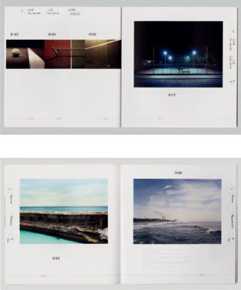
GRETCHEN NASH, STUDENT BOOK, California Institute of the Arts.
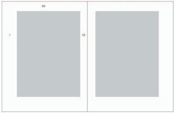
One Page versus the Page Spread
You should consider whether or not you want to make use of the entire page spread (both the left and right page together) or just one page (typically the right side). In part, your decision should be based on how you intend the book to open and whether or not it will lie flat. If it won't, although working with the entire page spread gives your composition more “room to breath,” it may feel awkward if both pages can't be viewed together. Your decision may also be influenced by the page size and proportion you choose for your overall portfolio. If you are working with a larger page size, perhaps you don't need any extra room. Just keep in mind that you shouldn't crowd images of your work, and you will need to leave a healthy margin of space around them.
IMAGES
The first step is to figure out what elements you want to include for each work. At a minimum you should of course include at least one image for each piece and some contextualizing information.
See our website at www.noplasticsleeves.com for a diagram on how to shoot 3D work.
Number and Size
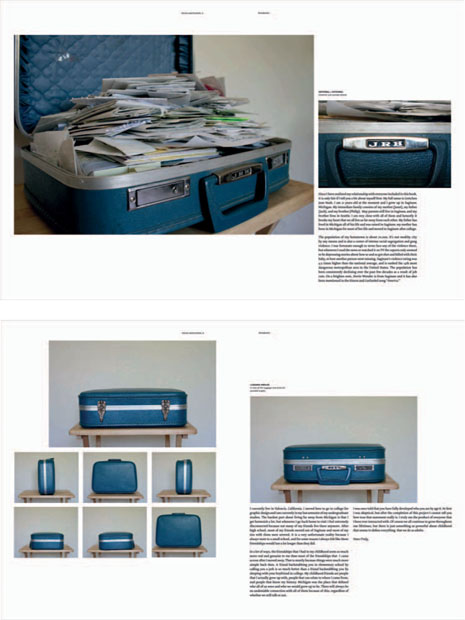
You should decide up front the number and size of imagery you want to include for each project. So, for example, you may decide that all landscape photographs are displayed at 7 × 5 inches and 300 dpi (dots per inch). Perhaps for certain types of work you decide to include a series of images or thumbnails in order to showcase important aspects, close-up details, or even sketches of the work at various stages. When presenting a three-dimensional (3D) piece, you may want to include a number of images that showcase the work from various angles. For an animated film or motion graphics piece you may decide to include multiple “key” frames as part of a sequence of images. You may decide to showcase interactive work as two 320 × 240-pixel screenshots of a homepage and a secondary page.
Keep in mind that the orientation (and aspect ratio) of each piece should remain as close as possible to the original. While the physical size of the imagery within the composition is somewhat dependent on the overall page size, remember that the work itself should be the focus and should probably take up the greatest amount of space. However you decide, it's usually a good idea to keep each piece to one page (or page spread) within the portfolio. In some cases, a very involved project could potentially be displayed over multiple pages if there were a number of parts to it.
Quality
Images of your work should be reproduced directly from their native digital file format and then converted (if need be) to a high-quality standard bitmap format. If a work is three dimensional, it is recommended that you digitally photograph it (or ask someone who can). Your images should be physically large enough on the page to see some actual detail within the work itself. There is nothing worse than opening up a portfolio and not really being able to see the work because the images are physically too small or simply poor quality. Potential employers shouldn't have to squint or hold your book up to the light in order to see your work.
Note: Label each piece in a manner that is meaningful to the target audience. Titles or labels specific to an educational institution (like a course number) are problematic because they don't mean anything outside of that institution.
You should include at least a title or some other system of identifying each work, like simply numbering. The size of the work is often included, especially for larger-scale projects. You may want to consider providing a reference to the date, season, or year in which the work was completed. Often it is appropriate to include the medium and even materials used, especially if significant to the process or creation of the work. For interactive work, you should also include a URL to the live website.
Remember that the focus of each layout should be on the work itself. Include only as much information as you think is really necessary to appreciate the work and/or the manner in which you organized it. Say, for example, you are organizing your portfolio as a timeline, demonstrating the progression of your capabilities over a period of time. It would then of course be important to include a reference to the date or year (junior year, senior year) in which the work was completed. You could, for example, decide to include dimensions for all your work, or just for those pieces for which you feel scale is an important aspect.
As you figure this out, try to be as consistent as possible with the types of information you are providing throughout the book. Depending on how you group and organize your work, it may also be appropriate to contextualize a series of work with an introductory statement or title. Such information could be presented on its own separate page preceding the series. This can be especially useful to help explain the thinking behind a more complex or lengthy endeavor, such as a senior thesis project.
One of the biggest challenges that designers have to overcome is simply deciding on the amount of content and information to use. 1
–STEVEN SNELL, Smashing Pumpkin Magazine
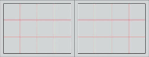
Composition: The Grid
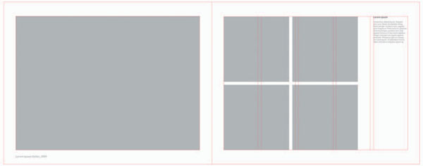
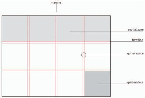
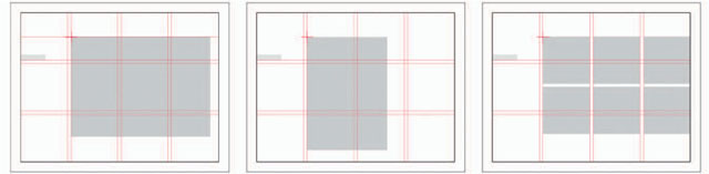
One of the most broadly used techniques in page layout design is the utilization of a grid structure. A grid divides the compositional space into proportional units and is used in almost all magazine, book, and newspaper layouts. They provide a strong means of grouping and organizing information and ensure both consistency and flexibility across a multi-page sequence. A grid structure consists of evenly spaced horizontal and vertical lines that interconnect to form uniform grid modules that can be proportionally subdivided even further. Together, the grid modules form a number of columns and rows, creating an underlying structure that can guide the placement of content on the page. Content-related elements, and sometimes even compositionally, related elements, align to the intersecting points on a grid. Typically, grids also include a consistent margin along the outer edge of the page and in-between individual columns (called “gutter space,” which is necessary when dealing with multiple paragraphs of text). In a traditional layout, it would be considered “bad form” to place content outside of this outer margin.
The number of columns and rows within a grid structure is entirely dependent on the content itself—amount, groups, and variation. It is best to avoid having all your content clustered together, and at the other extreme, making it all into separate little parts. The amount of content and number of groups usually determines how many columns and rows you need.
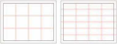
Typically, as the number of rows and columns increases, so too does the flexibility of the grid system. However, grids that are more complex than need be (too many columns and rows) often defeat their organizational purpose. Too many smaller grid modules can render spatial relationships unclear to the eye and make it difficult to see what the positive and negative spatial relationships are supposed to be.
Within a portfolio book, the amount of content needed for each page layout is probably not very great. Most often you are working with a few images, a couple of lines of text, and a compositional element or two. So in most cases, a simple grid structure (a range of three to six columns/rows) will do the trick. Keep in mind that the number of columns versus the number of rows will be different unless you are working with a square format.
If you find you need greater flexibility in terms of positioning content within a particular page layout, cut a column or row in half (or even thirds). As long as you always subdivide the space proportionally, your grid structure will hold up.
Grouping: Alignment and Proximity
When elements are broken up and interspersed throughout the composition those elements and the spaces between them appear disorganized and unrelated. By grouping elements you can create stronger, more organized relationships. In turn, the negative space becomes better consolidated. This creates a more simplified and cohesive perception of the composition and its elements. While there is an implied connection between all elements in a composition, if you study the content closely you will discover that some elements functionally belong more closely together than others. Keep in mind that you should place more emphasis on some groups and less on others (hierarchy).
The grid provides a strong organizational structure that can help group and connect various types of content together. This is done through the use of alignment and proximity. By putting elements in closer proximity to each other you create a perceived contextual relationship between them. A grid module represents a fixed unit of space that can be multiplied and divided proportionally in order to group and separate content by means of a consistent increment. When you align content you place elements along the same vertical or horizontal axis (grid line). This creates an invisible line connecting those elements together. This “line” also creates a sense of movement and direction as it activates the composition. Using alignment is an especially useful technique when you have a limited number of elements to work with, but still need to break up enough of the negative space within the composition. Through the use of alignment you can physically separate elements across the composition while still implying a connection between them.
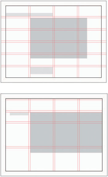
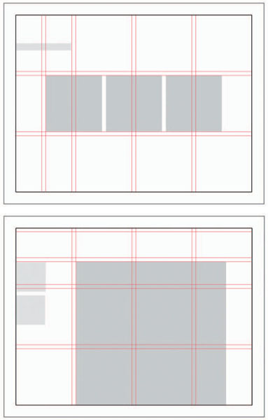
Image Layouts
As you review your work, decide which pieces can be displayed in a similar manner, either because they are part of a series or simply because they are in the same category of form or medium. This will allow you to begin narrowing down the different types of image layouts needed. There should be consistency in the number and size of imagery within work that falls under the same category. At the same time, you'll still need to allow for enough flexibility from layout to layout to account for a variety of work. You should, though, try to limit the variation between layouts as much as possible. You want your portfolio to feel cohesive and a big part of that is deciding on a limited number of possibilities. This doesn't mean that there can't be exceptions, but it does mean that you should be consciously making decisions about how the layout of your work will fit together as a whole. Keep the book's size and orientation in mind—it's unprofessional to make someone have to rotate a vertical book to see a horizontal image (or vice versa). Account for all the sizes and variations needed to display your work properly.
You could also consider the addition of special inserts within your portfolio book. These can be used to make the book more interesting and feature something in an unexpected way, such as a close-up, full-page bleed (all the way to the edges, or pop-up image.
WILL BRYANT, Mississippi State University.
In this example, while the size and number of images varies, the placement of both the title and the top left corner of the image is consistently placed in the same spot within the grid structure. This systematic approach provides for a well organized visual layout, achieving cohesiveness and unity across multiple pages.
Negative Space
Layout design is as much a consideration of the arrangement of elements you add into the composition as it is a consideration of the spaces left between them. In general, compositions become more visually active when they are subdivided into discrete areas of positive and negative space. By breaking up larger areas of negative space with visual elements (a title, an image, a compositional graphic, etc.), you can start to activate these “empty” areas and engage the entire composition. Furthermore, when you subdivide the composition into proportionally equal parts (such as with a grid) you can interconnect the positive and negative spaces by establishing a geometric relationship between their relative sizes and the increments of space between them. Through repetition, these areas of positive and negative space compliment each and establish a rhythmic pattern throughout the composition and even entire sequence of pages. Through this organizational scheme a sense of unity is created and content is not just left “floating” in an empty background.
Design is as much an act of spacing as an act of marking.2
– ELLEN LUPTON, Author
Thinking with Type: A Critical Guide for Designers, Writers, Editors, and Students
Margins of Space
It is important to provide negative space around images of your work (and any bodies of text explaining that work) so that each can be viewed as cleanly and clearly as possible. Figure out the margin needed and then be sure to apply that consistently to images and text throughout the portfolio sequence. It is recommended that you additionally avoid heavy frames or outlines around images of work, as these can be distracting. Let each piece speak for itself and be seen as is, devoid of anything taking away from it.
Single-Column Grid
Consider the following for a single-column grid structure:
- Most basic positional framework.
- Need to pay attention to margins.
- Classical approach: margins are larger on the side and bottom and smaller at the top, and the inner margin is half the outer margin.
DANA NEIBERT, PROMOTIONAL BOOK, Coronado, CA.
Don't let the materials become the focus of the communication—your images need to be the focus.
– DANA NEIBERT
Examples: (top) equal margins & full bleed, (middle) classical margins with page balance, (bottom) wider inner margin & horizontal image alignment.
Spreads & Margins
Two adjacent facing pages are together called a spread (also referred to as a double-page spread). Traditionally a text block rests in a consistent spot on each page and margins are of equal size around that page. The inner margin can appear larger (double the outer margin) because the inner margin from both pages are seen together on the interior of the spread. In general, narrow margins create a sense of tension as elements interact with the edge of the page. Wider margins establish a sense of stability and calm.
The margins around the page however do not have to be equal. In fact, there are classical page designs that set the outer and bottom margins wider. In addition and especially if you are considering a hand-bound book, you may want to set the inner margin generously wider than the outer margin. In doing so you won't have to worry about content getting pushed into the gutter – the place where the two pages meet in the middle and where the book is bound. Typically, unequal margins create a more dynamic visual tension throughout the spread.
If the page margins are not equal you will need to consider that the recto (right) and verso (left) pages have slightly different layouts –essentially mirror images of each other. As such, an image on the left side page aligns to the grid from its top left corner and an image on the right side page aligns to the grid from its top right corner. This way, content on both sides are spaced equidistant from the outer margin – which should be the same width. In any case, the gutter margins should take into consideration the amount of space needed for binding.
In addition, the order and arrangement of pages in a book (termed pagination) also needs to be considered.
Sequence
As mentioned before, the use of a grid can be a vital component in providing continuity among pages, structurally connecting each page together in a sequence. A grid structure can provide a guide in the consistent placement of elements, especially those that will repeat throughout a sequence. Doing so often unifies pages together and creates an expectation that certain elements will remain in certain “zones” from page to page. This allows the reader to concentrate on the important stuff and not get distracted by page numbers that jump around or blocks of text that move randomly about from page to page.
Through the utilization of a grid structure you can easily move elements based on the proportional increments of the grid module. In this manner, the movement of elements from page to page will not seem random, but will reference an underlying visual system that can be repeated. By referencing the grid and moving elements by proportional and consistent increments you can create variation and flexibility across a sequence while still establishing a unifying and discernible interconnected pattern.
In most publications there are at least some elements within a layout that remain in the same spot throughout. This is especially true for those publications that are more densely populated with content. However, even with more sparsely populated layouts, it is a good idea not to allow elements, whether content related or compositionally related, to move slightly and randomly from page to page. This can make the elements appear as if they jerk around in an awkward, sloppy, and unprofessional manner. So, try to keep at least some elements in the same exact spot from page to page (or start in the same spot from page to page).
By using a consistent start point for varying image sizes and a consistent increment of space to adjust for the placement of text, you can account for a variety of sizes and aspect ratios. In fact, some variation can make for a much more interesting sequence. Additionally, as previously discussed, keep in mind any differences between recto and verso pages layouts when working with a spread. If you do move elements around from page to page, do so with consideration and intent.
Print, Print, Print Make sure you print out your layouts so that you can get an accurate sense of the size and proportions of your work within the compositional space. If need be, go back and make adjustments to the size and proportion of your book design, including altering the cover design to fit. It's important that the images of your work read well, so make sure it all works.
GRETCHEN NASH, STUDENT BOOK, California Institute of the Arts.
Software note: Use the grid system available in Adobe InDesign to help you work out proportions and lay out the page.
ALISON MURPHY, STUDENT PORTFOLIO, Massachusetts College of Art and Design.
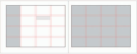
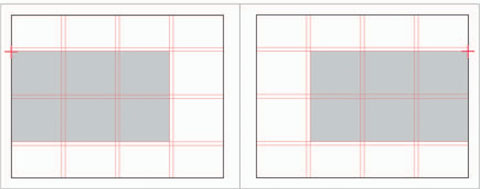
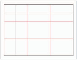
Rule of Thirds
A popular compositional method in photography is the rule of thirds. The same principle can be applied quite easily to layout design. Subdivide the page evenly into three columns and three rows. This will create nine grid modules. You can use these as a guide when grouping and separating text and imagery on the page.
- Use the horizontal and vertical grid lines to align content. Focal areas are created at the four intersecting points in the center.
- Each module can be subdivided even further—in halves or thirds, both horizontally and/or vertically, if you need more versatility within the page layout.
- Don't forget that you may still need a margin of space around the outside of the page, especially for text.
KRISTEN BERNARD, STUDENT PORTFOLIO, Endicott College.
Extending the Visual Identity
A visual brand identity works through repetition of specific visual elements. It's important to make sure that there is consistency throughout the entire portfolio book and other related parts so that your visual voice is communicated in a consistent and cohesive manner. Consider which visual aspects from your visual identity and cover design should be carried over into the interior layout. At the very least you should consider using a consistent color and typographic reference from cover design to interior layout. These aspects will also be useful in visually uniting your resume and any other promotional pieces. Keep in mind that while you should not incorporate distracting graphics into the interior layout, you can make more subtle secondary visual references. Graphical and linear elements can activate the compositional space and support the primary content by creating movement and directing the eye's focus. Work to ensure that all elements are cohesive and well integrated.
TYPOGRAPHY
Text on the page functions as not just information alone; it is also a visual element that must be considered within the overall design. It has weight, texture, movement, and an implied sense of direction within the composition. Be conscious of how the typography will affect the overall hierarchy and balance of your layout. Keep in mind that the text should be secondary to images of your work, so try to keep it simple. When working with typography, especially as part of a multipage sequence, it is important to develop a typographic system that can be applied consistently throughout.
Typographic Systems
You will need to create a style guide of sorts that determines typeface specifications—typeface, weight, size, color, and any limited variations depending on function and usage. You should limit the number of typefaces to probably one or two throughout the portfolio. If you are using more than one typeface, don't use it randomly, but decide which typeface to use for which elements, and keep that consistent throughout the book. As a rule, serif typefaces are easier to read for larger blocks of text. While given a shorter amount of text, sans-serif typefaces are usually considered “cleaner” and look more modern on the page. For informational kinds of text, always keep legibility in mind. For this reason, the use of decorative fonts, if used at all, should be used sparingly and reserved for special titles or other more graphical typographic treatments. Keep in mind that you can also work with the space between lines of type (leading). Doing so can prove aesthetically and functionally useful at times.
Typographic Range
For a limited amount of textual information, a single type family with a range of styles should suffice. However, if you decide to extend the typographic possibilities, you will need to pay close attention to how well the individual typefaces integrate and harmonize with each other. Typically, the use of multiple type families, usually limited to one serif and one sans serif, can help with hierarchy and create more visual contrast, color, rhythm, and texture. Working with a greater typographic range can also appear more “sophisticated,” but only, of course, if done well. Most serif/sans-serif typeface combinations are based on their comparative letterform characteristics, such as similar width, x-height, or other proportional relationships. It is possible to combine two serif or sans-serif typefaces, but only if they are considerably different from each other.

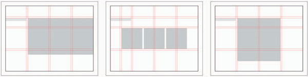
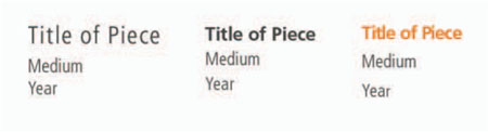
Typographic Hierarchy
A typographic system determines the hierarchy of information within the overall text on the page and even within each grouping of text. You should determine which types of information are most important to emphasize. If you are including three lines of text—say title, medium, and date—you will need to determine which of these three to make the most visually prominent. Keep in mind that we usually de-emphasize the types of information that are most redundant (such as page numbers in a book). In this example, if most of the work is of the same medium or the medium is quite obvious by looking at the image, it may be a good idea to make this bit of textual information less prominent.
If you are not organizing your work as a progression, perhaps the date is not as relevant either. So, in this case, we are left with the title as the primary bit of text, used to identify each individual piece by name. The title in this case can then be emphasized in a variety of ways. It is a good idea, however, to keep it simple and only emphasize through one visual means. This can be done by simply making the text bold, using an accent color, or even making it a point size (or two) larger. This differentiation does not need to be too complicated. A simple shift can be enough contrast to distinguish it. Remember that you don't want to create too much contrast, because such visual tension would draw the eye away from the image of your work. Use a limited number of fonts and type styles to create contrast and direct the eye. Changing the contrast can be accomplished by altering not only the typeface, but also weight, color, form, and structure. To the right are three different typographic systems, all using the same type family.
Legibility
Legibility is of concern when placing text along a vertical or diagonal axis. While such orientations can certainly make a composition feel more dynamic, keep in mind that it makes the copy more difficult to read and should probably be limited to simple lines of text. Another concern with legibility is, of course, size. One of the biggest mistakes made in layout design is in making the size of the text too large or too small. The typical size of body copy (paragraphs of text) is 9, 10, or 11 point, varying slightly depending on the typeface used. This is a rule of thumb to consider for multiple lines of type, such as for image captions.
Titles of course can get much larger, but again, shouldn't detract from the work itself. You'll need to find a balance between size, placement, weight, color, and opacity that works within your composition. Of course there are always exceptions and you should think about how you want your type to function. If you are creating title pages or experimenting with inserts you may very well want to utilize the typography as a more prominent feature.
Tips and References
- When using more than one typeface, make sure they are very different.
- Never use all caps for body copy or for highly decorative typefaces.
- Always have someone else proof your copy.
- Always proof your own copy at least twice.
Look to historic design masters and reliable texts for guidance and inspiration. Some to check out are: Swiss Graphic Design by Richard Hollis; The Elements of Typographic Style by Robert Bringhurt; Grid Systems in Graphic Design by Josef Muller-Brockmann; The New Typography by Jan Tschichold; Typographic Design: Form and Communication by Rob Carter, Ben Day, and Philip B. Meggs; Thinking with Type: A Critical Guide for Designers, Writers, Editors, and Students (Design Briefs) by Ellen Lupton; and Typographic Systems of Design by Kimberly Elam.
Paragraphs
Finally, for multiple lines of text, try experimenting with leading. Leading is a term that comes from the “old” days of typesetting and letterpress. It refers to the amount of space between lines of text. As you open up the space between these lines you lighten their combined textural appearance, making each line function on more of an individual level. This works for identifying information (title, date, etc.) since each line is able to function on its own. Such an approach can sometimes be useful since it allows you to activate more of the compositional space.
Also, align and justify (left, right, or forced).
From all these experiences the most important thing I have learned is that
LEGIBILITY AND BEAUTY STAND CLOSE TOGETHER
and that type design, in its restraint, should be only felt but not perceived by the reader.
ADRIAN FRUTIGER
For the Nondesigner
If you are less experienced with typography, using a sans-serif typeface family can be a good option. Such typefaces provide a number of dynamic variations in weight (bold, thin) and proportion (extended, condensed). Since each variation is part of the same family, they retain properties of the same underlying letterform anatomy. This means that all the variations will work together in complete harmony. Some of the most commonly used typeface families are: Univers, Helvetica, Frutiger, and Futura.
Need Help: Recommendations
Try these time-honored typefaces; most designers would agree that they are industry standards. (There are many, many excellent typefaces out there and this list is only a partial list, meant to provide you with a few suggestions.)
Avenir, sans serif, designed by Adrian Frutiger in 1988
Bodoni, serif, designed by Giambattista Bodoni in 1798
Caslon, serif, designed by William Caslon in 1734
Clarendon, serif, designed by Robert Besley in 1845
DIN, sans serif, designed by the D Stempel AG foundry in 1923
Franklin Gothic, sans serif, designed by Morris Fuller Benton in 1902
Frutiger, sans serif, designed by Adrian Frutiger in 1968
Futura, sans serif, designed by Paul Renner in 1927
Garamond, serif, designed by Claude Garamond in the 1540s
Gill Sans, sans serif, designed by Eric Gill in 1927–1930
Gotham, sans serif, designed by Tobias Frere-Jones in 2000
Helvetica, sans serif, designed by Max Miedinger and Eduard Hoffmann in 1957
Helvetica Neue, sans serif, designed by the D Stempel AG foundry in 1983
Sabon, serif, designed by Jan Tschichold in 1967
Univers, sans serif, designed by Adrian Frutiger in 1956
COMPOSITION: WORKING WITH IMAGES
Note: This material applies to any creative who is working with images. However, for photographers this is especially significant; thoughtful consideration of picture relationships can make for a much stronger photographic portfolio.
Traditionally, photographic books and portfolios have emphasized the image above all else, and tradition continues to dictate that photographs are presented in a very stark, single-image-per-page fashion. There has even been reticence concerning facing pages, and you can see this if you stop in any bookstore and examine books in print today. This is not to say that there aren't valid reasons for following this approach, in addition to numerous examples that explore a broad range of layouts and designs. This still leaves the question: How do you best present photographs and find the approach that will maximize their viewing? All too frequently portfolios present a static design that doesn't reflect the inventiveness of the individual and doesn't exploit the potential of the images.
Photographers by training have frequently presented images on a singular basis, and often the assignments and projects undertaken dictate that they do so. Yet a portfolio, if it is going to function as a statement, needs to be considered as a presentation of a body of work, a set of related images that comprise a whole. Thus, at minimum, sequence and page-to-page (picture-to-picture) relationships need to be considered. Can you order the work in a manner other than by the type of image or subject category? Are there ways to build relationships among multiple images seen adjacent to each other in one spread, rather than each on individual pages? Can one image provide the context for another? If you have a series based on a narrative, or a multiple-image project, can you present them in a more connected way, allowing the images to build on each other?
By working with multiple images and thinking beyond a single-image presentation, one can demonstrate an ability to build more complex photographic pieces. The intention is not simply to use an image sequence structure gratuitously, but as a way to enhance the experience of your images. You are trying to break out of the expected norm of image presentation. By working out sequences you demonstrate a greater understanding of the use of images in a larger context and you present an understanding of design that extends beyond the construction through the use of a single image.
Note to designers: Creating a sequence for a portfolio of your works, even if they are varied by type of design or media, can contribute to a stronger, cohesive presentation. Just as with a sequence of photographs, the relationships within a page spread as well as the pace and flow of your sequence are not something to be overlooked.
All books are a combination of physical, visual, and conceptual transitions. The book may emphasize one extreme, … while downplaying the other extreme. … But the visual book remains a combination of all three, with visual transitions at the center.
– KEITH SMITH, Author, The Structure of the Visual Book,3
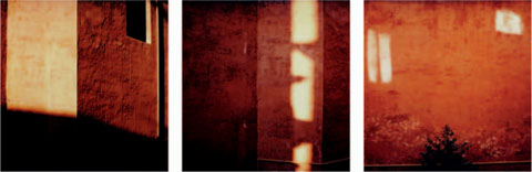
LARRY VOLK, SUFFRAGIO TRIPTYCH, SX70 Series.
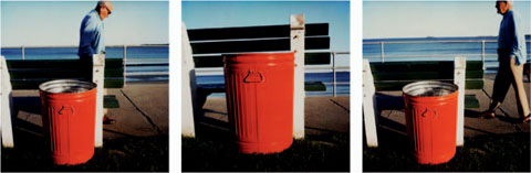
LARRY VOLK, SWAMPSCOTT, SX70 Series.
Creating Interplay and Image Relationships
Images placed together can build on each other by having connections based on formal elements, such as color, line, negative and positive space, pattern, and repetition. Images can also be linked by content and subject matter. Movement between images can be achieved by drawing the viewer's eye through pattern, or a progression of content. The content can present a narrative, or simply an interaction around related content. A larger creative leap can be taken by creating relationships and readings of disparate images, which hold together on formal terms or otherwise wouldn't be seen together.
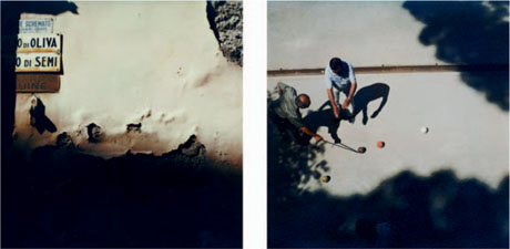
In the first example (top, left), the formal structure of the photograph is the basis for the triptych. There is movement within the frame: A single element (light on the wall) or multiple elements positioned within the frame shift across the three images.
In the second example (below left), you have a narrative progression or a progression that implies the passage of time—a progression builds from left to right around a specific content or action. The figure in the image changes position within the first and third frames, suggesting movement into view and out of view. The middle frame, being empty, exaggerates the shifting position of the figure by creating a gap in the reading, as if the figure had moved through the frame.
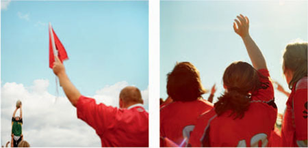
ANTHONY GEORGIS, “BLOOD MAKES THE GRASS GROW,” Promotional Book.
In this example, an extended narrative about a girl's rugby team is built through image pairs. Formally, the pairings allow shifts in viewing the subject, creating movement within pairings. The images paired together can be tensioned through differences or unified through common elements. The pairing above left, uses the color red as well as the raised hands carry the viewer's eye from one image to the next. The paring above right, is tensioned by the of shifting vantage points within the images.
LARRY VOLK, VITERBO DIPTYCH, SX70 Series.
LARRY VOLK, SHADOW BOCCE, SX70 Series.
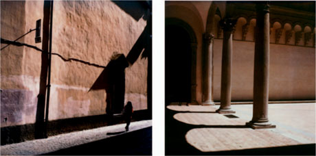
In this, diptych (top left), the images are related by a formal element (color, shape, negative or positive space) even though the content of these images is unconnected. The formal similarity unifies the pairing and draws the viewer's attention, while the dissimilarity of content requires the viewer to consider the images again and creates a more complex reading. Ultimately, the intention is to build a larger impression or association, in this case to a particular place or environment.
In the second example (bottom left), the images are connected by related content and formal elements: the physical spaces and the play of light and shadow. The pair of images builds on each other and allows the photographer more flexibility in representing the subject because the individual frames do not have to convey the entirety of the subject. The use of two frames allows for more range in composition, and the possibility of movement between them. The interplay between the combined images is intended again to build to a larger whole, while still reading as a pair of individual images.
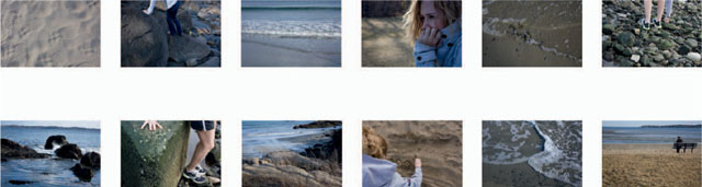
MEREDITH LINDSEY, STUDENT PROJECT, Endicott College.
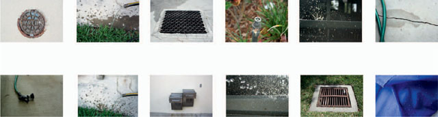
RACHEL LANDIS, STUDENT PROJECT, Endicott College.
top left: a narrative sequence involving a walk to the beach.
lower left: a sequence which uses referral with water as a theme. Images of water, are repeated with images of water systems.
Image Sequencing across Multiple Pages
Photographers frequently make extended bodies of work and their organization within a book format can be key to effectively conveying the idea or expression intended in the photographs. Ordering (sequencing) photographs across multiple pages requires attention to both relationships within facing page, as well as those from one page set to another.
True sequencing of photographs is not a simple linear progression or order within a book. It is worth making some distinctions. One of the most useful texts on the subject of image sequencing is Keith Smith's The Structure of the Visual Book. Smith characterizes sequencing as “several pictures that react or act upon each other, but not necessarily with the adjacent picture” (Smith, p. 46). This interaction between images is based on what Smith defines as “referral.” Direct referral is “an intentional relationship set by the picture maker from one specific element within a picture to another element within the same or another picture” (Smith, p. 45).
Simple movement from one image to another based on proximity is not a sequence. When placing images in a progression, the ordering is made more complex and substantive by having the elements within the photographs reference each other. This is the true function of a sequence by Smith's definition. Working from aspects found within the photographs themselves allows one to create relationships between photographs that aren't necessarily adjacent to each other. “Movement,” as Smith describes it, occurs image to image as well as between images through these references.
Subsequently, your ideas and the experience of the photographs are richer and more complex by incorporating these references within and between the photographs.
Applying Sequencing
The most common application of sequence can be found a in narrative or time-based progression. In each case the movement through the images is additive; development of an expression or concept builds as one reads through the images. In one case the content of the images can suggest a change of state, implying time. In another, the images reveal a progression, again through the changing content and what is suggested by reading the images.
Much like the triptychs, diptychs, and compound images, relationships and the subsequent sequence can be based on formal elements of the photographs. Progressions can be made based on color tone, negative and positive space, or a particular compositional choice.
Subject matter, themes, or motifs can be threaded through ordering your images. Themes can allow for the idea of referral, where a visual element, a motif, or a combination of formal elements and content appear throughout the progression of a body of images.
Depending on the body of imagery, more complexity can be brought to the work if symbols and visual metaphors are woven through the imagery. Many of the great sequenced photographic books have systems of signification within the sequence. Robert Frank's The Americans is probably the most compelling example of a system of referral within a complex sequence. This photographic exploration of 1950’s United States is an example of a complex sequence of themes or ideas represented through elements in the photographs, which repeat and refer back to each other throughout the book. A few of the major themes are: the flag (as an iconic symbol of the ideal America), religion (referenced in various objects and activities), the car (in a variety of images and contexts), and race and class (as seen through different subjects). As one reads through the photographs, these themes repeat and refer back to earlier images. Far more than a list or presentation of a body of images taken throughout the United States, Frank's book is a masterful application of complex sequencing.
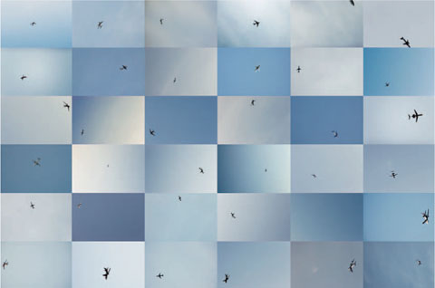
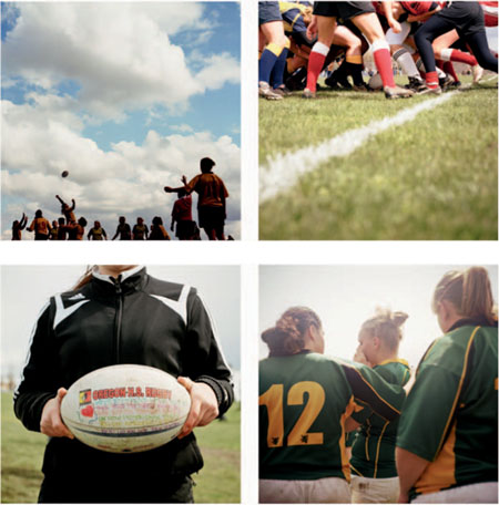
RON DIRITO, COMPOUND IMAGE,
“An Accumulated Experience of 36 Discrepant Observations [in Blue],” Salem, MA.
Compound Image on a Single Page
A compound image is a photograph formed of multiple individual photographs. The intention here is to maximize the ability to form relationships between a larger number of images than a diptych or triptych and to present a more expansive photographic expression. Grid structures are well suited to form a compound presentation, because the grid organizes the photographs, and within the grid one can effect movement and readings between multiples. In this situation one can form what might be considered a complex list. On the other hand, a grid can offer a progression that is directed, effecting a narrative on one page.
Compound images can function a number of ways:
- As a unified whole built of multiple pieces. The grid implies a whole even though we can see it is made up of unique parts.
- As a complex array of individual images with relationships between components that don't necessarily form a coherent whole.
- As a serial or time-based array of individual images, such as a document or narrative.
Note: A mosaic is not a compound image in that the emphasis is on viewing the larger image that is implied through the use of the individual pieces. In a compound image, the intent would be to read the individual images as well as the larger composite. In the mosaic, the pieces are meant to be small, and while visible as individual images, we generally don't read between them. Diptychs and triptychs are not compound images by our definition, as they are sets of images that are interrelated by physical proximity, content, form, or all of these, yet do not necessarily imply a larger whole.
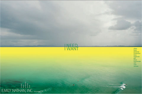
EMILY NATHAN, WEBSITE, New York, NY.
Getting Beyond Categories
In putting together a body of work, picture relationships such as diptychs and complex sequences may not be appropriate for your portfolio. However, it is still possible to take a fresh approach to presenting your work, beyond simply presenting subjects (portrait, still-life), formal aspects (color, black and white), or type of commissions (editorial, advertising). You can use more idiosyncratic ways of labeling, which can direct the viewer to your work. In the end, your work will be understood when encountered, so fear not, your audience will still get it. That being said, test your ideas and make sure the language you choose has some connection to the attitude and approach of your visual identity and your work.
A simple exploration of language is a good example of bringing some variety to the tried-and-true default ways of defining your work. Emily Nathan's website provides an example of using language to create sections within a website that might normally be categorized as “lifestyle” and “fashion,” or “portrait and still life.” The words, such as “time,” “materials,” and “local,” are links to groups of images. These word choices refer to larger ideas, rather than specific subjects, and bring the viewer to the images in a fresh and off-center manner.
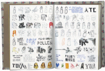
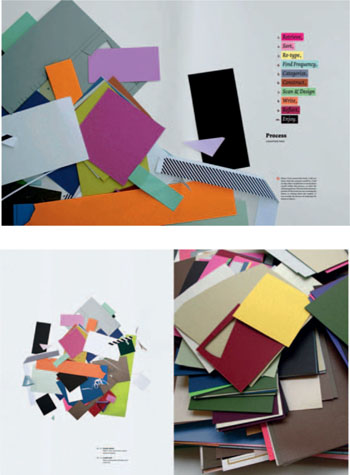
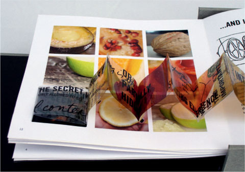
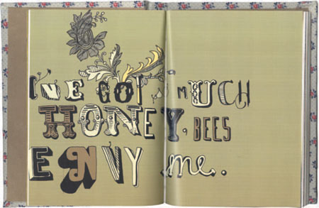
GRETCHEN NASH, STUDENT BOOK, California Institute of the Arts.
Breaking out of the box with a free visual journal approach requires trust in your vision and your work, and it is an approach you would want to apply to the overall portfolio. Here, sketches, ideas, and examples are combined in a free open format that has a personal, less produced quality. It allows the artist to move easily between styles of imagery and a variety of ideas.
Tip: Always print a dummy. If you are trying out sample page layouts and image combinations, print sample pages to scale. This will help in determining how your images are reading. In particular, if you are creating an extended sequence, print it out to see how it reads through the entire sequence. Pin it up on a work board, live with it. Make dummies and proofs to see if your work on the screen is working well on the printed page.
Scaling and Legibility
As any photographer or designer knows, the printed size of your images is going to have an effect on how they read and one should be conscious of how the scale of your image impacts its legibility. Some images benefit from running full page as large as possible. However, bigger is not necessarily better and some work is more effective at a smaller scale because this creates a more intimate viewing. Rather than bowl someone over with your large images, you can engage them in a subtler fashion. Certain images can be presented smaller, without having a dramatic effect on the viewer's experience of that image. A simple, more isolated subject will read better at a smaller scale than an image which has a densely packed frame or is finely detailed. Ultimately, you know your work, and how it should be presented. You should consider what size is going to be most beneficial within the limits of putting it into a reasonably sized portfolio.
Things to Consider
- For all of the ideas concerning “breaking out of the box” of traditional photographic presentation, you must be careful and consider how you put together your work. If it isn't consistent with your visual identity and isn't appropriate to your work and your intentions, don't do it.
- Photographs seen on a page or facing pages should be there for a reason. You shouldn't be putting together images that compete with each other. Don't consider grouping images together unless they can build on each other. Saving space by creating multiple-image layouts is not the best rationale.
- Unless you are making an example of a family photo album, or a bridal album, don't make your work look like one, with multiple formats in a combination page structure. At best, this will feel like an overlay of a stock template; demonstrate that you put thoughtful care and attention into your work.
- Consistency will create a stronger presentation. If you employ image pairings or a narrative sequence, it is important to have a consistent plan of layout for the overall book where these different approaches can be highlighted and seen as distinct from the other images in a well-considered layout.