Being able to crunch numbers or build database tables is of little use if your worksheet data is difficult or impossible for others to comprehend. Fortunately, you can mitigate this by liberally applying some of Excel's formatting tools. For example, you can apply themes to your workbooks to create a more polished and professional look, as well as add colors, patterns, and borders to cells to make them stand out. You can even use digital images as backgrounds in your worksheets.
To draw attention to cells that meet criteria you set, you can apply conditional formatting. For example, you might set a rule to highlight cells that contain values greater than, less than, equal to, or between a range of specified values. This enables you to detect problems, patterns, and trends at a glance.
Another way to display your data is in chart form. Whether you are depicting rising or falling sales or actual costs compared to projected costs, charts can make it easy for others to understand your data. By now, you are probably quite familiar with how easy it is to make a chart, but did you also know how easy it is to customize charts with various chart objects? You can also add mini-charts to your worksheet cells with the help of Excel's new Sparkline graphs.
To ensure that others can read the data in your worksheet's cells, you can fine-tune its appearance by adding gridlines, enabling Excel's text-wrapping feature (which automatically increases a cell's row height to make room for the data it contains), and changing text orientation within the cells. This chapter introduces you to a variety of tasks designed to help you make your data look great and print great so you can convey your information with ease and clarity.
Apply Workbook Themes. 136
Change Gridline Color. 138
Print Gridlines. 139
Add Emphasis with Borders. 140
Add a Background Color, Pattern, or Image. 142
Color-Code Your Data with Conditional Formatting. 144
Customize Your Chart with Chart Objects. 146
Reveal Trends with Trendlines. 148
Add Sparklines. 150
Wrap Text for Easy Reading. 152
Change Cell Text Orientation. 153
Center-Align Printed Data. 154
Center Text Across Columns without Merging Cells. 155
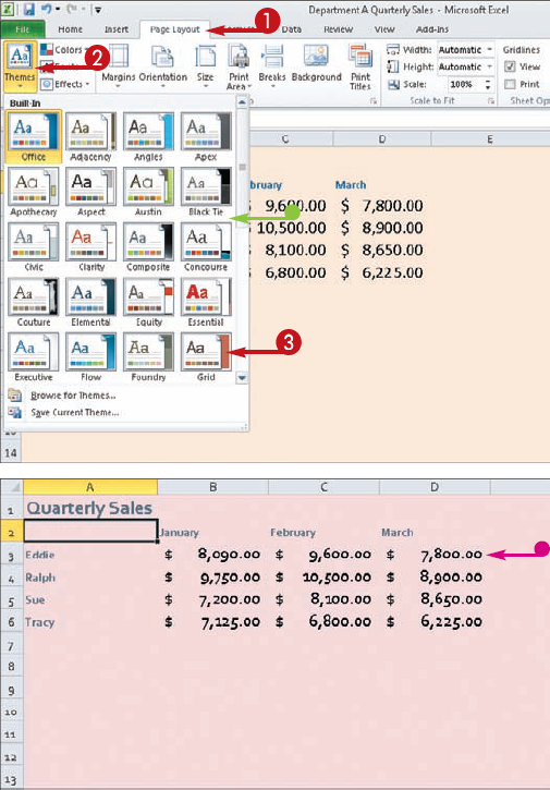
Tired of applying formatting to your worksheet data? You can use Excel's Themes Gallery to apply a combination of preset formatting settings to your spreadsheet to create an instant, professional looking spreadsheet.
To use themes to their fullest, you must apply styles to your worksheet, such as a heading style to any column headings or a title style to the worksheet title. Applying styles is easy, just select the cell to which you want to apply the style, click the Home tab, click the Cell Styles button in the Styles group, and choose a style.
If you want the worksheet to display the theme's background color, you must apply a background color beforehand. Select the cells to which the color should be applied, click the Home tab, click the drop-down arrow next to the Fill Color button, and choose a color.
You can modify a theme you have applied using the Colors, Fonts, and Effects buttons in the Page Layout tab's Themes group and then save the modified theme for reuse.

In this example, the font, size, and color are modified.


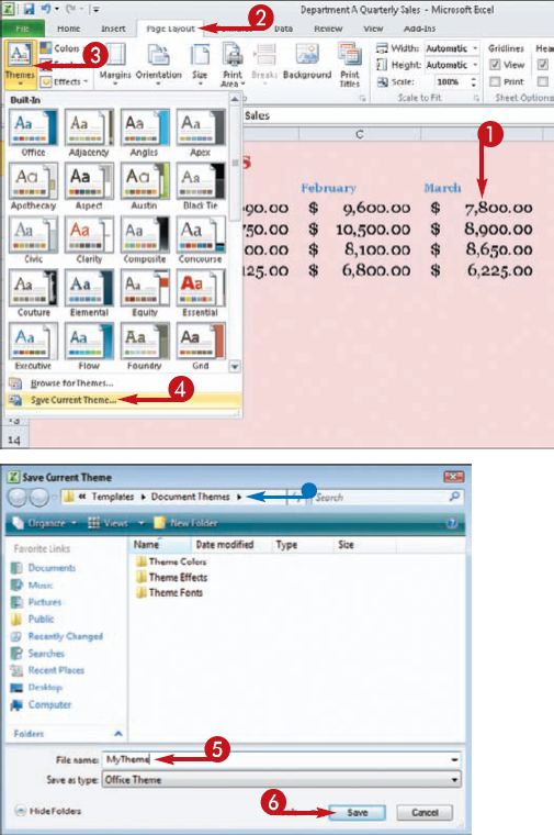
The Save Current Theme dialog box opens.


Tip
Did You Know?
You can find more themes to use with your Office 2010 programs online. Themes are just templates with ready-made formatting for the design appearance of a spreadsheet or other Office document. Although the Themes Gallery in Excel displays a wide variety of themes, you may be looking for something more stylized. Check out the Microsoft Office Web site (http://office2010.microsoft.com) and browse for more themes you can download and use.
Remove It!
If you create a custom theme and decide you no longer want it in your library, you can easily remove it. Display the Themes Gallery on the Page Layout tab and right-click the custom theme name. Next, click the Delete command. This opens the Microsoft Excel prompt box asking if you want to delete the theme. Click Yes and the theme is removed.
Gridlines are an essential element of every Excel worksheet you display. Gridlines are key to helping you maintain order and keeping your data-entry tasks organized and easy to perform. Gridlines help you keep your contents lined up properly in their respective cells.
By default, the gridlines appear as faint bluish-gray lines that define column and row borders and the cells contained within. Depending on how busy your worksheet becomes as you enter more and more data, it is not always easy to see the gridlines. Thankfully, you can customize the worksheet and substitute another color setting for gridlines.
You can change the gridline color by accessing the Excel Options dialog box and the Advanced options. If, after assigning a new color, you prefer to return to the default setting, simply revisit the dialog box settings and switch back to Automatic as your color choice for the gridlines.


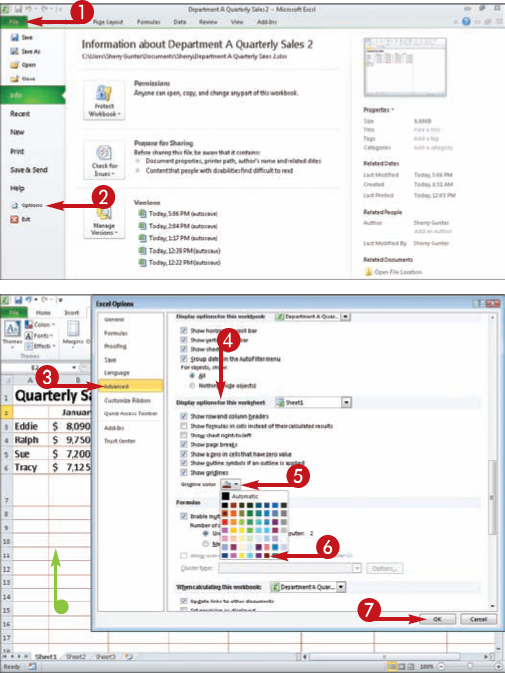
The Excel Options dialog box appears.


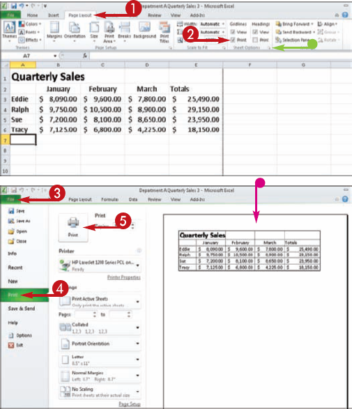
Gridlines make it easier to read a worksheet. By default, gridlines appear on-screen, but not in printed versions of your worksheet. If you plan to print your worksheet, you might want to set up Excel to print it with the gridlines displayed. Doing so makes the printed worksheet a bit easier to read — although be aware that printing with gridlines takes a bit longer than printing without them.
You can apply two methods to activate gridline printing. You can click the Print check box (
When you are finally ready to print the worksheet, you can use the Print settings available in Backstage view; click the File tab and click Print to display all the printing options and the command for printing the workbook. You can also see a preview of what your printed gridlines will look like.
You can add borders to your worksheet cells to help define the contents or more clearly separate the data from surrounding cells. You can apply a border to all four sides of a cell or range of cells or to just one, two, or three sides. Any borders you add to the sheet print out along with worksheet data.
One way to add borders is to select the cell or cells around which you want to apply a border, click the Home tab, click the drop-down arrow next to the Borders button, and click a border style in the list that appears.
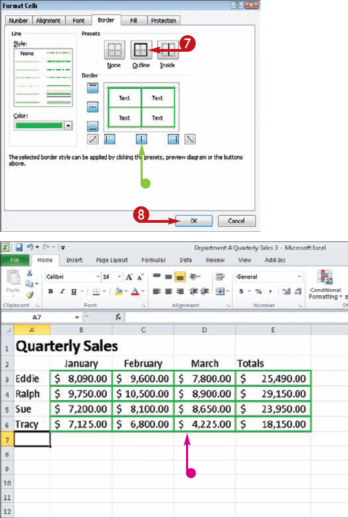
If your border requires a bit more formatting than that, you can open the Format Cells dialog box and set all of the border formatting in one convenient location. In addition to specifying which and how many sides of the cell or cells should sport a border, you can choose a line style and color. (Color options include Theme Colors, which mesh with whatever theme is currently applied to the worksheet, as well as a wider range of standard colors.)


The Format Cells dialog box appears.



Tip
Remove It!
Anytime you want to remove a border from a cell or group of cells, start by selecting the cells and then clicking the Borders drop-down arrow on the Home tab. From the menu that appears, click the No Border option. This removes all borders associated with the cell or cells.
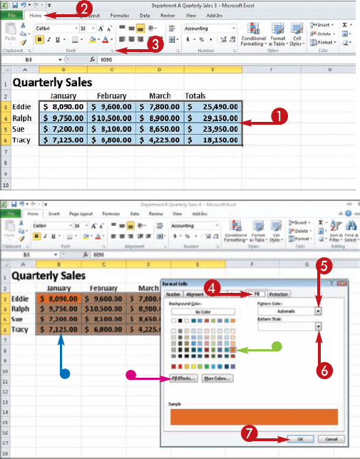
You can add a background color or pattern to the cells in your worksheet to make it more visually appealing. Excel offers a variety of preset colors and patterns from which you can choose to create just the right look for your worksheet data.
The easiest way to apply a quick background color or shading to selected cells is to apply a fill color. Just click the Fill Color button on the Home tab. For more fill options, including patterns, you can open the Format Cells dialog box to customize the fill. Anytime you choose a background color you need to be careful not to choose a color that makes it difficult to read the cell data.
In addition to adding a color or pattern to cells to serve as a background for your worksheet, you can also add a photo or other digital image. For example, if your worksheet documents sales, you might add a picture of a product. As with fill color, you need to choose an image that does not clash with the cell data or render it illegible. If it does conflict, you might need to change the color of the worksheet data.


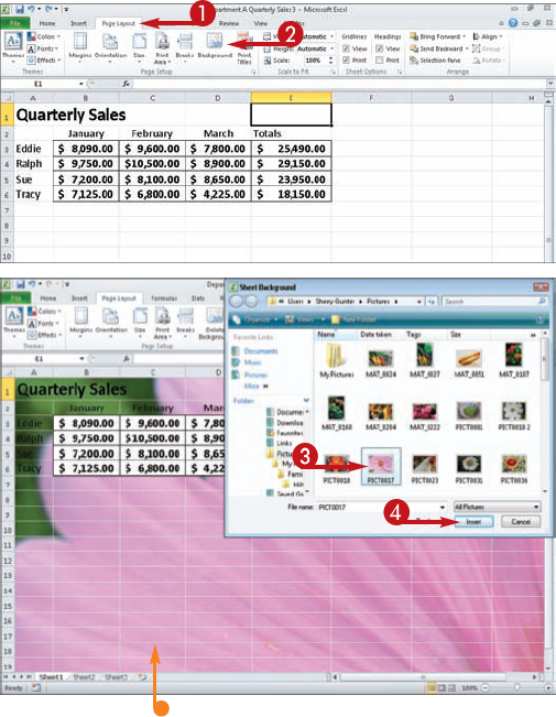
The Sheet Background dialog box opens.


Tip
Try This!
Even if you do not have a color printer, you can take advantage of the various shades of gray to add background colors to your worksheet cells. You can also experiment with the palette of solid colors to create varying degrees of background shading in grayscale tones.
Remove It!
To remove all of the formatting in a cell, including background colors or patterns, select the cell, click the Home tab, and then click Cell Styles. In the gallery of styles that appears, click Normal. This removes all the formatting that has been applied. To delete a background image, click Delete Background in the Page Layout tab.
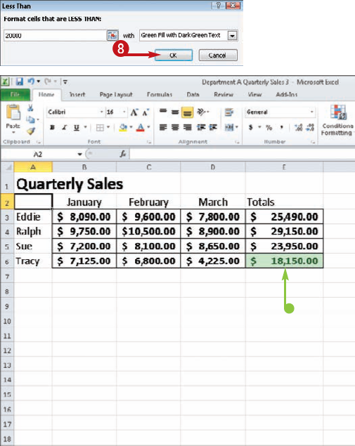
You can use Excel's conditional formatting functionality to assign certain formatting only when the value of the cell meets a specified condition. This enables you to detect problems, patterns, and trends at a glance.
Excel offers several predefined rules for conditional formatting. For example, you can set a rule to highlight cells that contain values greater than, less than, equal to, or between a range of specified values; specific text or dates; duplicate values; the top ten or bottom ten values; above-average or below-average values; and more.
You can format cells that meet conditions you set by changing the font or cell background. You can also apply data bars, where the length of the bar represents the value in the cell; color scales, which enable you to compare cells in a range using a gradation of color; and icon sets, which enable you to classify data into categories with each category represented by a particular icon.
If none of the predefined rules suits your needs, you can modify or create a new one.


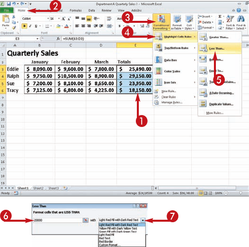
A dialog box appears, enabling you to specify the desired conditions.
Note
Depending on the rule you selected, the dialog box settings will vary.



Tip
Try This!
To quickly locate cells to which a conditional formatting rule has been applied, click any cell in the sheet, click the Home tab, click Find & Select, and click Conditional Formatting. To find only those cells with the same conditional formatting, click a cell to which said formatting has been applied, click Find & Select, choose Go To Special, click Conditional Formats, and click Same under Data Validation.
Remove It!
To remove conditional formatting from a worksheet, click the Home tab, click Conditional Formatting, point to Clear Rules, and then click Clear Rules from Entire Sheet. To remove conditional formatting from certain cells only, select the cells, click the Home tab, click Conditional Formatting, point to Clear Rules, and then click Clear Rules from Selected Cells.
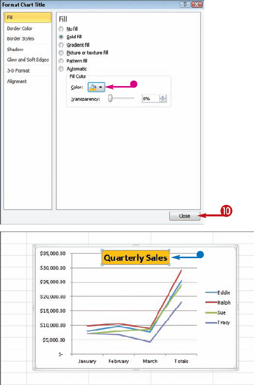
Creating charts is a popular task in Excel; however, not many users go beyond adding just a basic chart. One way that charts make data easier to interpret and understand is through the use of chart objects. These include legends, which convey what each data series in your chart represents; the chart title, which looks like a headline for your chart (as outlined here); the plot area, which is the background area of your chart; the value axis, which is the axis listing values for the data series; the value axis title, which is a headline identifying the value axis; the category axis, which lists the categories for the data series; the category axis title, which is a headline identifying the category axis; and the data series, which is the data plotted on the chart.
If the predefined chart style you applied to your data series does not include a particular chart object, you can add it manually from the Layout tab.
Whether an object in your chart appears by default or was applied manually, you can format it to suit your needs — for example, change the font or color of the object.


A format dialog box appears. Depending on the chart object you want to edit, the options offered will vary.



Tip
Did You Know?
If you find you use a particular chart type often, you can set it as the default type. To do so, open the Insert Chart dialog box by clicking the dialog box launcher (
Try This!
To move the chart to the desired location in a sheet, click an empty area in the window containing the chart and drag the chart to the preferred spot. Alternatively, move the chart to its own sheet by clicking Move Chart on the Design tab and clicking New Sheet.
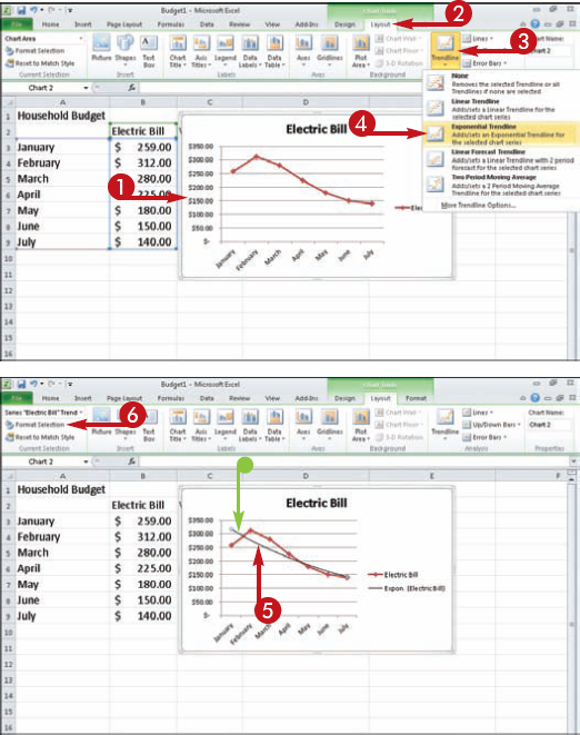
You are not limited to using charts to illustrate existing data; you can also chart forecasts using trendlines, which are used primarily in line, area, bar, and scatter charts. A trendline is a graphic representation of a trend in a data series.
For example, suppose you have created a chart showing your monthly household expenditures for the preceding year. You can add a trendline to your chart to show the projected expenditures for upcoming months. You can also add trendlines to show the general trend (that is, upward or downward) of the existing data series, or add a line to represent a moving average. A moving average is a sequence of averages computed from parts of a data series. Moving averages are helpful for smoothing the fluctuations in data to more clearly reveal the general pattern or trend.
Excel enables you to format various aspects of the trendline, such as its color, width, and so on.




The Format Trendline dialog box appears.


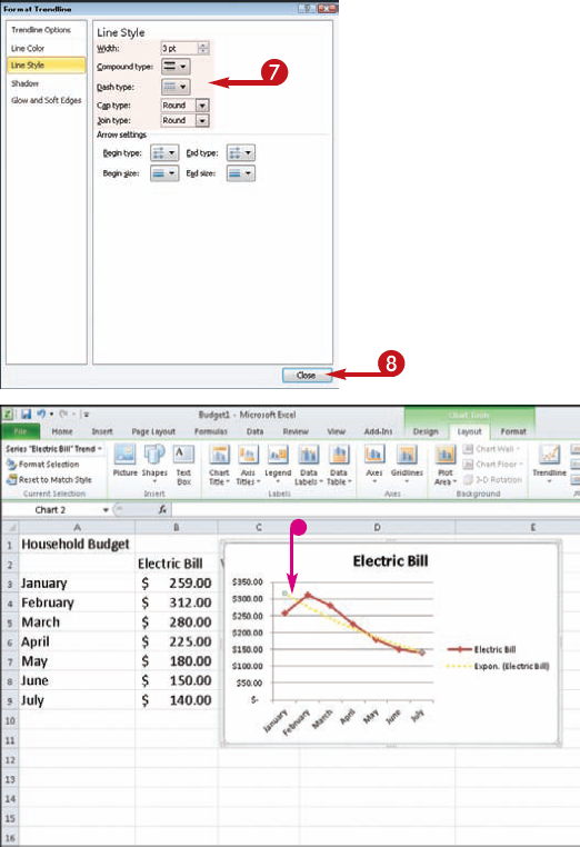

In this example, the line width, style, and color are modified.
Tip
Customize It!
You can customize your trendline by changing the various input parameters. For example, if you opted for a moving average trendline (see step 4), you can change the number of periods averaged to determine line placement. You can make this and other changes to the trendline from the Trendline Options screen of the Format Trendline dialog box. (Open the dialog box by right-clicking an existing trendline and clicking Format Trendline, or by clicking Trendline in the Layout tab and clicking More Trendline Options.)
New to Excel 2010, you can use Sparklines to illustrate data trends at a glance. Sparklines are mini-charts you can insert inside worksheet cells that let you view data that represents change for a particular row or column of entries. Unlike regular charts you create in Excel, Sparklines fit inside a single cell and quickly sum up information into a tiny visual glimpse. In previous versions of Excel, you needed a third-party add-in program to create Sparklines. Now this functionality is readily available to Excel 2010.
Sparklines present trends and variations in measurement, such as the ups and downs of stocks or varying degrees of temperature, just to give a few examples.
In order to utilize Sparklines, you need data that can be measured with three chart types: line, column, and high-low. When you activate the Sparkline tool, the Create Sparklines dialog box opens and you can specify the data range you want to chart and a location range in which to place the Sparkline chart.


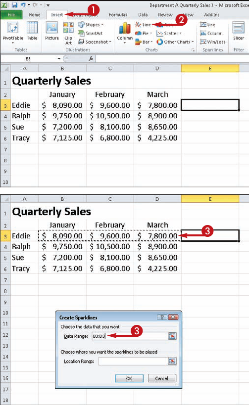
The Create Sparklines dialog box appears.


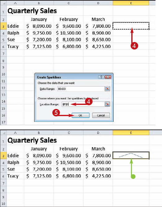

Tip
Did You Know?
Sparklines were named by their inventor, Edward Tufte, for "small, high-resolution graphics embedded in a context of words, numbers, and images," also described as "intense, simple, word-sized graphics." They were created specifically to bring meaning and context to reported numbers by embedding them into what they describe.
Customize It!
When you insert a Sparkline, Excel displays the Sparkline Tools Design tab, which offers tools for formatting the chart type, what elements appear, and a style for the chart. You can even alter the color of the chart.
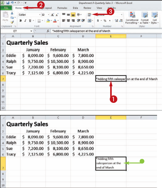
You may run into situations where the text you need to enter is wider than the cell meant to hold it, especially if your worksheet contains cells with lengthy text. By default, when the amount of data in a cell exceeds the cell's width, the data remains on one line. If the cells to the right of the cell in question are empty, this poses no problem because the data simply stretches across subsequent cells.
If, however, the cells to the right contain data, those cells will obscure any text that spans beyond the cell in question. To view the data in its entirety, you must click the cell that contains the data and look at the Formula bar.
If you want to be able to see the data in its entirety within the cell, you can turn on Excel's Wrap Text feature. When you do, data in the cell wraps to the next line, with the height of the row containing the cell increasing to make room.
You can add visual interest to your worksheet text by changing the text orientation, such as angling the text upwards or downwards in the cell. You might use this technique to make a long column heading take up less horizontal space on the worksheet. This can often prevent Excel from spreading the data to a second document page for printing. Angling the column headings is also a great way to make the text visually appealing.
Using the Orientation tool, you can rotate text to a diagonal angle or orient the text straight up or down in a cell. For a quick orientation assignment, simply click the Orientation button and choose the desired setting. For more control over the effect, open the Format Cells dialog box and set an exact degree of rotation, as shown in this task.


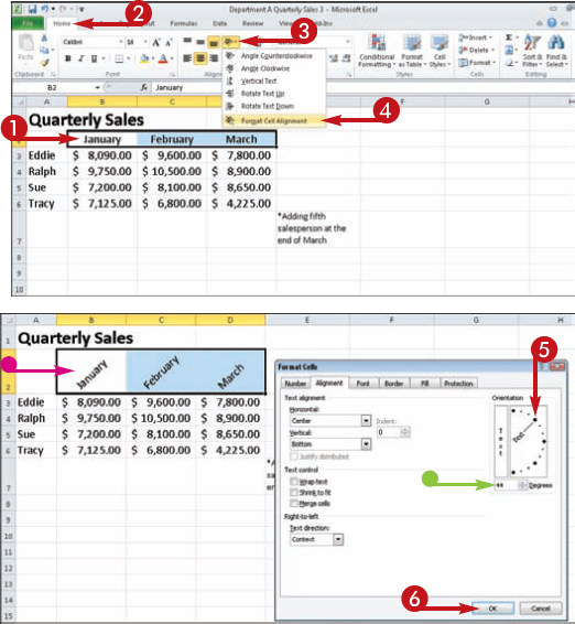
The Format Cells dialog box opens to the Alignment tab.


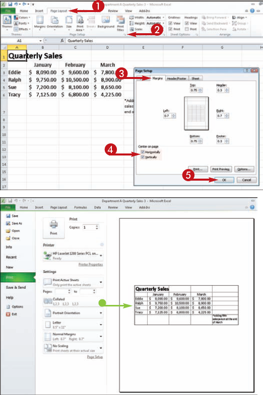
By default, Excel aligns all printed data to the left and top margins of the page when you print it out, unless you specify otherwise. You may find that some of your worksheets look better if you center the data on the printed page. You can use the Page Setup dialog box to determine how you want the printed data to align on the page.
You can select the Horizontally option to center data between the left and right margins, or the Vertically option to center the data between the top and bottom margins. You can also apply both centering alignments to the same page at the same time.
In addition, you can also use the Page Setup dialog box to control other margin aspects for the printed page, such as setting exact margin values or margins for header or footer text.


The Page Setup dialog box appears.



Another way to make your worksheets more visually appealing is by centering title text, such as a range heading, across several columns. Ordinarily, when you want to center text across several worksheet cells, you must use the Merge Cells command. This command creates one large cell to contain the title text. However, if you need to cut or copy the rows or columns that intersect with the merged cell, Excel does not allow you to do so. You may also find it difficult to perform a sort on a list that contains a merged cell.
Fortunately, there is another technique that centers your title text without combining worksheet cells. Using the Center Across Selection option in the Format Cells dialog box, you can achieve the same appearance as if you merged the cells. This technique leaves intersecting rows and columns safe for cutting and copying later.


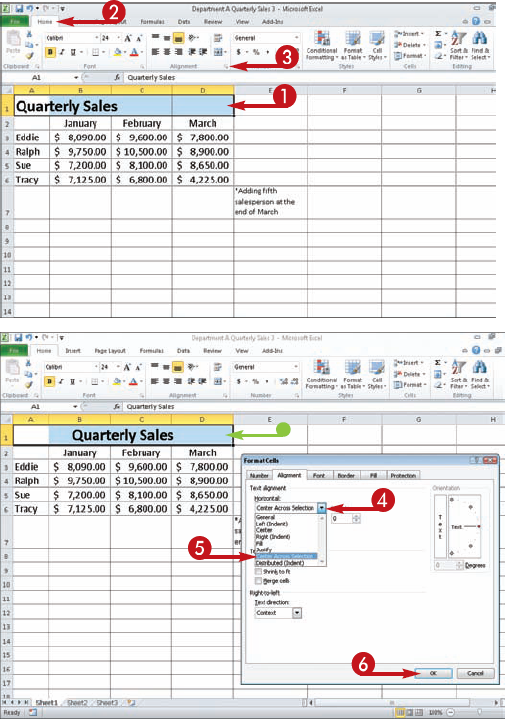
The Format Cells dialog box opens to the Alignment tab.


