9 Retouching People

© 2013 Cengage Learning®, All Rights Reserved.

© 2013 Cengage Learning®, All Rights Reserved.
THE PHOTOS IN THIS CHAPTER SHOWCASE REAL PEOPLE engaging in real life. They aren’t picture-perfect portraits shot in a studio. The studies illustrate the types of problems that tend to crop up in casual photography. You’ll learn how to quickly fix that photo of yourself with dandruff or the precious one of your kids where they all have red eyes so you can enjoy the photos.
Aside from feeling good about fixing up photos, it’s really fun working with people. It was fun for me to give myself a makeover. Err, well, a makeover in PaintShop Pro. I’m not ready to go spend the day at the spa with cucumbers on my eyes and mud on my face!
|
|
|
|
|
|
|
|
|
|
|
|
|
|
|
|
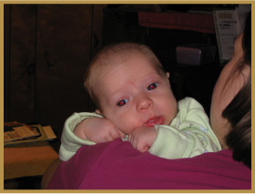
Photo Study 40: Removing Red Eye
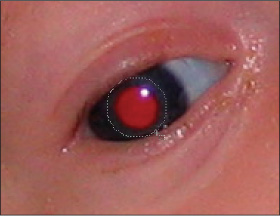
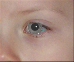
FIGURE 9.1 IS A PHOTO OF MY youngest child, Samuel, from 2007. I’m taking the photo from behind Anne as she holds him over her shoulder. It was dark enough in the room that the flash went off, and sure enough, it caught him with red eyes. If you don’t know, red eye is caused by the eye not reacting fast enough to the flash, which allows light to reflect off the blood-filled retina at the back of the eye. Animals aren’t immune to this effect, and certain animals (cats, for instance) have a reflecting layer on the back of their eyes, which increases the problem. This layer is why a cat’s eyes appear to glow in the dark.
Figure 9.1
Attack of the serious red eye.
© 2013 Cengage Learning®, All Rights Reserved.
There are a number of ways to get rid of red eyes in PaintShop Pro. I’ll start by showing the Red Eye tool and then my own technique.
Duplicate Layers
This photo study, and many that follow, use my technique of duplicating the Background layer and applying changes, such as the Red Eye tool, to that duplicate working layer. This preserves a copy of the original photo within the working .pspimage file. If I hide all the intervening layers, I can quickly compare the top “after” layer to the bottom “before” layer and see the overall transformation.
Using the Red Eye Tool
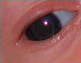
The standard method for removing red eyes in PaintShop Pro is to grab the Red Eye tool, which is located on the Tools toolbar. There is only one option to choose: the tool’s size. I’ve selected the tool in Figure 9.2, sized it to cover the entire red portion of Sam’s eye, and clicked on the red eye to apply. It did a pretty good job in the center, but there is still a red ring around his pupil.
Figure 9.2
Red Eye tool does well, but not completely.

© Corel® Corporation, All Rights Reserved. © 2013 Cengage Learning®, All Rights Reserved.
I kept clicking in the red area that was left behind in Figure 9.3 to see if I could complete the repair. I was able to make it better, but couldn’t completely eliminate a red tinge.
Figure 9.3
Further application is better.
© Corel® Corporation, All Rights Reserved. © 2013 Cengage Learning®, All Rights Reserved.
You might think that if I made the tool larger, much larger than the red pupil, that it would take care of all the red. Unfortunately, this is not always the case. I enlarged the Red Eye tool to a diameter of 99 pixels in Figure 9.4 and applied it to the same eye as before. The result is essentially identical.
Figure 9.4
Larger tool does about the same.
© Corel® Corporation, All Rights Reserved. © 2013 Cengage Learning®, All Rights Reserved.
An Alternate Technique
I’m not saying the Red Eye tool is useless or that you should never use it, but I want to extend beyond the simple basics of “click here” for portions of this book. There will be times when the Red Eye tool won’t work the way you want it to, and you will have to figure out a way to get the job done. This section shows you a technique that I came up with and use when I absolutely have to get the red eye out.
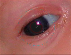
First, duplicate the Background or working layer in case you want to erase around the effect and blend it in with the layer below. Then choose the Selection tool from the Tools toolbar and change the Selection type from Rectangle (which is the default) to Circle.
Using Different Selection Types
You don’t have to use Circle if you don’t want to. Some pupils appear elliptical, and you may need to draw around the pupil of someone’s eye with the Freehand Selection tool. Use the type of tool that best fits your situation.
Then select the area around the red portion of the eye, as I have done in Figure 9.5. Get all the red, but don’t stray too far outside of this area.
© Corel® Corporation, All Rights Reserved. © 2013 Cengage Learning®, All Rights Reserved.
Now for the fun part. Take the red out of the eye with the Channel Mixer (Adjust ![]() Color
Color ![]() Channel Mixer). Uncheck the Monochrome box at the bottom of the dialog box and select different Output channels to edit. Since this is a case of too much red, the Red channel is a great place to start.
Channel Mixer). Uncheck the Monochrome box at the bottom of the dialog box and select different Output channels to edit. Since this is a case of too much red, the Red channel is a great place to start.
Figure 9.6 shows the settings that I use most of the time. You might think you should just be able to pull the red percentage down and be done with it, but you can’t. When I took red from 100% to 0% in this photo, the pupil looked too blue, and the glint was more cyan than white. I had to keep searching for the right combination, but I think I eventually found it. Leave the Green and Blue channels alone and set the Red, Green, and Blue percentages for the Red channel to 0, 125, and –15, respectively. (These numbers should work for most eye colors because you’re taking the red out of the pupil, not altering the iris.) Be patient and keep fine-tuning if you need to. You can match the pupil’s color to what it should be very precisely. By the way, if you take all the color out and make the pupil or iris absolutely black, you’ll make people look like aliens.
Figure 9.6
Tweak the Red channel.
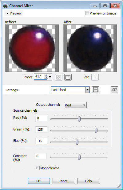
© Corel® Corporation, All Rights Reserved. © 2013 Cengage Learning®, All Rights Reserved.
I’ve accepted my Channel Mixer settings, and the result appears in Figure 9.7.
Figure 9.7
Red eye is really gone this time.

© 2013 Cengage Learning®, All Rights Reserved.
When I first removed red eye using this technique, I was astounded. I still am, really. The red is gone, and the pupil matches the rest of the eye. Notice that there’s a light area on the inside of the iris, next to the pupil. That’s the glint in someone’s eye. Take a look at some good close-ups of eyes without red eye, and you’ll see that this is the way an eye should look. Don’t try to take that out of a person’s eyes.
Finishing the Photo Study
Sam’s red eyes were about the only dramatic thing wrong with this photo. I tried brightening the background, but in essence, that “flaw” puts more of the focus on Sam, which is what I want. When the background is brighter, the clutter on the table and the piano stands out more. So I removed the red eyes with my technique and performed a Histogram Adjustment to improve the brightness and contrast. Finally, I smoothed Sam’s skin with Skin Smoothing (50). The finished study is shown in Figure 9.8. You should be able to complete retouching work like this quickly.

© 2013 Cengage Learning®, All Rights Reserved.
Photo Study 41: More Red Eye Techniques
MY SON, JACOB, IS SITTING on the couch watching television in Figure 9.9. This photo was taken on his birthday in 2008. He’s got his bear, Jonesy, with him. Jake’s red eyes are looking off obliquely to the camera, and his pupils appear elliptical. Red eyes that aren’t perfectly circular can be more difficult to retouch.
Figure 9.9
Cute photo marred by red eye.
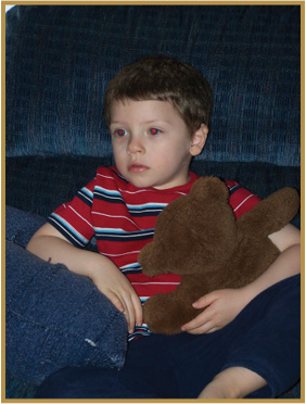
© 2013 Cengage Learning®, All Rights Reserved.
More Techniques
In this photo study, I will show you four red eye removal techniques one after another. The first uses the Red Eye tool, the second the Red Eye Removal command, the third a variation of the Red Eye Removal command, and the fourth is my own technique.
Red Eye Tool
I selected the Red Eye tool from the Tools toolbar and applied it to Jake’s eye in Figure 9.10. It has about the same effect as the previous photo study. Namely, it gets the red out of the center but leaves a red margin around the outside. In cases like this, enlarge the tool and try again. There are times you’ll hit the jackpot, and it will look great.
Figure 9.10
Red Eye tool on an elliptical pupil.

© Corel® Corporation, All Rights Reserved. © 2013 Cengage Learning®, All Rights Reserved.
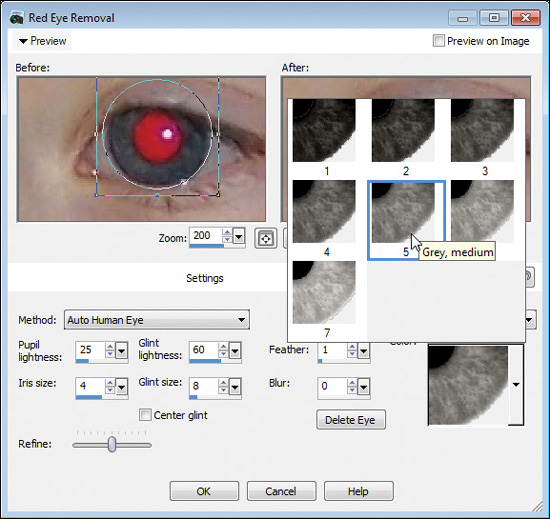
The Red Eye Removal Feature
There’s an alternate method of removing red eye tucked in a place you may not think to look. It’s called Red Eye Removal and is located in the Adjust menu. Figure 9.11 shows the Red Eye Removal dialog box. It’s pretty intense, and there are a lot of settings that affect how it works. You can spend a lot of time practicing with this one.
I’ll run through a series of steps to show you how to use Red Eye Removal. Many of the steps aren’t sequential. In other words, you can follow most of these in sequence, or not, or find a sequence you prefer to use instead of this one. It’s your call.
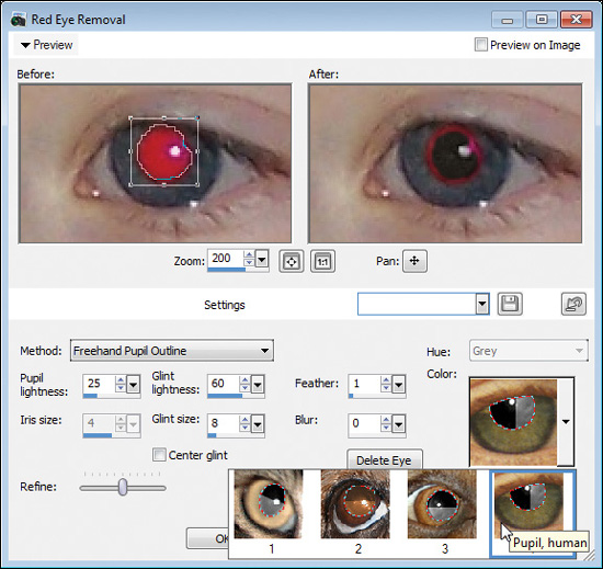
1. Choose a method. The options are Auto Human Eye, Auto Animal Eye, Freehand Pupil Outline, or Point-to-Point Pupil Outline. With the Auto methods, you have only limited ability to adjust the edges of the iris shape. With the Outline methods, you have more control since you manually draw around the pupil. If the eye is fairly circular, the Auto methods are more effective. For this example, I’ve chosen Auto Human Eye. I’ll cover another method later.
2. Select an eye in the left windowpane. You’ll see a circle, just like the Circular Selection tool, appear as you click and drag. The center point is where you click. Drag until it looks to be the right size and then let go. When you release the mouse button, the circle appears inside a box, as shown in Figure 9.11. You can resize the circle (which represents the eye’s iris) by clicking and dragging the box around the eye’s iris. You can move this box around by clicking on the inside and dragging.
If you click outside this eye’s iris, you’ll draw more circles, enabling you to perform multiple red eye removals at once. (You’ll either have to zoom out or move the Preview window view to the other eye.) If you want to delete a selection, select the square and click the Delete Eye button.
The trick here is to get the selection box sized just right and the circle positioned directly over the eye. You’ll see a preview of the effect in the right windowpane.
Figure 9.11
Draw box around the eye.

© Corel® Corporation, All Rights Reserved. © 2013 Cengage Learning®, All Rights Reserved.
3. Now it’s time to size the pupil (where the red is). Do this with the Iris size control. Note that increasing or decreasing the value of the Iris size control doesn’t change the outer diameter of the iris. It changes the pupil’s size within the iris. You’ll want this to be as exact as you can get it. Make sure to look at the right windowpane as you change the numbers. That’s where the iris size preview shows up.
4. At this point, take a look at the glint settings. Check Center glint if the glint is in the center of the eye, or uncheck it if the glint is offset, as it is in this case. You can also modify its lightness.
5. Next, change the Pupil lightness up or down. This has a dramatic effect, moving from black to a light gray.
6. You can also change the Feather and Blur settings. Feather affects the blend between the iris and pupil, and Blur takes the entire eye out of focus.
7. Next, drag the Refine slider left or right to match the overall shape of the eye and “completeness” of the iris. PaintShop Pro will change how much of the iris and pupil are displayed. Compare using the Before and After windowpanes until you get the best coverage.
8. Gray is the default color that Red Eye Removal will apply to the iris. You can change what shade of gray you want from the Color list box (see Figure 9.12). Click on an iris that matches your subject more closely. You can also choose a different color entirely, like green or blue.
9. Finally, click OK.
Most of the time, the Refine control gets you pretty close to the overall shape of the eye, but it isn’t always perfect. This is another reason why I duplicate the Background layer. I can erase the outer portion of the eye, the part the Refine control didn’t remove, as shown in Figure 9.13. Jake’s normal eye appears from underneath.
Figure 9.12
Choosing an iris hue and color.
© Corel® Corporation, All Rights Reserved. © 2013 Cengage Learning®, All Rights Reserved.
© Corel® Corporation, All Rights Reserved. © 2013 Cengage Learning®, All Rights Reserved.
Freehand Pupil Outline
Now that you’ve seen how to use Red Eye Removal in Auto mode, the Freehand Pupil Outline mode will be easier to follow. I’ll dispense with the steps and refer you to Figure 9.14.
Rather than selecting the eye’s iris, the Outline modes prompt you to outline the pupil. This technique is best suited for pupils that aren’t perfectly circular, as in this case. How you choose to outline the pupil is up to you. The difference is that in Freehand Pupil Outline mode, you’re drawing around the pupil just like you would use the Freehand Selection tool (Freehand mode). For Point-to-Point Pupil Outline mode, click at points outside the pupil to draw around it.
The other options are mostly the same between this mode and the Auto modes. The differences are that you don’t need to select an Iris size or Hue and you will need to select what type of eye you’re working on. You’ll make this selection in the Color section. The choices are Pupil, cat; Brown Pupil, dog; Black pupil, dog; and Pupil, human.
Figure 9.14
Using Freehand Pupil Outline.
© Corel® Corporation, All Rights Reserved. © 2013 Cengage Learning®, All Rights Reserved.
I’ve made a freehand selection in Figure 9.14 and am changing the color to a human pupil. You can see the preview in the right side of the window.
The Channel Mixer
I’ve selected Jake’s pupil in Figure 9.15 with the Selection tool. I changed the selection type to Elliptical to match the pupil. You can change the type to Circle or even switch to the Freehand Selection tool if you like. The important thing is to get all the red out and be working on a duplicate layer.
You can see that a portion of his eyelid is in the selection. Depending on their race (and other factors such as skin type and lighting), a person’s skin will have different amounts of red. Jake’s skin in this photo is pink. That might cause a little problem after I apply my color change. That’s why I use a duplicate layer. I can erase or mask out the extra and rely on the Background layer to pick up the correct color of his eyelid.

© Corel® Corporation, All Rights Reserved. © 2013 Cengage Learning®, All Rights Reserved.
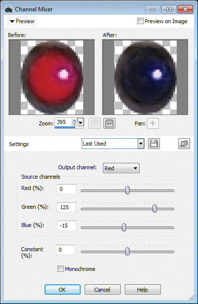
Next, I selected the Adjust ![]() Color
Color ![]() Channel Mixer menu to open up the Channel Mixer dialog box, as shown in Figure 9.16. I altered the amount of red in the Red Output channel as shown. You may need to tweak this, depending on the red in the red eye and the overall color balance in the photo.
Channel Mixer menu to open up the Channel Mixer dialog box, as shown in Figure 9.16. I altered the amount of red in the Red Output channel as shown. You may need to tweak this, depending on the red in the red eye and the overall color balance in the photo.
If it doesn’t look right, check the other channels to make sure that the Green and Blue channels are at their default. If it looks wacky, you may have leftover settings. To correct that, choose the Default preset from the Settings menu (this corrects the other channels) and enter new percentages in the Red channel for Red, Green, and Blue.
© Corel® Corporation, All Rights Reserved. © 2013 Cengage Learning®, All Rights Reserved.
The result is shown in Figure 9.17. I deleted the portion of Jake’s eyelid that was altered by the Channel Mixer so all you see is a perfectly retouched red eye and normal pink eyelid.

© 2013 Cengage Learning®, All Rights Reserved.
Finishing the Photo Study
Figure 9.18 shows the final result. I’ve completed the red eye removal in both of Jake’s eyes on a separate layer than the Background layer, erased the portions of his eyelids that were changed, selected everything and performed a merged copy, and then pasted the result as a new layer. Afterward, I used that merged layer as a basis to perform other adjustments. For this particular photo, I cleaned up parts of his pillow, darkened his skin with the Suntan Makeover tool, and cloned the top-left corner of the photo to extend the couch. After that, I lightened the photo a bit with Curves and then smoothed Jacob’s skin with Skin Smoothing (15). Finally, I brightened the entire photo with a Levels adjustment. All in all, it was a very successful retouching job.
Figure 9.18
Those blue eyes are sparkling now.

© 2013 Cengage Learning®, All Rights Reserved.
Photo Study 42: Whitening Teeth
THIS IS A FUNNY PICTURE OF ME and my daughter Grace (see Figure 9.19) from 2006. She’s wearing lots of pink, which was common for her. She’s trending toward purples and teals lately. She’s got pink glamour shades, a pink jacket, pink pants, and I think that’s a light pink top she has on. The furry thing around her neck isn’t a cat (although when it was on the floor at night it would freak me out because it looked just like our predominately black cats). It’s a detachable faux fur neck that goes on an old coat. We keep it around to play with, and she’s hamming it up as I hold her.
My teeth are really yellow in this photo. I don’t want to resign this nice picture to the stack that we never show anybody, however, so I will whiten my teeth as I enhance this photo.
Figure 9.19
Daddy with his princess.

© 2013 Cengage Learning®, All Rights Reserved.
Whitening Teeth
Whitening teeth is another retouching job that can go a long way toward making a photo better. The simplest method is to choose the Makeover tools from the Tools toolbar and then choose the Toothbrush from the Tool Options palette. Enter a Strength and click on the yellow teeth.
Easy does it. Most of us don’t have absolutely white teeth, and teeth that look too white can appear unnatural. To prove my point, look at Figure 9.20. I’ve applied the Toothbrush to my teeth and put the Strength up to 100. That’s overkill!
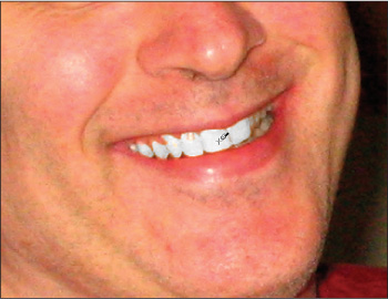
© Corel® Corporation, All Rights Reserved. © 2013 Cengage Learning®, All Rights Reserved.
A better technique is to tone down the Toothbrush and apply multiple levels of whitening until you get the desired result. I’ve chosen a Strength of 30 for my teeth in Figure 9.21 and the result is more realistic. You’ll notice that I pulled back the zoom quite a bit when compared to Figure 9.20. I get a better sense for how the whiter teeth will blend in with the rest of my face that way. Too much will stand out like a sore thumb, and too little is rather pointless.
Figure 9.21
Realistic is better.

© Corel® Corporation, All Rights Reserved. © 2013 Cengage Learning®, All Rights Reserved.
Teeth and Gums
If a person’s teeth aren’t touching (that sounds odd, but the gums may be separating the teeth), you may have to click multiple times on teeth in different areas to apply the Toothbrush successfully. The Toothbrush works partly like the Flood Fill tool.
Handling Blemishes and Skin Tone
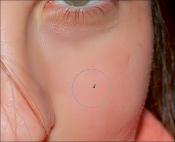
If you look carefully in Figure 9.22, you can see that I’ve applied the Blemish Fixer to a spot in my eyebrow. That’s a bad thing. You shouldn’t be able to see it. The problem is that the tool can blend the area around the blemish too much. In this case, that surrounding texture is my eyebrow hair, which makes blending obvious. It would be better to use the Clone brush in this area.
Figure 9.22
Blemish Fixer softens focus on brow.

© 2013 Cengage Learning®, All Rights Reserved.
The next few figures illustrate my efforts to even my skin tones. I’ve got some red areas (probably dry skin) on the bridge of my nose and other parts of my face. There are several possible ways to fix this problem.
I could use the Hue Up/Down brush to change the hue. I could use the Saturation Up/Down brush to lower the intensity of the red color in those areas. I could even try to use the Clone brush to clone areas of my skin that are a more pink color over the red areas. If you’re thinking along those lines, that’s great. Those are all good ideas.
I tried them, however, and wasn’t happy with any of them. It was after I switched to the Change to Target brush that I got the result I was after. I used the Change to Target brush in Hue mode to change the hue of the red areas of my face to match that of another, less red, patch of skin. If you ever wonder why there are tools like this in PaintShop Pro, and why they have all these different modes, this should help answer that question. This tool and this mode will fix this problem easily.
I chose the tool first (the Change to Target brush, in this case). Then I pressed Ctrl while I hovered my mouse over an appropriate color (see Figure 9.23) to load a color into the Foreground and Stroke Properties box on the Materials palette. That changed the cursor to the dropper, which I clicked to load the color. I went for a nice pink that wasn’t too red.
Figure 9.23
Select color for replacing hue.

© Corel® Corporation, All Rights Reserved. © 2013 Cengage Learning®, All Rights Reserved.
Next, and this is pretty important, I made sure the Mode (seen on the Tool Options palette) was in Hue. My goal was to match hues with another area, not lightness or saturation. With a more muted pink loaded into the right-sized brush, I started brushing away the red, as shown in Figure 9.24. If you’re doing this and it looks terrible, Undo and find another shade of skin tone from your face and try it again. Trial and error is critical for finding the right color sometimes.
Figure 9.24
Taking the red out.

© Corel® Corporation, All Rights Reserved. © 2013 Cengage Learning®, All Rights Reserved.
Other Touch-Ups
Before I close this photo study, I have a few more touch-ups to show.
First, as seen in Figure 9.25, I softened Grace’s sunglasses. They were smudged, and the softening effect reduced the smudginess and kept it from being too obvious. Look to make touch-ups like this in your photos. It wasn’t a big deal, but it was, if you know what I mean. If you’re going to retouch photos, use all the powers of your perception and imagination to make them better!
Figure 9.25
Softening smudged shades.

© Corel® Corporation, All Rights Reserved. © 2013 Cengage Learning®, All Rights Reserved.
Finally, I liked the levels of the subjects, but I wasn’t happy with the background. I isolated us from the background by performing a merged copy. (Remember, I did some cloning on my eyebrow, and when I clone I use a separate layer.) I pasted that as a new layer and then I duplicated the merged copy layer. One of the duplicate layers served as the Background layer (that I lightened) and the other held us. I am erasing us out of the Background layer in Figure 9.26. (A mask would work, too.)
Figure 9.26
Preparing to adjust background only.
© Corel® Corporation, All Rights Reserved. © 2013 Cengage Learning®, All Rights Reserved.
With that done, I could apply whatever color, brightness, or contrast change to the Background layer (the one I erased us out of) I wanted, and the foreground layer (myself and Grace) was left unchanged.
Finishing the Photo Study
To finish this photo, I applied a Histogram Adjustment to lighten up the background (the layer without us), and then I copied the merged photo, pasted that as a new layer, and made an overall levels adjustment. There’s a subtle sheen to the background (look at the paneling) that wasn’t there, and the contrast is much better. I made a Curves adjustment to brighten us up, masked Grace’s clothes out so they wouldn’t get too bright, and finished with Skin Smoothing. The final photo is shown in Figure 9.27.
I almost forgot to tell you, I cloned my thumb out. It’s not a huge difference, but I think it makes the photo better without the distraction.
Figure 9.27
Daddy looks better now.
© 2013 Cengage Learning®, All Rights Reserved.
Photo Study 43: Teeth, Eye, and Skin Touch-Ups
FIGURE 9.28 IS ANOTHER PHOTO of my wife, Anne, and son, Sam, from 2007. If you’ve got a digital camera and newborn children, you should be able to relate to this. We carried around the camera constantly, looking for opportunities to take more pictures. The great thing about digital photography is being able to take thousands of digital pictures and keeping the best.
If you take more pictures than you need, you’re bound to capture the right moment.
I will use this photo to polish Anne’s teeth a little differently than if I were to whiten them with the Toothbrush. I also want to show you a technique to brighten someone’s eyes and use Skin Smoothing. She’s in for a day at the spa!
Figure 9.28
Looking good, but worth touching up.
© 2013 Cengage Learning®, All Rights Reserved.
Whitening Teeth
In this photo of Anne, I just want to polish her teeth a bit. It’s more of a subtle approach than using the Toothbrush, but it makes teeth glow with a healthy radiance when you finish, instead of just being whiter.
To begin polishing, select the Lighten/Darken brush from the Tools toolbar and select an appropriate size. I like to make mine smaller than the tooth, but not by much. If it gets too small, you’ll see all the little brush lines (unless you set the Step to 1 and have Continuous selected in the Tool Options palette). I also set the Hardness to 0%. For 99% of the time, you’ll make your opacity something less than 100%. I am gently polishing Anne’s teeth in Figure 9.29 and have completed one of her incisors and moved on to another.
I’ll polish each tooth separately, changing my brush size if I need to. Do I need to mention that you should be doing all this on a duplicated layer (or otherwise copy-merged and pasted as new layer)? I didn’t think so.
© Corel® Corporation, All Rights Reserved. © 2013 Cengage Learning®, All Rights Reserved.
Now that her teeth are whiter, there are yellowish areas between Anne’s teeth in her gum line that should be pinker. I will use the same technique on her gums that I used in the previous photo study where I evened my skin tone.
I’ve selected the Change to Target brush, made sure it’s in Hue mode, adjusted the size to very small (4 pixels), pressed Ctrl and clicked to grab a good pink color from somewhere else on her gums, and changed the hue from yellow to pink, as shown in Figure 9.30.
Figure 9.30
Changing hue of gums.

© Corel® Corporation, All Rights Reserved. © 2013 Cengage Learning®, All Rights Reserved.
Retouching Eyes
People don’t have to have red eyes for you to retouch them. You can use this technique to change their eye color or strengthen the existing shade. In this case, I reinforced the existing green color.
Select Red Eye Removal from the Adjust menu to get started. Draw the eye selection and then choose your settings. Essentially, I pretended she had red eye and added a green color over her iris, as shown in Figure 9.31.
Figure 9.31
Deepening green eyes.

© Corel® Corporation, All Rights Reserved. © 2013 Cengage Learning®, All Rights Reserved.
I used the Auto Human Eye method because I could select a different Hue and Color to apply over her eye. There are a number of different shades and intensities of green to choose from. I tried to get a pretty good match to her original eye color.
Since I applied her “new” eyes on a duplicate layer and erased the extra (see Figure 9.32), I didn’t need to use the Refine control. Erasing, rather than using Refine, gives you more control over the area that is retouched.
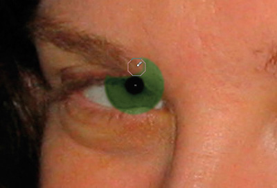
© Corel® Corporation, All Rights Reserved. © 2013 Cengage Learning®, All Rights Reserved.
Finally, I lowered the opacity of the new eyes layer to 30 to preserve most of the original hue (see Figure 9.33).
Figure 9.33
Lowering layer opacity to blend.
© Corel® Corporation, All Rights Reserved. © 2013 Cengage Learning®, All Rights Reserved.
Skin Smoothing
This is turning into a real makeover. Anne has beautiful skin, and she takes good care of it. But she’s human, and this is the real world. Unless you’re a full-time supermodel with your own personal skin smoother, you’re not going to have perfect skin. Besides that, models rely on digital artists to retouch their photos. Did you think those magazine close-ups were unretouched?
Figure 9.34 shows the Skin Smoothing dialog box. Select the person’s face or skin you want to smooth and choose Adjust ![]() Skin Smoothing. Choose a strength that looks good in the preview window and apply the filter.
Skin Smoothing. Choose a strength that looks good in the preview window and apply the filter.

© Corel® Corporation. © Cengage Learning®.
© Corel® Corporation, All Rights Reserved. © 2013 Cengage Learning®, All Rights Reserved.
For some photos (this is a good example of one), select the area you want to smooth before you start the process, rather than applying the effect to the entire photo. Sam’s skin doesn’t need any smoothing, so there’s no point in applying it to him. He’s only a few months old, and his skin is about as smooth as humanly possible.
If you need to be more precise than using a rough selection, use a mask and mask out what you don’t want smoothed.
Finishing the Photo Study
I finished the photo study by increasing the brightness by 15 and the contrast by 10 through Adjust ![]() Brightness and Contrast
Brightness and Contrast ![]() Brightness/Contrast; then I bumped up the saturation by 5 through Adjust
Brightness/Contrast; then I bumped up the saturation by 5 through Adjust ![]() Hue and Saturation
Hue and Saturation ![]() Hue/Saturation/Lightness. The photo was a little dark and had a gray sheen to it. The brightness and contrast adjustment took care of that, and then the saturation gave more vibrancy to Anne’s face. After looking at it closely for a while, I realized I could still improve the photo by cloning some imperfections from Anne’s face and using the Smudge brush very lightly on the brighter areas to tone them down. After this, I finished with another brightness adjustment. This time: Curves.
Hue/Saturation/Lightness. The photo was a little dark and had a gray sheen to it. The brightness and contrast adjustment took care of that, and then the saturation gave more vibrancy to Anne’s face. After looking at it closely for a while, I realized I could still improve the photo by cloning some imperfections from Anne’s face and using the Smudge brush very lightly on the brighter areas to tone them down. After this, I finished with another brightness adjustment. This time: Curves.
This is one of those photos with bright subjects and a dark background. I could have separated Anne and Sam from the background and adjusted their layer differently than the background. I decided against that, as I liked the dark background in this instance. Figure 9.35 is the final photo.

© 2013 Cengage Learning®, All Rights Reserved.
Photo Study 44: Glamorous Skin Smoothing
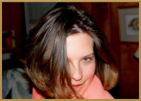
I TOOK THIS PHOTO (see Figure 9.36) of my wife, Anne, in 2009, on my birthday. It’s a great shot of her being playful, but when you look closely, her skin looks a little rough. That’s the problem with good cameras and lenses—they show everything, whether complimentary or not—with 10 or more million pixels of detail.
I’m going to give her a glamorous skin-smoothing makeover for this photo study. It’s actually not as hard as you might think, especially when the photo is great to start out.
© 2013 Cengage Learning®, All Rights Reserved.
The Treatment
Skin smoothing is a challenging endeavor to undertake because you risk smoothing away important details that make up a person, to say nothing about the rest of the photo. In that way, you face the same challenges when smoothing skin that you do when deciding how much noise reduction to apply to a noisy photo. The trick is to smooth a person’s skin in such a way that you don’t lose details in other areas of the photo.
Thankfully, there is a specific skin-smoothing adjustment in PaintShop Pro that targets skin. How well it does this in every circumstance is up to you to decide, but in general, the answer is very good. The trick is to only apply what you need, and if the going gets rough, mask out everything but a person’s skin so you don’t blur the entire photo.
Testing on Other Areas
To get a sense of how much skin smoothing affects the parts of the photo that aren’t skin, perform a “Max Effort Skin Smoothing” test. Here’s how I do it:
1. Duplicate the Background layer or the last fully opaque working layer you have so there are two identical layers you can use to compare.
2. Select the top layer and then choose Adjust ![]() Skin Smoothing. This launches the Skin Smoothing dialog box, which is so simple I don’t need to show it here. You only have to set the Amount.
Skin Smoothing. This launches the Skin Smoothing dialog box, which is so simple I don’t need to show it here. You only have to set the Amount.
3. Max the Amount and choose OK. No sense in playing around. You want to see where details are going to be lost the most.
The result is a layer with the most skin smoothing you can get from this tool on top of a layer without any.
4. Zoom in and out, pan around, and toggle the skin smoothing layer on and off to compare with the unsmoothed layer beneath it. Pay attention to where you lose the most detail outside of the skin and note these areas in case you need to return later to mask them out.
Figure 9.37 shows one side-by-side comparison of an area with lots of edge detail—Anne’s hair. Remember, I applied the maximum amount of skin smoothing to the photo. The result is a loss of detail, but not as much as you might expect. It looks like some of the highlights were smoothed.
Figure 9.37
Comparing maximum skin smoothing.

© 2013 Cengage Learning®, All Rights Reserved.
I find that toggling layers on and off is a very effective way of comparing results, even though it isn’t as convenient as looking at the Preview windows in most adjustment dialog boxes. That’s one reason why I don’t conduct this test for every photo. Knowing the right questions to ask and how to conduct tests to provide your own answers is pretty important, though.
Finding the Right Amount
Finding the right amount of skin smoothing for each photo is pretty simple. Just open up the Skin Smoothing dialog box and either use the Preview window or the main image window. The things you want to look for here are the following:
![]() Skin: The main effect. Look at areas of the skin to see how smooth they are and increase or decrease the Amount accordingly. Figure 9.38 shows her cheek with too little Skin Smoothing applied to make much of a difference. The Amount was 20.
Skin: The main effect. Look at areas of the skin to see how smooth they are and increase or decrease the Amount accordingly. Figure 9.38 shows her cheek with too little Skin Smoothing applied to make much of a difference. The Amount was 20.
Figure 9.38
The top swatch has no skin smoothing while the bottom has too little.

© 2013 Cengage Learning®, All Rights Reserved.
![]() Facial Hair: Examine areas where there is facial hair, such as mustaches, beards, sideburns, eyelashes, and eyebrows. Figure 9.39 shows the area around one of Anne’s eyes with the Amount at 100. This is too strong. Note the loss of detail in and around the hair follicles.
Facial Hair: Examine areas where there is facial hair, such as mustaches, beards, sideburns, eyelashes, and eyebrows. Figure 9.39 shows the area around one of Anne’s eyes with the Amount at 100. This is too strong. Note the loss of detail in and around the hair follicles.
Figure 9.39
Oversmoothing eyelashes and brows.
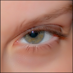
© 2013 Cengage Learning®, All Rights Reserved.
![]() Hair Boundaries: Check out parts, cowlicks, and other areas where the hairline begins. Pay attention to where wispy hair extends over the skin, as you will likely lose it there. Figure 9.40 shows a close-up of where some hair is covering Anne’s nose. In these cases, the amount of Skin Smoothing to use can be a tough judgment call. If you’re going for a glamorous effect, I wouldn’t worry about losing it.
Hair Boundaries: Check out parts, cowlicks, and other areas where the hairline begins. Pay attention to where wispy hair extends over the skin, as you will likely lose it there. Figure 9.40 shows a close-up of where some hair is covering Anne’s nose. In these cases, the amount of Skin Smoothing to use can be a tough judgment call. If you’re going for a glamorous effect, I wouldn’t worry about losing it.
Figure 9.40
Oversmoothing here doesn’t really matter.

© 2013 Cengage Learning®, All Rights Reserved.
At this point, you should have looked around and increased or decreased the amount of skin smoothing to suit your artistic purpose and not taken away the details you want preserved. If you have a tough time balancing things out, create a mask and apply skin smoothing to the photo layer below the mask layer. (They will both be in the same layer group.) Then mask out overly smooth areas. Don’t forget, you can also lower the opacity of the smoothed photo layer and blend it with the unsmoothed layers below.
Smudging
I settled on a final strength of 75, which sounds pretty strong, but was a bit undersmoothed for this image. I wanted a definite glamour look, but didn’t want it to look too airbrushed.
I wasn’t done, though. After applying skin smoothing to the working layer, I duplicated it and hid the original. I then chose the Smudge brush, made it reasonably large, lowered the Hardness to 0 and opacity to 50, and smoothed the rest of Anne’s face manually using gentle, circular brush strokes. (Hint: The larger the brush, the lighter your touch needs to be.) Figure 9.41 shows this in action.
Figure 9.41
Smoothing by smudging.
© Corel® Corporation, All Rights Reserved. © 2013 Cengage Learning®, All Rights Reserved.
I tried using the Soften brush, but it didn’t actually smooth away the details. The Soften brush softened edges, but didn’t make her skin look smooth. The key is to choose the Smudge brush and lower the opacity to get a good smooth look. I varied the size of the brush and worked it over any areas that I thought could use more smoothing.
Next, I lowered the opacity of the “smoothed and smudged” layer to blend it with the normal layer beneath, as shown in Figure 9.42. Use your judgment here. The key is to balance realism with glamour.
Figure 9.42
Blending the extra smoothing.

© Corel® Corporation, All Rights Reserved. © 2013 Cengage Learning®, All Rights Reserved.
Next, I performed a copy merged to lock all the changes into a single layer. (This is important when you’re working with semi-transparent layers that blend together and you want a single opaque working layer to continue with.) Then I used the Clone brush and Blemish Fixer to remove any remaining imperfections in her skin.
Finishing the Photo Study
After all that, I corrected the photo’s brightness and contrast problems with Levels and boosted the Vibrancy a bit. I then experimented with the Glamour effect in Effects ![]() Photo Effects
Photo Effects ![]() Film and Filters. This gave Anne a healthy glow about her that I liked. I also experimented going the opposite direction and tried sharpening the photo with Unsharp Mask.
Film and Filters. This gave Anne a healthy glow about her that I liked. I also experimented going the opposite direction and tried sharpening the photo with Unsharp Mask.
Figure 9.43 shows the final result. I’m happy with the balance of skin smoothing that resulted in a glamorous effect and yet doesn’t look overly done. I ended up using the Glamour filter, but toned it down some by lowering that layer’s opacity and blending it with the first working layer beneath the Glamour filter layer.
Figure 9.43
Glamorously smooth but not fake skin.
© 2013 Cengage Learning®, All Rights Reserved.
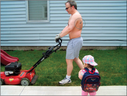
Photo Study 45: Complete Body Makeover
I’M HAPPILY MOWING THE LAWN in Figure 9.44, dressed in my lawn-mowing sneakers and shorts. The year was 2007. I like getting air and sun while I mow, so I dress minimally. It’s an hour or so that I get to be outside doing something physical.
I’ve been an outdoor person and athlete most of my life, although it’s been much harder to find the time the last few years. When I was at the Air Force Academy, physical fitness was regular and intense. Mandatory gym classes ranged from wrestling, boxing, judo, and unarmed combat, to water survival, which included a jump off a 10-meter platform in fatigues like you were bailing out of an airplane into the water.
Figure 9.44
You don’t have to say a thing.
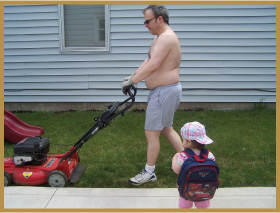
© 2013 Cengage Learning®, All Rights Reserved.
Well, that was some time ago. I’m pale and flabby in this photo. But that makes it the perfect candidate to give myself a complete body makeover with the Warp brush.
Tummy Tucking
Conceptually, once you get the hang of what’s going on here, it becomes a matter of execution.
First, I duplicated my Background layer so that I had a working layer to manipulate. Next, I started on the most obvious feature in need of repair, my tummy. (You talk funny when you’ve got four children under eight years of age—I would have never called this my “tummy” before I had kids.)
I tried to warp it in, but after several tries I realized it wasn’t going to work. I needed to think outside the box. The solution was to copy and paste my stomach, rotate it to a new orientation, and then flatten it.
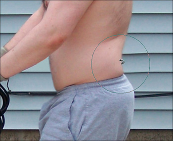
I selected it in Figure 9.45 with the Freehand Selection tool (Point mode). I made a rough selection with a little more than I needed because I will erase the extra and blend it in later.
Figure 9.45
Select the offending bulge.

© Corel® Corporation, All Rights Reserved. © 2013 Cengage Learning®, All Rights Reserved.
I copied and pasted it as a new layer, and rotated it to a more vertical orientation in Figure 9.46. I hid the other layers so you could see the rotation. When you do this, make whatever you’re transplanting semi-transparent so you can judge the rotation in relation to the background.
Figure 9.46
Rotate to desired angle.

© Corel® Corporation, All Rights Reserved. © 2013 Cengage Learning®, All Rights Reserved.
I used the Warp brush in Push mode to flatten the bulge, as seen in Figure 9.47. Take your time with these warps. They are very important. Don’t get tripped up by selecting too small a brush. Sometimes, a smaller brush works worse than a larger brush. In this case, a good large brush size (150) allowed me to push the center of my stomach in as a cohesive whole, rather than making several small, disjointed pushes.
Figure 9.47
Flatten with Warp brush.
© Corel® Corporation, All Rights Reserved. © 2013 Cengage Learning®, All Rights Reserved.
With the new tummy prepped and ready, I moved on to erase the bulging original. I used the Clone brush (see Figure 9.48) to push my stomach in and make it flat. I’m not worried about the outer border of the original stomach not looking perfect because the flattened version will serve that purpose. I just need to get enough of the old tummy out of the way so that it doesn’t stick out from under the new, flatter one.
Figure 9.48
Clone away excess original tummy.

© Corel® Corporation, All Rights Reserved. © 2013 Cengage Learning®, All Rights Reserved.
I placed the rotated and warped tummy in position and toggled it on and off so that I could judge the right amount of cloning I needed to do. You will see the flatter, composite stomach in the next figure.
More Cosmetic Warping
With the new stomach in place, it’s time for more cosmetic warping. I kept with the Warp brush in Push mode and alternated the size so that I picked up enough material in my warps to make steady, integrated pushes.
I am warping my “love handles” and pushing my back inward in Figure 9.49. This accentuates the curve of my back and will round the top of my buttocks. If you’re still looking at my back, notice the shadow between the hair on my back and where I am pushing in. That’s a good candidate to use the Lighten/Darken brush to take out some of the shadow (i.e., lighten it) to reduce its visual dominance.
Figure 9.49
Warping those love handles.
© Corel® Corporation, All Rights Reserved. © 2013 Cengage Learning®, All Rights Reserved.
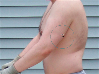
Next, I worked my way up to my arms. First, I added some muscle to the back of my arm, or triceps, as seen in Figure 9.50. I’m clicking and dragging the arm toward my back to get the right bulge. Be careful with Undo and the Warp brush. Take one area at a time (like I’m doing here) and then apply the warp. After you apply, move on to another area. That way, if you have to undo something, you won’t lose all your warps.
© Corel® Corporation, All Rights Reserved. © 2013 Cengage Learning®, All Rights Reserved.
To balance my arms, I decided to add mass to my biceps. It’s a simple operation of clicking and dragging toward the front, as seen in Figure 9.51.

© Corel® Corporation, All Rights Reserved. © 2013 Cengage Learning®, All Rights Reserved.
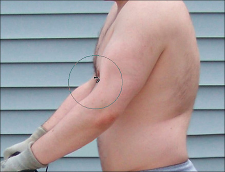
Warping my biceps out had the side effect of increasing my chest, and I didn’t like that, so I decided to push the chest (not the arms) back in, as shown in Figure 9.52. I also accentuated the biceps by making my elbow look a little tighter. Pay attention to things like the siding on the house behind me. Those lines and shadows forced me to push material in line with them (or clone out problems later). If I weren’t careful, you would see a bunch of wavy siding around me, giving something away.
Figure 9.52
Accentuating biceps.
© Corel® Corporation, All Rights Reserved. © 2013 Cengage Learning®, All Rights Reserved.
I said that once you got the concept down, this was easy. As you can see from Figure 9.53, I continued finding different parts of my body that needed to be enhanced or minimized, and then I applied the desired warp effect.

© Corel® Corporation, All Rights Reserved. © 2013 Cengage Learning®, All Rights Reserved.
Finally, I tightened up my neck and chin in Figure 9.54. There is less margin for error working around the face and chin, and I had to be careful here because the facial hair complicated the texture of my neck. If I just squished it in without thinking, I would make myself look much worse. To avoid that, I used smaller brushes and strokes.
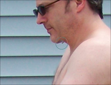
© Corel® Corporation, All Rights Reserved. © 2013 Cengage Learning®, All Rights Reserved.
Tanning
Last, but not least, I need a tan. The greatest challenge with the Tanning tool is to tan what you want without darkening your clothes or anything else. In cases like this, use a mask to mask out what you don’t want to tan.
First, I copy merged and pasted that as a new layer. I then duplicated that merged layer to work with my mask. Then I moved on to creating the mask.
I created a “Show All” mask in Figure 9.55 and hid everything but the skin I wanted to tan. I also set up a white layer and a black layer underneath so that I could see where the borders were. I used those layers to help me see what I needed to mask. Without those helper layers, I would see either one of my merged layers underneath (which would make it impossible to tell where I was masking) or, if they were hidden, the transparent background.
This is like painting or erasing. Modify the size and hardness of your brush and make a few passes around your subject. You’re not adding to or removing anything but the mask. You can paint the mask right back (or remove it, as the case may be) if you make a mistake. The important point is to make sure that you’re working on the mask layer, not a photo layer.
Figure 9.55
Preparing the mask.

© Corel® Corporation, All Rights Reserved. © 2013 Cengage Learning®, All Rights Reserved.
The purpose of the mask is to set up a complicated selection—namely, my skin, and not to include my hair, sunglasses, clothes, or any other background. Here’s how to make that selection and apply the tan.
1. Finish the mask.
2. Duplicate the photo layer and put it above the mask. This isn’t absolutely necessary, but it’s how I like to work. This is the layer that I applied the tan on.
3. Select the Mask layer (this is very important). It is contained in the layer group that gets created when you first create the mask and has a little mask icon next to its thumbnail in the Layers palette. In my case, the Mask layer is mostly black because I’m hiding most of the photo.
4. Next, choose Selections ![]() From Mask. This will be active only if you’ve got the Mask layer selected in the Layers palette. This makes a selection based on the mask you created, and in this case is the purpose for creating the mask in the first place. With my skin selected, I can apply the tan liberally and not worry about it bleeding into other areas of the photo.
From Mask. This will be active only if you’ve got the Mask layer selected in the Layers palette. This makes a selection based on the mask you created, and in this case is the purpose for creating the mask in the first place. With my skin selected, I can apply the tan liberally and not worry about it bleeding into other areas of the photo.
5. Now, click on the layer in the Layers palette where you want to apply the suntan. In my case, it was the layer I put above the mask group.
6. Finally, select the Makeover tool and choose the Suntan mode. Resize it if necessary and apply the suntan, as seen in Figure 9.56.
© Corel® Corporation, All Rights Reserved. © 2013 Cengage Learning®, All Rights Reserved.
The suntan was a little dark on me, so I took that layer and lowered its opacity to blend it with an untanned layer beneath. This allowed me to set the tan’s strength exactly where I wanted it to be.
I chose to use a mask to make a selection in this photo study and then apply a tan to the area within the selection on a separate photo layer. That “tanning” layer wasn’t a part of the mask group. An alternate method is to apply the tan to the photo layer in the mask group and let the background show through from beneath. I did it this way mostly to show (or remind you) how to make a selection from a mask.
Finishing the Photo Study
That’s really all there is to it. I copied and pasted a few areas (my tummy and one small area of my waistband that I didn’t have room to show you), warped them, and blended them in with the Clone brush. I used the Warp brush again to give myself some extra bulk in the muscle department and minimize my chest and chin. Then I created a mask of my skin so that I could apply the Suntan tool and blended that layer with an untanned layer to get the right strength.
To wrap it up, I made some brightness and contrast adjustments and ran the photo through the Smart Photo Fix. The finished product is Figure 9.57.
Figure 9.57
This is what I should look like.

© 2013 Cengage Learning®, All Rights Reserved.
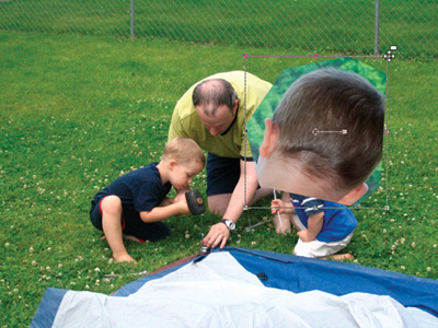
Photo Study 46: Hiding Hair Loss
CAMPING IS FUN, and camping with your kids is even more fun. Ben, Jake, and I are setting up our tent in the backyard in Figure 9.58. (This was in the summer of 2006, about six months before Sam was born and while Grace was still just a wee babe.) I’m giving Ben a turn hammering the tent stake in, while Jake watches intently, ready for his turn to come next.
And there’s my head. You can clearly see my thinning hair and balding spot. Rather than try to darken my scalp or thicken the existing hair, I want to show you how to perform a hair transplant.
Figure 9.58
Remind me not to look down again.

© 2013 Cengage Learning®, All Rights Reserved.
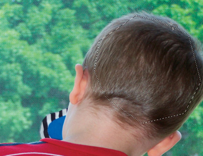
First, I needed to find a suitable hair replacement. I scoured our digital photo collection and found a decent photo of my son Jacob from the back. He was looking out the front door (see Figure 9.59), and his hair looks great. I made a selection of the hair I wanted to take and copied it.
Figure 9.59
Copying Jake’s hair.
© Corel® Corporation, All Rights Reserved. © 2013 Cengage Learning®, All Rights Reserved.
Next, I pasted that hair as a new layer into the photo I wanted to modify, as seen in Figure 9.60. I used the Pick tool to shrink it down to the right size and match the two hair textures. It wouldn’t look right if I had hair that was as thick as ropes!
Figure 9.60
Paste, resize, and position.
© Corel® Corporation, All Rights Reserved. © 2013 Cengage Learning®, All Rights Reserved.
After resizing it, I positioned it over my head and trimmed it down to fit (see Figure 9.61). Because Jake’s hair is lighter than mine, I had to use the Burn brush (Limit set to Highlights) to darken his hair to match mine.
Figure 9.61
Burn to match darkness.

© Corel® Corporation, All Rights Reserved. © 2013 Cengage Learning®, All Rights Reserved.
Because I didn’t want it looking like a toupee, I trimmed Jacob’s hair transplant to match my basic hairline in Figure 9.62.
Figure 9.62
Trim to desired hairline.
© Corel® Corporation, All Rights Reserved. © 2013 Cengage Learning®, All Rights Reserved.
For the same reason, I reduced the opacity of the hair transplant layer to 57. This blended it with my balding head and made it look more natural, as shown in Figure 9.63.
Figure 9.63
Blend using layer opacity.

© Corel® Corporation, All Rights Reserved. © 2013 Cengage Learning®, All Rights Reserved.
Finishing the Photo Study
This study has surprised me by how natural the new hair looks. After selecting all, copy merged, and pasting as a new layer, I increased the contrast and ran the photo through a filter. I used the Effects ![]() Photo Effects
Photo Effects ![]() Film and Filters menu to access the film filter effects and applied the Vibrant Foliage (because there’s a lot of nice green grass in this photo) filter to get the final effect. Figure 9.64 shows the result.
Film and Filters menu to access the film filter effects and applied the Vibrant Foliage (because there’s a lot of nice green grass in this photo) filter to get the final effect. Figure 9.64 shows the result.
I want to point out that I didn’t just copy and paste someone else’s hair on my head. I worked it. I chose someone I’m related to, carefully burned the transplanted hair color, erased it to fit a realistic hairline, and then blended it into the photo by making it more transparent. This approach is very effective.
Figure 9.64
A very good hair transplant.

© 2013 Cengage Learning®, All Rights Reserved.
Photo Study 47: Cleaning Up Nostrils
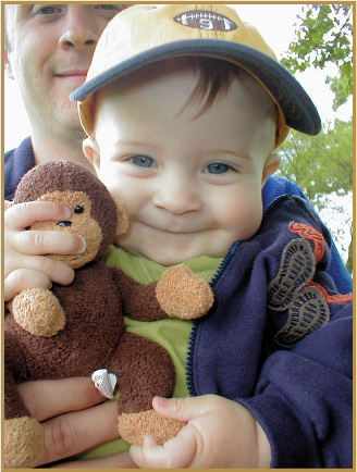
I’M HOLDING MY SON, BEN, in Figure 8.67. It was in the spring of 2003, and we had our jackets on.
What’s the first thing you notice when you look at this picture? Is it Ben, his smile, his eyes, his monkey, or is it the hairs coming out of his Daddy’s nose? Once you spot them, you can’t stop looking at them. One relatively minor blemish in a photo can overwhelm the positive things that are present.
Figure 9.65
Funniest photo study title ever.

© 2013 Cengage Learning®, All Rights Reserved.
Fixing Noses
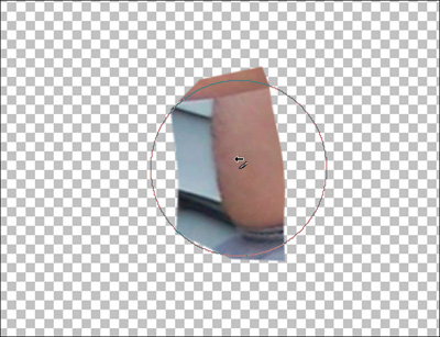
To fix the problem, I first cloned away the nose hairs on the outside of my nose, as seen in Figure 9.66.
Figure 9.66
Clone hairs outside of nose.
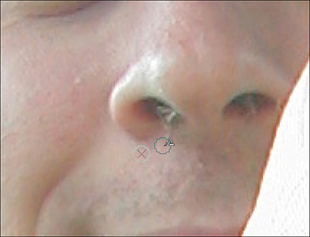
© Corel® Corporation, All Rights Reserved. © 2013 Cengage Learning®, All Rights Reserved.
Since there wasn’t enough darkness in my nostrils to clone over the hair that was still visible, I used the Burn brush to darken the light pixels (which is the hair), as shown in Figure 9.67. I switched the Limit parameter (look to the Tool Options palette to find it) to Highlights to burn only the brighter values.
Figure 9.67
Burning nostril to darken.

© Corel® Corporation, All Rights Reserved. © 2013 Cengage Learning®, All Rights Reserved.
When I got one good, dark nostril, I cloned that over to the other side, as seen in Figure 9.68.
Figure 9.68
Cloning dark nostril to the other.
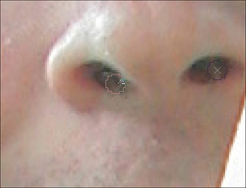
© Corel® Corporation, All Rights Reserved. © 2013 Cengage Learning®, All Rights Reserved.
I wanted this to be an unobtrusive part of the photo, so I used the Soften brush to ensure that there were no sharp pixel borders to draw anyone’s eyes to. I was careful to gently soften the nostril, as seen in Figure 9.69.

© Corel® Corporation, All Rights Reserved. © 2013 Cengage Learning®, All Rights Reserved.
Finally, I tackled some extra blemishes on my neck and on Ben’s nose, as shown in Figure 9.70, using the Blemish Fixer. Always be on the lookout for things like this to fix. Even small improvements can make a difference.
Figure 9.70
Taking out extra blemishes.

© Corel® Corporation, All Rights Reserved. © 2013 Cengage Learning®, All Rights Reserved.
Finishing the Photo Study
This is an example of a photo that didn’t take me more than 15 minutes to retouch from start to finish. I spent the most time at the end, deciding on which method to use to enhance the brightness and contrast.
In the end, I used Smart Photo Fix and then altered the levels. The final result, as seen in Figure 9.71, is free of extraneous nose hairs and blemishes.
Figure 9.71
Nose hairs safely trimmed.
© 2013 Cengage Learning®, All Rights Reserved.