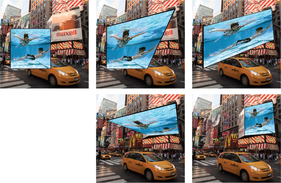
Chapter 5. Perspective, Point of View, and Scale

Photography compresses the three-dimensional world into a two-dimensional world. It flattens reality. However, it is possible to bring depth and dimensionality to your photographs with proper attention to perspective, lens choice, point of view, and scale. These principles are even more crucial when you’re shooting multiple elements under different conditions and attempting to combine them seamlessly, as with photorealistic composite images. The other key factor for dimensionality is the light, which was discussed extensively in the previous chapter. In this chapter we’ll concentrate on the way your lens renders the spatial relationships that exist anywhere you look in the three-dimensional world, how it processes that dimensional information, and how it renders it to a plane.
A good understanding of the general principles of lenses and perspective in straight photography is necessary before you try to tackle perspective in a composite. How many composite images have you seen where the scale and perspective are so far off they look like bad cartoons? Or perhaps you’ve seen others that are almost right but there are a few elements whose shapes don’t fit exactly into the scenes, rendering the entire images unbelievable. If you can match the perspective of all the elements in your composite, along with the lighting, of course, you’ll be able to create very convincing photorealistic illusions that look natural. Because Adobe Photoshop is a 2D application, you work on the X (horizontal) axis and Y (vertical) axis of an image.
The third dimension, which is not in Photoshop, is the Z dimension—the depth dimension in which camera, light, and position can be changed. Once an image is photographed and is in Photoshop, you cannot change any of these important visual properties. Therefore, you need to carefully plan and photograph with these considerations in mind before launching Photoshop.
In this chapter, you’ll learn:
• Basic principles of lenses
• How perspective works in photography
• How to match perspective for photorealistic composites
• How to control scale in composite images
• How to exaggerate scale and perspective for surreal images
Basic Principles of Lenses
Before making a single exposure, a professional photographer makes numerous decisions regarding camera equipment, lens choice, point of view, lighting, studio considerations, and style. These decisions influence the look, feel, and quality of the image and can make or break the final composite. A thorough knowledge of the attributes of available lenses is invaluable in planning how you’ll photograph each element in the composite. Planning ahead and making the right equipment choices and shooting decisions always results in a better image. For each shoot you’ll have to decide on your focal length, aperture, and depth of field, and through these choices, you’ll determine how the lens interprets the scene you’re capturing.
This book isn’t an all-inclusive photography book, and the dedicated space cannot replace the numerous books, lectures, and classes that address lenses and photographic issues. This section is rather just a rudimentary guide to how lenses work and their specific application to composite images.
Focal Length
The focal length of a lens, usually represented in millimeters, is a calculation of the distance between the point at which light rays converge to form a sharp image of an object—the focal point of the rear nodal point when the lens is focused at infinity—to the focal plane, which in digital cameras is the surface of the digital sensor. A 24mm lens is a wide-angle lens because it has a comparatively short focal length, and a 400mm lens is a telephoto or a long lens. Lens focal length determines the angle of view or how much of the scene will be captured, and lens magnification determines how large individual elements will be. A short focal length has a wide angle of view and the objects in the scene are less magnified, whereas a long focal length has a narrow angle of view and the objects are more magnified. Focal length also affects the relationship of the background to the foreground and the expansion or compression of the scene. It determines the way objects and people are rendered in the scene; that is, if they are distorted by their proximity to a wide-angle lens or compressed as with a telephoto lens.
Wide angle to telephoto
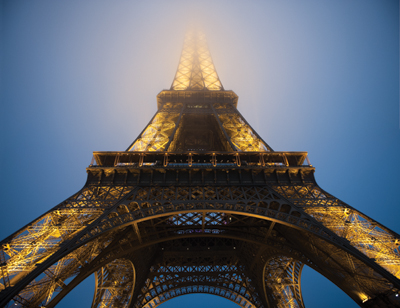
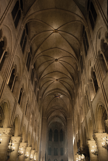
Wide-angle lenses range from 14mm to 40mm in the full-frame, digital camera format and are recommended when you want to show an expansive scene that has depth and a distinct foreground, middle ground, and background (FIGURE 5.1). They are especially good for landscapes, architecture, or city scenes where you want to dramatize the perspective (FIGURE 5.2 and FIGURE 5.3). Wide angles tend to expand the spatial relationships of your scene, whereas telephotos will compress and flatten them. Normal lenses are usually in the range of 40mm to 60mm in the full-frame, digital camera format.
© JP
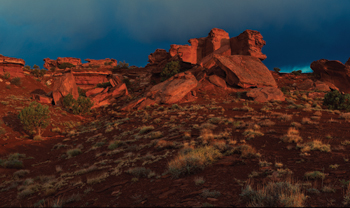
Figure 5.1. This desert landscape was shot with a 28mm wide-angle lens. Notice how the transition from foreground to background appears vast and extended.
© JP
Figure 5.2. This photo of the Eiffel Tower was shot with a 24mm wide-angle lens. Not only do wide angles let you get much closer to large subjects, but they also exaggerate the scale by the way they distort the subject.
© JP
Figure 5.3. This interior of Notre Dame was shot with a 14mm ultra wide-angle lens. It’s a vast space, and the 14mm is able to capture a great deal of it with its wide angle of view. As you decrease the focal length of your lens, you get more distortion of the subject.
The term full-frame, digital camera format refers to an image (or sensor) size of 24mm × 36mm, which was the standard size for the image area of photographs taken on 35mm film for many years.
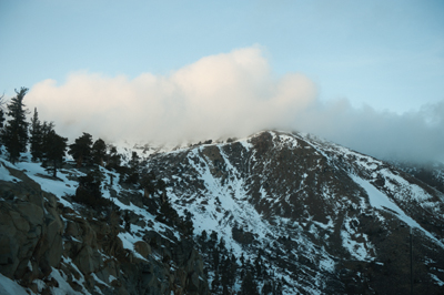
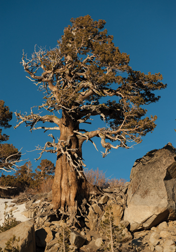
It’s important to note that depending on the size of your sensor, your lens focal length will have a different relationship to each corresponding format. For example, a 50mm lens on a full-frame, digital sensor format camera is a normal lens, meaning it sees the world similarly to your eye in terms of magnification and scale (FIGURE 5.4 and FIGURE 5.5); it’s not wide or telescopic. The same lens on a DX or cropped sensor camera would be considered a short telephoto because it’s essentially projecting the same size image on a smaller chip, which gives you less image information. In this section on lenses, we’ll refer to only the full-frame, digital sensor format for the sake of simplicity.
© JP
Figure 5.4. This landscape image was shot with a 50mm lens, which is considered a normal lens. It doesn’t magnify or reduce the scale of the image that you see with your eyes.
© JP
Figure 5.5. This gnarly old tree was shot with a 70mm lens, which is considered just longer than a normal lens; it slightly magnifies the scene from what your eye sees.
The telephoto lenses range from 75mm–1200mm and beyond; each higher number corresponds to a narrower field of view and greater magnification of your subjects. These are the massive lenses you see pro photographers use at baseball and football events. Telephoto lenses are more useful for isolating a single subject from a distance and will usually throw the background out of focus in the process (FIGURE 5.6).
© JP
Figure 5.6. This portrait of two young baseball players was shot with a 100mm lens at a wide aperture. Although a 100mm lens is not considered a long telephoto, notice how the out-of-focus background appears to flatten the image plane.
For successful photo composites, it’s crucial to have a thorough understanding of the attributes of different lenses, because when you combine images that were shot under different circumstances, the resulting image should look as though it was shot with a single lens from the same point of view. If not, the elements in the composite will look out of place, distorted, and out of scale, and will immediately transmit the message of a poorly done composite image. FIGURE 5.7 shows a single scene that is shot with progressive focal lengths.
© Hannah Thiem.
Figure 5.7. A single scene shot with a 24mm, 50mm, 100mm, and 200mm lens, respectively. Notice how the spatial relationships change as the focal length is increased.
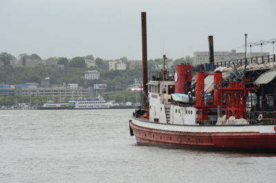
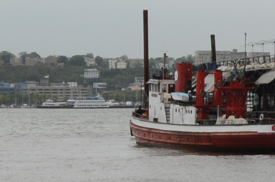
An interesting fact about how lenses render scenes is that if you compare the image that was shot at 200mm (FIGURE 5.8) with a version of the image that was shot at 24mm but has been cropped to reveal the same image information (FIGURE 5.9), the images are virtually the same. Changing lenses will not change the way the scene is rendered to the digital sensor; it just changes the magnification. This is an important concept to understand in the context of compositing, because depending on the focal length you’ve chosen for the whole composite, you’ll need to understand which lens to shoot each element with to render them naturally into the scene. If you are compositing elements into a scene that is shot with a normal lens, you don’t want to shoot them with a wide angle or they won’t fit.
© Hannah Thiem
Figure 5.8. The river scene shot with a 200mm lens from the previous example.
© Hannah Thiem
Figure 5.9. This cropped version of the river scene was shot with a 24mm lens. The image has been cropped to match the image area of the 200mm scene. Notice how although the resolution is much lower because it’s such a small section of the frame, the elements and spatial relationships look the same as the telephoto shot.
Before you shoot a single element for a new composite image, determine what angle of view you want the final image to have, and shoot all the elements with that attribute in mind for the entire process.
Background relationships
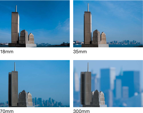
As you utilize different focal length lenses, the relationship of the foreground to the background changes. With wide-angle lenses, the background appears small and in the distance, and as you increase the focal length, the background magnifies progressively in relation to the foreground. If you photograph an element and maintain its size in the frame but shoot it with lenses of varying focal lengths—from wide angle to telephoto—you can see how these relationships change. This is of particular importance when you are making a composite image and you want to maintain the illusion that your image was shot through a single lens (FIGURE 5.10).
© KE
Figure 5.10. The focal length of the lens determines the angle of view and the degree of magnification. In this example, Katrin shot an object with four different focal length lenses: 18mm, 35mm, 70mm, and 300mm, each time keeping the object the same size in the frame. Notice how the background relationship changes with each lens.
Depth of field
Depth of field refers to the range of distance that appears acceptably sharp in your image. The area of sharpness in an image does not abruptly change from sharp to unsharp but instead transitions gradually. Depth of field can vary based on your aperture setting, the camera format you are using, your proximity to your subject, and the exact point in the scene at which you focus the lens. Small apertures increase depth of field, and large apertures decrease depth of field. Small apertures have values that are high numbers, like 11, 16, and 22, whereas large apertures that let more light into the lens have values that are low numbers, like 1.4, 2.8, 4, and 5.6.
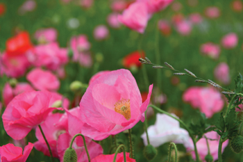
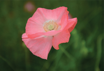
At first glance, wide-angle lenses appear to have a much greater depth of field than telephotos because they encompass a wider angle of view and hold sharpness throughout (FIGURE 5.11). Telephoto lenses appear to have a shallower depth of field because they are often used to magnify the subject (FIGURE 5.12). If you shot the same scene from the same point at the same aperture with a telephoto lens and a wide-angle lens but cropped the section of the wide-angle image to match the telephoto image, the depth of field of the two would be identical. You can refer back to Figures 5.8 and 5.9, which illustrate this, although the cropped section of the wide-angle image appears to be softer due to its lower image resolution. When you’re working with composite images, you must pay particular attention not only to the depth of field of the entire composition, but also the depth of field of each element. For instance, if you choose a wide-angle view with a vast depth of field (everything in focus) for your final composite, and then you shoot several elements to compose into the scene, you must make sure that the depth of field for each element is adequate so the subject is sharp from front edge to back edge. If one of your elements has a shallow depth of field and all the edges are not sharp (FIGURE 5.13), it will not compose properly into a scene that is completely sharp. Your composition should be made entirely of elements that are completely sharp. If you want to create depth of field, you can do this as a last stage of the compositing process once all the elements are assembled in place.
© JP
Figure 5.11. Photographs taken with wide-angle lenses seem to have unlimited depth of field, which means that the entire image is sharp from foreground to background. This Utah landscape was shot with a 28mm lens at f/16. Using a smaller aperture also increases depth of field.
© Hannah Thiem
Figure 5.12. When you’re shooting macro photography, even a short telephoto lens, like the 70mm lens used here, will give you a very shallow depth of field. In other words, the focus will rapidly fall off, especially when shot at a wide aperture. This picture was shot at f/5.
© Hannah Thiem
Figure 5.13. This flower was shot with a shallow depth of field. It would not be a good candidate for a composite because some of the edges are soft. Not only will it be hard to mask when composed into a sharp scene, but it will look immediately out of place.
Point of View
As photographers, we are always searching for a unique angle or view of the world that will result in a great picture. More than the average person, we’re constantly looking for a different view of our subjects. We’re curious about what the street might look like from a particular window, from the fire escape, or from ground level, or perhaps even from underwater. Most often, we probably end up shooting from eye level but won’t hesitate to crouch down or stand on a park bench to get a better angle for our shot. This is simply known as our point of view.
In composite work, once we choose our point of view, all the photographic elements that make up the final composite image must be shot from the same point of view, or at least appear to have been shot from the same point of view. They must also be in correct perspective to the chosen point of view. We’ll discuss extensively how to match perspective among your elements a little later in the chapter. It is fairly critical to establish your point of view early in the photography process so you have a specific blueprint for how you’ll shoot all your elements. If you start with an eye level point of view in mind and begin to shoot your background and elements and then decide halfway through the process that you’d rather use a higher vantage point of view, you’ll have to reshoot all those elements again at the new angle. Your point-of-view choice should be part of the planning process we discussed in Chapter 3, “Planning and Preparing,” or at the very least should be the first photographic decision you make.
Eye-level Viewpoint
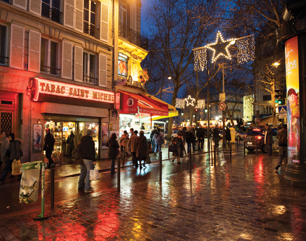
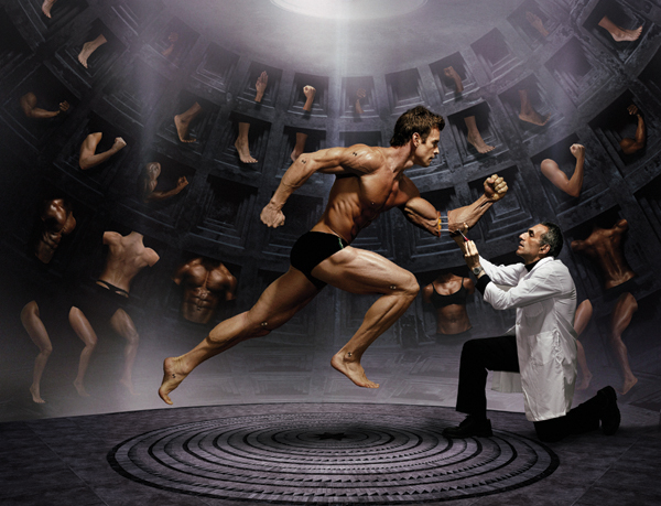
Depending on how tall you are, you probably shoot most of your pictures from between 5 and 6.5 feet from the ground, your standing eye-level viewpoint. This is your vantage point much of the time, and especially if you take a lot of photographs, this point of view will be a common thread among them. Although it’s the most obvious viewpoint to photograph from, it’s a completely valid choice for many photographic circumstances precisely because it doesn’t bring attention to itself as a unique point of view. The point of view basically becomes invisible because viewers are so used to seeing images and the world from that viewpoint. As a result, the viewer becomes completely absorbed in what is happening in the image (FIGURE 5.17 and FIGURE 5.18).
© JP
Figure 5.17. A Parisian street scene shot from eye level. In photographs like this the point of view does not draw attention to itself but instead becomes invisible.
© JP
Figure 5.18. This composite has a point of view just below eye level, which gives a heroic sense of volume to the subjects. Jim created this photo illustration for Time magazine to accompany a story on the use of performance-enhancing drugs by Olympic athletes.
Aerial Viewpoint
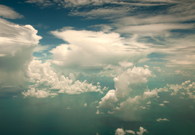
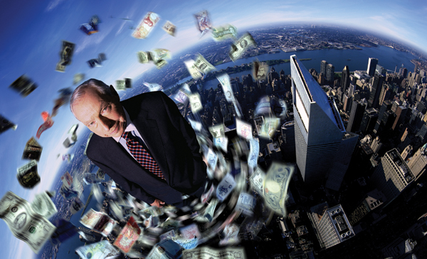
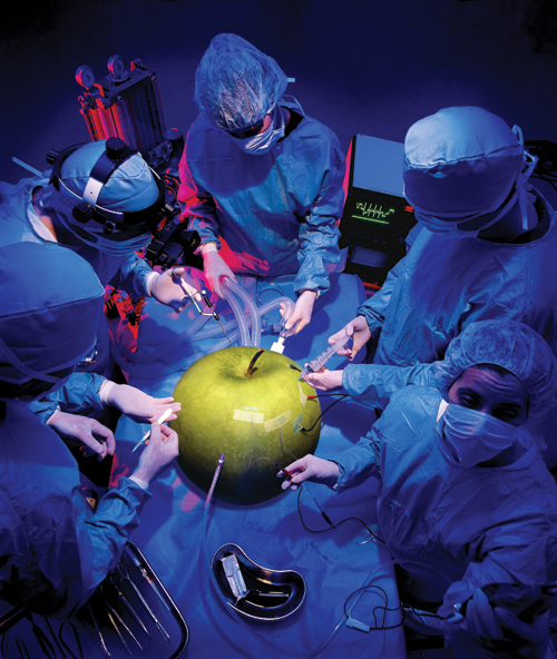
Any photograph taken from a high vantage point is an aerial point of view. A ladder, a rooftop, a bridge, a plane, or a helicopter all provide a unique perspective with which to observe the world. The term can refer not only to images taken from very high above the ground (FIGURE 5.19), but also to any angle where you’re looking down on the subject (FIGURE 5.20), and even a simulated hospital scene (FIGURE 5.21).
© JP
Figure 5.19. An aerial view of tropical clouds over the Caribbean Sea.
© JP
Figure 5.20. An aerial viewpoint was chosen for this conceptual portrait of Walter Wriston shot for Wired magazine. Walter was the CEO of Citibank from 1967–1984 and was known as one of the most influential bankers who revolutionized the business. Wired wanted to portray him as a giant in his field for the innovations that he introduced and that we all now take for granted.
© JP
Figure 5.21. Another photo illustration for Wired with an overhead or aerial viewpoint. Creative choice of viewpoint can result in a unique composition that will stand out.
Ground-level Viewpoint
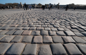
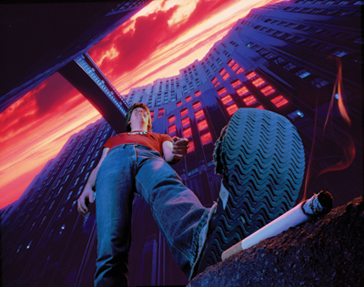
Another option for a unique point of view is a ground-level viewpoint (FIGURE 5.22). Shooting from ground level can provide an interesting and novel perspective on an otherwise ordinary scene and can be a great choice for the right image. When you’re doing a composite, often the point of view will be dictated by the concept you are executing (FIGURE 5.23).
© JP
Figure 5.22. This cobblestone plaza was shot from a few inches above the ground with a 14mm wide-angle lens to create a dramatic view of what might otherwise be an ordinary viewpoint.
© JP
Figure 5.23. One of Jim’s vintage film composites, pre-Photoshop, with an “ant’s-eye” view. Utilizing a unique vantage point and a radically wide perspective, he was able to achieve a nice effect, even within the limitations of a film-based process. Geek alert: Katrin gives more detail on its creation in Chapter 1.
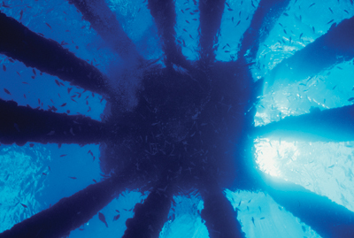
Your choice of point of view is very personal and can be a very creative part of your compositing process if you choose to imagine any camera angle and any perspective. Underwater images offer a whole world of camera positions and angles unrestricted by the bounds of gravity (FIGURE 5.24 and FIGURE 5.25).
© JP
Figure 5.24. Looking straight up at a platform and its columns from 40 feet below, the surface reveals another dimension with which to view the world.
© JP
Figure 5.25. In this photo illustration for National Geographic Traveler to illustrate overcrowded tourist destinations, Jim overfilled an underwater frame with divers. Choosing an underwater vantage point can be a unique way to attract readers to the story you illustrated.
Perspective
Perspective in the context of visual perception is the way in which objects appear to the eye based on their spatial attributes or their dimensions and the position of the eye relative to the objects. In drawing and photography, perspective is a technique for depicting volumes and spatial relationships on a two-dimensional surface. Early Renaissance artists, including Alberti, Brunelleschi, Donatello, and Masaccio, had an appreciation for the beauty of mathematics, and they developed the concept of perspective to compose and organize images. They understood the picture plane as a transparent window through which the viewer looks into the scene from a fixed standpoint. Prior to the use of perspective, paintings looked flat and figures appeared as if they were paper cutouts without any form or substance. Once the principles of perspective were understood, artists were able to achieve more realistic renditions of reality than had been previously possible.
Even for photographers today, an understanding of perspective is a valuable asset for not only capturing straight photographs, but for creating photo composites as well. When you are shooting straight pictures, your point of view, the lens focal length you are using, and the subject all determine the perspective of the final image without you actually having to be aware of what specifically is happening on a mathematical level. You can simply look through the lens until you find a pleasing composition and take the shot; the camera will record exactly what you saw. On the other hand, if you’re working on a composite where you are combining disparate elements to create the illusion of realism, a thorough knowledge of perspective is mandatory. The only way the elements that you combine into the scene will look as though they belong there is if the perspective of each element matches that of the establishing shot or background. There are three different types of perspective: one-point, two-point, and three-point perspective.
One-point Perspective
The term one-point perspective derives from the fact that all the lines in a scene recede toward a single vanishing point on the horizon line. The horizon line is the viewer’s eye level; it can be high or low depending on the photographer’s vantage point or, in the case of a composite, the effect you’re trying to achieve. One-point perspective exists when the picture plane, essentially the surface of your digital sensor, is parallel to two axes of a rectilinear scene, which is composed entirely of linear elements that intersect only at right angles. If a single element is parallel to the picture plane, all the elements in the scene are either parallel to the picture plane or perpendicular to it. These are the only conditions in which you can achieve one point perspective. All lines perpendicular to the picture plane will recede toward the single vanishing point at the horizon line, which is essentially your eye level.
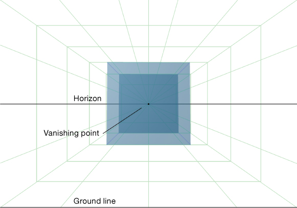
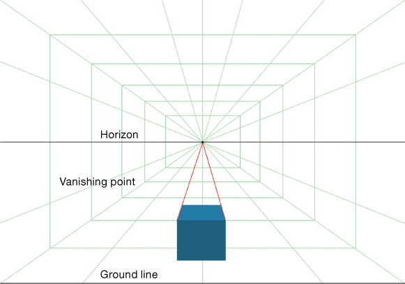
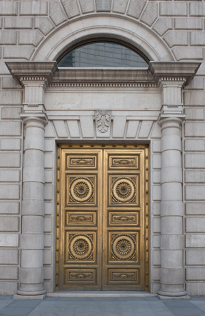
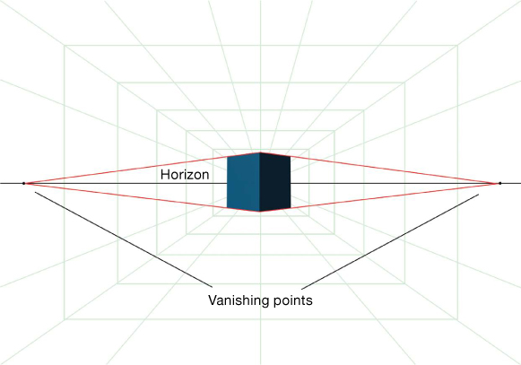
If you photograph a cube with the lens position at the center of the cube and the picture plane parallel to the front surface of the cube, you are using one-point perspective (FIGURE 5.26). If you raise the camera so you can see the top surface of the cube, the two top edges of the cube will form lines that will meet at the vanishing point (FIGURE 5.27). A couple of examples of straight photographs that exhibit one-point perspective are shown in FIGURE 5.28 and FIGURE 5.29.
© JP
Figure 5.26. A representation of a cube in a rectilinear space shown from dead center in one-point perspective. From this perspective, you would only see the front face of the cube.
© JP
Figure 5.27. In one-point perspective, if the cube is dropped lower in the frame to reveal the top surface, the lines that form from the top two edges of the cube will converge at the vanishing point on the horizon line.
© JP
Figure 5.28. Any two-dimensional surface that is photographed straight on with the lens in the center of the scene and the picture plane parallel to it, as shown in this door in Madrid, is one-point perspective.
© JP
Figure 5.29. When all the radial lines in architecture recede toward a single point in the frame, you have, you guessed it, one-point perspective.
With an understanding of one-point perspective, you can create a background environment that is based on a single vanishing point, and then you can build your composite on the design structure that you’ve established (FIGURE 5.30).
© JP
Figure 5.30. Jim made this composite as a self-promotional image. The design structure is single-point perspective, and although it has the appearance of a straight photograph, this composite consists of at least 15 original photographs.
Take a walk with your camera and see how many scenes you can photograph that exhibit single-point perspective. Remember to keep your camera level and plumb to create a single vanishing point.
Two-point Perspective
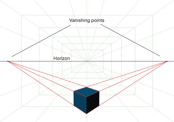
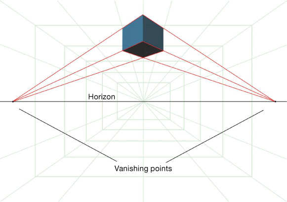
If you rotate the cube in Figure 5.26 so that you’re seeing its corner, you’ll have two-point perspective (FIGURE 5.31). The reason is that if you draw a vector along the top and bottom edges of each visible face of the cube, they will converge to two vanishing points rather than one. If you raise the cube above the horizon line to reveal the bottom of the cube, the edges will still converge to the same two vanishing points (FIGURE 5.32). Similarly, if you drop the cube below the horizon line to see the top of the cube, the edges will also meet at the two vanishing points (FIGURE 5.33). Note that in these examples the vertical edges and the center edge of the cube are all parallel to each other and perpendicular to the horizon line. If this were not the case, your cube would be transmitting a third vanishing point and would be considered three-point perspective.
© JP
Figure 5.31. A representation of a cube in a rectilinear space seen from dead center in two-point perspective. Rotating the cube 45 degrees from single-point perspective allows all four edges to recede to two vanishing points.
© JP
Figure 5.32. In two-point perspective, if the cube is dropped lower in the frame to reveal the top surface, the lines that form from the top four edges of the cube will converge to two separate vanishing points on the horizon line.
Figure 5.33. As with Figure 5.32, if the cube is raised in the frame, it creates two vanishing points.
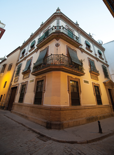
Depending on the perspective, such as that shot from a distance away with a normal or long lens, the vanishing points may exist far outside the bounds of the picture plane. So in practical terms, when you shoot the corner of a building, as long as your camera is not tilting up or down, you’ll be capturing two-point perspective (FIGURE 5.34). However, as soon as you tilt the camera a little up or down, you are generating an additional vanishing point, as you’ll see in the next section. FIGURE 5.35 shows a composite image where the design is based on two-point perspective.
© JP
Figure 5.34. Three different architectural scenes that exhibit two-point perspective. Note how all the verticals are parallel to the edge of the frame.
© JP
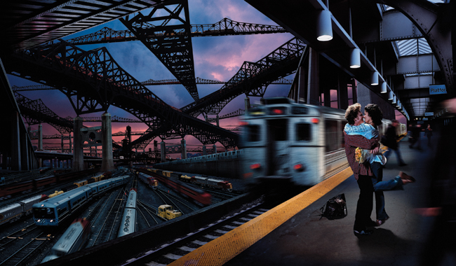
Figure 5.35. The basic design of this intricate and elaborate photo composite is primarily two-point perspective. Can you find the two primary vanishing points? There are several other vanishing points that give the image a multidimensional feeling but don’t deter from the principal design concept of two-point perspective. Jim made the image for Wired magazine to accompany a fictional story about a world where railroads were the main form of transportation.
In the gallery of images in Figure 5.34 and Figure 5.35, which were shot with two-point perspective, see if you can find the two primary vanishing points in each scene. They may be way outside the frame.
Three-point Perspective
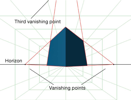
Three-point perspective exists when you are photographing a rectilinear scene but your picture plane is not parallel to any of the lines in the scene. Using the example of a city block that’s built on a grid, when you’re photographing the corner of one of the buildings but also tilting the camera slightly up to get the top of the building in the frame, you are forming three-point perspective. The cube in FIGURE 5.36 is rendered as if photographed with a 14mm lens from just right of center and looking up. Because of the distortion of the wide-angle lens, the left and right vanishing points are much closer to the cube and the third vanishing point is considerably outside the top edge of the frame. Three-point perspective is a great choice when you want to use sweeping, dramatic, and distorted shapes as the basis for your composite. It is a bit more difficult to match but usually worth the effort (FIGURES 5.37 through 5.40).
© JP
Figure 5.36. A cube distorted as if photographed with a 14mm lens in three-point perspective. The vanishing points to the left and right of the cube are fairly close to it because of the amount of distortion the lens forces on the cube. The radical distortion causes the edge vectors to converge more rapidly. As you pull back the camera and use a longer lens, the vanishing points spread out along the horizon. Note that the third vanishing point is out of the frame on top.
© JP
Figure 5.37. A building shot with a 14mm lens in three-point perspective. Can you find the vanishing points? The wider the lens and the closer you get to the subject, the more you will distort the shape of the subject.
© JP
Figure 5.38. Another example of three-point perspective using an ultra wide lens, in this case a 15mm. It’s easy to see the vanishing points left and right of the corner, but because the camera is only slightly tilted upward, the third vanishing point will be way out of frame on top.
© JP
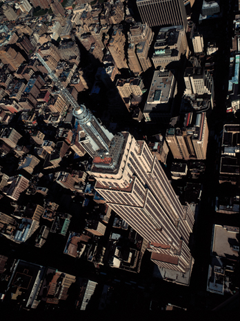
Figure 5.39. You don’t have to be looking up at a rectilinear subject to attain three-point perspective. This aerial view of the Empire State Building is shot looking down with a 28mm lens. Try to find all three vanishing points in this image. As stated previously, whenever you are shooting within a rectilinear scene, such as the New York City grid of buildings as shown here, and your picture plane is not parallel to any of the lines in the scene, three-point perspective will result.
© JP
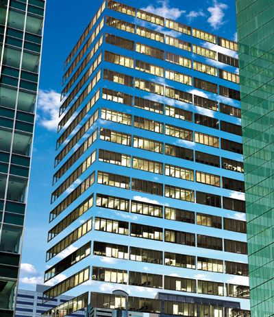
Figure 5.40. This image was for an ad for Phillips Glass office windows, and although it may look simple, it was actually quite complex to compose the night building into the day scene and match the perspective.
Determining the Perspective
Matching the perspective of an existing photograph starts with determining the vanishing points, which in turn determine the horizon line. Running parallel to and below the horizon line is the ground line, which in the case of photographs is the bottom edge of the image. Parallel lines between the ground line and the horizon line are called transversals. Determining the perspective of a photograph can be a very limiting exercise in that you can only ascertain the vanishing point in scenes that contain geometrically shaped objects—geometric objects that are arranged along parallel lines like buildings, or any other parallel lines, such as train tracks. Although optical perspective still exists in forests, organically shaped objects, and people scenes, it is usually very difficult to precisely determine a horizon line because you need distinct reference lines in a rectilinear scene to map out vanishing points. If the actual horizon between earth and sky is visible in the scene, it can be a useful reference for positioning elements in these nongeometric cases. Let’s try to match perspective by stepping through a preliminary exercise.
Drawing perspective guides
The first step in matching perspective in your composite is to draw perspective guides. If the following exercise, or any others in this chapter, contain techniques or areas of Photoshop you are unfamiliar with, they will not necessarily be explained here but will certainly be covered in future chapters.
![]() ch05_cornerbldg.jpg
ch05_cornerbldg.jpg
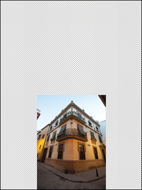
1. Open the file ch5_cornerbldg.jpg in Photoshop. In the Layers panel, double-click on the Background layer to promote it to an unlocked layer. Name it Building. Refer to FIGURE 5.41.
© JP
Figure 5.41. The sample image of a building used to draw perspective guides. The Background has been promoted to an unlocked layer and titled Building.
2. Because the vanishing points will exist outside the current frame area, increase the canvas size. Select the Crop tool, select the entire picture, and drag outward to the left, right, and top to give you enough room to pull the perspective guides out to the vanishing points (FIGURE 5.42).
© JP
Figure 5.42. Increase the canvas size left, right, and top to accommodate enough area to establish the vanishing points.
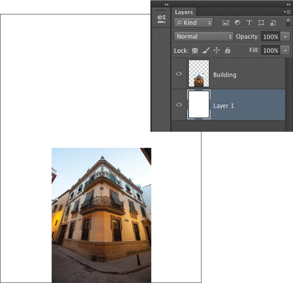
3. Create a new layer, fill it with white, and then in the Layers panel send it to the back by dragging it below the Building layer (FIGURE 5.43) so you have a clean background to work against.
© JP
Figure 5.43. Create a new layer, fill it with white, and drag it below the Building layer just to create a clean area to draw your guides.
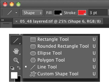
4. Select the Line tool, which is nested in the Shape tool, and set its options to Shape Layer and a 3-pixel width. Then choose a bright contrasting color (FIGURE 5.44).
© JP
Figure 5.44. The Line tool is nested in the Shape tool. Choose a bright color and a 3-pixel stroke width.
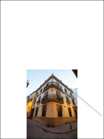
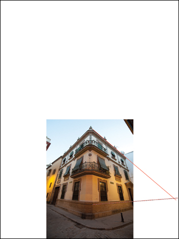
5. Use the Line tool to trace along the edge of the top-right rooftop. Be as accurate as possible, following the line of the building, and drag it out to the right close to the edge of the canvas (FIGURE 5.45).
© JP
Figure 5.45. Drag a line along the right roofline to form the first perspective guide.
6. Find a distinct, clear architectural line near the base of the building and trace it out to the right until it intersects the first line. This is your right vanishing point (FIGURE 5.46).
© JP
Figure 5.46. Find a clean architectural line at the base of the building and drag a line to intersect the first one.
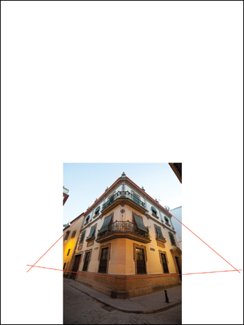
7. Repeat steps 5 and 6 for the left side of the building to determine the left vanishing point (FIGURE 5.47).
© JP
Figure 5.47. Drag a line on the left rooftop and another along a clear architectural line at the base of the building to create the left vanishing point.
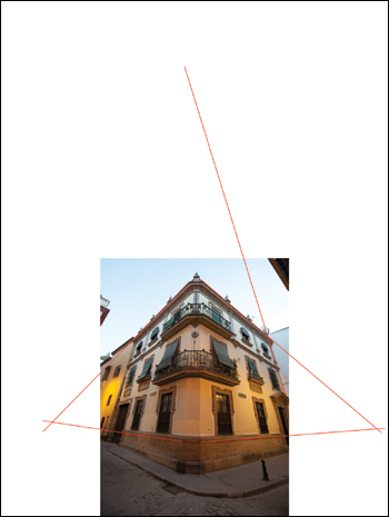
8. Create a line that goes along the right edge of the building straight up into the canvas (FIGURE 5.48).
© JP
Figure 5.48. Drag a line along the right vertical edge of the building.
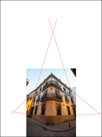
9. Create a line that goes along the left edge of the building to intersect the line from step 8. You now have all three vanishing points established for the image (FIGURE 5.49).
© JP
Figure 5.49. Drag a line along the left vertical edge of the building to complete all three vanishing points. The benefit of these guides will become apparent in the next two exercises.
Matching one-point perspective
Now that we’ve discussed the basic principles of perspective, we’ll focus on shooting a new element that matches the perspective of another scene and then compose it into the scene. Many people believe that you don’t have to shoot your element in correct perspective and that you can simply “fix it in Photoshop.” This couldn’t be further from the truth. Although Photoshop has tools that will distort and correct the shapes of images, they cannot fundamentally change the perspective of the image that you recorded. Very often, if you distort one image to fit into another simply by using Photoshop’s tools, it will be very obviously distorted and stand out as not fitting into the scene.
You should photograph each of your elements in the perspective that will most closely match its intended destination in the final image, and if it’s slightly off, you can use Photoshop’s tools to tweak it into perfect perspective. But don’t rely on the tools to correct the perspective of images that are not photographed to match their destination. The exception to that rule is for two-dimensional subjects. It is possible to take a rectangular-shaped subject and match its perspective perfectly into another rectangle that is shot at a different perspective simply by using the Distort tool (Free Transform > Distort).
So how do you shoot an element that matches the perspective of an existing image? Let’s start with a simple example of one-point perspective. The general process is to first establish the vanishing point of your background scene by creating perspective guides as described previously. Choose a subject that logically will fit into a single-point perspective environment. Use the triangular shape created by the perspective guides as a reference, and photograph your subject to match that shape. When composed into the scene, its shape should look like it belongs there, and if the lighting matches, you’ll have a very good match. We’ll go into more detail in the following example.
This is a worthwhile exercise to do on your own using all your original photography, even if you think you may never want to make an image that has matching linear perspective. The reason is that when you understand how to precisely match perspective among elements, you’ll be better able to apply this concept to matching organic shapes into scenes.
ch05_circuitboard.jpg
ch05_cb_1.jpg
ch05_cb_2.jpg
ch05_cb_3.jpg
ch05_cb_4.jpg
ch05_cb_5.jpg
ch05_cbcomposite.jpg
1. Open ch5_lightgrid.jpg, ch05_circuitboard.jpg, ch05_cb_1.jpg, ch05_cb_2.jpg, ch05_cb_3.jpg, ch05_cb_4.jpg, ch05_cb_5.jpg, and ch05_cbcomposite.jpg in Photoshop.
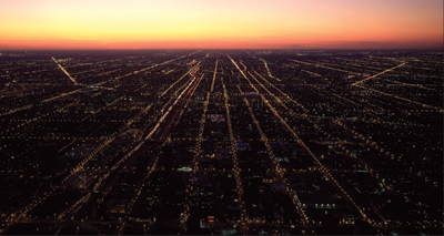
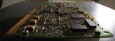
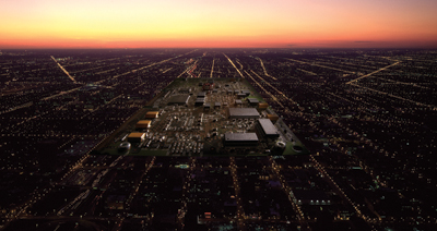
Jim used the aerial image of the twilight lights of suburban Chicago (FIGURE 5.51) as a destination image. He then fit the electronic circuit board image (FIGURE 5.52) into the scene.
© JP
Figure 5.51. The background image for the one-point perspective exercise. When doing this on your own, choose or shoot a background that has clear parallel lines to work from.
© JP
Figure 5.52. The circuit board that Jim composed into the scene in the correct perspective. If you decide to shoot an element and do this exercise on your own, choose an object that is rectangular and two dimensional.
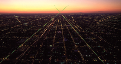
2. He first selected the Line tool and created two perspective guides by following the lines of lights in the background image. He then clicked on the folder at the bottom of the Layers panel to create a layer group, put the two guide layers in it, and labeled it Guides (FIGURE 5.53).
© JP
Figure 5.53. The background image with perspective guides in place. The vanishing point is above the actual earth horizon because the camera was 1350 feet off the ground when this picture was taken. Remember that the perspective horizon is always at the level of the eye or camera.
It is a good habit to organize your layers into groups and even color code them. You can do this by right-clicking on the eye icon next to any layer or group. From the drop-down menu, choose a color for that layer or group. When you start making composites with many layers, you’ll quickly see how naming your layers as soon as you make them and placing them in color-coded folders gives you an organizational discipline that will benefit your workflow.
Note how the vanishing point exists above the natural horizon line. The reason is that the horizon line for the camera position is actually at the same height off the ground as the camera, which in this case was about 1350 feet off the ground.
3. For the electronic circuit board image, Jim mounted his camera on a sturdy tripod and chose a lens that would be compatible with the background scene. He decided to photograph something fairly small to match the large and vast scene. Jim chose the 14–24mm Nikon zoom because he felt it would be able to match the fairly radical distortion that you would have to impose on this small object to get it to fit into the scene. He positioned the camera close to the subject, set it to f/22, and framed up the shot to what looked like it would match. After trying a few angles, he shot one that looked close, opened it in Photoshop, made a quick Pen tool path, converted it to a selection, clicked the Layer mask icon at the bottom of the Layers panel, and dropped it into the scene (FIGURE 5.54).
© JP
Figure 5.54. The perspective on the first try was not very close to the guides. It was necessary to reposition the camera to force the perspective.
Don’t worry if you don’t know how to use the Pen tool or make masks at this point. Complete instruction on the Pen tool is covered in the web-based chapter, “Pen Tool Power.”
The shape of the circuit board didn’t look terrible, but it didn’t fit within the perspective guides. It looked as though it needed more distortion and for the camera to move a little bit to the right. The process of getting the angle and shape perfect is one of taking a photo, dropping it in, analyzing it, making a small adjustment (sometimes a micro adjustment), shooting another photo, and dropping it in until you get it either perfect or very close.
4. Jim zoomed the lens out a little, moved the camera closer and slightly to the left, took another shot, and dropped it into the scene (FIGURE 5.55). The distortion that you see on the circuit board is all from the lens and angle; it has not been distorted at all in Photoshop, just scaled up or down to fit within the perspective guides. You can see here that it’s a bit closer to matching but the front edge looks like it’s coming up and it still feels twisted.
© JP
Figure 5.55. Jim zoomed the lens out and moved the camera closer. The circuit board then had a more extreme perspective than the first shot, a little too much in fact.
5. He then pulled the camera back incrementally and raised it slightly. These moves were very minimal at this stage. After dropping in the new circuit board (FIGURE 5.56), it looked fairly close to the guides, certainly close enough to adjust it using Free Transform (FIGURE 5.57).
© JP
Figure 5.56. Pulling back slightly and raising the camera resulted in a shape that was much closer to the guides but still wasn’t perfect. However, it was close enough to use the Free Transform tool to finesse it.
© JP
Figure 5.57. Using Free Transform and holding down the Command key allowed Jim to skew and distort each corner so the circuit board fit precisely within the guides.
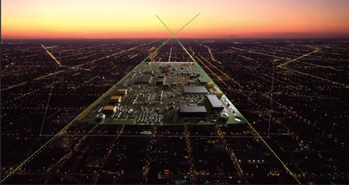
6. In the final image Jim added some darkening around the edges to make the board transition more smoothly with the background. This image was made only to demonstrate this technique and is not otherwise a fully realized concept (FIGURE 5.58).
© JP
Figure 5.58. The final image shows the circuit board in perspective to the underlying suburban grid.
On a practical level, you may or may not need to precisely match one-point perspective depending on your style of compositing, but it is worthwhile to complete the preceding exercise to gain an understanding of how geometric objects fit into rectilinear backgrounds. It is not enough to simply follow along with the demonstration exercises on the computer. You need to practice these techniques using your own photography to fully experience the breadth of this process, and we encourage you to do so until you achieve success. FIGURE 5.59 is a finished one-point perspective composite.
© JP
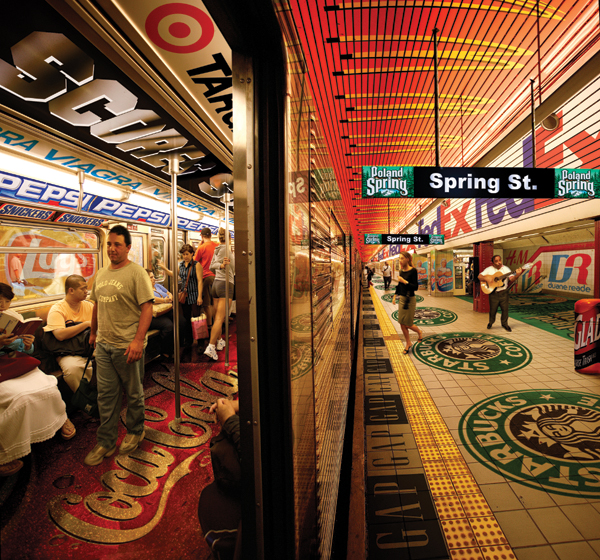
Figure 5.59. Jim made this photo illustration to accompany an article in New York magazine about the MTA’s decision to sell ad space to corporations in the New York City Subway in areas previously off limits.
Matching two- or three-point perspective
The process for matching two- and three-point perspective is the same as that for one-point perspective. You first establish the vanishing points with perspective guides, and then shoot your element in the same shape as the guides. The only difference is that it can be a lot more difficult to match the shape when there are multiple vanishing points. The degree of difficulty increases with each additional vanishing point. The more extreme the perspective, such as that resulting from an ultra wide-angle lens looking straight up a building, the trickier it will be to match. Another factor is that if you’ve shot your element from the incorrect perspective in a multiple perspective image, the Free Transform tool doesn’t always do a great job of changing its shape to match. As always, it is imperative to shoot the elements closely to the shape it needs to appear, the shape defined by the perspective guides.
Use a sturdy tripod and make sure the camera doesn’t move between each successive picture, because matching perspective is a progressive process. You will carefully inch your way until you attain the exact shape to fit. It’s ideal if your tripod has geared movements so you can precisely control the changes, and if necessary, return to the precise previous position. It helps if you shoot with your camera tethered to a computer so that the images appear on the screen as you capture them rather than shooting to a card and shuttling it back and forth.
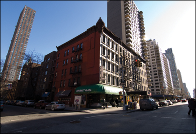
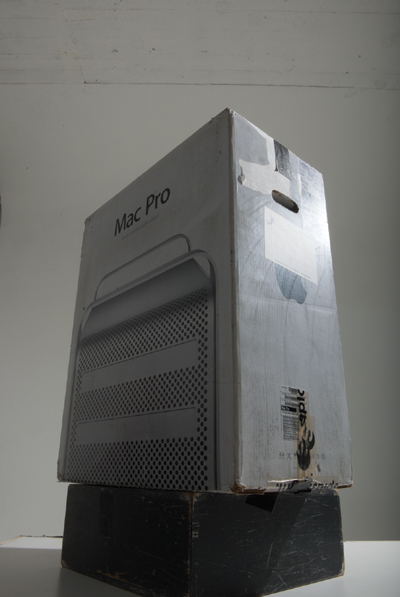
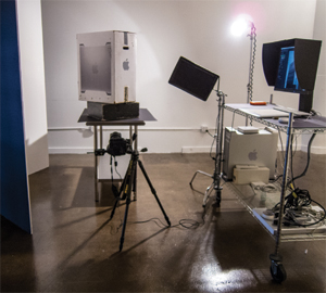
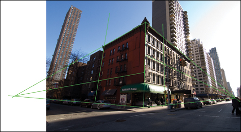
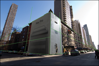
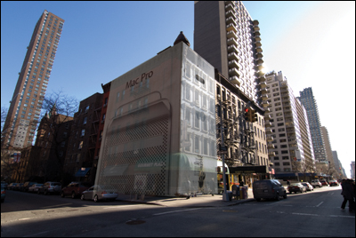
In the following exercise, you’ll start with a 14mm wide-angle shot of a New York City street corner (FIGURE 5.60) and walk through photographing a computer box (FIGURE 5.61) in the correct angle to match the street scene. This is not the most aesthetic combination of elements, but it will serve the purpose of this exercise.
© JP
Figure 5.60. The establishing shot for the three-point perspective exercise, shot with a 14mm lens.
© JP
Figure 5.61. The computer box used to match into the scene, shown here in the first position.
![]() ch05_3p_city.jpg
ch05_3p_city.jpg
ch05_3p_box.jpg
ch05_3point1.jpg
ch05_3point2.jpg
ch05_3point3.jpg
ch05_3point4.jpg
ch05_3point5.jpg
ch05_3point6.jpg
ch05_3pointcomposite1.jpg
ch05_3pointcomposite2.jpg
1. Open ch05_3p_city.jpg, ch05_3p_box.jpg, ch05_3point1.jpg, ch05_3point2.jpg, ch05_3point3. jpg, ch05_3point4.jpg, ch05_3point5.jpg, ch05_3point6.jpg, ch05_3pointcomposite1.jpg, and ch05_3pointcomposite2.jpg.
2. To shoot the box, Jim set up the camera with a very wide-angle lens on a tripod and tethered the camera to a workstation (FIGURE 5.62). With this basic photographic setup, you can quickly take a shot, mask it, and drop it into the background to check perspective, and then make a camera position adjustment and repeat until you get the perfect shape. The light is a point source and in the approximate location of the sun in the original background picture. A black flag is used to eliminate any flare on the lens.
© JP
Figure 5.62. The basic camera, lighting, and workstation setup for the exercise.
3. Jim selected the Line tool and made his perspective guides. He accurately traced along the defined parallel lines that existed in the scene (FIGURE 5.63). In some cases it may be more difficult to determine exactly where the lines fall due to obstruction, uneven pavement, or other factors, but do your best to make precise guides that follow the architecture of the scene.
© JP
Figure 5.63. The background scene with all three sets of perspective guides accurately in place.
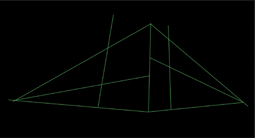
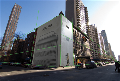
4. Jim made a new layer above the Background layer and filled it with black (FIGURE 5.64). That way you can see the shape created by his guides more clearly. This is the shape Jim wanted the computer box to fit into.
© JP
Figure 5.64. Perspective lines shown on a black layer will give you a clear idea of the box shape you need to fit the scene.
5. While looking through the camera, Jim positioned it so the box started to take on the desired shape. When you try this on your own, determine what happens when you move closer to the subject and use a wider zoom on the lens. Then pull back. How does the shape change? How does the shape change when you raise or lower the camera or move side to side, or tilt up and down?
6. Jim took the picture when the shape in the camera looked close to the shape of the guides. He opened it in Photoshop, made a Pen tool mask, and dragged it into the background image. While holding down the Shift key to prevent the proportions from changing, he scaled the box to the height of the building (FIGURE 5.65). He analyzed the shape he shot and compared it to the perspective guides. The top-right edge and the bottom-left edge looked pretty good, as did the center line, but the rest was way off.
© JP
Figure 5.65. In this first attempt to match the shape of the box to the background, although some of the edges match, it looks twisted too far to the right.
7. To match the shape, Jim rotated the box slightly to the left and moved the camera closer a bit. Bringing it into the composite and scaling it yielded a much closer result (FIGURE 5.66). The top edges were very close but the bottom right edge was still off.
© JP
Figure 5.66. Jim rotated the box back to the left a little and moved the camera slightly closer. The shape seems very close except for the bottom-right edge.
8. Jim then chose to move the camera a little closer and raise it slightly. Moving it closer increased the distortion and raising it created a deeper V at the base. When composed in place, it was much closer to matching (FIGURE 5.67). When doing this exercise on your own, you can choose to keep tweaking the moves until it’s absolutely perfect, and we highly recommend you do this. In this case, though, it’s close enough to finesse into position using the Distort tool (Free Transform > Distort) (FIGURE 5.68).
© JP
Figure 5.67. Jim raised the camera slightly and again got a bit closer. The image looked better on the bottom but not so good on top.
© JP
Figure 5.68. Here the image was close enough to use the Free Transform command and make the final correction.
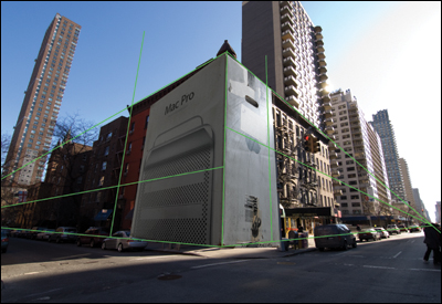
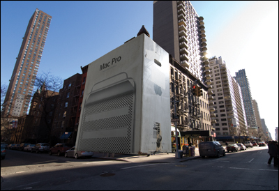
9. When the guides are disabled, you can see that the box appears to match the shape of the buildings in the scene (FIGURE 5.69). Reducing the opacity of the box layer to 70% (FIGURE 5.70) made it even easier to see that the exercise was successful.
© JP
Figure 5.69. Without the guides in place, you can see that the box looks like it’s the correct shape to match.
© JP
Figure 5.70. When the box is set at 70% opacity, it is even more apparent that Jim was successful in matching the shape.
This is by no means a finished composite; it is just an exercise to help you understand the process of matching three-point perspective.
Scale the shape from Figure 5.64 down to the size of your camera LCD screen, and accurately trace it onto a piece of clear acetate. Lay it over your camera LCD screen and, using the Live view feature on your camera, reposition the camera until the shape of your box matches the shape on the acetate. This will get you close to correct perspective.
Matching three-point perspective may seem fairly straightforward in the exercise, but as you attempt it, you’ll see how difficult and perhaps frustrating it is to perfectly match the angle and shape. The more precisely you are able to accomplish perspective matching, the more convincing and realistic your composite will be. The more distorted the shape you are trying to match, the more you will learn about your lenses and optics. Push yourself, go for a high degree of difficulty, and succeed; it will be worth it.
Scale
Another aspect of compositing that warrants consideration is scale, specifically, the relative scale of the various elements in your image and the background. When you are bringing various elements together in a composite, you need to determine what size to make each element so that the image has the correct balance of scale. Of course, this all depends on your intention. If you are trying to make a photorealistic composite and you don’t want the viewer to notice that it’s a fabrication, the various sizes of all the elements must be perfectly compatible with what you would expect to see in such an environment. Or if you want to bring emphasis to an element or idea by enlarging or reducing it and thus exaggerating it by making it a completely unrealistic scale, you are manipulating scale in an entirely different way. Whether you’re trying to match realistic scale or exaggerating scale, when the scaling of elements is poorly executed, it is immediately obvious to the viewer and will compromise the quality of your composite. Knowing how to size each element so it fits into the composition just right requires a bit of practice and a critical artist’s eye.
Realistic Scale
Each composite has its own requirements and attributes, and your choice of how to handle the scale of the elements is dictated by those factors. If you are trying to create a seamless image where the viewer can’t tell that the image is a composite, you’ll have to match the lighting, the perspective, and the scale of all the elements. Look for clues within the base image as to what size to make figures. You may even be able to create a measuring device within the image to help you with the scale. For instance, if you know a standard doorway is 7-feet tall, you can divide its height by 7. You’ll then have an increment that can be used to scale the elements that you are composing into the scene. However, it will only be accurate at the same location of the doorway, because as you bring your scaled figure closer to camera or farther from camera it will no longer be accurate.
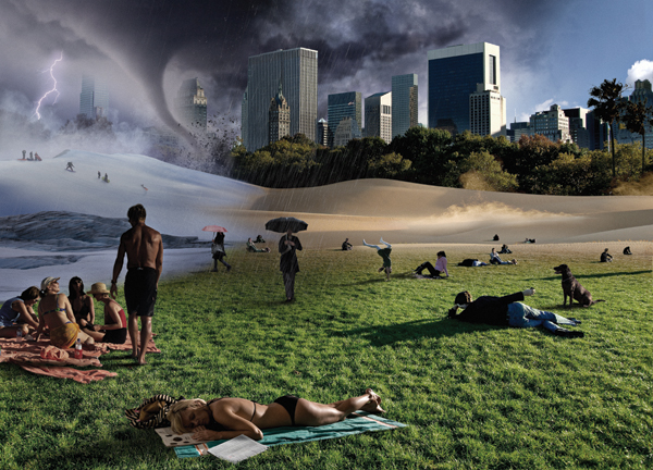
The best way to match scale is generally by eye. Use the structure of the background scene as a reference for your scaling decisions, and adjust each element one at a time until the balance feels perfect to your eye. Sleep on it and then do another round of scale adjustments with fresh eyes. FIGURE 5.75 is a photo illustration Jim did for New York Magazine that addressed the issue of the impact of climate change on New York City. The magazine wanted an otherwise ordinary Central Park scene with every conceivable weather scenario happening at once. It is definitely an unreal image, no question about it, but in terms of scale, all the people appear to be scaled in a natural way as they go back in the distance, even though most of them were shot separately. The best way to achieve natural-looking scaling is to shoot as many of your elements as possible in a single shot. It was not possible to shoot everyone in the Central Park scene because Jim needed different wardrobes to emphasize various seasons, but the guy with the dog was there as were several of the figures going back in the distance. It was these figures that Jim used as a basis to determine the scale of all the figures he added. Aside from the figures, there were other scale considerations, such as the size of the dunes and snowdrifts, the tornado, and the lightning. The scale of all these elements was determined as they related to the background establishing shot.
© JP
Figure 5.75. A photo illustration for New York Magazine on the subject of climate change.
Let’s consider another example of scale. Jim made the composite in FIGURE 5.76 for Business Week to illustrate the exodus of CEOs from large corporations. Budgets for editorial projects are usually fairly meager, so when you’re doing projects like this, economy is imperative. To keep costs low, he hired two professional models and two friends, and he also jumped into the photo to create a line of figures heading for the exit. Because he had four models on set, it was a simple matter to establish the scale and perspective by photographing the first four figures and set the composition. Once they were composed in place, the second group was shot from farther back. It would have been easier if there were eight models, but sometimes a composite image is done as a practical matter to save money.
© JP
Figure 5.76. This photo illustration required shooting one group of models twice and then scaling them correctly in perspective.
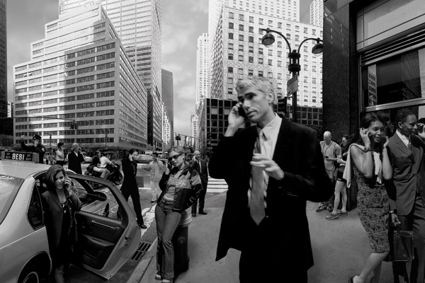
One way to accurately match the scale and perspective of multiple figures is to set a camera position, lock it down on a sturdy tripod, and shoot each figure in different parts of the frame. That is exactly how a composite image for an ad for a computer company, with everyone in a city scene speaking on vintage cell phones, was made (FIGURE 5.77). It features an ultra wide-angle perspective that was a composite of eight individual shots. The figures were shot in groups or individually from a single camera position, and when they were composed into the scene, they were in perfect scale and perspective.
© JP
Figure 5.77. In this composite ad for a computer company, individual figures were all shot from the same camera position so their scales and perspectives were all correct and more easily fit into the scene.
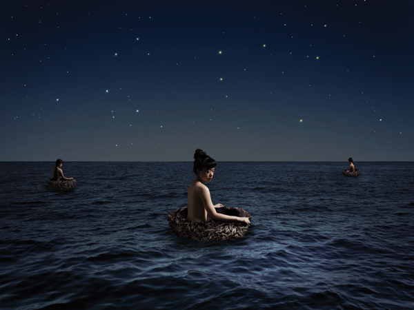
You can also attain a realistic sense of depth with figures going back in the distance as Bina Altera did in her peaceful, surreal artwork, “Finding Your Way” (FIGURE 5.78). When you’re working with similarly sized objects or figures that are going back in perspective toward a horizon line, the rule is to intersect each element on the horizon in the same location on the element. So, no matter what size you scale your element, simply drag it to the horizon line to intersect at the same point and it will appear natural to the eye. In Bina’s image, all the figures intersect the horizon at the top third of the model’s head, which looks correct.
© Bina Altera 2012 (www.binaaltera.com)
Figure 5.78. Bina Altera made this beautiful, composite scene for a class assignment. She shows a good use of scale and perspective. The scaling of the figures looks correct because each figure intersects the horizon at the same point on the figure.
Exaggerated Scale
Photo composites are excellent vehicles to exaggerate scale in images. Because you’re not limited by the actual scale of your subjects and can manipulate scale, proportion, and perspective at will, you’re able to make all sorts of visual statements that could never be realized with straight photography. If you look at popular media on the Internet, in magazines, and in ads, you see many examples of composites where the scale of the elements is either intentionally or unintentionally exaggerated. But many, if not most, of these examples are very poorly realized and look at best, amateur, and at worst, terrible. There is an art to manipulating and exaggerating scale in composite work. It takes practice and mindful attention to detail, as well as patience to achieve the correct balance of elements in your composition.
Probably the most important decision to make if you are doing an exaggerated scale image is your choice of elements. One of the most obvious and overdone subjects for this type of imagery is making giant people. Just because it’s been done so many times shouldn’t discourage you from trying it, but the concept you are trying to convey should rely on your choice of approach. In other words, don’t exaggerate the scale of an element unless it is making the specific statement you intend; it should not be done frivolously.
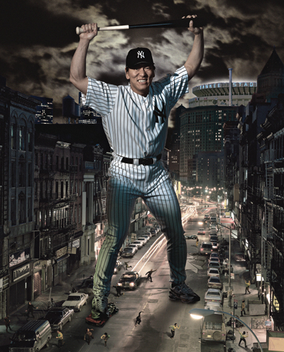
For example, Jim was assigned by Sports Illustrated to do a portrait of New York Yankee Hideki Matsui, whose nickname is Godzilla. The magazine wanted to portray him as Godzilla, a giant in the city, stomping on cars and frightening the citizenry. For the background, Jim chose his photograph of a New York City street scene taken from the Manhattan Bridge, which was approximately 50 feet off the ground. He photographed Hideki from a camera angle just above waist high to match him into the scene. He then added small figures shot from high above for scale, as well as a crushed car, moonlit clouds, and Yankee Stadium in the background to finalize the composite (FIGURE 5.79). When you’re attempting exaggerated scale images, as with all composites, the detail work is crucial, so pay close attention to every aspect of the composition to achieve success.
© JP
Figure 5.79. An exaggerated scale composite that Jim did for Sports Illustrated—a conceptual portrait of Hideki “Godzilla” Matsui.
Harmonizing Scale and Perspective
Scale and perspective are closely interconnected in practice. You can’t change one without affecting the other. Your goal when compositing is to achieve a perfect balance of scale and perspective from your chosen point of view for all of the elements in the composite. In actuality you’ll be tweaking the sizes of elements one at a time, over and over until the composite looks perfect to your eye. Don’t be in a rush to finish; take your time. Take breaks, and look at the image with fresh eyes. You’ll be amazed at how quickly you see what an illustration needs after not looking at it for a few hours or days.
When you’re compositing organically shaped objects or people, your guideposts for perspective may exist in the background scene, but they may just as likely not, so it will be up to you to create the perspective in the artificial world you’re creating. How successful you are will depend on how well you understand the concepts of matching light and perspective, and your attention to detail.
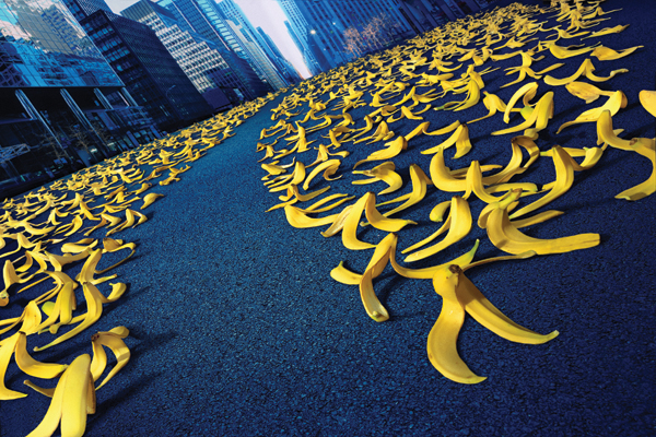
For an ad for Qwest, Jim was asked to cover a city street with banana peels as far as the eye could see and add a path through the forest of peels. In this case there were references for linear perspective, the street and the buildings, which gave him a guide to shoot the peels. One of the challenges was making sure the peels didn’t turn brown while on set. This was resolved by Scott Siken, Jim’s special effect guru, who formulated a solution that preserved the color of freshly peeled bananas indefinitely. Scott then arranged hundreds of banana peels on a 10,000 square foot floor, which Jim shot with a moderately wide-angle lens. Matching the perspective of the floor with that of the street gave the proper perspective effect. But the trick here was to make the peels appear as though they were going much farther into the distance than they actually were. This was achieved by creative use of lens perspective and compositing (FIGURE 5.80).
© JP
Figure 5.80. In this ad for Qwest, a telecom company, Jim used a wide-angle lens to force the perspective of a field of banana peels to make it appear as though they were going much farther in the distance than they actually were.
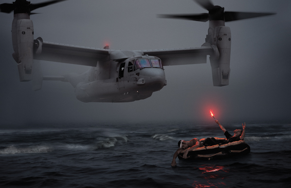
In another example, Jim made an artwork after doing an ad campaign for the Bell/Boeing V-22 Osprey. Using one of the pictures of the aircraft from the campaign, he wanted to convey the true potential of the search-and-rescue powerhouse with a dramatic seascape titled “Rescue at Sea.” In this case there were no reference points at all for scale other than the water surface, so each of the two principal elements were composed and scaled in relation to one another to establish the perspective of the scene (FIGURE 5.81).
© JP
Figure 5.81. An artwork inspired by the potential of the amazing search-and-rescue capabilities of the Bell/Boeing V-22 Osprey.
Closing Thoughts
Perspective, point of view, scale, and depth of field are all interrelated factors that can be controlled, manipulated, and utilized to create the image you see in your mind. The better understanding you have of each of these concepts and how they can work together, the more control you will have over your image. Matching the light and the perspective with your original photography is essential for successful photorealistic composite images before you get to the postproduction Photoshop work. The ensuing chapters will delve into the details of precise compositing and retouching skills, but remember that correctly executed photography will make the computer work much easier to manage at every stage.


