Chapter 4. Lighting and Backgrounds

The quality of the original photographic elements that make up your composite determines the look and feel of your final image, and as such, the more effort, attention, and energy you dedicate to the creation of those elements, the more outstanding your resulting image will be. The primary element in all photography is light, and how you choose to utilize it can make all the difference in the final image. When taking pictures not intended for composites, the light is a critical factor, but it can be considered independently for each situation you photograph. However, when you are creating a photorealistic composite image, you must match the light of each element in direction, quality, color, and intensity among all the images in the composite.
This chapter is a guide on how to do just that, starting with matching a single light source and then delving into more complex scenarios of matching multiple light sources. In this chapter you’ll learn:
• Light quality basics for photography
• How shadows change with the lighting
• How to match a single light source in a composite
• How to match multiple light sources in a composite
• How to choose a background when photographing elements for composites
Light Quality Essentials
As photographers, we probably pay more attention to light than most people. As the sun tracks across the sky every day, as cloud patterns shift and change, as shadows from buildings and people interrupt the light, we pay close attention to the subtle variations, patterns, and quality of light. We reach for our cameras when the light inspires us with the way it beautifully sculpts the three-dimensional beings and objects around us. When the light is flat or uninteresting, we tend to keep the camera stowed while we watch and wait until the light changes for the better: a lower angle of the sun, a break in the clouds, or a shift in color from blue to gold. But what is it about the light that makes us want to shoot sometimes but not others?
In this section we’ll investigate and explain what qualities of light are preferable in various circumstances, so that you can utilize the tool of light more effectively in your composite images. We’ll begin by discussing how the size of the light source affects the quality of the light, paying particular attention to shadow quality as well. When determining the light that was used in one of our library images chosen as the background for a composite, we’ll carefully look at the shadows to ascertain the type of light necessary to match it. We’ll reference natural light to describe these qualities and also address how to replicate them with artificial light. Often in composite work, we are trying to re-create in the studio the light we see in nature to allow us to match image elements with an existing background plate.
Point Light Source
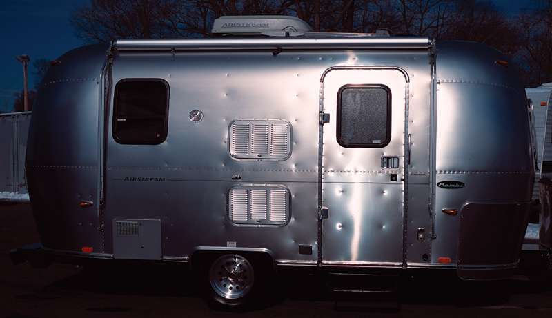
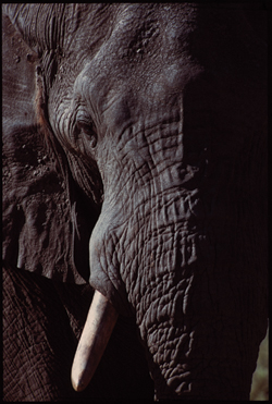
The smaller the actual source of light, the more specular, sharper, and harsher it is. The shadows are also sharper and better defined. We refer to this as a point light source. Point light sources possess the qualities they have by virtue of the size of the source. One of the most fundamental examples of a point light source (also known as hard light) is the sun on a crystal clear day. Notice how on a clear day the light is crisp, and highlights on metallic surfaces are glaring and high contrast (FIGURE 4.1). Shadows are razor sharp and clearly defined. A point light source is desirable for photography because it is very dramatic. When lit from the side, the texture and detail of a subject is enhanced by the distinct shadows and crisp highlights (FIGURE 4.2). Although the sun is the most universal point light source, there are many others, and we’ll discuss some of their features. Almost any small light source you can think of is a point light source. Flashlights, small electronic flashes, quartz halogen lights, headlights, and streetlights all share similar attributes to sunlight in that they all crisply define what they are illuminating and project sharp, clearly defined shadows.
© JP
Figure 4.1. An Airstream in direct sunlight provides an example of how a point light source looks on its stainless steel facade.
© JP
Figure 4.2. A photograph of an elephant in direct sunlight shows how crisply this light defines texture when the subject is lit from the side.
Spotlight
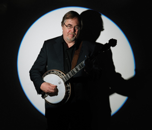
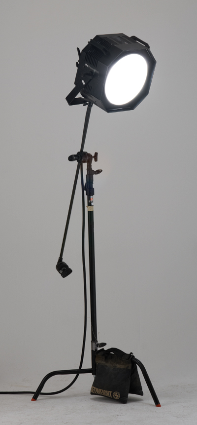
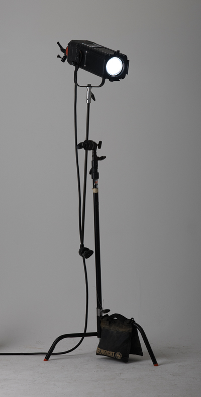
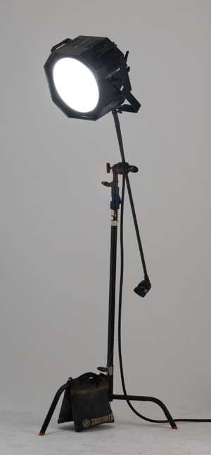
A spotlight is a point light source that is magnified or projected through a lens and focused on a subject. It produces very clean highlights and dramatic shadows (FIGURE 4.3). The lens acts to enhance the qualities of point light sources by sharpening the shadows. In the studio you can use a light projected through a lens, such as an optical spot or a Fresnel (FIGURE 4.4), and it will mimic many of the qualities of direct sunlight, although the sun will still be a smaller source than that derived in the studio; thus, sunlight will be slightly harsher with sharper shadows.
© JP
Figure 4.3. In this portrait of Tony Trischka, the banjo great, notice the dramatic light quality and the sharp shadows.
© JP
Figure 4.4. This Fresnel light source is a regular Profoto flash head rigged with a large, coarse, concentric glass lens.
Candlelight
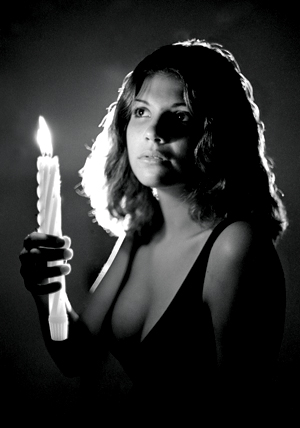
Candlelight is another point source, but it emits a very low level of light and can be difficult to photograph (FIGURE 4.5).
© JP
Figure 4.5. A portrait using candlelight as the main light source.
Point light source shadows
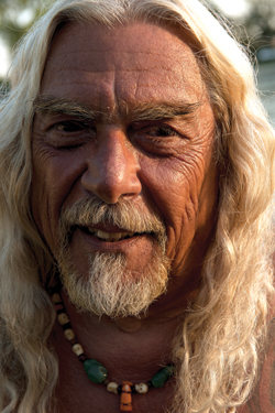
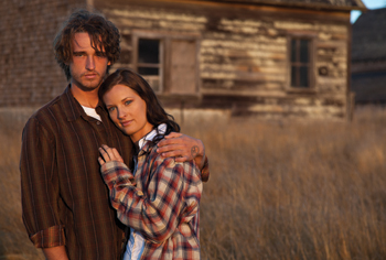
Shadows are dark images or shapes cast on a surface by the interception of light rays by an opaque body. A unique attribute of a point light source is the sharpness of its shadows. In addition to the specular quality of light, photographers will often choose a point light source when they want to use the sharp shadows to add drama or define texture. For the right subject, hard light can be wonderfully expressive (FIGURE 4.6) or beautiful (FIGURE 4.7), but if used carelessly, hard light can be unflattering for portraits because it reveals skin imperfections.
© JP
Figure 4.6. A photograph of Bob DeLuccia, a writer, teacher, and fisherman, with direct, end-of-day sunlight sculpting his face. Hard light can be very dramatic, but it defines every detail so must be very carefully employed.
© KE
Figure 4.7. The couple was photographed in direct, early morning sunlight, which is a gorgeous light for young, beautiful subjects.
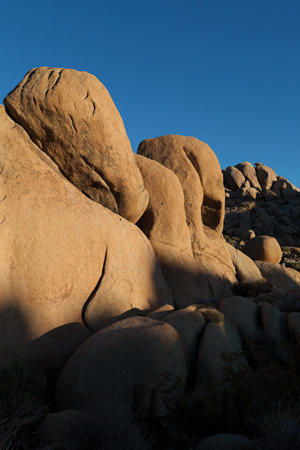
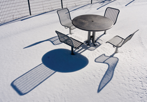
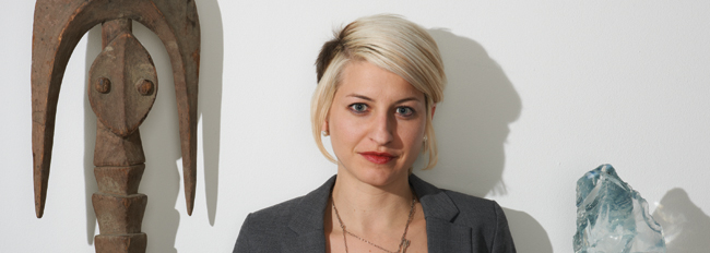
A person standing in sunlight will cast a shadow that is very sharp near the feet, but when you look at the shadow of the head, the edge of the shadow is ever so slightly soft (FIGURE 4.8). A tree will have a sharp shadow near the base of the trunk, but the shadow cast by the very top of the tree will be considerably softer, although still defined. The greater the distance between the subject and the surface that it is casting a shadow on, the softer the edge of the shadow. In the two examples in FIGURE 4.9 and FIGURE 4.10, note the difference in the crispness and detail of the shadow’s edges. In FIGURE 4.11 Jim lit Amy, his trusty and efficient assistant, in the studio with an optical spotlight (FIGURE 4.12) as an example of how to reproduce the look of sunlight with an artificial light source (FIGURE 4.13).
© KE
Figure 4.8. The photographer’s shadow is razor sharp near his feet, but you can see that the head’s shadow edge is slightly softer. The greater the distance between the subject and the surface with the shadow, the softer the edge will be.
© KE
Figure 4.9. These rocks, shot in direct sunlight, have softer shadows projected onto them, leading you to conclude that the rocks casting the shadows were a moderate distance away.
© KE
Figure 4.10. In direct sunlight the shadows of the outdoor furniture are crisply defined because the subject is very close to the ground.
© JP
Figure 4.11. A point light source in the studio. Amy, Jim’s assistant, who bravely volunteered to model for this exercise, is lit in the studio using a Profoto head inside an optical spot. Profoto strobe equipment has become virtually a standard in the industry for efficient and reliable strobe performance. Notice how sharp the shadows are and how harsh the lighting is with the optical spot.
© JP
Figure 4.12. The optical spot used for Figure 4.11 is a light that has a lens to focus the light and is the smallest point source in Jim’s studio. He uses it when simulating sunlight.
© JP
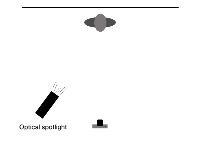
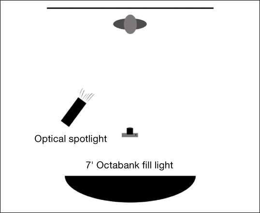
Figure 4.13. The lighting setup for Figure 4.11.
Directional Diffuse Source
A directional diffuse light source is larger than a point source, although its size and the amount of diffusion can vary considerably. Essentially, the larger the light source, the softer its quality and shadows. Imagine if the sun was partially obscured by a thin passing cloud. Effectively, what this does is enlarge the size of the source of light. In doing so, the light is slightly softened but still has a definitive directionality. The shadow’s edge becomes softer, but the shape is still clearly defined. The shadows on a subject’s face are not quite as distinct and harsh as in direct sunlight but still sculpt the subject and give the subject a dimensional look. So if you find that the point light source is too harsh, which is often the case, by enlarging the source and softening it, you can get a nicer look without sacrificing the shape and form of the subject. This can be a very flattering light for portraits. You can achieve this in studio by using a single light source and mounting a larger piece of diffusion material in front of it, creating a medium-sized, directional, diffused light source (FIGURES 4.14, 4.15, and 4.16).
© JP
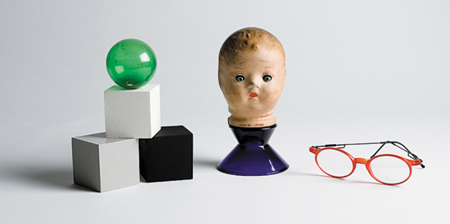
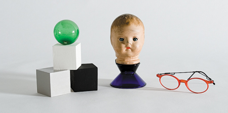
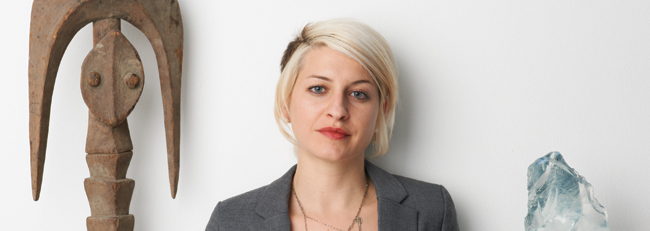
Figure 4.14. A directional diffuse light source in the studio was used to light Amy. How does this differ from the optical spot in Figure 4.11? Notice how the shadow of the object on the left has softened but is still defined.
© JP
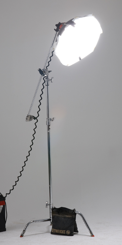
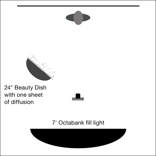
Figure 4.15. A 24-inch Beauty Dish with one sheet of diffusion material over the light.
© JP
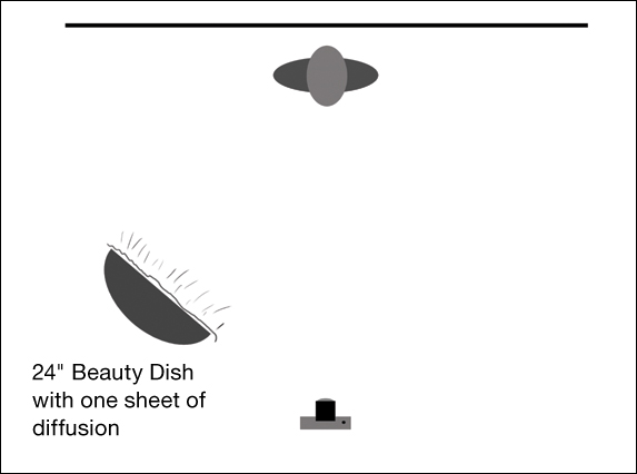
Figure 4.16. The lighting setup for Figure 4.14.
Directional diffuse source shadows
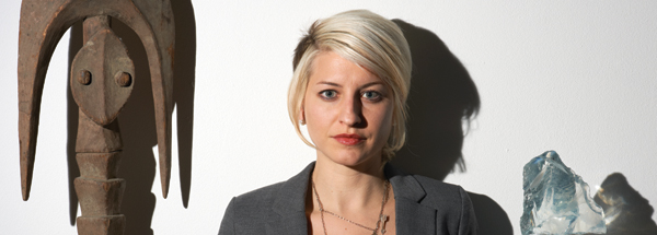
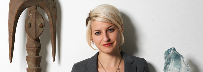
One of the areas where you most notice the difference in light sources is in the shadow definition. Whereas the point light source has crisply defined shadows, the directional diffuse source will have a softer edge; the softness of which varies depending on how large the light is and how close it is to the subject. When you look closely at the shadows on Amy’s face in FIGURE 4.17 and on the wall behind her, you see that the edge takes on a nice softness, yet the definition is still distinct enough to model her three-dimensional form within the bounds of a two-dimensional photographic image.
© JP
Figure 4.17. In this detail shot of Amy you can see how the shadows became slightly softer with the larger directional diffuse light source.
Large Diffuse Source
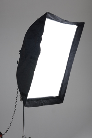
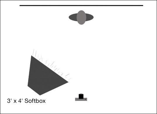
A large diffuse source is similar to a directional diffuse source except the source is simply larger. As the light source gets even larger in relation to the subject, the light quality and the shadows will become softer and softer. If a larger mass of clouds obscures the sun, the light still maintains its directionality, but objects lit by it appear less crisp and shadows are less defined. In the studio you can mimic this using a large softbox (FIGURES 4.18, 4.19, and 4.20).
© JP
Figure 4.18. A large diffuse light source in the studio was used to light Amy. Now you see that the shadow of the object has completely lost definition, the light on her face is softer and more flattering, and the glass takes on a dullish quality.
© JP
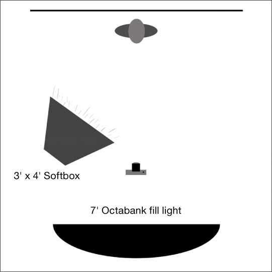
Figure 4.19. A 3′ × 4′ softbox.
© JP
Figure 4.20. The lighting setup for Figure 4.18.
When you’re lighting for composite work, it’s helpful to have a working knowledge of how the light from different-sized sources will look on your subject. The examples in Figures 4.11, 4.14, and 4.18 show the lighting differences from three specific studio light sources and give you an idea of how softening the light and enlarging the source changes the look on an object, a person, and glass. However, it’s important to note that although each different brand or model of light source will have its own particular light quality and look, the principles of how the size, amount of diffusion, and proximity of the light to the subject will apply nonetheless. In other words, whether you’re using a 7-foot diameter Octabank or bouncing a hardware store floodlight off a white wall, you will still get a soft, diffuse, directional light source lighting your subject. And as such, if you use an optical spotlight, a small electronic flash, or a flashlight, you will get sharp shadows and all the other qualities of a point light source. In conclusion, the size of the source controls the quality of the light.
Large diffuse source shadows
A large, soft, diffuse light casts softer, diffused shadows than smaller light sources. Essentially, the larger the light source, the more it “wraps around” the subject, diffusing the edges of the shadows. On a day when the entire sky is cloud covered—the ultimate, large, diffuse light source—look at the ground and you’ll find that many objects barely have a shadow at all. The reason is that the light is wrapping around and filling in all of the shadows, because it appears to come from every direction.
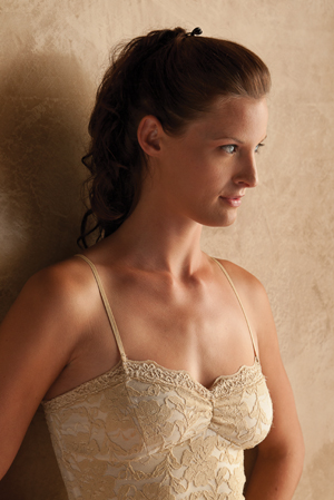
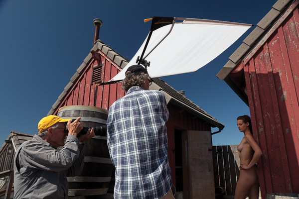
In the studio you can control the softness of the shadows by using smaller or larger light sources until you get just the right amount of hardness or softness (FIGURE 4.21). A large diffuse source can still sculpt form depending on what angle it is coming from but it does so with a flattering softness (FIGURE 4.22). Another way to create a large, diffuse light source is to place a large piece of diffuse, translucent white material between a point light source and your subject; the diffuser essentially becomes your light source (FIGURE 4.23).
© JP
Figure 4.21. In this detail from Figure 4.18, you can see that the large, soft light source casts a general diffuse shadow unless the object is very close to the surface. The reason is that the large light source “wraps around” the subject and diffuses the shadow’s edges.
© KE
Figure 4.22. Another example of a subject lit with a large, diffuse light source.
© KE
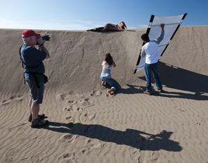
Figure 4.23. In this location shoot setup the point source of the sun is converted to a large, diffuse source by rigging a diffuser between the sun and the subject. Notice how it softens and smoothes the light quality on the model.
Choose a subject and light it with varying sized light sources to see how the light changes. Notice particularly how the shadows change as well. Photograph the subject with each light source, and look closely at the differences.
Size and Distance Relationships
Size and distance play an essential role in the quality of light. The farther a light source is from the subject, the more of a point source it becomes (and therefore the harder the edge that is produced). As the light is moved closer, the light source becomes larger in relation to the subject, and the light wraps around the subject more, producing a softer effect.
To illustrate this point, look at the photograph in FIGURE 4.24—the light source is farther away from the subject—and in FIGURE 4.25—the light source is closer to the subject. Both were photographed with the same light source, a small Chimera light bank, yet the shadows are softer with the closer lighting and harsher with the light farther back. Once you understand the way in which the size of the light source affects the quality of the light and shadows, you can control the light by not only the size of the source you choose but also by changing the proximity of the light to your subject.
© Mark Beckelman
Figure 4.24. This image was lit with a small softbox fairly close to the subject. Notice the softness of the light quality and also the soft edges of the shadows.
© Mark Beckelman
Figure 4.25. The same small softbox used in Figure 4.24 was simply pulled back away from the subject. Notice how the lighting takes on the qualities of a point light source, producing sharper shadows and smaller, more specular, highlights.
The Importance of Fill Light
Fill light supplements the key or main light without changing its character and is used especially to lighten shadows. One of the variables when you photograph any subject in any circumstance is how the reflected light from other surfaces and objects affect the lighting of your subject. When outdoors in direct sunlight, you may notice how the shadow of your subject can take on a blue cast. This is an ambient fill light from the blue sky. It is especially apparent in shadows on snow. If your subject is standing near a white wall, its reflected light will lighten the shadows on the subject.
When lighting in the studio, you can precisely control the amount of fill light that alters the density of the shadows in the subject. One way is to place a piece of large, white foam core next to the subject but out of frame; this will reflect the light from the principal light source (referred to hereafter as the main light) back onto the subject and into the shadow area. The drawback of this method is that the fill usually originates from one side or the other, and the light tends to fall off across the subject. A more reliable and controllable way to add fill light is to use a large, soft light source set at low power directly behind the camera. This works well because it evenly fills all the shadows, and turning the power up or down can control the shadow density.
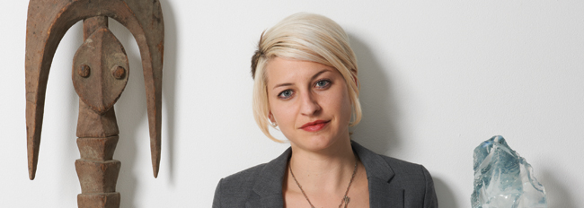
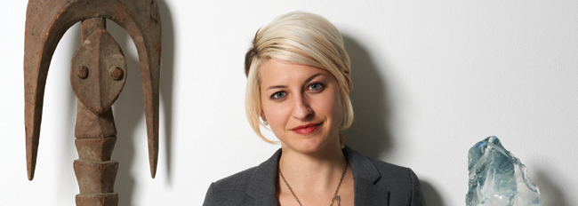
A very important principle to understand is that when you fill your subject in this manner, the amount of fill light that you use does not change the light quality of the main light. FIGURE 4.26 is lit using a point light source, and the shadows are filled with a large, diffuse source behind the camera. If you compare it to FIGURE 4.27, which was not filled, you’ll notice that the shadows are identical in shape and the only difference is that they are lighter in Figure 4.26. You can see a schematic of the lighting setup in FIGURE 4.28.
© JP
Figure 4.26. Amy is lit with the same point light source as in Figure 4.11, but the shadows are filled with a large, diffuse light source from behind the camera.
© JP
Figure 4.27. A point light source. Amy is lit in the studio using a Profoto head inside an optical spot, but there is no fill light.
© JP
Figure 4.28. The lighting diagram for Figure 4.26.
The principle that fill light does not alter the quality of the main light holds true for a directional diffuse light source as well. In FIGURE 4.29 Amy is lit with the Beauty Dish and filled with a large Octabank behind the camera. In FIGURE 4.30 she is lit with the same, but there is no fill light, and again you can see that the light quality and shadow shapes are identical and the only difference is the lightness or darkness of the shadows. A schematic of the lighting setup is shown in FIGURE 4.31.
© JP
Figure 4.29. Amy is lit with the same directional diffuse source as in Figure 4.14, but the shadows are filled with a large diffuse light source behind the camera.
© JP
Figure 4.30. A directional diffuse light source. Amy is lit in the studio using a Profoto head with a 24-inch Beauty Dish with one sheet of diffusion, but there is no fill light.
© JP
Figure 4.31. The lighting diagram for Figure 4.29.
Once again you see that adding a fill light does not alter the light quality with a large diffuse source either. FIGURE 4.32 is lit with the large softbox with a fill light, and FIGURE 4.33 is lit the same way but without the fill. And again you can see that the shadow and light quality of the main light are not altered by the fill light. As you begin to match light for compositing, you’ll see how the principles of fill light discussed here come into play. A schematic of the lighting setup is shown in FIGURE 4.34.
© JP
Figure 4.32. Amy is lit with the same large diffuse source as in Figure 4.18, but the shadows are filled with a large, diffuse light source behind the camera.
© JP
Figure 4.33. A large, diffuse light source in the studio. Amy is lit using a 3′ × 4′ Chimera softbox, but there is no fill light.
© JP
Figure 4.34. The lighting diagram for Figure 4.33.
Choose a subject and light it with a point light source. But this time add a fill light from the camera position and look at the captures as you incrementally add power to the fill light only, thus increasing its intensity while leaving the key or main light unchanged. Watch how the image changes as you progressively fill in the shadow areas. Notice that the fill light doesn’t change the look of the main light other than to lighten the shadows.
Light Quality Image Gallery
The gallery of images shown in FIGURE 4.36 through FIGURE 4.41 demonstrates a variety of lighting possibilities and illustrates how important the quality of light is for successful, dramatic, and eye-catching photography. As a photographic illustrator, you should always be looking at light with its infinite variations, not only in nature, but also in man-made environments. Instead of walking to school or work with your head down, cast your gaze upward and pay attention to how light affects your world: It’s drab one minute, yet striking the next. Look at how the light in an elevator or subway car falls and creates shape, or how light changes the same street at different times of the day and night, season to season. Even in the most uninteresting of environments, little snippets of fascinating light effects are going on. Make an effort to be aware and in the moment.
© KE
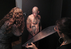
Figure 4.35. An assistant uses a silver reflector to bounce light from the key light into the shadow areas of the photographer’s inked subject.
© JP
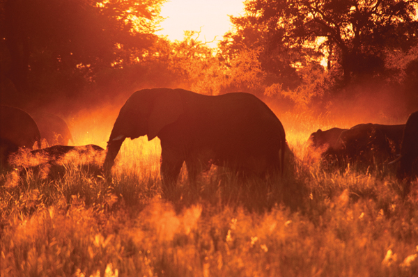
Figure 4.36. With the setting sun backlighting the dust kicked up by a herd of elephants in Botswana, a beautiful orange glow silhouettes the elephant’s majestic figures.
© JP
Figure 4.37. This Bedouin boy is edge lit from the sun breaking over the camel’s back, creating a sculptural and dramatic effect.
© JP
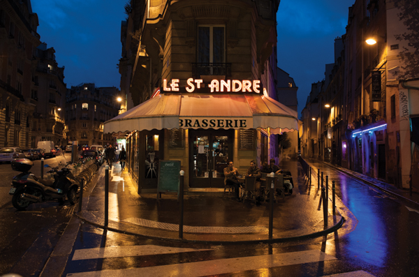
Figure 4.38. A mixture of rainy dusk light, street lights, and neon helps to create a very inviting and alluring Parisian street scene.
© JP
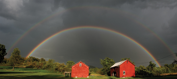
Figure 4.39. When the sun emerges during or after a storm, it often creates a dramatic light on buildings against a stormy sky, and in this case, a double rainbow. This panorama has been stitched together from three different shots.
© JP
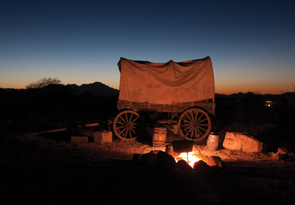
Figure 4.40. The afterglow after sunset provides a placid backdrop for the fire-lit campfire scene in the foreground. As with Figure 4.38, mixing light sources often creates the potential for a magical combination of colors and moods.
© JP
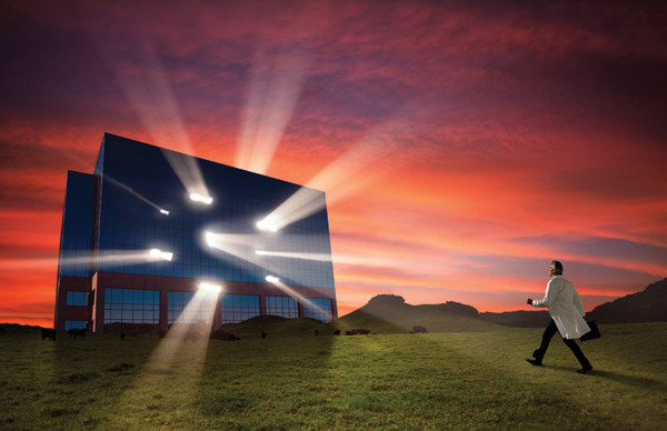
Figure 4.41. In this composite image, beams of light emanating from a building provide a visual metaphor for this story about a scientist en route to his lab and the possibilities he envisions there.
Carry a small point-and-shoot camera or cell phone at all times and shoot how light and shadow fall on a variety of surfaces at different times of day, in different weather, and during each season. Anytime the light inspires you, record it and study what’s happening with it.
Color Temperature
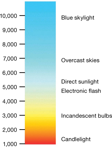
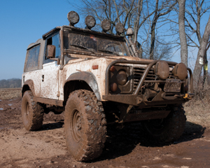
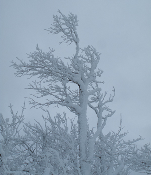
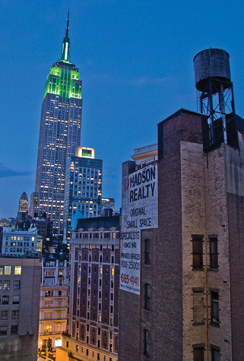
In scientific terms, color temperature is defined as the electromagnetic radiation emitted from an ideal black body as its surface temperature measured in kelvins (K). In other words, and please do not try this at home, if you heat a piece of black metal until it glows, the particular color seen at a specific temperature is the color temperature. As the metal gets hotter and emits light, it becomes a dull red; as it gets hotter, it glows yellow and then white; and at its highest temperatures, it glows blue. The light from a candle flame is measured at around 1850K, incandescent lightbulbs are usually between 2700 and 3300K, daylight at noon is generally 5500K, and the skylight in late afternoon usually measures approximately 7500K. So in simple terms, color temperature is a scale from warm (red, orange, yellow) to cool (blue) colors that we often refer to when we discuss photographic lighting. It seems counterintuitive that the higher temperatures connote cool colors and lower temperatures indicate warm colors. Color temperature can sometimes be used interchangeably with the white balance feature on most digital cameras, which allows the remapping of color values to simulate variations along the blue-yellow axis (FIGURE 4.42). The images in FIGURES 4.43 through 4.47 show a variety of natural light examples of different color temperature scenes.
Figure 4.42. A simple color temperature chart.
© KE
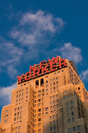
Figure 4.43. Katrin photographed the New Yorker Hotel building in the late afternoon. Note the warmth of the light. At sunrise, the color temperature of the light quickly cools off in the first hours of the day compared to the evening when the warm light tends to last longer.
© JP
Figure 4.44. Amy is lit with warm, late afternoon sunlight. Aside from the color, notice the sharpness of the shadows from the point light source.
© JP
Figure 4.45. This mud-covered Land Rover was shot in midday. The color temperature is pretty much dead neutral or 5500K—not warm, not cool. This temperature is usually the accepted neutral standard for viewing prints, calibrating monitors, and photographic or printing processes.
© JP
Figure 4.46. On a wintry day at the top of a mountain, the color temperature increases as the actual temperature drops. The automatic white balance on most digital cameras will correct a snow scene to neutral, but the actual color temperature will often be very cool.
© KE
Figure 4.47. This New York City scene is dominated by cool, dusk light but is mixed with accents of warm, street and office lighting to create a pleasing look.
Just as the quality of natural light changes depending on the time of day, so does its color. Warm colors appear in early sunrise (Figure 4.43) and late afternoon (Figure 4.44), more neutral colors at midday (Figure 4.45), cooler colors with cloud cover (Figure 4.46), and deep blues at dusk (Figure 4.47).
Color Correction Using Gels
One of the ways that photographers can achieve desired lighting effects and lighting balances is through the creative or practical use of colored gels on their lights. When dealing with daylight, all of the color correction takes place along the blue-yellow axis. As such, there are a two series of lighting gels designed expressly for this purpose: CTO (Color Temperature Orange) and CTB (Color Temperature Blue). They are available in full, half, quarter, and eighth strengths or values. The full version of the CTO corresponds exactly to the 85B daylight to tungsten camera conversion filter, and the full version of the CTB corresponds exactly to the 80A tungsten to daylight camera conversion filters. The fractional versions are just that, the same color correction but just less color saturation so you can control the color incrementally. CTO gels are used to “warm” up the light, and CTB gels are used to “cool” the lighting.
Matching a Single Directional Light Source
Now that we’ve discussed some concepts and terminology of basic photographic lighting principles, we’ll employ them to explore strategies for lighting the original photographic elements that you’ll utilize for your composites. When you see a poorly done composite image, very often the first thing you notice is that the shadows on the various subjects are going in different directions, some elements are brighter than others, and attention was not given to accurately matching the light among all the components. Sometimes this can be done intentionally for a specific look or effect, and in those cases, it can be perfectly fine to have varied lighting schemes throughout the image.
But here we’ll concentrate on photorealistic composites, which rely on the final image to follow all the laws of physics that would be in place in an unaltered photograph. Or at least they will appear to follow all the laws of physics: consistent light direction and intensity, perspective that is correct for all elements, and a unified color palette. It may be enough that all the elements appear to have been lit by the same source and be in the correct perspective. Of course, sometimes we’ll elect to enhance the lighting on certain elements or exaggerate the perspective beyond what would normally be possible in a straight photograph, but the viewer should never be aware of our handiwork.
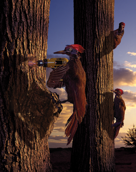
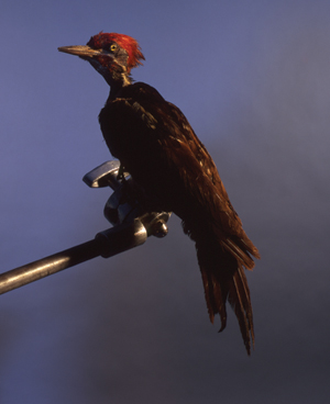
In the first example we’ll just match a single directional light source—the sun at end of day—to all the elements in the composite, in this case, a very clever, tool-wielding woodpecker who out-pecks his peers.
Analyzing the Background Image
When we talk about matching the light in a composite, where do we start? As discussed in Chapter 3, “Planning and Preparing,” we always begin by analyzing all the deciding factors and determining the controlling factor. When you are trying to build a composite based on an existing image, you must begin by closely analyzing the lighting established in that image. This will be the blueprint for lighting all of the elements that will make up the final composite. Because this section deals with matching light for a single light source, for the sake of simplicity, we’ll assume that the background you are matching is lit with a single light source.
The first factor to determine is the direction of the light source in the background image. In some scenes it is difficult to determine the light direction, so you’ll need to look for clues. Answering the following questions will help you determine the direction of the light source:
• In what direction are the shadows going?
• How long are the shadows?
• Are there fringe highlights on a subject’s hair or foliage that indicate the light source is above and backlighting the scene?
• Are there no shadows at all, indicating a large, diffuse light source from a vague direction?
• Are the shadows sharp, which would indicate a point light source?
• Are the shadows distinct but slightly blurred on the edges, indicating a directional diffused source?
• What is the color temperature of the light?
To get the proper lighting on the elements that you intend to add to the background, you must match not only the direction, but also the quality and the color of the light source established by the chosen background image.
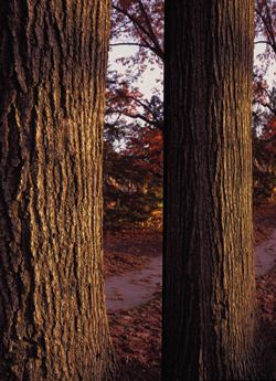
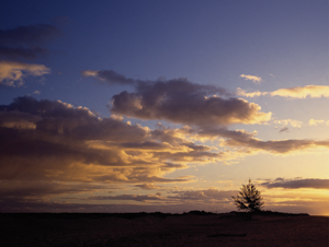
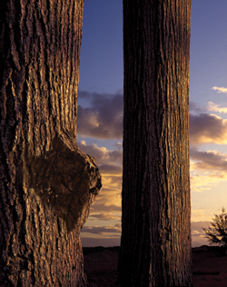
In the woodpecker composite example (FIGURE 4.48), Jim worked with three primary elements: the woodpeckers, the trees, and the sky. Here, Jim will show a simplified progression of the assembly of the primary elements of this composite. Because Jim would shoot the woodpeckers in the studio, he planned on matching their light to the natural background lighting. The trees thus became the controlling factor. He set out to shoot trees and liked the way the light looked when the sun came from the right side (FIGURE 4.49). But the environment around the trees was messy and distracting, so Jim masked two, large tree trunks and chose a sky image from his library (FIGURE 4.50) that had a similar light direction to that of the trees. He then had a background image that he could use as a guide for lighting the birds and the remaining elements in the studio (FIGURE 4.51). Because Jim had just shot the trees, he knew exactly what direction the light came from, the light quality, and the color temperature.
© JP
Figure 4.48. The final composite image of our hero woodpecker with astonished peers.
© JP
Figure 4.49. This image shows a single tree with its original background, and its layer is then duplicated and becomes the second tree in position for the final composite.
© JP
Figure 4.50. Jim chose this sky image from his library because it matched the light of the trees.
© JP
Figure 4.51. The assembled background image is ready to populate with industrious woodpeckers.
Sometimes you may want to use an existing image from your library, but you might have forgotten exactly what the light was like on that day. To determine the light in an existing image, examine the background, study the shadows, and make your best guess as to how to light your elements so they match the intended background.
Matching the Light Direction
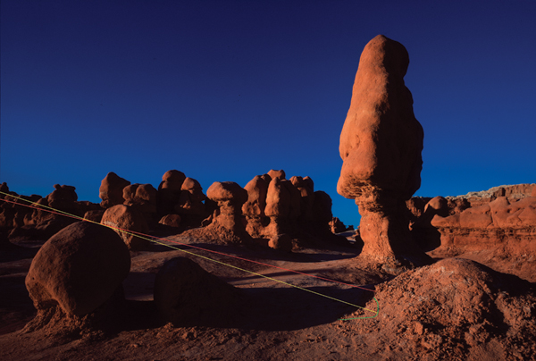
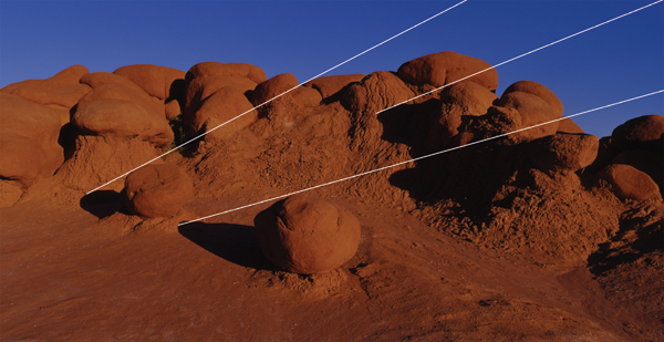
You can match light direction through a combination of semi-scientific, logical, and creative means. Using the background image as a guide, you can draw vectors on the image to determine the approximate placement of the light source and the angle at which it lights the scene. Consider FIGURE 4.52. By drawing a red vector from the tip of the shadow across the top of the rock that casts the shadow and out of frame, you can create a possible angle of light. But when further analyzing it, you see that the earth rises up slightly and the shadow follows the earth so the angle is imprecise. The green line approximates where the shadow might fall if the earth was flat, and the yellow vector describes another possible angle of light originating from that point. It is not a very precise system, but it does give you an idea of the angle of light, which you can then match in the studio. This example includes a fairly clear line to follow, but many images you work with will not. For example, in FIGURE 4.53 you can draw three vectors and get three different possible angles for the light. They are all in the same general direction and will give you some good information as to how to place your main light should you decide to photograph an element to compose into this scene. Determining the light direction becomes more difficult when the light is softer or the shadows are hard to decipher. In those cases you must make an educated guess as to where to place your light in the studio.
© JP
Figure 4.52. Two different vectors drawn from the top of a rock to the end of its shadow give you an approximate idea of where to position your light in order to match the direction.
© JP
Figure 4.53. Another example of drawing vectors to determine light direction yields three different angles of light. By placing your light at the average of these three angles, you can match the light direction on your subject fairly closely.
When analyzing the background for the woodpecker and when shooting the trees, we established that the light is a point source (the sun) coming from the right and behind the subject, and from a fairly low angle on the horizon. And although this section discusses matching a single light source, if you only used the single source, the shadows would be pitch black. So, you’ll also factor in a fill light, a large soft light from the camera position that evenly fills in all the shadows. Although the fill light is technically a second light source, its intensity will be much lower than the main light and therefore the entire look of the lighting will be dictated by the point source main light. Keep in mind that the fill light does not alter the light quality of the main light if it originates from the camera position.
Matching the Light Quality
There are infinite minute variations in light quality, both natural and artificial, that can be observed throughout each day. One way to simplify the process of analyzing the light quality for any photograph is to just consider the size of the light source. In doing so you’ll be able to match the light quality of your element to that of the background. As discussed earlier in the chapter, the physics behind different-sized light sources doesn’t change regardless of what brand of light you use or how you arrive at your lighting scheme. Remember that small point sources are harsh and produce sharp shadows; large, diffuse light sources are soft and produce indistinct shadows. These are the principle determinants of light quality, so look closely at the background and make an educated guess as to how large the light source is.
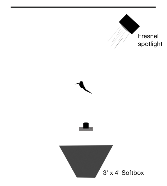
With the woodpecker background, Jim looked at the razor-sharp shadows and texture of the trees, and determined that the light to match was a point source. The sun is the ultimate point light source with its characteristic specular quality and razor-sharp shadows. Because the sky image was shot later in the day and there was a little haze on the horizon, Jim can soften the source slightly and still get the studio light to match the light on the trees using a Fresnel light for the main light (FIGURE 4.54) and a large softbox for the fill light. The Fresnel is basically a large, coarse glass lens that focuses the light and gives a sunlight quality, but it’s just a bit softer (FIGURE 4.55).
© JP
Figure 4.54. A Profoto Fresnel light source.
© JP
Figure 4.55. Lighting setup for the photographs of the woodpeckers showing the direction of the main light and the placement of the fill light.
Matching the Color
The final attribute to consider when matching the light is the color of each light source and the ratio of intensity between the two. Natural light always falls along the blue-yellow color temperature scale, whereas artificial light can be almost any color. Unless you measured the actual color temperature of each light source at the scene of the original background shoot with a color meter and recorded the values, you’ll have to analyze the background and make an educated guess as to what color to make your main light. Jim has a full catalog of colored lighting gels he uses precisely for this purpose.
A great resource for gels is the Lee Filters (www.leefilters.com) line of lighting gels. The company has every color you can imagine, which makes matching color a breeze.
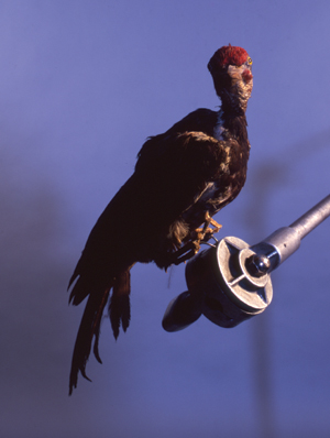
The woodpecker scene takes place at the end of the day when the light has a golden hue. So Jim chose a warm ½ CTO gel to put on the main light. You might think, why would you do that in the photography when you can just do it in Photoshop later? However, it is always preferable to make your original photographs as precisely and technically close as possible to your intended look. Although the main light is warm in color, the fill light will be slightly cool to mimic the blue skylight that tends to fill the shadows late in the day. Jim chose a pale blue ¼ CTB gel for the fill light. The resulting lighting shows a crisp warm light that defines and sculpts the birds, and produces slightly bluish shadow areas. Once the lighting is established, you can shoot all the elements that go into the scene using this setup (FIGURE 4.60 and FIGURE 4.61). You’ll find that if you do a great job matching the light, your elements will look very natural when composed into the scene.
© JP
Figure 4.60. A shot of one of the woodpecker elements.
© JP
Figure 4.61. Another shot of one of the woodpecker elements.
Choose one of your photographs shot in natural daylight, analyze the background, and see if you can determine the light direction, light quality, and color of the sunlight. Make a sketch of what you think the lighting would be if you were trying to match it in the studio. Take it a step further and shoot an object with that lighting. Then determine whether it would fit into the background scene.
Matching Multiple Light Sources
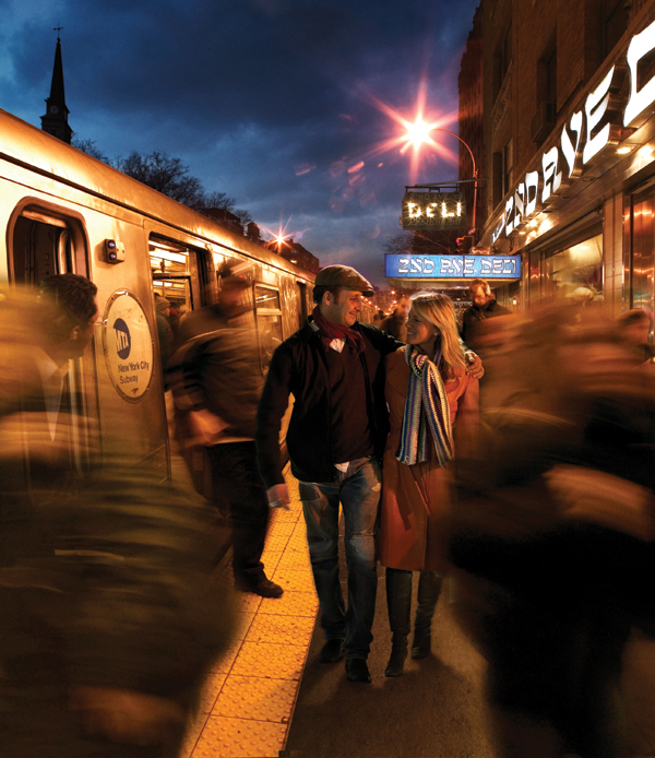
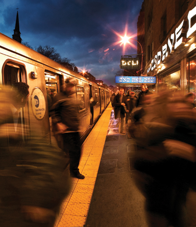
Matching the light to a scene where there are multiple light sources is understandably a more complex challenge than matching a scene where there is only a single light source. It requires a precise analysis of the scene you are matching, a thoughtful placement of your lights to match direction, attention to the quality of each source, and a careful balance of the color temperature of each source. If all of these factors are handled correctly, the element you’re adding to your composite will look very natural when it is placed into the scene. You will know very quickly if you’ve gotten it wrong, because your element will look completely out of context. For an example of multiple source lighting, Jim decided to use an illustration that was done for New York Magazine on the subject of the Second Avenue Subway. If you live in New York, you’ll know from as early as 1920 that various Transit Authorities had promised a subway line on the East side of the city along 2nd Avenue and it has never come into fruition. There are ample public transportation options on the west side of the city, but the east siders have been deprived by not having subway service. The editors at New York Magazine commissioned Jim to illustrate the ongoing saga by photorealistically compositing a train directly across from the famed 2nd Avenue Deli (FIGURE 4.62).
© JP
Figure 4.62. The final composite for the Second Avenue Subway illustration that ran in New York Magazine.
Analyzing the Background Image
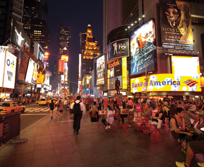
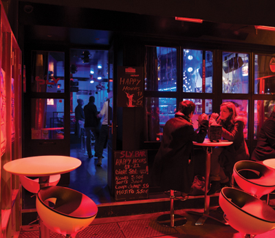
A multiple source background is a bit more difficult to analyze with different colored sources and various quality shadows going in multiple directions, indicating mixed lighting. Look for clues in the background as to what may be happening. Determine the location. If it’s Times Square, you have hundreds of light sources from every direction all mixing together. All of these sources blend together and form a new color that appears to come from one or two large, diffuse sources (FIGURE 4.63). Look at other subjects or objects in the scene and examine how the light falls on them as you form your strategy to light your composite elements. If your location is more intimate and lit with several distinct sources, like the Parisian bar scene in FIGURE 4.64, the lighting on your composite element will vary depending on where in the scene it is placed. If it’s in the foreground, you would use a strong red light, and if it’s in the interior of the bar, you would use a blue light. But if the subject was standing in the doorway, you would use a mixture of the two. A good strategy is to start with the dominant light source; identify the direction, quality, and color; and then move onto the secondary source and proceed in a hierarchical fashion. It is rare to find more than three distinct light sources lighting a single element in a scene.
© JP
Figure 4.63. This image of Times Square shows how when you have so many light sources converging in one area, they all blend together to form a new color that appears to come from one or two large, diffuse sources.
© JP
Figure 4.64. This Parisian bar scene has two distinct colored sources, and if you wanted to match light, your strategy would vary depending on exactly where you placed the subject. If the subject was outside, you would use a red source; if inside, a blue source; and if in the doorway, a mixture of the two.
The background image for the Second Avenue Subway composite (FIGURE 4.65) is shown with the subway train, platform, and some blurred commuters already assembled into the scene. This is done so we can focus solely on lighting the element that Jim will composite into the scene. We’ll go into great detail on how to composite images in future chapters, but for now let’s just concentrate on the lighting. Technically, this composite satisfies the requirements of the assignment, but to create a bit more connection with the reader, Jim decided to add a pair of young lovers walking down the street and mixing in with all the civic activity. A streetlamp is just to the right of center, a point light source that has an orange-red hue.
© JP
Figure 4.65. This background image for the Second Avenue Subway image is already composed of several elements: the train, blurred commuters, the street, and a sky. The background must be shown at this advanced stage so we have enough information to light our subjects.
A warm light originates from the deli to the right, and given the large, blue-sky area, there might be some deep blue in the shadows. In this case the train was actually shot in the subway, and its lighting is completely different from the street scene. There is no way to match it to the street scene; however, by tinting the color warm, it seems to fit right into the scene. When matching light, you don’t necessarily have to be 100 percent accurate to reality—what something really looks like in this situation. It’s your image; you can interpret the scene any way you want, and as long as your lighting appears to follow that of the scene, it will not be questioned, especially if you are aesthetically successful with your interpretation.
Matching the Light Direction(s)
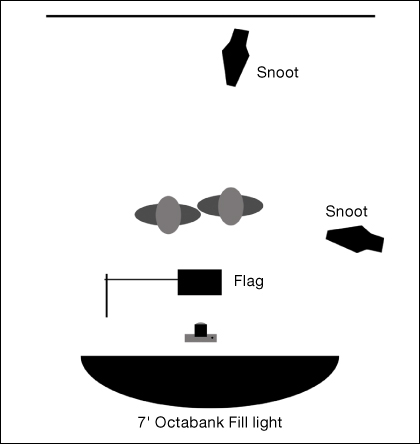
Because there are so many light sources bouncing around in this scene, it would be difficult to identify a main light, so Jim decided to use the streetlight as the dominant and brightest source to bring emphasis to the couple. It was easy to place, because it’s visible in the scene; a point light source, in this case a Profoto flash head with a snoot, was chosen and placed directly behind the subjects and slightly to the right pointing directly at the camera. A snoot is a flash head with a telescopic extension that narrows and directs the light in a single direction. Its quality is similar to that of an optical spotlight, but it does not have a lens. Most photographers know that when you shoot into the sun, your lens will flare and ghost your image. This is also true in the studio; you don’t want to shoot directly into one of your light sources. The way this is controlled is through the strategic placement of a flag, which is a black fabric rectangle mounted on a stand. It is placed precisely to block the light from hitting the lens but not so as to enter the frame or block the light off of the subject. The secondary source appears to emanate from the 2nd Avenue Deli on the right, so Jim placed a snoot to the right of the couple and from above to mimic spill light from the recessed lighting under the sign. The tertiary source here is just a general fill light to control the contrast, and a 7-foot Octabank will do a great job with that. The lighting diagram in FIGURE 4.66 shows the approximate light positions.
© JP
Figure 4.66. Overhead lighting diagram showing the placement of the lights for the subway image.
Matching the Light Quality
Matching the light quality of the various sources in a multiple light source composite is similar to doing so in a single source composite except sometimes the various sources conflict with one another, or cancel each other out, or just make it confusing to determine exactly which light is doing what to your subject. Regardless, look for the same artifacts—sharp or diffuse shadows, highlights on metal, and the harsh or soft quality that will indicate the size of the source. For Jim’s subway image, the dominant source—the streetlight—is obviously a point source because you can see it. Similarly, if you look at the small recessed lights under the deli sign, they are also point sources but are mixed with a more general light that comes from the restaurant. And finally, there is an overall fill that comes from the sky at dusk.
Matching the Color
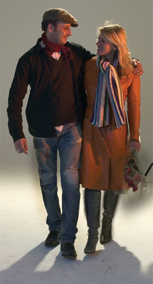
Looking again at the background, Jim decided to use a more neutral light for the dominant, streetlight snoot, even though it is slightly warm in the scene. He did this to highlight and bring attention to the couple. He chose a full CTO gel for the secondary snoot to the right of the couple to give them the warmth that most of the other people in the seen seem to be lit with. In addition, he chose a ½ CTB gel for the Octabank fill to give all the shadow areas a cool cast (FIGURE 4.67).
© JP
Figure 4.67. The photograph of the couple that Jim composited into the scene.
Choose one of your photographs that has more than one light source, and analyze it to determine the directions that the various sources are coming from. What is the light quality of each? How would you light an element to compose into the scene?
Choosing a Background For Elements
When you’re capturing elements for composite images, you not only need to consider matching the lighting, but also that you’re photographing your subject on a background that will facilitate masking them out and placing them in the new environment. Therefore, any element that you have the luxury of controlling the lighting and the background, and that can be shot in the studio should be shot against a plain, unobstructed background, such as seamless paper, a painted wall, or fabric. This section clarifies why you might elect to shoot on a white, neutral gray, black, or colored background depending on the destination of your element. In general, one of the most difficult subjects to mask is human hair, so you must take great care when you shoot people with the intention of masking them out of their original background. You need to consider what the final background will be and shoot them against a color or tone that facilitates a perfect hair mask when placed into the intended background.
White
If you know your subject will be composed onto a white background, shoot them on white as well. You have to be careful not to over light the white background because it will act as a secondary light source and create an edge light around the subject (FIGURE 4.68). When shooting elements to be composed, the goal is to get a clean edge around the entire element and have no light other than your main light(s) striking the subject. This means you should evenly light the background, block off the light sources from the camera, and try to contain all the light behind the subject. Shoot the subject well in front of the lights and background to avoid unwanted spill light. You can also bring in two pieces of foam core just to the edge of the frame to minimize the edge flare. However, the best solution is to shoot on a very light-gray background instead of white to avoid this artifact, unless of course the edge light is intentional and you want that effect. In FIGURE 4.69 Jim shot the subject not on white but on a very light shade of gray with the intention that it would be masked out and composed onto a white background, as shown in the final composed image in FIGURE 4.70.
© JP
Figure 4.68. An image of a subject on overlit white. Notice how the light wraps around the edges of the subject’s face, making the edge less distinct and introducing a new light source.
© JP
Figure 4.69. Jim shot this figure on very light gray so that it would mask easily and translate well to a white background when composed.
© JP
Figure 4.70. The final composite image on white. This illustration was done for a pharmaceutical company that made heart stents.
Gray
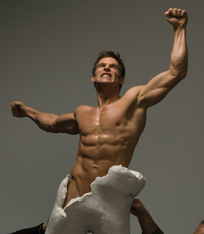
Photographing elements on neutral gray is a very versatile choice for several reasons. One of which is that it will not contaminate your subject with a color cast, which is possible when you shoot with blue, green, or another color. Also, most destination backgrounds for your element will be a midtone, not black or white, and shooting on gray gives you many masking options, especially if you’re not exactly sure what background you’ll be composing your element into. In the example in FIGURE 4.71 Jim shot the subject on a gray background knowing that the client wanted to use a neutral, slightly textured, concrete wall as the final background. It was a simple matter to mask the subject and retain all the subject’s hair. Various techniques for masking hair and fine-detail will be covered in Chapter 11, “Fine-edged Selections.”
© JP
Figure 4.71. Jim shot the subject against gray to easily mask and compose him against a gray background.
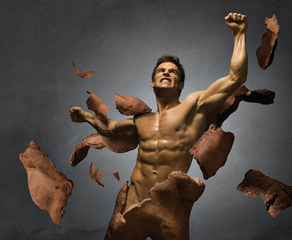
Jim did this assignment for a fitness magazine where the concept was to make an image that would urge people to break out of their normal fitness routines to achieve greater gains. The final image shows the protagonist breaking out of a stone shell (FIGURE 4.72). The principal factor you should pay close attention to as you’re photographing your subject on gray is the edge contrast, especially the hair. You’ll want there to be a distinct tonal difference between the hair and the background. Once the lighting is set for the main subject, adjust the light level of the background to create this contrast. Increase the tonal value of the gray if the subject’s hair is dark, and decrease it if the hair is lighter. In all cases you want to light the background as evenly as possible because this will also help the masking process.
© JP
Figure 4.72. The final composite image. This composite, done for a fitness magazine, encourages people to break out of their bad exercise habits.
Black
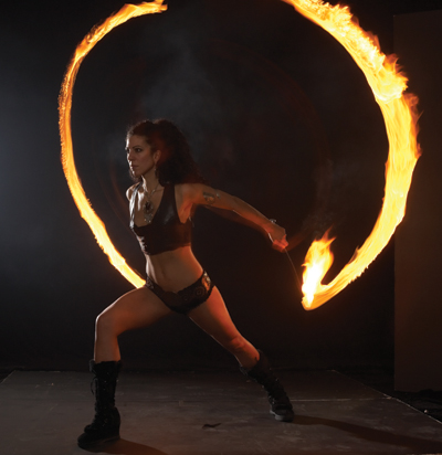
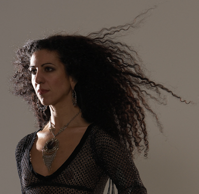
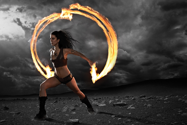
In some situations you’ll want to shoot your subject against a black background, but generally not too often because it has limitations. If you’re using a high-contrast light source, your shadows can disappear into the black, making it very difficult to distinguish the edge of the subject. This can make masking your subject an unnecessarily time-consuming challenge. Black is useful as a background when you are shooting anything that is a self-illuminating light source, such as fire, LED lights, or El Wire, which is an illuminated wire used to add lighting accents to clothes or objects. The example in FIGURE 4.73 includes a person and fire. The black background is ideal for capturing the fire, which if shot on gray would lose its intensity. But you can see how the model’s black hair gets completely lost against the background, an impossible masking scenario. Jim’s solution was to capture the fire and the model’s pose and expression in one photograph, and then do an additional shot of the model against gray, just for her hair element (FIGURE 4.74). The final composite preserves the integrity of the fire captured on black and the detail of the hair shot on gray (FIGURE 4.75).
© JP
Figure 4.73. Marisa Scirocco is a fire artist and is shown here in a time exposure to capture the flames and a flash exposure for the edge highlight and the fill light.
© JP
Figure 4.74. Notice the edge contrast between the even gray background and Marisa’s jet-black hair.
© JP
Figure 4.75. The final composite image is a personal project influenced by the culture of Burning Man.
Greenscreen or Bluescreen
Currently, one of the most commonly used techniques of capturing elements, not only for still photography but especially for film and video, is bluescreen or greenscreen. By shooting a subject on an evenly lit color you can make your masking work very simple indeed. As you’ll see in ensuing chapters, the advanced Color Range tool has become so precise that just by selecting a few areas, you’ll make an almost perfect mask with little or no effort. One question many people ask is, Why not just shoot everything on greenscreen so you can just drop them out? It’s a valid question but fails to take into account that many times when you shoot on a colored background, despite totally isolating the lighting between the foreground and background, the green color can seep into the subject. Sometimes this is apparent at the edges of the hair; other times it can show up as a slight cast that appears in the shadows or at the subject edges. For this to be successful, you’ll need to make sure the green or blue background is evenly lit, that your back-lights are not affecting your main subject lighting, and that you’ve balanced the intensity between the two.
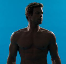
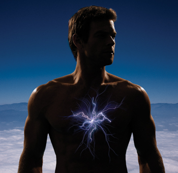
It may be tempting to think that you can shoot all your elements on greenscreen, but as with any technique, there can be drawbacks. First, you may not want to have all your shots against a green background, for instance, if you need to use them in other applications than the composite. Second, as mentioned previously, some of that color can seep into the edges of the hair, as well as the shadow areas of the body, and it can be quite difficult to remove. Third, sometimes Color Range can create artifacts that look fine from a distance but if you magnify the edge, you’ll notice a texture that requires laborious hand work to finesse. Shooting against green or blue is excellent for masking blond or light-brown hair because it is quite difficult to separate from gray due to the similarity in tonal value. In FIGURE 4.76 a model with light-brown hair is shot on blue with the advance knowledge that he would be placed on a blue background in the final magazine cover (FIGURE 4.77).
© JP
Figure 4.76. Tim is shot against an evenly lit blue background to facilitate his mask.
© JP
Figure 4.77. The final composite image was the cover of Business Week Magazine for a story about rewiring your body.
When you’re trying to choose a background to shoot your elements on, look at the image that you are composing into and imagine where in the scene you will place the element. Choose a background similar in tone and color to that area.
Closing Thoughts
Not all successful composites rely on matching the lighting among the elements that you’re bringing together. But if you’re trying to create a believable, photorealistic composite, it is an essential requirement. The other major factor that must be matched is the perspective of all the elements. This aspect will be covered in Chapter 5 where we’ll delve into how lenses, point of view, and scale can make or break the believability of your composites.

