Chapter 12. Creative Compositing

The creative process is simultaneously fulfilling, intimidating, and—in a way—addictive. It involves honing your craft, nurturing your muse, and creating images that express your values, perceptions, and sensibilities. In the process, especially during those times when you run up against a creative block, you may doubt yourself, your ideas, and your abilities, but don’t. Often, we seek the recognition and approval of people we respect, and we know from experience that worrying about what others will think can have a paralyzing effect on working freely. In Chapter 2, “The Creative Process,” we discussed finding your inspiration and turning off that nagging and doubting voice. This chapter continues that discussion and addresses working freely and creatively with Photoshop. In this chapter, you’ll:
• Discover inspiration with the simplest subjects
• Learn how to treat Photoshop as a digital sandbox
• Experiment with blending modes, textures, and effects
• Understand the essentials of image composition
The Photoshop techniques used in creative compositing are the same as those that have been presented throughout this book—from making selections, to masking, to experimenting with blending modes, to adding shadow and texture. In this chapter we review some key concepts and techniques, and feature several examples to illustrate how they can be used on actual compositing projects. Because this chapter concentrates more on the artistic process and on ways to foster and encourage your creative discoveries, it includes fewer step-by-step examples to work along with than previous chapters. But there’s still plenty of inspiration to give you ideas for your own collages!
Images and Inspiration
Creative inspiration for a collage can come from many places. Some of these may be known sources where you’ve had success finding ideas in the past, whereas others may be totally unexpected. The origins of creative inspiration may be mysterious at times, but what is not in doubt is how you should respond to them. Don’t let an idea for an image pass by without grabbing onto it and giving it a close look under a bright, conceptual light. Write down the idea in a journal or scrapbook. Make a sketch. Determine if it “has legs” by asking these questions: How much does it captivate your imagination? How hard would it be to transform the idea into an actual composite image? The places where you get your ideas can be just as important as the actual ideas. Once you know the location of “the well,” you can return to it again and again as you look for inspiration.
The Personal
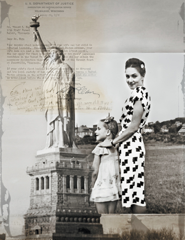
Our own story and that of our family is often the story we know best, or the tale that touches us most deeply. The pages of your personal story, the purely historical facts and the emotional currents running through it, can be fertile ground for finding ideas to work into a composite image. Mining the archives of old family letters, snapshots, immigration documents, and school papers and combining them with images of the places where you grew up or experienced significant life transitions is an effective way to work with a project that exercises all of the compositing skills featured in this book and also has personal meaning for you. Brigitte Carnochan followed this approach with her series “Imagining Then: A Family Story 1941–1947,” a meditation on her young childhood growing up in Germany (see the Artist in the First Person sidebar in Chapter 8, “Layer Essentials” for more on Carnochan’s work). You can use digital collage to explore aspects of your story with the intent that they be accessible to a wide audience or only for an audience of one—you (FIGURE 12.1).
© Brigitte Carnochan
Figure 12.1. An image from Brigitte Carnochan’s “Imagining Then: A Family Story 1941–1947” uses old letters, documents, and family photos to illustrate a personal history.
Cast-offs and Curios
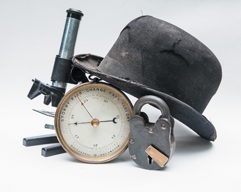
Every artist and designer we know is a flea-market walker, used-book-sale browser, junk shop gatherer, and inspiration scavenger. We are always on the lookout for an interesting artifact or discarded item that can serve as an element in a still life or be worked into a composite as the main subject, a supporting player, or an interesting texture or background (FIGURE 12.2).
© SD
Figure 12.2. Junk shops and flea markets are fertile ground for finding objects to use in collages.
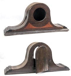
Seán found the old mantelpiece clock case shown in FIGURE 12.3 in a junk shop in New England. He was interested in it not for the front with the round opening for the face of the clock, but for the back with its little door for servicing the clock. He hasn’t used it yet, but one of these days it will end up in a composite! Finding these items isolated on dusty junk shop shelves or piled into tattered cardboard boxes at a flea market can actually be very conducive to receiving the creative spark of an idea on how to use them.
© SD
Figure 12.3. An old, battered clock case will be an interesting addition to a future composite.
Because they are removed from their natural context, it is somehow easier to imagine them in the context of a different scene or reality that might be constructed through the magic of compositing.
Natural Forms
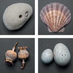
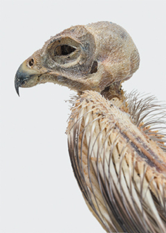
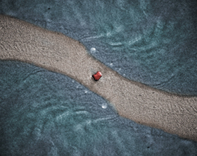
In addition to cast-off treasures found in the rummage bin or a local curiosity shop, natural forms such as leaves, roots, branches, seed pods, rocks, shells, feathers, or bones can all become effective grist for your creative mill (FIGURE 12.4). As strange as it may sound, we’ve even been known to bring home the dried-out carcasses of small animals, birds, and insects that we’ve found in our wanderings (FIGURE 12.5), which we’ve then scanned or photographed before giving them a proper burial (this falls under the category of suffering for our art, or perhaps more accurately, our spouses suffering for our art!). And for those natural forms that you can’t take home with you, such as a particularly interesting cloud or the curl of water gently lapping on a lakeshore, making a photograph of them allows you to add that ephemeral form to your image archive as source material for a future composite (FIGURE 12.6).
© SD
Figure 12.4. A collection of natural objects waiting for a creative collage spark.
© SD
Figure 12.5. The mortal remains of small animals often find their way back to our studios to serve as elements in a compositing project.
© SD
Figure 12.6. A detail shot of water lapping on the shores of Lake Superior is transformed into a simple yet calming design through an image-mirroring technique.
Museums, Galleries, and Classes
The source of your inspiration will come in many forms, but one sure place you’re likely to find it is when you immerse yourself in the creative work of other artists. Visit galleries and museums, go to lectures and presentations, take classes, read science fiction, go for a swim, let your mind wander, and look through your archive of images and imagine stories or scenes they might be good for. Our good friend and colleague, the late Mark Beckelman, found inspiration for his work by taking the time to browse through art and design books at local bookstores. He appreciated the abstraction that an illustrator brings to a topic, and it helped him to think outside of the photographic framework.
For Katrin, one of the most inspiring things she does is teach. Once her students realize they shouldn’t be trying to please her, they take off creatively. She looks forward to seeing their submissions for the weekly assignments. Their fresh take on a subject or topic always inspires her to develop assignments that will challenge them, and her, to make better art. FIGURE 12.7 shows two images created by Alice Meliere Kivlon, one of Katrin’s students in a photo illustration class at the School of Visual Arts.
© Alice Meliere Kivlon
Figure 12.7. Alice Kivlon’s composites create a contrast between the delicate beauty of flowers with the hard and unyielding metal structures that constrain them.
Travel and Inspiration
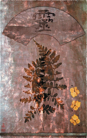
Many artists, whether they are photographers, painters, writers, or filmmakers, find inspiration in traveling and experiencing new scenery and different cultures. Being in a new place beyond the familiar topography of your normal environment has long proved to be a creative catalyst for artists. Artist Lyn Bishop appreciates the textures, light, and colors found in the simplest settings of an early morning walk or along a weathered wall. Lyn uses traditional printmaking and painting techniques as well as digital technology to express her inward and outward journeys, creating beautiful images, such as the one shown in FIGURE 12.8.
© Lyn Bishop
Figure 12.8. Lyn Bishop likes to discover and combine a variety of sources to create quietly compelling images.
As Lyn explains, “The journey is the integral inspiration that propels my art. Traveling throughout the world, I look for the simple, unsophisticated, and organic details that define the beauty of that culture. I am always intrigued by the differing human elements and visual stimulation that I encounter. The internal artistic journey begins with a feeling or thought until the work takes on its own personality.”
Lyn’s images express her deep respect for the diversity of world culture. Her prints are rich and full of delicate details that you need to see firsthand to appreciate fully.
Photoshop Sandbox Time
Sometimes, you can find inspiration when you take a break from plans, deadlines, and conceptual concerns and just play for a while. Seasoned artists know that creative playtime is one of the most important components in finding ideas, discovering the unexpected, having a sudden epiphany, or just exercising their eye and recharging their batteries by embracing serendipity and following a meandering path just to see where it leads.
Photoshop can be a wonderful “digital sandbox” for this type of creative play. By playing around with random images and making collages for fun, acting more on intuition than trying for a specific result, you can often make very interesting and intriguing discoveries. Seán likes to go on what he calls “Photoshop road trips” where he just gets in the car (Photoshop) with no destination in mind and hits the open pixel highway. Sometimes these “road trips” lead to unexpected places and result in images that he never imagined he would make. The images, the relationships they form when combined with other photos, and the seemingly unlimited possibilities offered by Photoshop are the guiding force that determines where the creative exploration will lead.
Experiment with Image “Mirrors”
Image mirrors are an excellent way to play in the Photoshop sandbox without having to worry about creating intricate selections or masks. A mirrored image is created when a photo is copied to another layer, flipped horizontally or vertically, and then arranged to create a reflection of the original image. The results can be delightfully surprising and are almost always intriguing and pleasing to the eye. This is due, in part, to the fact that the human brain is hard-wired to appreciate symmetry.
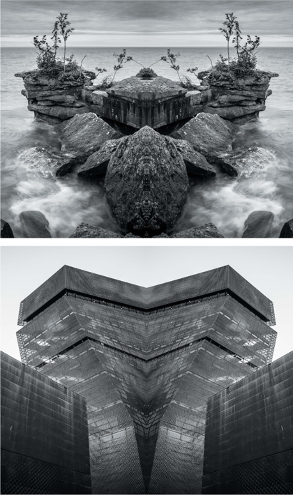
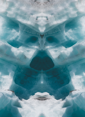
Natural forms as well as architectural elements, or a combination of both, work well with reflected images (FIGURE 12.9). With composites made from natural forms, such as clouds, rocks, trees, ice, or water, you can often discover “faces” that are created in the abstract and almost fractal patterns that emerge along the seam where the two versions come together (FIGURE 12.10).
© SD
Figure 12.9. Nature scenes, landscapes, and architecture shots work well as mirrored images.
© SD
Figure 12.10. In some mirrored images, especially those made from natural subject matter such as this iceberg, faces are formed in the patterns created along the seam between the two layers.
How to make a mirrored image
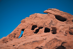
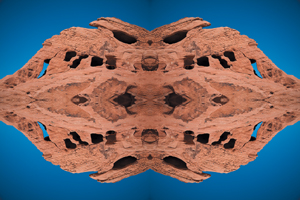
The first step in creating a mirrored image is to choose a photo that you will feel will look interesting when reflected with itself. After you’ve played around with this technique a few times, you’ll develop a sense of what types of images work well. Even with a fine “mirror” sense, it’s still worthwhile to try out the technique on images that you think won’t make a good mirrored image, because sometimes you just never know until you see it. The result may not be what you expect, but it could still lead in other worthwhile creative directions. To experiment with this technique, you can also use the “Valley of Fire” image available for download (FIGURE 12.11).
© SD
Figure 12.11. The original “Valley of Fire” image.
![]() ch12_valley_of_fire.jpg
ch12_valley_of_fire.jpg
1. Open the image in Photoshop. Make a copy of the Background layer by choosing Layer > New > Layer via Copy, or use the shortcut Command+J (Ctrl+J).
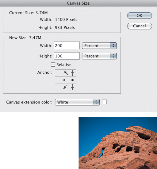
2. Decide in which direction you want to mirror the image (left, right, above, or below). You also might want to consider whether rotating the image first might result in a more interesting reflected image. For the “Valley of Fire” image, there is no one way that it needs to be mirrored; you can choose to add the extra space onto any of the four sides of the image. When you know which direction you will mirror the photo, add additional canvas space onto the file to create new space for the reflected version of the image. Choose Image > Canvas Size. Use the positioning grid in the Canvas Size dialog to determine where the new space is added. Make sure that the Relative check box is not selected, set the units to Percent, and add 200% to the height or width, depending on where you want to add the new empty space (FIGURE 12.12). The canvas extension color does not matter, because it will be covered up by the image. Click OK.
Figure 12.12. The Canvas Size dialog and the result of adding new canvas area to the image.
3. Ensure that the top, duplicate layer of the image is active in the Layers panel and press Command+T (Ctrl+T) to initiate the Free Transform controls. Right-click (Control-click) inside the transform bounding box and choose either Flip Horizontal or Flip vertical, depending on whether the layer will be moved to the left or right or to the top or bottom. Click the check mark button in the Options bar or press the Return (Enter) key to apply the transformation.
4. Use the Move Tool (V) to move the top layer into position where the new canvas space has been added. If you hold down the Shift key as you drag, it will constrain the movement of the layer either horizontally or vertically. Zoom in to 100% (View > Actual Pixels) and check that the edges of the two images are lined up well. You can use the arrow keys on the keyboard to nudge the active layer in one-pixel increments.
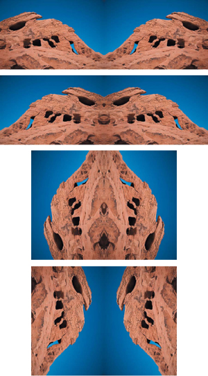
As you can see from FIGURE 12.13, each direction the “Valley of Fire” photo is reflected creates a very different, but also very interesting result. Compared with some of the methods we’ve explored in this book, the basic image-mirror technique is pretty simple! Image mirrors are a great way to play with the creative pixels in the Photoshop sandbox. They are fun and easy to do, and there’s a high instant gratification factor. And although image mirrors can yield a very satisfying result in and of themselves, if you regard them as just another starting point, you can move beyond basic image mirrors and use them as components in composites with other images. Let’s take a look at some of these concepts in action.
Figure 12.13. The “Valley of Fire” image creates an interesting mirror effect, no matter which way it is reflected or rotated.
Beyond the basic mirror
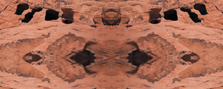
Now that you know how simple it is to make an image mirror, consider using a finished image mirror and mirroring it again (FIGURE 12.14). Then crop the result to form a new abstract composition, and maybe even mirror the image after it has been cropped (FIGURE 12.15). This approach can yield interesting repeating patterns that might work well as an element in another composite.
Figure 12.14. The “Valley of Fire” image mirrored twice.
Figure 12.15. The “Valley of Fire” photo was mirrored twice and then cropped to create a new abstract composition, and then that was mirrored again.
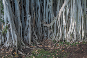
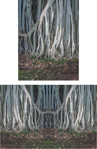
And speaking of cropping, you should also consider whether cropping the initial photo before creating the image mirror makes sense for the scene you want to create. Consider the photo of the banyan tree roots in FIGURE 12.16. Seán was intrigued by the curved shape of the roots on the right side and decided to crop the image so that the resulting mirror would create a fuller curve shape (FIGURE 12.17).
© SD
Figure 12.16. The original banyan tree roots photo.
Figure 12.17. The banyan roots cropped to show just the right half of the image and then mirrored to create a curved shape.
Image mirrors as collage elements
Although mirrored images are simple composites in their own right, perhaps the place where they can really shine is when they are used as elements within other composites. The shapes and structures created by reflected images often suggest other scenes or stories. By removing a mirrored image from its original context and placing it as a component of a collage, you can discover new visual relationships and narratives.
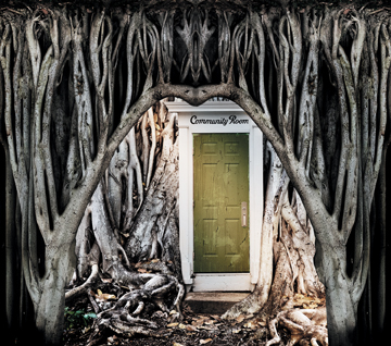
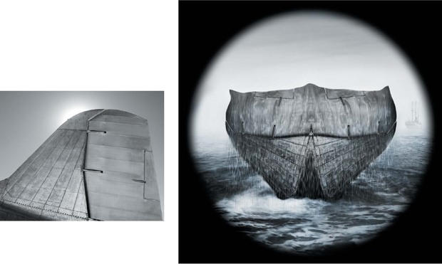
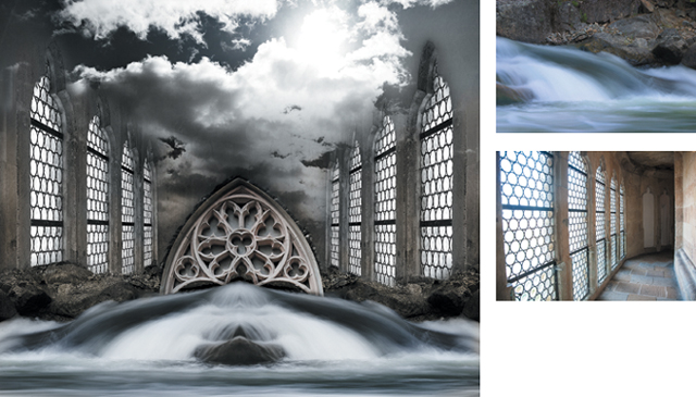
For example, consider the following images: The original banyan tree mirror from Figure 12.17 was flipped vertically to create an arch shape and was used as an element in “The Community Room” to suggest entering a secluded meeting place in the forest (FIGURE 12.18). In the sea tale of “The Sighting,” the mysterious craft is created from the mirrored image of an old DC-3 airplane tail (FIGURE 12.19). There are two different image mirrors in “The Spring,” the rushing river water and a shot of a castle corridor (FIGURE 12.20). The river photo was originally created as a mirrored image nearly ten years before this composite was made. That’s one of the great things about this technique: The images can work well on their own or can find new life when added to another collage.
© SD
Figure 12.18. The mirror image of the banyan roots flipped vertically and integrated into another multi-image composite.
© SD
Figure 12.19. “The Sighting.”
© SD
Figure 12.20. Two different image mirrors are used in “The Spring.”
Experiment with Blending Modes
Blending modes are perhaps the easiest way to begin experimenting with a collage idea or setting out to search for an idea or a discovery that will lead to a new image. We covered blending modes in great detail in Chapter 8. But because they are such a key tool for creating composites, we’ll review a few key blending mode concepts for specific types of collage purposes.
Blending modes to emphasize dark areas
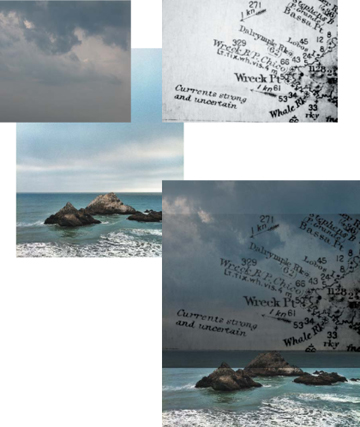
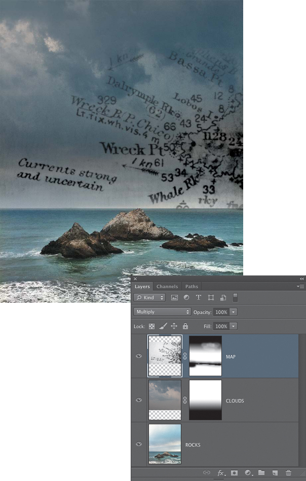
The Darken blending modes will affect images by displaying the darker tones while not showing the lighter tones. White is a neutral color for these blending modes, meaning it does not show. In this group of blending modes, both Darken and Multiply are ideal for blending dark text on a light background into an image, as shown in FIGURE 12.21. The old map and the clouds are both set to the Multiply blending mode. The addition of a simple gradient mask in the case of the clouds, and a painted layer mask for the map hides the hard edges and creates a smoother blend (FIGURE 12.22).
© SD (all)
Figure 12.21. The darker text of the map and the darker areas of the clouds are easily blended into the seacoast image using the Multiply blending mode.
Figure 12.22. Simple layer masks hide the hard transitions at the edge of the map and cloud layers.
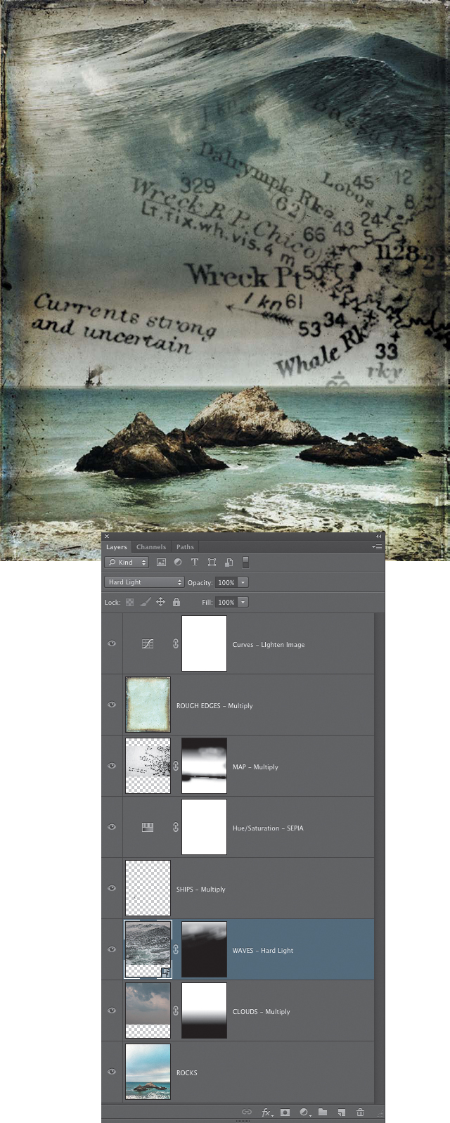
In the final image, distant ships and rough edges were added and these were also blended into the image using the Multiply blending mode. The waves at the top of the composite are set to Hard Light and a Hue/Saturation adjustment layer that adds a sepia tint is set to Soft Light, which creates a blend of the sepia and the original colors. The simple layer masks are important in this composite for fine-tuning the edges of some of the layers, but the blending modes are doing most of the heavy lifting (FIGURE 12.23). This composite could work well for a book cover, with plenty of space near the top to add the book title and author’s name.
© SD
Figure 12.23. The final “Wreck Point” composite. Blending modes are the key technique for blending the layers together.
Blending modes to emphasize light areas
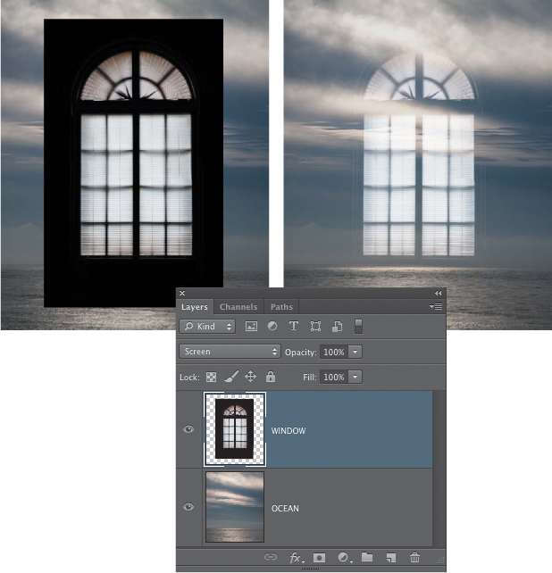
If you want to reveal the lighter areas of a layer and not show the darker areas, the group of Lighten blending modes is the place to start. Black is a neutral color for these blending modes, meaning it does not show (black will also not show when the blending mode is set to Difference, Exclusion, or Subtract). These blending modes are essentially the opposite of the Darken modes. In FIGURE 12.24 you can see that black areas surround the window. But a quick change to the Screen blending mode for that layer makes only the light parts of the layer visible in the composite.
Figure 12.24. The Screen blending mode is perfect for showing the shape of the window and hiding the black areas that surround it.
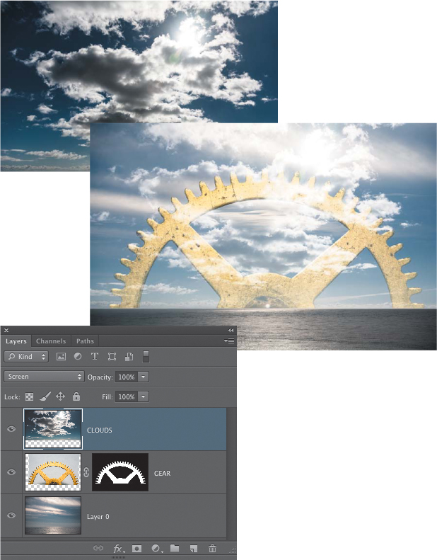
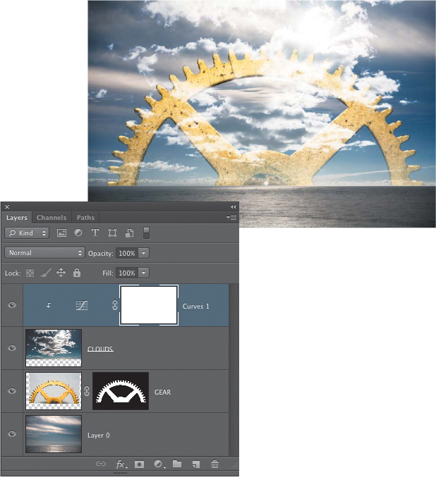
When the clouds layer in FIGURE 12.25 is set to Screen, the clouds show through, but the overall effect on the entire sky is lighter, because the blue color is a similar brightness to the original sky underneath. By adding a grouped adjustment layer to the clouds layer, we boosted the contrast and darkened the darker values on that layer, which minimized their influence on the composite (FIGURE 12.26). Screen favors lighter tones, so once the blue sky became darker than the underlying gray sky, the blue sky was no longer visible.
Figure 12.25. The Screen blending mode is useful for images in which you want to emphasize the lighter parts of the image.
Figure 12.26. By adjusting the tonal values of the layer that is using the Screen mode, you can further customize the look of the blend.
Contrast and detail blending
For blending the details of one image seamlessly into another photo, play around with Overlay, Soft Light, and Hard Light blending modes. These three modes are real workhorses for image composting, and we return to them again and again. In addition to being excellent for detail blending, you’ll typically see an increase in contrast with these modes.
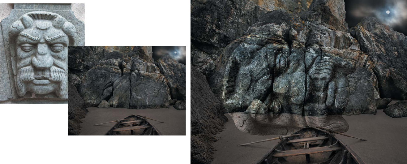
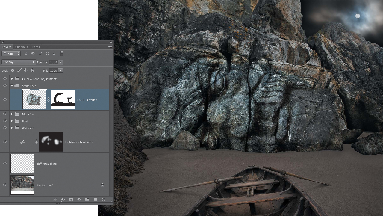
In the “Night Landing” composite, Seán used Overlay to create the initial blend of the carved face onto the rock (FIGURE 12.27) and then used a layer mask to hide the edges that extended onto the sand (FIGURE 12.28). The darker cracks and fissures of the rock are not covered up by the Overlay mode, which makes the effect more believable.
Figure 12.27. The carved face, set to Overlay, blends very well with the cracked surface of the rock.
© SD
Figure 12.28. A layer mask is used to show the carved face only on the rock.
Image component blending
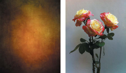
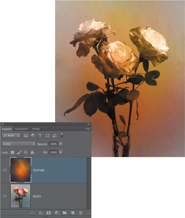
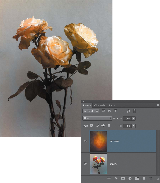
The last group of blending modes—Hue, Saturation, Color, and Luminosity—are used to blend those components of the active layer with the layers underneath. Although not particularly useful for the compositing of multiple images, they can be quite handy if you want only a certain aspect of an image, such as the color, to be blended with another image. Consider the image of the texture and the roses in FIGURE 12.29. Although blending the actual detail of the texture would look very good (more on working with textures in a bit), what if you wanted to use only the richly saturated color of the texture image, not the actual details of the canvas fabric? To accomplish that, choose the Color blending mode, which uses the hue and saturation values of the active layer and blends them with the image underneath (FIGURE 12.30). The Hue blending mode will blend only the hue of the active layer, using the saturation from the underlying image (FIGURE 12.31). Experimenting with blending modes is not only fun, it can lead to useful insights about how different images work together and also result in creative discoveries that push an image into new territory.
© SD
Figure 12.29. The colorful texture and the roses image before blending.
Figure 12.30. The Color blending mode creates a pleasing result by blending the hue and saturation of the texture with the luminance (brightness) of the flowers.
Figure 12.31. The Hue blending mode combines the hue values from the texture with the luminance (brightness) and saturation values of the roses image.
Experiment with Textures
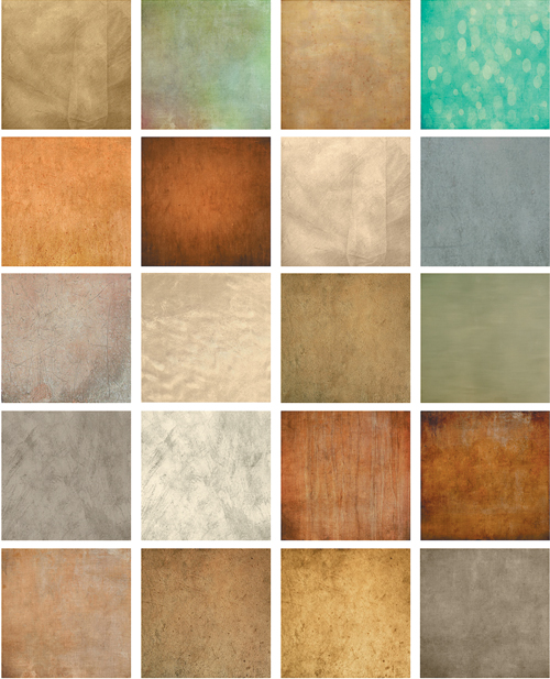
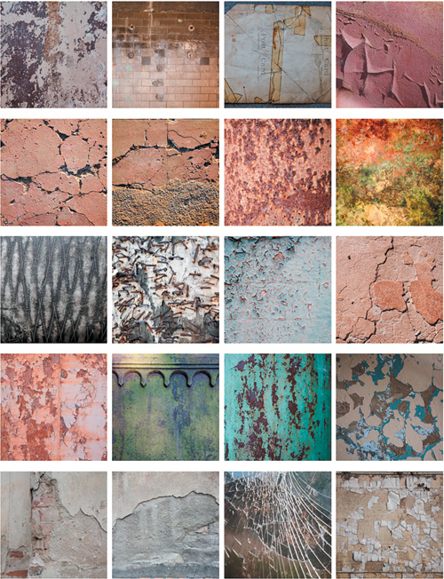
Texture can be a very satisfying element in an image. This is true for a straight shot right out of the camera or for a constructed composite image. You can purchase texture collections online (FIGURE 12.32), which is certainly a viable approach if you need to get up and running quickly with a collage project. Or you can gather your own collections of textures by photographing any interesting ones you come across. We love to photograph textures, and the three of us have texture libraries that we’ve built up over the years. We heartily recommend that you do the same. Never let a good texture pass you by! If there’s time and opportunity to photograph it, by all means do so. As a collage artist, you never know when it might come in handy (FIGURE 12.33).
Figure 12.32. A selection of textures from Flypaper Textures (flypapertextures.com).
Figure 12.33. A small sampling of the many photos of textures Seán has taken over the years.
In addition to photographing textures you find out in the world, you can also create your own from actual materials and either photograph them or scan them if you have access to a flatbed scanner. Art papers; delicate tissue; fabrics; old, torn pieces of cardboard—pretty much anything—can be turned into an interesting texture that might work well in a composite. In the days before Photoshop, and even before he got his first computer, Seán created texture effects in the darkroom by laying a sheet of single-ply tissue or thin vellum over the photo paper as it was being exposed to the enlarger light. This created an effect that was a blend of the texture and the image that was very similar to what can be done with blending modes in Photoshop (FIGURE 12.34).
© SD
Figure 12.34. An old-school, darkroom texture effect created by carefully distressing a thin sheet of single-ply tissue and laying it over the photo paper as the negative was being printed.
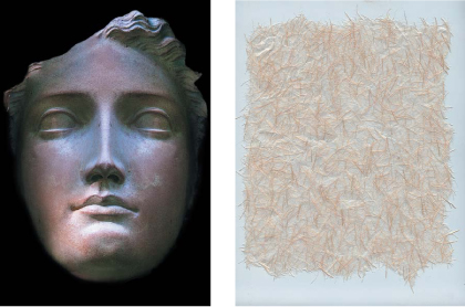
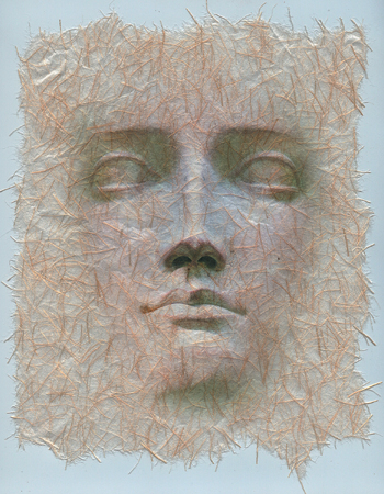
The addition of a texture to a composite creates depth and can suggest a varied and intricate surface structure for a specific object in the composite, or for the entire image. The easiest way to add a texture is by using blending modes. The exact blending mode you use will depend on the nature of the texture you’re adding and the image it is being added to, but in general, Overlay, Soft Light, and Hard Light are good modes to start with. In addition to blending modes, however, sometimes the addition of adjustment layers and other techniques can also affect how well a texture is integrated into the image. In the following exercise we’ll explore some different approaches for texture blending (FIGURE 12.35 and FIGURE 12.36).
© SD
Figure 12.35. The original images of the terra-cotta face and the handmade art paper.
© SD
Figure 12.36. The finished composite.
![]() ch12_terracotta_face.jpg
ch12_terracotta_face.jpg
ch12_handmade_paper.jpg
1. Open the terra-cotta face and the handmade paper images in Photoshop. Add the terra-cotta face onto the paper image to add it as a new layer. Use the Move tool to arrange it so it is centered over the paper.
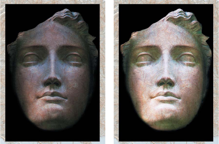
2. Try out some of the blending modes to see which ones work best. For this particular combination, Multiply and Hard Light provide the best results (FIGURE 12.37), although that is a subjective assessment, and depending on your ideas for how you want the image to look, you might decide to choose a different blending mode. For now, leave it set to Multiply.
Figure 12.37. Multiply (left) and Hard Light (right) blending modes create the most realistic blend of the texture into the face.
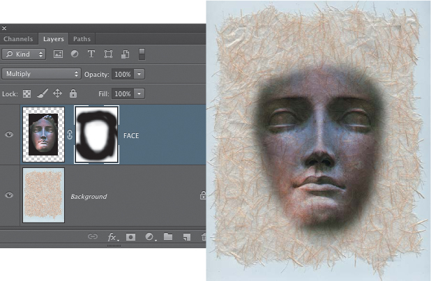
3. Click the Add Layer Mask button at the bottom of the Layers panel to add a layer mask to the Face layer. Select the Brush tool (B), make black the Foreground color, and use a large, soft-edged brush set to 100% opacity to paint on the layer mask and hide the black areas surrounding the face. When you have the main black areas hidden, lower the opacity of the brush to about 30% and mask in a bit more along the face edges to suggest that it is appearing out of the texture (FIGURE 12.38).
Figure 12.38. Masking the black areas surrounding the terra-cotta face.
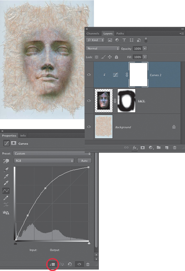
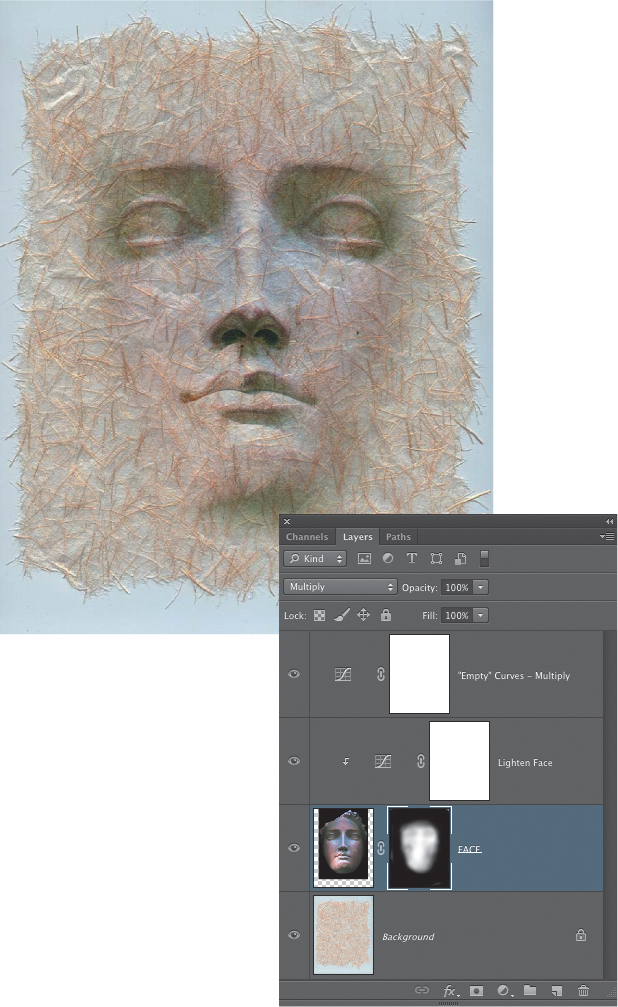
4. The main problem that is preventing the blend from looking believable is that the face is too dark and it does not look like it is of the same material as the handmade paper. Fortunately we can fix this with a grouped adjustment layer. Click the Add Adjustment Layer icon at the bottom of the Layers panel and choose Curves from the drop-down menu. At the bottom of the Curves panel, click the first icon on the left to create a clipping group arrangement with the underlying layer. This means that the adjustment will affect only the face, not the paper underneath it. Raise the curve up, as shown in FIGURE 12.39, or until the lightening effect looks good to you. If necessary, you may also need to go back and touch up the edges of the layer mask for the Face layer to hide the shadowed areas along the sides of the face.
Figure 12.39. A Curves adjustment layer to lighten the Face layer is clipped to that layer so it will affect only the face, not the paper.
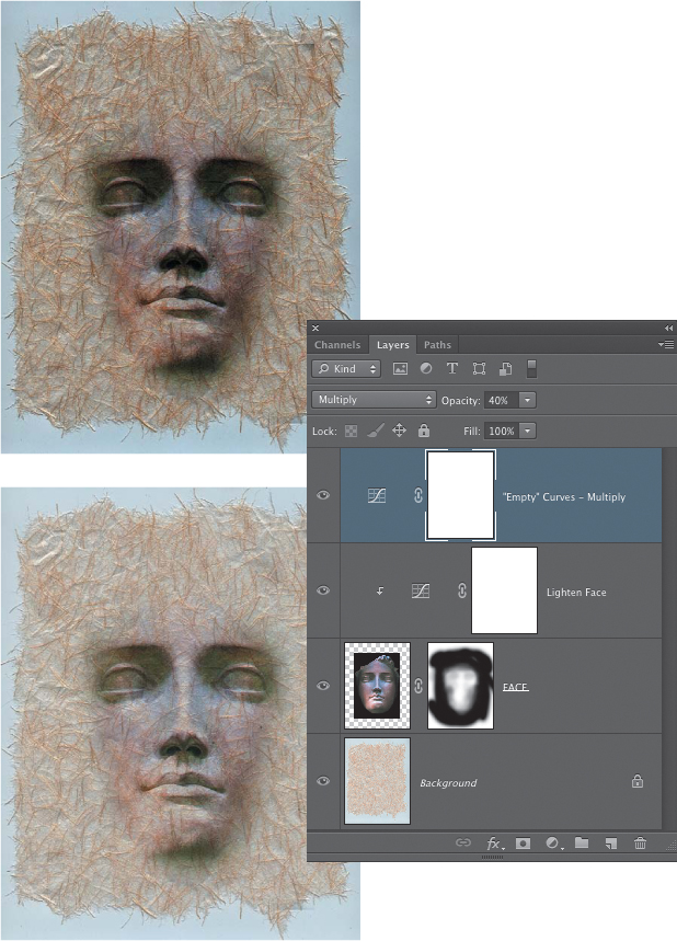
5. With the lightening applied to the face, it’s starting to look a lot better. Next, you’ll use another adjustment layer trick to add a bit more tonal depth to the composite. Add a new Curves adjustment layer, but don’t make any changes to the Curves adjustment panel. Just change the blending mode for the Curves layer to Multiply. This will initially create a result that is too dark, so lower the opacity until you find something you like; we used 40% opacity for this layer (FIGURE 12.40). We also applied further fine-tuning of the edges of the Face layer mask.
Figure 12.40. An “empty” Curves adjustment layer (meaning no settings have been made in the Adjustment panel) set to the blending mode of Multiply provides a quick darkening effect. The darker version is at 100% opacity, and the lighter version is at 40% opacity.
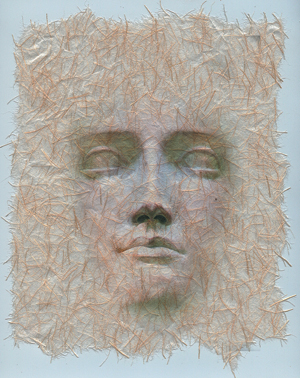
6. To finish the texture blending for this composite, return to the Curves layer that brightens the face and raise up the curve a bit more to further lighten the face. Then set the Brush opacity to 10% and paint with black on the Face layer mask to gradually reduce the amount of the face that is showing. This makes it appear more as if the face is a part of the surface of the paper (FIGURE 12.41). We also used the Free Transform tool (Edit > Free Transform) to scale the Face layer a bit larger (FIGURE 12.42).
Figure 12.41. The face is lightened a bit more and additional edits have been applied to the layer mask, reducing the amount of the face that shows in the composite.
Figure 12.42. The final composite after scaling the face a bit larger using Free Transform.
Layer blending modes are the main way to blend a texture into an image, but as you can see from this example, using adjustment layers to modify the tonal brightness and sometimes the color of certain elements in the composite can also help you finesse a texture blending effect to get it just right.
Experiment with Effects
Photoshop has many effects that you can apply to your images. They can be either canned filter effects or more customized transformations that you create. With each new revelation of what is possible in Photoshop, it will encourage new ideas as to how a particular effect might be used in a compositing project. The goal of this chapter is not to cover a wide range of different effects, but to inspire you with glimpses of what can be done. So, with that in mind, the next two sections describe a couple of useful effects that you can apply to textures.
Contour effects with displacement maps
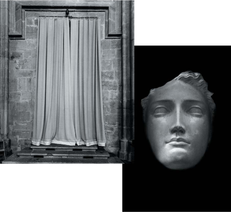
Blending modes do a great job of blending the detail of two images together, often in very interesting ways, but they do not take into account the shape contours of the images. To shift the pixels so that textures more accurately conform to the object they are being blended into, you have to venture into other areas. We’ll take a look at two of them. The first is the Displacement Filter. To explore this filter, we’ll use a variation of the terra-cotta face image and a shot of a curtained alcove in a cathedral (FIGURE 12.43).
© SD
Figure 12.43. The black-and-white terra-cotta face and the cathedral curtains.
![]() ch12_face_for_curtains.jpg
ch12_face_for_curtains.jpg
ch12_curtains.jpg
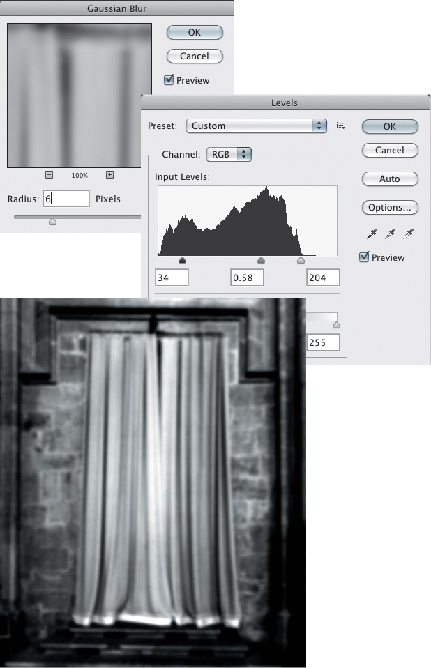
1. Open both files in Photoshop. You’ll first create a displacement map that you can use to distort the face image to fit the curtains. Create a duplicate of the curtains image by choosing Image > Duplicate. In the duplicate curtains file, choose Filter > Blur > Gaussian Blur. Blur the image by about 6 to 10 pixels and click OK. Choose Image > Adjust > Levels. The aim of this adjustment is to increase the contrast of the image (FIGURE 12.44). Save the file as curtain-face-displace in the Photoshop format when you are done.
Figure 12.44. After applying a Gaussian Blur filter to the duplicate curtains image, a Levels adjustment is used to increase the contrast.
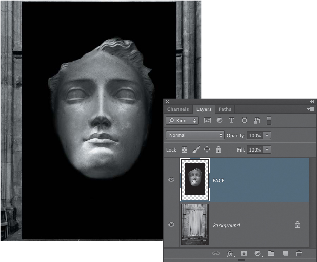
2. Bring the face image into the curtains image as a new layer. Lower the opacity a bit and position the face on the center of the curtain. Return the layer opacity to 100% before proceeding with the next step (FIGURE 12.45).
Figure 12.45. The Face layer positioned above the curtains.
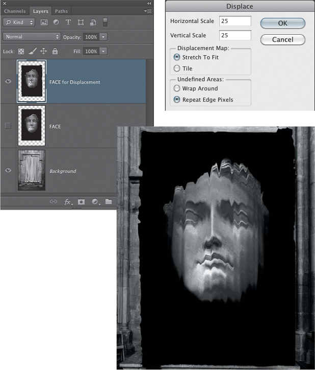
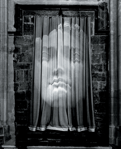
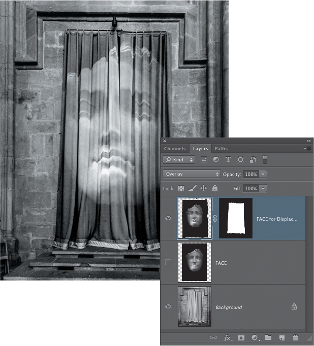
3. With the Face layer active, make a copy of it by dragging it to the New Layer icon at the bottom of the panel. Rename this layer Face for Displacement. Turn off the visibility for the first Face layer by clicking its eye icon (this Face layer will not be used, but because the Displacement Filter is a permanent effect, it’s always good to keep a backup of the original layer). Choose Filter > Distort > Displace. In the Displace dialog, enter 25 for the horizontal and vertical offset, and click OK. The file open dialog appears. Use this dialog to find the curtain-face-displace.psd file you saved at the beginning of this exercise, select it, and click Open to apply the displacement map. When the displacement is finished, the contours of the curtains will be mapped to the image of the face (FIGURE 12.46). Now change the blending mode for the displaced Face layer to Overlay (FIGURE 12.47). Other blending modes that work well with this image are Screen and Soft Light.
Figure 12.46. The Face layer is distorted to fit the curtains using a custom displacement map.
Figure 12.47. The blending mode for the displaced Face layer is set to Overlay.
4. Create a layer mask so the Face layer shows up only on the curtains. To do this, turn the displaced Face layer off for a moment and make the Background layer active. Use the Quick Selection tool to create a selection of just the curtains. When the selection is done, make the displaced Face layer visible and active again. Click the Add Layer Mask icon at the bottom of the Layers panel to create a layer mask based on the selection (FIGURE 12.48).
Figure 12.48. A layer mask is added to the displaced Face layer so it shows only on the curtains.
The Displacement Filter works well for some types of contoured shapes but not so well on others. Sometimes, you just have to try it out to see if it will produce a good result for the images you’re working with. One factor to keep in mind is that once you apply the Displacement Filter using a map made from the underlying image, moving the layer that has been displaced may not be an option because the contours created by the filter now conform to the contours of the image underneath. Moving the displaced layer will result in the two sets of contours no longer being aligned.
Contour effects with Liquify
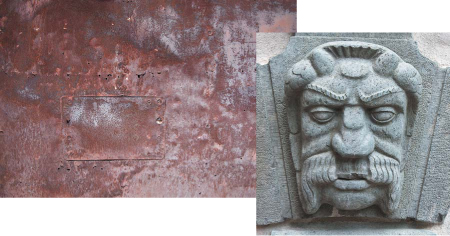
Another technique you can use to modify a texture to better fit the contours of the underlying image is the Liquify filter. This filter is best used for images where the changes you make are more general and do not need to match a specific image contour, as was the case with the example for the Displacement Filter. Check out how this works using the carved face and rusty metal images provided (FIGURE 12.49).
© SD
Figure 12.49. The carved face and rusty metal images.
![]() ch12_carved_face.jpg
ch12_carved_face.jpg
ch12_rusty_metal.jpg
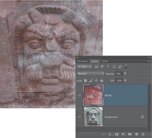
1. Open the two files in Photoshop. Bring the metal texture file into the carved face file as a new layer. Lower the opacity of the layer to about 50% so you can see to position it. Use the Move tool to move the metal texture layer so that the metal plate is over the nose of the carved figure (FIGURE 12.50).
Figure 12.50. The layer opacity for positioning the metal plate over the carved face is lowered.
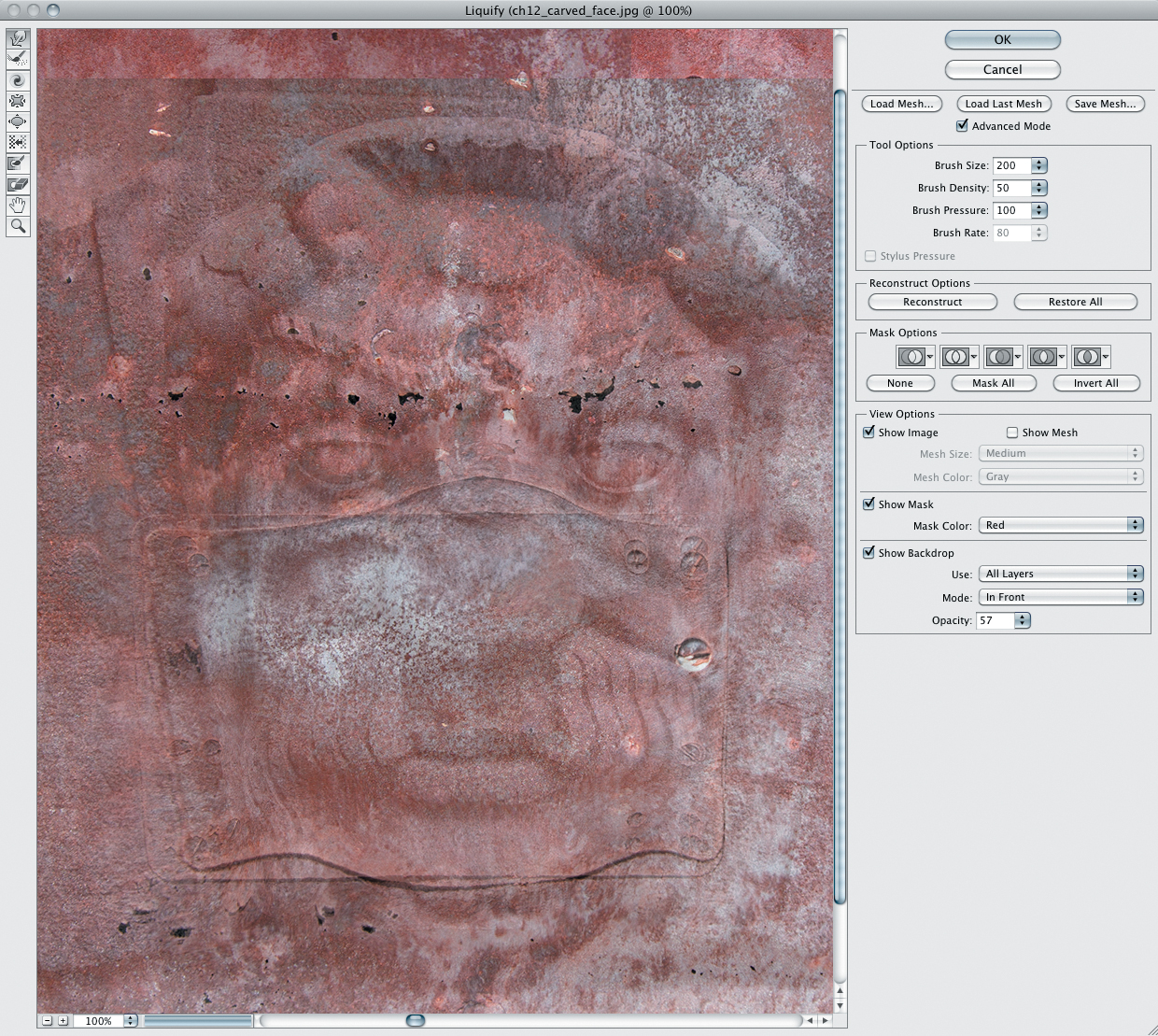
2. Choose Filter > Liquify. Near the top of the controls on the right side, select the Advanced check box. If you cannot see the face image when the Liquify dialog appears, select the Show Backdrop check box at the bottom of the controls on the right side and open the Use menu to choose the Background layer. The default opacity for showing the backdrop is 50%, which allows you to see the carved face image so you can decide how much of an effect to apply. The Forward Warp tool is the default active tool. Set the Brush Size to about 200, the Brush Density to 50, and the Brush Pressure to 100. Then push along the edge of the small metal plate to conform it to the contours of the face underneath (FIGURE 12.51). Click OK when you’re done.
Figure 12.51. The Liquify dialog.
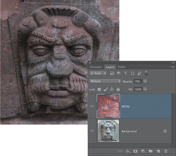
3. Set the blending mode for the Face layer to Multiply and change the opacity to 70% (FIGURE 12.52).
Figure 12.52. The composite after adjusting the texture layer opacity to 70% and changing the blending mode to Multiply.
The Liquify filter does a good job of letting you create a custom warping of the metal texture layer just by dragging on it to get it to conform more closely to the image underneath. For maximum flexibility, make a duplicate layer to run the Liquify effect on.
Concept and Story
Any type of photograph has the potential to be a visual metaphor or a symbol for concepts, themes, and ideas. And the framed structure of an image, as well as the ability to work in sequences, have the potential to set up a story. The instant of the photograph may suggest something that has just happened or hint at something that might be about to happen. Sequences of photos work like individual chapters or poems, smaller pieces of a greater narrative.
Multi-image composites are well suited for creating stories because you can create the scene from scratch. Making a composite has a lot in common with setting up the scenery and staging for a theater play or constructing a set piece for a movie. Therefore you should pay attention to the possibility for stories or narratives in your collages. The images that are the most interesting are those that engage the viewer with a concept, a story, interesting characters, or fantastic circumstances playing out on the stage of your composite.
Great Visuals in Search of a Story
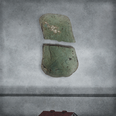
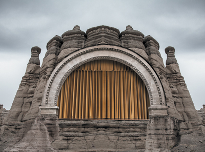
Once you know a few basic skills and techniques, it’s easy to put different objects and photos together in a new collage in Photoshop. And even though the different elements might look cool together, always be on the lookout for a way to create a more powerful visual hook for the viewer. For some images, it might be best to hold them in reserve until a better use for them presents itself. Consider the image in FIGURE 12.57, a surreal scene of a majestic theater stage in a stark and rocky desert. It certainly looks cool, not to mention a bit strange, but other than that there’s not much going on here. Seán regards this as an unfinished composite, or an element to be used in another composite. As good as it looks now, it needs something more. It needs a story.
© SD
Figure 12.57. Theater in the desert; it looks good but lacks a story. For now it is an unfinished composite, or a possible element for another collage.
The Human Element
In many cases, creating a story for a composite might involve adding people, or the trace of people, to a scene. When we see people or evidence of their presence, we project ourselves into the scene. This creates a deeper connection between the viewer and the image. By suggesting a story, or hinting at events in the composite, you are inviting the viewer to enter your narrative, pick up the loose thread of the tale, and follow it to see where it leads (FIGURE 12.58).
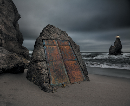
© SD
Figure 12.58. “The Lighthouse Door.” The location of the door is a puzzle, suggesting a tunnel leading under the surf to reach the lighthouse. Who is out there on this stormy afternoon?
Finding the Story and Characters
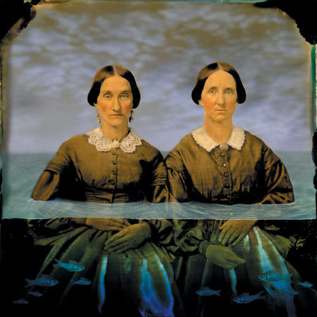
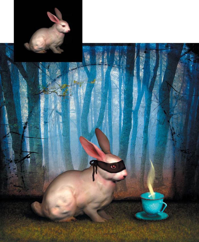
Maggie Taylor finds inspiration by visiting flea markets and scavenging eBay for antique letters, photographs, dollhouse furniture, and small toys. She then scans the three-dimensional subjects with a flatbed scanner and creates beautiful and emotive images, such as those shown in FIGURE 12.59 and FIGURE 12.60.
© Maggie Taylor
Figure 12.59. Starting with an antique photo and scans of real fish, Maggie created this ambiguous and intriguing image.
© Maggie Taylor
Figure 12.60. After scanning the small rabbit figurine and the toy teacup, Maggie created a tableau for their mysterious interaction.
Maggie is inspired by the stories that evolve as she creates her images. The backgrounds are her own paintings and photographs, and the subjects are dreamlike figures that serve as characters for the often mysterious stories she weaves together with humor and sensibility. She then makes stunning inkjet prints, which are exhibited and collected worldwide. Her images have also been commissioned for book and CD covers.
Essentials of Image Composition
Entire art movements, countless books, endless lectures, and numerous courses of study have addressed the laws, rules, guidelines, and reasoning of good image composition. Digital compositing relies on and combines design principles from painting and drawing, graphic design and typography, photography and filmmaking, and sculpture and 3D modeling. The best way to learn the fundamental design principles is to take classes in a variety of the listed concentrations and to look at many different types of art.
Image making is the art of creating visual relationships, which the viewer can conceptualize and appreciate. Many of these concepts rely on how our visual perception system perceives and processes information:
• Our eyes move from dark to light. Lightening the important aspects of an image and darkening the less important will guide the viewer’s eye through the image. Avoid light splotches near the edge of the image frame, because they will draw the viewer’s eye out of the image.
• Our eyes move from soft to sharp. Use selective softening and sharpening with layers and layer masks to focus on important image areas more than unimportant ones.
• Our eyes move away from less detail to more detail. To attract a viewer’s eye, enhance or add detail and texture.
• Our eyes are attracted to color. By reducing color in less essential image areas, our eyes will not dwell on them for very long.
The next time you are in a gallery or looking at an art book, relax your eyes a bit and notice how they move through an image. Do they keep coming back to the subject? Or do they “fall” out of the frame because the edge of the image is too light? Noticing how your eyes look at an image is a useful exercise for appreciating image composition.
If you’re anything like most artists, just the idea of laws or rules of composition makes your skin crawl. The essentials of image composition are not a strict set of guidelines that you must follow; rather, they are a visual reference for you to work with. The principles of good design and image making are timeless, and learning them, to then forget them, will enable you to be a more accomplished and confident artist.
Creating Visual Relationships
Sometimes we stare at the screen and spend countless hours moving layers and objects around; other times the images seem to flow together and find the right placement almost on their own. Working intuitively is the result of practice and confidence in your visual abilities.
Understanding the following elements of composition will help you create images that viewers will appreciate more easily.
Position
The position of an image element in relation to the overall image, other elements, and the frame plays a role in the perceived value of the element. Placing subjects off center, for example, creates a pleasing visual tension that lets the viewer’s eye move through the image and return to the subject.
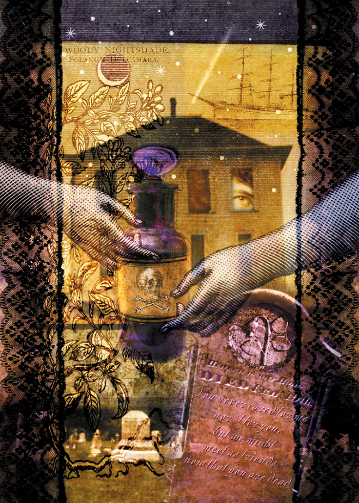
You can create visual tension by placing subjects just within kissing distance of one another, which makes the space between the two vibrate with an intriguing relationship. You can also use the frame of the image as part of the composition. In the poster for the opera Mourning Becomes Electra (FIGURE 12.61), digital collage artist Diane Fenster placed the arms close together, but not touching, and in a way that breaks the frame, leading the viewer’s eye directly to the bottle of poison. Because of the resulting visual tension and the subject matter, there’s no question that this opera is not a lighthearted romp.
© Diane Fenster
Figure 12.61. In this poster for the opera Mourning Becomes Electra, the layer and framing draws your eye into the scene.
Size
The size of the image element connotes importance—larger subjects are more important than smaller ones. Size can also convey spatial relationships, because smaller objects recede. Overlapping, repeating, and varying the size of objects are all exciting image composition schemes with which to experiment.
One approach to sizing elements that can produce interesting results is exaggerating their size relationships. Think of the visual tension that images from Alice in Wonderland or Gulliver’s Travels have. Alice can barely fit into the house, and Gulliver is tied down by hundreds of Lilliputians. These examples play with our perception of reality and are intriguing because they bring into question what we know and feel to be real (FIGURE 12.62).
© SD
Figure 12.62. By exaggerating the size of objects, you can create surreal scenes that play with your perception of reality.
Shape and form
Two-dimensional attributes, from mechanical geometric to natural abstract, define the shape of an object. The more unusual the shape, the more our eyes are attracted to it. Whenever you separate a subject from its environment, you draw attention to it. Use layer and vector masks to refine the shape and flatter the image composition.
Form is the dimensional quality of an image. You can insinuate depth using shadow, lighting, and perspective to add dimension to the subjects in the image.
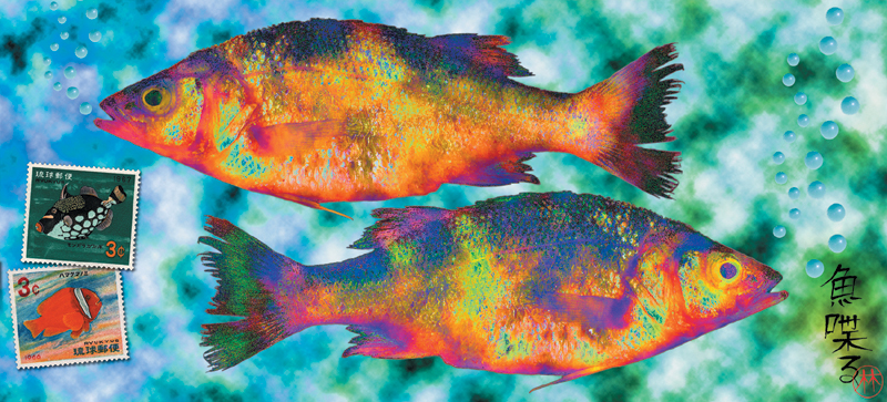
FIGURE 12.63, an image by Lyn Bishop, is based on shape, texture, and color. Gyotaku is the ancient Japanese folk art of creating fish rubbings. Gyo means fish, taku means rubbing. In Japan, gyotaku is practiced by anglers to make a record of their catch. Lyn’s piece “Talking Fish” plays off this ancient artform. Initially, Lyn began the piece traditionally by inking the fish with sumi ink and then tried to make a print impression onto thin washi paper. She was unhappy with the results after repeated tries, so she washed the ink off the fish and scanned it instead. As Lyn explains, “The simple act of scanning the fish created surprising color and intriguing textures in the fish.”
© Lyn Bishop
Figure 12.63. Repeating and contrasting shapes add to the visual interest in this collage.
Texture and details
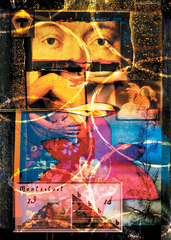
The surface quality of an image or subject can add tremendous visual interest to an image, and we enjoy looking at the details, as shown in an opera poster for Percival by Diane Fenster (FIGURE 12.64).
© Diane Fenster
Figure 12.64. The variety of color, details, texture, and lines creates an intriguing visual construction for the viewer.
Subjects that are too smooth and perfect seem artificial, cold, and computery. Adding texture mimics natural media, such as painting, drawing, and even photography, where the film grain or flaws like light leaks and uneven exposure can be an integral aspect of the image.
Focus
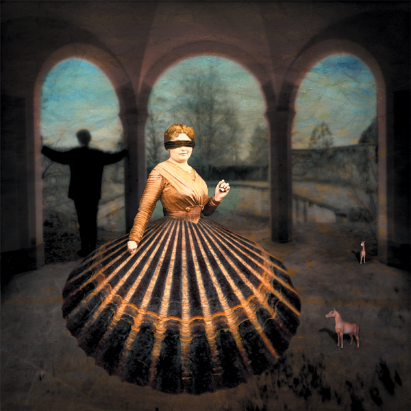
Making less important image areas softer and more important ones sharper focuses the viewer’s attention on the sharper of the two, as shown in FIGURE 12.65.
© Maggie Taylor
Figure 12.65. The soft background contrasts beautifully with the texture of the woman’s skirt.
By blurring the background, Maggie Taylor pushes it further back, which in turn brings your eye to the woman in the foreground. Our visual system is a comparative one, so by softening less important image areas, the sharper ones will look even sharper as the contrast between soft and sharp is accentuated.
Negative space
The space of the image is defined by the object’s shape, size, and placement. But just as important is the space that is not full—also referred to as the negative space—because it sets the stage for the subject. Negative space supports the image and allows the eye to leave the subject, rest for a moment, and find its way back to the subject. For this reason, the negative space, or background, should not compete with the subject.
In graphic design, negative space is often a blank white surface; in compositing, it is more likely to be a blurred photograph or a subtle color or texture.
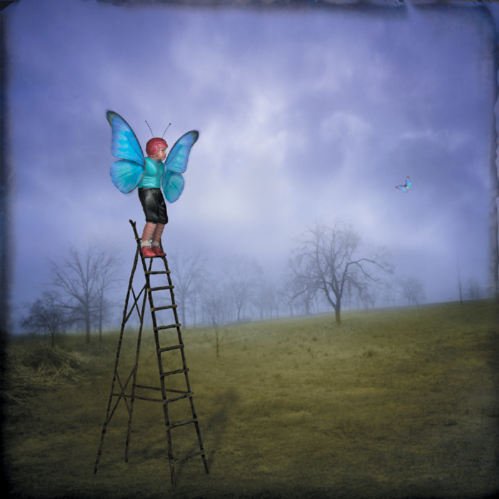
FIGURE 12.66, another beautiful image by Maggie Taylor, makes wonderful use of negative space. The seemingly empty space of the sky on the right carries the small butterfly that the figure on the ladder is watching. Notice how your eye moves back and forth between the two? That is good use of negative space and visual tension.
© Maggie Taylor
Figure 12.66. Empty space can be just as important as the subject.
Tone and color
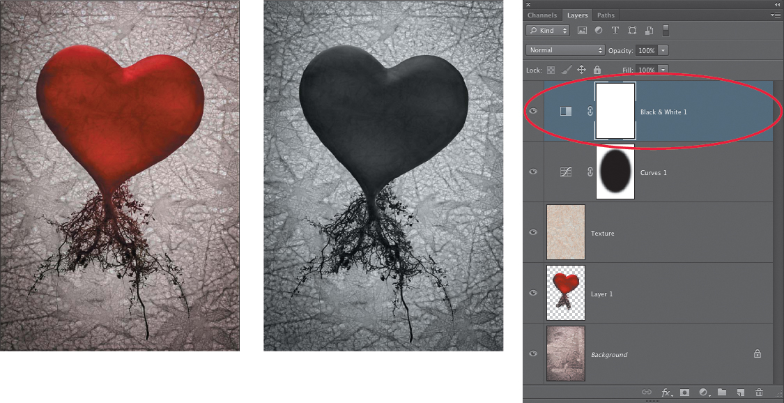
The tone of an image is the value from black to white. Our eyes are attracted to contrast, but too much contrast results in loss of shadow and highlight detail, and can become tedious to view. To quickly see how the tonal values of your composite are working, add a Black & White adjustment layer (FIGURE 12.67). Leave this layer at the top of your layer stack, and turn it on and off to see how the tonal values of your image are working.
© Mark Beckelman
Figure 12.67. Check the tonality of your image using a Black & White adjustment layer.
Color is one of the most essential imaging attributes with which we work. Full of cultural, psychological, and emotional references, color can attract or repel a viewer’s eye. Too much color or chaotic use of color is deemed incomprehensible, and too little color is deemed unstimulating by our visual system.
Color is a three-dimensional entity and is broken down into the following:
• Hue. The color an object is—red, green, chartreuse, and so on
• Saturation. How much color there is
• Luminosity. How light or dark the color is
Colors can contrast or harmonize, and the best way to learn about color is to take a painting class. It was during Katrin’s early attempts to paint that she first saw and appreciated how color bounces from the environment into the subject and varies from shadow to highlight. French Impressionist Claude Monet studied the ways that colors interact, which is reflected in a series of haystacks he painted in 1890 and in a series of the Rouen Cathedral he painted in 1894, which shows the façade changing color and character, depending on the change of seasons, weather, and times of day.
Lines and grids
A line connects two points and is often employed as a graphical or typographic element that leads the eye through an image. Lines can vary in length, width, texture, direction, and curve. They can be one of five varieties: vertical, horizontal, diagonal, curved, and zigzag.
Dividing an image into a grid creates an “image in an image” effect, as shown in FIGURE 12.68, in which Julieanne Kost explores the artifacts of memory. The shadowed dimension that Julieanne added to the image suggests that the image may have been folded and carried in someone’s pocket for a long time.
© Julieanne Kost
Figure 12.68. The balanced grid structures the image harmoniously and creates the look of a much folded memory.
Creating a Body of Work
Creating one good image in Photoshop is easy; creating two or three more takes a bit of effort; and creating an entire body of work is the sign of a true artist.
A body of work is a series of images that form a coherent collection signified by a unity of theme and subject matter. It is a thorough artistic investigation of an idea, concept, perception, or style. Visual signifiers, such as the format, size, color palette, style, output media, and technique, are all used to tie a series together. Artists may create a body of work over a short period of time or over the course of a lifetime as they veer in and out of artistic inspiration.
Closing Thoughts
Being an artist is invigorating, intimidating, essential, and one of the most valuable contributions we can make to this world. Working with composites allows you to imagine and create your own stories and meditations on the themes and concepts that matter to you. Keep your eyes open and your heart open as you move through the world, and be on the lookout for those things that move you, fill you with wonder, light a spark of anger, or raise questions in your mind.
Find what speaks to you, and then scan it, photograph it, write about it, place it on a shelf where you can see it every day, or pin it to a corkboard in your office. Live with it and with the ideas it suggests to you. Eventually, it will tell you what it needs. And don’t be concerned if this process takes longer than you thought it would. Ideas keep. They’ll be waiting for you when you’re ready to take them out again. Explore the possibilities, and enjoy learning about yourself and the world around you.

