Chapter 13. Photorealistic Compositing

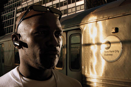
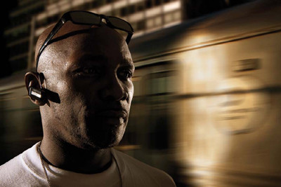
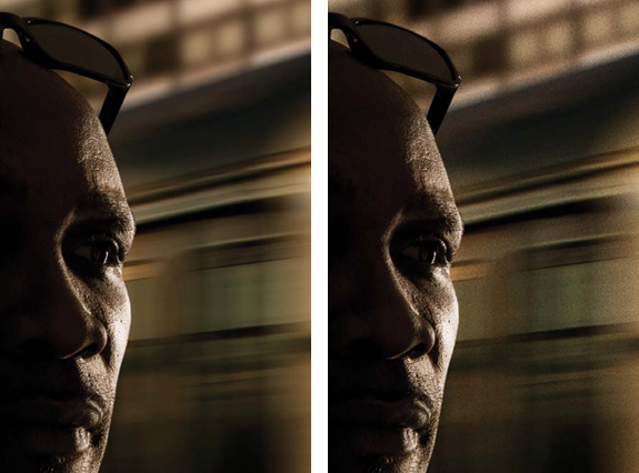
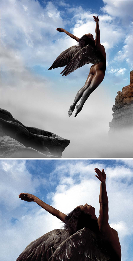
A photorealistic composite is an image that is made of at least two combined images but appears as though it is a single photograph. This type of composite follows all the physical laws that would be present in a single photograph: The lighting on each element is consistent with the environment, the perspective of all the elements is consistent with the environment, and the image quality of each photograph is consistent. This doesn’t mean that the content of the image need be realistic. Sometimes photorealistic composites represent fantastic or impossible scenarios, whereas other times you may not be aware that the image you are looking at is even composed of multiple images. The chief attribute that defines a photorealistic composite is that it appears to have been captured in a single photograph. You’ve seen many examples of composites that were intended to be photorealistic, but because the aforementioned factors were not adhered to, they immediately look fake, unbelievable, or just plain awful.
Photorealistic compositing differs from creative compositing, which was discussed in the previous chapter. In creative compositing you are not bound by the constraints of matching light, shadows, perspective, and image quality; you can do anything you desire. With photorealistic compositing, you do not have that luxury; you must work within the boundaries of a realistic photographic interpretation of your concept.
To succeed in making a photorealistic composite, you must first execute your original photography with the intention of matching light, perspective, and image quality. You then must do a meticulous job of masking each element, scaling and composing the elements to reside naturally together, balancing the levels and curves, and then finessing and retouching all the elements until the image is perfect. It’s not quite as simple as is stated here; there is quite a bit more to it. Successful photorealistic compositing requires the artist to envision the image in his or her mind and bring it into existence by sheer force of will. That may sound dramatic, but to master this art, you must dedicate yourself to the meticulous detail work that is necessary to create the illusion that your combination of images is actually a single image. This chapter will take you through those steps.
In this chapter, you’ll learn:
• How to do a rough composite to determine final composition
• How to work with Smart Objects
• Strategies for maximizing realism and dimensionality in your composites
• How to match image characteristics in photorealistic composites
• How to finesse an image and bring it to completion
Putting the Parts Together
If you’ve practiced all the exercises from the previous chapters, you’ll be familiar with all the skills necessary to create a complete composite image. You’ll have started with a sketch or idea for your image; planned the photographic process; captured your images by matching the lighting, perspective, and image quality to their intended destination; and will now be ready to bring it all together. Even if you know exactly how you want the image to look in your mind, you may want to see subtle variations on the different possibilities to realize your vision. Or, if you’re not really sure how the pieces will match up and need to do an exploratory process to figure it out, it makes sense to first make a rough composite of your idea.
Rough composites can be done at full resolution if you have a powerful computer and plenty of disk space and have a fairly clear idea of where you’re going with your image. But if you are exploring and experimenting, you may want to work with low-resolution images for increased image-processing speed and to conserve disk space. You can experiment with many more options in low resolution, and once you have a low-resolution composition (often called a sketch) you’re satisfied with, you can then reproduce it in full resolution and take it to its final phase. Working in low-res allows you to quickly look at a variety of background options or combination of foreground elements until you find what you’re looking for.
When working on an assignment for a paying client, you’ll need approval on your image direction at various stages of the process. In this case it’s wise to work in low-res until you and the client have agreed on a composition or at the very least have made a conceptual and stylistic sketch that contains all the final elements. You can then reproduce the work in a full-resolution composite. With more experience, you may find that it’s best for you to go directly to the hi-res image, bypassing the low-res sketching phase altogether. Whatever resolution you’re working at, it is not necessary to do meticulous, perfect masks in the rough compositing stage. It’s best to work with a decent enough mask until you’ve decided on the final elements and a definite composition. For instance, if you were doing a conceptual portrait, you may have several different expressions to choose from. Why go to the trouble of doing a perfect mask on an image that you may not even end up using? After you’ve been through the process of image assembly a few times, you’ll learn various ways of increasing your efficiency and finding a more direct path to your goal.
One way to think of the rough compositing process is like sanding wood. You start with a coarse-grit sandpaper (rough compositing), then work with a medium grade (more precise masking and assembly), move on to an even finer grit (adjustments and balancing), and finally finish up with a very fine-grade of sandpaper or even steel wool (image finessing). When you’re rough compositing, you can work quickly and experiment creatively, and when fine-tuning you pay attention to the tiniest of details. Working on a rough composite is a good way to resolve compositional issues before you get too caught up in the minute details of image crafting.
Rough Compositing Steps
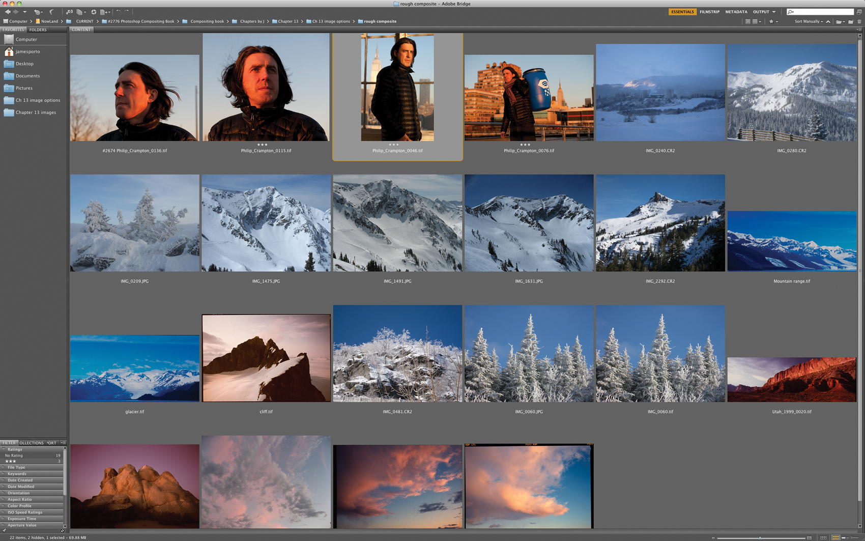
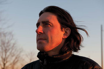
To walk you through the rough compositing steps, we’ll use a real-world example that will help you understand the processes involved. While in New York, Philip Crampton (a world-famous mountain climber and guide who has led over 30 expeditions up 26,000-foot peaks and has reached the summit of Mount Everest five times) asked Jim to do a portrait for his website. Jim took some shots of him with sunset light but thought it might be a more meaningful portrait if the background bore some correlation to his occupation. So he looked through his files and located snow-covered mountains, cliffs, trees, and skies, as well as four different portraits of Phil that he thought would work best for the composite (FIGURE 13.1). Because the rough compositing process is a sketching process, you typically work freely and quickly so you can establish a basic composition and look. Keep it loose, try different portraits, different backgrounds, and vary the composition until you’ve established the desired look and settled on the final image elements you want to use.
Figure 13.1. A selection of images in Adobe Bridge that Jim chose to demonstrate rough compositing.
In this example, we’ll do a rough composite of a simple two-image assembly, and you can follow along.
![]() ch13_phil1.jpg
ch13_phil1.jpg
ch13_phil2.jpg
ch13_mountain.jpg
ch13_cliff.jpg
ch13_sunset1.jpg
ch13_sunset2.jpg
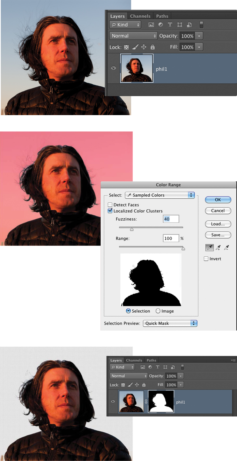
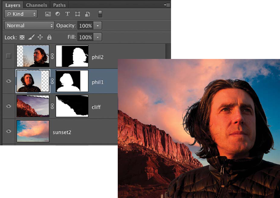
1. Open ch13_phil1 and ch13_mountain in Photoshop. Start with ch13_phil1.jpg. Double-click on the Background in the Layers panel to promote it to a layer. Name the layer phil1.
2. To make a quick yet serviceable mask, choose Select > Color Range, choose Quick Mask under the Selection Preview submenu, and sample the sky color by clicking anywhere in the sky. Add to the selection by Shift-clicking other sky tones. When the Quick Mask shows a suitable silhouette, click OK.
3. Color Range selected the sky, so invert the selection by choosing Select > Inverse.
4. Convert the Color Range selection into a layer mask by clicking the Add layer mask icon at the bottom of the Layers panel. This file will now be the working composite (FIGURE 13.2). Save the file as Phil Portrait.
© JP
Figure 13.2. The first selected portrait with a Color Range applied and then with the selection converted to a layer mask.
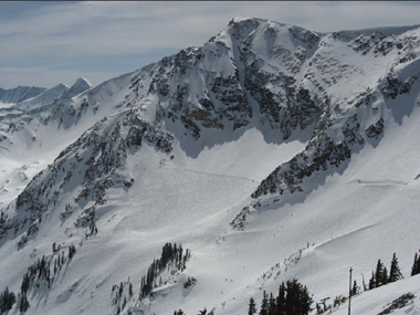
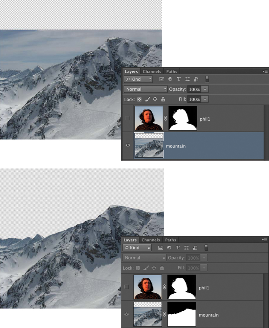
Because Phil is a famous mountain climber who is recognized for scaling the world’s largest peaks, let’s start with the mountain image (FIGURE 13.3). The color temperature is different than the light in Phil’s portrait, but maybe it can be matched with an adjustment. When you’re deciding on initial images for a rough composite, start with the ones most likely to be the chosen elements.
© JP
Figure 13.3. This mountain image initially looks as though it will give the feeling of the types of peaks that Phil climbs. The color temperature is very different from the light on Phil, as is the direction.
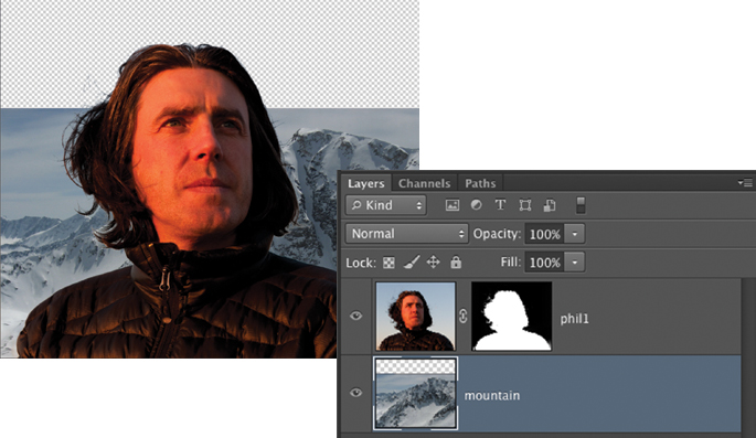
5. Switch to the mountain image, which you opened in step 1. Choose Select > Select All. Then choose Edit > Copy. Go back to the Phil Portrait file and choose Edit > Paste. Name the new layer mountain and place it below the phil1 layer (FIGURE 13.4). You may have to reposition it to look like Figure 13.4 using the Move tool (V).
Figure 13.4. The mountain image is copied and pasted into the working composite, and placed behind Phil.
6. Your goal is to mask out the original sky in the mountain image and replace it with a warmer sunset sky that will more closely match the light on phil1. This mountain may not even be used in the final composition, so don’t waste too much time perfecting the mask. Hide the phil1 layer by clicking the view icon next to the phil1 layer in the Layers panel. Select the Pen tool (P) and make a rough Pen tool path by clicking and plotting points along the top edge of the mountain. Convert the path into a selection by Command-clicking on the Work Path in the Paths panel. The path can also be converted to a selection by choosing Make Selection from the pull-down menu in the upper-right corner of the Paths panel. Convert the selection to a layer mask by clicking the Add layer mask icon at the bottom of the Layers panel (FIGURE 13.5). For more detail on working with the Pen tool, see the Web chapter, “Pen Tool Power.”
Figure 13.5. A very rough Pen tool path is made along the mountain’s top ridge; the path is converted to a selection and then the selection is converted to a layer mask.
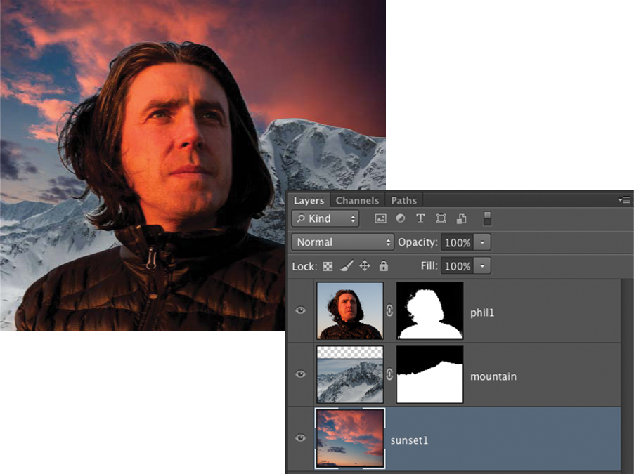
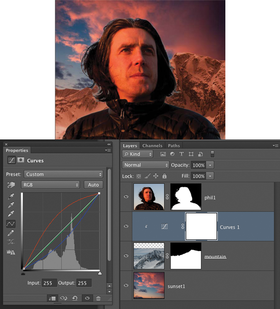
7. Open the sunset1 image. Choose Select > Select All. Then choose Edit > Copy (Command+C [Ctrl+C]). Go back to the Phil Portrait file and choose Edit > Paste (Command+V [Ctrl+V]). Name the new layer sunset1 and place it below the mountain layer (FIGURE 13.6). With the Move tool (V), move sunset1 to the top of the frame. Turn the phil1 layer back on. At this point the color of the mountain is clearly way out of sync with the rest of the image and needs to be warmer. Select the mountain layer. Add a Curves adjustment layer by choosing Layer > Adjustment Layer > Curves. With your cursor between the Curves layer and the mountain layer in the Layers panel, press Option-click (Alt-click). This will create a clipping mask so the Curves layer affects only the mountain layer, not the sunset1 layer below. Adjust the Curve by choosing the Red Curve and pulling it upward; then choose the Blue Curve and pull it down. Adjust the Green curve by slightly pulling it down (FIGURE 13.7). Save the file.
Figure 13.6. A sky is added to the composition and placed below the mountain layer.
Figure 13.7. The sky is warmed up to try to match the light on Phil.
Redirecting the rough composite
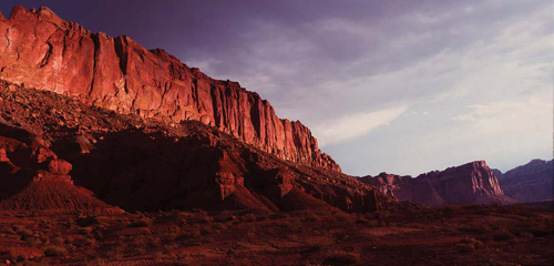
You can now see that the three elements you’ve combined do not fit naturally together at all. The reason is that the light quality and light direction of the mountain image does not in any way resemble the light on Phil. There are instances when you can use an adjustment layer to match the color of the elements in a convincing enough fashion to harmonize the elements, but not here. The light is just too far off. Rough compositing is ideal for quickly determining what will and what won’t work in a composite. In this case, the image of Phil is the controlling element, so we should look at the backgrounds again and find one that matches his light more accurately. Going back to the images we opened, it appears that the cliff image has a very similar light direction and quality, so let’s continue the rough compositing process using the cliff as the new background (FIGURE 13.8). Let’s also try a different portrait of Phil (FIGURE 13.9) to see if it might compose better into the scene and make a more successful composite.
© JP
Figure 13.8. This cliff shot has a light direction and quality that more closely matches that of the two portraits of Phil. The lighting on Phil was warm, late afternoon sunlight and so is the cliff light, which will work better than the first mountain scene.
© JP
Figure 13.9. Another portrait of Phil that might be a better choice for the final composite.
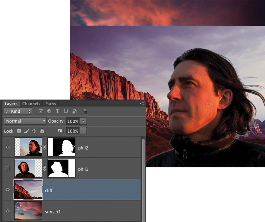
1. Delete the mountain layer and its Curves layer by selecting them in the Layers panel and pressing the Delete key. Rough compositing is the type of process where once you know an element isn’t working, you discard it and move on. Open the ch13_phil2 file. Follow the procedure from step 1 to create a mask of phil2 and drag the image into Phil Portrait. This is accomplished by using the Move tool (V), clicking anywhere in the Phil 2 image, dragging it to the top of the workspace onto the Phil Portrait tab, waiting a moment until Phil Portrait appears, and then dropping phil2 onto the image. Name the layer phil2. Place the phil2 layer at the top of the layer hierarchy. Hide the phil1 layer. Open the ch13_cliff file. Drag this file into Phil Portrait using the same method as just described. Name the layer cliff. Place the cliff layer above the sunset layer and phil2 at the top of the layer hierarchy (FIGURE 13.10). The initial composition is awkward at first, but maybe it can be improved upon. Use the Move tool (V) to position the elements to match Figure 13.10.
Figure 13.10. A rough initial assembly of the new portrait of Phil with a cliff background added.
2. Hide the layers phil2 and sunset1, and select the cliff layer. Choose Select > Color Range and click a point in the sky. Shift-click additional points until the sky is selected (FIGURE 13.11). Click OK to convert Color Range to a selection. The sky is now selected. If you Option-click (Alt-click) on the Add layer mask icon at the bottom of the Layers panel, the mask will hide the selection or basically cut out the sky.
Figure 13.11. The cliff background shown during the Color Range process.
3. With the cliff mask selected, use the Brush tool (B) with the foreground color set to 100% black (D) to paint out any remaining artifacts of the sky that the Color Range was not able to eliminate.
4. Switch to white (X) to paint and reveal portions of the cliffs that were unintentionally masked by the Color Range selection. Color Range often leaves areas that need to be edited by hand, but because this is a rough composite, it doesn’t have to be a perfect mask—just good enough to establish composition.
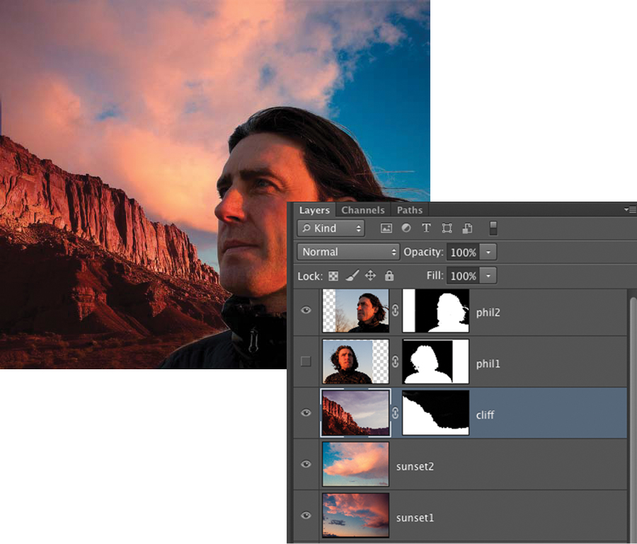
5. Open the sunset2 image, drag it into Phil Portrait, and place it below the cliff layer. Name the layer sunset2 and place it above sunset 1 in the layer hierarchy. Reposition it with the Move tool until it fills the frame. Turn on the phil2 layer and recompose the elements to make a more balanced composition. This is essentially the creative part of the rough compositing process when you move the elements around and scale them until the relationship of the elements look natural to your eye (FIGURE 13.12).
Figure 13.12. The new portrait of Phil assembled with the cliff background.
6. Use the Move tool to change the position of elements and choose Edit > Free Transform (Command+T [Ctrl+T]) while holding the Shift key to constrain the proportions while you change the scale of the elements.
To achieve the correct visual balance you’ll need to transform or resize image elements multiple times. Work with Smart Objects to maintain image quality.
Although the light matches in the resulting image, it’s not a great composition. Let’s see if there’s a better portrait of Phil that we can arrive at with the elements we have at hand. Maybe the original image of Phil will work better, let’s go back to phil1.
7. Turn on the phil1 layer and turn off the phil2 layer to compare the two different portraits. Using the Move tool, move phil1 to the right to reveal the cliff. You now see that the lighting on the phil1 layer comes from the opposite direction as that on the cliff layer (FIGURE 13.13).
Figure 13.13. The rough composite is shown here with the original portrait of Phil, but now the lighting on the background cliff doesn’t match.
8. Select the cliff layer and choose Edit > Free Transform (Command+T [Ctrl+T]). Control-click (right-click) anywhere within the bounds of the transformation and choose Flip Horizontal. This will reverse the layer from left to right. Move the layer until the section of the cliff that you want is visible. Press Return (Enter) to apply the transformation. Phil is now covering the cliff. Using the Move tool, move phil1 to the left.
9. The composition is a bit crowded, so let’s increase the canvas size to add some room on the right. Choose Image > Canvas Size. Change the width from 7 inches to 8 inches and move the dot in the lower grid to the left middle square. This will add image area to the right side but leave the top, bottom, and left as is.
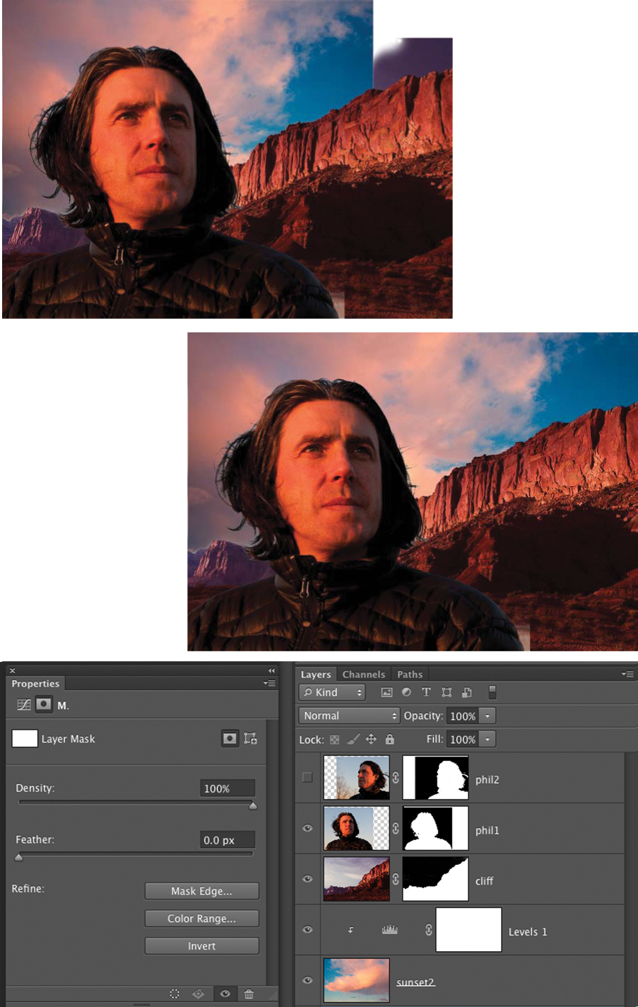
10. Revealing previously hidden canvas exposes some minor issues, such as cliff area that had not been masked and the sky not covering the canvas. Select the sunset2 layer and choose Edit > Free Transform (Command+T [Ctrl+T]). Holding down the Shift key to constrain the proportions, enlarge the sky to fill the frame. Click on the mask on the cliff layer and paint away some of the cliff’s original sky that was revealed by increasing the canvas size (FIGURE 13.14).
© JP
Figure 13.14. With the cliff and sky flipped left to right and the composition balanced, you have a reasonable, rough composite to examine.
There is no need to be too precise with masking at this stage. Think of the rough compositing process as a sketch, so you can work quickly and just see if the idea you’re going for is working. Once you’ve established a composition and have decided on the final elements, only then do you need to perfect the compositing techniques.
Finalizing the rough composite
Let’s complete the rough composite.
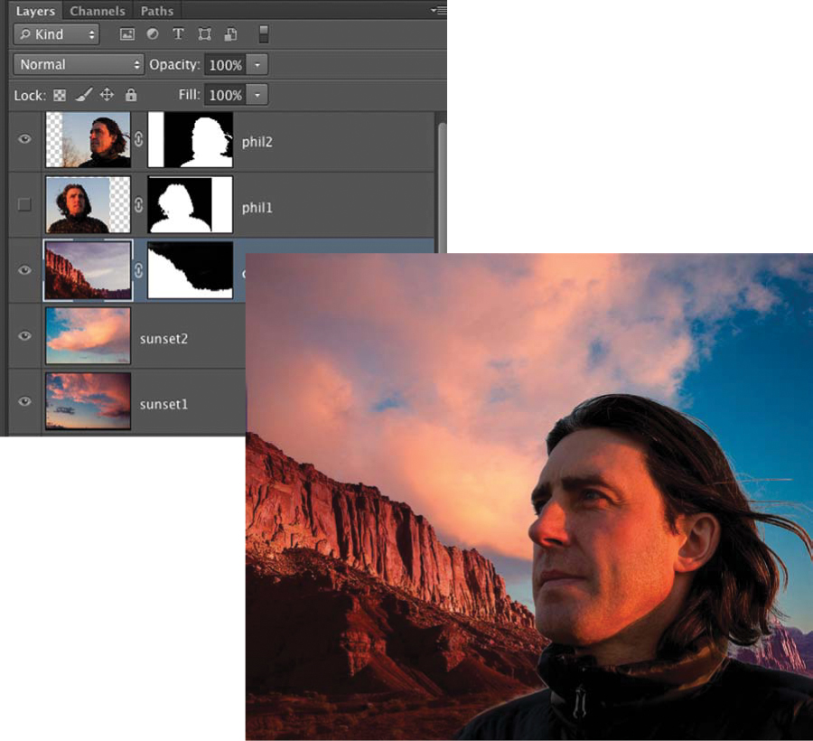
1. Turn off the sunset2 layer and turn on the sunset1 layer. The color and tone of this sunset is a bit more dramatic, and the color palette is more compatible with the background. Choose Edit > Free Transform (Command+T [Ctrl+T]). Holding down the Shift key to constrain the proportions, enlarge the sunset2 layer to fill the frame.
2. Select the phil1 layer and move it slightly left.
3. Select the cliff layer and choose Edit > Free Transform (Command+T [Ctrl+T]). Holding down the Shift key to constrain the proportions, enlarge the cliff and move it to the right to create some negative space to the right of phil1’s head to add some breathing room and also make the cliffs more iconic.
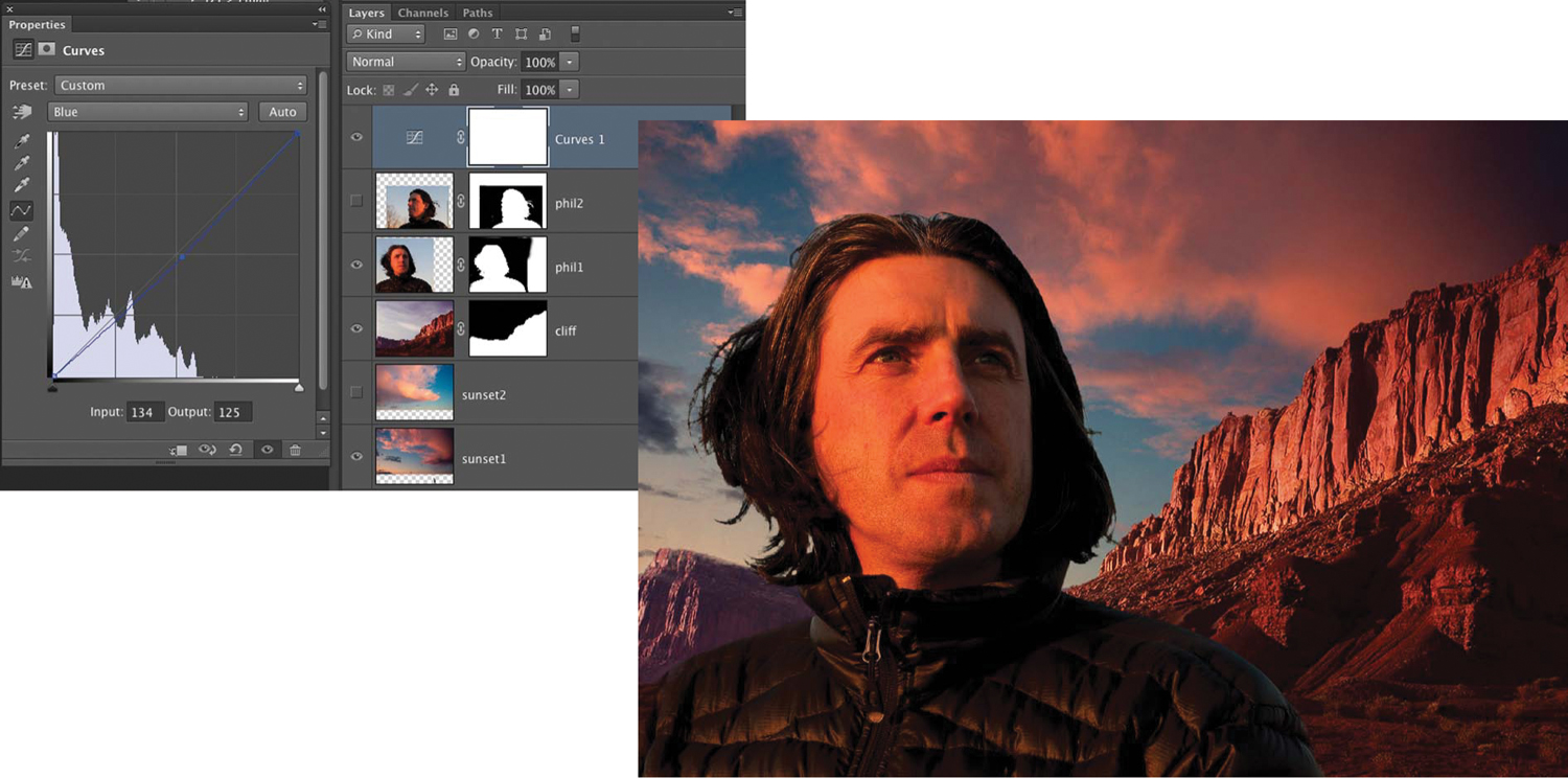
4. Finally, add a Curves adjustment layer by choosing Layer > Adjustment Layer > Curves. Select the Blue Curve and just pull it down a bit to reduce the blue and add yellow (FIGURE 13.15).
Figure 13.15. Going back to the sunset1 layer gives the composite more drama and also fits more naturally with the scene.
Congratulations! You’ve officially completed the rough compositing exercise!
When working on a commercial job, you would often be required to test out multiple portraits on a variety of backgrounds. Rough compositing allows you to create several different versions of your composition and compare them. When you have a composition that is close to your vision, you can either proceed to the high-resolution version, repeating the tasks that you performed in the rough composite, or if you made the rough composite in hi-res, finesse the composite you have.
Use some of your own images that you think might work well together in a composite, experiment with different compositions in a rough composite. Work freely and creatively, trying anything you can think of to make a great image. Make some magic!
Working with Smart Objects
Smart Objects are layers that you can edit in Photoshop nondestructively. Essentially, Smart Objects are placed versions of separate files that you can access within a single Photoshop document. Smart Objects invisibly embed the original raw file or layer and show all your adjustments on a representative layer so at any point in the process you can restore the attributes of the original raw file or layer, making it a nondestructive process. You can scale, skew, rotate, or transform Smart Objects without affecting the actual pixel data of the layer. Although you can edit and reedit Smart Objects repeatedly, the edits will be applied only when the layer is rasterized. Smart Objects can be created from raw image captures, any pixel-based layer, or any vector-based files from programs such as Adobe Illustrator. You can apply Smart Filters to Smart Objects and then later adjust the filter settings or mask, or discard them without affecting the actual pixel data of the layer. Smart Objects can be incredibly advantageous in the right circumstances but should by no means be used exclusively, because working with them also has its drawbacks.
Creating Smart Objects
To create a Smart Object, do any of the following:
• Choose File > Open As Smart Object, select the file, and click Open.
• Choose File > Place to import files as Smart Objects into an open Photoshop document (RAW, PSD, TIFF, or PSB files are preferable to JPEG files for maximum flexibility). Because JPEGs have already been compressed, there are sometimes pixel artifacts, which are visible along edges of objects and subjects within the image, so you’re always better off working with raw files.
• Drag PDF or Adobe Illustrator layers or objects into a Photoshop document to make them Smart Objects.
• Paste artwork from Illustrator into a Photoshop document, and then choose Smart Object in the Paste dialog.
• To convert a selected layer into a Smart Object, choose Layer > Smart Object > Convert to Smart Object.
• Select multiple layers in your document and choose Layer > Smart Object > Convert To Smart Object to combine the selected layers into a single Smart Object.
• And our favorite methods—in Adobe Camera Raw press the Shift key to change Open Image to Open Object. In Lightroom choose Photo > Edit In > Open as Smart Object in Photoshop.
Pros and Cons of Smart Objects
Some of the advantages of working with Smart Objects are as follows:
• Nondestructive image editing allows you to undo your changes at anytime.
• Each Smart Object layer created from a raw file retains all the attributes of the raw file.
• Transformations don’t destroy pixel data; you can size and resize until you get it just right without compromising the pixels of your layer.
• When you have multiple copies of a Smart Object layer in a document and you make changes to the object, those changes will be applied to all of the layer copies.
• Smart Filters enable you to apply a filter to a layer and later readjust the filter attributes. You can also remove or mask Smart Filters; they are nondestructive.
Some of the limitations of working with Smart Objects are as follows:
• Because Smart Objects are nondestructive, you can’t perform any operations that alter pixel data, such as painting, dodging, burning, cloning, or healing, without rasterizing the Smart Object and converting it to a regular pixel-based layer.
• File size will increase with every Smart Object you add to the file. This will slow your computer processing time and impede the speed at which you work.
Transformations
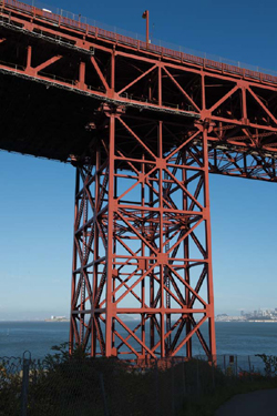
One of the primary motivations to utilize Smart Objects is that as you’re transforming your elements you’re not losing pixel information when applying a transformation. Sometimes you’ll reduce the scale of an element and then decide to make it larger later. Or you’ll do a distortion and then want to restore it to its undistorted state. With Smart Objects, all of this can be done without the risk of having to go back to the original element and reintroduce it to the composite. As an example, we’ll demonstrate the difference between how Smart Objects and pixel-based layers render transformations using the image in FIGURE 13.16. When the file is opened in Photoshop, it is converted to a Smart Object. Using Free Transform, we scaled the Smart Object to a very small size. We then scaled it back up to its original size. As you can see in FIGURE 13.17, there is no difference in image quality between the original and the resized Smart Object. We then rasterized the Smart Object (converted it back to a pixel-based layer). In FIGURE 13.18 the layer is transformed very small, the transformation is applied, and then it is scaled back up to the original size.
© JP
Figure 13.16. A section of the Golden Gate Bridge used to demonstrate one of the advantages of Smart Objects.
Figure 13.17. On the left, the Smart Object layer has been transformed very small. When it is enlarged back to its original size, it is indistinguishable from the original in Figure 13.16.
Figure 13.18. On the left, the pixel-based layer has been transformed very small. When it is enlarged back to its original size, the image quality has deteriorated to the point where it’s unusable.
The resized image looks soft and pixilated; it is unusable. When you are transforming pixel-based layers, information is discarded when the scale is reduced and interpolated up when the scale is increased. Smart Objects are linked to their original files, so they will reconstitute themselves based on the original file. If you’re the type of artist who wants maximum flexibility in your files so that you can return to them at anytime and change the scale of elements, Smart Objects are very applicable to your workflow. If, however, you’re quite decisive, and you know that once you have the composition it will probably not change, you may not want the extra file weight that accompanies Smart Objects.
Smart Filters
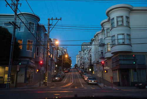
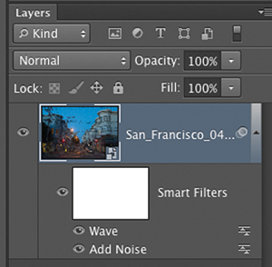
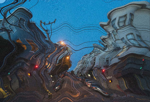
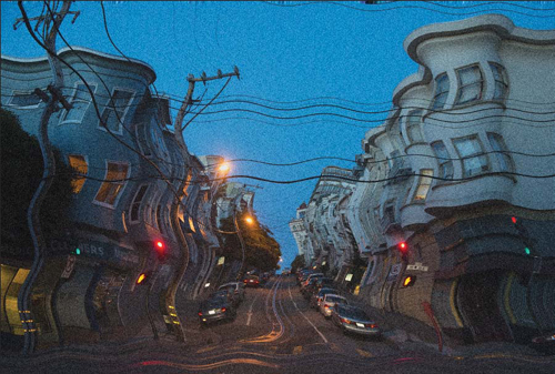
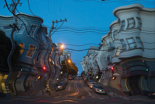
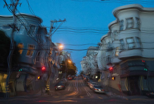
Another distinct advantage of using Smart Objects is the ability to add Smart Filters to them. Smart Filters are very useful in that you don’t have to commit to your filter decision; you can keep adjusting and readjusting them throughout your compositing process. You can add several filters and adjust the level or opacity of each filter independently. You can also control the area that the filters are applied to by painting on a layer mask dedicated to the Smart Filters. FIGURE 13.19 shows a street scene from San Francisco that was opened as a Smart Object using Adobe Camera Raw. To demonstrate the use of Smart Filters, we applied the Add Noise and Wave filter to the Smart Object. When you’re working with a Smart Object, the filters are automatically promoted to Smart Filters. You’ll see a Smart Filters icon next to a layer mask appear below the Smart Object you are working on (FIGURE 13.20).
© JP
Figure 13.19. A street scene from San Francisco that is used to demonstrate Smart Filters.
Figure 13.20. When you apply a filter to a Smart Object, it automatically becomes a Smart Filter and appears below the object with a layer mask. Painting black on this mask will hide the filter effect in the painted area.
For this example, we’ve intentionally exaggerated the intensity of filtration that is initially applied (FIGURE 13.21). Obviously it’s too much Wave and too much Noise. The great feature of Smart Filters is that at any point in the compositing process, you can just double-click the filter name in the Layers panel to reopen the filter and adjust it. FIGURE 13.22 shows the result of reopening the Wave filter and adjusting it to lessen the intensity of the Wave.
Figure 13.21. The example image with Add Noise and a Wave filter applied to the Smart Object.
Figure 13.22. Double-clicking on the Wave filter name reopens the Filter panel and allows us to lessen the Wave effect.
If you double-click the slider icon just to the right of the filter name, a dialog opens that allows you to uniformly decrease the opacity of the filter effect. This works well for effects such as textures and noise (FIGURE 13.23) but not so well for distortions, such as Wave (FIGURE 13.24).
Figure 13.23. The Opacity of the Noise filter has been reduced to 25%, creating a more subtle effect.
Figure 13.24. When the Opacity of the Wave filter is set to 50%, it reveals the untouched original underneath, creating a confusing double image rather than reducing the Wave effect. In this case it’s best to double-click on the filter name to reopen its dialog and reconfigure the filter rather than use the Opacity option.
Smart Objects and Smart Filters have their uses in the compositing process, and it’s up to each artist to decide how to utilize them. If all the layers of your composite are Smart Objects, you’ll have a lot of flexibility, but at one point or another, you’ll probably want to lock in your changes and finalize the image. In some instances you may want to save a copy of the file with all its Smart Objects, for instance, when you need a template image that has elements that you use over and over but change or update slightly. It depends on how definite you are in your creative decisions throughout your compositing process: Do you like how it looks and know you don’t need to revisit every decision but would rather keep forging ahead? Or would you like the option of being able to slightly tweak the balance of elements for as long as possible? If so, Smart Objects are for you. But be warned; they very quickly increase the mass of the file and can definitely slow your processing and saving time.
Experiment by applying a Smart Filter to one of your layers (choose Filter > Convert for Smart Filter and then choose a filter). See how easy it is to go back and alter the characteristics of the filter nondestructively.
Matching Image Characteristics
Making a convincing photorealistic composite is less reliant on brilliant Photoshop work than on the photography that makes up the component images. That’s not to say that your digital craftsmanship isn’t vitally important, but if the photography is not precisely rendered with specific intentions for your composite, all the Photoshop craftsmanship in the world will not be able to save it. Chapters 3, 4, and 5 discussed in detail how to plan, light, and match perspective and point of view with your photography. If you want to create a photorealistic composite that is indistinguishable from a straight photograph, you’ll have to closely study every detail of your scene and critically match these key attributes. This section assumes that at this point your photography has all been shot with the intent to match all of the image characteristics with those of your intended environment. Here we’ll address techniques and strategies for bringing all the elements together into harmonious, seamless Photoshop composites.
Foreground, Midground, Background
Because you work in layers in Photoshop, it’s helpful break down a composition to foreground, midground, and background. Each of these general regions of the image can be further broken down into numerous levels of depth but can also be reduced to simply foreground and background for basic composites.
Combine numerous image layers into general groups of foreground, midground, and background to maintain a working logic in your composite.
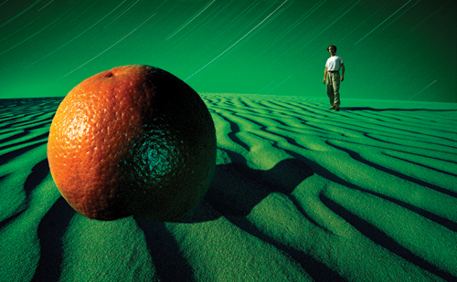
One handy way to think of your two-dimensional composite image is to imagine it as a three-dimensional space with infinite depth. Each image layer can represent another plane of depth starting from the immediate foreground and extending to the very distant background. Picturing your composite in this way will not only train you to think in layers in a similar manner to Photoshop, but will also give your images a more dimensional quality simply because you envisioned them as a three-dimensional space. Certainly, if you choose a wide-angle lens, you’ll extend and enhance the depth and dimensional quality of your composites, as shown in FIGURE 13.25. The wide-angle lens close to the sand surface exaggerates the foreground to background relationship. The entire composite was designed with the sand ripples as a guide for placement and scale of the two primary elements.
© JP
Figure 13.25. Jim did this composite for Wired magazine. Notice that it is designed based on a distinct foreground, midground, and background. It is essential to integrate these separate areas of the image when building your composites.
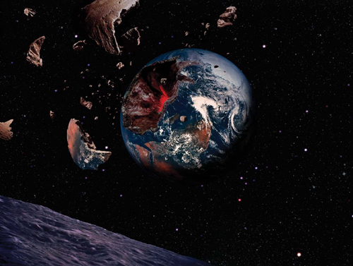
It’s not necessary to use an extreme wide-angle lens to retain a sense of depth. To illustrate, we’ll disassemble an example composite to reveal its layer composition and how it was broken down into foreground, midground, and background. Jim completed the composite in FIGURE 13.26 for an ad for Sony PlayStation to illustrate the epic power of one of its games. The point of view of this composite is from a spaceship situated above the moon’s surface and the lens is a wide angle, but not too extreme, probably equivalent to a 40mm lens.
© JP
Figure 13.26. Jim made this composite for an ad for Sony PlayStation. Can you see how it has been constructed from foreground through midground and then background?
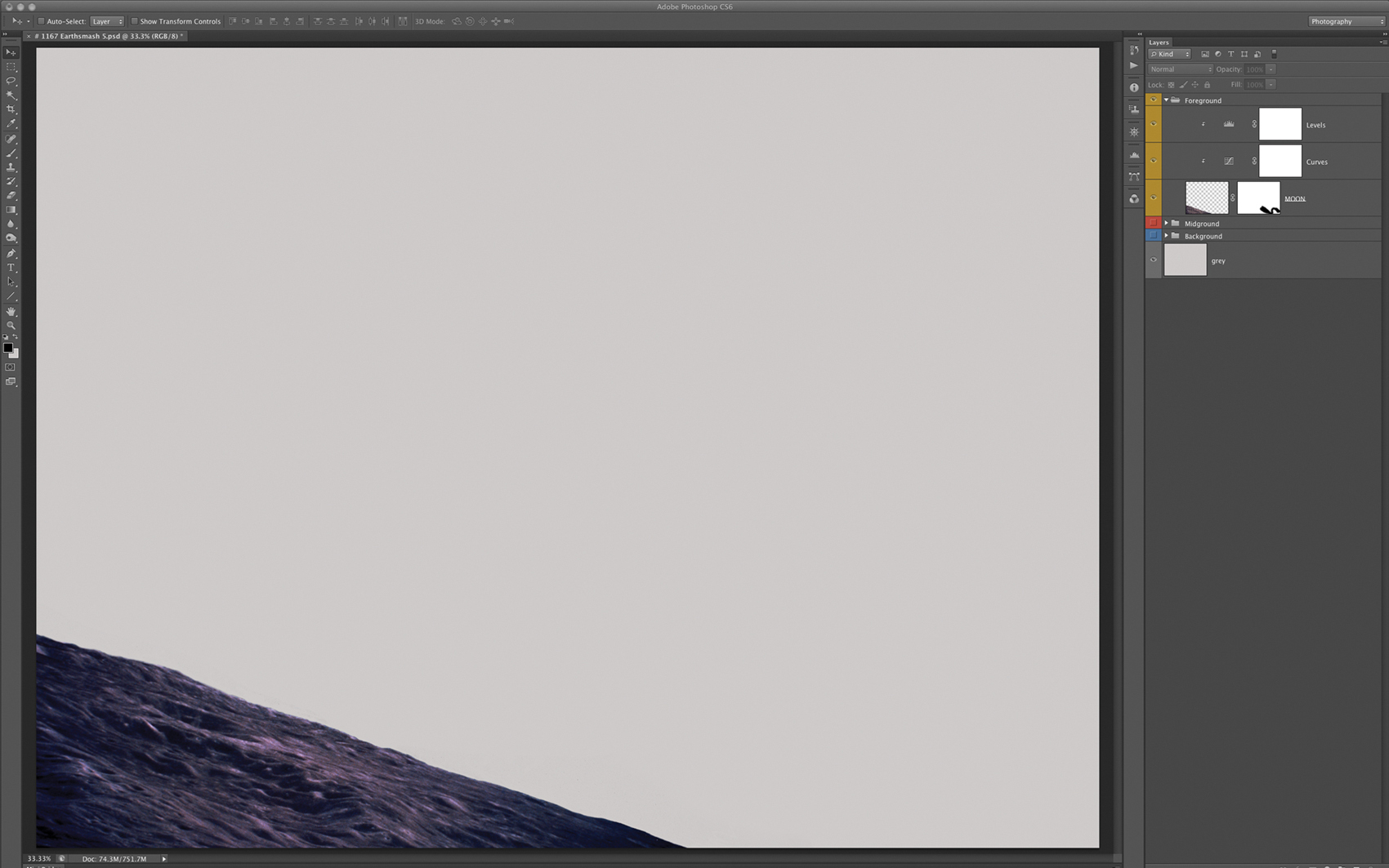
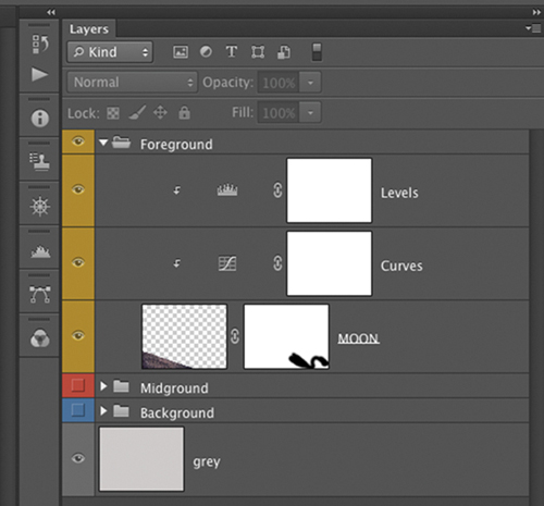
The idea that the viewer is looking at earth from the moon means that the moon is the closest element to the camera, so it becomes the foreground (FIGURE 13.27). Its layer group is titled Foreground, color-coded yellow, and contains the Moon layer and two adjustment layers (FIGURE 13.28).
Figure 13.27. The moon element is isolated against a light-gray background. The moon is the closest foreground element in the composite, so its Layer Group resides at the top of the hierarchy in the Layers panel.
Figure 13.28. The layers within the Foreground group.
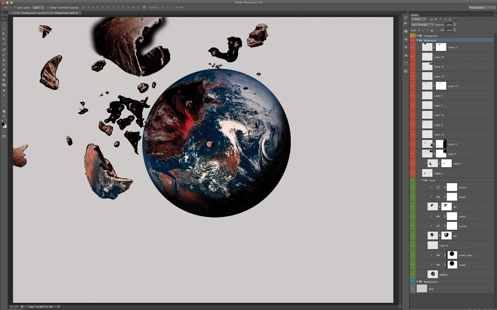
Moving further into the image to the midground reveals the earth and all the components that make up the explosion effect. The cavity in the earth, the fragments, and the pieces were sculpted by Scott Siken (FIGURE 13.29), a master sculptor and model maker who works with Jim to create the effects on many of his projects. Notice that the masks are not particularly refined. The reason is that because the fragments are being composed against an almost black background, they were shot against black and need only a rough outline mask to look seamless in the final composite. The Midground Layer Group (FIGURE 13.30) has many more layers than the Foreground group, is divided into two distinct sections, and is color coded accordingly. All the red layers are the various fragments of earth floating in space, and all the green layers are elements of the earth.
Figure 13.29. The Midground level of this composite is composed of the fragments and the earth. There are actually several levels of midground here: Can you see the separate image planes (layers) that recede from the foremost chunk to the earth?
Figure 13.30. The layers within the Midground group. All the fragments are color coded red, and all the components of the earth and the crater are color coded green.
Always try to shoot your elements against a background that is compatible with your destination to make the masking process as minimally laborious as possible. For example, if you know you’re going to put your subject against a blue sky, shoot against blue.
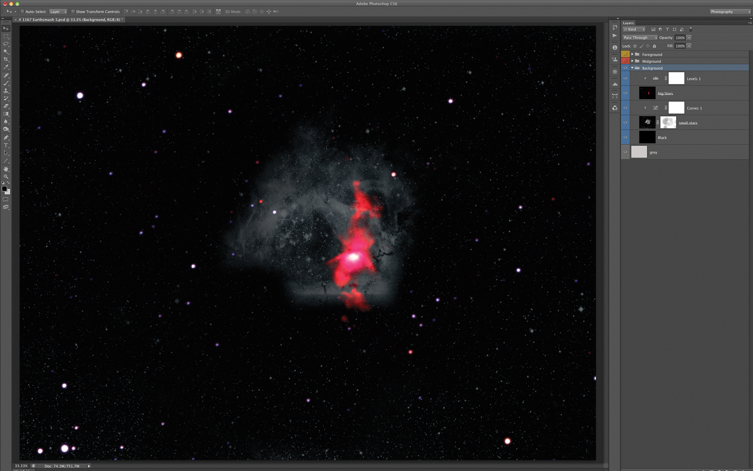
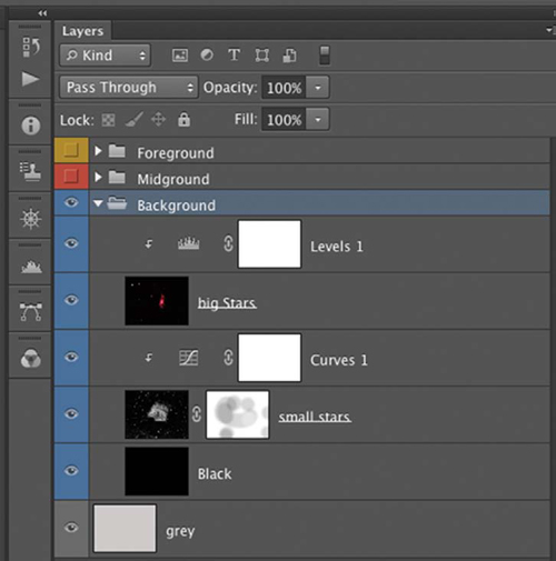
The Background level is the field of stars, which is composed of one layer of large stars and another of smaller stars (FIGURE 13.31). By combining these two layers, we’ve created another level of depth even in the far background behind all the action in the image. This is a result of treating the image plane as a window into a three-dimensional world and adding depth at every level of the composite, the foreground, midground, and background. The Background Layer Group has just two star layers, which are in Screen blending mode above a layer filled with 100% black (FIGURE 13.32).
Figure 13.31. The Background level of the composite is composed of a layer of large stars and a layer of small stars. Can you see how combining the two adds another level of depth to what could otherwise be a flat plane?
Figure 13.32. The layers within the Background group are color coded blue.
As you build your composites, take the time to label and color code your layers and Layer Groups. As you add layers, the level of complexity increases; it saves time and aggravation to keep the layers intelligently organized.
Realistic Compositing
As mentioned earlier, a convincing photorealistic composite requires that the photographic elements be shot specifically for the intended composite with all the primary attributes, such as point of view, perspective, scale, and lighting, established in the photography stage (refer to Chapters 4 and 5 to elaborate on these crucial attributes). But even if you’ve done all of these things convincingly, your composite can still look like a cut-and-paste montage rather than an integrated single photograph. You then have to compose the image in Photoshop in a way that integrates the elements harmoniously. This means you must balance the contrast and color of the elements; create realistic shadows where necessary; match the focus, sharpness, and resolution of all the elements; make perfect masks (refer to Chapters 6–11) for all of your elements; add light or reflections if the composition calls for it; create transitions in areas where two elements meet; and finesse the image with precise detail work. In the following sections we’ll elaborate on the techniques for each of these necessary tasks.
Balancing Contrast and Color
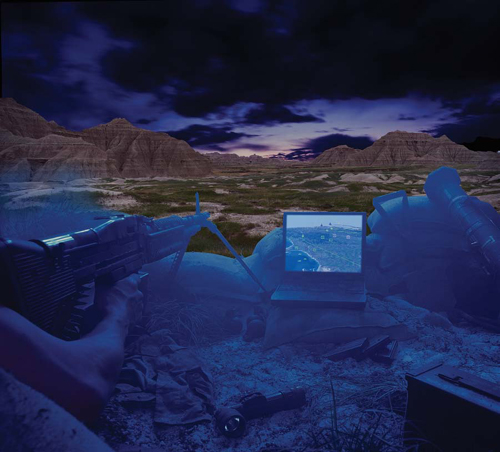
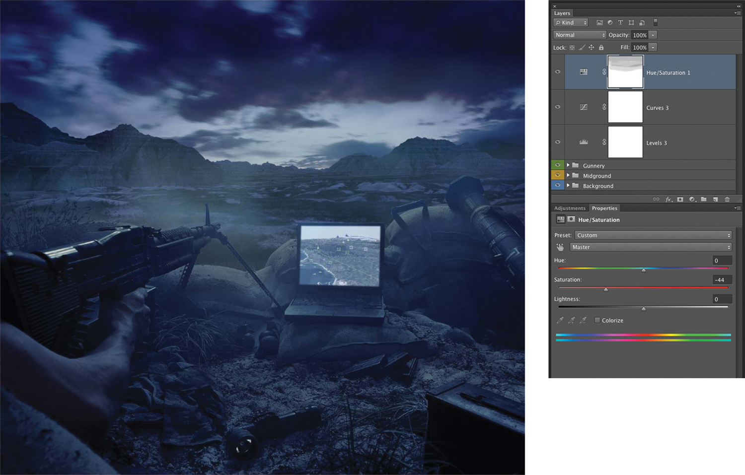
Once you’ve made your rough composite, determined all the final elements that will compose your composite, made excellent masks for each element, and assembled the composite, the very next process you should tackle is to balance the contrast and color of each element. Adding a Levels, Curves, Hue/Saturation, or any other adjustment layer to each element to balance the color and contrast so that every part of the image “lives in the same world” will very quickly make your composite appear to be a harmonized whole. To demonstrate how this works, Jim will use the example in FIGURE 13.33, which has been brought to the rudimentary composite stage. The masks are good and the composition is set, but none of the elements have been adjusted. Jim made this composite for an ad for a battlefield technology software program. The foreground was shot in the studio and has been combined with landscapes and skies from Jim’s library.
© JP
Figure 13.33. This composite for a software company is shown here before any of the elements have been corrected or balanced.
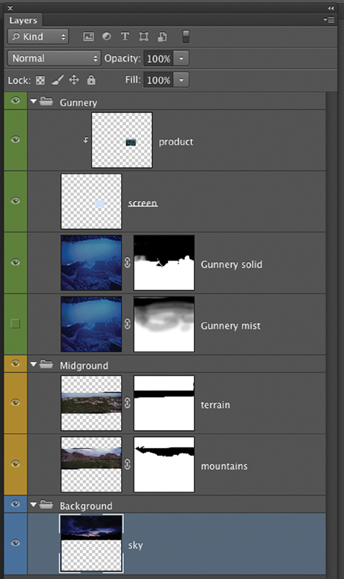
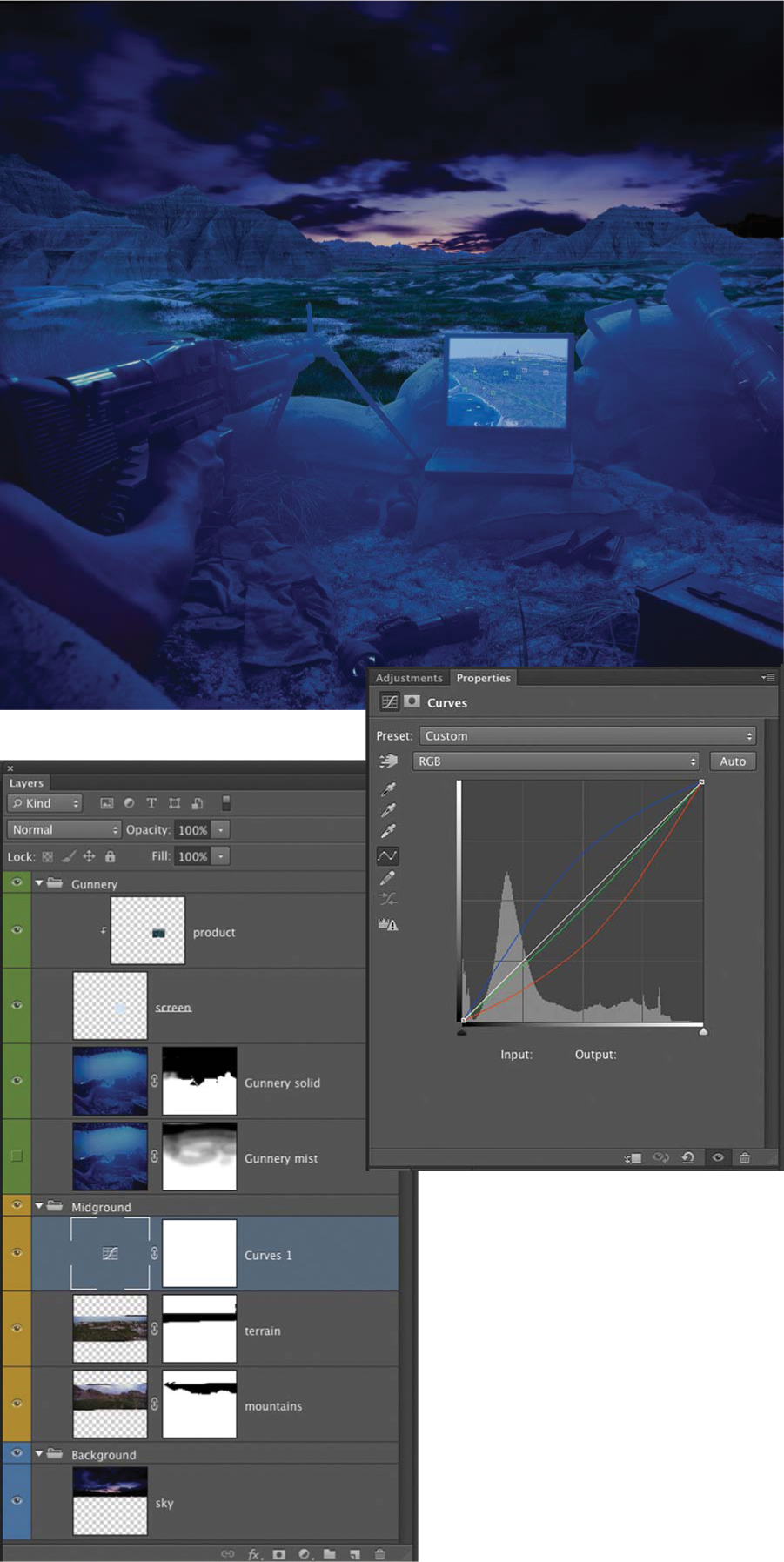
The basic layer composition has the Gunnery as the Foreground group; a grassy, rocky terrain and the mountains as a Midground group; and the sky as the Background group (FIGURE 13.34). The desired look for this image was a bluish pre-dawn light, so a good place to start is to add some blue to the midground (FIGURE 13.35). The blending mode for the Midground Layer Group is set to Normal so that any adjustments within the group will not affect layers or groups below them in the layer hierarchy. Then a Curves layer is above the two layers in the Midground group. Immediately, you see that the composite begins to look more integrated, but this is just the first move; it’s very far from looking truly harmonious.
Figure 13.34. The Layers panel for the Gunnery image before any adjustments.
Figure 13.35. The Gunnery scene with the midground shifted to blue with a single Curves adjustment layer.
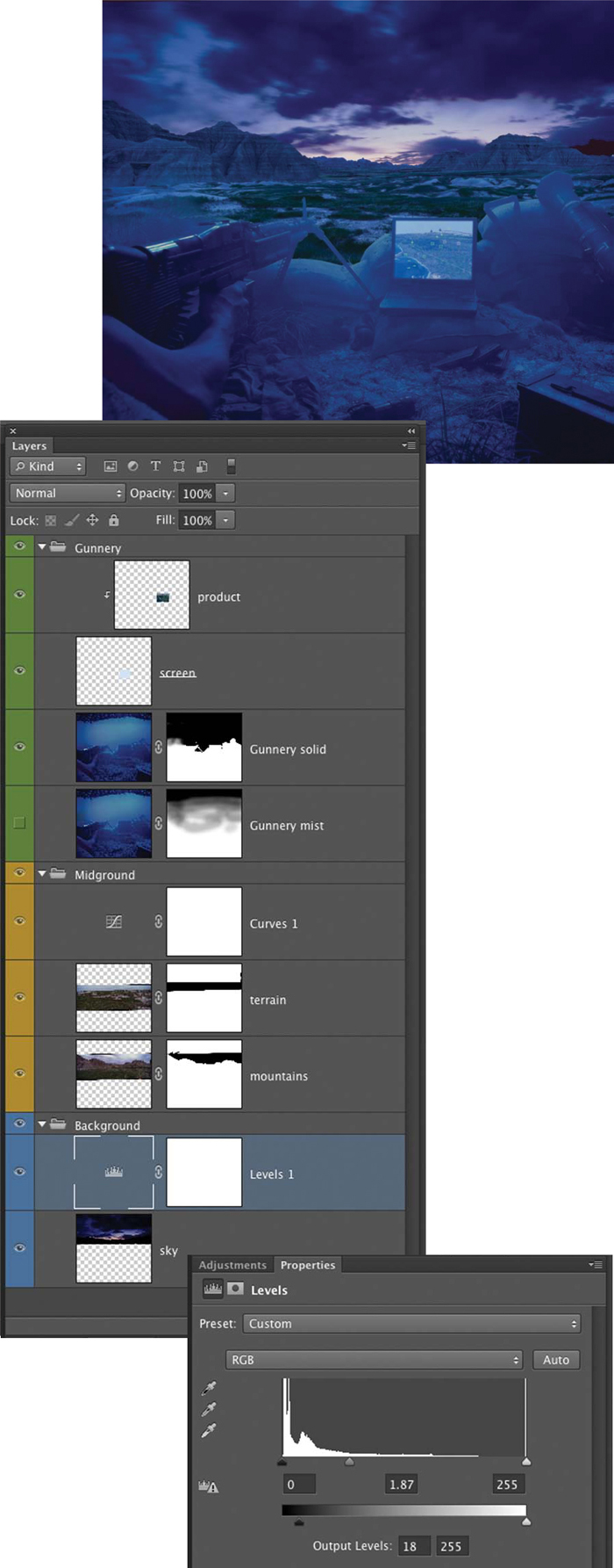
The entire scene is heavily saturated with color, giving the image a very produced or fake look. The goal is to make it feel believable not hyper-real or stylized, so let’s continue with the balancing process. The next move is to brighten the sky to create more of a pre-sunrise feeling by adding a Levels layer, and increasing the value of the midtones and reducing the shadow density (FIGURE 13.36).
Figure 13.36. The sky is brightened with a Levels adjustment layer.
Atmospheric Effects
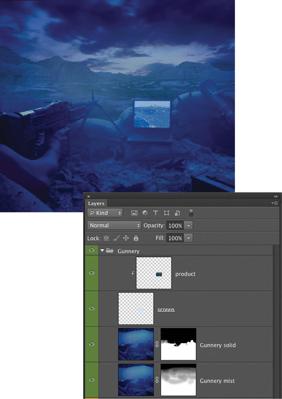
You may notice a difference in clarity between the foreground and the rest of the scene. This was intentional, because Jim wanted to create atmosphere using smoke or haze to enhance the realism of the scene. The smoke has to exist in the foreground and the rest of the scene, so the foreground is divided into two identical layers. As you can imagine, masking smoke is quite difficult and requires different strategies depending on the situation. In this case the topmost layer has a hard mask made with the Pen tool that defines the edge of the sandbags and guns. The copy layer below it has a layer mask, which has been painted on with black to take away the smoke or white to reveal the smoke. The brush is set to a low opacity to control the desired amount of atmosphere with subtlety (FIGURE 13.37).
Figure 13.37. An atmospheric effect helps to integrate the elements and enhance a sense of realism. It is created using two layers for the Gunnery. The top layer has a hard Pen tool mask, and the underlying layer has a mask that is painted on with a low-opacity brush to hide or reveal the smoke.
Once the balance between the individual elements seems satisfactory, it’s time to make some global corrections to the composite. The most obvious issue with the image is that the color is so saturated that it looks unreal. This is solved by adding a Hue/Saturation adjustment layer to the top of the layer hierarchy and adjusting the Master slider to reduce the saturation. A Curves adjustment layer has also been added to further remove the blue, and a Levels adjustment layer is added to control the overall contrast (FIGURE 13.38).
Figure 13.38. The final image has come a long way from Figure 13.33 and has the realistic feel that Jim was going for.
The process of balancing the adjustments of the elements in a composite has been abbreviated here due to limited space. In practice you’ll find that you’ll make an initial set of adjustments and then return to them again and again to slightly tweak their values throughout the compositing process. It’s a good idea to get the adjustments close to your vision to start with, and then address other areas of the composite. As you spend more time looking at the composite, you might return to specific elements and massage the values to further optimize the integration of the elements. This is a wonderful advantage of the adjustment layers feature in Photoshop; they are nondestructive and you can revisit their settings at anytime.
Creating Shadows
When you’re making photorealistic composite images, perhaps the single most crucial factor in enhancing realism is the addition of shadows. They must be in the appropriate place, and their shape has to simulate a real shadow of the element you’re adding. They also have to have the correct edge quality for the light source of the scene (refer to Chapter 4, “Lighting and Backgrounds,” for detailed information on the shadow quality from various light sources). The shadows you create must match the shadows in the scene you are compositing into.
The best way to get good at shadows is to start to notice them in your daily life, paying attention to their edge quality, color, how they conform to the various surfaces they fall on, and their density in different circumstances. Shadows that are not masterfully added to a composite will betray your Photoshop work every time and immediately render your image unbelievable. It is therefore well worth your while to learn the techniques of adding them and practicing until you become an expert.
Three-dimensional form rendered in two dimensions is defined by light and shadow. How you render your shadows will either enhance or diminish the appearance of dimensionality. This is true with not only a large primary shadow, but also every area where your composited elements come into contact with one another, even down to the smallest detail. Creating shadows for composites requires an observant scientific attention to detail and an artistic sensibility.
Hard shadows
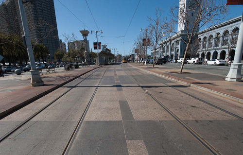
Whenever an object is lit by a point light source, such as the sun on a clear day, the shadows formed by the object are sharp and crisp, or hard shadows (FIGURE 13.39). The following example demonstrates one strategy for making a matching shadow in a hard-light situation. There are many different ways to approach the creation of shadows, so don’t limit yourself to this series of techniques.
© JP
Figure 13.39. A city scene lit by sunlight on a clear day. Notice the sharp-edged shadows and slight blue cast from the skylight.
![]() ch13_meltedcpu.jpg
ch13_meltedcpu.jpg
ch13_ferryterm.jpg
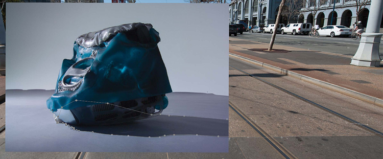
1. Open the meltedcpu and ferryterm images in Photoshop. First go to meltedcpu.jpg. In the Layers panel, double-click the Background to promote it to a layer. Select the Path called CPU path. Convert the path to a selection by pressing Command (Ctrl) and clicking the CPU path in the Paths panel. Convert the selection to a layer mask by clicking the Add layer mask icon at the bottom of the Layers panel. Label the layer Melted computer.
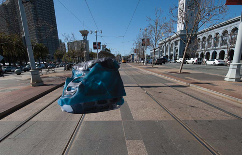
2. Using the Move tool (V), drag the image to the top of the desktop onto the ferryterm.jpg tab, wait a moment until the ferryterm image appears, and then place it into the image. Place the Melted computer layer in the same location as shown in FIGURE 13.40. When an object is brought into a scene and there are no shadows, it appears to float; simply adding a convincing shadow will increase the realism exponentially.
Figure 13.40. Meltedcpu has been masked and dragged into the ferryterm image. Without a shadow it appears to float in the scene.
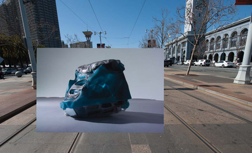
3. Disable the Layer mask for the Melted computer layer by holding down the Shift key and clicking its icon in the Layers panel (FIGURE 13.41).
Figure 13.41. Meltedcpu is shown here with its layer mask disabled. The existing shadow provides a guide for the new shadow.
In doing so you reveal the shadow that was made by the light in the original photograph of the CPU. If you’ve done a good job matching the light of your element and background, the existing shadow is a perfect guide for your new shadow because the light direction is the same as the background.
4. Select the Shadow Outline path in the Paths panel. (FIGURE 13.42).
Figure 13.42. Meltedcpu shows a Pen tool path along the edge of the original shadow and extending to the right.
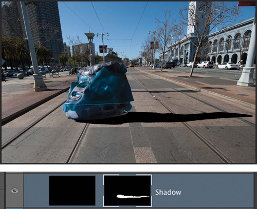
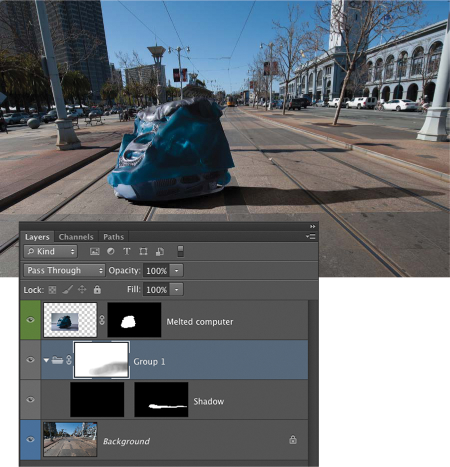
5. Enable the layer mask for Meltedcpu by clicking its icon in the Layers panel. Convert the path to a selection by pressing Command (Ctrl) and clicking the Shadow Outline path in the Paths panel. Create a new layer, and name it Shadow. Place it below the Melted computer layer in the layer hierarchy. Set its blending mode to Multiply to merge your shadow with the underlying layer more convincingly.
6. Click the Layer Mask icon at the bottom of the Layers panel to make a layer mask of the selection. Click the layer icon of the new layer you created and fill it with 100% black. You should have a solid black shadow in the approximate shape you desire.
7. Unlink the layer mask from the Shadow layer by clicking the chain link icon between the two icons in the Layers panel.
The layer mask controls the shape of the shadow so it can be transformed, blurred, or painted on to reveal or hide the shadow you’re creating. In this example the original shadow is at a different angle than that of the lamppost behind it.
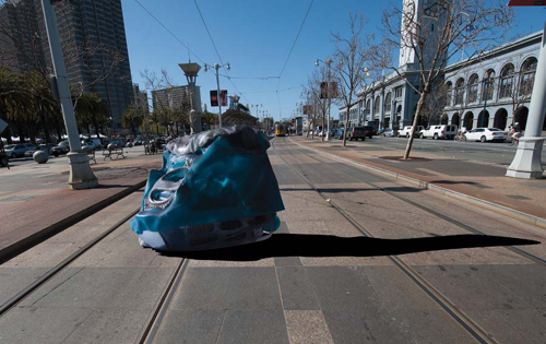
8. Select the unlinked layer mask and use Free Transform (Command+T [Ctrl+T]) to skew the mask slightly up until the shadow angles match (FIGURE 13.43 and FIGURE 13.44).
Figure 13.43. The unlinked layer mask is skewed using Free Transform to match the angle of the shadow behind it.
Figure 13.44. The transformed shadow is shown here.
Look at the shadow of the lamppost, and notice that it has a sharper edge closer to the base of the post, which gets slightly softer as it moves out to the right. You need to match that edge quality on your shadow.
9. Select the layer mask by clicking its icon in the Layers panel. Choose Filter > Gaussian Blur, and run a 2 pixel Gaussian Blur on the mask to slightly soften the entire edge of the shadow.
10. Click the Lasso tool, set it to 75px Feather, and select the right half of the shadow. Choose Filter > Gaussian Blur, and run a 5 pixel Gaussian Blur filter on the selection of the mask. The shadow edge should now be softer at the far edge than the base of the CPU (FIGURE 13.45). By choosing different areas of the layer mask and softening them at different blur levels, you can progressively modify the shadow edge to match the shadows in the scene.
Figure 13.45. By adding various degrees of blur to the mask, you can progressively soften its edge as you move out and away from the CPU.
11. Create a layer group by kicking the Add Layer Group icon at the bottom of the Layers panel. Add a layer mask to the group by clicking the Add layer mask icon at the bottom of the Layers panel. Select the Shadow layer icon and drag it onto the new layer group so it then resides in the group.
The layer mask defines the precise shape of the shadow. The Layer Group mask can be painted on to adjust the opacity of the shadow without affecting the shape or quality of the shadow edge.
12. Paint with black on the Layer Group mask with a large, soft, 10% brush to reduce the opacity of the right side of the shadow and reveal some of the street beneath it (FIGURE 13.46).
Figure 13.46. An additional layer mask placed on a layer group that contains the shadow allows you to control the opacity of the shadow without affecting its edge shape or quality.
Studying the image you can see a definite color difference between the lamppost shadow and the one you’re creating.
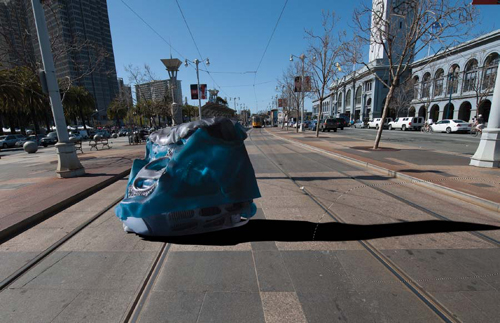
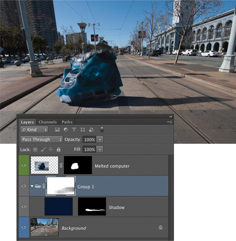
13. Click the Eyedropper tool and take a color sample of the darkest part of the lamppost shadow. Open the color picker and choose a darker, color-saturated section of the blue color that was selected. Fill the Shadow layer with this color.
Your shadow will take on a similar color to the lamp-post (FIGURE 13.47). You may have to sample and fill with several different colors before you get it just right.
Figure 13.47. The shadow is tinted blue by filling the shadow with a blue color sampled from the lamppost shadow.
To have more control over the color of your shadows, use a color fill layer instead of a regular layer filled with color. When you create your initial Shadow layer, choose Solid Color from the list that appears when you click the Add Adjustment Layer icon at the bottom of the Layers panel. This gives you a dynamic, flexible, and simple way of changing the color until you match it perfectly. Simply double-click on the Solid Color layer anytime, and it brings up the color picker. Choose your color and click OK.
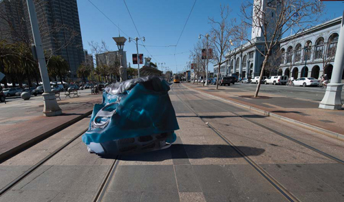
Shadow making is a progressive process. Taking a step back, you’ll notice that the shadow is too long. Compared to the lamppost, the CPU doesn’t warrant such a long shadow. With the way the file is set up, you can simply go to the Shadow layer mask and modify the shape by transforming the shadow layer mask until it looks exactly right (FIGURE 13.48).
Figure 13.48. The shadow is shortened by painting on the Shadow layer mask. It now looks more accurate.
In practice you’ll find that you’ll be modifying, tweaking, nurturing, and massaging your shadows over and over until they don’t betray your compositing handiwork, and most important, until they feel natural. The previous exercise uses only a single layer for the shadow, but often you’ll want to make your shadows from a combination of multiple layers, all with their own layer masks. It truly is an art, and you’ll have to practice and experiment until you find your own way of making excellent shadows. In the example image, we had the luxury of the CPU’s actual shadow as a reference for the shape. Often, you’ll have to create a shadow with no reference at all.
Whenever you shoot an element for compositing, be sure to include the entire shadow so that you have an accurate reference to work from.
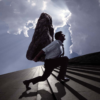
Here’s one of Jim’s composites with a distinct hard shadow (FIGURE 13.49).
© JP
Figure 13.49. Jim made this composite for a personal project. It shows an example of a hard shadow.
Soft shadows
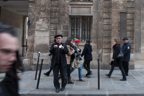
Not all shadows are as crisply defined and distinct as those that are cast by a point light source. Different light sources and lighting conditions cast all manner of different shadows. Multiple sources will cast multiple shadows, sometimes with each having a different quality or color. On cloudy days you may barely find a shadow at all (FIGURE 13.53).
© JP
Figure 13.53. In this Parisian street scene shot on a uniformly overcast day, notice how the only shadows that are apparent are those directly under people’s feet or a slight general darkening on the ground.
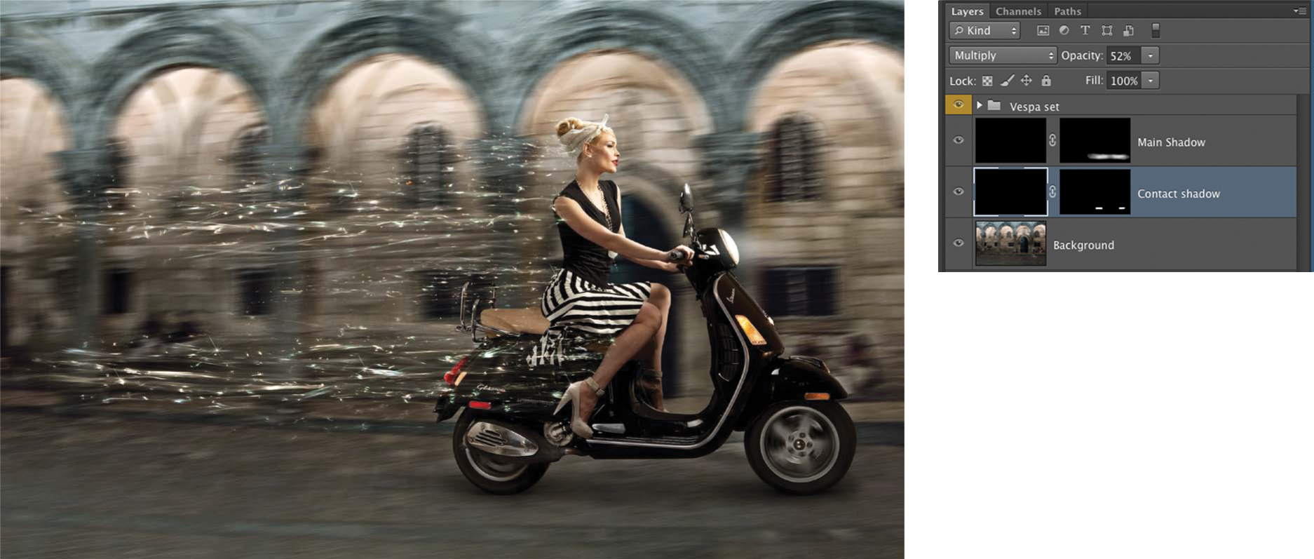
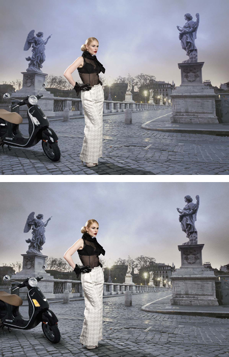
Creating soft shadows uses a similar method as that for hard shadows. You make a layer, set it to Multiply blending mode, fill it with black, and use a layer mask to control where and how much darkness you want. We’ll demonstrate this with a simple example using a composite that is completely finished except for its shadow (FIGURE 13.54).
© JP
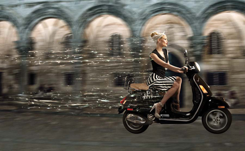
Figure 13.54. This fantastical scene of a beautiful young woman, who happens to be the illustrious Cynthia Kirchner, riding her Vespa through a European town, looks quite unfinished without a shadow to ground the Vespa. Holly Copeland did the exquisite wardrobe styling.
The first task we needed to complete was to create contact shadows below each tire (we’ll elaborate on contact shadows in the following section). A layer was made, set to Multiply, filled with black, and then a mask was added to the layer and also filled with black. The Shadow layer was placed between the Vespa and the background layers. Using a medium soft brush and painting on the layer mask with white, we then created a shadow everywhere we painted. (This is where your artistic sensibilities will come in handy.) The mask was painted on to reveal two little shadows in front of and behind each tire (FIGURE 13.55).
Figure 13.55. The first step in making the shadows for the Vespa scene was to create two contact shadows for the tires, as shown here.
Next, we created another shadow layer like the previous one, but this time using a large soft brush set to an Opacity of only 10%. We then painted a general area beneath the Vespa (FIGURE 13.56) to create a soft shadow that gave the entire composite a necessary sense of realism (FIGURE 13.57). Blending multiple layers is a versatile, flexible way of working with shadows because it gives you a great deal of control of the different areas of the shadow.
Figure 13.56. A second shadow was added, creating a large, soft, general darkness below the Vespa. This shadow is multiplied with the contact shadows because both of the layers are in the Multiply blending mode.
© JP
Figure 13.57. The final composite with the shadow in place. This shadow was made up of two shadow layers, one for the contact around the tires and one for the soft general shadow.
Contact shadows
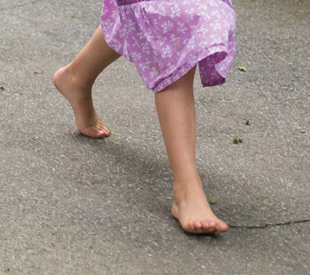
Two characteristics of shadows are worth noting. The first is that very often a shadow is darkest near the base of whatever object or person is casting the shadow and gradually gets lighter as the shadow moves away from the object. This may not be as apparent in crisp, direct sunlight because the shadows often appear to have uniform density, and although this is true sometimes, most shadows will get ever so slightly lighter as the distance from the object increases. Another characteristic of shadows that holds true is the contact shadow—a much darker shadow that occurs right at the point of contact of an object or person with the surface upon which the shadow is cast. Little light can reach these areas, regardless of the light source or circumstance, because it is the place where two surfaces meet. Notice the contact shadows in the two examples in FIGURE 13.58 and FIGURE 13.59.
© JP
Figure 13.58. On a fairly cloudy day, the contact shadows under this girl’s feet anchor her to the ground and the general soft shadow reinforces it. This can be replicated in a composite by making one shadow layer for the contact shadows and another for the general shadow, and controlling their values independently until you get the right balance.
© JP
Figure 13.59. Another cloudy day shot. The contact shadow originates near the player’s number and gets lighter as his legs come off the ground.
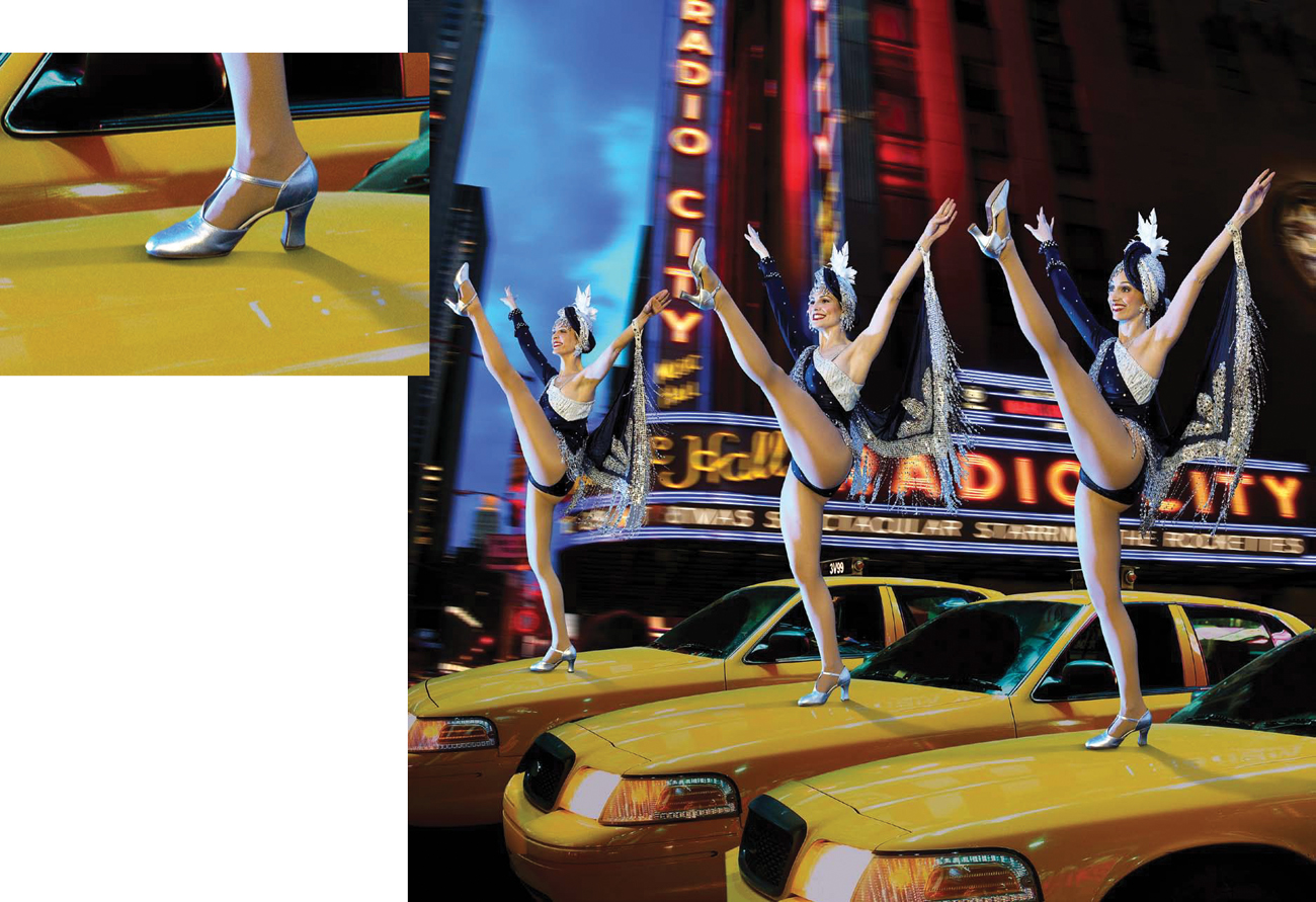
FIGURE 13.60 shows a composite Jim did for the Radio City Rockettes. The contact shadow, although subtle, was instrumental in anchoring the dancer’s feet to the top of the cab.
© JP
Figure 13.60. While Jim was working on the Radio City Rockettes Spectacular book for their 75th anniversary, he came up with this composite. See in the detail how important the contact shadow is to the believability.
It’s well worth your while to pay close attention to the behavior of shadows in real life and in your photographs. Study their attributes to learn what real shadows actually look like, so that when you need to create shadows that don’t exist, you’ll know how to render them. We cannot overstate how important it is to make excellent, convincing shadows to enhance believability in your photorealistic composites.
Creating Shape and Dimension
If we’re not careful when we make photorealistic composites, they can end up looking very flat and cut out. Even if all the masks are perfect, the elements are all properly scaled and in perspective, and all the images are lit well, they can still wind up looking fake and immediately unconvincing. One way to harmonize the elements after the composition has been established and everything is in place is to model dimensionality into the scene using light and shadow. Lightening and darkening local areas of the image can be achieved by using Levels adjustment layers, painting on layers, or burning and dodging. But no matter which method you use, the result will be the same. You will add dimensionality and depth to your composites.
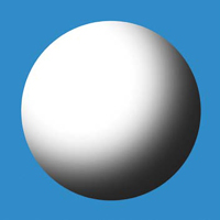
Let’s consider a very simple example to demonstrate how you can create dimension in a two-dimensional space just by painting with black, gray, or white. FIGURE 13.61 is simply a white circle against a blue background and is completely two dimensional. FIGURE 13.62 is the same circle with black and gray painted on it. Can you see how it instantly becomes a dimensional sphere? The same applies when you add highlights. FIGURE 13.63 is a black circle, but when painted on with white, it becomes three dimensional (FIGURE 13.64). These same principles of lightening and darkening can be utilized to create and enhance form in photographic composite images.
Figure 13.61. A two-dimensional white circle on blue.
Figure 13.62. Painting onto the circle with gray instantly makes the shape into a three-dimensional sphere.
Figure 13.63. A two-dimensional black circle on blue.
Figure 13.64. Painting onto the circle with white instantly makes the shape into a three-dimensional sphere.
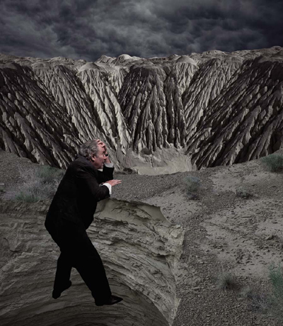
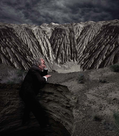
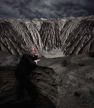
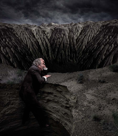
If you’ve studied art or drawing, you’ll be quite familiar with these principles, and they work incredibly well to help “sew” together the elements of a photographic composite. To demonstrate how well these principles work, we’ll refer to a composite Jim made to illustrate a story for Business Week that posed the question, “Is This a Double-Dip Recession?” The idea was to show a guy who just climbed out of a deep, dark, scary sinkhole to find that there’s another massive canyon in his path. With all of the elements masked and the composition in place, the image looks like a bad collage (FIGURE 13.65).
© JP
Figure 13.65. All the elements are masked and in place, but the composite looks like it was cut and pasted at this stage.
It’s important to have courage when you’re trying to bring your photorealistic composites from your mind into reality. Invariably, the first assemblies will look so rough that you’ll doubt whether or not the idea was all a big waste of time and if the composite will ever come together. Stay with the process and don’t give up, because if you focus your attention on one issue at a time, before you know it, you’ll have an amazing image. In this case, working from front to back, a shadow was added to the figure against the wall of the sinkhole. The next move was to darken the first pit and the foreground surface as well (FIGURE 13.66). The foreground looked better and the guy was more dimensional, but the top surface of the desert seemed too flat, and the concept was not yet working at all.
Figure 13.66. A shadow was added between the man and the wall, and the pit was darkened, as was the top surface.
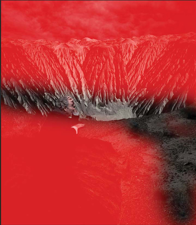
A Quick Mask was made by painting with a large, soft, black brush (FIGURE 13.67), and a Levels adjustment layer was added just to the selected area (FIGURE 13.68). It was a subtle move, but it gave a slight feeling of depth to the top surface. The last few moves brought the concept to fruition. Radically darkening the base of the pit enhanced the desired feeling of doom that a second recession evokes. It also provided a dark background for the protagonist to stand out from. His jacket was lightened, and finally a gradation was added to the sky to add depth and enhance the horizon (FIGURE 13.69).
Figure 13.67. A Quick Mask shows where Jim wanted to apply a Levels adjustment layer.
Figure 13.68. Levels was applied, slightly darkening the top surface of the ground as it moved away from the sinkhole, giving a feeling of depth.
Figure 13.69. The final touches that delivered the concept were a darkening of the bottom of the pit, lightening the guy’s suit, and a gradation in the sky.
When you’re trying to bring one of your composites to that sweet spot, you may be able to go directly to the optimal solution. But more likely, at least at first, you’ll want to try different interpretations of the scene. Locally lightening or darkening areas of the image through the use of Layer Masks, painting on layers, or dodging and burning can change not only the look of your composite, but can also change the concept of the image based on which areas are being emphasized and which are being subdued. If you’re not sure of the best way to model or nuance the lights and darks or your composite, try several versions and study each of them to see which is the most effective.
Layering Light
One of the useful and amazing features of Photoshop is the ability to composite nonsolid elements, such as light, into images. This is done through the creative use of the layer blending modes. It’s important to understand the principle behind their use to get the most out these features. Blending modes change the way that your selected layer appears in relation to the layers below it in the layer hierarchy. There are 27 different blending modes available; each one is driven by a different set of calculations that Photoshop performs on the layer (for more detailed information on layer blending modes, refer to Chapter 8, “Layer Essentials”). In this section, we’ll work only with the Screen blending mode, which is a lightening mode. Without going into the mathematics, a simple explanation of the way the Screen mode works is as follows: Photoshop compares the Screen layer to the layer(s) below it, and if the pixels in the Screen layer are darker than those below it, they become invisible. If the pixels are lighter than the underlying layers, they are visible. In short, it’s a great tool to use whenever you want to infuse light sources, fire, or glowing elements into your composites, because the Screen blending mode creates a very believable light effect. The darker the background is behind the Screen layer, the more believable the effect is for the same reason that a single light that’s illuminated in a dark room has a more distinct light quality than if the same light was turned on in a light room.
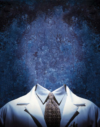
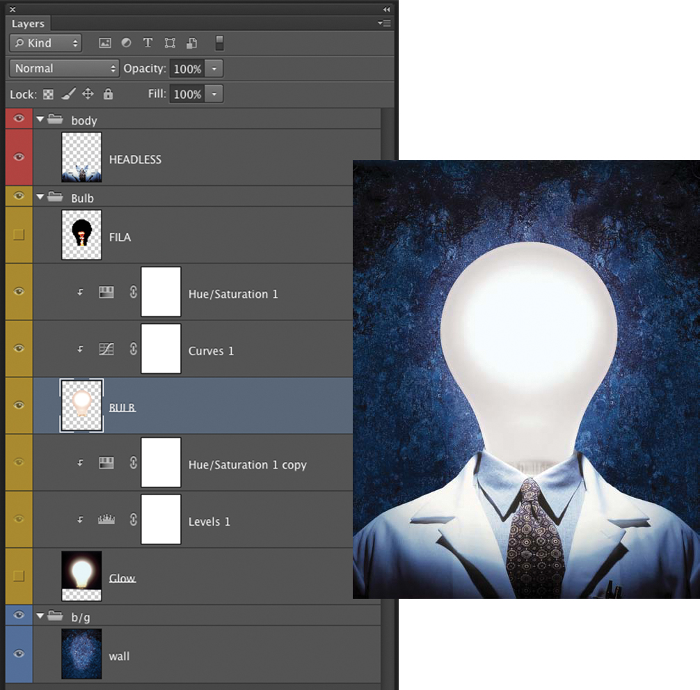
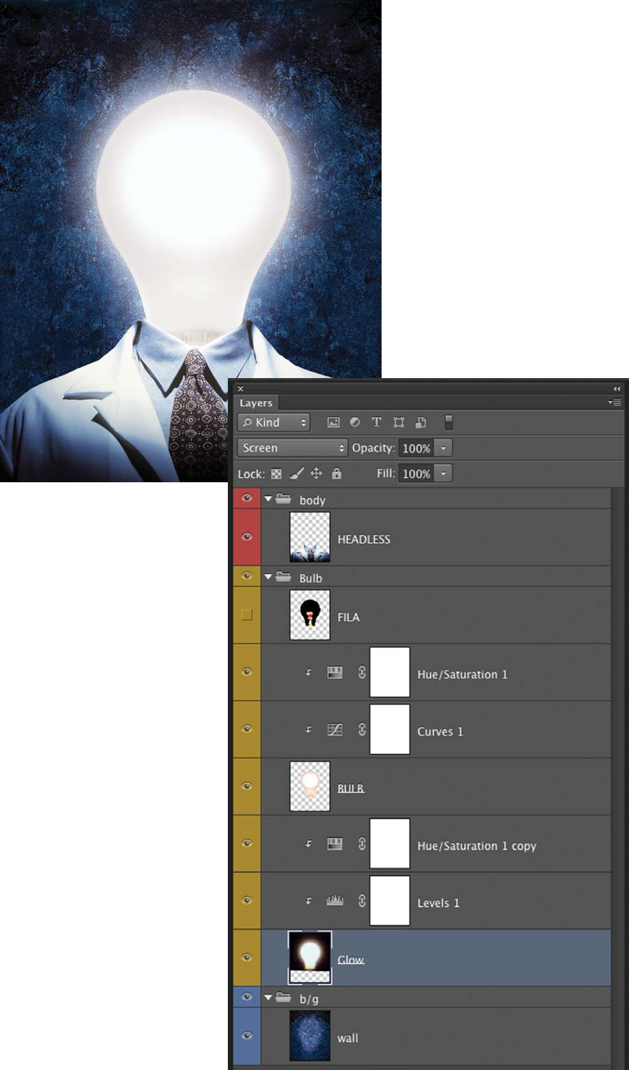
To demonstrate a technique for layering light, we’ll disassemble a composite that was predominantly based on the Screen blending mode. The image was made for the cover of Time Digital Magazine, which was about some of the new innovations in science and showed a man with a lightbulb for a head. Jim started with a simple two-image composite of a man’s torso and a deep-blue, textured wall background (FIGURE 13.70). The man’s torso was shot with a glow of light on his shoulders, so that when the bulb was added, the lighting would match. The background had already been lightened in the center and gradated darker toward the edges. Jim first added a photograph of a lightbulb that had a vector mask and was in the Normal blending mode (FIGURE 13.71).
© JP
Figure 13.70. The preliminary assembly shows a male torso with a blue wall surface that gradates light to dark from the center.
Figure 13.71. A photograph of a lightbulb was added using Normal blending mode.
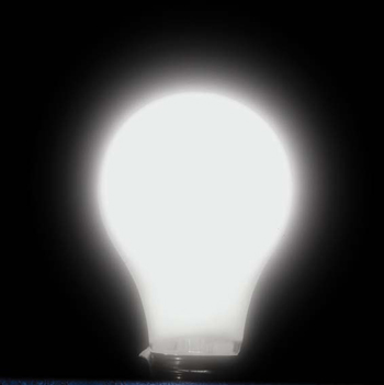
For Screen blending mode to work effectively, the element you’re trying to make into a light source must be photographed so that Screen can isolate it from its background. This means that you should shoot your light sources against solid black so that when overlaid, the background will become invisible. This is ideal because shooting light sources against black allows you to easily visualize the final appearance of the light source. The lightbulb was shot against black with a fog filter on the camera lens, and slightly overexposed (FIGURE 13.72). When it was brought into the composite and placed behind the normal bulb in Screen blending mode, it created a wonderful soft glow around the bulb (FIGURE 13.73).
© JP
Figure 13.72. A lightbulb was shot through a fog filter against black velvet.
Figure 13.73. Once the new lightbulb was brought into the composite and placed behind the Normal bulb in Screen blending mode, the glow effect was realized.
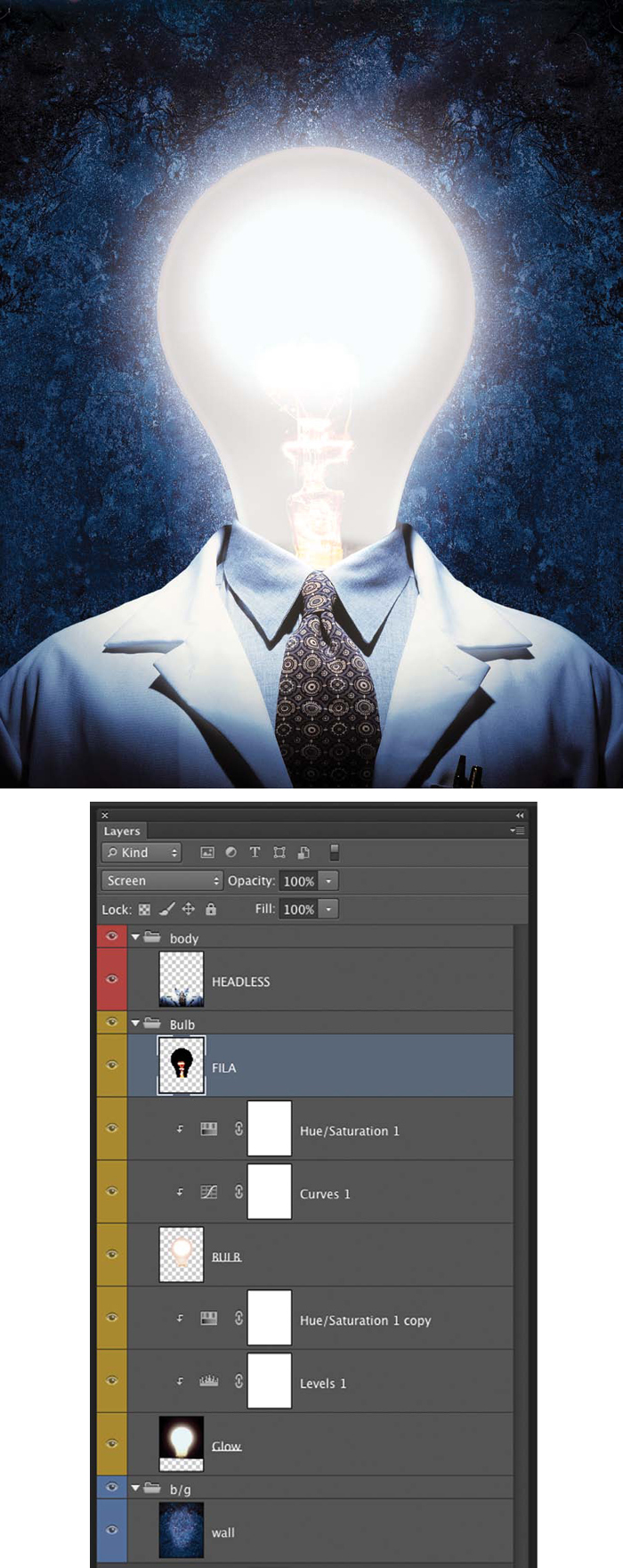
The final touch was to add a filament, which was also rendered in Screen blending mode (FIGURE 13.74).
Figure 13.74. The final composite that Jim did for the cover of Time Digital Magazine. Notice how the Screen blending mode creates a believable glow around the bulb.
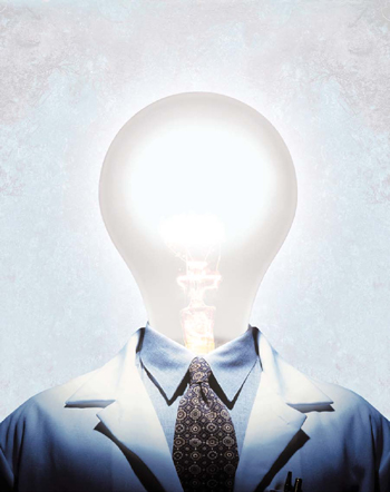
If the background is lightened dramatically, you can see that the Screen effect is still apparent but much less effective against the lighter background (FIGURE 13.75). To maximize the effect of layering light sources onto images, the darker the background, the more dramatic your results will be.
Figure 13.75. This version is meant to illustrate that light layering techniques are less effective against a lighter background.
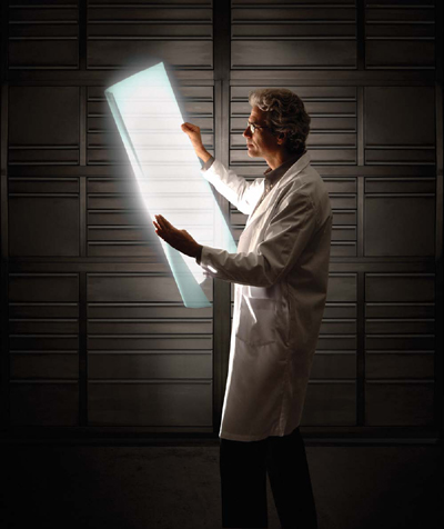
Whenever you use these light-layering techniques, you should make sure that you light the rest of the scene with the glowing object in mind. For example, a composite that Jim made to illustrate some of the new super-thin LCD screens being produced shows a scientist holding a glowing, flexible light form (FIGURE 13.76). The scientist was lit from the same direction as the sheet using a similar soft, directional light. When the sheet was added in with Screen blending mode, it appeared to be the only light source in the scene.
© JP
Figure 13.76. In this composite for an article illustrating a new LCD technology, the figure was lit with light that appeared to come from the screen he was holding. In this and with all photorealistic composites, matching the light is crucial.
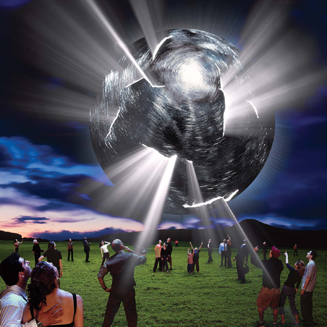
Screen blending mode works very well for light beams as well. In this composite of a UFO-like object above a field of people, light beams, which were originally shot on black, are rendered using Screen blending mode (FIGURE 13.77).
© JP
Figure 13.77. Light beams rendered with Screen blending mode add a dynamic energy to this unreal photo illustration.
Layering light with Screen blending mode is just one more tool for you to use to create effects or enhance realism in your creative or photorealistic composites. There are infinite ways to utilize this feature, and we encourage you to experiment, play, and explore ways to enliven your images through the use of this and other techniques shown in this book (FIGURE 13.78).
© JP
Figure 13.78. For an ad campaign for Texas Instruments, Jim had the opportunity to play with colored light in a series of images highlighting the company’s Digital Light Projection (DLP) technology. This one involved layering colored light rain over a model.
See if you can composite a glowing object into one of your images using the Screen blending mode. Start with a nice dark background so you can retain the nuance of the glowing light source that you’re layering into the scene.
Compositing Glass Objects
Continuing with the concept of blending modes and their advantages for certain types of photorealistic compositing, we’ll examine the process for compositing glass objects into a scene. It’s a very different process from compositing solid objects together, and the photography of your glass object is once again the key to a realistic result. The object must be photographed two ways: It must be shot against black with lighting that produces highlights that match your intended destination, and it must be shot silhouetted against white with no front lighting. Use a tripod and do not move the camera or the object in between the two shots, because they will need to be composed in register with one another. The practical way to do this is to set up both lightings at the same time and shoot them quickly in sequence so that there is little chance for the camera or subject to move.
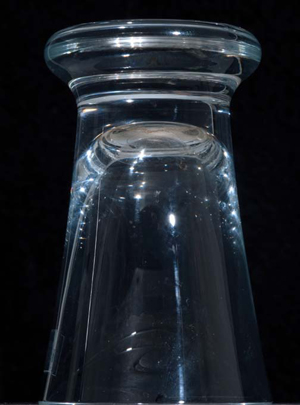
To demonstrate this process, we composed a glass into a tropical scene. The tropical scene was lit by direct sunlight, so we set up a glass in the studio against a black background and lit it with a single-point source light (FIGURE 13.79). When the glass was masked and brought into the tropical scene and its layer was set to Screen blending mode, it looked glasslike and almost worked (FIGURE 13.80). All the black pixels became invisible and just the highlights were apparent and looked approximately correct. The problem was that the glass looked ghosted, and anyone would easily be able to detect that this was a Photoshop blend because it didn’t look like it was truly there.
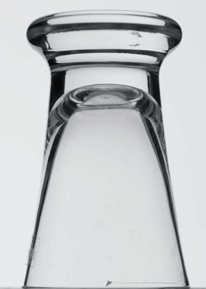
Figure 13.79. An inverted glass shot on black with a single point light source. This image was just used to composite the highlights of the glass.
Figure 13.80. When Figure 13.79 was composed into the tropical scene and its layer was set to Screen blending mode, the black disappeared and the highlights created a glasslike rendering of the object but was still not acceptably realistic.
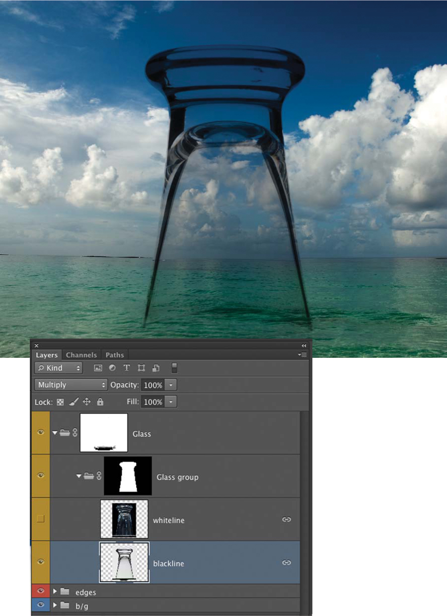
The next step was to photograph the glass as a silhouette against a white background without any highlights on the glass (FIGURE 13.81). This is known as a black line effect because it shows the density of the glass. The thickness of the black lines can be increased by moving black cards closer to the subject or decreased by moving them farther away from it. When this element was composed into the scene and its blending mode was set to Multiply, the glass took on a very different look (the previous highlight layer is not visible here) (FIGURE 13.82). In this version, the density of the glass is apparent, but it appears dark and unreal, as if the lights were turned off.
Figure 13.81. An inverted glass was shot as a silhouette on white with no front light. The density of the black lines can be controlled by black cards to the left and right of the subject moving in and out of frame.
Figure 13.82. When Figure 13.81 was added to the scene in Multiply blending mode, the density of the glass was rendered, but it still didn’t look photorealistic.
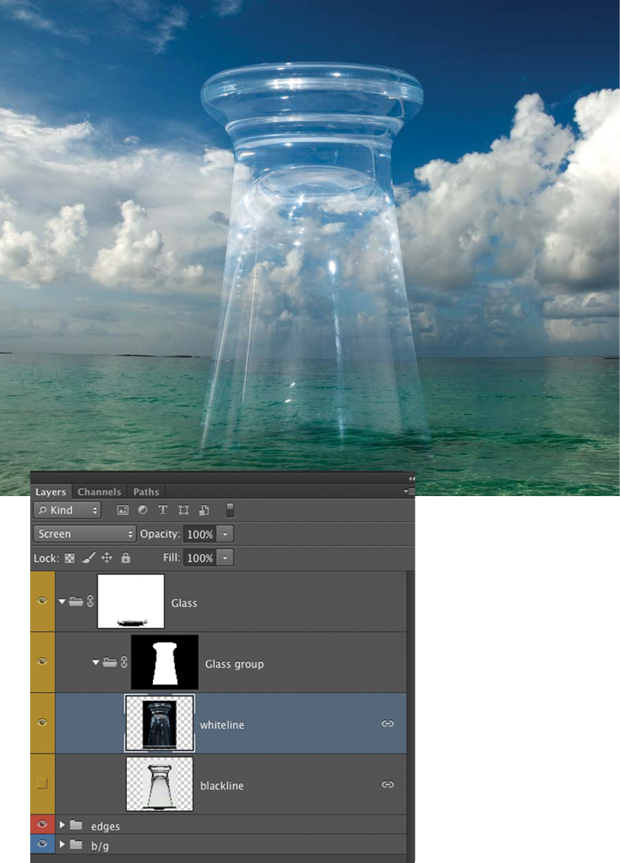
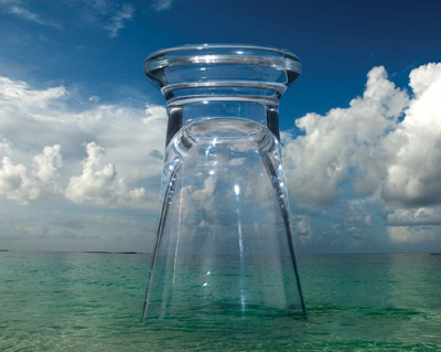
When the highlight layer (sometimes called white-line) was above the black line layer in the layer hierarchy and they were both visible and in register, the glass looks incredibly, realistically rendered into the scene (FIGURE 13.83). The black line gave the object density, and the highlight layer emphasized its reflective and glasslike qualities. This technique can be used on any transparent objects that can be shot in both lighting scenarios without the subject or camera moving.
© JP
Figure 13.83. The glass appeared realistically rendered with both the whiteline (highlight) layer and the black line layer visible.
Optimizing Perspective and Scale
Two of the primary image characteristics that you must optimize in your photorealistic composites are perspective and scale. This subject was discussed in great detail in Chapter 5, “Perspective, Point of View, and Scale,” so refer to that chapter for the more technical aspects of matching perspective and controlling scale. Essentially, matching perspective takes place at the photography stage of the process. If your elements are photographed with mismatching perspective, there is not that much you can do in the compositing stage to correct it. Sure, Photoshop has amazing transformation tools, but they cannot fundamentally change the angle of the camera. Small shifts can be made to meld images that are only slightly off, but major shifts should be addressed with a reshoot.
When you’re combining images that rely heavily on linear perspective or where perspective is a principle factor, the process is to make a rough composite of your image, matching the elements’ perspective as closely as possible. Live with the composition for a little while and keep adjusting the relative scales of elements whenever you find that something doesn’t look exactly right. Sleep on it and look at it the next day. Maybe even get others’ opinions; if a trusted colleague says it doesn’t fit together right, revisit it again. Sometimes it will look good to you after staring at it for 16 hours, but when others see it with fresh eyes, they will immediately be able to identify an issue with scale or perspective—it jumps out.
Refer to the background scene, and study it in great detail while you plan and photograph the elements that you’ll place into the scene. It can be helpful to work from the background to the foreground while establishing the composition in a rough composite, although not in all circumstances. The following examples were built from background to foreground.
For an illustration that Jim did for Wired magazine about potential life on Mars, he started the composition by establishing the sky and landscape first, and then shot the underground tubes to specifically match the landscape (FIGURE 13.84). The compositing process is often a back-and-forth building process between the camera and the computer. As you establish each element starting at the far background, build it right into the composite, and as you shoot each element, do a rough mask and drop it into the working composite. You can then see how well it fits and make any angle or perspective adjustment that you need to before you move on to photographing the next element. FIGURE 13.85 shows the breakdown of the image from back to front.
© JP
Figure 13.84. For an illustration about potential life on Mars, Jim designed this composite by establishing the landscape first and then shooting the tubes in perspective to match the landscape.
Figure 13.85. The image breakdown of the Mars composite.
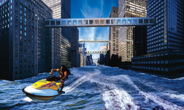
Similarly, in another project for Wired magazine on the subject of climate change, Jim made the humorous illustration in FIGURE 13.86 that shows a “Jet Ski messenger” blasting down a flooded Park Avenue. He first needed to establish the background, so he shot a series of four vertical images from the 7th floor of the Helmsley building right in the middle of Park Avenue. Those four images were composed together to make the background. The bridges, water, and distant boat were added all before the shoot of the Jet Ski, which was the last component. The Rastafarian was photographed on the Jet Ski from a few different angles and quickly masked and dropped into the composition. Once the ideal angle was determined, Jim shot a series of poses and expressions from that position to have some options.
© JP
Figure 13.86. This photo illustration for Wired magazine was composed from back to front with the architecture as the controlling element. The entire background had to be established before the photography of the Jet Ski messenger could be executed.
Focus, Sharpness, and Resolution
Photorealistic composites are most believable when all the image characteristics match. As mentioned previously, the lighting, perspective, and scale are the most prominent factors to address in the photography stage of the process. But other important characteristics that must be matched are the focus, sharpness, and resolution of the elements:
• Focus refers to which area of the image is sharpest and therefore which is emphasized. With a portrait, your subject may be in focus, but you may want to have the background out of focus.
• Sharpness refers to the degree of clarity and acuity that exists within the entire image. For some subjects, you may want everything to have a razor sharp quality, whereas for another, a more dreamlike look will necessitate a softer image.
• Resolution refers to the pixels per inch of the digital file you’re working from. It also refers to the degree to which the digital sensor, which recorded the image, and the camera lens, are able to define the details of the image. The resolution of digital cameras is defined in megapixels. A camera with a 3-mega-pixel chip is considered low resolution, whereas a camera with a 22-megapixel chip is considered high resolution. This relates to composite images in the following way: The elements of your composite should have matching resolution to maintain a uniformity of quality. If four out of five elements were shot in high resolution and the fifth was shot in low resolution, it would stand out and diminish the believability of the entire composite, unless the low-resolution element is rendered very small. We recommend doing all your photography at the highest possible resolution so that you have the option to downsize or use a section of the image. A single element that has mismatched resolution to the rest of the composite will betray your composite work.
When you’re compositing images, each element should be shot entirely in focus. You would not want the back edge of an element to go out of focus for two reasons: first, it will be hard to mask a soft edge, and second, if it is placed in a scene that is sharp throughout, it will also give away your handiwork. This is not to say you can’t employ shallow depth of field in your composites; you can. You must assemble all the elements in focus and at full resolution, and once the assembly is complete, you can go back and use selective Gaussian Blur filters on the areas you want softened.
For instance, the portrait in FIGURE 13.87 of Henry Davis, one of Jim’s collaborators, is shown with all the images assembled at full resolution, and each element is razor sharp. All of the elements have matching resolutions. When everything in the image is sharp, the background competes with the foreground and the eye doesn’t know where to focus its attention. Jim wanted Henry to be the hero of the photograph, so he ran a Motion Blur filter on the subway train and a Gaussian Blur filter on the building layer (FIGURE 13.88). The background immediately falls back and Henry comes forward. By starting with your image with all the elements sharp and then selectively softening or blurring various elements, you can define the point of focus or emphasis in your photorealistic composites.
© JP
Figure 13.87. This composite portrait of Henry Davis has three sharp elements: Henry, the train, and the building. All the resolutions match.
Figure 13.88. When a 205 pixel Motion Blur is added to the train layer and a 16 pixel Gaussian Blur is added to the building layer, the emphasis on the portrait shifts to Henry and away from the background.
Image Texture
Even if a photorealistic composite has been executed seamlessly, it almost always helps to run a uniform texture over the entire image to help unify and harmonize the elements. One simple way to do this is to make a new layer, fill it with 50% gray, and set its blending mode to Overlay. It will be invisible. Place this layer at the top of your layer hierarchy, and any texture you apply to the layer will be visible to all the underlying layers.
If you run an Add Noise filter to the gray overlay layer, it will create a uniform grain texture overall. Add Noise creates a very sharp grain, so if you run a Gaussian Blur filter on the grain layer, it will take the edge off the grain sharpness. The Gaussian Blur will have to be set to a fraction of a pixel, or the grain will be obscured entirely. It is especially good to add texture to blurred layers, as shown in the portrait of Henry from the previous section (FIGURE 13.89). The difference may not be apparent when the image is reproduced at a small size, but looking at the detail, you can see the way that the grain helps to “sew” the elements together in a natural way (FIGURE 13.90).
Figure 13.89. The Add Noise Filter has been run on Figure 13.88 to better meld the elements by overlaying a uniform grain.
Figure 13.90. Depending on how large the image is reproduced, the grain effect may not be as apparent. In this example, the image on the left has no overlaying texture, whereas the detail on the right has an Add Noise filter set to monochromatic and Gaussian.
Some people make the mistake of doing sloppy composite work and then thinking that they will be able to obscure any mistakes by running a heavy grain over the image. Although it may seem like it works in some cases, we greatly discourage this practice. We recommend doing impeccable Photoshop work at every stage of the process and then when you overlay grain, it will simply add the perfect finishing touch (FIGURE 13.91 and FIGURE 13.92).
© JP
Figure 13.91. Jim made this composite for the cover of Wired magazine. If you look at the detail, the background seems to have a grain texture that is larger than the woman or the wings.
Figure 13.92. When the Add Noise filter is run over the image, it appears to harmonize the quality of all the elements in a natural and subtle way.
Creative textures
Many other grain filters are available from third-party sources that replicate film grain, and you can also run any of the texture filters on your gray overlay layer to produce a more creative effect. The problem with using any of the Stylize or Texture filters in Photoshop on your entire image is that these filters are also being used by all of the millions of Photoshop users, so your image will almost inevitably look like any other image run with the same filter. Adding a custom texture that you photograph or scan, such as a building wall or distressed surface, can give your image a wonderful effect and a unique style. Overlaying multiple textures can also increase dimensionality and depth. Heavy use of textures can take your images out of the realm of photorealistic composites and into creative compositing, but the category doesn’t really matter as long as the image is a success to you. Giselle Behrens, who you may remember from Chapter 5, uses textures very effectively in her series “La Feminina” (FIGURE 13.93 and FIGURE 13.94).
© Giselle Behrens
Figure 13.93. Giselle Behrens used her photograph of water and bubbles to overlay this composite, which is part of her “La Feminina” series. Because it’s done in such an artistic manner, the images integrate very well and the result is a unified whole.
© Giselle Behrens
Figure 13.94. Another image from “La Feminina”; in this one, a more subtle texture has been added for an illustrative effect.
Interfacing transitions
The interfaces where your elements meet are the crucial areas that can make or break your composites. First and foremost, you must make perfect masks. But beyond that, you must make sure that all of these junctions look as they would if the image was a straight shot. Especially if you are creating an effect where your subject is in water, sand, or grass, a hard-cut, straight mask will not do the trick. If you infuse elements of the medium you’re composing into in the transition area, you will greatly increase the realism of the composite while covering your tracks. A perfect example is the “Runaway Beauty” image from Chapter 3, “Planning and Preparing,” shown here without any of the transitions in place (FIGURE 13.95). This composite looks completely unbelievable without an effect or artifact that will connect the horse to the snowdrift.
Figure 13.95. The “Runaway Beauty” image from Chapter 3 is shown here without any transition between the horse and the snow.
Transitions can be some of the most difficult elements to add to a composite because often they’re not solid, such as water, fire, snow, sand, and so on. You should allow yourself some time to play with different interpretations of how they can be manifested. For the “Runaway Beauty” image, Jim first tried adding footprints to the snow with some snow flying up (FIGURE 13.96). These images were taken of actual snow scenes for a different project, and they helped but still didn’t look right. Jim then decided to shoot some studio effects of powder blowing and added them to the scene (FIGURE 13.97). Much time was taken trying different versions and various shapes and densities of snow.
Figure 13.96. First, three footprints are added, two with snow spray. This was the beginning of the layering process for the snow transitions.
Figure 13.97. After shooting a series of powder explosions in the studio, Jim added two more snow layers. The action around the horse’s feet started to look good, but there was still a static quality to the composite.
A spray of snow added over the lower part of the horse’s body provided a nice screen for the underlying transitions and increased the action (FIGURE 13.98).
Figure 13.98. A more general snow spray was added over the lower body of the horse, and it seemed to increase the speed and action. To get this effect, Jim shot a series of white powder patterns against black in the studio and used the Screen blending mode to apply them to the scene.
Once the snowfall was added to the whole scene, all the snow transitions came together in a more natural way (FIGURE 13.99). When you’re creating transitions, you’ll quickly find that it takes a great deal of effort, attention, and persistence to form the shapes and nuances that appear to mimic reality and fully express your vision.
Figure 13.99. The final composite with all the transition layers in place. Even the general snowfall in the scene can be considered a transition because it helped fuse all the elements together.
Details Matter
There’s nothing wrong with taking your time to make your composites: Don’t rush the process. Keep working the composite like a painting, area by area, solving one issue at a time. Be patient. There’s nothing worse than rushing a composite and seeing it in print with the mistakes and cut corners glaring out at you. A good practice is that once you have addressed every issue in the composite that you can think of, zoom into your document at 100%, start in the upper-left corner, and sweep through and inspect the entire grid of the document at that magnification. You’ll be surprised at how many little imperfections you will be able to find and fix.
When all the major issues with the composite are resolved—the composition is set, the colors are balanced, and all the transitional and stylistic elements are in place or applied—it pays to take a step back and review your work. At this point, you should know if the image is working conceptually and aesthetically. It’s worthwhile to review the telltale signs of bad composites before you move on to the finessing stage. Finessing an image takes time and attention, and there is no point in going through the process unless you’re absolutely happy with the look of the image and want to take it to final.
Telltale Signs of Poor Composites
It can be helpful to refer to a checklist of attributes that will always degrade the believability of your photorealistic composite no matter how good the rest of your work on the image. Once you get to a point where your image is nearly finished, review the following list and verify that none of these attributes are present in your work.
• Mismatched light. Check each element in the composite, and make sure the light direction and quality matches. If the direction, quality, or color is only slightly off, you may be able to make a correction in Photoshop that will harmonize the lighting. If the lighting is way off, the best solution is to reshoot the elements, paying more attention to the lighting.
• Mismatched perspective and scale. Nothing screams “bad composite” louder than elements that are too large, too small, or not in perspective to the scene. If one or more of these factors are present, it’s back to the drawing board. See what you can do just by changing the scale of elements or distort them to try to match perspective. If the perspective is way off, go back through your original shoot of the elements and see if there’s another angle that works better. Make sure perspective and scale are perfect before you waste anytime finessing.
• Mismatched resolution. Look at each element at 200% magnification and compare its resolution and sharpness to all the other elements in the composite. If some elements are lower resolution than others, they will stand out. Sharpen the low-resolution elements using Unsharp Mask and soften the high-resolution elements until they match. Add a grain layer to the whole image to unify the image. If a low-resolution element is so off that matching the rest of the image to its quality will degrade the entire image, replace the element. Either find something else or reshoot.
• Bad shadows. Even if all of the preceding characteristics are perfectly matched, poorly made shadows will thwart all your good work. They stick out like a sore thumb. Look at each shadow critically for direction, edge quality, and gradation within the shadow. Continue to modify and finesse them until they are perfect. This is an entirely Photoshop process; you won’t need to reshoot; just continue to massage them until they look absolutely perfect.
• Unbalanced color. If the color balance of all the elements is not coherent, it will give away your handiwork. This is one of the easiest characteristics of all to fix; just keep tweaking the adjustment layers of each element until you’ve achieved the ideal balance. Stepping away and coming back to the composite after a break enables you to diagnose the problem more easily sometimes.
• Bad masks. If you’ve been working nondestructively, you won’t have applied your layer masks yet and can still edit the edge quality of each of your elements. Evaluate every masked edge in the composite and correct each as necessary. If the edges are too hard, soften them; if they are too soft, harden them. Hair masks must be perfect or they will ruin everything. Practice the skills and make it happen.
• Liquify or distort artifacts. If you use the Liquify filter or the Puppet Warp Transform, or you’ve distorted any element too extremely, your composite will scream “Photoshop!!!!” to all who see it. Make sure when you use these tools you do so judiciously and subtly so you don’t betray your machinations. This is also true for many of Photoshop’s filters; go easy and cover your tracks.
Finessing the Final Image
Finessing is the very last stage of the compositing process. It’s the stage where after you’ve solved every issue on the preceding list of telltale signs of poor composites you scour the image and see where you can improve it. You might ask the following questions: Does this element need a little modeling so it sits more comfortably into its shadow? If the sky is brightened a bit, will it pull the composition together? Is the model’s gown flowing correctly, or do I need to tweak the shape of the fabric? Does the edge of this element need to be just a hair softer?
There’s a lot of fine brushwork involved in finessing an image, and your goal is to knit your composite together with your refinements. Sometimes these refinements are so incremental that you may not be sure anyone would ever notice whether you did them or not. Don’t hesitate to do them anyway because the net effect of all your detail work is to increase realism. It’s difficult to quantify the steps you take to finesse an image because each image has its unique set of requirements.
Here are two examples shown before and after finessing: FIGURE 13.100 shows a section of a finished composite, and FIGURE 13.101 shows a complete composite image. The changes are subtle. This is where your artistry comes into play. Your dedication will pay off and eventually, once you’ve addressed every conceivable nuance and issue you can think of, you will click Save and call it finished. You are the only one who knows when your vision has been realized and expressed.
© JP
Figure 13.100. In this detail from a book cover image, the top version is shown before finessing and the bottom version has been finessed. The fabric has been altered, the shadows are more nuanced, the Levels have been balanced, and the masks are all fixed.
© JP
Figure 13.101. This fashion illustration of the incomparable Cynthia Kirchner is shown before finessing (above) and after finessing (below). The contrast has been increased, the saturation lowered, the shadows made more realistic, a parking light has been added to the Vespa, and the studio highlight reflection is removed. Holly Copeland did the wardrobe styling for this image.
Closing Thoughts
The dedication required to create a successful photo-realistic composite can be overwhelming. The skills you need to hone, the sheer volume of work that it requires, and the time it takes to get it right, all conspire to discourage you from taking on the challenge. But if you have an image in your mind that you feel compelled to manifest into a photorealistic composite image, you can do so with the skills you’ve learned in this book. Be bold and take the challenge! You won’t regret it (FIGURE 13.102).
Figure 13.102. “Red Jaguar” is an image from Jim’s “Winged Women” series of large-scale, fine art prints.

