
CHAPTER 1
How to Use the Plug-ins
Because CSS is supported by all major browsers, you might think that using it is as easy as having a text editor and a web browser. Well, you could get by with just those, but there’s actually a lot more to it if you want to produce pages that display to their best on all major browsers.
First of all, although CSS is available on almost all web browsers, it varies slightly between them in the way certain features are implemented, including differing amounts of spacing around elements, and even sizes of elements. This means you need to be able to test your web pages on all the main browsers to ensure they display well in all cases.
Therefore, if you use Mac OS X or another operating system such as Linux, you really need to also have access to a Windows computer because recent versions of Internet Explorer are available only for that operating system.
Downloading and Installing Web Browsers
Table 1-1 lists the five major web browsers and their Internet download locations. While all of them can be installed on a Windows PC, some of them are not available for OS X or Linux. The web pages at these URLs are smart and offer up the correct version to download according to your operating system, if available. Before proceeding with this book, I recommend that you ensure you have installed as many of these browsers on your computer as you can.
If you’re running any version of Windows from XP onwards, you will be able to install all the browsers, but on other operating systems it’s not quite so easy. For example, on Mac OS X (because development of IE for the Mac was halted many years ago when it reached version 5), you can install all the browsers except for Microsoft Internet Explorer. And although it’s possible to install the Wine windows application interface on a Mac and run Internet Explorer using it, I have found it to be a laborious process with inconsistent results. Therefore, I wouldn’t recommend that method. Neither would I suggest you rely on those web sites that take screen shots of a web page in different browsers, because they can’t tell you whether the mouse, keyboard, and other features are working well, or at all.
Instead, your best option is to either perform a dual install of Windows alongside Mac OS X, or ensure you have access to a Windows PC. After all, unless you intend to develop only for Mac computers, people using a Windows operating system will represent the majority of your users by far.
As for Linux, not only does it not have access to Internet Explorer, there is no version of Safari either, although all the other browsers do come in Linux flavors. And, as with OS X, while various solutions exist that incorporate Wine for running Internet Explorer, they only seem to work with some distributions and not others, so it can be a bit of a minefield trying to find a bulletproof way for you to run Windows browsers on Linux.
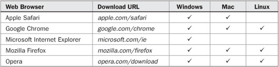
TABLE 1-1 Web Browser Download URLs and Supported Operating Systems
So what it all comes down to is that, if you will be developing on a non-Windows computer, I recommend you arrange to have access to a Windows PC, or have Windows installed as a dual boot (or a virtual machine) alongside your main operating system so you can fully test your web sites before publishing them to the web at large.
Older Versions of Microsoft Internet Explorer
The latest version of Internet Explorer (IE8 at the time of writing, although IE9 is definitely in the works) has made tremendous strides towards compatibility with the other major browsers, but there are still large numbers of users running IE7 and even IE6. According to statcounter.com, as of mid 2010 the breakdown of browsers by use was that shown in the screen grab in Figure 1-1.

FIGURE 1-1 Browser market share as of June 2010
Because each version of Internet Explorer works differently (with IE6 and IE7 having over 25 percent of all users between them), besides testing your web pages in the latest versions of the main browsers you also need to test them in these older versions, too. I know, it’s a pain, but it has to be done. Luckily, though, there’s a trick to make this easier than it might otherwise be.
Emulating Internet Explorer 6 and 7
To aid developers who have designed web sites to work specifically with older versions, the developers of Internet Explorer created a meta tab that you can add to the head of a web page to make IE think it is an earlier version of itself. Here are the two main meta tags you would use.
<meta http-equiv="X-UA-Compatible" content="IE=7" />
<meta http-equiv="X-UA-Compatible" content="IE=5" />
And this is an example of how you would incorporate the IE7 tag:
<html>
   <head>
      <meta http-equiv="X-UA-Compatible" content="IE=7" />
      <title>My Website</title>
  </head>
  <body>
  … Website Contents …
There is no IE=6 option (presumably because the rendering engines for IE5 and IE6 are so similar), so using the IE=5 option makes Internet Explorer enter what is known as “quirks” mode, in which it behaves like both IE5 and IE6.
Incidentally, if you wish to force Internet Explorer into full standards mode (to be as compatible as possible with other browsers), you can use the option IE=8. Or, without the meta tag, Internet Explorer will use its own proprietary and optimal settings, known as “edge” mode—which you can also select with the option IE=edge. Of course, once you have finished testing, you should remove or comment out these meta tags unless you wish to use one for a particular reason.
In addition, you should always ensure you have a suitable HTML doctype declaration at the start of each document. For example, the most commonly found doctype is the following, which has been fully tested and works with all the plug-ins in this book.
<!DOCTYPE HTML PUBLIC "-//W3C//DTD HTML 4.01 Transitional//EN"
"http://www.w3.org/TR/html4/loose.dtd">
TIP If you use a different doctype from this, certain plug-ins may behave differently, and you may find you have to slightly modify them. I often use both the preceding “loose” doctype and the IE7 meta tag to get the most compatible results with other major browsers. Remember that if IE behaves strangely when all other browsers appear to work well with your web pages, the solution could be to change the doctype and/or IE5/IE7 meta tags. If you are interested in the subject of browser compatibility and its various nuances, I recommend visiting the Quirks Mode web site at quirksmode.org.
The Companion Web Site
To save you the effort of typing them all in, you can download the plug-ins from this book’s companion web site at plugincss.com (see Figure 1-2).
Click the Download link to download the file plug-ins.zip, which is an archive file (easily extractable on all operating systems) containing all the plug-ins. Once extracted, you’ll find all the plug-ins in numerical order, saved in the file PC.css. There is also a file called ReadMe.txt which contains the latest details about the plug-ins, including any improvements or updates that have been made since this book was published.
Additionally, there are various example files showing the use of each plug-in, which you can load into a browser to try out for yourself.
Accompanying these are a couple of JavaScript files called PJ.js and PC.js, which are explained toward the end of this chapter in the section on JavaScript, and which are used by the plug-ins in Chapter 12.
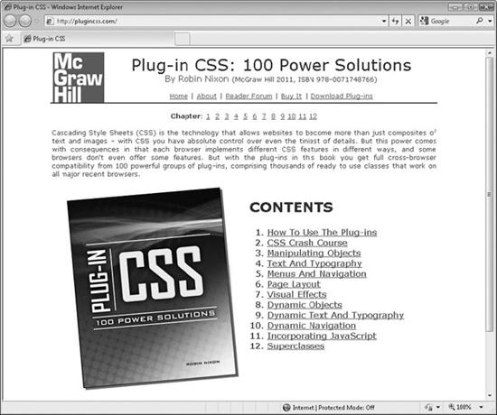
FIGURE 1-2 The companion web site at plugincss.com
CAUTION By default, Windows computers may not show the file extensions unless you have enabled this facility, in which case the files will simply show as index (instead of index.html) or PC (instead of PC.css) and so on.
About the Document Object Model
When HTML was invented, one of the fundamental design decisions was to base it around a Document Object Model (DOM). This is a means of separating out all the different elements within a web page into discrete objects, each with their own properties and values. It was a very smart decision because it led to the introduction of style sheets, enabling a web page’s content to be completely separated from its styling, and also makes HTML documents easily modifiable by languages such as JavaScript to provide dynamic user interaction.
When a web page is placed into a DOM, it is a simple matter for you to style every aspect of it with CSS. For example, each heading will be within pairs of tags such as <h1> … </h1> and a single CSS instruction can set the styling of all such occurrences within a document, changing the font used, its size, any font decoration, and so on. This lets you completely change the design of a page without altering the HTML and, as you’ll see in some of the later plug-ins, some style settings can even apply dynamic effects to page elements (such as changing their color and other properties) when the mouse passes over them, or even create transition effects by using proprietary browser extensions.
How the DOM Works
The Document Object Model separates the different parts of an HTML document into a hierarchy of objects, each one having its own properties. The term property is used for referring to an attribute of an object such as the HTML it contains, its width and height, and so on.
The outermost object possible is the window object, which is the current browser window, tab, iframe, or popped-up window. Underneath this is the document object, of which there can be more than one (such as several documents loaded into different iframes within a page). And inside a document there are other objects such as the head and body of a page.
Within the head there can be other objects, such as the title and meta objects, while the body object can contain numerous other objects, including HTML tags with headings, anchors, forms, and so forth.
Figure 1-3 shows a representation of the DOM of an example document, with the title “Hello” and a meta tag in the head section, and three HTML elements (a link, a form, and an image) in the body section. Of course, even the simplest of web pages has more structure than is shown here, but it serves to illustrate how the DOM works. Starting from the very outside is the window, inside which there’s a single document, and within the document are the various elements or objects, which connect to each other.
In the figure, properties are shown with a darker background and in italics. For example, the value “robots” is a property of name, which is a property of meta, and so on. Although it isn’t shown in the figure, the meta tag should have another matching property called content, which would contain a string specifying which robots may access the web page.
Other properties are “http://google.com”, which is a property of the href tag (itself a property of a, and so on), and “Hello”, which is a property of title. All the other items are objects or object argument names. If the figure extended further down and sideways, other objects and properties attached to the ones shown would come into view. A couple of the places where these would appear are shown by unconnected dotted lines.
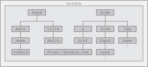
FIGURE 1-3 Example of a DOM showing head and body sections
Representing this as HTML code, the structure of the head section looks like this:
<head>
   <meta name="robots" content="index, follow" />
   <title>Hello</title>
</head>
And the body section of HTML might look like this:
<body>
   <img src="/images/welcome.jpg" />
   <a href="http://google.com">Visit Google</a>
   or enter your username and password to continue…
   <form id="login" method="post" action="login.php">
      <input type="text" name="name" />
      <input type="password" name="password" />
      <input type="submit" />
   </form>
</body>
Remembering that these two sections of HTML are part of the same document, we would bring them both together inside an <html> tag, like this:
<html>
    <head>
       <meta name="robots" content="index, follow" />
       <title>Hello</title>
    </head>
    <body>
       <img src="/images/welcome.jpg" />
       <a href="http://google.com">Visit Google</a>,
       or enter your username and password to continue…
       <form id="login" method="post" action="login.php">
          <input type="text" name="name" />
          <input type="password" name="password" />
          <input type="submit" />
       </form>
    </body>
</html>
Of course, a web page can look quite different from this, but it will usually follow the same form, although that’s not always the case because most browsers are very forgiving and allow you to omit many things, such as the closing tags at the end, and the opening ones, too, if you choose. I don’t recommend you do this though, because one day you might want to convert your page to XHTML, which is a lot stricter. So it’s always a good idea to close every tag, and make sure you do so in the right order. For example, you shouldn’t close a document by issuing </html> followed by </body> because the proper nesting of tags would be broken by this reversal.
For the same reason, you should also get into the habit of self-closing any tags that do not have a closing version, such as <img src=“…” />, which does not have a matching </img> tag, and therefore requires a / character right before the final > in order to properly close it. In the same way, <br> becomes <br />, and so on.
You should also remember that arguments within tags must have either single or double quotation marks to be XHTML compatible, even though nearly all browsers allow you to omit them.
NOTE In the early days of the Web, when most users had very slow dial-up modems, it was common to see all manner of things such as quotation marks and various tags omitted from web pages. But nowadays, most of your users will have fairly decent bandwidth speeds, and there’s no longer any reason to do this.
About Cascading Style Sheets
Using CSS, you can apply styles to your web pages to make them look exactly how you want. This works because CSS is connected to the DOM so you can quickly and easily restyle any element. For example, if you don’t like the default look of the <h1>, <h2>, and other heading tags, you can assign new styles to override the default settings for the font family and size used, or decide whether bold or italics should be set, and many more properties, too.
One way you can add styling to a web page is by inserting the required statements into the head of a web page between the <head> and </head> tags. So, to change the style of the <h1> tag, you might use the following code:
<style>
   h1 { color:red; font-size:3em; font-family:Arial; }
</style>
Within an HTML page, this might look like the following (see Figure 1-4):
<html>
   <head>
      <style>
         h1 { color:red; font-size:3em; font-family:Arial; }
      </style>
   </head>
   <title>Hello World</title>
   <body>
      <h1>Hello there</h1>
   </body>
</html>
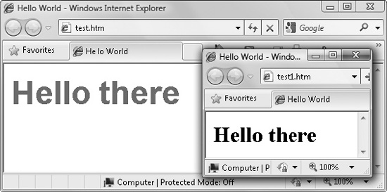
FIGURE 1-4 Styling the <h1> tag, with the original style shown in the small window
Importing a Style Sheet
When you wish to style a whole site, rather than a single page, a better way to manage style sheets is to completely remove them from your web pages to separate files, and then import the ones you need. This lets you have different style sheets for different layouts (such as web and print), without changing the HTML.
This can be achieved a couple of different ways, the first of which is by using the CSS @import directive like this:
<style>
   @import url("/css/styles.css");
</style>
This statement tells the browser to fetch a style sheet with the name styles.css from the /css folder. The @import command is quite flexible in that you can create style sheets that themselves pull in other style sheets, and so on. Just make sure that there are no <style> or </style> tags in any of your external style sheets, otherwise they will not work.
Importing CSS from within HTML
You can also include a style sheet with the HTML <link> tag like this:
<link rel="stylesheet" type="text/css" href="/css/styles.css" />
This has the exact same effect as the @import directive, except that <link> is an HTML-only tag and is not a valid style directive, so it cannot be used from within one style sheet to pull in another, and also cannot be placed within a pair of <style> … </style> tags.
Just as you can use multiple @import directives within your CSS to include multiple external style sheets, you can also use as many <link> statements as you like in your HTML.
Local Style Settings
There is also nothing stopping you from individually setting or overriding certain styles for the current page on a case-by-case basis by inserting style statements directly within HTML, like this (which results in italic blue text within the tags):
<div style="font-style:italic; color:blue;">Hello</div>
But this should be reserved only for the most exceptional circumstances since it breaks the separation of content and layout.
IDs and Classes
A better solution for setting the style of an element is to assign an ID to it in the HTML, like this:
<div id='iblue'>Hello</div>
What this does is state that the contents of the div with the ID iblue should have the style defined in the #iblue style setting applied to it. The matching CSS statement for this might look like the following
#iblue { font-style:italic; color:blue; }
Note the use of the # symbol, which specifies that only the ID with the name iblue should be styled with this statement.
If you would like to apply the same style to many elements, you do not have to give each one a different ID because you can specify a class to manage them all, like this:
<div class="iblue">Hello</div>
What this does is state that the contents of this element (and any others that use the class), should have the style defined in the iblue class applied to it. Once a class is applied, you can use the following style setting, either in the page header or within an external style sheet for setting the styles for the class:
.iblue { font-style:italic; color:blue; }
Instead of using a # symbol, which is reserved for IDs, class statements are prefaced with a . (period) symbol.
NOTE You can apply styles to elements in many more ways than using single IDs or classes. These are explained in detail in Chapter 2.
CSS and Semicolons
In order to separate CSS statements when they appear on the same line, you must place semicolons after each. But if there is only one statement on a line (or in an inline style setting within an HTML tag), you can omit the semicolon.
To avoid hard-to-find CSS errors, you may prefer to always use a semicolon after every CSS setting while developing your style sheets, only removing the unnecessary ones later if you need to optimize your style sheets for maximum download speed and minimum size.
Using the Plug-ins in Your Own Web Sites
Once you have downloaded the plug-ins.zip file from the plugincss.com web site (and extracted the files from it), the recommended way for you to access them is to load the entire set stored in the file PC.css as an external style sheet, with a command such as:
<link rel="stylesheet" type="text/css" href="css/PC.css" />
Here, /css is the folder where you have saved the file (relative to the current folder) and PC.css is the filename of the style sheet (the initials P and C are short for Plug-in and CSS).
This method of inclusion ensures that you can add new elements to your web pages that require additional plug-ins, without having to copy and paste the additional ones in separately. The file is not very different in size from an average image, thus the speed of loading and bandwidth consumed are about the same, so normally it won’t be an issue to include the entire file. But should you need to only include some of the plug-ins, they are clearly commented and you can easily copy and paste them into another style sheet, or into the <style> section of your web page.
NOTE Some of the JavaScript-aided plug-ins require a couple more lines of HTML to include. If you wish to use them, please refer to the section entitled JavaScript-Aided Plug-ins a little further on.
Class Name Conflicts
In order to keep the plug-ins easy to access, I have tried to always use short, self-explanatory class names, even including a number of single-letter classes such as i (which applies italics to text).
However, if your own style or that of a third party use any of the same class names, then one or other class will take precedence (according to rules explained in the next chapter), and the other styles may only be partially implemented, if at all. In such cases, you are unlikely to be able to successfully use both at the same time.
JavaScript-aided Plug-ins
Some of the plug-ins in this book perform actions that are simply not possible to achieve with CSS alone. They do this by using two JavaScript libraries of plug-ins. These are PJ.js, from the companion book to this, Plug-in JavaScript, and PC.js, which was specially written for this book. The PJ.js functions provide a wide range of positioning, sizing, and transition effects, which are then called upon by the PC.js functions to achieve various enhanced CSS effects.
Using these libraries is very easy and clearly explained in the sections that access them, and simply consists of including the following line of HTML in the head of a web page:
<script src="PJ.js"></script><script src="PC.js"></script>
This line loads in the libraries from the current folder (but you can also import them from elsewhere) and performs the basic initialization required by them. Both of these files are also included in the plug-ins.zip file downloadable from the plugincss.com web site.
Including JavaScript-aided CSS Alongside Pure CSS
In order to use all of the plug-ins in this book (both pure CSS and JavaScript-aided), and to set up and forget their inclusion, I recommend you add the following two lines to the head section of all your web pages that use them:
<link rel="stylesheet" type="text/css" href="PC.css" />
<script src="PJ.js"></script><script src="PC.js"></script>
Remember to preface the filenames with the correct path(s) if you are importing these files from somewhere other than the current folder.
NOTE There is a smaller version of the PJ.js file called PJsmall.js, which is also available in the plug-ins.zip download. It contains all the same functions and works in exactly the same manner, but it has been compressed to around half the size of PJ.js. Therefore, where file size and/or available bandwidth are an issue, you may wish to use this smaller file instead of PJ.js.
Users Without JavaScript
There is a slight downside to using the JavaScript-aided plug-ins, in that a very small number of users have JavaScript disabled on their browser. Therefore, you may choose to not use the JavaScript-aided plug-ins, which would be a shame since they provide some great enhancements.
Or you could include an HTML segment such as the following to ask your readers to enable JavaScript on your web site (in which case you should remember that those enhanced features that cannot degrade gracefully will simply not be available to users without JavaScript):
<noscript>
<h1>JavaScript Enhanced</h1>
This website is enhanced with JavaScript and you will be able to
view it at its best only if you enable JavaScript in your browser.
</noscript>
Alternatively, a much friendlier method (albeit a little more time-consuming), is to offer an alternative <noscript> … </noscript> section of HTML for each time you use JavaScript-aided CSS. That way your non-JavaScript users will never know the difference.
Summary
You should now have a basic picture of how style sheets work, how CSS and the DOM relate to each other, and how to import the plug-ins. In the next chapter, we’ll take a crash course on CSS, at the end of which you will be able to understand and use all the plug-ins in this book. You will also be able to create your own variations by tweaking or extending them.