CHAPTER 5
Menus and Navigation
This chapter explores a range of classes used for creating buttons and vertical and horizontal menus, and for implementing top and bottom dock bars similar to those used by Mac OS X.
There’s also a handy class for creating tooltips that you can format in a variety of different ways. Between them, you can provide a professional range of menuing and navigation aids for your web visitors.
PLUG-IN 33: Buttons
Plug-in group 33 makes it a simple matter to quickly create buttons when you need them. In Figure 5-1, an Internet Explorer and Safari web browser have been placed next to each other, showing the same web page. IE displays the different button sizes, but cannot manage the rounded borders, whereas Safari displays the buttons well. As you can see, even though IE is missing the rounded corners, it degrades gracefully.
Classes and Properties
About the Classes
Three classes are available in this plug-in for creating medium, small, or large buttons. They also use the :hover pseudo class to provide professional effects when clicked or hovered over. To do this, they change the object’s border, font-size, text-align, width, and overflow properties.
Hovered versions of the buttons change the border, while clicking them moves the button text down and to the right to emulate a 3D press.
How to Use Them
You can use these classes with any objects, but they work best with <input type=’submit’> and <button> tags. In conjunction with other classes, you can give the buttons rounded borders, different background colors, gradients that change when clicked or hovered over, add shadow effects, and more.
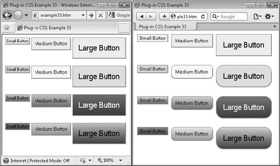
FIGURE 5-1 These classes make it easy to create great looking buttons.
Here is the HTML used to create the screen grabs in Figure 5-1:
<input type='submit' class='smallbutton'
   value='Small Button' />
<input type='submit' class='button'
   value='Medium Button' />
<input type='submit' class='largebutton'
   value='Large Button' /><br /><br />

<input type='submit' class='smallbutton smallestround lime_b'
   value='Small Button' />
<input type='submit' class='button round yellow_b'
   value='Medium Button' />
<input type='submit' class='largebutton largestround aqua_b'
   value='Large Button' /><br /><br />

<input type='submit' class='smallbutton smallestround carrot1 carrot2_a'
   value='Small Button' />
<input type='submit' class='button round sky1 sky2_a'
   value='Medium Button' />
<input type='submit' class='largebutton largestround wine1 wine2_a white'
   value='Large Button' /><br /><br/>

<input type='submit' class='smallbutton smallestround rose1 rose2_a
   white_h' value='Small Button' />
<input type='submit' class='button round sunset1 sunset2_a white_h'
   value='Medium Button' />
<input type='submit' class='largebutton largestround grass1 grass2_a
   white_h' value='Large Button' /><br /><br/>
The first row of buttons offers plain features, while the second row adds rounded borders and background colors. In the third row, the background colors have been replaced with gradient fills that reverse when the buttons are clicked, while the fourth row adds a hover color of white to each button.
As I have already noted a few times, different browsers have different features and so they will fall back gracefully when one isn’t supported. For example, Internet Explorer will not display rounded borders, but Firefox, Opera, Safari, and Chrome will. There again, Opera won’t display gradient background fills, and so on.
Even so, these button classes go a long way toward producing more engaging web sites and, as browsers implement the missing features, these classes will display better, without you having to change anything.
The Classes
.button {
   padding:8px;
}
.button:hover {
   border:2px solid #666666;
   padding:7px 8px 8px 7px;
}
.button  :active {
   border-width:2px 1px 1px 2px;
   padding:9px 7px 7px 9px;
}
.smallbutton {
   font-size:75%;
   padding:2px;
}
.smallbutton:hover {
   border:2px solid #666666;
   padding:1px 2px 2px 1px;
}
.smallbutton:active {
   border-width:2px 1px 1px 2px;
   padding:3px 1px 1px 3px;
}
.largebutton {
   font-size:125%;
   padding:15px;
}
.largebutton:hover {
   border:2px solid #666666;
   padding:14px 15px 15px 14px;
}
.largebutton:active {
   border-width:2px 1px 1px 2px;
   padding:16px 14px 14px 16px;
}
.button, .smallbutton, .largebutton {
   text-align:center;
  border-color:#999999;
   border-width:1px 2px 2px 1px;
   vertical-align:top;
   border-style:solid; /* Required by Opera */
   width:auto;         /* Required by IE to not pad the sides */
   overflow:visible;
}
PLUG-IN 34: Vertical Menu
Plug-in 34 creates a dynamic vertical menu using only unordered lists. In Figure 5-2, three levels of menu have been created, with each overlaying and offset from the previous, and with each submenu set to overlay the chevron submenu indicator of its parent.
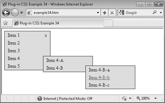
FIGURE 5-2 With this plug-in, you can create professional looking vertical menus.
Classes and Properties
About the Class
This class manipulates a large number of CSS properties in order to create menus and submenus that dynamically appear and disappear as required. The way it works is to make all second- and third-level menus (if any) invisible, and then it unhides them when they are due to appear.
The submenus are also given absolute positioning so they can be placed alongside the parent menu, starting at the item that calls them up, covering over the chevron symbol that indicates a submenu is available.
How to Use It
To use this class, create a menu structure using unordered lists. The simplest of which might look like this:
<div class='vmenu aqua_b black_l blue_lh u_lh'>

   <ul>  <!-- Beg Level 1 -->
       <li><a href='url'>Item 1</a></li>
       <li><a href='url'>Item 2</a></li>

       <li><a href='url'>Item 3</a></li>
       <li><a href='url'>Item 4</a></li>
       <li><a href='url'>Item 5</a></li>
   </ul> <!-- End Level 1 -->

</div>
The entire menu is enclosed in a <div> with the class name of vmenu. This div has its background color set to aqua, text within links set to black (or blue when hovered over), and underlines in links are enabled when hovered over. Inside this there are five list elements within an unordered list, and each of these elements contains a link.
For clarity, I have left a line break before and after the section labeled with <!—Beg Level 1 --> and <!—End Level 1 --> comments. These breaks indicate a complete section. When you open this HTML in a web browser, it looks like Figure 5-3, in which the third menu entry is currently being hovered over.
Creating a Two-Level Menu
Using almost the same structure it’s easy to add a second level of menus, as with the following example, which has taken the preceding HTML and expanded it to add three second-level menus:
 <div class='vmenu aqua_b black_l blue_lh u_lh'>

   <ul>  <!-- Beg Level 1 -->
      <li class='vmenu1'>
         <a href='url'>Item 1</a>

         <ul class='aqua_b'>      <!-- Beg Level 2 -->
             <li><a href='url'>Item 1-A</a></li>
             <li><a href='url'>Item 1-B</a></li>
             <li><a href='url'>Item 1-C</a></li>
         </ul>                <!-- End Level 2 -->
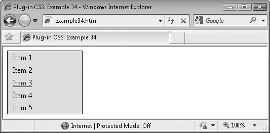
FIGURE 5-3 A single-level menu created with this class
       </li>
       <li><a href='url'>Item 2</a></li>
       <li><a href='url'>Item 3</a></li>
       <li class='vmenu1'>
          <a href='url' >Item 4</a>

          <ul class='aqua_b'>   <!-- Beg Level 2 -->
             <li><a href='url'>Item 4-A</a></li>
             <li><a href='url'>Item 4-B</a></li>
          </ul>                <!-- End Level 2 -->

       </li>
       <li class='vmenu1'>
          <a href='url'>Item 5</a>

          <ul class='aqua_b'>  <!-- Beg Level 2 -->
             <li><a href='url'>Item 5-A</a></li>
             <li><a href='url'>Item 5-B</a></li>
             <li><a href='url'>Item 5-C</a></li>
          </ul>                <!-- End Level 2 -->

       </li>
   </ul> <!-- End Level 1 -->

</div>
When viewed in a browser, this example looks like Figure 5-4, in which the first of the three menus has been opened by hovering over Item 1 in the main menu.
To add each second-level menu, the <li> and </li> tags surrounding the entry to which the menus are attached have been altered. The <li> tag has become <li class=’vmenu1’> and the </li> has been moved to after the position where the new menu was added. In other words, the line…

FIGURE 5-4 A two-level menu created with this class
<li><a href='url'>Item 1</a></li>
…has become the following section of code (the new code being marked by the comments):
<li class='vmenu1'>
   <a href='url'>Item 1</a>

   <ul class='aqua_b'>   <!-- Beg Level 2 -->
       <li><a href='url'>Item 1-A</a></li>
       <li><a href='url'>Item 1-B</a></li>
       <li><a href='url'>Item 1-C</a></li>
   </ul>                 <!-- End Level 2 -->

</li>
Creating a Three-Level Menu
You can take the process a step further by adding another level of menus, like the following code, which was used to create Figure 5-2:
 <div class='vmenu aqua_b black_l blue_lh u_lh'>

   <ul>  <!-- Beg Level 1 -->
       <li class='vmenu1'>
          <a href='url'>Item 1</a>

         <ul class='aqua_b'>  <!-- Beg Level 2 -->
             <li class='vmenu1'>
                <a href='url'>Item 1-A</a>

               <ul class='aqua_b'>  <!-- Beg Level 3 -->
                   <li><a href='url'>Item 1-A-a</a></li>
                   <li><a href='url'>Item 1-A-b</a></li>
               </ul>                <!-- End Level 3 -->

            </li>
             <li><a href='url'>Item 1-B</a></li>
             <li><a href='url'>Item 1-C</a></li>
         </ul>                <!-- End Level 2 -->

      </li>
       <li><a href='url'>Item 2</a></li>
       <li><a href='url'>Item 3</a></li>
       <li class='vmenu1'>
          <a href='url'>Item 4</a>

         <ul class='aqua_b'>  <!-- Beg Level 2 -->
             <li><a href='url'>Item 4-A</a></li>
             <li class='vmenu1'>
                <a href='url'>Item 4-B</a>
               <ul class='aqua_b'>  <!-- Beg Level 3 -->
                   <li><a href='url'>Item 4-B-a</a></li>
                   <li><a href='url'>Item 4-B-b</a></li>
                   <li><a href='url'>Item 4-B-c</a></li>
               </ul>                <!-- End Level 3 -->

             </li>
         </ul>                <!-- End Level 2 -->

       </li>
      <li class='vmenu1'>
         <a href='url'>Item 5</a>

         <ul class='aqua_b'>  <!-- Beg Level 2 -->
            <li class='vmenu1'>
               <a href='url'>Item 5-A</a>

               <ul class='aqua_b'>  <!-- Beg Level 3 -->
                   <li><a href='url'>Item 5-A-a</a></li>
                   <li><a href='url'>Item 5-A-b</a></li>
               </ul>                <!-- End Level 3 -->

             </li>
             <li><a href='url'>Item 5-B</a></li>
             <li><a href='url'>Item 5-C</a></li>
         </ul>                <!-- End Level 2 -->

       </li>
   </ul> <!-- End Level 1 -->

</div>
Here, one of the second-level items has been split into a menu in the same way the first-level item was split into a second-level menu.
This example is now quite long, so to make its working clearer, following is the underlying set of nested unordered list items as they would appear without the CSS styling, as you can determine for yourself by not importing the PC.css style sheet file:
Item 1
    Item 1-A
       Item 1-A-a
       Item 1-A-b
    Item 1-B
    Item 1-C
Item 2
Item 3
Item 4
    Item 4-A
    Item 4-B
       Item 4-B-a
       Item 4-B-b
       Item 4-B-c
Item 5
    Item 5-A
       Item 5-A-a
       Item 5-A-b
    Item 5-B
   Item 5-C
If you study the following CSS rules, you’ll see references to an hmenu class. This is because the following horizontal menu plug-in (Plug-in 35) shares many of the same styles, so bringing them into the same rules is more efficient than including them twice.
By the way, a fourth (or any deeper) level of menus is not supported by this plug-in.
The Class
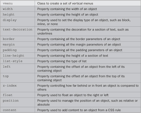
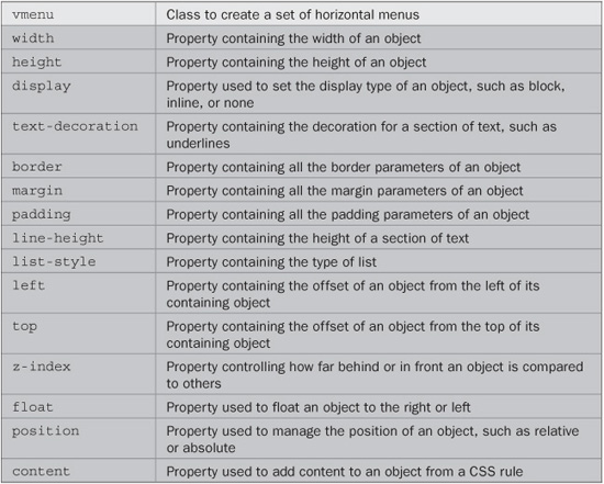
.vmenu, .hmenu {
width:150px;
}
.vmenu a, .hmenu a {
display:table-cell;
width:150px;
text-decoration: none;
}
.vmenu ul, .hmenu ul {
border:1px solid #000;
margin:0px;
padding:0px;
}
.vmenu ul li, .hmenu ul li {
height:25px;
line-height:25px;
list-style:none;
padding-left:10px;
}
.vmenu ul li:hover, .hmenu ul li:hover, {
position:relative;
}
.vmenu ul ul, .hmenu ul ul {
display:none;
position:absolute;
}
.vmenu ul ul {
left:125px;
top:5px;
}
.vmenu ul li:hover, ul, .hmenu ul li:hover, ul {
z-index:1;
}
.vmenu ul li:hover, ul {
display:block;
}
.vmenu ul ul li, .hmenu ul ul li {
width:150px;
float:left;
}
.vmenu ul ul li {
display:block;
}
.vmenu li:hover, ul li ul, .hmenu li:hover, ul li ul {
display:none;
}
.vmenu ul ul li ul, .hmenu ul ul li ul {
left:137px;
}
.vmenu ul ul li:hover, ul, .hmenu ul ul li:hover, ul {
z-index:1;
}
.vmenu ul ul li:hover, ul {
display:block;
}
.vmenu1:after, .hmenu1:after {
position:relative;
top:-25px;
float:right;
z-index:0;
margin-right:10px;
content:'�bb';
}
PLUG-IN 35: Horizontal Menu
Using this class, it is equally easy to create a horizontal menu. In fact, by swapping the class names vmenu and vmenu1 in the previous plug-in, for hmenu and hmenu1 in this one, the menu completely reorientates itself, as shown by Figure 5-5, which uses exactly the same unordered list structure.
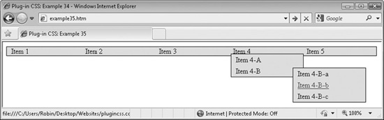
FIGURE 5-5 You can get a horizontal menu by using the hmenu classes instead of vmenu.
Classes and Properties
About the Class
This class is almost the same as for the vertical menu, except that a few CSS rules have been modified to display the menus inline so they line up horizontally. It also moves the submenus to slightly different relative locations.
How to Use It
You use this class in exactly the same way as the vertical menu class, just change the class names used from vmenu and vmenul to hmenu and hmenu1. Please refer to the Vertical Menu plug-in (Plug-in 34) for full details.
Following are the additional tweaks made to the class in the previous section to provide horizontal menus.
The Class
.hmenu, .hmenu ul, .hmenu ul li, .hmenu ul li:hover ul, .hmenu ul ul
.hmenu ul ul  li:hover,  ul {
   display:inline;
}
.hmenu ul ul {
   left:5px;
   top:15px;
}
.hmenu ul ul li ul {
   top:5px;
}
PLUG-IN 36: Top Dock Bar
Plug-in 36 provides a static dock bar that can be placed at the top of a web page for use as a menu or navigation aid. Figure 5-6 shows such a dock bar created from six icons, the fourth of which is currently being hovered over and has expanded under the mouse pointer.
Classes and Properties
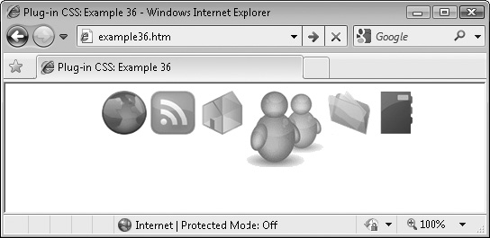
FIGURE 5-6 Using this class, you can create a top dock bar.
About the Classes
This plug-in has two classes: the first (topdockbar) is used to create a container for the dock bar items, and the second is for attaching to icons used in the dock bar (topdockitem).
The topdockbar class moves the object that uses it to the top of the browser and centers it. The object’s position is also fixed so it will not move when the browser scrolls.
The topdockitem class attaches a transition to the object so that any changes made to it will transition over the time period specified (on browsers that support transitions). It also aligns each item to the top of the dock bar so that passing the mouse over it will enlarge the image but keep it top-aligned.
A : hover pseudo class is then used to enlarge the icons when moused over, and restore them when the mouse passes away.
How to Use Them
To use these classes, you need to have six icons that are 86 × 86 pixels in size. If they are different sizes or a different number, you may need to modify the code in the PC.css file.
These images are then resized to 50 × 50 pixels for the initial display (so that they can be enlarged to their full dimensions when moused over).
Then, write some HTML to contain all the images, such as this:
<div class='topdockbar'>
    <img class='topdockitem' src='i1.gif'>
    <img class='topdockitem' src='i2.gif'>
    <img class='topdockitem' src='i3.gif'>
    <img class='topdockitem' src='i4.gif'>
    <img class='topdockitem' src='i5.gif'>
    <img class='topdockitem' src='i6.gif'>
</div>
When you use this HTML in a web page, you get the result seen in Figure 5-6. Of course, you will also attach links to the images to give each a function. When you do, a border may be displayed around the images, which you can remove by adding the argument border=’0’ to the <img…> tag. You may also wish to use Plug-in 19 (No Outline) to remove the dotted focus outline added to clicked elements.
NOTE In Internet Explorer, when the icons are hovered over, they will instantly enlarge, and reduce down again in size when the mouse passes away. But on all of Opera 10, Firefox 4, Safari 5, and the Chrome 5 web browsers (or better), the enlarging and reduction are animated using CSS transitions, which automatically generate and display a sequence of frames between a start and end set of styles settings.
Changing the Number of Icons and/or Icon Sizes
In the following CSS rules, note the value assigned to the margin-left property in order to center the dock bar. If you change the icon sizes or number of icons, you should calculate a new value for this property, using this formula:
(Reduced image size x Number of images) / 2
   +
(Actual width – Reduced width) / 4
So, for example, if you intend to use five 100 × 100 pixel images with a reduced size of 80 × 80 pixels, this is the calculation:
(5 x 100) / 2
   +
(100 – 80) / 4
This would give you a new value of 5 multiplied by 100 (which is 500), divided by 2 (which is 250), plus 100 - 80 (which is 20), divided by 4 (which is 5), which equals 250 plus 5, or a final value of 255 pixels.
You will also see mention of a bottomdockbar class in these rules. This is because the following plug-in shares much of the CSS, so it also shares some of the CSS rule assignments to save repeating the code.
The Classes
.topdockbar, .bottomdockbar {
   position:fixed;
   left:50%;
   margin-left:-159px;   /* Set to (total width of reduced images) / 2 */
                         /*      + (actual width -  reduced width) / 4 */
}
.topdockitem, .bottomdockitem {
   -moz-transition:   all .2s;
   -webkit-transition:all .2s;
   -o-transition:     all .2s;
   transition:        all .2s;
   vertical-align:top;
   width: 50px;         /* Set to reduced image width  */
   height:50px;         /* Set to reduced image height */
}
.topdockitem:hover, .bottomdockitem: hover {
   width: 86px;         /* Set to actual image width  */
   height:86px;         /* Set to actual image height */
}
PLUG-IN 37: Bottom Dock Bar
Plug-in 37 lets you create a bottom dock bar in the same way you can create a top dock bar in the previous plug-in. Figure 5-7 shows the classes being used in the Apple Safari browser.
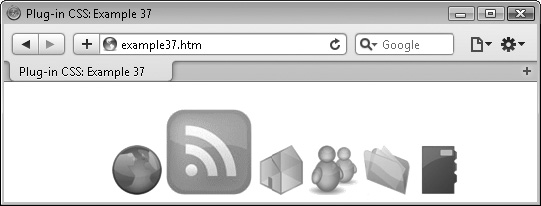
FIGURE 5-7 Creating a bottom dock bar in the Apple Safari Browser
Classes and Properties
About the Classes
These classes work in exactly the same manner as the topdockbar and topdockitem classes, only replacing those class names with bottomdockbar and bottomdockitem.
How to Use Them
Using these items is identical to creating a top dock bar, except for swapping the class names to bottomdockbar and bottomdockitem. Therefore, please refer to the previous plug-in for details.
Following are the additional CSS rules required to create bottom dock bars. If you change the height of any images, you will also need to change the margin-top property to the new height plus 7 pixels, and padding-top to the difference in pixels between the actual height of the images and their reduced heights.
The Classes
.bottomdockbar {
   top:100%;
   margin-top:-93px;    /* Set to -(actual image height + 7) */
}
.bottomdockitem {
   padding-top:36px;    /* Set to (actual height) - (reduced height) */
}
.bottomdockitem:hover {
   padding-top:0px;
}
PLUG-IN 38: Tooltip and Tooltip Fade
Plug-in group 38 lets you add tooltips (most of whose dimensions and HTML you can decide) to any object. In Figure 5-8, the word gravity has been assigned a short tooltip, briefly providing an explanation for the term. Tooltips can also be applied to links and any other objects.
Classes and Properties
About the Classes
The tooltip class takes a <span> that must be provided alongside the object being given a tooltip, and then hides it away to be displayed only when the mouse passes over the object.
The tooltipfade class is identical except that (where supported) it uses CSS transitions to slide and fade a tooltip into place.
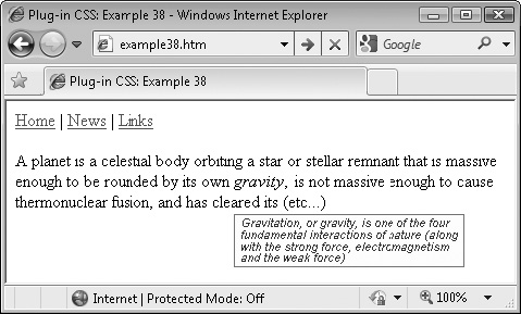
FIGURE 5-8 With this class, you can add tooltips to any object.
How to Use Them
To use either of these classes, you must place a <span> directly following the object to be given the tooltip, in which you should place the tip to be displayed, like this:
<a class='tooltip' href='/'>Home<span>Go to the Home page</span></a>
The <span> is then lifted from the flow of the web page and made invisible, to appear only when the object is moused over.
Here is the code used to create Figure 5-8, showing the two different variants of the class in action:
<a href='/'>Home</a> |
<a href='/news/'>News</a> |
<a class='tooltip' href='/links/'>Links<span>Click here for a<br />
collection of great links</span></a><br /><br />

A planet is a celestial body orbiting a star or stellar remnant that is
massive enough to be rounded by its own
<span class='tooltipfade i'>gravity<span>Gravitation, or gravity, is one
of the four<br />fundamental interactions of nature (along<br />with the
strong force, electromagnetism<br />and the weak force)</span></span>,
is not massive enough to cause thermonuclear fusion, and has (etc…)
The first use of these classes is of the tooltip class in the third link from the top, and the second is of the tooltipfade class in the text below it. The class argument of ’tooltipfade i’ tells the browsers to display the text within the tooltip in italics. When displayed in either the Opera 10, Firefox 4, Safari 5, or Chrome 5 browsers (or better), the tooltip attached to the word gravity will slide down into place, smoothly fading in at the same time. On Internet Explorer, the tooltip will simply appear and disappear as the mouse hovers over the object and away again.
These classes disallow automatic wrapping at white space so that the width of each tooltip can be specified according to where the <br /> tags are placed, and therefore the final width is that of the widest line.
NOTE The text and background colors of the tooltips are fixed, so if you want different ones, you’ll need to alter the PC.css file accordingly.
The Classes
.tooltip hover, .tooltipfade:hover {
text-decoration: none;
position: relative;
}
.tooltip span {
display: none;
}
.tooltip:hover span {
display:block;
position:absolute;
top:40px;
left:0px;
white-space:nowrap;
background:#ffffdd;
border:1px solid #888888;
color:#444444;
font-family:Arial, Helvetica, sans-serif;
font-size:8pt;
line-height:95%;
padding:2px 5px;
}
.tooltipfade span {
position:absolute;
white-space:nowrap;
font-family:Arial, Helvetica, sans-serif;
font-size:8pt;
line-height:95%;
padding:2px 5px;
top:0px;
top:-10000px�; /* IE hack to keep it out of the way */
left:0px;
background:#ffffdd;
border:1px solid #888888;
color:#444444;
opacity:0;
filter:alpha(opacity = '0'),
}
.tooltipfade:hover span {
-moz-transition :all .5s linear;
-webkit-transition:all .5s linear;
-o-transition :all .5s linear;
transition :all .5s linear;
opacity:1;
filter:alpha(opacity = '100'),
top:40px;
}