CHAPTER 7
Visual Effects
This chapter provides a wide range of visual effects such as star ratings (similar to those used on the Amazon website), progress bars or bar ratings, the scaling of images up or down, animating transitions at different speeds (and using different types of motion), viewing enlarged versions of thumbnail images, captioning and the rotation of images, changing the mouse pointer, and alternating the text and background colors of table rows.
Between them, you’ll find you can build an amazing variety of different effects just by applying the right classes to the right elements, all without JavaScript or having to write your own CSS (unless you want to).
PLUG-IN 46: Star Rating
Many sites use rating systems comprised of stars, the most notable probably being Amazon with its five-star ratings. Using this class, you can easily achieve a similar effect, as shown in Figure 7-1, in which a 65 percent popularity rating is displayed.
Classes and Properties
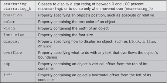
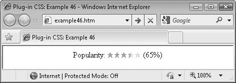
FIGURE 7-1 Using this class makes it easy to display star ratings.
About the Classes
These classes display a star rating using a star symbol already available as a character; therefore, they need no external image. This is achieved by overlaying two sets of stars. The first is a set of five very light stars, and the second is a set of darker stars truncated to the right at whatever percent value is to be displayed.
How to Use Them
To use these classes, embed a <div> (whose width is set using a style argument to the percent value to display) within another container such as a <span>, like this:
<span class='starrating'>★★★★★ <div style='width:65%'>★★★★★</div> </span>
The ★ HTML entity represents the solid star symbol, and the width parameter of the style argument restricts the width of the inner <div> to only 65 percent of the outer <span>.
You can also choose to display the rating only when hovered over, by using the starrating_h class instead of starrating. Also, because of the simplicity of this plug-in’s design, you can easily use other characters instead of stars.
The Classes
.starrating, .starrating_h {
   position:relative;
   color:#ffddcc;
   width:65px;
   font-size:10pt;
}
.starrating_h  div {
   display:none;
}
.starrating div, .starrating_h:hover div {
   display:block;
   position:absolute;
   overflow:hidden;
   color:#ff9900;
   top:0px;
   left:0px;
}
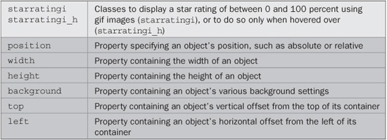
PLUG-IN 47: Star Rating Using Images
In much the same way that you can use different characters instead of the star in the previous plug-in, with this plug-in you can use images of your choice. In Figure 7-2, this class has been used with a pair of star images for a more interesting effect, due to the range of colors an image can use.
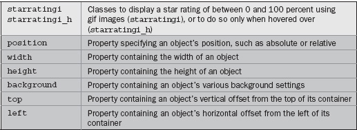
FIGURE 7-2 Using images for the stars provides greater color depth.
Classes and Properties
About the Classes
These classes display a star rating using an image. This is achieved by using images for the backgrounds of two objects that are overlaid on each other. The first is a set of five very light stars, and the second is a set of darker stars with the right cut off at whatever percent value is to be displayed.
How to Use Them
To use these classes, embed a <div> (whose width is set to the percent value to display) within another <div> (not a <span>), like this:
<div class='starratingi'><div style='width:52%'></div></div>
In this example the width parameter of the style argument restricts the width of the inner <div> to only 52 percent of the outer <div>. You can also choose to display the rating only when hovered over by using the starratingi_h class instead of starratingi.
You can change the images for any others of your choosing by altering the PC.css file (by either editing the starratingi class, or copying it and creating a new one), but if they will have dimensions other than 13 × 12 pixels, you will need to also alter the width and height properties in the class definition to the new image width (multiplied by the number of images used) and height. You will also need to change the filenames if you aren’t using star1.gif and star2.gif. Don’t forget that all the examples, classes, and images are available for download at plugincss.com.
The Classes
.starratingi, .starratingi_h {
   position:relative;
   width:65px;
   height:12px;
   background :url(star1.gif) 0 0 repeat-x;
}
.starratingi div, .starratingi_h:hover div {
   position:absolute;
   height:12px;
   background:url(star2.gif) 0 0 repeat-x;
   top:0px;
   left:0px;
}
PLUG-IN 48: Progress Bar
By relying on changing only an object’s background color, the class in this plug-in lets you create a progress or rating bar you can use to indicate how far a particular action has progressed, or the rating given to something, as shown in Figure 7-3, which shows 65 percent progress of a loading action.
Classes and Properties
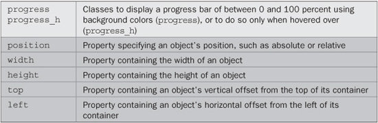
FIGURE 7-3 Show how far an action has progressed with this plug-in.
About the Classes
These classes display a progress bar using only the background colors of two objects that are overlaid on each other.
How to Use Them
To display a progress bar <div> inside another and give each a background color or perhaps a gradient fill using a suitable class (and use the style argument to set the width of the inner <div>), you would use code such as this:
<div class='progress yellow_b'>
   <div class='red_b' style='width:65%'></div>
</div>
In this example, a yellow progress bar is created with a red bar on top of it showing 65 percent progress. Or here’s an example that uses gradient fills:
<div class='progress sunset1'>
   <div class='sky1' style='width:23%'></div>
</div>
You can also use the progress_h class to show the progress only when the object is hovered over by the mouse.
As you can see, you can specify both colors and the percentage to indicate directly from HTML. But, if you would like to have a progress bar with dimensions other than 120 × 15 pixels, you’ll need to modify the class rules in the PC.css file.
The Classes
.progress, .progress_h {
   position:relative;
   width:120px;
   height:15px;
}
.progress div, .progress_h:hover div {
   position:absolute;
   height:15px;
   top:0px;
   left:0px;
}
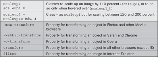
PLUG-IN 49: Scale Up
These classes let you scale an object up by between 110 and 200 percent. Rather than simply changing the width and height of an object, these classes scale it in place, without pushing other objects around to make room. Therefore, they are great for special effects such as rollovers.
Figure 7-4 shows ten instances of a 100 × 100-pixel image displayed at dimensions between 110 × 110 and 200 × 200 pixels. As you can see, none of them has affected the location of any of the other images.
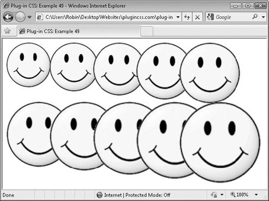
FIGURE 7-4 These classes let you resize an image in situ without affecting other objects.
Classes and Properties
About the Classes
These classes are particularly useful in that they create effects you don’t often see so easily implemented. What they do is use the CSS transform property (or browser-specific versions of it) along with the scale() argument, like this:
transform:scale(1.5);
CAUTION On Internet explorer, the filter property is used instead of transform to achieve a similar effect. However, this means that on IE only images can be scaled (whereas you can scale <div>, <span>, and other objects with other browsers). And there’s another couple of provisos: While all other browsers scale using the object’s center, IE scales from the top left. It also scales objects up behind other objects. Therefore, elements that may be scaled up should be separated from others that could obscure it, or vice versa. There is more on this topic in Plug-in 51.
How to Use Them
To use these classes, place them in the class argument of an object to be scaled, as in the following example, which was used to create Figure 7-4:
<img src='smiley.gif' class='scaleup1' />
<img src='smiley.gif' class='scaleup2' />
<img src='smiley.gif' class='scaleup3' />
<img src='smiley.gif' class='scaleup4' />
<img src='smiley.gif' class='scaleup5' /><br /><br /><br />

<img src='smiley.gif' class='scaleup6' />
<img src='smiley.gif' class='scaleup7' />
<img src='smiley.gif' class='scaleup8' />
<img src='smiley.gif' class='scaleup9' />
<img src='smiley.gif' class='scaleup10' />
You can also use the _h hover versions of the classes to resize an object only when it is hovered over, like this:
<img src='smiley.gif' class='scaleup5_h' />
NOTE When scaling up an object in the Opera or Firefox browsers, if the new size of the object will place its boundaries outside the browser’s borders, scroll bars will be added to the browser. This behavior does not occur on other browsers.
The Classes
.scaleup1, .scaleup1_h :hover {
   -moz-transform    :scale(1.1);
   -webkit-transform :scale(1.1);
   -o-transform      :scale(1.1);
   transform         :scale(1.1);
   filter            :progid:DXImageTransform.Microsoft.Matrix(
                     SizingMethod='auto expand', M11='1.1', M22='1.1'),
}
.scaleup2, .scaleup2_h :hover {
   -moz-transform    :scale(1.2);
   -webkit-transform :scale(1.2);
   -o-transform      :scale(1.2);
   transform         :scale(1.2);

   filter            :progid:DXImageTransform.Microsoft.Matrix(
                      SizingMethod='auto expand', M11='1.2', M22='1.2'),
}
.scaleup3, . :hover {
   -moz-transform    :scale(1.3);
   -webkit-transform :scale(1.3);
   -o-transform      :scale(1.3);
   transform         :scale(1.3);
   filter            :progid:DXImageTransform.Microsoft.Matrix(
                      SizingMethod='auto expand', M11='1.3', M22='1.3'),
}
.scaleup4, .scaleup4_h :hover {
   -moz-transform    :scale(1.4);
   -webkit-transform :scale(1.4);
   -o-transform      :scale(1.4);
   transform         :scale(1.4);
   filter            :progid:DXImageTransform.Microsoft.Matrix(
                      SizingMethod='auto expand', M11='1.4', M22='1.4'),
}
.scaleup5, .scaleup5_h :hover {
   -moz-transform    :scale(1.5);
   -webkit-transform :scale(1.5);
   -o-transform      :scale(1.5);
   transform         :scale(1.5);
   filter            :progid:DXImageTransform.Microsoft.Matrix(
                      SizingMethod='auto expand', M11='1.5', M22='1.5'),
}
.scaleup6, .scaleup6_h :hover {
   -moz-transform    :scale(1.6);
   -webkit-transform :scale(1.6);
   -o-transform      :scale(1.6);
   transform         :scale(1.6);
   filter            :progid:DXImageTransform.Microsoft.Matrix(
                      SizingMethod='auto expand', M11='1.6', M22='1.6'),
}
.scaleup7, .scaleup7_h :hover {
   -moz-transform    :scale(1.7);
   -webkit-transform :scale(1.7);
   -o-transform      :scale(1.7);
   transform         :scale(1.7);
   filter            :progid:DXImageTransform.Microsoft.Matrix(
                      SizingMethod='auto expand', M11='1.7', M22='1.7'),
}
.scaleup8, .scaleup8_h :hover {
   -moz-transform    :scale(1.8);
   -webkit-transform :scale(1.8);
   -o-transform      :scale(1.8);
   transform         :scale(1.8);
   filter            :progid:DXImageTransform.Microsoft.Matrix(
                      SizingMethod='auto expand', M11='1.8', M22='1.8'),
}


.scaleup9, .scaleup9_h :hover {
   -moz-transform    :scale(1.9);
   -webkit-transform :scale(1.9);
   -o-transform      :scale(1.9);
   transform         :scale(1.9);
   filter            :progid:DXImageTransform.Microsoft.Matrix(
                     SizingMethod='auto expand', M11='1.9', M22='1.9'),
}
.scaleup10, .scaleup10_h :hover {
   -moz-transform    :scale(2);
   -webkit-transform :scale(2);
   -o-transform      :scale(2);
   transform         :scale(2);
   filter            :progid:DXImageTransform.Microsoft.Matrix(
                     SizingMethod='auto expand', M11='2', M22='2'),
}
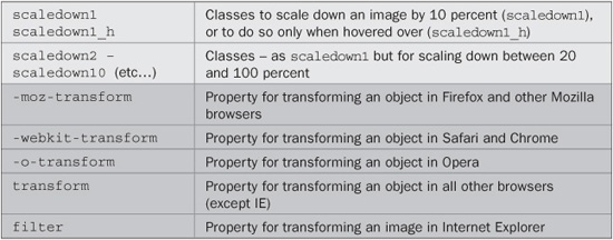
PLUG-IN 50: Scale Down
These classes offer the inverse functionality to the previous plug-in group, in that they reduce an object down by between 10 and 100 percent, as shown in Figure 7-5, in which ten instances of an image have been reduced by these amounts.
As with the previous group of Scale Up classes, these classes do not alter the position of surrounding objects.
FIGURE 7-5 These classes let you scale objects down to as little as 0 percent in size.
Classes and Properties
About the Classes
These classes use the CSS transform property (or browser-specific versions of it) along with the scale() argument, like this:
transform:scale(0.5);
On Internet Explorer, the filter property achieves a similar effect. However, this means that on IE only images can be scaled. Also, while all other browsers scale using the object’s center, IE scales from the top left.
How to Use Them
To use these classes, place them in the class argument of an object to be scaled, as in the following example, which was used to create Figure 7-5:
<img src='smiley.gif' class='scaledown1' />
<img src='smiley.gif' class='scaledown2' />
<img src='smiley.gif' class='scaledown3' />
<img src='smiley.gif' class='scaledown4' />
<img src='smiley.gif' class='scaledown5' /><br /><br /><br />

<img src='smiley.gif' class='scaledown6' />
<img src='smiley.gif' class='scaledown7' />
<img src='smiley.gif' class='scaledown8' />
<img src='smiley.gif' class='scaledown9' />
<img src='smiley.gif' class='scaledown10' />
You can also use the _h hover versions of the classes to resize an object only when it is hovered over, like this:
<img src='smiley.gif' class='scaledown5_h' />
The Classes
.scaledown1, .scaledown1_h :hover {
   -moz-transform   :scale(0.9);
   -webkit-transform:scale(0.9);
   -o-transform     :scale(0.9);
   transform        :scale(0.9);
   filter           :progid:DXImageTransform.Microsoft.Matrix(
                     SizingMethod='auto expand', M11='0.9', M22='0.9'),
}
.scaledown2, .scaledown2_h :hover {
   -moz-transform   :scale(0.8);
   -webkit-transform:scale(0.8);
   -o-transform     :scale(0.8);
   transform        :scale(0.8);
   filter           :progid:DXImageTransform.Microsoft.Matrix(
                     SizingMethod='auto expand', M11='0.8', M22='0.8'),
}
.scaledown3, . :hover {
   -moz-transform   :scale(0.7);
   -webkit-transform:scale(0.7);
   -o-transform     :scale(0.7);
   transform        :scale(0.7);
   filter           :progid:DXImageTransform.Microsoft.Matrix(
                     SizingMethod='auto expand', M11='0.7', M22='0.7'),
}
.scaledown4, .scaledown4_h :hover {
   -moz-transform   :scale(0.6);
   -webkit-transform:scale(0.6);
   -o-transform     :scale(0.6);
   transform        :scale(0.6);
   filter           :progid:DXImageTransform.Microsoft.Matrix(
                     SizingMethod='auto expand', M11='0.6', M22='0.6'),
}
.scaledown5, .scaledown5_h :hover {
   -moz-transform   :scale(0.5);
   -webkit-transform:scale(0.5);
   -o-transform     :scale(0.5);
   transform        :scale(0.5);
   filter           :progid:DXImageTransform.Microsoft.Matrix(
                     SizingMethod='auto expand', M11='0.5', M22='0.5'),
}
.scaledown6, .scaledown6_h :hover {
   -moz-transform   :scale(0.4);
   -webkit-transform:scale(0.4);
   -o-transform     :scale(0.4);
   transform        :scale(0.4);
   filter           :progid:DXImageTransform.Microsoft.Matrix(
                     SizingMethod='auto expand', M11='0.4', M22='0.4'),
}
.scaledown7, .scaledown7_h :hover {
   -moz-transform   :scale(0.3);
   -webkit-transform:scale(0.3);

   -o-transform     :scale(0.3);
   transform        :scale(0.3);
   filter           :progid:DXImageTransform.Microsoft.Matrix(
                     SizingMethod='auto expand', M11='0.3', M22='0.3'),
}
.scaledown8, .scaledown8_h :hover {
   -moz-transform   :scale(0.2);
   -webkit-transform:scale(0.2);
   -o-transform     :scale(0.2);
   transform        :scale(0.2);
   filter           :progid:DXImageTransform.Microsoft.Matrix(
                     SizingMethod='auto expand', M11='0.2', M22='0.2'),
}
.scaledown9, .scaledown9_h :hover {
   -moz-transform   :scale(0.1);
   -webkit-transform:scale(0.1);
   -o-transform     :scale(0.1);
   transform        :scale(0.1);
   filter           :progid:DXImageTransform.Microsoft.Matrix(
                     SizingMethod='auto expand', M11='0.1', M22='0.1'),
}
.scaledown10, .scaledown10_h:hover {
   -moz-transform   :scale(0);
   -webkit-transform:scale(0);
   -o-transform     :scale(0);
   transform        :scale(0);
   filter           :progid:DXImageTransform.Microsoft.Matrix(
                     SizingMethod='auto expand', M11='0', M22='0'),
}
PLUG-IN 51: Transition All
For browsers that support the new transition property, including Opera 10, Firefox 4, Apple Safari 5, and Google Chrome 5 (but, sadly, not Internet Explorer), you can use this plug-in to make any changes made to an object transition smoothly, over a time between 0.1 and 2.0 seconds. Browsers that do not support transitions ignore these classes and will change properties immediately rather than transitioning.
In Figure 7-6 (a screen grab taken using the Apple Safari browser), the mouse is currently hovering over the middle smiley in the bottom row, which has smoothly enlarged—and it will gently shrink back down in size when the mouse moves away.
However, a word of caution when using scaling…. In Figure 7-7 (a screen grab taken using Internet Explorer), the object has correctly enlarged (but not transitioned, as IE doesn’t support it), and you can see the reason for the warning I gave in Plug-in 49 about ensuring objects that may be scaled up in an IE window are separated from each other (since scaled-up objects appear behind others in IE). Other browsers do, however, correctly bring an object to the front when scaled, and move it back to its previous position when not scaled.
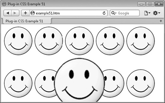
FIGURE 7-6 Combining the transitionall and scale8_h classes to create a rollover effect
NOTE Unfortunately, Internet Explorer is currently out of the picture as far as CSS 3 transitions go, with even the IE9 beta not supporting them. So users of this browser will simply see instant changes rather than animated transitions. Let’s hope that this powerful feature is added to IE soon.
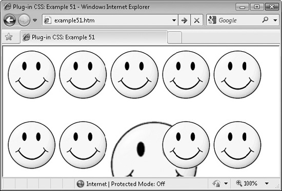
FIGURE 7-7 If you do not separate objects that are scalable, they can obscure each other when viewed in Internet Explorer.
Classes and Properties
About the Classes
These classes apply transitions to all of an object’s properties that change. This change is usually a result of the :hover pseudo class, as used by the _h versions of the classes in this book, or it can be a change instigated through the use of JavaScript, as implemented in the remaining chapters.
The transition is applied to an object using a CSS rule such as the following (or browser-specific variants of the property name like those that begin -moz, -webkit-, or -o-):
transition:all .7s;
Browsers that do not support transitions will ignore this and just change properties immediately, without transitioning.
How to Use Them
To use these classes, add them to the class argument of an object and forget about them. Then, when any properties of the object are changed that can transition, they will be animated over the period of time specified, rather than changing immediately.
For example, here’s the example HTML from Plug-in 49, but modified to change all the hover effects to transitions of differing durations:
<img src='smiley.gif' class='scaleup1_h transitionallslowest' />
<img src='smiley.gif' class='scaleup2_h transitionallslow' />
<img src='smiley.gif' class='scaleup3_h transitionall' />
<img src='smiley.gif' class='scaleup4_h transitionallfast' />
<img src='smiley.gif' class='scaleup5_h transitionallfastest' />
<br /><br /><br />
<img src='smiley.gif' class='scaleup6_h transitionallslowest_l' />
<img src='smiley.gif' class='scaleup7_h transitionallslow_l' />
<img src='smiley.gif' class='scaleup8_h transitionall_l' />
<img src='smiley.gif' class='scaleup9_h transitionallfast_l' />
<img src='smiley.gif' class='scaleup10_h transitionallfastest_l' />
The first set of five images use the default easing transition, in which the animation starts slow, increases in speed and then slows again at the end. The second set uses the _1 versions of the plug-ins to specify linear motion for the animation, where there is no speeding up and slowing down.
TIP You will find you can add transitions to a wide range of the classes in this book that provide _h hover versions. This includes changing colors, position, dimensions, shadows, opacity, borders, and many more properties. All right, users of Internet Explorer won’t get to see these nice transitions (yet), but for the sake of adding a simple extra class to your HTML, all other browser users (which as of late 2010 looks set to become the majority) will enjoy a much more sophisticated environment on their web pages.
The Classes
.transitionall {
   -moz-transition   :all .7s;
   -webkit-transition:all .7s;
   -o-transition     :all .7s;
   transition        :all .7s;
}
.transitionallslowest  {
   -moz-transition   :all 2s;
   -webkit-transition:all 2s;
   -o-transition     :all 2s;
   transition        :all 2s;
}
.transitionallslow  {
   -moz-transition   :all 1.5s;
   -webkit-transition:all 1.5s;
   -o-transition     :all 1.5s;
   transition        :all 1.5s;
}
.transitionallfast  {
   -moz-transition   :all .3s;
   -webkit-transition:all .3s;
   -o-transition     :all .3s;
   transition        :all .3s;
}
.transitionallfastest  {
   -moz-transition   :all .1s;
   -webkit-transition:all .1s;
   -o-transition     :all .1s;
   transition        :all .1s;
}

.transitionall_l {
   -moz-transition   :all .7s linear;
   -webkit-transition:all .7s linear;
   -o-transition     :all .7s linear;
   transition        :all .7s linear;
}
.transitionallslowest_l  {
   -moz-transition   :all 2s linear;
   -webkit-transition:all 2s linear;
   -o-transition     :all 2s linear;
   transition        :all 2s linear;
}
.transitionallslow_l  {
   -moz-transition   :all 1.5s linear;
   -webkit-transition:all 1.5s linear;
   -o-transition     :all 1.5s linear;
   transition        :all 1.5s linear;
}
.transitionallfast_l  {
   -moz-transition   :all .3s linear;
   -webkit-transition:all .3s linear;
   -o-transition     :all .3s linear;
   transition        :all .3s linear;
}
.transitionallfastest_l  {
   -moz-transition   :all .1s linear;
   -webkit-transition:all .1s linear;
   -o-transition     :all .1s linear;
   transition        :all .1s linear;
}
PLUG-IN 52: Thumb View
This class provides a simple and effective way for users to browse large versions of photo thumbnails. In Figure 7-8, six thumbnails are displayed and the mouse is currently hovering over the second, which has caused the large version of the image to be displayed.
Classes and Properties
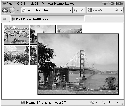
FIGURE 7-8 Use these classes to create a simple viewer for thumbnail images.
About the Class
This class displays the contents of a <span> that accompanies a thumbnail image by hiding it using the opacity property and by scaling it to zero dimensions—until the mouse passes over the image, when the <span> is scaled back up again, and the opacity is restored to reveal it. The <span> is set to appear inset from the left of the container and down from the top by 30 pixels.
For some reason, the Opera browser doesn’t vertically offset the same way that the other browsers do, so a browser-specific hack is used to change the top property of the <span> to a different value.
How to Use It
Although this plug-in is intended mainly for displaying a large version of a thumbnail image, because it simply hides and displays a <span> on demand, you can place anything you like in it, meaning you can use it to display information on an image or other details.
Here is the HTML used for Figure 7-8:
<span class='thumbview'>
   <img class='bwidth1 bblack bsolid' src='t1.jpg' />
   <span><img class='bwidth2 bblack bsolid' src='i1.jpg' /></span>
</span>
<span class='thumbview'>
   <img class='bwidth1 bblack bsolid' src='t2.jpg' />
   <span><img class='bwidth2 bblack bsolid' src='i2.jpg' /></span>
</span>

<span class='thumbview'>
   <img class='bwidth1 bblack bsolid' src='t3.jpg' />
   <span><img class='bwidth2 bblack bsolid' src='i3.jpg' /></span>
</span><br />

<span class='thumbview'>
   <img class='bwidth1 bblack bsolid' src='t4.jpg' />
   <span><img class='bwidth2 bblack bsolid' src='i4.jpg' /></span>
</span>
<span class='thumbview'>
   <img class='bwidth1 bblack bsolid' src='t5.jpg' />
   <span><img class='bwidth2 bblack bsolid' src='i5.jpg' /></span>
</span>
<span class='thumbview'>
   <img class='bwidth1 bblack bsolid' src='t6.jpg' />
   <span><img class='bwidth2 bblack bsolid' src='i6.jpg' /></span>
</span>
The outer container of each thumbnail and image is a <span>, but it could equally be a <div> or other container. Within each container is an image followed by a <span>, in which a large version of each thumbnail image is placed. When the mouse passes over the outer container, the inner one is set to display, and when the mouse passes out, the inner one is hidden again.
NOTE In Internet Explorer, what has been described here is pretty much what you will see. But on Opera 10, Firefox 4, Apple Safari 5, and Google Chrome 5, the images (or whatever is contained in the inner <span>) will fade and zoom in at the same time (and out again when the mouse passes away) due to the combined use of transitions, scaling, and opacity. If you can, try to view it in one of these browsers to see the impressive effect that results.
The Class
.thumbview {
     position:relative;
}
.thumbview span {
   position:absolute;
   top :-30px;
   left :30px;
   -moz-transition   :all .3s linear;
   -webkit-transition:all .3s linear;
   -o-transition     :all .3s linear;
   transition        :all .3s linear;
   -moz-transform    :scale(0);
   -webkit-transform :scale(0);
   -o-transform      :scale(0);
   transform         :scale(0);
   opacity           :0;
   z-index           :0;
   filter            :progid:DXImageTransform.Microsoft.Matrix(
                       SizingMethod='auto expand', M11='0', M22='0'),
}

.thumbview:hover span {
   -moz-transform    :scale(1);
   -webkit-transform :scale(1);
   -o-transform      :scale(1);
   transform         :scale(1);
   opacity           :1;
   z-index           :100;
   filter            :progid:DXImageTransform.Microsoft.Matrix(
                       SizingMethod='auto expand', M11='1', M22='1'),
}

@media all and (-webkit-min-device-pixel-ratio:10000), /* Only  Opera */
   not all and (-webkit-min-device-pixel-ratio:0) { /* sees this hack */
   .thumbview span { top:30px; }
}
PLUG-IN 53: Caption Image
Using this plug-in you can present your images with neat white borders and a shadowed caption on a thicker border at the picture’s bottom. In Figure 7-9, the HTML from the previous example has been reused, with this class added to provide captions, and without the previous borders, since this class provides its own.
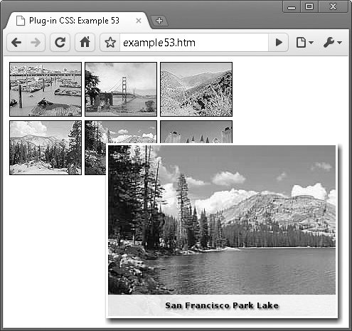
FIGURE 7-9 Use Plug-in 53 to add captions and interesting effects to images
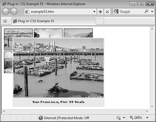
FIGURE 7-10 Displaying an image using a caption class in Internet Explorer
The screen grab was taken using Google Chrome, which is representative of the results you’ll get with most browsers in that there is a smooth transition, the border of the photo is white and shadowed, and the caption is shadowed text on a translucent background.
However, in Internet Explorer it’s not possible to achieve quite the same effect, mainly because IE dislikes using many of its features within a content property that is part of a pseudo class such as :before, or :after. Nevertheless, as you can see in Figure 7-10, it degrades reasonably well thanks to a few (unfortunately necessary) CSS hacks.
Classes and Properties
About the Classes
These classes frame and caption an image in a professional manner by changing various properties such as its borders, and by adding content taken from the alt argument.
The caption_h class applies the caption only when the mouse passes over the associated image, while the caption class applies it as soon as the larger image is displayed.
A few hacks must be used in the CSS to get Internet Explorer to display anything at all! These consist of affixing the � suffix to any rules that only IE should see. Also, to create the light ribbon behind the captions, the Unicode character 2588 (a solid block) is repeated 50 times in a :before set of rules. This block character string should be enough for reasonably wide pictures, but you can easily increase it if it isn’t. Non-IE browsers do not see these :before rules.
How to Use Them
To use these classes, you need to provide a caption for the image in the alt argument of its container (such as a <div> or <span>), and then use either the caption or caption_h class in the class argument, like this:
<span class='caption_h' alt='A caption'>
   <img src='myimage.jpg' />
</span>
For example, following is the HTML used for Figures 7-9 and 7-10, which combines the thumbview class with both the caption and caption_h classes:
<span class='thumbview'>
   <img class='bwidth1 bblack bsolid' src='t1.jpg' />
   <span class='caption' alt='San Francisco, Pier 39 Seals'>
      <img src='i1.jpg' />
   </span>
</span>

<span class='thumbview'>
   <img class='bwidth1 bblack bsolid' src='t2.jpg' />
   <span class='caption' alt='San Francisco Bay Bridge'>
       <img src='i2.jpg' />
   </span>
</span>
<span class='thumbview'>
   <img class='bwidth1 bblack bsolid' src='t3.jpg' />
   <span class='caption' alt='The San Francisco Peaks'>
       <img src='i3.jpg' />
   </span>
</span><br />

<span class='thumbview'>
   <img class='bwidth1 bblack bsolid' src='t4.jpg' />
   <span class='caption_h' alt='San Francisco Peaks Forest'>
       <img src='i4.jpg' />
   </span>
</span>
<span class='thumbview'>
   <img class='bwidth1 bblack bsolid' src='t5.jpg' />
   <span class='caption_h' alt='San Francisco Park Lake'>
       <img src='i5.jpg' />
   </span>
</span>
<span class='thumbview'>
   <img class='bwidth1 bblack bsolid' src='t6.jpg' />
   <span class='caption_h' alt='Las Vegas At Night'>
       <img src='i6.jpg' />
   </span>
</span>
The captions are immediately displayed when the larger version is shown of any of the top row of thumbnails, but the bottom row of icons only open up the large image. You need to move the mouse into this image to be shown the caption, too.
The Classes
.caption, .caption_h {
position:relative;
}
.caption img, .caption_h img {
background:#000000;
padding :3px;
}
.caption img, .caption_h:hover img {
padding:0px;
border:3px solid #ffffff;
border:3px solid #eeeeee�; /* IE hack */
-moz-box-shadow :3px 5px 9px #444;
-webkit-box-shadow :3px 5px 9px #444;
box-shadow :3px 5px 9px #444;
}
.caption:before�, .caption_h:hover:before� { /* IE hack section */
position:absolute�;
color:#eeeeee�;
top:auto�;
bottom:3px�;
left:0px�;
font-size:20pt�;
font-weight:bold�;
font-family:Impact�;
content: '258825882588258825882588258825882588258825882588
25882588258825882588258825882588258825882588258825882588
25882588258825882588258825882588258825882588258825882588
2588258825882588258825882588258825882588'; /* 1 long line */
}
.caption:after, .caption_h:hover:after {
position:absolute;
background:#ffffff;
color:#000000;
top:auto;
bottom:3px;
left:0px;
width:100%;
text-align :center;
height:30px;
line-height:30px;
font-size:8pt;
text-shadow:#888888 2px 2px 2px;
font-weight:bold;
font-family:Verdana, Helvetica, sans-serif;
content:attr(alt);
opacity:.9;
}
PLUG-IN 54: Pointer
This pointer class is useful for making the mouse cursor change from an arrow to a pointing finger when it passes over an object, and is especially useful for attaching to buttons (which generally don’t have this cursor behavior).
In Figure 7-11, two screen grabs have been taken with the mouse pointer enabled, and then merged to show the effect of passing the cursor over one object not using this class, and another that is. In the figure, the mouse cursor has changed to a pointing finger as it passes over the second button.
Classes and Properties
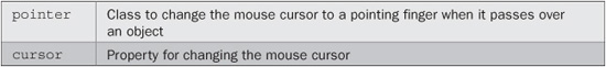
FIGURE 7-11 This class lets you alert users that an object is clickable.
About the Class
This short and sweet class simply sets the cursor property of an object to the value pointer, so that the mouse cursor will change to a pointing finger when it passes over the object.
How to Use It
Following is the HTML used for Figure 7-11, in which the class has been assigned to one of two buttons:
<button>This is a normal button</button>
<button class='pointer'>This button causes a pointing finger cursor
</button>
The Class
.pointer { cursor:pointer; }
PLUG-IN 55: Rotation
With these classes, you can rotate an image by 90, 180, or 270 degrees, as shown in Figure 7-12 in which a smiley face appears 12 times. The first four instances are the four possible clockwise rotations (the first being unrotated), the second group is the same, except that the rotation occurs only when the mouse passes over an image, and the third is the same as the second group, except that the rotations are counterclockwise. In the figure, the second smiley on the third row is currently being hovered over and has rotated counterclockwise by 90 degrees.
TIP If you need to rotate by different amounts than intervals of 90 degrees, see Chapter 8 for a JavaScript-aided solution.
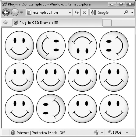
FIGURE 7-12 These classes let you display images in any of four different rotations.
Classes and Properties
About the Classes
These classes take an object and apply a rotation of 90, 180, or 270 degrees to it. The transforms used rotate in either a clockwise or counterclockwise direction so, for example, the rotatec90 class uses this CSS rule:
transform:rotate(90deg);
…and the rotatea90 class uses this rule (the a standing for the initial letter of the European term anticlockwise, since c is already taken for clockwise):
transform:rotate(-90deg);
The reason for providing both clockwise and counterclockwise methods is to allow the use of the transitionall classes (Plug-in 51) with these classes. When combined, on browsers that support transitions, the image will rotate smoothly in the direction supplied, rather than immediately change.
The Internet Explorer browser doesn’t support transitions but does change the object to the required rotation.
How to Use Them
To use these classes, enter them into the class argument of an object, like this:
<img class='rotatec90' src='myphoto.jpg' />
Browsers other than Internet Explorer support the rotating of any object such as a <span> or <div>, which means complete sections of text and HTML can be rotated. But IE is limited to only images.
Here is the HTML used to create Figure 7-12:
<img src='smiley.gif' />
<img class='rotatec90' src='smiley.gif' />
<img class='rotatec180' src='smiley.gif' />
<img class='rotatec270' src='smiley.gif' /><br />

<img src='smiley.gif' />
<img class='transitionall rotatec90_h' src='smiley.gif' />
<img class='transitionall rotatec180_h' src='smiley.gif' />
<img class='transitionall rotatec270_h' src='smiley.gif' /><br />

<img src='smiley.gif' />
<img class='transitionall_l rotatea90_h' src='smiley.gif' />
<img class='transitionall_l rotatea180_h' src='smiley.gif' />
<img class='transitionall_l rotatea270_h' src='smiley.gif' />
The first group instantly rotates the images and the second one rotates them only when the mouse hovers over an image. This group also implements the transitionall class, so that browsers that support it will animate the rotation.
The final group is the same as the second except that the images rotate counterclockwise, and the transitionall_l class is used for a linear, rather than easing, movement to the animation.
The Classes
.rotatec90,.rotatec90_h:hover {
   -webkit-transform:rotate(90deg);
   -moz-transform   :rotate(90deg);
   -o-transform     :rotate(90deg);
   transform        :rotate(90deg);
   filter:progid:DXImageTransform.Microsoft.BasicImage(rotation=1);
}
.rotatec180, .rotatec180_h:hover {
   -webkit-transform:rotate(180deg);
   -moz-transform   :rotate(180deg);
   -o-transform     :rotate(180deg);
   transform        :rotate(180deg);
   filter:progid:DXImageTransform.Microsoft.BasicImage(rotation=2);
}
.rotatec270, .rotatec270_h:hover {
   -webkit-transform:rotate(270deg);
   -moz-transform   :rotate(270deg);
   -o-transform     :rotate(270deg);
   transform        :rotate(270deg);
   filter:progid:DXImageTransform.Microsoft.BasicImage(rotation=3);
}
.rotatea90,.rotatea90_h:hover {
   -webkit-transform:rotate(-90deg);
   -moz-transform   :rotate(-90deg);
   -o-transform     :rotate(-90deg);
   transform        :rotate(-90deg);
   filter:progid:DXImageTransform.Microsoft.BasicImage(rotation=3);
}
.rotatea180, .rotatea180_h:hover {
   -webkit-transform:rotate(-180deg);
   -moz-transform   :rotate(-180deg);
   -o-transform     :rotate(-180deg);
   transform        :rotate(-180deg);
   filter:progid:DXImageTransform.Microsoft.BasicImage(rotation=2);
}
.rotatea270, .rotatea270_h:hover {
   -webkit-transform:rotate(-270deg);
   -moz-transform   :rotate(-270deg);
   -o-transform     :rotate(-270deg);
   transform        :rotate(-270deg);
   filter:progid:DXImageTransform.Microsoft.BasicImage(rotation=1);
}
PLUG-IN 56: Odd and Even Text Colors
When you wish to present a table in a more easy-to-read format, you can use the classes in this plug-in to alternate the color of each row by adding a class to the <table> tag, as shown in Figure 7-13 (a screen grab from Google Chrome), where the text color in the odd rows has been changed to green.
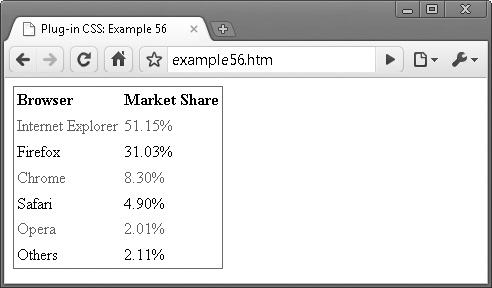
FIGURE 7-13 Using the Plug-in 56 classes to create alternately colored rows of text in tables
These classes work in all the latest browsers except for Internet Explorer (even the IE9 beta), although it is rumored that the final release of IE9 may support the properties these classes rely on. IE8 and lower will simply display tables the normal way.
Classes and Properties
About the Classes
These classes change the text color of either the odd- or even-numbered rows in a table by using the nth-child pseudo class, like this:
.aqua_o tr:nth-child(odd) { color:#0ff; }
For example, this rule sets the class aqua_o to change the text color of all odd table rows to aqua, using the tr: part of the rule, in conjunction with the :nth-child(odd) pseudo class. For even rows, the odd parameter is changed to even.
How to Use Them
To use these classes, simply mention them in the class argument of a table, as in the following, which will change the text color of all even rows to green:
<table class='green_e'>
Here’s the HTML used to create Figure 7-13:
<table class='bsolid bwidth1 green_e' cellspacing='0' cellpadding='3'>
   <tr class='green_e'>
      <td><b>Browser</b></td>
      <td><b>Market Share</b></td>
   </tr>
   <tr>
      <td>Internet Explorer</td>
       <td>51.15%</td>
   </tr>
   <tr>
      <td>Firefox</td>
       <td>31.03%</td>
   </tr>
   <tr>
       <td>Chrome</td>
       <td>8.30%</td>
   </tr>
   <tr>
       <td>Safari</td>
       <td>4.90%</td>
   </tr>
   <tr>
       <td>Opera</td>
       <td>2.01%</td>
   </tr>
   <tr>
       <td>Others</td>
       <td>2.11%</td>
   </tr>
</table>
This example displays the market share of the main web browsers in July 2010 according to Wikipedia. It starts by creating a solid black border around the table with a width of one pixel, and then uses the green_e class to set the color of all even rows in the table to green. The table’s cellspacing and cellpadding arguments are also set to 0 and 3, respectively, for improved styling.
A color class with the suffix _o could also be used if the odd row color needed changing from the default of black.
The Classes
.aqua_o    tr:nth-child(odd),  .aqua_e      tr:nth-child(even)
   { color :#0ff }
.black_o   tr:nth-child(odd),  .black_e     tr:nth-child(even)
   { color :#000 }
.blue_o    tr:nth-child(odd),  .blue_e      tr:nth-child(even)
   { color :#00f }
.brown_o   tr:nth-child(odd),  .brown_e     tr:nth-child(even)
   { color :#c44 }
.fuchsia_o tr:nth-child(odd),  .fuchsia_e   tr:nth-child(even)
   { color :#f0f }
.gold_o    tr:nth-child(odd),  .gold_e      tr:nth-child(even)
   { color :#fc0 }
.gray_o    tr:nth-child(odd),  .gray_e      tr:nth-child(even)
   { color :#888 }
.green_o   tr:nth-child(odd),  .green_e     tr:nth-child(even)
   { color :#080 }
.khaki_o   tr:nth-child(odd),  .khaki_e     tr:nth-child(even)
   { color :#cc8 }
.lime_o    tr:nth-child(odd),  .lime_e      tr:nth-child(even)
   { color :#0f0 }
.maroon_o  tr:nth-child(odd),  .maroon_e    tr:nth-child(even)
   { color :#800 }
.navy_o    tr:nth-child(odd),  .navy_e      tr:nth-child(even)
   { color :#008 }
.olive_o   tr:nth-child(odd),  .olive_e     tr:nth-child(even)
   { color :#880 }
.orange_o  tr:nth-child(odd),  .orange_e    tr:nth-child(even)
   { color :#f80 }
.pink_o    tr:nth-child(odd),  .pink_e      tr:nth-child(even)
   { color :#f88 }
.purple_o  tr:nth-child(odd),  .purple_e    tr:nth-child(even)
   { color :#808 }
.red_o     tr:nth-child(odd),  .red_e       tr:nth-child(even)
   { color :#f00 }
.silver_o  tr:nth-child(odd),  .silver_e    tr:nth-child(even)
   { color :#ccc }
.teal_o    tr:nth-child(odd),  .teal_e      tr:nth-child(even)
   { color :#088 }
.white_o   tr:nth-child(odd),  .white_e     tr:nth-child(even)
   { color :#fff }
.yellow_o  tr:nth-child(odd),  .yellow_e    tr:nth-child(even)
   { color:#ff0 }
PLUG-IN 57: Odd and Even Background Colors
These classes complement those in Plug-in 56 by enabling the changing of a table row’s odd or even background colors as shown in Figure 7-14, in which the background colors have been styled to alternate between lime green and aqua.
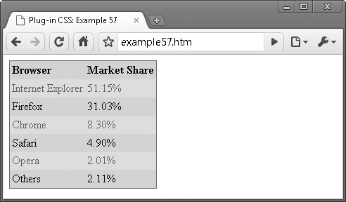
FIGURE 7-14 The table from the previous plug-in, now styled with alternating background colors
As with the odd and even text color classes, these classes will not work with Internet Explorer, although they may do so in the full release of IE9. In IE8 and earlier, the table will simply display as normal; therefore, you may wish to apply a standard background color to your tables as a fallback.
Classes and Properties
About the Classes
These classes work in the same way as those in the previous plug-in group, except that they change the background instead of the color property.
How to Use Them
To use these classes, simply mention them in the class argument of a table as in the following, which will change the background color of all even rows to aqua:
<table class='aqua_be'>
Here’s the HTML used to create Figure 7-14:
<table class='bsolid bwidth1 green_e aqua_be lime_bo'
   cellspacing='0' cellpadding='3'>
   <tr class='green_e'>
      <td><b>Browser</b></td>
      <td><b>Market Share</b></td>
    </tr>
   <tr>
      <td>Internet Explorer</td>
       <td>51.15%</td>
    </tr>
   <tr>
      <td>Firefox</td>
       <td>31.03%</td>
    </tr>
   <tr>
       <td>Chrome</td>
       <td>8.30%</td>
    </tr>
   <tr>
       <td>Safari</td>
       <td>4.90%</td>
    </tr>
   <tr>
       <td>Opera</td>
       <td>2.01%</td>
    </tr>
   <tr>
       <td>Others</td>
       <td>2.11%</td>
    </tr>
</table>
This example adds the classes aqua_be and lime_bo to the previous example to change the background colors of the table rows. Although the colors in this example may look garish when you run them on your computer, I chose them because they convert well to the gray scale printing used in this book—and it’s easy enough for you to change them anyway.
NOTE This concludes the standard CSS plug-ins. In the next chapter, I’ll introduce Dynamic classes and show what you can do when you add a little JavaScript to your CSS.
The Classes
.aqua_bo    tr:nth-child(odd), .aqua_be     tr:nth-child(even)
   { background:#0ff }
.black_bo   tr:nth-child(odd), .black_be    tr:nth-child(even)
   { background:#000 }
.blue_bo    tr:nth-child(odd), .blue_be     tr:nth-child(even)
   { background:#00f }
.brown_bo   tr:nth-child(odd), .brown_be    tr:nth-child(even)
   { background:#c44 }

.fuchsia_bo tr:nth-child(odd), .fuchsia_be  tr:nth-child(even)
   { background:#f0f }
.gold_bo    tr:nth-child(odd), .gold_be     tr:nth-child(even)
   { background:#fc0 }
.gray_bo    tr:nth-child(odd), .gray_be     tr:nth-child(even)
   { background:#888 }
.green_bo   tr:nth-child(odd), .green_be    tr:nth-child(even)
   { background:#080 }
.khaki_bo   tr:nth-child(odd), .khaki_be    tr:nth-child(even)
   { background:#cc8 }
.lime_bo    tr:nth-child(odd), .lime_be     tr:nth-child(even)
   { background:#0f0 }
.maroon_bo  tr:nth-child(odd), .maroon_be   tr:nth-child(even)
   { background:#800 }
.navy_bo    tr:nth-child(odd), .navy_be     tr:nth-child(even)
   { background:#008 }
.olive_bo   tr:nth-child(odd), .olive_be    tr:nth-child(even)
   { background:#880 }
.orange_bo  tr:nth-child(odd), .orange_be   tr:nth-child(even)
   { background:#f80 }
.pink_bo    tr:nth-child(odd), .pink_be     tr:nth-child(even)
   { background:#f88 }
.purple_bo  tr:nth-child(odd), .purple_be   tr:nth-child(even)
   { background:#808 }
.red_bo     tr:nth-child(odd), .red_be      tr:nth-child(even)
   { background:#f00 }
.silver_bo  tr:nth-child(odd), .silver_be   tr:nth-child(even)
   { background:#ccc }
.teal_bo    tr:nth-child(odd), .teal_be     tr:nth-child(even)
   { background:#088 }
.white_bo   tr:nth-child(odd), .white_be    tr:nth-child(even)
   { background:#fff }
.yellow_bo  tr:nth-child(odd), .yellow_be   tr:nth-child(even)
   { background:#ff0 }