11
Appearance
One of the two main objectives of applying a coating is providing protection of the substrate against outside influences. Hence, homogeneity of quality and thickness of a coating are important to realize proper protective action. Defects, as referred to at several locations in the preceding chapters, can compromise this function. Here we summarize the main occurring defects and their causes. Defects also influence the other main reason to use coatings, namely, aesthetics, but evidently the color of a coating plays a major role in this as well. Individuals judge color rather subjectively, and thus there is a (strong) need for a quantitative assessment. The characterization of color is rather different from the usual chemical and physical characterization, and we discuss this topic in some detail. Finally, other functionalities are becoming increasingly important, and the feel or haptic is one of the characteristics for the perception of a coating (we still use appearance – this term being conventionally used). The latter topic, even more so than color, is in need of a (semi)quantitative characterization, and we discuss some aspects in the final section of this chapter.
11.1 Defects
Any coating, aiming at providing functions like protection or decoration, should have proper thickness, adhesion, durability, and visual appeal but should also be without defects that possibly arise during application. Obviously these defects may be related to outside sources (e.g. dust particles), which can be avoided by good housekeeping and cleaning. However, they may be also due to the production/application method, such as overspray in a spraying process, dewetting due to impurities or contamination, or the presence of gel particles in the paint. Finally, there are intrinsic defects. They can be divided in defects related to the substrate–coating interface, defects related the coating itself, and, possibly the most relevant, defects related to the rheology and the interfacial behavior of the system at the surface of the coating controlling the film formation process.
Some defects are mainly affecting the aesthetics of the coating. Other defects deteriorate the protective quality of the coating. For the former type we mention the orange peel effect (the surface structure of a coating resembling the skin of an orange; Figure 5.13a), brush marks, sagging (Figure 1.6a), and telegraphing (surface and structural features of the substrate mimicked by the coating). For the latter type we mention cratering (small bowl‐shaped depressions, usually due to contamination), air entrapment (leading to bubbles or crater‐like defects), dewetting (usually due to poor cleaning if the system is properly designed), and solvent popping (defects created by the violent evaporation of entrapped solvent after film formation has occurred).
At several places we already referred to various defects, but it may be useful to overview their cause somewhat more systematically, and we do so in the next paragraphs. In discussing remedies it may be useful to distinguish between the nonadditives approach, which tries essentially to balance the wetting, surface tension, and viscosity by modifying the amount of or changing the nature of the principal components (PCs) of a coating, and the additives approach, in which chemical additives are added once the PCs have been chosen [1]. Several rather practical papers on coating defects are due to Schoff [2] as well as Bierwagen [3], while [4] provides a catalog of defects, illustrating the various types by useful (and aesthetically pleasing) cross‐sectional optical images.
Good wetting is clearly required for obtaining a proper coating, and the substrate–coating interface is the relevant stage. As discussed in Chapter 7, spontaneous wetting requires the spreading coefficient S = γSV − (γSL + γLV) to be positive, where γ, as before, denotes the surface tension between solid (S), liquid (L), and vapor (V). If S < 0, a liquid with an initial uniform thickness forms drops with a spherical cap and eventually, with increasing amount of liquid, pancake‐like shapes with a constant height h0. From energy balance considerations we can write γSV = γSL + γLV − ρgh02/2, where the last term describes the work against gravity with g the acceleration of gravity and ρ the density of the fluid. Solving for h0, introducing Young's equationγLVcos θ = γSV − γSL and the capillary length a−1 = (γLV/ρg)1/2, we obtain h02 = (1 − cos θ)/a2 or inserting the goniometric relation (1 − cos θ) = 2 sin2(θ/2), h0a = 2 sin(θ/2). A film with thickness h > h0 is stable against breakup, but if h < h0 the film eventually will develop in a discontinuous film with patch height h0. Using typical values, say, surface tension γ = 35 mJ m−2 and density ρ = 1.1 g cm−3, the capillary length becomes a−1 ≅ 1.8 mm, and with, say, θ = 10°, the final result is h0 ≅ 310 µm. For h > h0 any hole (defect) that might be formed in the film by whatever perturbation will heal. From a perturbative analysis of the governing differential equation [5], it appears, however, that for films with h < h0 there is a critical hole radius r for which the film still will revert to a closed film, or vice versa, for a certain hole size all films thinner than a critical film thickness recede from the substrate due to spontaneous growth of the hole. The condition is given by h/r = sin θ ln[(1 + cos θ)ar] and applies when rha2 ≪ sin θ for h < h0/3 with θ in the range 10° < θ < 170°, a condition that is nearly always fulfilled. To quote some solutions, for ra = 0.001 (0.01, 0.07), ha ≅ 0.0052 (0.029, 0.064). This implies, for example, using the same data as above, that for a hole with radius 1.8 µm, the minimum thickness for which the hole can disappear is h ≅ 9.4 µm. These numbers are all in the range of typical coatings thicknesses and defects. Normal dewetting can often be prevented by introducing some roughness provided the contact angle θ < 90° (see Section 7.3.5).
However, initial good wetting is no guarantee for final good wetting. In time a coating may dewet as a consequence of changing properties with changing composition. Dewetting occurs normally through a thermal process, in which instabilities are induced by spinodal dewetting, by nucleation and growth dewetting, or by other side mechanisms, whereas solvent‐induced dewetting occurs under the influence of solvent (vapor). Generally the main difference between thermal dewetting and solvent‐induced dewetting is that the cause of instability is the long‐range force of van der Waals interactions in the thermal dewetting, whereas it is the short‐range force of polar interactions in the solvent‐induced dewetting [6]. For very thin films, typically less than 100 nm, the fluid–vapor interface and fluid–substrate interface may interact, leading, if sufficient mobility is present (T > Tg), to film rupture unless sufficient repulsion between the two interfaces is present. Solvent‐induced dewetting is illustrated in Figure 11.1.

Figure 11.1 OM images of dewetting of PS films of thickness h = 64 ± 2 nm with different molar mass Mw and aging time tA under saturated acetone vapor at room temperature. (a)–(c) Mw = 4.1 kg mol−1, tA = 12 h; tA = 60 h; tA = 108 h, respectively; (d)–(f) Mw = 48.1 kg mol−1, tA = 12 h; tA = 60 h; tA = 108 h, respectively. The bar scale is 100 µm in (a)–(e) and 200 µm in (f).
The wetting behavior of thin polymer films is of great importance not only because of the applications of polymers in various fields of industry but also because of the importance of polymers as model systems for testing (mean field) theories. Geoghegan and Krausch [7] provided a review on wetting transitions, discussing the influence of a boundary in polymer blends and the growth of wetting layers in which hydrodynamic flow plays a dominant role. Pattern formation caused by dewetting of topographically or chemically patterned substrates can be employed to realize required structures [8].
As maintaining homogeneity and continuity of polymer thin films is critical for their applications in the areas of microelectronics, adhesion, lubrication, and nonlinear optics, various modifications of polymer films and/or substrates have been attempted to suppress or inhibit dewetting. The retardation of dewetting has mostly been achieved by the addition of foreign materials including nanoparticles, homopolymers, block copolymers, and metal ions into polymer films. Such modifications made to polymer films clearly alter their characteristics. Moreover, the dewetting inhibitors added to fully suppress dewetting cause residual material to be left in the bulk film and, hence, not only are physical, optical, and electrical properties of the film altered but also the surface chemistry and topology. Those alterations can be critical for the applications of polymer thin films. Amine‐terminated organosilanes (e.g. 3‐aminopropyltriethoxysilane, APTES) have been widely utilized as coupling agent to enhance adhesion between organic materials and inorganic substrates [9]. The three ethoxy groups in each APTES molecule can be hydrolyzed and react not only with active groups (e.g. ─OH) on the inorganic substrate but also with those of other APTES molecules, resulting in a polymerized network. In addition, the ─NH2‐terminal group can interact with surface hydroxyl groups as well as with the hydrolyzed head groups. Furthermore, the intermolecular van der Waals forces between the short alkyl chains (─(CH2)3─) of APTES are insufficient for the molecules to stand straight against each other and form an ordered monolayer. Therefore, APTES molecules normally form a relatively loose three‐dimensional (3D) multilayer network with a minimum amount of permanent chemical bonds that anchors to the substrate with only a few chemical bonds. To crosslink the APTES molecules, a thermal treatment is normally required, which provides a window of opportunity for the organic materials, especially those with high Tgs or melting points, to interact chemically or physically with the network while it is being irreversibly formed. Such an adhesion‐promoting mechanism can prevent dewetting [10].
Defects may also arise from the coating material itself. One cause is that coatings often contain particles and that gravity can lead to sedimentation of these particles. To estimate the effect of sedimentation, let us assume for simplicity a Newtonian system. For spherical particles with radius a having a density ρp and a liquid with density ρl, the forces involved are the gravitational force, the buoyancy force, and the friction force described by Stokes' law. These forces are given by, respectively,
where g is the acceleration of gravity, v the settling velocity, and η the viscosity. In the stationary state ff = fg − fb, so that the sedimentation velocity becomes
Hence, to prevent sedimentation of particles, the viscosity (at low shear rate) must be as high as possible. Moreover, in the presence of pigments with different sizes and/or densities, an initially homogeneous distribution of pigments may become segregated. Vertical separation of particles with different sizes or density can lead to a surface color of the applied film that is uniform but is darker or lighter than it should be and is called flooding. If in the coating flows are present (see below), this may cause a lateral separation of different pigments in the film, leading to a mottled, splotchy, or streaked appearance of the surface of a paint film. This phenomenon is called floating and is most apparent in coatings colored with two or more pigments (Figure 11.2a). Moreover, flocculation may occur (see Section 7.6) so that the effective particle size is changing (Figure 11.2b). As for gloss and color stability all pigments must be deflocculated well, stabilizers are usually added. For organic pigments one solution is the use of high molar mass dispersing agents that adsorb on the pigment, thereby increasing their effective diameter and reducing their mobility. For waterborne systems electrostatic stabilization may be required. Frequently used are gel formers, which introduce a small yield strength value, preventing sedimentation but still allow leveling.

Figure 11.2 Segregation defects. (a) Flooding and floating. (b) Agglomerated, dispersed, and flocculated particles.
Another material coating‐related cause of defects is that during curing there is an imbalance between solvent evaporation and the curing process itself. Too rapid curing can lead to entrapment of solvent bubbles, which in a later stage may, due to evaporation, cause so‐called solvent popping (Figure 1.6b). As the surface is already much more viscous in that stage, sufficient leveling may become impossible.
Many defects do arise due to an imbalance of rheological and surface‐related aspects. As coatings are normally applied in a wet state, let us first discuss briefly the application process. Upon applying a coating, a shear stress f is exerted, the magnitude of which is determined by the viscosity η and shear rate ![]() . Here we consider a 1D Newtonian model of a horizontal coating with mass density ρ and thickness h, so that
. Here we consider a 1D Newtonian model of a horizontal coating with mass density ρ and thickness h, so that
with v the velocity (in the x‐direction). Assuming no‐slip conditions at the substrate interface (y = z = 0), the velocity at the surface v0 and the mass flux J become, respectively,
where f0 is the force at the surface and g the acceleration of gravity. For coatings on a vertical surface, sagging (see Figure 1.6a) can occur. Using the same model, but now with the surface positioned vertically, indicates the relevant factors. Estimating the gravitational force f involved as f = ρg(h − y) = ηdv/dy, the velocity at the surface v0 and the flux J now become
Sagging can thus be prevented if the velocity is sufficiently low or, equivalently, the viscosity (at low shear rate) is sufficiently high or the thickness is sufficiently small.
In case the coating is applied by brushing (or rolling for that matter), the surface has to level to a large extent to eliminate brush marks. Again a simple model, originated by Orchard [11], indicates the relevant factors. We suppose that the brush marks for a film of thickness h can be represented by a sinusoidal pattern with wavelength λ and amplitude A, with A ≪ h. Under the influence of surface tension, the coating surface levels, but its viscosity counteracts leveling. Again assuming no‐slip conditions at the substrate interface and free flow at the coating surface, A as a function of time t can be written as
where τ is the relaxation time and k = 2π/λ. The governing equation for A is
(using θ as an abbreviation of kh). Since the viscosity η and the surface tension γ1 generally change with time, the amplitude A at time t becomes

with relaxation time τ = [2η/γkF(kh)]. For thick layers (kh ≫ 1), F(kh) → 1 and T → 2η/γk = ηλ/πγ. For thin layers (kh ≪ 1), F(kh) → 2(kh)3/3 and T → 3η/γk4h3 = 3ηλ4/(2π)4γh3. The latter condition is usually applicable and in that case

where in the last step the time dependence of γ is neglected, as this is usually much smaller than for η. If η is constant (Newtonian flow), the half‐time for leveling is given by τ1/2 = (3 ln 2)ηλ4/(2π)4γh03. Gravity can be incorporated by the substitution γ → γ + ρgk2, but it appears that gravity effects can be neglected when the capillary length a−1 = (γ/gρ)1/2 ≪ kh. This condition is usually satisfied if, say, λ is less than 3 mm. Moreover, it appears that nonlinear flow effects, which are not incorporated as A ≪ h was assumed, can be neglected if A is less than about 0.8h, which is also usually the case. Hence, the above analysis shows that, in principle brush marks will disappear – the higher the surface tension, the smaller the wavelength and the lower the viscosity. Note though that the rheology requirements for leveling of brush marks and for sagging are opposite, and thus a compromise must be found.
Although we supposed in the above that the surface tension is uniform over the surface, this is not true in many cases. Localized temperature and concentration variations along the surface play a major role and lead to surface tension differences. Consider again a horizontal coating of thickness h for which we assume that at a point at the surface with coordinate x along the surface, it has a surface tension γ and at point x + dx a surface tension γ + dγ. The force f per (unit) length in the x‐direction in the surface is f = dγ/dx ≡ γ′ and drives material from the lower to the higher surface tension regions. The velocity at the surface and the flux become v0 = γ′h/η and J = γ′h2/2η, respectively. The difference of the fluxes at x and x + dx leads to material pileup at to x + dx and to depletion at x, as described by ∂h/∂t = −h2γ″/2η (Marangoni flow). This can lead to an uneven surface. It is one of the intrinsic reasons for the presence of the orange peel effect (another intrinsic reason is a too high viscosity leading to insufficient leveling). However, there are some further complications, in particular for waterborne paints. Suppose again a sinusoidal pattern and note that the relative thickness change due to evaporation is larger in the valleys as compared with that on the hills. This leads to an enhanced surfactant concentration in the valleys and thus to a lower surface tension. As a result the valleys try to extend their surface and drag also the liquid beneath in the direction of the hills. The overall consequence is that, due to evaporation, thickness differences increase. As for solventborne coatings evaporation usually leads to a higher surface tension (since typically γsolvent < γbinder), evaporation helps in leveling.
Two effects are related to these surface tension gradients. The first effect is the occurrence of Bénard cells, approximately hexagonal cells (as seen from the top of a coating (Figure 5.13b,c)) that are produced by a circulation flow. Such flow is induced by gravity in thick (mm) films and surface tension gradients arising from temperature or concentration gradients across the film surface for typical coating thicknesses of 10–100 µm (Figure 5.13). The latter mechanism leads to Marangoni flow. In order to preserve a horizontal (or nearly horizontal) liquid surface, liquid will descend at the high γ positions. This downwelling provides a driving force for convection cells. The liquid in such a cell is in motion with the flow up in the center and down along the walls of the cell, leading to segregation of different components in different parts of the cell, resulting in surface irregularities (floating). Obviously minimizing surface tension gradients may solve the problem. This can be done by, for example, better temperature control, increasing viscosity, or replacing the most polar components by lower surface energy components. Another way is adding a low surface energy polymer that concentrates at the surface and compensates for the surface gradients that arise from solvent evaporation and uneven heating. Silicone compounds are generally rather effective in this respect, although using too much can lead to adhesion problems. The second effect is telegraphing, that is, the mimicking of surface and structural features of the substrate by the coating on its surface. This effect is also usually caused by surface tension differences arising from thermal or concentration gradients. Thermal gradients may occur, for example, due to the presence of locally thicker structural parts in the substrate (e.g. required for mechanical reasons). The locally enhanced heat flow leads to a locally lower temperature and therefore higher surface tension, causing material to flow. Inhomogeneous heating during curing leads to a similar effect. Minimizing thermal gradients, increasing viscosity, and lowering surface tension are means to reduce telegraphing.
Finally, we make some remarks related to the orange peel effect and craters. If the orange peel effect is due to the application method, for example, spraying, the behavior is analogous to leveling, but surface flow may also arise because surface tension gradients are present due to impurities, temperature gradients, or composition changes during drying/curing. Craters can form, as discussed before, due to surface‐induced flows away from the low γ areas to high γ areas. The flow behavior of high solids (HS) coatings is particularly troublesome, as their viscosity change with curing time is large and differs severely from that of conventional coatings (Figure 11.3 [12]). The difference can be explained by assuming that for conventional coatings the viscosity decreases by solvent evaporation but at the same increases due to uncoiling of the (high Mw) polymer coils but that the coil model is not applicable to the (low Mw) resins used for HS coatings. Moreover, for HS coatings less solvent evaporates during spraying, and the solvent is more strongly bonded due to hydrogen bonding. Consequently the diffusion‐controlled regime occurs sooner than for conventional systems [13]. This leads easily to more sagging, which may be reduced or avoided by introducing a higher viscosity at low shear (thixotropy) and/or a yield strength. Empirical rules can be used to alleviate the orange peel effect and cratering. Assuming the orange peel effect is due to the application method and the craters are due to surface flow with Newtonian behavior, to remedy these defects in a nonadditives approach, one can use the approximate rules that for craters the flux J ∼ h2γ′/η [14] and that for orange peel J ∼ η/h3γ [15]. As before, h is the thickness, η the viscosity, γ the surface tension, and γ′ the surface tension gradient. Note that h and η operate in opposite ways in both effects, so that a compromise must be found. In the additives approach one adds flow control agents (FCAs), which, due to controlled incompatibility, segregate to the surface and keep the surface more fluid for some time. Additives used comprise silicones, acrylates, fluorochemicals, and acetylenics [1].

Figure 11.3 Schematic of the change in viscosity η with temperature T for a conventional and high solids (HS) coating, indicating the approximate transition between the flow dominated regime (solvent evaporation) and the diffusion dominated regime (crosslinking).
11.2 The Characterization of Color
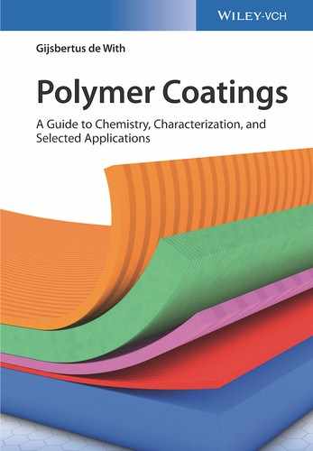
An important aspect of a coating is its optical appearance, including evidently whether the coating should be glossy or mat, as well as its color. Perception of color appears to be a complex area in which the light source, the material illuminated, and human factors all play their roles. Each of these aspects is discussed, so as to obtain an appreciation of their interplay in color perception and judgment as our judgment of color is quite ambiguous without special precautions. The perception of color by humans is the product of the spectral intensity distribution of the light source; the reflectance of the object, that is, the ratio of the reflected and incident flux at various wavelengths; and the spectral sensitivity of the eye, as visualized in Figure 11.4.
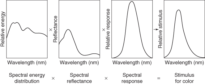
Figure 11.4 The stimulus for color depends on factors related to the light source, the colored object, and the sensitivity of the eye.
The first knowledge of the colors dates back to 1666, when Sir Isaac Newton used a prism to split white light into colors. He denoted them (as we know now from small to large wavelengths; Table 11.1) as violet, indigo, blue, green, yellow, orange, and red. In 1801 Thomas Young proposed his trichromatic theory, postulating that the eye has three types of color receptors. Refined by Hermann von Helmholtz (1867), this theory was useful in explaining many phenomena, like the various types of color deficiency. Young's postulate was experimentally confirmed by the discovery of the blue, red, and green sensitive cones in the retina of the eye in 1964 [16]. In the absence of proof of the existence of color‐sensitive receptors, many other color systems have been proposed of which we mention only the opponent‐colors theory of Ewald Hering, dating from 1874. This theory, using the three pairs of opposite attributes light–dark, red–green, and blue–yellow, is capable of explaining the afterimage and contrast effects and why color combinations like reddish green and bluish yellow do not exist.
Table 11.1 The colors of the (visible) electromagnetic spectrum and the color temperatures of various light sources.
| Color | λ (nm) | Light source | Color temperature (K) |
| Ultraviolet | …–380 | Candle light | 1800 |
| Violet | 390–430 | Sunset | 2000 |
| Indigo | 440–450 | 60 W light bulb | 2400 |
| Blue | 460–480 | Halogen light | 3200 |
| Green | 490–530 | Camera flash | 5600 |
| Yellow | 550–580 | Normal daylight | 5600 |
| Orange | 590–640 | Clear sky | 6500 |
| Red | 650–750 | Clear sky in summer | 8000–30 000 |
| Infrared | 750–… | — | — |
Nowadays we know that both systems are relevant: Our eyes detect according to the trichromatic system, but in the brain the signals are converted into opponent signals and both systems are in use. However, the trichromatic system prevails and is used, for example, in color printing, sometimes complemented by black, as well in the coding of television signals.
11.2.1 Light Sources
Light is electromagnetic radiation that we record with our eyes with wavelengths between about 400 and 750 nm (Table 11.1). Like all electromagnetic radiation, light propagates in vacuum with a velocity c = νλ ≅ 3 × 10⁸ m s−1, with frequency ν and wavelength λ. As heated bodies emit light, light can be characterized by a color temperature (CT). A heated black body at temperature T emits radiation with intensity E according to Planck's law:
where dE is the energy in the interval λ to λ + dλ and h and k denote Planck's and Boltzmann's constant, respectively. The emitted spectrum for different temperatures of the black body is visualized in Figure 11.5. A body at room temperature (300 K) emits no noticeable visible light, while a body at 1000 K emits some light of large wavelengths, leading to a red color. Still higher temperatures lead to a more whitish color. The total intensity is described by Stefan's lawE ∼ T4 and therefore rises quickly with rising temperature. Moreover, the contribution of the short wavelengths in the visible range becomes more pronounced.
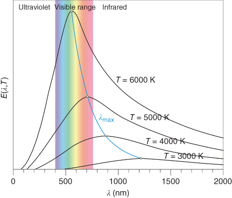
Figure 11.5 Intensity distribution of radiation of black body as function of its temperature.
In practice, the CT of light sources ranges between about 103 and 104 K, as illustrated in Table 11.1. In a narrow range of CT, differences in intensity and spectrum can well be noticed, as illustrated in Figure 11.5. For incandescent lamps the electrically heated filament more or less acts like a black body. In the case of fluorescent tubes, an electrical current that flows through mercury gas, thereby exciting the mercury atoms to a higher energy state, is used. On falling back to their ground state, the mercury atoms emit radiation in the UV range. The glass tube inner surface is covered by fluorescent material (phosphor) that absorbs the UV light and converts it to visible light. The mixture of phosphors defines the color of the tube. In this case one can expect that the visible spectrum is not as continuous as in Figure 11.5, but rather shows some narrow peaks, each peak being due to one of the phosphors used. Nowadays, light‐emitting diodes (LEDs) have become more common, and they emit light in bands centered at various wavelengths. Hence, to obtain white light, either a combination of various LEDs with a different central frequency is required, or part of the light should be converted by a fluorescent layer to another wavelength.
11.2.2 Color Sensing, Perception, and Quantification
Light that enters the eye is imaged onto the retina, the area on the backside of the eye that contains two types of photoreceptors, rods and cones [17]. On average the retina contains close to 4.5 million cone cells and 90 million rod cells. The rods are more sensitive than the cones, but they are not sensitive to color. The cones provide the eye's color sensitivity, and they are much more concentrated in the central yellow spot known as the macula. In the center of that region is the fovea centralis, a 0.3 mm diameter rod‐free area with very thin, densely packed cones. Experimental evidence suggests that the cones are of three different types, each sensitive to a different but widely overlapping range of optical frequencies. Although the three receptor types are often named blue (B), green (G), and red (R), one should be aware that in reality each type is sensitive to a wide range of wavelengths rather than to pure blue, green, and red. The approximate sensitivities of the cones (and rods) are shown in Figure 11.6. A problem in uniquely defining the sensitivities of the cones is that each type has the highest concentration at the optical axis but that their density drops off in a different way with increasing angles with respect to the optical axis. The brain converts the signals of these three receptor types into an actual perceived color.
Figure 11.6 The sensitivity and the angular distribution of the different receptor types.
The color of any object has its own distinct appearance based on three elements: hue, chroma, and value. Hue is how we perceive the object's color − red, orange, green, blue, etc. Chroma describes the vividness or dullness of a color or, in other words, how close the color is to either gray or the pure hue. Value represents the luminous intensity of a color, that is, its degree of lightness. However, color perception is subjective, analogous to the contrast effect for gray colors (Figure 11.7). There is, for example, the aftereffect: after prolonged viewing of a certain color, the perception of a next‐viewed color is shifted to the opposite of the first color. Another example is the Bezold–Brücke effect, which says that with increased luminance of an object, the perception of that object slightly shifts: below 500 nm to the blue end of the spectrum and above 500 nm to the yellow. These effects and others stress the need for well‐defined physical measurement and classification techniques.

Figure 11.7 The contrast effect: the central part in a left frame is erroneously seen as darker than the central part in the right frame.
Since the perception of color depends on the three types of cones, it follows that visible color can be mapped in terms of three numbers, called tristimulus values. Indeed color perception has been successfully modeled in these terms. This can be done in various ways, but we limit ourselves mainly to the almost generally accepted system of the International Commission on Illumination (Commission Internationale de l′Éclairage (CIE)), based on experiments in which colors are described by mixtures of three primary colors, usually red, green, and blue. In 1931 the CIE introduced a standard observer using a 2° foveal angle, while in 1964 they introduced a supplementary standard for a 10° angle, usually denoted with a subscript 2 or 10. As the light source is also important, it became standardized too. Often used illuminations are D65, representing standard (noon) daylight (CT = 6504 K), and A, representing typical, domestic, tungsten‐filament lighting (CT ≅ 2856 K). For fluorescent lighting, a series of twelve standards, denoted as Fj with j = 1, … , 12, is available. For example, F1 for daylight (CT = 6430 K), F2 for cool white (CT = 4230 K), and F4 for warm white (CT = 2940 K). With each of these light source definitions, the color matching functions ![]() ,
, ![]() , and
, and ![]() for the three types of cones in the retina of the standard observer were developed (Figure 11.8). Defining
for the three types of cones in the retina of the standard observer were developed (Figure 11.8). Defining ![]() with k a scaling constant and R(λ) the reflectance and using similar definitions for Y and Z , it holds that when the standard light sources C1 and C2 with different intensities E1(λ) and E2(λ) yield the same color, X1 = X2, Y1 = Y2, and Z1 = Z2. When using this scale, the color's lightness is defined by the Y value and its chromaticity by the quantities
with k a scaling constant and R(λ) the reflectance and using similar definitions for Y and Z , it holds that when the standard light sources C1 and C2 with different intensities E1(λ) and E2(λ) yield the same color, X1 = X2, Y1 = Y2, and Z1 = Z2. When using this scale, the color's lightness is defined by the Y value and its chromaticity by the quantities
Evidently these two parameters, x and y, completely characterize the color given a specific value of Y. In Figure 11.9 the so‐called 1931 CIE x,y chromaticity diagram is plotted. In this graph the spot labeled white represents white under standard daylight D65. Note that the right top triangle is empty, because the area with x + y > 1 is nonexistent. This horseshoe‐shaped color envelope represents on its rim the pure spectral colors from red to violet. The dashed line closing the horseshoe includes the two nonspectral colors purple and magenta. Going from white to any fully saturated color on the horseshoe means increasing the chroma at a specific hue while keeping the lightness (more or less) constant. White can be constructed by mixing blue and yellow light, according to the dashed line through the white spot. The relative intensities of these two composing spectral colors should be dosed according to the lever rule. In a similar way any other color can be constructed from the fully saturated colors, either spectral or nonspectral.

Figure 11.8 Color matching functions (the sensitivities of the color receptors for spectral light) for the color receptors with 2° (•) and 10° (o) foveal angle.

Figure 11.9 The 1931 CIE x,y chromaticity diagram.
One of the problems of the CIE 1931 (XYZ) system is that color areas are not proportional to the number of visually discriminative colors in any part of its diagram. For example, the green area is much larger than it should be. Moreover, tristimulus values, unfortunately, have limited use as color specifications because they correlate poorly with visual attributes. For the CIE x,y system, Y relates to value (lightness), but X and Z do not correlate directly to hue and chroma. To overcome the limitations of chromaticity diagrams like Yxy, the CIE recommended two alternate, uniform color scales: CIE 1976 (L*,a*,b*) and CIE 1976 (L*,C*,h°), often denoted as CIELAB and CIELCH, respectively. These color scales are based on transformations of the X, Y, and Z values to improve visual uniformity, use the opponent‐colors theory, and will be discussed in Section 11.2.4. Before we do that, however, we need to deal with scattering.
11.2.3 Scattering, Absorption, and Color
When (white) light strikes a coated surface, some of it is reflected, some of it is absorbed, and, if the object is not opaque, some of it is transmitted. The reflected light may be due to (i) a glossy, mirrorlike reflection (entrance angle = exit angle, specular reflection), (ii) a diffuse reflection with light scattered uniformly in all directions (exit angle over a (wide) angular range, diffuse reflection), or (iii) a reflection in between the extremes (i) and (ii) (Figure 11.10a). A highly polished metal can reflect as much as 99% of the incident light in the specular direction. A white powder, like TiO2, scatters the light uniformly in all directions and is also able to reflect as much as 99% of the incident light. Specular reflection is related to the visual perception of gloss, while diffuse reflection is related to the visual perception of lightness and, hence, to color.
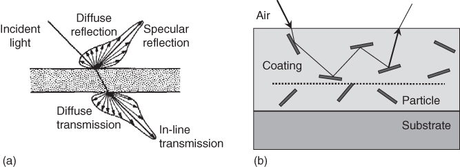
Figure 11.10 Reflection and transmission. (a) Specular and diffuse reflection and transmission. (b) Schematic of multiple reflection on particles dispersed in a coating. The angles of incidence and reflection are not necessarily the same as the particles may be rough. The dotted line indicates the maximum penetration depth from below which light no longer escapes.
Specular reflected light leaves the surface at the same angle as the incident angle. For normal incidence, the reflection coefficients of an optical beam on a smooth surface for a single reflection, R′, and for multiple reflections at the front and back of a (freestanding) film, R, are given by the Fresnel expressions
where nj refers to the refractive index of material j. Multiple reflection evidently occurs only when the coating is sufficiently transparent. For nonnormal incidence a somewhat more complex expression results, but the amount of reflected light remains dependent on the difference between the refractive indices of both materials. The higher the difference in value of n, the higher the reflection coefficients R′ and R. In principle, specular reflection could be optimized by selection of a binder with an optimal n‐value. However, as for most organic polymers the n‐value is between 1.45 and 1.60 and the chemical and mechanical properties and the durability of a coating are linked to the choice for a particular binder, this offers in practice not many options for optimization the reflectivity of a coating.
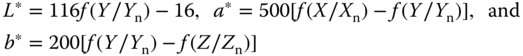
Scattering can be considered as reflection from uneven interfaces, be it the coating surface or the particle–matrix interface. Coatings that exhibit so much scattering within the film due to the presence of pigment particles in the coating that the transmission of light to the substrate is negligible are called opaque, and no color information from the substrate can reach the surface. Evidently, this depends on the thickness and properties of the coating. One usually speaks of hiding power to indicate in how far underlying colors are invisible. In the case of nonnegligible transmission, the transmission can be either diffuse or specular, depending on whether or not the light is mainly scattered while passing through a material. Coatings that exhibit no scattering and have hardly any absorption are called transparent, while materials that both transmit and scatter light are called translucent. Usually the aim of paint is to hide the color of the substrate and to give the object precisely and exclusively the color of the paint, requiring full hiding power, which is largely related to scattering. The pigment particles, when small enough, scatter light in all directions, and all the reflected irradiation follows paths like sketched in Figure 11.10b, resulting in a perfectly diffuse reflection only related to the coating itself.
If we introduce the parameter x = r/λ, where r is the radius of the particle and λ the wavelength of the radiation involved, the following three regimes can be recognized. For x < 0.1, scattering theory according to Rayleigh (1871) applies, while for x > 10 diffraction theory is relevant. In the intermediate regime with x ≅ λ, the more complex Mie scattering theory (1908) has to be used. Since the typical size of a particle is 0.25 µm and the wavelength of visible light is of the same magnitude, in principle the full Mie scattering theory has to be applied [18]. These calculations are complex as the refractive index changes with wavelength, the size of the particles is not uniform while they are often agglomerated to some extent, and multiple scattering occurs [19]. Similar as for reflection, though, the scattering power will be larger for particles with a larger refractive index difference with the binder. In that respect TiO2 is a very good candidate, as can be seen in Table 11.2. In summary so far, from the pigment point of view, both the refractive index and the size (distribution) of the pigments are important.
Table 11.2 Refractive indexn of binders and white pigments.
| White pigments | n | Binders | n |
| Diatomaceous earth | 1.45 | Vacuum | 1.000 00 |
| Silica | 1.45–1.49 | Air | 1.0003 |
| Chalk (CaSO4) | 1.63 | Water | 1.33 |
| BaSO4 | 1.64 | Polyacrylate latex | 1.40 |
| China clay (kaolin) | 1.65 | Polystyrene–acrylate latex | 1.43 |
| Talc (MgSiO3) | 1.65 | Polyvinyl acetate | 1.47 |
| Lithopone (from BaSO4 + ZnS) | 1.84 | Soybean oil | 1.48 |
| ZnO | 2.02 | Linseed oil | 1.48 |
| SnO | 1.09–1.29 | PVC | 1.48 |
| ZnS | 2.37 | Polyacrylate | 1.49 |
| TiO2 (anatase) | 2.55 | Soybean alkyd | 1.52–1.53 |
| TiO2 (rutile) | 2.73 | Alkyd/melamine/ureum (70/15/15) | 1.54 |
| Alkyd/melamine (75/25) | 1.55 |
Apart from the refractive index difference between particle and matrix, for white pigments it is also required that they do not absorb the visual light. This implies that the refractive index should not vary with wavelength. For oxides containing no dopants, this usually is approximately the case in the visible region. For example, for rutile the refractive index n with the wavelength ranging from λ = 0.43 µm to λ = 1.530 µm is well described by [20]
resulting in n = 2.87 at λ = 0.430 µm (violet) and n = 2.53 at λ = 0.750 µm (red). As scattering ability determines the hiding power, rutile has the best hiding power of the oxides (but is also rather expensive and under scrutiny for environmental reasons). Chalk in alkyds results in low hiding power, while its use in acrylate may yield acceptable hiding power. When the load of chalk is increased beyond the critical pigment volume concentration (CPVC), the hiding power increases drastically due to the fact that air domains will appear in the dry film. For similar reasons, a water‐based paint usually suffers some loss of hiding power on drying because water with a relatively low refractive index evaporates.
As indicated, also the particle size D is important for the hiding power and the amount of scattering. For a paint with a fixed volume fraction of pigment, the scattering intensity S increases in the Rayleigh regime with increasing D according to S ∼ D3. After having reached a maximum in scattering in the Mie regime, the scattering decreases according to S ∼ D−1 in the diffraction (or geometrical optics) regime. The optimum particle size Dm is related to the difference in refractive index between particle and binder np−nb, and Weber [21] showed that this size can be rather well described by
where λ, as before, is the wavelength of the light in vacuum. Using n = 2.75 for the pigment and n = 1.5 for the binder, for rutile the optimum size is about 210 nm at λ = 550 nm. With lower refractive index pigments, the optimal particle size shifts to larger values. As Dm is a function of λ, even a nonabsorbing, colorless pigment can result in a slight off‐white, toward blue, effect due to slightly wavelength‐dependent scattering. This can be counteracted to some extent by using a specific particle size distribution with a somewhat larger average size for the pigment.
In diffuse reflection the light travels to some extent through the coating before it leaves the coating again. Therefore, by incorporating a (color) filter in the binder, the spectral distribution of the diffusely reflected light can be changed. Filtering can be realized by incorporating organic and/or inorganic pigments in the coating. The former often absorb light by the presence of conjugated double bonds, while for the latter absorption occurs via electronic transitions and charge transfer between molecular orbital energy levels. In all cases the filter molecule or aggregate of molecules absorbs part of the radiation, while the rest just passes through and/or is scattered by it. Thus, on its way through the coating, the light loses part of its wavelength distribution and is left with the complementary part.
11.2.4 Addition and Subtraction Systems subtraction systems"?>
In Section 11.2.2 we introduced the CIE x,y system, which essentially describes color addition. However, the absorption process, briefly described in the previous section, deals with color subtraction. Consider the trichromatic color subtraction system, like in use in printing (see Figure 11.11). The primary light colors are red, green, and blue, and proper dosing of these primary color lights should lead to the desired stimulation of the cones in the eye (one can easily check this by defining a color with the RGB values on a computer screen). Now introduce filter pigments with color cyan, yellow, and magenta. The more of, for example, a cyan pigment is used, the more the red component of the light (the opposite color in Figure 11.11) is removed (or more precisely that part of the light that stimulates the red cones without stimulating the other cones). Similarly, yellow and magenta are colors opposite to green and blue, respectively.

Figure 11.11 The additive and the subtractive trichromatic systems.
Several subtraction‐oriented color systems have been developed over the years. We will only discuss here the CIELAB system. In this system, L* defines lightness, a* denotes the red/green value, and b* represents the yellow/blue value, and these values are calculated from the X, Y, and Z values according to
where the functions Xn, Yn, and Zn describe the tristimulus values of the illuminant used. The function f(Y/Yn) is defined by
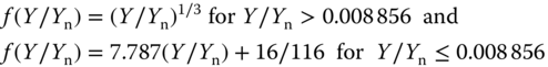
and similar expressions are used for f(X/Xn) and f(Z/Zn). The color‐plotting diagrams for (L*,a*,b*) are shown in Figure 11.12. The a* axis runs from left to right, and a step in the +a direction implies a shift toward red. Along the b* axis, a step in the +b direction represents a shift toward yellow. The center L* axis represents black at L* = 0 at the bottom and white at L* = 100 at the top. At the center of the a*–b* plane, the color is neutral or gray. While CIELAB uses Cartesian coordinates to calculate a color in a color space, the fully equivalent system CIELCH uses polar coordinates L* (lightness), C* (chroma), and h° (hue angle). The transformations read
It is in principle possible to achieve the same coating color with two paints that have different sets of pigments or, to be more precise, to see the same color under standardized daylight conditions. However, measured in spectral composition, these paints usually will be different. When the illumination conditions are changed, these two coatings may show considerable color differences, an effect called metamerism. Especially with automotive repair paints, this is an important issue, and in this case the spectral conformity, that is, the resemblance of the spectral distribution of the light sources, should be as good as possible.

Figure 11.12 The CIELAB system. (a) The CIELAB color chart, where A indicates a typical yellow color and B a typical red color in this black‐and‐white image. (b) The total system where the L* value is represented on the center axis and the a* and b* axes appear on the horizontal plane.
When using colored pigments, a question is: What is the optimal particle size? Usually large particles will not be penetrated completely by the light, and so the effectivity of the colored pigment is not optimal. Because colored pigments are generally expensive, its particle size should be kept as small as possible. As their refractive index usually is also lower than that of TiO2, their scattering power will be much less than of TiO2. Often a white pigment, like TiO2, is used as the basic pigment component as it determines the average optical path length of the reflected light in the coating. In that case the chroma is determined by the extinction of the colored pigment at that path length. This also implies that colloidal stability control is an important factor in all pigment applications as the various pigments will have different colloidal stability requirements.
Until now we assumed that, with diffusely reflected light, the color is not dependent on the measuring conditions. This is not entirely true. For this reason CIE has defined recommended geometries for color measurement. They all operate with standard white light. The geometries are shown in Figure 11.13. Of these the 0°/45° (Figure 11.13a) and 45°/0° instruments usually provide the same results, except when polarized light is involved like with oriented metallic flakes in automotive coatings. No instrument sees color more like the human eye than a 0°/45° instrument. This simply is because a viewer does everything in her or his power to exclude the specular reflection when judging color and a 0°/45° instrument largely removes gloss from the measurement and measures the appearance of the sample similarly as a human would do. For somewhat more detailed information, multiangle instruments are available, measuring at, say, 10°, 25°, 45, 75°, and 110° (Figure 11.13b). Integrating sphere instruments are used for randomizing the direction of either the incident or the reflected light and are the instrument of choice when the sample is textured, rough, or irregular (Figure 11.13c).

Figure 11.13 CIE recommended geometries for reflectance measurement with white light. (a) Single angle using the 0°/45° geometry. (b) Multiangle geometry. (c) Integrating sphere.
11.2.5 Color Tolerancing
Often colors are compared, and, clearly, just comparing colors visually is cumbersome, because poor color memory, eye fatigue, color blindness, and viewing conditions can all affect the ability of a human to distinguish color differences. Hence, an objective comparison is often highly desired, and this is frequently done using the CIELAB or CIELCH system. So, one puts ranges ΔL, Δa, and Δb on the coordinates L*, a*, and b* for which a (standard) human perceives no differences and calculates ΔE = [(ΔL2) + (Δa2) + (Δb2)]1/2. It appears, however, that the visual acceptability range is best represented by an ellipsoid (Figure 11.14) with one of its axes aligned radially, and since the CIELAB system uses Cartesian coordinates, the resulting tolerance block matches poorly with such an ellipsoid. In this respect the CIELCH system performs better, as the overlap between the ellipsoid and the tolerance wedge (a volume element in polar coordinate space) matches more closely (Figure 11.14). Still, the deviations between measurements and human perception remain relatively large. Accordingly, another system, based on the CIELCH system, was invented, purely for comparing colors by the Colour Measurement Committee of the Society of Dyers and Colourists in Great Britain that became public domain in 1988. It is known as CMC 1988 tolerancing system and uses, around any color (L*,a*,b*), an ellipsoid with semiaxes corresponding to hue, chroma, and lightness. This ellipsoid represents the volume of acceptable color deviation and varies in size and shape depending on the position of the color in color space. Since the eye will generally accept larger differences in lightness L than in chroma C, normally a default ratio L:C = 2 : 1 is used. By varying the ellipsoid volume via an extra commercial factor c, the ellipsoid can be made as large or small as necessary to match visual assessment acceptable for commercial purposes. If c = 1.0, then ΔECMC < 1.0 implies passing, but ΔECMC > 1.0 implies failure. A new tolerance method, called CIE94, was released by the CIE and also uses an ellipsoid as tolerance volume in color space using lightness L and chroma C, as well as a commercial factor c. These settings affect the size and shape of the ellipsoid in a manner similar to how the L, C, and c settings affect the CMC tolerance volume. While CMC tolerancing system targets the textile industry, CIE94 tolerancing system targets the paint and coatings industry. For textured or irregular surface, the CMC tolerancing system may be the best, but when the surface is smooth and regular, the CIE94 tolerancing system may be the best choice. It has been claimed [22] that while CIELAB and CIELCH result in 75% and 85% agreement with visual inspection, the CMC and CIE94 lead to 95% agreement. It seems that the CMC and CIE94 systems, as compared with the CIELAB or CIELCH systems, best represent color differences as our eyes see them. A review on color tolerancing is available [23].
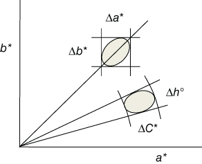
Figure 11.14 Tolerance ellipsoid inside the tolerance box (Δa*,Δb*) of the CIELAB system and within the tolerance wedge (ΔC*,Δh°) of CIELCH system.
In effect coatings containing flake pigments, the pigments cause a nonuniformity of color (i.e. a visual texture) and a dependence of color on measurement geometry. This so‐called color flop is usually accounted for by determining the color difference between two samples at several measurement geometries. For these effect coatings it is well known that changes in temperature affect the orientation mechanism of flake pigments during spraying. Therefore, color variations also occur if there is insufficient temperature control during paint application. The perceived texture of paints can be best described by two parameters, the so‐called glint impression (GI) and the diffuse coarseness (DC). Under diffuse illumination at a distance of about 70 cm, metallic and pearlescent coatings show a type of irregular light–dark pattern, labeled diffuse coarseness. Under intense unidirectional light, the same coatings show a sparkling formed by many tiny but intense reflections spots, labeled as glint impression. The actual perceived appearance is a combination of these two. Under outside conditions glint impression can be considered as the texture seen under a sunny sky, while diffuse coarseness corresponds to an overcast sky. Models and methods are available to assess texture values, but they have only about 80–90% correlation with visual assessments. This may limit (or avoid altogether) producing, applying, and assessing of the actual coatings [24].
Finally, we note that colors change in time due to effects such as aging caused by oxidation or degradation by UV radiation. The Hazen scale (also named the APHA scale and more appropriately as the platinum/cobalt (Pt/Co) scale) is used as a measure of this yellowing with time. It was originally intended to describe the color of waste water, but its usage has expanded to include other industrial applications. The scale is also sometimes referred to as a yellowness index as it is used to assess the quality of liquids that are clear to yellowish in color. The scale goes from 0 to 500 in units of parts per million of platinum cobalt to water, where zero on the scale represents distilled water. Standards can be used for both visual comparison and instrumental measurements. These standards are commercially available or made according to the guidelines prepared by the American Society for Testing and Materials (ASTM D1209 and D5386). The mixture itself is an acidic solution of potassium hexachloroplatinate(IV) and cobalt(II) chloride with different levels of dilution for intermediate steps.
To summarize, color assessment and perception is a complex issue but of primary importance for coatings. A great deal of research has been done, leading to far‐ranging standardization. Nevertheless, it may be wise to keep two statements by Billmeyer [25], an authority in the area of color, in mind:
- Use calculated color differences only as a first approximation in setting tolerance, until they can be confirmed by visual judgments – in other words, verify calculations visually.
- Always remember that nobody accepts or rejects color because of numbers – it is the way it looks that counts.
11.3 The Characterization of Feel or Haptic Property
Apart from targeting on appearance and other physical properties of coatings, also imparting the unique soft feel, also referred to as haptic property, has been taking place for some time, and the area of haptic coatings has grown in prevalence over the last two decades. These coatings are used by end users in a wide variety of applications to elicit a positive response from the end user. It has become quite common in automotive interior surfaces and has a long‐standing tradition in leather and textile coatings [26]. A key challenge in developing haptic coatings is the subjective nature of judging the feel using qualifications like rubbery, velvety, and silky. One approach to effectively balance the haptic properties with their other performance properties is through the development of an objective test methodology. Evaluation of this type of properties creates some special challenges as characterization methods are heavily biased toward physical properties in order to measure objective properties. Despite extensive work [27] in the area, there are no definitive models linking materials properties to tactile perception. Directly relating the feel to the coefficient of friction, hardness, deformation, and modulus of a coating is only of limited value. Possibly the work by Rutland et al. [28]2 has come the closest to building these understandings for coating systems by formulating coatings with different topology, but the same chemistry, having wrinkle wavelengths ranging from 300 nm to 90 mm and amplitudes between 7 nm and 4.5 µm. By comparing the results of 20 persons testing 201 pairs of surfaces, a two‐dimensional tactile space was defined by a rough–smooth dimension and a sticky–slippery dimension. A hard–soft dimension could not be observed as the chosen stimuli to isolate the effect of topography were all equally hard. The fact that the tactile space is well described by only two dimensions shows that the participants distinguished the surfaces with respect to two basic perceptual aspects, which cannot, however, be related a priori to physical quantities. It is generally held that perceptual dimensions are not linearly related to physical quantities or even combinations thereof. One of the surprising results of this work is that the minimum pattern that a human fingertip could distinguish from unwrinkled reference surfaces had a wavelength of 760 nm with an amplitude of only 13 nm. This shows unambiguously that the human finger, with its coarse fingerprint structure in the submillimeter range, is capable of dynamically detecting surface structures many orders of magnitude smaller and indicates that nanotechnology may well have a role to play in haptics and tactile perception.
Nevertheless, this does not remove the need for assessing perception by a human panel [29]. Assessing human perception is often counter to the bias scientists have regarding the need to remove the human element from the measurement process. There are also many pitfalls when quantifying human perception. One particularly dangerous pitfall is to confuse the actual human response with likes/dislikes about a product (hedonics). Over the last several decades the science of quantifying human perception to an external stimulus has been well developed, and this has now become an established research area [30, 31]. These methodologies are nowadays applied to quantify the human perception of haptic properties. In the next section one widely employed method in this field, quantitative descriptive analysis (QDA), will be discussed.
11.3.1 QDA of Haptic Coatings: An Example
Over the last 50 years QDA has been developed, which has greatly aided in understanding complex human responses to stimuli. In the language of sensory science, the elements of perception are described as sensory attributes. QDA allows one to ascribe a set of attributes to these coatings and map the multidimensional space in which they fall. As an example of QDA, a specific example will now be discussed. A panel of 12 people was trained over a period of several months [29] to quantitatively rate coated substrates on a set of attributes that were preselected to differentiate between the coatings [32]. These included attributes such as slippery, sticky, and perception of particles. In total 9 attributes were selected. For all attributes a standard test protocol was established, and a set of ratings standards were provided. This helped to anchor the panelist's results and reduce experimental errors. The methodology followed was a standard QDA. The different samples were evaluated by the panelists in a 2 hour session, thereby limiting fatigue among the panelists. Typically 10–12 unique coatings were evaluated, and each panelist rated all coatings. The sample orders were used according to statistical experimental plans that can deal with psycho/physiological carryover and sample order effects [33]. For the many coatings evaluated, the tests for a few were repeated multiple times to extract a sense of session‐to‐session variability, which was, however, found to be low. In addition several benchmark materials, such as velvet, paper, silk, satin, and leather, were evaluated. The coatings spanned a range of chemistries and technologies, such as 2K NCO coatings, acrylates, urethanes, and inorganic materials.
The data collected were evaluated using analysis of variance (ANOVA) [34] models to assess the quality of the data. In particular, the variability assigned to the different samples and that assigned to the panelists (assessors) or to replicates were assessed. In addition, the attribute data across all samples were analyzed and used to extract the principal components (PCs) present in the data. This procedure allows the responses to be condensed to a smaller set of principal attributes, but unfortunately it can be difficult to represent these principal dimensions in relation to the original attributes. In essence, the attribute space becomes a mathematically abstract space (analogous to reduction of reflection spectra into 3D color space). The advantage of a PC analysis is that it removes correlations that may exist between attributes, and thus it may be possible to condense many measured attributes into a simple two‐ or three‐dimensional space. In the measurements the 9 attributes used were each associated with a physical name; however, in principle these names are not important and in fact can skew results if too much significance is associated with a name. Hence, the attributes were listed as Al–A9. The robustness of the test panel was routinely checked by doing triangle difference tests [35], where the panelists were provided with two different samples, which they had rated previously as being different, and two where they rated them as essentially the same. In these triangle difference tests, the panelists rated samples as before, providing confidence that the chosen attributes could adequately differentiate between the coatings.
One of the first critical questions to answer when doing a measurement involving human perception is that of data quality: Is one measuring noise rather than or differences that really can be ascribed to the different samples? There are potentially two main sources of variability in measured attributes: first, the variability associated with the assessor (panelist) and, second, the variability associated with the product (i.e. the coated material). Assessor and product cross‐effects are also possible. These effects can be accounted for in a model that describes the data, while the remaining variability can be assigned to random noise (effects unaccounted for). In this case an R2 value larger than 0.8 was obtained for all attributes, indicating that the data are well described by the model. For all attributes the assessor was a significant factor. There are also significant assessor–product cross interactions, but in most cases the product contribution itself was significant, although it should be noted that very similar coatings were evaluated. The presence of a significant assessor effect highlights the need for doing balanced sessions and including several assessors (≅10) to generate a representative mean value. Hence, in all the analyses the mean values of the attributes for each coating or material were used.
To assess whether correlations exist between the measured attributes, the correlations were built using values from 207 (coating) surfaces, also including the correlation values between the attributes. As can be seen in Figure 11.15a, several of the attributes are correlated both positively and negatively, such as A3 and A4 or A3 and A6. The fact that some of the attributes are correlated suggests than in reality there may be a subset of combined attributes that can describe the variability in the data. This is the conceptual essence of PC analysis, in that it uses the correlations to build a new set of attributes that are linear combinations of the measured attributes with the idea of arriving at the minimal set required to explain the data. The method is quite powerful and leads to a lower dimensional representation of the data.
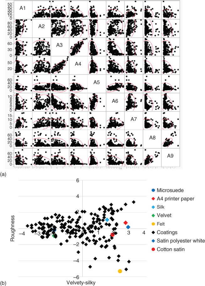
Figure 11.15 Quantitative descriptive analysis. (a) Correlation matrix for the nine attributes chosen, showing strong positive correlation for A3–A4 and A8–A9 and a strong negative correlation for A3–A6. (b) Plot of the samples used, including benchmark materials, in the cross section with axes velvety–silky and roughness of the 3D principal components space having stickiness as the third axis.
It appeared that only three PCs were required to explain 75% of the data variability. When taking into account the types of attributes being measured along with a consideration of the type of materials, it appeared that the three PCs can be described as velvety–silky, roughness, and stickiness (similar to others [36] that have found four important dimensions). As shown in Figure 11.15b positive values on the x‐axis represent a silkier and negative values a more velvety surface. Many of the coating systems display responses similar to many benchmark materials.
In conclusion, although one must be cautious to over‐ascribe meaning to the PCs obtained, the use of QDA methodology for quantifying human tactile response has proved to be very robust for haptic coatings. Using high‐quality data, such an analysis helped to differentiate between a wide range of coating surfaces spanning many polymer chemistries. The attribute responses can be reduced to PCs, and the coated surfaces can be represented in a 3D space. If, in addition, several benchmark materials, such as velvet, microsuade, paper, and silk, are characterized, this allows a better understanding of coating performance profile.
References
- 1 Schwartz, J., Mayer, B.A. and Smith, R.E. (1998). J. Coat. Technol.70: 71.
- 2 (a) Pierce, P.E. and Schoff, C.F. (1994). Coating film defects. In: Federation of Societies for Coating Technologies, 2e. PA: Blue Bell.(b) Schoff, C.K. (1999). J. Coatings Technol.71: 56.
- 3 (a) Bierwagen, G. (1975). Prog. Org. Coat.3: 110.(b) Bierwagen, G. (1991). Prog. Org. Coat.19: 59.
- 4 Haase, T. and Osterhold, M. (1996). Catalog of Defects, 2e. Wuppertal: Herberts GmbH.
- 5 Sharma, A. (1993). J. Colloid Interface Sci.156: 96.
- 6 Lee, S.H., Yoo, P.J., Joon Kwon, S. and Lee, H.H. (2004). J. Chem. Phys.121: 4346.
- 7 Geoghegan, M. and Krausch, G. (2003). Prog. Polym. Sci.28: 261.
- 8 Xue, L. and Han, Y. (2011). Prog. Polym. Sci.36: 269.
- 9 Plueddemann, E.P. (1991). Silane Coupling Agents, 2e. New York: Plenum Press.
- 10 Choi, S.‐H. and Newby, B.‐M.Z. (2006). Surf. Sci.600: 1391.
- 11 Orchard, S.E. (1962). J. Appl. Sci. Res.A11: 451.
- 12 Miller, D.G., Moll, W.F. and Taylor, V.W. (1983), Modern paint and coatings, April 30, Chem. Week. Ass.
- 13 Hill, L.W., Kozlowski, K. and Sholes, R.L. (1982). J. Coat. Technol.54: 67.
- 14 Fink‐Jensen, P. (1962). Farbe und Lack68: 155 (in German).
- 15 Patton, T.C. (1979). Paint Flow and Pigment Dispersion, 503–604. New York: Wiley‐Interscience.
- 16 (a) Marks, W.B., Dobelle, W.H. and MacNichol, E.F. (1964). Science143: 1181.(b) Brown, P.K. and Wald, G. (1964). Science144: 45.
- 17 (a) Curcio, C.A., Sloan, K.R., Kalina, R.E. and Hendrickson, A.E. (1990). J. Comp. Neurol. 292: 497.(b) See also Oyster, C.W. (1999). The Human Eye: Structure and Function. Sinauer Associates.
- 18 (a) van de Hulst, H.C. (1957). Light Scattering by Small Particles. New York: Wiley.(b) Kerker, M. (1969). The Scattering of Light and other Electromagnetic Radiation. New York: Academic Press.
- 19 See, e.g. Auger, J.‐C., Martinez, V.A. and Stout, B. (2009). J. Coat. Technol. Res.6: 89.
- 20 Devore, J.R. (1951). J. Opt. Soc. Am.41: 416.
- 21 (a) Weber, H.H. and Gerhards, J. (1961). Farbe und Lack67: 437.(b) Weber, H.H. (1961). Kolloid Z.174: 66.
- 22 Brochure (2007). A Guide to Understanding Color Communication. Michigan: X‐rite Company.
- 23 Kirchner, E.J.J. and Ravi, J. (2014). Color. Res. Appl.39: 88.
- 24 Kirchner, E.J.J. and Ravi, J. (2012). Predicting perceptions. Proceedings of the 3rd International Conference on Appearance, Edinburgh. p. 25.
- 25 Berns (2000).
- 26 Cackovich, A. and Perry, D. (2001). Paint Coat. Ind.17 (10): 72.
- 27 Wongsriruksa, S., Howes, P., Conreen, M. and Miodownik, M. (2012). Mater. Des.42: 238.
- 28 Skedung, L., Arvidsson, M., Chung, J.Y. et al. (2013). Sci. Rep.3: 2617.
- 29 Gebhard, M., Derks, E. and Buckmann, F. (2017). Quantifying human perception of haptic coatings: an analytical instrument with personality. CoSI 2017, Noordwijk, The Netherlands (26–30 June).
- 30 Stone, H., Sidel, J., Oliver, S. et al. (1974). Food Technol. 28 (11), 24, 26, 28, 29, 32.
- 31 Stone, H. and Sidel, J. (2004). Sensory Evaluation Practices, 3e. San Diego, CA: Elsevier Academic Press.
- 32 Civille, G.V. and Carr, B.T. (2016). Sensory Evaluation Techniques, 5e. Boca Raton, FL: Taylor and Francis.
- 33 Cochran, W. and Cox, G. (1957). Experimental Designs. New York: Wiley.
- 34 Box, G., Hunter, W. and Hunter, J. (1978). Statistics for Experimenters, An introduction to Design, Data Analysis, and Model Building. New York: Wiley.
- 35 Meilgaard, M., Civille, G. and Carr, B. (2007). Sensory Evaluation Techniques. Boca Raton, FL: CRC Press.
- 36 Picard, D., Dacremont, C., Valentin, D. and Giboreau, A. (2003). Acta Psychol.114: 165.
Further Reading
- Berns, R.S. (2000). Billmeyer and Saltzman's Principles of Color Technology, 3e. Wiley‐Interscience.
- Pierce, P.E. and Marcus, R.T. (2003). Color and Appearance. PA: Federation of Societies for Coatings Technology, Bluebell.
- Williamson, S.J. and Cummins, H.Z. (1983). Light and Color in Nature and Art. Wiley.
- Wyszecki, G. and Stiles, W.S. (1982). Color Science: Concepts and Methods Quantitative Data and Formulae. New York: Wiley.