
Microsoft Dataverse is a robust application platform that stores and manages all your business data in a tight security layer. The Dataverse is made up of tables and columns of business data. The Dataverse provides a standard set of Lead, Account, Contact, Opportunity, and Quote tables, which are used in common scenarios such as lead qualification and quote review. You can also configure custom tables to fit your specific business needs. You can use dataflow to import data into your table, by using Power Query with data transformation.
Microsoft Power Platform is made up of Power Apps, Power Automate, Power BI, and Power Virtual Agent, They can be configured to use the data stored in the Dataverse.
In this chapter, you learn about working with Dataverse tables, columns, and solutions. You learn about schema customization and how to configure forms, views, and relationships between tables.
Dynamics 365 and the Dataverse are closely related. Dynamics 365 applications such as sales, marketing, and services also use the Dataverse to store data. This enables you to build apps by using Power Apps and the Dataverse directly against your core business data, which is already used in Dynamics 365, without the need for integration.
Understanding Power Apps Solutions
Solutions are a great way to package configuration items and customization components to distribute to upstream environments. This ensures Application Lifecycle Management (ALM) for solution components in Power Apps. For example, if you want to develop a custom application and have the same application in other environments or if you want to share your app with source configurations, you can package all the components into a Power Apps solution. Then you can export them from the source environment and import them into the target environment.

A rectangular box titled solution on the top left presents solution components that read nine boxes placed three in a row. Each box reads tables, flows, roles, fields, power apps, web resources, relations, chatbots, and assemblies. The boxes are shaded.
Solution components
Versions in Solution

A table of our columns and two rows. The contents of the table are listed below. Row 1: major, minor, build and release. Row 2: 1, 0, 0, and 0.
Solution version format
Create a New Solution
To create a new solution, you have to navigate to make.powerapps.com and provide the credentials. You will be directed to the Power Apps home page. Choose the environment you want to use to create the solution.
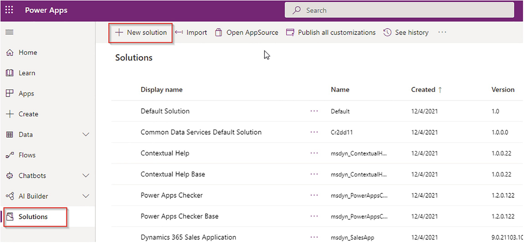
A screenshot of a webpage titled power apps on its left top and search tab on its right. It has a menu bar where the new solution is highlighted. It has 2 panels. The first panel lists a few options and the solution is selected. The second panel reads solutions. It lists the display name, name, created, and version with their corresponding details.
Solutions view and creating a new solution

A screenshot reads the new solution on its left. It lists display name with a box reads school solution highlighted as 1, a name with a box reads school solution highlighted as 2, a publisher with a box reads select a publisher and plus new publisher highlighted as 3, asterisk with a box reads 1 dot 0 dot 0 dot 0, and more options with a box below.
Solution details and information
In the New Publisher panel, provide the Publisher Display Name, the Name without a space, a Description, and a prefix that’s a maximum of eight characters. Click Save.

A screenshot reads the new publisher on its left. It lists properties (selected), and contacts. It lists display name, name, description publisher, and each option with a box below reads school publisher, prefix with a box reads school, choice-value prefix with a box reads 2 8 4 6 0, and a preview of new object name with school underscore object.
The publisher creation panel

A screenshot of a webpage titled power apps on its left top. It has two panels. The first panel lists a home, learn, apps, and create. The second panel has two sections. The first section has a menu bar. The second section reads solutions on its left top. It lists the display name, name, created, and version with their corresponding details.
Solution in view
You have successfully created a solution in Power Apps. Solutions that are freshly created are unmanaged by default. You can add components to the solution now.
The Solution Types
Solution Type | Details |
|---|---|
Default | This is a special solution that contains all components in the system of the current environment. The default solution is useful for finding all the components and configurations in your system. Default solutions cannot be exported. |
Unmanaged | Solutions that are in the development stage. With unmanaged solutions, you can add, remove, and delete components. |
Managed | When an unmanaged solution is completed with the development activities and is ready for production or distribution, you can export the unmanaged solution as a managed solution by specifying the managed properties. You cannot edit components inside managed solutions unless the managed property is enabled. It is recommended that export solutions are always managed. |
Managed Properties

A screenshot reads school solution on its left top greater than all. It reads the display name and name. It lists a radial box selected, accounts colon account that lists a menu that has edit, publish, add required components, managed properties (selected), show dependencies, see solution layers, add subcomponents, and remove.
The Managed Properties option

A screenshot of managed properties menu. It lists allow customizations, display name can be modified, can change additional properties, new forms can be created, a new chart can be created, new views can be created, can change a hierarchical relationship, can change tracking be enabled, can enable sync to the external search index. All are selected
The Managed Properties option lists
Publish the Solution
Every time you update a solution component, you need to publish the solution so that the changes will be reflected; otherwise, the changes will be just saved, not published.
Solution Patches
A solution patch contains changes or updates to the parent solution, such as adding or editing components. You are not required to add parent solution components to the patch unless you want to edit the component. Solution patches are useful for hotfixes and small changes to existing components of a parent solution.
Solution patches let you choose a new build or release version. You cannot change the Major or Minor version of the parent solution. Figure 2-9 shows some solution patches.
When you clone a patch, the parent solution becomes read-only. You cannot change any components inside the parent directly; rather, you have to work on the patches. Once you are ready for a major upgrade, you can create a clone of the parent solution, which will roll up all patches and create a new major version of the previous parent solution with all the components.

A quartet of tables with 2 rows and 4 columns. Each table reads a header of major, minor, build, and release. Table 1 is on the left and tables 2, 3, and 4 are on the right. Table 1 is named parent solution. Table 2 is patch dash 1. Table 2 is patch dash 2. Table 3 is patch dash 2. Table 4 is patch dash 3. Each table lists its corresponding values.
Solution patches
Cloning Solutions
When you clone an unmanaged solution, the original solution and all the patches of the solution are rolled up into a newly created version of the original solution. After you clone, the new solution version contains the original entities plus any components or tables that were added in the patch.

A flow diagram of 3 stages. Stage 1 reads a parent solution, patch 1, patch 2, and patch 3 with a quartet of tables. Stage 2 reads clone 1 and patch 1 of clone 1 with a pair of tables. Stage 3 reads clone 2 with a table. Arrows between each stage are named cloned. Each table has 2 rows and 4 columns with major, minor, build and release data.
Patch deployment diagram
Export and Import Solutions
Solutions can be exported from a source environment as a managed or unmanaged solution and imported into a target environment. When you import a managed solution into a target environment where an older version of the same solution is imported, you have more options to choose when importing the managed solution.
As a best practice, you should export solutions as managed solutions so that when you import them, they can be rolled back. Unmanaged solutions cannot be rolled back.
Managed solutions are imported and stacked in multiple layers in the target environment. If you uninstall a managed solution, the changes will affect the solution below the uninstalled layer. Read more about solution layers at https://docs.microsoft.com/en-us/power-apps/maker/data-platform/solution-layers.
You can choose the Upgrade, Stage for Upgrade, and Update options when importing managed solutions.
Upgrade
Upgrade is the default option. It upgrades your solution to the latest version and rolls up all the previous patches in a single step. Any solution components associated with the previous solution version that are not in the newer solution version will be deleted in the target environment. This is the recommended option, as it will ensure that your resulting configuration state is consistent with the importing solution, including removing components that are no longer part of the solution.
Stage for Upgrade
This option upgrades your solution to the higher solution version, but does not delete the previous version and any related patches until you apply a solution upgrade. This option should only be selected if you want to have the old and new solutions installed in the system concurrently, perhaps so that you can do some data migration before you complete the solution upgrade. Applying the upgrade will delete the old solution and any components that are not included in the new solution.
Update
Maintain customizations (recommended): Selecting this option will maintain any unmanaged customizations performed on components but also implies that some of the updates included in this solution will not take effect.
Overwrite customizations: Selecting this option overwrites any unmanaged customizations previously performed on components included in this solution. All updates included in this solution will take effect. Figure 2-11 shows the options while importing an existing managed solution.

A text with three radio buttons. 1. Upgrade selected, upgrades your solution to the latest version. Any objects in the newest solution will be deleted. 2. Stage for an upgrade, upgrades your solution to the higher version but defer the deletion of the previous version and any related patches until the upgrade later. 3. Update, replaces your older solution with this one. The first button is selected.
Upgrading solution options
Working with Table Configurations and Settings
In the previous section, you learned how to create solutions in Power Apps. In this section, you see how to configure tables in the Dataverse. In the Dataverse, tables are used to store data. For example, you can create a table to store student data.
Table Types
Tables are classified into three categories—Standard, Activity, and Virtual. Standard tables are best when you want to store transactional or master data. For example, Student, Professor, Time Sheet, Loans and so on, can be considered standard tables. Activity tables represent activities. For example, Letter, Email, Appointment, Booking, and so on. They require a timestamp to complete the activity. All activity type tables have date and time related columns, such as Due Date, Start Time, End Time, and so on.
Virtual tables are special tables that you can create for integration purposes. They are also known as virtual entities and they enable the integration of data residing in external systems by seamlessly representing that data as tables in the Microsoft Dataverse, without replicating the data and often without custom coding. Virtual tables replace previous client-side and server-side approaches to integrating external data. These old approaches required customized code and suffered from numerous limitations, including imperfect integration, data duplication, and extensive commitment of development resources. In addition, for administrators and system customizers, the use of virtual tables greatly simplifies administration and configuration. Read more about virtual tables from Microsoft at https://docs.microsoft.com/en-us/power-apps/developer/data-platform/virtual-entities/get-started-ve.
Record Ownership
While creating tables, you need to determine whether the table will store organization owned data or user/team owned data. If you think that the records require a proper user/team level security, choose user/team owned; otherwise, choose organization owned. For example, tables such as Article, Article Template, Competitor, Currency, and Web Resource are organization owned. Tables like Account and Contacts are user/team owned because these records are owned by a user or team. They’re connected to a business unit and have specific security roles for the business unit. Therefore, these entities participate in role-based security.
Table Configurations
Tables are used to model and manage business data. When you develop an app, you can use standard tables, custom tables, or both. The Dataverse provides standard tables by default. These are designed, in accordance with best practices, to capture the most common concepts and scenarios in an organization. While configuring tables you can enable/disable many features, such as apply duplicate detection rules and enable them to create activity.
A table defines information that you want to track in the form of records, which typically include properties such as company name, location, products, email, and phone.
Types of Tables
Standard: Several standard tables, also known as out-of-box tables, are included with the Dataverse environment. Account, business unit, contact, task, and user tables are examples of standard tables in the Dataverse. Most of the standard tables included with the Dataverse can be customized. Tables that are imported as part of a managed solution and set as customizable also appear as standard tables. Any user with appropriate privileges can customize these tables, where the table property has customizable set to true.
Managed: Tables that aren’t customizable and have been imported into the environment as part of a managed solution.
Custom: Unmanaged tables that are either imported from an unmanaged solution or are new tables created directly in the Dataverse environment. Any user with appropriate privileges can fully customize these tables.
Create a New Table
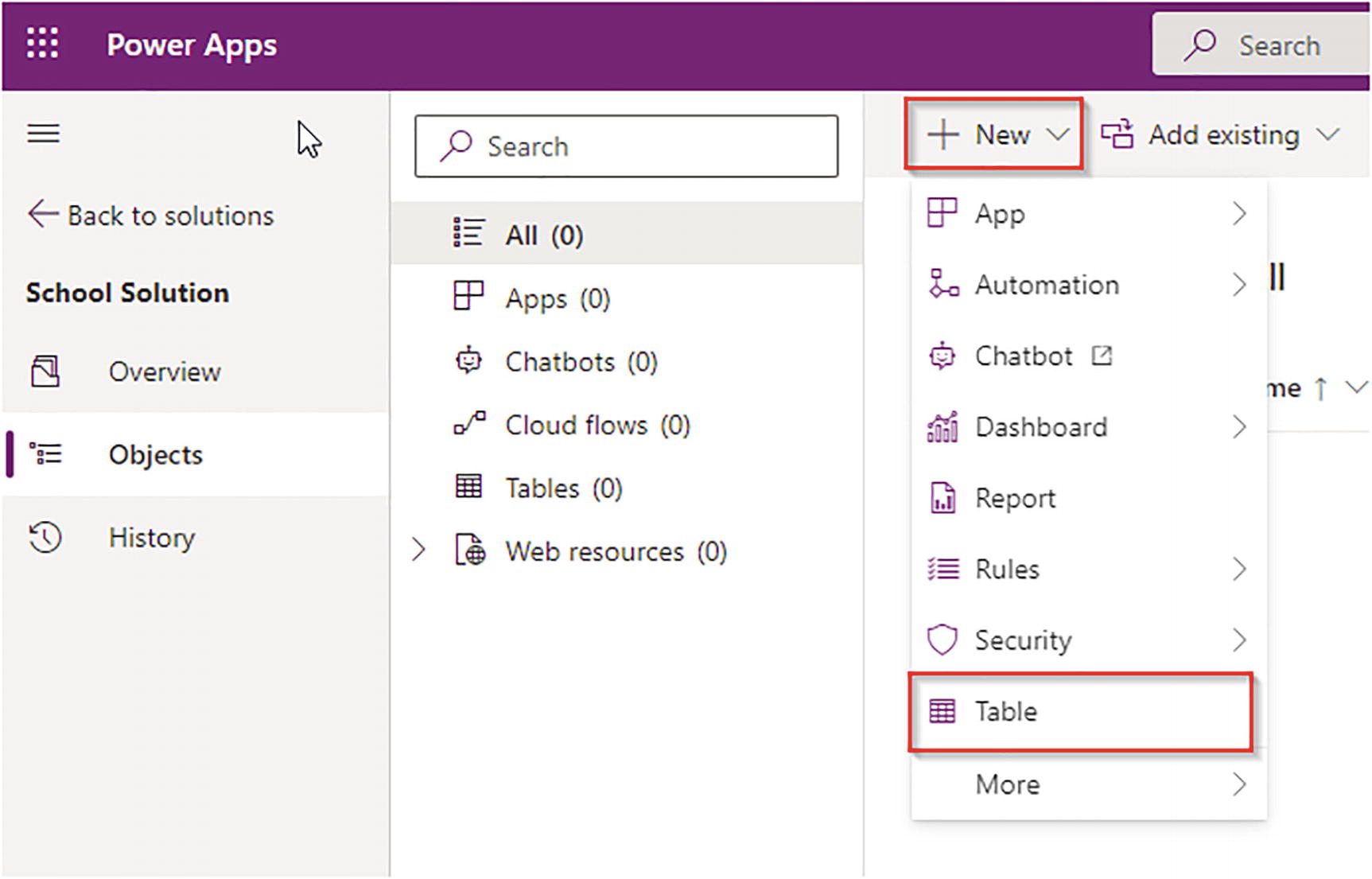
A screenshot of a webpage titled power apps on its left top. It has three panels. The first panel lists a menu of school solutions where the object is selected. The second panel lists all, apps, chatbots, cloud flows, tables, and web resources. The third panel presents a menu bar where new is selected that lists a menu where a table is highlighted.
Add a new table
The new table creation side panel will open, where you can provide table information. This chapter builds a school management system, so you see how to design the tables based on these requirements.
Requirements
This school management system must allow users to enter student information such as roll number (auto-number), name, address, father’s name, mobile, email, and qualification. The system should capture course information and the users should be able to record students joined for courses. The app must create payment information with term facility and payment details.
Add a new table with Display Name set to Student (the plural name is automatically populated as Students). Provide a description for the table, such as “Stores student information”. If you want to enable features, click the Advanced options. Choose Type as Standard and Record Ownership as User/Team.

A screenshot reads the new table on its left. It lists properties- selected, and the primary column. It lists display name, plural name both with a box reads students, description with a box reads store student information, advanced options, schema name, type, and record ownership with boxes below and their related details.
Table configuration
In this case, the Student table has three names—Display Name: Student, Schema Name: school_Student, and Logical Name: school_student.

A screenshot reads properties and primary column- selected. It lists display names with a box that reads name and description. Advanced options with schema name with a box read school underscore name, column requirement with a box reads business required, and maximum character count with a box reads 100.
Primary field of table configuration
After providing these details, save the Student table. The table will be listed under the component list of the solution.
For any table, you can configure Columns, Relationships, Business Rules, Views, Forms, Dashboards, Charts, Keys, Commands, and Manage Data. You learn more about these options in upcoming sections of this chapter.
Working with Columns, Datatypes, Calculated Fields, and Rollup Fields
Click the table to open the table component to add or edit the columns. Columns are fields that store information about the student, such as roll number (auto-number), name, address, father’s name, mobile, email, and qualifications.
System Columns vs. Custom Columns

A screenshot reads school solution, tables, and student (highlighted). It lists a menu bar where the column is selected. It presents display name, name, data type, type, and custom. Each column further lists their related data. In the display name column, the data from, created by to U T C conversion time zone code is highlighted within a box.
System columns
You can add custom columns as per your business needs. The custom fields can be identified by their Name, which is specified with the publisher prefix. The primary key is represented as <prefix>_<tablename>id, which is a 32-bit digit called a unique identifier. It behaves as a primary key of records.
Datatypes

A screenshot reads text on its left top. It reads the data types on the left and the columns on the right. A few data types are text, text area, email, U R L, ticker symbol, phone, auto number, whole number, whole number, duration, timezone, language, date time, date and time, date only, choice, choices, currency, customer, and file.
Column datatypes
Calculated Fields
Calculated fields are the fields for which values can be automatically calculated using conditions and formula in design time. These values will be automatically assigned to the field once certain conditions are satisfied. For example, if you want to store the next renewal date of a student automatically after the student is created, you can use the Feature Calculated field to auto-calculate the renewal due date and store that value. You don’t have to write any custom code,
Read more about calculated columns and their configurations at https://docs.microsoft.com/en-us/power-apps/maker/data-platform/define-calculated-fields.
Rollup Fields
A rollup field contains an aggregate value that’s computed over the records related to a specific record, such as unpaid payments. You can also aggregate data from activities directly related to a record, such as emails and appointments, and activities indirectly related to a record via the Activity Party entity. In more complex scenarios, you can aggregate data over a hierarchy of records. As an administrator or customizer, you can define rollup fields by using the feature, all without needing a developer to write code.
Read more about rollup fields and their configuration at https://docs.microsoft.com/en-us/power-apps/maker/data-platform/define-rollup-fields.
Column Name | Datatype |
|---|---|
Address | Multiline text |
Father Name | Text |
Mobile | Phone |
Gender | Choice (Male, Female, Other) |
Qualification | Choices (MCA, MBA) |
Click the +Add Column option to create these columns. Set the Required option to Optional, Required, or Business Recommended, as needed. If the business need is to require a mobile number, choose Required here. If a field value is not mandatory, it can be defined as Business Recommended. That way, a plus sign appears next to the field, indicating it’s recommended. The system will not restrict record creation if you leave the field blank.
To add the Choice datatype field, you need to add items to choose the field by selecting the New Choice option. Every choice field has a Text value to display and a Value option to be used internally. You can change them if you want.
Read more about the Choice field configuration at https://docs.microsoft.com/en-us/learn/modules/working-with-option-sets/3-exercise.

A screenshot reads the mobile number on its left. It lists the following. Display name with a box reads the mobile number, Name with a box reads school underscore mobile number, Data type with a box reads phone, Required with a box reads required, and a radial box- selected searchable.
The Mobile Number column

A screenshot of a table of 7 rows and 8 columns. Column 1 lists the student, qualification, name, mobile number, gender, email, and address. Column 2 lists ellipses, column 3 lists the school details, column 4 lists emails and phone, column 5 lists standard and custom, columns 6 and 8 lists tick marks, and column 7 lists required or optional.
Custom columns
Auto-Number Columns in the Dataverse

A screenshot reads the Roll number on its left. It lists the following. Display name, Name, Data type, Required, a radial box- selected- Searchable, Auto number type, Prefix, Minimum number of digits, Seed value, and Preview. Each option presents a box below it with its related details.
Roll Number column auto-number
Set Prefix to STD, Minimum Digits to 4, and Seed Value to 1000. The preview will display as STD-1000, STD-10001, and so on.
Save the column after configuration and then save the table. Now, whenever you create a student record, the roll number will be automatically generated.
Configuring Relationships and Relationship Behaviors
Relationships in the Dataverse are between two tables. For example, a student might have multiple payments, and one student can register for multiple courses. So, for such scenarios, you can associate two tables with a relationship.
There are three types of relationships in Power Apps—one to many (1:N), many to one (N:1), and many to many (N:N). The 1 is the parent and the N is the child.
Configure a new table called Student Payment with Payment ID, Amount, and Terms columns and build a 1:N relationship between Student and Student Payment.
Column Name | Datatype |
|---|---|
Payment ID | Auto Number |
Amount | Currency |
Term | Choice (1, 2, 3) |

A screenshot of a table of 5 rows and 3 columns. Column 1 lists the amount- selected, amount base, name primary name column, student payment, and term. Column 2 lists ellipses, column 3 lists school underscore amount, school underscore amount underscore base, school underscore name, school underscore student payment id, and school underscore term.
Payment table columns
Now add a relationship to the Student Payment table. The following diagram defines the relationship between Student and Student Payment.
 A pair of tables. Table 1 titled students lists the roll number, full name, address, father name, mobile, email, qualification, and gender with their respective details on its right. Table 2 lists the payment id, student, amount, and terms with their respective details on its right. Tables are connected by arrows named 1 and N.

A screenshot of a header reads add a relationship, add subcomponents, and add required components. The add relationship option lists a menu of many to one, one to many, and many to many options that overlap a page that reads student payment.
The many-to-one relationship

A screenshot reads many to one on its left top. It presents two panels. The first panel reads current-many that lists, table with a box read student payment-greyed out, the Lookup column display name with a box read student, and Lookup column name. The second panel reads Related data that lists Table with a box below selected student.
The many-to-one relationship setup
For every many-to-one relationship, a new lookup field will be created in the table, which represents the many; the lookup points to the table record, which represents the 1.
In this case, Student Payment represents the many, so a new lookup column is created called school_Student in the Student Payment table, which holds the student record.
Relationship Behavior
Relationship behavior defines how the parent records behave when you perform an operation such as delete, assign, share, and so on, on their child records.
Type of Behavior | Datatype |
|---|---|
Referential | Referential behavior has two actions: Delete - Remove Link: You can delete a parent record and the related child records remain in the system. The lookup field that holds the parent record association will be blank. Delete - Restrict: Any related records can be navigated to. Actions taken on the parent record will not be applied to the child record, but the parent record cannot be deleted while the child record exists. |
Parental | Any action taken on a record of the parent table is also taken on the related child table records. |
Custom | Custom behavior for each possible action can be selected. You can define custom cascade behavior for operations such as Share, Assign, Un-share, Reparent, or Delete. Cascade All: Any action taken on a record of the parent table is also cascaded to the related child table records. Cascade Active: Any action taken on a record of the parent table is cascaded to the related active child table records. Cascade User-Owned: Any action taken on a record of the parent table is cascaded to the related child table records owned by the current, logged in user. Cascade None: Actions taken on a record of the parent table will not cascade to the related child table records. |
For the current scenario, use the Referential relationship behavior and the Restrict Delete operation.
This way, you can configure the relationship behavior as one-to-many or many-to-one only. For a many-to-many relationship, this type of behavior is not applicable.

A work plan with a hexad of tables placed 3 in a row. Each table is named students, students, payment details, student registered courses, courses, and professor. The tables list their related details. Data flows through Tables 1, 2, and 3. Data from Tables 5 and 1 flows to 4. Data interflows within 5 and 6. Outflow data is 1 and the inflow is N.
ER diagram overview

A screenshot reads many to many on its left top. It presents 2 panels. The first panel reads current many that lists, Table with a box read professor greyed out, Relationship name, and Relationship table name. Each with boxes below read their related details. The second panel reads Related many that lists Table with a box below reads courses.
The many-to-many relationship
You have now created all the tables and relationships for the school management system.
Working with Business Rules
Action | Explanation |
|---|---|
Set Field Value | Use this action to set a value of a field. |
Set Default Field Value | Use this action to set the default value of a field. |
Lock/ Unlock Field | Use this action to make a field read-only or editable. |
Set Business Required | Use this action to make a field mandatory or optional. |
Set Visible | Use this action to hide or show a form field. |
Recommendations | Use this action to recommend some action to the user. |
Show Error Message | Use this action to display an error message. |
Scope of Business Rules
Scopes | Explanation |
|---|---|
Entity | This scope ensures that the business rule will work on the client-side and the server-side. The business rule will run when you interact with data using table forms and will be applicable when you are creating records using server-side code, like plugins. |
All Forms | This scope will only applicable when you create records using table forms i.e., only on the client-side. |
Specific Form | This scope will only applicable when you create records using a specific table form, not all forms. |
You cannot use datatype fields in business rules. Business rules are table specific. So, to add a business rule, you have to open a table and select the Business Rule option.
Create a Business Rule

A screenshot. A page reads student colon new business rule on its left top with sope at its right top which highlights 6. scope that lists entity, all form, and information. It presents two sections. The first section highlights 1. define name and 2. description. The second section highlights 3. rule canvas, 4. rule condition, and 5. actions.
The Business Rule Designer
Business Requirement: Make the email field mandatory for all mail students.
Provide a Name, Description, and Scope as Entity and then click the condition box on the rule canvas to enable the property window.

A screenshot of a dialog box that lists the options under the properties tab. It reads condition and lists the options: display name, entity, rules, rule 1, source, field, operator, type, value, and condition expression. Each option has a box below that reads their related data. The bottom of the page has Apply-selected and discard buttons.
The business rule condition setup

A screenshot. It reads student colon new business rule. It presents two panels. Panel 1 reads four boxes placed two in a row. Condition, set business required, a greyed-out box, and business rule. Panel 2 lists the options under the properties tab. It lists the display name, entity, and business required with apply-selected and cancel buttons.
The business rule components

A screenshot presents two panels. Panel 1 reads four boxes placed two in a row. Condition check if male student, if yes set business required mandate email, if no new action. Panel 2 lists the options under the properties tab. It lists the display name, entity, and business required. Each option has boxes below it that read their related data.
The business rule components using the negation branch

A screenshot. It reads a menu bar at the top. The bar Email: Required field must be filled in is highlighted. New student dash unsaved. It further lists General, Name: Rakesh Kumar, Gender: Male, Email: dash dash dash Email: Required fields must be gilled in is highlighted.
The business rule testing scenario
Now you can configure multiple business rules for tables, based on your business needs. Make sure to choose the correct scope for these business rules.
Configure Views for Tables
Views are a subset of a table’s records, defined by a filter condition. For example, you can create a view to display students joined this year as a view so that you do not need to build the query every time to fetch data. Instead, you can select the view and get the data. Views come in three types—system views, custom views, and user/personal views.
System and custom views are those views that you configure inside a solution; they are visible or accessible to any user in the organization. System views are by default created by a solution, but custom views are manually created inside a solution. Personal views are created by users and are visible only to the user who created them.
System views cannot be shared because they are available to all users. Personal views can be shared by users, as they are created by specific users. You can use Advance Find to create personal or user views.
System View | Explanation |
|---|---|
Active View | This view displays active records. |
Inactive View | This view displays inactive records. |
Quick Find Active View | This view displays records in the search option. |
Advanced View | When you search records in Advanced Find, this view is used. |
Associated View | This view is responsible for displaying records in a related table view. |
Lookup View | This view is used when you search records in a lookup control. |

A screenshot of a menu bar reads columns, relationships, business rules, vies, forms, dashboards, charts, and keys. It lists the options under the views tab. Name, View type, Status, and Type. The name column lists the student details. View type column lists default or associated view. The status type column lists active. The type lists standard.
The views list
Create a Custom View
Create a custom view to display only male students. For this requirement, you simply navigate to the solution and open the Student table, select Views, and then click Add View.

A screenshot of 2 panels. Panel 1 reads a header Create a view with clipart of a notepad with stacks and arrow symbols. Panel 2 reads the Name view that lists Name and Description with boxes below it reads male students and this view displays male students.
The views list

A screenshot of a page titled power apps. It has three panels. The first panel lists a menu of table columns where the contents of the table are highlighted. The second panel lists the Roll Number, Name, Email, and View column. The third panel presents the options under the Male student's tab, where the option edit filters is highlighted.
The views columns

A screenshot of a dialog box reads edit filters. It lists And, Gender, Equals, Male, ellipses, and Add. Each option is defined in boxes. Two buttons Ok and Cancel are observed at the bottom. Ok is selected.
The views filter condition

A screenshot of a dialog box reads Sort by ellipses. It lists a box that reads Roll Number with Then sort by option below.
Sorting views
Once you have completed these steps, save and publish the view. You have successfully created a custom view. Now you can test it.

A screenshot of a menu bar where Male students at the right top are highlighted. It lists School Solution Advanced, Tables, and students (highlighted). It further lists columns, relationships, business rules, views, forms, dashboards, charts, keys, commands, and data that read Roll Number, Name, and Email of the saved student.
View selector option
Table Forms Design and Layouts
Forms are user interface elements by which users can interact with datasource. You can use forms to create new records and update existing records.
Form | Explanation |
|---|---|
Main Form | The default form that can be used to interact with table records. |
Quick View Form | Can be configured to display parent record information inside the child record form. |
Quick Create Form | Used to quickly create records of a table type with fewer data items. This form can be created if you have enabled the table setting for Quick Create form. |
Card Form | Used to display information in a card format. |
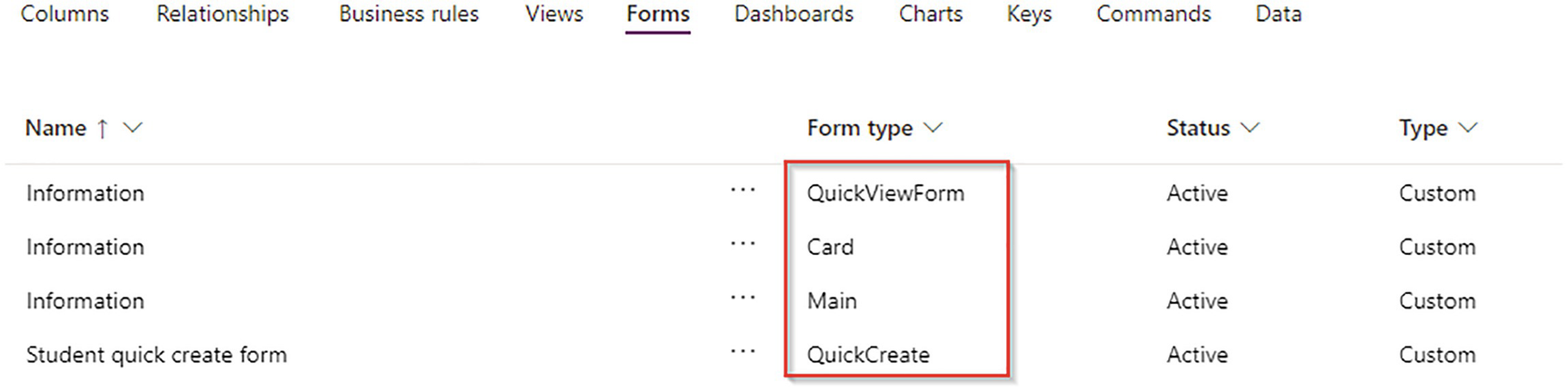
A screenshot of a page that reads the data under the forms tab in the menu bar. It lists Name, Form Type, Status, and Type. The Name column lists the student information. The form type column is highlighted that reads quick view form, card, main, and quick create. The status column reads active. The type column reads custom.
Form types
You can edit the form layouts as needed. The main form consists of three parts—header, body, and footer. Inside the body, you can add tabs, and inside tabs, you can add one or multiple column sections. Section can be used to hold one or multiple fields.
Form Security

A screenshot of a form settings box overlaps the objects window. It has 2 panels. Panel 1 has a menu where a security role is selected. Panel 2 has security roles for portal student form with specific security roles selected. It lists the Name and Business unit of the saved data. Save and publish-greyed out, and cancel buttons are observed below
Form security
Enable Fallback Form

A screenshot of a form settings window. It has 2 panels. Panel 1 lists a menu where a fallback form is selected. Panel 2 reads fallback forms with Enable fallback forms for the student table. It lists Name and Enable or Disable data where the information row is selected. Save and publish-selected, and cancel buttons are observed below.
The fallback form option
Create New Forms
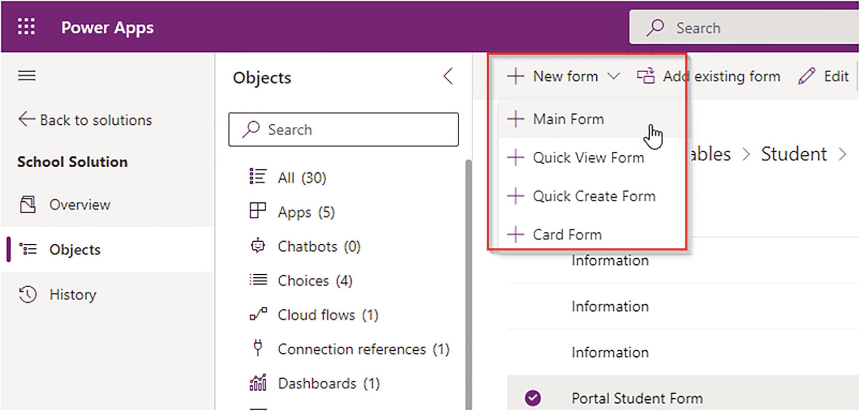
A screenshot of a page titled power apps. It has three panels. Panel 1 lists a menu of school solutions where the object is highlighted. Panel 2l lists the All, Apps, Chatbots, Choices, Cloud flows, Connection references, and Dashboards. Panel 3 presents the options under the New form where the main form is selected.
New form types
Edit Student Main Form
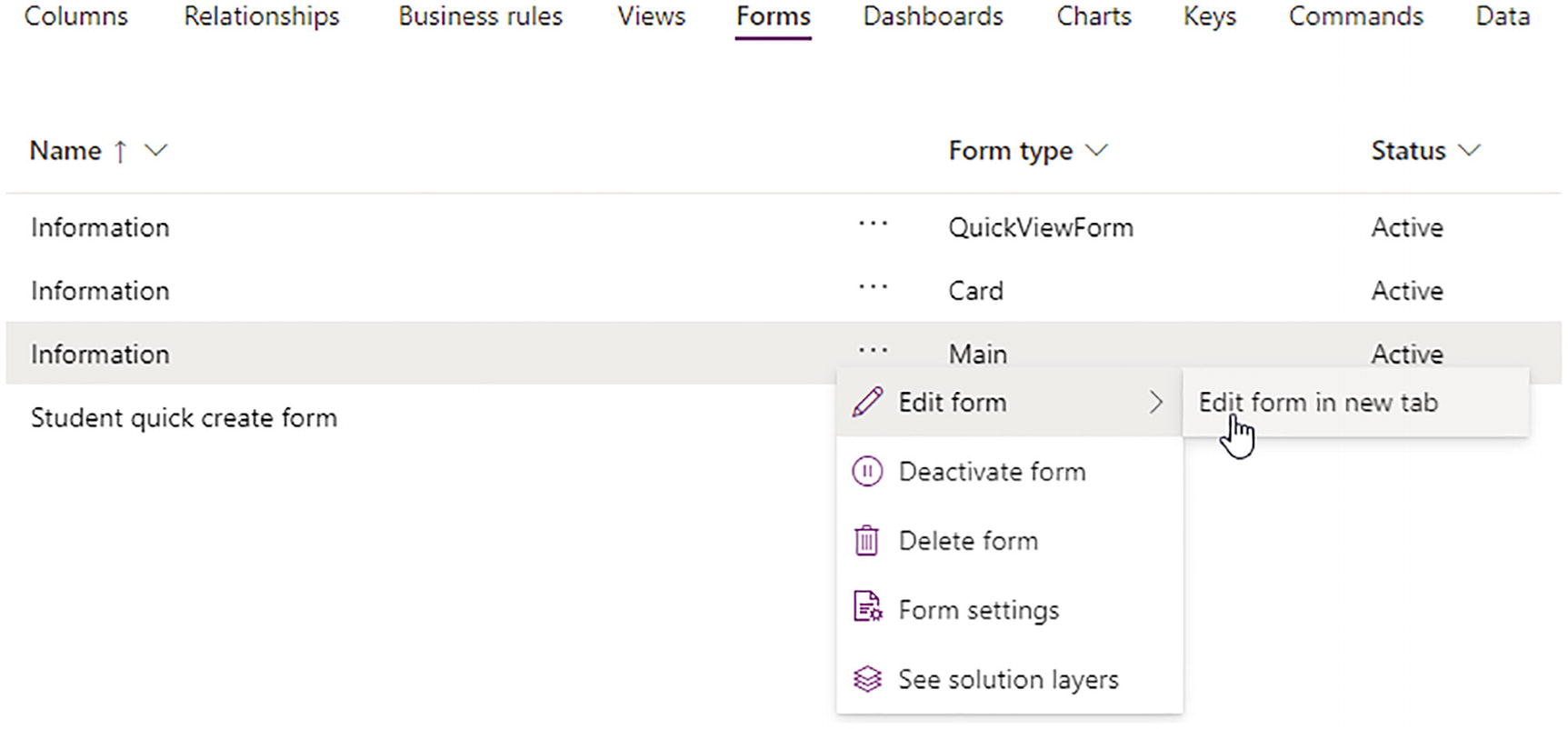
A screenshot of a menu bar that reads columns, relationships, business rules, views, forms-selected, dashboards, charts, keys, commands, and data. It further lists Name, form type, and status, where the information row is selected that lists a popup menu where edit form is selected that further list edit form in new tab.
Edit existing form types

A screenshot of a page titled power apps. It has three panels. Panel 1 lists a menu where the clipart of the grid is highlighted. Panel 2 lists the options under components that are highlighted. Panel 3 reads a header New student, General with Name, Gender, Email, Address, Mobile Number, Qualification, Roll Number, and Owner.
Form layout

A screenshot of a page with 2 panels. Panel 1 lists a menu where a clipart of Abc is selected. Panel 2 lists the options under Table columns that lists show only unused table columns, created by, created by the delegate, and created on are highlighted. Panel 3 reads a header New student with General, Name, Gender, Email, Address, and Mobile Number.
Form fields

A screenshot reads New Student dash unsaved with a header named General, Name: Robert Hook, Gender: Male, Email: Robert at the rate of Gmail dot com, Address: London, and Mobile Number: 6 6 6 6 6 6 6 6 6 6.
The New Student form
Chart Configuration and Dashboard Pinning
A chart is a graphical representation of table data. Charts can make data interesting, attractive, and easy to read and evaluate, which can help you analyze and compare your data.
In Power Apps, you can create bar charts, pie charts, tabular data, and so on. You can connect to the Dataverse table to display data in graphical images.
Create a Chart

A screenshot of a menu bar of add chart -highlighted, add subcomponents, add required components, delete table, and data. It reads a header School Solution Advanced, Tables, Student-highlighted. It further lists columns, relationships, business rules, views, forms, dashboards, charts (highlighted), and keys. It further lists the Name and type.
Student table chart option

A screenshot of a window that has a menu bar on the top with several icons. It reads a header Working on solution: School Solution Advanced. It lists active students, students by gender with a graph of gender and count of all below, Legend entries that list Name, Count: All, Horizontal axis labels, gender, and Add a category.
Student table chart designer
Choose Name with Aggregation, Count: All, and Gender for the horizontal axis. This scenario creates a chart to display students by gender. The preview of the chart will be displayed on the Designer Screen. Save the chart. The chart can be used in model-driven apps.
You can create multiple charts for a specific table with different scenarios, such as students by payment, top five students with highest payments, students by joined on date, and so on.
Dashboards
To display multiple charts on a single page, you can use dashboards. You can choose a layout like two-column or four-column dashboards. There are two types of dashboards—table-specific and global.
When you create a dashboard in a table, you can only use charts from the same table in the dashboard; these are called table-specific dashboards.
Create a Dashboard

A screenshot of a menu bar of add dashboard-highlighted, add subcomponents, add required components, delete table, and data. The add dashboard lists several options where 2 dash column overview is selected. It reads a header Tables, Student-highlighted. It further lists business rules, views, forms, and dashboards highlighted.
Student table Dashboard Designer

A screenshot of add component dialog box that overlaps the power apps window. It lists record type, view, and chart at the left. Students by gender with a graph of gender versus count of all at its right. It plots a shaded vertical bar at the male option. Two buttons Add and Cancel are observed below, where Add is selected.
Student table dashboard designer tiles

A screenshot of the Edit Stream dialog box that overlaps the streams window. It lists Record type: student and View name: active students, and chart at the left. Two buttons Set and Cancel are observed below, where Set is selected.
Student table dashboard stream

A screenshot has a menu bar at the top. Dashboard- student dashboard. It lists the name, filter entity, entity view, filter by, and time frame. It further lists two rows. Row 1 reads a header section of two panels with charts of graphs of gender versus counts of all names. Row 2 reads streams that have a section header of the students.
The rendered Student table dashboard
You can configure multiple dashboards for a single table to represent different strategic visual screens. Charts and dashboards can both be added in model-driven Power Apps as entity assets.
To configure global dashboards, you need to create model-driven Power Apps. Then you can add multiple charts, web resources, and insight tiles by connecting multiple tables on a single page.
Configure Table-Specific Dashboards
Dashboards configured inside a table are called table-specific dashboards. In these dashboards, you can only use the charts related to that table. You cannot use multiple tables in a table-specific dashboard.
For more information about dashboards, see the Microsoft site at https://docs.microsoft.com/en-us/power-apps/developer/model-driven-apps/create-dashboard.
Concepts of Alternate Keys
Alternate keys are useful for third-party system integrations. Power Apps store their primary keys in GUID format. However, third-party systems do not use GUID format, so for system integration, you have to configure an alternate key. This is done by combining multiple columns to uniquely represent a row or record. To add an alternate key, navigate to the table, choose Key, and click Add Key.

A screenshot of the student key form. It lists display name, name, and columns. Options under the column are email-selected, gender, import sequence number, mobile number-selected, name, record created on, roll number, time zone rule version number, and U T C conversion time zone code. Two buttons, done-selected, and cancel are at the bottom.
Alternate key configuration
The alternate key calls the UPSERT command in Power Apps. The UPSERT command will check the record to be inserted or updated, as per the key check.
Working with Data in the Dataverse

A screenshot reads a menu bar at the top left with Ramesh Kumar below. It lists General-highlighted and Related tabs. It lists name: Ramesh Kumar, gender: Male, email: ramesh at the rate of Gmail dot com, address: Mumbai, mobile number: 1 1 1 1 1 1 1 1 1 1, qualification: M C A, roll number: S T D dash 1 0 0 1, owner: Sanjay Prakash.
Student main form

A screenshot reads school solution advanced, tables, student-highlighted. It list columns, relationships, business rules, views, forms, dashboards, chart, keys, commands, and data is highlighted. It lists the contents under data that has a name, address, email, gender, mobile number, qualification, and roll number with their respective data below.
Student records
Business Scenario, Use Cases, and Implementation
1 | Systems should be able to combine different configuration and customization components in a package so that they can be distributed to other environments. | Configure Power Apps Solution and add required components to it for packaging. |
2 | The school management system must allow users to enter student information such as roll number (auto-number), name, address, father’s name, mobile, email, and qualifications. The system should capture course information and users should be able to record students joined. The app must create payment information with term facility and payment details. | Solution components include tables, fields, forms, views, and relationships. |
3 | The system should display student-level total amount to be paid by student and it should display the next renewal due date of the student after one year of joining. | The solution requires you to configure rollup fields and calculated fields. |
4 | Mobile number and email should be mandatory when creating students. | Use business rules to solve this business need. |
5 | The system should allow associate courses for students. One student can have multiple courses and one course can be chosen by multiple students. | Configure relationships and relationship behaviors. |
6 | The system should have a visualization to display courses by students joined and display students by joining date. | Configure charts for the solution. |
7 | The system should display a page of all visualizations for the Student table. | Create a table-specific dashboard. |
In the next chapter, you see how to work with Power Apps to leverage these Dataverse concepts.
Summary
Understanding Power Apps solutions
Working with table configurations and settings
Working with columns, datatypes, calculated fields, and rollup fields
Using auto-number columns in the Dataverse
Configuring relationships and relationship behaviors
Working with business rules
Configuring table views
Designing table forms and layouts
Chart configuration and dashboard pinning
Configuring a table-specific dashboard
Understanding alternate keys
Working with data in the Dataverse
Business scenarios, use cases, and implementation
The concept of Power Apps and a no-code, less-code platform
Working with Canvas apps in detail
Using Power Fx for Power Apps
Working with model-driven apps
Power Portal concepts and designing with deployment
Managing Power Apps
Business scenarios and implementations