
9 Review of Probability and Probabilistic Sampling
,Probability Distributions and Density Functions
The Normal and t Distributions
The Usefulness of Theoretical Models
When Samples Surprise: Ordinary and Extraordinary Sampling Variability
Case 1: Sample Observations of a Categorical Variable
Case 2: Sample Observations of a Continuous Variable
Overview
The past three chapters have focused on probability—a subject that forms the crucial link between descriptive statistics and statistical inference. From the standpoint of statistical inference, probability theory provides a valuable framework for understanding the variability of probability-based samples. Before moving forward with inference, this short chapter reviews several of the major ideas presented in Chapters 6 through 8, emphasizing two central concepts: (a) probability models are often very useful summaries of empirical phenomena, and (b) sometimes a probability model can provide a framework for deciding if an empirical finding is unexpected. In addition, we’ll see another JMP script to help visualize probability models. As we did in Chapter 5, we’ll use the WDI data table to support the discussion.
Probability Distributions and Density Functions
We began the coverage of probability in Chapter 6 with elementary rules concerning categorical events, then moved on to numerical outcomes of random processes. In this chapter, we’ll start the review by remembering that we can use discrete probability distributions to describe the variability of random outcomes of a discrete random variable. A discrete distribution essentially specifies all possible numerical values for a variable as well as the probability of each distinct value. For example, a rural physician might track the number of patients reporting flu-like symptoms to her each day during flu season. The number of patients will vary from day to day, but the number will be a comparatively small integer.
In some settings, we know that a random process will generate observed values that are described by a formula, such as in the case of a binomial or Poisson process. For example, if we intend to draw a random sample from a large population and count the number of times a single categorical outcome is observed, we can reliably use a distribution to assess the likelihood of each possible outcome. The only requirement is that we know the size of the sample and we know the proportion of the population sharing the categorical outcome. As we’ll see later, we know that approximately one-third of the countries in the WDI table are classified as “high income” nations. The binomial distribution can predict the likelihood of selecting a random sample of, say, 12 nations and observing a dozen high-income countries.
The Normal and t Distributions
When the variable of interest is continuous, we use a density function to describe its variation. In conventional parlance, a continuous density function is said to specify the distribution of a variable or family of variables. Chapter 7 presented an in-depth treatment of the normal model and some of its uses. The normal model is one notable example of a theoretical continuous distribution, i.e. a distribution that can be characterized mathematically. In Chapter 8 we encountered Gosset’s t distribution, similar to the normal in that it is symmetric and mound-shaped. These are two continuous distributions that underlie many of the techniques of inference, and that there are yet many more distributions used regularly by statisticians and data analysts.
For a quick visual refresher on the distributions do the following:
1. File ► Open. Within the directory of this book’s JMP files, open the Scripts folder and open JMP_Distribution_Calculator_V0_E. Figure 9.1 shows the initial view of this distribution calculator.
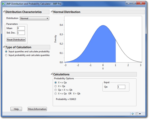
Initially the calculator displays the standard normal distribution. As you recall, all normal distributions are specified by two parameters—a mean and a standard deviation. There are two types of calculations we might want to perform. Either we want to know the probability corresponding to values of the random variable (X), or we want to know the values of X that correspond to particular probabilities. The left side of the dialog box allows the user to specify the parameters and type of calculation.
Below the graph is an input panel to specify regions of interest (less than or equal to a value, between two values, etc.) and numerical values either for X or for probability, depending on the type of calculation. Spend a few moments exploring this calculator for normal distributions.
This calculator can perform similar functions for many discrete and continuous distributions, including the few that we have studied. To review and rediscover those distributions, try this:
2. In the upper left of the dialog, click the button next to Distribution. This opens a dropdown list of all the distributions available for the calculator, as shown in Figure 9.2.
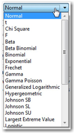
As you scroll through the list, you will find the t, normal, Poisson, and uniform distributions as well as others that are unfamiliar. Select the familiar ones and notice the parameters of each as well as their characteristic shapes. Curious readers may wish to investigate other distributions in the list as well.
The Usefulness of Theoretical Models
In statistical applications and in introductory statistics courses, we tend to put these theoretical models to work in two ways. In some instances, we may have a model that reliably predicts how random values are generated. For example, we know how to recognize a binomial or Poisson process and we know when the Central Limit Theorem is relevant. In other instances, we may simply observe that sample data are well-approximated by a known family of distributions (e.g. Normal) and we may have sound reasons to accept the risks from using a single formula rather than using a set of data to approximate the population. In such instances, using the model instead of a set of data can be a more efficient way to draw conclusions or make predictions. In the context of statistical inference, we will often use models to approximate sampling distributions; that is, the models will help us to characterize the nature of sampling variability and therefore, sampling error.
Let’s consider one illustration of using a model to approximate a population, and refer back to Application Scenario 7 of Chapter 7 which in part worked with the cellphone use rates among countries in the WDI data table. We’ll elaborate on that example here.
3. Open the WDI data table.
4. Select Analyze ► Distribution. Select the column cell (number of mobile cellular subscriptions per 100 people).
Because cell phone usage has changed considerably over the 22-year period, we’ll focus on just one year, 2011. We can apply a data filter within the Distribution report to accomplish this.
5. Click the red triangle next to Distributions and choose Script ► Local Data Filter to Show and Include only data from the year 2011.
6. Finally, add a normal quantile plot. The comparatively straight diagonal pattern of the points suggests that a normal distribution is an imperfect but reasonable model for this set of 191 observations.
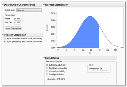
The Distribution command reports selected quantiles for this column. We can see, for example, that 75% of the reporting countries had 122.984 subscriptions or fewer per 100 people. Suppose we wanted to know the approximate value of the 80th percentile. We might use a JMP command to report the 80th percentile from the sample, but we can quickly approximate that value using the normal distribution calculator. From the Distribution report, we know that the sample mean = 95.544 subscriptions, and the sample standard deviation = 43.236 subscriptions.
Follow these steps to calculate the 80th percentile of a theoretical normal population with the same mean and standard deviation.
7. Return to the Distribution and Probability Calculator, and re-select Normal distribution in the upper left.
8. In the Parameters panel, enter 95.544 and 43.236 as the mean and standard deviation.
9. Under Type of Calculation, select Input probability and calculate quantiles.
10. Finally, under Calculations,
select Left tail probability, and type .8 in the Probability box.
The completed dialog is shown in Figure 9.3. In the lower right panel, we find that the theoretical 80th percentile is 131.9 subscriptions. If you repeat this exercise to locate the 75th and 90th percentiles, you will see that the theoretical normal model is a good approximation of this set of empirical data.
When Samples Surprise: Ordinary and Extraordinary Sampling Variability
Chapter 8 was devoted to probabilistic sampling and to the idea that samples from a population will inevitably differ from one another. Regardless of the care taken by the investigator, there is an inherent risk that one particular sample may poorly represent a parent population or process. Hence, it is important to consider the extent to which samples will tend to vary. The variability of a sample statistic is described by a sampling distribution.
In future chapters, sampling distributions will be crucial underpinnings of the techniques to be covered, but will slip into the background. They form the foundation of the analyses, but like the foundations of buildings or bridges, they will be metaphorically underground. We will rely on them, but often we won’t see them or spend much time with them.
As we move forward into statistical inference, we will shift our objective and thought processes away from summarization towards judgment. In inferential analysis, we frequently look at a sample as evidence from a somewhat mysterious population, and we will want to think about the kind of population that would have yielded such a sample. As such, we’ll begin to think about samples that would be typical of a particular population and those that would be unusual, surprising, or implausible.
All samples vary, and the shape, center, and variability depend on whether we’re looking at quantitative continuous data or qualitative ordinal or nominal data. Recall that we model the sampling variation differently when dealing with a sample proportion for qualitative, categorical data and the sample mean for continuous data. Let’s consider each case separately.
Case 1: Sample Observations of a Categorical Variable
To illustrate, consider the WDI data table once again. The table contains 40 different columns of data gathered over 22 years. Of the 214 countries, approximately one-third are classified as high income (70 of 214 nations = 0.327). If we were to draw a random sample of just twelve observations from the 4,708 rows, we would anticipate that approximately four of the twelve sample observations would be high income nations. We should also anticipate some variation in that count, though. Some samples might have four high income countries, but some might have three, or five, or perhaps even two. Is it likely that a single random sample of twelve would not have any high-income countries? Could another sample have twelve? Both are certainly possible, but are they plausible outcomes of a truly random process?
The process of selecting twelve nations from a set of 4,708 observations and counting the number of high-income nations is approximately a binomial process. It is only approximately binomial because the probability of success changes very slightly after each successive country is chosen; for the purposes of this discussion, the approximation is sufficient1. As such, we can use the binomial distribution to describe the likely extent of sampling variation among samples of twelve countries.
1. In the probability calculator, select the Binomial distribution.
2. Specify that the probability of success is 0.327 and a sample size, N, of 12.
Your screen will look like Figure 9.4. The binomial histogram (reflecting the discrete number of successes in twelve trials) is initially set to show the probability of obtaining one or fewer high-income countries. This probability is represented by the blue shading, and at the bottom of the dialog, we find that it is 0.0590. By selecting other options within the dialog, we can discover that it is extremely unlikely that a random sample from this data table will contain more than seven high-income countries.

3. Below the histogram, click the radio button marked X > Qa, and enter a 6 into the Input panel box Qa.
4. The probability that a twelve-country sample will contain more than 6 high income countries is 0.0603. Repeat step 3 for 7, 8, and 9 countries; notice that the probability becomes vanishingly small.
Such random samples may be logically possible, but are so unlikely as to be considered nearly impossible. By far, it is most likely that this population would generate samples with between (say) 2 and 7 high-income countries.
Case 2: Sample Observations of a Continuous Variable
For this example, we’ll move away from the WDI data and return to the Pipeline Safety data that we recently investigated in Chapter 8. As we did then, we’ll work with the column called STMin, which is the number of minutes between the first report of a pipeline disruption until the area was made safe. We will recall the exercise we did then with the Sampling Distribution simulator and look into the results more deeply than before.
1. Open the Pipeline Safety data table.
2. Create a distribution of the column STMin.
As we found in Chapter 8, this column is strongly skewed because most disruptions are secured rather quickly, but sometimes the disruptions can be quite lengthy.
Usually we think of samples as coming from a very large population or from an ongoing process. This data table has a sample of 468 reported disruptions over a period of time. We can think of pipeline operations as a continuous process that periodically is interrupted. For the sake of this review, imagine that this sample is representative of the ongoing process.
If all pipeline disruptions required the same amount of time to repair, then any sample we might draw would provide the same evidence about the process. In fact, a sample of n=1 would be sufficient to represent the process. Our challenge arises from the very fact that individual disruptions vary; because of those individual differences, each sample will be different.
In Chapter 8, we used the Sampling Distribution simulator to simulate thousands of random samples of size n = 45 from the data table. This process is sometimes known as bootstrap sampling or resampling, in which we repeatedly sample and replace values from a single sample until we have generated an empirical sampling distribution.
Readers who wish to repeat the simulation should go back to the section of Chapter 8 entitled “Sampling Distribution of the Sample Mean”, and regenerate perhaps 50,000 iterations until the histogram is relatively smooth and mound-shaped. The results of one such simulation appear in Figure 9.5; the histogram has been revised to more clearly show the horizontal axis. The blue vertical line at 149.018 minutes is the location of the original sample mean.
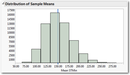
So what message are we supposed to take away from this graph and the resampling exercise? Consider these messages for a start:
• Different 45-observations samples from a given population have different sample means;
• Though different, sample means tend to be “near” the mean of the population;
• We can model the shape, center, and variability of possible sample means;
• Despite the fact that STMin in the original sample is very strongly skewed to the right, repeated samples consistently generate sample means that vary symmetrically.
Very importantly, the histogram establishes a framework for judging the rarity of specific sample mean values. Samples of 45 pipeline disruptions commonly have means between approximately 108 and 175 minutes. Sample means will very rarely be smaller than 80 minutes or longer than 240 minutes. It would be stunning to take a sample of 45 incidents and find a sample mean of more than 275 minutes.
We cannot conclude that a result is surprising or rare or implausible without first having a clear sense of what is not rare, or what is typical. Sampling distributions tell us what is common.
Conclusion
Probability is an interesting and important subject in its own right. For the practice of data analysis, it provides the foundation for the interpretation of data gathered by random sampling methods. This chapter has reviewed the content of three earlier chapters that introduce readers to a few essential elements of probability theory. Taken together, these chapters form the bridge between the two statistical realms of description and inference.
1 The correct distribution to apply here is the Hypergeometric distribution, another discrete distribution that applies when one samples without replacement. The probability of success changes following each observation. In this particular case where the population size is so much larger than the sample size, the impact of the change in probabilities is miniscule. Inasmuch as this is a review chapter, I decided to resist the introduction of a new distribution.