
14 Analysis of Variance
,Does the Sample Satisfy the Assumptions?
Factorial Analysis for Main Effects
What if Conditions Are Not Satisfied?
Including a Second Factor with Two-Way ANOVA
Overview
Previous chapters introduced the concept of bivariate inference and the idea of a response and factor variables. In Chapter 12, we worked with two categorical variables and in Chapter 13, we worked with a continuous response and a dichotomous factor (to represent two independent samples). This chapter introduces several techniques that we can use when we have a continuous response variable and one or more categorical factors that may have several categorical values.
What Are We Assuming?
As a first example, consider an experiment in which subjects are asked to complete a simple crossword puzzle, and our response variable is the amount of time required to complete the puzzle. We randomly divide the subjects into three groups. One group completes the puzzle while rock music plays loudly in the room. The second group completes the puzzle with the recorded sound of a large truck engine idling outside the window. The third group completes the puzzle in a relatively quiet room. We refer to the different sound conditions as treatments.
Our question might be this: does the mean completion time depend on the treatment for the group? In other words, are the means are the same for the three groups or not?
We might model the completion time for each individual (Yik) as consisting of three separate elements: an overall population mean, plus or minus a treatment effect, plus or minus individual variation. We might anticipate that the control group’s times might enable us to estimate a baseline value for completion times. Further, we might hypothesize that rock music helps some people work more quickly and efficiently, and therefore that individuals in the rock music condition might complete the puzzle faster, on average, than those in the control group. Finally, regardless of conditions, we also anticipate that individuals are simply variable for numerous unaccountable (or unmeasured) reasons.
Symbolically, we express this as follows:
where:
μ represents the underlying but unknown population mean,
τk is the unknown deviation from the population mean (that is, the treatment effect) for treatment level k, and
εik is unique individual variation, or error.
Our null hypothesis is that all groups share a single mean, which is to say that the treatment effect for all factor levels (τk) is zero. We can express this null hypothesis in this way:
H0: τ1 = τ2 = … = τk = 0 versus the complementary alterative hypothesis that H0 is not true.
The first technique we’ll study is called one-way analysis of variance (ANOVA), which is a reliable method of inference when our study design satisfies these three assumptions:
• All observations are independent of one another.
• The individual error terms are normally distributed1.
• The variance of the individual errors is the same across treatment groups.
These three conditions form the foundation for drawing inferences from ANOVA. In practice, it is helpful, though not necessary to have samples of roughly equal size. With varying sample sizes, the technique is particularly sensitive to the equal variance assumption, which is to say that the statistical results can be misleading if our sample data deviate too far from approximately equal variances. Therefore, an important step in conducting an analysis of variance is the evaluation of the extent to which our data set challenges the validity of these assumptions.
One-Way ANOVA
Our first example comes from the United Nation’s birth rate data, a source we’ve used before. In this instance, we’ll look at the variation in the birth rate around the world. Specifically, birth rate is defined as the number of births annually per 1,000 population. We’ll initially ask if differences in birth rates are associated with one particular matter of public policy: whether maternity leave is provided by the state, by the private sector, or by a combination of public and private sectors.
Note that this is observational data, so that we have not established the different factor levels experimentally or by design. Open the BirthRate 2005 data table.
We’ll start simply by examining the distribution of the response and factor variables, in part to decide whether we’ve satisfied the conditions needed for ANOVA, although we’ll evaluate the assumptions more rigorously below. Even before looking at the data, we can conclude that the observations are independent: it is hard to think of reasons that either the birth rates or type of provider in one country would be affected by those in another.
1. Select Analyze ► Distribution. Cast the columns BirthRate and Provider into the Y, Columns role, and click OK.
When we look at the BirthRate histogram, we find that the variable is positively skewed in shape; this could signal an issue with the normality assumption, but we have large enough subsamples that we can rely on the Central Limit Theorem to proceed with the analysis.
2. Click on any of the bars in the Provider graph to select the rows that share one provider type. When you do so, note the corresponding values in the BirthRate distribution. Does there seem to be any consistent pattern in birth rates that corresponds to how maternity leave benefits are provided? ANOVA will help to clarify the situation.
To begin the ANOVA, we return to the Fit Y by X analysis platform.
3. Select Analyze ► Fit Y by X. Cast BirthRate into the Y role and Provider into the X role, and click OK. The default output is a simple scatterplot showing the response values across the different treatment groups; Figure 14.1 has been modified to jitter the points for visual clarity:
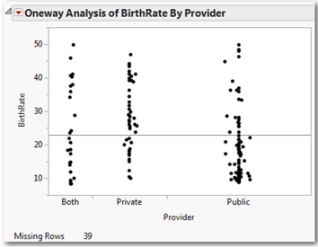
This graph reveals at least two things of interest. The dispersion of points within each group appears comparable, which suggests constant variance and some indication of a treatment effect—that countries with publicly provided maternity-leave benefits might have somewhat lower birth rates on average than those with privately provided benefits. In the graph, notice the concentration of points above the overall mean line in the Private group and the large number of points below the line for the Public group. Let’s look more closely.
4. Click the red triangle next to Oneway Analysis of BirthRate by Provider and select Means/Anova.
As shown in Figure 14.2, you’ll see a green means diamond superimposed on each set of points. In this case, the diamonds have different widths that correspond to differences in sample size.
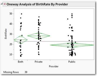
The center line of the diamond is the sample mean, and the upper and lower points of the diamond are the bounds of a 95% confidence interval. The horizontal lines near the top and bottom of the diamonds are overlap marks; these are visual boundaries that we can use to compare the means for the groups. Diamonds with overlapping areas between the overlap marks indicate insignificant differences in means. In this picture, the means diamond for the Public group does not overlap the Private group, suggesting that we do have significant differences here. Before we go too much further with the analysis of variance, we need to check our assumptions.
Does the Sample Satisfy the Assumptions?
The independence assumption is a logical matter; no software can tell us whether the observations were collected independently of each other. Independence is a function of the study and sampling design; and, as noted above, we can conclude that we have satisfied the independence condition.
1. We can test for the equality of variances by again clicking the red triangle and choosing UnEqual Variances, which generates the result in Figure 14.3.
Direct your attention to the lower table titled Test. There are several standard tests used to decide whether we’ve satisfied the equal variance condition. In all cases, the null hypothesis is that the variance of all groups is equal, and the alternative hypothesis is that variances are unequal. Levene’s test is probably the most commonly used, so you should use it here.
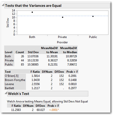
In this example, the P-values for all four tests are relatively large by conventional standards. That is, there is insufficient evidence to reject the null assumption of equal variances, so we can feel safe in continuing to assume that the sample satisfies the equal variance assumption.
When we test for equality of variances, JMP also reports the results of Welch’s test. This test adjusts for the inequality of variance to provide an alternative to the standard one-way analysis of variance. In other words, Welch’s test is a fallback option in case the variances are unequal; we’ll say more about this in a few pages.
Although the Central Limit Theorem applies in this case, it is still prudent to check whether the individual error terms might be normally distributed. We have no way to measure the individual errors directly, but we can come close by examining the deviations between each individual measurement and the mean of its respective group. We call these deviations residuals, and can examine their distribution as an approximation of the individual random error terms.
To analyze the residuals, we proceed as follows:
2. Click the red triangle next to Oneway, and select Save ► Save Residuals. This creates a new column in the data table.
3. In the data table, select Birthrate centered by Provider. Right-click, select Column Info, and change the column name to Residuals.
4. With the data table highlighted, select Analyze ► Distribution. Choose the new residuals column as Y, Columns, and click OK.
5. Click the hotspot next to Residuals and select Normal Quantile Plot. We can use the normal quantile plot (Figure 14.4) to judge whether these residuals are decidedly skewed or depart excessively from normality.
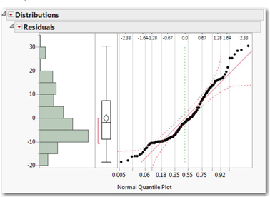
The reliability of ANOVA is not dramatically affected by data that is non-normal. We say that the technique is robust with respect to normality. As long as the residuals are generally unimodal and symmetric, we can proceed.
Figure 14.4 shows the distribution of residuals in this case, and based on what we see here we can conclude that the normality assumption is satisfied. Thus, we’ve met all of the conditions for a one-way analysis of variance, and can proceed.
Factorial Analysis for Main Effects
In the scatterplot with means diamonds, we found visual indications that the mean of the Public provision group might be lower than the other two groups. We find more definitive information below the graph. Having validated the assumptions, it is time to look back at the Oneway Anova report. We find three sets of statistics, shown below in Figure 14.5. At this point in our studies, we’ll focus on just a few of the key results.
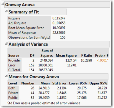
The Summary of Fit table provides an indication of the extent to which our ANOVA model accounts for the total variation in all 155 national birth rates. The key value here is Rsquare2, which is always between 0 and 1, and describes the proportion of total variation in the response variable that is associated with the factor. Here, we find that only 12% of all variation in birth rates is associated with the variation in provision of maternity benefits; that’s not very impressive. Other factors must account for the other 88% of the variation.
In the Analysis of Variance table (similar to the tables described in your main text), we find our test statistic (10.2897) and its P-value (< .0001). Here, the P-value is very small indicating statistical significance. We reject the null hypothesis of equal treatment effects, and conclude that at least one treatment has a significant effect.
Looking at the last table, Means for Oneway Anova, we see that the confidence interval for the mean of the private group is higher than the mean for the public group, and that the interval for the “both” group overlaps the other two. For a more rigorous review of the differences in group means, we can also select a statistical test to compare the means of the groups.
We have several common methods available to us for such a comparison. With two factor levels, it makes sense to use the simple two-sample t-test comparison, but with more than two levels the t-tests will overstate differences, and therefore we should use a different approach here.
In this particular study, we do not have a control group as we might in a designed experiment. Because there isn’t a control, we’ll use Tukey’s HSD (Honestly Significant Difference), the most conservative of the approaches listed. Had one of the factor levels referred to a control group, we’d use Dunnett’s method and compare each of the other group means to the mean of the control group.
1. Click the Oneway hotspot once again, and choose Compare Means ► All Pairs, Tukey’s HSD.
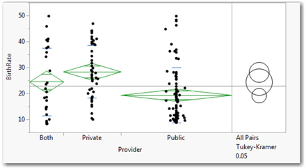
In the upper panel (shown above in Figure 14.6), we now see a set of three overlapping rings representing the three groups. Note that the upper ring (Private group) overlaps the middle Both ring, that the middle and lower rings overlap, but that the Private and Public rings do not overlap.
Click the uppermost (Private) ring; notice that it turns red, as does this middle (Both) ring, but the lower Public ring becomes blue. This indicates a significant difference between Private and Public, but no significant difference between Private and Both.
We’ll scroll down to find the numerical results of Tukey’s test, shown here in Figure 14.7.
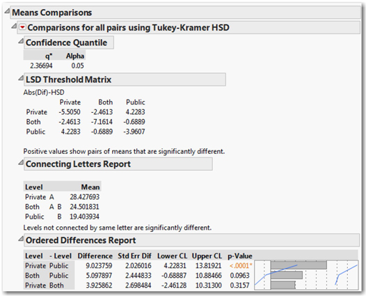
How do we read these results? The bottom portion of the output displays the significance levels for estimated differences between each group. We find one significant P-value, which is associated with the difference between the Private and the Public provision of benefits. We can confidently conclude that mean birth rates are different (apparently higher) in countries with private provision of benefits than in those with public provision of benefits, but cannot be confident about any other differences based on this sample.
You might also want to look at the connecting letters report just above the bottom portion. Here the idea is simple: each level is tagged with one or two letters. If a mean has a unique letter tag, we conclude that it is significantly different from the others. If a level has two tags, it could be the same as either group. In this analysis, Private is A and Public is B, but Both is tagged as A B. So, we conclude that the means for public and private are different from one another, but can’t make a definitive conclusion about the Both category.
What if Conditions Are Not Satisfied?
In this example, our data were consistent with the assumptions of normality and equal variances. What happens when the sample data set does not meet the necessary conditions? In most introductory courses, this question probably doesn’t arise or if it does, it receives very brief treatment. As such, we will deal with it in a very limited way. Thankfully, JMP makes it quite easy to accommodate “uncooperative” data.
Earlier we noted that the assumption of equal variances is a critical condition for reliable results in an ANOVA, and we saw how to test for the equality of variances. If we find that there are significant differences in variance across the groups, we should not rely on the ANOVA table to draw statistical conclusions. Instead, JMP provides us with the results of Welch’s ANOVA, a procedure that takes the differences in subgroup variation into account.
1. Look back in your output for the Test that the Variances are Equal (which appears in Figure 14.3 above).
At the bottom of that output, you’ll find the results of Welch’s test. In our example, that test finds F = 11.2583 with a P-value < 0.0001. We would decide to reject the null hypothesis and conclude that the group means are not all equal. With Welch’s test, there are no procedures comparable to Tukey’s HSD to determine where the differences lie.
If the residuals are not even close to looking normal—multimodal, very strongly skewed, or the like—we can use a nonparametric equivalent test. Nonparametric tests make no assumptions about the underlying distributions of our data (some statisticians refer to them as “distribution-free” methods).
2. Return to the hotspot, and select Nonparametric ► Wilcoxon Test.
Now look at the results, labeled Wilcoxon/Kruskal-Wallis Tests. First a note on terminology: strictly speaking, the Wilcoxon test is the nonparametric equivalent of the two-sample t-test, while the Kruskal-Wallis test is the equivalent of the one-way ANOVA.
These tests rely on chi-squared, rather than the F, distribution to evaluate the test statistic. Without laying out the theory of these tests, suffice it to say that the null hypothesis is this: the distributions of the groups are centered3 in the same place. A P-value less than 0.05 conventionally means that we’ll decide to reject the null.
Including a Second Factor with Two-Way ANOVA
Earlier we noted that our model accounted for relatively little of the variation in national birth rates, and that other factors might also play a role. To investigate the importance of a second categorical variable, we can extend our Analysis of Variance to include a second factor. The appropriate technique is called Two-Way ANOVA.
In some countries new mothers typically have lengthy maternity leaves from their jobs, while in others the usual practice is to offer much briefer time off from work. Let’s use the variation in this aspect of prevailing national policies as an indication of a country’s commitment to the well-being of women who give birth. We’ll focus on the factor called MatLeave90+, a dichotomous variable indicating whether a country provides 90 days or more of maternity leave for new mothers.
1. As we did before, use Analyze ► Distribution. This time, select BirthRate, Provider, and MatLeave90+ as the Y, Columns.
2. Click on different bars in the three graphs, looking for any obvious visual differences in birth rates in countries with different insurance and maternity leave practices. Think about what you see in this part of the analysis.
Before performing the two-way analysis, we need to consider one potential complication. It is possible that the duration of the maternity leave and the provider of benefits each have separate and independent associations with birth rate, and it is also possible that the impact of one variable is different in the presence or absence of the other. In other words, perhaps the duration of the leave is relevant where it is privately provided, but not where it’s publicly provided.
Because of this possibility, in a two-way ANOVA, we investigate both the main effects of each factor separately as well as any possible interaction effect of the two categorical variables taken together. When we specify the two-way model, we’ll identify the main factors and their possible interactions.
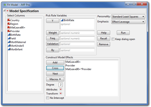
3. Now let’s perform the two-way ANOVA. Select Analyze ► Fit Model. As shown in Figure 14.8, cast Birthrate as the Y variable, and then highlight both Provider and MatLeave90+ and click Add.
4. Now highlight the same two categorical columns again in Select Columns and click Cross. Crossing the two categorical variables establishes an interaction term with six groupings (three provider groups times two leave duration groups).
5. Now click Run to perform the analysis.
This command generates extensive results, and we’ll now focus on a few critical elements that will be illustrated in the next several pages. In a two-way analysis, it is good practice to review the results in a particular sequence. We see in the Analysis of Variance table that we have a significant test (F = 5.5602, P-value = 0.0001), so we might have found some statistically interesting results. First we evaluate assumptions (which are the same as for one-way ANOVA), look at the significance of the entire model, then check to determine whether there are interaction effects, and finally, evaluate main effects.
The Fit Model results are quite dense, and contain elements that go far beyond the content of most introductory courses in statistics. We’ll look very selectively at portions of the output that correspond to topics that you are likely to see in an introductory course. If your interests lead you to want or need to interpret portions that we bypass, you should use the context-sensitive Help tool (![]() ) and just point at the results you want to explore.
) and just point at the results you want to explore.
Evaluating Assumptions
As before, we can reason that the observations are independent of one another, and should examine the residuals for indications of non-normality or unequal variances.
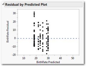
1. Scroll to the bottom of your output, and find the Residual by Predicted Plot (Figure 14.9).
This graph displays the computed residuals in six vertical groupings, corresponding to the six possible combinations of the levels of both factors. We use this graph to make a judgment as to whether each of the groups appears to share a common variance; in this case, the spread of points within each group appears similar, so we can conclude that we’ve met the constant variance assumption. If the spreads were grossly different, we should be reluctant to go on to evaluate the results any further.
Let’s also check the residuals to see how reasonable it is to assume that the individual error terms are normally distributed.
2. We can again save the residuals in the data table by clicking on the hotspot at the top of the analysis and selecting Save Columns ► Residuals.
3. As you did earlier, use Analyze ► Distribution to create a histogram and normal probability plot of the residuals.
You should see that the residuals are single-peaked and somewhat skewed. While not perfectly normal, there’s nothing to worry about here.
Interaction and Main Effects
Next we should evaluate the results of the test for the interaction term. We do so because a significant interaction can distort the interpretation of the main effects, so before thinking about the main effects, we want to examine the interaction. An interaction exists when the relationship between one factor and the response is different across the groups of the second factor.
1. Below the ANOVA table, locate the Effect Tests table, as shown in Figure 14.10.
This table lists the results of three separate F-tests, namely the test for equality of group means corresponding to different provider arrangements, different lengths of maternity leave, and the interaction of the two factors. The null hypothesis in each test is that the group means are identical.
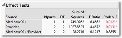
Each row of the table reports the number of parameters (Nparm), corresponding to one less than the number of factor levels for each main factor, and the product of the nparms for the interaction. We also find degrees of freedom, the sum of squares, and the F-ratio and P-value for each of the three tests.
We first look at the bottom row (the interaction) and see that the F statistic is quite small with a very high P-value. Therefore, we conclude that we cannot reject the null for this test, which is to say that there is no significant interaction effect. Whatever difference (if any) in birth rates are associated with the length of maternity leave, it is the same across the different provider conditions. Ordinarily, having found no evidence of an interaction, an investigator would probably re-run the model without the interaction term. However, to illustrate additional visualizations of main and interaction effects, we’ll leave the term in the model for now.
Finally, we consider the main effects where we find that both P-values are significant. This indicates that both of the factors have main effects, so the natural next step is to understand what those effects are.
For a visual display of the differences in group means we can look at factor profiles.
2. Click the red triangle at the very top of the report (next to Response Birthrate), and select Factor Profiling ► Profiler.
JMP generates two graph panels that display confidence intervals for the mean birth rates for each main factor level grouping.
3. Use the Grabber (Hand) tool to stretch the vertical axes to magnify the scale of the two graphs, or enlarge the graphs by dragging the lower-right corner diagonally. The result will look like something like Figure 14.11.
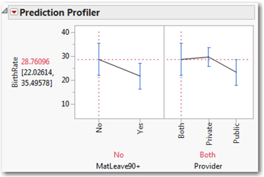
The profiler graphs are easy to interpret. In the left panel, we see confidence intervals for mean birth rate in the countries with maternity leaves less than 90 days and those with 90 days or more. Similarly, the right panel compares the intervals for the different provider arrangements. As with other JMP graphs, the panels here are linked and interactive.
The red dashed lines indicate the level settings for the profiler. Initially, we are estimating the birth rate for countries with shorter maternity leaves that are provided jointly by the public and private sectors. On the far left, we see the confidence interval of approximately 22.03 to 35.50.
4. To see how the mean birth rate prediction changes, for example, if we look at countries with shorter maternity leaves that are publicly provided, just use the arrow tool and click on the blue interval corresponding to Public.
The prediction falls to approximately 18.09 to 28.73.
5. Experiment by clicking on the different interval bars until you begin to see how the BirthRate estimates change with different selections in the Profiler.
We can also construct a profiler for interaction effects. In this example, the interaction is insignificant, but we can still learn something from the profiler graph.
6. Click the red triangle again and select Factor Profiling ► Interaction Plots. Enlarge the plot area or use the Grabber to adjust the vertical axes so that you can see the plotted lines clearly as in Figure 14.12.
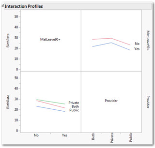
The interaction profiles show the mean birth rates corresponding to both categorical variables. In the lower-left graph, the different provider arrangements are represented by three color-coded lines, and we see that regardless of provider, the mean BirthRate is lower for those countries with longer maternity leaves (MatLeave90+ = Yes). The plot in the upper right swaps the arrangement. In this graph, we have two color-coded lines, corresponding to the two different levels of maternity leave durations. The lines display the different birth rate mean values for the three different provider systems.
When there is no interaction, we’ll find lines that are approximately parallel. If there is a significant interaction, we’ll see lines that cross or intersect. The intersection shows that the pattern of different means for one categorical factor varies depending on the value of the other factor.
If we want more precision than a small graph offers, we can once again look at multiple comparisons just as we did for the one-way ANOVA. Because this command performed three tests (two main effects and one interaction), we’ll need to ask for three sets of multiple comparisons.
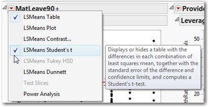
7. Return to the top of the output, scroll to the right slightly to locate the Leverage Plots4, and click the red triangle next to MatLeave90+. Because this categorical variable is dichotomous, we can compare the means using a two-sample t-test. Choose LSMeans Student’s t as shown in Figure 14.13.
8. Click the red triangle next to Provider and select LSMeans Tukey HSD.
Now look below each of the Leverage Plots and locate the connecting letters reports (shown here in Figure 14.14; scroll down a bit to adjust the report in this fashion).
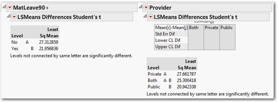
Here we see the significant contrasts: there is a significant difference in means between countries with longer and shorter maternity leaves, and also between those that provide the benefits privately and publicly.
Application
Now that you have completed all of the activities in this chapter, use the techniques that you’ve learned to respond to these questions. In all problems, be sure to evaluate the reasonableness of the ANOVA assumptions and comment on your conclusions.
1. Scenario: We’ll continue to examine the World Development Indicators data in the data table BirthRate 2005. We’ll broaden our analysis to work with other columns in that table:
• Region: country’s geographic region
• Fertil: number of births per woman
• Mortmaternal: maternal mortality, estimated deaths per 100,000 births
• MortUnder5: deaths, children under 5 years per 1,000
• MortInfant: deaths, infants per 1,000 live births
a. Perform a one-way ANOVA to decide whether birth rates are consistent across regions of the world. If you conclude that the rates differ, determine where the differences are.
b. Perform a one-way ANOVA to decide whether fertility rates are consistent across regions of the world. If you conclude that the rates differ, determine where the differences are.
c. Perform a two-way ANOVA to see how maternal mortality varies by length of maternity leaves and provider. If you conclude that the rates differ, determine where the differences are, testing for both main and interaction effects.
d. Perform a two-way ANOVA to see how mortality under five years of age varies by length of maternity leaves and provider. If you conclude that the rates differ, determine where the differences are, testing for both main and interaction effects.
2. Scenario: A company that manufactures insulating materials wants to evaluate the effectiveness of three different additives to a particular material. The company performs an industrial experiment to evaluate the additives. For the sake of this example, these additives are called Regular, Extra, and Super. The company now uses the regular additive, so that serves as the control group.
The experimenter has a temperature-controlled apparatus with two adjoining chambers. He can insert the experimental insulating material in the wall that separates the two chambers. Initially, he sets the temperature of chamber A at 70°F and the temperature of the other chamber (B) at 30°F. After a pre-determined amount of time, he measures the temperature in chamber A, recording the change in temperature as the response variable. A good insulating material prevents the temperature in chamber A from falling far.
Following good experimental design protocols (see Chapter 18) he repeats the process in randomized sequence thirty times, testing each insulating material a total of 10 times.
We have the data from this experiment in a file called Insulation.JMP.
a. Perform a one-way ANOVA to evaluate the comparative effectiveness of the three additives.
b. Which multiple comparison method is appropriate in this experiment, and why?
c. Should the company continue to use the regular additive, or change to one of the others? If they should change, which additive should they use?
3. Scenario: How do prices of used cars differ, if at all, in different areas of the United States? Our data table Used Cars contains observational data about the listed prices of three popular compact car models in three different metropolitan areas in the U.S. The cities are Phoenix, AZ; Portland, OR; and Raleigh-Durham-Chapel Hill, NC. The cars models are the Chrysler PT Cruiser Touring Edition, the Honda Civic EX, and the Toyota Corolla LE. All of the cars are two years old.
a. Perform a two-way ANOVA to see how prices vary by city and model. If you find differences, perform an appropriate multiple comparison and explain where the differences are.
b. Perform a two-way ANOVA to see how mileage of these used cars varies by city and model. If you find differences, perform an appropriate multiple comparison and explain where the differences are.
4. Scenario: Does a person’s employment situation influence the amount that he or she sleeps? Our TimeUse data table can provide a foundation for analysis of this question.
a. Perform a one-way ANOVA to see how hours of sleep vary by employment status. If you find differences, perform an appropriate multiple comparison and explain where the differences are.
b. Perform a two-way ANOVA to see how hours of sleep vary by employment status and gender. If you find differences, perform an appropriate multiple comparison and explain where the differences are.
5. Scenario: In this scenario, we return to the Pipeline Safety data table to examine the consequences of pipeline disruptions.
a. Perform a one-way ANOVA to see how the dollar amount of property damage caused by a disruption varies by Region. If you find differences, perform an appropriate multiple comparison and explain where the differences are.
b. Perform a two-way ANOVA to see how the dollar amount of property damage caused by a disruption varies by Region and Ignite. If you find differences, perform an appropriate multiple comparison and explain where the differences are.
c. Perform a one-way ANOVA to see how the time required to make the area safe caused by a disruption varies by type of disruption. If you find differences, perform an appropriate multiple comparison and explain where the differences are.
d. Perform a two-way ANOVA to see how the dollar amount of property damage caused by a disruption varies by type of disruption and Region. If you find differences, perform an appropriate multiple comparison and explain where the differences are.
6. Scenario: A company manufactures catheters, blood transfusion tubes, and other tubing for medical applications. In this particular instance, we have diameter measurements from a newly designed process to produce tubing that is designed to be 4.4 millimeters in diameter. These measurements are stored in the Diameter data table.
Each row of the table is a single measurement of tubing diameter. There are six measurements per day, and each day one of four different operators was responsible for production using one of three different machines. The first 20 days of production were considered Phase 1 of this study; following Phase 1 some adjustments were made to the machinery, which then ran an additional 20 days in Phase 2. Use the data filter to analyze just the Phase 1 data.
a. Perform a one-way ANOVA to see how the tubing diameters vary by Operator. If you find differences, perform an appropriate multiple comparison and explain where the differences are.
b. Perform a one-way ANOVA to see how the tubing diameters vary by Machine. If you find differences, perform an appropriate multiple comparison and explain where the differences are.
c. Perform a two-way ANOVA to see how the tubing diameters vary by Operator and Machine. If you find differences, perform an appropriate multiple comparison and explain where the differences are.
d. Explain in your own words what the interaction plots tell you in this case. Couch your explanation in terms of the specific machines and operators.
7. Scenario: JMP ships illustrative data tables with the software. One of these is the Popcorn data table. It is one of the few realistic but artificial examples we’ll use in this book, but because it is based on the work of three highly influential statisticians5 it appears here.
a. Perform a series of three one-way ANOVAs to decide if Yield varies by popcorn type, by the amount of oil used (oil amt), or size of batch. Verify assumptions; if you find differences, perform an appropriate multiple comparison and explain where the differences are.
b. Perform a series of two-way ANOVAs to see if there are any interactions among factors, and report on your findings.
1 Alternatively, we might express this assumption as saying that the individual responses are normally distributed within each group.
2 We’ve seen Rsquare before in Chapter 4, and will work with it again in Chapter 15 and 16 when we study regression analysis.
3 Different nonparametric procedures take different approaches to the concept of a distribution’s “center.” None use the mean per se as the One-way ANOVA does.
4 Leverage plots are discussed more fully in Chapter 15.
5 The Popcorn data table is inspired by experimental data from Box, Hunter, Hunter (1978).