11 Inference for a Single Continuous Variable
,Using JMP to Conduct a Significance Test
What if Conditions Aren’t Satisfied?
Using JMP to Estimate a Population Mean
Matched Pairs: One Variable, Two Measurements
Overview
Chapter 10 introduced inference for categorical data and this chapter does the same for continuous quantitative data. As in Chapter 10, we’ll learn to conduct hypothesis tests and to estimate a population parameter using a confidence interval. We already know that every continuous variable can be summarized in terms of its center, shape, and spread. There are formal methods of inference for a population’s center, shape, and spread based on a single sample. In this chapter we’ll just deal with the mean.
Conditions for Inference
Just as with categorical data, we rely on the reasonableness of specific assumptions about the conditions of inference. Because the conditions are so fundamental to the process of generalizing from sample data, we begin each of the next several chapters by asking “what are we assuming?”
Our first two assumptions are the same as before: observations in the sample are independent of one another and the sample is small in comparison to the entire population (usually 10% or less). We should also be satisfied that the sample is probabilistic and therefore can reasonably represent the population. If we know that our sample data violates one or more of these conditions, then we should also understand that we’ll have little ability to make reliable inferences about the population mean.
The first set of procedures that we’ll encounter in this chapter relies on the sampling distribution of the mean, which we introduced in Chapter 8. We can apply the t-distribution reliably if the variable of interest is normally distributed in the parent population, or if we can invoke the Central Limit Theorem because we have ample data. If the parent population is highly skewed, we might need quite a large n to approach the symmetry of a t-distribution; the more severe the skewness of the population, the larger the sample required.
Using JMP to Conduct a Significance Test
We’ll return to the pipeline safety data table and reanalyze the measurements of elapsed time until the area around a disruption was made safe. Specifically, suppose that there were a national goal of restoring the areas to safe conditions in less than three hours (180 minutes) on average, and we wanted to ask if this goal has been met. We could use this set of data to test the following hypotheses:
H0: μ ≥ 180 [null hypothesis: the goal has not been met]
Ha: μ < 180 [alternative hypothesis: the goal has been met]
As before, we’ll assume that the observations in the table are a representative sample of all disruptions, that the observations are independent of one another, and that we’re sampling from an infinite process.
1. Open the Pipeline Safety data table.
2. Select Analyze ► Distribution. Select STMin as Y, and click OK. You’ve seen this histogram before.
3. Click the red triangle next to Distributions and Stack the results (shown in Figure 11.1 on the next page).

Before going further, it is important to consider the remaining conditions for inference. The histogram reveals a strongly right-skewed distribution, most likely revealing a sample that comes from a similarly skewed population. Because our sample has 455 observations, we’ll rely on the Central Limit Theorem to justify the use of the t-distribution.
If we had a smaller sample and wanted to investigate the normality condition, we would construct a normal quantile plot by clicking on the red triangle next to STMin and selecting that option.
4. Click the red triangle next to STMin, and select Test Mean. This opens the dialog box shown in Figure 11.2. Type 180 as shown and click OK.
Notice that the dialog box has two optional inputs. First, there is a box into which you can “Enter True Standard Deviation to do z-test rather than t-test.” In an introductory statistics course, one might encounter a textbook problem that provides the population standard deviation, and therefore one could base a test on the Normal distribution rather than the t-distribution (that is, conduct a z-test). Such problems might have instructional use, but realistically, one never knows the population standard deviation. The option to use the z-test has virtually no practical applications except possibly when one uses simulated data.
The second option in the dialog box is for the Wilcoxon Signed Rank test; we’ll discuss that test briefly in the next section. First, let’s look at the results of the t-test in Figure 11.3.
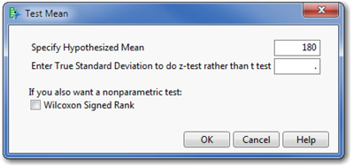
In the test report, we find that this test compares a hypothesized value of 180 minutes to an observed sample mean of 149.018, using a t-distribution with 454 degrees of freedom. The sample standard deviation is 212.64 minutes.
We then find the Test Statistic, which JMP computes using the following formula:
Below the test statistic are three P-values, corresponding to the three possible formulations of the alternative hypothesis. We are doing a less-than test, so we’re interested in the last value shown in red: 0.0010. This probability value is so small that we should reject the null hypothesis. In view of the observed sample mean, it is not plausible to believe that the population mean is 180 or higher. The graph at the bottom of the panel depicts the situation. Under the null hypothesis that the population mean is truly 180 minutes, the blue curve shows the likely values of sample means. Our sample mean is marked by the red line, which sits –3.1 standard errors to the left of 180. If the null hypothesis were true, we’re very unlikely to see a sample mean this low.
More About P-Values
P-values are fundamental to the significance tests we’ve seen thus far, and they are central to all statistical testing. You’ll work with them in nearly every remaining chapter of this book, so it is worth a few moments to explore another JMP feature at this point.
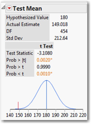
1. Click the red triangle next to Test Mean and select PValue animation. This opens an interactive graph (Figure 11.4) intended to deepen your understanding of P-values.
The red curve is the theoretical sampling distribution assuming that the population mean equals 180, and the vertical black line marks our sample mean. In the current example, our alternative hypothesis was μ < 180, and because our sample mean was so much smaller than 180, we concluded that the null hypothesis was far less credible than this alternative. We can use this interactive graph to visualize the connection between the alternative hypothesis and the P-value.
2. Click the Low Side button, corresponding to the less-than alternative.
This illustrates the reported P-value of 0.001. Clicking the other two buttons in turn shows where the probability would lie in either of the other two forms of the alternative.
Suppose that our initial hypothesized value had not been three hours (180 minutes) but a lower value. How would that have changed things?
3. Notice that there is a small square at the peak of the curve. Place your cursor over that peak, click and drag the cursor slowly to the left, essentially decreasing the hypothesized value from 180 minutes to a smaller amount.
As you do so, the shaded area grows. Using the initial value of 180, the results of this test cast considerable doubt on the null hypothesis. Had the null hypothesis referred to a smaller number, then our results would have been less closely associated with the low side alternative.
4. Continue to move the center of the curve until the P-value decreases to just about 0.05—the conventional boundary of statistical significance.
From this interaction we can see that our sample statistic of 149.018 would no longer be statistically significant in a low side test (that is, with a less-than alternative) if the hypothesized mean is about 165 or less.
What if our sample had been a different size?
5. Click the number 455 next to Sample Size in the lower center of the graph. Change it to 45 and observe the impact on the graph and the P-value.
6. Change the sample size to 4,500 and observe the impact.
The magnitude of the P-value depends on the shape of the sampling distribution (assumed to be a t-distribution here), the size of the sample, the value of the hypothesized mean, and the results of the sample. The size of the P-value is important to us because it is our measure of the risk of Type I errors in our tests.
Ideally, we want to design statistical tests that lead to correct decisions. We want to reject the null hypothesis when the alternative is true, and we want to retain the null hypothesis when the alternative is false. Hypothesis testing is driven by the desire to minimize the risk of a Type I error (rejecting a true null hypothesis). We also do well to think about the capacity of a particular test to discern a true alternative hypothesis. That capacity is called the power of the test.
The Power of a Test
Alpha (α) represents the investigator’s tolerance for a Type I error. There is another probability known as beta (β), which represents the probability of a Type II error in a hypothesis test. The power of a test equals 1 – β. In planning a test, we can specify the acceptable α level in advance, and accept or reject the null hypothesis when we compare the P-value to α. This is partly because the P-value depends on a single hypothesized value of the mean, as expressed in the null hypothesis.
The situation is not as simple with β. A Type II error occurs when we don’t reject the null hypothesis, but we should have done so. That is to say, the alternative hypothesis—which is always an inequality—is true, but our test missed it. In our example, where the alternative hypothesis was μ < 180, there are an infinite number of possible means that would satisfy the alternative hypothesis. To estimate β, we need to make an educated guess at an actual value of μ. JMP provides another animation to visualize the effects of various possible μ values.
For this discussion of power, we’ll alter our example and consider the two-sided version of the significance test: is the mean different from 180 minutes?
1. Click the red triangle next to Test Mean and select Power animation. This opens an interactive graph (Figure 11.5 below) that illustrates this concept of power.
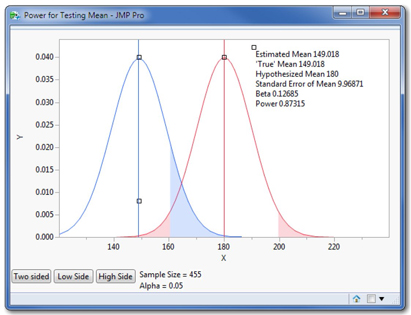
2. Initially, the annotations on the graph (estimated mean and so on) are far in the upper left corner. Grab the small square at the upper left and slide all of text to the right as shown in Figure 11.5 so that you can see it clearly.
This graph is more complex than the earlier one. We initially see two distributions. The red one (on the right), centered at 180, shows the sampling distribution based on the assumption expressed in the null hypothesis. The blue curve on the left shows an alternative sampling distribution (a parallel universe, if you like) based on the possibility that μ actually is equal to 149.018, the value of the sample mean.
So this graph lays out one pre-sampling scenario of two competing visions. The red vision depicts the position of the null hypothesis: the population mean is truly 180, and samples vary around it. The blue vision says “Here’s another possible reality: the population mean just so happens to be 149.018.” We’ll be able to relocate the blue curve, and thereby see how the power of our test would change if the population mean were to be truly any value we choose.
The graph initially displays a two-sided test. In the red curve, the pink-shaded areas now represent not the P-value but rather α = .05. That is, each tail is shaded to have 2.5% with 95% of the curve between the shaded areas. If we take a sample and find the sample mean lying in either pink region, we’ll reject the null hypothesis. In advance of sampling, we decided to make the size of those regions 5%. This is the rejection rule for this particular test.
The blue-shaded area shows β. As it is depicted, with the population mean really at 149.018, the null hypothesis is false and should be rejected. Among the possible samples from the blue universe (which is where the samples would really come from) about 13% of them are outside of the rejection region of the test, and in those 13% of possible samples, we’d erroneously fail to reject the null hypothesis. The power of this test is 0.87, which is to say that if the true mean were really 149.018 minutes, this test would correctly reject the null hypothesis in 87% of possible samples. Not bad. Now let’s interact with the animator.
3. First, let’s change Alpha from 0.05 to 0.01. Click 0.05 and edit it.
Notice what happens in the graph. Because alpha is smaller, the pink shaded area is smaller and the light blue shading gets larger. There is a trade-off between α and β: if we tighten our tolerance for Type I error, we expose ourselves to a greater chance of Type II error and also diminish the power of a test.
4. Restore Alpha to 0.05, and now double the Sample Size to 910. You’ll need to rescale the vertical axis (grab the upper portion with the hand tool) to see the full curves after doing this.
Doubling the size of the sample radically diminishes beta and substantially increases power from 0.87 to 0.99. So there’s a lesson here: another good reason to take large samples is that they make tests more powerful in detecting a true alternative hypothesis.
5. Finally, grab the small square at the top of the blue curve, and slide it to the right until the true mean is at approximately 170 minutes.
This action reveals yet another vertical line. It is green and it represents our sample mean. More to the point, however, see what has happened to the power and the chance of a Type II error. If the mean truly were 170 minutes, the alternative is again true and the null hypothesis is false: the population mean is not 180 as hypothesized, but 10 minutes less.
When the discrepancy between the hypothesized mean and the reality shrinks, the power of the test falls and the risk of Type II error increases rapidly. This illustrates a thorny property of power and one that presents a real challenge. Hypothesis testing is better at detecting large discrepancies than small ones. If our null hypothesis is literally false but happens to be close to the truth, there will be a relatively good chance that a hypothesis test will lead us to the incorrect conclusion. Enlarging the sample size would help, if that is feasible and cost-effective.
What if Conditions Aren’t Satisfied?
The pipeline data table contains a large number of observations so that we could use the t-test despite the indications of a highly skewed population. What are our options if we don’t meet the conditions for the t-test?
If the population is reasonably symmetric, but normality is questionable, we could use the Wilcoxon Signed Rank test. This is an option presented in the Test Means command, as illustrated in Figure 11.2. Wilcoxon’s test is identified as a non-parametric test, which just indicates that its reliability does not depend on the parent population following any specific probability distribution. Rather than testing the mean, the test statistic computes the difference between each observation and the median, and ranks the differences. This is why symmetry is important: in a skewed data set the gap between mean and median is comparatively large.
We interpret the P-values just as we do in any hypothesis test, and further information is available within the JMP Help system. At this point it is useful to know that the t-test is not the only viable approach.
In recent years, many statisticians have taken yet another approach known as bootstrapping. The idea of bootstrapping is to use software to take a large number of repeated random samples with replacements from the original data table, and to compute the sample mean for each of these samples. This rapidly produces an empirical sampling distribution for the population mean and permits a judgment about the likelihood of the one observed sample mean.
The professional edition of JMP (JMP PRO©) includes a bootstrapping capability. Because it is not included in the standard version of the software, it is not illustrated here.
If the sample is small and strongly skewed, then inference is risky. If possible, one should gather more data. If costs or time constraints prohibit that avenue, and if the costs of indecision exceed those of an inferential error, then the techniques illustrated above might need to inform the eventual decision (however imperfectly) with the understanding that the estimates of error risk are inaccurate.
Using JMP to Estimate a Population Mean
Just as with categorical data, we may want to estimate the value of the population parameter—in this case, the mean of the population. We’ll continue examining the number of minutes required to restore an area to safety following a pipeline break. We’ll start by looking back at the initial Distributions report that we created a few pages back.
You might not have noticed previously, but JMP always reports a confidence interval for the population mean, and it does so in two ways. Box plots include a Mean Confidence Diamond (see Figure 11.6) and the Summary Statistics panel reports the Upper 95% Mean and Lower 95% Mean. The mean diamond is a visual representation of the confidence interval, with the left and right (or lower and upper) points of the diamond corresponding to the lower and upper bounds of the confidence interval.

Now look at the Summary Statistics panel, shown earlier in Figure 11.1. If we can assume that the conditions for inference have been satisfied, we can estimate with 95% confidence that the nationwide mean time to secure the area of a pipeline disruption in the U.S. is between 129.4 and 168.6 minutes.
Notice that JMP calculates the bounds of the interval any time we analyze the distribution of a continuous variable; it is up to us whether the conditions warrant interpreting the interval.
What if we wanted a 90% confidence interval, or any confidence level other than 95%?
1. Click the red triangle next to STMin, and select Confidence Interval ► 0.90.
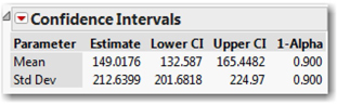
A new panel opens in the results report (see Figure 11.7). The report shows the boundaries of the 90% confidence interval for the population mean. It also shows a confidence interval for the population standard deviation—not only can we estimate the population’s mean (μ), but we can similarly estimate the standard deviation, σ.
Matched Pairs: One Variable, Two Measurements
The t-distributions underlying most of this chapter were the theoretical contribution of William Gosset, so it is appropriate to conclude this chapter with some data originally collected by Gosset, whose expertise was in agriculture as it related to the production of beer and ale, the industry in which he worked as an employee of the Guinness Brewery.
This particular set of data contains measurements of crop yields from eleven different types of barley (referred to as corn in Gosset’s day) in a split plot experiment. Seeds of each type of barley were divided into two groups. Half of the seeds were dried in a kiln, and the other half were not. All of the seeds were planted in eleven pairs of farm plots, so that the kiln-dried and regular seeds of one variety were in adjacent plots.
As such, the data table contains 22 measurements of the same variable: crop yield (pounds of barley per acre). However, the measurements are not independent of one another, because adjacent plots used the same variety of seed and were presumably subject to similar conditions. The point of the experiment was to learn if kiln-dried seeds increased the yields in comparison to conventional air-dried seeds. It is important that the analysis compare the results variety by variety, isolating the effect of drying method.
The appropriate technique is equivalent to the one-sample t-test, and rather than treating the data as 22 distinct observations, we treat it as 11 matched pairs of data. Rather than analyze the individual values, we analyze the differences for each pair. Because we have a small sample, the key condition here is that the population differences be approximately normal, just as in the one-sample t-test.
1. Open the data table Gosset’s Corn. The first column shows the yields for the 11 plots with kiln-dried seeds and the second column shows the corresponding yields for the regular corn. Glancing down the columns, we see that the kiln-dried values are sometimes larger and sometimes smaller than the others.
2. Select Analyze ► Matched Pairs. Choose both columns and select them as Y, Paired Response, and click OK. The results are shown in Figure 11.8.
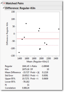
This report provides a confidence interval and P-values for the mean of the pairwise differences. First, we see a graph of the eleven differences in comparison to the mean difference of –33.7 pounds per acre. There is variation, but on average the kiln-dried seeds yielded nearly 34 pounds more per acre within the sample (the differences are calculated as regular – kiln). Now we want to ask what we can infer about the entire population based on these results.
Next note the confidence interval estimate. With 95% confidence, we can conclude that the yield difference between regular and kiln-dried seeds is somewhere in the interval from –78.182 to +10.7271. Because this interval includes 0, we cannot confidently say that kiln-drying increases or decreases yield in the population, even though we did find an average increase in this one study.
On the lower right side of the report, we find the results of the significance test. We’re interested in the bottom P-value, corresponding to the less-than test (that is, our alternative hypothesis was that kiln-dried yields would be greater than regular, so that differences would be negative). Based on this P-value, the results fall slightly short of conventional significance; we don’t reject the null hypothesis.
Application
Now that you have completed all of the activities in this chapter, use the concepts and techniques that you’ve learned to respond to these questions.
1. Scenario: We’ll continue our analysis of the pipeline disruption data. The columns PRPTY and GASPRP contain the dollar value of property and natural gas lost as a consequence of the disruption.
a. Do each of these columns satisfy the conditions for statistical inference? Explain.
b. Report and interpret a 95% confidence interval for the mean property value costs of a pipeline disruption.
c. Now construct and interpret a 90% confidence interval for the same parameter.
d. In a sentence or two, explain what happens when we lower the confidence level.
e. Construct and interpret a 99% confidence for the dollar cost of natural gas loss in connection with a pipeline disruption.
f. Conduct a test using an alternative hypothesis that, on average, a pipeline disruption loses less than $20,000 worth of gas. Report on your findings.
g. Use the P-value animation tool to alter the null hypothesis just enough to change your conclusion. In other words, at what point would the data lead us to the opposite conclusion?
h. Use the power animator and report on the power of this test.
2. Scenario: Recall the data table called Michelson 1879. These are Michelson’s recorded measurements of the speed of light. Because the measurements were taken in different groups, we’ll focus only on his last set of measurements. Before doing any further analysis, take the following steps.
• Open the data table.
• Select Rows ► Data Filter. Highlight Trial# and click Add.
• Select the Show and Include check boxes, and select fifth from the list. Now your analysis will use only the 20 measurements from his fifth trial.
a. Assume this is an SRS. Does the Velocity column satisfy our conditions for inference? Explain.
b. Construct and interpret a 90% confidence interval for the speed of light, based on Michelson’s measurements.
c. Michelson was a pioneer in measuring the speed of light, and the available instruments were not as accurate as modern equipment. Today, we generally use the figure 300,000 kilometers per second (kps) as the known constant speed. Put yourself in Michelson’s shoes, and conduct a suitable hypothesis test to decide whether 300,000 kps would have been a credible value based on the measurements he had just taken.
d. Use the P-value animation tool to alter the null hypothesis so that Michelson might have believed the null hypothesis. In other words, at what point would his data no longer be statistically distinguishable from the null hypothesis value?
3. Scenario: Recall the data in the NHANES data table. Specifically, remember that we have two measurements for the height of very young respondents: BMXRECUM and BMXHT, the recumbent (reclining) and standing heights.
a. In a sentence or two, explain why you might expect these two measurements of the same individuals to be equal or different.
b. Perform a matched pairs test to decide if the two ways of measuring height are equivalent. Interpret the reported 95% confidence interval, and explain the test results. What do you conclude?
4. Scenario: The data table Airline Delays contains a sample of flights for two airlines destined for four busy airports. Using the data filter as described in Scenario 2 above, select just the sample of American Airlines flights at Chicago’s O’Hare Airport (ORD) for analysis. Our goal is to analyze the delay times, expressed in minutes.
a. Assume this is an SRS of many flights by the selected carrier over a long period of time. Have we satisfied the conditions for inference about the population mean delay? Explain.
b. Report and interpret the 95% confidence interval for the mean flight delay for American Airlines flights bound for Chicago.
c. Let L stand for the lower bound of the interval and U stand for the upper bound. Does this interval tell you that there is a 95% chance that your flight to Chicago will be delayed between L and U minutes? What does the interval tell you?
d. Using a significance level of 0.05, test the null hypothesis that the population mean delay is twelve minutes against a one-sided alternative that the mean delay is less than twelve minutes.
e. Now suppose that the true mean of the delay variable is actually ten minutes. Use the power animation to estimate the power of this test under that condition. Explain what you have found.
5. Scenario: We have additional flight data in the data table Airline delays 3, which contains data for every United Airlines flight departing Chicago's O'Hare International Airport from March 8 through March 14, 2009. Canceled flights have been dropped from the table. Our goal is to analyze the departure delay times, expressed in minutes.
a. Assume this is an SRS. Have we satisfied the conditions for inference about the population of United Flights?
b. “Departure Delay” refers to the time difference between the scheduled departure and the time when the aircraft’s door is closed and the plane pulls away from the gate. Develop a 95% confidence interval for the mean departure delay DepDelay, and interpret the interval.
c. Sometimes there can be an additional delay between departure from the gate and the start of the flight. “Wheels off time” refers to the moment when the aircraft leaves the ground. Develop a 95% confidence interval for the mean time between scheduled departure and wheels-off (SchedDeptoWheelsOff). Report and interpret this interval.
d. Now use a matched-pairs approach to estimate (with 95% confidence) the mean difference between departure delay and wheels off delay. Explain what your interval tells you.
6. Scenario: In this exercise, we return to the FAA Bird Strikes data table. Recall that this set of data is a record of events in which commercial aircraft collided with birds in the United States.
a. Do the columns speed and cost of repairs satisfy the conditions for statistical inference? Explain.
b. Report and interpret a 95% confidence interval for the mean speed of flights.
c. Now construct and interpret a 99% confidence interval for the same parameter.
d. In a sentence, explain what happens when we increase the confidence level.
e. Conduct a test using an alternative hypothesis that, on average, flight repairs caused by bird strikes cost less than $170,000. Report on your findings.
f. Use the P-value animation tool to alter the null hypothesis just enough to change your conclusion. In other words, at what point would the data lead us to the opposite conclusion?
g. Use the power animator and report on the power of this test.
7. Scenario: In 2004, the state of North Carolina released to the public a large data set containing information on births recorded in this state. Our data table NC Births is a random sample of 1,000 cases from this data set. In this scenario, we will focus on the birth weights of the infants (weight) and the amount of weight gained by mothers during their pregnancies (gained). All weights are measured in pounds.
a. Do the data columns labeled weight and gained satisfy the conditions for inference? Explain.
b. Test the hypothesis that the mean amount of weight gained by all N.C. mothers was more than 30 pounds in 2004. Explain what you did and what you decided. Use a significance level of 0.05.
c. Construct and interpret a 95% confidence interval for the mean birth weight of NC infants in 2004.